using interactive graphics to teach multivariate data analysis to psychology … · ·...
TRANSCRIPT
Journal of Statistics Education, Volume 19, Number 1 (2011)
1
Using Interactive Graphics to Teach Multivariate Data Analysis to
Psychology Students
Pedro M. Valero-Mora
Universitat de València (Spain)
Rubén D. Ledesma
Universidad Nacional de Mar del Plata (Argentina)
Journal of Statistics Education Volume 19, Number 1 (2011),
www.amstat.org/publications/jse/v19n1/valero-mora.pdf
Copyright © 2011 by Pedro M. Valero-Mora and Rubén D. Ledesma all rights reserved. This
text may be freely shared among individuals, but it may not be republished in any medium
without express written consent from the authors and advance notification of the editor.
Key Words: Interactive graphics; Multivariate data; Parallel boxplots; Principal components;
Cluster analysis.
Abstract
This paper discusses the use of interactive graphics to teach multivariate data analysis to
Psychology students. Three techniques are explored through separate activities: parallel
coordinates/boxplots; principal components/exploratory factor analysis; and cluster analysis.
With interactive graphics, students may perform important parts of the analysis ―by hand,‖ using
techniques such as pointing at, selecting and changing the colors of the points/observations. Our
experience demonstrates that this approach is very useful when teaching an
intermediate/advanced course on multivariate data analysis to students of Psychology, who tend
to have low to moderate proficiency in Mathematics.
1. Introduction
Teaching multivariate data analysis to Psychology students is an interesting challenge. On the
one hand, these students generally do not have a strong grounding in Statistics or Mathematics,
and they usually have a rather unenthusiastic attitude towards these subjects. On the other hand,
the objectives of some multivariate techniques, such as factor analysis or cluster analysis, are
Journal of Statistics Education, Volume 19, Number 1 (2011)
2
very closely tied to concepts they learn as students of Psychology; consequently, they are able to
appreciate the utility of these techniques very quickly. For example, they are familiar with
theories of factorial intelligence and personality, and they readily understand the concept of
clustering individuals in different groups according to symptoms, characteristics or traits. Based
on our experience, we recommend that courses on multivariate statistics for Psychology students
first review this knowledge and then introduce the statistical or mathematical aspects later in
order to keep students highly motivated.
Interactive and dynamic graphics are excellent tools for introducing multivariate data analysis
(Cook, 2009) for they allow students to apply these techniques entirely or partially in a
graphic/interactive way, providing insights into the procedures that do not stem easily from the
formulae. Dynamic graphics are special, computer-based statistical graphics that change in
response to a direct user manipulation or other data-analysis action/event, such as changes in
other related plots-windows (Theus and Urbanek, 2009; Young, Valero-Mora, and Friendly,
2006). Because they are difficult to define in words, this paper includes several videos that show
dynamic graphics in action. The videos show how interactive graphics allow the students to
visualize multivariate data and then perform activities that are very natural for them. Since the
math involved is minimal, students can begin playing with the data immediately, identifying
outliers and specific observations they are curious about, or clustering groups of observations
with similar profiles across variables. Once they have experienced carrying out these activities
―by hand‖ it is easy to introduce the mathematical concepts behind the graphics. Then, a
discussion of the differences between the results obtained interacting with the graphics and the
formal mathematical method can provide a deeper insight into the algorithms, their limitations,
and the way of solving the analytical problems that may arise during the analysis. Last but not
least, as the interpretation of the outputs of multivariate techniques is sometimes rather
complicated, interactive graphics may also help by providing a succinct view of the different
parts of the output.
The aim of this paper is to demonstrate how interactive and dynamic statistical graphics can be
used to teach a course on introductory multivariate statistics to Psychology students. Note that,
although we use ViSta ―The Visual Statistics System‖ (Young et al., 2006) the same activities
can be performed with other statistics software. ViSta is multivariate visualization and data
analysis software that we actively contribute to in terms of development and maintenance; we
also use ViSta in our statistics courses. These are the main reasons why we use ViSta in this
paper. However, we will emphasize the activities and not our own software. Further, in section 5,
we provide a review of other statistics programs with dynamic graphics capabilities.
This paper is organized as follows: first, we will describe the profile of the typical student we see
in our multivariate data analysis courses; second, we will introduce three activities to illustrate
the use of interactive graphics in the classroom; finally, we will provide a quick introduction to
ViSta and a short account of other programs that provide interactive graphics.

Journal of Statistics Education, Volume 19, Number 1 (2011)
3
2. Our Students
Teaching statistics in Psychology is always a challenge in terms of finding appropriate strategies
(Wiberg, 2009). It is worth noting that students of Psychology enrolled in a multivariate data
analysis course are special in several respects. First of all, as these courses are generally optional,
the unmotivated students simply do not enroll; second, the students that do enroll usually have an
approximate idea of the application of statistics to psychology (as they have already been
exposed to research applied to the latter that is based on the former); third, courses on
multivariate statistics are taken in the final years of the program; and fourth, enrolled students
have already taken exams on statistics in the past (for example, the exam following the
introductory course that is usually a prerequisite for the advanced course) and are, therefore, not
as apprehensive of the subject matter as students tend to be in an introductory statistics course. In
summary, our students possess a number of characteristics that contribute positively to the
learning process.
However, these students also possess attributes that, though not entirely negative, need to be
taken into consideration as well. For instance, they often do not have a deep understanding of
mathematics and often they have been taught that they do not really need it. Indeed, if strategies
such as those reviewed by Wiberg (2009) (e.g., to emphasize data and concepts at the expense of
theory, to have hands-on problems or real life problems, and to use real data and focus on the
students’ learning instead of the lecturing) have been used to teach them introductory courses on
statistics in the past, they will not easily accept that a new strategy will be used now. Fulfilling
this expectation can be a more difficult challenge in an advanced course than in an introductory
one, as it may become rather complicated to convey the concepts of multivariate statistics
without resorting to matrix operations or probability theory.
In our experience, the activities that follow have proven useful in the situation described above.
Going through them, students obtain an intuitive approximation of the techniques involved and
can interact with data or results to understand the multivariate problem. Actually, in some cases,
they can even try to solve the problem manually, arriving at a solution that is similar to the one
that could be obtained algorithmically. Comparisons between the results obtained manually and
mathematically are also of interest, as they may help students understand the complexities of the
problem and how to avoid possible pitfalls. Finally, as the interpretation of the results is not as
straightforward as it is for other situations, the interactive graphics presented here can also be
invaluable in the final part of the multivariate analysis.
3. Software Downloads
We encourage the reader to install the ViSta software on his/her computer. Instructions for
software installation are included in the Appendix.
Each activity described in Section 4 has a corresponding video that illustrates use of the ViSta
software in the data analysis. You may download these videos from JSE by clicking on the links
below. These same videos are also linked later in the paper as Movie 1, Movie 2, and Movie 3.
Each download may take up to five minutes.
Journal of Statistics Education, Volume 19, Number 1 (2011)
4
Section 4.1 Parallel Lines/Boxplots -
http://www.amstat.org/publications/jse/v19n1/BoxplotswithSound.avi
Section 4.2 Principal Component Analysis -
http://www.amstat.org/publications/jse/v19n1/PCAwithSound.avi
Section 4.3 Interactive Cluster Analysis -
http://www.amstat.org/publications/jse/v19n1/ClusterwithSound.avi
4. Three Activities for Exploring Multivariate Techniques
We will discuss three activities in this section: parallel lines/boxplots as a way of exploring many
variables simultaneously in a direct, intuitive way; principal component analysis using
interactive graphics; and cluster analysis ―by hand.‖ The reason we have chosen these activities
is because they have proven to be engaging activities for our students and because, after a short
introduction, students can work autonomously and arrive at conclusions by themselves.
4.1 Parallel Lines/boxplots
4.1.1 Pedagogical Purpose
In this first activity, we show how dynamic graphics can be used to introduce students to a
multivariate data analysis problem. The activity consists of using an interactive parallel boxplot
to explore a multivariate dataset. The objectives of this activity are for students to interact with
raw multivariate data, familiarize themselves with the data’s typical structure, and explore the
data in various ways. As a result of this interaction/exploration, we expect that students will learn
to compare multivariate profiles, detect outliers and clusters in the data, form general hypotheses
about the relationships among variables, etc.
4.1.2 Sample Data and Data-Analysis Activity
For this activity, we use a sample set of multivariate data called "Crime." The data include the
rates per 100,000 people of seven major classifications of crime in each of the 50 U.S. states
from 1980 (Young and Sarle, 1982). When you download ViSta this dataset is available at the
data/princomp/ directory; see the file crime.vdf. In this data file, rates are quantitative variables
and states are the ―observations.‖ With this data, we propose an activity that consists of: (1)
generating a parallel box-plot with the sample data; (2) introducing students to the information
that the dynamic box-plot displays; and (3) exploring the data in different ways by using the
dynamic box-plot’s capabilities, such as indentifying outliers, specific cases that meet certain
criteria (e.g., cases above a variable’s average), groups of states with similar crime profiles,
relationships among the observed rates, etc.
Journal of Statistics Education, Volume 19, Number 1 (2011)
5
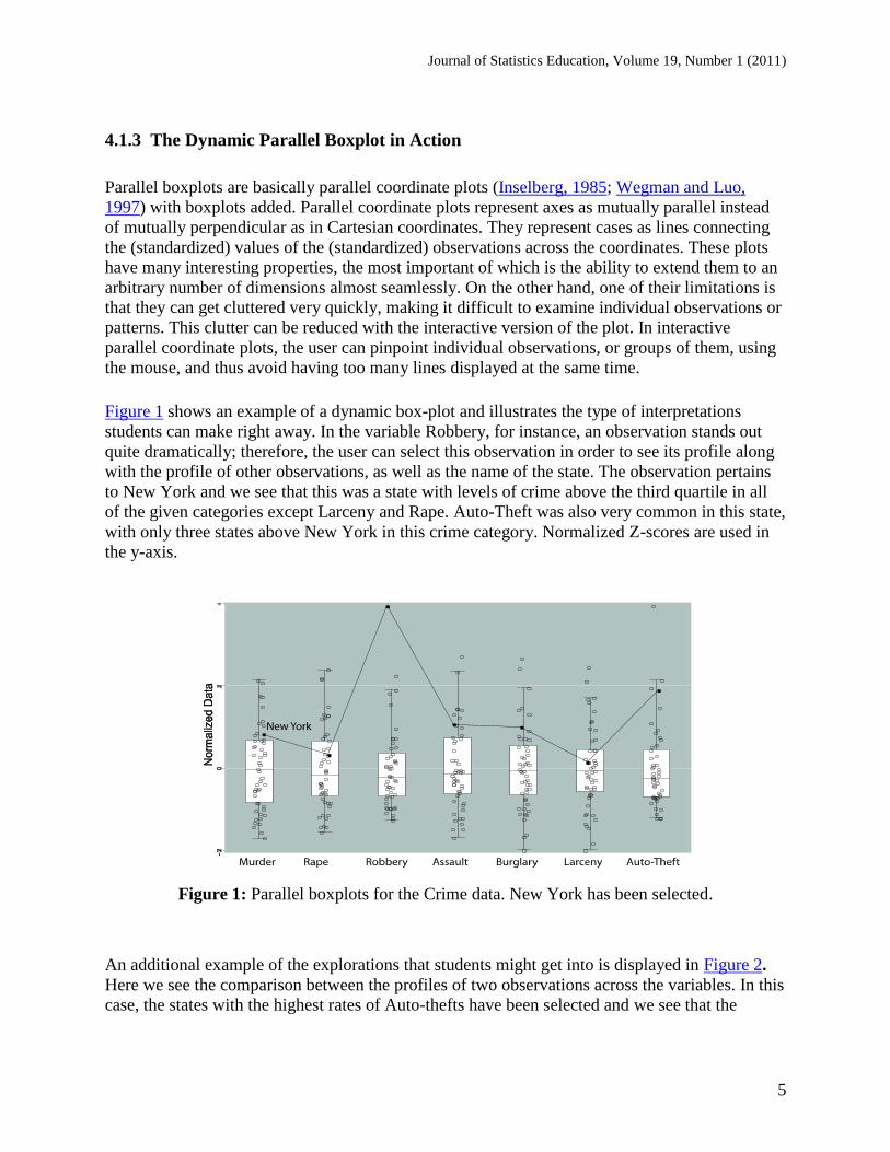
4.1.3 The Dynamic Parallel Boxplot in Action
Parallel boxplots are basically parallel coordinate plots (Inselberg, 1985; Wegman and Luo,
1997) with boxplots added. Parallel coordinate plots represent axes as mutually parallel instead
of mutually perpendicular as in Cartesian coordinates. They represent cases as lines connecting
the (standardized) values of the (standardized) observations across the coordinates. These plots
have many interesting properties, the most important of which is the ability to extend them to an
arbitrary number of dimensions almost seamlessly. On the other hand, one of their limitations is
that they can get cluttered very quickly, making it difficult to examine individual observations or
patterns. This clutter can be reduced with the interactive version of the plot. In interactive
parallel coordinate plots, the user can pinpoint individual observations, or groups of them, using
the mouse, and thus avoid having too many lines displayed at the same time.
Figure 1 shows an example of a dynamic box-plot and illustrates the type of interpretations
students can make right away. In the variable Robbery, for instance, an observation stands out
quite dramatically; therefore, the user can select this observation in order to see its profile along
with the profile of other observations, as well as the name of the state. The observation pertains
to New York and we see that this was a state with levels of crime above the third quartile in all
of the given categories except Larceny and Rape. Auto-Theft was also very common in this state,
with only three states above New York in this crime category. Normalized Z-scores are used in
the y-axis.
Figure 1: Parallel boxplots for the Crime data. New York has been selected.
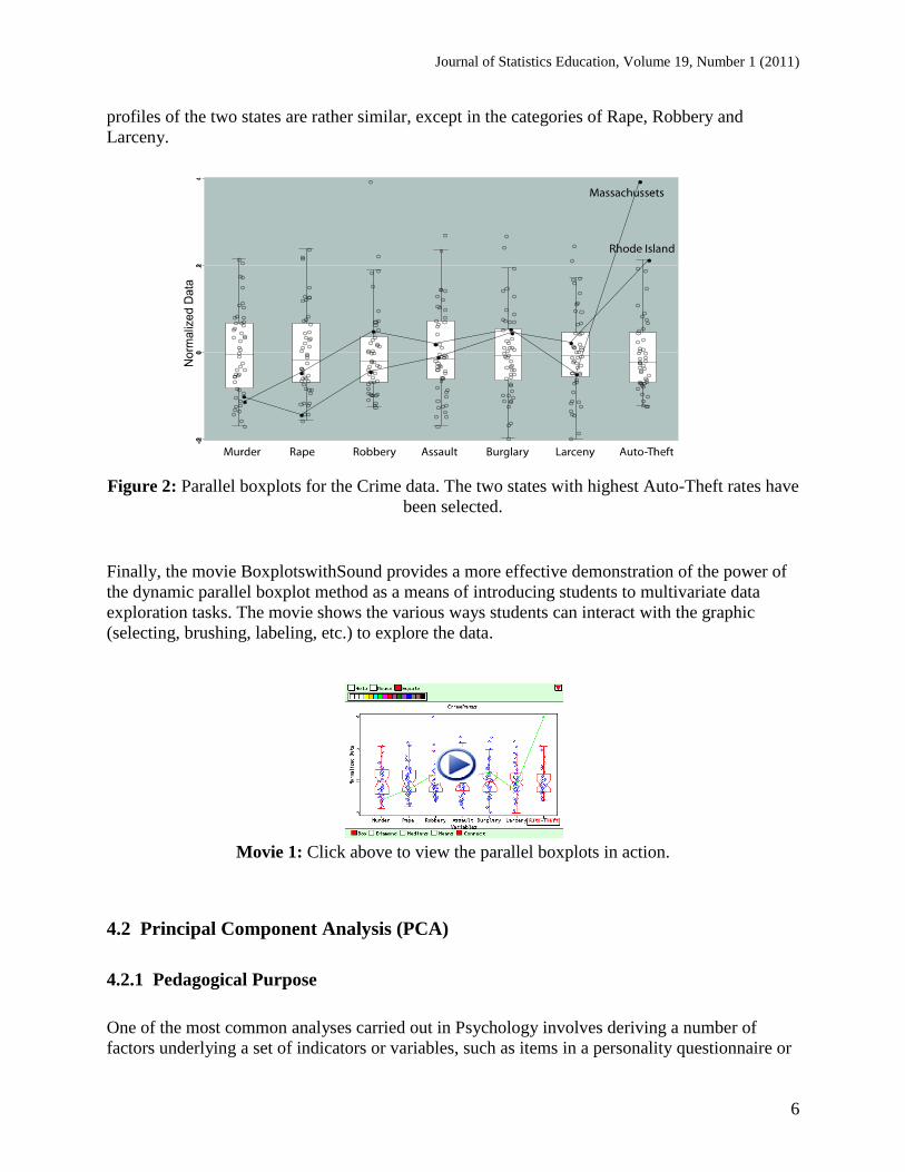
An additional example of the explorations that students might get into is displayed in Figure 2.
Here we see the comparison between the profiles of two observations across the variables. In this
case, the states with the highest rates of Auto-thefts have been selected and we see that the
Journal of Statistics Education, Volume 19, Number 1 (2011)
6
profiles of the two states are rather similar, except in the categories of Rape, Robbery and
Larceny.
Figure 2: Parallel boxplots for the Crime data. The two states with highest Auto-Theft rates have
been selected.
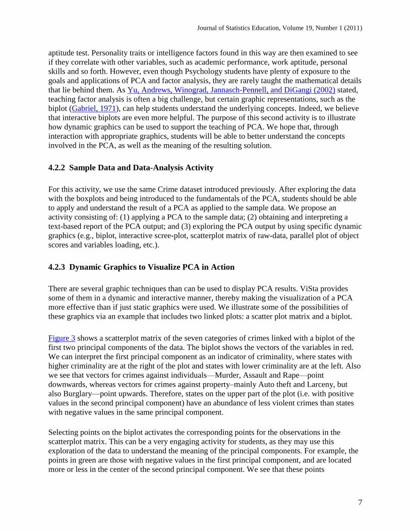
Finally, the movie BoxplotswithSound provides a more effective demonstration of the power of
the dynamic parallel boxplot method as a means of introducing students to multivariate data
exploration tasks. The movie shows the various ways students can interact with the graphic
(selecting, brushing, labeling, etc.) to explore the data.
Movie 1: Click above to view the parallel boxplots in action.
4.2 Principal Component Analysis (PCA)
4.2.1 Pedagogical Purpose
One of the most common analyses carried out in Psychology involves deriving a number of
factors underlying a set of indicators or variables, such as items in a personality questionnaire or
Journal of Statistics Education, Volume 19, Number 1 (2011)
7
aptitude test. Personality traits or intelligence factors found in this way are then examined to see
if they correlate with other variables, such as academic performance, work aptitude, personal
skills and so forth. However, even though Psychology students have plenty of exposure to the
goals and applications of PCA and factor analysis, they are rarely taught the mathematical details
that lie behind them. As Yu, Andrews, Winograd, Jannasch-Pennell, and DiGangi (2002) stated,
teaching factor analysis is often a big challenge, but certain graphic representations, such as the
biplot (Gabriel, 1971), can help students understand the underlying concepts. Indeed, we believe
that interactive biplots are even more helpful. The purpose of this second activity is to illustrate
how dynamic graphics can be used to support the teaching of PCA. We hope that, through
interaction with appropriate graphics, students will be able to better understand the concepts
involved in the PCA, as well as the meaning of the resulting solution.
4.2.2 Sample Data and Data-Analysis Activity
For this activity, we use the same Crime dataset introduced previously. After exploring the data
with the boxplots and being introduced to the fundamentals of the PCA, students should be able
to apply and understand the result of a PCA as applied to the sample data. We propose an
activity consisting of: (1) applying a PCA to the sample data; (2) obtaining and interpreting a
text-based report of the PCA output; and (3) exploring the PCA output by using specific dynamic
graphics (e.g., biplot, interactive scree-plot, scatterplot matrix of raw-data, parallel plot of object
scores and variables loading, etc.).
4.2.3 Dynamic Graphics to Visualize PCA in Action
There are several graphic techniques than can be used to display PCA results. ViSta provides
some of them in a dynamic and interactive manner, thereby making the visualization of a PCA
more effective than if just static graphics were used. We illustrate some of the possibilities of
these graphics via an example that includes two linked plots: a scatter plot matrix and a biplot.
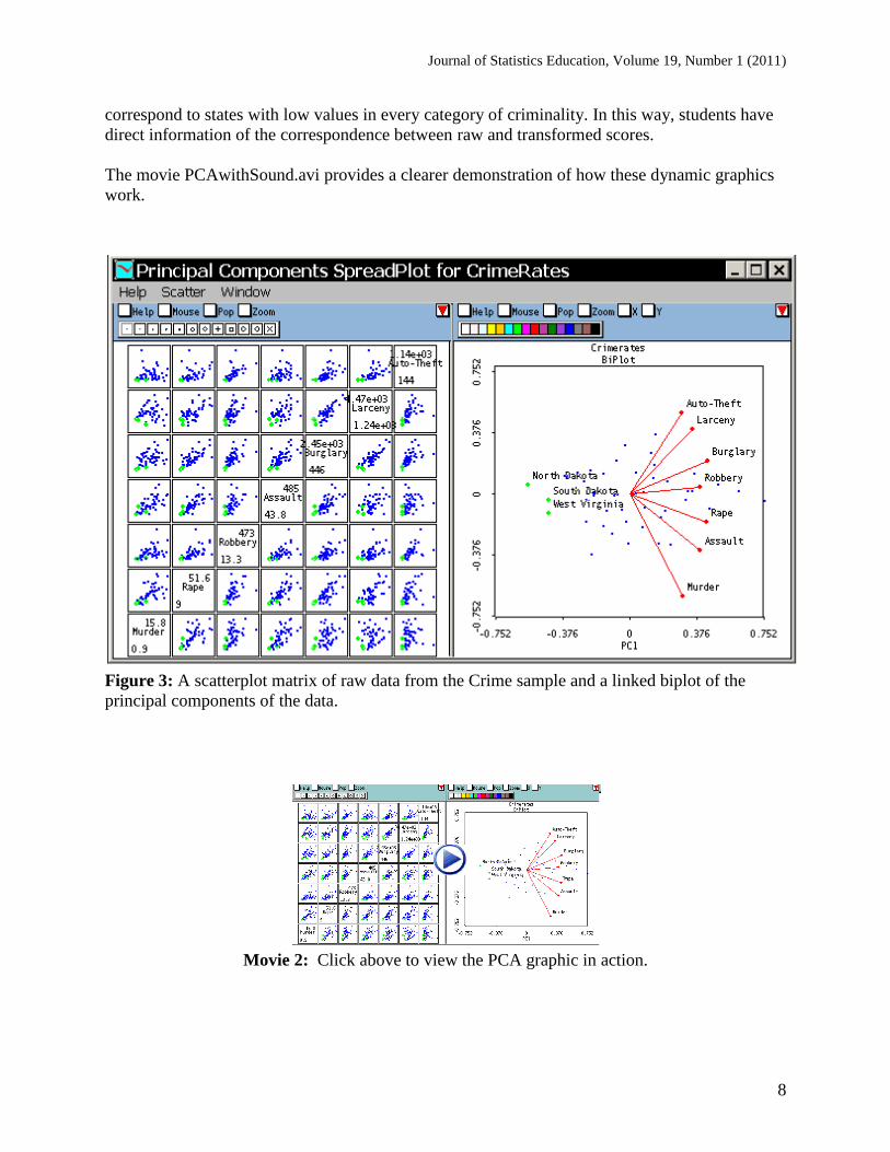
Figure 3 shows a scatterplot matrix of the seven categories of crimes linked with a biplot of the
first two principal components of the data. The biplot shows the vectors of the variables in red.
We can interpret the first principal component as an indicator of criminality, where states with
higher criminality are at the right of the plot and states with lower criminality are at the left. Also
we see that vectors for crimes against individuals—Murder, Assault and Rape—point
downwards, whereas vectors for crimes against property–mainly Auto theft and Larceny, but
also Burglary—point upwards. Therefore, states on the upper part of the plot (i.e. with positive
values in the second principal component) have an abundance of less violent crimes than states
with negative values in the same principal component.
Selecting points on the biplot activates the corresponding points for the observations in the
scatterplot matrix. This can be a very engaging activity for students, as they may use this
exploration of the data to understand the meaning of the principal components. For example, the
points in green are those with negative values in the first principal component, and are located
more or less in the center of the second principal component. We see that these points
Journal of Statistics Education, Volume 19, Number 1 (2011)
8
correspond to states with low values in every category of criminality. In this way, students have
direct information of the correspondence between raw and transformed scores.
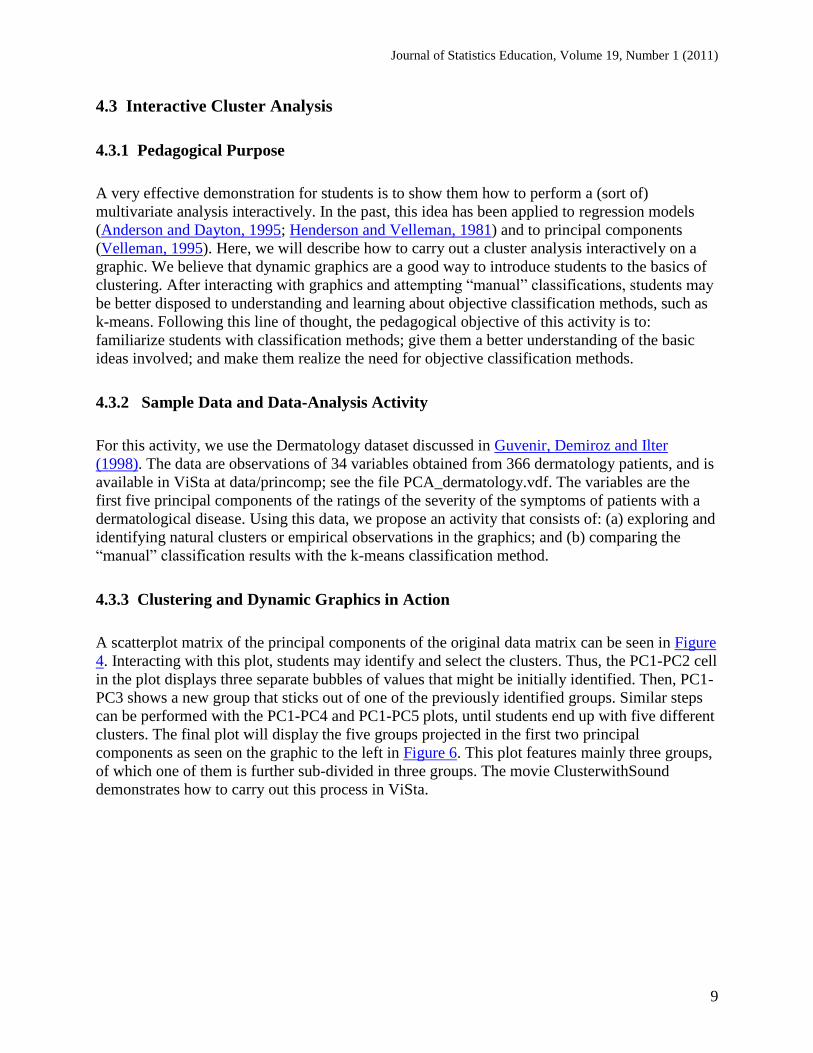
The movie PCAwithSound.avi provides a clearer demonstration of how these dynamic graphics
work.
Figure 3: A scatterplot matrix of raw data from the Crime sample and a linked biplot of the
principal components of the data.
Movie 2: Click above to view the PCA graphic in action.
Journal of Statistics Education, Volume 19, Number 1 (2011)
9
4.3 Interactive Cluster Analysis
4.3.1 Pedagogical Purpose
A very effective demonstration for students is to show them how to perform a (sort of)
multivariate analysis interactively. In the past, this idea has been applied to regression models
(Anderson and Dayton, 1995; Henderson and Velleman, 1981) and to principal components
(Velleman, 1995). Here, we will describe how to carry out a cluster analysis interactively on a
graphic. We believe that dynamic graphics are a good way to introduce students to the basics of
clustering. After interacting with graphics and attempting ―manual‖ classifications, students may
be better disposed to understanding and learning about objective classification methods, such as
k-means. Following this line of thought, the pedagogical objective of this activity is to:
familiarize students with classification methods; give them a better understanding of the basic
ideas involved; and make them realize the need for objective classification methods.
4.3.2 Sample Data and Data-Analysis Activity
For this activity, we use the Dermatology dataset discussed in Guvenir, Demiroz and Ilter
(1998). The data are observations of 34 variables obtained from 366 dermatology patients, and is
available in ViSta at data/princomp; see the file PCA_dermatology.vdf. The variables are the
first five principal components of the ratings of the severity of the symptoms of patients with a
dermatological disease. Using this data, we propose an activity that consists of: (a) exploring and
identifying natural clusters or empirical observations in the graphics; and (b) comparing the
―manual‖ classification results with the k-means classification method.
4.3.3 Clustering and Dynamic Graphics in Action
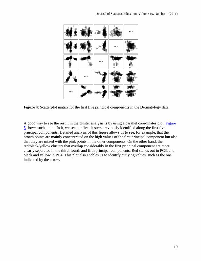
A scatterplot matrix of the principal components of the original data matrix can be seen in Figure
4. Interacting with this plot, students may identify and select the clusters. Thus, the PC1-PC2 cell
in the plot displays three separate bubbles of values that might be initially identified. Then, PC1-
PC3 shows a new group that sticks out of one of the previously identified groups. Similar steps
can be performed with the PC1-PC4 and PC1-PC5 plots, until students end up with five different
clusters. The final plot will display the five groups projected in the first two principal
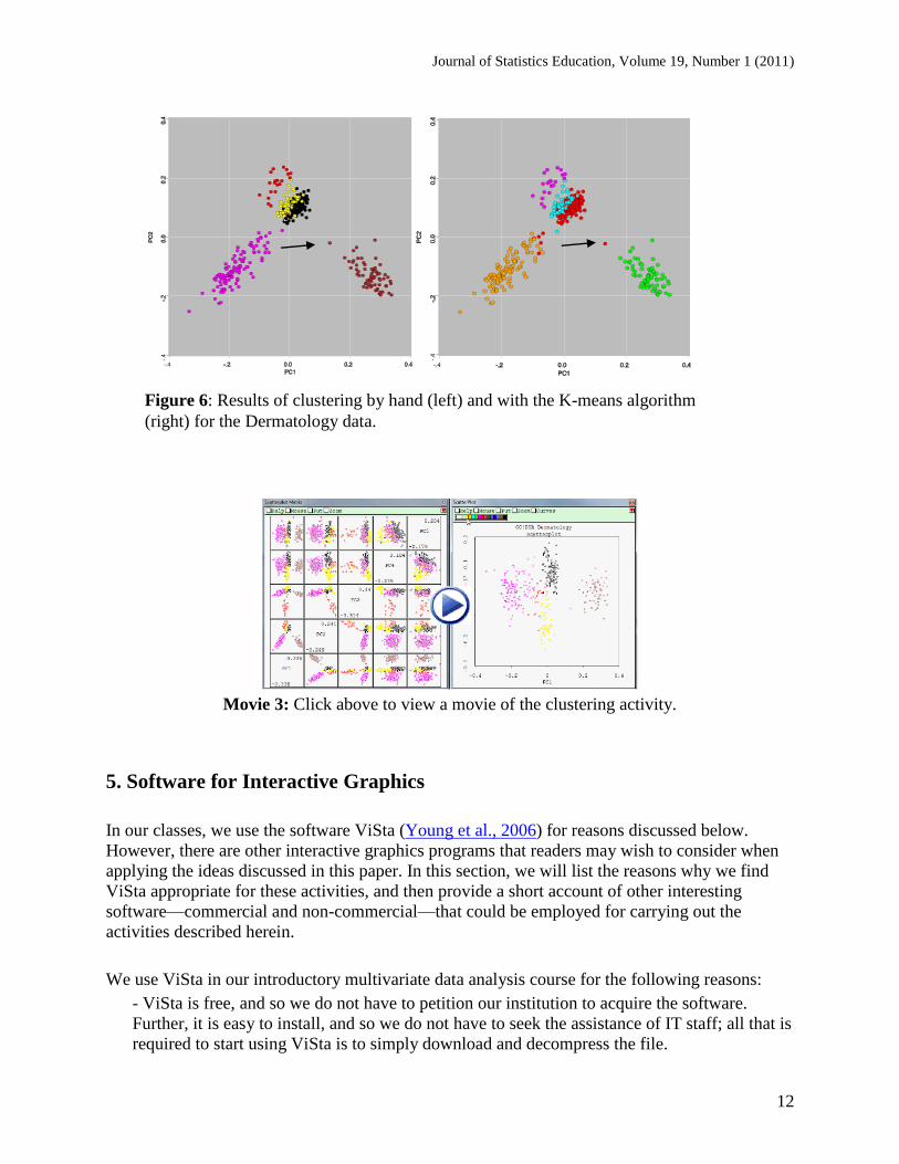
components as seen on the graphic to the left in Figure 6. This plot features mainly three groups,
of which one of them is further sub-divided in three groups. The movie ClusterwithSound
demonstrates how to carry out this process in ViSta.
Journal of Statistics Education, Volume 19, Number 1 (2011)
10
Figure 4: Scatterplot matrix for the first five principal components in the Dermatology data.
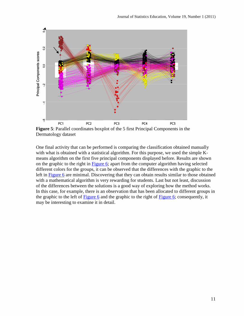
A good way to see the result in the cluster analysis is by using a parallel coordinates plot. Figure
5 shows such a plot. In it, we see the five clusters previously identified along the first five
principal components. Detailed analysis of this figure allows us to see, for example, that the
brown points are mainly concentrated on the high values of the first principal component but also
that they are mixed with the pink points in the other components. On the other hand, the
red/black/yellow clusters that overlap considerably in the first principal component are more
clearly separated in the third, fourth and fifth principal components. Red stands out in PC3, and
black and yellow in PC4. This plot also enables us to identify outlying values, such as the one
indicated by the arrow.
Journal of Statistics Education, Volume 19, Number 1 (2011)
11
Figure 5: Parallel coordinates boxplot of the 5 first Principal Components in the
Dermatology dataset
One final activity that can be performed is comparing the classification obtained manually
with what is obtained with a statistical algorithm. For this purpose, we used the simple K-
means algorithm on the first five principal components displayed before. Results are shown
on the graphic to the right in Figure 6; apart from the computer algorithm having selected
different colors for the groups, it can be observed that the differences with the graphic to the
left in Figure 6 are minimal. Discovering that they can obtain results similar to those obtained
with a mathematical algorithm is very rewarding for students. Last but not least, discussion
of the differences between the solutions is a good way of exploring how the method works.
In this case, for example, there is an observation that has been allocated to different groups in
the graphic to the left of Figure 6 and the graphic to the right of Figure 6; consequently, it
may be interesting to examine it in detail.
Journal of Statistics Education, Volume 19, Number 1 (2011)
12
Movie 3: Click above to view a movie of the clustering activity.
5. Software for Interactive Graphics
In our classes, we use the software ViSta (Young et al., 2006) for reasons discussed below.
However, there are other interactive graphics programs that readers may wish to consider when
applying the ideas discussed in this paper. In this section, we will list the reasons why we find
ViSta appropriate for these activities, and then provide a short account of other interesting
software—commercial and non-commercial—that could be employed for carrying out the
activities described herein.
We use ViSta in our introductory multivariate data analysis course for the following reasons:
- ViSta is free, and so we do not have to petition our institution to acquire the software.
Further, it is easy to install, and so we do not have to seek the assistance of IT staff; all that is
required to start using ViSta is to simply download and decompress the file.
Figure 6: Results of clustering by hand (left) and with the K-means algorithm
(right) for the Dermatology data.
Journal of Statistics Education, Volume 19, Number 1 (2011)
13
- Students can use ViSta both at home and at the university, as opposed to some commercial
programs that provide licenses that are not valid outside the university campus, forcing
students to use on-campus computers at all times.
- ViSta has a GUI interface that is relatively standard and familiar to students (menus,
buttons, dialog boxes, etc.).
- ViSta is visually oriented; many of the techniques provide animations or visual
representations that help students interpret the results.
- ViSta graphics are interactive, linked, etc. (Young et al., 2006; Cook and Swayne, 2007) so
that it is possible to explore the results of the analysis in depth.
- ViSta includes the techniques most commonly discussed in multivariate statistics courses
oriented to Psychology students, namely principal components and factor analysis,
multidimensional scaling, cluster analysis, correspondence analysis, etc. Also, it includes a
module for psychometric analysis, which is not found in other data visualization programs.
- Last but not least, we are involved in ViSta’s development and maintenance, so we can tune
up specific features to meet our needs and we can also address requests from other users of
the software.
We sometimes hear concerns about whether there will be support for ViSta in the foreseeable
future. At present, ViSta runs on the latest three operating systems for Windows (XP, Vista and
7). This guarantees that the current version of ViSta may be used for several years before a
significant overhaul of the current hardware/software combination arrives. However, despite our
stated preference for ViSta, the figures in this paper are software-neutral (not screenshots) in all
cases but one, as we wish to make it clear that the specific activities described herein can also be
performed with programs other than ViSta. A list of some of the other programs that could be
used instead of ViSta is provided below.
- RGobi (http://www.ggobi.org/rggobi/): This is the most recent version of the software
previously called XGobi/GGobi. This version is connected to the R statistical environment.
This means that users have access to all of the power of R for performing statistical analysis
and can resort to RGobi for visualization. Cook and Swayne (2007) is an outstanding
reference source on this software and on the applications of interactive dynamic graphics in
statistics.
- Mondrian (http://stats.math.uni-augsburg.de/Mondrian/): Mondrian is an excellent (and free)
program for interactive plots. It features linked boxplots, scatterplots, histograms and more. It
is also very strong in graphics for categorical data such as barcharts and mosaic plots. As in
RGobi, there is a connection between Mondrian and R, so it is possible to compute analysis
and results in R and visualize them in Mondrian. iPlots (http://rosuda.org/iplots/) provides
Journal of Statistics Education, Volume 19, Number 1 (2011)
14
high interaction plots similar to those of Mondrian, but embedded in R, as a complement to
the standard plots in this statistical environment.
- DataDesk (http://www.datadesk.com/) is a commercial program that provides a direct
manipulation interface, dynamic interactive graphics and linked plots in a very responsive
environment. DataDesk has been around since the 80s; it was ahead of its time in many
features then and has stood the test of time wonderfully. Additionally, its authors have been
involved in writing highly successful introductory statistics handbooks in recent years,
including a reduced version of DataDesk, so many students may already have access to this
program.
- Gapminder (http://www.gapminder.org/): This is a website that provides several interactive
dynamic graphics on data indicators about the world. Although not as flexible as a statistical
program—you cannot use data of your own and you are limited to the visualizations already
on the page—Gapminder offers a lot of exciting tools for exploring the data provided.
Similar technology is used in the Google public data explorer
(http://www.google.com/publicdata/home).
- JMP (http://www.jmp.com/): JMP is a commercial program that also features interactive
graphics. There are also student versions and textbooks that use it for analysis.
- Spotfire (http://spotfire.tibco.com/): This is a commercial program that started on a Human
Computer Interaction lab and includes many innovations in graphics and data analysis.
Tableau (http://www.tableausoftware.com/) is another commercial program with similar
features.
The list above is likely incomplete in some respects and is intended to serve simply as a starting
point for readers interested in exploring the different alternatives currently available.
6. Conclusion
Dynamic graphics are an exceptional tool for teaching multivariate data analysis methods to
students of Psychology. For example, dynamic parallel boxplots are an excellent means of
introducing students to multivariate data analysis. Students generally like interacting with the
plot and visualizing the profiles of the observations with different datasets. As the math involved
is minimal, they can start playing with the data right away, identifying outliers and specific
observations they are curious about, or clustering groups of observations with similar profiles
across variables all by themselves. Often, we set up a projector and invite students to show their
findings to the class, and then discuss them as a group.
Dynamic graphics can also be applied to more sophisticated cases, such as introducing PCA or
Cluster Analysis methods. In this article we illustrate how dynamic graphics can help students
with limited mathematical knowledge explore the underlying concepts and understand the output
of these multivariate methods. Today, teachers have a variety of software available to implement
these graphic techniques (e.g., ViSta, GGobi, etc.); although the featured software may not be as

Journal of Statistics Education, Volume 19, Number 1 (2011)
15
well known and widely used as other conventional statistics systems, such as SPSS, they are
more than sufficient for the purposes discussed in this paper. We hope this report encourages the
use of dynamic graphics in teaching multivariate data analysis in psychology and related
sciences.
Journal of Statistics Education, Volume 19, Number 1 (2011)
16
Appendix: Downloading and Installing ViSta
As of this writing, the most recent version of ViSta is 7.9.2.5. This version runs only on MS
Windows (XP, Vista and 7). Users of MacOS or Linux may find earlier versions of ViSta on the
internet; however, these earlier versions are no longer supported. In particular, MacViSta 5.6,
available at http://forrest.psych.unc.edu/research/vista-frames/version.html, only works with pre-
OSX versions of MacOS. Alternatively, users of Intel Macintoshes may use the free BootCamp
or VirtualBox for running MS Windows on their computers in order to use the most recent
version of ViSta. Users of Linux may use similar solutions for the same purpose.
ViSta may be downloaded at the following internet address
(www.uv.es/visualstats/Book/DownloadBook.htm). Click on the link Download Vista 7.9.2.5
for the current version. Download the compressed file (.zip) to your computer. (Note: It may
take a couple of minutes for the compressed file to download.) To install ViSta from this file, the
user must:
Decompress the folder in the directory in which the user wishes to install ViSta (a natural choice
is Program Files/ViSta 7.x.x). (Note: Extracting all files may take several minutes.)
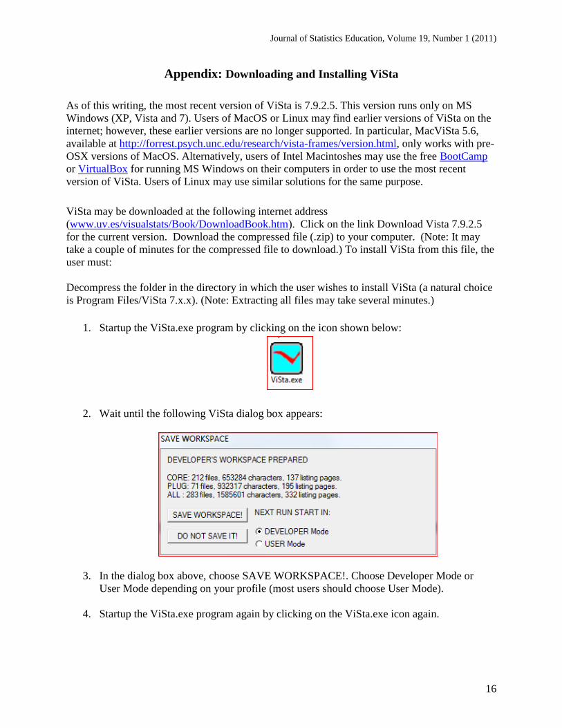
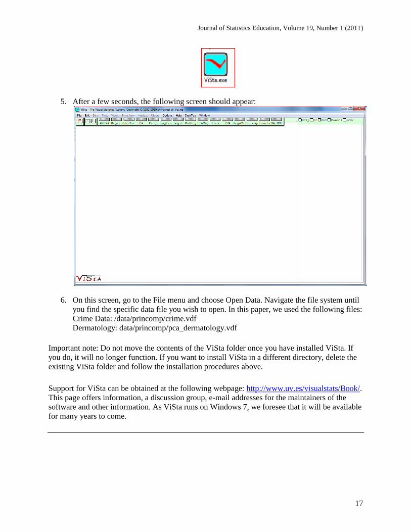
1. Startup the ViSta.exe program by clicking on the icon shown below:
2. Wait until the following ViSta dialog box appears:
3. In the dialog box above, choose SAVE WORKSPACE!. Choose Developer Mode or
User Mode depending on your profile (most users should choose User Mode).
4. Startup the ViSta.exe program again by clicking on the ViSta.exe icon again.
Journal of Statistics Education, Volume 19, Number 1 (2011)
17
5. After a few seconds, the following screen should appear:
6. On this screen, go to the File menu and choose Open Data. Navigate the file system until
you find the specific data file you wish to open. In this paper, we used the following files:
Crime Data: /data/princomp/crime.vdf
Dermatology: data/princomp/pca_dermatology.vdf
Important note: Do not move the contents of the ViSta folder once you have installed ViSta. If
you do, it will no longer function. If you want to install ViSta in a different directory, delete the
existing ViSta folder and follow the installation procedures above.
Support for ViSta can be obtained at the following webpage: http://www.uv.es/visualstats/Book/.
This page offers information, a discussion group, e-mail addresses for the maintainers of the
software and other information. As ViSta runs on Windows 7, we foresee that it will be available
for many years to come.
Journal of Statistics Education, Volume 19, Number 1 (2011)
18
Acknowledgements
ViSta would not have been possible without the work of Forrest W. Young. Forrest was the
creator and designer of ViSta, both in terms of its look and feel, and in terms of its internal
software architecture. He also implemented the design and wrote much of the documentation. He
worked on the ViSta project since 1990, receiving considerable help from his students and
colleagues, until his premature death in 2006.
References
Anderson, J. E., and Dayton, J. D. (1995). "Instructional Regression Modules Using XLISP-
STAT", Journal of Statistics Education, 3 [On-line] Available at:
http://www.amstat.org/publications/jse/v3n1/anderson.html
Cook, D. (2009). "Incorporating Exploratory Methods using Dynamic Graphics into Multivariate
Statistics Classes: Curriculum Development". In MC Shelley II, LD Yore, B Hand (eds.).
Quality Research in Literacy and Science Education: International Perspectives and Gold
Standards, pp. 337-355. Dordrecht, Netherlands: Springer.
Cook, D., and Swayne, D. F. (2007). "Interactive and Dynamic Graphics for Data Analysis",
New York: Springer.
Gabriel, K. R. (1971). "The biplot graphic display of matrices with application to principal
component analysis", Biometrika, 58, 453-467.
Guvenir, H. A., Demiroz, G., and Ilter, N. (1998). "Learning differential diagnosis of
erythemato-squamous diseases using voting feature intervals", Artificial Intelligence in
Medicine, 13, 147-165.
Henderson, H. V., and Velleman, P. F. (1981). Building Regression Models Interactively-Data
originally collected from Consumer Reports, Biometrics, 391-411.
Inselberg, A. (1985). "The plane with parallel coordinates," The Visual Computer , 1, 69-97.
Marasinghe, M., Duckworth, W.M., and Shin, T-S., (2004). "Tools for Teaching Regression
Concepts Using Dynamic Graphics", Journal of Statistics Education, 12, 2, [On-line] Available
at: http://www.amstat.org/publications/jse/v12n2/marasinghe.html
Theus, M. and Urbanek, S. (2009). Interactive Graphics for Data Analysis: Principles and
Examples. Boca Raton, FL: Chapman & Hall/CRC Computer Science & Data Analysis.
Velleman, P. F. (1995). DataDesk version 5, Ithaca, New York: DataDescription Inc.
Journal of Statistics Education, Volume 19, Number 1 (2011)
19
Verzani, J. (2008). "Using R in Introductory Statistics Courses with the pmg Graphical User
Interface," Journal of Statistics Education , 16, 1-17, [On-line] Available at:
http://www.amstat.org/publications/jse/v16n1/verzani.html
Wegman, E. J. and Luo, Q. (1997). "High dimensional clustering using parallel coordinates and
the grand tour," Computing Science and Statistics , 28, 361-368.
Weisberg, S. (2005). "Lost Opportunities: Why We Need a Variety of Statistical Languages,"
Journal of Statistical Software , 13, 1-12. [On-line] Available at:
http://www.jstatsoft.org/v13/i01/paper
Wiberg, M. (2009). "Teaching Statistics in Integration with Psychology". Journal of Statistics
Education, 17, 1, [On-line] Available at:
http://www.amstat.org/publications/jse/v17n1/wiberg.html
Young, F. W., and Sarle,W. S. (1982). Exploratory Multivariate Data Analysis, SAS Institute.
Young, F. W., Valero-Mora, P. M., and Friendly, M. (2006). Visual Statistics: Seeing Data with
Dynamic Interactive Graphics. NJ: Wiley & Sons.
Yu, C. H., Andrews, S., Winograd, D., Jannasch-Pennell, A., & DiGangi, S. (2002). Teaching
factor analysis in terms of variable space and subject space using multimedia visualization.
Journal of Statistics Education, 10 [On-line] Available at:
http://www.amstat.org/publications/jse/v10n1/yu.html
Pedro M. Valero-Mora
Departamento de Metodología de las Ciencias del Comportamiento
Universitat de València (Spain)
Rubén D. Ledesma
Consejo Nacional de Investigaciones Científicas y Técnicas (Argentina)
Universidad Nacional de Mar del Plata (Argentina)
Volume 19 (2011) | Archive | Index | Data Archive | Resources | Editorial Board |
Guidelines for Authors | Guidelines for Data Contributors | Guidelines for Readers/Data Users | Home Page | Contact JSE | ASA Publications