using microsoft® excel to plot and analyze kinetic...
TRANSCRIPT

1
Figure 1
Figure 2
Using Microsoft Excel to Plot and Analyze Kinetic Data®
Entering and Formatting Data
Open Excel. Set up the spreadsheet page (Sheet 1) so that anyone who reads it will understand the page (Figure1).
• Type a title in the cell in the upper lefthand corner, cell A1• Label column A as the substrate concentration in cell A3• Label column B as the reaction rate for 30s in cell B3• Label column C as the reaction rate for 1min in cell C3• Adjust column widths to fit the labels by clicking on the column heading and dragging the border to the
appropriate width
Enter your data pairs in the appropriate columns. (Don’t forget to enter 0,0 for one of your data pairs.) If yourdata was not collected in order of increasing substrate concentration, enter the data pairs in the order collectedand sort them in ascending order (Fig. 2).
• Click and drag over the cells that contain the data pairs• Choose Data > Sort

2
Figure 3
Figure 4
When the Sort menu comes up, select “S (pennies/m^2)” from the drop-down menu then click on “OK” (Fig. 3).
Once the data is sorted in ascending order (Fig. 4), the reaction rate for 1min can be calculated in column C byentering the formula =(B4*2) in cell C4. You can copy and paste the formula into the other cells in column Cby clicking the right-hand button on the mouse and making the appropriate selection.
For now, skip column D and label row 3 in columns E and F “1/S” and “1/v,” respectively. Calculate thevalues for these columns by taking the inverse of the values in column A and column C (e.g., in cell E4 type=(1/A4) and in cell F4 type =(1/C4)). Copy and paste the formulas into the other cells (Fig. 5).

3
Figure 5
Figure 6
If desired, the values for 1/S and 1/v can be formatted to three decimal places to make the sheet easier to read(Fig. 6).
• Choose Format > Cells• Click on the Number tab• Under Category, choose Number and set Decimal places to 3• Click OK

4
Figure 7
It’s time to start analyzing the data. By creating a double-reciprocal plot (or Lineweaver-Burk plot) the values
m maxfor K and V can be determined from a regression line through the values for 1/S vs. 1/v. The first step isto create a scatter plot from the data.
• Select the Chart Wizard icon from the tool menu (Fig. 7)• Select the XY (Scatter plot) from the Chart type list• Select the upper most plot type (point, no lines) from the Chart sub-type icons• Click Next
• On the Source Data menu, follow directions to specify the data to be plotted• Select Columns for Series in:• Select the Data range: by clicking on the spreadsheet icon (red arrow at the end of the input line)• You’ll be taken to the spreadsheet where you need to highlight the data in columns E and F and hit the
Enter key on the keyboard to accept the data range• The Source Data menu should now show the selected data range (Fig. 8)• The window on the Source Data menu should show an image of the plot• Click Next and the Chart Options menu will come up

5
Figure 8
Figure 9
The Chart Options menu is where you enter the labels for your plot (Fig. 9)
For Chart Title, type in Lineweaver-Burk Plot• Enter 1/S for the Value (X) axis• Enter 1/v for the Value (Y) axis
Remove the Legend (Series 1 label) by clicking on the Legend tab.
• Unselect the Show legend option (Fig. 10)• Click Next

6
Figure 10
Figure 11
Figure 12
Keep the plot As object in: Sheet 1 and click Finish (Fig. 11).
The plot should now appear in Sheet 1 (Fig. 12)

7
Figure 13
Figure 14
m maxBy adding a trendline to the plot, a regression line can be generated, providing values for K and V .
• Click on the plot to change the Data heading on the toolbar to Chart (Fig. 13)• Select Chart > Add trendline
On the Add Trendline menu, select Linear for the Trend/Regression type (Fig. 14).
Next, click the Options tab near the top of the Add Trendline menu.
• Leave the Trendline Name set to Automatic (Fig 15)• Check Display equation on chart and Display R-squared value on chart• Click OK

8
Figure 15
Figure 16
Your plot should now display a regression line through your data points, as well as the equation for the line andan R value (Fig. 16).2
oIn the example shown above (Fig. 16), the R value indicates that almost 98% of the variation in 1/v (y) is due2
to the variation in 1/S (x). In addition, if we take the square root of r we can determine that the correlation2
coefficient, r, is almost 1, indicating an excellent fit between the data points and the regression line and showing
o m maxthat as 1/S increases, 1/v increases. The equation of the line is used to provide the K and V values for the
max maxenzyme. The y-intercept, 0.0076, is equal to 1/V . Therefore, V = 1/0.0076 = 131.579. The slope of the
m max m max m maxregression line, 0.7053, is equal to K /V , so K = (V )(K /V ) = (131.579)(0.7053) = 92.803. Thesevalues can be calculated and recorded on the spreadsheet (Fig. 17).

9
Figure 17
Figure 18
m maxThe values for K and V provide valuable information about the enzyme and can be used to plot theMichaelis-Menton Curve.
• Create a new plot, showing the relationship between S and v.• Highlight the titles and data in your first three columns (Fig. 18)
• As you did earlier, select the Chart Wizard icon from the toolbar• For Chart type, select XY (Scatter)• Again, choose plot showing only data points for the Chart sub-type• Click on Next• The menu that comes up (Chart Source Data) should show a small plot of S vs. v with two curves on it• Click on the Series tab near the top• Under the Series submenu, make sure that the selection v (pennies/30s) is highlighted• Click on the Remove button (The plot should now only display one curve)• Click on Next• The Chart Options menu should come up with the Titles submenu displayed• Under Chart title: type Michaelis-Menton Plot• Under Value (X) axis: type S (pennies/m^2)• Under Value (Y) axis: type v (pennies/min)

10
Figure 19
• Click on the Legends tab• Unselect Show legend (the legend box should disappear on the little diagram)• Click on Next and the Chart Location menu will come up• Make sure that As object in: is selected for Sheet1 • Click on Finish and return to Sheet1• Drag the chart to an unoccupied area (Fig. 19)
In order to draw an accurate line through the data points, the first step is to calculate values for v using thekinetic constants determined with the double-reciprocal plot.
max m• Using the Michaelis-Menton equation, v = (V C [S])/(K + [S]), determine values of v for the substrateconcentrations (Fig. 20)
• Label column D “calc v” to designate it as the calculated values• Type the formula, =(F$27*A4)/(F$29+A4), into cell D4 (The $ in the formula is to set the row as an
absolute address so that it won’t change when the formula is copied to other rows.)• Copy the formula in cell D4 and paste it into the cells below• Click the left-hand mouse button and drag it over all the values in column D to highlight them• Right-click, select Format cells > Number > Number• Set Decimal places to 1• Click OK

11
Figure 20
Figure 21
Plot the data in column D on the Michaelis-Menton plot.
• Click on the plot to select it• Right-hand click• Select Source data from the menu• Click on the Series tab near the top• Click on the Add button under the Series window and a new series, Series1, will be created• Enter data by clicking on the small boxes with the red arrows• For Name:, click the red arrow, select calc v (cell D3), and hit Enter• For X Values:, click the red arrow, select the values under S, and hit Enter• For Y Values:, click the red arrow, select the values under calc v, and hit Enter• The data points will appear on the plot• Click OK and return to the spreadsheet
The data points from the calculated values need to be converted to a line.
• Move the cursor to a data point, leaving it still until a popup box appears that shows calc v as theseries(Fig. 21)

12
Figure 22
• Right-click and choose Format Data Series from the menu• On the Patterns submenu, select Automatic for Line and None for Marker• Click OK to see the modified plot on the spreadsheet (Fig. 22)
The Eadie-Hofstee plots can be constructed in a manner similar to constructing the Lineweaver-Burke plots.
o oInstead of 1/S, the x-axis (and corresponding data column) will be v /S. The y-axis is v , so no further
max mcalculations are required. The y-intercept is V and the slope is -K .
This completes basic data analysis of the Mock Enzyme kinetic data with Microsoft Excel. Three plots were®
produced from each assay, one representing the Michaelis-Menton equation and the other two representing linearized forms of that equation, specifically a double-reciprocal plot called a Lineweaver-Burk plot and an
m maxEadie-Hofstee plot. Values for K and V should be determined from each plot and compared. Although thevalues should be similar between plots of the same data, they may not be. Discuss why this may be the case and
m maxexplain which plot provides more accurate values for K and V . (You may want to look at curves on theMichaelis-Menton plot generated from both sets of values.)
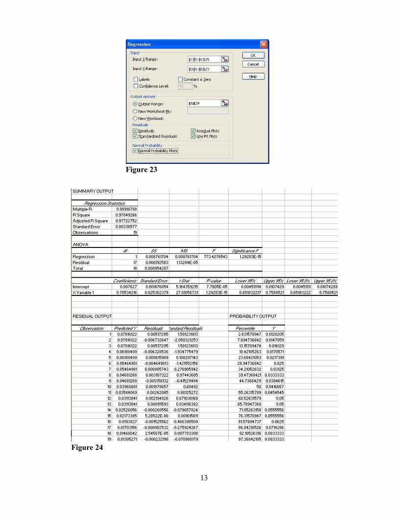
A more detailed analysis of your data can be performed by selecting Regression from the Data Analysis menu(Tools > Data Analysis > Regression). The Regression menu (Figure 23) is straight-forward and the choicesallow for examination of several aspects of the data. In this example the confidence interval is left at the defaultvalue of 95% and all of the analytical options have been selected. Using the data for the Lineweaver-Burke plotabove, several tables and plots are generated (Figures 24 and 25).
13
Figure 23
Figure 24

14
Figure 25