vendor sales dashboard user guide
TRANSCRIPT

VENDOR SALES DASHBOARD USER GUIDE
Introduction: Better Together
One of our guiding values at Stitch Fix is partnership. Through partnering with our
supplier community, we believe that together we can create products that enable us to
grow our businesses, transform the way people find what they love, and help people be
their best selves.
The Vendor Sales Dashboard empowers you, our suppliers, to review client feedback
and gain insights into what is and is not performing well and dig into why a style is
performing the way it is.
This guide will help you understand how to use the Sales Dashboard and offer
suggestions for how you might leverage insights from it. We should say that beyond the
tips we offer in this guide, there are many more ways for you to dig into the data we are
sharing with you and we hope you and your team do!
Our entire Stitch Fix team is excited to see how you interpret this data and bring it to life
in product and assortment iterations. We hope that you enjoy learning about how to best
serve our clients and partner with us to do so.
Table of Contents
Accessing the Sales Dashboard
Overview of the Sales Dashboard
Style Tab
By Week Tab
Period Over Period
Help
Stitch Fix Glossary
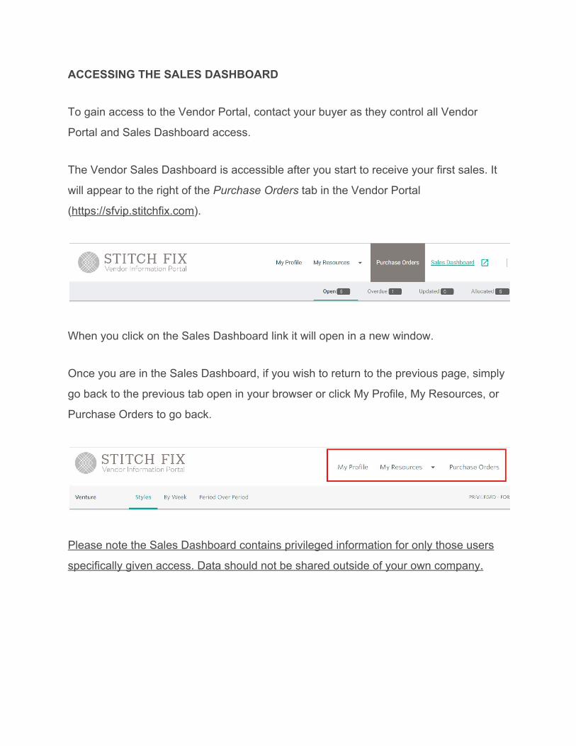
ACCESSING THE SALES DASHBOARD
To gain access to the Vendor Portal, contact your buyer as they control all Vendor
Portal and Sales Dashboard access.
The Vendor Sales Dashboard is accessible after you start to receive your first sales. It
will appear to the right of the Purchase Orders tab in the Vendor Portal
(https://sfvip.stitchfix.com).
When you click on the Sales Dashboard link it will open in a new window.
Once you are in the Sales Dashboard, if you wish to return to the previous page, simply
go back to the previous tab open in your browser or click My Profile, My Resources, or
Purchase Orders to go back.
Please note the Sales Dashboard contains privileged information for only those users
specifically given access. Data should not be shared outside of your own company.

OVERVIEW OF THE SALES DASHBOARD
The Vendor Sales Dashboard has three tabs to view client feedback, product success
rates, and receipt history with Stitch Fix. Each tab serves a unique purpose:
● Style tab shows brand sku level insights as a snapshot of a specified period.
Client comments are also visible at the brand sku and colorway level.
● By Week tab shows various category level insights aggregated as a snapshot
and overtime in chart form.
● Period Over Period shows category level insights in table form comparing two
periods. There is also the option to download data in a CSV in this tab at the
category or brand sku level.
Additional Notes
All date filters are based on the Stitch Fix Fiscal Calendar.
The filters selected in one tab will carry over as you move from tab to tab.
Other brands and vendors cannot see your data. It is exclusively visible to you.
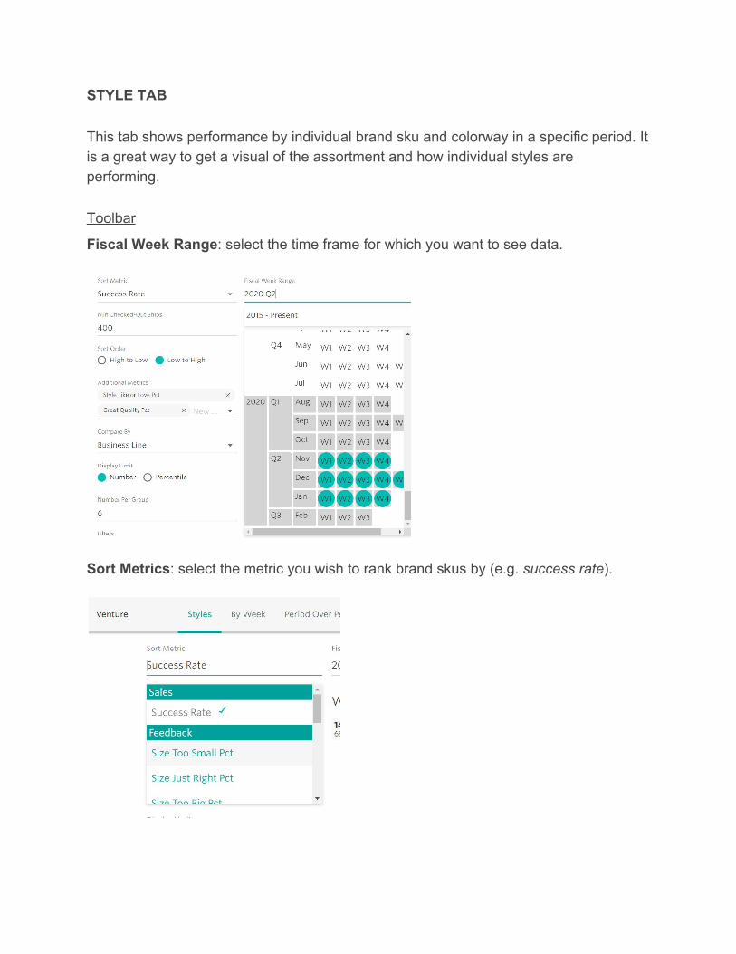
STYLE TAB
This tab shows performance by individual brand sku and colorway in a specific period. It is a great way to get a visual of the assortment and how individual styles are performing.
Toolbar
Fiscal Week Range: select the time frame for which you want to see data.
Sort Metrics: select the metric you wish to rank brand skus by (e.g. success rate).
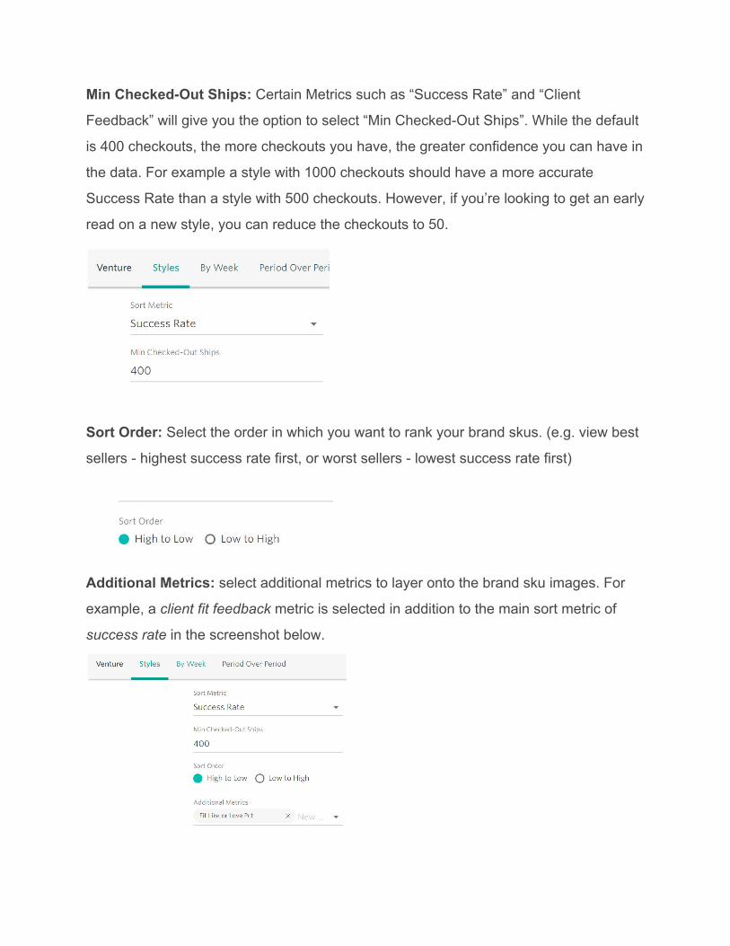
Min Checked-Out Ships: Certain Metrics such as “Success Rate” and “Client
Feedback” will give you the option to select “Min Checked-Out Ships”. While the default
is 400 checkouts, the more checkouts you have, the greater confidence you can have in
the data. For example a style with 1000 checkouts should have a more accurate
Success Rate than a style with 500 checkouts. However, if you’re looking to get an early
read on a new style, you can reduce the checkouts to 50.
Sort Order: Select the order in which you want to rank your brand skus. (e.g. view best
sellers - highest success rate first, or worst sellers - lowest success rate first)
Additional Metrics: select additional metrics to layer onto the brand sku images. For
example, a client fit feedback metric is selected in addition to the main sort metric of
success rate in the screenshot below.

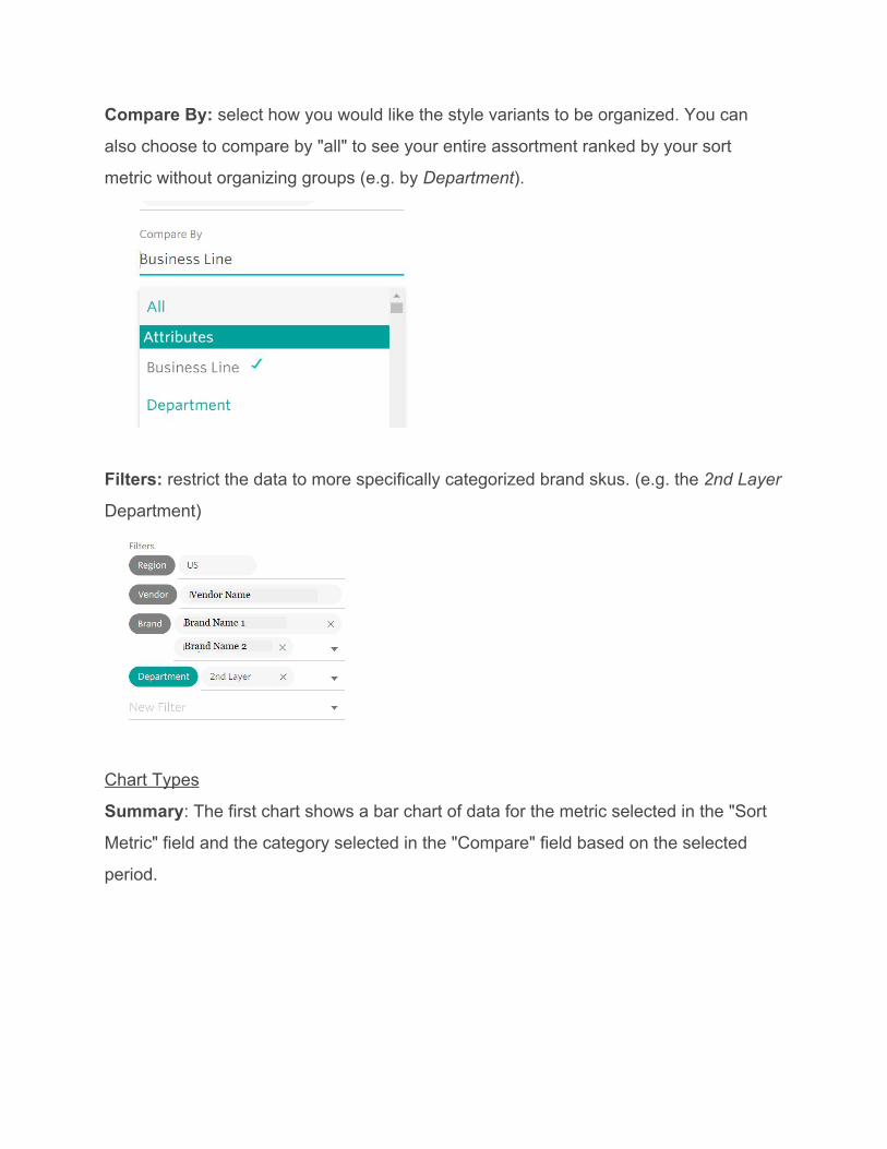
Compare By: select how you would like the style variants to be organized. You can
also choose to compare by "all" to see your entire assortment ranked by your sort
metric without organizing groups (e.g. by Business Line).
Display Limit & Number Per Group: restrict your view to showing just the high or low
performing brand skus (depending on how you are sorting the data) by either using a
finite number of skus or the top or bottom % of brand skus.
Filters: restrict the data to more specifically categorized brand skus. (e.g. the 2nd Layer
Department)

Examples of Reports to Make
To identify your top performing styles in terms of sellthrough (success rate%) and
explore if quality or style is more of a factor in clients purchasing them:
1. Filter the Fiscal Time Period to all quarters to view performance over all time
2. Select the Sort Metric to “Success Rate” and ensure the sort selection is on High
to Low
3. Select “Great Quality” and “Like & Love Style” in Additional Metrics
If you want to narrow your focus to review top sellers and try to assess why they are top
sellers for a specific category within a specific business line, add filters:
1. Filter for a specific business line (if you sell to more than one business) to narrow
your focus
2. Filter for a specific category using the department and class filters

OR if you want to compare how your assortment is performing by all departments at
once:
1. Use the Compare By feature to select “Department”
*You can also take these steps to do the reverse and assess your poor performing
styles by adjusting the Sort Selection to Low to High and then update the client
feedback compare by metrics to critical feedback such as “Size Too Big Pct” and “Size
Too Small Pct” to see if size feedback is driving down Success Rate.

Style Details: When you hover over a style you’ll see a little magnifying glass icon.
Click that to open up details about a style including on order information.
>>>>

Client Comments: When you hover over a style you’ll see a little comment cloud icon.
Click that to open up client comments about a style. In addition to viewing client
comments you’ll see client feedback ratings for the selected style for the period selected
on the Styles tab. However, all client comments will show.
>>>
In the client comment view, you’ll be able to filter the information to try to hone in on
comments related to specific ratings or whether something was returned or not.

BY WEEK TAB
This tab shows various category level insights aggregated as a snapshot and overtime
in chart form. By providing a visualization of performance data over time, one gains a
more high-level look at business performance.
Toolbar
Fiscal Week Range: select the time frame for which you want to see data.
Sort Metrics: select the metric you wish to rank brand skus by (e.g. success rate).
Compare By: select how you would like the style variants to be organized. You can
also choose to compare by "all" to see your entire assortment ranked by your sort
metric without organizing groups (e.g. by Department).
Filters: restrict the data to more specifically categorized brand skus. (e.g. the 2nd Layer
Department)
Chart Types
Summary: The first chart shows a bar chart of data for the metric selected in the "Sort
Metric" field and the category selected in the "Compare" field based on the selected
period.

*You may notice small or large lines in the middle of each bar, this is to give you a
gauge of the spread of the metric.
By Week: This chart shows performance by fiscal week, month, and quarter, again
reflecting the 'Sort Metric' and 'Compare' field selected within the period selected.

Note on each chart there are filters to select, 5, 10, 15, or All. This feature is helpful
when comparing a categorization with over five possible data points such as category.
The filters of 0, 5, 10, 15, and All, group together the information based on which
category has the most client check outs and then ranks them according to the sort
metric selected.
Examples of Reports to Make
To assess how specific colors are contributing to client’s Like & Love Style feedback
over a period of time:
1. Select the Fiscal Week Range you want to review (e.g. during a specific season
to see how seasonal colors are performing)
2. Select “Style Like or Love Pct” in the Sort Metric field
3. Select “Color1” in the Compare by Field
PERIOD OVER PERIOD TAB
This tab shows category level insights in table form and compares two periods. Data
can be populated both into a report within the dashboard and exported into a CSV file at
a category or brand sku level.
Toolbar
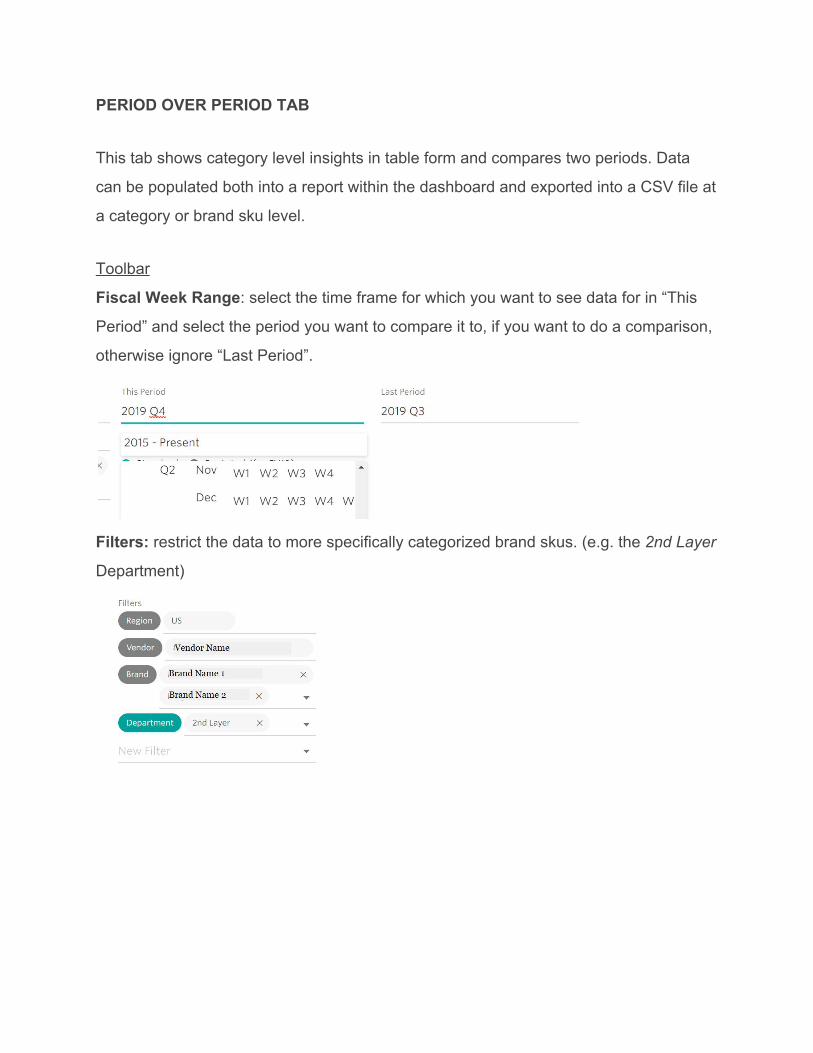
Fiscal Week Range: select the time frame for which you want to see data for in “This
Period” and select the period you want to compare it to, if you want to do a comparison,
otherwise ignore “Last Period”.
Filters: restrict the data to more specifically categorized brand skus. (e.g. the 2nd Layer
Department)
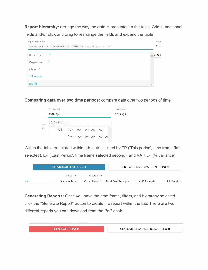
Report Hierarchy: arrange the way the data is presented in the table. Add in additional
fields and/or click and drag to rearrange the fields and expand the table.
Comparing data over two time periods: compare data over two periods of time.
Within the table populated within tab, data is listed by TP ('This period', time frame first
selected), LP ('Last Period', time frame selected second), and VAR LP (% variance).
Generating Reports: Once you have the time frame, filters, and hierarchy selected,
click the "Generate Report" button to create the report within the tab. There are two
different reports you can download from the PoP dash.
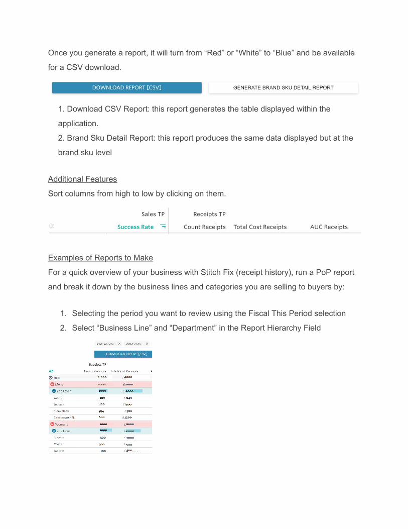
Once you generate a report, it will turn from “Red” or “White” to “Blue” and be available
for a CSV download.
1. Download CSV Report: this report generates the table displayed within the
application.
2. Brand Sku Detail Report: this report produces the same data displayed but at the
brand sku level
Additional Features
Sort columns from high to low by clicking on them.
Examples of Reports to Make
For a quick overview of your business with Stitch Fix (receipt history), run a PoP report
and break it down by the business lines and categories you are selling to buyers by:
1. Selecting the period you want to review using the Fiscal This Period selection
2. Select “Business Line” and “Department” in the Report Hierarchy Field

HELP
If you are unable to access the Sales Dashboard, first contact your buying partner to
ensure you have the proper access.
If there is a bug and the data is not loading, contact [email protected].
To submit enhancement suggestions, contact [email protected] and

STITCH FIX GLOSSARY
Receipts: units received in Stitch Fix warehouses
Receipt Cost: wholesale financial value of received units
Success Rate: % of items sold of items checked out
On Order: units of purchase orders, not yet received in the warehouse
Client Feedback: feedback responses given by clients when checking out a product
Checked Out Ships: times an item has been checked out by a client (sent out and then
either kept or returned), does not equate to sold

Stitch Fix Fiscal Calendar:
** 5 wk period (53 wk
yr)
FY18 FY18 FY19 FY19 FY20 FY20
FY qtr Merch
Months Beg End Beg End Beg End
Q1 August 07/30/17 08/26/17 07/29/18 08/25/18 08/04/19 08/31/19
Q1 September 08/27/17 09/30/17 08/26/18 09/29/18 09/01/19 10/05/19
Q1 October 10/01/17 10/28/17 09/30/18 10/27/18 10/06/19 11/02/19
Q2 November 10/29/17 11/25/17 10/28/18 11/24/18 11/03/19 11/30/19
Q2 December 11/26/17 12/30/17 11/25/18 12/29/18 12/01/19 01/04/20
Q2 January 12/31/17 01/27/18 12/30/18 01/26/19 01/05/20 02/01/20
Q3 February 01/28/18 02/24/18 01/27/19 02/23/19 02/02/20 02/29/20
Q3 March 02/25/18 03/31/18 02/24/19 03/30/19 03/01/20 04/04/20
Q3 April 04/01/18 04/28/18 03/31/19 04/27/19 04/05/20 05/02/20
Q4 May 04/29/18 05/26/18 04/28/19 05/25/19 05/03/20 05/30/20
Q4 June 05/27/18 06/30/18 05/26/19 06/29/19 05/31/20 07/04/20
Q4 July 07/01/18 07/28/18 06/30/19 08/03/19 ** 07/05/20 08/01/20
FY21 FY21 FY22 FY22 FY23 FY23
FY qtr Merch
Months Beg End Beg End Beg End
Q1 August 08/02/20 08/29/20 08/01/21 08/28/21 07/31/22 08/27/22
Q1 September 08/30/20 10/03/20 08/29/21 10/02/21 08/28/22 10/01/22
Q1 October 10/04/20 10/31/20 10/03/21 10/30/21 10/02/22 10/29/22
Q2 November 11/01/20 11/28/20 10/31/21 11/27/21 10/30/22 11/26/22
Q2 December 11/29/20 01/02/21 11/28/21 01/01/22 11/27/22 12/31/22
Q2 January 01/03/21 01/30/21 01/02/22 01/29/22 01/01/23 01/28/23
Q3 February 01/31/21 02/27/21 01/30/22 02/26/22 01/29/23 02/25/23
Q3 March 02/28/21 04/03/21 02/27/22 04/02/22 02/26/23 04/01/23
Q3 April 04/04/21 05/01/21 04/03/22 04/30/22 04/02/23 04/29/23
Q4 May 05/02/21 05/29/21 05/01/22 05/28/22 04/30/23 05/27/23
Q4 June 05/30/21 07/03/21 05/29/22 07/02/22 05/28/23 07/01/23
Q4 July 07/04/21 07/31/21 07/03/22 07/30/22 07/02/23 07/29/23