visual analytics of large homogeneous datavisual analytics of large homogeneous data categorical,...
TRANSCRIPT

Visual Analytics of LargeHomogeneous Data
Categorical, Set-typed, and Classification Data
DISSERTATION
zur Erlangung des akademischen Grades
Doktor der technischen Wissenschaften
eingereicht von
Bilal AlsallakhMatrikelnummer 0627567
an derFakultät für Informatik der Technischen Universität Wien
Betreuung:Ao. Univ.-Prof. Dr. Mag. Silvia MikschProf. Dipl.-Ing. Dr. Helwig Hauser
Diese Dissertation haben begutachtet:
(Ao. Univ.-Prof. Dr. Mag.Silvia Miksch)
(Professor in VisualizationDipl.-Ing. Dr. Helwig Hauser)
(Professor John Stasko)
Wien, 05.08.2014(Bilal Alsallakh)
Technische Universität WienA-1040 Wien � Karlsplatz 13 � Tel. +43-1-58801-0 � www.tuwien.ac.at
Die approbierte Originalversion dieser Dissertation ist in der Hauptbibliothek der Technischen Universität Wien aufgestellt und zugänglich. http://www.ub.tuwien.ac.at
The approved original version of this thesis is available at the main library of the Vienna University of Technology.
http://www.ub.tuwien.ac.at/eng

Visual Analytics of LargeHomogeneous Data
Categorical, Set-typed, and Classification Data
DISSERTATION
submitted in partial fulfillment of the requirements for the degree of
PhD in Computer Science
by
Bilal AlsallakhRegistration Number 0627567
to the Faculty of Informaticsat the Vienna University of Technology
Advisors:Ao. Univ.-Prof. Dr. Mag. Silvia MikschProf. Dipl.-Ing. Dr. Helwig Hauser
The dissertation has been reviewed by:
(Ao. Univ.-Prof. Dr. Mag.Silvia Miksch)
(Professor in VisualizationDipl.-Ing. Dr. Helwig Hauser)
(Professor John Stasko)
Vienna, 05.08.2014(Bilal Alsallakh)
Technische Universität WienA-1040 Wien � Karlsplatz 13 � Tel. +43-1-58801-0 � www.tuwien.ac.at


Erklärung zur Verfassung der Arbeit
Bilal AlsallakhSpeisinger Strasse 57, 1130 Vienna
Hiermit erkläre ich, dass ich diese Arbeit selbständig verfasst habe, dass ich die verwende-ten Quellen und Hilfsmittel vollständig angegeben habe und dass ich die Stellen der Arbeit -einschließlich Tabellen, Karten und Abbildungen -, die anderen Werken oder dem Internet imWortlaut oder dem Sinn nach entnommen sind, auf jeden Fall unter Angabe der Quelle als Ent-lehnung kenntlich gemacht habe.
(Ort, Datum) (Unterschrift Verfasser)
i


Acknowledgements
I acknowledge the contributions of the following people to this thesis:
• Lilas Al Sallakh, my sister, proofread this thesis thoroughly and pointed me to unclaritiesand writing issues.
• Silvia Miksch introduced me to the field of Visual Analytics, and how to conduct researchin this field. She taught me the importance of task-driven and user-centered design, whichhad major influence on my research. She was open and supportive to explore new researchdirections that lead to this thesis, and dedicated a lot of time to discuss and refine my ideasand guide them into fruitful directions.
• Helwig Hauser gave crucial feedback on my ideas and proposed research directions thatimproved the applicability of my ideas to set visualization and classification data. He alsoreferred me to inspiring related work and helped in structuring this thesis.
• Eduard Gröller introduced me to the field of visualization, and supervised my Master’sthesis, where the first ideas behind this work started. He taught me scientific writing byproviding grass-roots feedback on my Master’s thesis and co-authored articles.
• Wolfgang Aigner helped me to refine my visualization and interaction design and to baseit on solid theory. He also helped me to realize potential applications of my ideas.
• Peter Filzmoser gave statistical feedback on my proposals and provided useful datasets.He also encouraged me to applying my ideas to classification problems.
• Chris Weaver gave thoughtful feedback on my ideas on visualizing categorical associa-tions and relations.
• Aidan Slingsby gave thoughtful feedback on my initial visual design and proposed theuse of aggregation to simplify this design.
• Simone Kriglstein, Margit Pohl, and Florian Scholz gave critical feedback on my initialvisual design which made me reconsider and refine many design decisions. Florian alsoinfluenced the user interface design by proposing to divide the space between overviewand detail views and to show them side by side.
iii

• Markus Bögl explained statistical concepts to me, and gave feedback on parts of thisthesis. He also translated the abstract into German, together with Birgit.
• Mohamad Rabbath exchanged thoughtful discussions with me on measuring usabilityand performing evaluation. He also gave feedback on the introductory part of this thesis.
• Stephan Hoffmann gave feedback on parts of this thesis.
• The IEG group at Vienna University of Technology were part of a professional and niceworking environment and gave constructive feedback on my test talks and presentations.
• The anonymous reviewers of the publications in Part II raised many important pointsthat helped me refine my ideas and better explain my manuscript.
I also acknowledge the support of Mondi Austria Privatstiftung in financing my master stud-ies in Vienna. It was during this period that the first ideas behind this thesis were developed.
Mrs. Fleury-Sauer was also very supportive throughout the course of this PhD. She wouldvisit me in the lab in the last weeks of March, bring warm meals, and encourage me to work.
Finally, I dedicate this thesis to my father, M. Zafer. He dedicated a lot of his time toteach me math and physics and pushed me to read scientific books. Though he wished I studymedicine, he supported my decision to study computer science with the condition that I earn adoctorate in this field instead. This was a constant motivating factor to pursue this thesis.

Related Publications
This thesis is based on the following publications (see Part II of the thesis):
• Paper A:
Bilal Alsallakh, Wolfgang Aigner, Silvia Miksch, and Helwig HauserRadial Sets: Interactive Visual Analysis of Large Overlapping SetsIEEE Transactions on Visualization and Computer Graphics (Proceedings of IEEE Info-Vis), 19(12):2496-2505, 2013.Supplementary video: http://radialsets.org/
• Paper B:
Bilal Alsallakh, Allan Hanbury, Helwig Hauser, Silvia Miksch, and Andreas RauberVisual Methods for Analyzing Probabilistic Classification DataIEEE Transactions on Visualization and Computer Graphics (Proceedings of IEEE VAST),20(12), 2014, to appear.Supplementary video: http://www.cvast.tuwien.ac.at/ConfusionAnalysis
• Paper C:
Bilal Alsallakh, Wolfgang Aigner, Silvia Miksch, and M. Eduard GröllerReinventing the Contingency Wheel: Scalable Visual Analytics of Large CategoricalDataIEEE Transactions on Visualization and Computer Graphics (Proceedings of IEEE VAST),18(12):2849-2858, 2012.Supplementary video: http://www.cvast.tuwien.ac.at/wheel
In addition, the following publications are related to the topic of this thesis:
• The early version of the proposed visual metaphor:Bilal Alsallakh, Eduard Gröller, Silvia Miksch, and Martin SuntingerContingency Wheel: Visual Analysis of Large Contingency TablesProceedings of the International Workshop on Visual Analytics (EuroVA), pp. 53-56,2011, Eurographics.
• Evaluation of the early version of the proposed visual metaphor:Margit Pohl, Florian Scholz, Simone Kriglstein, Bilal Alsallakh, and Silvia Miksch
v

Evaluating the Dot-Based Contingency Wheel: Results from a Usability and UtilityStudyProceedings of HCI International - Lecture Notes in Computer Science (LNCS) on HumanInterface and the Management of Information, pp. 76-86, 2012, Eurographics.
• A state of the art report on visualizing set-typed data:Bilal Alsallakh, Luana Micallef, Wolfgang Aigner, Helwig Hauser, Silvia Miksch, andPeter RodgersVisualizing Sets and Set-typed Data: State-of-the-Art and Future Challenges”Proceedings of the Eurographics Conference on Visualization (EuroVis) - State of The ArtReports, pp. 1-21, 2014,Eurographics.
• An application of the proposed set visualization in Information Retrieval:Bilal Alsallakh, Silvia Miksch, and Andreas RauberTowards a Visualization of Multi-faceted Search Results”Proceedings of the DL2014 Workshop on Knowledge Maps and Information Retrieval(KMIR), the ACM/IEEE Joint Conference on Digital Libraries, 2014.
Finally, the following is a list of other publications I worked on during my PhD study and aspart of my work in the CVAST project. These publications are not closely related to the thesistopic.
• Bilal Alsallakh, Markus Bögl, Theresia Gschwandtner, Silvia Miksch, Bilal Esmael, ArghadArnaout, Gerhard Thonhauser, and Philipp ZöllnerA Visual Analytics Approach to Segmenting and Labeling Multivariate Time SeriesData”Proceedings of the International Workshop on Visual Analytics (EuroVA), 2014, Euro-graphics.
• Bilal Alsallakh, Peter Bodesinsky, Silvia Miksch, and Dorna NasseriVisualizing Arrays in the Eclipse Java IDEEuropean Conference on Software Maintenance and Reengineering, 2012, pp. 541-544,IEEE.
• Bilal Alsallakh, Peter Bodesinsky, Alexander Gruber, and Silvia MikschVisual Tracing for the Eclipse Java DebuggerEuropean Conference on Software Maintenance and Reengineering, 2012, pp. 545-548,IEEE.

Abstract
A multidimensional data set is homogeneous when the dimensions have the same nature. Forinstance, these dimensions can represent the probabilities for a sample to belong to differentclasses, or item memberships of multiple sets. Such data appear very often in different domainsto describe how a relatively large number of items are related to a relatively small number ofclasses or categories. For examples, a homogeneous data set might record which genes (rows)appear in which individuals (columns), or how many times books (rows) are sold in differentcountries (columns). Analyzing these relations reveals several patterns in the data such as genesthat are observed frequently or never together, or books that sell mostly in a specific country.Both automated methods and visualization have been applied to analyze homogeneous data.However, state-of-the-art visualization techniques are lacking either in scalability with the num-ber of data points or in addressing the specific nature of different classes of homogeneous data,and the tasks associated with them.
In this dissertation, I propose novel visual metaphor and interactive exploration environ-ment for analyzing large homogeneous data. The proposed wheel metaphor allows analyzingand selecting the data points based on their relations with the different dimensions. Moreover, itemphasizes the dimensions and the relations between them as the central part of the visualiza-tion, and allows analyzing these relations based on the data points defining them. The proposedinteractive exploration environment allows analyzing different aspects of the data at multiplelevels of detail. I illustrate how the proposed approach can be applied to analyze three classes ofhomogeneous data: set-typed data, probabilistic classification data, and categorical data. Eachclass has its own characteristics that imply specific requirements and tasks. These different tasksare supported by the proposed approach, thanks to its flexibility and extensibility.
I demonstrate the applicability of my approach by means of usage scenarios and case stud-ies with various datasets from multiple domains. Also, both user studies and interviews withdomain experts were conducted to assess the utility of the proposed methods. The major ad-vantages of the proposed visual metaphor is its scalability in the number of data points, thanksto dedicated aggregation methods for homogeneous data, and to the rich sets of interactions itsupports to select the data based on a variety of criteria. The major disadvantages are the com-plexity of the visual metaphor that requires sufficient user training, the limited scalability in thenumber of dimensions, and the low sensitivity to small differences in the data being analyzed.Nevertheless, the wheel metaphor is suited to gain an overview of large homogeneous data, withcomplementary analytical methods, interactions, and coordinated views being used to cope withthe limitations. As a result, novel analysis possibilities and insights in the data are possible,beyond state-of-the-art techniques.
vii


Kurzfassung
Homogene multivariate Daten umfassen eine Vielzahl an Variablen mit ähnlichem Verhalten/ähnlicher Struktur. Diese Variablen können Unterschiedliches repräsentieren – zum Beispiel dieWahrscheinlichkeit, mit der ein Element in eine bestimmte Gruppe gehört, oder die Zuordnungeines Elementes zu einer Reihe von Mengen. In vielen Anwendungsgebieten werden solcheDaten genutzt, um die Zugehörigkeit von einer relativ großen Menge an Elementen zu einerrelativ kleinen Anzahl an Gruppen oder Kategorien zu beschreiben. Eine homogene Tabelle zeigtbeispielsweise, welche Gene (Zeilen) in welchem Individuum (Spalten) vorkommen, oder wieoft ein Buch (Zeilen) in verschiedenen Ländern (Spalten) verkauft wurde. Die Analyse solcherZusammenhänge ermöglicht es, Muster in den Daten zu erkennen – etwa Gene, die oft odernie zusammen vorkommen, oder Bücher, die hauptsächlich in bestimmten Ländern verkauftwerden. Für die Untersuchung derartiger Muster in großen homogenen Datenmengen wurdenbereits automatisierte Methoden und Visualisierungen angewandt. Allerdings mangelt es selbstbei der Verwendung neuester Visualisierungstechniken an der Skalierbarkeit in Bezug auf dieAnzahl von Elementen, und an der fehlenden Miteinbeziehung der speziellen Eigenschaften,die verschiedene Gruppen homogener Daten, bezogen auf die konkreten Aufgabenstellungen,haben.
In dieser Dissertation stelle ich neue visuelle Metaphern und interaktive Explorationsumge-bungen für die Analyse großer homogener Daten vor. Die vorgeschlagene Rad-Metapher ermög-licht es, basierend auf den Zusammenhängen mit anderen Spalten, Elemente auszuwählen undzu untersuchen. Darüber hinaus liegt das Hauptaugenmerk der Visualisierung auf den Spalten-variablen und den Relationen zwischen den Spalten. Dieser Fokus ermöglicht die Analyse dieserBeziehungen basierend auf den Zeileneinträgen, die diese Relationen definieren. Die interaktiveExplorationsumgebung erlaubt es, verschiedene Aspekte der Daten und der Element-Attributein verschiedenen Detailgraden zu betrachten. Ich veranschauliche meinen Ansatz mit drei un-terschiedlichen Arten von homogenen Daten: mengenartige Daten, wahrscheinlichkeitstheore-tische Klassifikationsdaten, und kategorische Daten. Jede dieser drei Gruppen weist bestimmteCharakteristika in den Daten auf, wie etwa spezielle Anforderungen und Aufgaben. Damit zei-ge ich, dass die visuelle Metapher ausreichend flexibel und erweiterbar ist, um diese Aufgabenskalierbar zu lösen.
Ich belege die Anwendbarkeit meines Ansatzes anhand von Usage-Szenarien, Insight-Studienund Fallstudien mit unterschiedlichen Daten aus mehreren Domänen. Zur Beurteilung der Brauch-barkeit der vorgestellten Methoden wurden Benutzerstudien und Interviews mit Experten durch-geführt. Die größten Vorteile der visuellen Metapher sind die Skalierbarkeit in Bezug auf die
ix

Anzahl der Elemente anhand von geeigneten Aggregationsmethoden für homogene Daten, so-wie die zahlreichen Interaktionsmöglichkeiten, um die Auswahl der Daten basierend auf einerVielzahl von Kriterien zu unterstützen. Nachteile zeigen sich in der Komplexität der visuellenMetapher, welche es für den Benutzer notwendig macht, diese ausreichend zu erlernen, in derlimitierten Skalierbarkeit in Bezug auf die Anzahl der Spalten und in der niedrigen Sensitivität,kleine Unterschiede in den Relationen zu analysieren. Dennoch ist die Rad-Metapher geeignet,die Limitierungen mit komplementären analytischen Methoden, Interaktionen und koordiniertenAnsichten zu überbrücken und damit einen Überblick über große homogene Daten zu erlangen.Als Ergebnis entstehen neuartige Analysemöglichkeiten sowie neuartige Erkenntnisse in denDaten, und zwar über den aktuellen Stand der Technik hinaus.
Contents
List of Figures xv
I Overview 1
1 Introduction 31.1 Motivation . . . . . . . . . . . . . . . . . . . . . . . . . . . . . . . . . . . . . 31.2 Problem Statement . . . . . . . . . . . . . . . . . . . . . . . . . . . . . . . . 4
1.2.1 Data . . . . . . . . . . . . . . . . . . . . . . . . . . . . . . . . . . . . 51.2.2 Users . . . . . . . . . . . . . . . . . . . . . . . . . . . . . . . . . . . 61.2.3 Tasks . . . . . . . . . . . . . . . . . . . . . . . . . . . . . . . . . . . 71.2.4 Hypotheses and Research Questions . . . . . . . . . . . . . . . . . . . 7
1.3 Contributions . . . . . . . . . . . . . . . . . . . . . . . . . . . . . . . . . . . 81.4 Structure of the Thesis . . . . . . . . . . . . . . . . . . . . . . . . . . . . . . 9
2 State of the Art 112.1 Visualizing Multidimensional Data . . . . . . . . . . . . . . . . . . . . . . . . 11
2.1.1 Scatterplot Matrices (SPLOMs) . . . . . . . . . . . . . . . . . . . . . 122.1.2 Parallel Coordinates . . . . . . . . . . . . . . . . . . . . . . . . . . . 122.1.3 Biplots . . . . . . . . . . . . . . . . . . . . . . . . . . . . . . . . . . 142.1.4 Table Lens . . . . . . . . . . . . . . . . . . . . . . . . . . . . . . . . 142.1.5 Heat Maps and Matrices . . . . . . . . . . . . . . . . . . . . . . . . . 162.1.6 Ploceus: Network-based Visual Analysis of Tabular Data . . . . . . . . 182.1.7 Circos . . . . . . . . . . . . . . . . . . . . . . . . . . . . . . . . . . . 202.1.8 Summary . . . . . . . . . . . . . . . . . . . . . . . . . . . . . . . . . 21
2.2 Data Reduction . . . . . . . . . . . . . . . . . . . . . . . . . . . . . . . . . . 212.3 Coordinated and Multiple Views . . . . . . . . . . . . . . . . . . . . . . . . . 23
3 The Proposed Approach 253.1 Visual-Analytics Paradigm . . . . . . . . . . . . . . . . . . . . . . . . . . . . 253.2 Automated Analytical Methods . . . . . . . . . . . . . . . . . . . . . . . . . . 26
3.2.1 Entity Association with Homogeneous Attributes . . . . . . . . . . . . 263.2.2 Aggregating Homogeneous Data . . . . . . . . . . . . . . . . . . . . . 27
xi

3.2.3 Filtering Homogeneous Data . . . . . . . . . . . . . . . . . . . . . . . 283.2.4 Relations Between Homogeneous Attributes . . . . . . . . . . . . . . 293.2.5 Correlations with non-Homogeneous Attributes . . . . . . . . . . . . . 313.2.6 Summary . . . . . . . . . . . . . . . . . . . . . . . . . . . . . . . . . 32
3.3 Visual Representation . . . . . . . . . . . . . . . . . . . . . . . . . . . . . . . 333.4 Interactive Exploration Environment . . . . . . . . . . . . . . . . . . . . . . . 373.5 Visual-Analytics Paradigm - Revisited . . . . . . . . . . . . . . . . . . . . . . 393.6 Comparison with Related Work . . . . . . . . . . . . . . . . . . . . . . . . . . 39
3.6.1 Comparison by What is Represented . . . . . . . . . . . . . . . . . . . 403.6.2 Scalability . . . . . . . . . . . . . . . . . . . . . . . . . . . . . . . . 42
3.7 Evaluation and Limitations . . . . . . . . . . . . . . . . . . . . . . . . . . . . 443.7.1 Early Item-based Visual Design . . . . . . . . . . . . . . . . . . . . . 443.7.2 Revised Visual Design . . . . . . . . . . . . . . . . . . . . . . . . . . 443.7.3 Perceptual Limitations . . . . . . . . . . . . . . . . . . . . . . . . . . 47
4 Example Applications 494.1 Analyzing Genetic Data . . . . . . . . . . . . . . . . . . . . . . . . . . . . . . 494.2 Survey Analysis . . . . . . . . . . . . . . . . . . . . . . . . . . . . . . . . . . 514.3 Comparing Multiple Classification Algorithms . . . . . . . . . . . . . . . . . . 524.4 Supporting Faceted Search . . . . . . . . . . . . . . . . . . . . . . . . . . . . 54
5 Conclusion 575.1 Summary of Contributions and Limitations . . . . . . . . . . . . . . . . . . . 575.2 Revisiting the Hypotheses and Research Questions . . . . . . . . . . . . . . . 585.3 Lessons Learned . . . . . . . . . . . . . . . . . . . . . . . . . . . . . . . . . 595.4 Future Work . . . . . . . . . . . . . . . . . . . . . . . . . . . . . . . . . . . . 60
II Papers 63
A Radial Sets: Interactive Visual Analysis of Large Overlapping Sets 65A.1 Introduction . . . . . . . . . . . . . . . . . . . . . . . . . . . . . . . . . . . . 66A.2 Related Work . . . . . . . . . . . . . . . . . . . . . . . . . . . . . . . . . . . 68
A.2.1 Euler Diagrams and Euler-like Diagrams . . . . . . . . . . . . . . . . 68A.2.2 Node-link Diagrams . . . . . . . . . . . . . . . . . . . . . . . . . . . 69A.2.3 Matrix-based Methods . . . . . . . . . . . . . . . . . . . . . . . . . . 69A.2.4 Frequency-based Methods . . . . . . . . . . . . . . . . . . . . . . . . 70
A.3 Radial Sets . . . . . . . . . . . . . . . . . . . . . . . . . . . . . . . . . . . . 71A.3.1 The Visual Metaphor . . . . . . . . . . . . . . . . . . . . . . . . . . . 71A.3.2 The Interactive Exploration Environment . . . . . . . . . . . . . . . . 78
A.4 Usage Scenarios . . . . . . . . . . . . . . . . . . . . . . . . . . . . . . . . . . 82A.4.1 ACM Paper Classification . . . . . . . . . . . . . . . . . . . . . . . . 82A.4.2 IMDb Movies . . . . . . . . . . . . . . . . . . . . . . . . . . . . . . . 83
A.5 Discussion . . . . . . . . . . . . . . . . . . . . . . . . . . . . . . . . . . . . . 85
xii

A.6 Conclusion . . . . . . . . . . . . . . . . . . . . . . . . . . . . . . . . . . . . 87
B Visual Analytics Methods for probabilistic classification Data 89B.1 Introduction . . . . . . . . . . . . . . . . . . . . . . . . . . . . . . . . . . . . 89B.2 Related Work . . . . . . . . . . . . . . . . . . . . . . . . . . . . . . . . . . . 91
B.2.1 Building Classifiers Interactively . . . . . . . . . . . . . . . . . . . . . 91B.2.2 A Posteriori Analysis . . . . . . . . . . . . . . . . . . . . . . . . . . . 92
B.3 Motivation of our Work . . . . . . . . . . . . . . . . . . . . . . . . . . . . . . 93B.4 Our Visual Analysis Tools . . . . . . . . . . . . . . . . . . . . . . . . . . . . 94
B.4.1 Confusion Wheel . . . . . . . . . . . . . . . . . . . . . . . . . . . . . 95B.4.2 Feature Analysis View . . . . . . . . . . . . . . . . . . . . . . . . . . 97B.4.3 The Interactive Exploration Environment . . . . . . . . . . . . . . . . 99
B.5 Usage Scenarios . . . . . . . . . . . . . . . . . . . . . . . . . . . . . . . . . . 102B.5.1 Inspecting Misclassified Samples . . . . . . . . . . . . . . . . . . . . 102B.5.2 Analyzing Classifier Behavior . . . . . . . . . . . . . . . . . . . . . . 102B.5.3 Comparison with Another Classifier . . . . . . . . . . . . . . . . . . . 103B.5.4 Defining Post-Classification Rules . . . . . . . . . . . . . . . . . . . . 104
B.6 Discussion . . . . . . . . . . . . . . . . . . . . . . . . . . . . . . . . . . . . . 108B.7 Conclusion . . . . . . . . . . . . . . . . . . . . . . . . . . . . . . . . . . . . 110
C Reinventing the Contingency Wheel: Scalable visual analytics of large categori-cal data 111C.1 Introduction . . . . . . . . . . . . . . . . . . . . . . . . . . . . . . . . . . . . 112C.2 Contingency Wheel++ . . . . . . . . . . . . . . . . . . . . . . . . . . . . . . 114
C.2.1 Mapping Frequencies to Associations . . . . . . . . . . . . . . . . . . 115C.2.2 Visualizing the Contingency Table . . . . . . . . . . . . . . . . . . . . 117C.2.3 Interactive Exploration Environment . . . . . . . . . . . . . . . . . . . 121
C.3 Use Case . . . . . . . . . . . . . . . . . . . . . . . . . . . . . . . . . . . . . 123C.3.1 Categories & Characteristics . . . . . . . . . . . . . . . . . . . . . . . 124C.3.2 Single Movies . . . . . . . . . . . . . . . . . . . . . . . . . . . . . . 126C.3.3 Hypotheses and Specific Questions . . . . . . . . . . . . . . . . . . . 127C.3.4 Decisions and Actions Planned . . . . . . . . . . . . . . . . . . . . . . 128C.3.5 Improvements of Contingency Wheel++ . . . . . . . . . . . . . . . . . 129
C.4 State of the Art . . . . . . . . . . . . . . . . . . . . . . . . . . . . . . . . . . 129C.5 Conclusion . . . . . . . . . . . . . . . . . . . . . . . . . . . . . . . . . . . . 130
Bibliography 131
xiii


List of Figures
1.1 An example of homogeneous data . . . . . . . . . . . . . . . . . . . . . . . . . . 51.2 Three classes of homogeneous data . . . . . . . . . . . . . . . . . . . . . . . . . . 6
2.1 A scatterplot matrix . . . . . . . . . . . . . . . . . . . . . . . . . . . . . . . . . . 132.2 A parallel-coordinates plot . . . . . . . . . . . . . . . . . . . . . . . . . . . . . . 132.3 A biplot . . . . . . . . . . . . . . . . . . . . . . . . . . . . . . . . . . . . . . . . 152.4 Table lens . . . . . . . . . . . . . . . . . . . . . . . . . . . . . . . . . . . . . . . 152.5 A heat map . . . . . . . . . . . . . . . . . . . . . . . . . . . . . . . . . . . . . . 172.6 A confusion matrix . . . . . . . . . . . . . . . . . . . . . . . . . . . . . . . . . . 172.7 A heatmap of set overlaps . . . . . . . . . . . . . . . . . . . . . . . . . . . . . . . 182.8 A two-mode network in Ploceus view . . . . . . . . . . . . . . . . . . . . . . . . 192.9 A 1-mode network in Ploceus view . . . . . . . . . . . . . . . . . . . . . . . . . . 192.10 A Circos visualization . . . . . . . . . . . . . . . . . . . . . . . . . . . . . . . . . 202.11 Coordinated and multiple views in ComVis . . . . . . . . . . . . . . . . . . . . . 232.12 Coordinated and multiple views in Improvise . . . . . . . . . . . . . . . . . . . . 24
3.1 Defining bins over the entities . . . . . . . . . . . . . . . . . . . . . . . . . . . . 273.2 The proposed visual metaphor . . . . . . . . . . . . . . . . . . . . . . . . . . . . 343.3 Highlighting selected elements in color . . . . . . . . . . . . . . . . . . . . . . . 353.4 Visualizing an attribute by color . . . . . . . . . . . . . . . . . . . . . . . . . . . 363.5 Visualizing attributes in additional views . . . . . . . . . . . . . . . . . . . . . . . 363.6 An example of the generic interactive exploration environment . . . . . . . . . . . 373.7 Defining visual queries on the elements interactively . . . . . . . . . . . . . . . . 383.8 Comparison with related work . . . . . . . . . . . . . . . . . . . . . . . . . . . . 403.9 Comparison against matrix-based design . . . . . . . . . . . . . . . . . . . . . . . 413.10 Scalability limits of the wheel metaphor . . . . . . . . . . . . . . . . . . . . . . . 433.11 Perceptual issues with the wheel metaphor . . . . . . . . . . . . . . . . . . . . . . 47
4.1 Visualization of gene transcripts in 14 individuals . . . . . . . . . . . . . . . . . . 504.2 Visualization of survey answers . . . . . . . . . . . . . . . . . . . . . . . . . . . 524.3 Comparing multiple classification algorithms . . . . . . . . . . . . . . . . . . . . 534.4 Visualization of multi-faceted search data . . . . . . . . . . . . . . . . . . . . . . 54
A.1 The main interface of Radial Sets . . . . . . . . . . . . . . . . . . . . . . . . . . . 66
xv

A.2 Four techniques for visualizing element-set memberships . . . . . . . . . . . . . . 67A.3 Set’o’grams vs. Radial Sets . . . . . . . . . . . . . . . . . . . . . . . . . . . . . . 71A.4 Euler diagrams vs. Radial Sets . . . . . . . . . . . . . . . . . . . . . . . . . . . . 73A.5 Displaying overlap disproportionality in Radial Sets . . . . . . . . . . . . . . . . . 76A.6 Radial Sets of the IMDb movies x countries . . . . . . . . . . . . . . . . . . . . . 76A.7 Radial Sets of IMDb movies × genres . . . . . . . . . . . . . . . . . . . . . . . . 79A.8 Tooltips in Radial Sets . . . . . . . . . . . . . . . . . . . . . . . . . . . . . . . . 81A.9 Three classes of ACM papers over time . . . . . . . . . . . . . . . . . . . . . . . 84A.10 Popular Genre combinations in Indian movies . . . . . . . . . . . . . . . . . . . . 85
B.1 The proposed visual analysis tools . . . . . . . . . . . . . . . . . . . . . . . . . . 90B.2 Previous techniques for visualizing classification results . . . . . . . . . . . . . . . 91B.3 The Confusion Wheel showing classification results of handwritten digits . . . . . 94B.4 Filtering and coloring the samples in the confusion wheel . . . . . . . . . . . . . . 97B.5 The interactive exploration environment of classification results . . . . . . . . . . 98B.6 Obtaining details about elements interactively . . . . . . . . . . . . . . . . . . . . 101B.7 Comparing results of multiple classifiers side by side . . . . . . . . . . . . . . . . 103B.8 Comparing results of two classifiers using color . . . . . . . . . . . . . . . . . . . 104B.9 Defining post-classification rules . . . . . . . . . . . . . . . . . . . . . . . . . . . 107
C.1 Contingency Wheel++ showing the MovieLens dataset . . . . . . . . . . . . . . . 112C.2 Categorical data in the MovieLens data set . . . . . . . . . . . . . . . . . . . . . . 113C.3 Comparing the behavior of two residual functions . . . . . . . . . . . . . . . . . . 114C.4 Item-based vs. aggregation-baed representations . . . . . . . . . . . . . . . . . . . 118C.5 Showing attribute distributions . . . . . . . . . . . . . . . . . . . . . . . . . . . . 119C.6 The exploration environment of the Contingency Wheel++ . . . . . . . . . . . . . 120C.7 Visual exploration of movies associated to user occupations . . . . . . . . . . . . . 123C.8 Associations between user age and movie genres . . . . . . . . . . . . . . . . . . 125C.9 Associations between user gender and movie genres . . . . . . . . . . . . . . . . . 126C.10 Details about selected genres . . . . . . . . . . . . . . . . . . . . . . . . . . . . . 126C.11 Associations of individual movies . . . . . . . . . . . . . . . . . . . . . . . . . . 127C.12 Visual exploration of the Godfather trilogy . . . . . . . . . . . . . . . . . . . . . . 128
xvi

Part I
Overview
1


CHAPTER 1Introduction
1.1 Motivation
Background
Information Visualization (InfoVis) and Visual Analytics (VA) have emerged as new data analysisparadigms that complement automated techniqus with visualization. InfoVis has been defined as“the use of computer-supported, interactive, visual representations of abstract data to amplifycognition” [24, p. 7]. Such data have usually no inherent spatial structures that characterizescientific data such as blood flow or air density. Abstract data often represent non-physicalentities and concepts such as friendship relations between people, tags on documents, or thehierarchy of an organization. The data can originate from a variety of domains, and hence canvary strongly in form (e.g., tabular, hierarchical, relational, etc.), semantics, and dimensionality.VA has been defined as “the science of analytical reasoning, facilitated by interactive visualinterface” [151, p. 4].
A large number of InfoVis and VA techniques have been developed over the past two decadesto support the analysis of different types of data such as trees [128], graphs [161], and time-oriented data [105]. Besides reference collections of such techniques, a lot of effort has beenmade to develop data type and task taxonomies which help the systematic development, un-derstanding, and evaluation of these techniques [20, 139]. Understanding the characteristicsof different data types and identifying common analytical tasks associated with them enablebetter analysis of the design space of visualization techniques for these types, and fosters there-usability and the wide applicability of these techniques. Shneiderman’s Task by Data TypeTaxonomy [139] was the first and most foundational work on developing InfoVis data type andtask taxonomies. With respect to data type, Shneiderman identified seven generic data typesthat have different characteristics: “one-, two-, three-dimensional data, temporal and multi-dimensional data, and tree and network data”. Besides these types, he identified seven generictasks that can be applied to these datatypes: “one-, two-, three-dimensional data, temporal andmulti-dimensional data, and tree and network data”.
3

In his taxonomy, Shneiderman illustrated how relational and statistical databases can be con-veniently manipulated as multidimensional data in which items with m attributes become pointsin an m-dimensional space. These attributes might represent real-world concepts having differ-ent nature such as length and weight, making the data potentially heterogeneous. Heterogeneousdata encompass multiple attributes that can potentially have different forms (e.g. numerical /cat-egorical / Boolean attributes), different measurement units (kg, meter, USD), or different rangesof possible values.
Homogeneous Data: A Special Type of Data
In some applications, all the attributes of a multidimensional dataset have the same nature andvalue ranges. As an example, the data can represent the probabilities computed by a classifierfor a set of n handwritten letters to belong to each of the 26 letter classes. In this case, all theattributes have the same nature: the probability for a sample to belong to a class. Also, thevalues of these attributes can be compared directly as they belong to the same value range [0, 1].Moreover, the attribute values for one sample can be aggregated meaningfully. For example, thesum of these values is equal to 1. Also, the maximum value indicates the class with the highestprobability, which is selected as the predicted class for the given sample by the classifier.
In this thesis, I refer to multidimensional datasets whose attributes have the same natureand value ranges as homogeneous data. I argue that these special characteristics provide newpossibilities to analyze and visualize such data, beyond the possibilities available for hetero-geneous data (Chap. 3). I demonstrate these possibilities with three classes of homogeneousdata: (1) set-typed data that encompass element-set memberships, (2) classification data thatencompass sample-class probabilities, and (3) two-way contingency tables that describe the re-lation between two categorical variables. Each of these classes has been treated separately inthe literature, with several methods proposed to visualize data of this class. These methods havelimitations either in terms of scalability, or in the level of detail they reveal in the data. I demon-strate how the similar structure of the above-mentioned classes allows specifying many taskswith the data in similar ways and developing common visualization and interaction methods tosolve these tasks.
Besides homogeneous attributes, many datasets contain additional heterogeneous attributesthat describe the row entities. For example, in addition to class probabilities, the data aboutclassification samples such as handwritten letters might encompass classification features usedby the classifier to compute these probabilities. These attributes often determine the values ofhomogeneous data or influence certain tendencies in them. I demonstrate how the methods Ipropose allow analyzing these heterogeneous attributes in relation to the homogeneous data.
1.2 Problem Statement
As proposed by Miksch and Aigner [104], I define the VA problem addressed in this work bymeans of the data being analyzed, the users who will use my methods, and the tasks these usersneed to solve with the data. Additionally, I state the hypothesis behind my research and thecorresponding research questions.
4

Figure 1.1: A classification dataset containing three groups of attributes of the classificationsamples: (1) heterogeneous data features used for classification, (2) classification results (actualand predicted class names), (3) homogeneous attributes representing the probabilities computedfor the samples to belong to each of the classes.
1.2.1 Data
This work is dedicated to analyze homogeneous data, as a special type of multidimensional data.I define homogeneous data as a dataset of n entities E described by a set of m homogeneousnumerical attributes A1 . . . Am having the same nature and value ranges. The entities E canhave additional p heterogeneous attributes F1 . . . Fp as well.
In particular, I address homogeneous data having a relatively small number of homogeneousattributes m (in the order of tens), but a relatively large number of entities n (in the order of tensof thousands). I identify three classes of data that can be modeled as homogeneous data:
• Element-Set memberships (set-typed data): givenm sets S1 . . . Sm, the membership ofthe n entities E to these sets can be represented by m homogeneous attributes A1 . . . Am.The values of each binary attribute Aj denote the membership of the elements to therespective set Sj , with Aj(ei ∈ E) = 1 ⇐⇒ ei ∈ Sj (Fig. 1.2a).
As an example, the entities E can represent survey participants and the sets can representm possible answers to a multiple-choice question. The attributes A1 . . . Am denote whichparticipant selected which answer(s) to the question. The participants might further haveother heterogeneous attributes F1 . . . Fp such as age, sex, or political affiliation.
I refer to this class data as set-typed data throughout this thesis.
• Probabilistic classification data: Probabilistic classifiers compute the probability pij ∈[0, 1] that a sample ei ∈ E belongs to one ofm classes C1 . . . Cm. These probabilities canbe represented by m homogenous attributes A1 . . . Am where Aj(ei) = pij . The attributevalues for item ei sum up to
∑Aj(ei) = 1. In addition, the samples can have a number
of heterogeneous data features F1 . . . Fp used for the classification (Fig. 1.2b).
As an example, the items E can be a large set of images that contain handwritten digits.The classes C1 . . . Cm represent the digits. The attribute value Aj(ej) indicates the prob-ability that image ei represents digit Aj , as computed by the classifier. The heterogeneousattributes F1 . . . Fp represent classification features extracted from the images.
5

Figure 1.2: Three examples of homogeneous data having similar dimensionality: (a) sample-class probabilities, (b) element-set memberships, (c) a contingency table.
• Contingency tables / Categorical data: An n × m contingency table records the fre-quency of observations fij ∈ N for each combination of categories (ei, cj) ∈ E × C oftwo categorical variables E and C. In a skewed contingency table withm << n, the vari-able C has few categories while the row variable E has a large number of categories. Thistable can be modeled as m homogenous attributes A1 . . . Am representing the categoriesof variable C where Aj(ei) = fij (Fig. 1.2c).
As an example,E can be a large set of books andC a set of countries, with fij representingthe purchases of book ei ∈ E in country cj ∈ C. In addition, these books can have a setof heterogeneous attributes F1 . . . Fp such as release date, author(s) and publisher(s).
1.2.2 Users
The techniques I propose can be potentially applied to data of the above-listed classes, in ageneric way. When applied to a specific application domain, these techniques require users whoare experts in this domain and understand the data and their characteristics. Domain expertiseis important to (1) determine if and how the proposed methods are applicable to the particulardomain, (2) steer computational analysis, e.g., to choose appropriate algorithms, measures, andparameters for a specific dataset, and (3) interpret the visualization correctly, e.g., to relate thevisual findings to the data and the problem domain, and to draw correct conclusions about them.
As an example, I assume that users who aim to analyze sample-class probabilities aremachine-learning experts who are aware of the classification algorithm and data feature usedto compute these probabilities. Similarly, users who want to analyze relation between genes andindividuals are assumed to be biologists who can interpret the data.
6

1.2.3 Tasks
It is important to understand which particular tasks need to be carried out by the users duringthe analysis process, in order to design effective VA solutions that address these tasks [104].In his Task by Data Type Taxonomy [139], Shneiderman identified seven abstract tasks thatarise when using InfoVis applications: overview, zoom, filter, details-on-demand, relate, history,and extract. Schultz et al. [130] propose a design space of visualization tasks according to thefollowing dimensions: goal, means, data characteristics, data target and cardinality, the order oftasks, and the (type of) user. They apply this space to recommend suited visualization for a givenvisualization task. Brehmer et al. [20] propose a multi-level typology of abstract visualizationtasks. Their topology aims to connected low-level and high-level task taxonomies by describingcomplex tasks as a sequence of interdependent simpler ones. They organize this typology onthree dimensions: why the task is performed, how the task is performed, and what are the task’sinputs and outputs.
For each of the three classes of data listed in the previous section, there are specific taskrequirements. For example, typical tasks with set-typed data involve analyzing how the elementsbelong to the sets and how the sets intersect. On the other hand, Analyzing classification datainvolves finding which samples have high or low probabilities to belong to a certain class, andcomparing confusions between the classes. Analyzing contingency data, also involves findingcategories that appear more often together than other categories.
A comprehensive list of tasks related to set-typed data has been proposed recently [5]. Itencompasses tasks related to the elements E, tasks related to the sets A1 · · ·Am, and tasksrelated to the attributes F1 · · ·Fp. Chapter. A illustrates which of these set-related tasks areaddressed in this thesis. Chapter. B discusses analysis tasks with classification data proposedin the literature, and demonstrates the ones addressed in this thesis. Chapter. C demonstratesstatistical analysis tasks of large contingency tables extracted from categorical data.
The structural similarity between the classes allows formulating many of their tasks in aunified way. For example, analyzing data of any of these classes involve finding data pointsthat are highly associated with a specific homogeneous dimension e.g. by belonging exclusivelyto the respective set or by having very high probability to belong to the respective class. Thissuggests developing common interactive solutions for these tasks as I show in Chapter 3.
1.2.4 Hypotheses and Research Questions
The two main hypothesis of the proposed research are:
• H1: VA methods provide new insights in- and analysis possibilities of homogeneous data,that are difficult to gain or perform using automated data analysis methods.
• H2: The structural similarities between different classes of homogeneous data enablere-using VA solutions across these classes.
Based on the research problem and hypotheses stated above, I investigated VA methods toaddress the following research questions about homogeneous data:
7

• Q1: How to analyze the association relations between a large number of row entities Eand the m homogeneous column categories represented by the attributes A1 . . . Am?
For example, a basic question about set-typed data is to which sets (column categories) anelement (row entity) belongs. Likewise, analyzing classification results involves findingat which probability certain samples belong to certain classes. Finally, finding pairs ofcategories that frequently appear together is a typical task in analyzing contingency tables.
• Q2: How to analyze the correlation between homogeneous attributes A1 . . . Am?
Besides being dependent on the application domain, the definition of attribute correlationhighly depends on the narrow class of the homogeneous data. For example, two attributesthat correspond to a highly overlapping pair of sets take the same values (0 or 1) for a sig-nificant number of row entities. Also, when analyzing classification results, it is desirableto find classes that are frequently confused for each other. In contingency table analy-sis, correlations are usually computed using statistical methods such as correspondenceanalysis.
• Q3: How to analyze the influence (in both directions) of an additional attribute Fk of therow entities on the row-column associations (Q1) and attribute correlations (Q2)?
For instance, elements that belong to a certain set (or set combinations) might predom-inantly have a high or a specific value for a certain attributes. As an example, moviesthat belong exclusively to genre “Horror” receive lower ratings on average than those ofother genres. Also, the handwritten digits frequently confused between two classes mightbe written mainly be a certain test subject. Finally, row entities that have certain valuesfor Fk might have disproportionally high frequencies with certain column categories in acontingency table. For example, language and publisher are usually factors that impactbook purchases in specific countries, e.g., German books usually have disproportionatelylarge purchases in German-speaking countries.
1.3 Contributions
The research contributions of this thesis are twofold. On one hand, this thesis contributes a setof tools for analyzing and visualizing three specific classes of data, in particular:
1. Novel VA methods for analyzing set-typed data: This technique, called Radial Sets,provides an overview of how a large number of elements (in order of tens of thousands),belong to about 30 to 40 sets. As demonstrated in Chapter A, Radial Sets enable flexibleanalysis of the data and provide new insights into the data that is not possible in state-of-the-art set visualization techniques.
2. Novel VA methods for analyzing probabilistic classification data: These methods pro-vide novel ways for analyzing classification results in relation with classification probabil-ities computed by a probabilistic classifier. They can handle tens of thousands of samplesclassified into about 20 classes. As demonstrated in Chapter B these methods reveal sev-eral patterns in the classification results that allow improving the classifier design.
8

3. Novel VA methods for categorical data: These methods allow analyzing associations be-tween the categories of two categorical variables, with one of them having a large numberof categories. The respective skewed contingency table (tens of thousands × 30) cannotbe handled using previous techniques such as mosaic displays [58] or Parallel Sets [13],that are usually restricted to a total number of categories in the order of tens.
On the other hand, this thesis identifies the class of homogeneous data as a subclass of multi-dimensional data. It describes the characteristics of this sub-class and demonstrates the limi-tations of generic multidimensional data analysis and visualization techniques when applied tohomogeneous data. Based on that, the thesis makes the following contribution:
1. A unified view on different classes of homogeneous data that is based on the structuralsimilarities between them, and that takes into account the variations between them. Thisview enables a common VA framework for these different classes.
2. Unified automated analysis of large homogeneous data to reduce the data volume andextract the most important information and relationships in the data. The common ab-straction of the data takes the specific nature of different data classes into account, byemploying class-specific analytical methods.
3. A unified visual metaphor for homogeneous data based on their common abstraction.This metaphor provides overview of major relationships in the data by visualizing, andallows various interactions to brush the data for exploration in other views.
4. A unified interactive exploration environment for homogeneous data that incorporatesclass-specific views and allows exploring the data at multiple levels of abstraction.
5. Scalable analysis of homogeneous data w.r.t the number of data points, thanks to au-tomated analysis that aggregates the data and to the multi-level exploration environment.
1.4 Structure of the Thesis
This thesis is divided into two parts:
• Part I (Overview) illustrates the context of the work and motivates the special class of ho-mogeneous data as well as the research questions of this thesis. Chapter 2 provides a sum-mary of most related state-of-the art methods for visualizing multidimensional data, andwhy they are insufficient to visualize homogeneous data. It also provides an overview ofgeneral data reduction approaches for multidimensional data, and how they can be appliedin the context of homogeneous data. Chapter 3 introduces the VA approach proposed inthis thesis, along with a comparison with existing multidimensional visualization methodsmentioned above, in addition to a summary of the evaluation results as well as the scalabil-ity and perceptual limitations of the proposed visualization. Chapter 4 demonstrates fourselected applications of the proposed approach in different domains. Chapter 5 reflectson the lessons learned and illustrates how the proposed approach addresses the researchquestions presented in Sect. 1.2.4.
9
• Part II (Papers) explains how the proposed VA approach is applied to each of the threeclasses of homogeneous data addressed in this thesis. It consists of three research paperspublished in the IEEE Transactions on Visualization and Computer Graphics:
– Paper A is about visualizing element-set memberships (set-typed data).
– Paper B is about analyzing probabilistic classification data.
– Paper C is about visualizing categorical data and contingency tables.
These papers provide details about the three classes of data and the concrete tasks as-sociated with them. Each paper provides state-of-the-art methods designed specificallyfor visualizing the respective class of data. The paper also illustrates in detail how theproposed VA approach is applied to this class by (1) explaining the automated analysismethods employed, (2) showing how the visual metaphor is adjusted to fit the nature ofthe data, and (3) illustrating additional class-specific views that are developed to supportthe interactive exploration of the data. The three papers provide several usage scenariosfor different datasets and summarize feedback by domain experts when the method is usedto analyze data in a specific applications domain. The papers reflect also on encounteredlimitations and propose extensions for future work.
10

CHAPTER 2State of the Art
As discussed in Chapter 1, homogeneous data are a special class of multidimensional data.Therefore, visualization techniques for multidimensional data can basically be applied to homo-geneous data, however, without addressing or exploiting the characteristics of such data.
Section 2.1 surveys related multidimensional visualization techniques, and discusses theirapplicability to homogeneous data Section 2.2 provides an overview of data reduction methodsfor multidimensional data. Section 2.3 provides an overview of exploration environments thatemploy multiple views to explore the data at multiple levels of detail. Part II elaborates on state-of-the-art visualization techniques to visualize sets, classification data, and categorical data.
2.1 Visualizing Multidimensional Data
A large portion of InfoVis research focuses on visualizing multidimensional data. Many cate-gorizations have been proposed to classify existing visualization techniques [24, 81, 162], forexample, based on the graphical primitives used in the rendering [162]: points, lines, regions, orcombinations thereof. Keim [81] classifies the techniques into five categories, according to thevisual representations they use to encode the data values:
• Geometric techniques project the data in a geometric space using position or size asprimary visual variables [17] to encode the data values. Examples for this are scatterplotmatrices (SPLOMs) [56], parallel coordinates [69], and RadViz [68].• Pixel-oriented techniques encode the data values in a compact display using color as a
primary visual variable. Examples for this are heat maps and pixel bar charts [78].• Icon-based techniques use icons that encode the data values for individual data items.
Examples for this are stick figures [111] and color icons [91].• Hierarchical techniques recursively divide the data space to show the values of multiple
attributes. Example for this are dimensional stacking [90] and tree maps [138].• Graph-based techniques use node-link diagrams to show relations between data items
and dimensions. Examples for this are Ploceus [93] and PivotSlice [175].
11

The above categories are not exclusive, as some techniques combine ideas from multiplecategories. The following sections overview of representative techniques from three of the abovecategories. The techniques are selected based on (1) their relatively high scalability with thenumber of data points (compared with other techniques) and (2) their generic applicability tomultidimensional data from different domains. To illustrate the applicability of the followingtechniques to visualize homogenous data, I provide a screenshot when possible of how theyvisualize the example dataset depicted in Fig. 1.1. The dataset comprises probabilities computedby a probabilistic classifier for 1000 patent images to belong to 9 classes of patent images. Thedata was collected during the CLEF-IP 2011 classification evaluation campaign [113]. Sect. 3.6compares the proposed VA approach with these techniques in terms of scalability and the newinsights it reveals in homogeneous data.
2.1.1 Scatterplot Matrices (SPLOMs)
SPLOMs [56] use a matrix layout to show the relations between pairs of dimensions by means ofscatterplot. Each scatterplot depicts the whole data points projected on the respective pair of di-mensions. The scatterplots are synchronized: brushing certain data points in one plot highlightsthese points in the other plots.
Fig. 2.1 shows a SPLOM of the classification probabilities depicted in Fig. 1.1. Each scatter-plot shows the relation between classification probabilities of the samples in the respective pairof classes. The majority of samples in Fig. 2.1 are located along the two axis in their scatterplots.These samples were determined by the classifier to possibly belong to one of the class, and not tothe other class in the respective scatterplot. Fewer samples were assigned non-zero probabilityin both of the classes. These samples appear more often when the respective pair of classes aremore likely to be confused for each other (e.g. “graphs”, “drawings”, and “flow chart”).
Depending on the complexity of the data, SPLOMs can fit up to 10-20 dimensions at a suf-ficient resolution. Also, since the plots are allocated small areas, they can fit only a relativelysmall number of data points (up to few hundreds). SPLOMs are usually used to depict the rawdata values, without additional aggregated information about the data elements. This furtherlimits their applicability to homogeneous data, when such aggregations are required. For exam-ple, if the homogeneous variables represent binary set memberships, the data is mapped to oneof the four points (0, 0), (0, 1), (1, 0), (1, 1), which provides limited insights into the data.
2.1.2 Parallel Coordinates
Proposed by Inselberg [69], parallel coordinates are one of the popular geometric techniques tovisualize multidimensional data in one plot. The dimensionsA1..Am are represented as equidis-tant parallel axes. The data items e1..en ∈ E are represented as polylines. Each polylineconnects the points on the parallel axes that correspond to a tuple in E.
Fig. 2.1 shows a parallel-coordinates plot of the classification probabilities depicted in Fig. 2.1.Each of the 9 axes represents a class and each of the 1000 polylines represents a sample. It isevident that samples having high probabilities in one class have low probability in other classes.This finding is already, as the probabilities sum up to 1. Also, few samples have high proba-bilities in class “gene seq” compared with class “graph”. this finding would have been possible
12

Figure 2.1: A scatterplot matrix of the class probabilities depicted in Fig. 1.1.
Figure 2.2: A parallel-coordinates plot of the class probabilities depicted in Fig. 1.1.
13

to observe using simple histogram charts of the sample probabilities in each class. Several in-teractions are possible, e.g., to change the axes ordering or scale and to filter the elements bybrushing certain value ranges.
The main drawback of parallel-coordinates plots is clutter, which obscures several relationsand patterns in the plot. Another problem is their sensitivity to axis ordering: certain patternsare revealed only when certain ordering is used. There has been a lot of work to reduce clutterand to compute suitable axis orders. Nevertheless, parallel-coordinates plots remain less suitedto visualize homogeneous data, as they do not address the characteristics of such data that needspecific aggregations to emphasize relevant patterns in the data.
2.1.3 Biplots
A biplot [50] is a 2D projection of multidimensional data, based on Principal Component Anal-ysis (PCA) [75]. The dimensions are also projected on this plane, as vectors, to represent theircontribution to the variance and their relations to the data values. The data points are projectedon the 2D plane spanned by the first two principal components that capture the majority of thevariance in the data. Fig. 2.3 shows the biplot of the classification probabilities depicted inFig. 1.1. It reveals several patterns such as clusters of samples having similar projections. Thesesamples have similar class probability profiles, compared with other samples. Furthermore, it isevident that classes “drawing” and “graph” have large contribution to the overall variance. Theirsamples appear in different forms in the data set, leading to varying probability profiles.
The main drawbacks of biplot are clutter and difficulty of interpretation. The principal com-ponents cannot be directly associated with the data dimensions that have clear interpretation.Also, overplotting restrict the usefulness of the plots to small datasets.
Several other projections of multidimensional data are possible, such as MultidimensionalScaling (MDS) [86]. Recently, Turkay et al. [154] propose a simplified projection on their DualAnalysis technique. This projection includes dimensions only, and allows users to select an in-terpretable 2D projection space. The authors showed how using common statistical measures todefine this space, such as mean and variance, enables selecting attributes that exhibit interestingbehavior and analyzing the respective values in the data space.
2.1.4 Table Lens
Instead of projecting multiple dimensions on the same plot, table lens [120] visualizes the val-ues in each dimension individually, using a table layout. The table columns represent the di-mensions, while rows represent the data items. The data values are represented as lines ofproportional length and of 1-pixel thickness to fit a large number of items in one screen.
Fig. 2.4 shows a table lens view of the classification probabilities depicted in Fig. 1.1. Eachcolumn represents a class, with the bars showing sample probabilities to belong to this class.Columns have the same size and scale to enable direct comparison of lines. The table rows aresorted by their probabilities to belong to class “graph”. This reveals the probability distributionof the samples in this class, in addition to how the other class probabilities correlate with class“graph”. For example, it is evident that there are several samples which have relatively highprobability value both in “drawing” and in “graph”.
14

Figure 2.3: A biplot of the class probabilities depicted in Fig. 1.1. Labels in black representthe data points while labels in red represent the classes (the homogeneous dimensions).
Figure 2.4: A table lens view of the classification probabilities depicted in Fig. 1.1.
15

Table lens combines features from both geometric and pixel-based techniques to provide asimple and compact overview of homogeneous data. However, the view is limited in the insightsit reveals. The table can be sorted by one column at a time. This makes it hard to analyze thedistribution of the other columns and to compare them against each other. Furthermore, theview suffers from over-plotting when showing more data items than pixels available. Finally, themetaphor restricts data aggregation possibilities that are needed to analyze certain homogeneousdata such as set-typed data. This is because the values for a data point should be placed in thesame row and cannot be aggregated to groups lying in different rows.
2.1.5 Heat Maps and Matrices
Heat maps offer an alternative pixel-based representation that encodes the data values by meansof color. Fig. 2.5 shows a heat map of the same data depicted in Fig. 2.5, Fig. 2.2 and Fig. 2.3.The columns represent the homogeneous attributes (i.e. the classes). The rows represent thedata items (i.e. the samples). Color represents the probability for each sample to belong to eachclass. The same color scale is used for all attributes, which is possible in case of homogeneousattributes that have the same nature and value ranges (probabilities in the depicted example). Therows and columns are ordered to reveal clusters of samples that exhibit similar class probabili-ties. The map can be augmented with dendrograms that explicitly depict hierarchical clusteringof the rows (resp. columns), according to their similarities (Fig. 2.5).
Heat maps provide a clear overview of homogenous data. They help estimating the distri-bution of the values, and how it changes across different row and columns. As illustrated byBertin [18], ordering has a vital impact on the patterns revealed by heat maps and matrices ingeneral. Ordering simplifies the heat map by placing similar rows and columns close together,and reveals clusters of cells having similar values. Heat maps offer a good scalability with thenumber of attributes: About one hundred columns can be fit in one screen. On the other hand,heat maps offer fair scalability in the number of data points: few hundreds rows of can be fit inone screen, with minimum row visibility. Depicting larger number of items requires aggregationtechniques to map multiple items into a 1-pixel row. Color is used by heat maps as the primaryvisual variable to show the values of homogeneous data. This limits the possibilities to usecolor for other purposes, such as showing selected items, or showing additional heterogeneousattributes of the data 1.2.
Instead of showing item-class relations (i.e. attribute values), heat maps and matrices canalso be used to explicitly show relations between the attributes. In this case, both the rows andthe columns of the map represent the attributes, with cell colors encoding their mutual relations.
Fig. 2.6 shows an example of a heat map depicting class confusions in the classification dataof Fig. 1.1. The actual and predicted classes of the samples are mapped to the rows and columnsrespectively. The cells on the diagonal represent samples that are correctly classified in theiractual classes. The remaining cells encode class confusions by color, with light color encodingfewer confusions. Other encodings of the class confusions are possible, such as cell size insteadof cell color (Fig. B.2a).
Fig. 2.7 shows another example of a heat map depicting how multiple sets mutually overlap.The sets are mapped both to the rows and to the columns, with cell color encoding the overlapbetween the respective pair of sets.
16

Figure 2.5: A heat map of the classification probabilities depicted in Fig. 1.1. Rows representsamples. Columns represent classes. Cell colors encode sample-class probabilities.
Figure 2.6: A confusion matrix of the classification results in Fig. 1.1.
17

Figure 2.7: A heatmap showing how the 11 ACM classes [1] overlap as sets over ACM papers.
The matrix representation of pair-wise relations between the attributes gives a clear overviewof value distributions by emphasizing these relations as primary objects in the visualizations.However, the information related to one attribute is rather scattered in multiple row and columncells. Besides, color is used as primary visual variable to show the attribute relations, which hin-ders the possibility of using it to show more details about their values or about other informationabout the data.
Node-link diagrams are alternative representations to matrix. They have been used to visu-alize multidimensional data, as explained next.
2.1.6 Ploceus: Network-based Visual Analysis of Tabular Data
Node-link diagrams can visualize relations between data values in a multidimensional dataset.The Ploceus [93] visualization system provides possibilities to create and interact with such dia-grams. Fig. 2.8 shows the relation between two categorical attributes in a dataset: organizations(in orange) and funding programs (in blue).
It is also possible to contract the network into a one-mode network, which visualizes the re-lations between the values of one categorical variable. These relations can be analyzed in contextof other attributes, by using small multiple. Fig. 2.8 shows collaboration between organizationson NSF grants, broken down by year and amount [93].
Node-link diagrams suffer from inherent limitation scalability. Depending on the networkcomplexity (measured by number of edges and nodes), tens of nodes can be shown in one dia-gram. As the number of nodes and edges increases, the clutter caused by line crossings increasesand hinders gaining insights in the data. Instead of using node-link diagrams to show single dataitems, these diagrams can be used to show aggregated similarity relation or correlations betweenthe attributes, as explained next.
18

Figure 2.8: Ploceus view showing relation between the values of two attributes as a two-modenetwork [93].
Figure 2.9: Ploceus view showing relation between values of one dimension [93].
19

2.1.7 Circos
The Circos system [87] is developed for analyzing genomic data by facilitating the comparisonof genomes. It allows identifying similarities and differences between genomes by employing avariant of chord diagrams (Fig. 2.10). To analyze these similarities and to correlate them withthe data properties, additional information is embedded in the radial layout using line charts andbar charts.
Figure 2.10: The Circos system [87] for visualizing genomic data.
Circos uses both geometric as well as graph-based techniques to visualize multidimensionaldata. It provides a variety of interactions to select certain genomes and to adjust the layout.While Circos is originally designed to visualize genomic data, it has been applied in otherdomain as well. In particular, Circos was demonstrated to be suited for visualizing relationsbetween categorical variables, whentwo the number of categories is relatively smalls (tens ofcategories).
20

2.1.8 Summary
The previous sections give an overview on certain geometric, pixel-oriented, and graph-basedtechniques for visualizing multidimensional data. Icon-based techniques were not included inthis overview due to their inability to handle large volumes of data, which is a primary goalof this thesis. Hierarchical techniques are also unsuited for homogeneous data, as they assignthe attributes different degrees of visual primacy. On the other hand, visualizing homogeneousdata requires techniques that treat the dimensions equally, as they are all of the same nature andgenerally of the same importance and relevance for the analysis.
Geometric techniques often suffer from clutter when they combine multiple dimensions inone plot or when they represent individual data items without aggregation. This is becauseprojection can lead to overplotting or line crossings, depending on how the data points are rep-resented. On the other hand, geometric techniques are potentially suited to show quantities ofaggregated data values, e.g. using bar charts. This is because they use position and size whichare effective visual channels for showing quantitative information.
Pixel-oriented techniques are efficient at providing overview of how the values are distributedin a dataset having a large number of items. Color can be used to show additional informationabout items that are laid out using geometric techniques. When used without aggregation, pixel-oriented techniques offer moderate scalability, depending on the number of available pixels. Theinsights gained in such visualizations depend heavily on how the items are ordered in the screen(which also applies to some geometric techniques as well).
Graph-based techniques are suited to show aggregated relations between a few number ofdimensions or attributes, as in Circos. They can hence be used in combination with other tech-niques that show information about the data items.
As Chapter 3 demonstrates, the visualization technique for homogeneous data proposed inthis thesis combines features from geometric, graph-based, and pixel-oriented techniques. Ituses bar charts to show aggregated information about the data, visual links to show relationsbetween the multiple attributes, and color to show further information about the items aggregatedin the bar charts. Furthermore, the presented approach employs a multi-level overview+detailexploration environment to show different different aspect about the data at multiple levels ofdetail. Such use of multiple views has been proposed in various interactive visualization systems,as discussed in the next section.
2.2 Data Reduction
Visualizing large volume of multidimensional data comprising hundreds of thousands of itemsis challenging and quickly leads to issues with clutter if all the data values are presented at oncein one screen. Therefore, it is important to reduce the amount of data to volumes that can bevisualized effectively at a sufficient resolution and clutter. Keim [80] classifies data reductionmethods into the following categories:
21

• Dimension Reduction: These techniques reduce the dimensionality by projecting the dataon a low-dimensional space. Examples for that are Principal Component Analysis (PCA)[75] and Multidimensional Scaling (MDS) [86]. However, as illustrated in Sect. 2.1, thesetechniques are not suited for homogeneous data, as the results are hard to interpret inthe projection space. To avoid impacting interpretability, data reduction should ratherpreserve the original homogeneous dimensions.
• Sampling: These techniques reduces the number of the data points by selecting a repre-sentative subset thereof. In fact, the data points available in a given dataset are usually asubset of all points that occur in a studied phenomenon. Sampling can be basically ap-plied to reduce the volume of homogeneous data, especially if the number of data points isvery large (e.g., in the order of millions) and would impose performance limits. However,when this is not the case, sampling should be avoided as it might mask important patternssuch as outliers, and might cause certain queries and assumptions about the data to fail ifthe related data points are not included.
• Querying (Filtering): Instead of randomly selecting a subset of the dataset, this subsetcan be described in a deterministic way. For example, a sales analyst might restrict theanalysis to data from a certain region or shop. This avoids the issues of failed queries whenusing sampling, as the analyst is aware of what is included in the active subset. However,filtering limits the generalizability of insights and findings to the respective subset, asthese might not necessarily apply to other subsets.
• Segmentation: As a divide-and-conquer strategy, segmentation allows dividing a largedataset into subsets that can be analyzed individually. As with filtering, this is usuallydone based on certain attributes, e.g., to divide sales data by region. This also means thatthe insights found are limited to the respective subsets of data.
• Aggregation: To reduce the volume of data involved in the analysis, it is possible toperform the analysis with groups of data points instead of individual points. This is per-formed by aggregating multiple data points in a group, based on similar characteristics.The visualization is restricted to visualize the resulting groups as visual elements of pro-portional sizes. Hence, the number of data points aggregated in each group can be inferfrom the visualization. It is also possible to retrieve these points on demand using interac-tion. The inclusion of all data points, even in an aggregated form, is advantageous: Pointsthat match a specific user query are always retrieved and highlighted in the visualization,which does not always hold with the other data reduction methods.
Other methods for data reduction include statistical methods that summarize a large amount ofdata by appropriate model parameters. The approach adopted in this thesis is based mainly ondata aggregation and partially on filtering, as explained in Chapter. 3.
22

2.3 Coordinated and Multiple Views
One way to cope with the complexity of visualizing multidimensional data is to display the datain multiple views using different visualizations. These views show different aspects about thesame data, and can be linked together using brushing and linking techniques [30, 122]. Sev-eral systems use such coordinated and multiple views (CMV) to enable rich visual analysis ofmultidimensional data in different domains such scientific simulation [38], finance [25], andGeoAnalytics [72]. Also, several models and architectures were devised for building CMVsystem [19, 32, 108, 109]. Roberts [122] surveyed different models and techniques for imple-menting such views and the challenges of applying them in VA. He discusses many aspects ofimplementing CMV system, including data processing and oreparation, view generation andmultiple views, exploration techniques, coordination and control, tools and infrastructure, hu-man interface, and usability and perception.
Fig. 2.11 shows an example of a CMV system called ComVis. It integrates various viewsthat show different aspects of the data, including bar charts, histograms, line charts, heat maps,scatterplots, parallel coordinate plots, and sortable tables. Brushing items in one view updatesthe selected items in the other views, highlighted in red.
Figure 2.11: Coordinated and multiple views in ComVis [97].
Fig. 2.12 shows another example of a CMV system called Improvise. This system is de-signed for building highly-coordinated visualizations, by means of a shared-object coordinationmechanism coupled with an expression-based visual abstraction language.
23

Figure 2.12: The Improvise [164] for building highly-coordinated visualizations.
The use of multiple views enables an overview+detail paradigm for exploring multidimen-sional data. This paradigm follows Shneiderman’s visual information-seeking mantra: “overviewfirst, zoom and filter, then details-on-demand” [139, p. 2]. It uses spatial separation as the mainscheme to allow users to work at, and move between, focused and contextual views [30].
An overview+detail exploration environment is well-suited to support visual analysis usingaggregation-based visualizations. It allows to interactively explore certain aggregated elementsat multiple levels of detail. Each level of detail has its specific view which is linked with the otherviews to update the information it shows upon changes in the selection. Appropriate brushingand linking techniques are need to select elements of interest, e.g., using mouse interaction, andto highlight them in linked views, e.g., using color.
The Visual-Analytic approach proposed in this thesis follows the above-mentioned paradigmto analyze homogenous data. It uses both aggregation and overview+detail exploration, as ex-plained in detail in the next chapter.
24

CHAPTER 3The Proposed Approach
This chapter outlines the approach adopted in this thesis for analyzing homogeneous data 1.After motivating the use of a VA paradigm, I explain how VA is applied to computationallyanalyze and aggregate the data (Sect. 3.2). Then, I propose a novel visualization that is suitedto display and interact with the aggregated data (Sect. 3.3). Sect. 3.4 elaborates on the design ofthe interactive environment for exploring the data at multiple levels of detail.
I close this chapter by comparing the proposed approach with the state-of-the-art methodspresented in Chapter. 2, and emphasizing its scalability advantages and limitations (Sect. 3.6). Ialso report an overview of qualitative and quantitative evaluation results of the proposed design,applied to the different data classes (Sect. 3.7).
3.1 Visual-Analytics Paradigm
Classical visualization methods suffer from inherent limitation: they cannot always depict moredata than pixels available on the screen. Depending on the visual representation used, and thecomplexity of the data depicted, the visualization might become quickly cluttered even withhundreds of data items. The field of Visual Analytics [151] aims to intertwine automated anal-ysis techniques with interactive visualizations enriched by cognition and perception to allowsolving tasks and gaining insights that are cumbersome to perform using either paradigm inde-pendently [79]. Automated methods exploit the computational capabilities of modern computersto find the desired information and patterns in huge amounts of data. Interactive visualizationsallow involving the user in the analysis loop and incorporating domain knowledge to guide theanalysis process and toassess the results. Moreover, the human visual system is excellent at de-tecting unexpected patterns and anomalies that are hard to be captured in advance by automatedmethods.
1 Part II elaborates in detail on the specific analytical methods used to aggregate the data for each of the threeclass of homogeneous data addressed in this thesis. It also explains how the generic visual metaphor and explorationenvironment are customized to visualize the data and solve related tasks for each of these classes.
25

The VA paradigm proposed in this thesis follows Keim’s VA Mantra [79, p. 82]: “Analysefirst – show the important – zoom, filter and analyse further – details on demand”. The next threesections show how analytical methods compute the important information in homogeneous data,how the visualization is designed to show this information, and how the interactive explorationenvironment allows conducting further analysis and obtaining details on demand.
3.2 Automated Analytical Methods
Automated analysis helps in analyzing large amount of data by computing the important in-formation. This reduces the volume of data and makes it appropriate for visualization and ex-ploration. The next sections give a unified overview of how automated analysis is applied tothree classes of homogeneous data. These sections cover five common aspects of data analysisthat arise in all of the three classes of data: (1) associations within the data (2) aggregation (3)filtering (4) relations between the homogeneous attributes (5) correlation with other attributes.Further details about the analysis of each of these classes are provided in Part II.
3.2.1 Entity Association with Homogeneous Attributes
A major analysis task of homogeneous data is to understand how the row entities differ in theirrelation with the homogeneous attributes. These relations can be expressed by means of anassociation function r(ei, Aj) between the entities e1≤i≤n ∈ E and the attributes A1≤j≤m. Thisfunction differentiates between data points that have high or low association with an attributeAj , depending on the class of homogeneous data being analyzed:
• Probabilistic classification data: The association values with attribute Aj are equal tothe probabilities computed for the samples in the respective class:
r(ei, Aj) = Aj(ei) (3.1)
The association with attribute Aj is hence larger for samples that are more likely to fall inthe respective class.
• Element-set memberships: The association value of an element ei with attribute Aj isbased on the set membership degree of ei [8], and whether ei is an element of the respectiveset Sj represented by attribute Aj :
r(ei, Aj) =
(m− degree(ei))/(m− 1) ei ∈ Sj
−1 otherwise
(3.2)
where degree(e) = |{Sj : 1 ≤ j ≤ m ∧ e ∈ Sj}| indicates the number of sets towhich this element belong. Elements ei that are exclusive to a set Sj have a degree of1, and hence are assigned the highest association value r(ei, Aj) = 1 with attribute Aj .On the other hand, elements that exist in all the sets have a set membership degree of m
26

and are hence assigned the lowest association value of 0 with all attributes, as they are notspecifically associated with any of these attributes. Elements that are not members of setSj are assigned a negative association value of −1 with attribute Aj , and can hence beexcluded when analyzing the elements of this set.
• Categorical data: The association value of an element ei with attribute Aj is based oncomparing the actual frequency Aj(ei) of the category combination (ei, Aj), and the ex-pected value eij of this frequency under H0, assuming 0 association (Eq. C.1):
r(ei, Aj) = tanh
Aj(ei)− eij√eij ·
(1− fi+
n++
)·(
1− n+j
n++
) (3.3)
where ni+ =∑m
j=1Aj(ei) and n+j =∑n
i=1Aj(ei) are the marginal row- and columnfrequencies in the homogeneous data table, and n++ is the sum of all table frequencies.
Sect. C.2.1 provides more details about the associations measures used in Eq. 3.3. Theassociation is positive when the frequency is higher than expected under H0, with +1being the largest positive association value. Likewise, the association is negative when thefrequency is lower than expected under H0, with -1 being the largest negative associationvalue (e.g., when the respective row and column categories never appear together).
3.2.2 Aggregating Homogeneous Data
The proposed approach aggregates the values of each homogeneous attribute A1≤j≤m individ-ually. The association values r(ei, Aj) are used to divide the entities into b groups Gj1, ..., Gjb
with respect to attribute Aj . This is performed by binning the value range of r into b binsB1 = [low1, high1] .. Bb =]lowb, highb], as illustrated in Fig. 3.1. Entities that fall in the samebin B1≤k≤b are aggregated together in one group Gjk:
Gjk = {e ∈ E : r(e,Aj) ∈ Bk ⊂ R} (3.4)
Figure 3.1: Binning the value range of the association function with attribute Aj .
The choice of the number of bins b and the value ranges of the bins B1 ... Bb depend onthe class of homogeneous data being analyzed, on the data distribution, and on the tasks to besolved based on the data:
27

• In case of element-set memberships, it is possible to define the bins to be the set-membership degrees, so that elements of the same degree in a set fall in the same bin.It is also possible to define bins of different ranges, for example, to group the elementsinto those that are exclusive to their sets (degree(e) = 1), those that are shared between2-4 sets (2 ≤ degree(e) ≤ 4), 5-9 sets (5 ≤ degree(e) ≤ 9), and between 10+ setsdegree(e) ≥ 10.
• In case of probabilistic classification data, equal bin sizes should be used, which allowsdepicting the bins over a linear and equally-divided probability axis. It is possible to re-strict the bins to the effectively-used probability range ⊆ [0, 1] instead of spanning thewhole range [0, 1]. It is also possible to aggregate samples classified with 100% proba-bility in a special bin, to aid easy access to these samples. The number of bins can beselected to be equal to the number of classes m. It can also be selected according to theprobabilistic classification algorithm used, e.g., a multiple of k in case of k-NN classifi-cation.
• In case of categorical data, a fixed number of equally-sized bins is used to show theproportion of entities at multiple levels of associations with each column category. Thisnumber can be determined by statistical rules such as Scott’s normal reference rule [131].
Aggregating homogeneous data inm×b bins enables a massive reduction of the data volume,compared with the number of row entities n. Each entity is aggregated in up to m differentbins, according to the m attributes individually. As explained in Sect. 3.4, a list of the entitiesaggregated in a specific bin can be obtained interactively for further analysis.
It is also possible to aggregate homogeneous data “vertically” along the homogeneous at-tributes, instead of the row entities. For example, when analyzing set-typed data, it is possibleto aggregate multiple sets into one set, using set union. This allows focusing the analysis oncertain sets without ignoring the remaining sets that can be aggregated in one group, e.g., “oth-ers”. Similar aggregations can be applied to frequency and probabilistic data by summing upfrequencies or probabilities cell-wise to combine the respective column categories or classes.
3.2.3 Filtering Homogeneous Data
Besides aggregating the entities, it is also possible to filter out certain entities either to hide themfrom the visualization or by completely excluding them from the analysis. This enables reducingthe amount of information displayed and exploring the remaining entities at greater detail. Theentities e can be filtered out based on their associations r(e,Aj) with certain homogeneousattributes Aj or on other criteria. Each of the classes of homogeneous data can employ filteringfor specific purposes:
• When analyzing element-set memberships, it is possible to filter elements by their set-membership degrees. For example, filtering out elements that ar eexclusive to their setsallows focusing on elements involved in set overlaps. This is especially useful whenthe sets in a set system do not exhibit a lot of overlap, leaving the majority of elementsbelonging to one set only. On the other hand, when a set system exhibits a high degree of
28

overlap, it is possible to filter out elements that belong to the majority of sets. This enablesfocusing on elements that are specific to certain sets or set combinations and analyzing ifthey have specific features compared with other elements.
• When analyzing probabilistic classification data, it is advantageous to filter out non-class samples that are classified as such, especially when they are assigned low probabil-ity in this class. Such true negatives usually form the majority of the samples, and areless relevant when analyzing classification results. Filtering out these samples enablesfocusing the analysis on misclassified samples that are more relevant for improving theclassification performance.
• In case of categorical data, it is possible to filter out row entities that have low overallsupport in the database (i.e. low marginal row frequency). The associations computedfor these entities are usually less significant (e.g., based only on one occurrence in thedatabase). Filtering out these entities enables focusing the analysis on significant associa-tions that imply generalizable association rules.
Instead of filtering data points, it is also possible to filter certain homogeneous attributes.This allows analyzing associations between a subset of these attributes, and how they relate tothe data points. This is useful when the number of attributes exceeds the visual limits of thevisualization design. For example, when analyzing set-typed data, it is possible to restrict theanalysis to a small number of sets to find out how they overlap, regardless to the remaining sets.These relations between the attributes is a central information in the data, as explained next.
3.2.4 Relations Between Homogeneous Attributes
The homogeneity of the data described by homogeneous attributes enable new forms of comput-ing the relation between the real-world entities they represent, beyond the general case of mul-tidimensional data. In the general case, the relation is computed based on statistical measuressuch as the covariance between the attributes by treating them as dimensions. Alternatively,these relations can be computed to address the specific nature and characteristics of the data,and how the comparison tasks are defined. This facilitates the interpretation of these relationsand what the computed measures represent. The proposed approach employs different measuresto compute the relation between attributes, depending on the class of homogeneous data theyrepresent (the relation is denoted as rc(j1, j2)):
• Set similarities: When the homogeneous attributes represent sets, their pair-wise relationscan be computed as similarities between these sets. Many set-related tasks involve findingpairs of sets S1 and S2 that exhibit higher similarity than other pairs, with respect to thenumber of elements shared between them |S1 ∩ S2|. Several similarity measures betweenfinite sets have been proposed in the literature [8]. The choice of an appropriate measuredepends on the data characteristics and on the tasks to be solved. Jaccard [55] proposed asymmetric similarity measure:
Jaccard(S1, S2) = |S1 ∩ S2|/|S1 ∪ S2| (3.5)
29

Though this measure is intuitive to interpret, it is, however, biased with respect to the setsizes: Larger sets have higher chance to overlap, and hence are systematically assignedhigh pair-wise similarities. One way to address this issue is to compute the similaritybased on overlap probability of the sets. This can be performed by treating the sets asevents and computing the deviation between the actual probability and the probability incase of conditional independence. A normalization using the χ2 statistic can be used toeliminate bias toward set sizes (Eq. 3.6):
rc(j1, j2) =P (Sj1 ∩ Sj2)− P (Sj1) · P (Sj2)√
P (Sj1) · P (Sj2)(3.6)
Other measures of set similarity can be employed such as Tversky [155] generalized index:
Tversky(S1, S2) =|S1 ∩ S2|
|S1 ∩ S2|+ α · |S1 \ S2|+ β · |S2 \ S1|(3.7)
It is also possible to weight shared elements differently when computing the similarity,instead of just using their count. For example, elements of degree 2 in S1 ∩ S2 can beweighted higher than other elements, as they belong exclusively to the overlap. Also,elements exclusive to their sets can be excluded from the computation of the denominator.This allows focusing on shared elements especially in sparse family of sets that exhibitlittle overlaps.
It is also possible to compute the similarity between multiple sets S1, S2, · · · , Sk based ontheir intersection S1∩S2∩· · ·∩Sk. The above-mentioned measures can be generalized toaccommodate multiple sets, e.g., using |S1 ∪S2 ∪ · · · ∪Sk| for normalization and P (S1) ·P (S2) · ... · P (Sk) for computing the probability in case of conditional independence.
• Class confusions
In probabilistic classification, the classifier returns the class with the highest probabilityas the predicted label lp(e) for a given input sample e ∈ E [7]:
lp(e ∈ E) = argmax1≤j≤m
Aj(e) (3.8)
The confusion between classes j1 and j2 is computed by comparing the predicted labelslp(e) with their actual labels la(e):
rc(j1, j2) = |e ∈ E : (la(e) = j1) ∧ (lp(e) = j2)| (3.9)
The relation between two attributes representing two classes is based on the confusionbetween these classes. This relation is generally asymmetric because when samples ofone class are confused with another class, the opposite does not necessarily happen [7].
• Categorical similarities
When the homogeneous data represent a contingency table, the similarity between twocolumns is computed based on how similar their relations with the row entities are. Two
30

columns are high relation if the row entities exhibit positively (or negatively) high asso-ciation with both of them (Eq. 3.3). One way to express this relation is to compute thecorrelation between these row-column association values:
rc(j1, j2) =1
n+j1 + n+n2
·∑e∈E
r(e,Aj1) · r(e,Aj2) (3.10)
Correspondence Analysis offers another possibility to compute the relations between theattributes [52, 126]. It is designed to compute a 2D reduction of contingency tables in asimilar way as with Principal Component Analysis, and can compute the similarity be-tween the table dimensions according to their cell values.
3.2.5 Correlations with non-Homogeneous Attributes
As explained in Sect. 1.1, the datasets containing homogeneous attributes usually exist alongwith other heterogeneous attributes. The methods proposed in this thesis treat homogeneousdata as the primary focus of analysis. Nevertheless, many analysis tasks involve analyzing theheterogeneous attributes in relation to the homogeneous data.
One generic analysis task is to compare the attribute distributions between different groupsof data. For example, users often want to know if elements that belong to a specific set or setscombination have different values of their other attributes than the remaining elements. Thesame applies when analyzing classification data, to figure out if high probability to belong toclass is associated with certain attributes values.
One way to support the comparison of numeric attribute values between two groups of en-tities X1 ⊆ E and X2 ⊆ E, is to use a significance statistic. Welch’s t-statistic [34] is suitedwhen the groups are of unequal sizes. The statistic for each feature fk can be computed asfollows:
tk =mean(fk(X1))−mean(fk(X2))√
var2(fk(X1))/|X1|+ var2(fk(X2))/|X2|(3.11)
The corresponding p-values according to Student’s t-distribution should be used to enable a di-rect comparison of the resulting t-values. Features with more significant differences betweenX1
and X2 will have lower p-values. It is also possible to infer whether the differences are signifi-cant or not by applying a t-test to the values, to figure out if the differences can be explained byrandom sampling only.
Binning is another way to compare attribute distributions. This is not only suited for anumerical attribute, but also for a categorical attribute as categories naturally define bins. Theχ2 statistic is suited to compare two binned histograms having b bins:
χ2k =
b∑l=1
(fk(X1)− fk(X2))2
fk(X2))(3.12)
This is suited to compare a set of selected entitiesX1 (i.e. observed behavior) against the remain-ing entities X2 (expected behavior), as used for testing the goodness of fit between observed andtheoretical distributions. In contrast with the t-statistic which is a holistic mean and variance,
31

binning allows capturing differences that are masked by holistic measures. For this purpose,an appropriate number of bins should be used, based on the underlying feature distributions.Other statistics that are independent of the distributions can be used to compare two numericaldistributions such as the Kolmogorov-Smirnov statistic [96].
Another task related to the additional attributes is to find out if two or more groups of entitiescan be separated (i.e. distinguished from each other) by means of an attribute. This task arises,for example, when analyzing classification data in order to find if certain confusions betweentrue positive and false positives can be resolved by means of data features extracted from thesamples. For this purpose, separation measures can be used to assess the separation power ofindividual attributes or attributes combinations. Variants of the F-Measure [115] can be usedfor this purpose, applied to histograms h1k and h2k of a feature fk in X1 and X2 respectively(where b is the number of histogram bins):
Fk =
bh∑b=1
h1k(b) · h1k(b)
h1k(b) + h2k(b)(3.13)
The above-mentioned tasks can be generalized to analyze the behavior of pairs of attributesamong different subsets of the data. Other attribute-related tasks can also be defined for specificinstances and applications. It is important to choose appropriate analytical techniques that fit (1)the task, e.g., finding differences vs. separability, and (2) the data characteristics, e.g., numericalvs. categorical attributes, specific attribute distributions, etc. For these purposes, many otherdata analysis techniques can be applied beyond the above mentioned exemplary ones.
3.2.6 Summary
The previous sections demonstrate how automated analysis can be applied to compute associ-ations within homogeneous data tables and relations between the homogeneous attributes, aswell as correlations with other heterogeneous attributes in the dataset. The previous sectionsalso demonstrate how automated analysis is vital to reduce large volumes of homogeneous databy means of aggregation and filtering.
It is essential to mention that the presented techniques exploit the homogeneity of the datawhich offers new analysis possibilities that are not possible to use in the general case of (het-erogeneous) multidimensional data. This was demonstrated when computing the associations(e.g., based on set-membership degrees) and the attribute relations (e.g., set similarities), as wellas when aggregating and filtering the data (e.g., based on set-membership degrees, or using setoperations).
Part II gives further details about how automated analysis is applied for each class of ho-mogeneous data addressed in this thesis. Employing a common analysis paradigm make theoutcome of automated analysis similar for all these classes: binning-based aggregated associ-ations, as well as quantified attribute similarities. This enables developing a common visualmetaphor to visualize this outcome, as the next section illustrates.
32

3.3 Visual Representation
Despite the different nature of the data classes addressed in this thesis, they share several com-monalities that allow developing a common visual metaphor for them. This is possible, thanksto the computational analysis which creates a unified abstract representation of the data. Theassociation measures introduced in Sec. 3.2.1 convert the values of a homogeneous data tableinto associations in the range [0, 1] or [−1, 1], depending on the measure used. These associa-tions r(ei, Aj) have similar interpretation: strong / weak association between the entities ei ∈ Eand the respective column category Aj . This enables to visually treat these values in a simi-lar manner, unlike the raw data that have different interpretations, i.e. binary set memberships,probabilities, and frequencies. Moreover, this enables aggregating these association values simi-larly into binned histograms (Sect. 3.2.2). The histogram bins differentiate between row entitiesthat have strong or weak associations with the respective columns.
The wheel metaphor
This thesis proposes a common visual metaphor called the wheel metaphor to visualize homo-geneous data. This metaphor consists of the following components (Fig. 3.2):
• The attributesA1, ..., Am are represented as sectors of a ring chart, with the attribute labelsbeing depicted next to these sectors.
• The aggregated associations rc(ei, Aj) are depicted as binned histograms into these sec-tors along the radial dimension. The outermost histogram bin represents entities havinghighest association with the respective attribute. The innermost histogram bin representsentities having the lowest association with the respective attribute. The length of his-togram bar k in sector j represents the number of entities |Gjk| at association level k withattribute Aj (Eq. 3.4).
• The relation between the attributes rc(j1, j2) are represented as links between the sectors,depicted in the inner circle ring chart. The thickness of a link encodes the relation (e.g.,similarity) between the respective attributes.
The ring sectors are reordered to optimize the visual layout by reducing clutter and groupingrelated attributes. This is done by selecting an order that makes thicker links as short as possible,which has two advantages:
• Reducing the ink used to depict the links and the clutter caused by crossings between thicklinks.
• Placing sectors of attributes having strong mutual relations close together, to reveal groupsof inter-related attributes.
Computing an optimal ordering for the above criteria is an NP-Complete problem [95]. In thisthesis, an O(m2) greedy algorithm is proposed to produce an approximate solution (where m isthe number of attributes), as explained in detail in Sect. A.3.1.
33

Figure 3.2: The proposed visual metaphor for visualizing homogeneous data: (a) sectors forattributes, (b) histograms for aggregated entities, (c) links for attribute relations.
The design rationale of the wheel metaphor is to depict the attributes as primary objects ofthe visualization (as labeled sectors), which contain all related information about these attributes.This information encompasses entity associations (depicted as histograms), and relations withother attributes (depicted as links). This is because the homogeneous attributes are central ob-jects in the analysis and should be easily identifiable, along with all related information. Thereare two main reasons for choosing a radial layout for the attributes:
• The inner circle of the layout is a natural and compact place to depict the relations be-tween the attributes as links. Placing the sectors in a grid would hinder depicting the arcs.Placing the sectors in one linear row imposes an artificial ordering on the attributes sincethe row has a start and an end. It also requires about π times more space in width (dueto circle unfolding) and is unsuited to show the links as they would vary highly in length.Visualization expert, Stephen Few, comments on circular data visualizations [45]:
“One of the few things that they can display well are the relationships between a sin-gle list of items ... The circular arrangement of a single list of comparable items ... lendsitself nicely to the display of relationships between them, represented by lines that connectthem. In this case, a linear arrangement would not work as well.”
• The placement of the histograms simulates the magnet metaphor of Yi et al. [173], withsector labels acting as magnets on the radial dimension. The items aggregated in theoutermost bars (closer to the labels) are highly associated with the respective attributes,and have a weak or no association with the other attributes. These items represent, forexample, set-exclusive elements, or samples having high probability ≥ 90% to belong toa class. The items aggregated in the innermost bars (closer to the inner circle) are less
34

associated with the respective attributes, as they have association with the other attributes.For example, a sample having 30% probability to belong to a class, has 70% probability tobelong to the other classes, and is hence attracted to the middle area that represents sharedelements. Likewise, an element in set S that exists in most other sets in a set system isaggregated in the inner bins. This element is less attracted by the magnet representing thelabel of S, as it is closer to the inner circle which attracts shared elements.
• The depiction of the histograms and the links in one view facilitates a better interpretationand richer analysis. Each element can be aggregated into multiple histograms in differentsectors (e.g., being a member of multiple sets). Links explicitly reveal this redundancyby encoding the existence of shared elements that contribute to the relation between twohomogeneous attributes (e.g., overlap relation between the sets). Additionally, integratinglinks and histograms in one view enables to visually relate these pieces of information.For example, when the link encodes a confusion between two classes, it is possible toinfer which probability the confused samples are assigned in both classes. Interaction isimportant to perform this kind of analysis, as explained in Sect. 3.4.
The wheel metaphor combines both geometric and graph-based techniques to represent mul-tidimensional data, according to Keim’s classification [81] (Sect. 2.1). It uses position and sizeto represent aggregated entity associations with homogeneous attributes, as well as links to showrelations between these attributes.
Use of color The metaphor as presented so far uses only spatial and size variables to representthe data. This allows using color to support brushing and highlighting of selected elements, asillustrated in Fig. 3.3. For a given selection the entities Esel ⊆ E, it is possible to compute thefraction of selected elements in the elements Gjk aggregated in each histogram bar (Eq. 3.4).The selection can be indicated by coloring selected fractions of the histogram bars. Likewise, itis possible to compute the fractions of attribute relations contributed by the selected elements,e.g., portion of selected elements in an overlap between two sets. These fractions can also behighlighted in the links.
Figure 3.3: Color indicates fractions of bars and links representing selected elements.
35

Color can also show additional information about the data in the histograms, such as valuesof an attribute fk for elements aggregated in the bars. In case the attribute fk is categorical, eachbar can be divided into colored sections to show the breakdown of its elements by the respectivecategories (Fig. 3.4a). In case the attribute fk is numerical, the bar color can be used to encodean aggregation of the attribute values in the bar elements, such as the average or the median ofthese values (Fig. 3.4b).
Figure 3.4: Coloring histogram bars by (a) a categorical attribute indicating classificationresults (Chapter. B), (b) a numerical attribute (only the medians per histogram bar is shown).
The attribute values can alternatively be explored in additional views using suited visualiza-tions, such as bar charts and boxplots (Fig. 3.5). These views can also show selected fractionsof the elements. Interaction allows exploring the elements aggregated in certain bars in detail,along with their attributes as explained in the next section.
Figure 3.5: Visualizing attributes in additional views (a) a bar chart of an attribute with fractionsrepresenting selected entities highlighted in color. (b) box plots to give an overview of multipleattribute distributions and compare them among selected and unselected entities.
36

3.4 Interactive Exploration Environment
The wheel metaphor is designed to show a rich overview of homogeneous data, which providesinformation both on entity-attribute associations and on attribute relations. For this purpose, themetaphor makes use of aggregation by showing groups of entities (Eq. 3.4) instead of individ-ual items. To enable exploring individual items aggregated in a certain group, multiple-viewexploration is needed (Sect. 2.3).
The structural similarity between the classes of homogeneous data, and the unified abstrac-tion employed by the wheel metaphor, both allow (re-)using similar exploration environmentsfor all of these classes. Depending on the concrete tasks associated with each class, the respec-tive environment might still contain specific views that support these tasks.
Figure 3.6: The interactive exploration environment with customized views for analyzing setoverlaps. The two views on the left-hand side provide a summarized overview of the dimensions(top-left) and the entities (bottom-left). The central view shows gives a richer overview of thedimensions and the entities at once using the wheel metaphor. The right-hand side view showsdetailed information about selected entities as in tabular lists.
The basic exploration environment, shared between all classes of homogeneous data, is de-signed following Shneiderman’s visual information-seeking mantra: “overview first, zoom andfilter, then details-on-demand” [139]. Fig. 3.6 shows an example exploration environment forexploring overlapping sets. The left-hand side views show a high-level overview of the data,showing the sets by their cardinality and elements by their degrees. The central view shows amore detailed overview of the data using the wheel metaphor. The right-hand side views showdetails about selected elements on demand, including a list of these elements and their attributes,
37

as well as fractions they make up of the set overlaps. Part II explains in detail how the explo-ration environment is customized for three classes of homogeneous data, in particular whichspecific views and interactions are included to aid the analysis of the data.
Interaction is vital to explore the data at multiple levels of detail. It allows selecting certainelements in one view, and checking these elements in the other views. The elements can beselected by clicking on the respective visual items. In Fig. 3.3, the elements shared between twosets are selected by clicking on the respective link. In Fig. 3.6, the elements of degree 2 in a setare selected. In both cases, all occurrences of these elements in the wheel view and in the otherviews are highlighted. A textual description of the query used to select the elements is displayedin red at the top of the detail views. The selected elements can be refined further by iterativelyrefining this query. This can be done by combining multiple selections using set operations(set union, set intersection, and set difference). For example, it is possible to exclude elementsin set „VEGA“ from the active selection (using set difference) by clicking on the respectivebar or sector while holding a special key modifier (Fig. 3.7). Alternatively, using other keymodifiers, it is also possible to restrict the selection to elements that belong to set „VEGA“(using set intersection), or to add the elements of this set to the selection (using set union). Thevisualization interactively updates the list of selected elements and the fractions highlighted inthe bars, as well as the textual description of the query. This allows to visually guide the creationof the queries, by showing which elements are affected by a new filter a priori.
Figure 3.7: Defining visual queries on the elements interactively.
Interaction is also vital to steer the automated analysis of the data (Sect. 3.2), based on theinsights gained by the visualization. For example, the data can be filtered and re-aggregatedbased on how they are distributed in the initial visualization. In Fig. 3.6, elements of degree ≥ 5are filtered out, as these were correctly retrieved by the majority of the depicted classifiers. Thisaims to focus on classifiers that often succeed together, while the majority of the other classi-fiers fail. Interaction also, allows examining and comparing different association and similaritymeasures, to find ones that are suited for a given data set. Finally, interaction is vital to analyzeif a subset of the data correlates with certain attributes (Sect. 3.2.5), by iteratively selecting thissubset and exploring its element attributes in other views.
38

3.5 Visual-Analytics Paradigm - Revisited
The previews sections illustrate the three components of the proposed VA approach: automatedanalysis, visualization, and interactive exploration. These components facilitate a VA paradigm,following Keim’s VA Mantra [79, p. 82]: “Analyse first – show the important – zoom, filter andanalyse further – details on demand”:
• Analyse first: The analytical methods presented in Sect. 3.2 are applied to the data first.This reduces a large n×m homogeneous tables into m× b bins that summarize how then data points are related to the dimensions A1 · · ·Am and to m × m links that summa-rize how the dimensions are related to each other. Additionally, the automated analysisranks the data features F1 . . . Fp according to how their distributions differ between certaingroups of data (e.g. selected vs. unselected).
• Show the important: The wheel visualization (Sect. 3.3) shows the important informa-tion computed by the automated analysis. The bars reveal the elements that have highor low association with each homogeneous dimension. The links emphasizes strong re-lations by means of thickness. Additional visualizations, such as box plots, show themost relevant data features for certain analysis context such as features that enable strongseparation between certain groups of data.
• Zoom, filter and analyze further: The interactive exploration environment (Sect. 3.4)enables highlighting or filtering out certain elements based on their associations and at-tributes. For example it is possible to filter out set-exclusive elements interactively whenthey form the majority of set elements, to focus on elements shared between the sets.Other examples of how automated analysis can be applied interactively are given at theend of Sect. 3.4.
• Details on demand: The interactive exploration environment (Sect. 3.4) is composedof multiple views that allow exploring the data at multiple levels of detail. Elementsthat are aggregated in certain bars or links can be explored individually in tabular lists.Also, the attributes of selected elements can be explored in additional views using suitablevisualizations such as bar charts, histograms, and box plots.
Part II explains in detail how this VA paradigm is applied to analyze three classes of homoge-neous data: set-typed data, classification data, and categorical data.
3.6 Comparison with Related Work
The proposed VA approach enables new insights in and analysis possibilities of homogeneousdata beyond the state of the art. In the following, I compare the presented approach with thegeneric visualization methods presented in Chapter 2, depending on what is represented in thevisualization and by scalability. Part II compares the approach with other techniques dedicatedto visualize each of the respective classes of homogeneous data.
39

3.6.1 Comparison by What is Represented
Scatterplot matrices (SPLOMs) [56] provide details about how two dimensions correlate witheach other, by showing how individual data points are scattered with respect to each pair ofdimensions. Parallel coordinates plots (PCPs) [69] show this information between adjacentdimensions by means of connecting lines. Biplots [50] show this information implicitly, bymeans of distances between points representing projected dimensions on a 2D plane. The tablelens [120] shows this information between one dimension that defines the table sorting, and theother dimensions. The proposed analytical methods summarize these relations between all thedimensions by means of similarity measures that are visualized as links in the wheel metaphor.This provides a compact overview of these relations, and additional information about groups ofdimensions that are closely related together. Details about certain relations can be explored ondemand, for example, in scatter plots. Fig.3.8 shows the same data depicted in Chapter 2 usingthe generic multi-dimensional visualization techniques mentioned above.
Figure 3.8: The wheel visualization showing the homogeneous data depicted in Fig. 1.1. Chap-ter B provides more information about the visualization.
In addition to the relation between dimensions, the proposed approach also computes aggre-gated association information of elements with dimensions, and visualizes this information ashistograms. In contrast to the table lens [120], these histograms are depicted individually foreach dimension, providing an overview of these associations for all dimensions at once.
40

Heat maps and matrices [56] offer a competing design to the node-link metaphor used toshow the relations between the dimensions. Ghoniem et al. [51] compare between matrices andnode-link diagrams and provide guidance on which metaphor is suited for which tasks and datacomplexity. It is easier to visually follow the link ends to infer the involved pairs of dimensions,than to follow separate rows and columns to infer the dimensions involved in the cells. However,this holds only as long as the number of links is small, since otherwise, the visual clutter willimbed visual navigation. The total number of symmetric binary relations betweenm dimensionsis(m2
). When the number of significant relation varies relatively in small range [m..2 ∗m], the
node-links allow fast detection of these relations as thick links (assuming the remaining linksare thin and not relevant for the analysis). Heat maps are better suited to gain overview ofthe relations when the number of significant relations is large. Cell color is also more suitedto reveal small differences than link thickness, as the latter varies in a small range. Finally,matrices scale better in the number of dimensions (e.g., m = 200) than node-link diagrams.Nevertheless, the wheel metaphor has its advantages, when the number of dimensions is smallm ≤ 30. The histograms showing aggregated associations of the entities with the dimensionsenable to visually relate this information with the dimension relations visualized via the links.Including this information in the matrix design is cumbersome, as its layout dictates how thespace is divided, leaving limited space to show information at the boundaries. Fig. 3.9a showshow placing the histograms in a matrix layout limits their resolution and utility, even when theyare scaled differently (which prevents direct comparison of their bars). Assigning visual primacyto the histograms enables better utilization of the space, even when they are scaled uniformly(Fig. 3.9b).
Figure 3.9: Comparison between a matrix-based design and the wheel design showing thesame data. Chapter B provides more information about the depicted data.
41

3.6.2 Scalability
There are three aspects of visual scalability when visualizing homogeneous data:
• Scalability in the number of dimensions: The wheel metaphor can visualize about 20−40 dimensions as sectors in a radial layout. With a larger number of sectors, the spaceassigned to the histograms becomes smaller, which undermines their value. Also, thecrossings between the links and the associated visual clutter increases. The actual limitdepends on the given dataset, and whether the histograms are divided as in Fig. 3.4a.
In some datasets, the number of actual elements included in each histogram varies strongly,making few histograms occupy the majority of the space, while the remaining histogramsare depicted at lower resolution. One way to handle such cases is to assign equal spacesto the sectors and to scale the histograms differently to fit in the sectors. While this hin-ders absolute comparison of the length between different histogram bars, it still allowscomparing the overall distributions, by comparing the histograms shapes.
One way to handle a larger number of dimensions is to include only a subset that fits in thevisual limits, as explained in Sect. 3.2.2. The interactive exploration environment allowsselecting the dimensions to be included in the wheel view interactively, based on informa-tion depicted in the overview views (Fig. 3.6). The remaining dimensions can either beexcluded or aggregated into one special group with a suitable label (e.g., “others”). Forexample, dimensions that represent sets can be merged using set union. In case the dimen-sions exhibit a hierarchical aggregation, the analysis can be restricted to the aggregationlevels that fits into the visual limits, with certain groups expanded on demand.
• Scalability with the number of data points E = {e1, ..en}: The wheel metaphor ex-hibits high scalability with the number of entities n, thanks to the aggregations describedin Sect. 3.2.2. Only a total of m× k histogram bins are used to show aggregated entities,instead of showing all the n entities individually (where k is the number of bins used forbinning the association values). This allows analyzing datasets where n is in the order oftens to hundreds of thousands, as illustrated in Part II.
• Scalability with the number of additional heterogeneous attributes: The wheel metaphoris limited in its ability to show additional attributes of homogeneous data. It can use colorto show information of how one attribute is distributed in the entities aggregated in thehistogram bars. In case the attribute is categorical, only a few categories ≤ 7 can bedisplayed by dividing the bars into sections. In case the attribute is numerical, only a sum-mary statistic about its values among the aggregated entities can be displayed, such as theaverage or the median.
The detail views compensate for this limitations, by visualizing the attributes at a higherresolution and level of detail using suited visualizations such as bar charts, histograms.Multiple attributes can be visualized at once. Also, compact visualizations such as box-plots can be used to compare the distribution of multiple attributes (e.g., 20 attributes)between different subgroups of the data (Fig. 3.5).
42

Figure 3.10: Scalability limitations of the wheel metaphor. The visualization shows classifica-tion results of Latin letter in 26 classes (see Chapter B for more details about this application).
The wheel metaphor is hence more scalable with the number of data points than SPLOMs[56] or biplots [50] that depict these points individually. It is also more scalable than PCPs [69]both with the number and dimensions and data points. Compared with the table lens [120], thewheel metaphor exhibits similar scalability limits, given that multiple rows can be aggregated inone row in the table lens. Compared with a heat map showing raw data values (Sect. 2.1.5), thewheel metaphor is significantly more scalable in the number of data points, if the heat map doesnot aggregate the row items. Aggregating the rows of a heat map usually leads to informationloss, and the result heavily depends on the row order.
With respect to computational scalability, the presented methods allow fast automated anal-ysis of large volumes of homogeneous data, encompassing tens of homogeneous attributes, tensof additional heterogeneous attributes, and hundreds of thousands of data points. This is becausethe proposed association and similarity measures (Sect. 3.2) are fast to compute in a straightfor-ward way based on the given equations, and do not involve complex computations. Furthermore,many of these values can be pre-computed at the beginning of the analysis, without a need tobe re-computed upon interaction. The correlations with the additional attributes, and the signif-icance analysis of their deviations between multiple groups can also be computed efficiently forthe selected entities during the analysis. Finally, producing the visual layout from aggregateddata is computationally inexpensive. Besides simple geometric computations, an O(m2) greedyalgorithm is employed to compute the sector ordering, as explained in Sect. A.3.1.
43

3.7 Evaluation and Limitations
This section summarizes the evaluation results of the proposed approach, conducted using dif-ferent methods. I first explain how the proposed visual design was revised based on a pilotevaluation study of an earlier design. Then I explain the evaluation methods used for each appli-cation, and summarize the results. Finally, I report perceptual limitations of the proposed designthat impact the accuracy of perceiving the depicted information. Part II provides more detailsabout evaluation results for each of the three design instantiations.
3.7.1 Early Item-based Visual Design
The wheel metaphor proposed in Sect. 3.3 is based on an earlier design developed by the author[6]. This design also uses a radial layout to show the homogeneous attributes as sectors, andlinks to show relations between them. However, the data points were depicted as individual dotsinside these sectors, without aggregation into histograms (Fig. C.3c). The radial location of a dotencodes information about the association of the respective entity and homogeneous attribute.The angular location encodes no information and is used to alleviate overplotting the dots.
The early design was evaluated via a qualitative pilot user study to assess its utility and us-ability [114]. The study was conducted by the Institute for Design & Assessment of Technologyat the Vienna University of Technology. The data used for the evaluation was a 94 × 9 con-tingency table, extracted from a medical survey. The rows represent 94 survey questions, thecolumns represent answer agreements between teachers and parents. The table was visualizedusing the early version of the contingency wheel [6], with many features disabled to simplifythe user interface [114]. The participants were ten computer scientists, five of which were vi-sualization experts. After a tutorial part, the participants were asked to select and filter certaindata elements and to answer questions about the visualization and the data sets. A qualitativeassessment of the visualization was conducted based on the participants’ responses.
As the study shows, most participants state that the radial layout provides a good firstoverview of the entire data, without a need for scrolling, and with the ability to select certainitems for investigation. Additionally, the participants appreciated filtering and the possibility toexplore the underlying data in a linked tabular view. On the other hand, the participants founddifficulty in interpreting the links and the locations of the dots in the sectors (as the angularlocation is arbitrary). They also found the overall design to be very complex to understand.
3.7.2 Revised Visual Design
The wheel metaphor as presented in Sect. 3.3 was designed by revising the original design basedon the results of the pilot user study. The main difference lies in aggregating the entities intohistograms, instead of showing them as individual dots. This avoids confusion about what theangular locations of the dots represent, as the length of the histogram bars encodes informationabout their quantity. Informal follow-feedback from four visualization experts encourages thisdecision. These experts find histograms to be a good way to represent the information in aggre-gated form since histograms are easier to interpret than individual dots, besides avoiding severalissues with overplotting and layout artifacts caused by the dots.
44

The revised wheel metaphor is applied in this thesis to visualize three different classes ofhomogeneous data, where different forms of evaluations were used for each class:
Classification data: This application targets machine learning users who aim to understandand compare the behavior of their classification algorithms on a given dataset. As explained inChapter B, the visual design was adjusted to fit the nature of classification problem, and wasrefined iteratively based on feedback from machine learning experts. Chapter B provides usagescenarios with real datasets as well as details about expert feedback on the visualization design.Seven machine-learning experts and practitioners provided feedback based on an interactive in-teractive prototype. Additionally, nine experts reviewers provided anonymous written feedbackbased on a manuscript that describe the work. The experts agree that the design provide a goodoverview of the data, and reveals interesting patterns that explain the classifier behavior. How-ever, about half of them find the design complex and requires extensive training and explanationto understand. These experts consider the presented system useful for analyzing classificationdata if the metaphor is understood correctly.
Overlapping sets: Overlapping sets are the simplest class of homogeneous data addressedin this thesis. Chapter A provides usage scenarios using the wheel metaphor with real set-baseddata. Chapter 4 provides case studies with domain experts in gene analysis and survey analysis,as well as example applications in machine learning and information retrieval.
In a recent work, Rajjo [118] conducted a task-based quantitative evaluation of the wheelmetaphor for visualizing overlapping sets. The MovieLens dataset [53] was used for the evalua-tion, encompassing membership information of 3, 883 movies into 17 genres, along with movierelease date and average rating. 32 participants were university students having different back-grounds including computer science, engineering, management, and social sciences. After a20-30 minutes tutorial part, the participants were asked to use the visualization to answer 53questions about the data, as well as to provide qualitative feedback about their experience withthe visualization. The questions were divided into three groups, according to a recent task tax-onomy [8]: tasks related to element-set memberships, tasks related to set relations, and tasksrelated to element attributes. Example questions are: “Name a movie that belongs ONLY toThriller genre”, “How many movies belong to Musical and Children at the same time?”, and“Name a genre that tends to have a low average rating”. The questions in each group were alsodivided further into three levels of difficulty, based on the number of set operations or deaggre-gation levels needed to solve the tasks. The performance was measured in terms of the timeneeded to answer the questions and the correctness of the answers. Table 3.1 summarizes theaverage performance measurements for each of the task groups and difficulty levels.
Based on the evaluation results, Rajjo concludes that the visualization is effective at solv-ing the evaluated tasks, given that the users were provided with sufficient training and exam-ples (about 20-30 minutes). The qualitative user feedback he collected also confirms that themetaphor is straightforward to learn with all users agreeing that histograms were intuitive toperceive a groups of elements. Two users found the sectors difficult to perceive as sets, and threeusers found the links difficult to perceive as set overlaps. Refer to [118] for more details aboutthe experiment design and the result analysis.
45

Element-related Tasks Set-related Tasks Attribute-related TasksDifficulty Correctness Time Correctness Time Correctness Time
Easy 100% 32.2 99.5 36.5 100% 57,4Intermediate 99.5% 31.1 98.8% 40.8 100% 64.4
Hard 85.6% 58.9 86.5% 112.3 97.7% 90.7Overall 94.7% 39.6 95.6% 59.1 99.3% 70.9
Table 3.1: Rajjo’s evaluation results [118] of the Radial Sets visualization (Chapter. A). Cor-rectness is computed as the rate of correct answers of questions in each task group and difficultylevel. Time is computed as the average time in seconds needed to answer these questions. Referto [118] for information about confidence intervals of the above values.
Categorical data / contingency tables: This application scenario targets the analysis ofassociations between the categories of two categorical attributes, measured as disproportionallyhigh (or low) frequency for pairs of categories to appear together. Chapter C provides usagescenarios using the proposed visualization with public data sets on movies rated by users [53].It demonstrates how the visualization helps in identifying strong associations between moviegenres and users or between user occupations and movies. It also demonstrates how coloringhelps in correlating these associations with additional attributes of the users and the movies.
The informal feedback collected by the author from more than ten visualization experts andpractitioners 2 suggests that the visualization as proposed in Chapter C is rather complex to un-derstand. It requires a lot of explanation and a strong understanding of the mathematical notionof categorical associations. The filtering and interaction possibilities proposed were also notstraightforward to apply, particularly in understanding their effects. This is partly due to theinherent complexity of contingency data [114]. Based on these remarks, the depicted informa-tion needs to be simplified and more annotation and visual aids should be provided to facilitateunderstanding. Other visual representations are potentially better suited to represent associationinformation than histograms. In particular colored bins or matrix cells are probably suited toshow which categorical combinations are highly associated with each other, as demonstrated byBernard et al. [15]. More work is needed to make such matrix-based representation as scalableas the histograms.
Based on the above findings, the wheel metaphor is best suited to visualize overlappingsets. This is mainly due to the simplicity of this data type and the intuitive concepts associatedwith sets and set algebra that are used for the visual mapping. The metaphor is also suited tovisualize probabilistic classification data, given that (1) users have enough experience with thenotion of such data and associated concepts such as class probabilities, class confusions, falsepositives, etc. (2) users are given sufficient training to understand the visual mapping and theinteraction possibilities. Finally, the metaphor is less suited to show contingency data, as to theaverage users, the visualization and the underlying mathematical concepts might be too complexto understand.
2This feedback was received to a poster at the IEEE VisWeek 2012 conference in Seattle.
46

3.7.3 Perceptual Limitations
The radial layout of the wheel metaphor suffers from perceptual limitations that impact theaccuracy of reading the histograms bars. The two main limitations are related to how the actualbar lengths are perceived, and how they can be compared against each other.
When the wheel sectors are created by dividing a ring charts, the histogram bars need tobe bent accordingly to fit in these sectors and to have equal bar thicknesses. However, theinnermost bar of a histogram is placed on a smaller circle than the outermost bar. This makesbars of identical length appear differently, as the innermost bar spans a larger angle than theoutermost bar, making them appear longer (Fig. 3.11a). This effect is minimized when the barsare short, as short arcs are perceptually flattened [123]. It is also possible to manipulate the barlengths to make equal bars appear of the same length.
Figure 3.11: Perceptual issues with the wheel metaphor: (a) bending histogram bars causesbias in length perception, (b) the radial arrangement of rectangular sectors causes bias in shapeperception, (c) closing the white gaps in (b) might lead to artificial 3D cues.
An alternative to bending the histogram bars is to flatten the sectors. In Fig. 3.11b, thesectors are depicted as rectangles with a radial arrangement. However, this causes irregularspacing between the sectors, and distorts the perception of rectangles that appear as trapezoids.A solution for these issues is proposed in Fig. 3.11c. Sectors are extended to fill the irregularspacing, leaving equally-sized gaps between the sectors. This however, adds artificial 3D cuesto the sectors. Furthermore, flattening the sectors distorts the symmetry of the radial layout,especially when sectors vary significantly in size.
47

Another issue with the histograms is that the bars are centered in their sectors instead of hav-ing a baseline. The rationale behind this layout is to avoid artificial asymmetry across histogramsin different sectors, and to make comparing their shapes easier. Moreover, the symmetry facili-tates perceiving the histograms as figures or objects in their sectors following Gestalt laws [165].This emphasizes the fact that the elements aggregated in the histogram are contained in the re-spective sectors which represent sets, classes, or categories.
Both the radial arrangement and the centered layout of the histograms impact the accuracyin perceiving and comparing the length of different bars. Therefore, the wheel metaphor issuited to provide an overview of item distributions in different sectors. Other views are neededto perform precise comparisons between or judgment about certain values. Nevertheless, theoverview is useful to detect different distribution patterns, and to find gaps or extreme values incertain histograms.
48

CHAPTER 4Example Applications
Chapter 3 presented the VA approach proposed in this thesis for analyzing homogenous data. PartII explains in detail how this approach is applied to three classes of homogeneous data, alongwith example applications. The next sections describe two actual applications of the approach incase studies with domain experts, along with two additional example applications. These studiesand examples involve analyzing set-typed data, that are the most common data class addressedin this thesis. Probabilistic classification data stem for a specific application example describedin detail in Chapter B. Contingency data are more restricted in applications than set-typed datadue to their complexity, as discussed in Sect. 3.7.
4.1 Analyzing Genetic Data
This application is concerned with the exploration of genetic data among a diverse set of indi-viduals. This problem encompass the following aspects, following the design triangle [104] forcreating user-centered design of VA solutions:
• Users: A collaborator specialized in genetics and working as post-doctoral research fellowin the school of medicine at Stanford University. He contacted the author after he readabout the set visualization technique proposed in Chapter A, and found it potentially suitedfor his application.
• Data: The collaborator provided a dataset that encompasses 9, 651 differentially-expressedgene transcripts for 14 individuals. Each of the individuals possesses a set of transcripts.These sets are intersecting, since the same transcript can be expressed in multiple individ-uals. The set elements are the transcripts. These elements have attributes such as RNAexpression, ribosome occupancy, translation efficiency, and protein level.
• Tasks: The collaborator wanted to analyze the intersection relations between these genesets. He was also interested in analyzing how an attribute is distributed in different setsand set intersections.
49

Figure 4.1: Visualization of gene transcripts in 14 individuals. The transcripts are colored bytheir translation efficiency.
The gene transcripts × individuals data can be visualized using Radial Sets, an instantia-tion of the proposed VA approach for visualizing overlapping sets. Fig. 4.1 shows an exampleof this visualization. The sectors represent the individuals, with histograms representing theirgene transcripts. These histograms provide an overview of how many genes each individualshares with how many other individuals, as requested by our collaborator. An arc between twoindividuals represents genes shared between them. The bar color is mapped from „translationefficiency“ of the gene transcripts and shows the median of this attribute among the transcriptsaggregated in the bar. The visualization enables flexible selection and filtering of certain genetranscripts, such as ones exclusive to a specific individual, or shared between two specific indi-viduals. The selected gene transcripts are accessible in a tabular list, along with their attributes.This list can be exported for further analysis in other programs, as requested by our collaborator.Using these features, our collaborator was able to gain the following insight in the data:
• Similarities between individuals roughly but not perfectly recapitulate the population thatthey are coming from.
• The individual relationships are highly consistent globally between RNA expression andRibosome Occupancy.
• Overall, the type of genes that are differentially expressed fall into specific categorieswhen comparing RNA Expression vs. Ribosome Occupancy.
50

The collaborator commented on his experience with the visualization as follows:
„I also think that the true power of the approach is to enable other researchers to look at theirfavorite sets of genes or GO1 categories. Therefore, I think it will be very useful to include theGO categories“.
More details about this application can be found in the following upcoming article: Ceniket al: „Integrative analysis of human variation in RNA expression, translation efficiency andprotein levels“, 2014 under review.
4.2 Survey Analysis
Survey data is rich of information that enable analyzing the relation between the survey answersand relating the subjects’ attributes with these answers. Binary yes/no survey questions definesets over the survey subjects. Each of these sets contain those subjects who answered the re-spective question with „Yes“. Another case where sets arise in survey data are questions thatallow crossing multi-choices as answers, such as the languages an applicant masters. Each ofthese choices define a set over the survey subjects containing subjects that crossed this choice(possibly besides other choices).
This application encompasses the following aspects:
• Users: A collaborator specialized in communication sciences and working as AssistantProfessor (affiliation removed to prevent identification). He contacted the author afterfinding the visual metaphor presented in this thesis potentially suited for his application.
• Data: The collaborator provided a dataset that encompasses subject answers to 10 yes/noquestions.
• Tasks: The collaborator was interested in analyzing how the answers to certain questionsinfluence the answers to other questions. He was also interested in analyzing if an attributeof the subjects influence their answers.
The survey data can be visualized using Radial Sets, an instantiation of the proposed VAapproach for visualizing overlapping sets (Chapter A). Fig. 4.1 shows an example of this visual-ization. Each question represents a set (question names anonymized). The histogram in each setrepresents subjects who answered the respective question by “Yes”. These subjects are groupedinto bars according to how many questions they answered by “Yes”. The bars are colored by anattribute of the subject.
The collaborator appreciated the insight provided by the visualization, in particular, to findquestions that were more often answered by ‘Yes” together. He also appreciated the interactionpossibilities to select certain subjects based on their answers and to explore their attributes.
1Gene ontology.
51

Figure 4.2: Visualization of survey answers, represented by sectors.
4.3 Comparing Multiple Classification Algorithms
Classification is a central problem in machine learning, involving predicting the class (out ofmany classes) a given sample belongs to. When the ground truth is available, it is possible tocompare the predicted classes with the actual classes of the samples, to assess the classificationperformance. Multiple classification algorithms can be compared against each other by meansof overall performance. However, even when algorithm A has higher performance than algo-rithm B, there are samples that algorithm A classifies better than algorithm B. This leads to thefollowing analysis problem:
• Users: Machine learning experts.
• Data: Classification results of a set of samples by multiple algorithms. These algorithmscan be modeled as sets over the classification samples, with each set containing the sam-ples that are correctly classified by the respective algorithm. The samples can have furtherattributes such as their actual classes or the data features used for classification.
• Tasks: Comparing multiple classification algorithms in detail, beyond comparison ofoverall classification rates. This involves finding which samples are correctly classifiedby certain algorithms and not by other algorithms, and what the actual classes and thedata features of these samples are.
52

Figure 4.3: Comparing multiple classification algorithms, represented by sectors. Each sectorcontains samples classified correctly by the respective algorithm. The samples are grouped andfiltered by their degrees and are colored by their actual classes.
Fig. 4.3 shows a visualization of classification data computed by eight classifiers. Theseclassifiers were developed by Joanneum research center during the CLEF-IP 2011 classificationevaluation campaign2. These classifiers are depicted as sectors. The dataset being classifiedcomprises 1,000 patent images that are classified into nine classes as described in the color leg-end. These samples are depicted as histograms and are colored by their actual classes. The his-tograms reveal that all samples correctly classified by „BETELGEUSE“ were also correctly clas-sified by at least one other classifier. This is revealed by the outermost bin, where set-exclusiveelements are depicted, being empty. To focus the analysis on samples that were more specificto their classifiers, samples that were recognized by the majority of classifiers (five to eight) arefiltered out. This shows that the classifiers „ALPHANUMERIC“ and „BETELGEUSE“ excelat classifying „graph“ images, compared with the other classifiers. On the other hand „PRO-CYON“ excels mainly in classifying images of classes „drawing“ and „chemical structures“.There is also a visible cluster of three classifiers („CANOPUS“ „SIRUS“ and „RIGEL“) thatfrequently succeed on the same samples while the other classifiers fail. It is also possible tocolor the samples by their attributes, to see if certain classifiers perform better than most of theothers for certain attribute values.
2http://www.ir-facility.org/call-for-participation1 - accessed Aug 1, 2014
53

4.4 Supporting Faceted Search
Faceted search [153] is an information-retrieval technique which assumes that the data itemsbeing searched can be multi-classified into facets. This classification paradigm assigns one morefacets to the data items, based on their properties. The items are retrieved based on these facets,where users can define which facets they want to include in the search results. Very often, fewor no search results are returned that satisfy all search facets, which causes the user to iterativelyrefine her search. This process is not only tedious and time consuming, but it might cause theuser to miss relevant results that partially satisfy the search constraints. The user needs to gainan overview of how many data items satisfy each combination of her search facets. This leadsto the following analysis problem:
• Users: information seekers who search data items by their facets.
• Data: multi-faceted data items, where one data item might satisfy multiple search facets.Each facet can be defined as a set containing data items that satisfy it.
• Tasks: (1) gaining overview of how many data items satisfy different combinations ofsearch facets, and (2) defining search queries iteratively based on which facets can still besatisfied among items that satisfy selected facets.
Figure 4.4: Visualization of multi-faceted search data. Bubbles are depicted instead of links toindicates all facet combinations. This demonstrates the extensibility of the wheel metaphor.
54

Fig. 4.4 shows the proposed set visualization for multi-faceted data. The sectors represent thesearch facets, with a histogram in each sector showing the data items that satisfy the respectivefacet. This histogram distinguishes between the items in each facet by how many other facetsthey satisfy. Items that satisfy only one facet are included in the outermost histogram bars nextto the facet label. Items that belong to two facets are included in the next histogram bar, and soon. Hence, the histogram bars closer to the central area contain items that belong to more facets.It is possible to see immediately from the visualization, if items satisfying a certain search facettend to satisfy other facets or not. For example, items satisfying ‘facet G’ in Fig. 4.4 cannotsatisfy other search facets, whereas all items satisfying ‘facet B satisfy two or three other facets.
Instead of showing links between pairs of facets, the visualization shows how the itemsare distributed into all facet combinations by means of bubbles in the inner area. The bubblesare organized into concentric rings, with the outermost ring containing combinations betweenpairs of facets, the next ring contains combinations between three facets, and the innermostring contains combinations between four facets. The size of a bubble encodes the number ofdata items that satisfy the respective facet combination. The bubbles are sorted by size in therespective ring. To avoid visual clutter, the visualization initially does not indicate which facetsare involved in a specific bubble. This information can be obtained on demand by hovering themouse over a bubble. The respective facet combination is shown in a tooltip and can additionallybe highlighted by means of visual links between the bubble and the respective sectors. It ispossible to include rings starting for a specific number of facets, to focus on items that satisfy asmany facets as possible.
Interaction allows selecting certain items in the visualization to explore these items in detail.The exploration environment allows showing selected search items in a tabular lists, along withtheir attributes. The visualization helps the user in interactively defining her faceted searchquery. For example, the user can start by selecting ‘English’ as an important skill when searchingfor a job candidate. This highlights matching portions of all histograms for all facets. Based onthis visual guidance, the user can iteratively check and decide which facets can still be satisfied,and then narrow the search by combining selections using ‘AND’ operator.
This application demonstrates the extensibility of the wheel metaphor to address the specificrequirements of certain applications. It was possible to replace the links between pairs of sectorswith bubbles that represent the intersection between multiple search facets, and to organize thesebubbles by the number of facets involved in them. Chapter. A provides more details about thisextension and how it can be applied to visualize information specific to set-typed data. It alsodemonstrates how hyperlinks of degree 3 or 4 can be shown between the bubbles and the sectors.Further details about the applications of this visualization to multi-faceted search are availablein [9].
55


CHAPTER 5Conclusion
I conclude this thesis by summarizing the main contributions and limitations and by revisitingthe hypotheses and research questions. I also reflect on the lessons learned from the conductedresearch, and discuss possible research directions for future work in the research topic addressedby this thesis.
5.1 Summary of Contributions and Limitations
This thesis contributes novel VA methods for analyzing three classes of data:
• Element-set memberships (set-typed data).• Probabilistic classification data.• Categorical data / contingency tables.
It proposes a unified VA framework for these three classes of data by modeling them as instancesof a broader class of homogeneous data. This framework encompasses:
• Automated analysis methods to abstract the data.• Novel visualization methods to show important relations in the data.• An interactive environment to explore the data at multiple levels of abstraction.
The thesis identifies the characteristics of homogeneous data, and the new analysis and visu-alization opportunities enabled by the homogeneity of the data. Homogeneous data encompassmultiple dimensions that have the same nature, as a special case of multidimensional data. Thethesis demonstrates how the unified VA framework supports various analysis tasks of the dataclasses listed above. An evaluation is conducted by means of user studies and use cases.
Several applications of the proposed VA approach are demonstrated with various datasetsstemming from different domains. Examples include gene analysis, survey analysis, under-standing classifier behavior and analyzing its performance, comparing classification algorithms,and supporting multi-faceted search.
57

The following list summarizes the major advantages of the proposed approach:
• Providing an overview of large homogeneous data encompassing thousands of data items.• A high scalability with the number of data items, thanks to automated analysis methods
that aggregate the data, and to the aggregation-based visual metaphor.• Gaining new insights in data of the classes listed above beyond the state of the art.• Enabling new analysis possibilities in homogeneous data, thanks to the multiple-level
overview+detail exploration environment.
The following list summarizes the major disadvantages of the proposed approach:
• The complexity of the visual metaphor, which requires sufficient user training.• The scalability with the number of dimensions is limited to about 20-40 dimensions.• The visual metaphor exhibits low sensitivity to small differences in the data.• The radial layout suffers from perceptual issues that impact the accuracy of reading and
comparing the depicted values.
The evaluation results presented in Chapter. 3 suggest that the proposed methods are bestsuited for analyzing set-typed data, due to the simple notion of sets and set relations. In addition,the methods are useful for analyzing probabilistic classification data, given that the users aregiven sufficient training. Finally, the methods are less suited for analyzing categorical datasummarized in contingency tables, as the proposed visual metaphor does not dierctly map tocontingency tables.
5.2 Revisiting the Hypotheses and Research Questions
The thesis started with the following hypotheses and research questions (Sect. 1.2.4:
H1: VA methods provide new insights in and analysis possibilities of homogeneous data,that are difficult to gain or perform using automated data analysis method.This hypothesis is confirmed based on the case studies presented in Chapter 4 and the use casespresented in Part II. These cases demonstrate how the proposed VA methods enabled users anddomain experts to understand and analyze their data and provided insight into interesting rela-tions and patterns in the data, these experts were not aware about before. Sect. 3.4 demonstrateshow interactive visualization is vital to steer automated analysis of homogenous data, whichwould be hard to perform without visual inspection.
H2: The structural similarities between different classes of homogeneous data enable re-using interactive visual analysis solutions across these classes.This hypothesis cannot be confirmed, and needs further study to confirm or reject. The unifiedVA approach proposed in this thesis was applied to three different classes of homogeneous data,as demonstrated in Part II. While this approach reveals new insights in each of these data classes,it requires sufficient learning in order to apply and to interpret the results correctly. The users
58

who participated in the user studies and the domain experts who led the case studies were con-fronted with one data class only. It remains unclear if users can adapt to use the same visualmetaphor for analyzing a different class of data than the ones they learned first. Chapter. 3 tech-nically demonstrates how the same abstraction can be applied to multiple classes, leading to aunified interpretation of the visualization (e.g. items that have high or low association with a di-mension). However, when this abstraction is applied to a concrete data class, these associationshave specific interpretations (e.g. set-exclusive vs. set-shared elements, or high vs. low classprobability) that might confuse the users if they are combined in the same application.
Q1: How to analyze the association relations between a large number of row entities Eand the m homogeneous column categories represented by the attributes A1 . . . Am?Automated analysis is crucial to quantify these relations (Sect. 3.2.1), aggregate them into bins(Sect. 3.2.2) and to focus on the most relevant relations (Sect. 3.2.3). Aggregation-based visualrepresentations (Sect. 3.3) together with an interactive exploration environment (Sect. 3.4) arecrucial to explore these relations at multiple levels of abstraction, in a scalable way.
Q2: How to analyze the correlation between homogeneous attributes A1 . . . Am?Automated analysis is crucial to quantify and summarize these correlations (Sect. 3.2.4). A ra-dial node-link layout (Sect. 3.3) is suited to provide a compact overview of these relations andof groups of highly-correlated attributes. Interactive exploration (Sect. 3.4) is vital to analyzethe summarized correlations between certain attributes in more detail.
Q3: How to analyze the influence (in both directions) of additional attributes Fk of therow entities on the row-column associations (Q1) and attribute correlations (Q2)?Automated analysis is crucial to compare the attribute distributions between different groups ofdata, to find significance differences between these distributions, and to measure the separabilityof these groups by the attribute (Sect. 3.2.5). Visualization is crucial to gain an overview ofattribute distributions in different parts of the data (Sect. 3.3). Interactive exploration (Sect. 3.4)is crucial to select certain groups of data in order to analyze their attributes in detail.
5.3 Lessons Learned
The general lesson learned in this thesis is that VA is crucial to analyze large data sets that cannotbe visualized in their entirety, and where automated analysis is very limited. More specifically,with respect to homogeneous data:
• Automated analysis is vital to reduce large volumes of data and to compute the mostrelevant information for interactive analysis, as stated by Keim in his VA mantra [79].
• Aggregation is an effective data reduction method coupled with an overview+detail ex-ploration environment to retrieve individual elements that are aggregated in the overview.
• Homogeneous data lend themselves to new forms of aggregation and filtering, beyond theones applicable to multi-dimensional data in general. Exploiting the homogeneity of the
59

data is key to computing effective aggregations and filtering that take into account thespecific nature of the data and the tasks associated with them.
• Developing a new visual metaphor might result in a complex visualization that requiresextensive training to understand and use effectively. Nevertheless, once understood, thevisualization can lead to new insight and discoveries in the data.
• Set-typed data, encompassing element-set memberships along with element attributes,comprise a widely applicable and powerful data type. The raw data and the results ofautomated analysis are easy to understand, thanks to the simple notion of sets.
5.4 Future Work
Here I list open issues that were not addressed in this thesis, as well as potentially fruitful re-search directions for visualizing homogeneous data. Part II gives further pointers to researchchallenges specific to the respective class of homogeneous data.
Reducing the visual complexity One of the main limitation of the proposed VA approach isvisual complexity. This can be addressed by investigating how to reduce the amount of informa-tion being depicted. Interactive filtering techniques could also offer a solution to this issue byallowing users to focus on certain relationships and attributes at a time.
Scalability with the number of dimensions The proposed visual metaphor can handle about20 to 40 dimensions. One way to increase this limit is to investigate new forms of aggregationsfor homogeneous data, especially for set-typed and categorical data. These forms could furtherreduce the volume of the data. For example, hierarchical aggregation and exploration techniquescould help to group certain dimensions and to expand them on demand.
Attribute hierarchies In some cases, the homogeneous attributes belong to a intrinsic hierar-chy. For example, a classification can be defined at a coarse level which includes a small numberof classes or at finer levels that specify the classes more narrowly. Dedicated methods shouldbe investigated to support interactive exploration of such hierarchies and to analyze the relationsand associations in the data at multiple levels of the hierarchy.
Interaction The main focus of this thesis was on developing computational methods and vi-sual representations, where interaction was rather an afterthought in the proposed design. Ef-fective and usable interactions add a lot of power to the visual representations and allow cus-tomizing the visualization to fit specific data characteristics and user needs. As mentioned in theprevious points, new interactions can be investigated to reduce the visual complexity, to mergeor aggregate certain parts of the data, and to support flexible and usable hierarchical exploration.
60

Evaluation Further evaluation of the proposed methods is needed to assess which featuresand parts of the design are useful, and which ones need to be revised. It is also important toperform comparative task-based evaluations of the proposed visualization against other visual-ization techniques and against alternative visual designs.
Alternative visual designs Several alternative visual designs can be proposed to show theinformation encoded in the wheel visualization. One alternative is to visually separate the entityassociations (depicted via histograms) and the attribute relationships (depicted via links) andto use simpler representations for both pieces of information. Another alternative it to showrelationships implicitly or on demand instead of showing all of them explicitly in one overview.This allows using a linear layout to avoid the complexity as well as the perceptual and scalabilitylimitations of the radial layout. Finally, a matrix-based layout is a competing alternative thatcould reduce the visual complexity and provide a rich overview of the data.
Additional application examples Several application domains could profit from the methodsproposed in this thesis. In particular, the field of computational biology and bioinformaticsrequire analyzing large volumes of data that exhibit similar characteristics to the data classesinvestigated in Part II. Analyzing such datasets with the proposed methods can lead to betterunderstanding of the data relations and might reveal hidden patterns and enable new discoveriesin these fields. Multi-faceted search is also a promising application area that might profit furtherfrom analyzing set relations, as explained in Chapter. 4. Investigating such applications canalso introduce refinements and alternatives to the proposed methods and help in assessing whichfeatures are more useful in actual applications than other features.
Other classes of homogeneous data There are other classes of data that can potentially profitfrom the VA paradigm proposed in this thesis. For example, a homogeneous data table mightcontain nominal values instead of binary values, probabilities, or frequencies. Additionally,fuzzy element-set memberships result in real and continuous values instead of discrete binaryvalues. Identifying such classes and the tasks associated with them allows investigating theapplicability of the proposed methods to analyze such data to gain new insight that was notpossible before.
61


Part II
Papers
63


CHAPTER ARadial Sets: Interactive Visual
Analysis of Large Overlapping Sets
Appears in IEEE Transactions on Visualization and Computer Graphics, 19(12):2496-2505,2013.
Abstract: In many applications, data tables contain multi-valued attributes that often storethe memberships of the table entities to multiple sets such as which languages a person masters,which skills an applicant documents, or which features a product comes with. With a growingnumber of entities, the resulting element-set membership matrix becomes very rich of informa-tion about how these sets overlap. Many analysis tasks targeted at set-typed data are concernedwith these overlaps as salient features of such data. This paper presents Radial Sets, a novelvisual technique to analyze set memberships for a large number of elements. Our techniqueuses frequency-based representations to enable quickly finding and analyzing different kinds ofoverlaps between the sets, and relating these overlaps to other attributes of the table entities.Furthermore, it enables various interactions to select elements of interest, find out if they areover-represented in specific sets or overlaps, and if they exhibit a different distribution for aspecific attribute compared to the rest of the elements. These interactions allow formulatinghighly-expressive visual queries on the elements in terms of their set memberships and attributevalues. As we demonstrate via two usage scenarios, Radial Sets enable revealing and analyz-ing a multitude of overlapping patterns between large sets, beyond the limits of state-of-the-arttechniques.
keywords: Multi-valued attributes, set-typed data, overlapping sets, visualization technique,scalability.
65

Figure A.1: The main interface of Radial Sets: (a) the sizes of the overlapping sets, (b) ahistogram of the elements by degree, (c) the Radial Sets view showing n > 50, 000 papers multi-classified into 11 ACM classes [1]; hyperedges of degree 3 are depicted to indicate overlapsbetween triples of sets; selected portions are highlighted in the bars and in the bubbles), (d) a listof 1, 098 selected elements and their attributes, along with a natural text describing the selectioncriteria, (e) the overlap analysis view showing details about overlaps classified by degree intodifferent lists, (f) a search box to select elements containing a specific text, (g) a linked viewshowing the publication date distribution of all papers and of the ones in (d).
A.1 Introduction
Sets are one of the most fundamental concepts in mathematics. A set is a collection of uniqueobjects, which are called elements of the set. Because of their simple and generic notion, setsare widely used in computer science to represent real-world concepts, query results, and theresults of various algorithms. Compared to lists, sets ensure the uniqueness of their elementsand impose no order on them. A set system comprises multiple sets defined over the sameelements. Multiple set memberships are common in practice to represent both technical andreal-world concepts. As an example, they can represent people memberships to different clubs,the markers a gene contains, or multiple tags or labels assigned manually or automatically to aset of entities. these memberships are usually stored in a database using either a multi-valuedattribute or a group of Boolean attributes.
Sets defined over the same elements in a dataset potentially overlap. With a growing numberof elements, these large overlapping sets contain a wealth of patterns that are worth to discoverand analyze. Euler diagrams are the most common and natural way for depicting overlappingsets. However, they are inherently limited in terms of scalability.
66

Figure A.2: Four techniques for visualizing element-set memberships: (a) untangled Euler dia-grams [63] with duplications of elements that belong to multiple sets, (b) Anchored Maps [106]with sets represented as anchors on a circle and elements as free nodes, (c) two reorderablematrices [17] showing the element-set memberships and the set overlaps. (d) equal-height his-tograms [168] showing elements as bars in different rows,
In this paper we introduce a novel visualization technique for analyzing large overlappingsets. Our technique, called Radial Sets1, shares several properties with state-of-the-art tech-niques proposed for the same purpose (Sect. B.2). It builds upon selected ideas from thesetechniques to improve both on readability and scalability, and to support advanced analysis andpattern-finding tasks for this kind of data. In particular, given set memberships of a large numberof elements in about m ≤ 30 sets,Radial Sets enable the following analysis tasks that are common for this kind of data [48,63,141]:
• T1: Analyze the distribution of elements in each set according to their degrees (thenumber of sets they belong to).
• T2: Find elements in a specific set that are exclusive to this set, or that belong to at least,at most, or exactly k other sets.
• T3: Analyze overlaps (intersections) between groups of k sets.• T4: Analyze overlaps between pairs of sets: find which pairs of sets exhibit higher overlap
than other pairs (related to T3).• T5: Find elements that belong to a specific overlap.• T6: Analyze how an attribute of the elements correlates with their memberships to the
sets and the overlaps.• T7: Analyze how set memberships and attribute values for a selected subset of elements
differ from the rest of the elements.
The tasks T1 and T2 are concerned with element memberships in the sets. For example,if the sets are defined over products to represent the features they come with, a typical questionabout one feature is whether it tends to come exclusively, or along with one, two, or more otherfeatures. The overlap tasks T3, T4, and T5 enable finding out which feature combinations
1A prototype implementation is available at www.radialsets.org
67

are more common among the products, and which products belong to these combinations. Theattribute analysis tasks T6 and T7 answer questions like how the price of a product dependson its features and whether certain feature combinations are particularly cheap or particularlyexpensive.
As we show in Sect. A.3, the visual design of our technique is derived from the requirementsof these tasks. It employs frequency-based representations of the set elements to support thememberships tasks T1 and T2 in a scalable way. Also, it dedicates a large portion of thescreen space to emphasize the overlaps as first-order objects in the visualization, as requiredby the overlap tasks. Both the set elements and the overlaps are visualized using area-basedrepresentations. This supports using retinal variables [17] like color to show information aboutthe elements, as required by the attribute-analysis tasks.
Sect. A.4 presents two usage scenarios of Radial Sets to demonstrate how they can be used toperform the tasks T1, · · · , T7 with large sets defined over thousands, to hundreds of thousandsof elements. In Sect. A.5 we discuss the applicability and the limitations of Radials Sets, andoutline possibilities for future work.
A.2 Related Work
Visualizing overlapping sets is a non-trivial problem due to the potentially large number ofpossible overlaps: there might be up to 2m distinct intersections between m sets [159]. Eachelement lies in one of these intersections, based on its memberships to the different sets. Thoughmany of these intersections is equal to the empty set in practice, the number of non-emptyoverlaps can still be large, even with a dozen sets. These overlaps are salient features of set datawith many analysis tasks typically concerned with different kind of overlaps between the sets.
Some techniques for visualizing overlapping sets bypass the complexity problem by limitingthe number of sets and overlaps that can be visualized at once. Other techniques avoid visual-izing the overlaps explicitly and convey more abstract information about the set system instead.In the following, we categorize existing techniques based on the visual representations they useand discuss their scalability and which of the tasks listed in Sect. C.1 they support.
A.2.1 Euler Diagrams and Euler-like Diagrams
Euler diagrams [42] represent sets as closed regions in the plane, providing a very natural way todepict overlaps. However, they suffer from a severe limit: all possible overlaps can be depicteddistinctively only with a small number of sets m ≤ 4. Verroust and Viaud [160] showed thatthis limit can be increased to m ≤ 8 by relaxing the conditions on the contours and by allowingholes in the regions.
Several techniques have been recently devised to automatically generate Euler-like diagrams.The methods of Flower et al. [46, 47] generate Euler diagrams in case of drawability. Rodgerset al. [124] and Simonetto et al. [142] presented techniques that generate an output even forundrawable instances by allowing disconnected regions. Both techniques can result in com-plex non-convex zones especially when the sets exhibit numerous overlaps. Henry Riche andDwyer [63] proposed two variations to draw simplified rectangular Euler-like diagrams that also
68

represent individual elements. Their second variation, called DupED, does not depict the inter-sections between the sets explicitly. It rather creates separate rectangular regions for the sets,and duplicates the elements that belong to multiple sets. Multiple instances of the same ele-ment are then linked with hyperedges (figure A.2a). Recent work has focused on generatingarea-proportional Venn and Euler diagrams [28, 82, 166]. Such diagrams convey how large theoverlaps are compared to each other without depicting the elements. However, generating thesediagrams accurately is restricted to three sets.
Euler-like methods have also been employed to visualize set memberships over existingvisualizations that determine the positions of the elements. BubbleSets [31], LineSets [3] andKelp diagrams [36, 99] are examples of such methods with varying design goals and degree ofcompactness. Itoh et al. [70] proposed depicting the set memberships as colored glyphs insidethe visual elements. Each set is hence denoted by disconnected regions linked only by havingthe same color.
In summary, methods based on Euler diagrams often impose severe limits on the number ofsets, elements, and overlaps they can depict, and hence can only partially cope with the tasksT2, T3, T4 and T5.
A.2.2 Node-link Diagrams
A set system of m sets S1≤j≤m defined over n elements e1≤i≤n can be modeled as a bipartitegraph G = (V 1 ∪ V 2, E). The vertices of this graph are the elements V 1 = {ei : 1 ≤ i ≤ n}and the sets V 2 = {Sj : 1 ≤ j ≤ m}. The edges E = {(ej , Si) : ej ∈ Si} are the membershiprelations between the elements and the sets. A variety of approaches were devised both fordrawing [35, 107, 176] and for visualizing [106, 129] bipartite graph as node-link diagrams.Anchored Maps [106] place the vertices of one class as anchors on a circle. The vertices of theother class are placed as free nodes with links connecting each free node with the anchors it hasedges with (figure A.2b). The position of these free nodes are determined by spring embedders.
A set system can be depicted as an Anchored Map by representing the sets as anchors andthe elements as free nodes. This enables quickly finding which elements are exclusive to eachset, and which elements are shared between multiple sets, partially solving the tasks T2 andT4. However, with an increasing number of elements shared between multiple sets, the view be-comes quickly cluttered making it difficult to recognize which elements belong to which overlap.This is an inherent limitation of node-link diagrams that restricts their applicability to a smallnumber of elements.
Hypergraphs offer a more general way to model a set system with each set representedby a hyperedge that connects all element vertices in this set, or vice versa. The two generalapproaches to draw hypergraphs [94] roughly resemble Euler diagrams (subset standard) andnode-link diagrams (edge standard).
A.2.3 Matrix-based Methods
A matrix can depict memberships of n elements represented as rows in m sets represented ascolumns (figure A.2c-top). Bertin described how reordering the rows and columns can simplifysuch matrices [17]. This ordering has a significant impact on the ability to find patterns in
69

the matrix, especially clusters of elements that exhibit similar patterns of memberships of thesets and vice versa [18, 167]. As the ordering problem is NP-complete [95], a large numberof heuristics have been proposed for reordering matrices [92]. In addition, several interactivesystems have been proposed to create and refine reorderable matrices for different purposes[64, 140, 146].
With a growing number of relations, the membership matrix outperforms node-link diagramsin several low-level reading tasks [51]. However, it falls short of solving tasks specific to set data.A separate matrix is needed to explicitly reveal the overlap between pairs of sets (task T4) asa heatmap (figure A.2c-bottom). Henry Riche et al. [65] augmented matrices with links thatshow additional relations between the rows or the columns (figure A.2c). Similar ideas canpartially support T4 in the membership matrix without the need for a separate matrix. Anotherproblem with matrix representations is scalability: A large number of elements that belong to asmaller number of sets result in a skewed membership matrix. This is challenging for multi-leveltechniques that are usually designed for square matrices [41].
A.2.4 Frequency-based Methods
Node-link diagrams and memberships matrices offer item-based representations of overlappingsets that create a distinct visual item, like a node or a row for every element in the sets. In con-trast to that, frequency-based representations aggregate multiple elements that belong to specificoverlaps into a single visual item like a bar. This makes them potentially scalable in the numberof elements they can depict.
Wittenburg proposed an extension to bargrams [169] to depict set-valued attributes [168].The sets are represented as rows in the bargrams, sorted from the largest to the smallest. Thehorizontal dimension represents all the elements, sorted by their membership of the topmost set,then of the second topmost set, and so on. Bars are drawn in each row to depict the elements thatbelong to the corresponding set according to this sorting (figure A.2d). This reveals differentoverlaps between the sets, however, from the perspective of the larger sets which define theelements’ order. A different ordering of the rows is needed to infer the overlap between the twobottommost set.
Set’o’grams [48] extend bar charts to visualize overlapping sets. Each set is represented bya bar of proportional size. This bar is divided into sections that represent the different degreesof elements in the respective set (figure A.3a). The degree of an element is equal the number ofsets it belongs to. The sections are distinguished both from each other both by shading, and byassigning increasingly smaller widths to sections of higher degrees. Hence, it is possible to inferfor each sets how many elements belong exclusively to it and how many of its elements belongto k other sets, solving exactly tasks T1 and T2. Interaction by means of brushing can solvetask T5 but falls short of providing an overview of overlaps required for tasks T3 and T4.
Our work extends the basic idea of Set’o’grams. It employs an alternative visual design thatemphasizes the single sections in the bars and allows depicting different kinds of overlaps as weshow next.
70

Figure A.3: (a) Set’o’grams [48] showing 11 overlapping sets as bars of proportional size,divided into groups of elements of equal degree, (b) Radial Sets showing the same data withoverlaps between pairs of sets depicted as arcs. Ideally, only one color scale should be used.
A.3 Radial Sets
To enable a scalable visual analysis of large overlapping sets, Radial Sets employ frequency-based representations that aggregate the elements in the sets and in their overlaps. Also, multipleviews depict the information at multiple levels of detail. The main view (Sect. A.3.1) showsboth the distribution of elements in the sets and the overlaps between the sets. Additional viewsshow both summary and detailed information about the elements and the overlaps (Sect. C.2.3).Together, these views enable an elaborate analysis of overlapping sets.
A.3.1 The Visual Metaphor
To visually encode overlapping sets, Radial Sets use three types of visual elements: (1) regionsto represent the sets, (2) histograms inside the regions to represent the elements in each set, and(3) links between the regions to represent overlaps between the sets. Figure A.4 shows how fouroverlapping sets are represented as Radial Sets.
71

Visualizing the sets
Radial Sets represent the sets as uniformly-shaped non-overlapping regions. The regions arearranged radially on a circle. This arrangement aims mainly to ease the depiction of the overlapsbetween the sets as links inside this circle, and to emphasize them as the central part of the visu-alization. Moreover, it facilitates the interpretation of the histograms representing the elementsin the individual regions as we explain in Sect. A.3.1.
Unlike Set’o’grams [48], the areas of the regions are not necessarily proportional to thesizes of the sets. A dedicated view in the user interface conveys these sizes more effectivelyvia a bar chart (Sect. A.3.2). Depending on how the histograms are scaled, the regions can beeither made of equal area or assigned different areas to fit the histograms. In the latter case, theregions are depicted as rounded parallelograms leaving equally-sized gaps between the regions.This alleviates visual artifacts and asymmetries caused by non-uniform gaps. However, theparallelograms might imply 3D cues to the regions, which impacts the accuracy of perceivingthe bars insides these regions.
The use of distinct visual elements to represent the sets and the overlaps enables using simpleshapes to depict the set regions. As discussed in Sect. A.2.1, a similar idea was employed byHenry Riche et al. to simplify Euler diagrams [63]. They argued that the use of convex andsimple regions is a primary factor impacting readability, as shown by empirical results in Gestaltpsychology [76]. We also duplicate the representations of elements that belong to multiple sets,like in the untangled Euler diagrams (figure A.2a). However, we aggregate these elements, andthe overlaps they result in as we describe next.
Visualizing the elements
Like Set’o’grams [48], Radial Sets aggregate the elements of each set into groups according totheir degrees. In a system of m sets S1≤j≤m and n elements E = {ei : 1 ≤ i ≤ n}, the degreeof an element e ∈ E is equal to the number of sets it belongs to:
degree(e) = |{Sj : 1 ≤ j ≤ m ∧ e ∈ Sj}| (A.1)
The elements of each set Sj are aggregated via a histogram Hj of their degrees. Eachhistogram consists of b = d bins with d denoting the largest number of sets that share at leastone item:
d = max{degree(e) : e ∈ E} (A.2)
Hence, the number of items in bin k of histogram Hj is:
hjk = |{e ∈ Sj : degree(e) = k}| (A.3)
It is possible to use a smaller number of bins b than d. In this case the last bin b aggregateselements having degrees equal to or higher than b:
hjb = |{e ∈ Sj : degree(e) >= b}| (A.4)
72

Figure A.4: (a) An Euler diagram (adapted from Wyatt [170]), (b) the equivalent representationin Radial Sets. The histograms in gray show a breakdown of the elements in each set by theirdegrees (Eqs. A.1, B.1). The arcs show overlaps between pairs of sets. The icons are forillustration only.
This aggregation limits the analysis to overlaps between 2, 3, . . . , till b-or-more sets. This isdesirable since usually only few elements have high degrees. Aggregating them simplifies thevisualization. The degree histogram retains access to these elements (Sect. C.2.3).
The histograms H1≤j≤m are placed radially in the regions of their respective sets. The ra-dial dimension encodes the elements’ degrees k, with hj1 mapped to the outermost boundary ofregion Sj and hjb mapped to the innermost boundary (figure A.4b). This intends to emphasizethat the items in outermost bar are exclusive to the respective set, while the items of the inner-most bar are shared with multiple other sets. This is analogous to the magnet metaphor of Yiet al. [173] with set labels acting as magnets on the radial dimension.
Bars representing the same degree k in different histograms {Hj} are located at the sameradial position in their regions. This makes it easier to identify and interact with these bars thanin Set’o’grams, where sections of the same degree are located at different heights. Furthermore,gaps in the distribution can be more easily identified, since the bars do not need to be stackedlike the sections in Set’o’grams.
The bars are by default centered in their regions to avoid artificial asymmetry across thehistograms and to make comparing their shapes easier. Moreover, the symmetry facilitates per-ceiving the histograms as figures or objects in their regions following Gestalt laws [165]. Thisemphasizes that these objects represent elements contained in the respective sets. A similar lay-out was used for augmenting histograms over the axes of parallel coordinate plots [61]. However,the lack of a baseline, the radial arrangement, and the 3D visual cues (Sect. A.3.1) impact theaccuracy of comparing the length of individual bars and of estimating selected fractions of thesebars (figure 1c). Therefore, Radial Sets offer an overview visualization, with precise compar-isons needed to be performed on demand as we discuss in Sect. A.5.
The histogram scales can be either uniform or assigned individually to fit the histograms inregions of equal area. Uniform scaling is useful for comparing the bars of different histograms inlength. Nonuniform scaling is useful for comparing the shapes of the histograms especially whenthe sets exhibit a large variance in size. In the latter case, the different scales can be indicated
73

via rectangles along the hjk axes (figure A.6) scaled differently in each region to depict the samenumber of elements, as suggested by Cleveland [29, p. 90].
Representing the elements in each set as a histogram of their degrees gives an idea of howmuch overlap this set has with how many sets. This solves the tasks T1 and T2. However,histograms do not tell with which sets these overlaps are. As we show in Sect. C.2.3, all 2m
possible overlaps can be analyzed on demand via interaction with the histograms. But to gain anoverview of individual overlaps, additional visual elements are needed as we show in the nextsection.
Visualizing the overlaps
An overlap O{j1,...,jk} =⋂l=k
l=1 Sjl is the intersection between k specific sets {Sj1 , . . . , Sjk} inthe set system. By k we denote the degree of the overlap. Each element e in this overlap is ofdegree(e) ≥ k. Hence, this overlap contains overlaps of higher degree OJ⊃{j1,...,jk}, and canintersect with other overlaps of degree k. The elements exclusive to an overlap O{j1,...,jk} are:
EO{j1,...,jk} = {e ∈ O{j1,...,jk} : degree(e) = k} (A.5)
Radial Sets map overlaps to frequency-based representations of proportional size. Theserepresentations can either depict the absolute sizes of the overlaps or their normalized sizes.
nsize(O{j1,...,jk}) =|O{j1,...,jk}||⋃l=k
l=1 Sjl |(A.6)
Normalization makes it easier to compare overlaps between sets of different sizes by empha-sizing the proportions of the respective sets they represent, as illustrated in figure A.5. Eq. A.6computes the normalized size of an overlap by considering only the sets involved in this over-lap. Disproportionality measures offer another possibility to compare two overlaps, taking intoaccount all elements E in the set system. The disproportionality of an overlap is the deviationbetween the actual and expected probabilities of an element e ∈ E to lie in this overlap:
disproportionality(O{j1,...,jk}) =|O{j1,...,jk}|
n−
k∏l=1
|Sjl |n
(A.7)
The expected probabilities are computed by assuming marginal independence of the sets. Theresulting residuals can take either positive or negative values, and can be conveyed by color-ing the overlaps using a diverging color scale. Other residuals are also possible to eliminate apossible bias in Eq. A.7, caused by the sets being of different sizes [4].
To simplify overlap analysis, we restrict the visualization by default to overlaps of a certaindegree k selected by the user. This is in accordance with task T3, where users ask questionslike ”which three sets exhibit disproportionally large overlap?”. Moreover, this simplifies thevisualization by reducing the number of visual elements needed to depict the overlaps and bymaking these element to have the same semantics and similar shapes. The number of possibleoverlaps of degree k is equal to
(mk
), the number of possible combinations of k objects from a
set of m objects. This number can be relatively large for values of k larger than 2. Therefore,Radial Sets adopt different strategies for depicting overlaps, depending on their degrees andactual count.
74

Visualizing overlaps of degree = 2 as arcs Radial Sets visualize overlaps between pairs ofsets (task T4) as arcs between their regions. The thickness of an arc encodes the absolute or thenormalized size of the overlap (figure A.6). To alleviate clutter that results from arc crossings,the regions are ordered so that thicker arcs are kept as short as possible. For this purpose, we usea greedy algorithm that iteratively concatenates chains of regions, starting from the individualregions. At each iteration, the algorithm selects the next thickest arc between two regions andconcatenates the two chains that contain these regions in one chain, optimizing on the arc length:
Algorithm 1 Compute regions’ order to shorten thick arcsfor all j in 1 . . .m dochain[j]← {j} as list
end foroverlaps← {O{j1,j2} : 1 ≤ j1 < j2 ≤ m} as listSort overlaps in descending order of |O{j1,j2}| or nsize(O{j1,j2})for all O{j1,j2} in overlaps do
if chain[j1] 6= chain[j2] thenc[1]← concatenate(chain[j1], chain[j2])c[2]← concatenate(chain[j1], reverse(chain[j2]))c[3]← concatenate(chain[j2], chain[j1])c[4]← concatenate(chain[j2], reverse(chain[j1])){concatenate according to the shortest arc j1j2}index← argmini{j1j2 computed in c[i] : 1 ≤ i ≤ 4}chain[j1]← c[index]chain[j2]← c[index]if |c[index]| = m then {all regions are in one chain}
return c[index]end if
end ifend for
The ordering problem resembles the seriation problem [26,92] in reorderable matrices (Sect.A.2.3). The computed order not only alleviates clutter, but also reveals clusters of sets havinghigh overlap with each other. To analyze these overlaps more explicitly, links of higher degreeare needed instead of the arcs as we explain next.
Visualizing overlaps of degree ≥ 3 as hyperedges To visualize the overlap between k ≥ 3sets (task T3), Radial Sets create a bubble of proportional size in the inner area. The bubbleis connected with the respective regions via elongated arrow heads (figure 1c). The bubblealong with these heads form a hyperedge over m vertices denoting the sets. To fit multiplehyperedges in the inner area, a layout algorithm is needed to reduce bubble overlaps and edgecrossings. Finding the optimal solution is an NP-complete problem [40]. Therefore, we use agreedy algorithm that employs a density map to place the bubbles. The algorithm iterates overthe overlaps of degree k in descending order of their absolute or normalized sizes. For each
75

Figure A.5: Two overlaps of 2nd-degree, having different absolute sizes, but nearly equalnormalized sizes (Eq. A.6). The color denotes the overlap disproportionality (Eq. A.7) usingthe same color scale as in figure A.3b.
Figure A.6: Radial Sets depicting IMDb movies produced in two or more countries (includingformer countries). An arc between two countries represents the overlap between their movies. Itsthickness and color respectively encode the normalized size (Eq. A.6) and the disproportionality(Eq. A.7) of this overlap. The different scales of the histograms are indicated as thin rectanglesrepresenting the same number of elements.
overlap it creates a hyperedge centered at a point (x, y) in the map. The point is chosen so thatthe overall density at the pixels the hyperedge occupies is minimized. The densities at these
76

pixels are increased to alleviate the overlap with hyperedges created in next iterations.The design of the hyperedges intends to emphasize overlap sizes by mapping them to the
bubble size. Bubbles are also appropriate for showing fractions of the overlaps to denote ele-ments selected by the user (Sect. C.2.3). The edge connecting a bubble with a region is plottedwith decreasing thickness to reduce clutter. The varying thickness helps to some degree in visu-ally separating overlapping hyperedges.
Density maps have also been used to create visual links that do not occlude the visualiza-tion [144]. The algorithm described above yields interactive performance for computing theplacement of 100 hyperedges with a map resolution of 200 × 200 pixels. The bottleneck israther its visual scalability: hyperedges are more complex objects than arcs. This imposes asevere limit on the number of hyperedges that can be visualized with sufficient readability. Fig-ure 1c shows about 150 overlaps of 3rd degree, with the largest 10% overlaps accounting for 50%of the areas. The number and the shape complexity of the hyperedges potentially increase foroverlaps of higher degree. This can rapidly increase the clutter even with a dozen sets. One wayto avoid the clutter is to analyze the overlaps in a separate detail view (Sect. A.3.2). Another wayis to show the links of a hyperedge only for a few number of large overlaps, or only on demandas we explain next.
Visualizing overlaps as bubbles Showing only the bubbles of the hyperedges describedabove results in a “bubble chartöf the overlaps. Pointing over a bubble reveals the links tothe sets involved in the corresponding overlap. In case the histograms are scaled uniformly, thebubbles can be scaled using the same scaling factor. This facilitates perceiving an overlap inproportion of the involved sets. Alternatively, the bubbles can be scaled to fit in the inner area,to efficiently use this area in supporting the interaction with the bubbles and the comparison oftheir sizes (figure A.7).
The compactness and the uniform shape of the bubbles allow showing overlaps of multipledegrees 2 ≤ k ≤ b at once by dividing the inner area into concentric rings. Starting from theoutermost, each ring k contains bubbles that represent overlaps of degree k + 1. A bubble canrepresent either all the elements in the overlap, or the elements exclusive to it (Eq. A.5). Thelatter case avoids the redundancy of representing the same element in multiple overlaps. Theformer case allows comparing absolute overlap sizes across multiple degrees to analyze, forexample, the satisfaction of increasing set membership requirements. Both color and interactionallow analyzing the exclusiveness of these overlaps and the intersections they exhibit betweeneach other, as we explain next.
Visualizing information about the elements via color
Each arc, bubble, and histogram bar in Radial Sets represents a subset of the elements E whosesize is encoded by its area or thickness. Further information about the elements in this subsetcan be communicated by coloring this area. When the user performs a select operation over theelements (Sect. C.2.3), Radial Sets use color to depict selected fractions in each of the above-mentioned subsets. If no selection exists, the user can specify which information to encode viacolor.
77

By choosing an attribute of the elements as source of the color information, the user can gainan overview of the distribution of its values in the different subsets (figure A.7). As we show inthe usage scenarios (Sect. A.4), this provides insights into how this attribute correlates with theelements’ membership of different sets and overlaps (task T6).
Color can also be used to depict relative information about the subsets. As can be seen infigure A.6, color reveals the disproportionality of the overlaps. Likewise, while the length of ahistogram bar encodes the absolute size hjk of the corresponding subset (Eq. B.1), its color canencode the disproportionality of this subset, defined as follows:
disproportionality(hjk) =hjk|Sj |− k · |Ek|∑m
j2=1 |Sj2 |(A.8)
In the above equation, Ek is the set of elements of degree k:
Ek = {e ∈ E : degree(e) = k} (A.9)
This disproportionality measure compares the actual histograms with the ones that would resultif all histograms exhibit the same distribution 2. This reveals, for example, which sets tend tohave more (or less) exclusive elements or 2nd-degree overlaps than the other sets. The exclu-siveness of an overlap (Eq. A.5) can be analyzed by coloring its visual element by the averagedegree of its elements. An exclusive overlap receives a color that correspond to the overlap de-gree. Alternatively, the exclusiveness of an overlap can be analyzed via interaction, by selectingthe elements Ek as we show next.
A.3.2 The Interactive Exploration Environment
The main user interface of Radial Sets comprises coordinated and multiple views that show infor-mation at different levels of detail. The Radial Sets view is the central part of the interface. Theadditional views show both summary and detailed information about the sets, the elements, andthe overlaps. Together, these views enable formulating highly-expressive and visually-guidedqueries on the elements iteratively, and analyzing the query results in detail as we show next.
Summary views
Two views show summary information about the set system:The sets bar chart depicts the set sizes {|S1≤j≤m|} in descending order, along with the
selected fractions of these sets (figure 1a). Since the sets can overlap, the bars do not sum up tothe number of elements n, but to the number of their set memberships
∑mj=1 |Sj |.
The degree histogram D (figure 1b) depicts a breakdown {|E0≤k≤d|} of the set elementsby their degrees (Eqs. A.1, A.9). The histogram bins sum up to the number of elements n =∑d
k=0 |Ek|, with E0 containing elements that belong to none of the sets of the set system. A subhistogram Dselected depicts selected elements by their degrees.
2See the supplemental materials for more explanation of this measure.
78

Figure A.7: Radial Sets depicting IMDb movies according to their genres. The bubbles encodethe overlaps of degrees 2, 3, and 4 between the genres and are scaled to fit in the inner area. Thearea of a bubble encodes the normalized size of the overlap (Eq. A.6). The color represents themedian release date for the movies aggregated both in the bubbles and in the histograms. Thesets involved in an overlap can be inferred by hovering over the respective bubble (a, b).
Summary views are also essential to define which sets to depict in the Radial Sets view(show/hide) and which elements to incorporate in the computations (include/exclude). Further-more, they are vital for gaining an overview on the elements under selection as well as for defin-ing or refining the selection. Finally, both views are very useful for understanding the metaphorof Radial Sets as we explain next.
Radial Sets view
The Radial Sets view (figure 1c) can be thought of as a cross representation of both summaryviews: For each set Sj represented by a bar in the sets bar chart, Radial Sets show the breakdownof its elements by degree as a histogram Hj in the set’s region (Eq. B.1). When the selectionis equal to Sj , the sub histogram Dselected in the degree histogram is equal to Hj , assuming noaggregation of degrees, i.e. b = d (Eq. A.2).
The visual design of Radial Sets aims to provide an overview of a set system, emphasizinghow the sets overlap and how the elements are distributed in them. More details about theelements and the overlaps can be obtained on demand either via tooltips or in the detail views.
79

Hovering the mouse pointer over a visual element in Radial Sets shows a tooltip with moreinformation about the elements in the respective subset (figure A.8). This comprises a shortdescription of the subset, the absolute and relative sizes of the subset and of the selected frac-tion in it, and further statistics such as disproportionality or aggregated attribute values. Moredetails about the individual elements in the subsets can be obtained using brushing and linking(Sect. A.3.2).
In addition, the Radial Sets view supports direct manipulation to merge the sets or changetheir order using drag and drop. Merging two sets replaces them by their union and updates thevisualization accordingly. The order of the sets can also be configured from the menu bar inthe top of the view. The commands in this bar allow specifying color mappings (Sect. A.3.1),histogram scaling, and overlaps’ degree and sizes (absolute / relative). The selection commandsallow manipulating the selected elements as we explain next.
Brushing the elements for details on demand
The Radial Sets view along with the summary views expose several subsets of the elements Ein the set system. Brushing these subsets enables defining a selection over E. This selectioncan be specified iteratively using set operations to represent a variety of combinations of thesesubsets. This allows a highly expressive selection of elements by their set memberships anddegrees. Furthermore, the selected fractions depicted in Radial Sets and in the summary viewsare updated during the iterative selection. This gives an immediate feedback to the user on howthe selected elements belong to the different sets and overlaps, and offers guidance on how torefine this selection3.
Brushing the elements in a set region can be performed either by clicking on the individualbars or by defining a range over the degree axis using mouse dragging. Similar interactions arepossible in the summary views and with the overlaps. If no keyboard modifier is active duringthe brushing operation, the selection is set to the newly brushed elements. Specific keyboardmodifier can be used to specify if the brushed elements should be added to (set union), inter-sected with, or subtracted from the existing selection. In addition to defining the selection basedon set memberships, the elements can be selected based on their attribute values. Radial Setssupports this both via textual search in the attribute values (figure 1f), or via coordinated viewsthat enable brushing elements having certain attribute values.
The selection view shows detailed information about the selected element (figure 1d). Thetop of this view shows a formula that details how the selection was specified. The formula text iscomposed using the common set-theory notation, with extensions to express further conditionson the elements’ degrees and attribute values. The body of the selection views is a tabularlist of the elements in the selection, showing their attribute values. The list can be sorted byone of these attributes. These attributes can also be analyzed in detail via additional views(figure 1g). Clicking on an element in the tabular list highlights this element and shows itsset memberships both graphically and in text. The text is shown at the bottom of the selectionview as a comma-separated list of these set memberships. Additionally, these memberships are
3The supplementary video demonstrates the interactive selection of elements in Radial Sets in detail.
80

Figure A.8: Tooltips showing various information about the subsets represented by the regions,the bars and the links in Radial Sets.
indicated graphically as a star graph over the Radial Sets view. This graph shows in which regionand in which bars in these regions the highlighted element is present.
Besides gaining details into specific elements, interactive selection is also useful for filteringand manipulating the data. it can be used to hide or exclude certain elements from the analysisbased on their attributes, degrees, and set memberships. This is useful for dealing with real-world datasets that often exhibit highly skewed distributions of set sizes (few sets comprisethe majority of the elements) or of element degrees (most elements are exclusive in their sets).Filtering out such elements reveals finer details about the rest of the data.
The expressive power of the interactive selection possibilities and the immediate feedbackon selected fractions in Radial Sets, enable an elaborate analysis of the set memberships and theattribute values of certain elements in the set system (task T7). These possibilities constitute avisual query language for set-typed data. This language covers all possible 2m overlaps betweenthe sets, and goes beyond by allowing the selection of exclusive parts of these overlaps, partshaving specific degrees, or parts containing certain values for selected attributes. Furthermore,the memberships of selected elements in different overlaps can be analyzed in detail as weexplain next.
Overlap analysis view
The arcs and bubbles in Radial Sets give a compact overview of existing overlaps and the setsinvolved in them. They are also suited to revealing overlap patterns such as clusters of highlyoverlapping sets and to quickly select a specific overlap. To analyze and compare the overlapsin more detail, Radial Sets employ a coordinated view that shows these overlaps in tabular lists(figure 1e). Each list Lk in this overlap analysis view contains the overlaps of a specific degreek ≥ 2. An additional list L1 contains the sets like in the summary sets bar chart (Sect. A.3.2),along with further statistics about the sets. For each overlap O{j1,...,jk}, the list Lk textuallyshows the sets {Sj1 , . . . , Sjk} involved in this overlap, separated by commas and ordered bytheir order in L1. Additionally, Lk can show the absolute and normalize sizes of the overlap, thefractions of selected elements in it, a summary value of the color attribute in the whole overlapand in the selected portion, and the disproportionality of the overlap and of its selected portion.These statistics can be shown either textually or graphically using color and/or bar charts. The
81

overlaps list Lk can be sorted according to these statistics. This enables a detailed analysis of theoverlaps in the lists and quickly finding large or overrepresented overlaps at different degrees,without having space limitations or clutter issues.
The overlap analysis view is interactively updated when the selection changes. Also, theRadial Sets view is updated when an overlap in one of the lists Lk≥2 is clicked: In case the viewalready includes a visual element for this overlap, it becomes highlighted. Otherwise, a newvisual element is overlaid in the Radial Sets view to indicate involved sets and the size of theoverlap in proportion to them.
A.4 Usage Scenarios
To demonstrate Radial Sets, we report insights we gained in two real-world set-typed datasetsusing some of the features described in Sect. A.3. The datasets are of different scales and skew-ness, and deal resp. with multi-label classifications and with multi-valued attributes.
A.4.1 ACM Paper Classification
The ACM digital library comprises computer science papers tagged with multiple index termsfrom the ACM classification system [1]. We define a set system over a collection of more than50, 000 ACM papers extracted by Santos and Rodrigues in 2008 [127] . The sets of this systemare the top-level index terms (A. to K.), also called classes. Figure A.3b depicts the RadialSets of these index terms. Each histogram bar is colored by the median publication date of thepapers it represents. The arcs depict the overlaps between the index terms, with thickness andcolor representing the normalized size (Eq. A.6) and disproportionality (Eq. A.7) respectively.From the histograms it can be easily seen that the index terms vary in their exclusiveness: fewcomputer-science papers are exclusive to class G (Mathematics of Computing); while 92.2% ofthe papers in this class have other index terms. On the contrary, 42% of “Hardware” papers didnot have other terms assigned.
It is also noticeable that the index terms vary in the recency of their papers, indicated bythe median publication date. The median date varies between 1994 (classes F and G) and 2001(classes C and E). Also, papers that belong to one class tend to be more recent than papersthat belong to multiple classes, with medians at 2003 and 1997 respectively. This variance canbe easily inferred by coloring the bars in the summary charts (Sect. A.3.2) with the mediandates. However, by examining the Radial Sets view, finer details about this variance can beobserved, compared to the summary views. For example, contrary to the global trend, papersexclusive to class G have a median date of 1984, which is significantly older than the classmedian 1994. On the other hand, while class J has also a relatively old median date of 1995, thesmall fraction of papers exclusive to it have a very recent median date of 2005. A similar contrastbetween exclusive and shared papers is noticeable in class C. To verify the above observations,we plot the distribution of publication date in each of these paper classes as histograms, alongwith sub-histograms that represent the papers exclusive to them (figure A.9). This confirms therecency trend of class C with exclusive papers in this class being an increasing trend, constituting67% of the papers in 2007 (up from 10% in 2000). A similar observation holds for papers
82

exclusive to class J: they started to appear in 2002, and made up 40% of “Computer Application”papers in 2007. To get more details about these papers, we select them in the Radial Sets viewand examine the venues they were published in using the detail view (Sect. A.3.2). Most ofthem were published in conference series that started in the past decade on topics like “mobilecomputing”, “genetic and evolutionary computation”, “electronic governance”, “future play”,and “advances in computer entertainment technology” to mention a few. The long tradition ofclass G is observable, with papers exclusive to it being an old trend that disappears in the 1990sand reappears in the past decade. To investigate this trend, we select the G-exclusive paperswhose publication dates are newer than 2000 and observe their venues. While some of thesevenues are recent like “Symbolic-Numeric Computation”, the majority of them are establishedyearly conferences that were started in the 1980s or earlier on topics like “symbolic and algebraiccomputation”, “theory of computing”, “computational geometry”, “parallelism in algorithmsand architectures” and “supercomputing”. By searching for all papers of these conferences inthe dataset and examining their publication dates, we consistently found full or large gaps in the1990s. This explains the gap we observed for the G-exclusive papers (figure A.9) and reveals asampling bias in the dataset.
The insights gained so far are focused on set-membership tasks ( T1 and T2) and attribute-analysis tasks ( T6 and T7). To explicitly analyze set overlaps (tasks T3, T4 and T5), weobserve the arcs in figure A.3 and the hyperedges in figure 1c. From the arcs we immediatelynotice a significant overlap between “Mathematics of Computing” and “Theory of Computing”.This overlap constitutes 15.5% of the union of these classes; up from 5% expected overlap incase of statistical independence. Many other disproportionally-high overlaps are noticeable suchas “Information Systems” ∩ “Computer Methodologies” and “Hardware” ∩ “Computer SystemsOrganization”. On the other hand, there are classes that exhibit only a small overlap such as“Hardware” ∩ “Information Systems”. By examining the 207 papers in this overlap in the detailviews, we observe that many of them were published in conferences on “Design Automation”(40 papers), “Human Factors in Computing” (24), and “Management of Data” (19).
Hyperedges with large bubbles in figure 1c indicate significant overlap between three classes,such asD∩H∩K and F ∩G∩H . In this figure, papers having “Human Factor” in their generalterms are selected, comprising about 19.6% of the dataset. The bubbles are colored to indicateselected fractions in the overlaps. Certain overlaps have disproportionally-large selected frac-tions. For example, 66% of papers on “Computing Milieux”, “Computing Methodologies”, and“Information Systems” address issues of “Human Factors”. This ratio is higher in the overlapthan in its individual classes, as can be observed in the summary view (figure 1a). These paperswere published in conferences like ACM CHI (48 papers), SIGACCESS (40), SIGCSE (26)SIGGRAPH (16), and IUI (9).
A.4.2 IMDb Movies
Information about movies comprises several multi-valued attributes such as genres, productioncountries, and languages. To illustrate the insights gained by Radial Sets in such attributes, weconsider two set systems that can be defined over a 2010 snapshot of the IMDb database [2]comprising over 525,000 movies.
83

Figure A.9: The number of papers over time for three classes in the ACM digital library.Exclusive papers in each class are highlighted in blue. The dashed lines indicate the medianpublication date in each class.
The sets of the first system are the top 35 production countries of the movies. The sets exhibita large skewness in their sizes with the US being involved in 38% of the movies, followed bythe UK (7.7%). The smallest sets are East Germany and Russia, each involved in about 0.4% ofthe movies. Another large skewness exist in the distribution of the element degrees: 96% of themovies were produced in one country. These elements do not contribute to any overlaps, andhence are less important for analyzing co-production patterns between the countries. Includingthem obscures finer information about the overlaps. Similarly, very few movies (0.03%) wereproduced in five or more countries, with only one movie having the largest element degree of13. Therefore, we group elements of degree≤ 5 to increase the resolution of the histogram bars.Depicting absolute values in the histograms will assign the majority of the available space to thefew top-5 countries and obscure the rest of the data. Therefore, we assign the regions equal areasto enable relative comparison of the distributions in these histograms (figure A.6). This reveals avariety of patterns in the data: pairs of countries that produced relatively more joint movies thanother pairs become visible ( T4). Such countries often have a common language or a commonborder. The ordering algorithm reveals groups of countries that exhibit high mutual overlaps,most noticeably the Scandinavian countries. By checking the 4th-degree overlaps in the overlap-analysis view, we immediately notice that 41 movies were produced jointly by all of Denmark,Finland, Norway, and Sweden, making this the largest overlap of 4th degree ( T3). Figure A.8shows the absolute sizes of these overlaps graphically using hyperedges. The 2nd-largest overlapis between USA, UK, France and Germany, the four largest sets comprising 56.5% of all movies.This points to a very significant disproportionality of the Scandinavian overlap, given the smallsizes of the involved sets (summing up to 3.5% of all movies).
The sets of the second systems are the 28 IMDb movie genres. Figure A.7 depicts the RadialSets of the genres set system. The bubbles in the different rings represent normalized overlaps of
84

Figure A.10: Selected genre overlaps that exhibit disproportionately high presence of Indianmovies (highlighted in red).
degree 2, 3, and 4. We also employ relative analysis both for the histograms and for the bubblesdue to the high skewness between the set sizes. We easily notice that the genres vary in theirexclusiveness ( T1 and T2): 94.1% of Animation movies had other genres, whereas 93.1% ofAdult movies were exclusive to this genre. The elements are colored by the median release dateof the movies they represent. This reveals a significant variance in the recency of the genres andtheir combinations ( T6). For example, movies exclusive to Mystery were predominantly old(median date 1944), whereas Mystery movies that have other genres are more recent (median1988). The opposite holds for genre News. This is revealed by contrasting the first bar with theother bars in the regions.
The combination Comedy ∩ Short contains mainly the older movies (median 1926) fromboth genres (figure A.7a) that have individually more recent median dates (1967 and 1966). Incontrast, Animation ∩ Adventure contains mainly the newer movies (median 1997) from bothgenres (figure A.7b) that have older median dates (1966 and 1986).
The two set systems (countries and genres) can be analyzed against each other to find dis-proportionalities in the overlaps ( T7). For example, while Indian movies comprise 2% of thedataset, selecting them in the Radial Sets of Genres reveals higher percentages in specific over-laps (Fig A.10). In particular, these movies comprise 83% of Musical ∩ Action ∩ Romance(figure A.10a), and 65% of Musical ∩ Action (figure A.10b). The other two pairs of these threegenres (figure A.10c-d) exhibit less percentages. These findings can be analyzed and comparedagainst each other in more details in the overlap analysis view.
A.5 Discussion
Radial Sets build upon and extend several ideas from state-of-the-art techniques to enable ad-vanced visual analysis of large overlapping sets. Our technique extends the frequency-basedaggregation of Set’o’grams [48], which accounts for high scalability in the number of elementsof the set system. Also, it uses separate visual elements for the sets and for the overlaps, similarto the untangled Euler diagrams [63]. The hyperedges between radially-arranged regions areinspired from the free nodes in Anchored Maps [106]. The radial layout is adopted from Con-tingency Wheel++ [4] which was designed to visualize skewed contingency tables having few
85

columns but a large number of rows. These tables have a similar structure and dimensionalityas the elements-set membership matrix. Nevertheless, Radial Sets use different aggregation forthe elements in the histograms and in the overlaps, and introduce additional visual elements toaddress the characteristics of set data and support the tasks specific to them.
The visual design of Radial Sets is a compromise between information richness and effective-ness. For example, anm×m heatmap can be more effective at showing the 2nd-degree overlapsthan crossing arcs with a limited range of varying thicknesses. Also, standard bar charts are moreprecise at showing the elements by degree in each set than non-aligned bars depicted in radially-arranged parallelograms. Finally, color is sub-optimal for showing the values of an attribute inthe elements aggregated in a bar or in a bubble. Nevertheless, depicting all this informationtogether enables gaining a high-level overview of the distributions of the elements, the overlaps,and the attributes, in relation to each other. Using separate visualizations such as an overlapmatrix, element histograms and attribute histograms makes it harder to visually link betweenrelated elements. Our interaction techniques allow certain elements in Radial Sets to be investi-gated at greater detail on demand using simpler and more precise visualizations. Hence, RadialSets serve as a starting point of the analysis and as a means to detect extreme differences andto quickly formulate queries to select these elements. However, in an informal pilot feedbacksession with 10 engineers from different disciplines, three subjects reported that Radial Sets ofmovies are showing too much information at once. One of them recommended showing the arcsfor one selected set only. Nevertheless, the subjects were able to interpret the visual metaphorcorrectly and use interaction to perform set operations on the elements and to answer questionson the relations between the sets.
The visual complexity of Radial Sets imposes a limit on the number of sets it can depict. Forexample, using the 2nd-level classes of the ACM classification in Sect. A.4.1 results in 89 sets,each receiving 4 degrees of the angular resolution on average. A higher angular resolution isneeded to ensure a sufficient readability of the histograms, which limits the number of sets thatcan be visualized at once to about m ≤ 30. On the other hand, Radial Sets can handle a largenumber of elements, at the order of 1 million, thanks to the frequency-based aggregations andto the relative analysis possibilities. For example, figure A.7 depicts information about 525,000movies using non-uniform scaling for the histograms and normalized sizes for the bubbles.
Another limitation is the number of hyperedges that can be visualized at once being ≤ 100(assuming a normal distribution of overlap sizes), which is only 2% of all possible 3rd-degreeoverlaps between 30 sets. The remaining possibilities in these cases are to show the bubblesonly or to analyze the overlaps separately in the detail view.
Finally, using separate visual representations for the overlaps and for the sets hinders thedepiction of containment relations between the sets. Such relations are pre-attentive in Eulerdiagrams [82], even in a composite form such as S1 ⊂ S2 ∪ S3 or O{1,2} ⊂ S3. Also, both thearcs and the bubbles show the absolute or normalized size of an overlap, without indicating thedifferent fractions it constitutes in the involved sets. This information needs to be investigatedon demand by selecting this overlap and checking these fractions individually.
86

Future Work One way to compensate for the visual limitations of Radial Sets and their lowsensitivity to small differences between attribute values or overlap sizes is to employ comple-mentary computational methods. These methods can pre-compute significant disproportionali-ties in the overlaps and in attribute distributions among all elements or in selected subsets. Weare investigating statistics-based and computationally-efficient measures for this purpose alongwith possibilities to communicate their results visually, and steer the calculation interactively.Additionally, we are considering different placements of histograms and hyperedges to addressthe perceptual issues of the current layout as well as alternative visual representations basedon heatmaps to visualize the same information in a more scalable way in the number of sets.Finally, to confirm our informal findings on the understandability of our visual design, we arecurrently conducting a formal evaluation of Radial Sets that will assess how well they supportthe tasks intended in comparison with other alternatives.
A.6 Conclusion
Radial Sets is a novel interactive technique for the visual analysis of large overlapping sets,designed to provide insights into different kinds of overlaps between the sets. These overlapsare salient features of set-typed data and are central to relevant analysis tasks. Radial Setsbuilds upon selected ideas from existing techniques to support these tasks in a scalable wayusing several aggregation methods and a multi-level overview+detail exploration environment.In particular, our technique enables (1) gaining insights into different kinds of overlaps betweenthe sets and into the disproportionalities they represent, (2) analyzing the element membershipsof the sets and the overlaps in relation to other attributes of the elements, and (3) interactivelyquerying the elements by their set memberships and attribute values, and analyzing how selectedelements differ from the rest of the elements in their memberships of the sets and the overlaps. Asthe usage scenarios demonstrate, Radial Sets enable conducting elaborate analysis workflows inlarge set-typed data using expressive visual queries. These queries allow combining set-theoreticoperations to select and analyze specific elements of interest in the data. Compared with existingvisual representations, Radial Sets offer richer information in the overview but at lower precisionand sensitivity to small differences. Nevertheless, using interaction and complementary views,Radial Sets reveal a variety of overlapping patterns in large overlapping sets, beyond the limitsof state-of-the-art techniques.
87


CHAPTER BVisual Analytics Methods for
probabilistic classification Data
Appears in IEEE Transactions on Visualization and Computer Graphics, 20(12), 2014.
Abstract: Multi-class classifiers often compute scores for the classification samples de-scribing probabilities to belong to different classes. In order to improve the performance of suchclassifiers, machine learning experts need to analyze classification results for a large numberof labeled samples to find possible reasons for incorrect classification. Confusion matrices arewidely used for this purpose. However, they provide no information about classification scoresand features computed for the samples. We propose a set of integrated visual methods for an-alyzing the performance of probabilistic classifiers. Our methods provide insight into differentaspects of the classification results for a large number of samples. One visualization emphasizesat which probabilities these samples were classified and how these probabilities correlate withclassification error in terms of false positives and false negatives. Another view emphasizes thefeatures of these samples and ranks them by their separation power between selected true andfalse classifications. We demonstrate the insight gained using our technique in a benchmarkingclassification dataset, and show how it enables improving classification performance by interac-tively defining and evaluating post-classification rules.
Keywords:Probabilistic classification, confusion analysis, feature evaluation and selection,visual inspection.
B.1 Introduction
The performance of classifiers in terms of correct classification is a major factor in determiningtheir applicability for a given problem. Significant advances in machine learning have led tothe development of a variety of classifiers and to an improved understanding of their proper-ties. Designing a classification algorithm for a given problem is usually an iterative process that
89

Figure B.1: Our visual analysis tools: (a) the confusion wheel shows sample-class probabili-ties as histograms colored by classification results, (b) the feature analysis view depicts featuredistributions among selected samples, separated by their results, and ranked by a separation mea-sure, (c, d) histograms and scatterplots reveal the separability of selected true and false classifiedsamples by one or two features.
involves several decisions and choices. These include choosing an appropriate classifier, param-eter tuning of this classifier, feature selection, and possibly introducing specific extensions tothe classifier in order to handle special cases or to incorporate domain knowledge. This processaims to optimize the performance of the classifier according to some measures such as error rate,cost, or risk. For each of the above-mentioned stages in the design process, machine-learning ex-perts need to understand the data involved in order to make choices that increase performance.Providing tools that assist these experts in analyzing the data in relation to the classificationperformance enables valuable guidance for the design process [88, 163].
Visualization has played an important role in understanding and comparing classificationalgorithms and in improving their design (Sect. B.2). In case of multi-class classifiers, theperformance is usually reported by means of a confusion matrix that records for each classhow many times its samples were confused for each other class (Fig. B.2a). Compared withoverall performance measures, these matrices provide more details about the results and helpin introducing appropriate adjustments to the classifier. Besides predicting the class for a giveninput sample, many multi-class classification algorithms compute likelihood scores for a samplebeing of each of the classes. Analyzing how these scores correlate with the classification errorand data features is important to understand the behavior of such classifiers. Confusion matricesdiscard this information as they incorporate final classifier decisions only. This paper presentsvisual methods for analyzing classification results of a multi-class probabilistic classifier for alarge number of labeled samples. After motivating this problems and identifying related tasks(Sect. B.3- B.4), we describe how our methods allow analyzing classification results in contextof class probabilities (scores) and data features. Our main contributions are:
• Involving class probabilities in the analysis of classification data by explicitly representingthem as colored histograms.
• Intertwined automated and visual methods to analyze data features in relation with clas-sification results and probabilities, and to rank them by their separation of true and false
90

Figure B.2: Techniques for visualizing classification results: (a) an interactive confusion ma-trix [77], (b) ROC curves comparing five classifiers [43], (c) binary classification boundariesprojected on two factors [103], (d) Class Radial Visualization [134].
classification.• An interactive exploration environment to analyze different aspects of probabilistic clas-
sification data.
Sect. B.5 presents usage scenarios to demonstrate the applicability of our methods in ana-lyzing and improving classification results. In Sect. B.6 we discuss the advantages and short-comings of our approach compared to previous work, and report expert feedback as well aspractitioners experience in analyzing their classification data.
B.2 Related Work
A variety of approaches and tools have been proposed to improve classification performanceusing visualization. They can be categorized into techniques that engage the user actively inbuilding the classifier, and those that focus on retrospective analysis of the performance.
B.2.1 Building Classifiers Interactively
Ware et al. [163] argue that classifiers built by users can compete with automated techniquesas the users can incorporate their domain knowledge in the classifier design. Several techniqueshave been proposed for interactively constructing specific classifiers such as ones based on lineardiscriminant analysis (LDA) [27] or decision trees [11, 150, 158]. Also, similar ideas wereproposed for specific aspects of classifier design such as distance measures [10, 22] and featureselection [21, 98, 174].
Certain techniques offer visual support for active learning, an approach which enables ma-chine learning algorithms to query the user for the desired class of an unlabeled sample [135].This learning paradigm has been shown useful in several domains such as video analysis [67]and document retrieval [62] where the number of samples is very large, prohibiting a manuallabeling beforehand [133].
Talbot et al. [147] presented an interactive system to support ensemble learning, an ap-proach to combine multiple classifiers to build one that is superior to its components. Their
91

EnsembleMatrix technique visualizes the confusion matrices of the individual classifiers and al-lows combining these classifiers interactively with immediate update to the combined confusionmatrix. Kapoor et al. [77] developed ManiMatrix, a system to refine a classifier by means ofsimple interactions with the confusion matrix (Fig. A.2a). Reducing the tolerance for confusionbetween two classes triggers a search for new classification boundaries and updates the matrixinteractively if a solution is found.
B.2.2 A Posteriori Analysis
Several visualization techniques were developed to help machine-learning experts analyze clas-sification results a posteriori. These techniques are not tightly integrated with the classifiers,but are designed for post-mortem analysis, which makes them potentially classifier-agnostic.We describe next three categories of these techniques according to the primary information theyvisualize.
Classifier performance: Receiver operating characteristic (ROC) curves [43] and their vari-ations [39] are well-established methods for tuning, assessing, and comparing the performanceof binary classifiers. A ROC curve plots the true positive rate against the false positive rate of abinary classifier for a varying discrimination threshold (Fig. A.2b). While ROC analysis can beextended to multi-class classifiers, it is still computationally exhaustive due to the large numberof class combinations that need to be computed [88]. Also, visualizing high-dimensional ROCspaces is challenging, with existing techniques being able to show only partial information aboutthe classes [59].
Data features: These techniques are dedicated to analyze the influence of data features onthe classification results. Anand et al. [10] use a bubble chart to depict how the samples ofa target class are distributed based on the values of one nominal and one numerical data fea-tures. Kienreich and Seifert [83] use feature-class matrices to show how features correlate withclasses. A number of techniques visualize the decision boundaries of a binary classifier in amulti-dimensional feature space [23,103]. Multiple scatter plots of the data features are used forthis purpose (Fig. A.2c). A recent follow-up technique augments the data points with informa-tion about their distances to the decision boundary [102]. This was shown useful for steering theclassification model and identifying cost-changing data elements.
Class probabilities: Dedicated techniques have been proposed to visualize class probabilitiesin the case of probabilistic classification. Rheingans and desJardins used a heatmap to visu-alize the probability of a given class for each value combination of two features [121]. Theyaccount for a larger number of features by creating a 2D projection of the feature space. Iwataet al. [71] proposed a projection of class probabilities to visualize multiple classes in the sametime. Projection-based techniques can preserve interesting structures in the high-dimensionalspace. Nevertheless, they might potentially result in complex visualizations that require goodunderstanding of their properties and semantics to interpret correctly. Seifert and Lex [134] pro-posed a simplified technique for visualizing class probabilities. It places the classes on a circle
92

and depicts the samples as points in this circle based on their class probabilities (Fig. A.2d).These probabilities can be shown on demand for one sample as lines of varying thicknesses.The points are colored according to their predicted classes. In our work we also employ a radiallayout for the classes, but use different visual abstractions and interactions as we explain next.
B.3 Motivation of our Work
When classifying samples using a probabilistic classifier, it is possible to infer for a wrongly-classified sample whether the actual class is the 2nd, 3rd or last guess (i.e. the rank of theactual class). Fig. B.3 shows a histogram of the ranks computed by a classifier for the actual
classes of 10,992 samples. About 17.3% improvement on the classification rate is possible ifthe classifier would succeed on the 2nd guesses, e.g. by simple adjustments to the classifieror by using additional classification rules. On the other hand, 11.3% of the samples fail withlow improvement chance with the current classifier. These samples are hard to separate fromnon-class samples.
The histogram of actual class ranks does not provide actionable insight beyond indicating theamount of improvement potential. More detailed visualizations are needed to guide the users onhow they can improve the performance. Fig. B.3a shows a confusion matrix of the classificationresults described above. The size of a cell encodes the samples of its row class that are confusedfor its column class.
The matrix is augmented with histograms of sample probabilities in each row and column.The row histograms represent false negatives (FNs), while the column histograms represent falsepositives (FPs) in the respective class. As we show in the next sections, this information is vitalto understand the behavior of probabilistic classifiers. However, the matrix representation doesnot assign visual primacy to the histograms, which limits their usefulness. Moreover, it doesnot include information about correctly classified samples (true positive TPs and true negativesTNs) and how their probabilities are distributed, compared to misclassified samples. Finally, theinformation related to one class is scattered in multiple cells and two histograms in the respectiverow and column. We address these issues by employing alternative visual designs dedicated foranalyzing probabilistic classification data.
93

Figure B.3: Visualizing classification results of 10,992 handwritten digits [12] (a) using aconfusion matrix augmented with histograms of sample probabilities in the respective rows andcolumns, (b) using the confusion wheel: Sectors represent digits with chords showing classifi-cation confusion between them. Histograms represent the probabilities of the samples in eachclass according to the color legend.
B.4 Our Visual Analysis Tools
We propose a set of visualization tools that are integrated to analyze probabilistic classificationdata. The data encompasses:
• A set S of n labeled samples that are classified into m classes C = {c1≤j≤m}.• The actual label for each sample la(s) ∈ C : s ∈ S.• The predicted label for each sample lp(s) ∈ C : s ∈ S.• The probability pij for each sample si ∈ S to belong to class cj ∈ C, as computed by the
classifier.• A set of l data features f1≤k≤l(si) for each sample si ∈ S, used by the classifier to
compute the class probabilities.
The above information is available when classifying unknown samples, except for the actuallabels la. Therefore, la-independent observations in the data can be reproduced during actualclassifications.
Our tools aim to support the following analysis tasks:
• T1: Analyze the overall probability distribution of the samples to belong to a class (re-gardless to their actual classes).
94

• T2: Compare the probability distribution of the samples according to their classificationresults (TPs, FPs, FNs, TNs) in a class.
• T3: Find out FNs / FPs that have high / low probability. These samples are easier toimprove than other FNs and FPs.
• T4: Select samples confused between two classes, and analyze their probability distribu-tions in these classes.
• T5: Select samples by their class probabilities, classification results, or data features forfurther analysis.
• T6: Find out if FPs / FNs at a certain probability range can be separated from TPs / TNsin that range by the data features.
All of these tasks involve the class probabilities, and some of them involve the data features aswell. Matrix representations fall short of supporting these tasks, as they assign visual primacy toclass confusions. Therefore, we propose two main visualizations that assign visual primacy tothe probabilities (Sect. B.4.1) or to the data features (Sect. B.4.2). We show in the next sectionshow these views are suited for solving the above-listed tasks, and enable new insight in theclassification results beyond the information available in the matrix representation.
We illustrate our tools based on a UCI benchmarking dataset [12] that contains 10,992 la-beled samples representing pen-based handwritten digits. The samples have 16 data featuresthat comprise the x and y coordinates of eight points sampled along the curve of each digit.
B.4.1 Confusion Wheel
To assign visual primacy to the sample-class probabilities, we create histograms to show howthey are distributed in each class (task T1). We employ the visual layout of ContingencyWheel++ [4] which places these histograms in a ring chart whose sectors represent the classesc1..cm (Fig. B.3b). In contrast to the matrix, this layout emphasizes the classes as primary vi-sual objects with all information related to a class grouped in one place. This includes classprobabilities and confusions with other classes as we explain next.
Visualizing sample-class probabilities as histograms
For each class cj , the samples S are divided into four sets according to their classification re-sults:TPj , FPj , TNj , and FNj . A histogram of the class probabilities is created for each ofthese sets using a uniform number of bins b, equal to n by default. The samples Xjk aggregatedin bin k in this histogram are a subset of the corresponding set Xj , where Xj is one of the foursets mentioned above:
Xjk = {si ∈ Xj : (k − 1)/b < pij ≤ k/b} (B.1)
A closed interval [0, 1/b] is used for the first bin. The confusion wheel visualizes thesehistograms along the radial dimension in the respective sector, with the first bin placed next tothe inner ring and the last bin b next to the outer ring. The user can select which histograms toinclude in the visualization (task T2). These histograms are stacked and centered in each sectorto show the probability distribution of the respective samples. Color reveals the breakdown of
95

these samples according to their classification results (Fig. B.3b). All histograms have the samescale and the sectors are scaled to fit them.
By default, the confusion wheel filters out the bottommost bars of TNs having pij ≤ 10%.Showing these samples is of marginal interest, as they usually do not compete with the winnerclass. Filtering out these samples increases the resolution of the other histograms that show moreimportant information about TPs and misclassified samples. Likewise, it is also possible to filterout the topmost bars of TPs having pij ≥ 90% to further increase the resolution.
A reference circle indicates the 50% probability level in each sector. All negatives are locatedbelow this line. It is also possible for positives to lie below this line: this happens, for example,when the highest three class probabilities for a sample are nearly equal.
The colored histograms give more information about the classifier performance than confu-sion matrices. For example, it is evident in Fig. B.3b that classes c4 and c6 have the clearestdiscrimination, with the majority of positive samples (≥ 98%) in these classes being predictedwith high probabilities (≥ 90%). The opposite holds for c5, where only 48% of its positive sam-ples predicted with (≥ 90%) probabilities. Only 25% of these samples were classified correctly.The percentage information can be obtained interactively in a tooltip.A naïve Bayesian classifieris used to classify the data.
Fig. B.4 shows three classes from the data depicted in Fig. B.3b. It includes only misclas-sified samples (FPs and FNs) depicted at a higher resolution by filtering out TPs and TNs (taskT3). The samples are colored according to their actual classes. For this purpose, a unique coloris assigned to each class from an appropriate qualitative color scale. As a result, the FNs in eachclass are colored by the class color. The FPs are colored by their actual classes, showing whichother classes were confused for this class, and at which probability. This reveals that samplesconfused for c3 are mostly of classes c5 and c9. Also, there is mutual confusion between c5 andc8 in the probability range ]0.2, 0.8]. A misclassified sample s is double coded in Fig. B.4 sinceit counts as a FP in lp(s) and as a FN in la(s). This is indicated by the chords that representclass confusions are we explain next.
Visualizing class confusions as chords
The confusion wheel depicts class confusions as chords between the sectors (task T4). A chordbetween two classes is depicted with a varying thickness: the thickness at sector j1 is propor-tional to Mj2j1 , the number of elements of class cj2 confused for cj1 . Likewise, the thickness atsector j2 is proportional to Mj1j2 . Hence, following the chords outgoing from a sector revealsfor which other classes its false negatives are confused. Alternatively, the chord can be split intoadjacent ones that show the confusion in each direction individually. The sectors are ordered sothat thicker chords are made shorter, using an O(m2) greedy algorithm [5]. This reduces thevisual ink and the clutter caused by chord crossings, resulting in a clearer visualization. Also,this reveals groups of classes that have more confusion among each other than with the otherclasses. For example, it is evident in Fig. B.3b that the digits 1, 2 and 7 are often confused witheach other, as their shapes are similar to some degree.
Compared with the chords, a matrix representation is more accurate at showing class confu-sions and their distribution in the matrix. Nevertheless, a chord is better at showing the mutual
96

Figure B.4: Filtering and coloring the samples in the confusion wheel, representing the samedata as in Fig. B.3b. Only misclassified samples are shown (FPs and FNs), colored by theiractual classes.
confusion between a pair of classes and the asymmetry of this confusion, compared with twovisually-separate cells in a matrix.
Visualizing additional information about the samples
Instead of coloring the histograms by their classification results, a histogram bar can be alterna-tively colored by an attribute of the samples aggregated in it. For example, color can be usedto compare the classification results against another classifier (Fig. B.8). This shows for whichsamples the classification improved, worsened, or did not change in the depicted data (Sect. B.5).
B.4.2 Feature Analysis View
Investigating the reason behind certain misclassifications and how to improve them dependsheavily on analyzing how the data features are distributed among the affected samples. In par-ticular, it is important to find out if certain features discriminate these samples from correctlyclassified samples. Therefore, we created a dedicated view that assigns visual primacy to thefeatures by depicting how they are distributed in a selected subset of samples S ⊆ S. As wedid in the wheel view, we split the samples in S into the same four groups according to theirclassification result in a specific class c ∈ C selected by the user. To provide an overview first,we create up to four boxplots below each other for each data feature, showing how its valuesare distributed in each of the four groups ˆTP j , FP j , ˆTN j , ˆFN j . If a group is empty, e.g. noFNs for c in S, no boxplots are created for it. The view shows boxplots of multiple data featuresordered in a list (Fig. 1b and C.6g).
Typical feature analysis scenarios involve finding features that separate two main groupsamong selected samples: ˆTP j from FP j , or ˆTN j from ˆFN j (task T6). This has two impli-cations on our design: First, we used a minimal version of boxplots, showing the whole valuerange, the medianQ2, and the inter-quartile range [Q1, Q3]. We do not show outliers as they are
97

Figure B.5: The interactive exploration environment showing information about classificationresults, class probabilities, and feature distributions. The summary charts show breakdowns ofthe samples by (a) actual class, (b) predicted class, (c) classification correctness, (d) the probabil-ity of the predict class, (e) the probability rank of the actual class. The wheel view (f) shows thesame data as in Fig. B.4a. Selected samples are highlighted in color. The feature analysis view(g) shows summary information data features of the selected samples, broken down accordingto their classification results, and the selection criteria in natural text. (h) A control panel to rankthe features according to their separation power along with a recall-precision curve for possibleseparation. (i) A histogram of the top ranked feature.
irrelevant for the separation task. Second, and more importantly, we rank the features f1≤k≤l bytheir separation power of two of selected groups X1, X2 from the above four groups. Severalseparation measures can be used for this purpose. One method is to use a significance statistic:for each feature fk, we compute Welch’s t-statistic [34] (which is used for Student’s two-samplet-test with unequal sample sizes):
tk =mean(fk(X1))−mean(fk(X2))√
var2(fk(X1))/|X1|+ var2(fk(X2))/|X2|(B.2)
We rank the features by the corresponding p-values, computed according to Student’s t-distribution. This places features with more significant mean differences between X1 and X2 inthe top of the list. Such features are more likely to separate the samples in both groups, assumingthe values in these groups are normally distributed as in Fig. 1c.
Boxplots show only summary information of feature distribution. To gain more details aboutit, the user can click on a feature’s area, which shows a stacked histogram of its values, depictingbreakdown of the samples into the multiple groups described above. It helps in better estimatingthe separability of the groups by the selected feature.
98

In many cases, higher mean difference between two groups does not mean better separability.An example is shown in Fig. C.6i, where two groups have relatively closer means, and yet betterseparability by the respective feature than by other features. This often happens when one ofthe groups represents combined phenomena like TNs that belong to different actual classes. Toaccount for such cases, we provide alternative separation measures to rank the features. Both χ2
and K-S statistics [96] are applicable generic measures to compare two empirical distributionswithout further assumptions. When defining additional classification rules (Sect. B.5.4), it isimportant to identify ranges in feature distributions that have high separation. For this purpose,we use the following measure, based on the histograms h1k and h2k of a feature fk in X1 andX2 respectively:
Fk =
bh∑b=1
h1k(b) · h1k(b)
h1k(b) + h2k(b)(B.3)
Similar to χ2, this measure is computed from binned distributions with an adjustable number bhof histogram bins. Instead of summing up deviations, it sums up the number of X1 samples ineach bin weighted by their retrieval precision, as with the F-measure [115].
To provide an overview of how much separation of X1 from X2 is possible using only oneof the data features, we create a recall-precision graph in the top of the view (Fig. C.6h). Thisgraph indicates for each precision level to retrieve X1 , the largest recall rate possible.
In some cases, no single feature provides good separation of the groups. Therefore, we offera scatterplot view of selected samples S in the 2D space of two selected features, to check if thesefeatures offer better separation (Fig. 1d). Automated and visual techniques can be employedto recommend scatterplots with best separation [110, 132, 148]. In our implementation, theuser selects the scatterplot dimensions from two lists of features, ranked by their univariateseparability.
The visual tools described so far show different aspects of classification data. In the nextsections we show how these tools are integrated together and describe use cases of our approach.
B.4.3 The Interactive Exploration Environment
Analysis scenarios of classification results typically involve examining different pieces of theinformation to formulate and test hypothesis about the results, and to introduce improvements.Therefore, we developed an exploration environment that shows these pieces of information atdifferent levels of detail using multiple views that are arranged and coordinated accordingly inthe user interface.
Summary views
These views show summary information about the classification results and performance. Theyassign visual primacy to the classification results, which are shown as secondary informationin color in the other views. Each view highlights samples currently under selection. Three barcharts show breakdowns of the samples s ∈ S by their actual class la(s) (Fig. C.6a), predictedclass lp(s) (Fig. C.6b), and classification correctness whether lp(s) = la(s) or not (Fig. C.6c).
99

In addition, two histograms show breakdowns of the samples by the probability of the pre-dicted class pij : lp(si) = cj (Fig. C.6d) and by the rank r(si, la(si)) of the actual class la(si)(Fig. C.6d), where:
r(si, lj) = |{1 ≤ j′ ≤ m : pij′ > pij}|+ 1 (B.4)
Confusion wheel view
This is the central view in the user interface, showing aggregated information in more detailsthan the summary views. Four checkboxes and two sliders at the top of this view enable quicklydefining which samples to include. The sliders allow filtering TPs with high probability andFNs with low probabilities, to focus the analysis on more problematic samples to be depicted ata higher resolution (tasks T3).
Hovering the mouse over a visual element shows a tooltip with summary information aboutthe samples that it represents (Fig. B.6a). This encompasses, for example, recall and precisionin a class, and the number of samples confused between two classes for a chord. More detailsabout selected samples can be obtained in the detail views.
Detail and feature analysis views
The detail views show more information about the samples selected in other views. The toparea in these views show a textual description of current selection. A tabular list shows the datafeatures as well as the predicted and actual classes for the selected samples (Fig. B.6b). Thefeature analysis view shows this information graphically, as explained in Sect. B.4.2. Likewise,the probability view shows the class probabilities of the samples as a tabular list or as multiplehistograms (Fig. B.6c). The two tabular lists are synchronized: clicking on an sample in oneview highlights it and ensures its visibility in both views. This enables a textual examination ofthe class probabilities of a certain samples. These probabilities are also depicted graphically asa star graph in the wheel view (Fig. B.6a). Also, when possible, a graphical representation ofthis sample can be shown in a dedicated view (Fig. B.6d).
Interactive Queries on the Samples
By clicking on a bar in the summary views or in the wheel view, the respective subset E ⊆ Sof samples is selected (task T5). The views are immediately updated to highlight the fractionsof bars and chords that represent elements in E. These fractions in the wheel view retain theircolors. The rest of the elements become uncolored.
Multiple bars can be selected at once in a histogram in the wheel view. The selection inFig. C.6 is initially defined by brushing the range [0.1, 0.3] over the radial dimension in c7. Thisselects samples si with pi,7 ∈ [0.1, 0.3]. The selection is refined by excluding predicted samplesin c7, focusing only on TNs and FNs. These samples are highlighted in other sectors to showtheir classification results in the respective classes. The feature analysis view is updated to showthe feature distributions among these samples.
100

The samples confused between two classes can be selected by clicking on the respectivechord (task T4). This allows examining how these samples are distributed in the probabilityhistograms of both sectors. The selection in Fig. B.6a is defined by clicking on the chord betweenc2 and c7. The views are updated to show the class probabilities and feature values of thesamples in E. These samples can be examined individually by clicking on an item in theseviews (Fig. B.6c). Finally, samples can be further selected based on their features or otherattributes by selecting a specific value range in the respective view 1.
The subsets that correspond to the above-mentioned selection possibilities can be combinedinteractively using set operations as in [5]. Specific keyboard modifiers allow specifying if thenewly brushed elements should be added to, intersected with, or subtracted from the existingselection. This allows defining highly-expressive visual queries to select samples based on theirclassification results and probabilities in each class, and on their actual and predicted classes.For example, by clicking on c3 in “predicted class” summary chart all positive samples in thisclass are selected (both TPs and FPs). This selection can be refined to TPs only by clicking onthe respective bar in “actual class” while in set intersection mode. Also, certain FPs such asconfusions with c5 and c9 can be filtered out by clicking on their bars in this chart while in setexclusion mode. We show in the next section how interactive selection of the samples supportsseveral analysis scenarios of probabilistic classification data.
Figure B.6: Obtaining details about elements interactively: (a) selecting samples confusedbetween c2 and c7. The list view show their (b) features and (c) class probabilities. One sampleis selected for inspection by showing its graphical representation (d). Its class probabilities arehighlighted both in the list view, and in the wheel view using arrows.
1The supplementary video illustrates some of the interaction possibilities
101
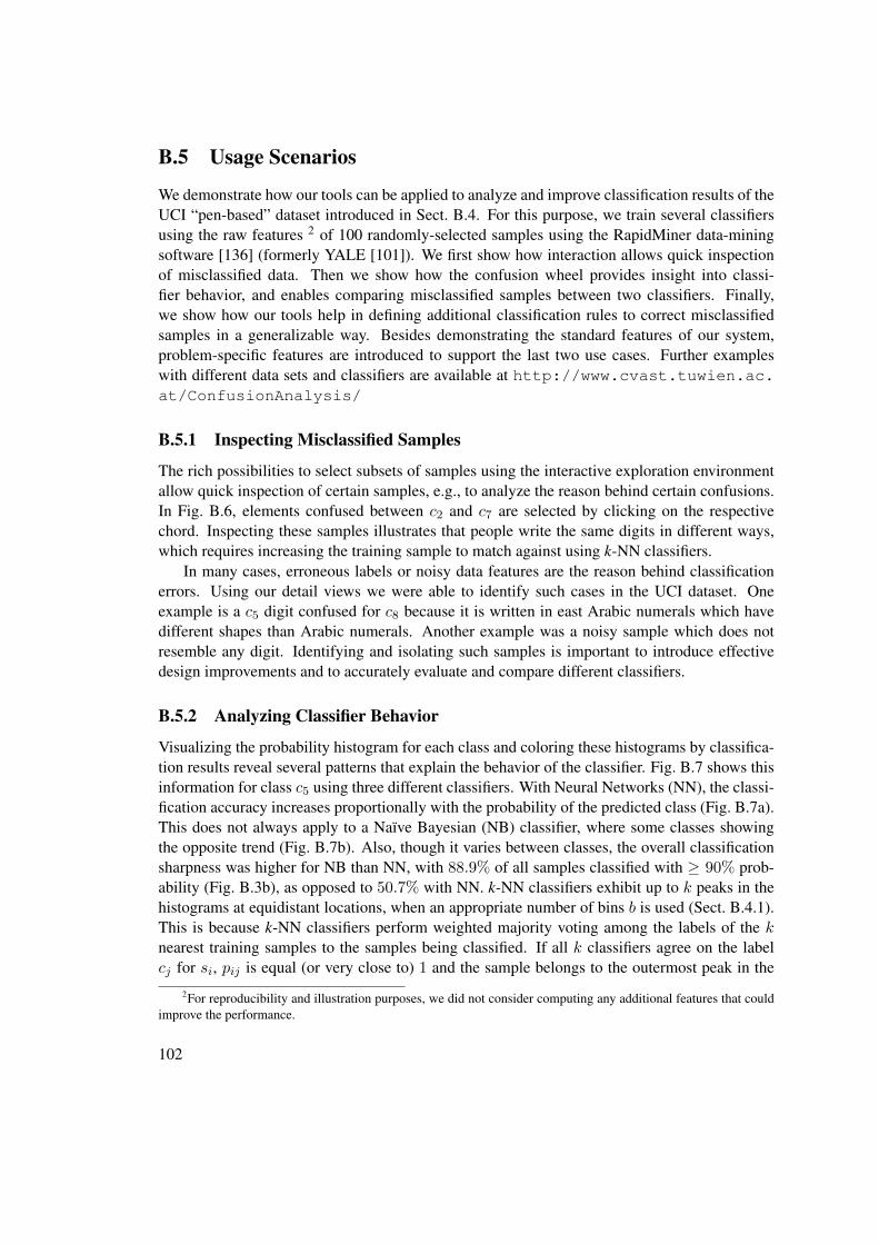
B.5 Usage Scenarios
We demonstrate how our tools can be applied to analyze and improve classification results of theUCI “pen-based” dataset introduced in Sect. B.4. For this purpose, we train several classifiersusing the raw features 2 of 100 randomly-selected samples using the RapidMiner data-miningsoftware [136] (formerly YALE [101]). We first show how interaction allows quick inspectionof misclassified data. Then we show how the confusion wheel provides insight into classi-fier behavior, and enables comparing misclassified samples between two classifiers. Finally,we show how our tools help in defining additional classification rules to correct misclassifiedsamples in a generalizable way. Besides demonstrating the standard features of our system,problem-specific features are introduced to support the last two use cases. Further exampleswith different data sets and classifiers are available at http://www.cvast.tuwien.ac.at/ConfusionAnalysis/
B.5.1 Inspecting Misclassified Samples
The rich possibilities to select subsets of samples using the interactive exploration environmentallow quick inspection of certain samples, e.g., to analyze the reason behind certain confusions.In Fig. B.6, elements confused between c2 and c7 are selected by clicking on the respectivechord. Inspecting these samples illustrates that people write the same digits in different ways,which requires increasing the training sample to match against using k-NN classifiers.
In many cases, erroneous labels or noisy data features are the reason behind classificationerrors. Using our detail views we were able to identify such cases in the UCI dataset. Oneexample is a c5 digit confused for c8 because it is written in east Arabic numerals which havedifferent shapes than Arabic numerals. Another example was a noisy sample which does notresemble any digit. Identifying and isolating such samples is important to introduce effectivedesign improvements and to accurately evaluate and compare different classifiers.
B.5.2 Analyzing Classifier Behavior
Visualizing the probability histogram for each class and coloring these histograms by classifica-tion results reveal several patterns that explain the behavior of the classifier. Fig. B.7 shows thisinformation for class c5 using three different classifiers. With Neural Networks (NN), the classi-fication accuracy increases proportionally with the probability of the predicted class (Fig. B.7a).This does not always apply to a Naïve Bayesian (NB) classifier, where some classes showingthe opposite trend (Fig. B.7b). Also, though it varies between classes, the overall classificationsharpness was higher for NB than NN, with 88.9% of all samples classified with ≥ 90% prob-ability (Fig. B.3b), as opposed to 50.7% with NN. k-NN classifiers exhibit up to k peaks in thehistograms at equidistant locations, when an appropriate number of bins b is used (Sect. B.4.1).This is because k-NN classifiers perform weighted majority voting among the labels of the knearest training samples to the samples being classified. If all k classifiers agree on the labelcj for si, pij is equal (or very close to) 1 and the sample belongs to the outermost peak in the
2For reproducibility and illustration purposes, we did not consider computing any additional features that couldimprove the performance.
102

Figure B.7: Classification results in c5 using (a) neural networks, (b) a naïve Bayesian classifier,and (c) a k-NN classifier with k = 2. TNs in the bottommost bars are filtered out. Individualhistogram scales are used.
histogram. If none of the classifiers agree, the label cj of the closest training sample is predictedbut with low probability, and the sample hence belongs to the innermost peak in the histogramof cj . In Fig. B.7c there are two peaks, as k equals 2. In Fig. 1a and Fig. C.6f, there are up tofive peaks per sector, as k equals 5.
B.5.3 Comparison with Another Classifier
Classifier designers typically analyze the effect of using a different classification algorithm orchanging certain parameters on the results. Besides a holistic measure of classification rate im-provement, they often want to gain insight about the samples whose classification improved bythis change, and the ones that worsened. A typical example is analyzing how the classes varyin their improvements, using two-sided bar charts that depict improved and worsened samplesfor each class in different directions. Another example is analyzing which class confusions in-creased or decreased by the changes, using a suited matrix representation. These representationsdiscard available information on class probability which offers new ways to improve the perfor-mance. To address this limitation, we offer a mode to color the samples in confusion wheel bytheir improvement status as illustrated in Fig. B.8. The data is classified using a k-NN algorithmwith k = 1 and k = 3. The histograms show the class probabilities computed with k = 3.TNs are not shown, as they are irrelevant for comparison on class level. Dark blue indicatesmisclassified samples in the depicted data that would improve when k = 1. Dark red indicatescorrectly classified samples that would worsen when k = 1. It is noticeable that k = 1 performsbetter than k = 3 as there is more dark blue than dark red (overall 6% improvement). We inves-tigated the reason for that by checking samples that improved or worsened. Fig. B.8a illustratesan example of a sample whose nearest neighbor is the correct class, but the 2nd and 3rd nearestare not. In this example k = 1 succeeds while k = 3 fails. Fig. B.8b shows the opposite case:2 out of 3 nearest neighbors have the correct labels, making k = 3 succeeds and k = 1 fails. Inboth cases, the sample is close to the outer boundary in c2 as two of the three nearest neighborsagree on its label.
Fig. B.8c shows an interesting case which resembles Fig. B.8a, with the only difference thatthe 2nd and 3rd neighbors are significantly far from the sample. This makes the classifier less
103

confident about their votes, and hence predicting the answer at lower probability. Except for onesample, all 480 samples that fall in this probability range in this class would either improve orstay the same when k = 1. This suggests adding a rule to re-classify these samples, as we shownext.
B.5.4 Defining Post-Classification Rules
In some cases, an existing classifier cannot be refined internally due to the lack of source code orexpertise. Post-classification rules are one way to improve the performance in such situations byhandling specific cases [157], incorporating domain knowledge [33], and rectifying systematicerrors. Such rules are usually defined over the data features and are usually easy to understandand adapt especially if they are defined by domain experts. In case of probabilistic classification,a rule can specify Boolean conditions q(si) on the class probabilities pij or ranks (Eq. B.4) ofthe samples si, in addition to conditions on their features fk(si). Both types of information areavailable at runtime as they do not involve the actual labels la(s).
We consider three rules for correcting classification errors:
• Correcting false negatives: This rule intends to correct FNs of class cj by replacing theirpredicted classes with cj :
RFNj : q1(si) ∧ . . . ∧ qk(si) ∧ lp(si) 6= cj ⇒ lp(si)← cj (B.5)
Samples that satisfy conditions q1..qk are post-classified as cj .• Correcting false positives: This rule intends to correct FPs of class cj by replacing their
predicted classes with the 2nd guesses:
RFPj : q1(si) ∧ . . . ∧ qk(si) ∧ lp(si) = cj ⇒ lp(si)← cj′ : r(si, cj′) = 2 (B.6)
Figure B.8: Comparing the results of k-NN classifiers with k = 1 (encoded in color) againstk = 3 (defining the histograms).
104
It post-classifies a potential FP that satisfies its premise as the class cj′ ranked 2nd for thissample (Eq. B.4).
• Using another classifier: This rule intends to re-classify certain samples by using anotherclassifier Clz:
RClz : q1(si) ∧ . . . ∧ qk(si)⇒ lp(si)← Clz(si) (B.7)
It post-classifies a sample si that satisfies its premise as the class Clz(si) predicted byClz .
Our visual tools support in defining rules of the above types and in testing their actual im-provement. For this purpose, the data set should be split into two parts: (1) training data that areloaded in the visualizations and used in defining the rules, and (2) validation data that are usedto assess the actual improvement on unseen data. This is important to avoid dataset bias whichoccurs when defining rules that overfit the training data and fail to generalize to unseen data. Ex-cept for Fig. B.3, the visualizations depicted in this paper use 80% of the UCI data introduced inSect. B.4. In the following we illustrate how potential improvements can be visually identified,and how the respective rules can be defined and validated on the remaining 20% of the data.
To improve misclassified samples in a class cj , the respective rule should define conditionson the samples that include as much of these samples as possible and in the same time excludecorrectly-classified samples. This is important as applying the rule on the latter samples wouldworsen their classification. The wheel view gives an overview on how misclassified samplescj are distributed according to their probabilities. This makes it easy to spot probability rangesin cj having a significant number of these samples that are likely to improve by one of therules. Typically, these samples interfere with correctly classified samples. In particular, theinterference of TPs (green) with FPs (yellow) requires separation using further conditions onthe data features, before applying RFPj . This interference is usually larger in the outermostbin(s) that are dominated by TPs, which suggests excluding these bins when defining this rule.Similarly, the interference of FNs (red) with TNs (grey) requires separation in order to applyRFNj . Also the innermost bin(s) need to be excluded when defining this rule, as their probabilityrange is highly dominated by TNs.
To separate the interference in a potentially improvable probability range Qcj in cj , the userselects the samples in this range using brushing. The feature analysis view lists possible featuresthat offer good separation, as explained in Sect. B.4.2. After inspecting the feature histograms,the user can select a feature fk to define an improvement rule by double clicking on its histogram.This opens a dialog box which shows the histogram in higher resolution and allows selecting aspecific value range Qfk for fk (Fig. B.9). The user selects a range that contains the majorityof samples that need improvements (FPs or FNs) and excludes as much of the other samples aspossible. The dialog also allows specifying which rule to apply to samples that fall both in Qcj
andQfk . The selected rule is externalized in text and applied to such samples both in the trainingdataset loaded in the visualization, and in the test dataset. The results in both cases are reportedas the absolute number of samples that improved and worsened, and the total improvement onthe classification rate. Changing the feature rangeQfk automatically updates the results, to assistthe user in choosing a robust range that performs well both in training and test datasets.
105
As example, in Fig. C.1a, the analyst notices a large number of FNs in c7. She selects therespective probability range in c7 (Fig. C.6f) and finds that feature y8 offers good separation ofthese FNs from the TNs in the value range [20%, 60%] (Fig. C.6i). Therefore, she creates thefollowing rule:
(0.1 ≤ pi7 ≤ 0.3) ∧ (20 ≤ x8(i) ≤ 60)⇒ lp(si)← c7 (B.8)
This rule improves 591 and worsens 13 samples in the loaded data, yielding a significant totalimprovement rate of 6.57%. Similar results apply to the testing data (141 improved, 3 wors-ened, 6.28% total rate) making the analyst accept this rule. She continues further to investigatethe large number of FPs in c1 by selecting the probability range [30%, 80%] and restricting theselection to samples with lp(s) = c1. She checks the features for separation but notice inter-ference between FPs and TPs, even with the features with most separation power (Fig. B.9a).She selects the small range with as few TPs as possible, and applies rule RFP1 which achieves1.11% overall with 136 improved and 36 worsened samples in the training dataset. She rejectsthis rule and searches for more robust rules to improve these samples.
The scatterplot view allows identifying if two features can in combination achieve a goodseparation of interfering sample groups. As example, Fig. 1d illustrates how two features sepa-rate about 76% of FNs in c8 that lie in probability range [10%, 30%] from the TNs, with only 13TNs unseparated. Reclassifying these samples with RFNj yields 3.5% and 3.4% improvementson the training and test datasets. Dedicated algorithms are needed to rank the pairs of features bytheir separation power, and to recommend optimal region separations in a specific scatter plot.For the purpose of this use case, a manual search for such features is sufficient to illustrate theimportance of visual inspection to assess their separation power.
Besides searching for separating features, it is possible to improve certain misclassificationsusing the results of another classifiers. As example, it is evident in Fig. C.1a that the results forc2 involve a large number of mixed misclassifications (FNs and FPs) especially in the proba-bility range [30%, 70%]. We provide a separate view to check how other classifiers perform onthese samples by selecting them (Fig. B.9b). This reveals that neural-networks-based classifier(NN) yields 7.31% improvement rate if applied to these samples, which suggests creating thefollowing post-classifying rule (Eq. B.7):
0.3 ≤ pi2 ≤ 0.7⇒ lp(si)← lpNN (si) (B.9)
Such combinations of results from multiple classifiers has been extensively researched in pattern-recognition and machine-learning literature [89,149,172]. Many of these techniques apply com-bination heuristic such as weighted majority voting in a holistic way to all samples. We illus-trated that declaratively restricting such heuristics to certain samples yields better improvements,as this avoid impacting correct classifications among the remaining samples. Using visual in-spection, we were able to outperform automated techniques for combining multiple classifierssuch as majority voting (Fig. B.9b).
Post-classification rules should be defined carefully to avoid over-fitting the data. First, thetesting dataset should be representative and of sufficient size to warrant generalization. Second,the conditions used in these rules should be based on probability and feature ranges that havea sufficient number of samples to avoid creating rules specific to the training dataset. In fact,
106

Figure B.9: Defining post-classification rules: (a) checking separability between FPs (yellow)and TPs (green) according to a feature, (b) checking the performance of other classifiers onselected samples.
the distributions depicted in the probability histograms tend to be invariant among random sub-sets of sufficient sizes, if extreme values are discarded and avoided. Finally, defining severalrules increases the overlap between their premises, the conflict in their actions, and the risk ofover-fitting in general. It is important to select a small number of rules that exhibit robust im-provement results, high precision, and few overlaps with each other. In general, classificationerrors should ideally be solved by improving the classification algorithm when possible, withhelp of the insights gained by the interactive visualizations.
107

B.6 Discussion
In this section we discuss the advantages and limitations of our tools and compare them withother techniques for visualizing probabilistic classifiers. We also report feedback and observa-tions from classification experts and practitioners.
Scalability: The use of aggregated representations makes our tools highly scalable with thenumber of samples. For example, the histograms in the confusion wheel were able to handledatasets containing tens of thousands of samples. Furthermore, the filtering possibilities pre-sented in Sect. C.2.3 enable focusing on fine details contained in small subsets of these samples.Likewise, the boxplots and histograms in the feature analysis view scale well with the numberof samples. Stacking the boxplots allow depicting summary information about 15-20 features atonce. This is sufficient for our purposes, thanks to feature ranking which interactively places themost relevant features for the current analysis context at the top.
To ensure enough visibility of the information in each class, up to 20 classes can depictedat once as sectors in the wheel view. This limit is feasible for a wide range of classificationproblems that do not require a larger number of classes. In case of larger number of classes, asubset of them can be selected manually or automatically to be shown at once, such as the subsetwith the highest confusions between its classes.
Handling imbalanced data: Sometimes, classification data exhibit skewed distributions ofthe samples to the classes. This causes classes having large number of positives to occupy themajority of display area, possibly obscuring fine details in smaller classes. To handle such casesis to possible to make the sectors of equal sizes, and stretch the histogram to fit in these sectorsusing individual scaling factors. Arcs representing the same amount of samples can be drawnoutside the sectors using different scales to indicate these scaling factors. Although this hinderscomparing the histograms in absolute values, the shapes of the distributions and the proportionsof misclassified samples are still comparable across the classes. Such relative comparisons areusually more relevant in analyzing the results than comparing absolute values between classesof significantly different sizes. Similarly, the class confusions can be normalized by the totalnumber of samples in the respective classes. These relative confusions can be indicated in coloror by adjusting the chord thicknesses to show relative instead of absolute confusions.
Some classifiers compute relatively low probabilities for the winning class, such as onesbased on fuzzy logic. This limits non-empty histogram bars to the inner bins only, which lowersthe visual resolution. It is possible in such cases to redefine the bins to cover the effectiveprobability range at higher resolution and make the histogram span the whole sector area.
Comparison with previous work: Our tools combine different pieces of information thathave been addressed individually in previous work, as presented in Sect. B.2. Compared with ex-isting techniques that visualize class probabilities such as Class Radial Visualization (Fig. A.2),the added-value in using the wheel metaphor lies in (1) aggregating the samples to analyzetheir probability distributions and to avoid clutter and ambiguity issues caused by individualpoints [134], (2) using color to show classification results of the samples next to each other and
108

to reveal their separability, and (3) visualizing class confusions in a compact layout, thanks to theradial arrangement. This provides a rich overview of classification results that was not possiblein previous techniques and enables new insight and tasks as we illustrate in the usage scenar-ios. Confusion matrices are better suited than the chords to gain more precise information aboutclass confusions. Nevertheless, the chords reveal groups of classes having higher mutual con-fusions, emphasize the asymmetries in these confusions, and enable relating them to respectiveclass probabilities.
The area-based nature of the histograms offers several possibilities for selecting and high-lighting certain subsets of samples in confusion wheel. This is essential in a coordinated-multiple-view environment in order to formulate queries on the samples and to gain detailedinsight into them in the feature analysis view. This environment enables a novel integrationbetween probability-based and feature-based representations of classification data.
The visual analysis methods we propose are based on familiar visual representations such asboxplots and stacked histograms, as well as on the wheel metaphor [4]. This metaphor is origi-nally designed to visualize associations between entities and categories, and similarities betweencategories. By treating samples as entities and classes as categories, we were able to adapt thismetaphor for classification data: Instead of associations and similarities, we compute probabil-ities and two-way confusions. Also, we introduced several changes to the visual encoding anddifferent interactions to address the characteristics of classification problems.
Expert feedback: We analyzed classification data comprising about 40, 000 labeled samplesprovided by our industry partners. The data were classified in 10 classes using a fuzzy rule-based system designed by domain experts. We refined our design iteratively based on feedbackfrom these experts, and on what information they wanted to analyze. After we explained thevisualizations we created for their data, they were able to identify issues with their classificationrules. For example, one class had a large number of FNs that were highly concentrated inthe middle of the respective sector. Analyzing the reason for that revealed that the respectiveclassification rule was assigned relatively low weight by the domain experts. Also, examiningthe features for selected FPs in a class revealed a rule that uses an inappropriate feature thatwas mistaken for the correct one: The values of this feature among these FPs should not appearamong actual samples of the class, according to domain experts. These experts were able torefine their system accordingly. We did not have the possibility to quantify the improvement.
The informal feedback from our industry partners and from five other machine-learning ex-perts confirms that our tools offers both a good overview of classification results and detailedinformation on demand. However, our visual metaphors need to be learned with enough exam-ples and explanations before they can be interpreted correctly: One domain expert, asked forclarification on what the histograms in the wheel view mean, about 30 minutes after we startedpresenting our findings. To avoid such misunderstanding, the metaphor should be introducedpart by part with sufficient examples, before discussing insights. In fact, our system is featureladen, and needs extensive learning of how these features work together. One machine-learningexpert requested showing separate arcs to encode class confusions in both directions. Also, twomachine-learning experts did not encourage using post-classification rules in general, as theycould encourage over-fitting the data. They suggested using the insight gained in improving the
109

classifier design instead.
B.7 Conclusion
The availability of class probabilities enables new possibilities to analyze the performance ofprobabilistic classifiers, beyond comparisons between predicted and actual classes. Commonvisual representations such as confusion matrices and ROC curves ignore class probabilities byassigning visual primacy to classification error in terms of false positives, false negatives, or classconfusion. Assigning visual primacy to class probabilities or to the data features enables analyz-ing their influence on classification performance and performing further analysis tasks related tothe data. We proposed a representation of probabilistic classification data by showing the prob-ability distributions as stacked histograms in a radial layout and by coloring these histogramsby the classification results of the samples. We showed how this representation lends itself torich interactions to select samples based on their probabilities, and to perform further analysis ofthese samples based on their data features. We proposed intertwined automated and visual meth-ods to analyze these features in a dedicated view and to rank them according to their separationpower between true and false classifications among the selected samples. We presented severalanalysis scenarios that are possible using our visual tools. These include visual inspection andcomparison of classification results, identifying performance problems, and interactive defini-tion of post-classification rules to improve misclassified samples a posteriori. We demonstratedby that how exploratory analysis can reveal relevant patterns and correlations in classificationdata that are difficult to specify and identify automatically, and are usually compromised inholistic analysis methods. These insights are essential to introduce effective improvement to theclassifier design that reduce the classification error in a generalizable way. Our future work aimsto provide visual means to compare and combine the results of several classifiers, to supportanalyzing a large number of classes, and to explore hierarchical and multi-label classificationresults by means of similar interactive visualization methods.
Acknowledgement: We thank Peter Filzmoser from TU Vienna for feedback on separation measures, Colin Johnson from the
University of Kent for feedback on confusion wheel, and Bilal Esmael and Arghad Aranout from the TDE Data Engineering for
cooperation and discussions. This work was supported by the Austrian Federal Ministry of Economy, Family and Youth via CVAST,
a Laura Bassi Centre of Excellence (project no. 822746).
110
CHAPTER CReinventing the Contingency Wheel:
Scalable visual analytics of largecategorical data
Appears in IEEE Transactions on Visualization and Computer Graphics, 18(12):2849-2858,2012.
Abstract: Contingency tables summarize the relations between categorical variables andarise in both scientific and business domains. Asymmetrically large two-way contingency tablespose a problem for common visualization methods. The Contingency Wheel has been recentlyproposed as an interactive visual method to explore and analyze such tables. However, thescalability and readability of this method are limited when dealing with large and dense tables.In this paper we present Contingency Wheel++, new visual analytics methods that overcomethese major shortcomings: (1) regarding automated methods, a measure of association based onPearson’s residuals alleviates the bias of the raw residuals originally used, (2) regarding visu-alization methods, a frequency-based abstraction of the visual elements eliminates overlappingand makes analyzing both positive and negative associations possible, and (3) regarding theinteractive exploration environment, a multi-level overview+detail interface enables exploringindividual data items that are aggregated in the visualization or in the table using coordinatedviews. We illustrate the applicability of these new methods with a use case and show how theyenable discovering and analyzing nontrivial patterns and associations in large categorical data.
keywords: Large categorical data, contingency table analysis, information interfaces andrepresentation, visual analytics.
111

Figure C.1: Contingency Wheel++ uses complementing visual representations and a multi-leveloverview+detail user interface to enable rich exploratory analysis of large categorical data. Theexample above shows information about 1 million user ratings on 3706 movies.
C.1 Introduction
Many problems in scientific domains such as medicine, biology and pharmacology, as well as inbusiness domains such as retail and logistics require analyzing associations between categoricalvariables. For example, a movie retailer might be interested in associations between movies andusers based on sales data with the goal of optimizing marketing strategies. The discrete natureof categorical data and their lack of an inherent similarity measure pose significant challengesto the fields of information visualization [13] and data mining [171]. Contingency tables (alsoknown as crosstabs) are a common way to summarize categorical data as a first step of analysis.A two-way contingency table is an n×m matrix that records the frequency of observations fijfor each combination of categories of two categorical variables. Many data analysis frameworkssuch as KNIME [16], WEKA [54] and R [116] offer possibilities to create and analyze contin-gency tables. One of the best-known statistical tests for the overall association (or independence)between two categorical variables is Pearson’s χ2 test [119]. It assesses the significance of asso-ciations between the categories of the two variables. However, it does not provide informationabout how single pairs of categories are associated.
Several visualization methods were developed to analyze associated categories in contin-gency tables. As we discuss in Sect. C.4, these methods are designed to handle rather smalltables having few categories. However, often much larger contingency tables need to be ana-lyzed, which poses a problem to these methods. Figure C.2a shows large categorical data fromthe MovieLens data set [53]. It contains about one million user ratings on movies. For each user,it provides his or her occupation, sex, and age group, and for each movie, its release date andgenres. Examples for tables extracted from this data set are:
• A 3706× 21 table which counts for each movie, how many times it was rated from users
112

Figure C.2: (a) Categorical variables of the MovieLens data set [53] showing about one millionuser ratings on 3706 movies, (b) the contingency table of the variables “movie title” and “useroccupation”, (c) the Contingency Wheel of the table in (b): Sectors represent occupations anddots represent movies positively associated with them. Thicker arcs show which occupationsshare more movies highly associated with both of them.
of each occupation (figure C.2b).• A 6040× 17 table which counts for each user, how many times he/she rated movies from
each genre (figure C.6d).
The Contingency Wheel [6] has been introduced as an interactive visual method for explor-ing positive associations in asymmetrically large tables. The column categories are visualized assectors of a ring chart and the table cells are depicted as dots in these sectors (figure C.2c). Thedot for cell (i, j) is placed in sector i at a radial distance from the ring’s inner circle proportionalto the strength of association rij between row i and column j. A layout algorithm calculates theangular positions of the dots in each sector to reduce occlusion. It copes with a large numberof rows by visualizing only the cells that represent significant associations rij , determined byadjustable thresholds. An arc is drawn between two sectors if one or more rows have dots inboth sectors. This arc is thicker if more such rows exist and if their dots represent higher asso-ciations with both sectors. User interaction enables analyzing different types of associations inlarge tables.
Scalability is one of the major challenges visual analytics aims to address [152]. The wheelmetaphor explained above has several shortcomings which degrade its readability and scalabil-ity, especially with large and dense tables (Sect. 3.7.3). In this paper we propose ContingencyWheel++: new visual analytics methods that tackle the issues of the original wheel. Our methods(described in Sect. C.2) address its computational component, visual representation and interac-tive interface, and intertwine these three components to enable scalable analysis of categoricaldata. The new methods encompass:
113

• Automated methods: a new association measure results in a better distribution of the dotsto sectors of different sizes. This is important when analyzing large tables that oftenexhibit high skewness in the distribution of their frequencies.• Visualization methods: a frequency-based abstraction of the dots eliminates overlapping
which allows showing all the cells, instead of just small subsets thereof. This enablesanalyzing and querying both positive and negative associations.• Interactive exploration environment: an overview+detail interface allows exploring indi-
vidual items aggregated in the visualization or in the table, and analyzing their attributes.
In Sect. C.3 we present a use case to illustrate how our new methods can be used to explorethe MovieLens data set. We show how nontrivial patterns and associations in the data can bediscovered. In Sect. C.4 we compare our approach with other methods for visualizing categoricaldata and elaborate on its scalability.
Figure C.3: (a) raw residuals and (b) adjusted residuals plotted as a function of fij for differentvalues of f+j with both nonuniform- (left) and uniform scaling (right), (c) the same data plottedin figure C.2c using uniformly-scaled adjusted residuals instead of raw residuals (with Tr = 30%and Ts = 1).
Contingency Wheel++ 1 improves both on the readability and on the scalability issues men-tioned above by employing visual analytics methods as presented in the next section.
C.2 Contingency Wheel++
In the following, fij denotes the frequency in cell (i, j), fi+ =∑m
j=1 fij and f+j =∑n
i=1 fijare the marginal row- and column frequencies, and f++ is the sum of all table frequencies
1A prototype implementation of Contingency Wheel++ is available at http://www.cvast.tuwien.ac.at/wheel
114

(figure C.2b). We first address the data mapping employed by Contingency Wheel++ (Sect.C.2.1). Then we propose a frequency-based visual representation which abstracts the dots (Sect.C.2.2). In Sect. C.2.3 we show how an interactive visual interface integrates additional tableviews to bridge the gap between the data representation and the visual representations and tosupport a flexible visual exploration process.
C.2.1 Mapping Frequencies to Associations
The main goal of Contingency Wheel++ is to reveal how the row categories of a contingencytable are associated with its column categories. For this purpose, it uses a statistical measure rijthat computes the association between row i and column j based on fij and takes value in therange [−1, 1]. This measure is usually based on statistical residuals between the actual frequencyfij and expected frequencies eij . The frequency in cell (i, j) predicted under the null hypothesisH0, i.e., assuming no association, is [143]:
eij =fi+ · f+j
f++(C.1)
If fij = eij holds for cell (i, j), its share fij/fi+ of the marginal row frequency is equal tothe column’s share f+j/f++ of all table frequencies. This means that row i is neither positivelynor negatively associated with column j, and corresponds to a zero association value rij = 0.Cells with fij > eij indicate a positive association between row i and column j. Statisticalresiduals rij can be used to quantify this association. They can be designed to incorporatea priori information about the data and their distribution. In the following we describe theoriginally-used residuals and our improvements on them.
Raw residuals
The association measure used originally by the Contingency Wheel is based on raw residuals(fij − eij) [6]. To generate association values rij ≤ 1, the raw residual for cell (i, j) is dividedby the maximum value it can take (fi+ − eij):
rsc_rawij=fij − eijfi+ − eij
(C.2)
This measure maps frequencies linearly to association values (figure C.3a-left). The maxi-mum association rij = 1 is reached when all cells of row i have zero frequencies except for cell(i, j). For such a row, only one dot is created on the outer boundary of sector j. A cell withrij = 0 creates a dot on the inner boundary of sector j (assuming no thresholds). Cells withnegative associations are ignored. The above-mentioned normalization is not uniform with re-spect to the columns: For row i, different scaling factors are used in different columns, becausethe expected frequency eij is larger for columns with larger f+j . This makes better use of thesector area for revealing the distribution of dots along the radial dimension. Also, rows i thatare fully associated with column j (fij = fi+) can be easily found as dots at the outer boundary.However, the different scaling factors result in a bias especially when f+j varies largely between
115
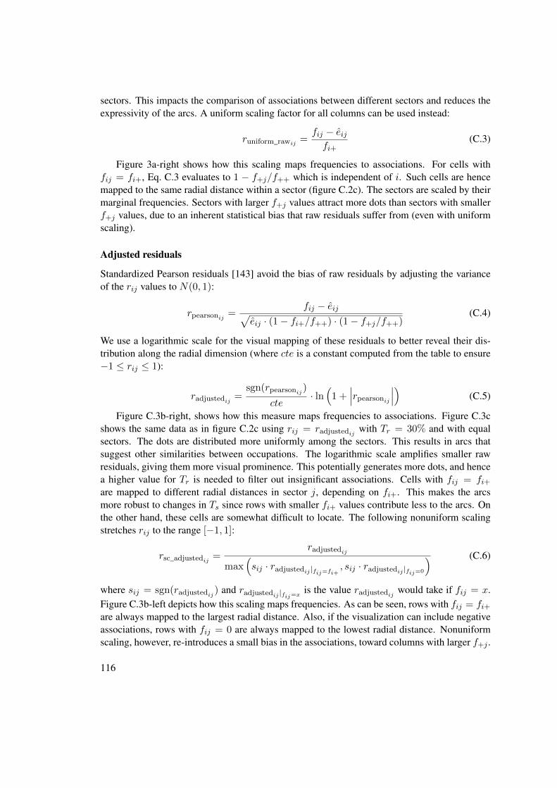
sectors. This impacts the comparison of associations between different sectors and reduces theexpressivity of the arcs. A uniform scaling factor for all columns can be used instead:
runiform_rawij=fij − eijfi+
(C.3)
Figure 3a-right shows how this scaling maps frequencies to associations. For cells withfij = fi+, Eq. C.3 evaluates to 1 − f+j/f++ which is independent of i. Such cells are hencemapped to the same radial distance within a sector (figure C.2c). The sectors are scaled by theirmarginal frequencies. Sectors with larger f+j values attract more dots than sectors with smallerf+j values, due to an inherent statistical bias that raw residuals suffer from (even with uniformscaling).
Adjusted residuals
Standardized Pearson residuals [143] avoid the bias of raw residuals by adjusting the varianceof the rij values to N(0, 1):
rpearsonij =fij − eij√
eij · (1− fi+/f++) · (1− f+j/f++)(C.4)
We use a logarithmic scale for the visual mapping of these residuals to better reveal their dis-tribution along the radial dimension (where cte is a constant computed from the table to ensure−1 ≤ rij ≤ 1):
radjustedij =sgn(rpearsonij )
cte· ln(
1 +∣∣∣rpearsonij ∣∣∣) (C.5)
Figure C.3b-right, shows how this measure maps frequencies to associations. Figure C.3cshows the same data as in figure C.2c using rij = radjustedij with Tr = 30% and with equalsectors. The dots are distributed more uniformly among the sectors. This results in arcs thatsuggest other similarities between occupations. The logarithmic scale amplifies smaller rawresiduals, giving them more visual prominence. This potentially generates more dots, and hencea higher value for Tr is needed to filter out insignificant associations. Cells with fij = fi+are mapped to different radial distances in sector j, depending on fi+. This makes the arcsmore robust to changes in Ts since rows with smaller fi+ values contribute less to the arcs. Onthe other hand, these cells are somewhat difficult to locate. The following nonuniform scalingstretches rij to the range [−1, 1]:
rsc_adjustedij =radjustedij
max(sij · radjustedij |fij=fi+
, sij · radjustedij |fij=0
) (C.6)
where sij = sgn(radjustedij ) and radjustedij |fij=xis the value radjustedij would take if fij = x.
Figure C.3b-left depicts how this scaling maps frequencies. As can be seen, rows with fij = fi+are always mapped to the largest radial distance. Also, if the visualization can include negativeassociations, rows with fij = 0 are always mapped to the lowest radial distance. Nonuniformscaling, however, re-introduces a small bias in the associations, toward columns with larger f+j .
116

C.2.2 Visualizing the Contingency Table
The visualization aims to reveal how the row categories of a contingency table are associatedwith its column categories, based on the association measure used. Our new visual represen-tation makes use of the advantages of uniformly adjusted residuals (Sect. C.2.1). It provides aclearer and more intuitive visualization of the table, as compared to the original wheel design [6].Moreover, depending on the user’s choice, it enables showing all associations or positive asso-ciations only as we describe in the following subsections.
Visualizing columns
Like in the original wheel metaphor, columns are drawn as sectors of a ring chart. The maindifference is that they are drawn with equal size. This has several advantages: First, this is in ac-cordance with the fact that adjusted residuals result in a more uniform distribution of the cells tothe sectors. Second, by using a frequency-based representation (Sect. C.2.2), the distribution ofthe associations can be compared between different sectors. Third, the arcs become evenly dis-tributed in the central area, unlike the arcs in figure C.2c which overlap more near small sectors.Finally, column categories are treated equally from a visual point of view, in the same way as thedimensions of a star plot [56]. This simplifies the visualization and eliminates confusion aboutthe meaning of different sector sizes. The information of different column marginal frequenciesf+j is conveyed in a linked bar chart (Sect. C.2.3). Incorporating it in the wheel representationwould not contribute to the goal of Contingency Wheel++, i.e., to explore associations.
Visualizing row-column associations
The radial dimension of the ring chart linearly encodes the association values rij computedby one of the association measures. The outer boundary corresponds to rij = 1. The innerboundary corresponds to rij = −1 if showing all associations, and to rij = 0 if showing positiveassociations only. Instead of the dot representation originally used, we suggest a frequency-based representation to visualize the row-column associations. A histogram Hj is created ineach sector j to show the distribution of the associations rij along the radial dimension. Anadjustable number b of equal bins is used for all histograms, initially determined by Scott’snormal reference rule [131]. Each bin k in sector j aggregates the rows i having associations inthe interval Ik = [lk, lk+1[. The interval boundaries lk are equally spaced between [−1, 1]:
lk =2(k − 1)− b
b(C.7)
A closed interval Ib = [lb, 1] is used for the last bin to account for rij = 1. Hence, thenumber of items hkj in the kth bin of sector j is:
hkj = |{1 ≤ i ≤ n : fi+ ≥ Ts ∧ rij ∈ Ik}| (C.8)
Each bin k of histogram Hj is visualized as a track in sector j. This track occupies the radialposition which corresponds to its interval Ik. The length of this track is proportional to hkj .A uniform or sector-specific scaling factor ensures that all tracks fit in their sectors. Tracks
117

Figure C.4: Dot vs. histogram representation of row-column associations. The dimensions of ahistogram bin are annotated (Eq. C.8).
are centered in their sectors, following the Gestalt principle of symmetry [165]. This avoidsartificial asymmetry along the angular dimension in the sectors and makes it easier to comparetheir histograms. Figure C.4 shows both dot and histogram representations for some sectors offigure C.3c. The histograms show how 3706 movies are associated with 2 occupations. Bothpositive and negative associations are included.
Rows whose associations with sector j lie in a specific interval can be inspected individuallyalong with the attributes of their entities, as explained in Sect. C.2.3. The distribution of a nu-merical or categorical attribute of these entities can be shown by coloring the histograms insteadof coloring individual dots. This provides a clearer understanding of the attribute distribution atdifferent radial distances. Figure C.5a shows the release-date distribution of movies positivelyassociated with specific occupation categories. Figure C.5b shows the genres of the movies.Movies highly associated with the “Retired” category tend to be old. The opposite holds forthe “K-12 student” category which also tends to be highly associated with “Children” movies.Movies highly associated with “Technician/Engineer” are more likely to have “Sci-Fi / Fantasy”genres. These tendencies seem stronger as compared to the distribution of both attributes amongall movies (figure C.5c).
The frequency-based representation has several advantages over the dot representation: First,the angular dimension now has a clear meaning (frequency of associations at different radialdistances in the sectors). Second, the artifacts and overlaps caused by showing separate dotsare eliminated. Third, histograms are familiar visualizations that are easy to interpret. Theybetter emphasize that the visualization is showing a distribution of the row associations in eachsector, and not individual entities. This avoids the confusion due to multiple dots representingthe same row. Finally, the redundancy of double-coding the association using both dot size anddot location is also eliminated.
Bended histograms embedded in a ring chart suffer from visual illusions in perceiving dif-ferent arc lengths at different radial distances. This effect can be accounted for computationallyand is minimized when arcs are short that are perceptually flattened [123] (figure C.6).
118

Visualizing column similarities
We compute similarities between the columns of the contingency table based on their row asso-ciations. A similarity value rcj1j2 is computed for every pair of columns (j1, j2), to assess howsimilar the two distributions rij1 and rij2 are. Only active rows in both sectors are included inthe computation. Active rows in sector j have sufficient support fi+ and associations rij higherthan Tr, and are defined as follows:
Aj = {1 ≤ i ≤ n : rij ≥ Tr ∧ fi+ ≥ Ts} (C.9)
Active rows in each sector are depicted in dark gray in the respective histogram (figure C.6b).The column similarities are computed as follows:
rcj1j2 =1
|Aj1 |+ |Aj2 |·
∑i∈Aj1
∩Aj2
rij1 · rij2 (C.10)
Between each pair of sectors (j1, j2), an arc is drawn whose thickness and opacity are deter-mined by rcj1j2 . A thick arc means that the active rows in both sectors tend to have similarassociations with the two columns j1 and j2. Changing the Tr value results in smaller or largeractive parts, and hence influences the thicknesses. By checking the arcs with different Tr values,the user can examine in which ranges and to which extent the column similarities hold.
Figure C.5: Distributions of (a) a numerical attribute (release date) or, (b) a categorical attribute(genre) of the movies in the histograms. (c) The global distributions of release date and genreamong all movies.
119

Figure C.6: Five levels of abstraction to explore the user-genre table and the underlying infor-mation: (a) a bar chart of the column categories (genres), (b) the wheel view showing sectorsfor the items selected in (a), (c) detail view for items selected in (b) (currently empty), (d) thecontingency table with cells in active parts in (a) colored in dark gray, (e) the categorical datasummarized in the cell highlighted in red in (d).
Arcs showing column similarities based on row associations is a unique feature of the Con-tingency Wheel and one of the main reasons of adopting a circular layout for the visualization.This layout provides a compact representation to show and compare column similarities. Fur-thermore, arcs are useful in creating a user-controlled hierarchical grouping of the column cat-egories based on their similarities: A right-click on an arc merges the two affected sectors intoone sector. The resulting wheel is built from the contingency table that results by merging thecorresponding columns into one column, by summing up the frequencies cell-by-cell. The newsector is inserted at its appropriate position according to the sector ordering scheme currentlyin use (alphabetical, by size, or user-defined sector ordering). Successively merging pairs ofsectors connected by thick arcs enables abstracting the visualization by reducing the number ofvisual items. Moreover, it enables analyzing similarities between groups of similar columns andnot only between pairs of columns, as the use case shows (Sect. C.3).
Visual aids
We provide several visual aids to facilitate understanding. Three association levels evenly spacedbetween the inner and the outer sector boundaries are shown to allow an easier interpretation of
120

the radial distances. An additional circle in pink shows the current value of the associationthreshold Tr, which can be adjusted using the slider embedded in the ring chart. Inactive partsof the histograms (Eq. C.9) are visually de-emphasized. A color gradient is shown in the back-ground of the Tr slider to reflect the association levels. It uses either a diverging or a sequentialcolor scale [57], depending on whether negative associations are included or not. Arcs outsidethe ring chart indicate sector groups (figure C.1). Finally, a legend shows the scale used in thehistograms by depicting an arc of average length.
C.2.3 Interactive Exploration Environment
The original Contingency Wheel may result in a cluttered visualization especially for large databecause it creates dots for individual row entities. These dots need to be selected individually toobtain details about the corresponding entities [6]. To improve on these shortcomings, our newmethods follow Shneiderman’s visual information-seeking mantra [137]: The visualization firstshows an overview of the data using histograms. The user can filter the data interactively andselect entities she is interested in exploring. Then, details about these entities can be obtainedin linked views. Contingency Wheel++ offers an overview visualization of an asymmetrically-sized contingency table. Likewise, the contingency table offers a summarization of a larger dataset by cross-tabulating two categorical dimensions. We designed the user interface to enableexploring the data at these multiple levels of abstraction as explained in the following.
Multiple Views
Whenever we explain Contingency Wheel++ to new users, our first step is to show the underly-ing contingency table. This allows explaining the basic concepts like row- and column marginalfrequencies, actual- and expected frequencies (Eq. C.1), and row-column associations (Eq. C.2-C.5). We are thus showing both the wheel visualization and the underlying table side-by-sidein one interface. This combination bridges the gap between the visual representations and thedata representation (i.e., association values) computed by the automatic methods. The main userinterface (UI) of our prototype is divided into five coordinated views:
A bar chart shows the column categories and their marginal frequencies f+j (figure C.6a).Columns selected in this view define the sectors of the wheel view. The user can thus focuson selected columns. Also, if the number of columns exceeds the limits for the wheel, smallersubsets of columns can still be visualized.
The wheel view is the central part of the interface (figure C.6b). It provides an overviewof the data and existing associations within. Several interactions are possible to find interestingpatterns in the data and select specific row entities for further analysis. The association thresholdTr can be adjusted interactively via the slider embedded in the ring chart. Also, this view enablessetting several parameters by means of its toolbar and context menu.
A list view shows details about the row entities selected in the wheel view (figure C.6c andfigure C.7d). Beside the attributes of these entities (available from the data set), their marginalrow frequencies fi+ and associations rij with a specific column j are listed. The entities can besorted according to one of the columns, and histograms or bar charts can be created for a specificcolumn in the list.
121

A tabular view shows the contingency table and the marginal frequencies (figure C.6d).By hovering the mouse pointer over a cell (i, j), a tooltip shows the expected frequency eijand the association value rij according to the measure used. If cell coloring is enabled via acheckbox, the cell is shown in dark gray if it corresponds to an active part in the visualization(i.e., i ∈ Aj). Also, the support threshold Ts can be adjusted via a slider to filter out entire rowsi with fi+ < Ts.
A second list view shows details about selected items from the tabular view (figure C.6e). Bydouble-clicking on a cell, a row, or a column in the tabular view, cross-tabulated data items areshown in this list view along with their attributes. The items can be sorted and the distributionsof the values in a specific column can be explored using a histogram or a bar chart.
These views make it easier to explain to new users how the data are visualized in Con-tingency Wheel++. Even more importantly, they constitute a multi-level overview+detail ex-ploration interface. This allows experienced users to perform elaborate analysis workflows byhaving quick access to all information available in the data. Hence, associations can be detectedand investigated further in relation to other attributes. The incorporation of analytical methodsin the visual interface enables a visual analytics process following Keim’s mantra [79]: Ana-lyze first – show the important – zoom, filter and analyze further – details on demand. Aftercomputing the row-column associations (Sect. C.2.1) and the columns similarities (Sect. C.2.2),the visualization shows the important results, i.e., strong associations or high similarities. Usingdifferent interactions, the user can change the thresholds Tr and Ts, merge columns, or set adifferent association measure. This causes the analytical methods to recompute the associationsand similarities which are then visualized interactively. Details on selected items in the wheel orin the tabular view can be obtained on demand.
Linking and Brushing
Contingency Wheel++ offers multiple ways to brush the visualized row categories. One wayis by clicking on a bar in the histograms, which selects the rows it aggregates (Sect. C.2.2).Another way is using the sector marquee tool to define a radial interval I in a sector j using themouse (figure C.1). This selects the rows i with rij ∈ I . Clicking on sector j selects the rowsAj that are currently active (Sect. C.2.2). Also, clicking on an arc selects rows active in bothsectors it connects (the items that define this arc). Rows i with rij ≤ Tr for all columns j canbe selected using a menu command. When Tr is positive but small, this command selects rowsthat do not exhibit a high association with any column. Finally, rows can be selected using anexternal query, like the instant search box at the top of the view. This box selects row categoriescontaining a specific text.
The top-right list view (figure C.7d) shows the selected rows defined either by filtering,brushing, selection, or the search box query. When an item in this list is clicked, the tabular viewscrolls to and highlights the corresponding row iwhich shows the frequencies fij (figure C.12e).Also, a star graph [56] of the associations rij can be shown in the wheel view, labeled withthese frequencies. Selected row categories are highlighted in the histograms of all sectors. Theoriginal histograms become desaturated and new sub-histograms are drawn centered on top ofthem showing the selected portion using color (figure C.7c). Likewise, the original arcs are
122

Figure C.7: Visual exploration of movies associated to user occupations: (a-c) major overlapsbetween user groups, (d) details of selected items in (c), (e-g) histograms of movie release datefor different subsets of movies, (h, i) wheel view colored by movie release dates to reveal itsrelation with different user groups, (j, k) wheel view colored by movie genre to reveal dominantgenres in the movie preferences of different user groups.
desaturated and the parts corresponding to the selected items are highlighted. Three modes areoffered for performing brushing operations in the wheel, depending on keyboard modifiers:
• Set union: the new selection is added to an existing selection.• Set intersection: the new selection is intersected with the existing selection. This en-
ables creating nested queries on the data. For example, in the wheel showing the movies-occupation table, the user can select movies highly associated with the categories “pro-grammer” and “scientist” but negatively associated with the category “executive”. Thisis done by drawing ranges at the corresponding radial distances in each sector while theCTRL key is pressed. TimeSearcher uses a similar brushing technique for time-series databy means of timebox widgets [66].
• If no modifier is defined or if brushing is performed using an external query, the activeselection is replaced by the new one.
C.3 Use Case
To demonstrate the applicability of our approach, we present a use case along the fictitiouscharacter Jane, who is an analyst at a large movie rental service. The use case is based on 10analysis sessions conducted over the course of a week and added up to a total of 8 hours time.For the analysis, the MovieLens data set [53] has been used as introduced in Sect. 1. Jane’sgoal is to get insights into the massive amount of data they have collected about their customers
123

who rented, watched, and rated movies using their service. Based on the insights gained fromthis analysis she plans to make decisions and take actions related to the ongoing marketingstrategies and recommender algorithms they have in place. Jane uses mainly two different tablesfor her analysis: first, occupations (movies × user occupations) and second, genres (users ×movie genres). By exploring the interactive wheels and the associated views and diagrams, Janegains a number of insights, some of which were expected but also some surprising ones. BeforeJane starts the analysis, she asks herself about the semantics of the data – what do associationsbetween the entities user and movie actually mean? A user and a movie are associated if a userhas entered a rating for a movie in the system which in turn implies that he or she has watchedthe movie. However, an association does not express how much they liked a movie.
C.3.1 Categories & Characteristics
As a first step, Jane aims for getting an overview of the categories to get a feeling for the dataand overall (dis)similarities, to explore characteristics of single categories as well as to possiblysimplify the data by merging categories.
User occupations Jane starts her analysis by creating a wheel based on a contingency tablethat displays the different occupations (i.e., jobs) of the users as sectors and the related moviesas histogram bars within these sectors (figure C.7). After opening the initial wheel, she adjuststhe association slider to >40% in order to focus on higher associations and similarities betweensectors. By studying the thickness of the connections inside the wheel she notices that thereis a lot of overlap (same movies rated) between “K-12 student” and “college/grad student ”(figure C.7a) as well as between “programmer” and “technician/engineer” (figure C.7b) whichseems plausible to her. However, a more surprising aspect is that there is also a higher degree ofoverlap between “academic/educator” and “retired” (figure C.7c). To investigate this connectionin more detail, Jane selects the arc (figure C.7c) and takes a look at the selected entities in the listview in the upper right of the UI (figure C.7d). She sorts the movies by release date by clickingon the respective table header and discovers that they seem to be mostly older movies. Onlythree out of 52 movies are from the 90’s, the rest are older movies. Based on the mentionedsimilarities, she merges “K-12 student” with “college/grad student”, “programmer” with “tech-nician/engineer”, and “academic/educator” with “retired” by right-clicking on the correspondingarcs in order to simplify the further analysis.
Then, Jane continues her exploration of release dates of movies highly associated to thegroup [academic/educator, retired]. For this, she brings up a histogram using the context menuof the release-date column-header (figure C.7e). This provides details about the distribution ofmovies over time. For comparison, she also brings up release-date histograms for [college/gradstudent, K-12 student] (figure C.7f), as well as for all movies that were rated (figure C.7g).This confirms that the distribution concerning [academic/educator, retired] is quite different.Moreover, Jane finds out that there seems to be a peak of watched and rated movies in themid 80s followed by a valley at the beginning of the 90s and another peak at the end of the90s. To get a further overview of release dates of categories, she colors the wheel by releasedate which clearly shows that [academic/educator, retired] more often watch older movies than
124

others (larger portion of dark parts than average, figure C.7h). [K-12 student, college/grad stu-dent] watch more often newer movies than others (larger portion of bright parts than average,figure C.7i). Jane concludes her exploration by coloring the occupation wheel by genre. Thisreveals that [programmer, technician/engineer] contain a much larger portion of highly associ-ated “SciFi/Fantasy” movies (orange, figure C.7j) and [college/grad student, K-12 student] havea much larger portion of highly associated “Children” and “Comedy” movies (blue and yellow,figure C.7k) than on average.
Movie genres Jane switches to the genre wheel and finds high overlaps of “Musical” and“Children”, “Action” and “Adventure”, and “War” and “Western” which seem to be reasonableto her. More surprisingly, she finds no particularly high overlap between [War, Western] and“Crime” which she would have suspected. Besides, she observes that “Horror” seems inverselyrelated to many other genres. Based on her observations she merges genres into [Children,Musical, and Fantasy], [Noir, Mystery, Thriller], [Adventure, Action, SciFi], and [War, Western](figure C.3.1a-b). Jane colors the wheel by age using a diverging color scheme (figure C.3.1a).Looking at this, she finds it surprising that the age distribution of users watching [Musical,Children, Fantasy] is not very different from others. Overall, age-group distributions seem to bequite similar in all genres.
Figure C.8: Associations between users and movie genres: colored by age.
Further, Jane wants to inspect possible gender differences and turns on coloring by gender inthe genre wheel (figure C.3.1b). As a general observation, she recognizes that there are a lot moremen than women rating movies. As anticipated, Jane finds the genre “Romance” as an exceptionwhere the most highly associated users are female. Surprisingly “Horror” does not show lesswomen than other genres such as “Documentary”, [Adventure, Action, SciFi], [Noir, Mystery,Thriller], or “Crime”. After that, Jane takes a closer look on different genres using histogramsof gender, age, and occupations (figure C.3.1c). For “Children” movies she notices that there isan almost equal distribution between male and female viewers, and that most viewers are in theage group of 18–24 years. Particularly, the last fact is somewhat surprising to Jane, since she
125

Figure C.9: Associations between users and movie genres: colored by gender.
Figure C.10: Associations between users and movie genres: Details about selected genres.
thought that the majority of users watching “Children” films would be younger. Having a lookat “War” movies she spots that there are by far more men present which are often executivesand in the age group of 35–44 years. “Western” movies show a quite similar picture, except thateven older age groups watch and rate these movies.
C.3.2 Single Movies
After her top-down exploration of occupations and genre categories, Jane has a couple of moviesin mind she wants to inspect further for potentially interesting findings in a bottom-up manner.
Mainstream erotic films She takes a look at the two movies Basic Instinct (1992) and Nine1/2 Weeks (1986) and compares the star plots in the wheel views. Interestingly, both movies
126

are highly associated to “technician/engineer” but negatively associated to “programmer” (fig-ure C.11a-d) which are otherwise quite similar as she had found out earlier.
The Godfather trilogy Next, Jane remembers that The Godfather movies (1972, 1974, 1990)were quite big hits at her movie rental service in the last years. She uses the search box (fig-ure C.12a) to find them. The movies matching the query are shown in the detail list in the upperright of the UI. She selects the first movie of the trilogy in the list (figure C.12b) which bringsup a star plot in the center of the wheel view showing individual associations for the differentoccupations. She can see that the movie has the highest associations with the occupations “ex-ecutive” and “lawyer” (figure C.12c,d). When she selects the second movie, the picture is quitesimilar, however, the third movie is somewhat different. Jane sees that it is highly associatedto “executive” again but that it is negatively associated to “lawyer” and highly associated to“sales/marketing”. Further, Jane would like to inspect how the three movies were rated amongexecutives. For this, she double clicks on the “executive” column in the table (figure C.12e)which brings up the ratings in the list view on the lower left of the UI (figure C.12f). Via acontext menu, she displays the rating histograms (figure C.12g-i) and spots that they are quitepositive and similar for the first two but much lower for the third movie.
C.3.3 Hypotheses and Specific Questions
During the visual exploration, Jane generated some hypotheses and specific questions she istrying to answer subsequently.
Association vs. rating behavior One hypothesis Jane had in mind is to check whether it is truethat very high associations of movies correspond to more positive ratings. Using the occupationwheel, she is probing rating histograms of highly associated movies (>75%) with “college/gradstudent”, such as Transformers (1986, good ratings) and Teenage Mutant Turtles II (1991, badratings). As a result, she finds evidence that her hypothesis does not hold.
Figure C.11: Associations of mainstream erotic films to “programmer” (a, c) and “techni-cian/engineer” (b, d) – left: Basic Instinct (1992), right: Nine 1/2 Weeks (1986).
127

Figure C.12: Visual exploration of the Godfather trilogy: (a) search box, (b) search result, (c,d) star plot of associations of selected item to user occupations, (e) row of selected movie incontingency table, (f) raw data of user ratings, (g-i) rating histograms for the three movies of thetrilogy.
Rating Another question Jane wants to inspect is whether there are differences in the generalrating behavior of different user occupations, i.e., are particular groups more or less criticalthan others in general? By using the occupation wheel and comparing the grading histogramsof selected sectors, Jane observes that the rating behavior is strikingly similar among groups.She can only spot subtle differences such as that unemployed persons tend to give lower ratingswhereas retired persons do not tend to give many low ratings.
C.3.4 Decisions and Actions Planned
Visually exploring the vast data collection of her movie rental service helped Jane to better un-derstand her customers and unearth commonalities as well as differences between groups ofusers and movies. Based on the gained insights, decisions are taken and actions are plannedthat are intended to make her business more successful: The merging of some user categoriesand movie genres can simplify the internal recommender engine. New SciFi & Fantasy releaseswill be presented particularly to programmers and technicians/engineers. As there were moremovies watched and rated from the mid 1980s, there will be a campaign highlighting some ofthese. Suggestions concerning Children movies will no longer be focused on younger customersbut concentrate on the age group of 18–24 years. War and Western movies will be recom-mended more intensively to male executives older than 35 years. Finally, Horror movies will besuggested to users who already watched those without restricting suggestions to men.
128

C.3.5 Improvements of Contingency Wheel++
Jane benefited from the improvements in the new design and gained insights that would nothave been possible using the original Contingency Wheel. Due to the fact that dots have beenreplaced by histograms, she was able to represent all movies without filtering steps which wouldhave been necessary to avoid overlaps. The distribution of an attribute of the movies (e.g.,release date) can now be inspected using colored histograms which allowed for complex in-sights involving multiple data attributes. Because of the multi-level overview+detail explorationenvironment, Jane had easy on-demand access to all available data, such as movie details, con-tingency table, and raw data. This allowed for drilling down to clarify and check findings froman aggregate level. Further, she was able to create bar charts and histograms of selected elementsfrom different attributes, such as movie release dates or ratings, and compare the results with theglobal distributions. On top of that, the ability to merge sectors enabled the detection of patternsbetween groups of sectors that could not be detected when looking at single columns.
C.4 State of the Art
Methods dedicated for visualizing contingency tables are usually designed to handle a smallnumber of categories. Based on what the visual representations depict, they can be classifiedinto three types:
Frequency representations These methods map the table frequencies fij to visual elementsof proportional size. Mosaic Displays [58] and their variations use tiles to represent the frequen-cies (similar to Treemaps [138]). Parallel Sets [13] and their variations, such as Circos [87],represent frequencies as stripes or ribbons between visual elements that depict the categories.These approaches offer an intuitive visual representation that can be divided further to accom-modate additional dimensions. However, they can handle only a relatively small number ofcategories (≤ 30 for Parallel Sets). With larger tables, the clutter increases in Parallel Sets, andthe increased skewness and number of zeros in the table values make it difficult to identify andcompare the tiles in Mosaic Displays [156].
Deviation representations Association Plots [100] use bar charts to show the deviations be-tween the actual frequencies fij and the expected frequencies eij (Eq. C.1). Sieve Diagrams [49]plot fij as sieves in Mosaic Displays of eij to show how both deviate from each other. Sieveswith smaller holes represent higher associations. A recent approach was proposed for explor-ing proportions in multivariate categorical data [112]. It adopts the layout of Parallel Sets, butdepicts the proportionality of relationships between the categories instead of fij .
Intermediate representations Correspondence Analysis [14] (CA) projects the categories topoints in a 2D space, spanned by the two most contributing factors of the χ2 statistic, in a waysimilar to Principal Component Analysis [75]. A higher association between categories of thesame class positions their points closer together, in a way similar to multidimensional scaling[86]. The approach can also accommodate additional categorical dimensions [52]. However,
129

with a growing number of categories, the plot becomes more difficult to read. It lacks an intuitivestructure as its axes bear no interpretable semantics. Johansson et al. [74] and Rosario et al. [126]proposed methods for quantifying categorical data based on CA. The quantified data can thenbe visualized using scatter plots or parallel coordinates. However, the latent numerical variablesused for the quantification are not always easy to interpret.
The dot-based Contingency Wheel uses deviation representations for the cells as dots alongthe radial dimension. Like many approaches for dealing with large data [37, 117, 145] it usesdata reduction to handle tables having a large number of rows. Also, it employs alpha blendingto reveal overlapping, as done by other approaches for dealing with similar issues [44, 73, 85].In contrast, Contingency Wheel++ employs a frequency-based approach to abstract large data,as used by many other techniques [60, 84, 125]. Also, it makes use of interactive visual ana-lytics techniques to enable the exploration of individual data items. As the use case illustrates,asymmetrically-sized tables with a small number of columns (≤ 30) and thousands of rows canbe handled efficiently by Contingency Wheel++ without filtering the data.
C.5 Conclusion
Contingency Wheel++ employs novel visual analytics methods that address the major shortcom-ings of the original dot-based wheel for visualizing and discovering patterns in large categori-cal data. It improves on the computational component by introducing an association measurebased on Pearson’s residuals to alleviate the bias in the association measure originally used.It eliminates the scalability and readability limitations caused by overlapping dots, by using afrequency-based abstraction that shows distributions rather than individual entities. Finally, itoffers a multi-level overview+detail interface to explore individual entities that are aggregatedin the visualization or in the table along with their attributes. The use case demonstrates howthese methods can be used to find nontrivial patterns in large categorical data, and how furtherattributes can be analyzed in separate views or by coloring the histograms in the wheel visual-ization.
Future work aims to conduct comparative user studies to assess the effectiveness and effi-ciency of Contingency Wheel++, and to apply it to different real-world domains. Also, we areexploring further measures of associations and column similarities. Finally, we are investigatingthe applicability of our approach to other problems having similar data structures, such as point-set memberships or the class probabilities computed by a fuzzy classifier for a large number ofsamples.
130

Bibliography
[1] The ACM computing classification system [1998 version]. http://www.acm.org/about/class/1998. accessed: August 2014.
[2] The IMDB database (snapshot in sept. 2012). http://www.imdb.com/interfaces. accessed: August 2014.
[3] B. Alper, N. Henry Riche, G. Ramos, and M. Czerwinski. Design study of linesets, a novelset visualization technique. Visualization and Computer Graphics, IEEE Transactions on,17(12):2259–2267, 2011.
[4] B. Alsallakh, W. Aigner, S. Miksch, and Meister Eduard Gröller. Reinventing the Con-tingency Wheel: Scalable visual analytics of large categorical data. Visualization andComputer Graphics, IEEE Transactions on, 18(12):2849–2858, 2012.
[5] Bilal Alsallakh, Wolfgang Aigner, Silvia Miksch, and Helwig Hauser. Radial Sets: In-teractive visual analysis of large overlapping sets. Visualization and Computer Graphics,IEEE Transactions on, 19(12):2496–2505, 2013.
[6] Bilal Alsallakh, Eduard Gröller, Silvia Miksch, and Martin Suntinger. Contingencywheel: Visual analysis of large contingency tables. In Proceedings of the InternationalWorkshop on Visual Analytics (EuroVA), pages 53–56. Eurographics, 2011.
[7] Bilal Alsallakh, Allan Hanbury, Helwig Hauser, Silvia Miksch, and Andreas Rauber. Vi-sual analytics methods for probabilistic classification data. Visualization and ComputerGraphics, IEEE Transactions on, 20(12), 2014. to appear.
[8] Bilal Alsallakh, Luana Micallef, Wolfgang Aigner, Helwig Hauser, Silvia Miksch, andPeter Rodgers. Visualizing sets and set-typed data: State-of-the-art and future challenges.In Eurographics conference on Visualization (EuroVis)?State of The Art Reports. Euro-graphics, 2014.
[9] Bilal Alsallakh, Silvia Miksch, and Andreas Rauber. Towards a visualization of multi-faceted search results. In Proceedings of the DL2014 Workshop on Knowledge Mapsand Information Retrieval (KMIR), the ACM/IEEE Joint Conference on Digital Libraries,2014.
131

[10] A. Anand, L. Wilkinson, and Dang Nhon Tuan. An L-infinity norm visual classifier. InIEEE International Conference on Data Mining (ICDM), pages 687–692, 2009.
[11] Mihael Ankerst, Christian Elsen, Martin Ester, and Hans-Peter Kriegel. Visual classi-fication: an interactive approach to decision tree construction. In Proceedings of thefifth ACM SIGKDD international conference on Knowledge discovery and data mining(KDD), pages 392–396. ACM, 1999.
[12] K. Bache and M. Lichman. UCI machine learning repository, 2013. University of Califor-nia, Irvine, School of Information and Computer Sciences. http://archive.ics.uci.edu/ml.
[13] Fabian Bendix, Robert Kosara, and Helwig Hauser. Parallel sets: visual analysis of cate-gorical data. In Proceedings of the IEEE Symposium on Information Visualization, pages133–140, 2005.
[14] J. P. Benzécri. Correspondence Analysis Handbook. Marcel Dekker, New York, 1990.
[15] Jürgen Bernard, Martin Steiger, Sven Widmer, Hendrik Lücke-Tieke, Thorsten May, andJörn Kohlhammer. Visual-interactive Exploration of Interesting Multivariate Relations inMixed Research Data Sets. Computer Graphics Forum, 33(3):291–300, 2014.
[16] Michael R. Berthold, Nicolas Cebron, Fabian Dill, Thomas R. Gabriel, Tobias Kötter,Thorsten Meinl, Peter Ohl, Christoph Sieb, Kilian Thiel, and Bernd Wiswedel. KNIME:The Konstanz information miner. In Data Analysis, Machine Learning and Applications,Studies in Classification, Data Analysis, and Knowledge Organization, pages 319–326.Springer Berlin Heidelberg, 2008.
[17] Jacques Bertin. Graphics and graphic information processing. de Gruyter, 1981.
[18] Jacques Bertin and Myriam Daru. Matrix theory of graphics: Jacques Bertin’s theories.Information Design Journal, 10(1):5–19, 2000.
[19] Nadia Boukhelifa and Peter J Rodgers. A model and software system for coordinated andmultiple views in exploratory visualization. Information Visualization, 2(4):258–269,2003.
[20] M. Brehmer and T. Munzner. A multi-level typology of abstract visualization tasks. Vi-sualization and Computer Graphics, IEEE Transactions on, 19(12):2376–2385, 2013.
[21] Sebastian Bremm, Tatiana von Landesberger, Jürgen Bernard, and Tobias Schreck. As-sisted descriptor selection based on visual comparative data analysis. Computer GraphicsForum, 30(3):891–900, 2011.
[22] E.T. Brown, Jingjing Liu, C.E. Brodley, and R. Chang. Dis-function: Learning distancefunctions interactively. In IEEE Conference on Visual Analytics Science and Technology(VAST), pages 83–92, 2012.
132

[23] Doina Caragea, Dianne Cook, Hadley Wickham, and Vasant Honavar. Visual methodsfor examining SVM classifiers. In Visual Data Mining, pages 136–153. Springer, 2008.
[24] Stuart K Card, Jock D Mackinlay, and Ben Schneiderman. Readings in information visu-alization: using vision to think. Morgan Kaufmann, 1999.
[25] Remco Chang, Mohammad Ghoniem, Robert Kosara, William Ribarsky, Jing Yang, EvanSuma, Caroline Ziemkiewicz, Daniel Kern, and Agus Sudjianto. WireVis: Visualizationof categorical, time-varying data from financial transactions. In IEEE Symposium onVisual Analytics Science and Technology (VAST), pages 155–162. IEEE, 2007.
[26] Chun-Houh Chen. Generalized association plots: Information visualization via iterativelygenerated correlation matrices. Statistica Sinica, 12(1):7–30, 2002.
[27] Jaegul Choo, Hanseung Lee, Jaeyeon Kihm, and Haesun Park. iVisClassifier: An inter-active visual analytics system for classification based on supervised dimension reduction.In IEEE Symp. on Visual Analytics Science and Technology (VAST), pages 27–34, 2010.
[28] Stirling Christopher Chow. Generating and drawing area-proportional Euler and Venndiagrams. PhD Thesis at the University of Victoria - Canada, 2007.
[29] W.S. Cleveland. The elements of graphing data. AT&T Bell Laboratories, 1994.
[30] Andy Cockburn, Amy Karlson, and Benjamin B Bederson. A review of overview+ detail,zooming, and focus+ context interfaces. ACM Computing Surveys (CSUR), 41(1):2, 2008.
[31] C. Collins, G. Penn, and S. Carpendale. Bubble sets: Revealing set relations with isocon-tours over existing visualizations. Visualization and Computer Graphics, IEEE Transac-tions on, 15(6):1009–1016, 2009.
[32] Isabel F Cruz and Yuan Feng Huang. A layered architecture for the exploration of hetero-geneous information using coordinated views. In Visual Languages and Human CentricComputing, IEEE Symposium on, pages 11–18. IEEE, 2004.
[33] Amy E Daniels. Incorporating domain knowledge and spatial relationships into landcover classifications: a rule-based approach. International Journal of Remote Sensing,27(14):2949–2975, 2006.
[34] Jay Devore. Probability and Statistics for Engineering and the Sciences. Cengage Learn-ing, 2011.
[35] Emilio Di Giacomo, Luca Grilli, and Giuseppe Liotta. Drawing bipartite graphs on twocurves. In Graph Drawing, pages 380–385. Springer, 2007.
[36] K. Dinkla, M.J. van Kreveld, B. Speckmann, and M.A. Westenberg. Kelp diagrams: Pointset membership visualization. In Computer Graphics Forum, volume 31, pages 875–884.Wiley Online Library, 2012.
133

[37] Alan Dix and Geoff Ellis. By chance: enhancing interaction with large data sets throughstatistical sampling. In Proceedings of the Working Conference on Advanced Visual In-terfaces, AVI ’02, pages 167–176, New York, NY, USA, 2002. ACM.
[38] Helmut Doleisch. SimVis: Interactive visual analysis of large and time-dependent 3dsimulation data. In Proceedings of the 39th conference on Winter simulation: 40 years!The best is yet to come, pages 712–720. IEEE Press, 2007.
[39] Chris Drummond and RobertC. Holte. Cost curves: An improved method for visualizingclassifier performance. Machine Learning, 65(1):95–130, 2006.
[40] Peter Eades and Nicholas C Wormald. Edge crossings in drawings of bipartite graphs.Algorithmica, 11(4):379–403, 1994.
[41] Niklas Elmqvist, Thanh-Nghi Do, Howard Goodell, Nathalie Henry Riche, and J-DFekete. ZAME: Interactive large-scale graph visualization. In IEEE Pacific Visualiza-tion Symposium (PacificVis), pages 215–222. IEEE, 2008.
[42] Leonhard Euler. Lettres à une princesse d’Allemagne sur divers sujets de physique et dephilosophie, volume 1 letters no. 102-108. Courcier, 1772.
[43] Tom Fawcett. An introduction to ROC analysis. Pattern recognition letters, 27(8):861–874, 2006.
[44] J.-D. Fekete and C. Plaisant. Interactive information visualization of a million items. InIEEE Symposium on Information Visualization, 2002., pages 117–124, 2002.
[45] Stephen Few. Our irresistible fascination with all things circular. Perceptual Edge VisualBusiness Intelligence Newsletter, pages 1–9, 2010.
[46] Jean Flower, Andrew Fish, and John Howse. Euler diagram generation. Journal of VisualLanguages & Computing, 19(6):675–694, 2008.
[47] Jean Flower and John Howse. Generating Euler diagrams. Diagrammatic Representationand Inference, pages 285–285, 2002.
[48] Wolfgang Freiler, Kresimir Matkovic, and Helwig Hauser. Interactive visual analysis ofset-typed data. Visualization and Computer Graphics, IEEE Transactions on, 14(6):1340– 1347, November 2008.
[49] M. Friendly. Graphical methods for categorical data. In SAS User Group InternationalConference Proceedings, volume 17, pages 190–200, 1992.
[50] Karl Ruben Gabriel. The biplot graphic display of matrices with application to principalcomponent analysis. Biometrika, 58(3):453–467, 1971.
[51] Mohammad Ghoniem, J-D Fekete, and Philippe Castagliola. A comparison of the read-ability of graphs using node-link and matrix-based representations. In IEEE Symposiumon Information Visualization (INFOVIS), pages 17–24. IEEE, 2004.
134

[52] Michael J. Greenacre and Jörg Blasius. Multiple correspondence analysis and relatedmethods. Chapman & Hall/CRC, 2006.
[53] GroupLens. MovieLens data sets. http://www.grouplens.org/node/73. accessed: August2014.
[54] Mark Hall, Eibe Frank, Geoffrey Holmes, Bernhard Pfahringer, Peter Reutemann, andIan H. Witten. The WEKA data mining software: an update. SIGKDD Explor. Newsl.,11(1):10–18, November 2009.
[55] Lieve Hamers, Yves Hemeryck, Guido Herweyers, Marc Janssen, Hans Keters, RonaldRousseau, and André Vanhoutte. Similarity measures in scientometric research: thejaccard index versus salton’s cosine formula. Information Processing & Management,25(3):315–318, 1989.
[56] Robert L. Harris. Information Graphics: A Comprehensive Illustrated Reference. OxfordUniversity Press, Inc., New York, NY, USA, 1999.
[57] Mark Harrower and Cynthia Brewer. ColorBrewer.org: An Online Tool for SelectingColour Schemes for Maps. The Cartographic Journal, pages 27–37, June 2003.
[58] J. A Hartigan and B Kleiner. Mosaics for contingency tables. In Computer Science andStatistics: Proceedings of the 13th Symposium on the Interface, pages 268–273. Springer-Verlag, 1981.
[59] Md Rafiul Hassan, Kotagiri Ramamohanarao, Chandan Karmakar, M Maruf Hossain, andJames Bailey. A novel scalable multi-class ROC for effective visualization and computa-tion. In Advances in Knowledge Discovery and Data Mining, pages 107–120. Springer,2010.
[60] H. Hauser, F. Ledermann, and H. Doleisch. Angular brushing of extended parallel coor-dinates. In IEEE Symposium on Information Visualization, pages 127 – 130, 2002.
[61] Helwig Hauser, Florian Ledermann, and Helmut Doleisch. Angular brushing of extendedparallel coordinates. In IEEE Symposium on Information Visualization (INFOVIS), pages127–130. IEEE, 2002.
[62] F. Heimerl, S. Koch, H. Bosch, and T. Ertl. Visual classifier training for text documentretrieval. Visualization and Computer Graphics, IEEE Trans. on, 18(12):2839–2848,2012.
[63] N Henry Riche and T. Dwyer. Untangling Euler diagrams. Visualization and ComputerGraphics, IEEE Transactions on, 16(6):1090–1099, 2010.
[64] Nathalie Henry Riche and J-D Fekete. MatrixExplorer: a dual-representation system toexplore social networks. Visualization and Computer Graphics, IEEE Transactions on,12(5):677–684, 2006.
135

[65] Nathalie Henry Riche and Jean-Daniel Fekete. MatLink: Enhanced matrix visualizationfor analyzing social networks. Human-Computer Interaction–INTERACT 2007, pages288–302, 2007.
[66] Harry Hochheiser and Ben Shneiderman. Dynamic query tools for time series data sets:timebox widgets for interactive exploration. Information Visualization, 3(1):1–18, March2004.
[67] B. Hoferlin, R. Netzel, M. Hoferlin, D. Weiskopf, and G. Heidemann. Inter-active learn-ing of ad-hoc classifiers for video visual analytics. In IEEE Conference on Visual Analyt-ics Science and Technology (VAST), pages 23–32, 2012.
[68] Patrick Hoffman, Georges Grinstein, Kenneth Marx, Ivo Grosse, and Eugene Stanley.Dna visual and analytic data mining. In Visualization’97., Proceedings, pages 437–441.IEEE, 1997.
[69] Alfred Inselberg. The plane with parallel coordinates. The Visual Computer, 1(2):69–91,1985.
[70] T. Itoh, C. Muelder, Kwan-Liu Ma, and J. Sese. A hybrid space-filling and force-directedlayout method for visualizing multiple-category graphs. In Visualization Symposium,2009. PacificVis ’09. IEEE Pacific, pages 121–128, 2009.
[71] Tomoharu Iwata, Kazumi Saito, Naonori Ueda, Sean Stromsten, Thomas L Griffiths, andJoshua B Tenenbaum. Parametric embedding for class visualization. Neural Computa-tion, 19(9):2536–2556, 2007.
[72] Mikael Jern, Sara Johansson, Jimmy Johansson, and Johan Franzen. The GAV toolkit formultiple linked views. In Coordinated and Multiple Views in Exploratory Visualization(CMV), pages 85–97. IEEE, 2007.
[73] Jimmy Johansson, Patric Ljung, Mikael Jern, and Matthew Cooper. Revealing struc-ture in visualizations of dense 2d and 3d parallel coordinates. Information Visualization,5(2):125–136, June 2006.
[74] Sara Johansson, Mikael Jern, and Jimmy Johansson. Interactive quantification of cate-gorical variables in mixed data sets. In Proceedings of the 12th International Conferenceon Information Visualisation, pages 3–10, Washington, DC, USA, 2008. IEEE ComputerSociety.
[75] I. T. Jolliffe. Principal Component Analysis. Springer, 2nd edition, 2002.
[76] Gaetano Kanizsa and Walter Gerbino. Convexity and symmetry in figure-ground organi-zation. Vision and artifact, pages 25–32, 1976.
[77] Ashish Kapoor, Bongshin Lee, Desney Tan, and Eric Horvitz. Interactive optimizationfor steering machine classification. In Proceedings of the International Conference onHuman Factors in Computing Systems (CHI), pages 1343–1352. ACM, 2010.
136

[78] Daniel Keim, Ming Hao, Umesh Dayal, Meichun Hsu, and Julain Ladisch. Pixel barcharts: A new technique for visualizing large multi-attribute data sets without aggrega-tion. In Information Visualization, IEEE Symposium on, pages 113–113. IEEE ComputerSociety, 2001.
[79] Daniel Keim, Florian Mansmann, Jörn Schneidewind, Jim Thomas, and Hartmut Ziegler.Visual analytics: Scope and challenges. In Visual Data Mining, volume 4404 of LectureNotes in Computer Science, pages 76–90. Springer Berlin / Heidelberg, 2008.
[80] Daniel A. Keim. Visual techniques for exploring databases. In ACM SIGKDD Interna-tional Conference on Knowledge Discovery and Data Mining (KDD) - Invited Tutorial,1997.
[81] Daniel A. Keim. Designing pixel-oriented visualization techniques: theory and applica-tions. Visualization and Computer Graphics, IEEE Transactions on, 6(1):59–78, 2000.
[82] Hans Kestler, André Müller, Johann Kraus, Malte Buchholz, Thomas Gress, HongfangLiu, David Kane, Barry Zeeberg, and John Weinstein. VennMaster: area-proportionalEuler diagrams for functional GO analysis of microarrays. BMC bioinformatics, 9(1):67,2008.
[83] Wolfgang Kienreich and Christin Seifert. Visual exploration of feature-class matrices forclassification problems. In International Workshop on Visual Analytics (EuroVA), pages37–41. The Eurographics Association, 2012.
[84] Robert Kosara, Fabian Bendix, and Helwig Hauser. Timehistograms for large, time-dependent data. In Oliver Deussen, Charles Hansen, Daniel Keim, and Dietmar Saupe,editors, Symposium on Visualization (VisSym), pages 45–54, 340. Eurographics Associa-tion, 2004.
[85] Robert Kosara, Silvia Miksch, and Helwig Hauser. Focus+context taken literally. IEEEComputer Graphics and Applications, 22:22–29, 2002.
[86] J B Kruskal and M Wish. Multidimensional scaling. Methods, 116(2):463–504, 1978.
[87] Martin Krzywinski, Jacqueline Schein, I.nanc Birol, Joseph Connors, Randy Gascoyne,Doug Horsman, Steven J Jones, and Marco A Marra. Circos: an information aesthetic forcomparative genomics. Genome Research, 19(9):1639–1645, 2009.
[88] Nicolas Lachiche and Peter Flach. Improving accuracy and cost of two-class and multi-class probabilistic classifiers using ROC curves. In International Conference on MachineLearning (ICML), volume 20, pages 416–423, 2003.
[89] Louisa Lam and Ching Y Suen. Optimal combinations of pattern classifiers. PatternRecognition Letters, 16(9):945–954, 1995.
137

[90] Jeffrey LeBlanc, Matthew O Ward, and Norman Wittels. Exploring n-dimensionaldatabases. In Proceedings of the 1st conference on Visualization’90, pages 230–237.IEEE Computer Society Press, 1990.
[91] Haim Levkowitz. Color icons: merging color and texture perception for integrated visual-ization of multiple parameters. In Proceedings of the 2nd conference on Visualization’91,pages 164–170. IEEE Computer Society Press, 1991.
[92] Innar Liiv. Seriation and matrix reordering methods: An historical overview. StatisticalAnalysis and Data Mining, 3(2):70–91, 2010.
[93] Zhicheng Liu, Shamkant B Navathe, and John T Stasko. Network-based visual analysis oftabular data. In Visual Analytics Science and Technology (VAST), 2011 IEEE Conferenceon, pages 41–50. IEEE, 2011.
[94] Erkki Mäkinen. How to draw a hypergraph. International Journal of Computer Mathe-matics, 34(3-4):177–185, 1990.
[95] Erkki Mäkinen and Harri Siirtola. Reordering the reorderable matrix as an algorithmicproblem. Theory and Application of Diagrams, pages 453–468, 2000.
[96] Frank J Massey Jr. The Kolmogorov-Smirnov test for goodness of fit. Journal of theAmerican statistical Association, 46(253):68–78, 1951.
[97] Kresimir Matkovic, Wolfgang Freiler, Denis Gracanin, and Helwig Hauser. Comvis:A coordinated multiple views system for prototyping new visualization technology. InInformation Visualisation, 2008. IV’08. 12th International Conference, pages 215–220.IEEE, 2008.
[98] T. May, A. Bannach, J. Davey, T. Ruppert, and J. Kohlhammer. Guiding feature subset se-lection with an interactive visualization. In IEEE Conference on Visual Analytics Scienceand Technology (VAST), pages 111–120, 2011.
[99] W. Meulemans, N. Henry Riche, B. Speckmann, B. Alper, and T. Dwyer. KelpFusion: ahybrid set visualization technique, 2013.
[100] David Meyer, Achim Zeileis, and Kurt Hornik. Visualizing independence using extendedassociation plots. In Kurt Hornik, Friedrich Leisch, and Achim Zeileis, editors, Pro-ceedings of the 3rd International Workshop on Distributed Statistical Computing, Vienna,Austria, 2003.
[101] Ingo Mierswa, Michael Wurst, Ralf Klinkenberg, Martin Scholz, and Timm Euler. YALE:Rapid prototyping for complex data mining tasks. In Proceedings of the ACM SIGKDDInternational Conference on Knowledge Discovery and Data Mining (KDD), pages 935–940. ACM, 2006.
[102] MA Migut, M Worring, and CJ Veenman. Visualizing multi-dimensional decision bound-aries in 2d. Data Mining and Knowledge Discovery, pages 1–23, 2013.
138

[103] Malgorzata Migut and Marcel Worring. Visual exploration of classification models forrisk assessment. In IEEE Symposium on Visual Analytics Science and Technology (VAST),pages 11–18. IEEE, 2010.
[104] Silvia Miksch and Wolfgang Aigner. A matter of time: Applying a data-users-tasks designtriangle to visual analytics of time-oriented data. Computers & Graphics, Special Sectionon Visual Analytics, 38:286–290, 2014.
[105] Silvia Miksch and Heidrun Schumann. Visualization of time-oriented data. Springerver-lag London Limited, 2011.
[106] Kazuo Misue. Drawing bipartite graphs as anchored maps. In Proceedings of the Asia-Pacific Symposium on Information Visualisation (APVIS), pages 169–177. AustralianComputer Society, Inc., 2006.
[107] Matthew Newton, Ondrej Sýkora, and Imrich Vrt’o. Two new heuristics for two-sidedbipartite graph drawing. In Graph Drawing, pages 465–485. Springer, 2002.
[108] Chris North and Ben Shneiderman. Snap-together visualization: a user interface for coor-dinating visualizations via relational schemata. In Proceedings of the working conferenceon Advanced visual interfaces, pages 128–135. ACM, 2000.
[109] Tim Pattison and Matthew Phillips. View coordination architecture for information vi-sualisation. In Proceedings of the Asia-Pacific symposium on Information visualisation-Volume, pages 165–169. Australian Computer Society, Inc., 2001.
[110] Tuan Pham, Ronald Metoyer, Katerina Bezrukova, and Chester Spell. Visualization ofcluster structure and separation in multivariate mixed data: A case study of diversityfaultlines in work teams. Computers & Graphics, 38:117–130, 2014.
[111] RM Pickett and GG Grinstein. Iconographic displays for visualizing multidimensionaldata. In Systems, Man, and Cybernetics, 1988. Proceedings of the 1988 IEEE Interna-tional Conference on, volume 1, pages 514–519. IEEE, 1988.
[112] H. Piringer and M. Buchetics. Exploring proportions: Comparative visualization of cat-egorical data. In IEEE Conference on Visual Analytics Science and Technology (VAST),pages 295 –296, 2011.
[113] Florina Piroi, Mihai Lupu, Allan Hanbury, and Veronika Zenz. CLEF-IP 2011: Retrievalin the intellectual property domain. In CLEF (Notebook Papers/Labs/Workshop), 2011.
[114] Margit Pohl, Florian Scholz, Simone Kriglstein, Bilal Alsallakh, and Silvia Miksch. Eval-uating the dot-based contingency wheel: Results from a usability and utility study. In Hu-man Interface and the Management of Information. Information and Knowledge Designand Evaluation, pages 76–86. Springer, 2014.
139

[115] David MW Powers. Evaluation: from precision, recall and f-measure to roc, informed-ness, markedness & correlation. Journal of Machine Learning Technologies, 2(1):37–63,2011.
[116] R Development Core Team. R: A language and environment for statistical computing. RFoundation for Statistical Computing, Vienna, Austria, 2009.
[117] Davood Rafiei and Stephen Curial. Effectively visualizing large networks through sam-pling. Visualization Conference, IEEE, pages 375 – 382, 2005.
[118] Molham Rajjo. Evaluation of an information visualization technique for large overlappingsets. Technical Report Master’s thesis, Vienna University of Technology, to be finalizedin September 2014.
[119] J. N. K. Rao and A. J. Scott. The analysis of categorical data from complex samplesurveys: Chi-squared tests for goodness of fit and independence in two-way tables. TheJournal of the American Statistical Association, 76:221–230, 1981.
[120] Ramana Rao and Stuart K Card. The table lens: merging graphical and symbolic rep-resentations in an interactive focus+ context visualization for tabular information. InProceedings of the SIGCHI conference on Human factors in computing systems, pages318–322. ACM, 1994.
[121] P. Rheingans and M. desJardins. Visualizing high-dimensional predictive model quality.In Proceedings of IEEE Visualization, pages 493–496, 2000.
[122] Jonathan C Roberts. State of the art: Coordinated & multiple views in exploratory visu-alization. In Coordinated and Multiple Views in Exploratory Visualization (CMV), pages61–71. IEEE, 2007.
[123] J. O. Robinson. The Psychology of Visual Illusion. Dover Publications, Inc., 1998.
[124] Peter Rodgers, Leishi Zhang, and Andrew Fish. General Euler diagram generation. Dia-grammatic Representation and Inference, pages 13–27, 2008.
[125] Jr. Rodrigues, J.F., A.J.M. Traina, and Jr. Traina, C. Frequency plot and relevance plotto enhance visual data exploration. In Proceedings of Brazilian Symposium on ComputerGraphics and Image Processing (SIBGRAPI 2003), pages 117–124, October 2003.
[126] Geraldine E. Rosario, Elke A. Rundensteiner, David C. Brown, Matthew O. Ward, andShiping Huang. Mapping nominal values to numbers for effective visualization. Infor-mation Visualization, 3(2):80–95, June 2004.
[127] Antonio Paulo Santos and Fatima Rodrigues. Multi-label hierarchical text classificationusing the ACM taxonomy. 14th Portuguese Conference on Artificial Intelligence (EPIA),pages 553–564, 2009.
140

[128] H. Schulz. Treevis.net: A tree visualization reference. Computer Graphics and Applica-tions, IEEE, 31(6):11–15, 2011.
[129] Hans-Jörg Schulz, Mathias John, Andrea Unger, Heidrun Schumann, et al. Visual analysisof bipartite biological networks. In Eurographics Workshop on Visual Computing forBiomedicine, 2008.
[130] Hans-Jorg Schulz, Thomas Nocke, Magnus Heitzler, and Heidrun Schumann. A designspace of visualization tasks. Visualization and Computer Graphics, IEEE Transactionson, 19(12):2366–2375, 2013.
[131] David W. Scott. On optimal and data-based histograms. Biometrika, 66(3):605–610,December 1979.
[132] Michael Sedlmair, Andrada Tatu, Tamara Munzner, and Melanie Tory. A taxonomy ofvisual cluster separation factors. In Computer Graphics Forum, volume 31, pages 1335–1344. Wiley Online Library, 2012.
[133] C. Seifert and M. Granitzer. User-based active learning. In Data Mining Workshops(ICDMW), IEEE International Conference on, pages 418–425, 2010.
[134] C. Seifert and E. Lex. A novel visualization approach for data-mining-related classifica-tion. In Information Visualisation (IV), 13th International Conference, pages 490–495,2009.
[135] Burr Settles. Active learning literature survey. Computer Sciences Technical Report 1648,University of Wisconsin–Madison, 2009.
[136] Faisal Shafait, Matthias Reif, Christian Kofler, and Thomas M Breuel. Pattern recognitionengineering. In RapidMiner Community Meeting and Conference, volume 9, 2010.
[137] B. Shneiderman. The eyes have it: a task by data type taxonomy for information vi-sualizations. In Proceedings of IEEE Symposium on Visual Languages, pages 336–343,1996.
[138] Ben Shneiderman. Tree visualization with tree-maps: 2-d space-filling approach. ACMTransactions on Graphics (TOG), 11(1):92–99, January 1992.
[139] Ben Shneiderman. The eyes have it: A task by data type taxonomy for informationvisualizations. In Visual Languages, 1996. Proceedings., IEEE Symposium on, pages336–343. IEEE, 1996.
[140] Harri Siirtola and Erkki Mäkinen. Constructing and reconstructing the reorderable matrix.Information Visualization, 4(1):32–48, 2005.
[141] P. Simonetto and D. Auber. Visualise undrawable Euler diagrams. In 12th InternationalConference Information Visualisation (IV), pages 594–599. IEEE, 2008.
141

[142] Paolo Simonetto, David Auber, and Daniel Archambault. Fully automatic visualisationof overlapping sets. Computer Graphics Forum, 28(3):967–974, 2009.
[143] Jeffrey S. Simonoff. Analyzing Categorical Data. Springer, 2nd edition, 2003.
[144] Markus Steinberger, Manuela Waldner, Marc Streit, Alexander Lex, and Dieter Schmal-stieg. Context-preserving visual links. Visualization and Computer Graphics, IEEETransactions on, 17(12):2249–2258, 2011.
[145] Maureen C. Stone, Ken Fishkin, and Eric A. Bier. The movable filter as a user interfacetool. In Proceedings of the SIGCHI conference on Human factors in computing systems:celebrating interdependence, CHI ’94, pages 306–312, New York, NY, USA, 1994. ACM.
[146] Justin Talbot, Bongshin Lee, Ashish Kapoor, and Desney S Tan. EnsembleMatrix: In-teractive visualization to support machine learning with multiple classifiers. In Proceed-ings of the 27th international conference on Human factors in computing systems, pages1283–1292. ACM, 2009.
[147] Justin Talbot, Bongshin Lee, Ashish Kapoor, and Desney S Tan. EnsembleMatrix: Inter-active visualization to support machine learning with multiple classifiers. In Proceedingsof the International Conference on Human Factors in Computing Systems (CHI), pages1283–1292. ACM, 2009.
[148] Andrada Tatu, Georgia Albuquerque, Martin Eisemann, Jörn Schneidewind, HolgerTheisel, Marcus Magnor, and Daniel Keim. Combining automated analysis and visualiza-tion techniques for effective exploration of high-dimensional data. In IEEE Symposiumon Visual Analytics Science and Technology (VAST)., pages 59–66. IEEE, 2009.
[149] David MJ Tax, Martijn Van Breukelen, Robert PW Duin, and Josef Kittler. Combiningmultiple classifiers by averaging or by multiplying? Pattern recognition, 33(9):1475–1485, 2000.
[150] Soon Tee Teoh and Kwan-Liu Ma. PaintingClass: interactive construction, visualizationand exploration of decision trees. In Proceedings of the ninth ACM SIGKDD internationalconference on Knowledge discovery and data mining (KDD), pages 667–672, New York,NY, USA, 2003. ACM.
[151] James J Thomas and Kristin A Cook. Illuminating the path: The research and develop-ment agenda for visual analytics. IEEE Computer Society Press, 2005.
[152] James J. Thomas and Kristin A. Cook. Illuminating the Path: The Research and Devel-opment Agenda for Visual Analytics. IEEE Computer Society, 2005.
[153] Daniel Tunkelang. Faceted search. Synthesis lectures on information concepts, retrieval,and services, 1(1):1–80, 2009.
142

[154] Cagatay Turkay, Peter Filzmoser, and Helwig Hauser. Brushing dimensions-a dual visualanalysis model for high-dimensional data. Visualization and Computer Graphics, IEEETransactions on, 17(12):2591–2599, 2011.
[155] Amos Tversky. Features of similarity. Psychological review, 84(4):327, 1977.
[156] Antony Unwin, Martin Theus, and Heike Hofmann. Graphics of Large Datasets: Visual-izing a Million. Springer-Verlag New York, Inc., Secaucus, NJ, USA, 2006.
[157] Tim Van de Voorde, William De Genst, and Frank Canters. Improving pixel-based vhrland-cover classifications of urban areas with post-classification techniques. Photogram-metric Engineering and Remote Sensing, 73(9):1017, 2007.
[158] S. van den Elzen and J.J. van Wijk. Baobabview: Interactive construction and analysis ofdecision trees. In IEEE Conference on Visual Analytics Science and Technology (VAST),pages 151–160, 2011.
[159] John Venn. On the diagrammatic and mechanical representation of propositions and rea-sonings. The London, Edinburgh, and Dublin Philosophical Magazine and Journal ofScience, 10(59):1–18, 1880.
[160] Anne Verroust and Marie-Luce Viaud. Ensuring the drawability of extended Euler di-agrams for up to 8 sets. Diagrammatic Representation and Inference, pages 271–281,2004.
[161] Tatiana Von Landesberger, Arjan Kuijper, Tobias Schreck, Jörn Kohlhammer, Jarke J vanWijk, J-D Fekete, and Dieter W Fellner. Visual analysis of large graphs: State-of-the-artand future research challenges. 30(6):1719–1749, 2011.
[162] Matthew Ward, Georges Grinstein, and Daniel Keim. Interactive data visualization: foun-dations, techniques, and applications. AK Peters, Ltd., 2010.
[163] Malcolm Ware, Eibe Frank, Geoffrey Holmes, Mark Hall, and Ian Witten. Interactive ma-chine learning: letting users build classifiers. Intl. Journal of Human-Computer Studies,55(3):281–292, 2001.
[164] Chris Weaver. Building highly-coordinated visualizations in improvise. In IEEE Sympo-sium on Information Visualization (InfoVis), pages 159–166. IEEE, 2004.
[165] M. Wertheimer. Laws of organization in perceptual forms. In W. D. Ellis, editor, Asourcebook of Gestalt psychology, pages 71–88. Routledge and Kegan Paul, 1938.
[166] L. Wilkinson. Exact and approximate area-proportional circular Venn and Euler diagrams.Visualization and Computer Graphics, IEEE Transactions on, 18(2):321–331, 2012.
[167] Leland Wilkinson and Michael Friendly. The history of the cluster heat map. The Ameri-can Statistician, 63(2):179–184, 2009.
143

[168] K. Wittenburg, A. Malizia, L. Lupo, and G. Pekhteryev. Visualizing set-valued attributesin parallel with equal-height histograms. In Proceedings of the International WorkingConference on Advanced Visual Interfaces (AVI), pages 632–635. ACM, 2012.
[169] Kent Wittenburg, Tom Lanning, Michael Heinrichs, and Michael Stanton. Parallel bar-grams for consumer-based information exploration and choice. In Proceedings of the 14thannual ACM symposium on User interface software and technology, pages 51–60. ACM,2001.
[170] David F. Wyatt. http://www-edc.eng.cam.ac.uk/tools/set_visualiser/. accessed: August 2014.
[171] Tengke Xiong, Shengrui Wang, Andre Mayers, and Ernest Monga. A new MCA-baseddivisive hierarchical algorithm for clustering categorical data. In Proceedings of IEEEInternational Conference on Data Mining, pages 1058–1063. IEEE Computer Society,2009.
[172] Lei Xu, Adam Krzyzak, and Ching Y Suen. Methods of combining multiple classifiersand their applications to handwriting recognition. Systems, Man and Cybernetics, IEEETransactions on, 22(3):418–435, 1992.
[173] Ji Soo Yi, Rachel Melton, John Stasko, and Julie A Jacko. Dust & magnet: multivariateinformation visualization using a magnet metaphor. Information Visualization, 4(4):239–256, 2005.
[174] Jianting Zhang and L. Gruenwald. Opening the black box of feature extraction: Incorpo-rating visualization into high-dimensional data mining processes. In IEEE InternationalConference on Data Mining (ICDM), pages 1188–1192, 2006.
[175] Jian Zhao, Christopher Collins, Fanny Chevalier, and Ravin Balakrishnan. Interactive ex-ploration of implicit and explicit relations in faceted datasets. Visualization and ComputerGraphics, IEEE Transactions on, 19(12):2080–2089, 2013.
[176] Lanbo Zheng, Le Song, and Peter Eades. Crossing minimization problems of drawingbipartite graphs in two clusters. In Proceedings of the Asia-Pacific Symposium on Infor-mation Visualisation (APVIS), pages 33–37. Australian Computer Society, 2005.
144

Curriculum Vitae
Homepage http://www.cvast.tuwien.ac.at/~bilal
Work experience
01.06.2010 – Now Research Assistant at Vienna University of Technology, Austria
01.09.2009 – 31.01.2012 Software Developer at AMOS-Austria
05.08.2008 – 30.06.2009 Research assistant at UC4 Software GmbH, Vienna, Austria
13.08.2007 – 30.09.2007 Internship at VRVis Forschungs GmbH, Vienna, Austria
Education
October 2010 – Sept 2014 PhD candidate in Computer Science at Vienna University of Technology
Sept 2010 The UKVAC Visual Analytics Summer School, Middlesex University London.
March 2007 - July 2009 Master of Science (MSc.) at Vienna University of Technology
Sept 2001 - July 2006 Bachelor of Science (BSc.) at Damascus University – Faculty of Information Technology
Research Interests
Visual Analytics and Information Visualization
Set Visualization and Search interfaces
Pattern Recognition and Machine Learning
Software Visualization
Award and Honors
2012
2008
2006
Best Paper Honorable mention at IEEE Conference on Visual Analytics Science and Technology
TU Vienna PRIP Prize (Pattern Recognition and Image Processing)
Damascus University Best Bachelor Graduate Award
Services to the Scientific Community
2014
2013-2014
2010-2014
Organizing Committee of the IEEE VIS Conference.
Program Committee of the IEEE Working Conference on Software Visualization - "NIER" and "Tool Demos" tracks
Various reviews to major conferences and journals on visualization
Invited Talks
2013
State-of-the-art methods for visualizing set-typed data
Invited Seminar Talk at the University of Kent - School of Computing