visualization techniques for the analysis of network...
TRANSCRIPT
VISUALIZATION TECHNIQUES FOR THE ANALYSIS
OF NETWORK SIMULATION RESULTS
by
Christopher S. Main
A Thesis
Presented to the Faculty of
Bucknell University
in Partial Fulfillment of the Requirements for the Degree of
Bachelor of Science with Honors in Computer Science
Approved:Luiz Felipe PerroneThesis Advisor
Stephen GuatteryChair, Department of Computer Science

ii
Acknowledgments
First and foremost, I would like to thank my research adviser and mentor LuizFelipe Perrone, this work would have not been possible without his guidance andsupport. This work would have also not been possible without past development byBryan Ward and Andy Hallagan, Computer Science & Engineering students from theclass of 2011. It also would not have been possible without the funding of the NationalScience Foundation under award number 0958142. I would also like to thank MitchWatrous of University of Washington, who provided data and example plots whichare used throughout this text. Last but not least, I would like to thank my parentsfor their ongoing support of my education.
iii
Contents
Abstract ix
1 Introduction 1
2 Motivation 4
2.1 Issues in Network Simulation . . . . . . . . . . . . . . . . . . . . . . . 4
2.2 The SAFE Project . . . . . . . . . . . . . . . . . . . . . . . . . . . . 5
2.2.1 Educational Value . . . . . . . . . . . . . . . . . . . . . . . . 6
2.2.2 User Stories . . . . . . . . . . . . . . . . . . . . . . . . . . . . 7
2.3 Chapter Summary . . . . . . . . . . . . . . . . . . . . . . . . . . . . 11
3 Background 12
3.1 Semiology of Graphics . . . . . . . . . . . . . . . . . . . . . . . . . . 12
3.1.1 Purpose of Graphic Representation . . . . . . . . . . . . . . . 13
3.1.2 Information . . . . . . . . . . . . . . . . . . . . . . . . . . . . 13
3.1.3 Retinal Variables . . . . . . . . . . . . . . . . . . . . . . . . . 14
CONTENTS iv
3.1.4 Notes on Color Variation . . . . . . . . . . . . . . . . . . . . . 16
3.1.5 Time Series . . . . . . . . . . . . . . . . . . . . . . . . . . . . 17
3.2 Exploratory Data Analysis . . . . . . . . . . . . . . . . . . . . . . . . 18
3.2.1 Data Summaries . . . . . . . . . . . . . . . . . . . . . . . . . 18
3.2.2 Data Distributions . . . . . . . . . . . . . . . . . . . . . . . . 19
3.3 Information Visualization Evolves . . . . . . . . . . . . . . . . . . . . 20
3.3.1 Micro/Macro Visualizations . . . . . . . . . . . . . . . . . . . 20
3.3.2 Dense Data and Small Multiples . . . . . . . . . . . . . . . . . 22
3.3.3 Aesthetics . . . . . . . . . . . . . . . . . . . . . . . . . . . . . 22
3.4 Interaction and Plotting . . . . . . . . . . . . . . . . . . . . . . . . . 23
3.4.1 Overview . . . . . . . . . . . . . . . . . . . . . . . . . . . . . 23
3.4.2 Zoom and Filter . . . . . . . . . . . . . . . . . . . . . . . . . . 23
3.4.3 Details-on-Demand . . . . . . . . . . . . . . . . . . . . . . . . 24
3.5 A Grammar of Graphics . . . . . . . . . . . . . . . . . . . . . . . . . 24
3.5.1 Interactive Exploration . . . . . . . . . . . . . . . . . . . . . . 24
3.5.2 Double Axes . . . . . . . . . . . . . . . . . . . . . . . . . . . . 25
3.6 Chapter Summary . . . . . . . . . . . . . . . . . . . . . . . . . . . . 27
4 Design Considerations 28
4.1 Licensing . . . . . . . . . . . . . . . . . . . . . . . . . . . . . . . . . . 28
4.2 Platform . . . . . . . . . . . . . . . . . . . . . . . . . . . . . . . . . . 29
CONTENTS v
4.3 Interactive Graphics . . . . . . . . . . . . . . . . . . . . . . . . . . . 30
4.3.1 Relevant Technologies . . . . . . . . . . . . . . . . . . . . . . 30
4.3.2 Data Interchange . . . . . . . . . . . . . . . . . . . . . . . . . 35
4.3.3 Data Binding and Scaling . . . . . . . . . . . . . . . . . . . . 36
4.3.4 Brushing . . . . . . . . . . . . . . . . . . . . . . . . . . . . . . 39
4.3.5 Hoverable Data Points . . . . . . . . . . . . . . . . . . . . . . 39
4.4 Static Graphics . . . . . . . . . . . . . . . . . . . . . . . . . . . . . . 49
4.4.1 Relevant Technologies . . . . . . . . . . . . . . . . . . . . . . 50
4.4.2 Extendability . . . . . . . . . . . . . . . . . . . . . . . . . . . 52
4.5 Open Source Tools for Data Visualization . . . . . . . . . . . . . . . 52
4.5.1 Shiny . . . . . . . . . . . . . . . . . . . . . . . . . . . . . . . . 53
4.5.2 Google Chart Tools . . . . . . . . . . . . . . . . . . . . . . . . 53
4.5.3 googleVis . . . . . . . . . . . . . . . . . . . . . . . . . . . . . 54
4.5.4 NVD3 . . . . . . . . . . . . . . . . . . . . . . . . . . . . . . . 54
4.6 Chapter Summary . . . . . . . . . . . . . . . . . . . . . . . . . . . . 55
5 Case Studies 56
5.1 Exploration, Comparison, and Magnitude . . . . . . . . . . . . . . . . 56
5.2 Creating Graphics for Publication . . . . . . . . . . . . . . . . . . . . 58
5.3 Chapter Summary . . . . . . . . . . . . . . . . . . . . . . . . . . . . 59

CONTENTS vi
6 Related Work 61
6.1 SimProcTC . . . . . . . . . . . . . . . . . . . . . . . . . . . . . . . . 61
6.2 Akaroa2 . . . . . . . . . . . . . . . . . . . . . . . . . . . . . . . . . . 62
6.3 James II . . . . . . . . . . . . . . . . . . . . . . . . . . . . . . . . . . 63
6.4 Chapter Summary . . . . . . . . . . . . . . . . . . . . . . . . . . . . 63
7 Conclusions and Future Work 64

vii
List of Figures
2.1 Power User Workflow and System Architecture . . . . . . . . . . . . . 8
2.2 Novice User Workflow and System Architecture . . . . . . . . . . . . 10
3.1 Invariant and Components Example . . . . . . . . . . . . . . . . . . . 14
3.2 Moire Vibration . . . . . . . . . . . . . . . . . . . . . . . . . . . . . . 15
3.3 Saturated Tones . . . . . . . . . . . . . . . . . . . . . . . . . . . . . . 17
3.4 Constant Value Tones . . . . . . . . . . . . . . . . . . . . . . . . . . 17
3.5 Example of a Box-and-whisker Plot . . . . . . . . . . . . . . . . . . . 19
3.6 Example of a Normal Q-Q Plot . . . . . . . . . . . . . . . . . . . . . 20
3.7 Vietnam Veterans Memorial . . . . . . . . . . . . . . . . . . . . . . . 21
3.8 Normalization . . . . . . . . . . . . . . . . . . . . . . . . . . . . . . . 26
3.9 Faceting . . . . . . . . . . . . . . . . . . . . . . . . . . . . . . . . . . 26
4.1 Labeled Context Plus Focus Graphic . . . . . . . . . . . . . . . . . . 31
4.2 Plot Exhibiting Various Scale Differences . . . . . . . . . . . . . . . . 37

4.3 Empty Plot . . . . . . . . . . . . . . . . . . . . . . . . . . . . . . . . 38
4.4 Tweaking Parameter h . . . . . . . . . . . . . . . . . . . . . . . . . . 43
4.5 Tweaking Parameter p . . . . . . . . . . . . . . . . . . . . . . . . . . 48
4.6 Lines of Variable Domain . . . . . . . . . . . . . . . . . . . . . . . . . 50
5.1 Data Series with No Normalization . . . . . . . . . . . . . . . . . . . 57
5.2 Data Series Plotted with SAFE . . . . . . . . . . . . . . . . . . . . . 57
5.3 Data Series Plotted with SAFE, Brushed . . . . . . . . . . . . . . . . 58
5.4 Publication Graphic, One Data Series . . . . . . . . . . . . . . . . . . 59
5.5 Publication Graphic, Two Data Series, Normalized and Faceted . . . 59

ix
Abstract
The Simulation Automation Framework for Experiments (SAFE) streamlines the de-
sign and execution of experiments with the ns-3 network simulator. SAFE ensures
that best practices are followed throughout the workflow a network simulation study,
guaranteeing that results are both credible and reproducible by third parties. Data
analysis is a crucial part of this workflow, where mistakes are often made. Even
when appearing in highly regarded venues, scientific graphics in numerous network
simulation publications fail to include graphic titles, units, legends, and confidence
intervals. After studying the literature in network simulation methodology and in-
formation graphics visualization, I developed a visualization component for SAFE to
help users avoid these errors in their scientific workflow. The functionality of this
new component includes support for interactive visualization through a web-based
interface and for the generation of high-quality, static plots that can be included in
publications. The overarching goal of my contribution is to help users create graphics
that follow best practices in visualization and thereby succeed in conveying the right
information about simulation results.

1
Chapter 1
Introduction
The use of graphics to explore interesting characteristics of data has greatly increased
in popularity over the past fifty years. To a great extent, this increased attention is due
to the work of the pioneers of exploratory data analysis, most notably John Tukey [46]
and William Cleveland [15]. Both of these statisticians showed that graphics were a
very effective tool in analyzing large datasets. The other major contributing factor
to the increase in use of information graphics was the widespread adoption of the
personal computer. With computers accelerating the amount of data being produced,
collected, and stored, data visualization became a necessity in gleaning knowledge
from a sea of numbers. This fact is especially true for scientific data sets which are
often large and difficult to interpret.
Network simulation is one area of scientific research that creates massive amounts
of data [41]. Simulation has become a popular tool in network research because
physical networks are often expensive to build and difficult to test with precision.
Simulation allows researchers to conduct experiments with high-quality models of
real world entities and observe how various changes to a network affect its operating
characteristics. Simulation has the added benefits of making certain metrics easier to
observe and giving the experimenter precise control over the experimental scenario.

CHAPTER 1. INTRODUCTION 2
In many cases, the complexity of the simulation model leads to numerous potentially
interesting streams of data which, depending on the length of the simulation and the
sampling interval, can produce millions of data points.
Unfortunately, numerous credibility problems exist in current network simulation
methodology and output analysis practices. Researchers often publish simulation
results that lack repeatability and are statistically biased. Furthermore, many pub-
lications in network simulation that use graphics fail to include titles, labels, and
legends. These publications have made their way to some of the most prestigious
conference venues, including the ACM International Symposium on Mobile Ad Hoc
Networking and Computing (MobiHoc) [31].
Frameworks such as Akaroa2 [30], STARS [35], and SimProcTC [17] have con-
tributed to automating experiment execution and output data analysis. However,
they don’t provide all the guidance that could help less experienced users of network
simulation. Perrone et al. [38] argue that network simulation is a powerful educational
tool for both graduate and undergraduate students, yet much of a student’s time is
spent learning the inner-workings of a particular simulator. A tool that makes credible
simulation experiments accessible at the undergraduate level would be invaluable in
both networking and simulation courses. Such a tool would also allow researchers in
the field of network simulation to publish statistically credible and repeatable results.
A crucial part of reporting experimental results is making them understandable
and meaningful. Years of research have shown that presenting information visually
greatly improves the decipherability of results [46]. There is a serious need in the
network research community for a tool that allows users to generate such graphics in
an intuitive manner.
One major trend in technology over the past twenty years has been a movement
to shift services to the cloud, that is, to remote machines accessed over the Internet.
Many of today’s most popular applications are web-based, with the majority of the
programming logic and data living in the cloud. There are many advantages in the
use of web-based applications, one of the most imporant being their accessibility and

CHAPTER 1. INTRODUCTION 3
portability. The user only needs a web-browser and an Internet connection to use the
application.
It is no surprise that using the web as a platform for data visualization is an idea
that is quickly gaining popularity. The web has always been a platform that promotes
interactivity and exploration, both of which are useful components for constructing
high-quality data visualizations. There exist several web-applications that build high-
quality, interactive visualizations from user uploaded data [9; 8].
The goal of my research was to survey various modern visualization techniques and
to evaluate their suitability in the study of network simulation datasets. To this end,
I have constructed a tool that allows researchers to explore interesting characteristics
of their simulation data and produce statistically valid, publication-quality graphics.
The remainder of this thesis is structured as follows. Chapter 2 describes various
credibility issues in network simulation and how these issues can be addressed with
a framework for automating the simulation workflow. Part of such a framework is
a tool for visualizing network simulation results in a meaningful manner. Chapter
3 provides background information regarding data visualization. Much research has
been conducted over the past 60 years in data analysis and visualization, and this can
be applied to a component for visualizing network simulation data. Chapter 4 details
many of the design considerations that went into the making of this component.
These design considerations were influenced by both the goals of SAFE and best
practices from the literature in information graphics. Chapter 5 examines the most
common scenarios for the use of SAFE’s visualization component in the form of case
studies. These case studies illustrate that SAFE’s visualization component helps to
avoid many of the pitfalls common in network simulation research. Chapter 6 puts
SAFE and its visualization component into context, comparing it to other tools of
similar scope. Finally, Chapter 7 draws conclusions from my work and discusses plans
for future work.
4
Chapter 2
Motivation
While research in network simulation has produced interesting results for many years,
it is not a field without issues. The complexity of network simulators makes them suit-
able only for experienced researchers. Studies have also shown that even experienced
researchers can make mistakes that find their way into publications at well-known
venues [31]. As argued in the literature, one possible way to avert this problem is
with the use of software tools that lead to less mistakes and more credible results [38].
These tools have the added benefit of bringing the power of cutting-edge network sim-
ulators to inexperienced users such as undergraduate students. Since output analysis
is a critical step in network simulation studies, such an automation tool must have a
component for visualizing and analyzing experimental results. The focus of my work
was to create such a component, adhering to the best practices of network simulation
research and data visualization.
2.1 Issues in Network Simulation
Numerous papers have been published concerning credibility problems in network
simulation methodology. Early work by Pawlikowski et al. [37] claimed that this cri-

CHAPTER 2. MOTIVATION 5
sis of credibility could be resolved with the application of common-sense guidelines,
namely the use of high quality random number generators and rigorous output data
analysis. Unfortunately, the roots of the problem went deeper, with Kurkowski et
al. [31] showing that many published studies leave something to be desired in re-
producibility, statistical rigor, and the suitability of experimental scenarios. They
describe in detail how publications have failed to deal properly with important is-
sues in the simulation experimental workflow, exposing a number of pitfalls that have
traditionally tripped up network simulation researchers.
Kurkowski et al. [31] and Pawlikowski et al. [37], have analyzed and found cred-
ibility issues in a large body of publications from highly regarded sources including
the proceedings of the IEEE International Conference on Computer Communications
(INFOCOM), the ACM International Symposium on Mobile Ad Hoc Networking and
Computing (MobiHoc), and journals such as the IEEE Transactions on Communica-
tions, IEEE/ACM Transactions on Networking, and Performance Evaluation Journal.
It is fair to assume that the problems that undermine the credibility of network sim-
ulation studies extend well-beyond these venues and are at least as severe.
Of specific interest to my work are findings made by Kurkowski et al. [31] relating
to the use of plots to report network simulation results. Of the 114 surveyed publi-
cations, 112 of them of them included some type of plot. Of these 112 publications,
only 100 had legends on the plots, only 84 had units or labels associated with the
data, and only 14 of them used confidence intervals. Although such mistakes are easy
to avoid, they can lead readers to misinterpret the data and make wrong conclusions
about experiments.
2.2 The SAFE Project
The Simulation Automation Framework for Experiments (SAFE) [39] was conceived
to address many of the issues of credibility in network simulation research by support-
ing users in following best practices. The philosophy behind SAFE’s functionality is

CHAPTER 2. MOTIVATION 6
to apply automation to the simulation workflow, so that the experimental method is
followed rigourously by default. This allows users to focus on the science rather than
on the details of the workflow methodology. It also stores data concerning an exper-
iment’s configuration and execution so that an experiment can later be reproduced
and verified. SAFE is built to support the open source and widely used ns-3 network
simulator. The ns-3 community has a need for a tool like SAFE and the intent is that
the ns-3 community will help to further develop SAFE in the future.
Bryan Ward [50] and Andrew Hallagan [27] carried out much of the early develop-
ment work for SAFE, while working toward their honors theses research. Throughout
the spring and summer of 2012, I completed and expanded upon what Ward and Hal-
lagan had started. I integrated many of the core components of SAFE into a coherent
piece of software that covered the majority of the experimental workflow. The results
of this effort appeared in a paper presented at the 2012 Winter Simulation Confer-
ence [39] and are summarized in the remainder of this section.
This thesis focuses on my effort to bring high quality methods of visualization
design and output analysis to augment SAFE’s functionalities.
2.2.1 Educational Value
One of the driving forces behind the creation of SAFE was its potential educational
value. Without a framework such as SAFE, a student can spend considerable time
learning enough about a network simulator in order to conduct even a simple exper-
iment [38]. On top of the steep learning curve of the network simulator, students
cannot be expected to avoid many of common mistakes made by experienced re-
searchers in network simulation, as described in Section 2.1.
SAFE automates much of the workflow of network simulation, allowing even in-
experienced undergraduate students to make use of ns-3 in their classes and research.
An example of a scenario where this would be very valuable is in an undergradu-

CHAPTER 2. MOTIVATION 7
ate networking class. In this scenario the professor will craft ns-3 simulation scripts
and pass them to students, who define parameter values and run experiments via
an interface offered via a web-browser. The same interface gives students access to
a web-based data visualization tool, from which they can analyze the experimental
results and generate graphics to include in homework and reports. The advantage
to this approach is that all of this can be done with little to no knowledge of ns-3:
students don’t have to spend time learning the simulator and can go straight into
creating and evaluating experiments with various networking scenarios.
2.2.2 User Stories
SAFE supports two types of users, defined as follows. A power user is defined as
an individual who is comfortable with the inner-workings of ns-3 and experienced
with common UNIX system applications such as ssh and sftp [10], which enable
remote access and file transfer. A novice user, on the other hand, may have little to
no knowledge of ns-3, and will access the system via an easy to navigate web user
interface. While a graduate student would likely fall into the power user category, an
undergraduate would likely fall into the novice user category. SAFE is designed to
serve the two types of users with different interfaces supported by a common backend.
Support for Power Users
Figure 2.1 shows an overview of the the architecture of SAFE and the workflow
for a power user. The workflow of SAFE begins at (1), when a user writes their
own simulation script and places it into the ns-3 directory on their own machine.
In (2) the user crafts a file describing the experiment they wish to run using the
Experiment Description Language (NEDL) [27], an XML-based language designed to
describe experiments to be conducted using SAFE. The user must also craft a small
configuration file which points to both their simulation script and their experiment
description file.

CHAPTER 2. MOTIVATION 8
SERVERCLIENTS
Database
3
1-2
Users
Diskwith user repos
4
Analysis
7
6File Transfer
USER
5
EEM
LauncherDaemon
TerminationDetector
SAMPLES &ARTIFACTS
9
8
Figure 2.1: High level view of power user workflow and system architecture.
After the configuration file has been written, the user proceeds to (3) in which they
use sftp to connect to the server. The server contains a database of user credentials
for those who are authorized to access the system. Each user has their own directory
on the server for which they are granted access upon a successful login attempt. After
the user has successfully logged in, they upload to the server their experiment bundle,
which includes their ns-3 installation, simulation script, experiment description file,
and configuration file. As soon as this is completed, the user logs out of the server
and their experiment execution begins.
When the server realizes that it has a new experiment to run in (4), the launcher
daemon begins sending the compressed experiment bundle to the client machines,
in parallel connections. As this is happening, the launcher daemon also starts the
Experiment Execution Manager (EEM) in (5). The EEM will take the user’s ex-
periment description file and generate the experiment space. The experiment design
space comprises design points, each of which corresponds to one simulation run to
be executed on one of the client machines. As soon as a client machine receives the
experiment bundle, it uncompresses it and starts simulation client processes. In case
this client machine has multiple cores, one simulation client process is started for each
of its cores. The simulation client processes register with the EEM and then wait to

CHAPTER 2. MOTIVATION 9
receive design points for execution (6).
As soon as the simulation client receives a design point, it starts ns-3 and begins
executing the simulation. At some point, the ns-3 run starts to generate output data
in the form of ‘samples,’ which are passed to the local simulation client for relaying
to the EEM (7). The EEM receives samples and stores them in a database along
with all the data pertaining to the experiment. Meanwhile, a termination detector,
running in the server, monitors incoming samples to determine when enough data
has been collected to reach an appropriate level of precision for statistical interval
estimation. When this condition is reached, the experiment can be terminated (8)
and the EEM tells all clients to stop their ns-3 runs. As the clients stop, they clean
up any temporary files or processes that were created during the execution of the
experiment.
Clients finalize their operation by sending to the EEM any experiment artifacts
(files) that may have been generated. Upon receiving artifacts, the EEM stores them
to disk, in the respective compartment for the user (9). After all artifacts have been
collected, the experiment is marked as completed and the analysis of results can begin.
Currently, power users must use the web interface in order to query the database
and analyze experimental data. Future plans include adding support for static plot
generation that could be scripted by the user. This feature could be based of of the
web-based static plotting functionality, with output files being put into the user’s
compartment instead of being displayed in the web user interface.
Support for Novice Users
Figure 2.2 shows an overview of the the architecture of SAFE and the workflow for a
novice user. Although the underlying insfrastructure of SAFE is very similar for both
novice and power users, the user interfaces are quite different. Novice users interact
with SAFE solely via a web-based interface offered through a standard web browser.

CHAPTER 2. MOTIVATION 10
SERVERCLIENTS
Database
Users
Diskwith user repos
4
Analysis
7
6
5
EEM
LauncherDaemon
TerminationDetector
SAMPLES &ARTIFACTS
9
8
Web Interface
1-3
Figure 2.2: High level view of novice user workflow and system architecture.
When a novice user wishes to use SAFE, they first point their web browser to the
address (URL) of the SAFE server. The user is first presented with a login prompt,
where they enter their user credentials to be verified against SAFE’s user database (1).
After successfully logging in, the user will have access to a variety of ns-3 simulation
scripts that have been made public by power users, or they can upload their own
simulation script if they choose (2). After selecting a simulation script, the user is
presented with a form that allows them to configure their experiment (3). After this
step is complete, SAFE will have generated a NEDL file and know the location of the
simulation script to be executed. From this point on, SAFE proceeds with the same
steps (4)-(9) described in Section 2.2.2.
As stated previously, the main focus of the research work presented in this thesis
was to build a tool for data visualization. This tool is an integral part of SAFE,
which is presented to the user following step (9) in the workflow. The user is notified
through the web interface when their experiment is complete and they can proceed
to the data analysis step which is described in detail in Chapter 4.
CHAPTER 2. MOTIVATION 11
2.3 Chapter Summary
SAFE was conceived to address the crisis of credibility in network simulation re-
search. By automating much of the experimental workflow, SAFE helps both experts
and novices in network simulation research to avoid mistakes that lead to unreliable
results. In addition to automating much of the experimental workflow, SAFE stores
experiment configuration and execution data to make the experiment reproducible by
others. This chapter introduced the reader to the broader architecture of SAFE and
identfied the main focus of this thesis, which is the research and the development of
a new framework component that allows users to visualize and analyze experimental
results, as well as to produce publication-quality graphics from them.

12
Chapter 3
Background
Using graphics to illustrate interesting characteristics of large data sets is not a new
idea. Research is this field spans a variety of disciplines including, but not limited
to, graphic design, statistics, cognitive psychology, and computer science. In order
to design and construct the visualization component for SAFE, I researched the best
practices from all of these disciplines. This chapter summarizes the findings from the
literature that directed my implementation.
3.1 Semiology of Graphics
One of the most important and influential works ever published in the field of infor-
mation graphics is Jacques Bertin’s Semiology of Graphics [12]. Originally published
in French in 1967, Bertin’s work paved the way for the fields of exploratory data
analysis and information visualization. A cartographer by trade, Bertin developed
an insightful theory of graphics almost entirely through his own perception. Bertin’s
early work has inspired much research in the field of information graphics and his
work has held up in modern studies of cognition and perception [23].
CHAPTER 3. BACKGROUND 13
3.1.1 Purpose of Graphic Representation
According to Bertin [12], graphic representation serves three purposes:
1. Record Information,
2. Communicate Information, and
3. Process Information.
The main motivation for my work was to enable the best cognitive processing of
scientific data presented visually. Bertin [12] describes this purpose in more detail
as “reducing the comprehensive, nonmemorizeable inventory to a simplified, memo-
rizable message.” Ultimately, whether users are experienced researchers or students,
they want to be able to draw some meaningful message from the data resulting from
their experiments. Information graphics are among the best methods to identify such
messages in large data sets.
3.1.2 Information
Bertin [12] defines information as “a series of correspondences observed within a finite
set of variational concepts of ‘components.’ All the correspondences must relate to a
variable common ground, which we will term the ‘invariant.’ ” This definition is best
understood with an example. Figure 3.1 shows a graphic that could be constructed
from network simulation data. In this graphic the components are time (in seconds)
and size (in queue items). The invariant is the size of a queue, expressed in the total
number of items therein. Another data series could be added to Figure 3.1 as long as
its addition follows the invariant.
CHAPTER 3. BACKGROUND 14
Experiment #141, Queue Size
Time
Que
ue S
ize
2
4
6
8
10
10 20 30 40 50
Figure 3.1: Typical plot produced by network simulations (synthetic data).
3.1.3 Retinal Variables
There exist six retinal variables according to Bertin [12]: Size, Value, Texture, Color,
Orientation, and Shape. These variables represent variations in perception that occur
above the plane of the graphic and are often discussed in the context of experimental
psychology as defining how humans perceive depth. In creating two-dimensional
graphics, these variables represent all of the tools in the hands of the designer.
Size describes a variation in the dimensions of a mark on a plot which causes
perceptual stimulus. This variable applies to points, lines, and areas. An impor-
tant consideration about size variation is that it is dissociative, meaning that it will
dominate any other retinal variable with which it is combined.
Value variation describes the ratio between black and white objects on a given
surface. An order exists within value variation, from light to dark, and not following
this ordering will produce a graphic that is not suitable for visual interpretation.
Interestingly, value is also dissociative and not quantitative by itself. When combined
with size variation though, value variation can be used to represent quantitative data.
CHAPTER 3. BACKGROUND 15
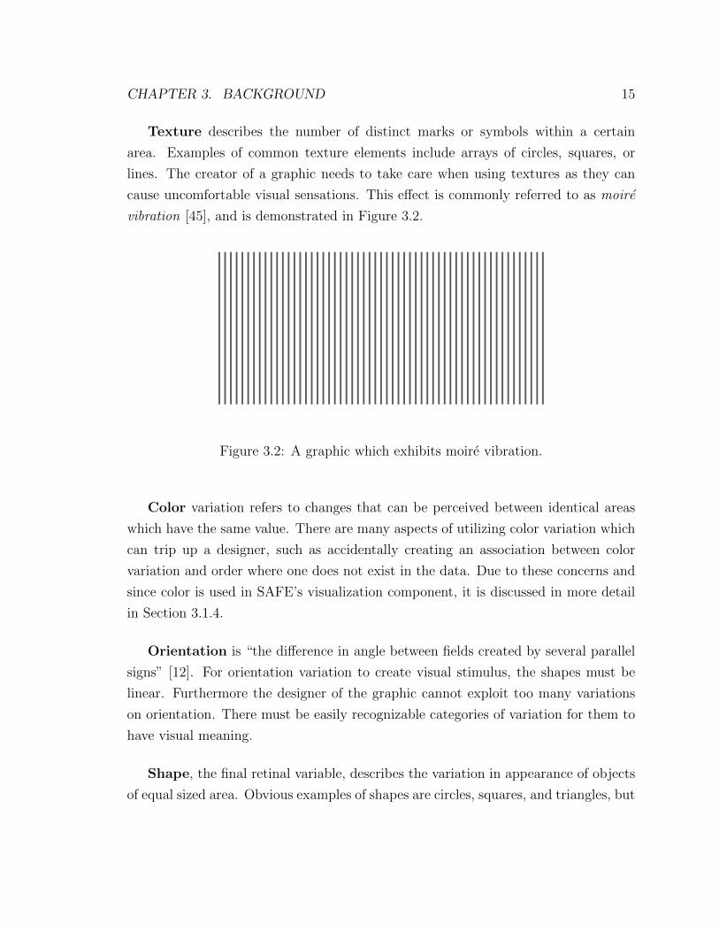
Texture describes the number of distinct marks or symbols within a certain
area. Examples of common texture elements include arrays of circles, squares, or
lines. The creator of a graphic needs to take care when using textures as they can
cause uncomfortable visual sensations. This effect is commonly referred to as moire
vibration [45], and is demonstrated in Figure 3.2.
Figure 3.2: A graphic which exhibits moire vibration.
Color variation refers to changes that can be perceived between identical areas
which have the same value. There are many aspects of utilizing color variation which
can trip up a designer, such as accidentally creating an association between color
variation and order where one does not exist in the data. Due to these concerns and
since color is used in SAFE’s visualization component, it is discussed in more detail
in Section 3.1.4.
Orientation is “the difference in angle between fields created by several parallel
signs” [12]. For orientation variation to create visual stimulus, the shapes must be
linear. Furthermore the designer of the graphic cannot exploit too many variations
on orientation. There must be easily recognizable categories of variation for them to
have visual meaning.
Shape, the final retinal variable, describes the variation in appearance of objects
of equal sized area. Obvious examples of shapes are circles, squares, and triangles, but
CHAPTER 3. BACKGROUND 16
countless others exist. In certain types of graphics, such as maps, the use of mimetic
shapes, or shapes that imitate what they represent, can make a graphic much easier
to comprehend. It is important, though, not to use mimetic shapes where the mark
is not intended to have any particular meaning.
3.1.4 Notes on Color Variation
To understand how color variation can be used in the construction of graphics, one
must first understand the concepts of color hue and color value. Color hue can be
divided into the following categories: violet, blue, green, yellow, orange, red, purple,
and gray. Color value is the percentage of black in the corresponding gray. A pure
tone, or saturated tone, is one that involves no mixture with other colors. Such a tone
is neither darkened by the addition of black, or lightened by the addition of white.
Examples of saturated tones are pictured in Figure 3.3. Constant value tones, on the
other hand, have some addition of black or white to produce the tone. Examples of
saturated tones are pictured in Figure 3.4. What is important to take away from this
discussion is that saturated tones are not of constant value; rather, they vary in value
according to the color.
The difference between saturated tones and constant value tones leads to two
distinct uses of color in information graphics. If the designer wishes colors to represent
ordered values, then saturated tones should be used. The ordering of such tones is
also important, with yellow denoting the smallest value and either purple or violet
representing the largest value. The values in between yellow and purple should be
orange and red, in that order. This ordering is referred to as the “warm” tones.
The colors between yellow and violet should be green and blue, in that order. This
ordering is referred to as the “cool” tones. One should not mix warm and cool tones
when denoting order, as it creates visual confusion. If one does not want color to be
associated with ordered values, then constant value tones should be used.
When using constant value tones it is important to maintain a level of selectivity,

CHAPTER 3. BACKGROUND 17
Figure 3.3: A collection of saturated, or pure, tones.
Figure 3.4: A collection of constant value tones which have been darkened fromsaturation.
or “distinguishability,” between colors. Selectivity is maximal near saturated tones
and diminishes as the tone moves towards either white or black. However, there are
tones that are more selective than others depending on the tone’s value. For example,
with light value tones, blue, purple, violet, and red tend to look grayish and should
not be used. It is advisable to choose steps around yellow, from green to orange.
While color variation is an excellent technique for differentiation, it does have some
notable disadvantages. Individuals with anomalies in chromatic perception, such as
color blindness, may perceive little to no information in a graphic constructed with
color. Reproducing color on paper can also be difficult, and color graphics when re-
produced monochromatically may have little value. To mitigate these disadvantages,
it is good practice to combine color with another variable such as texture or size.
3.1.5 Time Series
While numerous types of information graphics exist, such as maps and networks, time
series diagrams are of central interest in relation to my work. Bertin [12] describes
a number of issues that may affect the perceptibility of a time series graphic. He

CHAPTER 3. BACKGROUND 18
claims that optimal angular perceptibility occurs around 70 degrees, so the scale of
the domain should be adjusted to not have overly pointed or flat curves. He also
describes using points affixed to a line to obtain precision readings, a technique used
in SAFE’s visualization component.
3.2 Exploratory Data Analysis
Some of the most influential work concerning data visualization in the field of statistics
comes from John Tukey [46] and William Cleveland [15; 16]. Tukey [46] legitimized ex-
ploratory data analysis (EDA) as a technique to gain a better understanding of data.
Cleveland built upon Tukey’s work providing guidance on how the techniques asso-
ciated with EDA could be used most effectively. Since a variety of these techniques
are useful in analyzing data produced by network simulation, SAFE’s visualization
component was designed to incorporate them.
3.2.1 Data Summaries
One of the simplest and most effective ways to gain a better understanding of a
large data set is a data summary, which is defined as either numerical or graphical
information that reveals big picture characteristics of the data. It is important to
understand that data summaries are not the details; they do not revel the unusual
characteristics of the data.
The most common graphical method for showing summary statistics is the box-
and-whisker plot as shown in Figure 3.5. This is a graphical method for displaying
five-number summaries which include the sample minimum, the first quartile, the
median, the third quartile, and the sample maximum. The height of the box part
of a box-and-whisker plot goes from the first quartile to the third quartile with the
median drawn as a line. The whiskers can either extend to the sample minimum

CHAPTER 3. BACKGROUND 19
Box−and−Whisker Plot
Metric
Val
ue
2000
4000
6000
8000
Metric 1 Metric 2
Figure 3.5: Example of a Box-and-whisker Plot.
and sample maximum, or a variety of other values, such as one standard deviation of
the data. Tufte [45] proposes an alternative representation of Tukey’s [46] box-and-
whisker plot that uses even less ink by compressing the box horizontally along the
x-axis into a line.
3.2.2 Data Distributions
There are numerous graphical methods for analyzing and comparing the distributions
of data. One of the simplest methods is to use box-and-whisker plots, as discussed
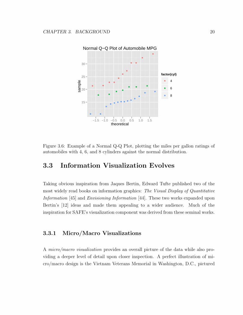
in Section 3.2.1. Another common method is the quantile-quantile plot (Q-Q plot).
This type of graphic shows two distributions against each other; if they are similar
the points of the plot will fall along the line y = x. An example of a Q-Q plot is shown
in Figure 3.6, with the distribution of automobile miles per gallon being compared
to a normal distribution. Comparing data to theoretical distributions in this manner
helps to determine if data fits a certain theoretical model [46; 15].
CHAPTER 3. BACKGROUND 20
Normal Q−Q Plot of Automobile MPG
theoretical
sam
ple
15
20
25
30
−1.5 −1.0 −0.5 0.0 0.5 1.0 1.5
factor(cyl)
4
6
8
Figure 3.6: Example of a Normal Q-Q Plot, plotting the miles per gallon ratings ofautomobiles with 4, 6, and 8 cylinders against the normal distribution.
3.3 Information Visualization Evolves
Taking obvious inspiration from Jaques Bertin, Edward Tufte published two of the
most widely read books on information graphics: The Visual Display of Quantitative
Information [45] and Envisioning Information [44]. These two works expanded upon
Bertin’s [12] ideas and made them appealing to a wider audience. Much of the
inspiration for SAFE’s visualization component was derived from these seminal works.
3.3.1 Micro/Macro Visualizations
A micro/macro visualization provides an overall picture of the data while also pro-
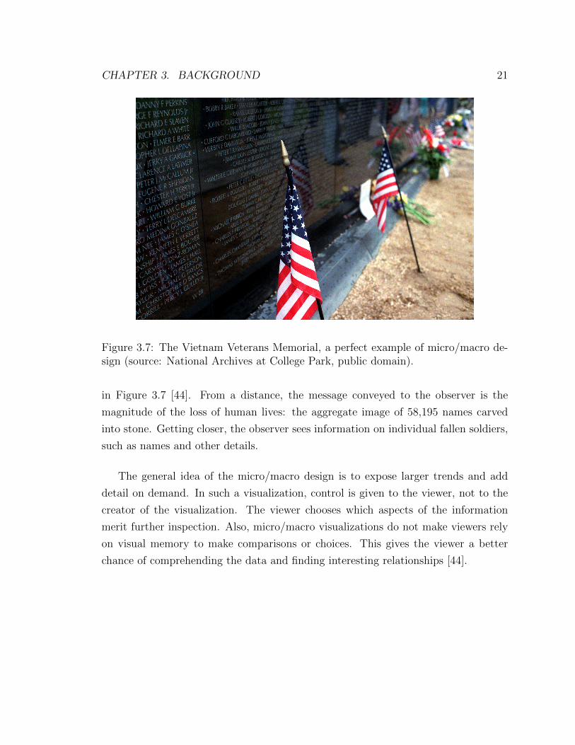
viding a deeper level of detail upon closer inspection. A perfect illustration of mi-
cro/macro design is the Vietnam Veterans Memorial in Washington, D.C., pictured
CHAPTER 3. BACKGROUND 21
Figure 3.7: The Vietnam Veterans Memorial, a perfect example of micro/macro de-sign (source: National Archives at College Park, public domain).
in Figure 3.7 [44]. From a distance, the message conveyed to the observer is the
magnitude of the loss of human lives: the aggregate image of 58,195 names carved
into stone. Getting closer, the observer sees information on individual fallen soldiers,
such as names and other details.
The general idea of the micro/macro design is to expose larger trends and add
detail on demand. In such a visualization, control is given to the viewer, not to the
creator of the visualization. The viewer chooses which aspects of the information
merit further inspection. Also, micro/macro visualizations do not make viewers rely
on visual memory to make comparisons or choices. This gives the viewer a better
chance of comprehending the data and finding interesting relationships [44].

CHAPTER 3. BACKGROUND 22
3.3.2 Dense Data and Small Multiples
Tufte [45] describes the concept of small multiples as follows:
“Well-designed small multiples are inevitably comparative, deftly multi-
variate, shrunken high-density graphics, usually based on a large data ma-
trix, drawn almost entirely with data-ink, efficient in interpretation, often
narrative in content, showing shifts in the relationship between variables
as the index variable changes (thereby revealing interaction or multiplica-
tive effects).”
Small multiples generally show how something evolves over time by showing only
small changes between each multiple. The key point in this definition is that small
multiples facilitate comparison. A viewer can easily scan small multiples and see how
they evolve over time. This technique is very effective at breaking down dense data
into small, comprehensible units.
3.3.3 Aesthetics
In addition to the overall organization of a visualization, there are a number of aes-
thetic design considerations that can have subtle effects on comprehension. One key
design consideration is the dimensions of the visualization. The Golden Rectangle
has a ratio of 1.0 in height to 1.618 in width. As a rule of thumb, data visualizations
with aspect ratio close to this are preferable. Another key design consideration is line
style. Lines should be thin and their value should be chosen in accordance with their
position in the hierarchy of chart objects. For example, light gray lines should frame
the visualization, while darker lines populate the foreground [44; 45].

CHAPTER 3. BACKGROUND 23
3.4 Interaction and Plotting
As computers and the Internet became more popular in the 1990s, new methods for
data visualization emerged. Shneiderman [43] describes many of these methods in his
landmark paper The Eyes Have It: A Task by Data Type Taxonomy for Information
Visualizations. In this paper Shneiderman [43] describes what he believes to be the
most important principle in information visualization, the Visual Information Seeking
Mantra: “Overview first, zoom and filter, then details-on-demand” [43]. To explore
the implications of the Visual Information Seeking Mantra, it is worthwhile breaking
it into parts and discussing each each one individually, as follows.
3.4.1 Overview
The main goal of the overview is to gain a notion of the entire collection of data
that one is viewing. This is similar to the notion of the macro view of a micro/macro
visualization discussed in Section 3.3.1. The overview generally contains an adjustable
area that can be used to select a detail view which is similar to the notion of the micro
view. Strategies typically employed to provide the detail view include zooming and
fish-eying [43].
3.4.2 Zoom and Filter
The act of zooming is to focus in on certain items in a collection that are of interest.
Making this action happen gradually allows the user to retain a sense of position
which may be important when interpreting the data. To filter is to remove items
that are not of interest. Both of these actions are often accomplished through the use
of slides or buttons accompanying the graphic [43].

CHAPTER 3. BACKGROUND 24
3.4.3 Details-on-Demand
The notion of details-on-demand is that a user can request more details about an
item or group of items whenever needed. For this to happen the collection of items
needs to be trimmed to a reasonable size so that individual items can be selected.
Typically the selection of an individual item is accomplished by clicking or hovering
on the item which results in a popup window [43]. Section 4.3.5 discusses how SAFE’s
visualization component handles forming collections that provide details-on-demand.
3.5 A Grammar of Graphics
The trend of twentieth century publications concerning graphics was to discuss them
informally. Leland Wilkinson’s The Grammar of Graphics [52] sought to formalize
much of what had been previously discussed informally. Wilkinson sought to extend
the notion of what makes up a graphic by formalizing grammatical rules for creating
perceivable graphs. His grammar is a mix of mathematical and aesthetic rules. In
this sense, the word aesthetics is not treated as a matter of taste, but rather by
relating sensory attributes to abstractions. For a discussion of “taste” see Section 3.3.
Although most of Wilkinson’s grammar goes beyond the scope of this thesis, in the
remainder of this section, I discuss important points that relate directly to my work.
3.5.1 Interactive Exploration
Wilkinson [52] defines two categories of exploratory controllers: indirect manipulation
tools and direct manipulation tools. Indirect manipulation tools operate on a alter-
native representation of the graphic and not the graphic itself. Examples of indirect
manipulation tools include sliders, buttons, and joysticks. Direct manipulation tools,
which are generally preferred, operate on the graphic itself. This provides the benefit
of the user not having to look away from the graphic when it is being manipulated.
CHAPTER 3. BACKGROUND 25
One specific method for direct manipulation that is of interest in relation to my
work is brushing. The act of brushing highlights objects contained within a certain
region of a graphic. It can be thought of as dragging a paintbrush over a certain
portion of the graphic and that portion changing its properties to reflect that it has
been dragged over. Brushing as it relates to SAFE’s visualization tool is discussed in
more detail in Chapter 4.
3.5.2 Double Axes
A graphic with double axes is one in which a left and right vertical axis exist, each with
their own scale. Double axes can serve one of two purposes: the axis can represent the
same variable with two different scales or they can represent different variables. The
latter purpose allows the viewer of the graphic to index one variable against another
graphic element [52]. For example, one axis could scale a line representing the price
of the S&P 500 while the other axis could scale a line representing the unemployment
rate.
The main problem with graphics that utilize double axes is that the relative dif-
ferences of the two scales can potentially create a deceptive graphic [52; 49; 51].
However, it is useful at times to compare two different series which have different
units or which have the same units but different magnitudes. Wickham [51] identifies
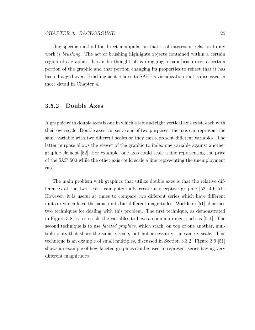
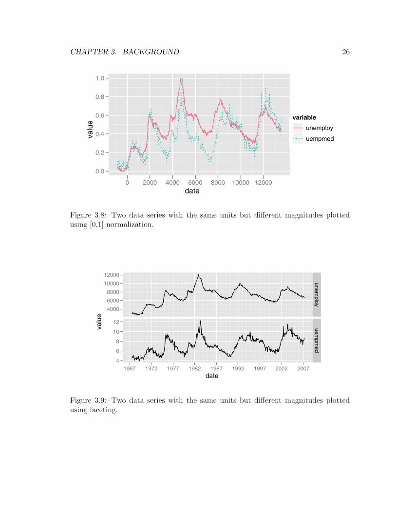
two techniques for dealing with this problem. The first technique, as demonstrated
in Figure 3.8, is to rescale the variables to have a common range, such as [0, 1]. The
second technique is to use faceted graphics, which stack, on top of one another, mul-
tiple plots that share the same x-scale, but not necessarily the same y-scale. This
technique is an example of small multiples, discussed in Section 3.3.2. Figure 3.9 [51]
shows an example of how faceted graphics can be used to represent series having very
different magnitudes.
CHAPTER 3. BACKGROUND 26
166 9 Manipulating data
date
unem
ploy
2000
4000
6000
8000
10000
12000
1967 1972 1977 1982 1987 1992 1997 2002 2007
variable
unemploy
uempmed
date
valu
e
2000
4000
6000
8000
10000
12000
1967 1972 1977 1982 1987 1992 1997 2002 2007
variable
unemploy
uempmed
Fig. 9.4: The two methods of displaying both series on a single plot produce identicalplots, but using long data is much easier when you have many variables. The serieshave radically di!erent scales, so we only see the pattern in the unemploy variable.You might not even notice uempmed unless you’re paying close attention: it’s the lineat the bottom of the plot.
There is a problem with these plots: the two variables have radicallydi!erent scales, and so the series for uempmed appears as a flat line at thebottom of the plot. There is no way to produce a plot with two axes in ggplot2
because this type of plot is fundamentally misleading. Instead there are twoperceptually well-founded alternatives: rescale the variables to have a commonrange, or use faceting with free scales. These alternatives are created with thecode below and are shown in Figure 9.5.
range01 <- function(x) {
rng <- range(x, na.rm = TRUE)
(x - rng[1]) / diff(rng)
}
emp2 <- ddply(emp, .(variable), transform, value = range01(value))
qplot(date, value, data = emp2, geom = "line",
colour = variable, linetype = variable)
qplot(date, value, data = emp, geom = "line") +
facet_grid(variable ~ ., scales = "free_y")
date
valu
e
0.0
0.2
0.4
0.6
0.8
1.0
0 2000 4000 6000 8000 10000 12000
variable
unemploy
uempmed
date
valu
e
4000
6000
8000
10000
12000
4
6
8
10
12
1967 1972 1977 1982 1987 1992 1997 2002 2007
unemploy
uempm
ed
Fig. 9.5: When the series have very di!erent scales we have two alternatives: left,rescale the variables to a common scale, or right, display the variables on separatefacets and using free scales.
Figure 3.8: Two data series with the same units but different magnitudes plottedusing [0,1] normalization.
166 9 Manipulating data
date
unem
ploy
2000
4000
6000
8000
10000
12000
1967 1972 1977 1982 1987 1992 1997 2002 2007
variable
unemploy
uempmed
date
valu
e
2000
4000
6000
8000
10000
12000
1967 1972 1977 1982 1987 1992 1997 2002 2007
variable
unemploy
uempmed
Fig. 9.4: The two methods of displaying both series on a single plot produce identicalplots, but using long data is much easier when you have many variables. The serieshave radically di!erent scales, so we only see the pattern in the unemploy variable.You might not even notice uempmed unless you’re paying close attention: it’s the lineat the bottom of the plot.
There is a problem with these plots: the two variables have radicallydi!erent scales, and so the series for uempmed appears as a flat line at thebottom of the plot. There is no way to produce a plot with two axes in ggplot2
because this type of plot is fundamentally misleading. Instead there are twoperceptually well-founded alternatives: rescale the variables to have a commonrange, or use faceting with free scales. These alternatives are created with thecode below and are shown in Figure 9.5.
range01 <- function(x) {
rng <- range(x, na.rm = TRUE)
(x - rng[1]) / diff(rng)
}
emp2 <- ddply(emp, .(variable), transform, value = range01(value))
qplot(date, value, data = emp2, geom = "line",
colour = variable, linetype = variable)
qplot(date, value, data = emp, geom = "line") +
facet_grid(variable ~ ., scales = "free_y")
date
valu
e
0.0
0.2
0.4
0.6
0.8
1.0
0 2000 4000 6000 8000 10000 12000
variable
unemploy
uempmed
date
valu
e
4000
6000
8000
10000
12000
4
6
8
10
12
1967 1972 1977 1982 1987 1992 1997 2002 2007
unemploy
uempm
ed
Fig. 9.5: When the series have very di!erent scales we have two alternatives: left,rescale the variables to a common scale, or right, display the variables on separatefacets and using free scales.
Figure 3.9: Two data series with the same units but different magnitudes plottedusing faceting.

CHAPTER 3. BACKGROUND 27
3.6 Chapter Summary
This chapter discussed the field of information visualization as it has evolved over the
twentieth and twenty-first century. It analyzed the major contributions of Bertin [12],
Tukey [46], Tufte [44; 45], Shneiderman [43], and Wilkinson [52]. All of these indi-
viduals helped to legitimize the field of information visualization. They also helped
to develop best-practices which ensure that graphics are meaningful and credible.
SAFE’s visualization component was designed with the work of these individuals in
mind.

28
Chapter 4
Design Considerations
There are many important considerations behind the design and the implementation
of SAFE’s visualization component. These decisions were all influenced both by the
project goals of SAFE and by the best practices described in information visualization
literature. Since information visualization is a young and rapidly growing field, many
unanswered questions still arise when developing visualization tools. This chapter
presents a range of issues that I confronted in creating SAFE’s visualization compo-
nent, some of them related to design, others related to practical aspects of software
development.
4.1 Licensing
Licensing was a major consideration in the design of SAFE’s visualization component.
Since its inception, ns-3 has followed the GNU General Purpose License (GPL) version
2. For the sake of consistency with ns-3, SAFE follows the same licensing model, as
established in the proposal for the grant that funds its development [1].
Developed by Richard Stallman and the Free Software Foundation, GPL version

CHAPTER 4. DESIGN CONSIDERATIONS 29
2 was “designed to make sure that you have the freedom to distribute copies of free
software (and charge for this service if you wish), that you receive source code or can
get it if you want it, that you can change the software or use pieces of it in new free
programs; and that you know you can do these things” [2]. GPL version 2 is not to
be confused with the newer version of the license, GPL version 3. While all software
released under GPL version 2 is compatible with GPL version 3, the reverse is not
true.
To say that two licenses are compatible means that programs released under the
two licenses can be combined into a larger work while still satisfying the requirement
of both licenses. Due to SAFE’s licensing requirement, all of the programs bundled
within SAFE’s visualization component needed to be released with a license that was
compatible with GPL version 2. Such licenses include the Modified BSD license and
the Mozilla Public License (MPL) version 2.0 [3], to name a couple.
4.2 Platform
When it comes to building a tool for data visualization, there are two main software
platform options: a personal computer or web. Both platforms have advantages and
disadvantages, which need to be considered when evaluating them for development. In
general, personal computer tools have better support for hardware accelerated graph-
ics and can run as standalone applications. Unfortunately, in this type of setting,
tools are often dependent on the installation of other software, which complicates
deployment and maintenance.
Web applications, on the other hand, are very easy to maintain, and work on any
system that has a web browser. They are also well-suited for interactive applications
that have numerous graphics. Since SAFE’s experimental configuration front-end was
conceived with the web platform in mind, it made the most sense to also develop the
visualization component for the same environment.
CHAPTER 4. DESIGN CONSIDERATIONS 30
4.3 Interactive Graphics
Through the lessons learned from the literature discussed in Section 3.5.1, I concluded
that there would be benefit in creating an interactive view of simulation results. Also,
the background research in Section 3.3.1 inspired the decision to make this view offer a
micro/macro time-series graphic of the entire data set generated by the experiment’s
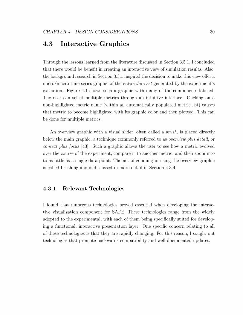
execution. Figure 4.1 shows such a graphic with many of the components labeled.
The user can select multiple metrics through an intuitive interface. Clicking on a
non-highlighted metric name (within an automatically populated metric list) causes
that metric to become highlighted with its graphic color and then plotted. This can
be done for multiple metrics.
An overview graphic with a visual slider, often called a brush, is placed directly
below the main graphic, a technique commonly referred to as overview plus detail, or
context plus focus [43]. Such a graphic allows the user to see how a metric evolved
over the course of the experiment, compare it to another metric, and then zoom into
to as little as a single data point. The act of zooming in using the overview graphic
is called brushing and is discussed in more detail in Section 4.3.4.
4.3.1 Relevant Technologies
I found that numerous technologies proved essential when developing the interac-
tive visualization component for SAFE. These technologies range from the widely
adopted to the experimental, with each of them being specifically suited for develop-
ing a functional, interactive presentation layer. One specific concern relating to all
of these technologies is that they are rapidly changing. For this reason, I sought out
technologies that promote backwards compatibility and well-documented updates.
CHAPTER 4. DESIGN CONSIDERATIONS 31
00:00:00 00:01:00 00:02:00 00:03:00 00:04:00 00:05:00 00:06:00 00:07:00 00:08:00 00:09:00 00:10:00 00:11:00 00:12:00 00:13:00 00:14:00 00:15:00 00:16:00
0
5
10
15
20
25
30
35
40
45
0
50
100
150
200
250
300
350
00:00:00 00:01:00 00:02:00 00:03:00 00:04:00 00:05:00 00:06:00 00:07:00 00:08:00 00:09:00 00:10:00 00:11:00 00:12:00 00:13:00 00:14:00 00:15:00 00:16:00
Time (HH:MM:SS)
Pa
cke
t L
oss (
Pa
cke
ts)
Re
sp
on
se
Tim
e (S
eco
nd
s)
Packet Loss
Queue Size
Response Time
00:00:00 00:01:00 00:02:00 00:03:00 00:04:00 00:05:00 00:06:00 00:07:00 00:08:00 00:09:00 00:10:00 00:11:00 00:12:00 00:13:00 00:14:00 00:15:00 00:16:00
0.0
0.1
0.2
0.3
0.4
0.5
0.6
0.7
0.8
0.9
1.0
00:00:00 00:01:00 00:02:00 00:03:00 00:04:00 00:05:00 00:06:00 00:07:00 00:08:00 00:09:00 00:10:00 00:11:00 00:12:00 00:13:00 00:14:00 00:15:00 00:16:00
Time (HH:MM:SS)
No
rma
lize
d V
alu
e
Packet Loss
Queue Size
Response Time
Left y-axis
Highlighted Metric
Focus (Plotting Window)Hoverable Data Point
Context
Figure 4.1: Labeled Context Plus Focus Graphic.
HTML
Of all of the technologies associated with the web, the HyperText Markup Language
(HTML) is arguably the most important. HTML is a markup language used to
describe the structure of webpages. It was first drafted in 1992 by Tim Berners-
Lee, and has since gone through many incarnations, with the most recent being
HTML5 [40].
In HTML, content is surrounded by tags which generally denote the semantics
of the content. For example, a paragraph in HTML always begins with a <p> tag,
referred to as an opening tag, and always ends with a </p> tag, referred to as a closing
tag. Similarly, the largest heading on a page always begins with a <h1> tag and always
ends with a </h1> tag. There are also self-closing tags such as the <img> tag. These
tags to do not require closing tags such as </p> and </h1>. Through the use of these
tags, a web developer can craft a page that can be viewed in a web browser such as
Google Chrome, Mozilla’s Firefox, Apple’s Safari, or Microsoft’s Internet Explorer.
CHAPTER 4. DESIGN CONSIDERATIONS 32
CSS
In the web’s infancy, HTML was the king of web development languages. As websites
and their designs became more complicated though, HTML started to be used in
ways that went against the ideals of its creators. As a markup language, HTML’s
purpose is to describe the roles of elements in a document. In the early-1990s, as the
number of websites grew, developers began to ignore the semantics of HTML’s tags.
The general practice at this time was to structure web pages using HTML’s table
element. Code for such pages quickly became illegible, as the tags were being used in
ways that were not intended. The table element was developed to contain tabular
data, not to define the style of webpages. Thus, HTML quickly became a tool for not
only describing the roles of elements in a web page, but also describing the style of a
web page.
By the mid-1990s many developers began to realize that betraying the semantics
of HTML and using it to describe the style of a page was a serious problem. In 1996,
Hakon Wium Lie and Bert Bos proposed a solution to this problem. Their solution,
named Cascading Style Sheets (CSS), allowed developers to separate the structural
system (HTML) from the presentational system (CSS). Developers could create one
stylesheet that would define the how their pages would look, and could easily change
the style of their entire website by editing one file [32].
CSS plays a critical role in modern web development, especially development of
interactive applications. The introduction of CSS3 put a whole new set of tools in
developers’ hands. CSS3 styles are capable of doing 2D and 3D transformations,
rounded corners, and transitions. Since the CSS3 standard is being modularly de-
veloped, new functionality is being added every year. Once fully implemented, these
tools will allow for better looking, more interactive web pages [48].
CHAPTER 4. DESIGN CONSIDERATIONS 33
JavaScript
JavaScript [22] is an object-oriented, interpreted language with syntax similar to C. It
is also one of the most widely used client-side scripting languages. While JavaScript
gained its popularity through its use in client-side scripts, it is now being used in a
variety of applications. Node.js [5], a popular event driven networking engine, has
brought the power of JavaScript to server-side applications. This allows developers
to use one language for their entire project, with both client and server-side scripts
being written in JavaScript. Such a development model has attracted major industry
players such as LinkedIn [24] and Microsoft [11]. This makes JavaScript an invaluable
tool for any front-end or back-end web developer [21].
Modern web applications are expected to be responsive, interactive, and visually
interesting. JavaScript allows developers to achieve all three of these goals. Browser
developers have also worked hard to make sure that their applications have power-
ful JavaScript engines that are quick and consistent. Both Google and the Mozilla
Foundation have invested large amounts of resources in developing such engines. In
fact, both Google Chrome’s V8 engine and Safari’s Nitro engine compile JavaScript
rather than interpret it, which allows the code to be executed as native machine code
as opposed to bytecode running on a virtual machine. This allows even extremely
complex client-side applications to achieve excellent performance [47].
SVG
Scalable Vector Graphics (SVG) is an XML-based language for describing and ani-
mating two-dimensional graphics. A major advantage of SVG is that, like HTML,
all elements of an SVG graphic have corresponding objects in the Document Ob-
ject Model (DOM). This allows SVG objects to be dynamically manipulated using
JavaScript, which is necessary for creating interactive graphics. As its name implies,
SVG is also vector-based. Unlike raster, or pixel-based, graphics which are commonly
stored in a format such as JPEG or Graphics Interchange Format (GIF), SVG-based
CHAPTER 4. DESIGN CONSIDERATIONS 34
graphics can be scaled to any size without noticeable quality loss. The combination
of these benefits makes for scalable, interactive graphics that are viewable in any web
browser [14].
D3.js
D3.js [13] is open source and JavaScript-based, developed after years of research into
best practices in visualization. One major advantage of D3.js is that it utilizes SVG
for graphics, which can be resized and zoomed to any resolution without noticeable
quality loss. SVG based graphics also have the advantage of having a well defined
structure that can be easily converted into other commonly used vector formats. Both
of these factors are significant advantages of SVG-based plotting libraries over ones
that utilize the HTML5 canvas element.
Django
Django is an open source, Python-based web development framework that follows the
model, template, and view (MTV) design pattern [29]. This design pattern is very
similar to the popular Model-View-Controller (MVC) design pattern which is com-
monly known for its use in iPhone application development. Two driving philosophies
behind both MTV and MVC design patterns are loose coupling of components of an
application and strict separation between pieces of an application.
To understand how Django serves the purposes of SAFE’s visualization compo-
nent, it is useful to have a bit of background on the MTV design pattern. The ‘M’
of MTV stands for Model, which is the data access layer of an application. This
layer abstracts interaction with the underlying database into easy to use functions.
This removes the confusion that often arises when developers try to interact with a
database using a language such as Structured Query Language (SQL). Since a cru-
cial part of SAFE’s visualization component is querying the database for simulation

CHAPTER 4. DESIGN CONSIDERATIONS 35
results, having this abstraction is very convenient.
The ‘T’ of MTV stands for Template, which is the presentation layer of the
application. A template is code that can be rendered by a web browser, such as
HTML or SVG, with placeholders throughout it where content can be dynamically
injected. This content is injected by the View, which is the ‘V’ in MTV. The View
is the business logic layer which interacts with the Model, bringing data into the
Template. It is useful to think of the View as a bridge between the Model and the
Template. Much of SAFE’s web interface needs to be dynamically generated based
on what the user is currently doing, making a framework such as Django useful.
I chose Django over other web frameworks when building SAFE’s web user in-
terface because it is the most powerful, general-purpose web framework written in
Python. The Django-based web user interface integrates seamlessly with the core
backend of SAFE which is written in Twisted, a Python based networking engine [20].
This ultimately makes for cleaner code that is easier to extend.
4.3.2 Data Interchange
Django is excellent for querying SAFE’s database for simulation data, but a method
for interchanging data between Django and D3.js was still needed. A common method
of interchanging data for web-based plotting is JavaScript Object Notation (JSON).
JSON allows for the serialization of a data structure which can subsequently be
transmitted within or between applications. A major advantage of JSON is that
it can easily be parsed into a JavaScript object which can then be plotted.
While JSON would have worked well for the interactive data visualization com-
ponent, I decided that the comma-separated values (CSV) format would be a better
solution. While JSON works for a variety of data types, CSV is designed solely for
tabular data. Since all of the data coming from SAFE’s database to the plotting
component is tabular, the CSV format is an adequate solution.

CHAPTER 4. DESIGN CONSIDERATIONS 36
What gives CSV an edge over JSON is its compatibility with many other plotting
tools. Having SAFE’s interactive plot driven by the CSV format enables the data
to be easily be downloaded for plotting with other software packages. With this
feature, power users can download data and plot it using tools as Excel, MATLAB,
or gnuplot.
4.3.3 Data Binding and Scaling
I also found it important to develop a method to scale multiple data series which may
have either different magnitudes or units. While this may seem like a minor point,
improper scaling can lead to a plot that is difficult to interpret, potentially leading
to wrong conclusions. Figure 4.2a shows an example of a plot with three series of
varying scales. The series in green is sufficiently large that it begins to overwhelm the
other two series. In extreme cases, such as in Figure 4.2b, one series can completely
overwhelm the others, making an uninterpretable plot.
When the interactive time-series visualization tool is started, there is one blank
left y-axis as shown in Figure 4.3. When a user decides to plot a new metric, the
plotting system first checks whether another data series is currently plotted on the
graphic. If no other data series is currently plotted on the graphic, then the metric is
plotted as a solid line. If another data series is already plotted on the graphic, then
the metric is plotted as a dotted line.
To handle the problem of differing magnitudes discussed in Section 3.5.2, I choose
to scale all metrics to a common scale. A metric’s data is represented by a set
D = {d0, d1, ..., dn} where each di is a data point. The maximum data point in D
is Dmax and the minimum data point is Dmin. D can then be normalized between 0
and 1 by computing the following for each member of D:
N(di) =di −Dmin
Dmax −Dmin

CHAPTER 4. DESIGN CONSIDERATIONS 37
(a) Moderate Scale Differences
(b) Major Scale Differences
Figure 4.2: Plots exhibiting various scale differences.

CHAPTER 4. DESIGN CONSIDERATIONS 38
Figure 4.3: Empty plot when tool is initialized.
This method normalizes all the data series added to the plot, which prevents any
data series from being overwhelmed by the others. While supported in the litera-
ture, this method produces the same plot as using double y-axes with maximal scale.
Likewise, the faceting technique described in Section 3.5.2 still has issues with deci-
pherability. Exploring additional ways to plot multiple metrics on the same plot in a
more interpretable way is planned as future work.
When the user removes metrics from the plot, I decided that the graphic should
preserve the line type and color of any lines remaining on the graphic. I found this
approach to be more intuitive than redrawing the remaining lines as if they were
originally drawn on a blank graphic. It also follows from Wilkinson’s notion that
the graphic frame either does not change or changes in a way that is expected and
consistent [52].

CHAPTER 4. DESIGN CONSIDERATIONS 39
4.3.4 Brushing
As discussed in Section 3.5.1, brushing plays a critical role in the interaction between
the user and SAFE’s interactive plotting component. SAFE’s interactive plotting
component is a direct manipulation tool and brushing is used to select which data is
currently being viewed in the focus graphic. The brush is dragged over the context
graphic to highlight a portion of the time-series for closer inspection. The brush can
be interactively expanded or dragged after it has been created to give the user finer
control over what to display in the graphic.
4.3.5 Hoverable Data Points
While a line on a time-series graphic can give a great indication of trends in the data,
in most cases there is also value in investigating specific data points. Unusual features
of the graphic and outliers may need to be analyzed individually, and thus having
some way of getting data back out of the line after it is plotted is quite useful.
To facilitate the observation and analysis of singular data points, what Shneider-
man [43] calls details-on-demand, I implemented hoverable data points, as seen in
Figure 4.1. These points are bound directly to the underlying data series and are
updated along with the plotting window. When a user hovers over one of these data
points, its x and y-value are displayed next to the point. The point is also enlarged
when hovered over to indicate to the user which particular data point they are cur-
rently viewing. As soon as the user removes his/her cursor from the data point, the
x and y-value fade away and the point goes back to its normal size.
A common characteristic of most simulations being conducted with SAFE is the
high volume of data they generate. Since a micro-macro graphic provides a view of
the entire zoomed-out data set in one window, it also provides a view of possibly
thousands of hoverable data points. Cramming all of these points into a single view
would make an incomprehensible graphic. The number of hoverable data points being
CHAPTER 4. DESIGN CONSIDERATIONS 40
plotted could easily outnumber the number of pixels to plot them. Since a pixel is
the smallest unit of manipulatable area on the screen, it is not possible to cram more
than one point into one pixel.
Instead of trying to cram an incomprehensible amount of hoverable data points
onto the screen at once, I developed a method for dynamically scaling the density of
points in the current plotting window. This metric will only show a hoverable data
point when it is separated from other hoverable data points by enough pixels that it
can be easily distinguished and interpreted.
Value-based Point Density Scaling
The initial method I developed for dynamically adjusting hoverable point density
relies solely on the amount of horizontal spacing h that each hoverable point needs
to be distinguished from surrounding hoverable data points. Figure 4.4 show how
various values for h affect the graphic. From these tests I determined an appropriate
value for h to be around 6. In the future I plan to expose this parameter to the user,
giving them a finer control over the graphic.
To understand how h is to be used, one must first understand how data is rep-
resented by the plotting tool. Each graphic is composed of a set of lines L =
{l0, l1, l2, ..., lk}. A line lk composed of n data points is represented by a set D such
that:
D = {p0, p1, p2, ..., pn−1} where pi is a pair pi = (xi, yi)
The final set of hoverable points H is simply a subset of D:
H ⊆ D

CHAPTER 4. DESIGN CONSIDERATIONS 41
h = 1
h = 2
(a)
Figure 4.4: Comparison of how different values for h affect graphic presentation.
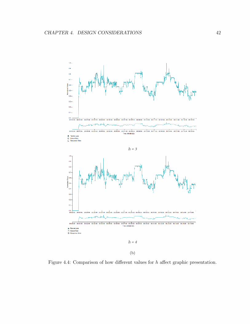
CHAPTER 4. DESIGN CONSIDERATIONS 42
h = 3
h = 4
(b)
Figure 4.4: Comparison of how different values for h affect graphic presentation.

CHAPTER 4. DESIGN CONSIDERATIONS 43
h = 5
h = 6
(c)
Figure 4.4: Comparison of how different values for h affect graphic presentation.

CHAPTER 4. DESIGN CONSIDERATIONS 44
Whether a certain point p should be hoverable, and thus be in H, can be deter-
mined iteratively using h as follows. The first hoverable point is always p0 as it is
the first point that is viewable in the plotting window, and thus it is added to the
set H. The points p1...pn are then examined in order, looking for the first pi where
xi > h× |H|, we will call this point pz. When pz ∈ D is found it is added to the set
H and the search begins again from pz...pn. The process terminates when z ≥ n.
After this process terminates, all the points in H are hoverable. If a graphic has
multiple lines such that |L| > 0, Hl0 ...Hlk can be determined and each line will be
have hoverable points of appropriate density bound to them.
While this technique handles data that was not uniformly sampled very well,
it is not the most aesthetically pleasing when brushing the graphic. When using
this method, the hoverable points tend to disappear and reappear as the graphic is
brushed, as if the hoverable points were flowing over the line. This can be both visually
distracting and also frustrating if one is trying to follow a single glyph. Wilkinson [52]
suggests making glyphs “move as a flock” so they are easier to track. To make this
happen a new approach for scaling point density had to be developed.
Index-based Point Density Metric
In an attempt to develop a more aesthetically pleasing method for point density
scaling, I utilized the following two aspects of the current graphic: the graphic window
width w and the number of points n in a specific line’s current domain.
In addition to the above two graphic parameters, a tweaking parameter p which
represents the number of pixels desired for each point is used to determine m using
the following formula:
m = dnw× pe
Thus, if a particular line had 500 points that were eligible to be hoverable in the
CHAPTER 4. DESIGN CONSIDERATIONS 45
current window, the window had a width of 900 pixels, and the user wanted to plot
10 pixels per point, m would be 6. Figure 4.5 shows how various values for p affect
the presentation of the graphic. From this figure I determined an optimal value for p
to be around 8. Again, in the future I plan to expose this parameter to the user.
After m is calculated it can be used in the following manner. Again, each graphic
is composed of a set of lines L = {l0, l1, l2, ..., lk}. A line lk composed of n data points
is represented by a set D such that:
D = {p0, p1, p2, ..., pn−1} where pi is a pair pi = (xi, yi)
The final set of hoverable points H is simply a subset of D:
H ⊆ D
We can use m to determine if a certain point piw should be hoverable as follows:
V (pi) = i (mod m)
If V (pi) = 0 then the point is added to H, otherwise it is not hoverable and
thus not added to H. Thus, H is built iteratively by applying this criterion on each
element of D.
This method works very well for uniformly sampled data and also is aesthetically
pleasing when brushing. Unfortunately, it does not handle non-uniformly sampled
data very well, especially data that is very sparse with high density clusters.
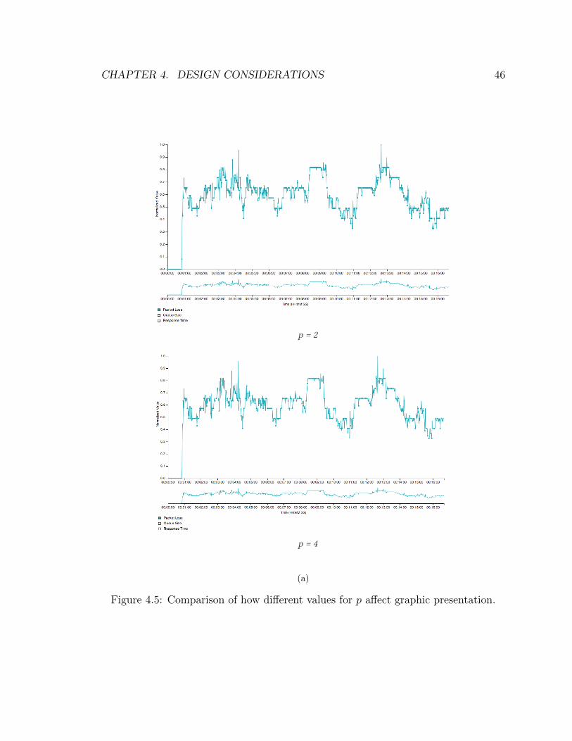
CHAPTER 4. DESIGN CONSIDERATIONS 46
p = 2
p = 4
(a)
Figure 4.5: Comparison of how different values for p affect graphic presentation.
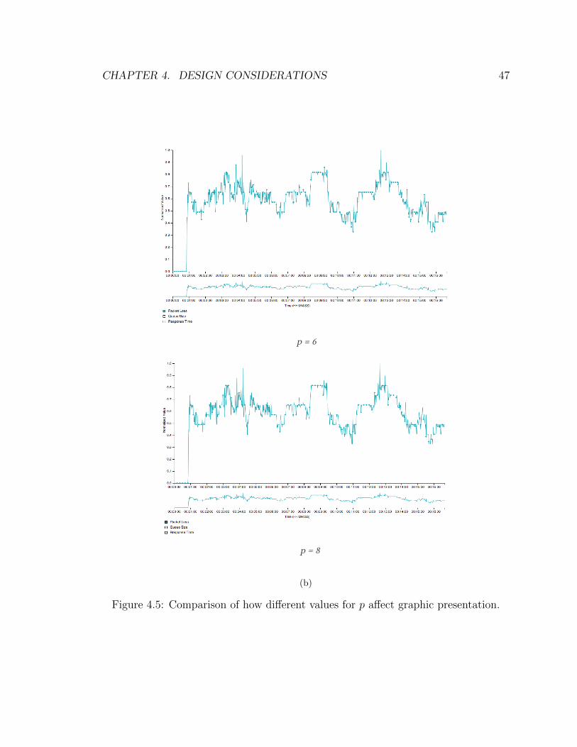
CHAPTER 4. DESIGN CONSIDERATIONS 47
p = 6
p = 8
(b)
Figure 4.5: Comparison of how different values for p affect graphic presentation.

CHAPTER 4. DESIGN CONSIDERATIONS 48
p = 10
p = 12
(c)
Figure 4.5: Comparison of how different values for p affect graphic presentation.

CHAPTER 4. DESIGN CONSIDERATIONS 49
Combined Point Density Metric
Both the value-based and index-based methods for point density scaling worked well
for the majority of cases, but unfortunately they both had minor flaws that made
them unsuitable for SAFE’s application. It turns out that when combined though,
these methods offset each others’ flaws, making a graphic which has easily trackable
glyphs.
Combining the two methods works as follows. First, the index-based method is
applied, resulting in a set of hoverable data points Hi. The value-based method is
then applied to Hi which results in a new set Hf . This is the final set of hoverable
data points.
Another advantage of this method is that it accounts for scaling the density of
points on lines that have different domains in the current plotting window, as shown
in Figure 4.6. In this case the index-based metric by itself may leave high density
clusters of hoverable data points in certain areas. The value-based method can then
pass over these clusters and prune them to the correct density.
4.4 Static Graphics
While an interactive graphic is great for exploring relationships in data, it is not
appropriate for publication. With static graphics, a more experienced user can have
a finer degree of control over what the graphic looks like, while still conforming to
the considerations outlined in Chapter 3. Another advantage of the static plotting
mechanism is that it encourages the use of vector-based graphics. While SAFE’s in-
teractive plotting component utilizes SVG-based vector graphics, these graphics are
not straightforward to export and save in a vector-based format. SAFE’s static plot-
ting component displays static graphics in the browser using the Portable Network
Graphics (PNG), which is not vector-based. However the graphics are also down-

CHAPTER 4. DESIGN CONSIDERATIONS 50
Figure 4.6: Lines with different domains still have properly scaled hoverable pointdensity.
loadable in Portable Document Format (PDF) which is vector-based. These vector
graphics ensure that blurry, eligible plots are not included in publications.
4.4.1 Relevant Technologies
I used many technologies in the construction of SAFE’s static visualization compo-
nent. The main purpose of using these technologies was to bring the power of desktop
plotting tools to the web. In addition to the following technologies, Django, which
is described in Section 4.3.1, also plays a critical role in generating SAFE’s static
graphics.

CHAPTER 4. DESIGN CONSIDERATIONS 51
R
R is a free programming language that is tailored for data manipulation and analysis.
Much of the inspiration for R came from the S programming language which was
developed by AT&T in the late 1970s. While S has become proprietary, R remains free
and has a large community of developers supporting it. For this reason R has become
one of the most popular languages in use by data analysis professionals today [34].
R implements both object-oriented and functional programming paradigms which
make it very flexible. Code written in R is generally very clean and understandable,
as well as efficient. R was chosen for this project for all of the above reasons, in
addition to the numerous amount of open source libraries that have been written for
it. R can be thought of as the data processing backend to SAFE’s static visualization
tool.
ggplot2
Of the many great open source libraries for R, ggplot2 ranks among the most popular
and useful. While a base installation of R includes graphic production functionality,
ggplot2 is much more powerful and flexible. At its heart, ggplot2 is based directly on
Leland Wilkinson’s The Grammar of Graphics [52], allowing it to be used to produce
nearly any kind of information graphic imaginable. These characteristics led to my
decision to use ggplot2 as the sole mechanism to generate SAFE’s static graphics.
rPy2
While R is a perfect candidate SAFE’s static plotting backend, it is not necessarily
easy to integrate code written in two different languages, such as R and Python.
Given that SAFE’s backend is written in Python this presented a problem. Luckily
others have also realized a need for integrating Python code and R code and rPy2 [25]

CHAPTER 4. DESIGN CONSIDERATIONS 52
was created. rPy2 provides a bridge between Python and R, allowing R code to be
written and called from directly within a Python program. Since ggplot2 is a library
for R all static plotting could be done through this bridge with the results being
passed into the web user interface.
4.4.2 Extendability
SAFE’s static plotting component was designed specifically to be flexible and extend-
able. While the code driving SAFE’s interactive visualization component is on the
order of thousands of lines for one graphic, the amount code for most static plots is
less than five lines. This makes it very easy for both SAFE’s maintainers and users
to add new types of static graphics.
Future work includes developing a mechanism for users to craft new graphic types
through the web user interface. After selecting experimental data, the user would
be presented with a form with a variety of plotting options. The user could then
customize these options and be presented with a graphic that fits their specific needs.
This mechanism could also drive the generation of static graphics for power users who
do not desire to use SAFE’s web user interface.
4.5 Open Source Tools for Data Visualization
In constructing SAFE’s data visualization component, I evaluated many other plot-
ting tools that could have been helpful. While some of these tools aligned with the
goals of SAFE, they were not licensed in a way in which they could be incorporated
into SAFE. Many of these tools acted as inspiration for SAFE’s visualization com-
ponent, showing what works well and what does not for interactive visualization.
Comparing the approaches of these tools to the points discussed in Chapter 3 guided
many of the decisions previously discussed in this chapter.

CHAPTER 4. DESIGN CONSIDERATIONS 53
4.5.1 Shiny
Shiny is a tool for R which allows R-based graphics to be displayed and interacted
with through a web browser [42]. The basic functionality of Shiny is very similar to
SAFE’s static plotting tool, but Shiny is much more flexible and extendable. Instead
of using a bridge between R and Python like SAFE, Shiny is written purely in R.
Shiny gives the option for developers to either write their interactive graphics in R or
HTML, CSS, and JavaScript. This makes Shiny work well for both statisticians and
web developers. Shiny would have been very helpful in the development of SAFE’s
visualization component, but unfortunately it is licensed under GPL version 3 which
is not compatible with GPL version 2 as discussed in Section 4.1.
4.5.2 Google Chart Tools
Google Chart Tools is an application programming interface (API) for displaying
interactive charts in a web browser [6]. It supports numerous chart types including
line charts, pie charts, scatter charts, area charts, and bar charts. Google Chart
Tools’ line graphic is similar to the focus graphic in SAFE’s interactive visualization
component. However, one notable difference is that hoverable points are not displayed
on the line, and only appear when hovered over.
Since Google Chart Tools is an API and not a library, it could be used within
SAFE’s visualization component without any licensing issues. However, the major
drawback of Google Chart Tools is that the user must be connected to the Internet
for it to function properly. The code to create the graphics is located on Google’s
servers, and thus the graphics cannot be generated unless a connection can be made
between the user’s computer and Google’s servers. Since no other portion of SAFE
relies on an Internet connection to function, it would not be ideal to require one for
the visualization component. For this reason I choose not to use Google Chart Tools,
instead opting for a local library that is more flexible.
CHAPTER 4. DESIGN CONSIDERATIONS 54
4.5.3 googleVis
Related to Google Chart Tools is the googleVis [26] library which is an interface be-
tween R and Google Chart Tools. The major advantage of googleVis over traditional
use of Google Chart Tools is that googleVis does not require one to upload their data
to Google’s servers to have it visualized. With googleVis the graphics are generated
locally, but still require Internet access for use of Google’s API. The main use case
which googleVis was developed around was for analysts and statisticians who already
knew R but did not necessarily have expertise in creating web-based information
graphics. I took a similar approach when creating SAFE’s static visualization tool.
Unfortunately SAFE could not leverage googleVis because it is licenced under GPL
version 3, which makes it incompatible with the rest of the project.
4.5.4 NVD3
Developed as an extra layer of abstraction on top of D3.js, NVD3 [7] provides a
variety of pre-built graphics, including one for context plus focus time series. The
graphics in NVD3 are similar to those created for SAFE’s interactive visualization
component, only more general purpose. NVD3 handles hoverable data points similar
to Google Chart Tools where they are only displayed when hovered upon by the user.
The context plus focus graphic also differs from SAFE’s in that it adaptively scales
the left y-axis based on the data in the current plotting window. I chose not to
include this in SAFE, as it has a similar distortion effect as having multiple y-axis, as
discussed in Section 3.5.2. Another aspect of NVD3 which restricted its use in SAFE’s
visualization component is its license. NVD3 is licensed under Apache Version 2.0,
which is compatible with GPL version 3, but not GPL version 2 [3].

CHAPTER 4. DESIGN CONSIDERATIONS 55
4.6 Chapter Summary
Many of the design considerations for SAFE’s visualization component were discussed
in this chapter. These included issues involving licensing, selecting the proper plat-
form, scaling the density of points on a graphic, and making an extendable tool, just
to name a few. Each of these decisions were made with the issues from Chapter 2
and the best practices from Chapter 3 in mind. The big picture design consideration
to take away from this chapter is that SAFE’s visualization component was designed
to be powerful yet user-friendly while supporting credibility in network simulation
research.

56
Chapter 5
Case Studies
To test the performance of SAFE’s visualization component, I subjected it to a variety
of common use scenarios. These scenarios include making graphics which have time
series of very different magnitudes, comparing two series where a causal relationship
may or may not exist, and generating graphics for publications. While these scenarios
do not cover all of the functionality and use cases of SAFE’s visualization component,
they represent areas where mistakes are usually made. Through these case studies I
show that SAFE’s plotting tool helps to avoid common mistakes.
5.1 Exploration, Comparison, and Magnitude
One mistake that is commonly made when generating graphics is plotting series which
have either very different magnitudes or different units entirely. As described in
Section 4.3.3, SAFE mitigates this issue by normalizing the data series so that they
have a common scale. This makes the y-axis unitless, but by hovering over data
points the user can still retrieve values with their corresponding units.
Comparing Figure 5.1 and Figure 5.2 shows how normalizing the data can be

CHAPTER 5. CASE STUDIES 57
useful. In Figure 5.1 the scale of the red series completely dominates the scale of
the blue series. This makes comparison of the series impossible. Figure 5.2, on
the other hand, shows how SAFE’s interactive plotting component handles the same
series. By normalizing the values, SAFE’s interactive plotting component allows users
to compare the series and look for interesting relationships. Figure 5.3 shows how
brushing can further aid in discovering relationships.
0 20 40 60 80 100
040
0080
00
Time
Val
ue
Figure 5.1: Data series exhibiting scale differences without normalization.
Figure 5.2: Data series exhibiting scale differences plotted with SAFE’s interactivevisualization component.
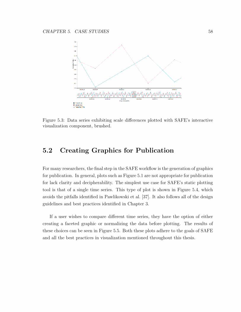
CHAPTER 5. CASE STUDIES 58
Figure 5.3: Data series exhibiting scale differences plotted with SAFE’s interactivevisualization component, brushed.
5.2 Creating Graphics for Publication
For many researchers, the final step in the SAFE workflow is the generation of graphics
for publication. In general, plots such as Figure 5.1 are not appropriate for publication
for lack clarity and decipherability. The simplest use case for SAFE’s static plotting
tool is that of a single time series. This type of plot is shown in Figure 5.4, which
avoids the pitfalls identified in Pawlikowski et al. [37]. It also follows all of the design
guidelines and best practices identified in Chapter 3.
If a user wishes to compare different time series, they have the option of either
creating a faceted graphic or normalizing the data before plotting. The results of
these choices can be seen in Figure 5.5. Both these plots adhere to the goals of SAFE
and all the best practices in visualization mentioned throughout this thesis.

CHAPTER 5. CASE STUDIES 59
Time Series Plot of Queue Size
Time (seconds)
Que
ue S
ize
(item
s)
2000
4000
6000
8000
10 20 30 40 50
variable
Queue Size
Figure 5.4: Single time series data series plotted with SAFE’s static visualizationcomponent.
Comparison of Metric 1 and Metric 2
Time (seconds)
Nor
mal
ized
Val
ue
0.2
0.4
0.6
0.8
5 10 15 20
variable
Metric 1
Metric 2
(a) Normalization
Comparison of Queue Size and Response Time
Time (seconds)
2000
4000
6000
8000
2
4
6
8
5 10 15 20 25 30
Queue S
ize (items)
Response T
ime (s)
(b) Faceting
Figure 5.5: Graphic demonstrating both options for dealing with different magnitudesand units.
5.3 Chapter Summary
This chapter discussed the most common scenarios for which SAFE’s visualization
component will be used and showed how it performed in such scenarios. These sce-
narios include time series data of different magnitude or units, comparing time series,

CHAPTER 5. CASE STUDIES 60
and generating static plots for publications. For all of these scenarios, SAFE’s visu-
alization component produces graphics that adhere to best practices in both network
simulation methodology and the creation of information graphics.

61
Chapter 6
Related Work
Numerous tools with goals similar to SAFE exist, both inside and outside the field
of network simulation. Some of these tools, such a SimProcTC, have integrated
plotting mechanisms into the core of the tool [18]. Other tools, such as James II,
have numerous communal projects which seek to support various types of information
visualization [33; 28]. The fact that these tools exist and realize the importance of
data visualization in output analysis gives credibility to the development of such a
tool for SAFE. Furthermore, my work builds upon many of the ideas presented in the
visualization components of these tools.
6.1 SimProcTC
SimProcTC [18] is a tool-chain developed to automate much of the work involved in
performing OMNeT++ network simulations. SimProcTC aids in simulation parametriza-
tion, distribution, and visualization of results. Simulation distribution in SimProcTC
is done through the Reliable Server Pooling (RSerPool) architecture, which was de-
veloped by the authors of SimProcTC, and is an accepted IETF standard. This
architecture considers session failover and redundancy in intelligently distributing

CHAPTER 6. RELATED WORK 62
simulations and managing a pool of servers running simulations.
Like SAFE, SimProcTC also contains a mechanism for visualization of experiment
results. The framework uses R for both simulation parametrization and plotting of
the results. Unlike SAFE though, the plotting functionality of SimProcTC is limited
to static plots. These plots are defined during experiment configuration using a
mechanism called Plotting Templates. These plotting templates are written in R, and
thus for the experimenter to utilize SimProcTC’s plotting mechanism, knowledge of
R is required.
SimProcTC does allow for other plotting mechanisms other than its internal one
to be used. This is accomplished by exporting the data into a space delimited table
file that can be read into GNU Plot, GNU Octave, and Microsoft Excel. With this
mechanism the user still must have some knowledge of plotting technologies, and
exploratory data analysis may be difficult.
6.2 Akaroa2
In terms of scope, Akaroa2 [36] is very similar to SAFE, seeking to make network sim-
ulation research practical and user-friendly. It is constructed around the paradigm of
Multiple Replications in Parallel (MRIP), also similar to SAFE. Akaroa2 is controlled
through a Shell Command Interface, similar to that for SAFE’s power users. It also
has a graphical user interface named akgui which runs on the desktop platform.
In terms of visualization, Akaroa2 does not have the ability to interactively plot
data. However, it does have a method for producing static plots through a series of
scripts. These scripts query Akaroa2’s Ingres relational database and produce plots
and tables of coverage and speedup versus selected experimental conditions.

CHAPTER 6. RELATED WORK 63
6.3 James II
Outside the area of network simulation, I have also found frameworks that closely
align with the scope of SAFE. A notable example is JAMES II [19], which provides
researchers in computational systems biology with support for modeling, experiment
design and execution, run length control, experiment storage and retrieval, and data
visualization and analysis. The concept of plug ins, which is widely applied in the
architecture of JAMES II, imbues the framework with a great deal of adaptability. We
have learned from this architecture and, in the development of SAFE, we are working
toward defining clear interfaces between components which might be conceived of as
plug ins.
James II also provides mechanisms for output analysis, both visual and statistical.
James II’s visual component for data analysis includes a line plot. This allows the
experimenter to view any numeric metric as it evolves over time.
6.4 Chapter Summary
While many tools of similar scope to SAFE have the ability to generate static plots,
few have the ability to generate rich, interactive visualizations. The fact that SAFE
was designed to be accessible to novice users calls for interactive visualizations that
are easy to manipulate. However, like other tools of similar scope, SAFE has an
extendable tool for generating static plots. Unlike most tools, though, SAFE offers
the its users interfaces that are appropriate to their levels of expertise.

64
Chapter 7
Conclusions and Future Work
The aim of data visualization goes far beyond the subjectivity of beautiful design.
Information visualization reveals patterns and knowledge that would be nearly im-
possible to quickly discern with rote data analysis. The amount of data generated
by network simulations make data visualization a powerful tool in analysis of results.
My work of coupling a strong visualization tool with built-in techniques for report-
ing credible results provides a much needed contribution to the network simulation
community.
This work fell under the umbrella of many disciplines including statistics, network
simulation, graphic design, and cognitive psychology. SAFE’s visualization tool was
constructed after careful study of the research literature in these fields. The ultimate
goal was to create a tool that lets the data speak for itself, effortlessly revealing its
knowledge to all interested observers, from researchers to students. This work was a
significant contribution to the advancement of SAFE, which ultimately benefits the
ns-3 community.
One area of planned future work is to extend SAFE’s static plotting component to
cover a larger variety of graphics. Currently the static plotting tool only has the ability
to create simple time series graphics. As more members of the network simulation
CHAPTER 7. CONCLUSIONS AND FUTURE WORK 65
community start to use SAFE, a notion of what other graphic types may be useful
will more easily obtainable. It is also planned to ensure that confidence intervals
are added to the graphic if the data is available. Since the tool was developed with
extendability in mind, adding these new graphic types will be straightforward.
Once a variety of graphic types are incorporated into the static plotting tool it
can also be extended further for power users. A convenient method for doing this
would be to include graphic configurations in the experiment configuration file. When
the experiment finishes these plots could be placed in the user’s compartment on the
server. This allows power users to avoid the web user interface entirely.
Another area of future work is investigating techniques for dealing with data series
either of different units or the same units with different magnitudes. Suggestions in
the current literature mitigate the problem, but do not solve it completely. Both
normalization and faceting can still distort relationships in the data depending on
how data is normalized and the axes are scaled. Finding a better way to deal with
this problem would improve the decipherability of the plots produced by SAFE’s
interactive visualization component.
A final area of planned future work is the expansion of the interactive plotting com-
ponent. As shown in Section 4.5, I investigated numerous open source technologies
which could have been leveraged by SAFE’s visualization component. Unfortunately
none of these tools turned out to be a good fit for integration with SAFE. One tool
that was not mentioned and could be useful for developing graphics that are not time-
series is Rickshaw [4]. Rickshaw’s time-series capabilities do not align with SAFE’s
design criteria, but many of the other graphic types provided by Rickshaw could be
useful in SAFE’s interactive visualization component. Further work is warranted in
investigation how these graphics could be integrated into SAFE’s visualization tool.
My work with SAFE began as a general investigation into how it could progress
from where Andrew Hallagan and Bryan Ward left off. It resulted in a coherent
design for SAFE as well as an implementation of the visualization component of this
design. Throughout this design and implementation process I uncovered issues that,

CHAPTER 7. CONCLUSIONS AND FUTURE WORK 66
to my knowledge, are not discussed in network simulation literature. These problems
include creating plots which do not scale attributes properly, misuse retinal variables,
and use double axes, just to name a few. The potential problems which Pawlikowski
et al. [37] discovered in network simulation publications only scratch the surface of
a myriad of graphic mistakes. By automating the workflow of the data analysis
process and providing a tool that encourages best practices I hope that publications
in network simulation become more comprehendible, aesthetically pleasing, and most
importantly credible.
67
References
[1] Frameworks for ns-3. Availabe at http://www.nsf.gov/awardsearch/
showAward.do?AwardNumber=0958142 [Online; accessed 28-June-2012].
[2] GNU General Public License. Available at http://www.gnu.org/licenses/
gpl.html [Online; accessed 23-January-2013].
[3] Various licenses and comments about them. Available at http://www.gnu.org/licenses/license-list.html [Online; accessed 23-January-2013].
[4] Rickshaw: A JavaScript toolkit for creating interactive time-series graphs. Avail-abe at http://code.shutterstock.com/rickshaw/ [Online; accessed 30-June-2012], 2012.
[5] Evented I/O for V8 JavaScript. Availabe at https://github.com/joyent/node[Online; accessed 5-March-2013], 2013.
[6] Introduction to using chart tools. Availabe at https://developers.google.
com/chart/interactive/docs/ [Online; accessed 5-March-2013], 2013.
[7] NVD3. Availabe at https://github.com/novus/nvd3 [Online; accessed 18-January-2013], 2013.
[8] Tableau server. Availabe at http://www.tableausoftware.com/products/
server [Online; accessed 13-March-2013], 2013.
[9] yeroon.net/ggplot2. Availabe at http://www.stat.ucla.edu/~jeroen/
ggplot2.html [Online; accessed 13-March-2013], 2013.
[10] Barrett, D. J., and Silverman, R. E. SSH, The Secure Shell: The Defini-tive Guide. O’Reilly & Associates, Inc., Sebastopol, CA, USA, 2001.
[11] Baxter-Reynolds, M. Here’s why you should be happy that Microsoft isembracing Node.js, 2011.

REFERENCES 68
[12] Bertin, J., and Berg, W. J. Semiology of Graphics. Esri Press, 2011.
[13] Bostock, M., Ogievetsky, V., and Heer, J. D3: Data-driven documents.IEEE Transactions on Visualization and Computer Graphics 17, 12 (Dec. 2011),2301–2309.
[14] Cagle, K. SVG Programming: The Graphical Web. APress Books, 2002.
[15] Cleveland, W. S. Visualizing Data, 1st ed. AT&T Bell Laboratories, MurrayHill, N.J., 1993.
[16] Cleveland, W. S., and McGill, R. Graphical perception: Theory, exper-imentation, and application to the development of graphical methods. Journalof the American Statistical Association 79, 387 (September 1984), 531–554.
[17] Dreibholz, T., Rathgeb, E. P., and Zhou, X. SimProcTC: The designand realization of a powerful tool-chain for OMNeT++ simulations. In Proceed-ings of the 2nd International Conference on Simulation Tools and Techniques(SIMUTools ’09) (2009), Institute for Computer Sciences, Social-Informatics andTelecommunications Engineering, pp. 75:1–75:8.
[18] Dreibholz, T., Rathgeb, E. P., and Zhou, X. Simproctc: The design andrealization of a powerful tool-chain for OMNeT++ simulations. In Proceedingsof the 2nd International Conference on Simulation Tools and Techniques (SIMU-Tools ’09) (2009), ICST (Institute for Computer Sciences, Social-Informatics andTelecommunications Engineering), pp. 75:1–75:8.
[19] Ewald, R., Himmelspach, J., Jeschke, M., Leye, S., and Uhrmacher,A. M. Flexible experimentation in the modeling and simulation frameworkJAMES II—implications for computational systems biology. Briefings in Bioin-formatics 11, 3 (January 2010), 290–300.
[20] Fettig, A. Twisted Network Programming Essentials, 1st ed. O’Reilly Media,2005.
[21] Firtman, M. Programming the Mobile Web, 1st ed. O’Reilly Media, July 2010.
[22] Flanagan, D. JavaScript: The Definitive Guide, 3rd ed. O’Reilly & Associates,Inc., Sebastopol, CA, USA, 1998.
[23] Garlandini, S., and Fabrikant, S. I. Evaluating the effectiveness and effi-ciency of visual variables for geographic information visualization. In Proceedingsof the 9th international conference on Spatial information theory (Berlin, Hei-delberg, 2009), COSIT’09, Springer-Verlag, pp. 195–211.
REFERENCES 69
[24] Garlapati, S. Blazing fast node.js: 10 performance tips fromLinkedIn Mobile. http://engineering.linkedin.com/nodejs/
blazing-fast-nodejs-10-performance-tips-linkedin-mobile, 2011.Accessed: 09/01/2012.
[25] Gautier, L. rpy2: A simple and efficient access to R from Python. URLhttp://rpy.sourceforge.net/rpy2.html (2011).
[26] Gesmann, M. Using the Google Chart Tools with R. Availabe at https:
//code.google.com/p/google-motion-charts-with-r/ [Online; accessed 30-January-2013], 2013.
[27] Hallagan, A. W. The design of XML-based model and experiment descriptionlanguages for network simulation, 2010. Honors Thesis, Bucknell University.
[28] Helms, T., Himmelspach, J., Maus, C., Rower, O., Schutzel, J., andUhrmacher, A. M. Toward a language for the flexible observation of sim-ulations. In Proceedings of the 2012 Winter Simulation Conference (WSC ’12)(2012), C. Laroque, J. Himmelspach, R. Pasupathy, and O. R. A. M. Uhrmacher,Eds.
[29] Holovaty, A., and Kaplan-Moss, J. The Django Book. 2013.
[30] Koepke, A., and Woesner, H. The ns-2/Akaroa2 project. Tech. Rep. TKN-01-008, Telecommunication Networks Group, Technical University of Berlin,Berlin, Germany, July 2001.
[31] Kurkowski, S., Camp, T., and Colagrosso, M. Manet simulation studies:The incredibles. ACM SIGMOBILE Mobile Computing and CommunicationsReview 9 (2005), 50–61.
[32] Lie, H. W., and Bos, B. Cascading Style Sheets: Designing for the Web,3rd ed. Addison-Wesley Professional, Boston, MA, May 2005.
[33] Luboschik, M., Rybacki, S., Ewald, R., Schwarze, B., Schumann, H.,and Uhrmacher, A. M. Interactive visual exploration of simulator accuracy:A case study for stochastic simulation algorithms. In Proceedings of the 2012Winter Simulation Conference (WSC ’12) (2012), C. Laroque, J. Himmelspach,R. Pasupathy, and O. R. A. M. Uhrmacher, Eds.
[34] Matloff, N. The Art of R Programming: A Tour of Statistical Software De-sign. No Starch Press, 2011.

REFERENCES 70
[35] Millman, E., Arora, D., and Neville, S. STARS: A framework for sta-tistically rigorous simulation-based network research. In Proceedings of the 2011IEEE Workshops of International Conference on Advanced Information Network-ing and Applications (WAINA) (March 2011), pp. 733–739.
[36] Pawlikowski, K. Akaroa2: Exploiting network computing by distributingstochastic simulation. In Proceedings of the 1999 European Simulation Multicon-ference (Warsaw, Poland, 1999), pp. 175–181.
[37] Pawlikowski, K., Jeong, H.-D. J., and Lee, J.-S. R. On credibilityof simulation studies of telecommunication networks. IEEE CommunicationsMagazine 40 (January 2002), 132–139.
[38] Perrone, L. F., Cicconetti, C., Stea, G., and Ward, B. C. On theautomation of computer network simulators. In Proceedings of the 2nd Interna-tional Conference on Simulation Tools and Techniques (2009), SIMUTools ’09,Institute for Computer Sciences, Social-Informatics and Telecommunications En-gineering, pp. 49:1–49:10.
[39] Perrone, L. F., Main, C. S., and Ward, B. C. SAFE: Simulation automa-tion framework for experiments. In Proceedings of the 2012 Winter SimulationConference (WSC ’12) (2012), C. Laroque, J. Himmelspach, R. Pasupathy, andO. R. A. M. Uhrmacher, Eds.
[40] Raggett, D., Lam, J., Alexander, I., and Kmiec, M. Raggett on HTML4, 2nd ed. Addison-Wesley Longman Publishing Co., Inc., Boston, MA, USA,1998.
[41] Riley, G. F., and Aremar, M. H. Simulating large networks - how big is bigenough? In Proceedings of the 1st International Conference on Grand Challengesfor Modeling and Simulation (2002).
[42] RStudio, Inc. Shiny. Availabe at https://github.com/rstudio/shiny [On-line; accessed 5-March-2013], 2013.
[43] Shneiderman, B. The eyes have it: A task by data type taxonomy for infor-mation visualizations. In Proceedings of the 1996 IEEE Symposium on VisualLanguages. (September 1996), pp. 336–343.
[44] Tufte, E. R. Envisioning Information, 1st ed. Graphics Press, Cheshire,Conn., 1990.

REFERENCES 71
[45] Tufte, E. R. The Visual Display of Quantitative Information, 2nd ed. GraphicsPress, Cheshire, Conn., 2001.
[46] Tukey, J. W. Exploratory Data Analysis, 1st ed. Addison-Wesley Series inBehavioral Science. Addison-Wesley Pub. Co., Reading, Mass., 1977.
[47] Vaughan-Nichols, S. J. The mobile web comes of age. Computer 41 (Novem-ber 2008), 15–17.
[48] W3C. CSS 3 working draft. http://www.w3.org/TR/css3-roadmap, 2011. Ac-cessed: 09/01/2012.
[49] Wainer, H. Visual Revelations: Graphical Tales of Fate and Deception fromNapoleon Bonaparte to Ross Perot. Copernicus, 1997.
[50] Ward, B. A framework for the automation of discrete-event simulation exper-iments. Bucknell University Undergraduate Honors Thesis., 2011.
[51] Wickham, H. ggplot2: Elegant Graphics for Data Analysis, 1st ed. Use R!Springer, New York, 2009.
[52] Wilkinson, L., and Wills, G. The Grammar of Graphics, 2nd ed. Springer,New York, 2005.