visualizations for data a critical review of usability...
TRANSCRIPT
REVIEW OF RESEARCH SUMMARYr Argues that the computer science orientation
to data visualizations is severely limited foraddressing many usability concerns
r Reviews the literature on the usability of datavisualizations and shows its contributions andblind spots
Visualizations for DataExploration and Analysis:
A Critical Review ofUsability ResearchBARBARA MIREL
Data visualization has been called the “killer app”of the 1990s (Card 1996). It is a powerful tool forexploring and analyzing data—for discoveringas well as testing hypotheses. This technology
has the potential to change the questions that people areable to pose to their data and transform their analyticalmethods and decision-making processes. It may, in fact, bethe next generation of data reporting tools. In this article Iargue that the prevailing computer science orientation todata visualizations is severely limited for addressing manyof the usability concerns associated with supporting usersin three critical problem areas—sophisticated visual liter-acy, complex data analysis, and new paradigms of visualinquiry. This article critically reviews the usability literatureabout data visualizations.
I first describe what visualization technology is andwhat is uncharted about the three usability areas of per-ceptually rich, interactive displays; complex problem-solv-ing; and visual querying. Then I explain what it means totake a computing—specifically an object-oriented—per-spective on the usability of visualizations, emphasizing thelimitations of this point of view when it comes to support-ing users in complex activities and reasoning.
Against this background, I critically review the currentliterature on the usability of data visualizations—primarilyauthored by computing specialists—and show the contri-butions and blind spots of current usability investigations.I find that this computing orientation causes investigatorsto overlook key relationships between users’ current ana-lytical practices; aspects of these practices that translatereadily to data visualizations; aspects that are new, requir-ing users to learn unfamiliar concepts and procedures rel-evant to visually structuring, querying, and exploring data;
and the interfaces and instructions that facilitate these map-pings.
The literature, for example, is mostly silent about thesupport that users need to monitor where they’ve been andwhere they’re heading or about the effectiveness of video-clips in online help versus conventional textual online helpin guiding users to successfully apply difficult conceptssuch as creating effective structures in complicated net-work diagrams. My aim is to prompt technical communi-cators—with their expertise in rhetoric and situated activi-ties—to conduct additional usability studies that will fill inthe current gaps occasioned by a dominant object-orientedperspective.
Three-dimensional visualizations are outside the scopeof this article because they warrant their own separatereview. In many respects, the advanced visual thinkingrequired for interactive 3-d data displays—motion detec-tion, spatial orientation, and complex image segmentationin multiple planes—is quite different from the visual liter-acy I discuss in this article.
WHAT IS INFORMATION VISUALIZATION?Data visualization technology has been around in medi-cine, science, and geography for some time and is onlyrecently starting to make headway into the business world.Unlike the static presentation graphics found in softwaresuch as Excel, SPSS, or Crystal Reports, data visualizationsare interactive and linked dynamically. Interactively, theyallow people to use mouse clicks and menu functions to
Manuscript received 15 April 1998; revised 30 June 1998;accepted 7 July 1998.
Fourth Quarter 1998 • TechnicalCOMMUNICATION 491
move almost seamlessly between overviews, detailed dis-plays, and different perspectives on the same data. Ingraphic overviews, users can examine the large-scale struc-ture of their data to discern patterns, trends, correlations,and outliers. Then they can click on or sweep across areasof interest and “blow them out” into greater and greaterdetail, with many graphs open and referenced to eachother at once. With dynamic linking, when users changeone graphic display, the others automatically update toreflect the changes. This dynamic updating gives usersdifferent views of the same information at the same mo-ment. For an example of this interactivity and dynamiclinking, see Figure 1.
With visualizations, users can see the data that data-base, spreadsheet, statistical, and graphing programs reportonly textually or present through static displays. Instead ofhaving to spend hours and even days searching through 50or more pages of reports to analyze the relationships that
they need for a decision, users may interact with datavisualizations to quickly retrieve and interpret data from a10,000-foot view and from a close-up detailed view almostat the same moment.
The beauty of data visualizations is that they exploitthe quickness of the human perceptual processing system.They enable users to see the structure of large amounts ofdata in one view and to identify outliers, aberrations,trends, and affinities at a glance.
Unlike conventional database queries in which everynew question requires users to return to a query screen towrite a new statement and wait for the program to providethe new response, querying in data visualizations is imme-diate and cumulative. Users select the data and graph thatthey want to display; then they proceed through a processof incrementally selecting subsets, adding dimensionthrough perceptual cues such as color coding and sizing ofdata points, drilling down for detail, zooming out again to
Figure 1. The top data sheet shows details of each record, and the scatterplot (overview) shows that some but not much correlation
exists between the average time telephone operators spend on ACW calls and the time they spend on ACD calls. In some cases,
however, it looks like a strong relationship exists (positively and negatively)—the outlier cases. In the bottom example, users of the
visualizations can select only the outliers as points of interest; the data sheet will update to show only these records. Now users may
zoom in on these selected records and inquire further into factors explaining the relationships.
REVIEW OF RESEARCHVisualizations for Data Explorations and AnalysisMirel
492 TechnicalCOMMUNICATION • Fourth Quarter 1998
relate micro and macro views, transforming data into newvariables, reorganizing data structures and relationships,and animating data relationships to see parts in relation tothe whole or to see changes over time. Unlike databasequerying and reporting, interactive, visualized inquiry isnonlinear.
Data visualizations have powerful potential uses inbusiness, some of which can already be realized thoughproducts available in the market (Wright 1997). For in-stance, visualizations extend data warehousing, data min-ing, and online analytical processing (OLAP) to a visualdimension, literally giving users a hands-on view of largequantities of corporate data for operational and strategicdecisions (Boyle, Eick, Hemmje, Keim, Lee, and Sumner1993). IBM’s Business Objects is heading in this visualizeddirection, as is an initiative in Lucent Technologies’ VisualInsights.
Visualizations also effectively display the structure andprocesses of corporate infrastructures. Platinum, for exam-ple, has built software with Visual Insights’ dynamic visualcomponents that pinpoints troublesome programs andcode for the Year 2000 (http://www.platinum.com/products/year2k/y2k.htm). For corporate infrastructures,visualizations also target network traffic, system perfor-mance, and efficiencies in distributed and geographicallydispersed corporate computing environments. At present,Tivoli and HP OpenView are integrating visualizations intotheir network monitoring packages. My group in VisualInsights is producing software in this space, as well(Baldonado and Winograd 1997; http://www.visualinsights.com). Finally, all-purpose visualizations such as Spotfireare available and are used, for instance, in the pharmaceu-tical industry (Alberg and Wistrad 1995; http://www.ivee.com/applications).
Despite these applications, data visualizations havebeen slow to take hold in the business world due, in part,to usability problems (Roth, Chuah, Kerpedjiev, andKolojejchick 1997). Three problems are particularly vexing:
r Aiding users in creating and understanding richlyencoded displays of data in which visual cues arefluid and open for modification
r Supporting users in complex, open-ended data anal-ysis tasks for nonstructured problems and under-
specified goals, tasks for which users have manylegitimate and contending options for displaying andanalyzing data
r Helping users manage their inquiries, includingmonitoring progress; evaluating the accuracy andvalidity of inferences and perceptual assumptions;organizing paths of inquiry, cumulative interpreta-tions, and findings; retracing steps after false moves;and returning to interrupted workBefore data visualizations become common fare, they
must overcome these usability problems. The followingsections expand on these problems.
1. Understanding and manipulatinggraphics rich in perceptual cuesThe strength of interactive visualizations is that they exploitperception and pattern recognition. Yet the more informa-tion that visual cues carry, the more usability may bethreatened—unless developers and interface and docu-mentation designers help to make visual information andmanipulation accessible to users. Visual coding adds di-mension to data plots through color, shape, size, or thick-ness. For example, a bar chart may show the number ofproducts sold and be color-coded by revenue generated,enabling users at a glance to see simultaneously eachproduct’s sales and revenues. Users may progressively addmore and more encoding to a single graph. Positioningcarries information as well—suggesting close relationshipsand affinities between physically proximate data points. Byrearranging or reordering data, users see relationships fromdifferent angles.
Drawing meaning from these perceptually sophisticatedand modifiable graphs calls for an advanced visual literacy.Visual literacy may be defined as a “basic system of grammarfor learning, recognizing, making, and understanding visualmessages that are negotiable by all audiences” (Brasseur1997). People vary in literacy by aptitude, experience, andtraining. As Brasseur notes, computer technologies have ush-ered in the need for advanced visual thinking because theyoffer ways to present and compose more visually complexdisplays than ever before. To read and interpret these dis-plays, users need to engage in sophisticated Gestalt percep-tion, complicated associations in mental processing, and in-formed manipulation for interactivity.
Perceptual decoding is particularly challenging in vi-sualizations that present multiple and at times contradictoryvisual cues at once. For instance, a network diagram maydepict projects belonging to various departments in a com-pany. Users may color code projects (the nodes in thediagram) by the risk associated with each project and at thesame time color code the links between departments andprojects by the project value. Color-coding the nodes andlinks on different values can result in a graphic that is
The beauty of data visualizations isthat they exploit the quickness ofthe human perceptual processing
system.
REVIEW OF RESEARCHVisualizations for Data Explorations and Analysis Mirel
Fourth Quarter 1998 • TechnicalCOMMUNICATION 493
difficult to interpret. If blues represent low values and redsrepresent high values, users will confront contradictorycueing. In looking for prize projects—low risk, high val-ue—they have to coordinate blue nodes and red links, aperceptual inconsistency that is likely to give them pause.Tests conducted in the usability lab by my group show thatprocessing these contradictions slows performance timesconsiderably.
Sophisticated decoding processes may never comeeasily to most people, much as interpreting complex, con-ditional sentences with compound negatives requires timeand effort even for people familiar with such linguisticconstructions. Yet certain dimensions of visual literacyseem to make a difference between the ability to makesense of visually rich displays or not. At the very least, usersneed to know how to find an entry point into a perceptu-ally rich landscape to render its encoded information intel-ligible. Even this minimal requirement in advanced visualliteracy requires support for users.
2. Supporting optimally complex tasks withminimal technological complicationIn most analysis and reporting programs, designers try tostrike a balance between enabling ad hoc analyses andsupporting frequently performed tasks through “canned”views and routines. Striking this balance is difficult in datavisualizations because this technology, at heart, targetscomputing for “wicked problems,” that is, for nonstruc-tured problems that lead users toward open-ended explo-ration more than formulaic methods and solutions. Theseproblems and tasks are notoriously difficult to model (Mirel1997). They have no clear stopping rules, and people’sapproaches depend a good deal on contextual factors,contingencies, and constraints, dynamics that exceed therepresentational capabilities of coding. In addition, com-plex tasks involve trial and error and serendipity, and theyengage users in many problem spaces at once. The hardpart is not developing functionality relevant to complextasks and problems. The hard part is supporting users intheir efforts to figure out how to control the visualizationsoftware so they can pursue paths of inquiry relevant totheir individual purposes.
Designers typically deal with this balance betweenuser and program control by simplifying complex tasks(Berg 1997). They localize tasks to target a specific domain;slice them into generic, decomposed parts; represent theseunit-sized parts in program functions and menu options;and offer, on the one hand, a standard version of thesoftware that provides prestructured tasks and routines andon the other hand, a professional version for nonstructuredad hoc inquiries and customizations. One problem withthis strategy for data visualizations—as findings fromneeds-gathering sessions for my group’s product under-
score—is that experienced data analysts and decision mak-ers want pre-scripted tasks along with ad hoc capabilities ina single, accessible product. As one person who is aninexperienced visualization user but an expert data analystsaid in interviews, “Without the ability to create my ownviews, the program isn’t valuable.”
Unfortunately, these user desires for control are likelyto outstrip users’ initial abilities to advantageously manip-ulate the full power of interactive visualizations. Accompa-nying the need to strike the right balance, therefore, is theneed to support users in the ad hoc tasks that they control.The learning curve is high. Unfortunately, within the pre-vailing object-oriented perspective in current usability test-ing, little investigation has been done to identify just howhigh this learning curve is. Nor have studies closely exam-ined both the information and instruction—form and con-tent—that users need and the most appropriate media todeliver distinct types of information—the interface, onlinehelp, or training. These questions are crucial to effectivetask performance. They also are rhetorical at heart and falldirectly within the purview of technical communicators.
Finally, another area of support required for complextasks is helping users interpret data accurately and managetheir inquiries. Users, for example, have to coordinate andmanage the iterative processes of calling up and drillingdown in relevant data. They have to organize emerginginferences and findings, keep track of various views of thedata, and check the validity and accuracy of their percep-tions. Many of these activities related to managing inquiriesare unique to interactive data visualizations.
3. Facilitating visual querying and explorationVisualization technology embodies a new paradigm forquerying and analyzing data, and users need to learn thisparadigm. Over time, this mode of inquiry may becomesecond nature to users, but at first it requires a transitionfrom conventional modes of querying based on databasereporting, Boolean logic, and statistical analysis. Conven-tional querying, unfortunately, does not directly map ontothe multiviewed and perceptually rich interpretations anddirect manipulations associated with visual queries. In vi-sual querying and analysis, users need to know whatgraphic or set of graphics should display what data toanswer specific—and often fuzzy—questions that they are
Visualization technology embodiesa new paradigm for querying andanalyzing data, and users need to
learn this paradigm.
REVIEW OF RESEARCHVisualizations for Data Explorations and AnalysisMirel
494 TechnicalCOMMUNICATION • Fourth Quarter 1998
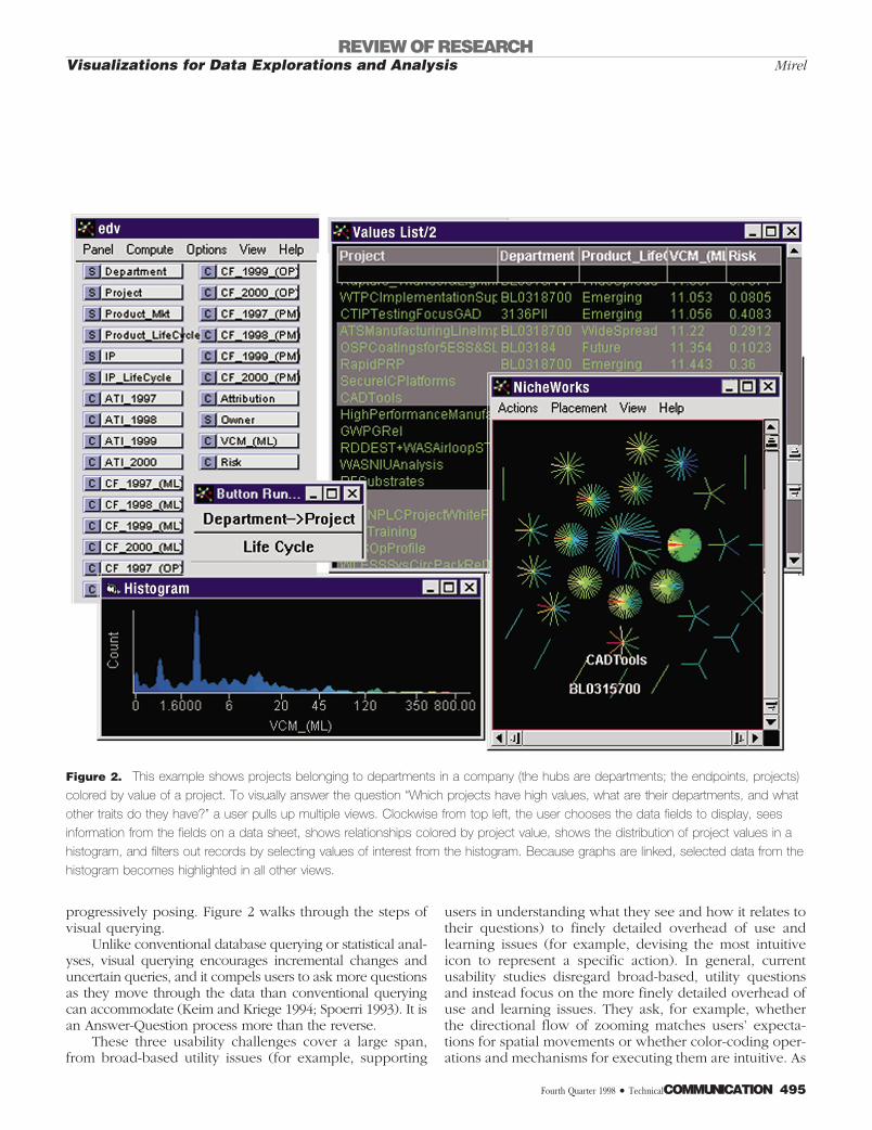
progressively posing. Figure 2 walks through the steps ofvisual querying.
Unlike conventional database querying or statistical anal-yses, visual querying encourages incremental changes anduncertain queries, and it compels users to ask more questionsas they move through the data than conventional queryingcan accommodate (Keim and Kriege 1994; Spoerri 1993). It isan Answer-Question process more than the reverse.
These three usability challenges cover a large span,from broad-based utility issues (for example, supporting
users in understanding what they see and how it relates totheir questions) to finely detailed overhead of use andlearning issues (for example, devising the most intuitiveicon to represent a specific action). In general, currentusability studies disregard broad-based, utility questionsand instead focus on the more finely detailed overhead ofuse and learning issues. They ask, for example, whetherthe directional flow of zooming matches users’ expecta-tions for spatial movements or whether color-coding oper-ations and mechanisms for executing them are intuitive. As
Figure 2. This example shows projects belonging to departments in a company (the hubs are departments; the endpoints, projects)
colored by value of a project. To visually answer the question “Which projects have high values, what are their departments, and what
other traits do they have?” a user pulls up multiple views. Clockwise from top left, the user chooses the data fields to display, sees
information from the fields on a data sheet, shows relationships colored by project value, shows the distribution of project values in a
histogram, and filters out records by selecting values of interest from the histogram. Because graphs are linked, selected data from the
histogram becomes highlighted in all other views.
REVIEW OF RESEARCHVisualizations for Data Explorations and Analysis Mirel
Fourth Quarter 1998 • TechnicalCOMMUNICATION 495

I show in the later sections, they do not ask such utilityquestions as how the program, instructions, or both facili-tate users’ efforts to compare outcomes from two differentpaths of inquiry when the data displays that they createalong the way have changed.
Because of the relatively narrow scope in current us-ability investigations, findings provide only a partial pictureof what constitutes usable data visualizations. We have yetto fill in the other parts with studies conducted from moresituated and rhetorical perspectives. Given that data visu-alization is a powerful mode of visual communication withsignificant usability challenges, it is surprising that technicalcommunicators have virtually ignored it. As a human fac-tors manager for visualization software, my experienceswarn me that this neglect may have dire consequences. Justat the time when this breakthrough technology is cominginto its own and is still malleable, the influence of technicalcommunicators, with their rhetorical bent and their con-cern for activity-in-context, is relatively absent.
In the past five years, no issue of Technical commu-nication has included an article on data visualizations al-though during these same years the literature in human-computer interaction has been awash in such articles–authored primarily by computer science specialists. In thissame time span, the Visual Communication stem of the STCAnnual Conference has included presentations on topicsranging from user interface design to technical illustrations,hypertext, Web design, international visual communica-tion, teleconferencing, and—increasingly—multimedia de-sign (so much so that the name of the stem changed in 1997to Multimedia Communication). Again, no presentation hasdealt with visualizations for interactive data analysis.
Interactive graphics are prime candidates for study bytechnical communicators, but this advanced technology andmethod of visual communication seem to be slipping throughthe cracks of technical communication. Instead, computingspecialists are shaping what will become the conventions for
visualization interfaces and instructions, and the standards forvisually manipulating and understanding data. Many of thesespecialists, trained primarily in software graphics and com-puter science, are in the field of human-computer interaction(HCI). Although HCI is a “sister field” to technical communi-cation, many of these specialists’ computing backgroundsgive them a perspective and design language distinct fromthose of technical communicators and contextually orientedtask analysts (Agre 1997).
Before I discuss the specific contributions and omis-sions found in this usability literature, I further explain inthe next section the object-oriented perspective thatgrounds and shapes the scope of much of the research inthis literature.
AN OBJECT-ORIENTED PERSPECTIVEIt is not surprising that a focus on finely detailed issues inusability studies dominates the literature. Most visualizationdesigners and developers are trained in computer scienceand are strongly disposed to thinking in object-orientedterms and categories. By object-oriented, I mean the ten-dency to break activities down to their smallest parts orbasic elements, each with associated properties and events.For example, an object-oriented view of the activity ofreading a book would see the book as an object withproperties such as pages, binding, printed words, covers.In being read, the book and its properties are subject tosome of the events associated with books in general andwith this book in particular—for instance, reading silently,reading aloud, opening and closing it, leafing though it, ormarking passages for later reference.
This decomposing strategy is the basis for program-ming languages such as C11. It also may frame the waysin which developers and designers treat human activity inthe real world, transposing their coding practices ontohuman activity-in-context. This transposition may happeneven when computer professionals understand and appre-ciate the complexities of human problem-solving. When itdoes happen, contextual aspects drop out of descriptionsof users’ work. In designing, therefore, interface and doc-umentation specialists pay little if any attention to thesenow absent contextual influences on work.
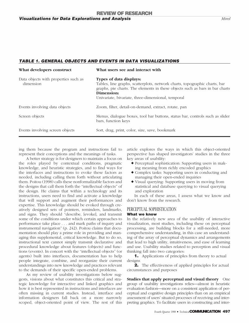
Table 1, derived from Shneiderman (1996), shows thatfor data visualizations, a number of general objects andevents are common.
Object-orientation is neither good nor bad. It—orsomething akin to it—is a fact of life in programminggenerally and visualization technology specifically. Short-sightedness in usability arises, however, when investigatorsrely on object-orientation as their only frame of reference.Then the context and other nonformalizable knowledgeand practices that disappear in descriptions of work be-come lost forever—or at least until users insist on reassert-
Interactive graphics are primecandidates for study by technical
communicators, but this advancedtechnology and method of visual
communication seem to be slippingthrough the cracks of technical
communication.
REVIEW OF RESEARCHVisualizations for Data Explorations and AnalysisMirel
496 TechnicalCOMMUNICATION • Fourth Quarter 1998
ing them because the program and instructions fail torepresent their conceptions and the meanings of tasks.
A better strategy is for designers to maintain a focus onthe roles played by contextual conditions, pragmaticknowledge, and heuristic strategies, and to find ways forthe interfaces and instructions to evoke these factors asneeded, including calling them forth without articulatingthem. Poitou (1998) calls these nonformalizable factors andthe designs that call them forth the “intellectual objects” ofthe design. He claims that within a technology and itsinstructions, users need to find and activate a knowledgethat will support and augment their performances andexpertise. This knowledge should be evoked through cre-atively designed sets of pointers, reminders, landmarks,and signs. They should “describe, [evoke], and transmitsome of the conditions under which certain approaches toperformance take place . . . and mark paths of inquiry andinstrumental navigation” (p. 242). Poitou claims that docu-mentation should play a prime role in providing and man-aging this supplemental, critical knowledge. But to do so,instructional text cannot simply transmit declarative andprocedural knowledge about features (objects) and func-tions (events). In concert with the “intellectual objects” (oragents) built into interfaces, documentation has to helppeople integrate, combine, and reorganize their currentunderstandings into new knowledge and practices relevantto the demands of their specific open-ended problems.
As my review of usability investigations below sug-gests, visions about what constitutes this critical and stra-tegic knowledge for interactive and linked graphics andhow it is best represented in instructions and interfaces areoften missing in current studies. Instead, interface andinformation designers fall back on a more narrowlyscoped, object-oriented point of view. The rest of this
article explores the ways in which this object-orientedperspective has shaped investigators’ studies in the threekey areas of usability:
r Perceptual sophistication: Supporting users in mak-ing meaning from richly encoded graphics
r Complex tasks: Supporting users in conducting andmanaging their open-ended inquiries
r Visual querying: Supporting users in moving fromstatistical and database querying to visual queryingand explorationIn each of these areas, I assess what we know and
don’t know from the research.
PERCEPTUAL SOPHISTICATIONWhat we knowIn the relatively new area of the usability of interactivevisualization, most studies, including these on perceptualprocessing, are building blocks for a still-needed, morecomprehensive understanding, in this case an understand-ing of the array of perceptual dynamics and arrangementsthat lead to high utility, intuitiveness, and ease of learningand use. Usability studies related to perception and visualthinking fall into two categories:
1. Applications of principles from theory to actualdesigns
2. The effectiveness of applied principles for actualcircumstances and purposes
Studies that apply perceptual and visual theory Onegroup of usability investigations relies—almost in heuristicevaluation fashion—more on a consistent application of per-ceptual and cognitive design principles than on an empiricalassessment of users’ situated processes of receiving and inter-preting graphics. To facilitate users in constructing and inter-
TABLE 1. GENERAL OBJECTS AND EVENTS IN DATA VISUALIZATIONS
What developers construct What users see and interact with
Data objects with properties such asdimension
Types of data displays:Tables, line graphs, scatterplots, network charts, topographic charts, bargraphs, pie charts. The elements in these objects such as bars in bar chartsDimension:Univariate, bivariate, three-dimensional, temporal
Events involving data objects Zoom, filter, detail-on-demand, extract, rotate, pan
Screen objects Menus, dialogue boxes, tool bar buttons, status bar, controls such as sliderbars, function keys
Events involving screen objects Sort, drag, print, color, size, save, bookmark
REVIEW OF RESEARCHVisualizations for Data Explorations and Analysis Mirel
Fourth Quarter 1998 • TechnicalCOMMUNICATION 497
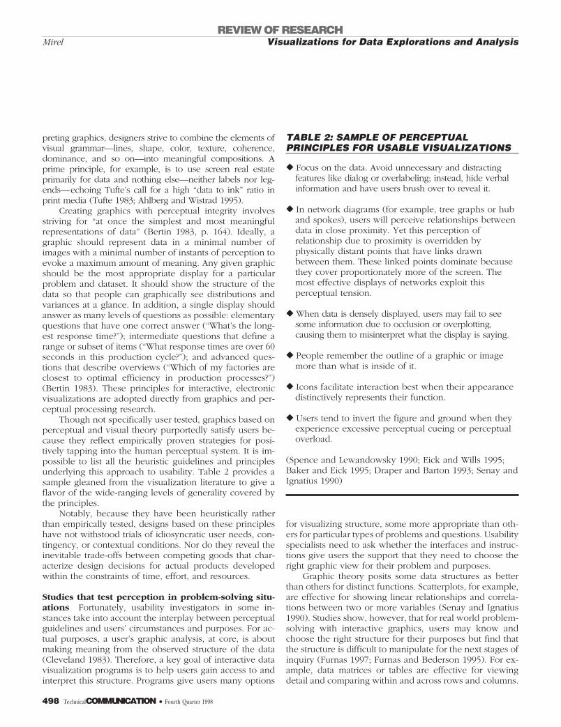
preting graphics, designers strive to combine the elements ofvisual grammar—lines, shape, color, texture, coherence,dominance, and so on—into meaningful compositions. Aprime principle, for example, is to use screen real estateprimarily for data and nothing else—neither labels nor leg-ends—echoing Tufte’s call for a high “data to ink” ratio inprint media (Tufte 1983; Ahlberg and Wistrad 1995).
Creating graphics with perceptual integrity involvesstriving for “at once the simplest and most meaningfulrepresentations of data” (Bertin 1983, p. 164). Ideally, agraphic should represent data in a minimal number ofimages with a minimal number of instants of perception toevoke a maximum amount of meaning. Any given graphicshould be the most appropriate display for a particularproblem and dataset. It should show the structure of thedata so that people can graphically see distributions andvariances at a glance. In addition, a single display shouldanswer as many levels of questions as possible: elementaryquestions that have one correct answer (“What’s the long-est response time?”); intermediate questions that define arange or subset of items (“What response times are over 60seconds in this production cycle?”); and advanced ques-tions that describe overviews (“Which of my factories areclosest to optimal efficiency in production processes?”)(Bertin 1983). These principles for interactive, electronicvisualizations are adopted directly from graphics and per-ceptual processing research.
Though not specifically user tested, graphics based onperceptual and visual theory purportedly satisfy users be-cause they reflect empirically proven strategies for posi-tively tapping into the human perceptual system. It is im-possible to list all the heuristic guidelines and principlesunderlying this approach to usability. Table 2 provides asample gleaned from the visualization literature to give aflavor of the wide-ranging levels of generality covered bythe principles.
Notably, because they have been heuristically ratherthan empirically tested, designs based on these principleshave not withstood trials of idiosyncratic user needs, con-tingency, or contextual conditions. Nor do they reveal theinevitable trade-offs between competing goods that char-acterize design decisions for actual products developedwithin the constraints of time, effort, and resources.
Studies that test perception in problem-solving situ-ations Fortunately, usability investigators in some in-stances take into account the interplay between perceptualguidelines and users’ circumstances and purposes. For ac-tual purposes, a user’s graphic analysis, at core, is aboutmaking meaning from the observed structure of the data(Cleveland 1983). Therefore, a key goal of interactive datavisualization programs is to help users gain access to andinterpret this structure. Programs give users many options
for visualizing structure, some more appropriate than oth-ers for particular types of problems and questions. Usabilityspecialists need to ask whether the interfaces and instruc-tions give users the support that they need to choose theright graphic view for their problem and purposes.
Graphic theory posits some data structures as betterthan others for distinct functions. Scatterplots, for example,are effective for showing linear relationships and correla-tions between two or more variables (Senay and Ignatius1990). Studies show, however, that for real world problem-solving with interactive graphics, users may know andchoose the right structure for their purposes but find thatthe structure is difficult to manipulate for the next stages ofinquiry (Furnas 1997; Furnas and Bederson 1995). For ex-ample, data matrices or tables are effective for viewingdetail and comparing within and across rows and columns.
TABLE 2: SAMPLE OF PERCEPTUALPRINCIPLES FOR USABLE VISUALIZATIONS
r Focus on the data. Avoid unnecessary and distractingfeatures like dialog or overlabeling; instead, hide verbalinformation and have users brush over to reveal it.
r In network diagrams (for example, tree graphs or huband spokes), users will perceive relationships betweendata in close proximity. Yet this perception ofrelationship due to proximity is overridden byphysically distant points that have links drawnbetween them. These linked points dominate becausethey cover proportionately more of the screen. Themost effective displays of networks exploit thisperceptual tension.
r When data is densely displayed, users may fail to seesome information due to occlusion or overplotting,causing them to misinterpret what the display is saying.
r People remember the outline of a graphic or imagemore than what is inside of it.
r Icons facilitate interaction best when their appearancedistinctively represents their function.
r Users tend to invert the figure and ground when theyexperience excessive perceptual cueing or perceptualoverload.
(Spence and Lewandowsky 1990; Eick and Wills 1995;Baker and Eick 1995; Draper and Barton 1993; Senay andIgnatius 1990)
REVIEW OF RESEARCHVisualizations for Data Explorations and AnalysisMirel
498 TechnicalCOMMUNICATION • Fourth Quarter 1998
But for large amounts of data, data tables are too extensiveto permit users to select subsets easily for further analysis.Researchers propose that interfaces and instructions shouldhelp users negotiate this tension between visualizing thebest structure for meaning versus the best structure forinteractivity. For example, options such as “folding lists”can fold away irrelevant columns and rows, or instructionalcues for interactivity can guide users in taking advantage ofdynamic linking. With linking they may bring up one dis-play for structure, another for interactive filtering—withselections from the second graph automatically propagat-ing to the first.
Usability researchers have also user tested perceptualprinciples for color-coding. Researchers debate how manycolors visualization programs should use for color-codingand how users interpret the logic of coloring (Hendee1997). Many visualization technologies color code usingthe entire color spectrum. Low values in the data corre-spond to cool colors (blues) in the spectrum, high values tohot colors (reds), and the values between low to high,respectively, to greens, yellows, and oranges (Eick andFyock 1996). Color-coding with the full spectrum has ob-vious pitfalls for people with impaired vision such as color-blindness. In addition, it is a design choice that assumespeople intuitively map a spectrum in one-to-one fashion toa linear logic in their data. However, many peoples do notperceive colors in the same way that our culture does. Forexample, some groups see only three colors in the world—black, white, and red—or four or five—black, white, red,green, and/or yellow (Wilson 1998). As Hendee (1997)stresses, categorizing logical linear orders in terms of wave-length is a modern phenomenon.
Even when people do perceive and think in terms ofour full color spectrum, they find color-coding by the fullspectrum to be useful only for some problem-solving situ-ations but not for others. Tweedie, Spence, Dawkes, and Su(1996) find, for example, that when users work with sig-nificant details to answer pressing questions, fewer colors(green, yellow, and red) convey the meanings that they arelooking for better than does the whole spectrum. Similarly,users whom I have interviewed stress that when they trou-bleshoot, they want only three colors, preferably the traffic
light metaphor—red for trouble, yellow for caution, andgreen for no problem. This metaphor is not surprisingbecause color is most useful when it corresponds closely tothe feature or relationship that users are analyzing (Wells1997). In contrast, for planning purposes when nuances areimportant, users value a full spectrum scheme for colorcoding.
On a different note, Hix, Templeman, and Jacob (1995)find that users benefit from having the color cueing used indata displays reiterated in the text that goes with the par-ticular datapoints. When users see a label in the same coloras its associated referent—reinforcing the encoded mean-ing—they are able to perform tasks that were previouslyimpossible for them.
As extensive as the perceptual research is in terms ofdesigning graphics to “standard,” a good deal more needsto be conducted to discover when, why, and how users’actual interactions and needs for real world problem-solv-ing may run counter to perceptual guidelines.
What we don’t knowBy and large, studies on the usability of visual design andperceptual cues focus on isolated features—for instance,the number of colors to use for color coding or the datastructures that best match both users’ purposes and theirsubsequent actions for analysis (Cleveland 1993; Tukey1977; Bertin 1983; Tufte 1983). This discrete tendency ac-cords with the “decomposed tasks” framework of object-oriented design and programming.
Numerous aspects of perceptual processing have yet tobe studied adequately, as follows:
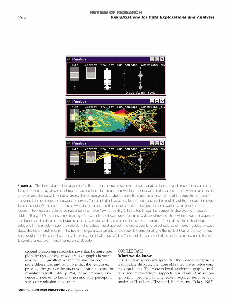
r The effect of users’ prior knowledge and expec-tations on their interpretations of what theysee Studies show that users’ domain knowledgeoften biases and leads them to mistaken meaningsabout visual cues; similarly, the more unfamiliar us-ers are with a type of graphic (for example, a net-work graph), the more likely they are to read thingsinto the view that are not actually there (Wells1997). Figure 3 shows an unfamiliar graph that mayconfound users in terms of an entry point and interms of knowing how to decode all the layers ofmeaning characteristically embedded in this type ofdisplay.
r Trade-off areas such as users’ needs for labelsand other information competing against theprinciple of using screen real estate primarilyfor data (Kitajima and Polson 1996)
r Limits in users’ perceptual processing capabili-ties Occlusion and perceptual overloading arestrong usability concerns, as are the encoding anddecoding of multiple visual cues in a given displayat once (size, shape, color, position, thickness). Per-
Fortunately, usability investigatorsin some instances take into account
the interplay between perceptualguidelines and users’ circumstances
and purposes.
REVIEW OF RESEARCHVisualizations for Data Explorations and Analysis Mirel
Fourth Quarter 1998 • TechnicalCOMMUNICATION 499
ceptual processing research shows that because peo-ple’s “analysis of organized areas of graphs [texture]involves . . . preattentive and attentive vision,” themore differences and variations that the texture ex-presses, “the greater the attentive effort necessary forcognition” (Wells 1997, p. 394). More empirical evi-dence is needed to know when and why perceptualstress or confusion may occur.
COMPLEX TASKSWhat we do knowVisualization specialists agree that the more directly usersmanipulate displays, the more able they are to solve com-plex problems. The conventional wisdom in graphic anal-ysis and methodology supports this claim. Any seriousgraphical, problem-solving effort requires iterative dataanalysis (Chambers, Cleveland, Kleiner, and Tukey 1983).
Figure 3. This boxplot graphic is a type unfamiliar to most users. Its columns present variables found in each record in a dataset. In
the graph, users may view sets of records across the columns and see whether records with similar values for one variable are related
on other variables as well. In this example, the records give data about transactions across an internet—that is, requests from users’
desktops (clients) across the network to servers. The graph displays values for the hour, day, and time of day of the request; it shows
the user’s login ID, the name of the software being used, and the response time—how long the user waited for a response to a
request. The views are colored by response time—blue (low) to red (high). In the top image, the parabox is displayed with records
hidden. The graph’s outlines carry meaning—for example, the boxes used for numeric data outline and shadow the means and quartile
distributions in the dataset; the bubbles used for categorical data are proportioned by the number of records within each plotted
category. In the middle image, the records in the dataset are displayed. The user’s goal is to select records of interest, guided by cues
about distribution and means. In the bottom image, a user selects all the records corresponding to the busiest hour of the day to see
whether other attributes in those records are correlated with hour of day. The graph is rich and challenging for someone unfamiliar with
it; coloring brings even more information to decode.
REVIEW OF RESEARCHVisualizations for Data Explorations and AnalysisMirel
500 TechnicalCOMMUNICATION • Fourth Quarter 1998
It involves looking at data in several ways, constructing anumber of plots, doing several analyses, letting the resultsof each step affect the next, and ensuring throughout thatone does not discern things in the data that are not there.Within this framework, three aspects of interactive visual-izations for solving complex problems are critical:
1. Users’ extent of control in an inquiry session2. Their success in interpreting data relationships3. Their skills in managing their inquiries
Extent of user’s control In characterizing the most in-tellectually satisfying computer-supported task situationsfor users, Frese (1987) argues that users thrive when theyhave maximum control over their work, optimal complex-ity in their tasks, and minimal complications from the tech-nology. Achieving this ideal in real contexts is a significantchallenge in interactive data visualizations. Recently, as astarting point for this idea, Buckingham Shum, MacLean,Bellotti, and Hammond (1997) have highlighted the rhetor-ical nature of design, stressing that as an argument, designrequires negotiating and collaborating with stakeholders(users) and their workplace perspectives. Invariably inthese dialogues, questions will arise about how much con-trol users want over their work processes, how much“canned” support they will accept for generalizable parts oftheir problem-solving, and how they would like a programto combine the two modes.
Few studies assess this tension. Johnston (1991), whodoes look at this question, finds that users want customiz-ing capabilities very shortly after they begin using visual-izations. They value open-ended tasks, “manipulat[ing]pieces of data in various ways and master[ing] techniquesin a ’play-to-learn’ environment” (Johnson, p. 85). Otherusability issues are likely shaped by decisions that design-ers make about this control issue. But scant evidence existsto inform this central design decision.
Examining relationships for interpretive purposesUsability studies that focus on interpretation seek to sup-port users in understanding what they see in relation totheir task goals and in interacting further with visualizeddata for additional insights. Key to interpretation is thatusers need help in contending with the “unconstrainedconditions” of most visualization technologies. Uncon-strained conditions are what users encounter when, in agiven view, they have more features and functions avail-able to them than they know what to do with. In regard tothis situation, issues that investigators have examined in-clude the following.
r Supporting users with labels, intelligent agents,and other content as means for negotiating theunconstrained conditions of visualizationsA fundamental premise for data visualizations is that
display-based problem-solving requires learning pre-cisely because both the problem-solving and thetechnology are complex and powerful (Larkin 1989).It is misguided to think that an improved “look andfeel” in user interfaces alone will make visualizationsan easy-to-use tool. Even experienced visualizationusers concentrate anew each time they explore anuntried dataset. Users need support from interfaces,online help, and training to figure out the meaningsof displays as they relate to the subject matter anddomain that they represent (Oostendorp and Wal-beehm 1995).
Research findings on the schema that people needfor interpreting visualizations reinforce the need forthis type of information. Katajima and Polson (1996)find that users need labels to build effective schema.Labels are “intellectual objects” that support users’efforts to tie plans for action to relevant data objectsand operations. Importantly, Katajima and Polsonidentify the actions that users may do to elicit certainoutcomes, the actions that are allowable in a givenprogram state, and the strategic interactions that aremore efficient than piecemeal operations as crucialfor these labels. Halya Yazici (1995) also finds thatusers need combined text and graphics for complexanalyses such as trending and forecasting. Specifi-cally, users need accompanying text and labels toexpress pragmatic knowledge, including corporateprocedures for using a given technology.
Furnas (1997) also advises using labels and echoesYazici in proposing that labels be specially designedto carry strategic knowledge. Likening labels to high-way signage, he believes that every labeled object ina display should be named in a way that evokespoints related to it in other parts of that graphic andother linked displays. Such labels are a challenge tocreate because they require usability specialists togenerate an unprecedented richness of categories.These categories can only be discovered by analyz-ing the ways in which users talk about their data
The conventional wisdom aboutintelligent agents is that novices
appreciate them more thanexperienced users, who often want
to be able to “turn them off” orcustomize them.
REVIEW OF RESEARCHVisualizations for Data Explorations and Analysis Mirel
Fourth Quarter 1998 • TechnicalCOMMUNICATION 501
and problem-solving activities in their actual con-texts of work.
Furnas’s ideas about labels are untested, as aremany other solutions to the problem of aiding usersin their interpretations and explorations, particularlythose involving intelligent agents. Intelligent agents,for example, may indicate the focus of users’ currentstate of analysis and prompt them with the nextquestion to pursue. Or they may flag the key impli-cations of a displayed data structure to help usersdraw inferences about relationships between at-tributes. A good number of intelligent agent proto-types and released products incorporating intelligentagents exist, but little empirical evidence of theirusability is available (Lieberman 1997; Han and Zuk-erman 1995). The conventional wisdom about intelli-gent agents is that novices appreciate them morethan experienced users, who often want to be ableto “turn them off” or customize them.
r Aiding users instructionally when they lackpreexisting schema for solving problems in aninteractive graphic mediumText and visuals again combine in this area of sup-porting interpretations in interactive visualizations.To support users with no preexisting schema forvisually and interactively analyzing and interpretingdata, interfaces and documentation need to beframed in the right terminology and language. Whenpeople do not see their own work language re-flected in the interface or instructions, they havegrave difficulty performing this work (Terwillingerand Polson 1997). To technical communicators, thisfinding is hardly surprising. But Terwillinger andPolson take their study one step farther. They com-pare the effects of using (1) effective terminology inboth the screens and online help; (2) ineffective ter-minology in screens and in help; (3) effective termi-nology in screens but not in help; and (4) effectiveterminology in help but not in screens. Predictably,they find that the first solution produces the bestunderstanding and performance, and the second, theworst. But they also find that if documentation de-velopers try to break from the program-oriented ter-minology presented on screens—hoping to provideinstructions in users’ terms—users’ understandingand performance is still poor. The same holds truefor the reverse. As with labels, informational contentand its match to users’ ways of thinking as part ofthe visualization package are paramount for highusability.
r Ensuring that users remain oriented spatiallywhen zooming in for details and out for over-views
It is challenging to keep users oriented as they panand zoom in particular views. Some investigatorshave examined orienting strategies by looking forthe most usable ways to scale and show the ele-ments in a display when users bring data pointscloser and farther from view (Hix, Templeman, andJacob 1995). User testing reveals that the three dis-play elements—graphic elements, icons, and text—all require different strategies. For text, for example,the most usable appearance in a zoomed-in presen-tation runs counter to actual experience. On screen,users prefer text to disappear gradually as theyzoom in and to reappear when they zoom out. Bycontrast, in real life, text seems magnified whencloser and smaller when distanced. This real-lifescaling on screen, however, disorients users.
Other efforts to maintain spatial orientation in-volve “graphic browsers” that show users’ theirzoomed-in site in relation to the whole landscape.Putting these mini-maps on the screen, however,challenges the perceptual principle of reservingscreen real estate primarily for data.
Finally, zooming and panning have evoked stud-ies about the usability of the zooming and panningdevices themselves. Researchers’ findings are incon-clusive as to the most intuitive look and feel forzoom bars, buttons, and keystrokes, and the movesand outcomes of zooming that most closely matchusers’ expectations (Johnson 1995).
Managing inquiry Users cannot effectively conductcomplex, multifaceted inquiries without successfully man-aging where they have been, where they are headed, andwhat they know and don’t know—but need to know. Ininteracting with their data, they have to keep track of theirplace, monitor and evaluate the accuracy and validity oftheir inferences and conclusions, and iterate between anal-ysis and presentation to share and communicate emergingresults. Aside from examining the need for history records,visualization specialists rarely study the usability of visual-izations in relation to managing an inquiry. Exceptionsinclude recent investigations into multimodal support
In regard to interpreting andmanaging inquiry, what is lacking
most in current usabilityinvestigations is a work-in-context
perspective.
REVIEW OF RESEARCHVisualizations for Data Explorations and AnalysisMirel
502 TechnicalCOMMUNICATION • Fourth Quarter 1998
(speech in addition to graphics and text) for such commu-nicative interactions as frequently interrupting analysis tosave and present a given set of graphics that will persuadea manager about the source of a problem (Roth, Chuah,Kerpedjiev, and Kolojejchick 1997).
Another way into the subject of managing inquiry is tolook at window management, a more object-orientedmeans for naming this activity. Visualization specialists doexamine the best windowing system for organizing andinteracting with many graphic displays at once. Color-coding window borders or making them fuzzy to signal tousers that they are disengaging or re-engaging with a dis-play has proven to be effective (Kandogan and Shneider-man 1997). In terms of window systems, the merits of tiledlayouts versus overlapping windows versus elastic win-dows depend on the type of viewing users do, but ingeneral, elastic windows give users the best support for themost types of viewing (Shneiderman 1996).
What we don’t knowIn regard to interpreting and managing inquiry, what islacking most in current usability investigations is a work-in-context perspective. When users interpret and manipu-late data displays, they may perform competently in tests
that use predefined scenarios and preselected data gearedespecially to a task scenario. But the same users oftenfounder when they return to their natural work environ-ments and engage in similar tasks but this time with theiractual and usually “messy” data and purposes. If theyfocused studies on users’ work-in-context, usability inves-tigators and task analysts would uncover the effects ofcontingencies and contextually grounded practices andwork arrangements.
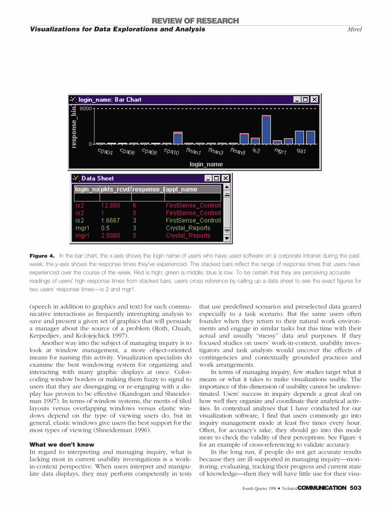
In terms of managing inquiry, few studies target what itmeans or what it takes to make visualizations usable. Theimportance of this dimension of usability cannot be underes-timated. Users’ success in inquiry depends a great deal onhow well they organize and coordinate their analytical activ-ities. In contextual analyses that I have conducted for ourvisualization software, I find that users commonly go intoinquiry management mode at least five times every hour.Often, for accuracy’s sake, they should go into this modemore to check the validity of their perceptions. See Figure 4for an example of cross-referencing to validate accuracy.
In the long run, if people do not get accurate resultsbecause they are ill-supported in managing inquiry—mon-itoring, evaluating, tracking their progress and current stateof knowledge—then they will have little use for their visu-
Figure 4. In the bar chart, the x-axis shows the login name of users who have used software on a corporate intranet during the past
week; the y-axis shows the response times they’ve experienced. The stacked bars reflect the range of response times that users have
experienced over the course of the week. Red is high; green is middle; blue is low. To be certain that they are perceiving accurate
readings of users’ high response times from stacked bars, users cross reference by calling up a data sheet to see the exact figures for
two users’ response times—is 2 and mgr1.
REVIEW OF RESEARCHVisualizations for Data Explorations and Analysis Mirel
Fourth Quarter 1998 • TechnicalCOMMUNICATION 503
alization program. This rejection is the single most dramaticindicator of poor usability.
In the area of complex tasks, the following investiga-tions are needed to fill current gaps in knowledge.
r Discovering effective language and categories ofmeaning for labels and other explanatory “intellectu-al objects” that researchers such as Furnas, Kitajimaand Polson, and Poitou deem vital
r Gaining an in-depth understanding of users’ actualquestions, inferences, misconceptions, and assump-tions, and the influence of these factors on realworld activities and collaborations
r Generating in-context descriptions of users’ patternsof actions and pragmatic, commonsense reasoningunderlying them, categorized by specific types oftasks and problems within specified work domains
r For specific problem types in various work domains,identifying points at which users (1) take stock ofemerging findings; (2) compare and assess differentgraphic views for particular subproblems; and (3)validate assumptions and inferences
r Analyzing the designs for saving and recalling data dis-plays that best suit users’ actual problem-solving prac-tices, discovering, for example, whether users want a
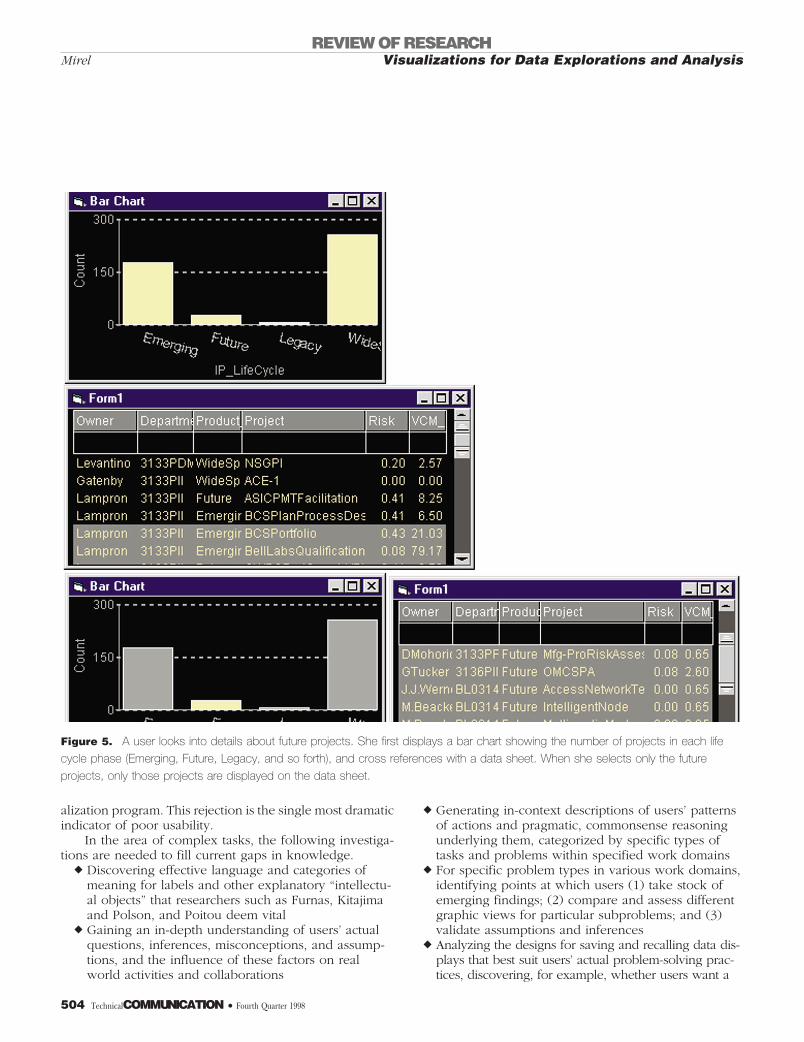
Figure 5. A user looks into details about future projects. She first displays a bar chart showing the number of projects in each life
cycle phase (Emerging, Future, Legacy, and so forth), and cross references with a data sheet. When she selects only the future
projects, only those projects are displayed on the data sheet.
REVIEW OF RESEARCHVisualizations for Data Explorations and AnalysisMirel
504 TechnicalCOMMUNICATION • Fourth Quarter 1998
recalled static view to become actively linked to dis-played graphs once they bring it back into view
r Exploring the effects that interrupting inquiries tosave and print a particular graphic have on userswhen they resume and reorient themselves to theirinquiry
VISUAL QUERYINGWhat we knowVisual querying often disorients users. It is a new paradigmfor information retrieval and analysis, and requires users tomove incrementally through linked graphics, progressivelybuilding a case that will answer the question-at-hand. Inthe visual querying example illustrated in Figure 5, thequestion the user is asking is “Who owns the projects in mydivision that are slated for the future and what are theirvalues and risks?” To visually query, this user sets up theappropriate graphics—in this case a bar chart on productlife cycles and a data list. She then selects only the futureprojects values, and this selection is updated automaticallyon the data sheet to show these projects’ values and risks.
In attempts to discover the support that users need toengage in this new visual mode of querying, investigatorshave explored the following questions:
r Is it better for users to learn and engage in que-rying or have the program prestructure inquir-ies and resulting displays, hiding the complex-ity of visual querying?Studies show that it is better for users to engage inand master visual querying than to have the program“protect” them from it. Results of users’ queries arebetter when users control the result set—when theycontrol what fields are displayed, how results aresequenced, and how they are clustered (Pirolli, Pit-kow, and Rao 1996).
r To help users query visually, what processes rep-resent efficient or expert approaches that can berepresented by interfaces and instruction?Bharavani and John (1997) investigate a small slice ofthe processes associated with visual querying, namelyactions for getting data into a desired position, a criticalinitial move in querying that assures a user that thestructure affords an entry point into the data. The re-searchers identify three generic strategies employed byefficient users: First group items in a clear structuresuch as a hierarchy, then spread groupings out or re-position them for better discrimination, and finallytweak the individual elements that “don’t quite fit.”Bharavani and John’s study is a first step in developinga taxonomy of subprocesses for the new paradigm ofvisual querying. Notably, it concentrates on finely de-tailed interactions typical of object-oriented approachesto users’ behaviors, a level at which users’ actions map
in one-to-one correspondence to program functionsand features.
Similarly, Shipman, Marshall, and Moran (1995) ad-dress ways to help users make meaning from datastructures. They find that users recognize a small set ofprimitive spatial structures as conventional patternswith specific functions. Users readily relate to lists,stacks, composites, and heaps, knowing, for example,that one sorts lists, puts items in stacks to select a lot ofitems at once in a small, manageable space, and so on.Although their conclusion is not yet tested, Shipman,Marshall, and Moran contend that users may under-stand the significance of structure in visualizations bet-ter if the visualizations “reveal” themselves incremen-tally in terms of these composite parts.
r What specific instructions and interface infor-mation aid users in learning and engaging inthis new visual mode of querying?Investigators find that users need interfaces to indi-cate the outcome of each step that they are taking asthey progressively refine their views. They also needa readily available history of the steps of their search(Koenemann and Belkin 1996).
r What querying devices give users optimal con-trol for their needs?Findings are mixed about the devices that supportusers best in setting up and carrying out visual que-ries. Options include sliders, drag and drop routines,select-by-sweeping options, and spatially orientedlenses (Fishkin and Stone 1995; Kumar, Plaisant, andShneiderman 1997). Different devices seem better orworse depending on the specific type of questionusers are asking and the nature of their data. Sliders,for instance, do not support users well in conductingcomplex queries (Tweedie, Spence, Dawkes, and Su1996; Fishkin and Stone 1995).
What we don’t knowThese investigations into the usability of visual queryingfocus primarily on discrete components: sliders versuslenses versus mouse selections; interface aids and historyrecords; and matches between querying patterns and cor-
Current investigations into theusability of visualizations reveal alarge range of concerns that can
easily occupy usability investigatorswell into the next century.
REVIEW OF RESEARCHVisualizations for Data Explorations and Analysis Mirel
Fourth Quarter 1998 • TechnicalCOMMUNICATION 505
responding objects and operations. What is missing arestudies that take an integrated look at the large scale im-portance of this new visual querying paradigm. The bestway for investigators to understand, describe, and designfor this Gestalt is by watching users interact with visualiza-tions as they work with their own data and questions intheir natural work settings.
Contextual inquiries that I have conducted on usersengaged in the new paradigm of visual querying consis-tently generate the same comments from users. Users findthe visualization tools fairly easy and straightforward tolearn and use; they quickly grasp the operations that theymay perform and the controls and objects that they shouldmanipulate to perform them. Their difficulty—and it isconsiderable—comes in knowing how to transform theirquestions—whether they be in work-related terms or Bool-ean phrases—into appropriate sets of graphics, filters, andencodings and into optimal incremental steps and paths.
For instance, one quality control manager used ourvisualizations to display his production, testing, and cus-tomer service data to answer the question, “Are customersreturning failed circuit boards because of poor testingmethods in my factory, faulty production processes in acertain production cycle, or customers’ ineffective uses ofthe boards or misdiagnosis of the problem?” Accustomed toexamining root causes with database queries, this managerknew the Boolean queries to write, the reports to examine,and the methods for sifting through multiple reports toanswer his question. He was stumped, however, when itcame to figuring out where to begin in a visual queryingenvironment. No graphic views or linkings leaped to mindas the equivalent of saying “I want to see correlationsbetween failed boards, disgruntled customers’ past returns,factory testing results, and the production cycle history forthe boards.” Caught in a vicious circle, users cannot gettheir data into the right format until they know the optimalgraphics to call up for the correlations that they want toexplore.
From an object-oriented perspective, interface and in-structional designers may evolve better sliders, magiclenses, or selection operations based on pre-defined taskscenarios that fit perfectly with preselected data. Yet thesestudies will not illuminate the following issues that needfurther investigation:
r Users’ understanding of what to do with variousquery devices once they try to visually tackle theirreal world problems with their unconditioned or un-cleansed data
r Users’ actual querying practices, language, and con-fusions in the context of use
r The combination of improved devices, verbal aids,training, and new interface metaphors that designersshould start with—a baseline for expressing in inter-
faces and instructions the strategic knowledge thatusers need if they are to transform their currentknowledge and conventions for information retrievalinto effective approaches for visual querying
r The underlying questions and directions that ani-mate users’ current querying approaches—mappingthese underlying questions to interactive visualiza-tions
r The picture that users envision when they use termslike “correlation,” including the associations that us-ers make between certain classes of graphics andprimitives and their analytical questions about datarelationships in particular work and problem do-mains
r The extent to which facility in learning visual query-ing depends on skills such as knowing the rightstructures for particular questions and purposes
r Users’ expectations from prior experiences for stylesof interactivity aimed at getting detail on subsets ofinterest
CONCLUSIONSCurrent investigations into the usability of visualizationsreveal a large range of concerns that can easily occupyusability investigators well into the next century. An object-oriented grounding has led researchers to focus on discreteissues and operations: positioning of data, zooming, andselecting a color spectrum. It also has encouraged investi-gators primarily to examine data analysis in terms of com-ponent parts rather than larger, more contextually basedactivities such as structuring data for meaning in giventypes of problems and distinct types of data. Admittedly,some studies have wider scopes, for instance studies ex-amining the match between the terminology and languageof interfaces, instructions, and users’ conceptions of work.Overall, current studies have started the process of layingthe usability groundwork for this advanced technology.
Current studies, however, paint an incomplete pictureof usability. Implicitly, they model users as operators ofvisualizations who need to learn discrete functions andfeatures along with the buttons to push to get the views thatthey want. Unquestionably, users need to be trained on thetools, but that how-to-work it and how-it-works instructionis not sufficient. These skills are important, but they are
Technical communicators areparticularly well suited to extendcurrent usability studies to users’
work-in-context.
REVIEW OF RESEARCHVisualizations for Data Explorations and AnalysisMirel
506 TechnicalCOMMUNICATION • Fourth Quarter 1998
only a starting point. Users also need to understand dis-plays in relation to their situated work and subject areadomains; moreover, they need to control displays, manip-ulating them to serve their specific problem-solving pur-poses and tangential questions; and they need to sharpentheir visual thinking and develop the deep structuresneeded to make sense of what they see with assurance.
In current usability investigations, what is missing inthe implicit user model is a picture of users as problem-solving experts who know their data and problems intri-cately and are deeply immersed in their analytical activities.To be usable, visualizations depend on users bringing thisexpert intelligence to the displays. A critical dimension ofusability for interactive data visualizations, therefore, isusers needing cues from interfaces and instructions on howto join and integrate their intelligence with the powerfulperceptual capabilities and manipulation techniques ofdata visualizations. Insights into what these cues and theirassociated designs for usability should be require a focuson users’ situated work and problem-solving.
Technical communicators are particularly well suitedto extend current usability studies to users’ work-in-con-text. The rhetorical framework that guides communicationprofessionals in their approach to information and de-sign—verbal and visual—is precisely what is missing inmany usability studies of data visualizations today. By ap-plying their insights and perspectives on information de-sign; by looking at the complex relationships betweendesign, users, purpose, context, and medium; and by usingtheir skills in contextual inquiry methodologies, technicalcommunicators could fill in current gaps in the usabilityresearch and positively influence the direction of theseinteractive, data visualization products. TC
ACKNOWLEDGMENTSMy thanks to Russell Borland for helping me think through manyusability ideas and issues, for commenting on an earlier draft of thisarticle, and for suggesting revisions. I’m grateful as well to theanonymous reviewers of this article for their suggestions and guid-ance.
REFERENCESAgre, Philip. 1997. “Toward a critical technical practice: Lessons
learned in trying to reform AI.” In Social science, technicalsystems, and cooperative work: Beyond the great divide, ed.G. Bowker, S. L. Star., W. Turner, and L. Gasser. Mahwah,NJ: Lawrence Erlbaum Associates, pp. 131–155.
Ahlberg, Chris, and Eric Wistrad. 1995. “IVEE: An informationvisualization and exploration environment.” Proceedings ofInformation Visualization Symposium 95, ed. Nathan Gershomand Stephen Eick. Los Alamitos, CA: IEEE Computer SocietyPress, pp. 66–73.
Baker, Marla, and Stephen Eick. 1995. “Space-filling softwaredisplays.” Journal of visual languages and computing 6:119–133.
Baldonado, M. Q. W., and T. Winograd. 1997. “SenseMaker: Aninformation-exploration interface supporting the contextualevolution of a user’s interest.” CHI 97 proceedings.http://www.acm.org/sigchi/chi97/proceedings/paper/mwb.htm
Berg, Marc. 1997. “Formal tools and medical practices:Computer-based decisions to work.” In Social science,technical systems, and cooperative work: Beyond the greatdivide, ed. G. Bowker, S. L. Star., W. Turner, and L. Gasser.Mahwah, NJ: Lawrence Erlbaum Associates, pp. 301–330.
Bertin, Jacques. 1983. Semiology of graphics. Madison, WI: TheUniversity of Wisconsin Press.
Bhavnani, Suresh, and Bonnie John. 1998. “Delegation andcircumvention: Two faces of efficiency.” CHI 98 proceedings.New York, NY: ACM, pp. 273–280.
Boyle, John, Stephen Eick, Matthias Hemmje, Daniel Keim, J. P.Lee, and Eric Sumner. 1993. “Database issues for datavisualization: Interaction, user interfaces, and presentation.” InIEEE Visualization ’93 Workshop: Database issues forvisualization, ed. John Lee, George Grinstein. Berlin, Germany:Springer-Verlag, pp. 25–34.
Brasseur, Lee. 1997. “Literacy in the computer age: A complexperceptual landscape.” In Computers and technicalcommunication: Pedagogical and programmatic perspectives,ed. Stuart Selber. Norwood, NJ: Ablex, pp. 75–97.
Buckingham Shum, Simon, Allan MacLean, Victoria Bellotti, andNick Hammond. 1997. “Graphical argument and designcognition. ”Human-computer interaction 12:267–300.
Card, Stuart. 1996. “Visualizing retrieved information: A survey.”IEEE computer graphics and applications 16 (March): 63–66.
Chambers, John, William Cleveland, Beat Kleiner, and PaulTukey. 1983. Graphical methods for data analysis. Belmont,CA: Wadsworth International Group.
Cleveland, W. 1993. Visualizing data. Summit, NJ: Hobart Press.
Draper, S., and S. Baron. 1993. Detecting bugs with learning byexploration. Internal report. Glasgow, UK: Glasgow InteractiveSystems Center, University of Glasgow.
Eick, Stephen. 1996. “Aspects of network visualization.” IEEEcomputer graphics and applications (March):69–75.
REVIEW OF RESEARCHVisualizations for Data Explorations and Analysis Mirel
Fourth Quarter 1998 • TechnicalCOMMUNICATION 507
Eick, Stephen, and Daniel Fyock. 1996. “Visualizing corporatedata.” AT&T technical journal 75:74–86.
Eick, Stephen, and Graham Wills. 1995. “High interactiongraphics.” European journal of operational research 81:445–459.
Fishkin, Ken, and Maureen Stone. 1995. “Enhanced dynamicqueries via movable filters.” CHI 95 proceedings. http://www.acm.org/sigchi/chi95/proceedings/papers/kpf_bdy.htm
Frese, Michael. 1987. “A theory of control and complexity:Implications for software design and integration of computersystems into the work place.” In Psychological issues of humancomputer interaction in the work place, ed. M. Frese, E. Ulich,W. Dzida. Amsterdam, Netherlands: Elsevier SciencePublishers, pp. 313–337.
Furnas, George. 1997. “Effective view navigation.” CHI 97proceedings. http://www.acm.org/sigchi/chi97/proceedings/paper/gwf.htm
Furnas, George, and Benjamin Bederson. 1995. “Space-scalediagrams: Understanding multiscale interfaces.” CHI 95proceedings. New York, NY: ACM, pp. 234–241.
Han, Yi, and Ingrid Zukerman. 1997. “A mechanism formultimodal presentation planning based on agentcooperation and negotiation.” Human-computer interaction12:187–226.
Hendee, William. 1997. “Cognitive interpretation of visualsegments.” In Perception of visual information, 2nd ed., ed.William Hendee and Peter Wells. New York, NY: Springer-Verlag, pp. 149–175.
Hix, Deborah, James Templeman, and Robert J. K. Jacob. 1995.“Pre-screen projection: From concept to testing of a newinteraction technique.” CHI 95 proceedings. http://www.acm.org/sigchi/chi95/proceedings/papers/dh_bdy.htm
Johnson, Jeff. 1995. “A comparison of user interfaces forpanning on a touch-controlled display.” CHI 95 proceedings.New York, NY: ACM, pp. 218–225.
Johnston, Neal. 1991. “Documenting a scientific visualizationtool.” Proceedings of the ACM ninth annual InternationalConference in Systems Documentation. New York, NY: ACM,pp. 83–87.
Kandogan, Eser, and Ben Shneiderman. 1997. “Elastic windows:Evaluation of multi-window operations.” CHI 97 proceedings.http:www.acm.org/sigchi/chi97/proceedings/paper/ek.htm
Keim, Daniel, and Hans-Peter Kriegel. 1994. “Using visualizationto support data mining of large existing databases.” In IEEEVisualization 93 Workshop: Database issues for datavisualization, ed. John Lee and George Grinstein. Berlin,Germany: Springer-Verlag, pp. 210–228.
Kitajima, Muneo, and Peter Polson. 1996. “A comprehension-based model of exploration.” CHI 96 proceedings.http:/www.acm.org/sigchi/chi96/proceedings/paper/kitajima/mk_txt.htm
Koenemann, Jurgen and Nicholas Belkin. 1996. “A case forinteraction: A study of interactive information retrieval behaviorand effectiveness.” CHI 96 proceedings. http://www.acm.org/sigchi/chi96/proceedings/paper/koenemann/jkl_txt.htm
Kumar, Harsh, Catherine Plaisant, and Ben Shneiderman. 1997.“Browsing hierarchical data with multi-level dynamic queries andpruning.” International journal of human-computer studies 46:103–124.
Larkin, J. 1989. “Display-based problem-solving.” In Complexinformation processing, ed. D. Klahr and K. Kotovsky. Hillsdale,NJ: Lawrence Erhlbaum Associates.
Lieberman, Henry. 1997. “Autonomous interface agents.” CHI 97proceedings. http://www.acm.org/sigchi/chi97/proceedings/paper/hl.htm
Mirel, Barbara. 1997. “Minimalism for complex tasks.” InMinimalism beyond the Nurnberg funnel, ed. John M. Carroll.Cambridge, MA: MIT Press, pp. 179–218.
Oostendorp, Herre, and Benjamin Walbeehm. 1995. “Towardsmodeling exploratory in the context of direct manipulationinterfaces.” Interacting with computers 7:3–24.
Pirolli, Peter, James Pitkow, and Ramani Rao. 1996. “Silk from asow’s ear: Extracting usable structures from the Web.” CHI 96proceedings. http://www.acm.org/sigchi/chi96/proceedings/paper/Pirolli_2/ppp2.html
Plaisant, Catherine, Brett Milash, Anne Rose, Seth Widoff, andBen Shneiderman. 1996. “Lifelines: Visualizing personalhistories.” CHI 96 proceedings. New York, NY: ACM, pp. 221–227, 518.
Poitou, Jean-Pierre. 1998. “Building a collective knowledgemanagement system: Knowledge-eliciting versus knowledge-eliciting techniques.” In Social science, technical systems, andcooperative work, ed. G. Bowker, S. L. Star., W. Turner, and L.Gasser. Mahwah, NJ: Lawrence Erlbaum Associates, pp. 235–256.
REVIEW OF RESEARCHVisualizations for Data Explorations and AnalysisMirel
508 TechnicalCOMMUNICATION • Fourth Quarter 1998
Roth, Steven, Mei Chuah, Stephan Kerpedjiev, andJohn Kolojejchick. 1997. “Toward an informationvisualization workspace.” Human-computer interaction 12:131–185.
Senay, Hikmet, and Eve Ignatius. 1990. “Rules and principles ofscientific data visualization.” Technical Report. GWU-IIST-90–13, Institute for Information Science and Technology, TheGeorge Washington University.
Shipman, Frank, Catherine Marshall, and Thomas Moran. 1995.“Finding and using implicit structure in human-organized spatiallayouts of information.” CHI 95 proceedings. New York, NY:ACM, pp. 346–353.
Shneiderman, B. 1996. “The eyes have it: A task by data typetaxonomy for information visualizations.” Proceedings of VisualLanguages 96. Los Alamitos, CA: IEEE Computer Press, pp.336–343.
Spence, Ian, and Stephan Lewandowsky. 1990. “Graphicalperception.” In Modern methods of data analysis, ed. JohnFox and J. Scott Long. Newbury Park, CA: SAGE, pp.13–57.
Spoerri, A. 1993. “InfoCrystal: A visual tool for informationretrieval.” Proceedings of information, knowledge andmanagement ’93. New York, NY: ACM, pp.150 –157.
Terwillinger, Robert, and Peter Polson. 1997. “Relationshipsbetween users’ and interfaces’ task representations.” CHI 97proceedings. http://www.acm.org/sigchi/chi97/proceedings/paper/pol.htm
Tufte, E. R. 1983. The visual display of quantitative information.Cheshire, CT: Graphics Press.
Tukey, J. W. 1977. Exploring data analysis. Reading, MA:Addison-Wesley.
Tweedie, Lisa, Robert Spence, Huw Dawkes, Hua Su. 1996.“Externalising abstract mathematical models.” CHI 96proceedings. New York, NY: ACM, 406–412.
Wells, Peter. 1997. “Problems and prospects in the perception ofvisual information.” In The perception of visual information, ed.William Hendee and Peter Wells. New York, NY: Springer, pp.391–400.
Wilson, Edward O. 1997. Consilience. New York, NY: Alfred A.Knopf.
Wright, W. 1997. “Business visualization applications.” Computergraphics and applications (July-August):66–70.
Yazici, Hulya. 1995. “A cognitive approach to the influence ofgraphics on decision-making.” In Human factors in informationsystems, ed. Jane Carey. Norwood, NJ: Ablex, pp. 101–112.
REVIEW OF RESEARCHVisualizations for Data Explorations and Analysis Mirel
Fourth Quarter 1998 • TechnicalCOMMUNICATION 509