visualizing and summarizing data - university of...
TRANSCRIPT

Visualizing and summarizing data
Ken Rice, Dept of Biostatistics
HUBIO 530
January 2015
Q. What’s your talk about?
Today I will describe:
• How to visualize small datasets
• How to summarize small datasets
• Some methods for larger datasets
The ‘summary’ ideas are usually introduced through formulae
alone – i.e. mathematical equations. Instead, I will use only
pictures to describe/explain what’s going on.
For those who want/need it (‘keen people’) the math is given in
supplementary slides.
1
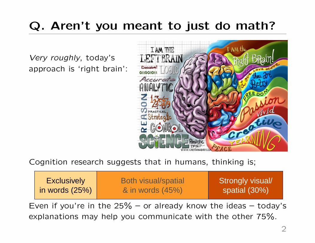
Q. Aren’t you meant to just do math?
Very roughly, today’s
approach is ‘right brain’:
Cognition research suggests that in humans, thinking is;
Exclusivelyin words (25%)
Both visual/spatial& in words (45%)
Strongly visual/spatial (30%)
Even if you’re in the 25% – or already know the ideas – today’s
explanations may help you communicate with the other 75%.
2
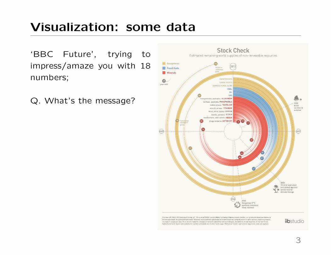
Visualization: some data
‘BBC Future’, trying to
impress/amaze you with 18
numbers;
Q. What’s the message?
3

Visualization: some data
The statistician-approved version – does it impress? amaze?
AluminiumPhosphorus (phosphate rock)TantalumTitaniumCopperSilverIndiumAntimony
CoalOilGas
Amazon completely deforestedAll coral reefs goneIndonesian rainforest completely deforestedSuitable agricultural land runs out
2°C warming threshold likely reached1/3 of land plant & animal species extinct due to climate changeArctic ice−free in summer (worst−case forecast)
●
●
●
●
●
●
●
●
●
●
●
●
●
●
●
●
●
●Climate Tipping Points
Ecosystems
Fossil Fuels
Minerals
0 50 100 150 200
Stock Check
Years from now
Estimated remaining supplies of non−renewable resources
‘Position on a common scale’ is known to be the best mode of
presentation, for making visual comparisons.
4
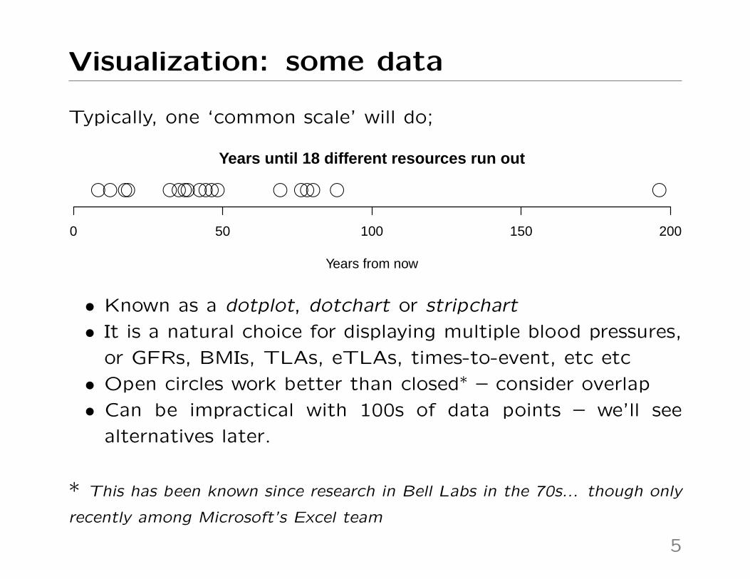
Visualization: some data
Typically, one ‘common scale’ will do;
●●●●●●● ●●●●●●●● ●●●
Years from now
0 50 100 150 200
Years until 18 different resources run out
• Known as a dotplot, dotchart or stripchart
• It is a natural choice for displaying multiple blood pressures,
or GFRs, BMIs, TLAs, eTLAs, times-to-event, etc etc
• Open circles work better than closed∗ – consider overlap
• Can be impractical with 100s of data points – we’ll see
alternatives later.
* This has been known since research in Bell Labs in the 70s... though only
recently among Microsoft’s Excel team
5
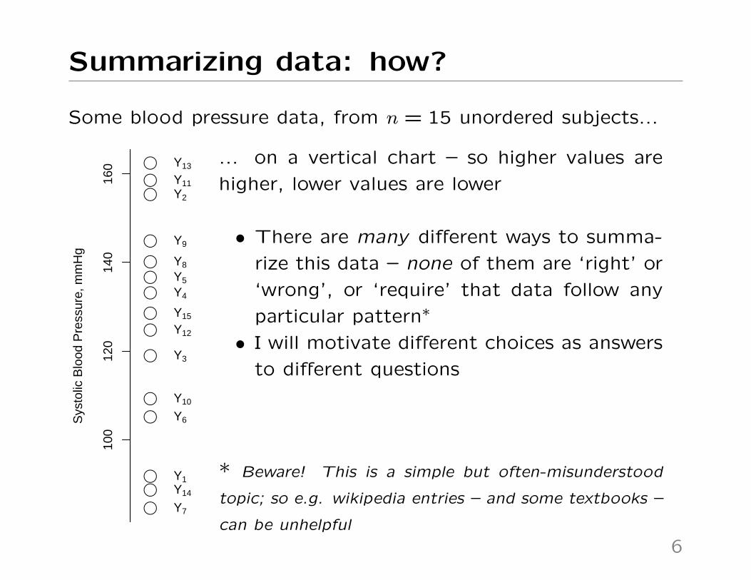
Summarizing data: how?
Some blood pressure data, from n = 15 unordered subjects...
●
●
●
●●
●
●
●
●
●
●
●
●
●
●
Sys
tolic
Blo
od P
ress
ure,
mm
Hg
Y1
Y2
Y3
Y4
Y5
Y6
Y7
Y8
Y9
Y10
Y11
Y12
Y13
Y14
Y15
100
120
140
160 ... on a vertical chart – so higher values are
higher, lower values are lower
• There are many different ways to summa-
rize this data – none of them are ‘right’ or
‘wrong’, or ‘require’ that data follow any
particular pattern∗
• I will motivate different choices as answers
to different questions
* Beware! This is a simple but often-misunderstood
topic; so e.g. wikipedia entries – and some textbooks –
can be unhelpful
6

Summarizing data: find a balance
Q. ‘Where’s the balance point in the data’ ?
●
●
●
●●
●
●
●
●
●
●
●
●
●
●
Sys
tolic
Blo
od P
ress
ure,
mm
Hg
−
+
+
++
−
−
++
−
+
+
+
−
+
100
120
140
160 • For any value, mark points above ‘+’ and
points below ’-’.
• What value balances these?
• Not this one (110 mmHg) ...too low
7

Summarizing data: find a balance
Q. ‘Where’s the balance point in the data’ ?
●
●
●
●●
●
●
●
●
●
●
●
●
●
●
Sys
tolic
Blo
od P
ress
ure,
mm
Hg
−
+
−
−−
−
−
−−
−
+
−
+
−
−
100
120
140
160 • For any value, mark points above ‘+’ and
points below ’–’
• What value balances these?
• Not this one (150 mmHg) ...too high
7

Summarizing data: find a balance
Q. ‘Where’s the balance point in the data’ ?
●
●
●
●●
●
●
●
●
●
●
●
●
●
●
Sys
tolic
Blo
od P
ress
ure,
mm
Hg
−
+
−
++
−
−
++
−
+
−
+
−
−
100
120
140
160 • For any value, mark points above ‘+’ and
points below ’–’
• What value balances these?
• This one! (128.5 mmHg) – known as the
median value
• Note that median point is neither ‘+’ nor
’-’, so giving 7 data on each side
7

Details: the median for even n
What to do when there is no ‘middle’ ?
●
●
●
●
●
●
●
●
●
●
Sys
tolic
Blo
od P
ress
ure,
mm
Hg
+
−
+
−
+
−
+
−
+
−
100
120
140
160
• Here n=10 – but would see same issue for
any even n
• Here, any value between 5th, 6th points
gives the same ‘balance’ – 5 on each side
• Default solution uses average (halfway
point) between two middle data points –
here 124 mmHg, the solid red line
8

Details: other quantiles
The median is a.k.a. the 50% quantile, or 50th percentile
●
●
●
●
●
●
●
●
●
Sys
tolic
Blo
od P
ress
ure,
mm
Hg
+
−
−
+
+
−
−
+
−
8010
012
014
016
0
+
−
−
+
−
−
−
−
−
+
+
−
+
+
−
−
+
+
• Shown here for n = 9; 50% above/below
• 75% quantile has 75% below, 25% above
• 25% quantile has 25% below, 75% above
• Could use any percentage between
0, 100%
9

Details: other quantiles
Special names for splitting data at evenly-spaced quantiles:
●
●
●
●●●
●
●
●
●
●
●
●
●
●
●
●
●
●
●
●
●●
●
●
●
●
●
●
●
●
●
●
●
●
●
●
●
●
●
●
●
●
●
●
●
●
●
●
●
●
●
●
●
●
●●
●
●
●
Sys
tolic
Blo
od P
ress
ure,
mm
Hg
8010
012
014
016
0
• Split at 33%, 66%: tertiles
• Split at 25%, 50%, 75%: quartiles
• Split at 20%, 40%, 60%, 80%: quintiles
• Same number of data in each ‘bin’ –
this is NOT equal width bins
• When no exact quantile available, use
special methods – not covered here
10
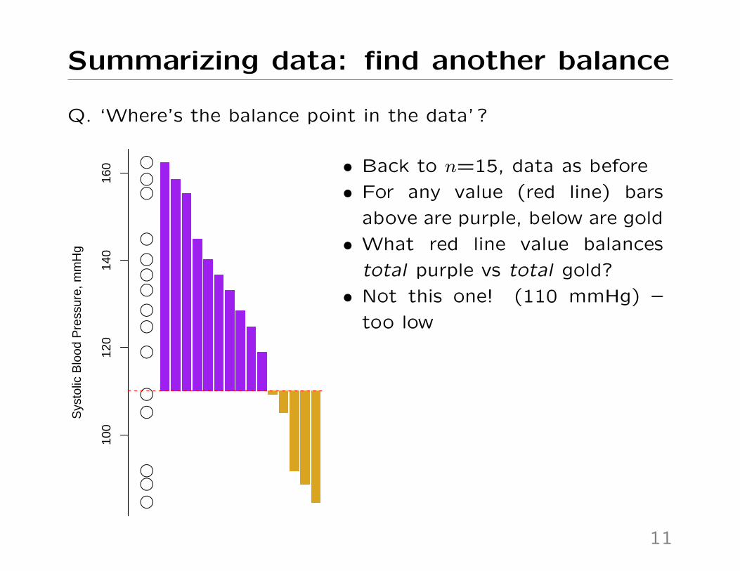
Summarizing data: find another balance
Q. ‘Where’s the balance point in the data’ ?
●
●
●
●●
●
●
●
●
●
●
●
●
●
●
Sys
tolic
Blo
od P
ress
ure,
mm
Hg
100
120
140
160 • Back to n=15, data as before
• For any value (red line) bars
above are purple, below are gold
• What red line value balances
total purple vs total gold?
• Not this one! (110 mmHg) –
too low
11

Summarizing data: find another balance
Q. ‘Where’s the balance point in the data’ ?
●
●
●
●●
●
●
●
●
●
●
●
●
●
●
Sys
tolic
Blo
od P
ress
ure,
mm
Hg
100
120
140
160 • Back to n=15, data as before
• For any value, bars above are
purple, below are gold
• What red line value balances
total purple vs total gold?
• Not this one! (150 mmHg) –
too high
11

Summarizing data: find another balance
Q. ‘Where’s the balance point in the data’ ?
●
●
●
●●
●
●
●
●
●
●
●
●
●
●
Sys
tolic
Blo
od P
ress
ure,
mm
Hg
100
120
140
160 • Back to n=15, data as before
• For any value, bars above are
purple, below are gold
• What red line value balances
total purple vs total gold?
• This one! (125.5 mmHg) –
known as the mean
11

Summary so far
• The median value balances number of values above/below• The mean value balances deviations of values above/below• These are not the same criteria, hence don’t give same
answers (128 mmHg vs 125.5 mmHg)
Which to give? It’s often fine to give both, but if you must pick:
• The mean is sensitive to extremes, while the median –depending only on the middle values – is not. Consider e.g.mean/median wealth & “the 1%”• Means relate directly to totals – e.g. if I drove 10 miles in
30 mins, what was my mean speed? median?• Means are often used in prediction – e.g. suppose in 1000
gambles each with $0, $1 for loss & win, that I win 600.What are my mean winnings per new gamble? Median?• Pragmatism can be okay: if mean and median are close and
you must give only one, your choice is unlikely to matter
12

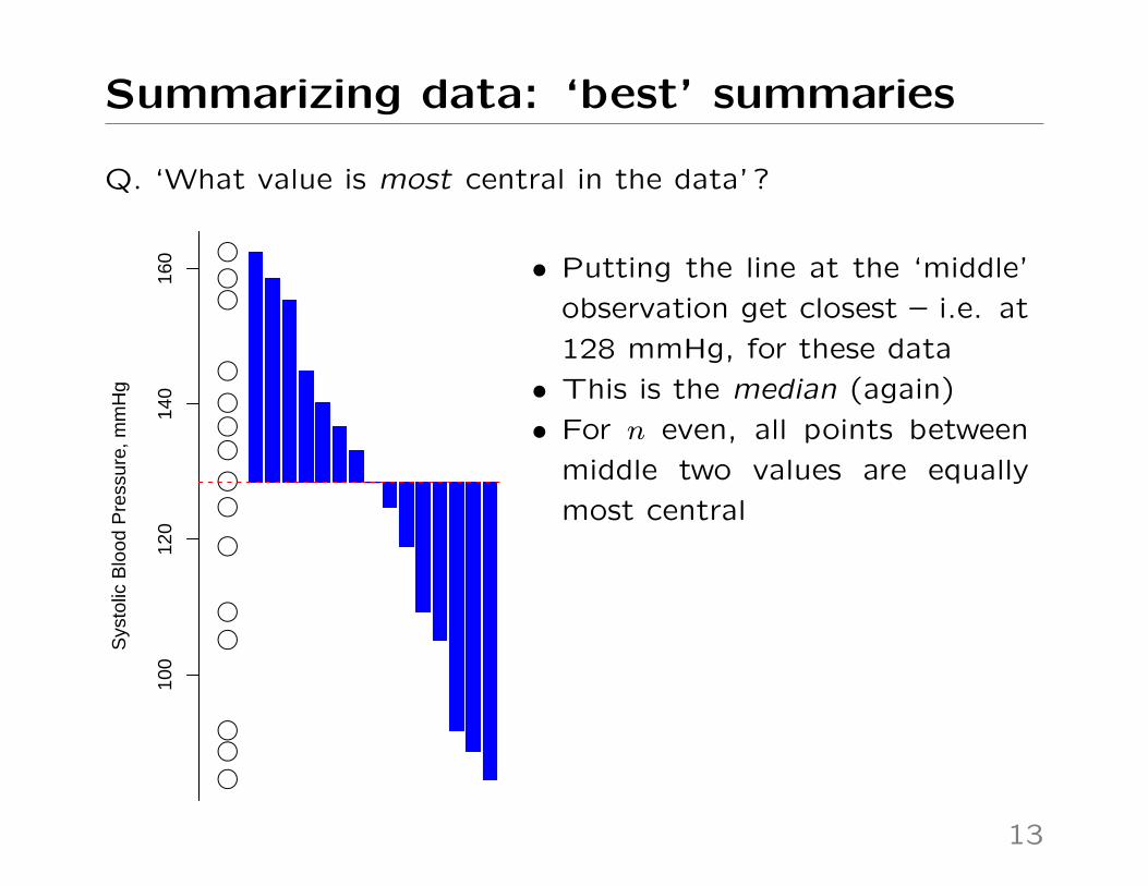
Summarizing data: ‘best’ summaries
Q. ‘What value is most central in the data’ ?
●
●
●
●●
●
●
●
●
●
●
●
●
●
●
Sys
tolic
Blo
od P
ress
ure,
mm
Hg
100
120
140
160 • To measure ‘centrality’, for a
given value (the red line) add
up all the deviations (blue bars)
from there to the data
• Q. What choice of red line
minimizes the total amount of
blue ink?
(Not this one! – at 150 mmHg)
13

Summarizing data: ‘best’ summaries
Q. ‘What value is most central in the data’ ?
●
●
●
●●
●
●
●
●
●
●
●
●
●
●
Sys
tolic
Blo
od P
ress
ure,
mm
Hg
100
120
140
160 • To measure ‘centrality’, for a
given value (the red line) add
up all the deviations (blue bars)
from there to the data
• Another attempt... 110 mmHg
Still not optimal!
13
Summarizing data: ‘best’ summaries
Q. ‘What value is most central in the data’ ?
●
●
●
●●
●
●
●
●
●
●
●
●
●
●
Sys
tolic
Blo
od P
ress
ure,
mm
Hg
100
120
140
160 • Putting the line at the ‘middle’
observation get closest – i.e. at
128 mmHg, for these data
• This is the median (again)
• For n even, all points between
middle two values are equally
most central
13

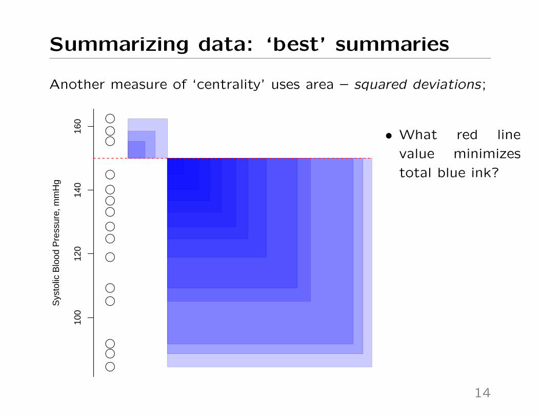
Summarizing data: ‘best’ summaries
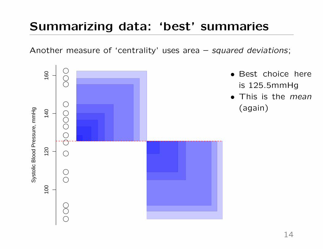
Another measure of ‘centrality’ uses area – squared deviations;
●
●
●
●●
●
●
●
●
●
●
●
●
●
●
Sys
tolic
Blo
od P
ress
ure,
mm
Hg
100
120
140
160
• What red line
value minimizes
total blue ink?
14
Summarizing data: ‘best’ summaries
Another measure of ‘centrality’ uses area – squared deviations;
●
●
●
●●
●
●
●
●
●
●
●
●
●
●
Sys
tolic
Blo
od P
ress
ure,
mm
Hg
100
120
140
160
• What red line
value minimizes
total blue ink?
14
Summarizing data: ‘best’ summaries
Another measure of ‘centrality’ uses area – squared deviations;
●
●
●
●●
●
●
●
●
●
●
●
●
●
●
Sys
tolic
Blo
od P
ress
ure,
mm
Hg
100
120
140
160 • Best choice here
is 125.5mmHg
• This is the mean
(again)
14

Summarizing data: ‘best’ summaries
We saw before that median and mean reflect different types of
balance. We can also interpret...
• ...the median as being most central, measured by absolute
deviation – a measure of length
• ...the mean as being most central, measured by squared
deviation – a measure of area
As before, these are different criteria – i.e. asking the data
different questions – so they provide different answers.
Thinking about these deviations leads to measures of dispersion
– how spread out is the data?
15
Summarizing data: ‘best’ summaries
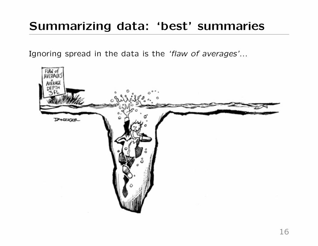
Ignoring spread in the data is the ‘flaw of averages’...
16

Summarizing data: dispersion
Q. Median length of blue bars around median? (Ordered, in RH)
●
●
●
●●
●
●
●
●
●
●
●
●
●
●
Sys
tolic
Blo
od P
ress
ure,
mm
Hg
100
120
140
160
●
●
●
●●
●
●
●
●
●
●
●
●
●
●
Sys
tolic
Blo
od P
ress
ure,
mm
Hg
100
120
140
160
The orange length (19.3 mmHg) is the median absolute deviationabout the median – known as the MAD.
17

Summarizing data: dispersion
Q. Average area of blue box? (This is harder to ‘eyeball’)
●
●
●
●●
●
●
●
●
●
●
●
●
●
●
Sys
tolic
Blo
od P
ress
ure,
mm
Hg
100
120
140
160
Area of this ‘average box’ (602 mmHg2, in orange) is the variance– its edge length (24.5 mmHg) is the standard deviation.
18

What to do with more data?
Dotcharts get a bit clumsy beyond n = 30 – here is n = 200;
● ● ●●● ●● ●●●●● ●●● ●● ●●● ●● ●● ● ●●●● ●● ●● ●● ● ●●● ●● ●●●● ● ●● ●●● ● ●●●● ●●● ●●● ●● ● ●● ●● ●● ●●● ● ●● ●●●● ● ●● ●●● ●●●● ● ●● ●●●● ●● ● ●● ● ● ●● ●● ●●● ● ●●● ●● ●● ●● ●●●● ● ●● ●●● ●● ●●● ●● ● ●●● ●●● ●●●● ●● ●● ●●●●●● ●● ●●● ● ●●● ●● ●●● ● ● ●●● ●●●● ● ●● ●●● ●●● ●● ● ●● ●●●
Systolic Blood Pressure, mmHg
60 80 100 120 140 160 180
• Exact SBP for any individual not important
• Want to get an idea of the location (center) and dispersion
(spread) of the data
• Coarsened data will do, for a summary
19

What to do with more data?
A stacked dotchart for the same data;
Systolic Blood Pressure, mmHg
● ●●
●●
●●
● ●●●
●●●
●●●
●●●●●●
●●●
●●●●●●●●●●
●●●●●●●●
●●●
●●●●●●●●●●
●●●●●●●●●●●
●●●●●●●●●
●●●●●●
●●●●●●●●●●●
●●●●●●●●●●●●●●●●●
●●●●●●●●
●●●●●●●●
●●●●●●●●●●●●●●
●●●●●●
●●●●●●●●●●●●●
●●●●●●●●●●
●●●●
●●●●●
●●●●●●
●●
●●●●
●●
●●
● ●●
● ●
60 80 100 120 140 160 180
• ‘Bins’ every 2.5 mmHg (120, 122.5, 125 etc)
• Count the data points in each bin
• Plot one point per observation, in each bin
• How to read off median? 75% quantile?
20

What to do with more data?
A histogram for the same data;
Systolic Blood Pressure, mmHg
Fre
quen
cy
60 80 100 120 140 160 180
05
1015
• ‘Bins’ every 2.5 mmHg (120, 122.5, 125 etc)
• Count the data points in each bin
• Bin height proportional to this count, a.k.a. frequency
• Better than stacking, for large n
21
What to do with more data?
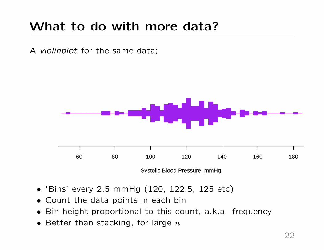
A violinplot for the same data;
Systolic Blood Pressure, mmHg
60 80 100 120 140 160 180
• ‘Bins’ every 2.5 mmHg (120, 122.5, 125 etc)
• Count the data points in each bin
• Bin height proportional to this count, a.k.a. frequency
• Better than stacking, for large n
22

What to do with more data?
Finally, a boxplot; (short for box-whisker plot)
● ●●
Systolic Blood Pressure, mmHg
60 80 100 120 140 160 180
• Solid bold line is the median, box edges are 25% and 75%quantiles, box width is the interquartile range (IQR)• ‘Whiskers’ go to last point up to 1.5×box width beyond box• Points beyond this plotted individually• Fancier versions exist, but this is the default
23

What to do with more data?
Boxplots are crude – cruder than dotcharts, and violinplots;
● ● ● ● ● ● ● ● ● ● ● ● ● ● ● ● ● ● ● ● ● ● ● ● ● ● ● ● ● ● ● ● ● ● ● ● ● ● ● ● ● ● ● ● ● ● ● ● ● ● ● ● ● ● ●
●●●●●●●●●● ● ● ● ● ●●●●●●●●●●●●●● ● ●●●●●●●●●● ● ● ● ● ●●●●●●●●●●●●●●
● ●●● ●● ●●●● ●●● ● ●●● ● ●●●●●● ● ●●● ● ●●● ● ● ●●● ● ●● ●●● ●●● ●● ● ●● ● ●● ●●●
The plot shows 3 different datasets: all give the same boxplot.
24

What to do with more data?
But plotting just quantiles aids comparison of many groups;
A quantile plot, showing various percentiles BMI by (many) ages
25
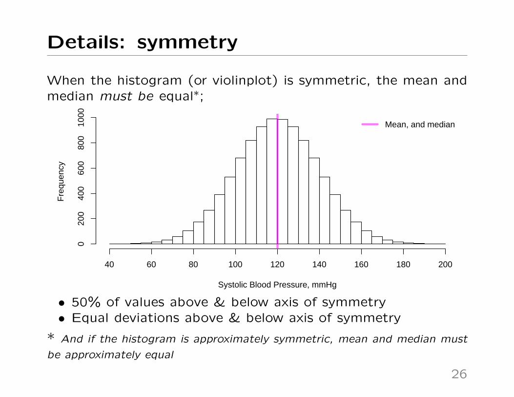
Details: symmetry
When the histogram (or violinplot) is symmetric, the mean andmedian must be equal∗;
Systolic Blood Pressure, mmHg
Fre
quen
cy
40 60 80 100 120 140 160 180 200
020
040
060
080
010
00
Mean, and median
• 50% of values above & below axis of symmetry• Equal deviations above & below axis of symmetry
* And if the histogram is approximately symmetric, mean and median must
be approximately equal
26

Details: symmetry
But mean and median being the same does NOT imply thedistribution is symmetric – even approximately∗;
Observation (count data)
Fre
quen
cy
0 1 2 3 4 5
Observation (continuous)
Mean, and median
Keen people: many texts claim seeing mean<median or mean>medianimplies data is skewed to the left/right, respectively. But this isnot true for standard measures of skewness.
* LH example is e.g. number of ‘successes’ from 5 trials, each with 80%
chance of success. RH could be e.g. height
27

Binary & categorical data
None of the approaches we have seen are great for binary(Yes/No) outcomes, e.g. death, pregnancy, hypertension.
Are you at least partially a visual thinker?
●●●●●●●●●●●●●●●●●●●●●●●●●●●●●●●●●●●●●●●●●●●●●●●●●●●●●●●●●●●●●●●●●●●●●●●●●●●●●●●●●●●●●●●●●●●●●●●●●●●●●●●●●●●●●●●●●●●●●●●●●●●●●●●●●●●●●●●●●●●●●●●●●●●●●●●●●●●●●●●●●●●●●●●●●●●●●●●●●●●●●●●●●●●●●●●●●●●●●●●●●●●●●●●●●●●●●●●●●●●●●●●●●●●●●●●●●●●●●●●●●●●●●●●●●● ●●●●●●●●●●●●●●●●●●●●●●●●●●●●●●●●●●●●●●●●●●●●●●●●●●●●●●●●●●●●●●●●●●●●●●●●●●●●●●●●●●●●●●●●●●●●●●●●●●●●●●●●●●●●●●●●●●●●●●●●●●●●●●●●●●●●●●●●●●●●●●●●●●●●●●●●●●●●●●●●●●●●●●●●●●●●●●●●●●●●●●●●●●●●●●●●●●●●●●●●●●●●●●●●●●●●●●●●●●●●●●●●●●●●●●●●●●●●●●●●●●●●●●●●●●●●●●●●●●●●●●●●●●●●●●●●●●●●●●●●●●●●●●●●●●●●●●●●●●●●●●●●●●●●●●●●●●●●●●●●●●●●●●●●●●●●●●●●●●●●●●●●●●●●●●●●●●●●●●●●●●●●●●●●●●●●●●●●●●●●●●●●●●●●●●●●●●●●●●●●●●●●●●●●●●●●●●●●●●●●●●●●●●●●●●●●●●●●●●●●●●●●●●●●●●●●●●●●●●●●●●●●●●●●●●●●●●●●●●●●●●●●●●●●●●●●●●●●●●●●●●●●●●●●●●●●●●●●●●●●●●●●●●●●●●●●●●●●●●●●●●●●●●●●●●●●●●●●●●●●●●●●●●●●●●●●●●●●●●●●●●●●●●●●●●●●●●●●●●●●●●●●●●●●●●●●●●●●●●●●●●●●●●●●●●●●●●●●●●●●●●●●●●●●●●●●●●●●●●●●●●●●●●●●●●●●●●●●●●●●●●●●●●●●●●●●●●●●●●●●●●●●●●●●●●●●●●●●●●●●●●●●●●●●●●●●●●●●●●●●●●●●●●●●●●
0(No)
1(Yes)
Violinplot
Histogram
Dotplot
Boxplot
These all show 750 Yes (coded as 1) and 250 No (coded as 0).
28

Binary & categorical data
Instead, just give the percentage of ‘Yes’; (somehow)
Yes No
Barplot(or bar chart)
Pro
port
ion
0.0
0.2
0.4
0.6
0.8
1.0
Stacked barplot
Pro
port
ion
0.0
0.2
0.4
0.6
0.8
1.0
●
Dotplot(of proportion)
Pro
port
ion
0.0
0.2
0.4
0.6
0.8
1.0
The dotchart emphasizes we’ve reduced the entire dataset (heren=1000) to just one number.
29
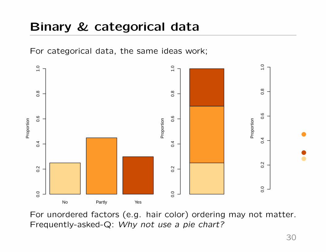
Binary & categorical data
For categorical data, the same ideas work;
No Partly Yes
Pro
port
ion
0.0
0.2
0.4
0.6
0.8
1.0
Pro
port
ion
0.0
0.2
0.4
0.6
0.8
1.0
●
●
●
Pro
port
ion
0.0
0.2
0.4
0.6
0.8
1.0
For unordered factors (e.g. hair color) ordering may not matter.Frequently-asked-Q: Why not use a pie chart?
30

Why not use a pie chart?
Because they encode data as angles, not positions on a common
scale – and work less well than the alternatives. But...
31

Why not use a pie chart?
Because they encode data as angles, not positions on a common
scale – and work less well than the alternatives. But...
31

Summary
Main points
• Data summaries have graphical interpretations – often more
than one interpretation
• There is no ‘right’ or ‘wrong’ summary (despite what some
texts say) but they do communicate different aspects of the
data
• What do you want to communicate? What is relevant to
your analysis? (You must decide, the data won’t tell you)
• For larger datasets, trade off data ‘coarseness’ for clarity of
message
32

Appendix: Math (for keen people)
First, calculating the median for our n = 15 example;
●
●
●
●●
●
●
●
●
●
●
●
●
●
●
Sys
tolic
Blo
od P
ress
ure,
mm
Hg
Y[1]
Y[2]
Y[3]
Y[4]
Y[5]
Y[6]
Y[7]
Y[8]
Y[9]
Y[10]
Y[11]
Y[12]
Y[13]
Y[14]
Y[15]
100
120
140
160 • Give new ordered labels; Y[1], Y[2], ..., Y[15]
• Find the middle data point – we have n =
15, so Y[8] has 7 data points both above
and below
• For Q ‘What value is in the middle?’, the
median is (also) your answer
33

Appendix: Math (for keen people)
Now without a picture;
1. Start with n observations
item Put them in increasing order, so
Y[1] < Y[2] < Y[3] < Y[4] < ... < Y[n−2] < Y[n−1] < Y[n]
2. • For n odd, Median = Y[(n+1)/2]
• For n even, Median = 12(Y[n/2]+Y[n/2+1]), i.e. the average
of the two ‘middle’ values
For other quantiles, special methods (not covered here) are used
when, as with n even, there is no uniquely-defined quantile.
34

Appendix: Math (for keen people)
For the mean:
Mean =Y1 + Y2 + ... + Yn
n
i.e. to get the mean, add all the data points, then divide by the
number you have. In ‘math’ notation, this is written as;
Mean =
∑ni=1 Yin
... where the numerator (i.e. top part) represents the ‘adding
them all up’ step, from 1 to n.
• Unlike the median, no need to order the data
• Also, no special treatment of n odd/even, or with ties
35

Appendix: Math (for keen people)
Defining measures of dispersion (spread) requires more notation;
Median absolute deviation;
MAD = Median{|Yi −Median{Y1, Y2, ..., Yn}|},where Median{Y1, Y2, ..., Yn} means ‘take the median of all theobservations Y1, Y2, ..., Yn, and the vertical bars |Yi − ...| denoteabsolute values.
Variance and Standard Deviation;
Variance =
∑ni=1(Yi −Mean)2
n
StdDev =
√∑ni=1(Yi −Mean)2
n=√
Variance
Note: many texts will define these with n−1 instead of n, in thedenominator – with almost-always minor impact.
Why do that? Using n − 1 removes bias when using samplevariance to estimate population variance.
36

Appendix: Math (for keen people)
Want more? The mean and median are both measures of
‘location’, or ‘measures of central tendency’. There are many
more of these, but mean & median are most commonly-used.
37