visualizing disease incidence in the context of...
TRANSCRIPT

Visualizing Disease Incidence in the Context ofSocioeconomic Factors
Jared ShensonVanderbilt University
2201 West End AvenueNashville, TN 37212
Alark JoshiBoise State University1910 University Drive
Boise, Idaho [email protected]
ABSTRACTCertain biological factors such as genetics, physical fitness,and lifestyle have been shown to influence an individual’srisk of acquiring disease. But are there are other socioe-conomic factors that influence disease incidence as well?In this paper, we introduce a visualization tool called Dis-easeTrends that explores the associations and possible cor-relations between specific economic (personal income percapita), educational (percentage of adult population with afour year college degree), and environmental (air pollutionlevel) factors with diabetes prevalence and cancer incidencerates across counties throughout the United States. It is struc-tured as an interactive geographical visualization that dis-plays disease incidence data as an interactive choropleth mapand connects it with coordinated views of the socioeconomicvariables for each county as the user scrolls over it. Addi-tionally, the ability to compare and contrast counties as wellas to interactively specify a region for comparison allowsfurther examination of the data. This results in an informa-tive overview of disease incidence trends that allows usersto spot areas of interest and potentially pursue these areasfurther with more scientific research.
ACM Classification KeywordsH.5.2 Information Interfaces and Presentation: User Inter-faces graphical user interfaces, interaction styles, user-centereddesign.
Author KeywordsGeographic Visualization, Graphical User Interfaces, Evalu-ation/Methodology
INTRODUCTIONIt is widely known that for any given individual, biologicaland personal health factors such as genetics, physical fitness,and lifestyle play a role in the possible onset of a disease. Forexample, the risk of Type 2 diabetes exhibits strong hered-itary links and further increases with a person’s age, obe-
Permission to make digital or hard copies of all or part of this work forpersonal or classroom use is granted without fee provided that copies arenot made or distributed for profit or commercial advantage and that copiesbear this notice and the full citation on the first page. To copy otherwise, orrepublish, to post on servers or to redistribute to lists, requires prior specificpermission and/or a fee.VINCI 2012, September 27–28, 2012, Hangzhou, China.
sity, and alcohol intake [13, 21]. An interesting questionhowever, is if there are socioeconomic factors that forecastdisease incidence as well. Is being economically well-offrelated to a person’s risk of acquiring diabetes? What aboutreceiving a four-year college education or being exposed tohigh levels of air pollution? While we recognize it is dif-ficult to give definite answers to these questions, let alonedetermine any causal relationships between these socioeco-nomic factors and disease incidence, we attempt to providehints at connections among the variables to motivate furtherresearch in the form of an interactive visualization tool.
We present DiseaseTrends, an interactive geographic visu-alization tool that allows the examination of these variableswith respect to disease incidence. Our visualization tool dis-plays and helps users explore any possible trends as well ascorrelation among these. We identified a number of socioe-conomic factors that we thought were potentially linked todisease incidence. On the economic side, we have personalincome per capita; on the educational side, the percentage ofthe population holding a four-year college degree; and lastly,on the environmental side, the estimated levels of air pollu-tion. All the variables are observed at the county level. Asfor the disease variable, we decided to concentrate on theincidence rates for two well-known diseases: diabetes andcancer. The reason for selecting these two came down tothe fact that there is much scientific and medical literaturehypothesizing links between these diseases and some of thesocioeconomic factors that we have chosen. DiseaseTrendsallows a user to filter the data, brushing the data to highlightspecific counties, pick specific counties for compare-and-contrast type tasks, or examine user defined regions to in-clude a cluster of counties. Once a user selects a county, wecompute a similarity metric based on our socioeconomic fac-tors and show counties that are mostly similar but may havevarying disease incidence rates. This may spur researchersto further examine those counties for other factors causingvarying disease incidences.
We believe our visualization will be most beneficial for (1)those in the public health research community who wouldlike to use our visualization as a launch pad for ideas orareas for deeper, more thorough investigation, and (2) laypeople who are interested in seeing how their county’s dis-ease incidence rates compare to those of others, and whethertheir relative economic, educational, and environmental fac-tors might be related to the incidence rates. It is important

Figure 1. The National Cancer Institute’s presentation of theirstatistically-modeled county-level cancer prevalence estimations. Thisstatic choropleth map incorrectly uses a diverging scale, typically usedto show values diverging away from a mean or median of the data. Themap is, however, readily understandable, but it is static and does notinvite user participation with the data.
to note that our visualization does not provide any concretestatistics or direct answers to questions about the correlationof socioeconomic factors with disease incidence; rather, webelieve it will function as a potential foundation for furtherresearch.
Our approach in building DiseaseTrends was to base the toolon a geographical model and build on top of this platform tointroduce new visualization techniques to improve data ex-ploration. Geographic visualization, often presented in car-tographic form, is a proven technique employed by manyfields to easily visualize geocoded data. Presentation in thisform is common to many users, from domain experts to thelay individual. Further discussion on the merits and chal-lenges of geographic visualization is presented in the sec-tions that follow.
RELATED WORKGeographical visualization has been in existence for cen-turies, starting with the earliest cartographic maps [27, 16].Geographic visualization has evolved over time, as MacEachren[29] describes the initial focus of cartographic visualizationas being for “personalized, highly interactive tools that facil-itate a search for the unknown”. But now geographic visual-ization can be used for exploration [26, 9], where hypothesesemerge from observed visual trends, rather than using geo-graphic visualization to answer a hypothesis. In order fortechniques to be successful in facilitating data exploration,Tomaszewski et al. [37] suggests that the implementationof highly interactive tools is critical. Further defining therole of geographic visualization, in How Maps Work [27],MacEachren says that the “goal of a map is to stimulate ahypothesis rather than communicate a message.” We believethat our interactive visualization tool stimulates a hypothesisregarding the prevalence of a disease and its possible corre-lations to other socioeconomic factors, which could furtherbe studied using research in public policy and other relatedfields.
Let us now examine a couple of visualizations that are closelyrelated to our work. Several years ago, the National Can-
cer Institute’s (NCI) Statistical Research and ApplicationsBranch used geographical visualization to display U.S. can-cer incidence rates for the year 1999, predicted by a statisti-cal model (see Figure 1) [17]. We believe their use of geo-graphical visualization was largely a success, but note howtheir visualization merely provided a static overview of thedata. The emphasis of their work was on the accuracy ofthe statistical predicting model. In our work, we opted fora more interactive, engaging visualization that would com-mence a line of thought rather than end it.
A more recent, closely-related predecessor we would like todraw attention to is the set of visualizations by Bill Daven-hall from his TEDMED talk, “Your health depends on whereyou live” [15]. In this talk, Davenhall argued that the placesyou have lived have a significant influence on your health.He proposed an interactive application for portraying thisdata to patients and doctors and exhibited two geographicalvisualizations: one with the distribution of heart attack ratesacross the country, and another with the location of toxicwaste facilities monitored by the EPA. Both illustrated howeasily we can see and link geographical factors to our healthrisks with the use of visualization. Davenhall’s visualiza-tions were more of the interactive, engaging type. It calledupon users to spot trends, form hypotheses, and test conclu-sions. The visualizations, however, focuses significantly onthe presentation aspect, and not on user interaction as a real-istic data exploration tool.
Below we will discuss some work from the data visualiza-tion community that has formed our approach. Frederik-son et al. [19] provided focus and context in cartographythrough facilitated drill-down coordination and aggregationfor geographic visualization of events. They maintained aMain View that contains markers, each representing an ag-gregation of values at a more local zoomed in level. Markerswere coded by size and color and positioned on map by lo-cation. Other approaches to display bivariate data includework by Nelson et al. [31], which identified three differenttypes of user interaction with bivariate symbol design: sep-arable symbols, integral symbols and configural symbols.
Most research for public health data visualization has con-centrated on extending capabilities of choropleth maps bydynamic linking in a dashboard setup [34], interactive filter-ing/dynamic queries [33], or integration of statistical meth-ods, computational clustering and pattern recognition. Carret al. [11] developed “linked micromaps” similar to thoseshown on the NCI website. Their approach provides a methodfor a user to filter a choropleth map (“conditioned choro-pleth map”) but does not allow interactive examination ofindividual counties. Wessel et al. [39] discuss the preva-lence of linked views for simultaneous comparison of data,and then propose an interesting method of conveying con-text to focus with an altitude-based focus region. A morestatistics oriented approach was taken by Chen et al. [12],who investigated the application of clustering / smoothingalgorithms of large datasets and visualizing results on choro-pleth maps. They used the Kulldorf spatial scan statistic tocluster their data. They combined the computed “reliability”

index with cluster data and provided visual representationsin the form of choropleth maps. We agree with them regard-ing the inherent problems with static choropleth maps whichare (i) data classification (ii) choosing an appropriate colormap is extremely crucial (See Mersey [30] for details) (iii)small numbers problem (small changes in absolute numbercan have large effects on rate and thus strongly influence ap-pearance on map) and (iv) visual bias problem (high-risk,small, densely populated regions that are not easy to see butrepresent real problems).
Of the tools described above, only some supported high lev-els of user interactivity, a feature described by many to be ofstrong value in geographic visualization. MacEachern et al.[28] share some of their experience with designing a linked-dashboard style web-based interface for exploring cancer in-cidence. They encourage developers to “keep features to aminimum for non-expert users especially since there is verylimited training time.”
Current GIS ToolsCurrent GIS tools allow users to explore geographic data.ArcGIS [32] facilitates exploration of maps in correlationwith geographic information. It is robust in its ability tohandle a large variety and formats of datasets, but it lacksthe flexibility of interactively defining regions of interest andcomparing them across a geographical region. TIBCO Spot-Fire [36] and Tableau Software [35] can both handle geo-graphic data, but they employ basic visualization capabili-ties such as coloring a region based on a quantity or placinga scaled bubble on the region to communicate that quantity.Basic “filter” type tasks as defined by Amar et al. [7] arepossible, but “correlation” and the ability to “characterizedistribution” and so on are not possible with these genericbusiness intelligence tools.
The U.S. Census Bureau’s Small Area Income and PovertyEstimates (SAIPE) [6] tool provides basic geographic visu-alization (choropleth map) that communicate “annual esti-mates of income and poverty statistics for all school districts,counties, and states.” It allows interactive exploration of thevalue for a state, county or school district which is usefulfor basic “retrieve value” type tasks [7]. Unfortunately, ba-sic tasks such as “filter, find extremum, determine range”too are not available. “Correlation” tasks are particularlyhard to conduct using their interface. The Geovisual Analyt-ics Visualization (GAV) Flash Tools [23] as created by theSwedish National Center for Visual Analytics (NCVA) is aweb-enabled tool [22] that brings the power of visual analyt-ics [8] to geographic visualization. It facilitates data explo-ration through the use of map layers, choropleth maps, infor-mation visualization techniques such as line graphs, parallelaxes charts, scatter plots, treemaps and many others [24].Among the kinds of tasks it seems to facilitate “filter, retrievevalue, determine range, find anomalies” type tasks [7]. In-teraction capabilities for comparison “correlate, characterizedistribution” type tasks does not seem possible and could notbe verified since the tool does not seem to be live any more.
METHODOLOGY
The methodology we followed in our project can be brokendown into four major stages: (i) data collection, (ii) design-ing and building the visualization (iii) obtaining feedbackvia expert evaluation.
Data CollectionOur first step was the data collection process. We relied ononline search engines and reliable websites, such as those ofgovernment agencies, to gather any economic, educational,or environmental data that seemed relevant and promising.The disease data was easy to locate because it is recorded bymany organizations within the government and medical re-search community. We gathered data on the age-adjustedestimates of the prevalence of adults with diagnosed dia-betes, compiled in 2007, from the website for the Centersfor Disease Control and Prevention (CDC) [1], and the 2006annual cancer incidence rates (which is an aggregate of alltypes of cancer) from the website for the National CancerInstitute [2]. Both variables were reported on the countylevel. For data on our economic factors, we looked to theBureau of Economic Analysis. We decided to use the com-parable statistics of personal income per capita, which wasprovided on the county level [4]. Our education data camefrom the Economic Research Service (ERS), which sourceddata from the 2000 U.S. Census [3]. Although the data maybe a bit dated, we chose to use it because, first, the Censusis highly reliable, and second, with our visualization beinggeared towards highlighting long-term trends (the influencesof air pollution may not be seen in disease incidence ratesfor years), the data is still appropriate. In the data set, therewere a number of different variables shown: the number ofpeople who have less than a high school education, onlya high school education, some college education, a four-year college education, and the corresponding percentageswith respect to the county populations. Lastly, we collectedour environmental data from the Environmental ProtectionAgency (EPA). In 2002, the EPA created computer modelsto describe the estimated total concentration of toxic air pol-lutants by county [5], which we used for our analysis. Itshould be noted that the EPA warns of its data that “resultsare most meaningful when viewed at the state or nationallevel, and should not be used to draw conclusions about lo-cal exposures or risks”. However, because our visualizationis meant to suggest areas for further investigation, rather thandraw definite conclusions, we continued to proceed with thedataset.
Designing the Interactive Data VisualizationBased on our design goals, we wanted to develop a geo-graphic visualization with the ability to maintain interac-tivity, allow users to examine specific data points, facilitateeasy comparison between counties, allow for filtering andhighlighting data to form hypotheses. Figure 2 shows anoverview of our interactive geographic visualization with achoropleth map showing incidence rates of diabetes. A usercan switch between the diabetes data and the cancer data byclicking on the leftmost button in the bottom panel. As a usermouses over a county, we show a tooltip with the data foreach county along with a linked bullet graph on the top rightshowing the other variables such as population, income, ed-

Figure 2. This figure shows an overview of DiseaseTrends. An interactive choropleth map is used to indicate incidence rates of a particular disease(diabetes or cancer) for the counties. We use the Blues color scheme obtained from Color Brewer for the choropleth map (shown on the right side ofthe figure). A user can mouse over any county to see the values for prevalence of the disease, the population of the county, the income per capita ofthe county, the education levels and the toxic risk in the form of air pollution for that county (shown on the right in the form of a bullet graph pervariable). Other buttons in that row allow a user to filter, select specific counties for compare-and-contrast type tasks and also to select a cluster ofcounties.
Figure 3. Bullet Graph visualization of the disease prevalence and so-cioeconomic factors for a county. For each variable, the value is shownas a bar and the two vertical lines perpendicular to the bar indicate thenational average (dark vertical line) and the state average (light verticalline). The background represents quartile data distribution.
ucation and toxic risk. The Color Legend used for the map isshown below the bullet graphs. The colors for the color leg-end were obtained from ColorBrewer [20]. The structure ofour large dataset with five unique variables and no hierarchi-cal relationship gave us pause in our initial considerations forour visualization. We decided that it would be futile to over-lay all variables on the same geographic map/frame, since itwould cause visual clutter and make it particularly difficultfor users to explore the data. We concluded that two sepa-rate visualizations would be more suitable to show diabetesand cancer incidence rates, as the two diseases were unlikelyto show any correlation and would only serve to occlude theviewing of the other data.
Developing a visual blueprintOur goal in designing the data visualization has been to en-able user interaction with disease incidence data as well asall three factor variables simultaneously. This design calledfor displaying a choropleth color map showing the diseaseincidence data and implementing a new linked visualiza-tion with the other factors. Since we needed to show thevalue of a variable in conjunction with the state and the na-tional averages for that variable, we chose Bullet Graphs,as introduced by Stephen Few [18]. Bullet graphs show aquantitative scale with the current value displayed as a bar,while vertical markers perpendicular to it serve as a compar-ative measure for quantities such as averages, median etc. In

Figure 4. Filtering is enabled for all the variables: prevalence, pop-ulation, income, education and toxic risk. The figure shows the userfiltering out high income counties to only display counties with highprevalence, low population and low income. The tab representing fil-tering at the bottom is highlighted in blue and shows the filters beingcurrently applied.
our case, we use two such vertical markers - one indicatingthe state average (light vertical marker) for that variable andone indicating the national average (dark vertical marker).This allows a viewer to compare the value of that variablewith the state and national averages. The background of thebullet graph encodes the data distribution in four shades ofgray, each shade representing a quartile of the distribution ofthe variable being visualized. For example, in Figure 3 thedistribution of prevalence for the entire country is towardsthe lower quartile. Therefore, Figure 3 shows that PulaskiCounty, MO has an average prevalence with a populationthat is below the state and national average for a county, anincome that is higher than the state and national average in-come for a county, higher education levels than state andnational levels and lower toxic risk as compared to the stateand national averages.
The bullet graphs are linked live to the mouse-over actionsof the user interacting with the map. Hovering over a par-ticular county causes the bullet graph to be updated with theparticular county and state data. Additional information isprovided to the user in the form of a tool tip (see Figure2). The tool tip reveals the county name, population, dis-ease incidence/prevalence rate, and state rank based on thatrate (where rank 1 is equal to the highest rate in that state).The top colored strip of the tool tip box encodes the samecolor as the county in the map, reinforcing the user’s colorassociation with the value of the county’s disease incidenceand overcoming the chance that, at the lowest zoom level,the selected county (and its color) is completely obscured bythe mouse cursor. At any time, the user has the ability toperform other functions to interact with the map includingzooming in and out, moving the map within the display win-dow, and switching the active disease dataset. The user caninteractively select counties for compare-and-contrast typeoperations, draw clusters of counties around the cursor, filterthe data to eliminate the display of counties that fall outside
the chosen filter values and brushing the data to highlightspecific counties.
FilteringWhile much can be learned about the data based on the toolsdescribed above, we believe it is important to allow users ofDiseaseTrends to filter the entire dataset by any combinationof the variables (the active disease data, the population andthe three factor variables). The filtering feature is accessedthrough a button in the toolbar, which displays a drop-downbox featuring sliding scales for each of the factors (Figure4). Users can click and drag the end points of the sliders toadjust the filtering range. Once the user clicks on the Ap-ply Filters button, the map is updated to only color countieswhose data meets the filters set by the user. All counties thatdo not meet the filtering criteria are shown in white. Figure4 shows an example of filtering. In the figure, the data is fil-tered to only preserve low-income counties with high preva-lence and low population. This results in a set of countiesand seems to highlight a large set of counties in the south-eastern part of the United States.
BrushingIn addition to the filtering options provided, a user can high-light certain counties on top of the entire map of the UnitedStates by using brushing. brushing allows a user to draw aviewer’s attention to a specific region or set of counties thatmeet the brushing criteria. As compared to filtering, wherewe only show counties that match the user’s selection, inbrushing we show the counties matching the brushing cri-teria in red with the unaltered map of the country (shownwith the blue color scale). Figure 8 shows an example wherecounties with a high prevalence of diabetes are highlighted.
County SelectionIn addition to getting a sense of the overall distribution of adisease, we provide the ability to compare-and-contrast var-ious counties. A user can select specific counties, whichthen show up on the bottom panel, as shown in Figure 5.As subsequent counties are selected, we display their de-tails in the bottom panel and place a number in their placefor easy reference of the selected counties for comparison.Since these counties are selected for comparison purposes,we compute a running maximum and minimum incidencevalue among the selected counties. On closer examinationof the panels in Figure 5 showing the selected counties, onecan notice that the lowest prevalence amongst the five coun-ties is highlighted in green (Big Horn County, Montana) andthe highest prevalence is highlighted in red (Buffalo County,South Dakota). This provides a quick snapshot of the se-lected counties and allows for easy comparison.
County CorrelationSince our goal has been to “stimulate a hypothesis”, we usethe County Selection process described above as a cue re-garding the interest a user has in further examining a county.Once a user selects a county, we compute a similarity metricusing a combination of the population, income, educationlevels and the toxic risk of the county. Based on the met-ric, we identify up to a maximum of five “similar” counties

Figure 5. County selection: A user can select counties for comparison by holding down the Shift key and clicking the county. This results in thecounty information being displayed at the bottom with a number. A user can select multiple counties to compare counties. Since Big Horn County,MT (1) has the least prevalence its value is shown in green, whereas Buffalo County, SD (5) has the highest prevalence among the selection and isshown in red.
and display them in the bottom panel with their correlationscores. We use the following formula to compute the simi-larity metric:
S =
√(
p1 − p2
1000)2 +(
i1 − i21000
)2 +(e1 − e2)2 +(t1 − t2)2 (1)
where S is the computed similarity metric and for the twocounties under consideration, p1 and p2 are the populationvalues, i1 and i2 are the average income values, e1 and e2 arethe education levels, t1 and t2 are the toxic risk levels. Basedon experimental evaluation, we identified a value of S < 5.0to identify meaningfully similar counties. Since populationvalues as well as the income values were in the thousands ascompared to the education levels and the toxic levels, we di-vided the population component and income component by1000. This ensures similar weighting for the calculating ofthe similarity score when comparing two counties. Note thata smaller similarity score (S) denotes a more similar county.Additionally, we display only the top five counties in de-creasing order of their similarity. For example in Figure 6,a user has selected Val Verde County, TX and based on theselection we have identified similar counties in Colorado,Oklahoma, Idaho and a couple of counties in Pennsylvania.An expert could then examine the incidence rates for thesecounties and further investigate reasons for differences in in-cidence rates despite similarities in population, income, ed-ucation and toxic risk.
Selecting a Cluster of Counties
A disease cluster is defined as a cluster that has an unusuallyhigh concentration of disease incidence in a region that is un-likely to have occurred by chance [14]. It is often referredto as a hot-spot cluster [12]. In situations where a user maywant to explore such a region or a cluster of counties, weprovide the ability to interactively select a cluster of coun-ties. Based on the user’s selection, we draw a translucentcircle representing the counties selected by the user. All thecounties that lie completely within as well as those touch-ing the drawn circle are considered as part of the cluster.For each cluster, we compute and display the average preva-lence, population, income, education and toxic risk for thatcluster in the form of bullet graphs, as shown in Figure 7.Additionally, for each cluster of counties we display the av-erage, minimum and maximum prevalence. We also main-tain a running minimum and maximum for the three valuesdisplayed in the bottom panel. For example, in Figure 7,the second cluster of counties has the highest average, mini-mum and maximum prevalence shown in red. At this point,we allow the user to only select a circular region but we areworking on allowing a user to specify a region by drawingan arbitrary shape.
IMPLEMENTATION DETAILSWe decided to use a framework for ActionScript 3 calledClearMaps [25], produced by Sunlight Labs. ClearMapsprovides the base foundation for rendering Shapefile (shp)data in Adobe Flash. We found it to be a good solution due tothe lightweight nature of the framework, its rendering speedand its built-in mouse-over functionality.

Figure 6. Similar Counties displayed once a county is selected. A similarity metric based on population, income, education and the toxic risk iscomputed and up to a maximum of five counties are displayed with their similarity metric shown in brackets. Here we see that a user has selected ValVerde County, TX and five other similar counties are shown below with their similarity scores.
Figure 7. Selecting a cluster of counties: A user can interactively specify a region to create a cluster of counties. For each cluster, we compute anddisplay the average, minimum and the maximum prevalence. Here we have selected four clusters of counties. In this case, cluster 2 has the highestvalues for the average, minimum and maximum prevalence (shown in red) and cluster 1 has lowest average and maximum prevalence (shown ingreen). For the current cluster (cluster 2 in this case), the bullet graphs on the right show the variables averaged for those counties. Here we onlyshow the national average (dark line), since clusters can cross state boundaries.
The team at Sunlight Labs mentions that the tool was de-signed to combat two issues of geographical visualizationsproduced for the browser: rendering of vector data in-browserand reducing vector data size for timely loading [38]. Bothof these issues are addressed by ClearMaps through the useof binary Shapefile data, in which the map features are con-verted into a compressed binary vector representation of orig-inal ShapeFile, significantly reducing the size of the file andmaking it much easier for the rendering engine to quicklyrendering all 3140 counties in the U.S. Since the Action-Script 3 code is run by the Adobe Flash browser plug-in, acomponent installed on a wide majority of computers world-wide, our visualization can be viewed and used by anyoneregardless of the computer platform (Windows, Mac, Linux)they use. The ClearMaps framework was fairly flexible andallowed us to build upon it, which we did extensively in or-der to create DiseaseTrends.
RESULTSWe think the best way to highlight the hypothesis generat-ing ability in DiseaseTrends is to examine the system withthe aim of exploring the data. Let us consider our diabetesdata. We note that there is a very high diabetes incidence ratein the southeast, indicated by the high frequency of countieswith dark red color (result of brushing high prevalence coun-ties as shown in Figure 8). This region has recently beendubbed as part of the Diabetes Belt [10] and further researchinto the reasons for the high prevalence are being investi-gated. This Diabetes Belt, as identified, consists of parts ofAlabama, Arkansas, Florida, Georgia, Kentucky, Louisiana,North Carolina, Ohio, Pennsylvania, South Carolina, Ten-nessee, Texas ,Virginia, West Virginia and the entire stateof Mississippi. We can clearly see these regions in Figure8, which not only helps confirm current findings in the fieldof preventative medicine, but also gives us confidence re-
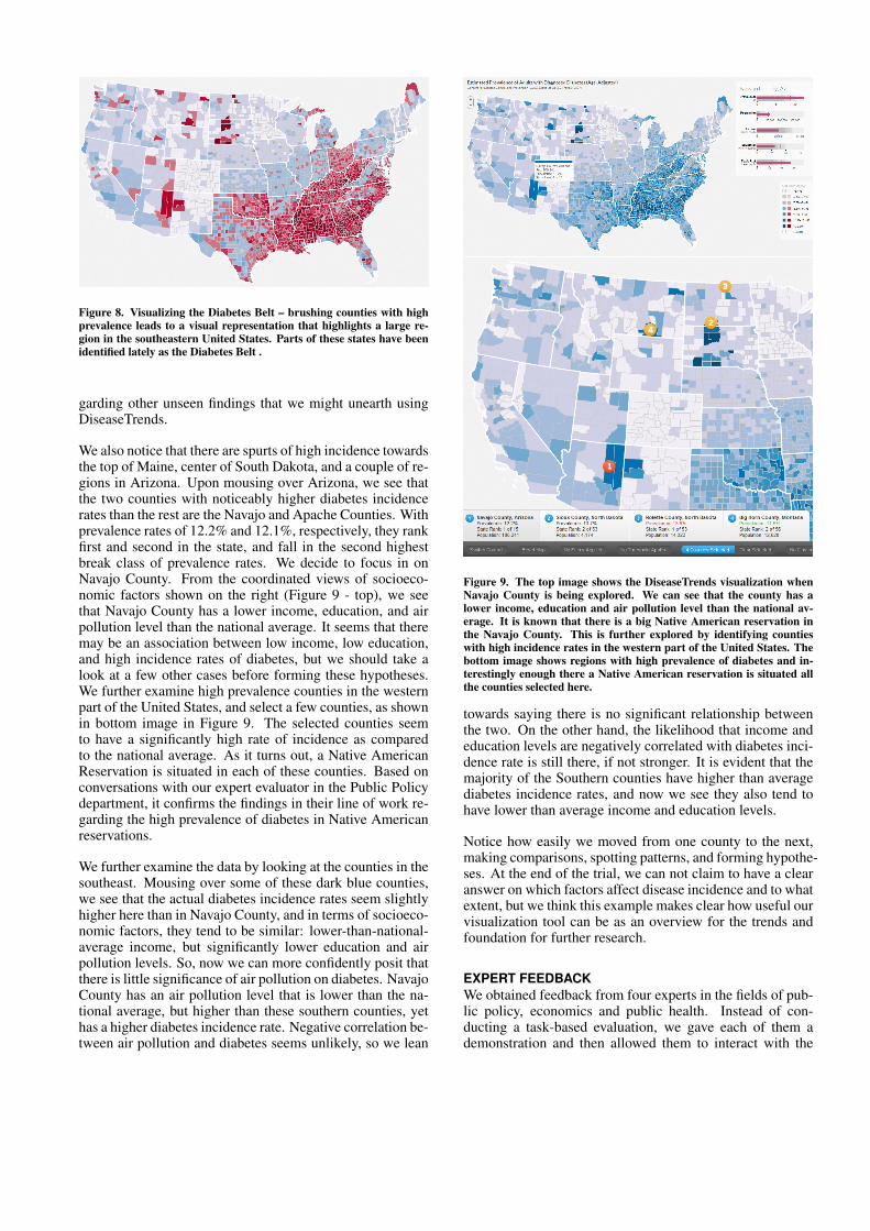
Figure 8. Visualizing the Diabetes Belt – brushing counties with highprevalence leads to a visual representation that highlights a large re-gion in the southeastern United States. Parts of these states have beenidentified lately as the Diabetes Belt .
garding other unseen findings that we might unearth usingDiseaseTrends.
We also notice that there are spurts of high incidence towardsthe top of Maine, center of South Dakota, and a couple of re-gions in Arizona. Upon mousing over Arizona, we see thatthe two counties with noticeably higher diabetes incidencerates than the rest are the Navajo and Apache Counties. Withprevalence rates of 12.2% and 12.1%, respectively, they rankfirst and second in the state, and fall in the second highestbreak class of prevalence rates. We decide to focus in onNavajo County. From the coordinated views of socioeco-nomic factors shown on the right (Figure 9 - top), we seethat Navajo County has a lower income, education, and airpollution level than the national average. It seems that theremay be an association between low income, low education,and high incidence rates of diabetes, but we should take alook at a few other cases before forming these hypotheses.We further examine high prevalence counties in the westernpart of the United States, and select a few counties, as shownin bottom image in Figure 9. The selected counties seemto have a significantly high rate of incidence as comparedto the national average. As it turns out, a Native AmericanReservation is situated in each of these counties. Based onconversations with our expert evaluator in the Public Policydepartment, it confirms the findings in their line of work re-garding the high prevalence of diabetes in Native Americanreservations.
We further examine the data by looking at the counties in thesoutheast. Mousing over some of these dark blue counties,we see that the actual diabetes incidence rates seem slightlyhigher here than in Navajo County, and in terms of socioeco-nomic factors, they tend to be similar: lower-than-national-average income, but significantly lower education and airpollution levels. So, now we can more confidently posit thatthere is little significance of air pollution on diabetes. NavajoCounty has an air pollution level that is lower than the na-tional average, but higher than these southern counties, yethas a higher diabetes incidence rate. Negative correlation be-tween air pollution and diabetes seems unlikely, so we lean
Figure 9. The top image shows the DiseaseTrends visualization whenNavajo County is being explored. We can see that the county has alower income, education and air pollution level than the national av-erage. It is known that there is a big Native American reservation inthe Navajo County. This is further explored by identifying countieswith high incidence rates in the western part of the United States. Thebottom image shows regions with high prevalence of diabetes and in-terestingly enough there a Native American reservation is situated allthe counties selected here.
towards saying there is no significant relationship betweenthe two. On the other hand, the likelihood that income andeducation levels are negatively correlated with diabetes inci-dence rate is still there, if not stronger. It is evident that themajority of the Southern counties have higher than averagediabetes incidence rates, and now we see they also tend tohave lower than average income and education levels.
Notice how easily we moved from one county to the next,making comparisons, spotting patterns, and forming hypothe-ses. At the end of the trial, we can not claim to have a clearanswer on which factors affect disease incidence and to whatextent, but we think this example makes clear how useful ourvisualization tool can be as an overview for the trends andfoundation for further research.
EXPERT FEEDBACKWe obtained feedback from four experts in the fields of pub-lic policy, economics and public health. Instead of con-ducting a task-based evaluation, we gave each of them ademonstration and then allowed them to interact with the

data. Based on their interactions and prior knowledge, weidentified certain trends as mentioned above regarding highprevalence of diabetes in Native American Reservations andregarding the Diabetes Belt.
All the experts were highly impressed with the user inter-face and specifically the ability to filter data, select specificcounties for compare-and-contrast type tasks and the abilityto specify a cluster of counties. The economist provided uswith feedback regarding displaying similar counties basedon the current selected counties. She said that it might beinteresting to examine counties with similar population, in-come, education and air pollution levels but varying inci-dence rates. We incorporated her suggestion as shown inSection . She also mentioned that it may be interesting to vi-sualize other variables such as racial distribution since theyhave seen some correlations with certain races and high in-cidences of diabetes. Unfortunately, they did not have anycounty level data for the entire country and so this could notbe incorporated. We have started conversations regardingcollaboration on the state level data that they have.
Based on conversations with the public policy expert, wefound that they would like to further examine whether caloricintake data was available to investigate a correlation betweencaloric intake and diabetes. The public health researchermentioned that it certainly could be a useful tool for pub-lic health researchers as a way to identify counties/clustersof interest for further investigation. He also felt that the toolmight suggest too much causation, rather than simply associ-ation. We have been particularly cautious with not implyingany causation throughout the paper and have merely hintedat possible associations with our variables. It is completelyup to a researcher in the field of public policy / public healthto further investigate the findings.
CONCLUSION AND FUTURE WORKWe have presented an interactive geographic visualizationtool that allows for exploration, examination and the gener-ation of hypotheses for further study. Based on our expertfeedback, we believe our visualization tool serves as an in-formative and effective overview of trends in disease inci-dence and specific socioeconomic factors. It allows a userto easily drill down on any trends and aspects in the data forfurther examination. Our visualization can easily incorpo-rate additional analysis, whether it is by adding other factors,looking at other diseases, or implementing different coordi-nated views as part of the analysis. This generalization ofthe DiseaseTrends program to work with new datasets, bothdisease as well as external factors can be accomplished withminimal additional work to our existing program. In ournext version, a user will be able to select from a number ofpreloaded datasets or upload their own data. Additionally,we plan to undertake a detailed task-based expert evalua-tion comparing of our system to evaluate the effectivenessof our tool. We are also planning to integrate Geographi-cally Weighted Regression (GWR) into the next version ofour tool. We are currently working on incorporating statisti-cal cluster detection methods into the tool.
ACKNOWLEDGEMENTSThe authors wish to thank Yoonie Hoh for her help with theproject and the Sunlight Labs.
REFERENCES1. Centers for disease control and prevention: National
diabetes surveillance system. county level estimates ofdiagnosed diabetes. http://www.cdc.gov/diabetes/statistics/index.htm.
2. National cancer institute. state cancer profiles:Incidence rates report.http://statecancerprofiles.cancer.gov/incidencerates/index.php.
3. United states department of agriculture: Economicresearch service. county-level education data.http://www.ers.usda.gov/Data/Education/#list, 2005.
4. Bureau of economic analysis: U.S. department ofcommerce. regional economic analysis: Local areapersonal income. http://www.bea.gov/regional/reis/default.cfm#step2, 2009.
5. United states environmental protection agency.technology transfer network: National scale air toxicsassessment. http://www.epa.gov/ttn/atw/nata2002/tables.html#table1., 2009.
6. US census bureau small area income and povertyestimates (saipe). http://www.census.gov/did/www/saipe/data/maps/index.html/,2012.
7. R. Amar, J. Eagan, and J. Stasko. Low-levelcomponents of analytic activity in informationvisualization. In IEEE Symposium on InformationVisualization, 2005, pages 111–117, 2005.
8. G. Andrienko, N. Andrienko, U. Demsar, D. Dransch,J. Dykes, S. Fabrikant, M. Jern, M. Kraak,H. Schumann, and C. Tominski. Space, time and visualanalytics. International Journal of GeographicalInformation Science, 24(10):1577–1600, 2010.
9. N. Andrienko and G. Andrienko. Exploratory analysisof spatial and temporal data: a systematic approach.Springer Verlag, 2006.
10. L. E. Barker, K. A. Kirtland, E. W. Gregg, L. S. Geiss,and T. J. Thompson. Geographic distribution ofdiagnosed diabetes in the U.S.A. diabetes belt.American Journal of Preventive Medicine,40(4):434–439, April 2011.
11. D. B. Carr. Designing linked micromap plots for stateswith many counties. Statistics in Medicine,20(9-10):1331–1339, 2001.
12. J. Chen, R. E. Roth, A. T. Naito, E. J. Lengerich, andA. M. MacEachren. Geovisual analytics to enhancespatial scan statistic interpretation: an analysis of U.S.cervical cancer mortality. International journal ofhealth geographics, 7:57, Jan. 2008.

13. S. Colagiuri. Epidemiology of prediabetes. MedicalClinics of North America, 95(2):299 – 307, 2011.Prediabetes and Diabetes Prevention.
14. E. K. Cromley and S. L. McLafferty. GIS and PublicHealth. The Guilford Press, 2002.
15. B. Davenhall. Your health depends on where you live.http://www.ted.com/talks/bill_davenhall_your_health_depends_on_where_you_live.html, 2010.
16. J. Dykes, A. MacEachren, and M. Kraak. Exploringgeovisualization, volume 1. Pergamon, 2005.
17. B. K. Edwards, E. J. Feuer, and L. W. Pickle. USpredicted cancer incidence, 1999: Complete maps bycounty and state from spatial projection models. In NCICancer Surveillance Monograph Series, 2003.
18. S. Few. Bullet graph design specification. In PerceptualEdge - White Paper, 2010.
19. A. Fredrikson, C. North, C. Plaisant, andB. Shneiderman. Temporal, geographical andcategorical aggregations viewed through coordinateddisplays: A case study with highway incident data. InProceedings of the Workshop on New Paradigms inInformation Visualization and Manipulation, pages26–34. ACM Press, 1999.
20. M. Harrower and C. A. Brewer. Colorbrewer.org: Anonline tool for selecting colour schemes for maps.Cartographic Journal, 40(1):27–37, Jun 2003.
21. B. Herrera and C. Lindgren. The genetics of obesity.Current Diabetes Reports, 10:498–505, 2010.
22. Q. Ho, P. Lundblad, T. Astrom, and M. Jern. Aweb-enabled visualization toolkit for geovisualanalytics. SPIE: Electronic Imaging Science andTechnology, Visualization and Data Analysis,Proceedings of SPIE, San Francisco, 2011.
23. M. Jern, T. Astrom, and S. Johansson. Geoanalyticstools applied to large geospatial datasets. InInformation Visualisation, 2008. IV’08. 12thInternational Conference, pages 362–372. IEEE, 2008.
24. M. Jern, J. Rogstadius, and T. Astrom. Treemaps andchoropleth maps applied to regional hierarchicalstatistical data. In Information Visualisation, 2009 13thInternational Conference, pages 403–410. IEEE, 2009.
25. S. Labs. Clearmaps [mapping framework]. http://github.com/sunlightlabs/clearmaps/,2010.
26. Q. Li, X. Bao, C. Song, J. Zhang, and C. North.Dynamic query sliders vs. brushing histograms. In CHI’03 extended abstracts on Human factors in computingsystems, CHI EA ’03, pages 834–835, New York, NY,USA, 2003. ACM.
27. A. M. MacEachren. How Maps Work: Representation,Visualization, and Design. The Guilford Press, NewYork, 2nd ed. edition, 2004.
28. A. M. MacEachren, S. Crawford, M. Akella, andG. Lengerich. Design and implementation of a model,web-based, gis-enabled cancer atlas. CartographicJournal, The, 45(4):246–260, Nov. 2008.
29. A. M. MacEachren and M.-J. Kraak. Researchchallenges in geovisualization. Cartography andGeographic Information Science, 28(1):3–12, Jan.2001.
30. J. E. Mersey. Color and thematic map design: The roleof colour scheme and map complexity in chloroplethmap communication. Carotographica, 27(3):1–167,1990.
31. E. Nelson. The impact of bivariate symbol design ontask performance in a map setting. Cartographica: TheInternational Journal for Geographic Information andGeovisualization, 37(4):61–78, 2000.
32. T. Ormsby, E. Napoleon, and R. Burke. Getting toKnow ArcGIS Desktop: The Basics of ArcView,ArcEditor, and ArcInfo Updated for ArcGIS 9. EsriPress, 2004.
33. C. Plaisant and V. Jain. Dynamaps: Dynamic querieson a health statistics atlas. In CHI ’94 Video Program,ACM CHI ’94 Conference Companion, pages 439–440.ACM, 1994.
34. J. Symanzik, G. Klinke, S. Klinke, S. Schmelzer,D. Cook, and N. Lewin. The arcview/xgobi/xploreenvironment: Technical details and applications forspatial data analysis. In ASA Proceedings of the Sectionon Statistical Graphics, pages 73–78. AmericanStatistical Association, 1997.
35. Tableau. Tableau software.http://tableausoftware.com/, 2012.
36. TIBCO. Tibco spotfire - business intelligence analyticssoftware. http://spotfire.tibco.com/, 2012.
37. B. Tomaszewski, A. Robinson, C. Weaver, M. Stryker,and A. MacEachren. Geovisual analytics and crisismanagement. In Proc. 4th International InformationSystems for Crisis Response and Management(ISCRAM), pages 173–179, 2007.
38. K. Webb. Clearmaps: A mapping framework for datavisualization.http://sunlightlabs.com/blog/2010/clearmaps-mapping-framework/, 2010.
39. G. Wessel, R. Chang, and E. Sauda. Visualizing GIS:Urban Form and Data Structure. In 96th AnnualConference of Association of Collegiate Schools ofArchitecture (ACSA), pages 378–384, 2008.