visualizing quantitative informationvisualizing quantitative...
TRANSCRIPT

visualizing quantitative informationvisualizing quantitative information
martin krzywinski
outlineoutline
best practices of graphical data design
data-to-ink ratio
cartjunkcartjunk
circos
the visual display of quantitative information
edward r tufte, 2001, 2nd ed
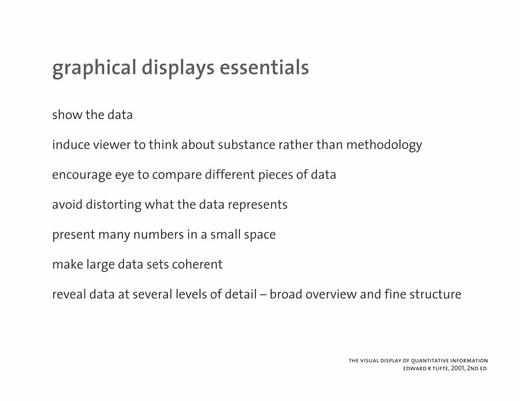
graphical displays essentialsgraphical displays essentials
show the data
induce viewer to think about substance rather than methodology
encourage eye to compare different pieces of dataencourage eye to compare different pieces of data
avoid distorting what the data represents
present many numbers in a small space
make large data sets coherent
reveal data at several levels of detail – broad overview and fine structure
the visual display of quantitative information
edward r tufte, 2001, 2nd ed
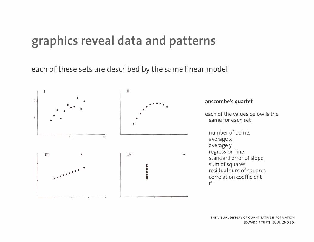
graphics reveal data and patternsgraphics reveal data and patterns
each of these sets are described by the same linear model
anscombe’s quartet
each of the values below is the same for each set
number of pointsaverage xaverage yregression linestandard error of slopesum of squaresqresidual sum of squarescorrelation coefficientr2
the visual display of quantitative information
edward r tufte, 2001, 2nd ed
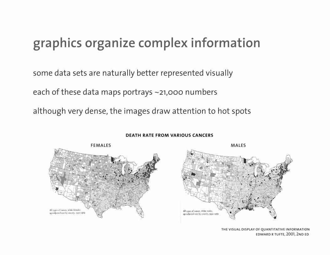
graphics organize complex informationgraphics organize complex information
some data sets are naturally better represented visually
each of these data maps portrays ~21,000 numbers
although very dense the images draw attention to hot spotsalthough very dense, the images draw attention to hot spots
death rate from various cancers
females males
the visual display of quantitative information
edward r tufte, 2001, 2nd ed
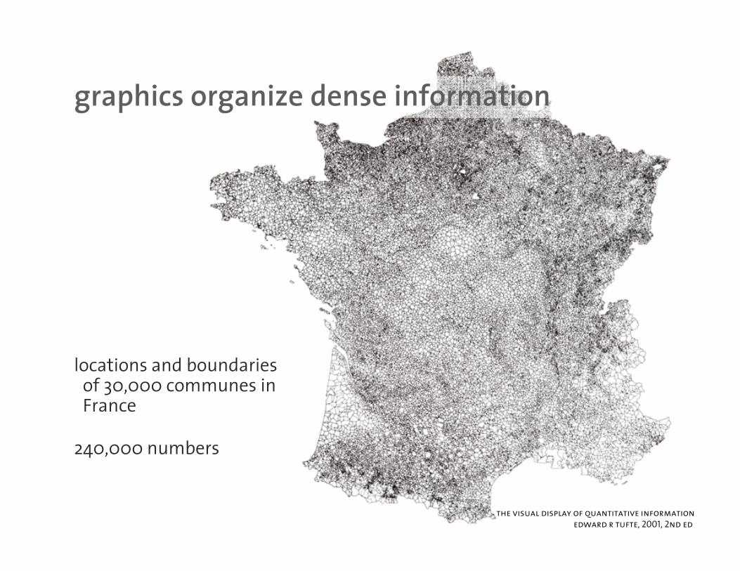
graphics organize dense informationgraphics organize dense information
locations and boundaries of 30,000 communes in 3 ,France
240,000 numbers
the visual display of quantitative information
edward r tufte, 2001, 2nd ed
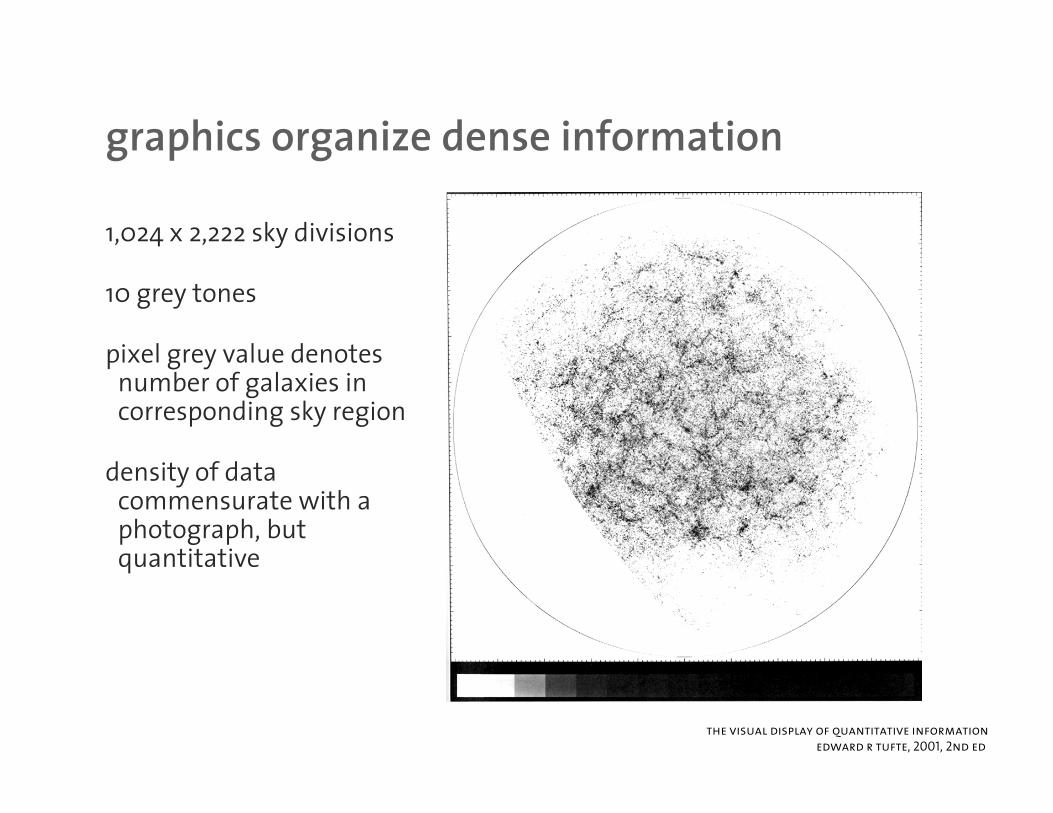
graphics organize dense informationgraphics organize dense information
1,024 x 2,222 sky divisions
10 grey tones
pixel grey value denotespixel grey value denotes number of galaxies in corresponding sky region
density of data commensurate with a photograph, but quantitativequantitative
the visual display of quantitative information
edward r tufte, 2001, 2nd ed
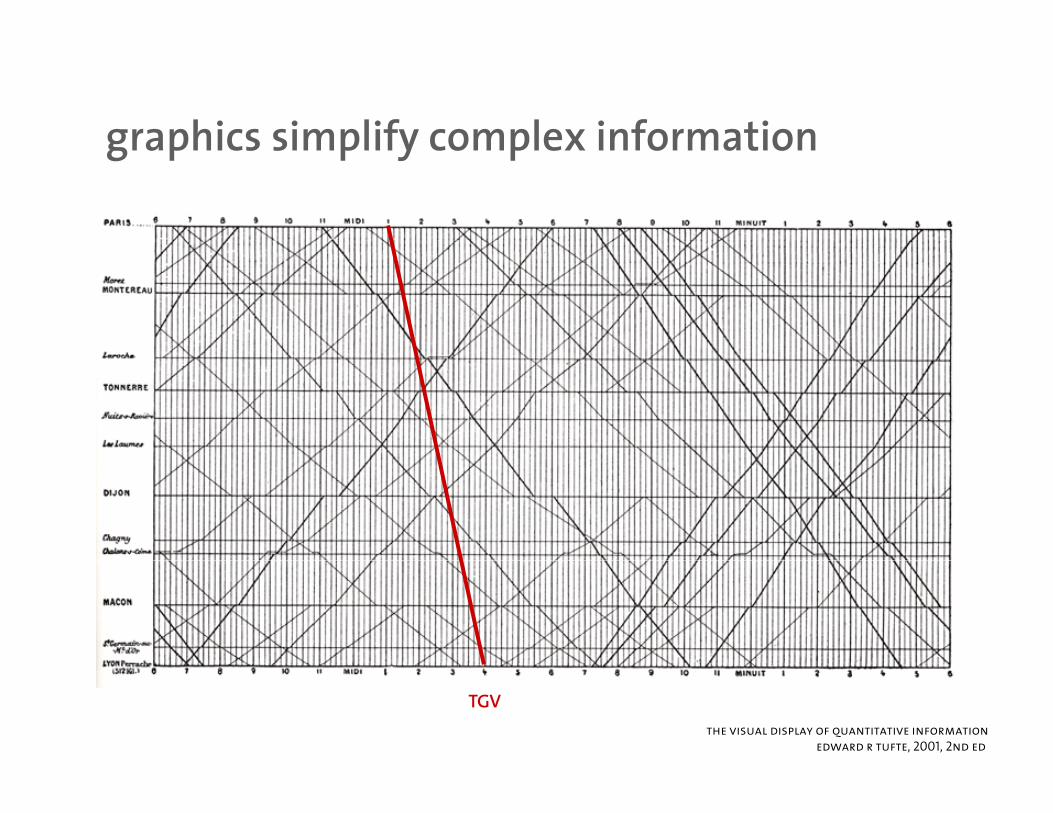
graphics simplify complex informationgraphics simplify complex information
TGVthe visual display of quantitative information
edward r tufte, 2001, 2nd ed

when the image is the datawhen the image is the data
the visual medium is ideal f d i ti lti i tfor depicting multivariate data
arguably univariate andarguably univariate and bivariate data should be tabularized, within reason
this example shows a plot for a case where data cannot be easilycannot be easily parametrized
the visual display of quantitative information
edward r tufte, 2001, 2nd ed
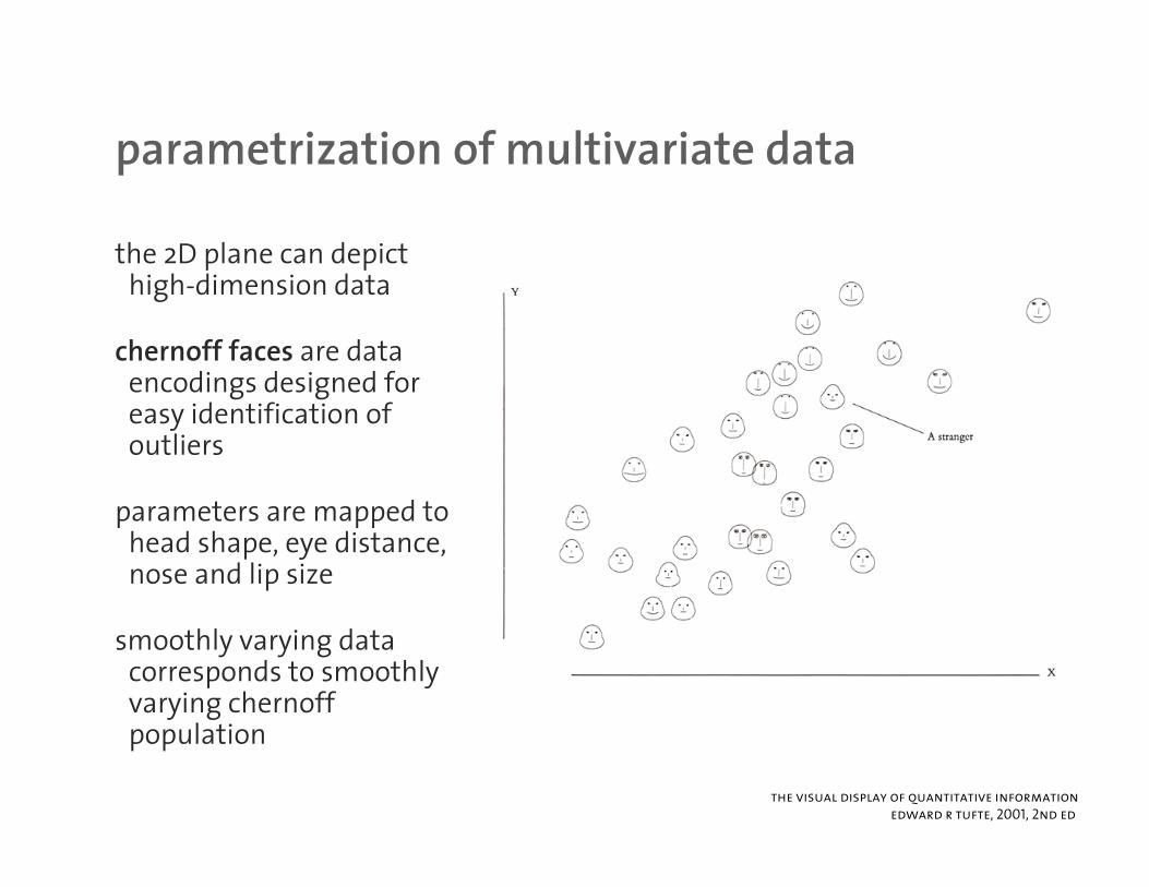
parametrization of multivariate dataparametrization of multivariate data
the 2D plane can depict hi h di i d thigh-dimension data
chernoff faces are data encodings designed forencodings designed for easy identification of outliers
dparameters are mapped to head shape, eye distance, nose and lip size
smoothly varying data corresponds to smoothly varying chernoff
lpopulation
the visual display of quantitative information
edward r tufte, 2001, 2nd ed
data-to-ink ratiodata to ink ratio
proportion of graphic’s ink devoted to the non-redundant display of data i f tiinformation
1.0 – proportion of a graphic that can be erased without loss of data informationinformation
data-to-ink ratio should always be maximized, within reason
the visual display of quantitative information
edward r tufte, 2001, 2nd ed
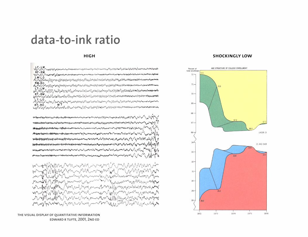
data-to-ink ratiodata to ink ratiohigh shockingly low
the visual display of quantitative information
edward r tufte, 2001, 2nd ed
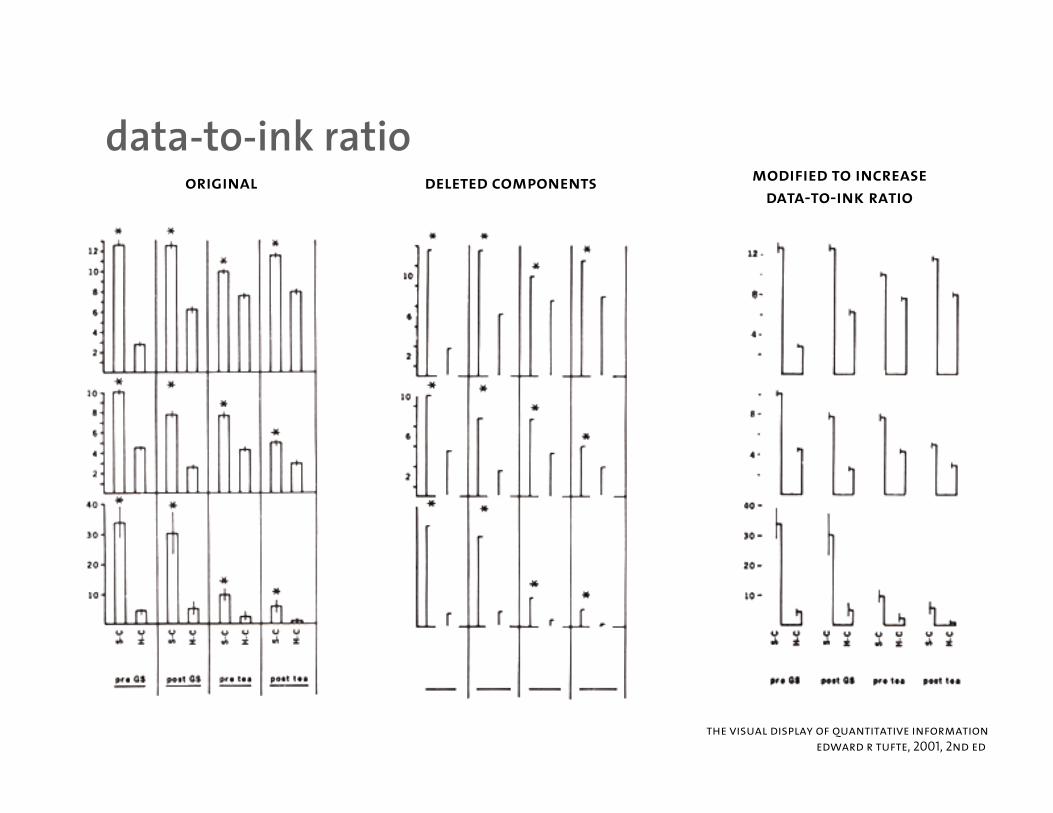
data-to-ink ratiodata to ink ratiooriginal deleted components
modified to increase
data-to-ink ratio
the visual display of quantitative information
edward r tufte, 2001, 2nd ed
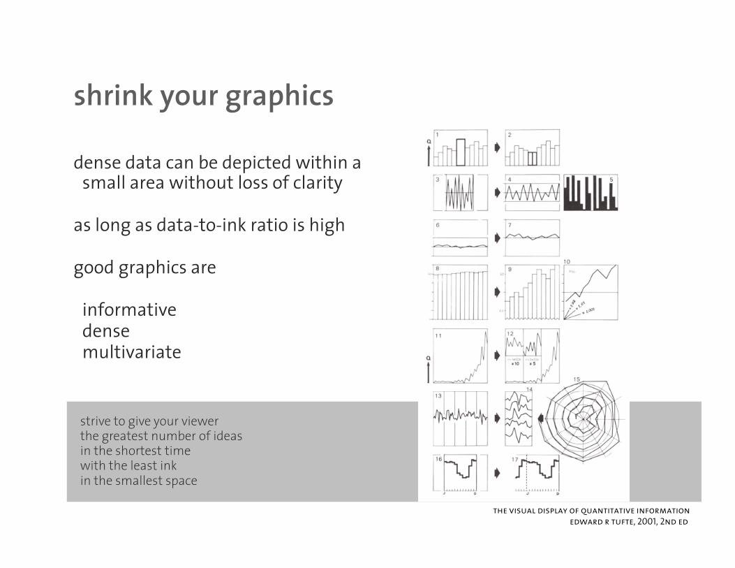
shrink your graphicsshrink your graphics
dense data can be depicted within a ll ith t l f l itsmall area without loss of clarity
as long as data-to-ink ratio is high
good graphics are
informativedensemultivariate
strive to give your viewerthe greatest number of ideasin the shortest time
ith the least inkwith the least inkin the smallest space
the visual display of quantitative information
edward r tufte, 2001, 2nd ed

cartjunkcartjunk
excessive use of grids and patterns cause perceived vibrations
avoid hatched patterns to limit moire
avoid excessive use of decorative formsavoid excessive use of decorative formsthe visual display of quantitative information
edward r tufte, 2001, 2nd ed
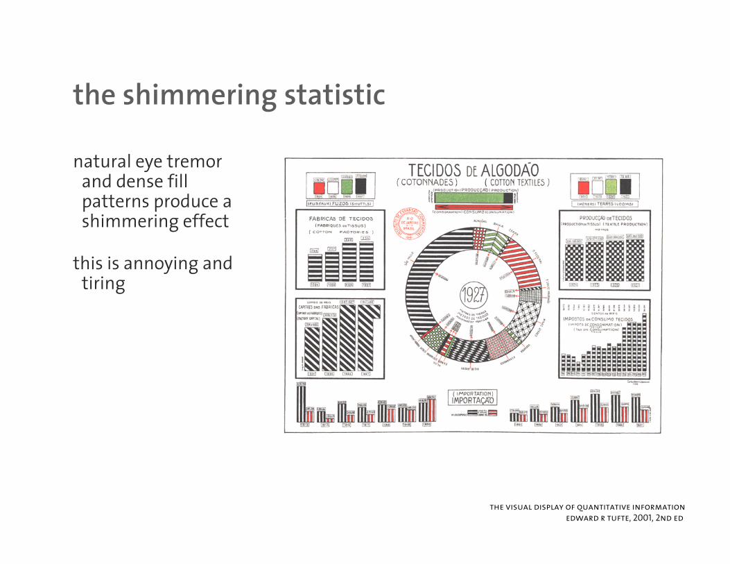
the shimmering statisticthe shimmering statistic
natural eye tremor d d filland dense fill
patterns produce a shimmering effect
this is annoying and tiring
the visual display of quantitative information
edward r tufte, 2001, 2nd ed
circoscircos
there are many genome browsers and y gvisualizers already available – do we really need another one?
communicating data visually critical forcommunicating data visually critical for large data sets
there certain types of data that obfuscate ypcommon diagram formats
standard 2D plots (2 perpendicular axes) are inadequate
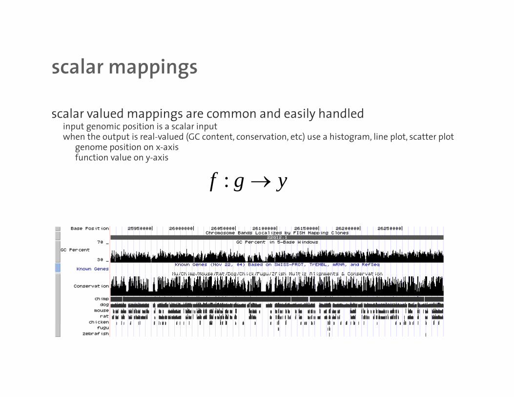
scalar mappingsscalar mappings
scalar valued mappings are common and easily handledi t i iti i l i tinput genomic position is a scalar inputwhen the output is real-valued (GC content, conservation, etc) use a histogram, line plot, scatter plot
genome position on x-axisfunction value on y-axis
f :f g y→
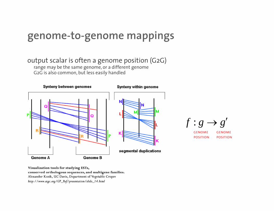
genome-to-genome mappingsgenome to genome mappings
output scalar is often a genome position (G2G)b th diff trange may be the same genome, or a different genome
G2G is also common, but less easily handled
f ′:f g g′→genome
position
genome
position
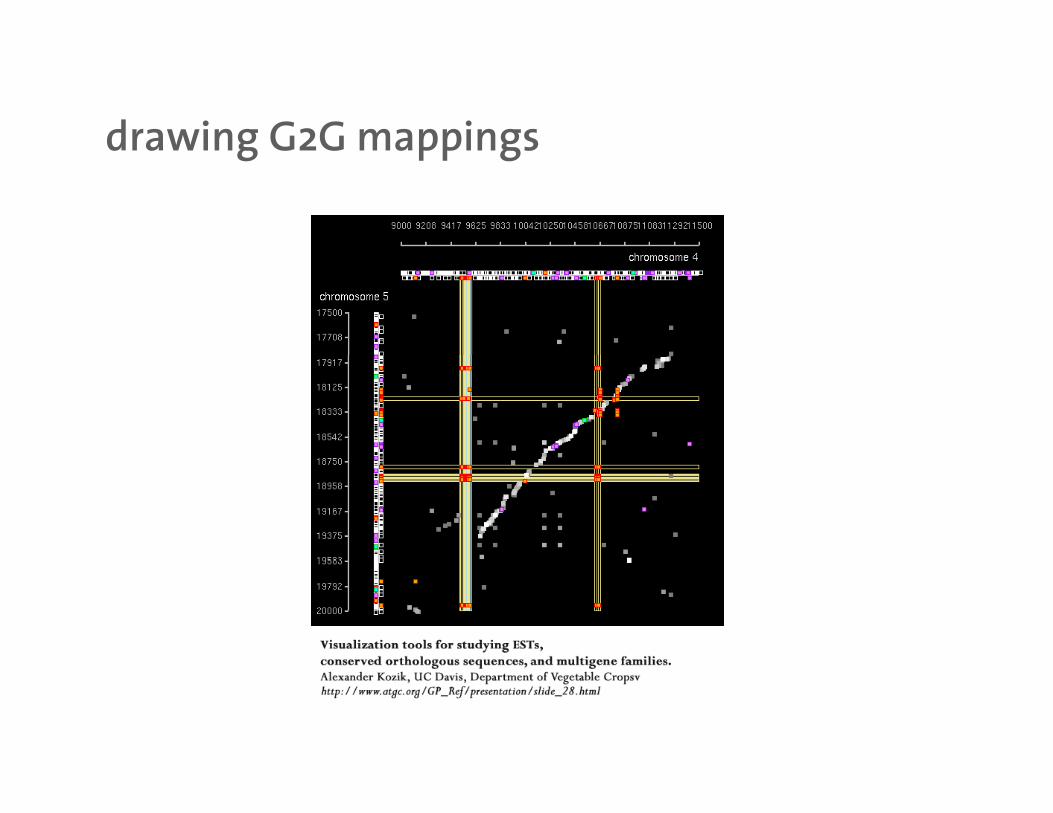
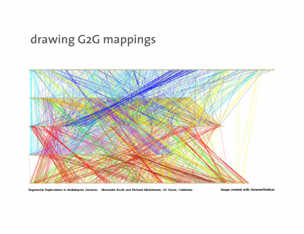
drawing G2G mappingsdrawing G2G mappings

drawing G2G mappingsdrawing G2G mappings
Genome Res. 2003 Jan;13(1):37-45
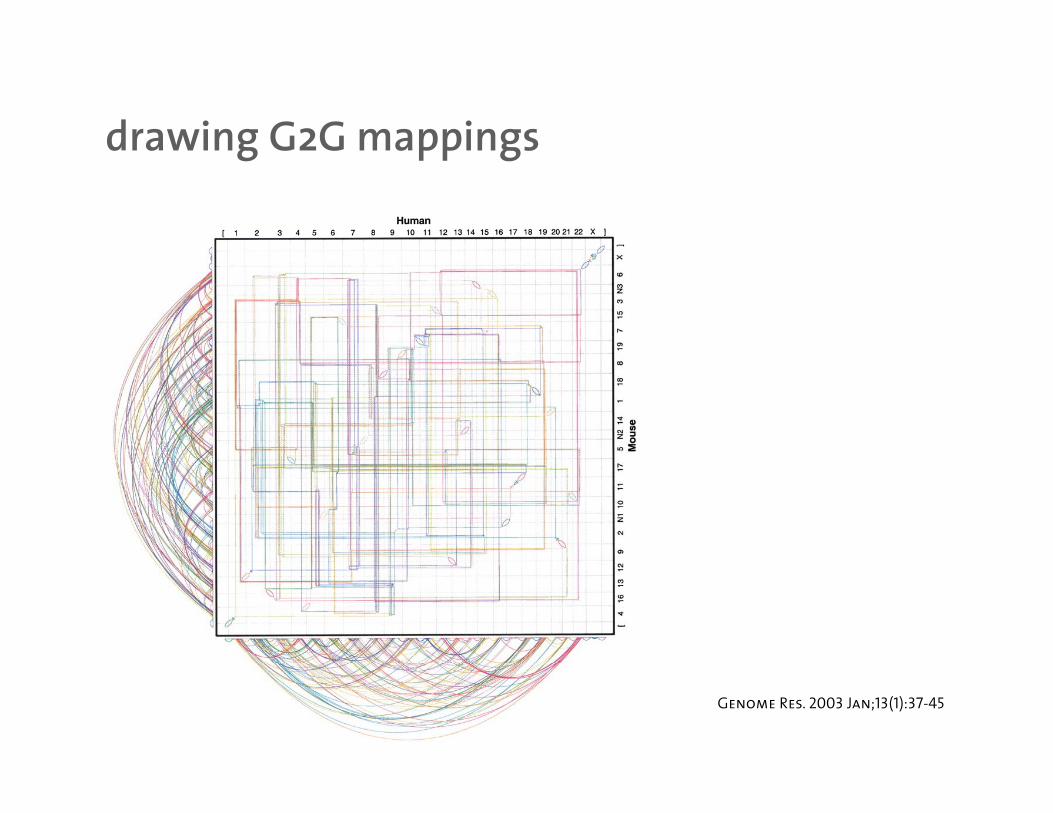
drawing G2G mappingsdrawing G2G mappings
Genome Res. 2003 Jan;13(1):37-45
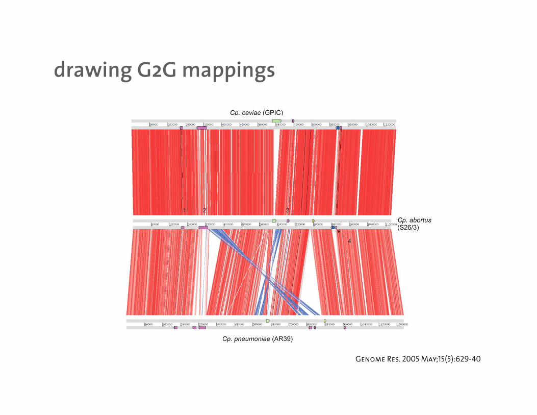
drawing G2G mappingsdrawing G2G mappings
Genome Res. 2005 May;15(5):629-40
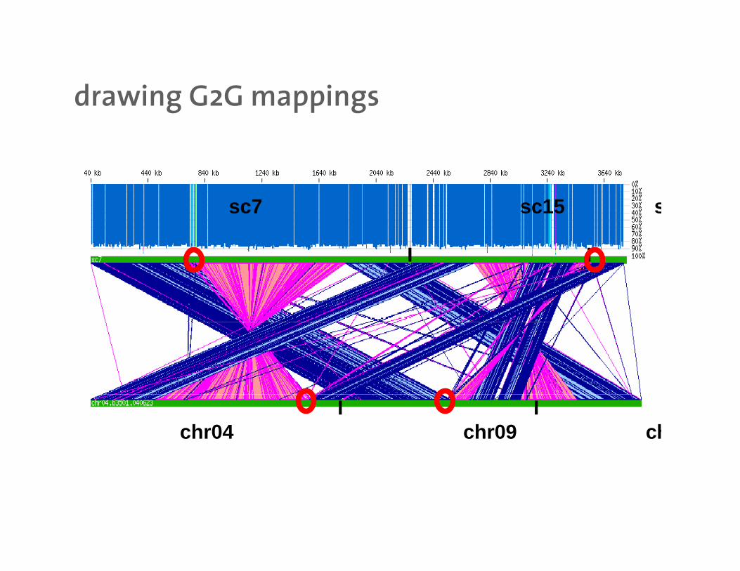
drawing G2G mappingsdrawing G2G mappings
sc7 sc15 s
I I I I
I I chr04 chr09 ch

drawing G2G mappingsdrawing G2G mappings
Genome Res. 2003 Jan;13(1):37-45

drawing G2G mappingsdrawing G2G mappings
http://www.egg.isu.edu/Members/deborah/genomics

drawing G2G mappingsdrawing G2G mappings
http://www.genome.wustl.edu/projects/human/chr7paper/chr7data/030113/segmental/index.php
drawing G2G mappingsdrawing G2G mappings
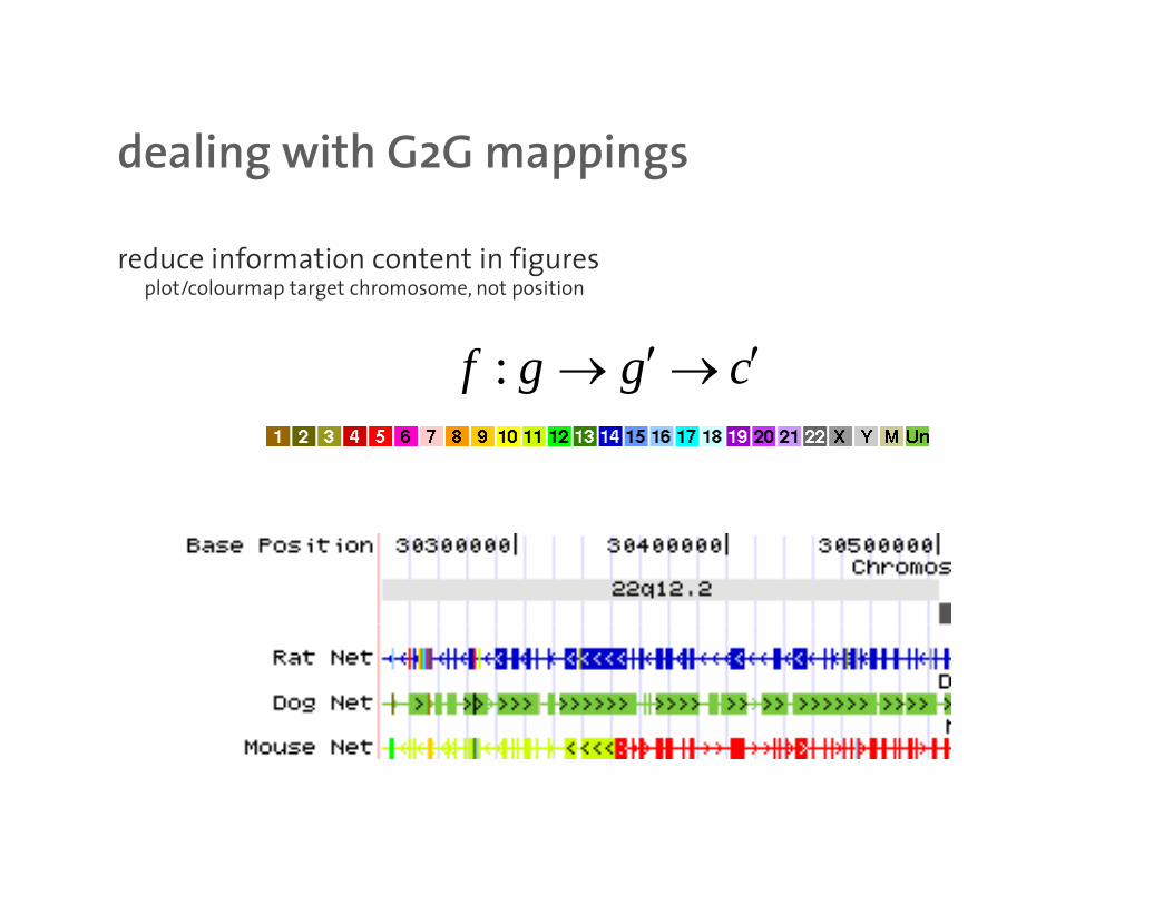
dealing with G2G mappingsdealing with G2G mappings
reduce information content in figuresl t/ l t t h t itiplot/colourmap target chromosome, not position
:f g g c′ ′→ →
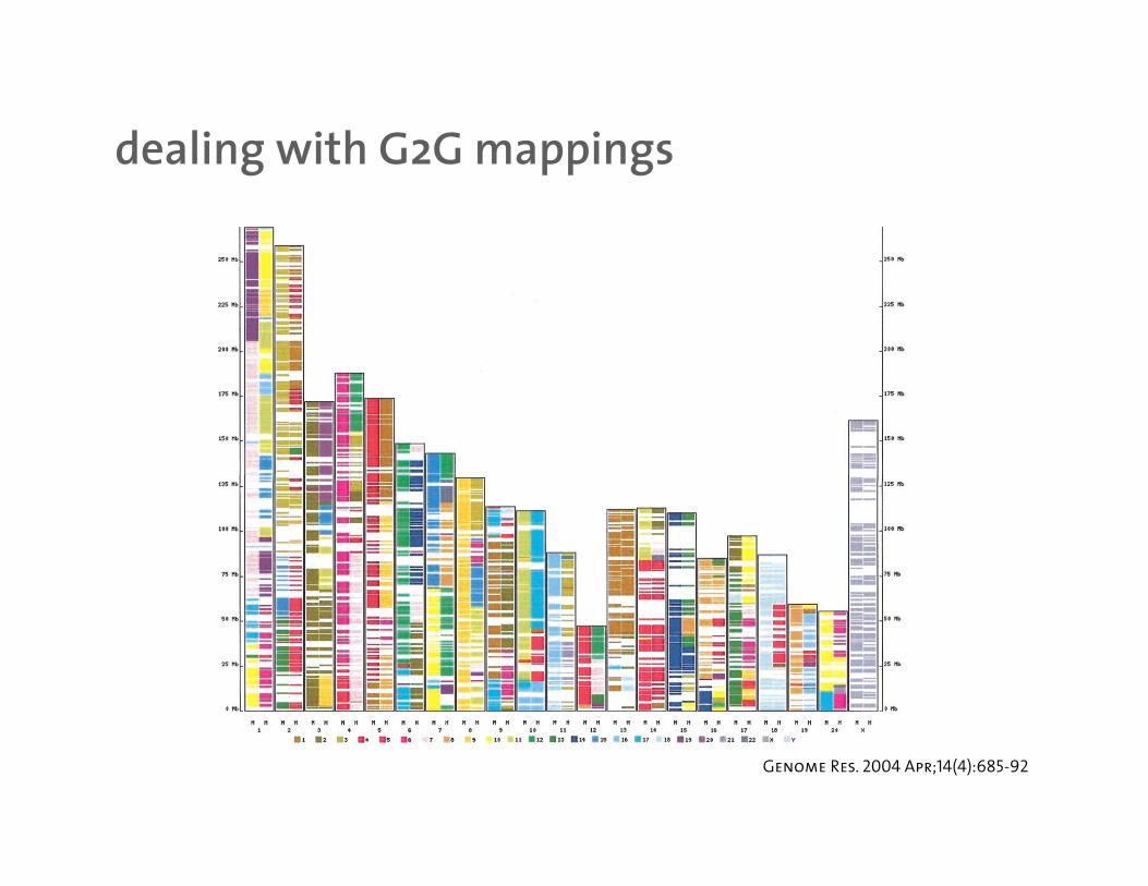
dealing with G2G mappingsdealing with G2G mappings
Genome Res. 2004 Apr;14(4):685-92
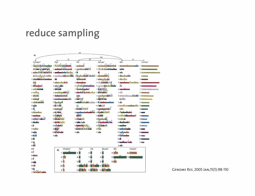
reduce samplingreduce sampling
Genome Res. 2005 Jan;15(1):98-110
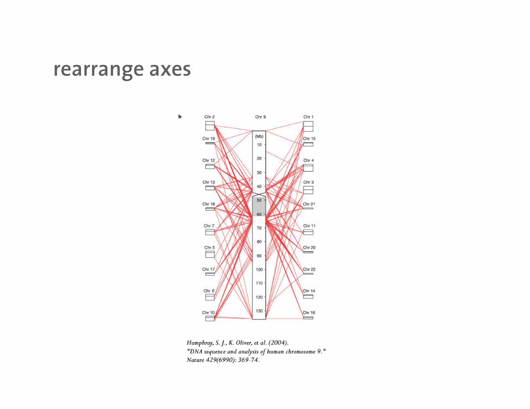
rearrange axesrearrange axes

partition datapartition data
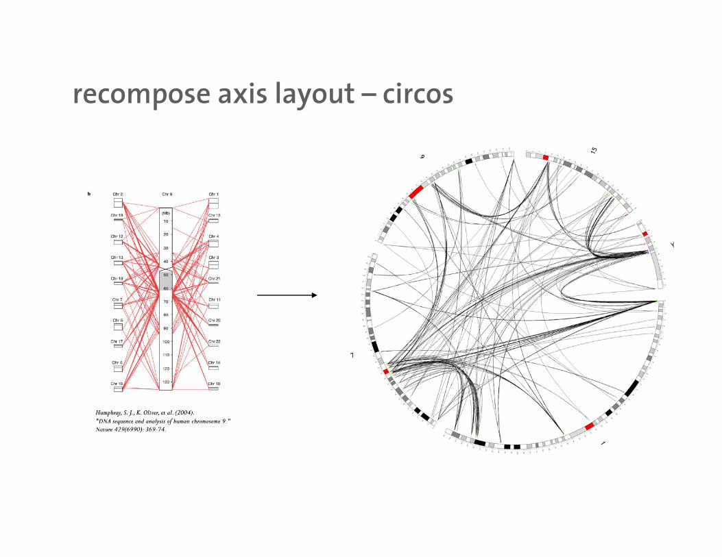
recompose axis layout – circosrecompose axis layout circos

circoscircos
written in Perl
Apache-style configuration file
plain text data input
PNG outputp
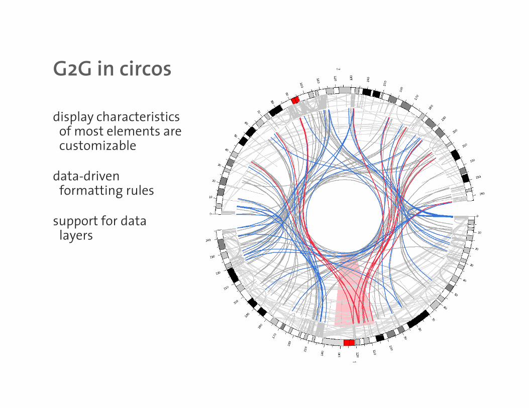
G2G in circosG2G in circos
display characteristics f t l tof most elements are
customizable
data-drivendata driven formatting rules
support for data llayers
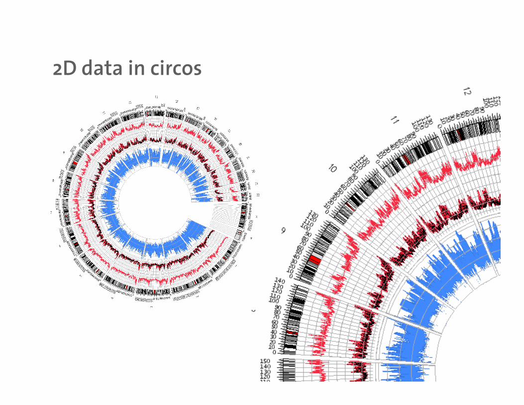
2D data in circos2D data in circos

2D data in circos2D data in circos
box
scatter
line
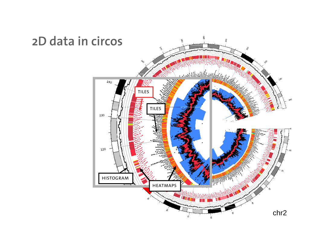
2D data in circos2D data in circos
tiles
tilestiles
heatmaps
histogram
chr2
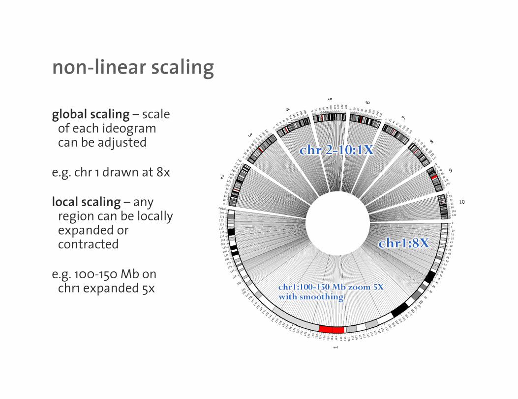
non-linear scalingnon linear scaling
global scaling – scale f h idof each ideogram
can be adjusted
e g chr 1 drawn at 8xe.g. chr 1 drawn at 8x
local scaling – any region can be locally
d dexpanded or contracted
e g 100-150 Mb one.g. 100-150 Mb on chr1 expanded 5x
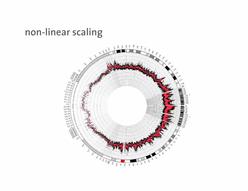
non-linear scalingnon linear scaling
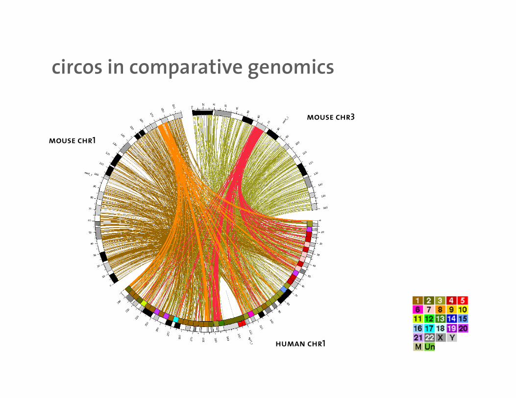
circos in comparative genomicscircos in comparative genomics
mouse chr3
mouse chr1
human chr1
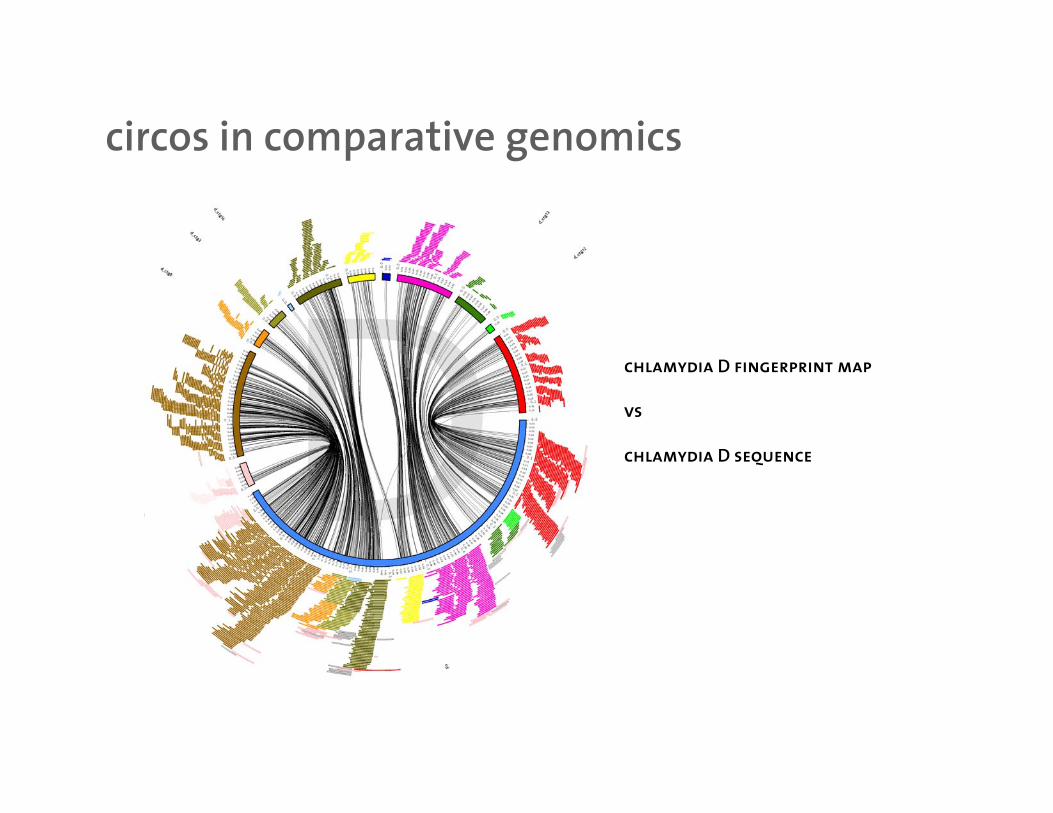
circos in comparative genomicscircos in comparative genomics
chlamydia D fingerprint map
vs
chlamydia D sequencechlamydia D sequence
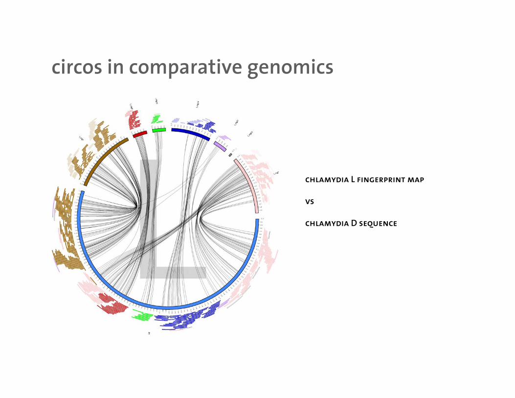
circos in comparative genomicscircos in comparative genomics
chlamydia L fingerprint map
vs
chlamydia D sequencechlamydia D sequence
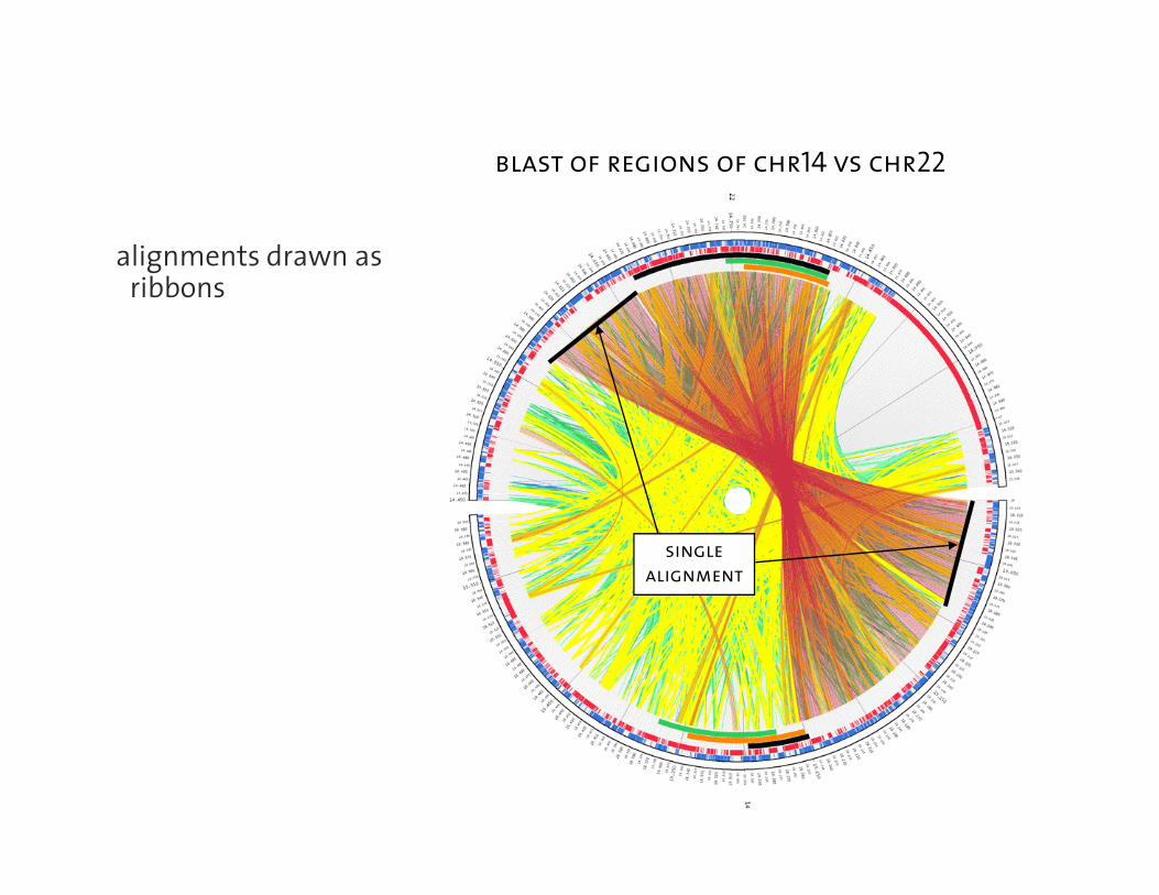
blast of regions of chr14 vs chr22
alignments drawn as ibb
blast of regions of chr14 vs chr22
ribbons
single
alignment
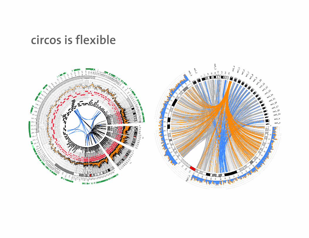
circos is flexiblecircos is flexible

mkweb.bcgsc.ca/circosmkweb.bcgsc.ca/circos
download
documentation
tutorialstutorials
circos art