visualizing the portuguese empire expansion and decline · visualizing the portuguese empire...
TRANSCRIPT
Visualizing the Portuguese Empire expansion and decline Pedro Cruz and Penousal Machado
CISUC, Department of Informatics Engineering, University of Coimbra, Portugal [email protected], machado.dei.uc.pt
Abstract — This paper describes a project that aims to visualize the expansion and decline of the Portuguese Empire. Two distinct forms of visualization were produced, one relating to the expansion and the other to the decline. The first makes use of The Lusiads to extract a general tone for the Portuguese achievements. A series of images were produced displaying the analysis. The second visualization is an animated sequence that displays the evolution of the British, French, Spanish and Portuguese empires during the XIX and XX centuries. An animated sequence produced in this context was able to get more than 340 000 views, traducing its viral nature. In this work, great care was given to the aesthetics and design of the visual output from the visualizations. Some design options are stated. Finally, other forms of visualization that merge the previous ones are discussed as a natural evolution for this ongoing project.
Index Terms — Digital narrative, Education, Information design, Information visualization, Portuguese history.
I. Introduction
The history of Portugal is often emphasized around the rise and fall of its Empire. The Portuguese Empire was arguably the first global empire in history. “It was also the longest lived of the modern European colonial empires, spanning almost six centuries, from the capture of Ceuta in 1415 to the handover of Macau in 1999”. [1]
The past extent and prestige of the Portuguese Empire contrasts with its influence in the modern world. It can be argued that the realization of a disrupted status of the Portuguese towards the world is patent in today’s way of being and thinking of the Portuguese people. Most of the times this realization translates a plain perception of loss when in fact the Portuguese history is capable of engage a multitude of other realizations. Nowadays, the Portuguese heritage can be seen all around the world through its language and architecture. The process that made this heritage was a long succession of events that require contextualization. In the same way those historical facts that led the Portuguese Empire to a peak should be envisioned in a wide global context. The vastness of the Empire, its influences and threats in a global context and a timeline of almost six centuries constitute a rich and complex data source. This data is able to feed an intuitive visualization that could permit the extraction of knowledge and contextualized opinions and conclusions.
This is an ongoing project that starts with several experiments about the evolution of the Portuguese Empire. The project aims to build a set of visual pieces capable of agreeably inform and contextualize the events that make the Portuguese Empire history. Every visual piece will be a complement of another or it will make part of a more complex piece. In this way the pieces will translate an iterative evolution that constitutes a natural goal of this project. Several datasets are explored with different visual approaches. These experiments aim to the evolution of more interesting visualizations, exploring different visual approaches and discovering the key facts in the Portuguese history and their most peremptory relation-ships. The structure of this paper consists first in the discussion of how this project fits into information visualization and which visualization strategies shall be explored. This is followed by a brief overview of the related work. Then the executed visualizations are presented explaining its processes, implementations and displaying their results. The first experiment consists mainly in analyzing the occurrences of the most frequent words in The Lusiads. The second visualization is an animated sequence that displays the evolution in extent of the four biggest maritime empires in the XIX and XX centuries. Finally, a merge of the described visualizations is discussed in conclusions and future work.
II. Information visualization
Information visualization is colloquially referred to map complex relationships to a more tangible and understand-able graphic space. Strictly, it is often defined as the use of computer-supported, interactive, visual representations of abstract data to amplify cognition [2][3]. Usually ab-stract data is referred in contrast to physically based data used in scientific visualization. In fact there’s no reason to assume that both types of data can’t be used in the same visualization. In the same way, nobody argues about the value of interactivity as a mean for visualization, but its presence shouldn’t be an imperative in the definition of information visualization. What seems to be ubiquitous is the concept of cognition amplification via the extraction of relevant knowledge.
In this project the visualization of information is recog-nized as a process. This process isn’t only about the design of the information throughput, but it consists too on an iterative narrowing of its purposes – the knowledge to be extracted and what is considered relevant is in research. Aesthetics aren’t formally a purpose of information visualization. Recently with the popularization of informa-tion visualization there is a trend of taking aesthetics into account and even constitute them as an objective [3]. Hav-ing said that, it should be stated that aesthetics were carefully embraced in this project not as a glorification or purpose, but as a natural consequence of the designed visualization and personal taste. The kind of information being visualized is inherently a pathway to invest in visualization techniques like storytel-ling where the variable time is explored.
III. Related work
The work Shapes of Portugal from Manuel Lima [4] constitutes a series of visualizations about the administra-tive divisions of the current Portuguese territory and their population, name, size and foundation. One technique that intrinsically relates with this work is the counting of the first letters and first words of all the names of the Portuguese territorial divisions, concluding about which are more frequent. Another similar technique to the ones being described in this work is the temporal display of the creation of territorial divisions during one thousand years. One can observe in which year a certain division was created, and in which periods that occurred more often. The visualization from Shapes of Portugal that is most related to the purpose of this work is The Smallness Syn-drome – The End of an Unjustified Excuse. This visualiza-tion analyzes the current area of Portugal and contextual-izes it with all the areas of every country in the world. It finally displays Portugal, not as a small, but as a medium sized country in the world and European contexts. Fernanda B. Viegas did some short experiments considering The Lusiads [5]. Those aim at plain word counting, and do not consider the analysis of their relative frequencies.
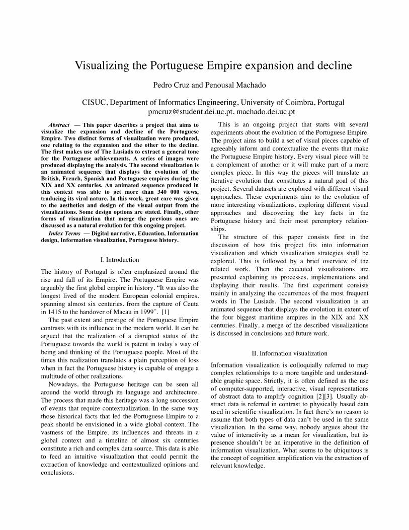
Fig, 1. Grayscale The most frequent words in The Lusiads. Several irrelevant words are displayed.
IV. The Lusiads
The Lusiads – Os Lusíadas – is a Portuguese epic poem by Luís Vaz de Camões first printed in 1572. [4] The Lusiads represents a national epic where the Portuguese voyages of discoveries are narrated. The main events narrated are the formation of the Portuguese nation with the moor expulsion and the birth of the Empire with its early expansion. The factual plot ends with the discovery of the maritime route to India. The historical facts that The Lusiads narrates are embellished by fantastical interpretations and an epic tone towards the Portuguese achievements. This tone makes up The Lusiads a flourished exacerbation of the rise of the Portuguese Empire. In that way it is interesting to translate this drama and enthusiasm to a visual language that shapes the presentation of the facts or incorporates the context of The Lusiads in the representation. The startup of this analysis to The Lusiads was simply counting the words on the text. This allows making some conclusions about the tone on the poem and put in evidence, the episodes where the narrative is longer. The Lusiads consists of ten books – cantos – with a variable number of stanzas. The total number of stanzas accounts 1102, each one having exactly eight verses. [6] Considering this structure, some building details of the visualization are described as follows. The poem was adapted [7] to a XML structure identifying its books, stanzas and each verse. A program was written in the Processing language [8] to break each verse in its words and account for their frequency on the poem. It was also written a filtering engine that selects the words being shown as relevant in the context of the poem. In that way four filtering rules were taken into account. 1) No word with less than ten occurrences in the whole poem is counted. 2) No word with less than two characters are taken into account. 3) The most common words in the Portuguese language aren’t considered like adverbs or pronouns. Some verbs and other words without a specific relevancy for the extrapolation of any concept aren’t taken into account either. To attain this it was written a list of more than five hundred words. 4) The plurals in the Portuguese language are identified and accounted as an occurrence of their singular form. This is a raw morphological analysis that compares the words and evaluates if they are plural-singular related. This core program simply analyzes the text and writes a file with the N most frequent words and their global position on the text, which book, stanza and verse it belongs to and the position in the verse. Thus, the ten most

frequent words on The Lusiads in descending order of occurrence are: 1) Gente – People 2) Terra – Lands 3) Reis – Kings 4) Mar – Sea 5) Sós – Alone 6) Águas – Waters 7) Mundo – World 8) Céu – Sky 9) Reino – Kingdom 10) Forte – Strong The first visualization concerning this thematic was a series of fifty images each referring to one of the fifty most frequent words in The Lusiads – Fig. 2. For all the images it was draw a line that spans through several lines, representing the total length of The Lusiads. All the occurrences of each word were draw with a circle in their respective position over the line. This visualization translates the amount of occurrences of each word in the text as well as their global and local densities i.e. in which parts of the text is more frequent. Each book in The Lusiads focus on well delimited episodes of the Portuguese history. Therefore it is consid-ered that would be interesting to analyze the occurrences of the most frequent words in each book. The core program described above was modified to be able to count and extract the ten most frequent words in each book. Table I summarizes the output of the program, displaying the ten most frequent words for each book sorted by frequency in descending order. Again, a series of ten images were created, each for one of the ten most frequent words in The Lusiads – Fig. 3 and Fig. 5. Each image contains the following representation primitives: 1) The word to be visualized along with its English translation.
2) Ten vertical lines properly identified that represent each book with a length proportional to the length in characters of the book. 3) A graph that intersects the lines described above. For each intersection of the graph, its high is directly proportional to the occurrences of the word in question in the corresponding book. 4) Lists of the ten most frequent words on each book sorted by descending order of occurrence. 5) The list of the ten most frequent words in The Lusiads, sorted by descending order. The word in question is marked. 6) A short description of the visualization.
Fig, 2. Grayscale Each figure displays the occurrences of a certain word in The Lusiads. It’s instant to analyze which words are more frequent and if they appear more often in determined positions in the poem.
TABLE I TEN MOST FREQUENT WORDS IN EACH BOOK OF THE LUSIADS – ENGLISH TRANSLATION
I II III IV V VI VII VIII IX X People People Kings Kings Sea Sea People Kings Useless Sea Lands Kings Lands People Lands Lands Lands People Waters Alone Moor Lands People Lands Waters Winds Kings Lands Goddess Lands Sea Moor Son Kingdom People Gods Sea Gama Beauteous Look at
Island Sea Strong Weapons Winds Sky Law Look at Love World Strong Chest Afonso Life Sky Kings Peoplehood Moor Vessels People Captain Sky Kingdom Chest New People City Alone Comely Kings
Sky Behold Chest Alone Coast Lady Alone Enemies Nymphs Island Mistake Waters Field First Eyes Kingdom Name Vessels Son Name Waters Winds Death Hard World Against Kingdom Achievements Alone God

Fig. 3. Image displaying the occurrence of the most frequent word in The Lusiads along its ten books. This was the first of the ten series images. The layout is identical to all the subsequent.
Fig. 4. Cropped additional image that displays the evolution of occurrences of the ten most frequent words in The Lusiads along its ten books. The graphs are sorted in descending order, from top to bottom, according to the global frequency of the word.
Fig. 5. Cropped images from eight graphs of the ten series. From left to right and top to bottom, the words are Lands, Alone, Sky, World, Kingdom, Strong, Sea and Waters. Please notice that in all pieces the ten graphs are displayed simultaneously, with the one referring to the word in question being colored. This portraits the purpose of making each piece part of series, and not a standalone analysis. One additional image was produced that instead of displaying the frequency graph for one word, it displays the ten graphs at the same time – Fig. 4. The graphs are vertically separated and sorted, being the top the most frequent and the bottom the least frequent of the ten words in The Lusiads. Although this visualization is much more compact then the previous series of ten images, it loses in elegancy and simplicity of the graphical piece that is no longer able to glorify each word by itself.
V. Visualizing modern empires decline
Another main focus of this project aims to the visualiza-tion of the decline of the Portuguese Empire. Analyzing its end is a requisite for the natural evolution of this ongoing project. The Lusiads are a source of information for the early formation of the Portuguese Empire. As stated before it constitutes a biased vision of the historic facts. Being interesting to explore this vision, analyzing raw historical

data is another valuable approach. The decline of an Empire is often made of abrupt and large events that reduce its power and prestige as a world player. The attention given to those events constitutes a crude narra-tive that fits well in the rawness of the historical data. The decline of an Empire should be contextualized in the respect to the world conjuncture. A sample of that could be to also display the evolution of analogous Em-pires. One way to translate the evolution of the power of an Empire can be through the land that it controls in any historical moment. Thus, one peremptory manifestation of its decline is a continuous loss of land. Having those purposes and strategies, it was analyzed the decline of the British, the Spanish, the French and the Portuguese empires during the XIX and XX centuries. Those empires constituted the top four maritime empires by land extension in the referred centuries. [9] Those centuries were chosen because during them the Portuguese empire had its peak and decline until the modern days. The maritime empires were chosen because they constitute analogous colonial empires in territorial organization and thus had similar objectives and faced similar problems. Also, the evolution of maritime empires is abrupt and dramatic along time, being able to set an interesting tone in the visualization. The limitation to four empires was motivated by two reasons – the numbers of empires to be displayed had to be limited as visualization had to actually be understandable with such amount of data; the Portuguese empire is the forth empire using the criterions already described. All the selected empires were at their peak during the XIX and XX centuries. To be rigorous, the French Empire during those centuries was in fact the Second French Colonial Empire. The loss of land by an empire is sparse along the time, bringing an idea of continuity that fits naturally in an animated sequence where the data can be displayed as an historical narrative. Starting as the world’s biggest powers and ending reduced to the original mainland constitutes the thought where the empire representation shouldn’t be one of a rigid body. Considering that, some building and design details of the visualization are described as follows. For the representation of each Empire is used a circle that looks and acts like a soft body, being attached to an impression of dissolution. The area of each circle is directly proportional to the extension of an empire. Although it should be noticed that due to the soft body like behavior, this area isn’t assertive during collisions that consequently change the shape of the circle The Processing language was used to produce the animated sequence that simulates the evolution of the four empires from 1800 to 2010. For fluidity and visualization space it was chose a frame rate of 30fps and a size of 1280x720 pixels. The simulation year is incremented once
per second, producing a video of 3 minutes and 21 sec-onds.
Each circle displays a label identifying the correspond-ing empire. A XML file was written and interpreted with 117 lines of data extracted from Wikipedia [9]. Each line corresponds to an event in the history of the empire, that could be a growth – annexation of new land, or a loss – formation of a new independent nation. Every event contains the name of the territory in question, its extension and the year of the event. The precise year of independence is sometimes historically hard to determine, so by rule it were considered the first manifestation of the urge for independence (e.g. declarations of independence). Dominions of an empire were considered parts of it.
The soft bodies behavior was implemented building a skeleton for each circle through particles connected with springs [10][11]. Springs are also used to implement the forces that act in the simulation world, being able to present a behavior that includes collisions, attractions, repulsions, etc. For this purpose, all the bodies were interconnected with springs that only distend if the distance of the bodies is inferior to certain minimum.
The simulation also exhibits the following behaviors 1) The four main empires were continuously attracted to the middle of the simulation world, always colliding against each other, traducing a continuous seek for power. 2) Six year prior to the independence of a territory, its starts growing a new circle over the perimeter of the corresponding empire’s circle. This new circle has no body like properties and grows until it reaches the area of the territory that will gain its sovereignty – traducing the tension of the forthcoming separation. 3) When a year of independence is reached, the previous circle disappears and a new body is created that immediately tends to repulse from its former empire. This represents a mitosis like split that is an analogy to the event. 4) On the moment of the split, the empire shrinks to its actual extension. The nation just formed carries a label with its name and the color of the empire in a darker tone. 5) The new nation isn’t attracted to the center, but it collides with all the other bodies. It displays this behavior for almost 7 seconds and them fades away giving room to forthcoming nations to be visualized. This video is online [11][12][13] and had been viewed more than 340 000 times by the date of writing of this paper. It had been described as a ludic narrative with good visuals that can be used in teaching.

Fig. 6. The empires in the beginning of the simulation.
Fig. 8. The Portuguese as the biggest modern maritime empire in 1974.
Fig. 9. The British hegemony in 1915.
Fig. 7. A relative Portuguese hegemony prior to the split of the Empire of Brazil.
Fig. 10. Cropped image of the simulation in 1960 when a vast quantity of French colonies gain independence. It’s notorious how tumultuous times are easily perceived.
VI. FUTURE WORK AND CONCLUSION
This project constitutes a series of visualizations that contextualize the Portuguese Empire expansion and decline in certain historical periods. Different kinds of contextualization could be successfully extracted from complex historical plots. The Lusiads, being a glorifying narration of the Portuguese early expansion, allowed the extraction of a tone set via feelings and elements presented in the poem. This analysis contrasts with the crudity of the facts displayed in the animated sequence of the empires’ de-cline. Those two approaches constitute an antithesis that shall be further explored in the future. The animated sequence produced in this work was able to gather attention of graphic designers, information visualization enthusiasts and history teachers. Its quick spread through the social web (e.g. blogosphere) consti-tutes with 340 000 views an indubitable viral nature. The future steps will be to merge in a harmonic way the two explored approaches of contextualization. Both pro-grams and approaches shall be further developed and reutilized. One purpose is to trace a parallelism between the facts in The Lusiads and the actual historical events. That visualization shall bring together the climate ex-tracted from The Lusiads and the historic tensions towards rival empires. Further information as the geographical position of the events shall be included. Plus, interactivity with the timeline and the empires or elements to display will be added. Beyond this, future work can also lead to a distance from the current objectives that place the Portuguese Empire as the center of attentions. In fact, one can decide to visualize the complex relationships between the world’s biggest empires, treating Portugal as a regular world player.
References [1] Wikipedia, “Portuguese Empire”, December 2009. [2] S. K. Card, J. D. Mackinlay and B. Shneiderman,
“Information Visualization”, Readings in Information Visualization Using Vision to Think, chapter 1, Academic Press, 1999.
[3] M. Lima, “Information Visualization Manifesto”, online at http://www.visualcomplexity.com/vc/blog/?p=644, December 2009.
[4] M. Lima, “Shapes of Portugal”, online at http://www.shapesofportugal.com/, December 2009 [5] F. B. Viegas, “Os Lusíadas”, online at http://manyeyes.alphaworks.ibm.com/manyeyes/visualizatio
ns/os-lusiadas, December 2009. [6] Wikipedia, “Os Lusíadas”, December 2009.
[7] Project Gutenberg, “Os Lusíadas by Luís Vaz de Camões”, online at http://www.gutenberg.org/etext/3333, December 2009.
[8] Processing Programming Language, online at http://www.processing.org/, December 2009. [9] Wikipedia, “List of largest empires”, December 2009. [10] toxiclibs, online at http://code.google.com/p/toxiclibs/,
December 2009. [11] P. M. Cruz, Information Visualization et al., “Visualizing
empires”, online at http://mondeguinho.com/master/visual-experiments/visualizing-empires, December 2009.
[12] P. M. Cruz, “Visualizing Empires Decline”, online at http://www.vimeo.com/6437816.
[13] P. M. Cruz. “Visualizing Empires Decline”, online at http://www.youtube.com/watch?v=EwOA8AfeHM4.