wave 6 - ifs
TRANSCRIPT

Wave 6
In association with:
The Dynam
ics of Ageing
Evidence from the English Longitudinal Study of A
geing 2002 – 20
12 (Wave 6)
The Dynamics of Ageing Evidence from the English Longitudinal Study of Ageing 2002 – 2012 (Wave 6)
The English Longitudinal Study of Ageing is a multidisciplinary study of a large representative sample of men and women aged 50 and over living in England. ELSA was designed to understand the dynamics of ageing as people move through their later years and the relationships between demographic factors, economic circumstances, social and psychological factors, health, cognitive function and biology. The study began in 2002 and the sample is re-examined every two years. This report details the sixth wave of data collection, which was carried out in 2012–13. Wave 6 of ELSA involved both the standard face-to-face interview conducted in every wave and a nurse visit during which functional capacity, physiological measures and biomarkers were assessed.
ELSA provides crucial evidence about population ageing that is relevant in a variety of policy arenas, from pensions and later-life working practices to health, well-being, transport, social engagement and cultural activity. It is also a valuable resource for academic researchers involved in economics, epidemiology and social science. An immense amount of detailed information has been collected from participants in the study, and a single report cannot do justice to the depth and richness of the data set. Accordingly, this report focuses on three issues that are of importance to public policy and scientifi c investigation:
The report also includes a detailed set of tables describing fi ndings in the different domains included in ELSA, including demographics, income, pensions and wealth, social and cultural activity, cognitive function, physical and mental health, and biomarkers. The tables include cross-sectional analyses of participants in wave 6 and longitudinal analyses of individuals who have remained in the study since wave 1. These tables provide the reader with a wealth of information about the experience of ageing in the early 21st century and will stimulate further investigation of this important study.
ISBN: 978-1-909463-58-5Price: £40
The Dynamics of Ageing Evidence from the EnglishLongitudinal Study of Ageing 2002 – 2012
Editors:James Banks James Nazroo Andrew Steptoe

The Dynamics of Ageing
EVIDENCE FROM THE ENGLISH LONGITUDINAL STUDY OF AGEING 2002–2012 (WAVE 6)
October 2014
David Batty Margaret Blake Sally Bridges
Rowena Crawford Panayotes Demakakos
Cesar de Oliveira David Hussey
Marta Jackowska Sarah Jackson
Michael Marmot Katey Matthews James Nazroo Zoë Oldfield
Dan Philo Aparna Shankar Andrew Steptoe Paola Zaninotto
Editors: James Banks, James Nazroo and Andrew Steptoe
The Institute for Fiscal Studies 7 Ridgmount Street London WC1E 7AE

Published by
The Institute for Fiscal Studies 7 Ridgmount Street London WC1E 7AE
Tel: +44-20-7291 4800 Fax: +44-20-7323 4780
Email: [email protected] Internet: www.ifs.org.uk
The design and collection of the English Longitudinal Study of Ageing were carried out as a collaboration between the Department of Epidemiology and Public Health at University
College London, the Institute for Fiscal Studies, NatCen Social Research, and the School of Social Sciences at the University of Manchester.
© The Institute for Fiscal Studies, October 2014
ISBN: 978-1-909463-58-5
Printed by Printondemand-worldwide.com
9 Culley Court Orton Southgate
Peterborough PE2 6XD

Contents
List of figures v List of tables vi 1. Introduction
Andrew Steptoe, Michael Marmot and David Batty 1
2. Inheritances, gifts and the distribution of wealth
Rowena Crawford 11
3. The evolution of lifestyles in older age in England
Katey Matthews, Panayotes Demakakos, James Nazroo and Aparna Shankar 51
4. Trends in obesity among older people in England
Paola Zaninotto, Sarah Jackson, Marta Jackowska, Sally Bridges and Andrew Steptoe
94
5. Methodology
Sally Bridges, David Hussey, Margaret Blake and Dan Philo 132
Reference tables E. Economics domain tables
Zoë Oldfield 162
S. Social domain tables
Katey Matthews and James Nazroo 209
H. Health domain tables
Aparna Shankar and Cesar de Oliveira 241


Figures Figure 2.1 Receipt of inheritances at each age, by cohort 19 Figure 2.2 Cumulative receipt of inheritances, by cohort 19 Figure 2.3 Distribution of total real value of inheritance(s) received 20 Figure 2.4 Inequality in the value of inheritance(s) received 21 Figure 2.5 Receipt of gifts at each age, by cohort 27 Figure 2.6 Cumulative receipt of gifts, by cohort 28 Figure 2.7 Distribution of total real value of gift(s) received 29 Figure 2.8 Inequality in the value of gift(s) received 29 Figure 2.9 Contribution of inheritances and gifts to wealth inequality 38
Figure 3.1 Prevalence of class membership in each domain, by sex, 2002–03 to 2012–13 a) Social and civic engagement 60 b) Cultural engagement 60 c) Consumption 60 d) Health behaviours 61 Figure 3.2 Significant odds ratios of behaviour type, by age group 62 Figure 3.3 Significant odds ratios of behaviour type, by being female 63 Figure 3.4 Significant odds ratios of behaviour type, by marital status 63 Figure 3.5 Significant odds ratios of behaviour type, by wealth quintile 64 Figure 3.6 Significant odds ratios of behaviour type, by education 65 Figure 3.7 Significant odds ratios of behaviour type, by employment status 65 Figure 3.8 Significant odds ratios of behaviour type, by self-rated health 66 Figure 3.9 Significant odds ratios of behaviour type, by being frail 66 Figure 3.10 Significant odds ratios of behaviour type, by no car access 67 Figure 3.11 Significant odds ratios of behaviour type, by no access to public transport 67 Figure 3.12 Significant odds ratios of change in social and civic engagement, by
education 71
Figure 3.13 Significant odds ratios of change in cultural engagement, by wealth quintile 72 Figure 3.14 Significant odds ratios of change in cultural engagement, by changes in frailty 75
Figure 4.1 Mean BMI at wave 2, by age group and sex 99 Figure 4.2 Change in mean BMI over eight years (2004–05 to 2012–13), by age group
and sex 100
Figure 4.3 Mean waist circumference at wave 2, by age group and sex 101 Figure 4.4 Change in mean waist circumference over eight years (2004–05 to 2012–13),
by age group and sex 101
Figure 4.5 Mean BMI at each wave, by retirement status and sex 103 Figure 4.6 Mean waist circumference at each wave, by retirement status and sex 103 Figure 4.7 Prevalence of obesity and central obesity, by wave and sex 107 Figure 4.8 Mean gait speed at each wave, by duration of obesity and sex 108 Figure 4.9 Mean gait speed at each wave, by duration of central obesity and sex 108 Figure 4.10 Mean hand grip strength at each wave, by duration of obesity and sex 109 Figure 4.11 Mean hand grip strength at each wave, by duration of central obesity and sex 109 Figure 4.12 Mean HbA1c at each wave, by duration of obesity and sex 110 Figure 4.13 Mean HbA1c at each wave, by duration of central obesity and sex 110 Figure 4.14 Mean minutes per hour of sedentary, light and moderate/vigorous physical
activity during waking hours (7am–10pm) of weekdays 115
Figure 4.15 Mean duration of sedentary, light and moderate/vigorous activity per hour across all 24 hours of the day (averaged over weekdays): obese ELSA respondents
115
Figure 4.16 Mean duration of sedentary, light and moderate/vigorous activity per hour across all 24 hours of the day (averaged over weekdays): non-obese ELSA respondents
116
v

Tables Table 2.1 Receipt of inheritances, by cohort 16 Table 2.2 Expectations of receiving an inheritance in future 17 Table 2.3 Value of inheritance(s) received, by donor 21 Table 2.4 Individual characteristics associated with the probability of having received an
inheritance, and the total value of inheritances received 23
Table 2.5 Receipt of substantial gifts, by cohort 26 Table 2.6 Individual characteristics associated with the probability of having received a
gift, and the total value of gifts received 30
Table 2.7 Composition of current net wealth 33 Table 2.8 Contribution of inheritance(s) to current net wealth 35 Table 2.9 Contribution of gift(s) to current net wealth 36 Table 2.10 Contribution of total transfers to current net wealth 37 Table 2.11 Shares of wealth held by parts of the current net wealth distribution 39 Table 2.12 Inequality in net wealth including and excluding transfers 39 Table 2.13 Sensitivity of main results to interest rate assumption 40 Table 2.14 Sensitivity of main results to assumption on proportion saved 42 Appendix 2A 46 Table 2A.1 Percentage of individuals with different characteristics who received an
inheritance, and the average value received
Table 2A.2 Individual characteristics associated with probability of having received a parental inheritance, and total value of parental inheritances received
Table 2A.3 Individual characteristics associated with probability of having received a non-parental inheritance, and total value of non-parental inheritances
Table 2A.4 Percentage of individuals with different characteristics who received a substantial gift, and the average value received
Table 2A.5 Impact of alternative interest rate assumptions on estimated contribution of transfers to current net wealth
Table 2A.6 Impact of alternative savings rate assumptions on estimated contribution of transfers to current net wealth
Table 3.1 Lifestyle behaviour changes across transition points, by dimension, 2002–03 to 2012–13
68
Table 3.2 Change in employment status, marital status, frailty and access to transport across transition points, 2002–03 to 2012–13
70
Appendix 3A 80 Table 3A.1 Proportions of respondents for each item used to construct the latent classes of
social and civic engagement, by wave, 2002–03 to 2012–13
Table 3A.2 Proportions of respondents for each item used to construct the latent classes of cultural engagement, by wave, 2002–03 to 2012–13
Table 3A.3 Mean spending (durables, food and clothes) and proportions of respondents for holiday items used to construct the latent classes of consumption behaviour, by wave, 2004–05 to 2012–13
Table 3A.4 Likelihood of class membership, by socio-demographic, socio-economic and health factors and access to transport
Table 3A.5 Change in social and civic engagement, by baseline characteristics Table 3A.6 Change in cultural engagement, by baseline characteristics Table 3A.7 Change in consumption, by baseline characteristics Table 3A.8 Change in smoking and drinking behaviour, by baseline characteristics Table 3A.9 Change in physical activity, by baseline characteristics Table 3A.10 Change in social and civic engagement, by change in life circumstances across
transition points
Table 3A.11 Change in cultural engagement, by change in life circumstances across transition points
Table 3A.12 Change in consumption, by change in life circumstances across transition points
vi

Table 3A.13 Change in smoking and drinking behaviour, by change in life circumstances across transition points
Table 3A.14 Change in physical activity, by change in life circumstances across transition points
Appendix 4A 122
Table 4A.1 Means of and changes in BMI, by wealth and sex Table 4A.2 Means of and changes in waist circumference, by wealth and sex Table 4A.3 Mean ± SD change in BMI and waist circumference between wave 2 and wave
6, by retirement status
Table 4A.4 Linear regression coefficients for the association between retirement and change in BMI and waist circumference between wave 2 and wave 6
Table 4A.5 Mean ± SD change in BMI and waist circumference between wave 2 and wave 6, by retirement status and wealth
Table 4A.6 Linear regression coefficients for the interaction between retirement and wealth on change in BMI and waist circumference between wave 2 and wave 6
Table 4A.7 Mean ± SD change in BMI and waist circumference between wave 2 and wave 6, by retirement status and level of physical activity in the workplace
Table 4A.8 Linear regression coefficients for the interaction between retirement and level of physical activity in the workplace on change in BMI and waist circumference between wave 2 and wave 6
Table 4A.9 Duration of obesity, by age and sex Table 4A.10 Duration of central obesity, by age and sex Table 4A.11 Duration of obesity, by wealth and sex Table 4A.12 Duration of central obesity, by wealth and sex Table 4A.13 Logistic regression for the relationship between duration of obesity and gait
speed: people aged 60 and over at wave 2
Table 4A.14 Logistic regression for the relationship between duration of central obesity and gait speed: people aged 60 and over at wave 2
Table 4A.15 Logistic regression for the relationship between duration of obesity and hand grip strength
Table 4A.16 Logistic regression for the relationship between duration of central obesity and hand grip strength
Table 4A.17 Logistic regression for the relationship between duration of obesity and glycated haemoglobin (HbA1c)
Table 4A.18 Logistic regression for the relationship between duration of central obesity and glycated haemoglobin (HbA1c)
Table 4A.19 Mean ± SD BMI and waist circumference at wave 6, by sex Table 4A.20 Prevalence of obesity at wave 6, by wealth Table 4A.21 Prevalence of obesity according to self-reported and objective physical activity
at wave 6
Table 4A.22 Logistic regression for the relationship between self-reported and objective physical activity and obesity, wave 6
Table 4A.23 Logistic regression for the relationship between self-reported and objective physical activity and central obesity, wave 6
Table 5.1 Respondents, by sample type: Cohort 1 141 Table 5.2 Core member respondents, by situation in wave 6 (2012–13): Cohort 1 141 Table 5.3 Respondents, by sample type: Cohort 3 141 Table 5.4 Core member respondents, by situation in wave 6 (2012–13): Cohort 3 142 Table 5.5 Respondents, by sample type: Cohort 4 142 Table 5.6 Core member respondents, by situation in wave 6 (2012–13): Cohort 4 143 Table 5.7 Respondents, by sample type: Cohort 6 143 Table 5.8 Core member respondents, by situation in wave 6 (2012–13): Cohort 6 143 Table 5.9 Reasons for non-response: core members in Cohort 1 145 Table 5.10 Reasons for non-response: core members in Cohort 3 145 Table 5.11 Reasons for non-response: core members in Cohort 4 145 Table 5.12 Reasons for non-response: core members in Cohort 6 145
vii

Table 5.13 Status of original Cohort 1 core members at wave 6 146 Table 5.14 Status of original Cohort 3 core members at wave 6 147 Table 5.15 Status of original Cohort 4 core members at wave 6 147 Table 5.16 Achieved sample of Cohort 1 core members, by age in 2012–13 and sex 148 Table 5.17 Wave 6 (2012–13) main interview response for Cohort 1 core members who
took part in waves 1–5, by age in 2002–03 and sex 148
Table 5.18 Achieved sample of Cohort 3 core members, by age in 2012–13 and sex 149 Table 5.19 Achieved sample of Cohort 4 core members, by age in 2012–13 and sex 149 Table 5.20 Achieved sample of Cohort 6 core members, by age in 2012–13 and sex 150 Table 5.21 Proxy interview sample (Cohort 1), by age in 2012–13 and sex 150 Table 5.22 Achieved nurse visits with core members from all cohorts, in 2012–13, by age
and sex 151
Table 5.23 Achieved nurse visits with core members from all cohorts as a percentage of wave 6 interviews (2012–13), by age
151
Table 5.24 Reasons for non-response to nurse visit for core members from all cohorts 152 Table 5.25 Household population estimates 156 Table 5.26 Achieved (combined) sample of core members, by age in 2012–13 and sex 157
Reference tables Economics domain tables 174 Table E1a Mean unequivalised net weekly family income, by age and family type: wave 6 Table E1b Mean equivalised net weekly family income, by age and sex: wave 6 Table E2a Distribution of total net weekly unequivalised family income, by age and
family type: wave 6
Table E2b Distribution of total net weekly equivalised family income, by age and sex: wave 6
Table E3 Mean and median wealth, by age and family type: wave 6 Table E4 Distribution of total net non-pension wealth, by age and family type: wave 6 Table E5a Private pension membership, by age and sex (workers and non-workers under
state pension age): wave 6
Table E5b Private pension membership, by age and sex (workers under state pension age): wave 6
Table E6 Mean equivalised weekly household spending, by age and family type: wave 6 Table E7 Mean self-reported chances of having insufficient resources to meet needs at
some point in the future, by age, sex and income group: wave 6
Table E8 Labour market participation, by age, sex and wealth group (individuals aged under 75 only): wave 6
Table E8N Sample sizes for Table E8 Table E9 Mean self-reported chances of working at future target ages, by age, sex and
wealth: wave 6
Table E9N Sample sizes for Table E9 Table E10 Whether health limits kind or amount of work, by age, sex and wealth: wave 6 Table E11 Mean self-reported chances of health limiting ability to work at age 65
(workers aged under 65 only), by age, sex and wealth group: wave 6
Table E11N Sample sizes for Table E11 Table EL1a Mean equivalised weekly family TOTAL income, by baseline (wave 1) age
and family type
Table EL1b Mean equivalised weekly family EARNINGS, by baseline (wave 1) age and family type
Table EL1c Mean equivalised weekly family PRIVATE PENSION income, by baseline (wave 1) age and family type
Table EL1d Mean equivalised weekly family STATE PENSION AND BENEFIT income, by baseline (wave 1) age and family type
Table EL1e Mean equivalised weekly family ASSET AND OTHER income, by baseline (wave 1) age and family type
Table EL2a Mean equivalised weekly family TOTAL income, by baseline (wave 1) age and education
viii

Table EL2b Mean equivalised weekly family EARNINGS, by baseline (wave 1) age and education
Table EL2c Mean equivalised weekly family PRIVATE PENSION income, by baseline (wave 1) age and education
Table EL2d Mean equivalised weekly family STATE PENSION AND BENEFIT income, by baseline (wave 1) age and education
Table EL2e Mean equivalised weekly family ASSET AND OTHER income, by baseline (wave 1) age and education
Table EL3 Interquartile ratio (p75/p25) of total equivalised net family income, by baseline (wave 1) age and family type
Table EL4a Persistency of making pension contributions in waves when observed under SPA, by age, sex and wealth group: aged under SPA and employed or self-employed at baseline only
Table EL4b Persistency of making pension contributions in waves when observed under SPA, by age, sex and wealth group: employed or self-employed in all waves observed below state pension age
Table EL5 Persistence of self-reported financial difficulties and persistence of managing very well financially, by age and family type
Table EL6a Persistence of having too little money to do three or more items of the material deprivation index (waves 2–6), by education and family type: aged 50–SPA
Table EL6b Persistence of having too little money to do three or more items of the material deprivation index (waves 2–6), by education and family type: aged SPA–74
Table EL6c Persistence of having too little money to do three or more items of the material deprivation index (waves 2–6), by education and family type: aged 75+
Table EL7a Percentage of men employed or self-employed at baseline (wave 1) and, of those, percentage still in employment or self-employment at waves 2–6, by wealth group and age
Table EL7b Percentage of women employed or self-employed at baseline (wave 1) and, of those, percentage still in employment or self-employment at waves 2–6, by wealth group and age
Table EL8 Percentage not employed or self-employed at baseline (wave 1) and, of those, percentage in employment or self-employment at waves 2–6, by age and sex
Table EL9a Persistency of health problem limiting ability to work in waves 1–6, by wealth group and age: men aged under 75 at baseline only
Table EL9b Persistency of health problem limiting ability to work in Waves 1–6, by wealth group and age: women aged under 75 at baseline only
Social domain tables 219 Table S1a Marital status, by age and sex: wave 6 Table S1b Marital status, by wealth group and sex: wave 6 Table S2a Ethnicity, by age and sex: wave 6 Table S2b Ethnicity, by wealth group and sex: wave 6 Table S3a Use internet and/or email, by age and sex: wave 6 Table S3b Use internet and/or email, by wealth group and sex: wave 6 Table S4a Mean total hours of TV watched per week, by age and sex: wave 6 Table S4b Mean total hours of TV watched per week, by wealth group and sex: wave 6 Table S5a Taken holiday (in UK or abroad) in the last 12 months, by age and sex: wave 6 Table S5b Taken holiday (in UK or abroad) in the last 12 months, by wealth group and
sex: wave 6
Table S6a Use of public transport, by age and sex: wave 6 Table S6b Use of public transport, by wealth group and sex: wave 6 Table S7a Use of private transport, by age and sex: wave 6 Table S7b Use of private transport, by wealth group and sex: wave 6 Table S8a Finds it difficult to get to services, by age and sex: wave 6 Table S8b Finds it difficult to get to services, by wealth group and sex: wave 6 Table S9a Voluntary work frequency, by age and sex: wave 6 Table S9b Voluntary work frequency, by wealth group and sex: wave 6 Table S10a Cared for someone in the last month, by age and sex: wave 6
ix

Table S10b Cared for someone in the last month, by wealth group and sex: wave 6 Table S11a Receives help with mobility, by age and sex: wave 6 Table S11b Receives help with mobility, by wealth group and sex: wave 6 Table S12a Mean number of close relationships with children, family and friends, by age
and sex: wave 6
Table S12b Mean number of close relationships with children, family and friends, by wealth group and sex: wave 6
Table S13a Self-perceived social standing in society, by age and sex: wave 6 Table S13b Self-perceived social standing in society, by wealth group and sex: wave 6 Table S14a Mean self-perceived chance of living to 85, by age and sex: wave 6 Table S14b Mean self-perceived chance of living to 85, by wealth group and sex: wave 6 Table SL1a Percentage married or remarried at baseline (wave 1) and, of those, percentage
still married at waves 2–6, by age and sex
Table SL1b Percentage married or remarried at baseline (wave 1) and, of those, percentage still married at waves 2–6, by wealth group and sex
Table SL2a Percentage using internet and/or email at baseline (wave 1) and, of those, percentage still using internet and/or email at waves 2–6, by age and sex
Table SL2b Percentage using internet and/or email at baseline (wave 1) and, of those, percentage still using internet and/or email at waves 2–6, by wealth group and sex
Table SL2c Percentage not using internet and/or email at baseline (wave 1) and, of those, percentage using internet and/or email at waves 2–6, by age and sex
Table SL2d Percentage not using internet and/or email at baseline (wave 1) and, of those, percentage using internet and/or email at waves 2–6, by wealth group and sex
Table SL3a Percentage been on holiday in the last year at baseline (wave 1) and, of those, percentage still been on holiday in the last year at waves 2–6, by age and sex
Table SL3b Percentage been on holiday in the last year at baseline (wave 1) and, of those, percentage still been on holiday in the last year at waves 2–6, by wealth group and sex
Table SL4a Percentage using public transport at baseline (wave 1) and, of those, percentage still using public transport at waves 2–6, by age and sex
Table SL4b Percentage using public transport at baseline (wave 1) and, of those, percentage still using public transport at waves 2–6, by wealth group and sex
Table SL4c Percentage not using public transport at baseline (wave 1) and, of those, percentage using public transport at waves 2–6, by age and sex
Table SL4d Percentage not using public transport at baseline (wave 1) and, of those, percentage using public transport at waves 2–6, by wealth group and sex
Table SL5a Percentage with access to a car or van at baseline (wave 1) and, of those, percentage still with access to a car or van at waves 2–6, by age and sex
Table SL5b Percentage with access to a car or van at baseline (wave 1) and, of those, percentage still with access to a car or van at waves 2–6, by wealth group and sex
Table SL6a Percentage volunteering at baseline (wave 1) and, of those, percentage still volunteering at waves 2–6, by age and sex
Table SL6b Percentage volunteering at baseline (wave 1) and, of those, percentage still volunteering at waves 2–6, by wealth group and sex
Table SL6c Percentage not volunteering at baseline (wave 1) and, of those, percentage volunteering at waves 2–6, by age and sex
Table SL6d Percentage not volunteering at baseline (wave 1) and, of those, percentage volunteering at waves 2–6, by wealth group and sex
Table SL7a Percentage not caring for someone at baseline (wave 1) and, of those, percentage caring for someone at waves 2–6, by age and sex
Table SL7b Percentage not caring for someone at baseline (wave 1) and, of those, percentage caring for someone at waves 2–6, by wealth group and sex
Health domain tables 257 Table H1a Self-rated health, by age and sex: wave 6 Table H1b Self-rated health, by wealth and sex: wave 6
x

Table H2a Limiting long-standing illness, by age and sex: wave 6 Table H2b Limiting long-standing illness, by wealth and sex: wave 6 Table H3a Diagnosed health conditions, by age and sex: wave 6 Table H3b Diagnosed health conditions, by wealth and sex: wave 6 Table H4a Mean walking speed, by age and sex: wave 6 Table H4b Mean walking speed, by wealth and sex: wave 6 Table H5a Difficulties with one or more ADLs and IADLs, by age and sex: wave 6
Table H5b Difficulties with one or more ADLs and IADLs, by wealth and sex: wave 6
Table H6a Mean cognitive function scores, by age and sex: wave 6
Table H6b Mean cognitive function scores, by wealth and sex: wave 6
Table H7a Health behaviours, by age and sex: wave 6
Table H7b Health behaviours, by wealth and sex: wave 6
Table H8a Mean score on quality of life measure, by age and sex: wave 6
Table H8b Mean score on quality of life measure, by wealth and sex: wave 6
Table H9a Mean scores on Center for Epidemiologic Studies depression scale and depressed cases, by age and sex: wave 6
Table H9b Mean scores on Center for Epidemiologic Studies depression scale and depressed cases, by wealth and sex: wave 6
Table HL1a Fair or poor self-rated health, by age and sex: waves 1 to 6
Table HL1b Fair or poor self-rated health, by wealth and sex: waves 1 to 6
Table HL2a Diagnosed CHD, by age and sex: waves 1 to 6
Table HL2b Diagnosed CHD, by wealth and sex: waves 1 to 6
Table HL3a Diagnosed diabetes, by age and sex: waves 1 to 6
Table HL3b Diagnosed diabetes, by wealth and sex: waves 1 to 6
Table HL4a Diagnosed depression, by age and sex: waves 1 to 6
Table HL4b Diagnosed depression, by wealth and sex: waves 1 to 6
Table HL5a Mean walking speed, by age and sex: waves 1 to 6
Table HL5b Mean walking speed, by wealth and sex: waves 1 to 6
Table HL6a Difficulties with one or more activities of daily living, by age and sex: waves 1 to 6
Table HL6b Difficulties with one or more activities of daily living, by wealth and sex: waves 1 to 6
Table HL7a Mean recall score, by age and sex: waves 1 to 6
Table HL7b Mean recall score, by wealth and sex: waves 1 to 6
Table HL8a Current smokers, by age and sex: waves 1 to 6
Table HL8b Current smokers, by wealth and sex: waves 1 to 6
Table HL9a Sedentary or low physical activity, by age and sex: waves 1 to 6
Table HL9b Sedentary or low physical activity, by wealth and sex: waves 1 to 6
Table HL10a Mean score on quality of life measure, by age and sex: waves 1 to 6
Table HL10b Mean score on quality of life measure, by wealth and sex: waves 1 to 6
Table HL11a Mean scores on the Center for Epidemiologic Studies depression scale, by age and sex: waves 1 to 6
Table HL11b Mean scores on the Center for Epidemiologic Studies depression scale, by wealth and sex: waves 1 to 6
Table N1a Mean BMI, by age and sex: wave 6
Table N1b Body mass index categories, by age and sex: wave 6
Table N1c Mean BMI, by wealth group and sex: wave 6
Table N1d Body mass index categories, by wealth group and sex: wave 6
Table N2a Waist circumference, by age and sex: wave 6
Table N2b Waist circumference, by wealth group and sex: wave 6
Table N3a Means of systolic and diastolic blood pressure, by age and sex: wave 6
Table N3b Means of systolic and diastolic blood pressure, by wealth group and sex: wave 6
Table N4a Lipid profile, by age and sex: wave 6
Table N4b Lipid profile, by wealth group and sex: wave 6
Table N5a Fibrinogen and C-reactive protein means, by age and sex: wave 6
xi
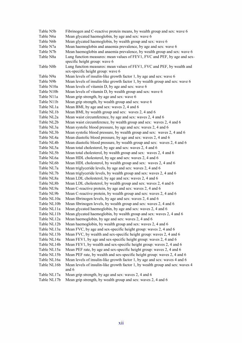
Table N5b Fibrinogen and C-reactive protein means, by wealth group and sex: wave 6
Table N6a Mean glycated haemoglobin, by age and sex: wave 6
Table N6b Mean glycated haemoglobin, by wealth group and sex: wave 6
Table N7a Mean haemoglobin and anaemia prevalence, by age and sex: wave 6
Table N7b Mean haemoglobin and anaemia prevalence, by wealth group and sex: wave 6
Table N8a Lung function measures: mean values of FEV1, FVC and PEF, by age and sex-specific height group: wave 6
Table N8b Lung function measures: mean values of FEV1, FVC and PEF, by wealth and sex-specific height group: wave 6
Table N9a Mean levels of insulin-like growth factor 1, by age and sex: wave 6
Table N9b Mean levels of insulin-like growth factor 1, by wealth group and sex: wave 6
Table N10a Mean levels of vitamin D, by age and sex: wave 6
Table N10b Mean levels of vitamin D, by wealth group and sex: wave 6
Table N11a Mean grip strength, by age and sex: wave 6
Table N11b Mean grip strength, by wealth group and sex: wave 6
Table NL1a Mean BMI, by age and sex: waves 2, 4 and 6
Table NL1b Mean BMI, by wealth group and sex: waves 2, 4 and 6
Table NL2a Mean waist circumference, by age and sex: waves 2, 4 and 6
Table NL2b Mean waist circumference, by wealth group and sex: waves 2, 4 and 6
Table NL3a Mean systolic blood pressure, by age and sex: waves 2, 4 and 6
Table NL3b Mean systolic blood pressure, by wealth group and sex: waves 2, 4 and 6
Table NL4a Mean diastolic blood pressure, by age and sex: waves 2, 4 and 6
Table NL4b Mean diastolic blood pressure, by wealth group and sex: waves 2, 4 and 6
Table NL5a Mean total cholesterol, by age and sex: waves 2, 4 and 6
Table NL5b Mean total cholesterol, by wealth group and sex: waves 2, 4 and 6
Table NL6a Mean HDL cholesterol, by age and sex: waves 2, 4 and 6
Table NL6b Mean HDL cholesterol, by wealth group and sex: waves 2, 4 and 6
Table NL7a Mean triglyceride levels, by age and sex: waves 2, 4 and 6
Table NL7b Mean triglyceride levels, by wealth group and sex: waves 2, 4 and 6
Table NL8a Mean LDL cholesterol, by age and sex: waves 2, 4 and 6
Table NL8b Mean LDL cholesterol, by wealth group and sex: waves 2, 4 and 6
Table NL9a Mean C-reactive protein, by age and sex: waves 2, 4 and 6
Table NL9b Mean C-reactive protein, by wealth group and sex: waves 2, 4 and 6
Table NL10a Mean fibrinogen levels, by age and sex: waves 2, 4 and 6
Table NL10b Mean fibrinogen levels, by wealth group and sex: waves 2, 4 and 6
Table NL11a Mean glycated haemoglobin, by age and sex: waves 2, 4 and 6
Table NL11b Mean glycated haemoglobin, by wealth group and sex: waves 2, 4 and 6
Table NL12a Mean haemoglobin, by age and sex: waves 2, 4 and 6
Table NL12b Mean haemoglobin, by wealth group and sex: waves 2, 4 and 6
Table NL13a Mean FVC, by age and sex-specific height group: waves 2, 4 and 6
Table NL13b Mean FVC, by wealth and sex-specific height group: waves 2, 4 and 6
Table NL14a Mean FEV1, by age and sex-specific height group: waves 2, 4 and 6
Table NL14b Mean FEV1, by wealth and sex-specific height group: waves 2, 4 and 6
Table NL15a Mean PEF rate, by age and sex-specific height group: waves 2, 4 and 6
Table NL15b Mean PEF rate, by wealth and sex-specific height group: waves 2, 4 and 6
Table NL16a Mean levels of insulin-like growth factor 1, by age and sex: waves 4 and 6
Table NL16b Mean levels of insulin-like growth factor 1, by wealth group and sex: waves 4 and 6
Table NL17a Mean grip strength, by age and sex: waves 2, 4 and 6
Table NL17b Mean grip strength, by wealth group and sex: waves 2, 4 and 6
xii

1. Introduction Andrew Steptoe University College London Michael Marmot University College London David Batty University College London
The remarkable demographic shifts towards an older population have continued to evolve since the English Longitudinal Study of Ageing (ELSA) began in 2002. The number of people aged 50 and over living in England has increased from 16.56 million in 2002 to 18.65 million in 2012, with the proportion of individuals aged 80 and older rising from 4.3% to 4.7%. Across the world, the number of people aged 65 and over increased by 25% between 2000 and 2010, and it is expected to double again by around 2030. These trends are a cause for celebration and are a testament to continuing improvements in public health, nutrition, education, health and social care. Older people make a major contribution to our society that is poorly recognised, in supporting younger generations financially, practically and in the transmission of wisdom, in volunteering, and in active engagement with local and national political issues. Nevertheless, the ageing of the population brings with it a series of major social and policy issues such as income security for older people, social protection, the prevention of impoverishment and social isolation in old age, access to quality health care, effective and affordable social care, the promotion of age-friendly environments that allow independent living, the prevention of discrimination against older people, and securing the human rights of the ageing population. Additionally, the burden of disease and disability increases with age, since most of the chronic diseases of public health importance are more common among the elderly. Understanding these processes is a key challenge that requires a robust and reliable evidence base detailing the experience of people as they age.
ELSA was designed to fulfil this need for high-quality data that integrate information about the economic, social, psychological, community and health experience of older people in England. We recruited a representative sample of men and women aged 50 and older, and have reassessed the sample every two years since then. This report describes findings from the latest wave of data collection, conducted in 2012–13. From the beginning, ELSA has been a multidisciplinary study with input from epidemiology, economics, demography, psychology, sociology and clinical medicine, tracking people as they prepare for and move into retirement and older age. The study is structured to inform policy as well as collect data that can be used by academic researchers. Thus the information in ELSA is relevant to pension policies and the changes in state pension age (SPA), the funding of social care, labour market participation, consequences of the restructuring of the National Health Service, policies designed to reduce social isolation and discrimination, public transport access, and many other issues. Researchers both in the UK and across the world are increasingly turning to ELSA to address topics such as social inequalities in health, subjective well-being, cognitive decline, digital

Introduction
inclusion, cross-national differences in health, the impact of the financial crisis on wealth and well-being, sleep, the health consequences of sedentary behaviour, and genetic factors in disease risk.
In wave 6, information was collected from 10,601 participants in ELSA, including 9,169 ‘core’ participants (age-eligible sample members who participated the first time they were approached to join the study). The sample included 5,659 individuals who have remained in the study from the start, plus refreshment cohorts first interviewed in wave 3 (2006–07), wave 4 (2008–09) and wave 6 (2012–13). The main reason for the refreshment cohorts is to ensure representation of people in their 50s, since the youngest participants from wave 1 are now over 60 years old. Data were collected using a computer-aided personal interview (CAPI) in the participants’ homes, supplemented by a self-completion questionnaire. In addition, a nurse visit was conducted for the assessment of physical functional status and biomarkers. This is the third round of biomarker collection (previous assessments took place in 2004–05 and 2008–09), and ELSA is currently the only large-scale multidisciplinary population study of older people in the world to contain such data.
As in previous waves, the ELSA team have tried to balance four issues in data collection. These are: the need for repeat measures of the same variables over waves, in order to build up the time series; the need to move ever closer to harmonisation of measures with other studies internationally, notably the Health and Retirement Study (HRS); the time constraints in data collection, and the importance of ensuring that the protocol is not so extensive as to be prohibitively costly and to overtax our older participants; and the drive to assess new issues and concepts that are relevant to population ageing against innovations and new variables that have not previously been included. In wave 6, we were successful in introducing a number of innovative measures that have broadened the scope of the study, including:
• a new module on social care, including information on the type of care and its funding;
• new measures of intergenerational transfers; • a comprehensive set of measures about sexual attitudes and behaviour; • new measures of fluid intelligence, based on methods developed in the
HRS; • more detailed questions about internet use and digital literacy; • new measures of subjective well-being, blending the approach used by the
Office for National Statistics (ONS) in its ‘Measuring National Well-Being’ programme with affect and time use methods developed in collaboration with colleagues in HRS;
• assessment of polypharmacy; • additional biomarkers, and assessment of objective physical activity with
accelerometers in a subsample.
It is not possible within a single report to cover all the topics and variables assessed in wave 6. We have therefore structured the report around three substantive chapters that address important issues in the economic, social and
2

Introduction
health domains (Chapters 2 to 4). These are coupled with a detailed set of tables (Chapters E, S and H) that summarise data collected in these domains, including cross-sectional analyses of wave 6 and longitudinal analyses of the study members who completed all six waves of assessment. This is a convenient way of presenting more results than is possible within separate chapters, though there are still important topics that we have not been able to include.
The topics of the three thematic chapters were selected during discussion with the representatives of the government departments that contribute to the funding of ELSA. They were chosen because of their importance to both policy and scientific research.
Intergenerational financial transfers Understanding how intergenerational monetary and financial transfers are distributed and what impact they have on wealth is an important policy issue. Transfers between parents, children and grandchildren have a major impact on wealth and standard of living during retirement. With increasing life expectancy, pensions and other savings have to last longer, and older people may be more reliant on inheritances and gifts than their predecessors. There is intense public interest in the social distribution of economic resources, and Thomas Piketty’s book Capital in the Twenty-First Century has stimulated vigorous debate around the argument that there are widening differences in income and wealth across society. Good evidence on this topic from the UK has been limited, with reliance on estate and inheritance data following death. But people not only receive inheritances but may also be given substantial gifts by donors when they are still alive. Wave 6 of ELSA included questions on the lifetime receipt of inheritances and substantial gifts, permitting a fuller account of intergenerational transfers and their impact on wealth. The results in Chapter 2 address a number of issues with greater precision than has been possible before.
How common are inheritances and gifts? The analyses in Chapter 2 indicate that just over a quarter of ELSA participants had received an inheritance in their lifetime, and 7% had received a gift worth £1,000 or more in today’s money. Some of the inheritances were very large, with one-in-ten of those who had an inheritance receiving more than £200,000, while 15% inherited less than £5,000. The value of gifts varied even more widely, with around a quarter of recipients receiving less than £2,000, while one-in-twenty received more than £100,000. Most of these inheritances and gifts were from parents, with a smaller proportion from grandparents or uncles and aunts.
An interesting issue is whether the inheritances and gifts are more common in cohorts born later within ELSA. We find good evidence that the participants in their 50s and 60s are more likely to have received inheritances and substantial gifts than those in their 70s and older, and that their expectations of future inheritances are also greater. This is probably due to the increase in homeownership and greater wealth among the parents of the younger ELSA participants compared with earlier generations.
3

Introduction
Inequalities in intergenerational transfers The results of these new analyses clearly document large inequalities in both the receipt and value of inheritances and gifts. Respondents with higher education and greater income were more likely to have received inheritances and gifts, and the value of these transfers was greater. These findings indicate that intergenerational transfers would reinforce, and potentially widen, economic and social inequalities. However, the situation is not so simple. Although the absolute distribution of the worth of inheritances and gifts is greater in more affluent sectors of the population, the relative contribution of these transfers to wealth is greater for those at the bottom of the wealth distribution.
Analyses of this sort raise many additional questions. The data in ELSA concern inheritances and gifts received by participants in the study, and we would dearly like to know about gifts from ELSA participants to their children, grandchildren and others. This notwithstanding, the results presented in Chapter 2 are an important first step towards a better understanding of relationships between generations.
The evolution of lifestyles Repositioning lifestyle in older people Several decades of population-based studies have established that health behaviours, most notably smoking, alcohol intake, physical inactivity and poor diet – both individually and collectively – are related to reduced life expectancy and an increased risk of psychological and physical illness. More recently, research has shown that lifestyle in its broadest sense, comprising not only these behaviours but also civic and cultural participation, may also influence health and longevity. As a result, several campaign groups and government initiatives aim to have lower levels of social engagement, particularly loneliness, recognised as a major public health issue. For example, the UK government launched a programme in 2010 aimed at supporting people aged 60 and older who are at risk of loneliness and social isolation, funding more than 450 local initiatives across the country. Chapter 3 of this report uses a combination of health behaviours, consumption and civic, social and cultural engagement (activities such as going to cinemas, museums or theatres) to define lifestyles at older ages. It describes these areas in more detail and shows both the size of the problem – that is, the prevalence of unfavourable levels of these characteristics – and the determinants of the lifestyle behaviours.
Lifestyle and how we age While up to 40% of study members had very little physical activity at wave 6, levels of smoking and daily drinking were actually very low, a not altogether uncommon result in older people. Taking the various waves of data collection together allowed us to explore trajectories, with the finding that these health behaviours were exceptionally stable over the older-age life course such that the majority of study members did not change their health-related habits. The high levels of sedentary behaviour pre-echo the findings in Chapter 4, and the
4

Introduction
lack of change in physical activity levels over time may partially explain the stability of weight in cohort members as they age. Illness and frailty emerged as important determinants of lifestyle. Both are age-dependent, occurring more frequently at the higher end of the age spectrum. These health states in the ELSA members partly explained our finding that, relative to the younger people in ELSA, older people tended to report lower levels of civic and cultural engagement, an effect that was particularly pronounced from 70 years of age onwards. On a more positive note, it was also the case that, contrary to our hypotheses, retirement was associated with increased social and civic engagement. Being widowed also had surprising effects; although some people showed reductions in social and civic activity, we found evidence that cultural activity increased as well. The explanation for this is unclear; however, it seems plausible that study participants might have been constrained by their partner’s preferences while being married, or perhaps their cultural activity had been limited by caring responsibilities that diminished after their partner had died.
Perhaps not surprisingly, access to transport has a significant influence on social, civic and cultural activity, with both car ownership and public transport use being important. As people grow older and stop having access to a car, their cultural activity diminishes greatly. The findings highlight the importance of older people’s bus passes in encouraging sustained cultural engagement as part of a healthy and active lifestyle.
Socio-economic factors and lifestyle at older ages The analyses in Chapter 3 provided further evidence of the crucial role of socio-economic factors in the lives of older people. Focusing on our measure of wealth, which was designed to capture multiple financial domains that are particularly relevant to older people (savings, investments, property value, business assets and so on), there were clear gradients in social, civic and cultural engagement, consumption and health behaviours: better-off respondents are more socially and culturally active, buy more goods and travel more, are more physically active and smoke less. The only facet of lifestyle in which richer participants appear to be disadvantaged is an increased likelihood of drinking daily. Education level, another indicator of socio-economic position, is also linked with social, civic and cultural engagement, but relationships with health behaviour are weaker than for wealth. Richer participants also remain more persistently engaged in cultural activity over time, and, in analyses of people who smoked, were more likely than other groups to quit the habit.
Trends in obesity The considerable social, economic and health burden of obesity has been well documented, leading to calls for urgent preventative action from health insurers, businesses, governments and other stakeholders. Importantly, the unfavourable consequences of higher weight do not seem to be confined to people who are obese: an elevated risk of a range of negative health and social outcomes is also apparent in overweight people. Abdominal or central obesity, indexed in ELSA by waist circumferences, confers additional risk for
5

Introduction
cardiovascular disease and diabetes over and above general obesity. The Department of Health policy outlined in Healthy Lives, Healthy People: A Call to Action on Obesity in England (2011) highlighted the ambition to stimulate a downward trend in adult weight by 2020. Obesity and its prevention and control is a major priority for Public Health England.
How can ELSA advance understanding in obesity research? Crucial to the planning of future health and social care provision in the UK is the contemporary quantification of obesity (and overweight) prevalence in a representative sample of the general population. While this is possible in several UK-based cross-sectional studies, a particular advantage offered by ELSA is that we can also understand trajectories in obesity, due to the very unusual repeat measurement of weight over eight years. While cross-sectional data provide ‘snapshot’ information at a single point in time, longitudinal studies that follow a group of individuals across the life course tell us about the natural history of a set of characteristics, including adiposity. ELSA is perhaps unique in this regard. A further advantage of the multidisciplinary nature of ELSA is that we have an array of social, psychological and physical data on participants which allow us to understand the determinants of obesity and whether these differ across certain groups (for example, the socially disadvantaged or those with chronic illness). In the continued absence of effective pharmacological treatment, primary prevention of obesity – the identification of causes – is crucial if successful policy interventions are to be implemented.
Prevalence, trajectories and determinants of obesity Adiposity was ascertained in ELSA using body mass index (a standard measure of weight which takes into account height) and waist circumference. It is of great concern that, at wave 2 (2004–05), around three-quarters of men and women in ELSA could be classified as either overweight or obese and, in waves 4 (2008–09) and 6 (2012–13), the prevalence has increased marginally for both markers of adiposity utilised in this study. We therefore find no evidence in this large sample of older men and women of any reductions in the prevalence of obesity over this eight-year period; indeed, in most age categories, obesity and waist circumference have increased.
The analyses in Chapter 4 show clear associations between obesity, functional capacity and markers of health risk. Sustained obesity over the eight-year study period was – perhaps not surprisingly – associated with increases in glycated haemoglobin (a risk marker for diabetes). However, we also found that persistently obese study members experienced faster declines in key indicators of healthy ageing. Thus, people who were persistently obese showed more rapid loss of walking speed (an important measure of functional capacity) and grip strength (an indicator of muscle strength). This indicates that, as well as being important health issues in their own right, obesity and central adiposity have implications for broader health and functional outcomes at advanced ages. These analyses illustrate the benefits of continuing to measure adiposity trends in ELSA over the forthcoming years.
A novel feature in wave 6 of ELSA was to include objective measures of physical activity in a subgroup of ELSA participants. With physical activity
6

Introduction
being a multidimensional behaviour, standard self-report may provide inaccurate data, particularly among older people, whose physical exertion tends to be of low intensity (for example, walking), occurring as part of everyday life rather than in easily recalled episodes of exercise. Until recently, accelerometry technologies have not enabled us objectively to measure physical activity and sedentary behaviours (including sleep) in sufficiently high numbers at realistic cost for meaningful analyses. The accelerometers provided useful data that complemented our self-report measures. It was particularly striking how many hours per day were spent in sedentary activities, which involve very little energy expenditure. The objective measures of activity showed closer associations with obesity than did self-report measures, which perhaps confirms the advantages of this technology.
Physical exercise habits often change with the occurrence of major life events such as retirement, and this may have implications for weight trajectories. The impact of retirement on health and social factors is particularly germane to pension policy and central government initiatives to extend working lives led by the Department for Work and Pensions. While retirement did not appear in these analyses to be related to weight gain across the complete ELSA sample, greater increases in body mass index and waist circumference were evident in those retirees who were less wealthy.
Clearly there is much useful work to be done in the context of obesity research using the ELSA resource. The focus of future work is unlikely to lie in further clarifying the health consequences of obesity and weight gain – already a well-researched area. Rather, priority might lie in the links with physical and cognitive function trajectories, social connections, pre-adult environment (including adversity), and major life events such as retirement, widowhood and the onset of chronic disease.
Methodology The fieldwork, sample design, response rates, content of the ELSA interviews and weighting strategies used in wave 6 are described in Chapter 5. A brief summary of the design is given here. The original ELSA sample was drawn from households that had responded to the Health Survey for England (HSE) in the years 1998, 1999 and 2001. Individuals were eligible if they were born before 1 March 1952 and were, at the time of the ELSA 2002–03 interview, still living in a private residential address in England. In addition, we interviewed partners under the age of 50 years, and new partners who had moved into the household since HSE. The participants who were recruited for the first wave of ELSA or have since become partners of such people are known as Cohort 1.
Wave 2 of ELSA took place in 2004–05, and the core members and their partners were eligible for interview provided they had not refused any further contact after the first interview. In the third wave, our aim was to supplement the original cohort with people born between 1 March 1952 and 1 March 1956 so that the ELSA sample would again cover ages 50 and over. The new recruits were sourced from the 2001–04 HSE years. Wave 4 took place in 2008–09 and the original cohort was supplemented with a refreshment sample
7

Introduction
of HSE respondents born between 1 March 1933 and 28 February 1958, taken from HSE 2006. The fieldwork for wave 5 was carried out in 2010–11.
Data collection on wave 6 was carried out in 2012–13. In addition to the cohorts included in previous waves, we added a refreshment sample of individuals born between 1 March 1956 and 28 February 1962. They had previously participated in the HSE in 2009, 2010 or 2011. Again, both core members and their partners were interviewed, but the analyses in this report are largely based on data provided by the core members only.
We carried out a face-to-face interview and a self-completion assessment in all waves. In waves 2 and 4, and again in the most recent wave (6), we also conducted a nurse visit.
The broad topics that have been covered in every wave include household composition, employment and pension details, housing, income and wealth, self-reported doctor-diagnosed diseases and symptoms, tests of cognitive performance and of gait speed, health behaviours, social contacts and selected activities, and a measure of quality of life. As noted on page 2, new material was added in wave 6 related to a number of issues.
Academic researchers, policy analysts and others interested in ageing research who are registered with the Economic and Social Data Service Archive can access the ELSA data sets, via the download service or via the online Nesstar software tool.
• ELSA data sets: www.esds.ac.uk/findingData/elsaTitles.asp • ESDS Nesstar Catalogue: nesstar.esds.ac.uk/webview/index.jsp
Reporting conventions The analyses in this report mostly use information from the core members of ELSA. The remaining data come from interviews with the partners of core members. Proxy interviews have been excluded, mainly because a much-reduced set of information is available for these people.
The cross-sectional analyses in reference tables E, S and H have been weighted for non-response, so that estimates should reflect the situation among people aged 50 and over in England. The longitudinal analysis tables use longitudinal weights, as described in Chapter 5.
Statistics in cells with between 30 and 49 observations are indicated by the use of square brackets. Statistics that would be based on fewer than 30 observations are omitted from the tables; the number eligible is given but a dash is placed in the cell where the statistic would otherwise be placed.
Future opportunities using ELSA The fieldwork for wave 7 of ELSA began in May 2014. The study is at the leading edge in both survey methodology and content, with new forms of data collection and new topics being introduced as the study progresses. The value of ELSA to research and policy increases as the longitudinal aspect is extended. Ultimately, however, the value of the study depends on its use by
8

Introduction
research and policy analysts, and their exploration of ELSA’s rich multidisciplinary data set. For a list of publications and reports and other documentation concerning ELSA, please go to our website: http://www.elsa-project.ac.uk/.
Acknowledgements ELSA is a highly multidisciplinary study that would not have been achievable without the efforts of a large number of people. The study is led by a small committee chaired by Professor Andrew Steptoe and made up of Professor James Banks, Dr David Batty, Dr Margaret Blake, Professor Sir Richard Blundell, Professor Sir Michael Marmot, Professor James Nazroo and Zoë Oldfield, and Dr Nina Rogers manages the study. The past input from Sam Clemens and Andrew Phelps to this committee is gratefully acknowledged.
We recognise and greatly appreciate the support we have received from a number of different sources. We are most indebted to those people who have given up their time and welcomed interviewers and nurses into their homes on so many occasions. We hope that our participants will in future years continue to commit to ELSA, helping us to understand further the dynamics in health, wealth and lifestyle of the ageing population. Another vital ingredient to the success of the study is the commitment of the more than 300 dedicated interviewers and nurses involved in collecting the data.
ELSA is coordinated by four main institutions: University College London (UCL), the Institute for Fiscal Studies (IFS), the University of Manchester and NatCen Social Research. There is also close collaboration with Dr Nicholas Steel from the University of East Anglia. The study involves a great many individuals in each of these institutions, some of whom have contributed to authorship of the chapters and reference tables in this report.
We would like to express our gratitude to Sheema Ahmed, for her careful administrative work on the study. With regard to this report, particular thanks are due to Judith Payne for her fastidious copy-editing of the final manuscript and to Emma Hyman, Benita Rajania and Stephanie Seavers for their continued guidance of the report during the different stages of publication.
The ELSA research team has been guided by two separate groups. First is a group of leading national and international consultants who have provided specialist advice. We are very grateful to this group, which includes Lisa Berkman (Harvard), Axel Börsch-Supan (Munich Center for the Economics of Aging), Nicholas Christakis (Yale), Hideki Hashimoto (University of Tokyo), Michael Hurd (RAND), Arie Kapteyn (University of Southern California), Hal Kendig (University of Sydney), David Laibson (Harvard), Kenneth Langa (University of Michigan), Johan Mackenbach (Erasmus University Rotterdam), John McArdle (University of Southern California), David Melzer (Peninsula College of Medicine and Dentistry), Marcus Richards (UCL), Kenneth Rockwood (Dalhousie University), Paul Shekelle (RAND), Johannes Siegrist (University of Dusseldorf), James Smith (University of Southern California), Robert Wallace (University of Iowa), David Weir (University of Michigan) and Robert Willis (University of Michigan). Second is the advisory group to the study, which is chaired by Baroness Sally Greengross. Members
9

Introduction
over this period have included Michael Bury, Richard Disney, Emily Grundy, Ruth Hancock, Sarah Harper, Tom Kirkwood, Carol Propper, Tom Ross, Jacqui Smith, Anthea Tinker, Christina Victor, Alan Walker and representatives of the UK government funding departments.
Finally, the study would not be possible without the support of funders to the study. Funding for the first six waves of ELSA has been provided by the US National Institute on Aging, under the stewardship of Richard Suzman, and several UK government departments. The departments that contributed to wave 6 included the Department for Communities and Local Government, Department of Health, Department for Transport, Department for Work and Pensions, and the Office for National Statistics. The UK government funding has been coordinated by the Office for National Statistics and we are grateful for its role in the development of the study. We are particularly grateful to Valerie Christian, Rachel Conner, Tom Gerlach, Richard Goulsbra, Jonathan Smetherham, Dawn Snape, Louise Taylor and James Umpleby, all of whom have made valuable contributions to ELSA over this period. Members of the UK funding departments provided helpful comments on drafts of this report, but the views expressed in this report are those of the authors and do not necessarily reflect those of the funding organisations.
10

2. Inheritances, gifts and the
distribution of wealth Rowena Crawford Institute for Fiscal Studies
In wave 6, the ELSA survey included recall questions on the lifetime receipt
of inheritances and substantial gifts (defined as those worth over £1,000 in
today’s money). This means that, for the first time, we have data on the
lifetime receipt of inheritances and gifts, alongside detailed wealth statistics,
for a large sample of today’s cohorts of older individuals. In this chapter, we
use this new ELSA data to document the pattern of inheritances and gifts
received by today’s cohorts of older individuals and the impact these transfers
may have had on the distribution of wealth for these cohorts.
The analysis in this chapter shows:
Over a quarter (28.2%) of ELSA respondents born between 1920 and 1959
report having received one or more inheritances in the past.
o About a fifth (21.8%) report having received an inheritance from a
parent or parent-in-law, 5.2% report having received an inheritance
from an uncle or aunt and 0.9% report having received an inheritance
from a grandparent.
Individuals in later cohorts are more likely to have received an inheritance.
o For example, by age 49, 13.2% of those born in the 1950s had received
an inheritance, compared with 10.8% of those born in the 1940s, 8.4%
of those born in the 1930s and 6.5% of those born in the 1920s.
There is considerable variation in the real value of inheritances received by
individuals. The median total value of inheritances received is £34,540
(2013 prices), but 15% of individuals who have received inheritance(s)
received less than £5,000 in total, while 10% of individuals have received
more than £200,000 in total.
Inheritances are more likely to have been received by women, those with
higher levels of education, those with no children, those with higher levels
of household income, those who are of white ethnicity and those whose
parents died at older ages.
Among those who received any inheritance, those with higher levels of
education and those with higher levels of income have on average received
larger inheritances.
Less than a tenth (7.0%) of ELSA respondents born between 1920 and
1959 report having received one or more substantial gifts (worth more than
£1,000 in today’s money) in the past.
o About a twentieth (4.5%) report having received a gift from a parent or
parent-in-law, 1.0% report having received a gift from an uncle or aunt
and 0.3% report having received a gift from a grandparent.

Inheritances, gifts and the distribution of wealth
12
Individuals in later cohorts are more likely to have received a substantial
gift: 8.7% among those born in the 1950s report having received such a
gift, compared with 4.6% of those born in the 1920s.
There is considerable variation in the real value of gifts received. The
median total value of gifts received among those who have received at
least one gift is £7,567 (2013 prices), but nearly 25% of individuals report
having received less than £2,000 in total and over 5% report having
received gifts totalling in excess of £100,000.
Women and those with higher levels of education are more likely to have
received substantial gifts in the past than men and those with lower levels
of education.
Among those who have received any substantial gifts, those of white
ethnicity on average received larger gifts than those of non-white ethnicity.
Inheritances and gifts are more likely to have been received by households
higher up the wealth distribution. For example, individuals in the top 10%
of the wealth distribution (conditional on positive wealth) are more than
three times as likely to be in a household that has received an inheritance
as individuals in the bottom 10%.
Assuming inheritances and gifts have been saved since they were received
and have accrued a real return of 3% a year, taken together they would be
responsible for 11.5% of current household wealth holdings among these
cohorts.
Inheritances and gifts are worth more in absolute terms for individuals
higher up the wealth distribution. However, the proportionate contribution
of such transfers to wealth is greater among those towards the bottom of
the wealth distribution, and so transfers are relatively more important for
these individuals.
Consequently, the direct impact of inheritances and substantial gifts is
estimated to be a small equalising effect on the distribution of wealth
among individuals born between 1920 and 1959.
This finding is robust to alternative assumptions over the interest rate
received on transfers and the proportion of transfers saved, when the same
assumptions are applied to all individuals. When the interest rate received
or the proportion of transfers saved is assumed to vary with wealth, the
effects are more complex, but the scenarios considered in this chapter still
suggest that transfers, if anything, have a small equalising direct impact on
the distribution of wealth.
Having established these patterns of inheritances and gifts for today’s older
individuals, the important question for future research will be how these trends
might differ for later cohorts.
2.1 Introduction
Intergenerational transfers are an increasingly important public policy issue.
Recent research comparing the economic experience of successive cohorts

Inheritances, gifts and the distribution of wealth
13
found that individuals born in the 1960s and 1970s are likely to need inherited
wealth if they are to be any better off in retirement than their predecessors
(Hood and Joyce, 2013). Such a finding has resulted in two different concerns:
first, that the inheritances expected by later cohorts may not come to pass,
leaving them with lower standards of living in retirement than their
predecessors; alternatively, that inheritances will play a major role in the
financial circumstances of later cohorts, but that such intergenerational
transfers would reinforce, and potentially widen, economic and social
inequalities among these cohorts.
In addition to these concerns, intergenerational transfers are a key determinant
of the intergenerational incidence of many different economic and social
policies. For example, policies pertaining to pensions, social care, housing,
childcare or higher education can all have knock-on consequences on cohorts
other than those directly affected by the policy, through their impact on
individuals’ ability to leave an inheritance or individuals’ need to receive one.
Understanding these spillover effects is crucial for discerning the full impact
of policies.
Despite this clear policy interest in understanding the pattern of
intergenerational transfers, UK evidence on this topic was, until relatively
recently, somewhat limited. For many years, the only data available on
inheritances were those derived either from estate data, or from mortality and
wealth ownership data. From such data, it is possible to estimate long-run
trends in the overall flow of inheritances (see, for example, Atkinson (2013)),
but since these data contain no information on the recipients of inheritances, it
is not possible to say anything more detailed about how inheritances are
distributed. However, more recently, surveys have been used to collect data on
inheritances received by samples of individuals, which has started to improve
our understanding of the relative importance of inheritances and their impact
on the distribution of wealth.
The most comprehensive set of analysis on this topic is that summarised in
Karagiannaki and Hills (2013). These authors use data from the British
Household Panel Survey (BHPS) and Attitudes to Inheritance Survey (AIS) to
address the question of how inheritances are distributed and what impact they
have on the wealth distribution. However, there are important drawbacks to
the data used. The AIS includes recall questions on lifetime receipt of
inheritances and gifts, but has a small sample size and only limited data on
other individual characteristics (importantly, the AIS does not contain good
data on wealth levels). The BHPS is larger and contains a wider range of data,
but only has data on the flow of inheritances and gifts received over the period
since 1996. Since people in the BHPS will be at different stages of their lives,
analysis of this flow of transfers is complicated by timing effects – many in
the sample will already have received an inheritance that is not captured over
that time frame, while others will expect to receive one in future. These
drawbacks with the data lead the authors to caveat their findings and conclude
that ‘inheritance appears generally to maintain existing wealth inequalities
rather than greatly changing them in either direction’.
In wave 6, the ELSA survey included recall questions on the lifetime receipt
of inheritances and substantial gifts (defined as those worth over £1,000 in

Inheritances, gifts and the distribution of wealth
14
today’s money). This means that, for the first time, we have data on the
lifetime receipt of inheritances and gifts, alongside detailed wealth statistics,
for a large sample of today’s cohort of older individuals.
In this chapter, we use these new ELSA data to document comprehensively the
pattern of inheritances and large gifts received by today’s cohorts of older
individuals. Specifically, we investigate the size, timing and nature of
inheritances and gifts received by those born between the 1920s and 1950s
(inclusive) and illustrate the impact these transfers may have had on household
wealth and the inequality of wealth holdings. This analysis goes beyond that
presented in Karagiannaki and Hills (2013) in two important respects. First,
we can distinguish differences that arise from individuals being at different
stages in the life cycle from differences that arise even conditional on age –
therefore we can analyse how patterns in inheritances have changed between
cohorts. Second, we can be more confident in our analysis of the impact of
inheritances and gifts on wealth and wealth inequality for these cohorts since
we capture any transfers received over the lifetime and do not have to be
concerned with how the timing of inheritances interacts with our window of
analysis.
Since ELSA is a survey of older individuals, we must necessarily focus our
analysis on those born in the 1950s and earlier. This has the disadvantage that
much of the ‘action’ in terms of increasing prevalence of intergenerational
transfers, or increasing ‘need’ for them, might be suspected to be among later
cohorts – those who, for example, face greater costs associated with higher
education or need larger deposits to get on the housing ladder, or have parents
who are wealthier and therefore better placed to leave an inheritance.
However, it is only once the impact of wealth transfers on these older cohorts
is better understood that future research can start to consider how trends
among later cohorts may differ and what impacts that may have.
The chapter proceeds as follows. Section 2.2 describes trends in the receipt of
inheritances: how the prevalence of inheritances differs across cohorts, the
distribution of amounts received, and the individual characteristics associated
with receipt of inheritances. Section 2.3 presents similar analysis on trends in
the receipt of substantial gifts, while Section 2.4 estimates the impact of these
inheritances and gifts on wealth and wealth inequality. Section 2.5 concludes.
2.2 Trends in the receipt of inheritances
2.2.1 The prevalence of inheritances
Among ELSA wave 6 respondents born between 1920 and 1959, 28.2%
reported having received an inheritance (excluding spousal inheritances) at
some point in the past.1 The majority of these individuals (78.7%) have
received one inheritance, but some individuals (17.8%) have received two
1 All the figures reported in this chapter exclude transfers (inheritances or gifts) received from
a spouse or partner on the basis that such transfers are more likely to reflect a relabelling of
what were in effect joint resources, rather than a true movement of resources.

Inheritances, gifts and the distribution of wealth
15
inheritances and a small number (3.6%) have received three or more
inheritances.2
This proportion of individuals reporting having received an inheritance is
lower than was the case among similarly-aged individuals interviewed in the
2004 Attitudes to Inheritance Survey. In the AIS, 47.5% of those aged 45–54
and 49.3% of those aged 55–64 reported having personally received an
inheritance in the past (see table 6 of Karagiannaki (2011a)). One potential
concern with the ELSA data is that, for couples who keep their finances
together, the questions on lifetime receipt of inheritances are only asked of one
respondent (on behalf of both individuals) rather than of each individual
separately. This could lead to an understatement of inheritances if the
responding partner is not aware of inheritances that have been received by
their spouse (which could have been received before they were a couple).
However, this concern is mitigated by the fact that 90% of those in joint-
finance couples answered the ELSA survey concurrently and so both partners
were likely present in the room at the time the questions on inheritances (and
gifts) were answered. The greater concern perhaps lies with the AIS. The
ELSA sample in this age range is around ten times the size of the AIS sample,
and has much greater claim to be representative of the household population.
In particular, the AIS suffered from problems of low response; one reason for
this suggested by the survey agency (MORI) was that ‘in less affluent areas,
where people may have nothing to leave and no one to leave them anything,
the survey was considered irrelevant by some’ (page 84 of Rowlingson and
McKay (2005)). This sort of non-response bias could lead to a higher
prevalence of inheritance in the AIS sample than among a more representative
sample.
Table 2.1 illustrates the proportion of individuals in ELSA who reported
having received an inheritance from various sources. Parents and parents-in-
law are the most common source of inheritances: 21.8% of individuals report
having received an inheritance from their parents or parents-in-law (77.4% of
those who had received any inheritance(s)). The next most common source is
uncles and aunts – from whom 5.2% report having received an inheritance –
followed by siblings or partner’s siblings. Among these older individuals,
relatively few report having received an inheritance from their grandparents
(fewer than 1%).
Table 2.1 also illustrates how the prevalence of inheritances differs between
cohorts. We need to be cautious with comparisons between cohorts for three
reasons. First, older individuals may be less able to remember receiving
inheritances in the past, and this recall bias could mean that the figures
presented for the older cohorts understate the actual prevalence of
inheritances. Second, differential mortality could mean that those born in older
cohorts who have survived long enough to respond to ELSA in 2012–13 are
not representative of all those born in the cohort in terms of their inheritance
experience – this could lead us to overstate or understate the prevalence of
2 Given that few individuals report receiving three or more inheritances, little information is
lost by the constraint in the ELSA survey that information is only solicited on up to the three
most important inheritances.

Inheritances, gifts and the distribution of wealth
16
inheritance among the cohort, depending on whether those who die younger
are less or more likely to have received an inheritance than those who survived
to 2012–13. The evidence presented in Section 2.2.4 indicates that inheritances
are more likely to be received by those with high education and higher income
– given these characteristics are also positively correlated with chances of
survival to older ages, it seems likely that analysis based on those who survive
to 2012–13 will overstate the prevalence of inheritances across all those born
in a certain cohort. Finally, since later cohorts are observed at younger ages,
there may be timing effects that result in differences between the cohorts that
would not still be apparent were all cohorts observed at the same age.
Table 2.1. Receipt of inheritances, by cohort
Cohort
All 1920s 1930s 1940s 1950s
% received an inheritance 28.2 21.9 29.8 34.0 24.0
% of whom have received:
1 inheritance 78.7 78.4 77.1 77.7 80.8
2 inheritances 17.8 14.7 18.7 19.0 16.3
3 or more inheritances 3.6 6.9 4.1 3.2 3.0
% received an inheritance from:
Grandparent 0.9 0.4 0.5 0.6 1.6
Parent or parent-in-law 21.8 13.0 21.6 28.5 18.4
Uncle/Aunt 5.2 5.0 5.7 6.0 4.3
Sibling or partner’s sibling 1.2 3.0 2.1 1.1 0.4
Child 0.1 0.1 0.0 0.1 0.0
Other 3.0 3.8 4.7 2.9 2.1
Unweighted N 8,765 754 2,087 3,247 2,677
Memo: age in 2012–13 52–93 82–93 72–83 62–73 52–63 Note: Figures for ‘% received an inheritance from’ do not sum to ‘% received an inheritance’
since some individuals have received inheritances from more than one type of donor.
These concerns notwithstanding, the figures presented in Table 2.1 suggest
that there is an increasing prevalence of inheritance among later cohorts.
Focusing on inheritances from parents, 28.5% of those born in the 1940s
report having received a parental inheritance, compared with 21.6% of those
born in the 1930s and 13.0% of those born in the 1920s. These comparisons
are relatively unaffected by timing effects, since only 14% of the 1940s
cohort, and virtually none of the 1920s and 1930s cohorts, have any living
parents in 2012–13 from whom they could expect to receive an inheritance in
future. While fewer (18.4%) of the 1950s cohort have received a parental
inheritance by 2012–13, around half of this cohort still have at least one living
parent and therefore the ultimate prevalence of parental inheritances among
this cohort would be expected to be significantly higher. Among those with no
living parents, 31.4% of the 1950s cohort have received an inheritance from
their parents – the same as the proportion of the 1940s cohort (and greater than
the 21.7% of the 1930s cohort and the 13.0% of the 1920s cohort).3
3 While the proportion of those with no living parents who have received a parental
inheritance is currently no higher among the 1950s cohort than among the 1940s cohort, this

Inheritances, gifts and the distribution of wealth
17
Comparisons of inheritances from grandparents between cohorts are also
unlikely to be distorted by timing effects, since few individuals in these
cohorts will have living grandparents. Again the prevalence of inheritances
from grandparents is higher among later cohorts – 1.6% among the 1950s
cohort, compared with around 0.5% among the previous cohorts – but, on the
whole, inheritances from grandparents are still relatively rare even among the
later cohorts we consider.
The other notable difference between cohorts is the lower proportion of
individuals in later cohorts reporting having received an inheritance from a
sibling (or a sibling of their partner). Whether this is a true cohort effect, or the
result of the siblings of individuals in later cohorts being more likely to still be
alive, is unclear. However, if this were simply a timing effect, the future
inheritances from siblings among later cohorts would act to reinforce the
increasing overall prevalence of inheritances among later cohorts that is shown
in Table 2.1.
Taking into account expectations of future inheritances
One way to circumnavigate any timing effects on the cohort comparisons is to
take into account expected future inheritances in addition to inheritances that
have been received by 2012–13. The ELSA survey asks respondents aged
under 75 what their expected chance of receiving an inheritance in future is
(and, for those who report a positive chance, what their expected chances of
receiving an inheritance of greater than £10,000 and than £100,000 are).
Table 2.2 describes how these expectations differ across individuals in
different cohorts. Over a quarter (28.2%) of individuals in the 1950s cohort
report that there is more than a 50:50 chance that they will receive an
inheritance in the future. This compares with 12.7% of the 1940s cohort and
just 3.4% of those in the 1930s cohort who are still aged under 75.
Table 2.2. Expectations of receiving an inheritance in future
Percentage reporting expected chance of receiving an
inheritance in future:
Greater than
zero
Greater than
50:50
80% or greater
1950s 59.1% 28.2% 14.6%
No living parents 37.8% 11.4% 8.0%
Has living parents 79.9% 44.7% 32.6%
1940s 34.6% 12.7% 9.5%
No living parents 28.6% 7.0% 5.1%
Has living parents 74.2% 50.3% 38.4%
1930sa 23.4% 3.4% 3.2%
a The questions on expected receipt of inheritance are only asked of those (non-proxy
respondents) aged under 75, and so only around one-quarter of the 1930s cohort were asked
these questions. Virtually all of those in the 1930s cohort have no living parents.
might be expected to change over time. The timing of parental death is non-random, and if
parents who die later are wealthier and more likely to leave an inheritance, then the proportion
of the 1950s cohort who receive a parental inheritance is likely to end up higher than the
proportion of the 1940s cohort.

Inheritances, gifts and the distribution of wealth
18
Among individuals who have at least one parent still alive, the proportion
reporting a greater than 50:50 chance of inheritance in future is particularly
high: 44.7% of those in the 1950s cohort and 50.3% of those in the 1940s
cohort. However, it is interesting to note that, even among those with no living
parents, there are individuals who have high expectations of receiving an
inheritance in future. This could suggest that some of the cohort differences in
non-parental inheritances described in Table 2.1 could be the result of timing
effects rather than true long-run cohort differences.
If we were to assume that all those who report an 80% or greater chance of an
inheritance in future were to receive one (and that only these individuals were
to do so), then the proportion of the 1950s cohort receiving an inheritance at
some point during their lifetime would increase from 24.0% (in Table 2.1) to
39.6%. Similarly, prevalence among the 1940s cohort would increase from
34.0% to 40.2% and among the 1930s cohort from 29.8% to 30.3%.4 If instead
we were to assume that all those who report a greater than 50:50 chance of an
inheritance were to receive one (and that only these individuals were to do so),
the prevalence of inheritances would increase to 30.4% among the 1930s
cohort, 42.3% among the 1940s cohort and 45.3% among the 1950s cohort.
Taken together, the evidence presented in Tables 2.1 and 2.2 strongly suggests
an increase in the prevalence of inheritances among later cohorts.
2.2.2 The timing of inheritances
The age at which inheritances were received by ELSA respondents is
illustrated in Figure 2.1. Receipt of inheritance initially increases with age –
for example, among the 1920s cohort, 1.6% of individuals reported receiving
an inheritance in their 30s compared with 4.1% in their 40s and 6.4% in their
50s – but at older ages the probability of receipt declines, as the donors
(typically parents) are more likely to have already died and passed on their
wealth. Figure 2.1 suggests that the peak age for inheritance receipt is later
among later cohorts – a fact that could be explained by rising life
expectancies.
The proportion of individuals who received an inheritance in a given age
bracket is almost always higher among later cohorts. The impact of this on the
cumulative proportion of the cohort who have received an inheritance by a
given age is illustrated in Figure 2.2.
Comparing the receipt of inheritances by a given age between cohorts is
another way to avoid timing effects confounding cohort comparisons (under
the assumption that the timing of inheritances is the same across cohorts). For
example, by age 49, 13.2% of those born in the 1950s had received an
inheritance compared with 10.8% of those born in the 1940s, 8.4% of those
born in the 1930s and 6.5% of those born in the 1920s. The timing of
inheritances may differ between cohorts but, if anything, increasing life
4 These simulated future prevalence rates are lower than the sum of the proportion who have
received an inheritance and the proportion who have an expected chance of inheritance of
80% or greater, since some of those who expect to receive an inheritance in future have also
already received an inheritance in the past.

Inheritances, gifts and the distribution of wealth
19
Figure 2.1. Receipt of inheritances at each age, by cohort
Figure 2.2. Cumulative receipt of inheritances, by cohort
expectancies would be expected to shift the timing of inheritances later among
later cohorts. Therefore again the evidence strongly suggests an increase in the
prevalence of inheritances among later cohorts.
2.2.3 The value of inheritances received
Not only do some individuals receive inheritances and others not, but the real
value of inheritances received also varies considerably.5 Figure 2.3 illustrates
5 The real value of an inheritance is calculated by applying price inflation from the point of
receipt until 2013. We use the retail price index (RPI) as the measure of price inflation since,
0
2
4
6
8
10
12
14
16
Under 20 20 to 29 30 to 39 40 to 49 50 to 59 60 to 69 70 or over
Pe
rce
nta
ge w
ho
re
ceiv
ed
an
inh
eri
tan
ce
At age
1950s 1940s 1930s 1920s
0
5
10
15
20
25
30
19 29 39 49 59 69 79
Pe
rce
nta
ge w
ho
hav
e r
ece
ive
d a
n in
he
rita
nce
By age
1950s
1940s
1930s
1920s

Inheritances, gifts and the distribution of wealth
20
Figure 2.3. Distribution of total real value of inheritance(s) received
the distribution of the total value of inheritances received by each individual
(for those who receive any inheritance). The median inheritance is around
£34,500 (in 2013 prices),6 but while a large proportion of individuals (15%)
received less than £5,000 (in 2013 prices), 10% of individuals who received
any inheritance received over £200,000 in total.
An alternative way to illustrate the inequality in the value of inheritances
received is to use a Lorenz curve. This orders individuals according to the size
of their inheritance, and plots the share of the total value of all inheritances
received by each share of inheritors. If all individuals received the same
inheritance, then the bottom 10% of inheritors would receive 10% of the total
value of all inheritances, the bottom 20% would receive 20% of the total value
and so on – in other words, the Lorenz curve would lie along the 45-degree
line. The further the Lorenz curve lies from the 45-degree line, the greater
inequality there is. Figure 2.4 illustrates that there is considerable inequality in
the value of inheritances received. The bottom 20% of inheritors received less
than 1% of the total value of inheritances received by all individuals, while the
top 1% of inheritors received 13% of the total and the top 10% of inheritors
received nearly 50% of the total. The Gini coefficient (which is a measure of
the distance of the Lorenz curve from the 45-degree line) is 0.656, where a
value of 0 would represent perfect equality in inheritances and a value of 1
would indicate maximal inequality (i.e. one individual received all the
inheritances). The Gini coefficient for the value of inheritances across all
while this index is now not considered to be a good indicator of changes in the cost of living
(specifically, it is widely believed to overestimate inflation), it is the only price index available
on a sufficiently long-run basis for our analysis.
6 It is interesting to note that this is higher than the median inheritance reported in the AIS,
which was around £15,200 among those aged 45–54 in 2004 and £20,100 among those aged
55–64. (Based on figures in table 6 of Karagiannaki (2011a) but converted into 2013 prices for
comparability with ELSA figures.)
0
2
4
6
8
10
12
14
16
< £
5k
£1
0k
- £
15
k
£2
0k
- £
25
k
£3
0k
- £
35
k
£4
0k
- £
45
k
£5
0k
- £
55
k
£6
0k
- £
65
k
£7
0k
- £
75
k
£8
0k
- £
85
k
£9
0k
- £
95
k
£1
00
k -
£1
05
k
£1
10
k -
£1
15
k
£1
20
k -
£1
25
k
£1
30
k -
£1
35
k
£1
40
k -
£1
45
k
£1
50
k -
£1
55
k
£1
60
k -
£1
65
k
£1
70
k -
£1
75
k
£1
80
k -
£1
85
k
£1
90
k -
£1
95
k
£2
00
k + Pe
rce
nta
ge o
f in
div
idu
als
wit
h a
n in
he
rita
nce
Total value of inheritances received (2013 prices)
Mean: £82,742 Median: £34,540

Inheritances, gifts and the distribution of wealth
21
individuals, where those who have not received an inheritance are counted
with a value of £0, is 0.903.7
The considerable variation in the value of inheritances received is not driven
solely by the source of the inheritance. On average, parental inheritances are
larger than inheritances from sources other than parents – for example, the
median total value of parental inheritance(s) among those who received one is
Figure 2.4. Inequality in the value of inheritance(s) received
Table 2.3. Value of inheritance(s) received, by donor
By donor:
All Parental Non-
parental
Average value (among recipients)
Median £34,540 £37,805 £19,792
Mean £82,742 £77,325 £64,737
Percentage of recipients who received:
Less than £5,000 15.1% 13.4% 24.5%
£5,000 to £20,000 20.7% 20.8% 26.1%
£20,000 to £50,000 22.6% 23.4% 21.1%
£50,000 to £200,000 31.1% 33.9% 21.7%
£200k or more 10.4% 8.4% 6.8%
Inequality
Gini coefficient 0.656 0.622 0.733
Unweighted N 2,760 2,156 984 Note: Figures relate to the total value of inheritances received from any given donor type,
among those who receive any inheritance from that donor type. The sample size for ‘all’ is
less than the sum of the sample sizes for ‘parental’ and ‘non-parental’ since some individuals
have received both parental and non-parental inheritances.
7 For comparison, the Gini coefficient for annual incomes across the UK population is
estimated to have been 0.34 in 2012–13 (Belfield et al., 2014).
0%
10%
20%
30%
40%
50%
60%
70%
80%
90%
100%
0% 10% 20% 30% 40% 50% 60% 70% 80% 90% 100%
Shar
e o
f to
tal v
alu
e o
f al
l in
he
rita
nce
s
Share of inheritors

Inheritances, gifts and the distribution of wealth
22
£37,805, compared with £19,792 for the total value of non-parental
inheritances among those who received a non-parental inheritance – but there
is a wide distribution of values for both categories of inheritance. As set out in
Table 2.3, 13.4% of individuals who received any parental inheritance(s)
received less than £5,000 in total, while 8.4% received £200,000 or more.
Among those who received a non-parental inheritance, 24.5% received less
than £5,000 in total from these inheritances, while 6.8% received £200,000 or
more. Parental inheritances are somewhat more equally distributed among
recipients than non-parental inheritances – with a Gini of 0.622 compared with
0.733 – but both are very unequally distributed.
2.2.4 Characteristics associated with receipt of inheritances
In order to begin to understand the implications of inheritances for the
transmission of wealth and the intergenerational incidence of economic and
social policies, it is necessary to explore not just the overall prevalence of
inheritances, but also who receives inheritances and what characteristics are
associated with the value of inheritances received.
The proportion of individuals with different characteristics who have received
inheritances, and the average amounts they received, are described in Table
2A.1 in the appendix to this chapter. However, since these different
characteristics are related, we instead focus on the association of each
characteristic with inheritance controlling for other characteristics using
multivariate regression analysis. The results from a probit regression exploring
the characteristics associated with the probability of receiving an inheritance
are shown in the first column of Table 2.4, while the results of regression
analysis exploring the characteristics associated with the value of total
inheritance are shown in the second column. The equivalent analyses for
parental inheritances only and non-parental inheritances only are provided in
Tables 2A.2 and 2A.3, respectively.
Consistent with the patterns described in Section 2.2.1, individuals in later
cohorts are found to be more likely to have received an inheritance even after
controlling for a number of individual characteristics. This is driven by a
greater likelihood of having received a parental inheritance; individuals in
later cohorts are actually found to be less likely to have received a non-
parental inheritance. However, conditional on receipt of an inheritance, there
is no difference in the average real value between individuals in different
cohorts.
Sex and ethnicity also both affect the probability of receipt but not the real
value conditional on receipt. Women are 6 percentage points more likely to
have received an inheritance than men, while non-white individuals are 35
percentage points less likely to have received an inheritance than white
individuals. These associations hold (qualitatively) for both parental
inheritances and non-parental inheritances.
A number of other individual characteristics are associated with both the
probability of receiving an inheritance and the value of an inheritance. For
example, those with higher levels of education and those with higher incomes
are both more likely to report having received an inheritance, and to have on

Inheritances, gifts and the distribution of wealth
23
Table 2.4. Individual characteristics associated with the probability of
having received an inheritance, and the total value of inheritances
received
Association with
probability of receipt
Association with
mean value
Cohort
1920s Ref Ref
1930s 6.7ppt *** –5.9%
1940s 10.6ppt *** 14.5%
1950s 9.1ppt *** –2.5%
Parents
At least one still alive Ref Ref
Last died before age 60 14.4ppt *** 44.2%
Last died at age 60–70 17.3ppt *** 44.2% **
Last died at age 70–80 19.6ppt *** 64.0% ***
Last died at age 80–90 25.9ppt *** 93.9% ***
Last died after age 90 32.3ppt *** 102.2% ***
Sex
Male Ref Ref
Female 6.4ppt *** 0.5%
Education
Less than GCSE (equiv) Ref Ref
GCSE (equiv) 7.1ppt *** 16.5% *
A level or higher (equiv) 14.5ppt *** 64.4% ***
Children
None Ref Ref
1 or 2 –3.9ppt ** –19.3% **
3 or more –3.4ppt** –32.8% ***
Income quintile
Lowest income Ref Ref
Quintile 2 –1.6ppt –1.3%
Quintile 3 5.5ppt *** 33.1% **
Quintile 4 4.2ppt ** 38.1% ***
Highest income 11.2ppt *** 86.5% ***
Ethnicity
White Ref Ref
Non-white –35.2ppt *** –36.6%
Sample size 7,513 2,481 Note: Figures in the first column are derived marginal effects from a probit regression; the
first figure in the first column indicates that those born in the 1930s are 6.7 percentage points
more likely to have received an inheritance than those born in the 1920s. Figures in the second
column are derived marginal effects from a regression of log(value) for those who reported
having received at least one inheritance; the first figure in the second column indicates that,
among those who had received any inheritance, those born in the 1930s on average received
5.9% less than those born in the 1920s. ***/**/* indicates a statistically significant difference
from the reference category at the 1%/5%/10% level. We do not report standard errors directly
as they are not in the same metric as the reported derived marginal effects.

Inheritances, gifts and the distribution of wealth
24
average received a larger inheritance, than those with lower levels of
education and those with lower incomes. Again this holds true for both
parental and non-parental inheritances.
Interestingly, those with children are less likely to have received an
inheritance. The additional results presented in the appendix show that this
arises from a lower probability of having received a non-parental inheritance,
rather than a lower probability of having received a parental inheritance.
However, having children is also associated with a lower value of inheritance
among those who have received one, and that is driven by a lower value of
both parental inheritances and non-parental inheritances. These patterns would
be consistent with individuals dividing their bequeathed wealth between both
their children and their grandchildren (rather than, say, leaving all their wealth
to their children or all their wealth to their grandchildren).
Finally, one potentially important factor for the prevalence and/or value of
inheritances is the age of an individual’s parents when they died. We could
think of this being associated with parental inheritances for two reasons. First,
if wealthier individuals live for longer, then those dying at older ages are those
who have been wealthier over their lifetimes and therefore they might be more
likely to have wealth (or more wealth) to bequeath. On the other hand, if
individuals live for longer, they have a longer retirement to finance and so
they may use up more of their wealth and be less likely (or have less) to
bequeath. The results in Table 2.4 illustrate that those whose parents died at
older ages are more likely to have received an inheritance. For example, those
whose last parent died between ages 80 and 90 are 6 percentage points more
likely to have received an inheritance than those whose parents died between
ages 70 and 80. This suggests that the effect of differential mortality on the
probability of inheritance is stronger than the impact of greater decumulation.
However, it is interesting to note that, conditional on receipt, having a parent
who died at an older age does not appear to have a significant impact on the
total value of inheritance(s) received.8
The interaction between parental and non-parental inheritances
An interesting question is whether those individuals who receive an
inheritance from their parents are more likely to also receive an inheritance
from someone other than their parents, and whether the values of parental and
non-parental inheritances are correlated for those who receive both.
The regression results presented in Tables 2A.2 and 2A.3 suggest that those
who have received a parental inheritance are 6 percentage points more likely
to receive a non-parental inheritance than those who have not (after controlling
for other individual characteristics), while those who have received a non-
parental inheritance are 11 percentage points more likely to receive a parental
inheritance. Furthermore, among those who receive both an inheritance from
their parents and a non-parental inheritance, the total values received are also
8 The stars in Table 2.4 indicate a statistically significant difference from the reference
category (that at least one parent is still alive). Additional significance tests indicate that the
average value does not differ significantly depending on the age at which the last parent died
(i.e. the coefficient for ‘last died before age 60’ from the regression of log(value) is not
statistically significantly different from the coefficient for ‘last died after age 90’).

Inheritances, gifts and the distribution of wealth
25
somewhat positively correlated, with a correlation coefficient of 0.41.
However, the overall correlation across all individuals (where those who have
not received a certain type of inheritance are counted as having received £0) is
relatively weak, with a correlation coefficient of just 0.16.
Correlation in receipt of inheritances within households
There is also correlation in the receipt of inheritances within couples. Among
coupled respondents who had received an inheritance, 46.7% had a partner
who had also received an inheritance, compared with 17.9% of coupled
respondents who had not themselves received an inheritance.9 However,
within couples where both individuals had received an inheritance, there is no
correlation between the value of those inheritances (the correlation coefficient
is just 0.08). Overall, when those with no inheritance are included with a value
of £0, the correlation between the values of inheritances received by members
of a couple is 0.12.
Since married individuals who have received inheritances are not all married
to partners who have also received inheritances, the proportion of individuals
in households that have benefited from inheritances is greater than the
proportion of individuals who have themselves benefited from an inheritance:
while 28.2% of individuals have received an inheritance, 36.8% of individuals
are in households that have benefited from an inheritance.
2.3 Trends in the receipt of substantial gifts
Intergenerational transfers happen not just on death but also throughout
individuals’ lives. These inter-vivos gifts can be important – both because,
over a lifetime, they can amount to a significant sum and because, being an
active choice of the donor, they are arguably more related to the ‘need’ of the
recipient than are inheritances in terms of their timing and value.
There is also reason to believe that the prevalence and value of gifts are
increasing – particularly among younger individuals in recent years. The
increasing charges for higher education and the larger deposits now needed by
those wanting to get on the housing ladder are two important drivers behind
this trend. For example, research by the Council of Mortgage Lenders (2006
and 2011) has suggested the proportion of first-time buyers aged under 30 who
receive assistance with their deposit increased from around 8% in 1995 to
almost 50% in 2005, and to nearly 80% in 2011.
The ELSA survey asks individuals about their lifetime receipt of ‘substantial’
gifts – defined as a gift worth more than £1,000 in today’s money. This is not
the complete picture of inter-vivos transfers, since the data do not capture
smaller gifts, regular financial support or probably many types of transfers in
kind, but it is still an important addition to the overall picture of
intergenerational transfers among these cohorts.
9 Figures exclude joint inheritances.

Inheritances, gifts and the distribution of wealth
26
2.3.1 The prevalence of gifts
Receipt of substantial gifts is much less common among ELSA respondents
born between 1920 and 1959 than receipt of inheritances: only 7.0% of
individuals have ever received such a gift.10
The majority of individuals who
have received a gift have only received one (78.9%), but 14.4% of recipients
have received two gifts while 6.7% have received three or more gifts. As with
inheritances, gifts are predominantly received from parents and, to a much
lesser extent, uncles or aunts and grandparents.
Table 2.5. Receipt of substantial gifts, by cohort
Cohort
All 1920s 1930s 1940s 1950s
% received a gift 7.0 4.6 5.1 6.7 8.7
% of whom have received:
1 gift 78.9 86.0 85.4 81.4 74.6
2 gifts 14.4 11.3 10.5 10.9 18.1
3 or more gifts 6.7 2.7 4.0 7.7 7.3
% received a gift from:
Grandparent 0.3 0.1 0.1 0.2 0.5
Parent or parent-in-law 4.5 2.2 2.2 4.4 6.2
Uncle/Aunt 1.0 0.7 1.0 1.0 1.0
Sibling or partner’s sibling 0.3 0.4 0.3 0.5 0.2
Child 0.1 0.1 0.1 0.1 0.0
Other 1.0 1.1 1.7 0.7 0.9
Unweighted N 8,765 754 2,087 3,247 2,677
Memo: age in 2012–13 52–93 82–93 72–83 62–73 52–63 Note: Figures for ‘% received a gift from’ do not sum to ‘% received a gift’ since some
individuals have received gifts from more than one type of donor.
Table 2.5 describes how the reported receipt of gifts differs across cohorts.
Gifts appear to be much more prevalent among later cohorts: only around 5%
of those born in the 1920s and 1930s report having received a substantial gift,
compared with nearly 7% among the 1940s cohort and nearly 9% among the
1950s cohort. However, we may be more concerned about recall bias in the
context of gifts than we were in the context of inheritances. First, receiving a
gift – even a substantial one – is likely to be a less memorable occurrence than
parental death and any consequent inheritance. Older individuals may
therefore have forgotten that they received a gift in the past. Second,
individuals may not realise that a gift they received a long time ago would
count as a ‘substantial’ gift. The ELSA survey asks about gifts that are worth
more than £1,000 in today’s money – if received in 1970, a gift would only
need to have been around £75 when received to meet that criterion. However,
10
As with receipt of inheritances, this figure looks low relative to that which might be
expected based on the AIS data, although directly comparable figures are not available. A
tenth (10%) of individuals in ELSA born between 1920 and 1959 report that they or their
partner had ever received a gift worth more than £1,000 in 2012–13 money, compared with
34.7% of those aged 45–54 (20.4% of those aged 55–64) in the AIS reporting they or their
spouse had received a transfer worth £500 or more in 2004 prices (Karagiannaki, 2011b).

Inheritances, gifts and the distribution of wealth
27
while we might ordinarily be concerned that individuals do not fully
appreciate the effects of inflation over such long periods of time, the ELSA
interviewers are provided with prompts (that £1,000 in today’s money would
be roughly £20 in the 1920s and 1930s, £30 in the 1940s, £45 in the 1950s,
£65 in the 1960s, £130 in the 1970s, £400 in the 1980s and £650 in the 1990s).
This should reduce the likelihood of gifts from longer ago being recalled but
not reported. To the extent that recall bias does result in older individuals
under-reporting gifts they have received though, the figures presented in Table
2.5 would overstate the increasing prevalence of substantial gifts among later
cohorts.
2.3.2 The timing of gifts
Unlike inheritances, the timing of which is determined by the death of the
donor, the timing of gifts one would suppose is more likely to be related to the
needs of the recipient.11
We might therefore expect gifts to be more prevalent
early in working life – for example, associated with first marriages or setting
up a home.
The actual timing of reported gifts is illustrated in Figure 2.5. Very few
individuals report receiving a gift below the age of 20 (a pattern that perhaps
might be suspected to be very different among later cohorts from among those
we consider, given the increase in university attendance and the increase in
Figure 2.5. Receipt of gifts at each age, by cohort
11
The timing of gifts may also be affected by the different tax treatment of inheritances and
gifts. Under the current UK tax system, donors must pay inheritance tax of 40% on estates
above a certain threshold (currently £325,000). Gifts made during life, however, are not taxed
if they amount to less than £3,000 per year or if they are made more than 7 years before the
death of the donor. Gifts of more than £3,000, which are made fewer than 7 years before the
donor’s death, would be added to the value of the donor’s estate when assessing the liability of
the donor for inheritance tax. Inheritances and gifts made to spouses are exempt from
inheritance tax.
0
1
2
3
Under 20 20 to 29 30 to 39 40 to 49 50 to 59 60 to 69 70 or over
Pe
rce
nta
ge w
ho
re
ceiv
ed
a g
ift
At age
1950s 1940s 1930s 1920s

Inheritances, gifts and the distribution of wealth
28
Figure 2.6. Cumulative receipt of gifts, by cohort
charges for attending university). Gifts are most likely to be received at older
ages. In fact, more individuals report receiving a substantial gift in their 50s
than report receiving one in any other 10-year age band.
This pattern could be the result of recall bias, if a greater proportion of gifts
received in more recent years are reported in ELSA. Alternatively (or in
addition), it could be indicative that a major motivation for gifts to these
cohorts is simply to transfer wealth before death, rather than wait to pass on
wealth as a bequest.
The cumulative proportion of each cohort who have received a substantial gift
by a given age is illustrated in Figure 2.6. Concerns about recall bias aside,
this would suggest that gifts are more prevalent among later cohorts: over four
times as great a proportion of the 1950s cohort report having received a
substantial gift by age 49 as among the 1920s cohort.
2.3.3 The value of gifts received
The distribution of the total real value of gifts received by each individual (for
those who receive one or more gifts) is illustrated in Figure 2.7.12
There is
considerable variation in the total value of gifts received: nearly a quarter of
recipients report receiving less than £2,000 in total (in 2013 prices), while
6.3% of recipients report receiving gifts totalling more than £100,000 each (in
2013 prices).
The Lorenz curve in Figure 2.8 illustrates how unequally gifts are distributed
among those who receive them. The bottom 20% of gift recipients again
12
The real value of a gift is calculated by applying price inflation from the point of receipt
until 2013. We use the retail price index (RPI) as the measure of price inflation since, while
this index is now not considered to be a good indicator of changes in the cost of living
(specifically, it is widely believed to overestimate inflation), it is the only price index available
on a sufficiently long-run basis for our analysis.
0
1
2
3
4
5
6
19 29 39 49 59 69 79
Pe
rce
nta
ge w
ho
hav
e r
ece
ive
d a
gif
t
By age
1920s
1930s
1940s
1950s

Inheritances, gifts and the distribution of wealth
29
receive less than 1% of the total value of all gifts, but the top 1% receive 40%
of the total and the top 10% receive 75% of the total. We cannot perfectly
compare the inequality in the value of gifts received with the inequality in the
value of inheritances received since, while we observe all inheritances, we
only observe gifts of greater than £1,000 (in today’s prices). However, the data
available suggest that gifts are less equally distributed among recipients than
inheritances; the Gini coefficient measuring inequality in the total value of
gifts received is 0.820 (compared with 0.646 for inheritances among those
who inherit more than £1,000). The Gini coefficient for the value of
substantial gifts across all individuals, where those who have not received a
gift worth more than £1,000 are counted with a value of £0, is 0.987.
Figure 2.7. Distribution of total real value of gift(s) received
Figure 2.8. Inequality in the value of gift(s) received
0
5
10
15
20
25
30
<£2
k
£4
k -
£6
k
£8
k -
£1
0k
£1
2k
- £
14
k
£1
6k
- £
18
k
£2
0k
- £
22
k
£2
4k
- £
26
k
£2
8k
- £
30
k
£3
2k
- £
34
k
£3
6k
- £
38
k
£4
0k
- £
42
k
£4
4k
- £
46
k
£4
8k
- £
50
k
£5
2k
- £
54
k
£5
6k
- £
58
k
£6
0k
- £
62
k
£6
4k
- £
66
k
£6
8k
- £
70
k
£7
2k
- £
74
k
£7
6k
- £
78
k
£8
0k
- £
82
k
£8
4k
- £
86
k
£8
8k
- £
90
k
£9
2k
- £
94
k
£9
6k
- £
98
k
£1
00
k+
Pe
rce
nta
ge o
f in
div
idu
als
wit
h a
gif
t
Total value of gifts received (2013 prices)
Mean: £44,740 Median: £7,567
0%
10%
20%
30%
40%
50%
60%
70%
80%
90%
100%
0% 10% 20% 30% 40% 50% 60% 70% 80% 90% 100%
Shar
e o
f to
tal v
alu
e o
f al
l gif
ts
Share of recipients

Inheritances, gifts and the distribution of wealth
30
2.3.4 Characteristics associated with the receipt of gifts
The proportion of individuals with different characteristics who have received
substantial gifts, and the average amounts they received, are described in
Table 2A.4 in the appendix. However, as with the analysis of inheritances,
here we focus on the results of multivariate analysis that aims to capture the
association of each characteristic with gifts while holding all other
characteristics constant. The results of a probit regression exploring the
characteristics associated with the probability of receiving a substantial gift are
shown in the first column of Table 2.6, while the results of regression analysis
exploring the characteristics associated with the total value of gifts received
are shown in the second column.
Table 2.6. Individual characteristics associated with the probability of
having received a gift, and the total value of gifts received
Association with
probability of receipt
Association with
mean value
Cohort
1920s Ref Ref
1930s 0.6ppt –37.9%
1940s 2.0ppt ** –50.9% **
1950s 3.5ppt *** –55.0% ***
Sex
Male Ref Ref
Female 2.4ppt *** –18.7%
Education
Less than GCSE (equiv) Ref Ref
GCSE (equiv) 2.2ppt *** 28.5%
A level or higher (equiv) 4.1ppt *** 35.9% *
Income quintile
Lowest income Ref Ref
Quintile 2 0.6ppt –9.3%
Quintile 3 0.7ppt –5.6%
Quintile 4 –0.3ppt –26.0%
Highest income 2.5ppt ** 13.4%
Ethnicity
White Ref Ref
Non-white –3.9ppt –61.9% ***
Sample size 8,481 625 Note: Figures in the first column are derived marginal effects from a probit regression; the
first figure in the first column indicates that those born in the 1930s are 0.6 percentage points
more likely to have received a gift than those born in the 1920s. Figures in the second column
are derived marginal effects from a regression of log(value) for those who reported having
received at least one gift; the first figure in the second column indicates that, among those who
had received any gift, those born in the 1930s on average received 37.9% less than those born
in the 1920s. ***/**/* indicates a statistically significant difference from the reference
category at the 1%/5%/10% level. We do not report standard errors directly as they are not in
the same metric as the reported derived marginal effects.

Inheritances, gifts and the distribution of wealth
31
The results suggest that individuals in later cohorts are more likely to have
received a substantial gift – for example, those born in the 1950s are 4
percentage points more likely to have received a gift than those born in the
1920s. However, conditional on receipt, those in later cohorts on average
receive gifts of a lower value. While this could be indicative of cohort
differences in the prevalence and size of gifts, it is also the pattern that would
arise from older respondents having greater difficulty recalling gifts received,
and in particular smaller gifts received, than younger respondents.
Those with higher levels of education are more likely to have received a gift
than those with lower levels of education. Women are more likely to have
received a substantial gift in the past than men but, conditional on receipt, the
average value received by women is if anything lower than that received by
men. Ethnicity is not strongly associated with the prevalence of gifts, but
among those who have received a gift, the average value received by non-
white individuals is 62% lower than the average value received by white
individuals.
Correlation in receipt of gifts within households
As with inheritances, there is also correlation in the receipt of gifts within
couples. Among coupled respondents who had received a substantial gift,
13.1% had a partner who had also received a substantial gift, compared with
4.4% of coupled respondents who had not themselves received such a gift.13
However, within couples where both individuals had received a substantial
gift, there is no correlation between the value of those gifts (the correlation
coefficient is just 0.09). Overall, when those who have not received any
substantial gifts are included with a value of £0, the correlation between the
values of gifts received by members of a couple is 0.11.
Since married individuals who have received a substantial gift are not all
married to partners who have also received a gift, the proportion of individuals
in households that have benefited from substantial gifts is greater than the
proportion of individuals who have themselves benefited from such a gift:
while 7.0% of individuals have received a substantial gift, 9.9% of individuals
are in households that have benefited from a substantial gift.
The interaction between gifts and inheritances
An interesting question is whether those individuals who receive inheritances
are also those who receive inter-vivos transfers. This is particularly important
in the context of concern about the impact of intergenerational transfers on
economic and social inequalities and mobility. If the same individuals receive
both sorts of transfers, then considering only inheritances or only gifts could
understate the impact of intergenerational transfers on inequality. On the other
hand, if different individuals received inheritances and gifts, focusing only on
one or the other could result in an overstatement of the impact of transfers on
inequality.
In fact, the ELSA data suggest that there is only a very weak correlation
between the receipt of inheritance and the receipt of gifts. Among those who
13
Figures exclude joint gifts.

Inheritances, gifts and the distribution of wealth
32
report having received an inheritance in the past, 7.2% report having also
received a gift, while 6.9% of those who report not having received an
inheritance in the past report having received a gift. Similarly, among those
who report having received a gift, 29.2% report having also received an
inheritance, while 28.1% of those who report not having received any gifts
report having received an inheritance. Among those who report having
received both inheritance(s) and gift(s), the correlation between the total real
value received from each is just 0.15. Across the whole sample, where
individuals who have not received an inheritance or gift are counted as having
received £0, the correlation between the total value of inheritances received
and the total value of gifts received is 0.01.
A full understanding of the impact of intergenerational transfers on individual
circumstances therefore requires careful consideration of both inheritances and
inter-vivos transfers. For the cohorts considered in this chapter (those born in
the 1920s to 1950s), the former are the more important, being more prevalent
and of greater value on average, but the same may not necessarily be true of
future cohorts.
2.4 The contribution of inheritances and gifts to
wealth and wealth inequality
How then have these inheritances and gifts received by the 1920s to 1950s
cohorts affected the distribution of wealth and wealth inequality? This is a
crucial question for understanding the impact of intergenerational transfers on
economic and social inequalities and mobility. Unfortunately, it is a difficult
question to answer, not least because we do not know how much wealth
individuals had when they received their inheritance or gift, or what they did
with the transfer. However, since we observe individuals’ current household
wealth holdings, we can, under some assumptions, describe the contribution of
inheritances and gifts to current wealth. We start in Section 2.4.1 by briefly
describing the distribution and composition of wealth among individuals born
between 1920 and 1959. In Section 2.4.2, we discuss the issues involved in
measuring the contribution of transfers to current wealth. We then present our
estimates of the contribution of inheritances and gifts to wealth in Section
2.4.3 and discuss the impact on wealth inequality in Section 2.4.4.
When considering wealth, it often makes more sense to focus on households
rather than individuals. Many couples hold assets jointly, and even when
assets are notionally held by different individuals in a couple, this may not be
truly individual wealth but may be implicitly (or explicitly) pooled within the
household. In contrast to the analysis presented in Sections 2.2 and 2.3, we
therefore now focus on the impact of receipt of inheritances and/or gifts by the
household on household wealth. Our unit of analysis is still individuals, but for
couples we pool and share equally between individuals both transfers received
and current levels of wealth – we refer to this as household wealth per
person.14
14
Our main results are not sensitive to this choice of equivalisation factor for couples or to the
exclusion of couples from the sample.

Inheritances, gifts and the distribution of wealth
33
2.4.1 The distribution and composition of current wealth
The measure of current household wealth we consider consists of financial
wealth, primary housing wealth, other property wealth and physical wealth
(which includes business wealth, farms, land, trusts, collectibles and antiques).
Among our sample of individuals born between the 1920s and 1950s
(inclusive), mean household wealth is £202,824 per person, while median
household wealth is somewhat lower at £132,103 per person. The majority of
our sample have positive net wealth, but 6% have zero or negative net wealth.
Table 2.7 describes the average holding of each of the main types of wealth.
The largest component is net primary housing; 80% of individuals are in
households that own primary housing wealth, and median housing wealth is
£100,000 per person. Primary housing wealth is more equally distributed
across individuals than total net wealth – with a Gini coefficient of 0.495
compared with 0.569 – and is much more equally distributed than other
housing wealth and physical wealth, which are held by relatively few
individuals. Most individuals are in households with positive net financial
wealth, but this is relatively unequally distributed (Gini coefficient 0.772).
Median net financial wealth is £12,600, while mean net financial wealth is
£47,522.
Table 2.7. Composition of current net wealth
Mean Median Percentage
with positive
wealth
Gini
coefficient
Total net wealth £202,824 £132,103 94% 0.569
of which:
Net financial £47,522 £12,600 87% 0.772
Net primary housing £121,114 £100,000 80% 0.495
Net other housing £14,029 £0 13% 0.945
Physical £20,160 £0 14% 0.981
2.4.2 How to measure the contribution of transfers to wealth
Wealth at a given age is determined by an individual’s history of earnings,
savings rates, rates of return and transfers. This is illustrated by equation 1,
where Wt is current wealth, Ek is earnings in period k, Ck is consumption in
period k, Tk are transfers received in period k and r is the rate of return.
[1]
This accounting identity is uncontroversial, but it does not disentangle the
contribution of transfers to wealth. Doing so requires us to know how much of
a transfer has been consumed and how the transfer has been capitalised over
time. For example, if the transfer was spent on a consumption good that the
individual would not have purchased in the absence of the transfer, then the
impact on current wealth is zero15
(i.e. the transfer Tk is just offset by higher
15
This might, for example, be the case if an individual is credit constrained, and receipt of
inheritance enables them to purchase a consumption good that they would not otherwise have
the resources to purchase.
Inheritances, gifts and the distribution of wealth
34
Ck). This represents a reasonable lower bound on the contribution of transfers
to wealth. On the other hand, suppose the transfer is saved. The contribution of
the transfer to current wealth could then be argued to be the initial transfer,
capitalised at some rate of interest each year since the transfer was received –
as set out in equation 2.
[2]
It would be convenient if were we able to think of this as an upper bound on
the contribution of transfers to wealth, i.e. if some of the transfer is consumed,
then the contribution to wealth would lie somewhere between zero and the
value given by equation 2. However, the contribution of a transfer to current
wealth holdings could be even greater than that suggested by equation 2 if an
individual is able to use the transfer to access a higher rate of interest for their
other wealth. For example, suppose an individual receives an inheritance and
combines that with their own savings to buy a house. If the real rate of return
on that property wealth is greater than the return they would otherwise have
got on their savings, then the contribution of the inheritance to their current
wealth is arguably not just the capitalised value of their inheritance, but that
plus the greater capitalisation of their existing wealth.
For the purposes of the main analysis presented in this chapter, we assume that
all inheritances and gifts are saved rather than consumed and that they accrue a
time-constant real rate of interest of 3% per year from the point of receipt until
2013.16
The contribution of each transfer to wealth is therefore that given by
equation 3 (where Tk is the value of the transfer and k is the year in which it
was received). For those who have received multiple transfers during their
lifetimes, the total contribution of transfers to wealth will be the sum of these
contributions.
[3]
In Section 2.4.4, we illustrate the sensitivity of our main results to the
assumptions made about the interest rate and the proportion of transfers saved.
2.4.3 The contribution of transfers to current wealth
As stated above, 36.8% of ELSA respondents born between 1920 and 1959 are
in households that have received an inheritance. If we assume that inheritances
are pooled within households and capitalised at a real rate of 3% per year, the
average contribution of inheritances to household wealth per person among
these individuals is £57,892. Across all individuals (i.e. counting those whose
households have not received an inheritance as having received £0), the mean
contribution of inheritances is £21,513. This is equivalent to 10.6% of average
net private wealth holdings.
This figure of 10.6% is lower than previous estimates of the ratio of inherited
wealth to marketable wealth: Karagiannaki (2011a) estimated a ratio of 28%
16
A baseline rate of return of 3% is common in the international literature that has
investigated the contribution of inheritances to wealth – see, for example, Klevmarken (2004)
and Wolff and Gittleman (2013).

Inheritances, gifts and the distribution of wealth
35
using the AIS data, and the Royal Commission on the Distribution of Income
and Wealth (1977) suggested that the size of inherited wealth in 1973 was
20% of aggregate wealth. However, it is important to note that these statistics
are defined for slightly different populations. The Karagiannaki figures and the
Royal Commission figures are for the whole population, while the 10.6%
figure calculated here is only for those born in the 1920s to 1950s. These older
individuals have higher average wealth than the population as a whole (due to
patterns of saving over the life cycle), and therefore the ratio of inheritances to
total wealth for these cohorts specifically would be expected to be lower than
the average for the population as a whole.
Table 2.8. Contribution of inheritance(s) to current net wealth
% in
households
that have
received an
inheritance
Mean contribution of
inheritances to household
wealth per person (£, 2013)
Mean
contribution of
inheritances to
wealth across
all individuals
Across all
individuals
Across
recipients only
All 36.8% 21,513 57,892 10.6%
Net wealth ≤£0 14.5% 2,649 18,286 –
Those with positive net wealth
Least wealthy 17.6% 2,967 15,961 108.7%
Decile 2 28.1% 7,578 26,930 21.7%
Decile 3 29.6% 6,793 22,738 9.3%
Decile 4 31.9% 9,166 28,700 9.2%
Decile 5 38.6% 12,058 31,225 9.5%
Decile 6 43.8% 22,611 51,293 14.3%
Decile 7 41.0% 20,563 49,398 10.6%
Decile 8 42.3% 23,998 56,170 9.8%
Decile 9 53.9% 44,700 80,949 13.2%
Most wealthy 55.7% 77,032 137,998 8.7% Note: Wealth deciles are defined on the basis of net household wealth per person for those
with positive net wealth. The contribution of inheritances to net wealth is calculated assuming
they are capitalised at a real rate of 3% per year from the time of receipt. Unweighted N =
8,457.
Table 2.8 sets out how the prevalence of inheritances, and the contribution of
inheritances to household wealth per person, vary across the current wealth
distribution. Individuals in wealthier households are more likely to benefit
from inheritances than individuals in less wealthy households – for example,
among individuals in the bottom 10% of the distribution of net household
wealth per person (conditional on having positive net wealth), 17.6% are in
households that have received an inheritance, compared with 55.7% among
the wealthiest 10% of individuals; in other words, individuals in the top wealth
decile are more than three times as likely to be in a household that has
received an inheritance than individuals in the bottom wealth decile. Similarly,
individuals in wealthier households benefit from larger inheritances on
average than individuals in less wealthy households. In part, this pattern would
be expected mechanically, since if everyone had equal non-inherited wealth,
those with the greatest inherited wealth would end up at the top of the wealth
distribution. However, the differences in net wealth across the wealth deciles

Inheritances, gifts and the distribution of wealth
36
are considerably greater than the differences in inheritances, implying that the
value of inheritances is on average greater among those with greater non-
inherited wealth.17
The proportionate contribution of inheritances to current net wealth is dealt
with in the final column of Table 2.8. The figures in this column represent the
ratio of the mean absolute contribution of inheritance (across all individuals in
the group) to the mean value of current total net wealth – in other words, the
proportion of the current wealth of the group that could be said to be due to
inheritances received (under the assumptions described in Section 2.4.2). The
crucial finding is that the relative contribution of inheritances to current net
wealth is highest among individuals in the bottom 20% of the net wealth
distribution and lowest amongst individuals in the top 10%. In other words,
although inheritances may be more prevalent and on average worth more in
absolute (£) terms for individuals higher up the wealth distribution, they are
more important relative to other wealth holdings (i.e. as a % of wealth) for
individuals lower down the wealth distribution.
The results of similar analysis for gifts are presented in Table 2.9. As with
inheritances, individuals lower down the wealth distribution are less likely to
be in households that have received substantial gifts than individuals higher up
the wealth distribution, and any gifts that have been received make, on
Table 2.9. Contribution of gift(s) to current net wealth
% in
households
that have
received a
gift
Mean contribution of
gifts to household wealth
per person (£, 2013)
Mean
contribution
of gifts to
wealth across
all individuals
Across all
individuals
Across
recipients only
All 9.9% 1,742 17,619 0.9%
Net wealth ≤£0 2.9% 248 8,483 –
Those with positive net wealth
Least wealthy 5.1% 420 8,083 15.4%
Decile 2 6.9% 563 8,122 1.6%
Decile 3 9.0% 1,134 12,657 1.5%
Decile 4 9.1% 1,066 11,693 1.1%
Decile 5 9.4% 585 6,223 0.5%
Decile 6 9.7% 1,200 12,277 0.8%
Decile 7 12.9% 1,835 14,281 0.9%
Decile 8 11.3% 2,600 22,950 1.1%
Decile 9 12.9% 2,522 19,470 0.7%
Most wealthy 16.9% 6,473 38,256 0.7% Note: Wealth deciles are defined on the basis of net household wealth per person for those
with positive net wealth. The contribution of gifts to net wealth is calculated assuming they
are capitalised at a real rate of 3% per year from the time of receipt. Unweighted N = 8,457.
17
We set out Tables 2.8–2.10 in terms of deciles of total current wealth, rather than in terms of
deciles of non-inherited wealth, since individuals’ positions in the distribution of non-inherited
wealth are sensitive to the assumptions made when calculating the contribution of transfers to
current net wealth.

Inheritances, gifts and the distribution of wealth
37
Table 2.10. Contribution of total transfers to current net wealth
% in
households
that have
received a
transfer
Mean contribution of
transfers to household wealth
per person (£, 2013)
Mean
contribution
of transfers to
wealth across
all individuals
Across all
individuals
Across
recipients only
All 42.4% 23,255 54,602 11.5%
Net wealth ≤£0 16.8% 2,898 17,266 –
Those with positive net wealth
Least wealthy 21.8% 3,387 15,296 124.0%
Decile 2 33.5% 8,140 24,201 23.3%
Decile 3 35.7% 7,927 22,141 10.8%
Decile 4 38.2% 10,232 26,781 10.3%
Decile 5 43.4% 12,644 29,118 10.0%
Decile 6 48.8% 23,811 48,361 15.1%
Decile 7 48.8% 22,399 45,688 11.6%
Decile 8 48.5% 26,598 54,459 10.8%
Decile 9 59.5% 47,222 78,813 14.0%
Most wealthy 62.3% 83,505 133,713 9.4% Note: Wealth deciles are defined on the basis of net household wealth per person for those
with positive net wealth. The contribution of transfers to net wealth is calculated assuming
they are capitalised at a real rate of 3% per year from the time of receipt. Unweighted N =
8,457.
average, a lower absolute contribution to household wealth per person.
However, the proportionate contribution of gifts to wealth is greater among
those lower down the wealth distribution – particularly so among the 10% of
individuals with the lowest (but still positive) net wealth – and so gifts are
relatively more important for these individuals than for wealthier individuals.
Combining the contribution of inheritances and gifts together (shown in Table
2.10), the same conclusions hold. Transfers are more prevalent and on average
worth more in absolute terms for individuals higher up the wealth distribution,
but they are more important relative to other wealth holdings for individuals
lower down the wealth distribution.
2.4.4 The impact of transfers on wealth inequality
Inequality in the distribution of current net household wealth per person
among ELSA respondents born in the 1920s to 1950s is illustrated by the
Lorenz curve in Figure 2.9. The Gini coefficient for current household net
wealth per person is 0.569. Wealth is therefore more equally distributed than
either inheritances (the Gini for household inheritances per person is 0.871) or
gifts (the Gini for substantial household gifts per person is 0.975).18
18
These Gini coefficients are lower than the 0.903 reported for inheritances in Section 2.2.3
and the 0.987 reported for gifts in Section 2.3.3 since, if we assume inheritances and gifts are
shared equally within couples, inequality in the value received by individuals would be lower
than if we assumed individuals benefited only from their own inheritances or gifts.

Inheritances, gifts and the distribution of wealth
38
Figure 2.9. Contribution of inheritances and gifts to wealth inequality
What has been the contribution of inheritances and reported gifts to this
inequality in wealth? We can illustrate this by subtracting from each
individual’s current net household wealth per person the estimated
contribution of transfers as described above. The Lorenz curve for this
resulting ‘net wealth excluding inheritances and gifts’ is also shown in Figure
2.9. The Lorenz curve for this measure of wealth actually lies slightly to the
right of the Lorenz curve for current net wealth, indicating that if transfers
were excluded, the distribution of wealth would be less equal; the Gini
coefficient would be higher at 0.609. Inheritances and gifts have therefore had
a small equalising impact on the distribution of wealth for these cohorts.19
This conclusion is perhaps surprising, given that inheritances and gifts are
more likely to be received by, and are on average larger for, those with other
indicators of social advantage (for example, higher education and higher
income). The explanation is that described above: while transfers are more
prevalent and on average worth more in absolute terms for individuals higher
up the wealth distribution, they are more important relative to other wealth
holdings for individuals lower down the wealth distribution, and therefore they
have an equalising impact on the distribution of wealth.
The small equalising impact of transfers on the distribution of wealth is
explored in more detail in Table 2.11, which illustrates how the shares of
wealth held by different parts of the current net wealth distribution would
differ were transfers excluded. The top 25% of the wealth distribution hold
64.7% of current net wealth, but if transfers were excluded from all
individuals’ wealth holdings, they would hold 65.2% of wealth – in other
19
Both inheritances and gifts individually have a small equalising impact on the distribution
of wealth, though the impact of gifts is much smaller given their lower prevalence and
typically smaller size. The Gini for net household wealth per person excluding just gifts would
be 0.572 and the Gini for net household wealth per person excluding just inheritances would
be 0.606.
-10%
0%
10%
20%
30%
40%
50%
60%
70%
80%
90%
100%
0% 10% 20% 30% 40% 50% 60% 70% 80% 90% 100%
Shar
e o
f to
tal e
qu
ival
ise
d n
et
we
alth
Share of individuals
Net wealth
Net wealth excl. inheritances and gifts

Inheritances, gifts and the distribution of wealth
39
words, wealth would be more concentrated among the wealthy. This is
particularly the case for the top 1% of individuals, who would hold a 1.1
percentage point greater share of wealth excluding transfers than they do of
current total wealth. At the other end of the wealth distribution, those in the
bottom 25% hold a greater share of current net wealth (1.7%) than they would
if transfers were excluded (1.2%). Inheritances and gifts are therefore
estimated to have reduced wealth inequality by increasing the share of wealth
held by the bottom 25% and reducing the share of wealth held by the top 25%
(more specifically, the share of wealth held by the top 1%).
One potential concern with the finding that transfers have a small equalising
impact on the distribution of wealth might be that it arises by construction
from life-cycle effects. For example, if households decumulate their wealth as
Table 2.11. Shares of wealth held by parts of the current net wealth
distribution
Share of wealth held by:
Total net
wealth
Total net wealth
excluding
transfers
Difference due
to transfers
Top 25% 64.7% 65.2% –0.5%
of which:
Top 1% 14.7% 15.8% –1.1%
Next 4% 15.8% 15.7% 0.1%
Next 5% 11.9% 11.7% 0.1%
Next 15% 22.3% 21.9% 0.4%
Next 25% 21.9% 21.7% 0.2%
Next 25% 11.8% 11.9% –0.2%
Bottom 25% 1.7% 1.2% 0.5%
of which:
Next 15% 1.8% 1.4% 0.4%
Next 5% 0.0% 0.0% 0.0%
Next 4% 0.0% 0.0% 0.0%
Bottom 1% –0.1% –0.2% 0.2% Note: Individuals are sorted according to their current total net household wealth per person.
Table 2.12. Inequality in net wealth including and excluding transfers
Cohort
All 1920s 1930s 1940s 1950s
Gini coefficient for:
Net household wealth per person 0.569 0.535 0.540 0.556 0.599
Net hh wealth pp excl. inheritances 0.606 0.575 0.584 0.595 0.630
Net hh wealth pp excl. gifts 0.572 0.541 0.541 0.559 0.600
Net hh wealth pp excl. inheritances and gifts 0.609 0.581 0.586 0.600 0.632
Increase in Gini from excluding inheritances 0.037 0.040 0.044 0.039 0.031
Increase in Gini from excluding gifts 0.002 0.005 0.001 0.003 0.002
Increase in Gini from excluding transfers 0.040 0.046 0.046 0.044 0.034

Inheritances, gifts and the distribution of wealth
40
they age, then older households will have lower current wealth, and therefore
be calculated as having a higher proportionate contribution from a given
transfer, than otherwise equivalent younger households. It could then be this
that drives the greater proportionate contribution of transfers to wealth among
the less wealthy, rather than transfers being relatively more important for the
less wealthy among individuals at the same stage of the life cycle. Table 2.12,
however, illustrates that the exclusion of transfers affects the distribution of
net household wealth per person in a similar way for each cohort in our
sample. This suggests that the result is not simply being driven by life-cycle
effects or by other cohort differences in wealth holdings and/or transfers.20
Sensitivity analysis
As described in Section 2.4.2, to estimate the contribution of transfers to
current net wealth (and therefore the impact of transfers on the distribution of
wealth), we need to make two important assumptions: how much of transfers
has been saved and what interest rate the saved proportion of transfers will
have been capitalised at since the time they were received. In this subsection,
we illustrate how sensitive our main results are to these assumptions.
In the above analysis, we have assumed that individuals have accrued a 3% a
year real rate of return on their inheritances and gifts. Table 2.13 illustrates
how our main results would differ were we to make alternative assumptions
about the interest rate. Assuming a lower rate of return (2% per year) results in
Table 2.13. Sensitivity of main results to interest rate assumption
Assumed real interest rate
Baseline
(3%)
2% 4% Varies with
wealtha
Mean contribution of transfers to
wealth (%)
11.5 10.0 13.4 13.8
Gini of net wealth 0.569 0.569 0.569 0.569
Gini of net wealth excl. transfers 0.609 0.600 0.625 0.619
Change in Gini from transfers –0.040 –0.030 –0.055 –0.050
Change, due to transfers, in share
of wealth held by:
Top 1% –1.1% –1.0% –1.3% –1.2%
Top 25% –0.5% –0.5% –0.6% 0.5%
Next 25% 0.2% 0.2% 0.2% –0.1%
Next 25% –0.2% –0.1% –0.2% –0.6%
Bottom 25% 0.5% 0.4% 0.6% 0.3% a Real interest rate is assumed to be 0% for those with negative or zero current net wealth, 1%
for those in the lowest two deciles of the current net wealth distribution (conditional on
positive net wealth), 2% for those in the next two deciles, 3% for those in the middle two
deciles, 4% for those in the next two deciles and 5% for those in the top two deciles of the
current net wealth distribution.
20
This is also consistent with the findings of Crawford and Tetlow (2012), who illustrated
relatively little decumulation of non-pension wealth during retirement.

Inheritances, gifts and the distribution of wealth
41
a lower estimated contribution of transfers to current net wealth (10.0% rather
than 11.5%) and a smaller (but still equalising) impact of transfers on the
distribution of wealth as measured by the Gini coefficient. Conversely, if we
were to assume a higher rate of return (4% per year), transfers would be
estimated to have contributed 13.4% of current net wealth and to have had a
greater (albeit still small) equalising impact on the distribution of wealth.
One could argue, however, that not all individuals benefit from the same
interest rate. In particular, it is possible that wealthier individuals are able to
benefit from higher interest rates, either because they are more experienced or
knowledgeable about how to get a better return or because greater wealth
gives access to financial instruments with greater returns that would not
otherwise be available. Assuming an interest rate that is increasing in wealth
could have important implications for our finding that inheritances are wealth
equalising, since it could increase our estimate of the contribution of transfers
to wealth among wealthier individuals and reduce it among less wealthy
households. However, the final column in Table 2.13 illustrates that when we
assume an interest rate that varies from 0% to 5% depending on current net
wealth, inheritances and gifts are still wealth equalising in that they reduce the
Gini coefficient for the wealth distribution. In other words, even with this
varying interest rate, transfers are still estimated to be relatively more
important for those in the lowest wealth quintiles than for those with higher
levels of wealth.21
In all the sensitivity tests described in Table 2.13, we have varied the interest
rate at which inheritances and substantial gifts are assumed to have been
capitalised. However, as discussed in Section 2.4.2, transfers could also affect
the interest rate that an individual is able to get on their other wealth as well
(for example, if an inheritance is combined with other wealth to provide a
deposit on a house). This is potentially very important, since such an effect
could increase the relative importance of transfers for those who had larger
amounts of non-inherited wealth and reduce or undo the wealth-equalising
impact of transfers that we describe above. Unfortunately, we are not able to
test the sensitivity of our results to this, since we do not know what other
wealth each household had at the time an individual received their gift or
inheritance, and so this must simply be kept in mind as a potential caveat to
our results.
In the results described above, we have assumed that all transfers are
completely saved. As discussed in Section 2.4.2, if instead all transfers were
completely consumed (i.e. the transfer is spent on something the individual
would not have purchased in the absence of the transfer), then transfers would
have no effect on current wealth or on wealth inequality (though they would,
of course, affect consumption inequality and lifetime utility). Table 2.14
illustrates the sensitivity of our main results to alternative intermediate
assumptions about the proportion of any inheritance or gift that is saved (as
opposed to consumed). Assuming a 75% saving rate for all individuals
21
Table 2A.5 in the appendix provides the mean estimated contribution of transfers to wealth
for each decile of the wealth distribution under the alternative interest rate assumptions.

Inheritances, gifts and the distribution of wealth
42
Table 2.14. Sensitivity of main results to assumption on proportion saved
Share of transfer saved
Baseline
(100%)
75% 50% Varies with
wealtha
Mean contribution of transfers to
wealth (%)
11.5 8.6 5.7 9.3
Gini of net wealth 0.569 0.569 0.569 0.569
Gini of net wealth excl. transfers 0.609 0.593 0.580 0.584
Change in Gini from transfers –0.040 –0.023 –0.011 –0.015
Change, due to transfers, in share
of wealth held by:
Top 1% –1.1% –0.8% –0.5% –0.8%
Top 25% –0.5% –0.4% –0.3% 0.8%
Next 25% 0.2% 0.1% 0.1% –0.2%
Next 25% –0.2% –0.1% –0.1% –0.6%
Bottom 25% 0.5% 0.4% 0.2% –0.1% a The share of transfers assumed to be saved is 0% for those with negative or zero current net
wealth, 20% for those in the lowest two deciles of the current net wealth distribution
(conditional on positive net wealth), 40% for those in the next two deciles, 60% for those in
the middle two deciles, 80% for those in the next two deciles and 100% for those in the top
two deciles.
roughly halves the impact of transfers on wealth inequality, while assuming a
50% saving rate for all individuals roughly halves the impact of transfers on
wealth.
As with interest rates, it is possible to argue that the savings rate itself varies
with wealth – in particular, there is evidence that suggests that those with
higher lifetime incomes have higher savings rates (see, for example, Dynan et
al. (2004)). The final column of Table 2.14 therefore explores the implications
of assuming a savings rate that varies with wealth, from 0% among those with
negative or zero current net wealth, to 100% among those in the highest two
deciles of the current net wealth distribution. This has the effect of reducing
the contribution of inheritances to wealth more among those with the lowest
current net wealth than among those with the highest levels of current net
wealth (see Table 2A.6 in the appendix). However, even so, we still estimate
that inheritances and gifts are relatively more important among those with the
lowest levels of net wealth, and therefore we still find transfers overall to be
wealth equalising, although the effect is much smaller than under our baseline
assumptions, and the impact on different parts of the wealth distribution is less
clear-cut.
2.5 Conclusions
The inclusion in ELSA wave 6 of questions on the lifetime receipt of
inheritances and gifts has made an important improvement in the data
available to researchers. For the first time, we have data on the lifetime receipt
of inheritances and gifts, alongside detailed wealth statistics, for a large
representative sample of today’s older individuals. In this chapter, we have

Inheritances, gifts and the distribution of wealth
43
used these new data to document the pattern of inheritances and large gifts
received by those born in the 1920s to 1950s (inclusive) and illustrated the
impact of these transfers on the distribution of wealth.
Over a quarter (28.2%) of individuals born between 1920 and 1959 report
having received an inheritance and 7.0% report having received a substantial
gift. This is a lower prevalence of transfers than was reported in the Attitudes
to Inheritance Survey, over which there might be some concern about its
representativeness. However, the pattern of recipients is found to be similar. In
particular, women are more likely to have received an inheritance than men,
those with higher levels of education are more likely to have received an
inheritance than those with lower levels of education, those with higher levels
of income are more likely to have received an inheritance than those with
lower levels of income, and those of white ethnicity are more likely to have
received an inheritance than those of non-white ethnicity. Among those who
have received an inheritance, those with higher levels of education on average
received larger amounts than those with lower levels of education, and those
with higher levels of income on average receive larger amounts than those
with lower levels of income.
A particular advantage of the ELSA data is that we can distinguish between
life-cycle timing effects and cohort differences. Such analysis clearly
demonstrates an increasing prevalence of inheritances among later cohorts – as
might be expected given increasing homeownership rates and increasing
wealth among these cohorts’ parents’ generations. There is also some evidence
of increasing prevalence of gifts, although we are more tentative over this
conclusion due to concerns that smaller gifts may not be consistently captured
across different cohorts.
We estimate that, assuming inheritances and gifts have been saved since they
were received and accrued a 3% a year real return, taken together these
transfers would be responsible for 11.5% of current net household wealth
holdings among individuals born in the 1920s to 1950s. Transfers are found to
be more prevalent, and on average worth more in absolute terms, for
individuals higher up the current net wealth distribution. However, they are
more important relative to other wealth holdings for individuals lower down
the wealth distribution, and therefore they have a small equalising impact on
the distribution of wealth. This confirms the findings of Karagiannaki and
Hills (2013); however, these authors were cautious about drawing this
conclusion because of the more limited nature of the data underlying their
analysis.
The finding that transfers have a small equalising direct impact on the
distribution of wealth is robust to alternative assumptions over the interest rate
received on transfers and over the proportion of transfers saved, when the
same assumptions are applied to all individuals. When the interest rate
received or the proportion of transfers saved is assumed to vary with wealth,
the effects are more complex, but the scenarios considered in this chapter still
suggest that transfers, if anything, have a small equalising impact. We are
unable to test, however, the sensitivity of our results to the argument that
transfers enable a greater interest rate on other non-inherited wealth, and so
this remains a potential caveat to our results.

Inheritances, gifts and the distribution of wealth
44
Having established these patterns of intergenerational transfers for today’s
older individuals, the important question for future research will be how these
trends might differ for later cohorts. On the one hand, individuals in later
cohorts might feel a greater ‘need’ for transfers from their parents to meet
expenditure needs that their parents did not face – such as university costs and
large housing deposits – or simply to finance their retirements (in particular
given the declining availability of typically more generous defined benefit
pensions in the private sector). On the other hand, their parents and others in
older generations may not have such capacity to provide inter-vivos gifts or
bequests, given their increasing retirement lengths and rising cost pressures in
older age such as for social care needs. Investigating empirically how these
competing influences might affect trends in intergenerational transfers in
future is therefore an important avenue for future research.
Acknowledgements
The authors gratefully acknowledge funding from the IFS Retirement Saving
Consortium and the Economic and Social Research Council (ESRC) through
the Centre for the Microeconomic Analysis of Public Policy at IFS (grant
number RES-544-28-5001). The IFS Retirement Saving Consortium
comprises Age UK, Department for Work and Pensions, Financial Conduct
Authority, HM Treasury, Institute and Faculty of Actuaries, Investment
Management Association, Just Retirement and Money Advice Service. The
authors would like to thank Jonathan Cribb, Carl Emmerson, Andrew Hood,
Gemma Tetlow and members of the IFS Retirement Saving Consortium for
comments and advice. The views expressed and any errors are the authors’
alone.
References
Atkinson, A. B. (2013), ‘Wealth and inheritance in Britain from 1896 to the
present’, Centre for Analysis of Social Exclusion, CASE Paper CASE/178,
http://sticerd.lse.ac.uk/dps/case/cp/CASEpaper178.pdf.
Belfield, C., Cribb, J., Hood, A. and Joyce, R. (2014), Living Standards,
Poverty and Inequality in the UK: 2014, IFS Report R96,
http://www.ifs.org.uk/uploads/publications/comms/r96.pdf.
Council of Mortgage Lenders (2006), ‘Will the real first-time buyers please
stand up?’, CML Housing Finance, 03/2006, 1–16.
Council of Mortgage Lenders (2011), ‘First-time buyers and affordability: a
fresh perspective’, CML news and views, 24, 14 December.
Crawford, R. and Tetlow, G. (2012), ‘The evolution of pension wealth and
contribution dynamics’, in J. Banks, J. Nazroo and A. Steptoe (eds), The
Dynamics of Ageing: Evidence from the English Longitudinal Study of Ageing
2002–10, London: Institute for Fiscal Studies, http://www.elsa-
project.ac.uk/uploads/elsa/report12/ch2.pdf.
Dynan, K. E., Skinner, J. and Zeldes, S. P. (2004), ‘Do the rich save more?’,
Journal of Political Economy, 122: 397–444.

Inheritances, gifts and the distribution of wealth
45
Hood, A. and Joyce, R. (2013), The Economic Circumstances of Cohorts Born
between the 1940s and the 1970s, IFS Report R89,
http://www.ifs.org.uk/comms/r89.pdf.
Karagiannaki, E. (2011a), ‘Recent trends in the size and distribution of
inherited wealth in the UK’, Centre for Analysis of Social Exclusion, CASE
Paper CASE/146, http://sticerd.lse.ac.uk/dps/case/cp/CASEpaper146.pdf.
Karagiannaki, E. (2011b), ‘The magnitudes and correlates of inter-vivos
transfers in the UK’, Centre for Analysis of Social Exclusion, CASE Paper
CASE/151, http://sticerd.lse.ac.uk/dps/case/cp/CASEpaper151.pdf.
Karagiannaki, E. and Hills, J. (2013), ‘Inheritance, transfers and the
distribution of wealth’, in J. Hills, F. Bastagli, F. Cowell, H. Glennerster, E.
Karagiannaki and A. McKnight (eds), Wealth in the UK: Distribution,
Accumulation and Policy, Oxford: Oxford University Press.
Klevmarken, N. A. (2004), ‘On the wealth dynamics of Swedish families,
1984–98’, Review of Income and Wealth, 50: 469–91.
Rowlingson, K. and McKay, S. (2005), Attitudes to Inheritance in Britain,
Bristol: Policy Press, http://www.jrf.org.uk/sites/files/jrf/1861347707.pdf.
Royal Commission on the Distribution of Income and Wealth (1977), Report
No. 5: Third Report on the Standing Reference, London: HMSO.
Wolff, E. and Gittleman, M. (2013), ‘Inheritances and the distribution of
wealth or whatever happened to the great inheritance boom?’, Journal of
Economic Inequality, forthcoming, DOI 10.1007/s10888-013-9261-8.

Inheritances, gifts and the distribution of wealth
46
Appendix 2A
Additional tables on inheritances, gifts and the
distribution of wealth
Table 2A.1. Percentage of individuals with different characteristics who received
an inheritance, and the average value received
% receiving Among recipients:
Median inheritance
(2013 prices)
Mean inheritance
(2013 prices)
All 28.2% £34,540 £82,742
Cohort
1920s 21.9% £38,345 £91,709
1930s 29.8% £28,390 £88,578
1940s 34.0% £41,913 £86,702
1950s 24.0% £31,727 £72,920
Parents
At least one still alive 13.6% £23,699 £63,437
Last died before age 60 22.7% £30,244 £62,390
Last died at age 60–70 26.7% £23,032 £63,637
Last died at age 70–80 29.5% £34,065 £70,659
Last died at age 80–90 38.2% £43,295 £89,434
Last died after age 90 44.3% £44,901 £103,079
Sex
Male 26.1% £36,064 £81,979
Female 30.1% £33,565 £83,335
Education
Less than GCSE (equiv) 21.5% £25,524 £71,068
GCSE (equiv) 30.0% £31,602 £79,448
A level or higher (equiv) 36.8% £48,173 £95,364
Children
None 32.3% £44,062 £103,344
1 or 2 26.9% £31,659 £81,582
3 or more 27.9% £34,446 £76,991
Income quintile
Lowest income 21.3% £23,816 £66,407
Quintile 2 22.8% £26,439 £65,730
Quintile 3 30.8% £34,311 £69,930
Quintile 4 29.4% £36,792 £82,418
Highest income 36.8% £52,069 £114,963
Ethnicity
White 29.5% £34,712 £83,052
Non-white 4.1% £23,032 £41,213
Sample size 8,681 2,738 2,738

Inheritances, gifts and the distribution of wealth
47
Table 2A.2. Individual characteristics associated with probability of having
received a parental inheritance, and total value of parental inheritances received
Association with
probability of receipt
Association with
mean value
Cohort
1920s Ref Ref
1930s 7.0ppt *** 10.8%
1940s 14.0ppt *** 29.4%
1950s 13.9ppt *** 21.7%
Parents
At least one still alive Ref Ref
Last died before age 60 11.1ppt *** 18.3%
Last died at age 60–70 18.1ppt *** 6.4%
Last died at age 70–80 20.1ppt *** 20.4%
Last died at age 80–90 27.1ppt *** 33.8% *
Last died after age 90 33.7ppt *** 27.8%
Sex
Male Ref Ref
Female 4.1ppt *** –6.0%
Education
Less than GCSE (equiv) Ref Ref
GCSE (equiv) 6.1ppt *** 15.7%
A level or higher (equiv) 13.4ppt *** 55.1% ***
Children
None Ref Ref
1 or 2 0.3ppt –21.3% **
3 or more 1.0ppt –28.2% ***
Income quintile
Lowest income Ref Ref
Quintile 2 –1.7ppt –3.2%
Quintile 3 3.8ppt ** 24.9% *
Quintile 4 2.7ppt * 37.0% **
Highest income 8.1ppt *** 82.2% ***
Ethnicity
White Ref Ref
Non-white –26.7ppt *** –51.4%
Other inheritance receipt
Not received a non-parental inheritance Ref Ref
Received a non-parental inheritance 10.5ppt *** 21.0% **
Sample size 7,513 1,955 Note: Figures in the first column are derived marginal effects from a probit regression; the first figure
in the first column indicates that those born in the 1930s are 7.0 percentage points more likely to have
received a parental inheritance than those born in the 1920s. Figures in the second column are derived
marginal effects from a regression of log(value) for those who reported having received at least one
parental inheritance; the first figure in the second column indicates that, among those who had received
a parental inheritance, those born in the 1930s on average received 10.8% more than those born in the
1920s. ***/**/* indicates a statistically significant difference from the reference category at the
1%/5%/10% level. We do not report standard errors directly as they are not in the same metric as the
reported derived marginal effects.

Inheritances, gifts and the distribution of wealth
48
Table 2A.3. Individual characteristics associated with probability of having
received a non-parental inheritance, and total value of non-parental inheritances
Association with
probability of receipt
Association with
mean value
Cohort
1920s Ref Ref
1930s –0.5ppt –35.2%
1940s –4.7ppt *** –27.2%
1950s –6.9ppt *** –58.1% ***
Parents
At least one still alive Ref Ref
Last died before age 60 3.4ppt 6.2%
Last died at age 60–70 –1.1ppt –1.1%
Last died at age 70–80 –0.8ppt –0.9%
Last died at age 80–90 –0.7ppt 41.8%
Last died after age 90 0.0ppt 96.6% **
Sex
Male Ref Ref
Female 3.3ppt *** –16.1%
Education
Less than GCSE (equiv) Ref Ref
GCSE (equiv) 1.8ppt ** 10.2%
A level or higher (equiv) 3.1ppt *** 40.5% **
Children
None Ref Ref
1 or 2 –4.0ppt *** –20.9%
3 or more –5.8ppt *** –42.1% ***
Income quintile
Lowest income Ref Ref
Quintile 2 0.3ppt –8.8%
Quintile 3 1.7ppt 52.8% *
Quintile 4 2.1ppt * 26.9%
Highest income 4.8ppt *** 67.5% **
Ethnicity
White Ref Ref
Non-white –17.5ppt *** –53.6%
Other inheritance receipt
Not received a parental inheritance Ref Ref
Received a parental inheritance 6.2ppt *** –6.2%
Sample size 7,513 885 Note: Figures in the first column are derived marginal effects from a probit regression; the first figure
in the first column indicates that those born in the 1930s are 0.5 percentage points less likely to have
received a non-parental inheritance than those born in the 1920s. Figures in the second column are
derived marginal effects from a regression of log(value) for those who reported having received at least
one non-parental inheritance; the first figure in the second column indicates that, among those who had
received a non-parental inheritance, those born in the 1930s on average received 35.2% less than those
born in the 1920s. ***/**/* indicates a statistically significant difference from the reference category at
the 1%/5%/10% level. We do not report standard errors directly as they are not in the same metric as
the reported derived marginal effects.

Inheritances, gifts and the distribution of wealth
49
Table 2A.4. Percentage of individuals with different characteristics who received
a substantial gift, and the average value received
% receiving Among recipients:
Median gift
(2013 prices)
Mean gift
(2013 prices)
All 7.0% £7,567 £44,740
Cohort
1920s 4.6% £13,244 £57,493
1930s 5.1% £10,576 £38,386
1940s 6.7% £7,567 £63,837
1950s 8.7% £6,942 £33,146
Sex
Male 6.0% £10,058 £34,953
Female 7.9% £6,865 £51,441
Education
Less than GCSE (equiv) 4.9% £6,967 £27,779
GCSE (equiv) 7.7% £7,832 £35,659
A level or higher (equiv) 9.5% £8,508 £65,177
Income quintile
Lowest income 5.7% £8,812 £41,717
Quintile 2 6.2% £7,677 £28,627
Quintile 3 6.8% £7,575 £44,056
Quintile 4 6.4% £5,821 £17,393
Highest income 10.2% £9,033 £74,225
Ethnicity
White 7.1% £7,915 £45,692
Non-white 4.3% £2,797 £15,377
Unweighted N 8,681 632 632

Inheritances, gifts and the distribution of wealth
50
Table 2A.5. Impact of alternative interest rate assumptions on estimated
contribution of transfers to current net wealth
Assumed real interest rate
Baseline
(3%)
2% 4% Varies with
wealtha
All 11.5% 10.0% 13.4% 13.8%
Those with positive net wealth
Least wealthy 124.0% 105.6% 147.3% 90.9%
Decile 2 23.3% 20.6% 26.5% 18.4%
Decile 3 10.8% 9.4% 12.9% 9.4%
Decile 4 10.3% 9.0% 11.9% 9.0%
Decile 5 10.0% 8.8% 11.4% 10.0%
Decile 6 15.1% 13.0% 17.7% 15.1%
Decile 7 11.6% 10.0% 13.5% 13.5%
Decile 8 10.8% 9.3% 12.9% 12.9%
Decile 9 14.0% 12.2% 16.1% 18.8%
Most wealthy 9.4% 8.1% 10.9% 12.8% a Real interest rate is assumed to be 0% for those with negative or zero current net wealth, 1% for those
in the lowest two deciles of the current net wealth distribution (conditional on positive net wealth), 2%
for those in the next two deciles, 3% for those in the middle two deciles, 4% for those in the next two
deciles and 5% for those in the top two deciles of the current net wealth distribution.
Table 2A.6. Impact of alternative savings rate assumptions on estimated
contribution of transfers to current net wealth
Share of transfer assumed saved
Baseline
(100%)
75% 50% Varies with
wealtha
All 11.5% 8.6% 5.7% 9.3%
Those with positive net wealth
Least wealthy 124.0% 93.0% 62.0% 24.8%
Decile 2 23.3% 17.5% 11.6% 4.7%
Decile 3 10.8% 8.1% 5.4% 4.3%
Decile 4 10.3% 7.7% 5.2% 4.1%
Decile 5 10.0% 7.5% 5.0% 6.0%
Decile 6 15.1% 11.3% 7.5% 9.0%
Decile 7 11.6% 8.7% 5.8% 9.2%
Decile 8 10.8% 8.1% 5.4% 8.7%
Decile 9 14.0% 10.5% 7.0% 14.0%
Most wealthy 9.4% 7.0% 4.7% 9.4% a The share of transfers assumed to be saved is 0% for those with negative or zero current net wealth,
20% for those in the lowest two deciles of the current net wealth distribution (conditional on positive
net wealth), 40% for those in the next two deciles, 60% for those in the middle two deciles, 80% for
those in the next two deciles and 100% for those in the top two deciles.

3. The evolution of lifestyles in older age in England Katey Matthews University of Manchester Panayotes Demakakos University College London James Nazroo University of Manchester Aparna Shankar University College London
Cross-sectional data can be used to describe differences in lifestyles across different age groups, or cohorts. However, this does not tell us how lifestyles change as individuals grow older and which events and characteristics are associated with age-related lifestyle changes. In this chapter, we are concerned with showing how and why lifestyles change as people grow older. To be more precise, the focus is on the evolution of forms of social engagement and behaviour. Lifestyle choices, such as health behaviours and engagement in societal and cultural activities, are in part set in early life, reflecting how preferences are shaped by socio-economic and age cohort contexts, but they are also shaped by external influences in later life, such as declining physical health, retirement, widowhood and other personal changes. The multidisciplinary nature of ELSA and its cross-cohort longitudinal design make it uniquely placed to examine several different dimensions of lifestyle, how they relate to each other, how they change in relation to age and life stage, and how these changes might vary across cohorts.
The dimensions of lifestyle covered by this chapter include social and civic engagement (i.e. volunteering, group membership and number of social contacts), cultural engagement (i.e. visiting the cinema, restaurants, museums and theatres), consumption (i.e. spending on holidays, takeaways and restaurants, clothes and household goods) and health behaviours (i.e. smoking, frequency of drinking and occupational and leisure-time physical activity). First, trajectories of changes in lifestyle behaviours are mapped by age, gender, education and wealth. Second, changes in these lifestyle factors are identified in response to events such as retirement, widowhood, onset of disease and onset of physical or cognitive impairment.
The cross-sectional analysis in this chapter shows that:
• In 2012–13, people aged 50 and over were consistently more likely to engage in lower, rather than higher, levels of social or civic engagement, yet more likely to engage in higher levels of cultural engagement than lower. The proportion of heavy drinkers and smokers was low.
• Around 30 to 40% of all older adults in 2012–13 had sedentary lifestyles or took part in only low-level physical activity. Women were slightly less likely than men to have lifestyles characterised by moderate or high physical activity.

Evolution of lifestyles
• Older age groups were less likely to show high or medium social and civic or cultural engagement, higher levels of consumption and higher levels of physical activity than younger age groups, especially from age 70 onwards.
• There was a strong relationship between wealth and all types of lifestyle behaviour in 2012–13. Older adults with higher levels of wealth were more likely to engage in high or medium social and civic or cultural activities, have higher rates of consumption and have higher physical activity levels than those who are poorer. Higher wealth was associated with a reduced likelihood of smoking but an increased likelihood of drinking daily. In each instance, a gradient pattern over wealth groups was observed. Levels of education showed the same pattern.
• Individuals’ self-rated health status was an important predictor of lifestyle behaviour. Poorer health was associated with lower levels of social and civic engagement, cultural engagement, consumption and physical activity. Those in poorer health were also significantly more likely to be smokers but less likely to drink daily.
• Those who had no access to a car when needed were significantly more likely to show low levels of social and civic and cultural engagement, lower consumption and lower levels of physical activity. Lack of car access was also associated with an increased likelihood of being a smoker. Having no access to public transport was associated with low levels of social and civic and cultural engagement and physical activity.
The longitudinal analysis in this chapter shows that:
• The majority of older adults did not change their lifestyle behaviours over the period 2002–03 to 2012–13.
• Wealth, education and health are key drivers of changes in levels of social and civic engagement. People with higher wealth and education and better health are less likely to ever display low levels of engagement.
• Wealth is the largest driver of changes in cultural engagement. Those with higher wealth are more likely to remain in stable high engagement or to move between high and medium levels of engagement. Higher wealth is consistently associated with a reduced likelihood of ever displaying low levels of cultural engagement.
• Stopping smoking is more likely among those with higher levels of wealth than lower, and both reducing and increasing alcohol intake are more common among those with poorer self-rated health. Levels of physical activity reduce with age, and higher levels of physical activity are strongly associated with higher wealth and better self-rated health.
• Becoming retired is associated with moving into lower levels of consumption, as well as with continued low consumption. Those who became retired also moved from both high and medium physical activity levels to low.
• Becoming widowed is associated with increases in both social and civic engagement and cultural engagement.
52

Evolution of lifestyles
• The onset of frailty is associated with a decrease in both social and civic and cultural engagement, stopping smoking and a reduction in levels of physical activity.
• Losing access to a car is associated with reduced social and civic engagement and a decrease in levels of physical activity.
3.1 Introduction Previous research has indicated that engagement in healthy and active lifestyle behaviours in later life is associated with positive outcomes. Studies have found that higher involvement in social and cultural activities and a greater number of social contacts are associated with lower levels of depression, higher subjective well-being, improved physical and cognitive function and lower mortality risk (de Leon et al., 2003; Glass et al., 2006; Niti et al., 2008; Chiao et al., 2011; Thomas, 2011). Better health behaviours, such as not smoking, keeping within recommended alcohol limits and increased physical exercise, have also been associated with better physical and mental health across the life course, and there is evidence to suggest maintenance of these behaviours is equally important in older age (LaCroix et al., 1991; Blow et al., 2000; Brach et al., 2004; Gow et al., 2012).
Societal engagement in later life may provide a useful means of benefiting well-being through various mechanisms. Participating in enjoyable social roles around the time of workforce exit might make for easier transitions into retirement by compensating for the loss of work roles (Adams, Leibbrandt and Moon, 2011) and, where activities are rewarding, such as voluntary work, a continued sense of social identity can be maintained (Drentea, 2002). Such ideas tie in with continuity and activity theories, which promote participation in socially rewarding roles over the retirement process in order to increase mental well-being and life satisfaction. Increased social integration gained by participation in societal activities may lead to increased knowledge on healthy lifestyle behaviours and healthcare resources (Thomas, 2011). It is important to note, however, that causal mechanisms are not clear, and it is uncertain whether reverse causality of an effect of health on engagement is more important than the potential effects of engagement on health. Social networks might also provide a useful means of dealing with death of a spouse in later life (Isherwood et al., 2012), and participation in social activities has also been associated with a better ability to deal with the impact of stressful life events, such as the loss of a spouse or onset of disease (Utz et al., 2002).
If there is evidence of health effects of various lifestyle behaviours in later life, it is important to understand the drivers of both initial behaviours and subsequent changes in behaviours. Where there are barriers to activity – for example, through disability, lack of access (for example, by means of public transport) or unaffordability – policymakers are keen to communicate with local communities, businesses and voluntary groups in order to better facilitate social and active lives for older people. Between March and December 2011, the government funded the ‘Active at 60’ programme, which helped older people become more physically active and engage with society through cultural and social activities. The project was aimed at those identified as
53

Evolution of lifestyles
being at higher risk of social isolation due to low income or disability (Hatamian et al., 2012). Research that continues to distinguish groups at risk of lower cultural and social engagement and poor health behaviours in later life may encourage policymakers to establish similar programmes.
This chapter is structured as follows. Section 3.2 outlines the methods used for the analysis, including the construction of our dimensions of lifestyle. Section 3.3 outlines the different types of lifestyle behaviours by dimension identified through means of latent class analysis and Section 3.4 describes changes in trends of these behaviours between 2002–03 and 2012–13 for older men and women individually. Section 3.5 examines the socio-demographic and socio-economic factors associated with different lifestyle behaviours. An overview of individual change in lifestyle behaviours is presented in Section 3.6, and Section 3.7 demonstrates how trajectories of lifestyle behaviours are affected by external influences such as the onset of retirement, the death of a spouse, the onset of frailty and loss of access to private and public transport. Section 3.8 concludes.
3.2 Methods 3.2.1 Sample The analysis uses core members from wave 1 of ELSA who responded to at least two consecutive waves of the data from wave 1 onwards. This includes people who were aged 50 and over in 2002–03. Weights are used in all analyses to account for non-response.
3.2.2 Measures of lifestyle behaviours We constructed four key domains of lifestyle based on the assessment of selected types of behaviour over time. These are social and civic engagement, cultural engagement, consumption, and health behaviours. These four dimensions were chosen as they represent four different aspects of behaviour in older life, and each is likely to be affected by changes in personal circumstances, such as the death of a partner, exit from the workforce or the onset of illness or frailty. The items comprising each of the domains are listed below.
Social and civic engagement The level of social and civic engagement is assessed through questions on membership of a political party; a church or religious group; a charitable association; a community-based organisation (such as a neighbourhood watch group); an educational group or class; a social club; a sports club, gym or exercise class; another social-based organisation or society; number of social contacts (children, other relatives or friends with whom the respondent meets up with once a week or more often); and whether or not the individual had participated in voluntary work in the last month.
Cultural engagement The level of cultural engagement is assessed through questions on visiting a cinema, restaurant, art gallery or museum, or a theatre at least once in the last year.
54

Evolution of lifestyles
Consumption Consumption is first measured in terms of the total amount spent on durables, including white goods, electrical goods and digital or cable television, in the last four weeks, the amount spent on eating out and takeaways in the last four weeks and the amount spent on clothes in the last four weeks. Second, consumption is assessed through questions on whether or not the individual has been on holiday in the UK or abroad in the last year.
Health behaviours Health behaviours are defined in terms of smoking (current smoker vs. non-smoker), frequency of alcohol consumption (daily or almost daily vs. other) and levels of physical activity. Physical activity is measured as the amount of moderate or vigorous activity participated in more than once a week, or participation in occupations that involve physical work or manual labour. The variable is split to show those who participate in high, medium and low physical activity (the low category also includes people with sedentary lifestyles).
3.2.3 Classificatory measures The analysis uses age, sex and marital status as socio-demographic measures. Wealth, education and employment status (including retired) were used as a measure of socio-economic position. Self-rated health and a binary measure of frailty were used to account for individual health. Models also include a measure of transport accessibility. Predictor variables used are onset of widowhood, retirement and frailty, and loss of car access or access to public transport.
Socio-demographic
• Age is grouped into four categories: 50–59, 60–69, 70–79 and 80 and over. The analysis uses a baseline measure of age to control for potential age effects on changes in lifestyle behaviour.
• Marital status is a four-category variable comprised of those who are single (i.e. never married or in a civil partnership and not cohabiting); married / in a civil partnership or cohabiting; separated or divorced and single; and widowed and single.
Socio-economic
• Wealth is measured as total household non-pension wealth. This includes all financial assets, property, other physical assets and any businesses owned by the individual and their partner (where applicable). The measure is net of debt, including mortgages. Individuals are grouped by the family unit into quintiles 1 to 5 from lowest wealth to highest wealth.
• Education is measured using the age an individual first left full-time education. Individuals are grouped into three categories: those who left at or before the compulsory school-leaving age that applied in the UK to their cohort (referred to as ‘low’ education); those leaving school after compulsory school-leaving age but before age 19 (referred to as ‘mid’
55

Evolution of lifestyles
education); and those leaving at or after age 19 (referred to as ‘high’ education).
• Employment status is a four-category variable according to the respondent’s employment status at the time of interview. The categories are retired, full-time employment, part-time employment and ‘other’, which comprises those who are unemployed, permanently sick or disabled, or looking after family members.
Health
• Self-rated health is a five-category variable with response categories as follows: excellent, very good, good, fair and poor.
• Frailty is measured using the Rockwood Frailty Index, which is comprised of items concerning mobility and difficulties with activities of daily living; indicators of cardiovascular disease and chronic disease; visual and hearing capability; symptoms of depression; cognitive function; and whether or not the individual has suffered pain while walking, hip fractures and joint replacement. The index has a potential score range of 0 to 1, where a higher value represents a greater number of indications of frailty. This analysis uses index scores of 0.2 and above to signify frailty.
Access to a car
• A person has access to a car if they state they have access to a car or van when needed, as either a driver or a passenger.
Access to public transport
• A person has access to transport if they have access to a car when needed (as a driver or passenger) or use public transport. Lack of access to transport is denoted by no car access when needed and infrequent use of public transport (once a month or less) combined with an access restriction such as unaffordability, unreliability or a health condition that prevents them from using it.
Predictor variables
• Retirement: As part of the aforementioned employment status variable, an individual is classed as retired if they state they are retired and do not simultaneously state any other economic situation, such as part-time work or absence from the workforce due to unemployment, redundancy or disability. A person is classed as becoming retired if they are retired at the wave of interest but were in either full- or part-time employment at the wave before.
• Being widowed: An individual is classed as widowed if they have stated themselves as widowed and single when asked to describe their marital status. A person is classed as becoming widowed if they state themselves to be widowed and single at the wave of interest but are married or in a civil partnership at the wave before.
56

Evolution of lifestyles
• Becoming frail: An individual is classed as becoming frail if they have an index score of 0.2 or above but have a score below 0.2 at the previous wave.
• Losing access to transport: An individual is classed as losing access to transport if they have access to either a car or public transport at the previous wave but have neither at the following wave.
3.2.4 Analysis There are two sets of analyses presented in this chapter. Initially, latent class analysis was used to identify latent classes of behaviours for three of the four lifestyle dimensions.1 Basic cross-sectional analysis of class membership, including frequencies and proportions of class members, was then carried out for each wave in order to identify whether there has been population change in lifestyle behaviours according to socio-demographic and socio-economic circumstances during 2002–03 to 2012–13. Logistic regression models are used to predict class membership according to individual socio-demographic and socio-economic characteristics, as well as by measures of health and access to transport.
The second part of the analysis observes movement between classes over time for core sample members aged 50 and over in wave 1 who have responded to at least two consecutive waves of ELSA. The analysis examines potential age-related drivers of movement between types of lifestyle behaviour, i.e. becoming retired, becoming widowed, becoming frail, and losing access to private or public transport. Logistic regression models are used to assess the impact of these changes in circumstances on lifestyle behaviours whilst controlling for socio-demographic and socio-economic characteristics.
3.3 Latent classes of lifestyle behaviours: cross-sectional analyses between 2002–03 and 2012–13 Latent class analysis identified three classes of lifestyle behaviour for social and civic engagement, cultural engagement and consumption behaviour. The classes are outlined below and full tables of class information are provided in the appendix to this chapter (Tables 3A.1–3A.3).
3.3.1 Social and civic engagement A high, medium and low social and civic engagement class was identified for each wave of the data, each of which was similar enough to be compared longitudinally. In the high engagement class, the majority of people belonged to three or four social or civic organisations or groups, although the proportion became slightly lower from wave 3 onwards as the sample aged. In the medium engagement class, the majority of people were engaged in one or two
1 Latent class analysis did not identify meaningful classes on the basis of the health behaviour items. Health behaviour items will subsequently be examined individually.
57

Evolution of lifestyles
organisations or groups, and in the lowest engagement class the majority were engaged in one or none. The majority of people in the high engagement class had one or two family members or friends they had contact with weekly, whilst in the medium class the majority of people had between zero and two contacts and in the low class most people had one or two close contacts. Between 80 and 90% of the high engagement class had taken part in voluntary work over the last month (with the exception of wave 1, where the proportion was just over 50%); this proportion was between 59 and 74% for the medium class and 7% or less for the low class.
3.3.2 Cultural engagement A high, medium and low cultural engagement class was identified for each wave of the data and again these were similar enough across waves to be examined longitudinally. In the high engagement class, between 86 and 90% of people visited the cinema, close to 100% of people ate at restaurants, 89 to 92% of people visited art galleries and museums and 97 to 98% of people went to the theatre. In the medium class, 20 to 34% of people visited the cinema, 95 to 98% of people ate at restaurants, 19 to 46% of people visited art galleries and museums and between 21 and 52% of people went to the theatre. In the low engagement class, 6% or less of people visited cinemas, art galleries and museums or the theatre, and between 50 and 66% of people ate out at restaurants.
3.3.3 Consumption Three classes of consumption behaviour were identified.2 Two smaller higher-consumption classes were distinguishable from one another by different distributions in spending. The first class showed an even distribution of spending among different categories of goods, with the most spent on durables, the second most spent on food and the least spent on clothes. Between 72 and 83% of this class had taken a holiday in the UK within the last year and between 72 and 88% had taken a holiday abroad. The second class spent considerably more money on durables and clothes but considerably less money on food. Between 70 and 79% of people in this class had taken a holiday within the UK in the last year, and between 55 and 75% had taken a holiday abroad. The third class identified was the largest and spent well below the first two groups on durables, food and clothes, although spending among this group was average for the ELSA sample as a whole. Within this class, between 55 and 57% of people had taken a holiday in the UK in the last year and between 41 and 47% had taken a holiday abroad.
3.3.4 Health behaviour Latent class analysis could not be used to construct classes of health behaviour, because there is very little variation in rates of smoking and heavy drinking in the ELSA data, and the three distinct categories of physical activity level (high, medium and low or sedentary) are not latent classes on their own. Consequently, this analysis will examine predictors of changes in health
2 The variables used to construct classes of consumption behaviour were only recorded from wave 2 onwards. Subsequently, consumption is measured across the period 2004–05 to 2012–13, rather than 2002–03 to 2012–13.
58

Evolution of lifestyles
behaviours on the basis of these three items of health behaviour separately. Descriptive statistics of these behaviours are discussed in the following section.
3.4 Population change in lifestyle behaviours: longitudinal analyses between 2002–03 and 2012–13 The prevalence of class membership and specific health behaviours during 2002–03 to 2012–13 is shown for each dimension of lifestyle behaviour by sex in Figure 3.1. The proportion of older adults within each class remained fairly stable at each wave of data between 2002–03 and 2012–13.
Across all waves, older adults were more likely to belong to the class of low social and civic engagement, although there is a slight general decline in membership of this class over time, from 70% of all cases at wave 1 to 64% at wave 6. The classes of high and medium engagement see a small increase in the number of members over time. Across all waves, a slightly higher number of men than women belong to the low engagement class. (Figure 3.1a)
Across all waves, older adults are least likely to belong to the class representing low cultural engagement and, with the exception of wave 1, the majority belong to the class representing high cultural engagement. There is a slight general increase in the number of cases in the high engagement class over time, with 60% of all cases belonging to the high engagement class at wave 2 and 66% at wave 6. (Figure 3.1b)
The latent class analysis of consumption identified three slightly different groups of people on the basis of their spending behaviour. A class of ‘low’ consumption is actually comprised of those who spend amounts on all products which are close to the average spending of the ELSA sample overall. There are then two classes of higher consumption. The first of these comprises individuals who spend more than average and who show an even distribution of spending across food, clothes and durables (high consumption). The second of the higher consumption classes represents those who spend disproportionately higher amounts on durables and clothes than on food (medium consumption). Class membership remains stable during 2004–05 to 2012–13. Across all waves, older adults are more likely to belong to the class representing lower (average) consumption of all items. With the exception of wave 4, when there is a noticeable drop in cases, there is a slight increase in the percentage of cases belonging to the higher consumption class, from 4% at wave 2 to 7% at wave 6. Men are consistently slightly more likely to belong to the higher consumption group than women. (Figure 3.1c)
Health behaviours remained reasonably stable across each data period. Individuals are predominantly non-smokers and drink less often than daily or almost daily. There is a small but steady decrease in the proportion of smokers and heavy drinkers over time. Men are more likely to be heavy drinkers than women at any time point. (Figure 3.1d)
59

Evolution of lifestyles
Figure 3.1. Prevalence of class membership in each domain, by sex, 2002–03 to 2012–13 a) Social and civic engagement
b) Cultural engagement
c) Consumption
0% 10% 20% 30% 40% 50% 60% 70% 80% 90%
100%
Wav
e 1
Wav
e 2
Wav
e 3
Wav
e 4
Wav
e 5
Wav
e 6
Wav
e 1
Wav
e 2
Wav
e 3
Wav
e 4
Wav
e 5
Wav
e 6
Wav
e 1
Wav
e 2
Wav
e 3
Wav
e 4
Wav
e 5
Wav
e 6
All Men Women
Low engagement
Medium engagement
High engagement
0% 10% 20% 30% 40% 50% 60% 70% 80% 90%
100%
Wav
e 1
Wav
e 2
Wav
e 3
Wav
e 4
Wav
e 5
Wav
e 6
Wav
e 1
Wav
e 2
Wav
e 3
Wav
e 4
Wav
e 5
Wav
e 6
Wav
e 1
Wav
e 2
Wav
e 3
Wav
e 4
Wav
e 5
Wav
e 6
All Men Women
Low engagement
Medium engagement
High engagement
0% 10% 20% 30% 40% 50% 60% 70% 80% 90%
100%
Wav
e 2
Wav
e 3
Wav
e 4
Wav
e 5
Wav
e 6
Wav
e 2
Wav
e 3
Wav
e 4
Wav
e 5
Wav
e 6
Wav
e 2
Wav
e 3
Wav
e 4
Wav
e 5
Wav
e 6
All Men Women
Lower (average) consumption
Medium (disproportionately higher) consumption
High (proportionately higher) consumption
60

Evolution of lifestyles
d) Health behaviours Smoking
Alcohol consumption
Physical activity
0% 10% 20% 30% 40% 50% 60% 70% 80% 90%
100%
Wav
e 1
Wav
e 2
Wav
e 3
Wav
e 4
Wav
e 5
Wav
e 6
Wav
e 1
Wav
e 2
Wav
e 3
Wav
e 4
Wav
e 5
Wav
e 6
Wav
e 1
Wav
e 2
Wav
e 3
Wav
e 4
Wav
e 5
Wav
e 6
All Men Women
Non-smoker
Smoker
0% 10% 20% 30% 40% 50% 60% 70% 80% 90%
100%
Wav
e 1
Wav
e 2
Wav
e 3
Wav
e 4
Wav
e 5
Wav
e 6
Wav
e 1
Wav
e 2
Wav
e 3
Wav
e 4
Wav
e 5
Wav
e 6
Wav
e 1
Wav
e 2
Wav
e 3
Wav
e 4
Wav
e 5
Wav
e 6
All Men Women
Non-heavy drinker
Heavy drinker
0% 10% 20% 30% 40% 50% 60% 70% 80% 90%
100%
Wav
e 1
Wav
e 2
Wav
e 3
Wav
e 4
Wav
e 5
Wav
e 6
Wav
e 1
Wav
e 2
Wav
e 3
Wav
e 4
Wav
e 5
Wav
e 6
Wav
e 1
Wav
e 2
Wav
e 3
Wav
e 4
Wav
e 5
Wav
e 6
All Men Women
High
Moderate
Sedentary/low
61
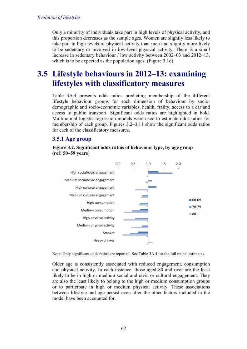
Evolution of lifestyles
Only a minority of individuals take part in high levels of physical activity, and this proportion decreases as the sample ages. Women are slightly less likely to take part in high levels of physical activity than men and slightly more likely to be sedentary or involved in low-level physical activity. There is a small increase in sedentary behaviour / low activity between 2002–03 and 2012–13, which is to be expected as the population ages. (Figure 3.1d)
3.5 Lifestyle behaviours in 2012–13: examining lifestyles with classificatory measures Table 3A.4 presents odds ratios predicting membership of the different lifestyle behaviour groups for each dimension of behaviour by socio-demographic and socio-economic variables, health, frailty, access to a car and access to public transport. Significant odds ratios are highlighted in bold. Multinomial logistic regression models were used to estimate odds ratios for membership of each group. Figures 3.2–3.11 show the significant odds ratios for each of the classificatory measures.
3.5.1 Age group Figure 3.2. Significant odds ratios of behaviour type, by age group (ref: 50–59 years)
Note: Only significant odds ratios are reported. See Table 3A.4 for the full model estimates.
Older age is consistently associated with reduced engagement, consumption and physical activity. In each instance, those aged 80 and over are the least likely to be in high or medium social and civic or cultural engagement. They are also the least likely to belong to the high or medium consumption groups or to participate in high or medium physical activity. These associations between lifestyle and age persist even after the other factors included in the model have been accounted for.
0.0 0.5 1.0 1.5 2.0
High social/civic engagement
Medium social/civic engagement
High cultural engagement
Medium cultural engagement
High consumption
Medium consumption
High physical activity
Medium physical activity
Smoker
Heavy drinker
60-69
70-79
80+
62

Evolution of lifestyles
3.5.2 Sex Figure 3.3. Significant odds ratios of behaviour type, by being female (ref: male)
Note: Only significant odds ratios are reported. See Table 3A.4 for the full model estimates.
Females are consistently more likely to belong to high or medium social and civic or cultural engagement groups than men. However, they are less likely than men to participate in high- or medium-level physical activity. They are less likely than men to either smoke or drink alcohol on a daily or almost daily basis.
3.5.3 Marital status Figure 3.4. Significant odds ratios of behaviour type, by marital status (ref: married, in a civil partnership or cohabiting)
Note: Only significant odds ratios are reported. See Table 3A.4 for the full model estimates.
0.0 0.5 1.0 1.5 2.0
High social/civic engagement
Medium social/civic engagement
High cultural engagement
Medium cultural engagement
High consumption
Medium consumption
High physical activity
Medium physical activity
Smoker
Heavy drinker
Female
0.0 0.5 1.0 1.5 2.0 2.5 3.0
High social/civic engagement
Medium social/civic engagement
High cultural engagement
Medium cultural engagement
High consumption
Medium consumption
High physical activity
Medium physical activity
Smoker
Heavy drinker
Single
Divorced/separated
Widowed
63

Evolution of lifestyles
Being married, in a civil partnership or cohabiting is associated with higher social and civic engagement yet lower cultural engagement. Those who are single, widowed, or divorced or separated are almost twice as likely to belong to the high or medium cultural engagement classes as those who are married, in a civil partnership or cohabiting. Those who are single are over twice as likely to belong to the high or medium consumption groups than those who are in a couple. Being single, divorced or separated, or widowed is also associated with a higher likelihood of participating in high- or medium-level physical activity. Those who are widowed are more likely to smoke than those who belong to a couple, but there are no associations between marital status and daily drinking.
3.5.4 Wealth Figure 3.5. Significant odds ratios of behaviour type, by wealth quintile (ref: poorest)
Note: Only significant odds ratios are reported. See Table 3A.4 for the full model estimates.
Wealth is strongly associated with all dimensions of lifestyle behaviour. Those in the richest wealth quintile are over four times as likely to belong to the high social and civic engagement group as those in the poorest, and over six times as likely to belong to the high cultural engagement group. They are also seven times more likely to belong to the highest consumption group. Higher wealth is also associated with higher physical activity, heavy drinking and lower chances of being a smoker. The relationship between wealth quintile and behaviour shows a strong gradient pattern, with higher engagement and better health behaviour consistently observed more with each increasing quintile.
0 1 2 3 4 5 6 7 8
High social/civic engagement
Medium social/civic engagement
High cultural engagement
Medium cultural engagement
High consumption
Medium consumption
High physical activity
Medium physical activity
Smoker
Heavy drinker
2
3
4
Richest
64

Evolution of lifestyles
3.5.5 Education Figure 3.6. Significant odds ratios of behaviour type, by education (ref: low)
Note: Only significant odds ratios are reported. See Table 3A.4 for the full model estimates.
Education follows a similar pattern to wealth. The highest levels of education are consistently associated with the highest levels of engagement, consumption and physical activity. Those who are more highly educated are less likely to smoke.
3.5.6 Employment status Figure 3.7. Significant odds ratios of behaviour type, by employment status (ref: full-time employed)
Note: Only significant odds ratios are reported. See Table 3A.4 for the full model estimates.
Being retired is associated with higher engagement in social and civic activities than being employed, but lower cultural engagement, lower consumption and lower levels of physical activity. Those who are recorded as ‘other’ (unemployed, permanently sick or disabled, or out of work in order to
0 1 2 3 4 5 6
High social/civic engagement
Medium social/civic engagement
High cultural engagement
Medium cultural engagement
High consumption
Medium consumption
High physical activity
Medium physical activity
Smoker
Heavy drinker
Mid
High
0.0 0.5 1.0 1.5 2.0
High social/civic engagement
Medium social/civic engagement
High cultural engagement
Medium cultural engagement
High consumption
Medium consumption
High physical activity
Medium physical activity
Part-time employed
Retired
Other
65

Evolution of lifestyles
look after family members) in terms of economic activity are more likely to belong to the group of people with high social and civic engagement, but more likely to belong to low cultural engagement and consumption groups.
3.5.7 Self-rated health Figure 3.8. Significant odds ratios of behaviour type, by self-rated health (ref: excellent)
Note: Only significant odds ratios are reported. See Table 3A.4 for the full model estimates.
Health appears to have a strong association with lifestyle behaviours. The poorer a person’s self-reported health is, the lower their likelihood of high or medium social and civic or cultural engagement. Poorer health is also associated with low physical activity, and the likelihood of being a smoker increases linearly with decreases in health. Again, a gradient of engagement by level of self-rated health can be observed, with levels of engagement and better health behaviour decreasing as health worsens.
3.5.8 Frailty Figure 3.9. Significant odds ratios of behaviour type, by being frail (ref: not frail)
Note: Only significant odds ratios are reported. See Table 3A.4 for the full model estimates.
0.0 0.5 1.0 1.5 2.0 2.5
High social/civic engagement
Medium social/civic engagement
High cultural engagement
Medium cultural engagement
High consumption
Medium consumption
High physical activity
Medium physical activity
Smoker
Heavy drinker
Very good
Good
Fair
Poor
0.0 0.2 0.4 0.6 0.8 1.0
High social/civic engagement
Medium social/civic engagement
High cultural engagement
Medium cultural engagement
High consumption
Medium consumption
High physical activity
Medium physical activity
Smoker
Heavy drinker
Frail
66

Evolution of lifestyles
As might be expected, being frail is associated with a reduced likelihood of belonging to the high or medium cultural engagement groups. Frailty is also associated with lower physical activity and lower likelihoods of smoking.
3.5.9 Access to a car Figure 3.10. Significant odds ratios of behaviour type, by no car access (ref: has access)
Note: Only significant odds ratios are reported. See Table 3A.4 for the full model estimates.
Having access to a car is strongly associated with lifestyle behaviours. In each instance of social or civic and cultural engagement, those with no car access are significantly more likely to belong to the group of those with low levels of participation. Low physical activity is also associated with those without access to a car when needed. Smokers are more likely to not have access to a car when needed than those who do not smoke.
3.5.10 Access to public transport Figure 3.11. Significant odds ratios of behaviour type, by no access to public transport (ref: has access)
Note: Only significant odds ratios are reported. See Table 3A.4 for the full model estimates.
0.0 0.2 0.4 0.6 0.8 1.0 1.2 1.4
High social/civic engagement
Medium social/civic engagement
High cultural engagement
Medium cultural engagement
High consumption
Medium consumption
High physical activity
Medium physical activity
Smoker
Heavy drinker
No access
0.0 0.2 0.4 0.6 0.8 1.0
High social/civic engagement
Medium social/civic engagement
High cultural engagement
Medium cultural engagement
High consumption
Medium consumption
High physical activity
Medium physical activity
Smoker
Heavy drinker
No access
67

Evolution of lifestyles
Having no access to public transport is associated with a significantly reduced likelihood of engaging in high or medium levels of social and civic or cultural activities. A lack of access to public transport is also associated with a reduced likelihood of having lifestyles characterised by high or medium levels of physical activity.
3.6 Between-wave individual change in lifestyle behaviours between 2002–03 and 2012–13 This section examines the individual-level longitudinal changes in lifestyle behaviours for each dimension separately for those core members of ELSA who have responded to at least two consecutive waves of data. Table 3.1 shows the level of change in lifestyle behaviours between two consecutive waves over the period 2002–03 to 2012–13. Results are also shown for those who see no change in behaviour between waves and these are stratified according to whether the stable behaviour is classed as ‘low’, ‘medium’ or ‘high’ engagement. Each transition between waves is treated independently, so the measure does not take into account previous transitions, or the length of time spent in each class prior to the change in class membership.
The majority of individuals did not change lifestyle behaviours across transition points. However, there are differences in the typical behaviours associated with each of the dimensions. More than half of the individuals showed consistent low engagement in social and civic activities, yet a similar proportion showed consistent high engagement in cultural activities. Only Table 3.1. Lifestyle behaviour changes across transition points, by dimension (% all pooled observations within each behaviour category), 2002–03 to 2012–13a
Social and civic
engagement
Cultural engagement
Consumption Physical activity
Smoking Heavy drinking
High to medium 1.69 6.05 0.57 7.37 High to low 0.59 1.04 1.76 1.55 Medium to high 2.11 11.93 0.85 6.46 Medium to low 9.20 3.13 2.74 11.66 Low to high 0.63 1.64 1.94 1.02 Low to medium 8.43 6.26 2.80 8.94 Stable high 0.83 51.38 1.06 10.07 Stable medium 20.58 14.88 0.50 32.11 Stable low 55.93 3.69 87.78 20.82 Total 100 100 100 100 Stable non-smoking / non-heavy drinking 85.03 70.83 Stable smoking / heavy drinking 11.99 19.21 Stops smoking / heavy drinking 1.98 6.14 Starts smoking / heavy drinking 1.00 3.82 Total 100 100
a Changes in consumption are only recorded between 2004–05 and 2012–13.
68

Evolution of lifestyles
3.7% of pooled observations showed consistent low cultural engagement across the transition points. The largest changes in social and civic engagement are from medium to low and from low to medium. For cultural engagement, the highest change is observed from medium to high.
The vast majority of people belong to the group of those displaying continuously low consumption behaviour (87.8%). The highest percentages of people changing consumption behaviour are observed among those who move between low and medium consumption behaviour.
Almost one-third of individuals take part in moderate physical activity in all waves, with only just over one in ten people taking part in high activity in all waves. The highest proportion of people changing activity levels is observed among those who move from medium to low activity. The vast majority of individuals are non-smokers, and only 2.0% of the respondents stop smoking across transition points. Almost a fifth of individuals drink daily or almost daily in all waves, and almost twice as many reduce their level of drinking as increase it.
3.7 Drivers of change in lifestyle behaviours 3.7.1 Model specification This section provides analysis of the drivers of changes in lifestyle behaviours using multinomial logistic regression modelling. The outcomes measures are changes in lifestyle behaviours between subsequent waves (i.e. changes in latent class membership for dimensions of engagement and consumption and changes in smoking, frequency of alcohol consumption and physical activity). The same model is fitted for each of the domains of lifestyle behaviour. The data included in the model are pooled for each transition point between each wave of ELSA (i.e. 2002–03 to 2004–05, 2004–05 to 2006–07, 2006–07 to 2008–09, 2008–09 to 2010–11 and 2010–11 to 2012–13) so that individuals are allowed to have more than one transition point recorded over the five potential transition periods and a longitudinal analysis of change over time can be reported. The longitudinal nature of the analysis is controlled for by measuring covariates that might influence changes in behaviour at baseline.
The model is fitted to include time-varying socio-demographic and socio-economic characteristics measured at the wave before the transition point (for example, age at 2002–03 if we are examining change in behaviour at 2004–05). Inclusion of baseline characteristics allows us to examine their associations with subsequent changes in lifestyle behaviours. In addition, changes of circumstance between waves (i.e. moving into retirement, becoming widowed, becoming frail and losing access to transport) are included as predictors of lifestyle change.
Table 3.2 shows the frequency of these changes in circumstance at each of the transition points.
Between a half and two-thirds of people are retired at any pair of waves across the data period, and this percentage generally increases over time. The
69

Evolution of lifestyles
Table 3.2. Change in employment status, marital status, frailty and access to transport across transition points (%), 2002–03 to 2012–13
Waves 1–2
Waves 2–3
Waves 3–4
Waves 4–5
Waves 5–6
Employment status Employed at both waves 32.69 29.61 32.36 28.57 23.49 Retired at both waves 56.42 61.19 57.46 61.01 66.82 Becomes retired 5.08 4.36 5.09 5.87 5.89 Starts or increases work 3.49 2.84 2.73 2.60 2.01 Reduces working hours 2.30 2.00 2.36 1.95 1.79
Marital status Couple at both waves 72.88 72.21 73.76 75.42 75.03 Single at both waves 4.82 4.78 5.14 5.15 4.96 Separated/divorced at both waves 2.72 2.56 2.63 2.57 2.56 Widowed at both waves 16.65 18.01 16.30 14.58 15.19 Becomes widowed 1.92 1.76 1.29 1.51 1.53 Becomes separated/divorced 0.32 0.22 0.20 0.26 0.29 Becomes a couple 0.69 0.46 0.68 0.51 0.44
Frailty Not frail at both waves 66.74 65.87 64.76 63.72 53.45 Frail at both waves 20.21 22.07 22.23 23.86 28.35 Becomes frail 8.28 7.32 8.04 8.69 13.90 Becomes not frail 4.77 4.74 4.97 3.74 4.30
Access to a car Access at both waves 78.00 78.56 79.01 79.78 79.06 No access at both waves 12.66 13.93 13.22 12.42 12.33 Loses access 5.93 4.20 4.26 4.58 5.70 Gains access 3.41 3.31 3.51 3.22 2.91
Access to public transport Access at both waves 61.51 56.15 53.64 57.96 59.30 No access at both waves 24.56 33.40 32.54 30.24 29.51 Loses access 5.51 6.15 5.44 5.97 6.54 Gains access 8.42 4.30 8.38 5.84 4.65
percentage of people becoming retired between waves increases slightly and the percentage of those who move back into work or increase their working hours decreases over time.
More than two-thirds of respondents are married, cohabiting or in a civil partnership across each transition point and the percentage increases over time. The proportion of people widowed at both waves decreases slightly over time.
The percentage of people who are frail in both waves of the transition point increases from 20% at waves 1–2 to 28% at waves 5–6, and the proportion of people who are not classed as frail at either wave falls from over two-thirds at the first transition point to just over half by the last.
Access to a car and to public transport remains stable across waves. The majority of people have access to a car when needed, and over half of adults
70

Evolution of lifestyles
have access to public transport, at each wave of the data. Only a small percentage of people lose transport access at each wave.
3.7.2 Changes in lifestyle behaviours by baseline characteristics Social and civic engagement Table 3A.5 presents the model estimates for changes in social and civic engagement conditional on baseline characteristics at each of the transition points. Significant odds ratios are highlighted in bold. Being female is associated with a reduced likelihood of belonging to low social and civic engagement groups at baseline (stable low and low to medium). Being single is associated with a reduced likelihood of remaining in the stable low group but an increased likelihood of belonging to the group that changes from low to high engagement. Being divorced or separated at baseline is associated with the lower engagement groups (stable low, medium changing to low and low changing to high). Being in the highest wealth quintile is associated with belonging to the stable high and high to medium groups, and belonging to any of the wealth quintile categories other than the poorest is associated with a lower likelihood of belonging to the stable low engagement group.
Education level appears to be a key driver of group membership. Figure 3.12 shows the significant odds ratios of social and civic engagement group membership by education level. Higher education levels are associated with membership of the higher engagement groups (stable high, high to medium and medium to high), and lower levels are associated with the lower groups (stable low, high to low, medium to low and low to high or medium).
Health is another key driver of group membership, with poorer baseline health strongly associated with membership of the stable low group, the medium to low group, and both groups that see an increase in engagement from low levels at baseline. Being retired is significantly associated with a lower likelihood of belonging to groups that show low engagement either before or after the transition point.
Figure 3.12. Significant odds ratios of change in social and civic engagement, by education (ref: low)
Note: Only significant odds ratios are reported. See Table 3A.5 for the full model estimates.
0 1 2 3 4 5
Low to high
Low to medium
Medium to high
High to low
High to medium
Medium to low
Stable high
Stable low
Mid
High
71

Evolution of lifestyles
Frailty is another key predictor of social and civic engagement in later life. Being frail at baseline is associated with an increased chance of moving from high engagement to low or medium, as well as from medium to low. Those who are frail are also more likely to belong to the group of individuals whose engagement levels are continuously low.
Having no access to a car and having no access to public transport are both associated with membership of the stable low engagement group. Having no access to public transport is significantly associated with a decreased likelihood of being able to increase levels of engagement in any manner.
Cultural engagement The estimates from the baseline model showing changes in cultural behaviour are presented in Table 3A.6. Older age is associated with membership of groups that see a decline in cultural engagement, as well as the stable low group. Being female is associated with membership of the stable high engagement group, as well as the groups that move between high and medium engagement. Being single is significantly associated with belonging to the stable low engagement group.
One of the largest drivers of cultural engagement appears to be baseline wealth. Figure 3.13 shows the significant odds ratios for membership of cultural engagement groups on the basis of wealth quintile. Being in higher wealth quintiles is associated with membership of high engagement groups (stable high and moving into and out of high engagement) as well as with significantly lower likelihoods of belonging to any of the groups characterised by low engagement either before or after the transition point.
Higher education level is also associated with membership of the groups that show stable high engagement, or movement into or out of high engagement. Belonging to the ‘other’ category of employment status, which includes people who are unemployed, disabled or caring for family members, is associated with membership of low engagement groups (stable and movement into and Figure 3.13. Significant odds ratios of change in cultural engagement, by wealth quintile (ref: poorest)
Note: Only significant odds ratios are reported. See Table 3A.6 for the full model estimates.
0 1 2 3 4 5 6
Low to high
Low to medium
Medium to high
High to low
High to medium
Medium to low
Stable high
Stable low
2nd
3rd
4th
Richest
72

Evolution of lifestyles
out of low engagement). Self-reported health appears to be another large driver of changes in cultural engagement over time, with better health associated with the high engagement groups (stable and movement into and out of high engagement) and poorer health associated with continuously low engagement. Frailty at baseline is associated with stable low engagement and movements into low engagement. People who have no access to a car when needed are over twice as likely to move from high to low engagement or to belong to the group displaying stable low engagement. They are also almost twice as likely to move from medium engagement to low. Similarly, having no access to public transport at baseline is significantly associated with moving from both high and medium engagement to low, as well as with stable low engagement. Those without car or public transport access are significantly less likely to be able to move from medium levels of engagement to high.
Consumption The strongest drivers of consumption behaviour appear to be education and frailty (see Table 3A.7). Those with higher education are less likely to belong to any of the consumption groups that move into or out of lower levels of consumption. Those who are frail at baseline are twice as likely to move from medium consumption into low.
Health behaviour Tables 3A.8 and 3A.9 show the results of the baseline model for changes in smoking, drinking and levels of physical activity. Non-smokers at both waves are likely to be older, wealthier and better educated, and less likely to be in poorer health and single, divorced or separated, or widowed. Wealth is a large driver of stopping smoking, with a gradual increase in the likelihood of stopping as wealth quintile increases.
Moving from daily or almost daily drinking to less than daily drinking, compared with continuous heavy drinking, is less likely among older people than those aged 50–59. Being female is significantly associated with less frequent drinking and less stable patterns of drinking (i.e. women are more likely to either reduce or increase alcohol consumption than men). All health categories have an increased likelihood of reducing drinking compared with those in excellent health.
Age is a key driver of change in physical activity. The oldest age groups are more likely to belong to groups that move to low activity or are low at the beginning of the transition point. Wealth is another important driver, with higher wealth associated with stable levels of high physical activity and movement between high and medium activity. The strongest driver of change in physical activity, however, is baseline health. Those with the poorest health are ten times more likely to belong to the group of people who remain in low activity across the transition point and between two and three times more likely to belong to the groups with movement into and out of low activity. Baseline levels of frailty are similarly associated with the activity groups showing movement into and out of the low category, and those who are frail are less likely to belong to the group with stable high activity.
73

Evolution of lifestyles
3.7.3 Changes in life circumstances and changes in lifestyle behaviour This section discusses the results of the logistic regression models when changes in employment, partnership, frailty and access to a car and to public transport are included in the model. The results are presented in Tables 3A.10 to 3A.14. The baseline effects remain consistent for each model after accounting for changes in individual circumstances and are not shown in the tables.
Social and civic engagement Becoming retired is associated with an increased likelihood of moving from low social and civic engagement to medium and a decreased likelihood of remaining in the low engagement group.
Those who become widowed are over twice as likely as couples to move from medium engagement to high and are likely to move from low to medium engagement. However, they are also more likely to remain in the low engagement group or to move from medium to low engagement after the change in relationship status.
Frailty is the main driver of changes in social and civic engagement. Those who become frail are more likely to move from medium to low engagement and are over twice as likely to move from high to low engagement. Additionally, being continuously frail is associated with all possible reductions in engagement.
Having no access to a car when needed both before and after a transition point, or only before or only after, is associated with continuously low social and civic engagement. Losing car access, as well as continuous lack of car access, is also associated with declines in engagement from high and medium to low.
The association between changes in public transport and lifestyle behaviours is less marked than that between changes in car access and lifestyle behaviours. Continuous lack of public transport access is associated with declines from high engagement to low or medium, and both continuous lack of access and loss of access are associated with belonging to the group of people displaying continuously low-level social and civic engagement.
Cultural engagement Changes in employment situations have little influence on cultural engagement. Being retired at both waves of the transition point is associated with an increased likelihood of moving from medium to low engagement, and a decreased likelihood of moving from low to high engagement.
Those who become widowed are almost three times as likely to move from low engagement to high engagement. Being single at both waves is associated with stable low engagement and movement from low to medium engagement.
Changes in frailty are a key driver of changes in cultural engagement. Figure 3.14 shows the significant odds ratios for the likelihood of group membership according to changes in frailty status. Becoming frail between waves is associated with an increased likelihood of moving from either high or medium
74
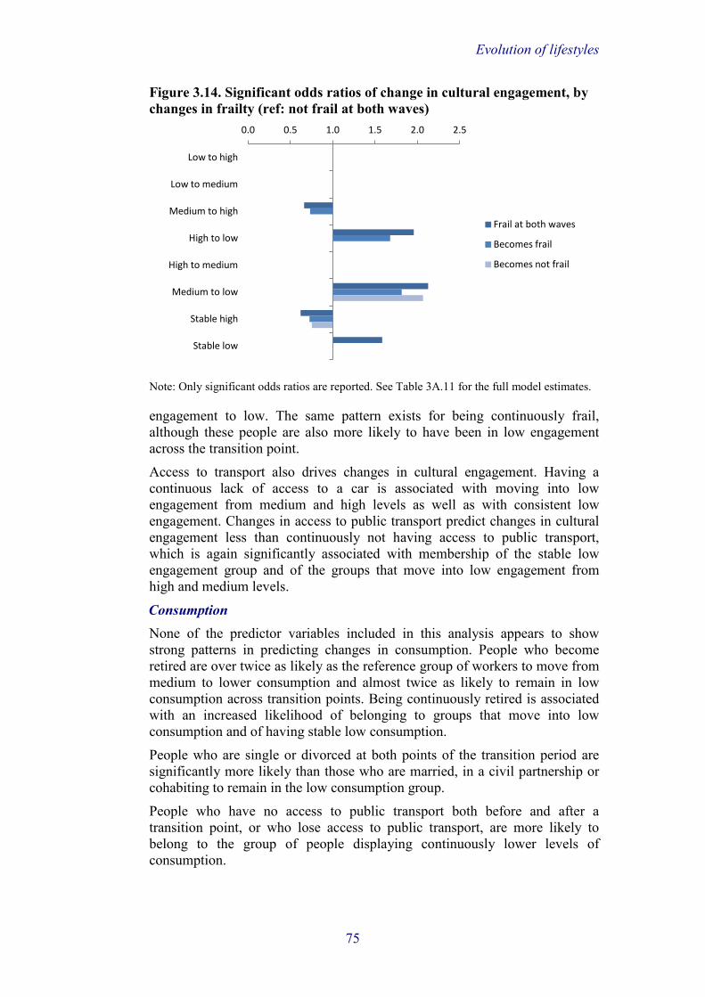
Evolution of lifestyles
Figure 3.14. Significant odds ratios of change in cultural engagement, by changes in frailty (ref: not frail at both waves)
Note: Only significant odds ratios are reported. See Table 3A.11 for the full model estimates.
engagement to low. The same pattern exists for being continuously frail, although these people are also more likely to have been in low engagement across the transition point.
Access to transport also drives changes in cultural engagement. Having a continuous lack of access to a car is associated with moving into low engagement from medium and high levels as well as with consistent low engagement. Changes in access to public transport predict changes in cultural engagement less than continuously not having access to public transport, which is again significantly associated with membership of the stable low engagement group and of the groups that move into low engagement from high and medium levels.
Consumption None of the predictor variables included in this analysis appears to show strong patterns in predicting changes in consumption. People who become retired are over twice as likely as the reference group of workers to move from medium to lower consumption and almost twice as likely to remain in low consumption across transition points. Being continuously retired is associated with an increased likelihood of belonging to groups that move into low consumption and of having stable low consumption.
People who are single or divorced at both points of the transition period are significantly more likely than those who are married, in a civil partnership or cohabiting to remain in the low consumption group.
People who have no access to public transport both before and after a transition point, or who lose access to public transport, are more likely to belong to the group of people displaying continuously lower levels of consumption.
0.0 0.5 1.0 1.5 2.0 2.5
Low to high
Low to medium
Medium to high
High to low
High to medium
Medium to low
Stable high
Stable low
Frail at both waves
Becomes frail
Becomes not frail
75

Evolution of lifestyles
Health behaviour Being retired both before and after a transition point is associated with a decreased likelihood of stopping smoking compared with people who are continuously employed, whilst either re-entering work (from any circumstance) or increasing hours worked is associated with a higher likelihood of stopping smoking. Becoming frail between waves is associated with a significantly increased likelihood of stopping smoking. None of the changes to individual circumstances is significantly associated with changes to drinking behaviour, apart from becoming a couple being associated with an increased likelihood of drinking heavily at both waves.
As might be expected, frailty is the largest driver of changes in physical activity in later life. Those who become frail between waves are over twice as likely to change from high to low or medium to low physical activity. Those who lose access to a car when needed, as well as those who continuously have no access to a car when needed, are significantly more likely to move from medium activity to low or to belong to the group of people displaying consistently low levels of physical activity. Becoming retired is associated with moving from high and medium activity to low. This is likely to reflect the loss of physical activity among people retiring from manual work.
3.8 Conclusions Previous research has suggested positive lifestyle behaviours in later life comprise part of the healthy ageing process. Conversely, lower engagement in social and cultural activities and unhealthy behaviour, such as low levels of physical activity, have been linked to poorer ageing outcomes. The research presented within this chapter has shown that lifestyle behaviours have remained relatively stable between 2002–03 and 2012–13, but that there was wide variation in these stable types of behaviours that older people were engaged in. Around two-thirds of older adults had low levels of social and civic engagement yet approximately the same number had high levels of cultural engagement. Very few adults aged over 50 smoked or drank heavily. Over the period 2002–03 to 2012–13, over a fifth of older adults changed their level of social and civic engagement at some point, almost a third changed their level of cultural engagement and a tenth changed their level of consumption. Half of those making changes to social and civic engagement and consumption saw decreases in activity, whilst this figure was a third among those changing levels of cultural activity. It should therefore be noted that ageing is associated with increases in healthy lifestyle behaviours as well as reductions.
Older age appeared to be associated with a decreased likelihood of belonging to all high or medium lifestyle behaviour groups. With the exception of high social and civic engagement, these associations remained significant after accounting for other age-related factors, such as being retired, being widowed and being frail. This suggests an association exists between growing older and lower levels of participation in lifestyle behaviours that may affect the healthy ageing process.
76

Evolution of lifestyles
Being married, in a civil partnership or cohabiting appeared to be associated with higher levels of social and civic engagement but lower levels of cultural engagement. Higher levels of consumption were observed among those who were single and never married, and being divorced or separated and being widowed were associated with increased participation in high and medium levels of physical activity. So, whilst being in a relationship may be protective of certain lifestyle behaviours, it appears to have the opposite association for others. This also suggests that being married, in a civil partnership or cohabiting is associated with an increase in social networks, subsequently leading to increased involvement in societal activities. Becoming widowed was associated with both increases and decreases in levels of social and civic engagement, but an increase in cultural engagement.
Wealth showed strong graded relationships with all types of lifestyle behaviours. Higher levels of wealth were consistently associated with higher engagement in social and civic activities, higher engagement in cultural activities, higher patterns of spending and higher participation in high levels of physical activity. Daily or almost daily drinking was also associated with higher wealth, but we were not able to quantify the amount consumed each day or the type of alcoholic beverage consumed. Smoking was the only activity linked to lower wealth. In terms of healthy lifestyle behaviours, a strong pattern was observable in that likelihood of engagement increased with every wealth quintile. This suggests low engagement in favourable lifestyle behaviours in older age is strongly linked to wealth and that attention must be paid to those in lower wealth groups, who may be at risk of isolation or of participation in unhealthy lifestyle choices. Education level followed a similar pattern to wealth, with higher engagement consistently noticeable among those who left education at older ages. This places participation in lifestyle behaviours within a life-course perspective, with better educational attainment likely to lead to higher wealth throughout adult life and therefore a healthier ageing process in later life.
Health was another important indicator of engagement. In each instance, with the exception of smoking, the worse an individual’s health was, the less likely they were to engage in any of the favourable lifestyle behaviours (better health was associated with higher alcohol consumption, but the lack of knowledge about the amount or type of drink consumed is problematic in meaningfully interpreting this result).
Becoming retired was associated with an increase in social and civic engagement and a reduced likelihood of consistently low social and civic engagement. Being retired was associated with membership of the higher social and civic engagement groups. This might be because the activities carried out within this dimension, such as attending an organisation or participating in voluntary work, might take up more time than other activities and therefore are more commonly done after giving up work. With the exception of social and civic participation, belonging to the ‘other’ group of the employment status categories was associated with lower levels of engagement in all lifestyle behaviours. Again, this suggests those who are in unfavourable situations, such as being unemployed, disabled or caring for family members, are at high risk of detachment from society and of adopting unhealthy lifestyles.
77

Evolution of lifestyles
Frailty was one of the strongest predictors of change in lifestyle behaviours. Becoming frail was consistently associated with drops in levels of both social and civic and cultural engagement. Consistent frailty was similarly associated with reductions in engagement and membership of the continuously low engagement groups.
No transport access and loss of transport access were associated with reductions in and continuously low levels of social and civic engagement and cultural engagement. Again, this highlights the importance of ensuring older people are able to connect themselves to the wider community in order to live favourable lifestyles. This may be especially true for those who do not use public transport because they cannot afford it or are physically incapable of doing so and are at high risk of detachment from society.
Policymakers might focus on accessibility of social, civic and cultural engagement, and ensure those at the highest risk of detachment from societal activities are able to participate in them. Policy should be targeted at those with the lowest levels of wealth and health, including those who are frail and becoming frail, in order to lessen the likelihood of movement into lower levels of engagement and unhealthier lifestyle choices, such as low-level physical activity. Public transport should be made accessible for those who struggle to use it and subsequently may not be able to engage in their preferred societal activities or lifestyle behaviours.
References Adams, K. B., Leibbrandt, S. and Moon, H. (2011), ‘A critical review of the
literature on social and leisure activity and wellbeing in later life’, Ageing and Society, 31: 683–712.
Blow, F. C., Walton, M. A., Barry, K. L., Coyne, J. C., Mudd, S. A. and Copeland, L. A. (2000), ‘The relationship between alcohol problems and health functioning of older adults in primary care settings’, Journal of the American Geriatrics Society, 48: 769–74.
Brach, J. S., Simonsick, E. M., Kritchevsky, S., Yaffe, K. and Newman, A. B. (2004), ‘The association between physical function and lifestyle activity and exercise in the Health, Aging and Body Composition Study’, Journal of the American Geriatrics Society, 52: 502–9.
Chiao, C., Weng, L. J. and Botticello, A. L. (2011), ‘Social participation reduces depressive symptoms among older adults: an 18-year longitudinal analysis in Taiwan’, BMC Public Health, 11: 292.
de Leon, C. F. M., Glass, T. A. and Berkman, L. F. (2003), ‘Social engagement and disability in a community population of older adults: the New Haven EPESE’, American Journal of Epidemiology, 157: 633–42.
Drentea, P. (2002), ‘Retirement and mental health’, Journal of Aging and Health, 14: 167–94.
78

Evolution of lifestyles
Glass, T. A., de Leon, C. F. M., Bassuk, S. S. and Berkman, L. F. (2006), ‘Social engagement and depressive symptoms in late life: longitudinal findings’, Journal of Aging and Health, 18: 604–28.
Gow, A. J., Corley, J., Starr, J. M. and Deary, I. J. (2012), ‘Reverse causation in activity-cognitive ability associations: the Lothian Birth Cohort 1936’, Psychology and Aging, 27: 250–5.
Hatamian, A., Pearmain, D. and Golden, S. (2012), Outcomes of the Active at 60 Community Agent Programme, Department for Work and Pensions (DWP) Research Report 808, https://www.gov.uk/government/uploads/system/uploads/attachment_data/file/193416/rrep808.pdf.
Isherwood, L. M., King, D. S. and Luszcz, M. A. (2012), ‘A longitudinal analysis of social engagement in late-life widowhood’, International Journal of Aging and Human Development, 74: 211–29.
LaCroix, A. Z., Lang, J., Scherr, P., Wallace, R. B., Cornoni-Huntley, J., Berkman, L., Curb, D., Evans, M. D. and Hennekens, C. H. (1991), ‘Smoking and mortality among older men and women in three communities’, New England Journal of Medicine, 324: 1619–25.
Niti, M., Yap, K. B., Kua, E. H., Tan, C. H. and Ng, T. P. (2008), ‘Physical, social and productive leisure activities, cognitive decline and interaction with APOE-ε4 genotype in Chinese older adults’, International Psychogeriatrics, 20: 237–51.
Thomas, P. (2011), ‘Gender, social engagement, and limitations in late life’, Social Science & Medicine, 73: 1428–35.
Utz, R. L., Carr, D., Nesse, R. and Wortman, C. B. (2002), ‘The effect of widowhood on older adults’ social participation: an evaluation of activity, disengagement, and continuity theories’, Gerontologist, 42: 522–33.
79

Evolution of lifestyles
Appendix 3A
Additional tables on evolution of lifestyles Table 3A.1. Proportions of respondents for each item used to construct the latent classes of social and civic engagement, by wave, 2002–03 to 2012–13
Wave 1 Wave 2 Wave 3 Wave 4 Wave 5 Wave 6 High engagement
Civic activities 0 0.00 0.00 0.00 0.10 0.00 0.09
1 0.01 0.00 0.36 0.21 0.00 0.18 2 0.06 0.01 0.21 0.26 0.40 0.28 3 0.13 0.01 0.36 0.32 0.51 0.34 4 0.80 0.97 0.08 0.11 0.10 0.12 Social activities 0 0.00 0.05 0.16 0.18 0.09 0.11 1 0.00 0.00 0.37 0.28 0.30 0.27 2 0.24 0.06 0.30 0.34 0.36 0.40 3 0.22 0.10 0.15 0.14 0.21 0.14 4 0.54 0.79 0.02 0.07 0.05 0.08 Contacts 0 0.09 0.18 0.16 0.25 0.23 0.19 1 0.39 0.25 0.45 0.39 0.49 0.46 2 0.25 0.41 0.26 0.21 0.15 0.24 3 0.27 0.17 0.14 0.15 0.13 0.12 Volunteers 0.51 0.82 0.87 0.82 0.89 0.89 Medium engagement
Civic activities 0 0.18 0.20 0.11 0.28 0.27 0.27
1 0.38 0.40 0.52 0.45 0.44 0.42 2 0.30 0.27 0.34 0.23 0.24 0.26 3 0.13 0.11 0.02 0.04 0.04 0.05 4 0.01 0.02 0.00 0.00 0.01 0.00 Social activities 0 0.24 0.26 0.31 0.32 0.29 0.29 1 0.42 0.43 0.42 0.43 0.43 0.44 2 0.26 0.24 0.22 0.20 0.23 0.22 3 0.08 0.06 0.04 0.05 0.05 0.06 4 0.01 0.01 0.01 0.00 0.01 0.00 Contacts 0 0.17 0.20 0.23 0.19 0.19 0.18 1 0.35 0.38 0.37 0.37 0.37 0.38 2 0.31 0.27 0.25 0.29 0.28 0.26 3 0.17 0.15 0.15 0.16 0.16 0.18 Volunteers 0.65 0.70 0.61 0.59 0.74 0.64
Table continues
80

Evolution of lifestyles
Table 3A.1 continued. Proportions of respondents for each item used to construct the latent classes of social and civic engagement, by wave, 2002–03 to 2012–13
Wave 1 Wave 2 Wave 3 Wave 4 Wave 5 Wave 6 Low engagement
Civic activities 0 0.74 0.69 0.75 0.78 0.72 0.75
1 0.23 0.26 0.21 0.20 0.23 0.21 2 0.03 0.04 0.03 0.02 0.04 0.03 3 0.00 0.00 0.01 0.00 0.01 0.01 4 0.00 0.00 0.00 0.00 0.00 0.00 Social activities 0 0.60 0.55 0.57 0.59 0.58 0.59 1 0.31 0.36 0.33 0.32 0.32 0.32 2 0.08 0.08 0.09 0.07 0.08 0.09 3 0.01 0.01 0.01 0.01 0.02 0.01 4 0.00 0.00 0.00 0.00 0.00 0.00 Contacts 0 0.15 0.16 0.16 0.16 0.16 0.17 1 0.31 0.32 0.32 0.33 0.35 0.34 2 0.33 0.32 0.32 0.32 0.31 0.31 3 0.22 0.20 0.20 0.20 0.19 0.19 Volunteers 0.07 0.03 0.05 0.00 0.00 0.00
Table 3A.2. Proportions of respondents for each item used to construct the latent classes of cultural engagement, by wave, 2002–03 to 2012–13
Wave 1 Wave 2 Wave 3 Wave 4 Wave 5 Wave 6 High engagement
Cinema 0.86 0.89 0.86 0.90 0.87 0.88 Restaurants 1.00 1.00 1.00 1.00 1.00 1.00
Museums 0.90 0.91 0.91 0.90 0.89 0.89 Theatre 0.97 0.97 0.98 0.98 0.97 0.97 Medium engagement
Cinema 0.31 0.31 0.30 0.34 0.20 0.28 Restaurants 0.95 0.95 0.95 0.96 0.98 0.96
Museums 0.46 0.28 0.29 0.30 0.19 0.21 Theatre 0.52 0.37 0.35 0.42 0.21 0.29 Low engagement
Cinema 0.02 0.01 0.00 0.02 0.02 0.00 Restaurants 0.66 0.55 0.57 0.59 0.51 0.50
Museums 0.04 0.04 0.06 0.04 0.01 0.01 Theatre 0.00 0.00 0.00 0.00 0.00 0.00
81

Evolution of lifestyles
Table 3A.3. Mean spending (durables, food and clothes) and proportions of respondents for holiday items used to construct the latent classes of consumption behaviour, by wave, 2004–05 to 2012–13
Wave 2 Wave 3 Wave 4 Wave 5 Wave 6 High consumption
Durables 782.00 642.97 731.26 663.90 527.95 Food 272.63 287.15 238.97 243.92 249.84
Clothes 151.00 281.17 140.36 125.47 115.67 Holidays UK 0.72 0.80 0.76 0.75 0.83 Holidays abroad 0.88 0.87 0.78 0.72 0.74 Medium consumption
Durables 936.32 2028.51 611.94 683.95 539.59 Food 77.22 69.57 143.85 72.85 83.39
Clothes 587.69 146.10 1341.63 512.53 597.84 Holidays UK 0.71 0.70 0.73 0.79 0.75 Holidays abroad 0.75 0.71 0.55 0.69 0.68 Low consumption
Durables 320.98 242.17 347.82 344.91 274.25 Food 28.82 28.95 30.75 32.53 34.52
Clothes 45.47 56.23 50.18 45.73 47.75 Holidays UK 0.57 0.56 0.55 0.56 0.57 Holidays abroad 0.47 0.45 0.46 0.42 0.41
82

Evolution of lifestyles
Table 3A.4. Likelihood of class membership, by socio-demographic, socio-economic and health factors and access to transport (odds ratios) Social/civic
engagement Cultural
engagement Consumption Physical
activity Smoker Heavy
drinker High Med. High Med. High Med. High Med. Age group 50–59 (ref) 60–69 1.339 1.036 1.271 0.969 1.180 0.738 0.921 0.983 0.665 0.983 70–79 1.805 1.130 0.936 0.808 0.735 0.464 0.561 0.794 0.399 1.058 80+ 1.218 0.899 0.570 0.761 0.689 0.197 0.180 0.441 0.152 1.146
Sex Male (ref) Female 1.222 1.214 1.611 1.127 0.946 0.948 0.568 0.751 0.932 0.538
Marital status Coupled (ref) Single 0.925 0.801 1.786 1.517 2.590 2.084 1.247 1.229 0.916 1.000 Divorced/sep. 0.811 0.602 1.840 1.379 2.770 1.729 1.378 1.345 1.176 0.961 Widowed 1.075 0.863 1.729 1.442 1.454 1.243 1.239 1.279 1.171 0.954
Wealth quintile Poorest (ref) 2 1.426 1.228 2.120 1.526 1.736 1.339 1.272 1.120 0.612 1.084 3 2.042 1.621 3.330 1.910 2.040 1.413 1.675 1.420 0.409 1.135 4 2.648 2.096 4.899 2.179 3.500 2.031 2.166 1.689 0.316 1.703 Richest 4.834 2.830 6.550 2.014 7.538 3.806 2.627 1.742 0.257 2.384
Employment status Full-time employed (ref) Retired 1.842 1.308 0.880 0.852 0.603 0.664 0.650 0.753 0.929 1.028 Part-time 1.543 0.985 0.965 0.866 0.772 0.598 0.972 1.208 1.042 0.942 Other 1.681 1.009 0.488 0.665 0.578 0.715 0.528 0.651 1.093 0.971
Education Low (ref) Mid 2.178 1.837 2.380 1.275 1.353 1.045 1.094 1.171 0.761 1.474 High 5.054 2.848 3.694 1.263 1.926 1.258 1.280 1.249 0.622 1.888
Self-reported health Excellent (ref) Very good 0.746 0.927 0.765 0.912 0.875 0.935 0.465 0.738 1.169 0.835 Good 0.477 0.858 0.496 0.760 0.806 0.700 0.276 0.566 1.437 0.749 Fair 0.286 0.693 0.305 0.566 0.731 0.646 0.155 0.386 1.864 0.657 Poor 0.166 0.454 0.180 0.455 0.872 0.479 0.073 0.181 2.149 0.583
Frailty Not frail (ref) Frail 1.028 0.704 0.711 0.874 0.809 0.903 0.268 0.405 0.963 1.010
Car access Has access (ref) No access 0.768 0.611 0.364 0.547 0.459 0.525 0.685 0.545 1.357 0.898
Public transport access Has access (ref) No access 0.411 0.718 0.642 0.671 0.758 1.200 0.477 0.527 1.012 0.900
83

Evolution of lifestyles
Table 3A.5. Change in social and civic engagement, by baseline characteristics (odds ratios) Low to
high Low to
medium Medium to high
High to low
High to medium
Medium to low
Stable high
Stable low
Age group 50–59 (ref) 60–69 0.651 1.007 1.052 1.023 1.604 0.836 2.454 0.997 70–79 0.493 0.754 1.067 1.065 1.894 0.755 4.354 0.882 80+ 0.781 0.963 1.029 1.455 1.800 1.253 2.481 1.308
Sex Male (ref) Female 0.821 0.855 1.106 0.916 1.100 0.888 0.967 0.810
Marital status Coupled (ref) Single 1.824 0.116 0.854 0.776 0.998 1.089 0.545 0.792 Divorced/sep. 2.972 0.259 0.604 2.750 1.432 1.455 0.999 1.667 Widowed 1.034 0.094 1.390 1.476 1.180 1.125 1.137 1.024
Wealth quintile Poorest (ref) 2 1.048 0.853 0.803 1.103 1.428 0.979 1.271 0.795 3 0.970 0.933 1.191 0.904 1.691 0.965 1.383 0.587 4 0.825 0.779 1.412 0.912 1.595 0.827 1.594 0.428 Richest 0.984 0.646 1.675 0.890 1.907 0.732 2.686 0.292
Employment status Full-time employed (ref) Retired 0.487 0.724 1.205 0.675 1.237 0.669 1.592 0.661 Part-time 0.817 1.118 1.178 1.467 1.411 0.878 1.645 0.941 Other 0.749 0.892 1.262 0.959 1.179 0.789 2.704 0.945
Education Low (ref) Mid 0.434 0.654 1.147 0.341 1.122 0.627 2.683 0.452 High 0.396 0.518 1.718 0.324 1.560 0.492 4.849 0.262
Self-reported health Excellent (ref) Very good 1.036 1.052 0.906 1.037 0.853 1.108 0.763 1.106 Good 1.259 0.998 0.935 1.020 0.641 1.297 0.555 1.360 Fair 2.259 1.203 0.977 1.475 0.469 1.627 0.613 2.149 Poor 4.578 1.766 0.453 1.738 0.210 2.075 0.446 4.074
Frailty Not frail (ref) Frail 1.086 1.486 1.149 2.262 1.576 1.351 1.042 1.661
Car access Has access (ref) No access 1.074 1.096 0.543 1.552 1.177 1.099 1.025 1.799
Public transport access Has access (ref) No access 0.307 0.551 0.287 0.814 0.943 0.433 0.254 1.228
84

Evolution of lifestyles
Table 3A.6. Change in cultural engagement, by baseline characteristics (odds ratios) Low to
high Low to
medium Medium to high
High to low
High to medium
Medium to low
Stable high
Stable low
Age group 50–59 (ref) 60–69 1.047 1.026 0.873 1.585 1.443 1.276 1.228 1.291 70–79 1.157 1.257 0.891 2.327 1.534 1.391 1.058 1.578 80+ 0.945 1.302 0.638 3.428 1.714 1.562 0.544 1.704
Sex Male (ref) Female 1.183 0.852 1.200 1.313 1.170 0.915 1.582 0.917
Marital status Coupled (ref) Single 0.846 1.258 0.948 1.419 0.843 1.264 0.797 2.340 Divorced/sep. 0.893 1.094 0.964 1.133 1.336 1.337 1.190 1.310 Widowed 0.953 1.128 1.021 0.820 0.855 1.029 1.089 0.960
Wealth quintile Poorest (ref) 2 0.792 0.713 1.191 0.885 1.297 0.827 1.596 0.563 3 0.787 0.658 1.433 0.609 1.244 0.569 2.226 0.378 4 0.682 0.565 1.635 0.449 1.396 0.559 2.933 0.333 Richest 0.920 0.591 1.995 0.720 1.463 0.459 5.049 0.335
Employment status Full-time employed (ref) Retired 1.635 1.020 1.040 1.568 1.221 1.574 1.078 1.938 Part-time 1.705 0.993 1.140 1.381 1.080 1.147 1.192 2.100 Other 1.633 1.366 0.928 1.460 0.912 1.969 0.722 2.962
Education Low (ref) Mid 0.848 0.922 1.327 1.099 1.432 0.908 2.381 0.876 High 0.610 0.864 1.286 1.067 1.341 1.065 3.770 0.883
Self-reported health Excellent (ref) Very good 1.181 1.132 0.903 0.763 0.908 0.933 0.767 0.994 Good 0.957 1.367 0.726 0.605 0.720 0.717 0.512 1.388 Fair 0.927 1.662 0.544 0.314 0.617 0.496 0.341 1.861 Poor 1.005 1.823 0.564 0.274 0.472 0.480 0.213 2.793
Frailty Not frail (ref) Frail 1.007 1.078 0.892 1.701 1.016 2.091 0.746 1.468
Car access Has access (ref) No access 0.863 1.332 0.739 2.087 1.012 1.891 0.588 2.481
Public transport access Has access (ref) No access 0.932 1.400 0.597 2.901 1.296 1.966 0.894 2.112
85

Evolution of lifestyles
Table 3A.7. Change in consumption, by baseline characteristics (odds ratios) Low to
high Low to
medium Medium to high
High to low
High to medium
Medium to low
Stable low
Age group 50–59 (ref) 60–69 1.127 0.609 2.316 0.820 0.597 1.035 1.096 70–79 1.685 0.924 3.435 1.122 0.872 1.639 2.637 80+ 4.381 0.796 4.331 3.383 1.159 1.655 6.128
Sex Male (ref) Female 1.052 0.867 1.060 0.893 0.955 0.954 1.005
Marital status Coupled (ref) Single 1.521 1.926 0.948 0.948 2.407 2.352 3.819 Divorced/sep. 0.666 0.943 1.070 0.663 1.452 0.759 0.934 Widowed 1.569 1.516 0.847 1.144 1.159 1.391 2.286
Wealth quintile Poorest (ref) 2 0.464 0.375 0.190 0.904 0.237 0.566 0.313 3 0.254 0.493 0.268 0.661 0.376 0.535 0.262 4 0.486 0.343 0.304 1.124 0.580 0.518 0.190 Richest 0.295 0.279 0.353 0.822 0.877 0.315 0.073
Employment status Full-time employed (ref) Retired 1.094 1.339 0.522 0.996 0.929 1.141 1.608 Part-time 1.069 1.327 0.663 1.376 1.006 0.922 1.714 Other 0.821 1.587 0.934 1.380 1.288 1.427 2.003
Education Low (ref) Mid 0.968 0.797 1.152 1.065 1.051 0.810 0.768 High 0.631 0.473 1.017 0.655 0.837 0.515 0.432
Self-reported health Excellent (ref) Very good 0.888 1.024 0.776 0.731 0.767 1.010 0.946 Good 1.191 0.994 1.066 0.977 0.381 0.777 1.102 Fair 1.247 1.163 1.053 0.927 0.295 0.718 1.237 Poor 3.001 1.382 0.000 1.135 0.000 0.675 1.572
Frailty Not frail (ref) Frail 0.259 1.583 1.203 1.986 0.303 2.029 1.783
Car access Has access (ref) No access 0.303 0.493 0.142 0.390 0.313 0.742 1.213
Public transport access Has access (ref) No access 1.411 0.845 1.070 1.227 0.984 2.402 1.618 Note: The reference category for consumption behaviour is a merged group of cases displaying stable high and stable medium consumption (the number of cases was too low to include a separate stable high category as with the other lifestyle behaviours).
86
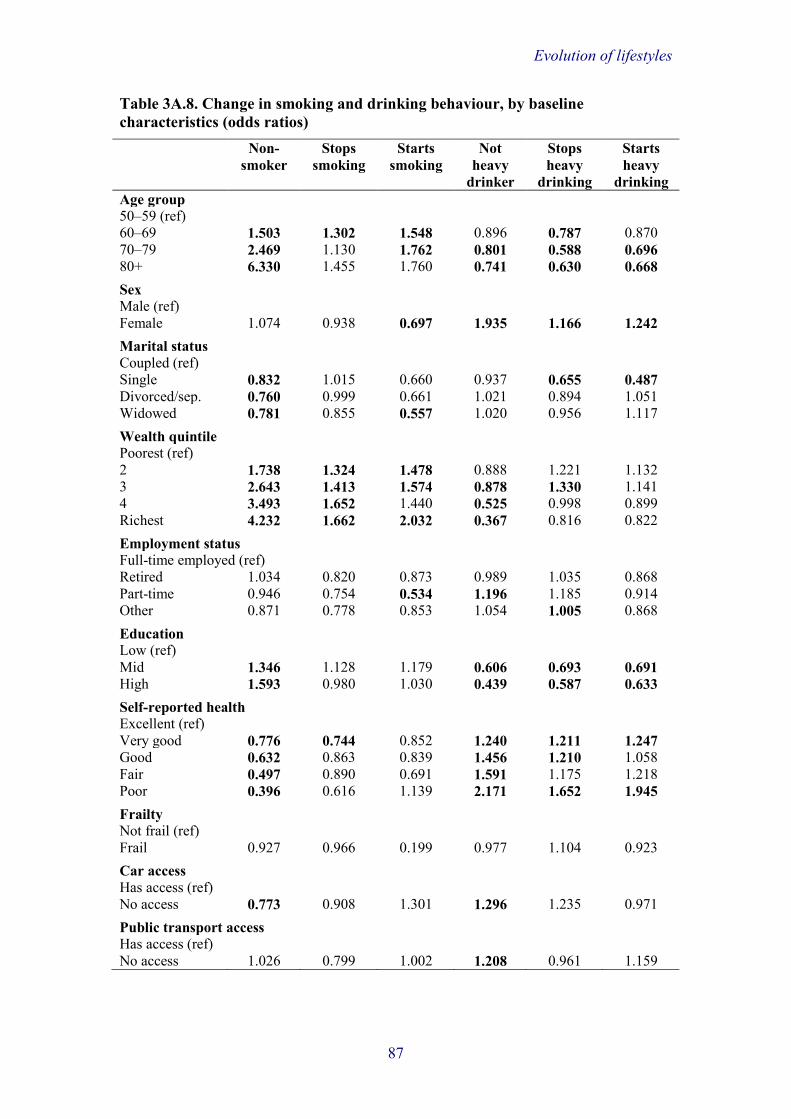
Evolution of lifestyles
Table 3A.8. Change in smoking and drinking behaviour, by baseline characteristics (odds ratios) Non-
smoker Stops
smoking Starts
smoking Not
heavy drinker
Stops heavy
drinking
Starts heavy
drinking Age group 50–59 (ref) 60–69 1.503 1.302 1.548 0.896 0.787 0.870 70–79 2.469 1.130 1.762 0.801 0.588 0.696 80+ 6.330 1.455 1.760 0.741 0.630 0.668
Sex Male (ref) Female 1.074 0.938 0.697 1.935 1.166 1.242
Marital status Coupled (ref) Single 0.832 1.015 0.660 0.937 0.655 0.487 Divorced/sep. 0.760 0.999 0.661 1.021 0.894 1.051 Widowed 0.781 0.855 0.557 1.020 0.956 1.117
Wealth quintile Poorest (ref) 2 1.738 1.324 1.478 0.888 1.221 1.132 3 2.643 1.413 1.574 0.878 1.330 1.141 4 3.493 1.652 1.440 0.525 0.998 0.899 Richest 4.232 1.662 2.032 0.367 0.816 0.822
Employment status Full-time employed (ref) Retired 1.034 0.820 0.873 0.989 1.035 0.868 Part-time 0.946 0.754 0.534 1.196 1.185 0.914 Other 0.871 0.778 0.853 1.054 1.005 0.868
Education Low (ref) Mid 1.346 1.128 1.179 0.606 0.693 0.691 High 1.593 0.980 1.030 0.439 0.587 0.633
Self-reported health Excellent (ref) Very good 0.776 0.744 0.852 1.240 1.211 1.247 Good 0.632 0.863 0.839 1.456 1.210 1.058 Fair 0.497 0.890 0.691 1.591 1.175 1.218 Poor 0.396 0.616 1.139 2.171 1.652 1.945
Frailty Not frail (ref) Frail 0.927 0.966 0.199 0.977 1.104 0.923
Car access Has access (ref) No access 0.773 0.908 1.301 1.296 1.235 0.971
Public transport access Has access (ref) No access 1.026 0.799 1.002 1.208 0.961 1.159
87

Evolution of lifestyles
Table 3A.9. Change in physical activity, by baseline characteristics (odds ratios) Low to
high Low to
medium Medium to high
High to low
High to medium
Medium to low
Stable high
Stable low
Age group 50–59 (ref) 60–69 1.311 1.093 1.000 1.167 1.005 0.904 0.858 1.059 70–79 1.171 1.098 0.686 1.397 0.851 1.022 0.566 1.404 80+ 1.008 1.831 0.463 2.761 0.661 2.090 0.303 3.555
Sex Male (ref) Female 1.127 1.413 0.760 1.290 0.800 1.036 0.734 1.485
Marital status Coupled (ref) Single 0.882 1.127 0.840 1.188 0.810 1.208 1.138 1.409 Divorced/sep. 0.894 0.989 1.338 0.847 1.206 1.069 1.085 0.936 Widowed 0.587 0.942 0.981 1.001 1.017 0.669 0.978 1.012
Wealth quintile Poorest (ref) 2 0.723 0.788 1.054 0.864 1.136 1.074 1.094 0.861 3 0.478 0.714 1.115 0.746 1.109 0.908 1.221 0.593 4 0.543 0.599 1.182 0.714 1.273 0.672 1.417 0.501 Richest 0.427 0.556 1.270 0.575 1.274 0.631 1.724 0.454
Employment status Full-time employed (ref) Retired 1.169 1.072 0.909 1.246 0.896 0.813 0.878 1.585 Part-time 0.796 0.803 0.863 0.956 0.851 0.631 0.730 0.796 Other 1.025 1.282 0.847 1.564 0.889 0.907 0.896 2.065
Education Low (ref) Mid 1.023 0.817 0.973 0.839 0.930 0.691 0.875 0.774 High 1.027 0.721 0.963 0.797 0.863 0.735 1.055 0.695
Self-reported health Excellent (ref) Very good 1.212 1.321 0.835 1.303 0.721 0.898 0.546 1.457 Good 1.160 1.556 0.682 1.553 0.606 0.919 0.364 2.223 Fair 1.509 2.011 0.606 1.937 0.429 1.485 0.274 3.610 Poor 2.357 3.546 0.666 2.972 0.635 2.631 0.209 10.396
Frailty Not frail (ref) Frail 1.020 1.892 0.894 1.133 0.750 1.959 0.713 3.784
Car access Has access (ref) No access 1.211 1.341 0.840 1.171 0.962 1.286 0.922 1.532
Public transport access Has access (ref) No access 1.358 0.974 0.963 0.974 1.060 0.960 1.068 2.128
88

Evolution of lifestyles
Table 3A.10. Change in social and civic engagement, by change in life circumstances across transition points (odds ratios)
Low to high
Low to medium
Medium to high
High to low
High to medium
Medium to low
Stable high
Stable low
Employment status Employed at both waves (ref) Retired at both waves
0.684 0.688 1.366 0.631 1.029 0.646 1.368 0.614
Becomes retired 1.698 1.288 1.390 1.114 1.070 0.998 1.693 0.835 Starts or increases work
0.853 0.927 1.810 0.957 1.625 0.874 1.947 0.713
Decreases hours 2.146 0.997 1.302 1.504 0.540 0.773 1.274 1.070
Marital status Coupled at both waves (ref) Single at both waves 1.868 0.927 0.884 0.434 0.912 0.982 0.564 0.727 Divorced/separated at both waves
3.357 1.749 0.898 1.852 2.066 1.640 0.568 1.858
Widowed at both waves
0.967 1.151 1.086 1.022 1.068 1.204 1.079 0.942
Becomes widowed 0.895 1.673 2.300 2.035 1.267 1.679 0.855 1.546 Becomes divorced/separated
0.000 0.242 0.000 0.000 1.447 0.691 0.000 0.744
Becomes a couple 0.000 1.608 0.544 0.000 0.718 1.907 1.815 1.282
Frailty Not frail at both waves (ref) Frail at both waves 1.806 1.678 1.297 2.521 2.308 1.476 1.805 1.802 Becomes frail 1.165 1.037 0.828 2.603 1.261 1.352 0.844 1.385 Becomes not frail 2.032 1.407 1.504 1.114 1.718 1.111 0.219 1.379
Car access Access at both waves (ref) No access at both waves
1.383 1.259 0.967 2.827 1.393 1.448 1.424 1.990
Loses access 0.400 1.506 1.877 3.409 0.694 1.552 1.922 2.082 Gains access 1.246 1.839 0.722 0.884 0.596 1.655 0.864 2.403
Public transport access Access at both waves (ref) No access at both waves
1.088 1.083 0.749 2.137 1.796 0.980 0.857 1.218
Loses access 0.144 0.856 0.873 0.417 0.808 1.199 0.659 1.171 Gains access 0.000 1.091 0.791 1.229 1.702 1.151 0.494 0.982
89

Evolution of lifestyles
Table 3A.11. Change in cultural engagement, by change in life circumstances across transition points (odds ratios)
Low to high
Low to medium
Medium to high
High to low
High to medium
Medium to low
Stable high
Stable low
Employment status Employed at both waves (ref) Retired at both waves
1.468 0.624 0.987 0.602 1.359 2.976 1.088 1.488
Becomes retired 1.352 0.953 0.935 0.000 1.005 0.509 1.081 1.398 Starts or increases work
1.165 1.186 0.916 0.000 0.431 3.118 1.108 0.000
Decreases hours 1.547 1.792 1.751 0.000 1.886 3.235 1.680 2.337
Marital status Coupled at both waves (ref) Single at both waves 0.767 1.567 0.912 2.427 0.447 1.634 0.861 2.030 Divorced/separated at both waves
0.670 1.448 1.183 5.372 2.029 1.264 1.289 1.392
Widowed at both waves
0.731 1.538 1.120 1.759 0.661 0.808 1.116 1.094
Becomes widowed 1.283 2.722 1.369 0.000 0.483 0.362 0.663 1.548 Becomes divorced/separated
0.235 1.161 0.003 0.121 1.003 1.462 0.022 1.252
Becomes a couple 3.915 1.401 2.605 0.000 0.000 0.000 4.254 0.000
Frailty Not frail at both waves (ref) Frail at both waves 0.909 0.951 0.661 1.957 0.971 2.127 0.619 1.584 Becomes frail 0.770 0.882 0.732 1.679 0.936 1.814 0.726 1.240 Becomes not frail 0.550 1.003 1.276 1.703 0.976 2.067 0.752 1.338
Car access Access at both waves (ref) No access at both waves
1.566 1.207 0.671 2.546 0.997 2.273 0.549 4.394
Loses access 0.864 1.095 0.851 1.156 0.597 1.316 0.559 3.334 Gains access 1.368 1.805 0.834 1.856 1.192 1.755 0.630 2.462
Public transport access Access at both waves (ref) No access at both waves
0.722 1.274 0.467 3.180 1.424 2.237 0.831 2.592
Loses access 0.462 0.777 0.577 0.838 1.044 0.838 0.927 1.201 Gains access 1.809 1.611 0.542 2.117 1.214 1.366 1.143 2.110
90

Evolution of lifestyles
Table 3A.12. Change in consumption, by change in life circumstances across transition points (odds ratios) Low to
high Low to
medium Medium to high
High to low
High to medium
Medium to low
Stable low
Employment status Employed at both waves (ref) Retired at both waves
0.661 0.805 1.265 1.498 1.068 1.630 1.607
Becomes retired 1.896 1.158 1.686 1.656 1.698 2.497 1.919 Starts or increases work
1.305 1.203 1.215 0.759 0.905 0.869 1.196
Decreases hours 1.361 0.881 1.693 0.791 1.277 1.264 0.744
Marital status Coupled at both waves (ref) Single at both waves
0.922 1.632 1.759 2.030 1.364 2.573 4.242
Divorced/separated at both waves
0.551 1.317 0.936 0.688 0.350 0.482 0.786
Widowed at both waves
1.101 1.250 1.787 2.120 1.477 1.823 3.227
Becomes widowed 0.000 0.000 1.103 1.122 1.366 0.845 1.692 Becomes divorced/separated
1.195 0.148 0.535 0.301 0.160 0.690 0.275
Becomes a couple 0.174 0.223 0.179 0.106 0.876 0.170 0.814
Frailty Not frail at both waves (ref) Frail at both waves 2.290 0.707 0.508 1.610 0.622 1.896 2.392 Becomes frail 1.171 0.600 0.432 1.264 0.347 1.242 1.695 Becomes not frail 5.609 4.357 4.901 6.609 3.982 5.897 6.776
Car access Access at both waves (ref) No access at both waves
1.481 1.317 0.347 1.570 0.000 1.479 3.913
Loses access 1.536 1.292 0.000 2.187 1.252 0.858 1.551 Gains access 0.425 0.627 0.000 0.340 0.598 0.613 0.936
Public transport access Access at both waves (ref) No access at both waves
1.712 1.340 1.119 1.456 0.358 2.992 2.156
Loses access 1.268 1.272 0.672 2.032 0.358 1.216 1.771 Gains access 1.623 0.843 1.013 1.878 0.561 1.787 1.597 Note: The reference category for consumption behaviour is a merged group of cases displaying stable high and stable medium consumption (the number of cases was too low to include a separate stable high category as with the other lifestyle behaviours).
91

Evolution of lifestyles
Table 3A.13. Change in smoking and drinking behaviour, by change in life circumstances across transition points (odds ratios) Smokes at
both waves Stops
smoking Drinks
heavily at both waves
Stops drinking heavily
Employment status Employed at both waves (ref) Retired at both waves 0.860 0.735 1.099 1.161 Becomes retired 0.798 1.153 1.067 1.221 Starts or increases work 1.001 1.740 0.987 1.130 Decreases hours 1.229 1.338 1.156 0.967
Marital status Coupled at both waves (ref) Single at both waves 1.377 1.448 1.173 0.744 Divorced/separated at both waves
1.220 1.400 0.634 0.658
Widowed at both waves 1.324 1.138 1.031 0.981 Becomes widowed 1.870 1.529 0.697 1.436 Becomes divorced/separated
1.175 1.314 0.622 0.000
Becomes a couple 1.104 1.263 2.253 1.959
Frailty Not frail at both waves (ref) Frail at both waves 0.991 1.108 0.994 1.086 Becomes frail 1.153 1.604 1.079 0.945 Becomes not frail 1.047 0.439 1.059 1.018
Car access Access at both waves (ref) No access at both waves 1.561 1.329 0.855 1.017 Loses access 1.696 1.538 0.903 0.922 Gains access 1.547 1.411 0.819 1.088
Public transport access Access at both waves (ref) No access at both waves 1.068 0.786 0.864 0.664 Loses access 1.125 1.044 1.027 0.923 Gains access 1.067 0.781 0.800 1.208
92

Evolution of lifestyles
Table 3A.14. Change in physical activity, by change in life circumstances across transition points (odds ratios)
Low to high
Low to medium
Medium to high
High to low
High to medium
Medium to low
Stable high
Stable low
Employment status Employed at both waves (ref) Retired at both waves
1.290 1.113 0.955 1.321 0.946 1.455 0.945 1.636
Becomes retired 1.020 1.126 1.099 2.222 1.082 1.344 0.919 0.894 Starts or increases work
1.108 1.014 0.866 0.202 1.032 1.232 0.988 1.297
Decreases hours 1.075 0.835 1.199 0.481 1.041 0.913 0.886 0.790
Marital status Coupled at both waves (ref) Single at both waves
0.540 1.001 0.795 0.778 0.710 1.077 1.119 1.264
Divorced/separated at both waves
0.689 1.141 1.303 0.777 1.043 0.806 1.054 0.916
Widowed at both waves
0.541 1.005 1.006 0.647 1.030 0.973 0.998 0.995
Becomes widowed 1.533 2.199 1.221 0.734 1.217 1.067 0.952 1.237 Becomes divorced/separated
2.081 0.714 1.156 0.000 0.717 1.992 1.243 0.464
Becomes a couple 1.623 1.599 1.483 1.355 0.571 0.959 0.958 0.746
Frailty Not frail at both waves (ref) Frail at both waves 0.573 1.842 0.704 1.882 0.703 2.509 0.731 5.519 Becomes frail 0.686 1.307 0.495 2.841 0.970 2.426 0.642 2.620 Becomes not frail 2.352 1.784 0.855 0.885 0.773 1.384 0.807 1.944
Car access Access at both waves (ref) No access at both waves
1.022 1.311 0.844 1.063 0.940 1.283 0.839 1.584
Loses access 1.181 0.980 1.033 1.681 0.911 1.307 1.004 1.662 Gains access 1.702 1.592 0.936 1.208 0.930 1.105 1.207 1.907
Public transport access Access at both waves (ref) No access at both waves
1.325 0.972 1.173 0.725 0.947 0.977 1.119 1.584
Loses access 0.944 0.751 1.142 1.172 0.977 1.190 0.871 1.662 Gains access 1.427 0.759 1.039 1.082 1.401 0.911 0.891 1.907
93

4. Trends in obesity among older people in England Paola Zaninotto University College London Sarah Jackson University College London Marta Jackowska University College London Sally Bridges NatCen Social Research Andrew Steptoe University College London
The findings in this chapter explore changes in obesity, as measured by body mass index (BMI) and waist circumference, over an eight-year period, between wave 2 (2004–05) and waves 4 (2008–09) and 6 (2012–13) in ELSA respondents aged 52 and over.
Key points arising from this chapter are:
• At wave 2 (2004–05), the average BMI was 29 kg/m2 for men and for women and this increased on average over the next eight years by a similar margin in men and women (0.5 kg/m2). The degree of change in BMI over time was not related to wealth.
• The average waist circumference at wave 2 was 102.1 cm for men and 92.5 cm for women and it increased over eight years by 1.6 cm among men and 1.4 cm among women. The increase in waist circumference over time was related to low wealth for men but not for women.
• The prevalence of men and women who were obese according to either BMI or waist circumference increased significantly over time; women were more likely than men to be obese (as defined by BMI) and centrally obese (measured by waist circumference) at each time point.
• Retirement did not have a significant impact on change in BMI or waist circumference overall, with similar increases over time observed in individuals who retired and those who did not retire. However, retirement was associated with greater increases in BMI and waist circumference over time in people who retired from standing and physically active occupations, and retirement at wave 6 was also associated with greater increases in waist circumference for those who were less wealthy.
• The prevalence of obesity in men and women recorded over three waves (2004–05, 2008–09 and 2012–13) was highest among those aged 52–59.
• In both sexes, the prevalence of never being obese was highest among those in the richest wealth quintile, and wealthy women were more likely than wealthy men never to be obese over the eight-year study period.
• People with intermediate levels of measured walking speed (0.87–1.02 m/s) and those with slow walking speed (below 0.87 m/s) were more

Trends in obesity
likely to have sustained obesity (as measured by both BMI and waist circumference) across waves than people with fast walking speed (above 1.02 m/s).
• Steep declines in walking speed (–0.102 to –0.32 m/s) and in hand grip strength (–16.2 to –4.6 kg) over waves were associated with increased odds of sustained obesity as measured by BMI.
• Older people with poor blood glucose control (glycated haemoglobin, HbA1c ≥58 mmol/mol) were more likely to be persistently obese and to have a raised waist circumference than were people without diabetes or those with low HbA1c.
• Increased levels of HbA1c were also associated with an increased risk of sustained obesity and central obesity across waves, independently of lifestyle factors, diabetes and other adjustment variables.
• In the subset of ELSA respondents who had physical activity measured objectively with accelerometers, both obese and non-obese respondents spent an average of between 40 and 50 minutes of each waking hour being sedentary, but those who were obese spent more time sedentary and less time carrying out light or moderate/vigorous activity than their non-obese counterparts.
• When physical activity was defined by self-report, we found that nearly 43% of respondents who reported sedentary activity were obese and 65% were centrally obese.
• When physical activity was assessed objectively, we found that 50% of sedentary respondents were classified as obese and 52% as centrally obese.
• In regression analyses adjusted for confounding variables, none of the self-reported physical activity levels was associated with obesity (as measured by BMI), while those carrying out only light or sedentary physical activity as measured objectively were significantly more likely to be obese than those engaging in moderate/vigorous objective physical activity.
• Sedentary behaviours assessed either by self-report or by objective measures were associated with increased odds of central obesity, with effects being stronger for objective measures.
4.1 Introduction Over the past 30 years, there has been a marked increase in the number of overweight and obese older adults, due to increases both in the total number of older people (Office for National Statistics, 2012) and in the proportion who are overweight (Health Survey for England, 2010).
Repeat cross-sectional data from the Health Survey for England and the National Health and Nutrition Examination Survey (NHANES) in the US reveal that while rates of obesity are rising across all age groups, there is a trend for greater increases in prevalence among older (55 and over) than among younger adults, reaching 32% (vs. 23%) in England (Health Survey for England, 2010) and 40% (vs. 35%) in the US in 2010 (Flegal et al., 2012).
95

Trends in obesity
In a study published in The Lancet, Wang and colleagues (2011) used data from the Health Survey for England (since 1993) and NHANES (since 1988) in a simulation model to predict future increases in obesity prevalence in the UK and the US. Based on recent trends, and taking into account the ageing populations in both countries, they projected that there would be an additional 11 million obese adults in the UK by the year 2030, of whom 3.3 million would be aged ≥60 years, and an extra 65 million in the US, of whom 24 million would be aged ≥60 (Wang et al., 2011, figure 1.6).
Wang et al. (2011) also modelled the likely economic consequences of a sustained rise in obesity prevalence over the next 20 years in the US and the UK. Their projections showed that if past trends continue, healthcare costs are likely to rise by $48–$66 billion each year in the US and by £1.9–£2 billion each year in the UK. Over the next two decades, this equates to a 13–16% increase in the annual costs of obesity-related diseases in the US, of which 4% will be attributable to population ageing alone, and a 24–25% increase in the UK, of which 10% will be attributable to ageing alone. A rise of this nature in the UK poses a significant threat to the future affordability of the NHS (Wanless, 2004).
For the older population, carrying excess weight comes with additional health risks. The prevalence of many of the medical complications related to obesity increases with advancing age. Approximately 80% of older adults have at least one chronic health condition, and 50% have two or more (Centers for Disease Control and Prevention, 2003). Obesity also has significant functional implications for older people, because it can worsen the age-related decline in physical function. Among older men and women, excess body fat mass and high BMI are positively associated with physical dysfunction and disability (Davison et al., 2002) and strongly predict decline in functional status and future disability (Jensen and Friedmann, 2002).
The next section of this chapter gives details of our sample and the measures and definitions that we use. In Section 4.3, we describe changes over eight years in BMI and waist circumference using three waves of anthropometric measures (wave 2, wave 4 and wave 6). Section 4.4 investigates the impact of an important experience for many people in their later years – namely, retirement – on changes in BMI and waist circumference. We then explore, in Section 4.5, the relationship between duration of obesity and changes in physical function (lower limb mobility and muscle strength) and health (glycated haemoglobin, HbA1c). Lastly, using a subsample of ELSA respondents who participated in a study of objective physical activity, Section 4.6 explores the relationships between obesity and self-reported and objective physical activity.
4.2 Methods 4.2.1 Sample In Sections 4.3, 4.4 and 4.5, the sample comprised 4,894 members, aged 52 and over, of the original ELSA cohort (core members) who had participated in the study and had a nurse visit in wave 2 (2004–05), wave 4 (2008–09) and wave 6 (2012–13).
96

Trends in obesity
The cross-sectional analyses described in Section 4.6 used exclusively data from a subsample of 244 ELSA respondents who participated in a study of objective physical activity and had a nurse visit in wave 6.
4.2.2 Obesity measures Height, weight and waist circumference were measured during the nurse visits carried out in waves 2, 4 and 6.
Height Height was measured using a portable stadiometer. Respondents were asked to remove their shoes. One measurement was taken with the respondent stretching to the maximum height and the head in the Frankfort plane.1 The reading was recorded to the nearest millimetre.
Weight Weight was measured using a portable electronic scale. Respondents were asked to remove their shoes and any bulky clothing. A single measurement was recorded to the nearest 0.1 of a kilogram. Respondents who weighed more than 130 kg were asked for their estimated weights because the scales are inaccurate above this level (approximately 0.2% of people at each nurse visit). These estimated weights were included in the analysis.
Waist circumference The waist was defined as the midpoint between the lower rib and the upper margin of the iliac crest. Waist circumference was measured using a tape with an insertion buckle at one end. The measurement was taken twice, using the same tape, and was recorded to the nearest even millimetre. Those whose waist circumference measurements differed by more than 3 cm had a third measurement taken. The mean of the two valid measurements (the two out of the three measurements that were closest to each other, if there were three measurements) were used in the analysis.
4.2.3 Definitions Obesity Body mass index (BMI) is a widely-accepted measure of weight for height and is defined as weight in kilograms divided by the square of the height in metres (kg/m2). BMI was calculated for all those respondents for whom both a valid height measurement and a valid weight measurement were recorded.
Applying the classification of the World Health Organisation (2000) and the National Institute of Health and Clinical Excellence (2006), we defined people as being obese if they had a BMI ≥30 kg/m2.
1 The Frankfort plane is an imaginary line passing through the external ear canal and across the top of the lower bone of the eye socket, immediately under the eye. This line must be parallel with the floor. This gives the maximum vertical distance from the floor to the highest point of the skull.
97

Trends in obesity
Central obesity BMI does not distinguish between mass due to body fat and mass due to muscular physique and does not take account of the distribution of fat. It has therefore been postulated that waist circumference may be a better measure than BMI or waist-to-hip ratio (World Health Organisation, 2000) for identifying those with a health risk from their body shape. As people age, the fat distribution changes considerably and abdominal fat tends to increase. Therefore waist circumference can be considered an appropriate indicator of body fatness and central fat distribution among the elderly. Using sex-specific cut-offs (Flegal, 2007), we defined central obesity as waist circumference ≥102 cm for men and ≥88 cm for women.
4.2.4 Classificatory variables, social covariates and outcome measures Three main classificatory variables were employed to analyse the obesity measures: age, sex and wealth. Age was coded into four groups: 52 to 59 years, 60 to 69 years, 70 to 79 years, and 80 years or older. (There was no refreshment sample in 2004–05, so the youngest participants, who were 50 in wave 1, had already been involved in the study for two years and were aged 52 in wave 2.)
Total wealth (excluding regular pension payments, but including lump sums from private pensions that had already been received but not yet consumed) was defined as financial wealth, physical wealth (such as business wealth, land or jewels) and housing wealth (primary and secondary residential housing wealth), minus debts. Wealth was categorised into five equal groups of net total non-pension wealth measured at benefit unit level (a benefit unit is a couple or single person along with any dependent children they might have). The longitudinal analyses employed wealth data from 2004–05 (wave 2) while the cross-sectional cross-wave analyses used wealth data from 2012–13 (wave 6).
4.2.5 Analysis Change over time in BMI and waist circumference To estimate change over time in BMI and waist circumference, we used latent growth curve (LGC) methodology (Meredith and Tisak, 1990; Duncan and Duncan, 1995). Latent factors representing intercept (baseline status) and slope (rate of change) components are extracted from the three observations of the variable of interest across time, here identified as wave 2 (baseline), wave 4 and wave 6. The model fit suggested that the baseline estimates and the rate of change were perfectly close to the observed data. The advantage of using LGC methodology is that missing data can be handled using Full Information Maximum Likelihood estimation, which computes parameter estimates on the basis of all available data under the assumption that data are missing at random (Enders and Bandalos, 2001). For the purpose of this chapter, we selected respondents who had at least two out of three valid BMI or waist measurements and consequently the third measurement was estimated using Full Information Maximum Likelihood estimation. The estimations resulted in longitudinal samples of 2,956 individuals for BMI and of 4,494 individuals for waist circumference.
98

Trends in obesity
Age standardisation Age standardisation has been used in all tables in Sections 4.3, 4.4 and 4.5 in which age is not included as a break variable. Age standardisation removes the effect of differences in age distributions from comparisons between groups. Direct standardisation was applied for both sexes, with the standards being the age distribution of the whole ELSA sample at wave 2.
4.3 Changes in anthropometric measures by age group, sex and wealth 4.3.1 Changes in BMI by age group and sex Figure 4.1 shows that the average BMI at wave 2 was 29.0 for men and 29.2 for women, indicating that, on average, both men and women were overweight at wave 2. There was no significant relationship between age group and average BMI for men or women at wave 2 (p=0.073 and p=0.153, respectively). Looking at change over eight years (Figure 4.2), average BMI increased by a similar margin in men and women (0.48 and 0.49, respectively). The change in average BMI over time differed across age groups for both men and women (p<0.001 and p<0.0005, respectively). For men, those aged 52–59 at wave 2 had the greatest increase in BMI (0.67), followed by those aged 60–69 (0.48). Among older age groups, there was no significant change over time in average BMI. The same pattern was observed among women, with those aged 52–59 having the greatest average increase in BMI, followed by those aged 60–69 (0.73 and 0.50, respectively). In the oldest age group, there were signs that, on average, women’s BMI was reducing, though this reduction was not statistically significant and the sample size was much smaller here than in other age groups.
Figure 4.1. Mean BMI at wave 2, by age group and sex
0
10
20
30
52-59 60-69 70-79 80+ All
Mea
n BM
I
Age group at wave 2
Men Women
99

Trends in obesity
Figure 4.2. Change in mean BMI over eight years (2004–05 to 2012–13), by age group and sex
4.3.2 Changes in BMI by wealth and sex At wave 2, average BMI varied with wealth for both men and women (p<0.0005 for both men and women). Those in the lowest wealth quintile had the highest BMI, on average, and BMI decreased with each increasing wealth quintile. Among men, average BMI ranged from 30.1 in the lowest wealth quintile to 28.1 in the highest wealth quintile (Table 4A.1 in the appendix to this chapter). The pattern was the same for women but with a steeper gradient, from 31.3 in the lowest wealth quintile to 26.7 in the highest.
The degree of change in BMI over time was not related to wealth for either men or women (p=0.697 and p=0.186, respectively). An increase of between 0.4 and 0.5 in average BMI was seen across all wealth quintiles for men (Table 4A.1). Among women, there were increases of between 0.3 and 0.5 across all wealth quintiles except for the fourth, where the change of 0.2 over time was not significant.
4.3.3 Changes in waist circumference by age group and sex At wave 2, the average waist circumference was 102.1 cm for men and 92.5 cm for women (Figure 4.3). There was no significant relationship between age group and average waist circumference at wave 2 for men or women (p=0.266 and p=0.054, respectively). Over eight years (Figure 4.4), average waist circumference increased by 1.6 cm among men and 1.4 cm among women. Average waist circumference in men and women increased among all age groups over time (p<0.05 for both men and women). The size of the increase differed by age group, with the youngest age group having the greatest average increase and the oldest age group having the smallest. Among men, the increase in average waist circumference ranged from 1.7 cm among 52- to 59-year-olds down to 0.9 cm among those aged 80 or over. The same pattern existed for women, with the greatest increase in average waist circumference, of 1.5 cm, seen in those aged 52–59 and the smallest, of 0.9 cm, in those aged 80 and over (Figure 4.4)
-0.2
-0.1
0.0
0.1
0.2
0.3
0.4
0.5
0.6
0.7
0.8
52-59 60-69 70-79 80+ All
Chan
ge in
BM
I ove
r 8 y
ears
Age group at wave 2
Men Women
100

Trends in obesity
Figure 4.3. Mean waist circumference at wave 2, by age group and sex
Figure 4.4. Change in mean waist circumference over eight years (2004–05 to 2012–13), by age group and sex
4.3.4 Changes in waist circumference by wealth and sex Table 4A.2 in the appendix shows that at wave 2, average waist circumference differed depending on wealth for both men and women (p<0.001 for both men and women). Those in the lowest wealth quintile had the largest waist circumference, on average, and waist circumference decreased with each increasing wealth quintile. Among men, the average waist circumference ranged from 105.3 cm in the lowest wealth quintile to 100.0 cm in the highest wealth quintile. The pattern was the same for women but with a steeper gradient, from 96.4 cm in the lowest wealth quintile to 89.3 cm in the highest.
The increase in waist circumference over time was related to wealth for men but not for women (p<0.01 and p=0.745, respectively). Among men, the level of increase in waist circumference over time was greatest in the lowest income quintile and reduced with each increasing wealth quintile apart from the
0
10
20
30
40
50
60
70
80
90
100
110
52-59 60-69 70-79 80+ All
Mea
n w
aist
circ
umfe
renc
e (c
m)
Age group at wave 2
Men Women
0.0
0.2
0.4
0.6
0.8
1.0
1.2
1.4
1.6
1.8
52-59 60-69 70-79 80+ All
Chan
ge in
wai
st c
ircum
fere
nce
over
8 y
ears
(c
m)
Age group at wave 2
Men Women
101

Trends in obesity
highest. Men in the lowest income quintile had an increase in average waist circumference of 1.9 cm, compared with an increase of 1.5 cm in the highest wealth quintile (Table 4A.2). There was no such pattern among women, where a similar increase of between 1.2 and 1.4 cm in average waist circumference was seen across all wealth quintiles.
4.4 Changes in obesity and retirement In this section, we explore the impact of retirement on changes in BMI and waist circumference across waves 2, 4 and 6, and we test interactions with occupation and wealth. We also investigate whether the association differs by sex and level of physical activity in the workplace. Previous studies have shown that retirement is associated with changes in anthropometry (Chung et al., 2009; Nooyens et al., 2005); however, the relationship varies according to the type of occupation and wealth of individuals.
4.4.1 Methods Retirement was defined on the basis of self-reported employment status. Those who reported being in paid employment at wave 2 and reported being completely retired at wave 4 were defined as having retired at wave 4. Likewise, those who reported being in paid employment at wave 4 and being completely retired at wave 6 were defined as having retired at wave 6. We compared these two categories with the rest of the sample, i.e. those who were still in paid employment, those who were always retired and those permanently unable to work or looking after home. We did not analyse those who defined themselves as being permanently unable to work or looking after home at one wave and then retired at another wave, since their life style is less likely to have changed. We also compared people who had retired from sedentary jobs, jobs involving standing, and physically active manual occupations.
4.4.2 Mean BMI and waist circumference by wave, sex and retirement status Figure 4.5 shows mean BMI values at wave 2, wave 4 and wave 6, by retirement status and sex. In each group, mean BMI increased consistently over time. Among men, there was little difference in the change in BMI over time by retirement group. However, among women, there was a slightly greater increase in BMI between waves in the groups who retired at wave 4 and wave 6 than in the group who did not retire at either of these waves. In the groups who retired, the increase in mean BMI over time was larger for women than men, but it was roughly the same for the two sexes in the group who did not retire.
Figure 4.6 shows mean waist circumference measurements at wave 2, wave 4 and wave 6, by retirement status and sex. Consistent with the data for BMI, weight circumference increased over time in all groups. However, there did not appear to be a differential change by retirement status in women as there was for BMI, with changes appearing consistent across all retirement groups in both sexes.
102

Trends in obesity
Figure 4.5. Mean BMI at each wave, by retirement status and sex
Note: ‘Retired W4’ indicates those who retired at wave 4. ‘Retired W6’ indicates those who retired at wave 6. ‘Other’ indicates those who did not retire from paid employment at wave 4 or wave 6. Age-standardised means.
Figure 4.6. Mean waist circumference at each wave, by retirement status and sex
Note: ‘Retired W4’ indicates those who retired at wave 4. ‘Retired W6’ indicates those who retired at wave 6. ‘Other’ indicates those who did not retire from paid employment at wave 4 or wave 6. Age-standardised means.
Mean changes in BMI and waist circumference between waves 2 and 6 are shown by retirement status in Table 4A.3. BMI increased by 0.34 kg/m2 on average in the group who retired at wave 4, by 0.28 kg/m2 in the group who retired at wave 6 and by 0.25 kg/m2 in the group who did not retire at either of these waves. Respective increases in waist circumference by group were 0.83 cm, 0.81 cm and 0.73 cm. Regression models showed no significant effect of retirement at wave 4 or wave 6 on change in BMI or waist
27.5
28.0
28.5
29.0
29.5
30.0
30.5
Retired W4 Retired W6 Other Retired W4 Retired W6 Other
Mea
n BM
I
Men Women
W2 W4 W6
85
90
95
100
105
Retired W4 Retired W6 Other Retired W4 Retired W6 Other
Mea
n w
aist
circ
umfe
renc
e (c
m)
Men Women
W2 W4 W6
103

Trends in obesity
circumference between waves 2 and 6 (Table 4A.4), indicating that retirement did not have a significant impact on BMI or waist circumference.
The effect of retirement on anthropometry did not differ by sex; neither men nor women who retired experienced a differential change in either BMI or waist circumference compared with those who did not retire (results not shown).
4.4.3 Changes in BMI and waist circumference by retirement status and wealth Table 4A.5 presents mean changes in BMI and waist circumference over time by retirement status and wealth. There was no significant interaction between retirement at wave 4 and wealth for changes in BMI or waist circumference, nor was there a significant interaction between retirement at wave 6 and wealth for changes in BMI (Table 4A.6). However, the interaction between retirement at wave 6 and wealth was significant for waist circumference (Table 4A.6), with a greater increase in waist circumference in the retirement group than in the group who did not retire among those in the lower four quintiles of wealth (1st (poorest) quintile: 0.99 vs. 0.75 cm; 2nd quintile: 0.86 vs. 0.79 cm; 3rd quintile: 0.95 vs. 0.75 cm; 4th quintile: 0.88 vs. 0.69 cm) but a smaller increase in the retirement group among those in the richest quintile (0.52 vs. 0.69 cm).
4.4.4 Changes in BMI and waist circumference by retirement status and level of physical activity in the workplace Table 4A.7 reports mean changes in BMI and waist circumference over time by retirement status and level of physical activity in the workplace prior to retirement. The interaction between retirement at wave 4 and physical activity in the workplace was significant for BMI and waist circumference (Table 4A.8). Those who retired from sedentary jobs had a smaller increase in BMI than those who did not retire (0.10 vs. 0.33 kg/m2), whereas those who retired from standing or physical jobs had a larger increase than those who did not retire (standing: 0.44 vs. 0.26 kg/m2; physical: 0.51 vs. 0.37 kg/m2). Changes in waist circumference followed the same pattern across groups (Table 4A.7). There was no significant interaction between retirement at wave 6 and physical activity in the workplace for either BMI or waist circumference (Table 4A.8).
4.4.5 Conclusions In this section, we have found that retirement did not have an overall significant impact on change in BMI or waist circumference, with similar increases over time observed in individuals who retired and those who did not retire. Results did not differ according to sex, although there were significant interactions with wealth and level of physical activity in the workplace. Retirement was associated with greater increases in BMI and waist circumference over time in people who retired from occupations involving standing and physical work than those who retired from sedentary jobs. Retirement at wave 6 was also associated with greater increases in waist circumference for those who were less wealthy. These findings are consistent with previous studies that compared changes in body weight, BMI and waist
104

Trends in obesity
circumference by type of occupation and wealth (Chung et al., 2009; Nooyens et al., 2005) and indicate that retiring from more active jobs is associated with weight gain. Having a physically demanding job did not protect people from weight gain after retirement; indeed, we observed the opposite pattern.
4.5 Duration of obesity and health This section addresses the question of whether duration of obesity (general and central obesity) over eight years is associated with changes in physical function (lower limb mobility and muscle strength) and health (glycated haemoglobin-HbA1c). Descriptive analyses are presented first, followed by logistic regression models for the association between duration of obesity and changes in physical function and health.
4.5.1 Methods Duration of obesity and central obesity Duration of obesity and central obesity was defined as the number of occasions across the three waves of anthropometric measurement (never, for one wave, for two waves, for three waves) on which respondents were obese (BMI ≥30) or centrally obese (waist circumference ≥102 cm for men and ≥88 cm for women). For simplicity, in the regression analysis the duration of obesity and central obesity variables were recoded as 0 for ‘never or for one wave’ and 1 for ‘for two or three waves’.
Physical function and health variables We used gait speed (in metres per second, m/s) and hand grip strength as objective measures of physical function. Gait speed is known to be a strong predictor of incident disability (Guralnik et al., 2000) and mortality (Cooper et al., 2010). A lower gait speed is a sign of impaired physical functioning. The gait speed test was administered only to respondents aged 60 and over. It involved them walking twice a distance of 8 feet at their usual pace from a standing start. Gait speed was calculated by dividing distance by the mean time of the two walks (or a single time measurement in the case of there being no second valid time measurement) and was computed only for participants who performed the test without the use of walking aids or other help. The grip strength test is a measure of upper body strength; it is known to be a predictor of disability (Rantanen et al., 1999) and mortality (Cooper et al., 2010). The test was given to all respondents who were willing to take it, with no upper or lower age limits, but with certain exclusions on safety grounds (respondents were excluded if they had swelling or inflammation, severe pain or a recent injury, or if they had had surgery to the hand in the preceding six months). If there was a problem with only one hand, measurements were taken using the other hand. After adjusting the gripometer (grip gauge) to suit the respondent’s hand and positioning the respondent correctly, the respondent was asked to squeeze the gripometer as hard as they could for a couple of seconds. Three values were recorded for each hand, starting with the non-dominant hand and alternating between hands. Any measurements carried out incorrectly were not included. The gripometer used was the ‘Smedley’s for Hand’ Dynamo Meter, scale 0–100 kg.
105

Trends in obesity
Glycated haemoglobin (HbA1c) was used as an objective measure of health. HbA1c reflects time-averaged blood glucose during the previous 8–12 weeks, and it is often used as a diagnostic test for diabetes. Blood samples were taken from willing ELSA core members, except those who had a clotting or bleeding disorder (e.g. haemophilia or low platelets), had ever had a fit, were not willing to give their consent in writing or were currently on anticoagulant drugs (e.g. warfarin therapy). Blood samples were analysed at the Royal Victoria Infirmary laboratory in Newcastle.
In wave 6, HbA1c was quantified using IFCC units (mmol/mol). In wave 2 and wave 4, we measured HbA1c using the previously recommended DCCT % units. The latter can be converted to IFCC mmol/mol using the following formula:
mmol/mol = (% – 2.15) × 10.929.
Change over time in physical function and health Change over time in physical function and health was estimated using the latent growth curve methodology described in Section 4.2.5. Wave 2 average gait speed and hand grip strength values were grouped into tertiles, while for HbA1c the following cut-offs were used:
• <48 mmol/mol (6.5%): no diabetes or good control; • 48–58 mmol/mol (6.5%–7.5%): target range for those with diabetes;
indicates diabetes; • ≥58 mmol/mol (7.5%): poor blood glucose control. Changes over time in gait speed, hand grip strength and HbA1c were grouped into tertiles.
Covariates A set of covariates from wave 2 were selected as adjustment for the regression models. These included age, sex, cohabitation status (defined as cohabiting or not with a partner), coronary heath disease (CHD), diabetes, limiting long-standing illness, physical activity (light/moderate/high vs. low/sedentary), frequency of alcohol consumption (less than daily vs. daily), smoking status (never smoked/ex-smoker vs. current smoker).
4.5.2 Duration of obesity and central obesity by age, sex and wealth Figure 4.7 shows the prevalence of men and women recorded as being obese or centrally obese at each wave. At wave 2, 25.9% of men were obese; the prevalence increased to 27.7% at wave 4 and to 28.2% at wave 6. Among women, the prevalence increased from 30.7% at wave 2 to 33.5% at wave 4 and to 33.9% at wave 6. The gender difference in the prevalence of obesity was statistically significant at each time point (p<0.001).
The prevalence of men who were obese according to waist circumference increased over time from 45.9% in wave 2 to 50.3% at wave 4, and then it slightly decreased at wave 6 to 48.9% (non-significant); similarly, the prevalence of women who were obese according to waist circumference
106

Trends in obesity
Figure 4.7. Prevalence of obesity and central obesity, by wave and sex
Note: Obesity defined as BMI ≥30. Central obesity defined as waist circumference ≥102 cm for men and ≥88 cm for women. Age-standardised figures.
increased from 55.8% in wave 2 to 62.0% in wave 4, and then it decreased to 60.9% (non-significant). Women were more likely than men to have raised waist circumference at each time point (p<0.001).
Table 4A.9 reports the duration of obesity (measured by BMI ≥30) by age and sex. The prevalence of men and women who were obese for three waves was highest among those aged 52–69 and gradually decreased in the oldest age groups. The prevalence of men who were obese for two waves was highest (14.7%) amongst the youngest age group, while for women it was highest for those aged 70–79 (19.8%). Around 62.8% of men aged 80+ and 57.1% of women aged 80+ were never obese.
The prevalence of central obesity did not show a clear pattern with age (Table 4A.10). Overall, men were more likely than women to have a high waist circumference on all three waves (29.5% of men and 17.1% of women, p<0.001), and this was also true in each age group. But in each age group, women were more likely than men to have a high waist circumference for two waves (p<0.001).
In both sexes, the prevalence of never being obese was greatest among those in the richest wealth quintile (Table 4A.11), and wealthy women were more likely than wealthy men never to be obese. In the poorest wealth quintile, 27.3% of women were obese on three waves, and this proportion fell linearly as wealth increased; but for men there was no clear wealth gradient in the prevalence of being obese on all three waves of measurement.
Overall, the prevalence of men and women who were never obese according to waist circumference was greatest in the richest wealth group (Table 4A.12). In both sexes, there was no clear relationship between wealth and the duration of central obesity.
0
10
20
30
40
50
60
70
Obesity Central obesity Obesity Central obesity
%
Men Women
W2 W4 W6
107
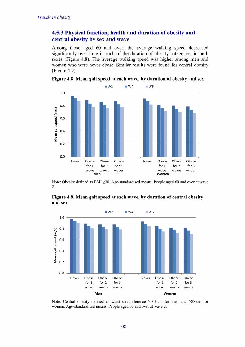
Trends in obesity
4.5.3 Physical function, health and duration of obesity and central obesity by sex and wave Among those aged 60 and over, the average walking speed decreased significantly over time in each of the duration-of-obesity categories, in both sexes (Figure 4.8). The average walking speed was higher among men and women who were never obese. Similar results were found for central obesity (Figure 4.9).
Figure 4.8. Mean gait speed at each wave, by duration of obesity and sex
Note: Obesity defined as BMI ≥30. Age-standardised means. People aged 60 and over at wave 2.
Figure 4.9. Mean gait speed at each wave, by duration of central obesity and sex
Note: Central obesity defined as waist circumference ≥102 cm for men and ≥88 cm for women. Age-standardised means. People aged 60 and over at wave 2.
0.0
0.2
0.4
0.6
0.8
1.0
Never Obese for 1 wave
Obese for 2
waves
Obese for 3
waves
Never Obese for 1 wave
Obese for 2
waves
Obese for 3
waves
Mea
n ga
it sp
eed
(m/s
)
Men Women
W2 W4 W6
0.0
0.2
0.4
0.6
0.8
1.0
Never Obese for 1 wave
Obese for 2
waves
Obese for 3
waves
Never Obese for 1 wave
Obese for 2
waves
Obese for 3
waves
Mea
n ga
it sp
eed
(m/s
)
Men Women
W2 W4 W6
108

Trends in obesity
Figure 4.10 shows the average hand grip strength at each wave by duration of obesity for men and women separately. Men who were obese on all three waves had greater hand grip strength at each wave than those who were obese on one wave or never. This result was not true among women, who at all time points and in all duration-of-obesity categories had lower hand grip strength than men.
The average hand grip strength decreased significantly over time in all duration-of-central-obesity categories (Figure 4.11). For men, grip strength was highest among those who were obese on three waves. For women, the average hand grip strength did not vary according to the duration of central obesity.
Figure 4.10. Mean hand grip strength at each wave, by duration of obesity and sex
Note: Obesity defined as BMI ≥30. Age-standardised means.
Figure 4.11. Mean hand grip strength at each wave, by duration of central obesity and sex
Note: Central obesity defined as waist circumference ≥102 cm for men and ≥88 cm for women. Age-standardised means.
0
5
10
15
20
25
30
35
40
45
Never Obese for 1 wave
Obese for 2
waves
Obese for 3
waves
Never Obese for 1 wave
Obese for 2
waves
Obese for 3
waves
Mea
n gr
ip st
reng
th (k
g)
Men Women
W2 W4 W6
0
5
10
15
20
25
30
35
40
45
Never Obese for 1 wave
Obese for 2
waves
Obese for 3
waves
Never Obese for 1 wave
Obese for 2
waves
Obese for 3
waves
Mea
n gr
ip st
reng
th (k
g)
Men Women
W2 W4 W6
109

Trends in obesity
Figure 4.12 shows the average glycated haemoglobin at each wave by duration of obesity in men and women. Over time, glycated haemoglobin increased significantly to a similar extent in each of the duration-of-obesity categories (5 mmol/ml); this was true in both sexes.
Similar results were found for central obesity (Figure 4.13). Women with sustained central obesity had lower levels of glycated haemoglobin than men in the same groups at each wave.
Figure 4.12. Mean HbA1c at each wave, by duration of obesity and sex
Note: Obesity defined as BMI ≥30. Age-standardised means.
Figure 4.13. Mean HbA1c at each wave, by duration of central obesity and sex
Note: Central obesity defined as waist circumference ≥102 cm for men and ≥88 cm for women. Age-standardised means.
0
5
10
15
20
25
30
35
40
45
Never Obese for 1 wave
Obese for 2
waves
Obese for 3
waves
Never Obese for 1 wave
Obese for 2
waves
Obese for 3
waves
Mea
n Hb
A1c
(mm
ol/m
l)
Men Women
W2 W4 W6
0
5
10
15
20
25
30
35
40
45
Never Obese for 1 wave
Obese for 2
waves
Obese for 3
waves
Never Obese for 1 wave
Obese for 2
waves
Obese for 3
waves
Mea
n Hb
A1c
(mm
ol/m
l)
Men Women
W2 W4 W6
110
Trends in obesity
4.5.4 Regression models for the association between changes in physical function and health and duration of obesity and central obesity The longitudinal analyses of this subsection use logistic regression models of wave 2 levels of physical function and health and changes over eight years on duration-of-obesity outcomes. The models were sequentially adjusted for age and sex (Model 1), cohabitation status, education and wealth (Model 2), CHD, diabetes and limiting long-standing illness (Model 3) and physical activity, alcohol consumption and smoking status (Model 4). The main outcomes – duration of obesity and central obesity – were recoded into binary variables indicating 0 ‘never obese or obese for one wave’ versus 1 ‘obese for two or three waves’.
Sequentially-adjusted regression models for wave 2 levels of gait speed and changes over eight years on the duration of obesity and central obesity are shown in Tables 4A.13 and 4A.14. Wave 2 gait speed and changes over time are grouped into tertiles to facilitate interpretation of results. Results show that compared with those with the fastest gait speed on wave 2, people aged 60 and over with intermediate gait speed levels (0.87 to 1.02 m/s) were 2.0 times (p<0.001) more likely to have sustained obesity adjusted for age and sex; the odds ratio decreased to 1.7 after full adjustment but it remained statistically significant. Adjusting for age and sex, people with the slowest wave 2 walking speeds (0.29 to 0.86 m/s) were 4.1 times more likely to be persistently obese across waves than people with the fastest walking speed levels. The relationship remained statistically significant after full adjustment and the odds ratio only decreased by 25%. A steeper decline in walking speed over eight years was associated with increased odds (1.4, p<0.01) of sustained obesity, compared with those who did not change walking speed or improved their speed; this relationship was approximately the same after full adjustment.
Similar results were found for central obesity (Table 4A.14) although the magnitude of the relationships between walking speed and duration of obesity is less strong than with obesity measured by BMI.
Tables 4A.15 and 4A.16 report the odds ratios for the relationship between changes in hand grip strength with obesity and central obesity respectively. The results show that people with an intermediate hand grip strength on wave 2 (26.0 to 35.9 kg) were less likely to be persistently obese (OR=0.7, p<0.01) than people with highest levels of hand grip strength, while there was no significant relationship between low levels of hand grip strength and duration of obesity. Participants with the fastest declines in hand grip strength (–16.2 to –4.6 kg) were more likely to be obese on two or three waves than those who experienced small changes or an improvement in hand grip strength over eight years.
Interestingly, low hand grip strength at wave 2 was not associated with decreased odds of sustained central obesity. There was no significant relationship between changes in hand grip strength and duration of obesity (Table 4A.16).
The relationships between changes in glycated haemoglobin and duration of obesity and central obesity are shown in Table 4A.17 and 4A.18 respectively.
111
Trends in obesity
Older people with HbA1c concentrations of at least 58 mmol/mol at wave 2 were more likely to be persistently obese and centrally obese across waves than those with normal HbA1c levels, independently of all adjustment variables. Moderately large increases in HbA1c (of at least 4.1 mmol/mol over eight years) were also associated with higher odds of sustained obesity and central obesity.
4.5.5 Conclusions In this section, we have reported the relationship between health and physical function and duration of obesity. We used glycated haemoglobin (HbA1c), walking speed and hand grip strength because they represent objective measures of health and physical function and they were available for the three waves considered in this chapter.
Slow walking speed in older adults is considered an early marker of disability and frailty, as well as a predictor of institutionalisation and mortality (Guralnik et al., 2000; Elbaz et al., 2013). Walking is a recommended form of exercise in obese people because it is beneficial for weight loss/management and health. However, obese people are more likely to walk slowly and less likely to engage in brisk walking, which can make it difficult to lose weight. In this section we have shown that intermediate levels of walking speed (0.87–1.02 m/s) and slow walking speed (below 0.87 m/s) were associated with increased likelihood of being obese (as measured by both BMI and waist circumference) over several waves. Moreover, those experiencing steep declines in walking speed were also more likely to be obese for longer.
Our results for the relationship between hand grip strength and duration of obesity showed that older people with low hand grip strength were less likely to have sustained obesity. This result is in line with previous studies showing that obese people usually have more muscle mass and more strength (Visser et al., 1998) than do non-obese people. However, we have shown that a steep decline in hand grip strength is associated with an increased risk of sustained obesity across waves. It is possible that the decline in hand grip strength is due to lack of physical exercise, which is more common among obese people. Although we have controlled for physical activity in our analyses, we have not controlled for changes in physical activity over time, which might have played a role in the observed decline over time in hand grip strength.
Diabetes is common among people with raised waist circumference and obese people. Glycated haemoglobin (HbA1c) is used to detect diabetes and it is known that HbA1c concentration steadily increases with age. Additionally, ageing is associated with several risk factors that contribute to elevated HbA1c, such as sedentary lifestyles, obesity and diabetes. In this section, we have shown that older people with poor blood glucose control (≥58 mmol/mol) were more likely to show sustained obesity across waves and to have larger waist circumferences over time than people without diabetes or in control (HbA1c ≤47.9 mmol/mol). Increased levels of HbA1c were also associated with increased risk of duration of obesity and central obesity, independently of lifestyle factors, diabetes and other adjustment variables.
112
Trends in obesity
4.6 Obesity and physical activity The final section of this chapter addresses the question of whether physical activity is related to obesity. The recommended level of physical activity for adults, including those 65 years or older, is at least 150 minutes of moderate activity in bouts of 10 minutes or more per week (Department of Health, 2011). Regular physical activity is key for maintaining good physical and mental health in older age (King and Guralnik, 2010), as corroborated by recent analyses of ELSA (Hamer et al., 2014). However, despite the common belief that physical inactivity is a major contributor to the obesity burden worldwide, the evidence supporting this link is mixed (Summerbell et al., 2009). In the absence of a calorie-restricted diet, physical activity alone is unlikely to lead to weight loss but it may help to maintain a more healthy weight. For example, in the Whitehall II study, men and women who adhered to the recommended physical activity guidelines (i.e. at least 2.5 hours of moderate physical activity per week) over a 10-year period had significantly lower levels of obesity, as measured by BMI and waist circumference, when compared with those who rarely adhered to these guidelines (Hamer et al., 2014).
A serious issue in physical activity research is that activity is notoriously difficult to measure. While self-report measures are relatively brief and inexpensive, and are therefore frequently used in large studies such as ELSA, they are prone to biases. This may be particularly true in older populations, where problems of recall arise, and where activity accumulates through everyday activities rather than formal exercise (Steptoe and Wikman, 2010). When compared with objective physical activity indicators, people’s reports of their activity levels are imprecise and often overestimated, and the average correlation between self-reported and objective physical activity measures is about 0.37 (Prince et al., 2008). In previous waves of ELSA, physical activity was measured solely by self-report, but at wave 6 we measured objective physical activity in a subset of participants. The aim of the analyses described here is to explore whether self-reported and objective physical activity levels in ELSA respondents differ by obesity status, and whether the associations with obesity are comparable across these two different activity measures.
4.6.1 Methods The analyses described in this section are based on a subsample of 244 respondents (127 men and 117 women) aged 67.5 on average (age range 55 to 81 years) who, in addition to having measures collected as part of wave 6 of ELSA, were requested to provide objective physical activity and sleep information (not detailed here). These data were collected during wave 6 with the GENEActiv accelerometer (Activinsights Ltd, Cambridgeshire, UK), a wrist-worn motion sensor which is ergonomic, fully waterproof, lightweight and unobtrusive. The major advantage of using the GENEActiv instead of an actigraph (the most widely-used objective physical activity measure) is its ability to measure water-based activities, such as swimming or aqua aerobics. In addition, the device provides raw data rather than just activity counts, which allows a greater sensitivity in determining the difference between sedentary and active behaviours. This is important given the emerging evidence linking
113

Trends in obesity
sedentary behaviour with adverse health outcomes including type 2 diabetes, cardiovascular disease and all-cause mortality (Grontved and Hu, 2011).
ELSA respondents were required to wear the GENEActiv continuously over seven days and nights as well as to complete a short sleep diary each day providing information about bed and wake-up times. The accelerometer was fitted at the end of the nurse visit in participants’ homes. They were instructed to wear the device on the dominant wrist. Activity was sampled at 87.5 Hz and stored in gravity units (1 unit = 9.81 m/s2). For the purpose of the analyses described graphically (Figures 4.14–4.16), activity counts were aggregated over each minute and were categorised based on the manufacturer’s cut-off points into sedentary (<241 activity counts), light (≥241 and <339 activity counts) and moderate/vigorous (≥339 activity counts) activity levels. So for each participant for every hour of every 24-hour period, we had data on sedentary, light and moderate/vigorous activity. Results were averaged into weekday and weekend day means, but here only the weekday results are presented. The average number of days contributing to the weekday means was 4.0 (range 0 to 5). For cross-tabulations and logistic regression analyses, activity counts from 7:00am until 10:00pm on weekdays were summed and then divided into tertiles. The lowest tertile corresponds to the lowest activity levels. The categorisation of activity data in these analyses was designed to assess relative differences in activity levels between obese and non-obese respondents, so it does not correspond to the current physical activity guidelines.
Self-reported physical activity was assessed by asking participants how often they engaged in vigorous or moderate physical activity; the response options were ‘hardly ever or never’, ‘one to three times a month’, ‘once a week’ and ‘more than once a week’. The items were modified from the Whitehall II Health Questionnaire administered in 1991–93 (Marmot et al., 1991).
In this section, responses to both types of activity were combined to create ‘sedentary’, ‘light’ and ‘moderate/vigorous’ activity categories. Specifically, respondents were classified into the ‘sedentary’ category if they reported engaging hardly ever or never in vigorous activity and less than once a week in moderate activity. Respondents reporting engaging hardly ever or never, or one to three times a month, in vigorous activity and more than once a week in moderate activity were classified as engaging in ‘light’ physical activity. Lastly, those engaging in vigorous/moderate activity one to three times a month, once a week, or more than once a week were classified into the ‘moderate/vigorous’ activity category.
4.6.2 Objective and self-reported physical activity and obesity There were 78 obese (32.0%) and 166 non-obese (68.0%) participants in this subset of ELSA wave 6 respondents. Figure 4.14 shows that on weekdays, both obese and non-obese ELSA respondents spent on average between 40 and 50 minutes of each waking hour being sedentary. But obese participants spent less time in light or moderate/vigorous activity than their non-obese counterparts (p<0.001).
114

Trends in obesity
Figure 4.14. Mean minutes per houra of sedentary, light and moderate/vigorous physical activity during waking hours (7am–10pm) of weekdays
a Adjusted for age, sex and wealth. Note: Obesity defined by BMI ≥30 kg/m2.
Figure 4.15. Mean duration of sedentary, light and moderate/vigorous activity per hour across all 24 hours of the day (averaged over weekdays): obese ELSA respondents
Figures 4.15 and 4.16 illustrate the profile over the entire 24-hour period, averaged over weekdays, and further demonstrate that during waking hours both obese (Figure 4.15) and non-obese (Figure 4.16) participants spent most of their time in sedentary activities. However, obese respondents spent less time doing light and moderate/vigorous activities. For example, it can be seen
0
10
20
30
40
50
60
Sedentary Light Moderate/ vigorous
Min
utes
per
hou
r
Objective physical activity category
Non-obese Obese
0
10
20
30
40
50
60
1 2 3 4 5 6 7 8 9 10 11 12 13 14 15 16 17 18 19 20 21 22 23 24
Min
utes
per
hou
r
Hour of the day
Sedentary Light Moderate / vigorous
115

Trends in obesity
Figure 4.16. Mean duration of sedentary, light and moderate/vigorous activity per hour across all 24 hours of the day (averaged over weekdays): non-obese ELSA respondents
that obese respondents spent an average of 20 minutes or more per hour in light and moderate/vigorous activities only for the period 11:00am–11:59am. By contrast, people who were not obese spent all the hours between 9:00am and 5:00pm being active for at least 20 minutes in each hour.
Table 4A.19 depicts mean obesity levels in the ELSA subsample who carried out objective physical activity monitoring. As in the full sample, both men and women were overweight on average. According to central obesity criteria defined by waist circumference, women were on average obese, with men right on the obesity threshold. In analyses carried out separately for respondents younger than 70 years and those aged 70 or older, BMI was lower in the older group for both sexes, and the same finding was obtained for central obesity, particularly in women (data not shown).
Table 4A.20 shows obesity levels by wealth. Obesity defined by BMI was most common in the lowest (poorest) and third wealth quintiles, while central obesity indexed by waist circumference was highest in the lowest three wealth quintiles. Central obesity levels were markedly higher across all wealth categories than obesity levels assessed by BMI, though the criteria are not strictly comparable.
Table 4A.21 displays the prevalence of obesity by self-reported and objective physical activity. In terms of physical activity defined by self-report, nearly 43% of respondents who were sedentary were also obese, as defined by BMI, but the prevalence rose to nearly 65% for central obesity (measured by waist circumference). The rates of obesity were halved among participants reporting moderate or vigorous physical activity. For example, only 20.6% of individuals in the moderate/vigorous activity category were obese, as defined by BMI.
Similarly to self-reported data, when activity was measured objectively a greater proportion of sedentary respondents were classified as obese.
0
10
20
30
40
50
60
1 2 3 4 5 6 7 8 9 10 11 12 13 14 15 16 17 18 19 20 21 22 23 24
Min
utes
per
hou
r
Hour of the day
Sedentary Light Moderate / vigorous
116

Trends in obesity
However, while the proportion of obese respondents as defined by BMI decreased in a linear fashion from sedentary to moderate/vigorous activity (50.0%, 31.2% and 17.3%, respectively), central obesity prevalence varied markedly less. For example, 51.9% of sedentary respondents were classified as centrally obese, but the prevalence of central obesity was only slightly lower in those who engaged in moderate/vigorous physical activity (48.8%).
Table 4A.22 depicts results of logistic regression models when obesity was regressed on physical activity. In terms of self-reported activity, it can be seen that in comparison with respondents reporting moderate/vigorous activity, those reporting light and sedentary activity both had a significantly increased odds ratio (OR) of obesity (OR=2.14, p=0.037 and OR=2.79, p=0.004, respectively, for Model 1). In Model 2, after adjustment for socio-economic circumstances, only respondents reporting sedentary activity were significantly more likely to be obese (OR=2.58, p=0.008), while those in the light activity category were not (OR=2.04, p=0.052). Model 3 further adjusted for medical conditions, and showed that neither light nor sedentary activity remained associated with obesity. Unsurprisingly, light and sedentary activity remained non-significant predictors of obesity after additional adjustment for smoking and alcohol consumption.
In the analyses relating objective physical activity with obesity, the associations were much stronger and survived adjustment for covariates (lower half of Table 4A.22). In Model 1, after adjustment for age and sex, respondents engaging in light activity were over twice as likely to be obese (OR=2.37, p=0.033), while sedentary people had an even larger risk of being obese (OR=5.96, p<0.001), when compared with those who did moderate/vigorous activities. Further adjustment for wealth, education and cohabitation status in Model 2 attenuated these results only slightly, and both light and sedentary activity remained strong predictors of obesity after medical conditions were added into the analysis in Model 3. The association with obesity became slightly stronger in Model 4 (light activity: OR=2.80, p=0.021; sedentary activity: OR=6.03, p<0.001), when health behaviours were added into the analysis.
Table 4A.23 shows the regressions on central obesity. Compared with self-reported moderate/vigorous activity, respondents reporting light (OR=1.99, p=0.039) and sedentary activity (OR=2.96, p=0.001) were significantly more likely to be obese after adjustment for sex and age (Model 1). After further adjustment for covariates, only sedentary activity remained a predictor of central obesity (Models 2–4). The corresponding logistic regressions relating objective activity with central obesity showed that the light activity category was not related to risk of obesity in any of the four models. However, the associations between central obesity and sedentary activity were much stronger than those for self-reported activity. In Model 1, sedentary activity was a significant predictor of central obesity (OR=4.50, p<0.001), and this association was only slightly attenuated after socio-economic factors were added in Model 2. Sedentary activity remained significantly associated with obesity after further adjustment for medical conditions (Model 3), when compared with the moderate/vigorous category. Finally, when smoking and alcohol consumption entered the analysis in Model 4, the association was still highly significant and largely unchanged (OR=3.61, p=0.001).
117

Trends in obesity
4.6.3 Conclusions In the ELSA subsample described here, men and women were generally overweight, with 31.5% being obese, and women were more likely than men to have waist circumferences above threshold. This is in line with the literature suggesting that central adiposity is more prevalent in women, in particular those post-menopause and/or older (Donato et al., 2006; Health and Social Care Information Centre, 2014). As with the full sample, obesity was more prevalent among those with less wealth.
Both self-reported and objective activity measures indicated that levels of sedentary behaviour were high, particularly among those who were obese. Because these data are cross-sectional, it is uncertain whether sedentary behaviour contributed to obesity. It has been suggested, however, that a sedentary lifestyle to some extent may result from obesity since physical activity is associated with greater physical effort among those carrying an excess weight (Ekelund et al., 2008; Golubic et al., 2013; Hamer et al., 2014). It is also notable that, according to the objective activity measure, non-obese participants spent considerably more time engaging in light and moderate/vigorous activity than did the obese. In fact, the amount of moderate/vigorous activity shown in Figure 4.16 suggests that non-obese ELSA respondents were close to meeting the recommended level of 150 minutes of physical activity per week. However, it should be borne in mind that we were not assessing prolonged bouts of moderate/vigorous activity, and brief episodes of intensive activity lasting only a minute, such as walking fast from one room to the other, contributed to these values, which accumulated over the recording period.
After adjustment for potentially confounding variables, light and sedentary self-reported activity were not associated with obesity indexed by BMI, while both objective light and sedentary activity remained strongly linked to obesity in the fully-adjusted models. This suggests that the objective activity assessments were much more sensitive to adiposity than were self-report measures. BMI is a measure of overall obesity while waist circumference is a measure of central adiposity, and the literature suggests that the latter is more strongly associated with physical exercise (Lee at al., 2005; van der Heijden et al., 2010). Results for obesity assessed by waist circumference were more comparable across the measures of activity, since for both self-reported and objective indices light activity was unrelated to obesity, but the sedentary category remained a strong predictor in fully-adjusted models. These findings are, of course, cross-sectional, so no conclusions about the direction of effects can be drawn.
References Centers for Disease Control and Prevention (2003), Healthy Aging: Preventing
Disease and Improving Quality of Life among Older Americans 2003, Department of Health and Human Services, http://otsl.pbworks.com/f/HealthyAging.pdf. Accessed on 8 September 2014.
118

Trends in obesity
Chung, S., Domino, M. E. and Stearns, S. C. (2009), ‘The effect of retirement on weight’, Journals of Gerontology Series B: Psychological Sciences and Social Sciences, 64B: 656–65.
Cooper, R., Kuh, D. and Hardy, R. (2010), ‘Objectively measured physical capability levels and mortality: systematic review and meta-analysis’, British Medical Journal, 341: c4467.
Davison, K. K., Ford, E. S., Cogswell, M. E. and Dietz, W. H. (2002), ‘Percentage of body fat and body mass index are associated with mobility limitations in people aged 70 and older from NHANES III’, Journal of the American Geriatrics Society, 50: 1802–9.
Department of Health (2011), ‘UK physical activity guidelines’, https://www.gov.uk/government/publications/uk-physical-activity-guidelines. Accessed on 12 June 2014.
Donato, G. B., Fuchs, S. C., Oppermann, K., Bastos, C. and Spritzer, P. M. (2006), ‘Association between menopause status and central adiposity measured at different cutoffs of waist circumference and waist-to-hip ratio’, Menopause, 13: 280–5.
Duncan, T. E. and Duncan, S. C. (1995), ‘Modeling the process of development via latent variable growth curve methodology’, Structural Equation Modeling, 2: 187–213.
Ekelund, U., Brage, S. and Besson, H. (2008), ‘Time spent being sedentary and weight gain in healthy adults: reverse or bidirectional causality?’, American Journal of Clinical Nutrition, 88: 612–17.
Elbaz, A., Sabia, S., Brunner, E., Shipley, M., Marmot, M., Kivimaki, M. and Singh-Manoux, A. (2013), ‘Association of walking speed in late midlife with mortality: results from the Whitehall II cohort study’, Age, 35: 943–52.
Enders, C. K. and Bandalos, D. L. (2001), ‘The relative performance of maximum likelihood estimation for missing data in structural equation models’, Structural Equation Modeling, 8: 430–57.
Flegal, K. M. (2007), ‘Waist circumference of healthy men and women in the United States’, International Journal of Obesity, 31: 1134–9.
Flegal, K. M., Carroll, M. D., Kit, B. K. and Ogden, C. L. (2012), ‘Prevalence of obesity and trends in the distribution of body mass index among US adults, 1999–2010’, JAMA, 307: 491–7.
Golubic, R., Ekelund, U., Wijndaele, K., Luben, R., Khaw, K-T., Wareham, N. J. and Brage, S. (2013), ‘Rate of weight gain predicts change in physical activity levels: a longitudinal analysis of the EPIC-Norfolk cohort’, International Journal of Obesity, 37: 404–9.
Grontved, A. and Hu, F. B. (2011), ‘Television viewing and risk of type 2 diabetes, cardiovascular disease, and all-cause mortality’, JAMA, 304: 2448–55.
Guralnik, J. M., Ferrucci, L., Pieper, C. F., Leveille, S. G., Markides, K. S., Ostir, G. V., Studenski, S., Berkman, L. F. and Wallace, R. B. (2000),
119

Trends in obesity
‘Lower extremity function and subsequent disability: consistency across studies, predictive models, and value of gait speed alone compared with the short physical performance battery’, Journals of Gerontology Series A – Biological Sciences and Medical Sciences, 55: M221–31.
Hamer, M., Lavoie, K. L. and Bacon, S. L. (2014), ‘Taking up physical activity in later life and healthy ageing: the English Longitudinal Study of Ageing’, British Journal of Sports Medicine, 48: 239–43.
Health and Social Care Information Centre (2014), ‘Statistics on obesity, physical activity and diet: England 2014’, http://www.hscic.gov.uk/catalogue/PUB13648/Obes-phys-acti-diet-eng-2014-rep.pdf. Accessed on 12 June 2014.
Health Survey for England (2010), ‘Health Survey for England – 2010: trend tables’, http://www.hscic.gov.uk/catalogue/PUB03090/hse-adul-tren-2010-tab1.xls. Accessed on 8 September 2014.
Jensen, G. L. and Friedmann, J. M. (2002), ‘Obesity is associated with functional decline in community-dwelling rural older persons’, Journal of the American Geriatrics Society, 50: 918–23.
King, A. C. and Guralnik, J. M. (2010), ‘Maximizing the potential of an aging population’, JAMA, 304: 1944–5.
Lee, S., Kuk, J. L., Davidson, L. E., Hudson, R., Kilpatrick, K., Graham, T. E. and Ross, R. (2005), ‘Exercise without weight loss is an effective strategy for obesity reduction in obese individuals with and without type 2 diabetes’, Journal of Applied Physiology, 99: 1220–5.
Marmot, M. G., Davey Smith, G., Stansfield, S., Patel, C., North, F. and Head, J. (1991), ‘Health inequalities among British civil servants: the Whitehall II study’, Lancet, 337: 1387–93.
Meredith, W. and Tisak, J. (1990), ‘Latent curve analysis’, Psychometrika, 55: 107–22.
National Institute of Health and Clinical Excellence (2006), Obesity: Guidance on the Prevention, Identification, Assessment and Management of Overweight and Obesity in Adults and Children, http://www.nice.org.uk/guidance/cg43. Accessed on 8 September 2014.
Nooyens, A. C. J., Visscher, T. L. S., van Rossum, C. T. M., Verschuren, W. M. M., van Mechelen, W. and Seidell, J. C. (2005), ‘Effects of retirement on lifestyle in relation to changes in weight and waist circumference in Dutch men: a prospective study’, Public Health Nutrition, 8: 1266–74.
Office for National Statistics (2012), ‘Population ageing in the United Kingdom, its constituent countries and the European Union’, http://www.ons.gov.uk/ons/rel/mortality-ageing/focus-on-older-people/population-ageing-in-the-united-kingdom-and-europe/rpt-age-uk-eu.html#tab-Associated-links. Accessed on 8 September 2014.
Prince, S. A., Adamo, K. B., Hamel, M. E., Hardt, J., Connor Gorber, S. and Tremblay, M. (2008), ‘A comparison of direct versus self-report
120

Trends in obesity
measures for assessing physical activity in adults: a systematic review’, International Journal of Behavioral Nutrition and Physical Activity, 5: 56.
Rantanen, T., Guralnik, J. M., Foley, D., Masaki, K., Leveille, S., Curb, J. D. and White, L. (1999), ‘Midlife hand grip strength as a predictor of old age disability’, JAMA, 281: 558–60.
Steptoe, A. and Wikman, A. (2010), ‘The contribution of physical activity to divergent trends in longevity’, in E. M. Crimmins, S. H. Preston and B. Cohen (eds), International Differences in Mortality at Older Ages: Dimensions and Sources, New York: National Academies Press.
Summerbell, C. D., Douthwaite, W., Whittaker, V., Ells, L. J., Hillier, F., Smith, S., Kelly, S., Edmunds, L. D. and Macdonald, I. (2009), ‘The association between diet and physical activity and subsequent excess weight gain and obesity assessed at 5 years of age or older: a systematic review of the epidemiological evidence’, International Journal of Obesity, 33(3): 1–92.
van der Heijden, G. J., Wang, Z. J., Chu, Z. D., Sauer, P. J. J., Haymond, M. W., Rodriguez, L. M. and Sunehag, A. L. (2010), ‘12-week aerobic exercise program reduces hepatic fat accumulation and insulin resistance in obese, Hispanic adolescents’, Obesity, 18: 384–90.
Visser, M., Langlois, J., Guralnik, J. M., Cauley, J. A., Kronmal, R. A., Robbins, J., Williamson, J. D. and Harris, T. B. (1998), ‘High body fatness, but not low fat-free mass, predicts disability in older men and women: the Cardiovascular Health Study’, American Journal of Clinical Nutrition, 68: 584–90.
Wang, Y. C., McPherson, K., Marsh, T., Gortmaker, S. L. and Brown, M. (2011), ‘Health and economic burden of the projected obesity trends in the USA and the UK’, The Lancet, 378: 815–25.
Wanless, D. (2004), Securing Good Health for the Whole Population, London: HM Treasury.
World Health Organisation (2000), ‘The problems of overweight and obesity’, in WHO, Obesity: Preventing and Managing the Global Epidemic. Report of a WHO Consultation, WHO Technical Report Series 894, Geneva: World Health Organisation.
121

Trends in obesity
Appendix 4A
Tables on trends in obesity Table 4A.1. Means of and changes in BMI, by wealth and sex Wealth quintile at wave 2 Lowest 2nd 3rd 4th Highest Mean BMI
(s.e. of the mean) Men Wave 2
30.1 (0.43)
29.3 (0.32)
29.4 (0.27)
28.4 (0.29)
28.1 (0.25)
Change over 8 years
0.4 (0.13)
0.5 (0.09)
0.4 (0.08)
0.5 (0.09)
0.4 (0.08)
Women Wave 2
31.3 (0.38)
29.8 (0.28)
29.5 (0.28)
28.6 (0.30)
26.7 (0.25)
Change over 8 years
0.5 (0.14)
0.4 (0.13)
0.5 (0.10)
0.2 (0.10)
0.3 (0.09)
N Men 144 221 245 262 293 Women 273 346 348 381 401 Note: Age-standardised figures.
Table 4A.2. Means of and changes in waist circumference, by wealth and sex Wealth quintile at wave 2 Lowest 2nd 3rd 4th Highest Mean waist circumference in centimetres
(s.e. of the mean) Men Wave 2
105.3 (0.73)
103.2 (0.62)
102.9 (0.50)
101.2 (0.49)
100.0 (0.36)
Change over 8 years
1.9 (0.13)
1.8 (0.10)
1.6 (0.09)
1.3 (0.08)
1.5 (0.08)
Women Wave 2
96.4 (0.66)
93.2 (0.47)
92.5 (0.50)
91.7 (0.49)
89.3 (0.43)
Change over 8 years
1.3 (0.11)
1.3 (0.10)
1.4 (0.09)
1.2 (0.11)
1.3 (0.09)
N Men 205 334 409 471 546 Women 370 486 491 541 572 Note: Age-standardised figures
122

Trends in obesity
Table 4A.3. Mean ± SD change in BMI and waist circumference between wave 2 and wave 6, by retirement status Retirement status Retired at wave 4 Retired at wave 6 Other BMI (kg/m2) 0.34 ± 0.88 0.28 ± 1.00 0.25 ± 0.95 Waist circumference (cm) 0.83 ± 0.95 0.81 ± 1.05 0.73 ± 1.04 N BMI 169 217 2,570 Waist circumference 247 323 3,924 Note: ‘Other’ indicates those who did not retire from paid employment at wave 4 or wave 6. Age-standardised figures.
Table 4A.4. Linear regression coefficients for the association between retirement and change in BMI and waist circumference between wave 2 and wave 6 N Coefficient 95% CI p-value BMI (kg/m2) Other 2,570 Reference – – Retired at wave 4 169 0.095 –0.053; 0.244 0.211 Retired at wave 6 217 0.047 –0.085; 0.180 0.483 Waist circumference (cm) Other 3,924 Reference – – Retired at wave 4 247 0.090 –0.044; 0.223 0.187 Retired at wave 6 323 0.084 –0.034; 0.201 0.164 Note: ‘Other’ indicates those who did not retire from paid employment at wave 4 or wave 6. Age-standardised figures.
Table 4A.5. Mean ± SD change in BMI and waist circumference between wave 2 and wave 6, by retirement status and wealth
Note: ‘Other’ indicates those who did not retire from paid employment at wave 4 or wave 6. Age-standardised figures.
Retirement status Retired at wave 4 Retired at wave 6 Other Wealth quintile at wave 2 BMI (kg/m2) 1 (poorest) 0.43 ± 1.25 0.48 ± 1.50 0.21 ± 1.13 2 0.38 ± 0.92 0.30 ± 0.99 0.30 ± 1.14 3 0.36 ± 0.69 0.26 ± 0.77 0.28 ± 0.92 4 0.41 ± 0.66 0.48 ± 1.05 0.24 ± 0.86 5 (richest) 0.13 ± 0.93 –0.01 ± 0.91 0.21 ± 0.78 N 168 217 2,529 Wealth quintile at wave 2 Waist circumference (cm) 1 (poorest) 0.89 ± 1.17 0.99 ± 1.26 0.75 ± 1.09 2 1.01 ± 1.07 0.86 ± 1.01 0.79 ± 1.13 3 0.79 ± 0.87 0.95 ± 1.04 0.75 ± 1.03 4 0.83 ± 0.84 0.88 ± 1.10 0.69 ± 1.02 5 (richest) 0.70 ± 0.99 0.52 ± 1.03 0.69 ± 0.97 N 244 318 3,863
123

Trends in obesity
Table 4A.6. Linear regression coefficients for the interaction between retirement and wealth on change in BMI and waist circumference between wave 2 and wave 6 N Coefficient 95% CI p-value BMI (kg/m2) Other 2,529 Reference – – Retired at wave 4 × Wealth 168 –0.064 –0.169; 0.041 0.230 Retired at wave 6 × Wealth 217 –0.079 –0.180; 0.022 0.126 Waist circumference (cm) Other 3,863 Reference – – Retired at wave 4 × Wealth 244 –0.056 –0.153; 0.040 0.253 Retired at wave 6 × Wealth 318 –0.094 –0.185; –0.003 0.043 Note: ‘Other’ indicates those who did not retire from paid employment at wave 4 or wave 6.
Table 4A.7. Mean ± SD change in BMI and waist circumference between wave 2 and wave 6, by retirement status and level of physical activity in the workplace Retirement status Retired at wave 4 Retired at wave 6 Other BMI (kg/m2) Sedentary 0.10 ± 0.78 0.20 ± 0.84 0.33 ± 0.80 Standing 0.44 ± 1.11 0.34 ± 1.25 0.26 ± 0.92 Physical 0.51 ± 0.79 0.39 ± 1.07 0.37 ± 0.86 N 169 215 1,175 Waist circumference (cm) Sedentary 0.58 ± 0.92 0.78 ± 1.07 0.77 ± 0.98 Standing 0.91 ± 0.96 0.77 ± 1.07 0.68 ± 1.02 Physical 1.02 ± 0.95 0.91 ± 1.04 0.89 ± 1.04 N 247 321 1,785 Note: ‘Other’ indicates those who did not retire from paid employment at wave 4 or wave 6. Age-standardised figures.
Table 4A.8. Linear regression coefficients for the interaction between retirement and level of physical activity in the workplace on change in BMI and waist circumference between wave 2 and wave 6 N Coefficient 95% CI p-value BMI (kg/m2) Other 1,175 Reference – – Retired at wave 4 × Physical activity 169 0.202 0.036; 0.368 0.017 Retired at wave 6 × Physical activity 215 0.086 –0.065; 0.236 0.265 Waist circumference (cm) Other 1,785 Reference – – Retired at wave 4 × Physical activity 247 0.186 0.029; 0.345 0.021 Retired at wave 6 × Physical activity 321 0.011 –0.130; 0.153 0.878 Note: ‘Other’ indicates those who did not retire from paid employment at wave 4 or wave 6.
124

Trends in obesity
Table 4A.9. Duration of obesity,a by age and sex Age group at wave 2 52–59 60–69 70–79 80+ All
% % % % % Men Never 53.6 60.8 59.9 62.8 57.8 Obese for 1 wave 12.4 10.8 15.2 15.7 12.5 Obese for 2 waves 14.7 12.3 12.0 13.7 13.2 Obese for 3 waves 19.3 16.1 12.9 7.8 16.5 N 668 628 349 51 1,696 Women Never 52.4 55.2 46.8 57.1 52.4 Obese for 1 wave 11.7 11.2 16.0 16.9 12.6 Obese for 2 waves 12.7 12.5 19.8 16.9 14.3 Obese for 3 waves 23.3 21.1 17.3 9.1 20.7 N 830 845 474 77 2,226 a Defined as BMI ≥30.
Table 4A.10. Duration of central obesity,a by age and sex Age group at wave 2 52–59 60–69 70–79 80+ All
% % % % % Men Never 37.2 33.2 28.4 35.1 33.8 Obese for 1 wave 15.0 17.8 18.6 20.8 17.0 Obese for 2 waves 17.2 21.4 21.8 18.2 19.8 Obese for 3 waves 30.7 27.5 31.3 26.0 29.5 N 729 723 409 77 1,938 Women Never 31.1 30.6 21.0 23.6 28.3 Obese for 1 wave 17.9 20.7 21.9 32.9 20.7 Obese for 2 waves 32.1 30.2 42.7 36.4 34.0 Obese for 3 waves 18.8 18.5 14.5 7.1 17.1 N 887 928 558 140 2,513 a Defined as waist circumference ≥102 cm for men and ≥88 cm for women.
125

Trends in obesity
Table 4A.11. Duration of obesity,a by wealth and sex Wealth quintile at wave 2 Poorest 2nd 3rd 4th Richest
% % % % % Men Never 43.8 48.0 54.0 63.8 66.4 Obese for 1 wave 19.5 10.9 13.1 11.5 10.2 Obese for 2 waves 17.0 18.2 12.4 12.7 10.1 Obese for 3 waves 19.7 22.9 20.5 12.0 13.4 N 175 275 362 393 470 Women Never 37.9 46.0 46.8 55.2 69.5 Obese for 1 wave 16.5 13.3 13.3 14.0 7.4 Obese for 2 waves 18.4 17.6 15.8 11.8 8.3 Obese for 3 waves 27.3 23.1 24.1 19.0 14.9 N 329 420 442 478 525 a Defined as BMI ≥30. Note: Differences by wealth and sex were statistically significant (p≤0.001).
Table 4A.12. Duration of central obesity,a by wealth and sex Wealth quintile at wave 2 Poorest 2nd 3rd 4th Richest
% % % % % Men Never 24.7 23.8 33.9 39.0 39.3 Obese for 1 wave 21.9 17.7 13.1 17.0 16.9 Obese for 2 waves 21.4 22.4 21.1 17.6 18.5 Obese for 3 waves 32.0 36.1 31.9 26.4 25.4 N 201 323 403 456 528 Women Never 18.1 25.2 27.4 29.8 38.9 Obese for 1 wave 19.6 20.1 19.9 21.1 19.9 Obese for 2 waves 37.1 37.4 34.0 31.8 28.7 Obese for 3 waves 25.2 17.4 18.7 17.2 12.5 N 375 486 493 543 574 a Defined as waist circumference ≥102 cm for men and ≥88 cm for women. Note: Differences by wealth and sex were statistically significant (p≤0.001).
126

Trends in obesity
Table 4A.13. Logistic regression for the relationship between duration of obesitya and gait speed: people aged 60 and over at wave 2 Model 1 Model 2 Model 3 Model 4 Odds ratio Odds ratio Odds ratio Odds ratio Wave 2 gait speed 1.03 to 1.92 m/s Reference Reference Reference Reference 0.87 to 1.02 m/s 1.96*** 1.85*** 1.75*** 1.74*** 0.29 to 0.86 m/s 4.09*** 3.64*** 3.11*** 3.06*** Gait speed changes over 8 years
–0.050 to 2.10 m/s Reference Reference Reference Reference –0.101 to –0.060 m/s 1.11 1.08 1.07 1.07 –0.320 to –0.102 m/s 1.40** 1.37** 1.33** 1.33** N 2,375 2,375 2,375 2,375 a Defined as BMI ≥30. Model 1 is adjusted for age and sex; Model 2 is Model 1 plus cohabitation status, education and wealth; Model 3 is Model 2 plus CHD, diabetes and limiting long-standing illness; Model 4 is Model 3 plus physical activity, alcohol consumption and smoking status. All adjustment variables measured at wave 2. *p<0.05; **p<0.01; ***p<0.001.
Table 4A.14. Logistic regression for the relationship between duration of central obesitya and gait speed: people aged 60 and over at wave 2
a Defined as waist circumference ≥102 cm for men and ≥88 cm for women. Model 1 is adjusted for age and sex; Model 2 is Model 1 plus cohabitation status, education and wealth; Model 3 is Model 2 plus CHD, diabetes and limiting long-standing illness; Model 4 is Model 3 plus physical activity, alcohol consumption and smoking status. All adjustment variables measured at wave 2. *p<0.05; **p<0.01; ***p<0.001.
Model 1 Model 2 Model 3 Model 4 Odds ratio Odds ratio Odds ratio Odds ratio Wave 2 gait speed 1.03 to 1.92 m/s Reference Reference Reference Reference 0.87 to 1.02 m/s 1.54*** 1.47*** 1.40** 1.38** 0.29 to 0.86 m/s 2.73*** 2.48*** 2.13*** 2.04*** Gait speed changes over 8 years
–0.050 to 2.10 m/s Reference Reference Reference Reference –0.101 to –0.060 m/s 1.10 1.09 1.08 1.07 –0.320 to –0.102 m/s 1.31** 1.30* 1.27* 1.27* N 2,765 2,765 2,765 2,765
127

Trends in obesity
Table 4A.15. Logistic regression for the relationship between duration of obesitya and hand grip strength Model 1 Model 2 Model 3 Model 4 Odds ratio Odds ratio Odds ratio Odds ratio Wave 2 grip strength 36.0 to 69.1 kg Reference Reference Reference Reference 26.0 to 35.9 kg 0.70** 0.75** 0.70** 0.70** 5.3 to 25.9 kg 0.88 0.85 0.76 0.73 Grip strength changes over 8 years
–3.0 to 15.8 kg Reference Reference Reference Reference –4.5 to –2.9 kg 1.02 1.08 1.03 1.03 –16.2 to –4.6 kg 1.36** 1.34** 1.35** 1.34** N 3,855 3,855 3,855 3,855 a Defined as BMI ≥30. Model 1 is adjusted for age and sex; Model 2 is Model 1 plus cohabitation status, education and wealth; Model 3 is Model 2 plus CHD, diabetes and limiting long-standing illness; Model 4 is Model 3 plus physical activity, alcohol consumption and smoking status. All adjustment variables measured at wave 2. *p<0.05; **p<0.01; ***p<0.001.
Table 4A.16. Logistic regression for the relationship between duration of central obesitya and hand grip strength Model 1 Model 2 Model 3 Model 4 Odds ratio Odds ratio Odds ratio Odds ratio Wave 2 grip strength 36 to 69.1 Kg Reference Reference Reference Reference 26 to 35.9 Kg 0.82 0.77* 0.72** 0.71** 5.3 to 25.9 Kg 0.87 0.76* 0.67** 0.63** Grip strength changes over 8 years
–3.0 to 15.8 kg Reference Reference Reference Reference –4.5 to –2.9 kg 0.87 0.86 0.86 0.88 –16.2 to –4.6 kg 1.08 1.07 1.05 1.05 N 4,375 4,375 4,375 4,375 a Defined as waist circumference ≥102 cm for men and ≥88 cm for women. Model 1 is adjusted for age and sex; Model 2 is Model 1 plus cohabitation status, education and wealth; Model 3 is Model 2 plus CHD, diabetes and limiting long-standing illness; Model 4 is Model 3 plus physical activity, alcohol consumption and smoking status. All adjustment variables measured at wave 2. *p<0.05; **p<0.01; ***p<0.001.
128

Trends in obesity
Table 4A.17. Logistic regression for the relationship between duration of obesitya and glycated haemoglobin (HbA1c) Model 1 Model 2 Model 3 Model 4 Odds ratio Odds ratio Odds ratio Odds ratio Wave 2 HbA1c ≤47.9 mmol/mol Reference Reference Reference Reference 48.0 to 57.9 mmol/mol 1.55* 1.39 1.38 1.34 ≥58.0 mmol/mol 2.68** 2.44** 2.52** 2.34** HbA1c changes over 8 years
–0.19 to 4.0 mmol/mol Reference Reference Reference Reference 4.1 to 4.7 mmol/mol 1.31** 1.32** 1.31** 1.39** ≥4.8 mmol/mol 2.11*** 2.06*** 2.00*** 2.06*** N 3,553 3,553 3,553 3,553 a Defined as BMI ≥30. Model 1 is adjusted for age and sex; Model 2 is Model 1 plus cohabitation status, education and wealth; Model 3 is Model 2 plus CHD, diabetes and limiting long-standing illness; Model 4 is Model 3 plus physical activity, alcohol consumption and smoking status. All adjustment variables measured at wave 2. *p<0.05; **p<0.01; ***p<0.001.
Table 4A.18. Logistic regression for the relationship between duration of central obesitya and glycated haemoglobin (HbA1c) Model 1 Model 2 Model 3 Model 4 Odds ratio Odds ratio Odds ratio Odds ratio Wave 2 HbA1c ≤47.9 mmol/mol Reference Reference Reference Reference 48.0 to 57.9 mmol/mol 1.64** 1.55* 1.32 1.29 ≥58.0 mmol/mol 2.65** 2.47** 2.08* 2.08* HbA1c changes over 8 years
–0.19 to 4.0 mmol/mol Reference Reference Reference Reference 4.1 to 4.7 mmol/mol 1.28** 1.29** 1.28** 1.29** ≥4.8 mmol/mol 2.09*** 2.05*** 1.94*** 1.94*** N 3,993 3,993 3,993 3,993 a Defined as waist circumference ≥102 cm for men and ≥88 cm for women. Model 1 is adjusted for age and sex; Model 2 is Model 1 plus cohabitation status, education and wealth; Model 3 is Model 2 plus CHD, diabetes and limiting long-standing illness; Model 4 is Model 3 plus physical activity, alcohol consumption and smoking status. All adjustment variables measured at wave 2. *p<0.05; **p<0.01; ***p<0.001.
Table 4A.19. Mean ± SD BMI and waist circumference at wave 6, by sex Men Women Total BMI (kg/m2) 27.9 ± 4.13 28.9± 6.03 28.4 ± 5.15 Waist circumference (cm) 101.6 ± 11.08 93.0 ± 14.11 97.5 ± 13.32 N 125 116 241
129

Trends in obesity
Table 4A.20. Prevalence of obesity at wave 6, by wealth Wealth quintile at wave 6 Lowest 2nd 3rd 4th Highest Total % % % % % % Obesitya 43.8 25.5 34.9 28.3 25.0 31.5 Central obesityb 62.5 58.8 50.0 35.2 43.9 50.0 N 48 51 43 53 40 235 a Defined as BMI ≥30. b Defined as waist circumference ≥102 cm for men and ≥88 cm for women.
Table 4A.21. Prevalence of obesity according to self-reported and objective physical activity at wave 6 a) Self-reported physical activity Sedentary Light Moderate/
vigorous Total
% % % % Obesitya 42.9 39.7 20.6 32.5 Central obesityb 64.8 57.4 36.6 50.8 N 70 68 102 240
b) Objective physical activity Sedentary Light Moderate/
vigorous Total
% % % % Obesitya 50.0 31.2 17.3 32.6 Central obesityb 51.9 40.0 48.8 46.9 N 78 80 81 239 a Defined as BMI ≥30. b Defined as waist circumference ≥102 cm for men and ≥88 cm for women.
Table 4A.22. Logistic regression for the relationship between self-reported and objective physical activity and obesity,a wave 6 Model 1 Model 2 Model 3 Model 4 Odds ratio Odds ratio Odds ratio Odds ratio Self-reported physical activity Moderate/vigorous Reference Reference Reference Reference Light 2.14* 2.04 1.76 1.81 Sedentary 2.79** 2.58** 1.60 1.67 N 240 234 234 234 Objective physical activity Moderate/vigorous Reference Reference Reference Reference Light 2.37* 2.34* 2.37* 2.80* Sedentary 5.96*** 5.52** 5.10** 6.03*** N 239 233 233 233 a Defined as BMI ≥30. Model 1 is adjusted for age and sex; Model 2 is Model 1 plus cohabitation status, education and wealth; Model 3 is Model 2 plus CHD, diabetes and limiting long-standing illness; Model 4 is Model 3 plus alcohol consumption and smoking status. All adjustment variables measured at wave 2. *p<0.05; **p<0.01; ***p<0.001.
130

Trends in obesity
Table 4A.23. Logistic regression for the relationship between self-reported and objective physical activity and central obesity,a wave 6 Model 1 Model 2 Model 3 Model 4 Odds ratio Odds ratio Odds ratio Odds ratio Self-reported physical activity Moderate/vigorous Reference Reference Reference Reference Light 1.99* 1.90 1.89 1.91 Sedentary 2.96** 2.75* 2.34* 2.28* N 240 235 235 235 Objective physical activity Moderate/vigorous Reference Reference Reference Reference Light 1.89 1.94 1.95 1.75 Sedentary 4.50*** 4.16** 3.76* 3.61** N 239 234 234 234 a Defined as waist circumference ≥102 cm for men and ≥88 cm for women. Model 1 is adjusted for age and sex; Model 2 is Model 1 plus cohabitation status, education and wealth; Model 3 is Model 2 plus CHD, diabetes and limiting long-standing illness; Model 4 is Model 3 plus alcohol consumption and smoking status. All adjustment variables measured at wave 2. *p<0.05; **p<0.01; ***p<0.001.
131

5. Methodology Sally Bridges NatCen Social Research David Hussey NatCen Social Research Margaret Blake NatCen Social Research Dan Philo NatCen Social Research
This chapter presents a summary of the survey methodology for the sixth wave (2012–13) of the English Longitudinal Study of Ageing. It includes a brief account of the sample design (Section 5.1), the content of the interview (Sections 5.2–5.4) and the approach to fieldwork (Section 5.5). It also provides basic information about survey response rates (Section 5.6) and the weighting strategies used in this report (Section 5.7). Section 5.8 concludes. Further detail is provided in the ELSA technical reports, which can be accessed via the ELSA website (http://www.elsa-project.ac.uk).
A summary of the key points relating to wave 6 is given below:
• The wave 6 (2012–13) core questionnaire was similar to that used in the previous waves. Some content was rotated back on and some off the questionnaire, but the structure and the majority of content were the same.
• As in previous waves, participants who completed the main ELSA interview were asked to complete a self-completion questionnaire. The content was broadly the same as in previous waves.
• In addition to the core self-completion, participants were asked to complete a self-completion about sexual experience, attitudes and desire.
• A nurse visit was offered to all core members who took part in an interview in person at wave 6. The nurse visit was broadly similar to the visits at wave 2 and wave 4. New spirometers were used to measure lung function and a hair sample was taken to measure cortisol, in place of the saliva sample taken at previous waves.
• Four cohorts of people made up the ELSA sample issued at wave 6: Cohort 11 born on or before 29 February 1952. Selected from Health Survey for England (HSE) 1998, 1999 and 2001. First interviewed at ELSA wave 1 (2002–03) aged 50 and over. Cohort 1 core members and their partners represented 54.1% of all issued cases at wave 6.
Cohort 3 born between 1 March 1952 and 1 March 1956. Selected from four years of HSE (2001 to 2004). First interviewed at ELSA wave 3 (2006–07). Cohort 3 core members and their partners represented 11.2% of all issued cases at wave 6.
1 All longitudinal analysis in this report is based on Cohort 1 core members interviewed at every wave of ELSA.

Methodology
Cohort 4 born between 1 March 1933 and 28 February 1958. Selected from HSE 2006. Sampled for ELSA wave 4 (2008–09) aged 50–74. Cohort 4 core members and their partners represented 18.4% of all issued cases at wave 6.
Cohort 6 born between 1 March 1956 and 28 February 1962. Selected from HSE 2009, 2010 and the first half of 2011. Wave 6 (2012–13) was their first opportunity to be interviewed at ELSA as a refresher sample aged 50–55 at the time of sampling. Cohort 6 core members and their partners represented 16.2% of all issued cases at wave 6.
• A total of 10,601 main interviews were completed at wave 6 across all four cohorts. Much of the analysis in this chapter focuses on core members. Core members are defined as age-eligible sample members who participated the first time they were approached to join the ELSA study. They represent the core element of the continuing ELSA sample. At wave 6, 5,659 interviews were with Cohort 1 core members from the original wave 1 sample, 888 were with core members from Cohort 3, 1,796 were with core members from Cohort 4 and 826 were with core members from Cohort 6. The remaining interviews were with partners of core members (defined as either core, young, old or new partners – see Box 5.1 later).
5.1 Sample design The ELSA sample is selected to be representative of people aged 50 years and over, living in private households in England. It was drawn from households who had previously responded to the Health Survey for England so that the study could benefit from data that had already been collected. Some background information about the HSE is provided below.
Health Survey for England The HSE is an annual cross-sectional household survey that gathers a wide range of health data and biometric measures. Each of the main HSE samples had originally been drawn in two stages. First, postcode sectors were selected from the Postcode Address File, stratified by health authority and the proportion of households in the non-manual socio-economic groups. Addresses were then selected systematically from each sector and 10 adults and 2 children in each household were deemed eligible for interview.
Eligible individuals at HSE were asked to participate in a personal interview for ELSA, followed by a nurse visit. Further details about the HSE years used to select the ELSA sample are available from the HSE Methodology Reports (Erens and Primatesta, 1999; Erens et al., 2001; Prior et al., 2003; Sproston and Primatesta, 2003; Sproston and Primatesta, 2004; Sproston and Mindell, 2006; Craig and Mindell, 2008; Craig and Hirani, 2010; Craig and Mindell, 2011; Craig and Mindell, 2012).
ELSA Cohort 1 The original cohort at wave 1 (persons born on or before 29 February 1952) were selected from households who had previously responded to the HSE in 1998, 1999 and 2001. The ELSA wave 1 interview took place in 2002–03,
133

Methodology
providing the baseline for the study. Overall, there were 12,099 achieved interviews at wave 1 and, of these, 11,391 became Cohort 1 core members. Interviews with Cohort 1 core members and their partners were attempted every two years following wave 1 (wave 2 in 2004–05, wave 3 in 2006–07, wave 4 in 2008–09, wave 5 in 2010–11 and wave 6 in 2012–13).
ELSA Cohort 3 At wave 3, a ‘refresher’ cohort of people just entering their 50s (born between 1 March 1952 and 1 March 1956) was introduced (Cohort 3). The sample used to form Cohort 3 was selected from four survey years of the HSE (2001 to 2004). There were 1,733 Cohort 3 interviews at wave 3 and, of these, 1,276 became core members. The majority of Cohort 3 core members (87%) came from HSE households issued for the first time at ELSA wave 3; the remainder were mainly younger partners in Cohort 1 households who were reclassified as Cohort 3 core members because they now met the age criteria. There are now four waves of interviews with Cohort 3 core members and their partners (wave 3 in 2006–07, wave 4 in 2008–09, wave 5 in 2010–11 and wave 6 in 2012–13).
ELSA Cohort 4 A cohort of people born between 1 March 1933 and 28 February 1958 (aged 50–74 at time of sampling) was added to the wave 1 and wave 3 cohorts in 2008–09 (henceforth referred to as Cohort 4). The main wave 4 cohort was selected from HSE 2006. There were 2,590 interviews at wave 4 and, of these, 2,290 became Cohort 4 core members. The group of Cohort 4 core members includes 248 people who were mistakenly not issued at wave 3 (as part of Cohort 3) and were followed up for interview at wave 4 instead. Wave 6 represents the third wave of interviews with Cohort 4 members and their partners (wave 4 in 2008–09, wave 5 in 2010–11 and wave 6 in 2012–13).
ELSA Cohort 6 At wave 6, a further ‘refresher’ cohort of people born between 1 March 1956 and 28 February 1962 (aged 50–55) was added in 2012–13 (Cohort 6). Cohort 6 was selected from participating individuals in HSE 2009, 2010 and the first half of 2011. There were 1,154 Cohort 6 interviews at wave 6 and, of these, 826 became core members. Wave 6 (2012–13) is the first wave of interviews with Cohort 6 members.
Types of eligible sample members Box 5.1 summarises the different types of sample members eligible for the ELSA study – namely, core members, core partners, younger partners, older partners and new partners.
134

Methodology
Box 5.1. ELSA sample members
Core members are individuals who had been living within the household that participated in HSE (although not all were personally interviewed for HSE). They met the age criteria for the ELSA study at the time of their first ELSA interview and had their first ELSA interview at a private residential address in England.
Core partners are individuals who, like core members, had been living within the household at the time of the HSE interview and were age-eligible for inclusion in ELSA. However, they were not interviewed the first time they were approached to join ELSA, so missed the baseline survey. As a consequence, they are now only approached by virtue of being the partner of a core member. (In Cohort 6, core partners are those who are age-eligible but did not take part in HSE themselves but did take part in ELSA wave 6 as a partner.)
Younger partners are the cohabiting younger spouses or partners of core members, who were living within the household at the time of HSE and the first ELSA interview, but who did not meet the age criteria to be classified as a core member.
Older partners (for Cohort 3, 4 and 6 only) are the older cohabiting spouses or partners of age-eligible sample members selected for ELSA, who had been living within the household at the time of the HSE or ELSA interview.
New partners are the cohabiting spouses or partners (of any age) of core members at the time of the ELSA interview who have joined the household since the original HSE interview.
Sample members are neither core members nor partners. These people were originally sampled for ELSA in their own right as they took part in HSE and were age-eligible for ELSA; however, they did not take part in the first ELSA wave they were invited to take part in and so could not become core members. They are retained in the sample file and have an opportunity to take part in future waves because they live with a core member of the sample but they are not cohabiting partners, e.g. they may be siblings, children or parents of a core member.
Eligibility criteria for wave 6 main interview The eligibility criteria for a wave 6 interview are given below:
• Individuals were not eligible for follow-up if they had since died, asked not to be revisited or moved out of Britain.2 For the refresher sample (Cohort 6), individuals are not eligible if they have moved out of England.
• Core members who later moved into a care home or institution, or into Scotland or Wales, after their first ELSA interview (baseline wave) remain eligible for all future ELSA interviews. A total of 72 productive institutional interviews were conducted at wave 6. These are excluded from some response rates presented in Section 5.6 because, for some analyses, they no longer represent the population of interest.
• An interview was attempted with all partners who had been living with a core member at the time of an ELSA interview in either wave 4 or wave 5 and had been separated, divorced or widowed from them, so that we could understand their circumstances after this event had occurred.
• Partners who stopped living with their core member partner are only eligible to be interviewed once following the split. Therefore if ex-partners
2 Note that sample members are followed if they move to Scotland or Wales but not if they move to Northern Ireland.
135

Methodology
were interviewed at wave 5 (or before), they were not re-contacted at wave 6. In the refresher sample, partners who had split from their core member partner were not eligible for an interview.
5.2 Development of the wave 6 interview (2012–13) Extensive discussion took place with ELSA collaborators about what changes were needed for the wave 6 interview and what new topics to include. There was a pilot in June 2011 to test the content that was new to ELSA. This included the sexual activity self-completion, new questions about receipt and provision of social care, and a new test of fluid intelligence in the cognitive function section. This pilot included an element of cognitive interviewing for some respondents, to understand the process by which they understood and responded to the new questions. It was also important to assess the acceptability of these new questions to ELSA respondents. There was a dress rehearsal from November 2011 to January 2012 to test the overall survey process including main interview and nurse fieldwork. From this, the research team collected feedback on the overall survey content and procedures to be implemented at wave 6, and developed a plan for interviewer and nurse training.
5.3 Structure and content of the wave 6 interview (2012–13) As at previous waves, the wave 6 main survey comprised a personal face-to-face interview and a self-completion questionnaire.
The structure of the main interview was the same as it had been at previous waves. In brief:
• In households with one respondent, or where two respondents were interviewed separately, each interview followed the course set out in Box 5.2, though some flexibility was given in the order of the walking-speed, income and assets, and housing modules.
• In households where more than one eligible respondent agreed to take part, two individuals could be interviewed in a single session (unless they kept their finances separately and were not prepared to share this information). In these ‘concurrent’ sessions, the two respondents were interviewed alongside each other, but were separated during the course of the interview so that the later modules assessing cognitive function and collecting information about expectations for the future, psychosocial health, demographic information and consents for linkages to administrative data could be administered in private.
• In addition to the core self-completion questionnaire, a self-completion questionnaire was introduced at wave 6 asking about sexual experience, attitudes and desire.
136

Methodology
Box 5.2. Content of the ELSA interview at wave 6 (2012–13)
Household demographics: collected or updated demographic information about everyone living in the household, including sex, age and relationships to each other, and collected or updated information about children living outside the household.
Individual demographics: collected or updated details about respondents’ legal marital status, parents’ age and cause of death, and number of living children.
Health: collected or updated self-reported general health, long-standing illness or disability, eyesight, hearing, specific diagnoses and symptoms, pain, difficulties with daily activities, smoking, mental health, urinary incontinence, falls and fractures, quality of care and cancer screening. New health questions at wave 6 included those on bowel incontinence. Questions on sleep and balance were included again at wave 6. Questions about dental health were omitted from wave 6.
Social care: new questions about receipt of social care were added at wave 6 to follow on from existing questions about ADLs and IADLs. These replaced previous questions about care received. Topics included the nature of care received, who it was received from, the amount received and payments made for care.
Social participation: covered the use of public transport.
Work and pensions: collected or updated current work activities, current and past pensions, reasons for job change, health-related job limitations and working beyond the state pension age and state pension deferral. At wave 6, questions about knowledge of the male state pension age were included.
Income and assets: assessed the income that respondents received from a variety of sources over the last 12 months: wages, state pensions, private pensions, other annuity income and state benefits; also collected financial and non-financial assets. Questions about perceived financial position relative to others were omitted from wave 6. Questions about lifetime receipt of gifts and inheritances were included in wave 6.
Housing: collected or updated current housing situation (including size and quality), housing-related expenses, adaptations to accommodation for those with physical impairments, ownership of durable goods and cars, and consumption including food in and out of home, fuel, durables and clothing.
Cognitive function: measured different aspects of the respondent’s cognitive function, including memory, speed and mental flexibility.
Expectations: measured expectations for the future in a number of dimensions, financial decision-making and relative deprivation. Questions about movement into a nursing home and future housing and care needs were added at wave 6.
Effort and reward: assessed the relationship between effort and reward in relation to voluntary and caring activities. New questions on care provided to others were integrated into existing questions in this section.
Psychosocial health: measured how the respondent viewed his or her life across a variety of dimensions.
Walking speed: for respondents aged 60 and over, a ‘timed walk’ with the respondent walking a distance of 8 feet (244 cm) at their usual walking pace.
Final questions: collected any missing demographic information and updated contact details and consents.
Self-completion questionnaires: covered quality of life, social participation, altruism, control at work, life satisfaction, consumption of fruit and vegetables, social networks and alcohol consumption. There was also a new self-completion questionnaire introduced at wave 6 about sexual experience, attitudes and desire.
137

Methodology
• Because wave 6 included two self-completion questionnaires, the procedures differed slightly from previous waves. In existing sample households (which had taken part in at least one wave of ELSA), the main self-completion was provided in advance of the interview (in person by the interviewer or by post). Respondents could complete it before their interview. In refresher sample households, the main self-completion was never given in advance and was usually completed after the face-to-face interview. During concurrent interviews, the sexual experience questionnaire was completed while the other person in the concurrent interview session completed the ‘private’ modules described above. If the eligible individual was interviewed alone, the sexual experience self-completion questionnaire was normally completed after the face-to-face interview was over and the interviewer had left the household. Completed questionnaires were returned by the interviewer (if they had been completed before or during the interview), posted back by the respondent or collected by the nurse during the subsequent nurse interview.
• Where two or more eligible individuals lived in a household, one was nominated as the respondent for the housing module. Similarly, one individual was asked to be the respondent to report on income and assets on behalf of each benefit unit. However, if two individuals in the same benefit unit kept their finances separately, the data for each financial unit were collected separately.
Overall, the intention at wave 6 was to collect data about the same topics as at the previous waves, but some changes to the questionnaire were made. The new topics introduced at wave 6 are included in Box 5.2, as well as key questions chosen to be omitted for this wave (for example, due to wave rotation).
The interview ended with a request to confirm or amend consent to obtain health data (Hospital Episode Statistics) and economic data (benefits and National Insurance information) from administrative sources. Consent for NHS Central Register linkage was requested from the refresher sample only if consent had not been provided at HSE. None of these consents was collected from individuals for whom a proxy respondent was needed. Contact details were requested for a stable address and for a nominated individual who might respond if a proxy, institutional or end-of-life interview were needed in the future.
5.4 Wave 6 nurse interview Eligibility criteria for wave 6 nurse interview After carrying out the interview, the interviewer made an appointment for the nurse to visit eligible respondents or set up contact between the nurse and respondent. The eligibility criteria for a wave 6 nurse interview are given below:
• Core members who completed a main interview in person at wave 6 were eligible for a nurse visit.
138

Methodology
• Partners were not eligible for nurse visits but were given a nurse visit if they requested it and it would assist with their future participation in the survey.
• Individuals who completed an interview by proxy were not eligible for a nurse visit.
• There were specific eligibility criteria for each measure conducted by the nurse. These are outlined briefly below and in more detail in the Nurse User Guide (available from the UK Data Service).
Structure and content of the wave 6 nurse interview (2012–13) The nurse visited the respondent to carry out a series of measurements listed in Box 5.3. These were only obtained if the appropriate consents were given and the respondent was able to respond to relevant safety and eligibility questions.
As described in Box 5.3, a blood sample was collected from respondents who gave consent for this in order to examine the factors outlined in Box 5.4.
Box 5.3. Content of the ELSA nurse interview at wave 6 (2012–13)
The nurse visit included several standard measures including:
Blood pressure
Lung function: a measure of how much air respondents can blow out from lungs, measured using a spirometer.a
Blood sample: most respondents under the age of 80 were asked to fast before giving the sample. The uses to which the sample was put are listed in Box 5.4.
Hair sample: respondents were asked to give a small sample of hair to measure cortisol, which is an indicator of stress.b
Anthropometric measures: weight, standing height and waist measurement (to assess the distribution of body fat across the body).
In addition, nurses took four physical performance measures. Taken together with the gait speed (or timed walk) measure carried out during the personal interview, these provide an excellent way of tracking change in physical well-being over time:
Grip strength: a measure of upper body strength, during which the respondent was asked to squeeze a grip gauge up to three times with each hand.
Chair rises: a measure of lower body strength, during which respondents were asked to stand up from a firm chair without using their arms. If they succeeded, they were asked to stand up and down as quickly as they can for either five rises if they are aged 70 years and over or up to ten rises if aged 69 years and under.
Balance: respondents were asked to stand in three different positions for up to 30 seconds.
Leg raise: respondents under 70 years old were asked to lift one foot off the ground for up to 30 seconds.
Questions about prescribed medication were introduced at wave 6, collecting the details of up to 40 prescribed medications currently being taken.
a Due to advancements in technology, new spirometers (NDD Easy On-PC) were used to measure lung function in wave 6. These new spirometers assess whether the measurement was technically acceptable and instruct nurses when another measurement is needed. As a result of the new equipment and improved nurse training on measuring lung function, lung function data from wave 6 should not be compared directly with data from wave 4. b In previous waves with a nurse visit, cortisol was measured using a saliva sample collected over a 24-hour period.
139

Methodology
Box 5.4. Purpose of the blood measurements at wave 6 (2012–13) Factors increasing heart disease risk: fibrinogen, total cholesterol, high triglycerides, high C-reactive protein (also a marker for inflammation) and low-density lipoprotein.
Risk of diabetes: fasting glucose and glycated haemoglobin.
Protective factors against heart disease: high-density lipoprotein and apolipoprotein E.
Checks on iron levels and anaemia: ferritin, haemoglobin, white blood cell count and mean corpuscular haemoglobin.
Other health: vitamin D for bone health and IGF-1 for digestion, immune system etc.
Genetics: genetic factors are associated with some common diseases, such as diabetes and heart disease, and relate to general biological aspects of the ageing process.
5.5 Fieldwork Each eligible individual was sent an advance letter inviting them to take part at wave 6. Interviewers then contacted the household by phone or in person to arrange an appointment for the face-to-face interview. A number of approaches were used to encourage participation among the sample, many of which were similar to those described in the first ELSA report (Marmot et al., 2003). Fieldwork for the sixth wave of ELSA began in May 2012 and spanned 13 months, finishing in June 2013.
5.6 Survey response In this section, we present summary information about survey response in wave 6 (2012–13) for the main interview and nurse interview.
Response to main interview Survey response and quality of fieldwork were carefully monitored throughout the study period. Ultimately, the ELSA wave 6 fieldwork produced 10,601 productive interviews (including both proxy and partial interviews). Of these interviews, 72 were conducted with individuals who had originally been interviewed in a private household and had since moved into an institution and were therefore still eligible for follow-up (see Section 5.1).
Table 5.1 shows the number of interviews conducted for Cohort 1 broken down by sample type. A total of 6,171 interviews were achieved with members of Cohort 1 at wave 6, and 5,659 of these were with core members.
Table 5.2 presents the pattern of response over time for the 5,659 Cohort 1 core members who were interviewed at wave 6 and gives a breakdown of the type of wave 6 interview conducted with them. Eighty-four per cent of Cohort 1 core members interviewed at wave 6 had completed an interview at every wave since wave 1. Ninety-five per cent of Cohort 1 core members interviewed at wave 6 were interviewed in person.
Table 5.3 gives a breakdown of the number of achieved interviews by each sample type for Cohort 3. A total of 1,225 interviews were conducted overall and 888 of these were with core members.
140

Methodology
Table 5.1. Respondents, by sample type: Cohort 1 Respondents in 2012–13, including proxies
Number of respondents Core membera 5,659 Core partnerb 124 Younger partner 269 New partner 119 Unweighted N 6,171 a Born on or before 29 February 1952. b Core partners are individuals sampled as core members in wave 1 but who did not respond in wave 1 and so were only interviewed in wave 6 by virtue of being the partner of a core member.
Table 5.2. Core member respondents, by situation in wave 6 (2012–13): Cohort 1 Core member respondents in 2012–13
Number of respondents % Pattern of response All six waves 4,766 84 Missed one or more waves 893 16 Type of interview Full interview in person 5,351 95 Full interview by proxy 215 4 Partial interview in person 23 <1 Partial interview by proxy 1 <1 Institutional interview in person 11 <1 Institutional interview by proxy 58 1 Unweighted N 5,659 100 Note: Columns may not add up to 100% because of rounding.
Table 5.3. Respondents, by sample type: Cohort 3 Respondents in 2012–13, including proxies
Number of respondents Core membera 888 Core partnerb 15 Younger partner 193 Older partner 93 New partner 36 Unweighted N 1,225 a Born between 1 March 1952 and 1 March 1956. b Core partners are individuals sampled as core members in wave 3 but who did not respond in wave 3 and so were only interviewed in wave 6 by virtue of being the partner of a core member.
141

Methodology
Table 5.4 shows the pattern of response over time for the 888 Cohort 3 core members interviewed at wave 6 and the type of interview conducted at wave 6. Eighty-eight per cent of Cohort 3 core members interviewed at wave 6 also took part at the three preceding waves for which they were eligible (waves 3, 4 and 5). Ninety-five per cent of Cohort 3 core members interviewed at wave 6 were interviewed in person.
Table 5.5 presents the breakdown of achieved interviews by sample type for Cohort 4. A total of 2,051 interviews were conducted and 1,796 of these were with core members.
Table 5.6 shows the type of wave 6 interview conducted with the 1,796 core members from Cohort 4. Ninety-six per cent of Cohort 4 core members interviewed at wave 6 also took part at the two preceding waves for which they were eligible (waves 4 and 5). Ninety-seven per cent of Cohort 4 core members interviewed at wave 6 were interviewed in person.
Table 5.7 presents the breakdown of achieved interviews by sample type for Cohort 6. A total of 1,154 interviews were conducted and 826 of these were with participants who then became core members.
Table 5.4. Core member respondents, by situation in wave 6 (2012–13): Cohort 3 Core member respondents in 2012–13
Number of respondents % Pattern of response All four waves (waves 3, 4, 5 & 6) 781 88 Missed one or more waves 107 12 Type of interview Full interview in person 845 95 Full interview by proxy 32 4 Partial interview in person 10 1 Partial interview by proxy 0 0 Institutional interview in person 1 <1 Institutional interview by proxy 0 0 Unweighted N 888 100 Note: Columns may not add up to 100% because of rounding.
Table 5.5. Respondents, by sample type: Cohort 4 Respondents in 2012–13, including proxies
Number of respondents Core membera 1,796 Core partnerb 26 Younger partner 91 Older partner 109 New partner 29 Unweighted N 2,051 a Born between 1 March 1933 and 28 February 1958. b Core partners are individuals sampled as core members in wave 4 but who did not respond in wave 4 and so were only interviewed in wave 6 by virtue of being the partner of a core member.
142

Methodology
Table 5.8 shows the type of wave 6 interview conducted with the 826 core members from Cohort 6. As wave 6 was the first wave of fieldwork for this cohort, no pattern of response is shown. Ninety-seven per cent of Cohort 6 core members interviewed at wave 6 were interviewed in person.
Table 5.6. Core member respondents, by situation in wave 6 (2012–13): Cohort 4 Core member respondents in 2012–13
Number of respondents % Pattern of response All three waves (waves 4, 5 & 6) 1,722 96 Missed one or more waves 74 4 Type of interview Full interview in person 1,736 97 Full interview by proxy 53 3 Partial interview in person 5 <1 Partial interview by proxy 0 0 Institutional interview in person 0 0 Institutional interview by proxy 2 <1 Unweighted N 1,796 100 Note: Columns may not add up to 100% because of rounding.
Table 5.7. Respondents, by sample type: Cohort 6 Respondents in 2012–13, including proxies
Number of respondents Core membera 826 Core partnerb 28 Younger partner 146 Older partner 144 New partner 10 Unweighted N 1,154 a Born between 1 March 1956 and 28 February 1962. b In wave 6, only people who took part in HSE were classed as core members. Core partners in wave 6 are those who were age-eligible for ELSA but who were not classed as core members because they had not taken part in HSE.
Table 5.8. Core member respondents, by situation in wave 6 (2012–13): Cohort 6 Core member respondents in 2012–13
Number of respondents % Type of interview Full interview in person 803 97 Full interview by proxy 22 3 Partial interview in person 1 <1 Partial interview by proxy 0 0 Unweighted N 826 100 Note: Last column may not add up to 100% because of rounding.
143

Methodology
Response rates There is no universally accepted definition of response rate. An important distinction exists between field and study response rates. Fieldwork response rates are based on the subset of individuals actually issued for interview at any particular wave. Study response rates for longitudinal surveys are broader in that they relate back to the originally selected sample, irrespective of whether eligible cases were issued to field at any particular wave.
Both field and study rates exclude cases not belonging to the target population through ‘terminating events’ such as deaths, institutional moves (refresher sample only) and moves out of Great Britain (or England for refresher sample). Fieldwork response rates are covered first and then key study response rates are presented.3 Respondents are defined as those who gave a full or partial interview either in person or by proxy.
Fieldwork response rates Three different types of fieldwork response rate are presented here. Household contact rates,4 individual cooperation rates5 and individual response rates6 are measures often used to evaluate the quality of fieldwork. External information from the NHS Central Register was matched to non-respondents to identify any deaths that had not been revealed in the course of fieldwork. Individuals whose outcome showed that their eligibility had not been confirmed during fieldwork were all assumed to be eligible for the response rate calculation (for non-contacts, movers etc.).
For all Cohort 1 households issued at wave 6, the household contact rate was 98.3%. Amongst Cohort 1 core members, an individual cooperation rate of 86.3% was achieved and the overall response rate for Cohort 1 core members was 84.8%. Table 5.9 shows the reasons for non-response for Cohort 1 core members in wave 6.7
The equivalent household contact rate for Cohort 3 was 96.7%. The individual cooperation rate for Cohort 3 core members was 83.9% and their overall response rate was 81.5%. Table 5.10 shows the reasons for non-response for Cohort 3 core members in wave 6.
3 Additional types of study response rate will also be included in the wave 6 technical report. 4 The contact rate is defined as ‘total households where contact was made with at least one member of the sample divided by total eligible households’. 5 The cooperation rate is defined as ‘total individual wave 6 respondents divided by total eligible individuals contacted by the interviewer’. Non-contacts and those untraced are therefore also treated as ineligible in this response rate. 6 The response rate is defined as ‘total individual respondents to wave 6 divided by total individuals eligible for wave 6’. By eligible, we mean that core members were not known to have died, moved into an institution (refresher sample only) or moved outside Great Britain (outside England for refresher sample). Note that inclusion in either the numerator or denominator was not conditional upon response at wave 5. Hence the total respondents in wave 6 included those core members who returned to the study after missing wave 5. 7 All core members had an interview at the first wave, but their pattern of response at subsequent waves differs amongst this group.
144

Methodology
The equivalent household contact rate for Cohort 4 was 97.5%. The individual cooperation rate for Cohort 4 core members was 85.2% and their overall response rate was 83.2%. Table 5.11 shows the reasons for non-response for Cohort 4 core members in wave 6.
The equivalent household contact rate for Cohort 6 was 88.9%. The individual cooperation rate for Cohort 6 core members was 61.5% and their overall response rate was 54.7%. Table 5.12 shows the reasons for non-response for Cohort 6 core members in wave 6.
Table 5.9. Reasons for non-response: core members in Cohort 1 Eligible core members but non-respondents in 2012–13 Frequency % Non-contact 34 3 Refusal 741 74 Moved – unable to trace 72 7 Other 160 16 Unweighted N 1,007 100 Note: Last column may not add up to 100% because of rounding.
Table 5.10. Reasons for non-response: core members in Cohort 3 Eligible core members but non-respondents in 2012–13 Frequency % Non-contact 11 5 Refusal 159 79 Moved – unable to trace 19 9 Other 12 6 Unweighted N 201 100 Note: Last column may not add up to 100% because of rounding.
Table 5.11. Reasons for non-response: core members in Cohort 4 Eligible core members but non-respondents in 2012–13 Frequency % Non-contact 17 5 Refusal 292 82 Moved – unable to trace 29 8 Other 20 6 Unweighted N 358 100 Note: Last column may not add up to 100% because of rounding.
Table 5.12. Reasons for non-response: core members in Cohort 6 Eligible core members but non-respondents in 2012–13 Frequency % Non-contact 59 9 Refusal 476 70 Moved – unable to trace 107 16 Other 41 6 Unweighted N 683 100 Note: Last column may not add up to 100% because of rounding.
145

Methodology
As in previous waves, the largest component (ranging from 70% in Cohort 6 to 82% in Cohort 4) of non-response within each of the cohorts was a result of refusals. A judgement of the impact of any differential non-response is reserved for Section 5.7, where bias is examined.
Study response rates As with the field response rates, study response rates exclude cases not belonging to the target population through ‘terminating events’ such as deaths, institutional moves (refresher sample only) and moves out of Great Britain (or England for refresher sample). Two key types of study response rates are presented here for each cohort: the (cross-sectional) wave 6 response rates conditional upon baseline wave and the (longitudinal) conditional wave 6 response rates.
The (cross-sectional) wave 6 response rate conditional upon baseline wave Cohort 1 A total of 11,391 original core members were interviewed at wave 1. Table 5.13 shows the status of these core members at wave 6.
In order to work out the proportion of eligible Cohort 1 core members interviewed at wave 6, the following response rate was calculated as conditional upon response in wave 1 (of those who were still eligible). However, inclusion in either the numerator or denominator was not conditional upon response in any subsequent wave. Hence the total number of respondents in wave 6 includes those who returned to the ELSA study at wave 6 after missing up to four prior waves. The (cross-sectional) wave 6 response rate conditional on response at wave 1 was 66.2%.
Table 5.13. Status of original Cohort 1 core members (C1CMs) at wave 6 Frequency % Died 2,682 24 Moved out of Great Britain 157 1 Respond at wave 6 5,659 50 Non-respond at wave 6 2,893 25 Unweighted N 11,391 100 Total C1CMs eligible at wave 6 8,552 Total C1CMs ineligible at wave 6 2,839 STUDY RESPONSE RATE 5,659 / 8,552 66.2 Note: Last column may not add up to 100% because of rounding.
Cohort 3 Wave 3 represents the baseline wave of ELSA for core members belonging to Cohort 3. A total of 1,276 Cohort 3 core members took part at wave 3. Table 5.14 shows the status of these core members at wave 6.
The wave 6 response rate conditional upon response at wave 3 reflects the proportion of core members from Cohort 3 with a wave 6 interview (of those who were still eligible). A response rate of 71.8% was achieved for Cohort 3 core members at wave 6.
146

Methodology
Table 5.14. Status of original Cohort 3 core members (C3CMs) at wave 6 Frequency % Died 26 2 Moved out of Great Britain 14 1 Respond at wave 6 888 70 Non-respond at wave 6 348 27 Unweighted N 1,276 100 Total C3CMs eligible at wave 6 1,236 Total C3CMs ineligible at wave 6 40 STUDY RESPONSE RATE 888 / 1,236 71.8 Note: Last column may not add up to 100% because of rounding.
Cohort 4 Wave 4 represents the baseline wave for Cohort 4 core members. A total of 2,290 Cohort 4 core members took part at wave 4. Table 5.15 shows the status of these core members at wave 6.
The wave 6 response rate conditional upon response at wave 4 reflects the proportion of core members from Cohort 4 with a wave 6 interview (of those who were still eligible). A response rate of 81.8% was achieved for Cohort 4 core members at wave 6.
Table 5.15. Status of original Cohort 4 core members (C4CMs) at wave 6 Frequency % Died 82 4 Moved out of Great Britain 13 1 Respond at wave 6 1,796 78 Non-respond at wave 6 399 17 Unweighted N 2,290 100 Total C4CMs eligible at wave 6 2,195 Total C4CMs ineligible at wave 6 95 STUDY RESPONSE RATE 1,796 / 2,195 81.8 Note: Last column may not add up to 100% because of rounding.
The (longitudinal) conditional wave 6 response rate The longitudinal response rate shows the proportion of core members who have been interviewed at every wave of the study from those who were eligible at each wave. This group is selected for longitudinal analysis. The longitudinal conditional rate for core members at wave 6 was 55.7% for Cohort 1, 63.2% for Cohort 3 and 78.5% for Cohort 4.
Profile of main interview respondents at wave 6 Cohort 1 The profile of core member respondents belonging to Cohort 1 (born on or before 29 February 1952) is presented in Table 5.16; this includes respondents who took part in all six waves plus some who returned to wave 6 after missing
147

Methodology
waves 2, 3, 4 and/or 5.8 The distribution shows that the sample contains more women than men, as expected.
Table 5.17 is based on Cohort 1 core members who had taken part in all of waves 1 to 5 and shows their main interview response at wave 6. Amongst those who were still eligible at wave 6 (i.e. had not died or moved out of Great Britain), the propensity to participate at wave 6 decreased with age for both men and women.
Table 5.16. Achieved sample of Cohort 1 core members, by age in 2012–13 and sex Respondents in 2012–13, including proxies but excluding those in institutions
Men Women Total Men Women Total Age in wave 6 % % % 60–64 525 665 1,190 9 12 21 65–69 620 726 1,346 11 13 24 70–74 440 537 977 8 10 17 75–79 403 521 924 7 9 17 80–84 264 365 629 5 7 11 85 and over 210 314 524 4 6 9 Unweighted N 2,462 3,128 5,590 44 56 100 Note: Columns may not add up because of rounding.
Table 5.17. Wave 6 (2012–13) main interview response for Cohort 1 core members who took part in waves 1–5, by age in 2002–03 and sex Eligible core members in 2012–13 who took part in waves 1–5
Age in wave 1 50–59 60–74 75+ All % % % % Men Respondents 96 93 90 94 Non-respondents 4 7 10 6 Women Respondents 94 94 90 94 Non-respondents 6 6 10 6 All Respondents 95 94 90 94 Non-respondents 5 6 10 6 Unweighted N 2,276 2,286 511 5,073 Men 1,029 992 185 2,206 Women 1,247 1,294 326 2,867 Note: Columns may not add up to 100% because of rounding.
8 Interviewers do not follow up sample members who have repeatedly refused or if comments recorded at their last visit suggest it would be unwise to return.
148

Methodology
Cohort 3 The profile of the core member respondents belonging to Cohort 3 is presented in Table 5.18. As with Cohort 1, the achieved sample of Cohort 3 core members at wave 6 contains more women than men. The age distribution of the Cohort 3 core member sample is not evenly distributed across the ages represented, with fewer sample members being in the youngest and oldest age year.
Table 5.18. Achieved sample of Cohort 3 core members, by age in 2012–13 and sex Respondents in 2012–13, including proxies but excluding those in institutions
Men Women Total Men Women Total Age in wave 6 % % % 56 35 52 87 4 6 10 57 132 153 285 15 17 32 58 126 151 277 14 17 31 59 91 101 192 10 11 22 60 20 26 46 2 3 5 Unweighted N 404 483 887 46 54 100 Note: Columns may not add up because of rounding.
Cohort 4 The profile of the core member respondents belonging to Cohort 4 is presented in Table 5.19. As with other cohorts, the achieved sample at wave 6 includes more women than men.
Table 5.19. Achieved sample of Cohort 4 core members, by age in 2012–13 and sex Respondents in 2012–13, including proxies but excluding those in institutions
Men Women Total Men Women Total Age in wave 6 % % % 50–54 9 10 19 1 1 1 55–59 174 201 375 10 11 21 60–64 210 279 489 12 16 27 65–69 182 195 377 10 11 21 70–74 146 150 296 8 8 16 75–79 113 125 238 6 7 13 Unweighted N 834 960 1,794 46 54 100 Note: Columns may not add up because of rounding.
149

Methodology
Cohort 6 The profile of the core member respondents belonging to Cohort 6 is presented in Table 5.20. As with other cohorts, the achieved sample at wave 6 includes more women than men.
Table 5.20. Achieved sample of Cohort 6 core members, by age in 2012–13 and sex Respondents in 2012–13, including proxies
Men Women Total Men Women Total Age in wave 6 % % % 50 24 37 61 3 4 7 51 54 74 128 7 9 15 52 67 80 147 8 10 18 53 68 79 147 8 10 18 54 57 76 133 7 9 16 55 46 79 125 6 10 15 56 40 44 84 5 5 10 57 0 1 1 0 <1 <1 Unweighted N 356 470 826 43 57 100 Note: Columns may not add up because of rounding.
Profile of proxy respondents
Proxy interviews were carried out if an ELSA panel member could not be interviewed in person because of a physical or cognitive impairment, or if they were away in hospital or temporary care, or if they had refused a personal interview but were happy for a proxy to answer for them. Not including institutional interviews, a total of 323 proxy interviews were carried out at wave 6 with core members across all cohorts. Of these, 216 were with Cohort 1 members. Table 5.21 shows the proxy sample in 2012–13 for Cohort 1 core members, by age and sex. There were more proxy interviews for men in the sample than for women (53% compared with 47%).
Table 5.21. Proxy interview sample (Cohort 1), by age in 2012–13 and sex Sample members requiring a proxy in 2012–13, excluding those in institutions
Men Women Total Men Women Total Age in wave 6 % % % 60–64 15 22 37 7 10 17 65–69 28 13 41 13 6 19 70–74 20 11 31 9 5 14 75–79 18 9 27 8 4 13 80–84 13 16 29 6 7 13 85 and over 20 31 51 9 14 24 Unweighted N 114 102 216 53 47 100 Note: Columns may not add up because of rounding.
150

Methodology
Profile of nurse interview respondents In total, 8,054 nurse visits were completed at wave 6. ELSA core members were eligible for the nurse visit if they had completed an ELSA wave 6 main interview in person (and not by proxy). 7,730 nurse visits were carried out with eligible core members and 323 were carried out with partners.9 Although not strictly eligible, partners were allowed a nurse visit if it would facilitate their future participation in the study. Among core members who had an in-person interview, and were thus eligible for the nurse visit, the response rate was 88%. The age–sex profile of nurse visit respondents is shown in Table 5.22 and achieved nurse visits by age are shown in Table 5.23.
Table 5.22. Achieved nurse visits with core members from all cohorts, in 2012–13, by age and sex Men Women Total Men Women Total Age in wave 6 % % % 50–54 225 278 503 3 4 7 55–59 532 660 1,192 7 9 15 60–64 666 843 1,509 9 11 20 65–69 692 811 1,503 9 10 19 70–74 506 603 1,109 7 8 14 75–79 447 558 1,005 6 7 13 80–84 217 294 511 3 4 7 85+ 163 235 398 2 3 5 Unweighted N 3,448 4,282 7,730 45 55 100 Note: Columns may not add up because of rounding.
Table 5.23. Achieved nurse visits with core members from all cohorts as a percentage of wave 6 interviews (2012–13), by age Productive
wave 6 interview (excluding proxies)
Productive wave 6
nurse visit
% of wave 6 interviews
resulting in a nurse visit
Age in wave 6 50–54 620 503 81 55–59 1,375 1,192 87 60–64 1,673 1,509 90 65–69 1,673 1,503 90 70–74 1,236 1,109 90 75–79 1,125 1,005 89 80–84 602 511 85 85+ 482 398 83 Unweighted N 8,786 7,730 88
9 One of the nurse visits was carried out with someone who was ineligible and is not included in the tables below.
151

Methodology
A number of reasons were given for not taking part in the nurse visit. The main reason was refusal (see Table 5.24). A minority did agree to take part but could not be contacted by the nurse. This may reflect some people’s circumstances, but in other cases this could be interpreted as an implicit refusal despite the fact that consent had been given to be visited by the nurse at the end of the main interview. Other reasons for non-response include being too ill or away at the time.
Table 5.24. Reasons for non-response to nurse visit for core members from all cohorts Core members who responded to wave 6 interview in person, but had no nurse visit
Frequency % Non-contact 50 5 Refusal 809 77 Other 197 19 Unweighted N 1,056 100
Note: Last column may not add up to 100% because of rounding.
5.7 Implications for analyses: weighting This section describes the weighting strategies used to adjust for non-response and the process of combining Cohorts 1, 3, 4 and 6. We describe the cross-sectional and longitudinal weights constructed at wave 6, beginning with the longitudinal weights. We then describe additional weights calculated for the self-completion questionnaire, nurse visit and blood sample.
Longitudinal weights For those core members from Cohort 1 eligible for the main interview in wave 6, and who responded at all previous waves, response to wave 6 was modelled using logistic regression analysis on a range of household- and individual-level information collected at wave 5 (supplemented by information taken from waves 1 to 4). The analysis was conducted using the longitudinal weight derived in wave 5 to ensure that the wave 6 weight did not replicate the adjustments made by the wave 5 weight.
The results showed significant differences between respondents and non-respondents on a number of characteristics:
• age (at wave 1) by sex; • government office region; • number in household; • whether had a long-term limiting illness; • white/non-white ethnicity; • self-reported general health. A longitudinal weight was calculated for the set of 4,711 core members who responded to all six waves of ELSA and remain living in private households. The weighting strategy in wave 6 aimed to minimise any bias arising from sample loss after wave 5. The longitudinal weight aims to be representative of
152

Methodology
those living in England at a single point in time (i.e. at wave 1 in 2002–03), so those who subsequently move to Scotland or Wales are still assigned a longitudinal weight.
Taking the inverse of the estimated probability of response (from the logistic regression model) created a non-response weight for wave 6. This was then multiplied by the wave 5 longitudinal weight (and scaled to an average of 1) to produce the wave 6 longitudinal weight. The sequential nature of the weighting10 means that we have adjusted for non-response to HSE and each of the six waves of ELSA.
Cross-sectional weights A cross-sectional weight was derived that can be used to analyse all core members responding at wave 6. This allows for the inclusion of Cohort 3, Cohort 4 and Cohort 6 core members including ‘wave non-responders’ (those core members from Cohorts 1, 3 and 4 who returned to the study at wave 6 after missing one or more previous waves). The cross-sectional sample at wave 6 aims to be representative of those living in England in 2012–13. As described below, we weight to population estimates for England, so by definition we cannot (and do not) include anyone now living in Scotland or Wales in the cross-sectional weighting.
Core members responding at wave 6 can be described as the combined sample. For weighting purposes, this combined sample was split into two main groups by age (at interview): those aged 61+ and those aged 50–60. The cross-sectional weight was calculated using the following steps:
1. Non-response to wave 6 was analysed for Cohort 3 core members who had responded to all previous waves (3 to 5). The response rate amongst those eligible was found to be very high (93%); therefore an adjustment for non-response between waves 5 and 6 was not judged to be necessary.
2. A non-response weight was derived for Cohort 4 core members who had responded to both waves 4 and 5 to adjust for non-response between waves 5 and 6.
3. A non-response weight was derived for Cohort 6 core members to adjust for non-response at wave 6.
4. Population estimates for core members aged 61+ at wave 6 were derived from the longitudinal group (those Cohort 1 core members responding to all five previous waves of ELSA) combined with Cohort 4 core members aged 61+.
5. The non-response weights for all core members aged 61+ at wave 6 (i.e. the two groups mentioned above in point 4 plus wave non-responders) were then calibrated to these population estimates plus estimates of
10 Longitudinal weights are based on a sequence of attrition models, one for each wave. Each time, the resulting non-response weight is multiplied by the weight created at the previous wave. In this case, the weight derived in wave 6 builds on the wave 5 weight, which, in turn, built on the weight created in wave 4 etc.
153

Methodology
age/sex and region from 2012 household population estimates for England.11
6. The non-response weights for all core members aged 50–60 at wave 6 were calibrated to 2012 population estimates of age/sex and region for England.12
7. Finally, the calibration weights from steps 5 and 6 above were combined and scaled so that the average weight was equal to 1.
These steps are discussed in turn. A more detailed description will be provided in the wave 6 technical report.
Non-response weights for Cohort 4 For the 1,932 Cohort 4 core members eligible for the main interview in wave 6 who responded to waves 4 and 5 (and remaining in private households in England), response to wave 5 was modelled on a range of household- and individual-level information collected at wave 5. The analysis was conducted using the non-response weight derived in wave 5 to ensure that the wave 6 weight did not replicate any adjustment made by the wave 5 weight.
The results showed significant differences between respondents and non-respondents on a number of characteristics:
• age by sex; • government office region; • white/non-white ethnicity; • housing tenure. Taking the inverse of the estimated probability of response created a non-response weight to adjust for potential non-response bias between wave 6 and wave 5 for a total of 1,775 respondents.
Non-response weights for Cohort 6 A cohort of people born between 1 March 1956 and 28 February 1962 was added to the ELSA sample at wave 6. They were selected from the Health Survey for England 2009, 2010 and 2011 and are collectively referred to as Cohort 6. This group can be seen as comprising two distinct cohorts:
• those born between 1 March 1960 and 28 February 1962 (aged 50–51 at point of sampling for wave 6), otherwise known as the refresher sample;
• those born between 1 March 1956 and 29 February 1960 (aged 52–55 at point of sampling for wave 6), thereby providing a ‘top-up’ of Cohort 4 core members.
Their response to wave 6 was modelled on a range of household- and individual-level information collected from HSE. The results showed significant differences between respondents and non-respondents on a number of characteristics:
11 Age is defined here as age at 1 March 2012, immediately prior to the beginning of wave 6 fieldwork. 12 Again age is defined as age at 1 March 2012.
154

Methodology
• sex; • government office region; • marital status; • household type; • National Statistics socio-economic classification (NS-SEC); • housing tenure. Taking the inverse of the estimated probability of response created a non-response weight to adjust for potential non-response bias between HSE and ELSA.
Cross-sectional weights for those aged 61+ Core members aged 61+ responding at wave 6 belonged to one of three groups:
1) Cohort 1 core members who had taken part in all five previous waves of ELSA;13
2) Cohort 4 core members who took part in waves 4, 5 and 6;14
3) wave non-responders: core members from Cohorts 1 and 4 who had returned to the study at wave 6 after missing one or more previous waves.15
It is often speculated that wave non-responders are likely to have different characteristics from those who have taken part at all waves (Lynn et al., 1994). At wave 3, it was found that the following socio-demographic features were predictive of wave non-response when compared with response to all waves:
• housing tenure; • white/non-white ethnicity; • highest educational qualifications; • marital status.
In order to combine the three groups to create a representative sample of persons aged 61+, it was necessary to make sure, as far as possible, that the characteristics of the combined sample match those of the population. In order to do this, estimates of population characteristics were required.
The first two groups already had weights derived to adjust for non-response at wave 6, previous waves of ELSA and HSE. Combining these groups provided a basis from which to estimate the population characteristics of those aged 61+. Before these estimates could be derived, two adjustments were necessary:
i) the non-response weights of those aged 61–78 were scaled down so that this group was in the correct proportion as compared with those aged 79 and over;
13 Ten of these respondents had moved to either Wales or Scotland and were therefore given zero cross-sectional weights. 14 Three of these respondents had moved to Scotland and were therefore given zero cross-sectional weights. 15 Thirteen of these respondents had moved to either Wales or Scotland and were therefore given zero cross-sectional weights.
155

Methodology
ii) these weights were then calibrated to mid-2012 household population estimates of age/sex and region.
Estimates of housing tenure, white/non-white ethnicity, highest educational qualifications and marital status were then derived from the combined groups weighted by the resulting weights (the same characteristics were used as in waves 3, 4 and 5 for consistency).
The non-response weights for all core members aged 61+ at wave 6 (i.e. the two groups already combined plus the third group of wave non-responders) were then adjusted using calibration weighting so that the resulting weights, when applied to the three groups combined, provide a sample profile that matches the population estimates on the four socio-demographic characteristics plus estimates of age/sex and region of those aged 61+ (from mid-2012 household population estimates – see Table 5.25).
Table 5.25. Household population estimates Mid-2012 England household population (aged 50 and over)
Age Men Women Total Men Women Total % % % 50–55 2,050,897 2,090,789 4,141,686 23.7 21.8 22.7 56–60 1,464,948 1,506,869 2,971,817 16.9 15.7 16.3 61–64 1,184,208 1,237,611 2,421,819 13.7 12.9 13.3 65–69 1,348,159 1,425,084 2,773,243 15.6 14.8 15.2 70–74 962,314 1,068,591 2,030,905 11.1 11.1 11.1 75–79 763,262 905,061 1,668,323 8.8 9.4 9.1 80–84 519,555 705,401 1,224,956 6.0 7.3 6.7 85+ 368,560 663,714 1,032,274 4.3 6.9 5.7 Total 8,661,903 9,603,120 18,265,023 100 100 100 Source: Calculated from ONS, Annual Mid-Year Population Estimates for England and Wales, 2012, http://www.ons.gov.uk/ons/rel/pop-estimate/population-estimates-for-england-and-wales/mid-2012/mid-2012-population-estimates-for-england-and-wales.html.
Cross-sectional weights for those aged 50–60 Responding core members aged 50–60 at wave 6 came from Cohorts 3, 4 and 6.16 These groups were combined and their non-response weights were adjusted using calibration weighting so that the resulting weights provide a sample profile that matches population estimates of age/sex and region (from mid-2012 household population estimates) for those aged 50–60.
Putting the cross-sectional weights together The final step in the calculation of the cross-sectional weights was to take the calibrated weights from the two groups (50–60 and 61+) combined and to scale them so that they are in the correct proportion in the final weighted sample. The final weights were then scaled so that the average weight was equal to 1.
16 Three of these respondents had moved to Wales and were therefore given zero cross-sectional weights.
156

Methodology
Table 5.26. Achieved (combined) sample of core members, by age in 2012–13 and sex Respondents in 2012–13, including proxies but excluding those in institutions
Men Women Total Men Women Total Age at wave 6 interview
% % %
50–55 1,018 1,038 2,056 23.7 21.8 22.7 56–60 727 748 1,475 16.9 15.7 16.3 61–64 588 614 1,202 13.7 12.9 13.3 65–69 669 708 1,377 15.6 14.8 15.2 70–74 478 531 1,008 11.1 11.1 11.1 75–79 379 449 828 8.8 9.4 9.1 80–84 258 350 608 6.0 7.3 6.7 85+ 183 330 512 4.3 6.9 5.7 Weighted N 4,300 4,768 9,068 100 100 100 Unweighted N 4,042 5,026 9,068 100 100 100 Note: Columns may not add up to 100% because of rounding.
The profile of the combined core member respondents, weighted by the cross-sectional weight, is presented in Table 5.26.
Self-completion weights For the 9,068 core members living in private households in England who completed a full or partial wave 6 main interview in person or by proxy, response to the main self-completion questionnaire was modelled on a range of household- and individual-level information collected from the ELSA wave 6 main interview. In a separate exercise, response to the sexual activities self-completion questionnaire was modelled using the same data. The weighting strategy aimed to minimise any bias arising from differential non-response to each self-completion questionnaire. The analyses were conducted on data weighted by the wave 6 cross-sectional weight.
Main self-completion weights The results for the main self-completion questionnaire showed significant differences between core member respondents to the main self-completion and non-respondents on a number of characteristics:
• age by sex; • government office region; • highest educational qualifications; • white/non-white ethnicity; • housing tenure; • self-reported general health; • whether had a long-term limiting illness; • number in household; • financial unit type; • current work/activity status; • whether had help with showcards.
157

Methodology
A non-response weight for the 7,903 self-completion respondents was created by taking the inverse of the estimated probability of response. The final self-completion weight was a product of this non-response weight and the wave 6 cross-sectional weight.
Sex self-completion weights The results for the sexual activity self-completion questionnaire showed significant differences between core member respondents to the sexual activity self-completion and non-respondents on the following characteristics:
• age by sex; • government office region; • highest educational qualifications; • white/non-white ethnicity; • marital status; • self-reported general health; • whether had help with showcards. A non-response weight for the 6,201 respondents to the sex self-completion was created by taking the inverse of the estimated probability of response. The final sex self-completion weight was a product of this non-response weight and the wave 6 cross-sectional weight.
Nurse visit and blood sample weights Nurse visit weights For the 9,068 core members living in private households in England who completed a full or partial wave 6 main interview in person or by proxy, response to the nurse visit was modelled on a range of household- and individual-level information collected from the ELSA wave 6 main interview. The weighting strategy aimed to minimise any bias arising from differential non-response to the nurse visit. The analysis was conducted on data weighted by the wave 6 cross-sectional weight.
The results showed significant differences between core member respondents to the nurse visit and non-respondents on a number of characteristics:
• age by sex; • government office region; • highest educational qualifications; • white/non-white ethnicity; • marital status; • self-reported general health; • whether had a long-term limiting illness; • financial unit type; • current work/activity status; • frequency of taking part in mildly energetic activities; • self-reported hearing; • whether ever smoked. A non-response weight for the 7,699 respondents with a nurse visit was created by taking the inverse of the estimated probability of response. The
158

Methodology
final nurse visit weight was a product of this non-response weight and the wave 6 cross-sectional weight.
Blood sample weights For the 7,699 core members living in private households in England who took part in the nurse visit, response to the blood sample was modelled on a range of household- and individual-level information collected from the ELSA wave 6 main interview. The weighting strategy aimed to minimise any bias arising from differential non-response in provision of a blood sample. The analysis was conducted on data weighted by the wave 6 nurse weight.
The results showed significant differences between core member respondents to the blood sample and non-respondents on a number of characteristics:
• age by sex; • government office region; • highest educational qualifications; • white/non-white ethnicity; • self-reported general health; • whether had a long-term limiting illness; • financial unit type; • whether has children and whether they are living with them or not; • frequency of taking part in vigorous activities; • frequency of taking part in mildly energetic activities; • current work/activity status. A non-response weight for the 6,180 respondents with a blood sample was created by taking the inverse of the estimated probability of response. The final blood sample weight was a product of this non-response weight and the wave 6 nurse weight.
5.8 Conclusions This chapter aimed to provide an overview of the survey methodology for ELSA wave 6. The main topics included sample design, interview content, field and study response rates, and weighting of the data.
The format of the ELSA interview itself has remained relatively unchanged over time, with interviews every two years and nurse visits every four years. Over the waves, ELSA interviewers have consistently worked hard to maintain the panel of ELSA sample members. At wave 6, household contact rates of over 96% were achieved for all three existing ELSA cohorts and 89% for the wave 6 refresher cohort.
The prior experiences of sample members within each cohort need to be considered when interpreting response rates at wave 6. For Cohort 1 members, this was the sixth ELSA interview they had been asked to do. Cohort 3 members joined ELSA at wave 3 (so wave 6 represented their fourth wave of ELSA interviewing), and wave 6 was the third interview for Cohort 4 members. Levels of non-response do tend to accumulate over time as further waves of interviewing are conducted and, as expected, higher study response rates were found at wave 6 amongst those existing members who joined ELSA
159
Methodology
most recently (Cohort 4). Response among those who had taken part at the first wave they were invited to and were still believed to be eligible at wave 6 were 66.2% for Cohort 1, 71.8% for Cohort 3 and 81.8% for Cohort 4. It was therefore important to present the response rates separately for each cohort rather than just producing combined rates.
Fifty-eight per cent of all wave 6 interviews were with those belonging to Cohort 1 and 53% were with Cohort 1 core members. Original core members from wave 1 are still found to be highly committed to the study. Their fieldwork response rate showed that 84.8% of those issued to field (and still found to be eligible) had a wave 6 interview. There is a wealth of data accumulating for this group, with 55.7% of eligible Cohort 1 core members having been interviewed at every wave (the longitudinal study response rate).
Cohort 3 sample members made up 12% of the total achieved sample at wave 6 and Cohort 3 core members made up 8% of the achieved sample at wave 6. They were introduced to ELSA at wave 3 to ‘refresh’ the younger age group and help ensure the study remained representative of all those aged 50 and over. The fieldwork response rates for Cohort 3 core members were slightly lower than for Cohort 1 (81.5% and 84.8%, respectively). Sixty-four per cent (63.5%) of Cohort 3 members who took part in an initial interview at wave 3 have taken part in every wave since they joined the study.
Cohort 4 accounts for 19% of achieved interviews at wave 6 (and core members from Cohort 4 account for 17%) covering sample members aged 54 to 78 at point of sampling for wave 6. This cohort had a higher study response rate than the two other existing cohorts but a similar fieldwork response rate (83.2%). Their cross-sectional study response rate (conditional upon baseline wave) was 81.8%, compared with 71.8% and 66.2% in Cohorts 3 and 1, respectively. Seventy-nine per cent (78.5%) of Cohort 4 members who took part in an initial interview at wave 4 have taken part in every wave since they joined the study.
Cohort 6 was introduced at wave 6 and accounts for 11% of the achieved interviews at wave 6 (core members from Cohort 6 account for 8% of the achieved interviews). This cohort was introduced to refresh the younger end of the sample. The team will continue to work hard to ensure that this group and others within the wider sample remain engaged with the study to ensure that the sample remains representative. Study and longitudinal response rates are not applicable to the refresher cohort. The fieldwork response rate was 54.7% for Cohort 6.
For all the cohorts, refusals made up the biggest component of non-response at wave 6. To help combat longer-term drop-out, most will be encouraged back to the study at wave 7.
The response rates in this chapter provide useful indicators of the success of panel maintenance. However, it is also important to investigate the impact of any differential non-response, i.e. whether those with certain characteristics were more likely to respond than others. The section on weighting highlights how we attempt to minimise any bias arising from sample loss after each wave. Key characteristics of non-respondents and respondents are presented, and a summary is given of how the longitudinal and cross-sectional weights at
160

Methodology
wave 6 were constructed. The process of combining Cohorts 1, 3, 4 and 6 to facilitate cross-sectional analysis of all core members at wave 6 is also described.
Over time, the ELSA study team intends to use information about differential non-response to help inform fieldwork practices and develop the strategies needed to maximise participation by those groups most at risk of attrition. Our experience with the Cohort 6 refresher sample at wave 6 has informed the redesign of introductory letters and the monitoring of response at wave 7.
References Craig, R. and Hirani, V. (eds) (2010), Health Survey for England 2009, Vol. 2:
Methodology and Documentation, London: The Information Centre.
Craig, R. and Mindell, J. (eds) (2008), Health Survey for England 2006, Vol. 3: Methodology and Documentation, London: The Information Centre.
Craig, R. and Mindell, J. (eds) (2011), Health Survey for England 2010, Vol. 2: Methodology and Documentation, London: The Information Centre.
Craig, R. and Mindell, J. (eds) (2012), Health Survey for England 2011, Vol. 2: Methodology and Documentation, London: The Information Centre.
Erens, B. and Primatesta, P. (eds) (1999), Health Survey for England 1998, Vol. 2: Methodology and Documentation, London: The Stationery Office.
Erens, B., Primatesta, P. and Prior, G. (eds) (2001), Health Survey for England. The Health of Minority Ethnic Groups 1999, Vol. 2: Methodology and Documentation, London: The Stationery Office.
Lynn, P., Purdon, S., Hedges, B. and McAleese, I. (1994), The Youth Cohort Study: An Assessment of Alternative Weighting Strategies and their Effects, Employment Department Research Series YCS Report no. 30.
Marmot, M., Banks, J., Blundell, R., Lessof, C. and Nazroo, J. (eds) (2003), Health, Wealth and Lifestyles of the Older Population in England: The 2002 English Longitudinal Study of Ageing, London: Institute for Fiscal Studies.
Prior, G., Deverill, C., Malbut, K. and Primatesta, P. (eds) (2003), Health Survey for England. The Health of Minority Ethnic Groups 2001, Vol. 2: Methodology and Documentation, London: The Stationery Office.
Sproston, K. and Mindell, J. (eds) (2006), Health Survey for England 2004, Vol. 2: Methodology and Documentation, London: The Stationery Office.
Sproston, K. and Primatesta, P. (eds) (2003), Health Survey for England 2002, Vol. 3: Methodology and Documentation, London: The Stationery Office.
Sproston, K. and Primatesta, P. (eds) (2004), Health Survey for England 2003, Vol. 3: Methodology and Documentation, London: The Stationery Office.
161

E. Economics domain tables Zoë Oldfield Institute for Fiscal Studies
Introduction E.1 This chapter presents selected data tables from the Economics domain of the English Longitudinal Study of Ageing. The tables are split into two main sections. The first section presents cross-sectional data from Wave 6 of ELSA, which took place from May 2012 to May 2013. The second section presents results that make use of the longitudinal aspect of the ELSA data.
E.2 Both main sections are further divided into three subsections, each containing information on income, pensions, wealth and other measures of resources, and labour market participation.
E.3 The variables included in each table have been selected to provide a broad picture of the data available from the Economics domain of ELSA. A glossary of the measures is provided in the annex to this chapter.
E.4 The unit of observation in all tables is the individual. All cross-sectional tables are based on the cross-section of ELSA sample members in wave 6 of the data. This includes refreshment sample members. All longitudinal tables are based on individuals who have responded in all of waves 1 to 6 (the ‘balanced panel’) unless otherwise specified. All numbers are based on weighted data. Both unweighted and weighted frequencies (N) are reported. For cross-sectional analyses, cross-sectional weights are used. For longitudinal analyses, longitudinal weights are used. All values are expressed in January 2013 prices using the retail price index (RPI).
Cross-sectional tables Income E.5 Table E1a shows mean unequivalised net weekly family income by age and family type. As with all tables in this report, the unit of observation is the individual but each individual is assigned the income level of their family (where a family is defined as a couple or a single person and any dependent children they may have). Table E1b shows mean equivalised net weekly family income by age and sex.
E.6 Equivalising income is one way to compare income across different family types. A couple will need more income than a single person to be equally well off but, because of economies of scale involved with sharing, they will not need twice as much income to be as well off. Although equivalising is useful in making comparisons across different family types, the process of equivalising means that assumptions have to be made about the extent of economies of scale and there are many different equivalence scales that could be used. For this reason, Table E1a shows numbers that are unequivalised so that it is possible to see the actual level of income unadjusted for household size.

Economics domain tables
E.7 The unequivalised numbers in Table E1a are grouped into family types so that comparisons can be made across age groups within household types. Tables E1a and E1b look at mean total income and also disaggregate income into some broad components: employment income, self-employment income, private pension income, state pension income, state benefit income, asset income and other income. Table E1b groups individuals into groups defined by age and sex.
E.8 Looking at all family types, Table E1a reveals that mean net unequivalised income is £559.41 per week. Converting all values to an equivalent-adult basis, Table E1b reveals that mean net equivalised income is £395.19 per week. At younger ages, employment income is the biggest component of total income, whereas at older ages private and state pension income becomes much more important.
E.9 Tables E2a and E2b look at the distribution of total net weekly family income. In a similar way to Tables E1a and E1b, Table E2a looks at the distribution of total unequivalised income by age and family type and Table E2b looks at the distribution of total equivalised income by age and sex. The first column of numbers reports the mean income level and the remaining columns report various percentile points including the median level.
Pensions, wealth and other measures of resources E.10 Income is just one way to measure financial resources and, particularly in the older population, other resources may be important. This subsection looks at financial wealth, private pension membership, household spending and a measure of adequacy of financial resources in the future.
E.11 Table E3 looks at average (mean and median) wealth by age and family type. Total net (non-pension) wealth is reported along with some broad components of wealth: net financial wealth, net physical wealth (including secondary housing) and net primary housing wealth. Table E4 looks at the mean of total net (non-pension) wealth along with various percentile points by age and family type. Primary housing wealth makes up the largest component of total (non-pension) wealth for all groups. There is a large amount of dispersion in the total wealth distribution. Looking at single women aged 55–59, for example, Table E4 reveals that 25% of this group have £400 or less of total wealth while 25% have £200,700 or more. The wealth distribution is much more unequal than the total income distribution. The ratio of the 75th percentile to the 25th percentile of income for all individuals (Table E2b) is 2.2, meaning that the income of the person at the 75th percentile point is 2.2 times larger than the income of the person at the 25th percentile point. In contrast, the ratio of the 75th percentile to the 25th percentile of total wealth for all individuals (Table E4) is 4.2.
E.12 Tables E5a and E5b look at private pension membership (pensions from all non-state sources). Private pension wealth can be an important potential source of resources for the older population and private pension membership is a useful proxy for private pension wealth. Table E5a looks at private pension membership by age and sex for all workers and non-workers under the state pension age (SPA) and Table E5b reports similar numbers for workers only. The first column of numbers in Tables E5a and E5b report the percentage of individuals who are members of a private pension scheme. The next three columns of numbers break this figure down into those who are currently contributing to a private pension scheme, those who are receiving income from a private pension scheme and those who have retained rights in a private pension
163

Economics domain tables
scheme. Because individuals can have multiple pensions at different stages of contribution, receiving income and retaining rights, these three columns of numbers do not sum to the total percentage of individuals who are members of a private pension scheme. The numbers show, for example, that 79% of men (workers and non-workers) aged 50–SPA are currently members of at least one private pension scheme. Breaking that down further, the numbers show that 43% of men aged 50–SPA are currently contributing to at least one private pension scheme, 29% are receiving an income from at least one private pension scheme and 30% have retained rights in at least one private pension scheme.
E.13 The next measure of resources that we report is household spending. This measure may be a more useful indication of the level of resources available for a household than income, because consumption tends to be smoothed across time. A retired household may have low income but may be drawing down assets in order to fund its consumption. Table E6 looks at the level of spending on some very broad types of goods and services by age and family type. Note that there are some large outliers in the level of spending on transfers outside the home which, combined with relatively small sample sizes, push up the level of the mean in some groups (notably single women aged 70–74 and 75–79), so any patterns in transfer expenditure should be interpreted with caution.
E.14 Current resources give us a useful picture of economic well-being, but respondents may be aware of other issues that might determine how well off they feel or how well off they expect to be in the future. For example, a respondent may have health issues that might affect their future expected resources; or they may be expecting to help in the care of elderly parents, which again might reduce their future expected resources. Using the expectations question methodology (see definition in the annex to this chapter), respondents are asked to report the chances that they will have insufficient resources at some point in the future to meet their needs, where a higher number indicates a higher chance of having insufficient resources. The results are reported by age, sex and income group in Table E7. Because expectations are asked on an individual basis, we split couples into ‘partnered men’ and ‘partnered women’ so that we can look at differences between men and women in couples. For most age and income groups (the oldest and the youngest age groups being the notable exceptions), partnered women are more pessimistic, on average, than their male counterparts despite having access to the same resources. Single women are often more pessimistic than their male counterparts on average, although they may have good reason to expect to have insufficient resources given that they have lower incomes on average, as Table E1a shows.
Labour market participation E.15 The tables in this subsection look at different aspects of labour market participation. Table E8 looks at the percentage of respondents working full-time, part-time or either full- or part-time by age, sex and wealth group. We restrict our sample to those aged less than 75 years.
E.16 Using the expectations question methodology (see definitions), Table E9 reports the mean chances of working at future ages. The age that respondents are asked to consider in thinking about their chances of working depends on their current age. The first column of numbers shows the ‘target age’ for each age group. For example, men aged 50–59 are asked about the chances of working at age 60, while women aged 50–54 are asked about the chances of working at age 55. The second
164
Economics domain tables
column of numbers reports the mean chances within each age and sex group. The five columns on the right-hand side report the mean chances within each age, sex and wealth group.
E.17 Health is an important factor in an individual’s ability to work. Respondents are asked whether they have a health problem that limits the kind or amount of work they can do. If respondents are currently working and they report that they do have a health problem that limits the kind or amount of work they can do, they are asked a follow-up question about whether this health problem limits the kind or amount of work they can do in their current job. The results in Table E10 combine the information from these two questions. The first column of numbers shows the percentages of individuals (by age, sex and wealth group) who do not report that they have a limiting health problem and the second column of numbers shows the percentage who do. The next three columns of numbers further break down the group with a health limitation into those who have a limiting health problem but are not currently working, those who have a limiting health problem that does not limit them in their current job and those who have a limiting health problem that does limit them in their current job.
E.18 For example, 22% of men aged 55–59 have a health problem that limits the kind or amount of work they can do. This 22% can be further broken down into 15% who are not working, 4% who are working but whose health problem does not limit them in their current job and 3% who are working and whose health problem does limit them in their current job. The numbers in Table E10 also reveal a stark difference between the lowest and highest wealth groups. Looking at all men aged 50–64, the table shows that of the 44% of men in the lowest wealth group who have a limiting health problem, only 7% ((1%+2%)/44%) are in work. This contrasts with the highest wealth group, where a much lower proportion have a limiting health problem (9%) and, of those who do, 44% ((2%+2%)/9%) are in work. A similar pattern is found for women.
E.19 As well as current health problems, respondents’ expectations about the effect of their health on their ability to work in the future may be an important factor in their decision making. Table E11 reports the mean chances that health will limit respondents’ ability to work at age 65 by age, sex and wealth group, where a higher number indicates a higher chance that health will limit the respondent’s ability to work. This information was collected using the expectations questions methodology (see definitions) for workers aged under 65 only.
Longitudinal tables Income E.20 Cross-sectional tables using a series of data from different time periods combine the effect of age, time and differential mortality. For example, looking at cross-sectional data on income over time, it would not be possible to isolate the effect of age on income because we cannot strip out the effect of time or differential mortality (that is, the observation that higher-income individuals tend to live longer than lower-income individuals). Because longitudinal data follow the same individuals over time, by selecting a sample of individuals who are interviewed in every wave we can eliminate the effect of differential mortality.
165

Economics domain tables
E.21 Table EL1a takes the set of individuals who have responded in every wave from 1 to 6 (the ‘balanced panel’) and tracks average total family income by age, sex and family type in 2002–03 (the ‘baseline’ year) across time (waves). Tables EL1b–EL1e are identical in structure to Table EL1a but look at the broad components of income instead of total income. Earnings is the sum of employment income and self-employment income. Note that family type may change over time as couples form or dissolve, but an individual is defined in terms of their couple status at baseline. Although income is measured at the family level, because family structure may change we look separately at partnered men and partnered women. Partnered women are more likely to see a change in their family structure due to widowhood.
E.22 Tables EL2a–EL2e are similar to Tables EL1a–EL1e but track income by age and education. Education can be a useful proxy for social status or permanent income.
E.23 Table EL3 looks at a measure of inequality. The measure chosen is the interquartile ratio, which is defined as the size of the 75th percentile of income relative to the 25th percentile of income (p75/p25). An interquartile ratio of 2.00 would mean that the 75th percentile point was twice as large as the 25th percentile point of income. A larger number implies a more dispersed distribution of income and higher inequality. In general, Table EL3 shows declining inequality over time for this balanced panel.
Pensions, wealth and other measures of resources E.24 Tables E5a and E5b looked at private pension membership. But private pension membership at a particular point in time is only part of the story. It is the amount that individuals accumulate in that pension fund that determines its value. As individuals move into or out of employment or their circumstances change, their pension contributions may vary. Table EL4a shows how persistently individuals contribute to their private pensions. The table takes the groups of men and women who are below state pension age at baseline and reports the percentage of men and women who never contribute to a private pension in any of the waves in which they are under state pension age (taking into account the changes to state pension age that came into effect), the percentage who contribute in some waves in which they are under state pension age and the percentage who contribute in all waves in which they are under state pension age. For example, a man aged 60 at baseline would be observed to be under state pension age at waves 2 and 3 (he would be 62 and 64, respectively) but over state pension age in wave 4 (he would be 66). If this individual were observed to be contributing to a private pension in waves 1 and 2 but not in wave 4 (when he is over state pension age), he would be counted as ‘always’ contributing to a private pension. The reason for doing this is to reduce the extent to which not contributing to a private pension is due to leaving the labour market. The table is based on individuals who are aged under state pension age at baseline and who are employed or self-employed at baseline and the proportions are reported by age, sex and (baseline) wealth group.
E.25 Table EL4a shows that a rather low proportion of men contribute to a private pension in all waves in which they are aged under the state pension age. Amongst all men aged 50–64 at baseline, only 30.7% always contribute. Amongst women aged 50–59, 45.8% always contribute. To reduce the effect that leaving the labour market has on pension contributions, we have not included years in which the individual is over state pension age when calculating how many waves an individual has contributed to a private pension. However, it is still the case that some of the
166

Economics domain tables
dynamics of pension contributions may be due to exits out of the labour market before the state pension age. So, for example, although a man aged 60 at baseline may have a full contribution history, if he retires at age 62 and therefore stops contributing to his pension he will be counted in Table EL4a as only ‘sometimes’ contributing to a private pension.
E.26 Table EL4b shows an alternative way of looking at the persistency of making private pension contributions that attempts to eliminate employment dynamics as an explanation for private pension contribution dynamics. This table is calculated on a similar basis to Table EL4a except that only those individuals who are employed in all waves that they are below state pension age are included. This means that if an individual is observed not contributing, it is not simply due to the fact that they have left the labour market. Table EL4b shows that even conditioning on being in the labour market in all waves, the proportion who contribute to a private pension in every wave is rather low (46.0% for men aged 50–64 and 54.4% for women aged 50–59).
E.27 An alternative way to assess how well off individuals are is to ask them directly how well they are managing financially. Respondents in ELSA are asked which phrase best describes how they (and their partner) are getting along financially. The question is asked once per family and the response categories are ‘manage very well’, ‘manage quite well’, ‘get by alright’, ‘don’t manage very well’, ‘have some financial difficulties’ and ‘have severe financial difficulties’. Looking at the first three columns of data in Table EL5, anyone who puts themselves into any of the bottom three categories (don’t manage very well, have some financial difficulties, have severe financial difficulties) is defined as ‘Reports having financial difficulty’. These columns report the percentage of single men, single women and couples who never report having financial difficulty, the percentage who sometimes report having financial difficulty and the percentage who report having financial difficulty in every wave (1–6). For example, 81.8% of single men did not report having financial difficulty in any of the five waves, 18.2% sometimes reported having financial difficulties and none of them reported having financial difficulty in every wave.
E.28 The numbers in the next three columns of Table EL5 use the same financial difficulties question but, instead of looking at families who report financial difficulties, they look at how many people report that they are managing very well (those putting themselves into the highest category). Again, the columns report the percentage of single men, single women and couples who never report that they manage very well, the percentage who sometimes report that they manage very well and the percentage who report that they manage very well in every wave (1–6). For example, 8.1% of single men reported in every wave that they manage very well, 54.6% sometimes reported managing very well and 37.3% never reported that they manage very well.
E.29 Tables EL6a–EL6c look at another measure of well-being and resources. In wave 2 onwards, respondents were asked whether having too little money stops them from doing any of the following things: buying your first choice of food items, having your family and friends round for a drink or meal, having an outfit to wear for social or family occasions, keeping your home in a reasonable state of decoration, replacing or repairing broken electrical goods, paying for fares or other transport costs to get to or from places you want to go, buying presents for friends or family once a year, taking the sorts of holidays you want, and treating yourself from time to time. An
167

Economics domain tables
index of material deprivation can be created by counting the number of items that a respondent reports that they cannot afford.
E.30 The question is asked once per individual, which means that even if members of a couple have access to the same financial resources, they can be recorded as feeling differently about whether they have too little money. For this reason, we split couples into ‘partnered men’ and ‘partnered women’, so any potential differences between men and women can be seen.
E.31 Tables EL6a–EL6c look at the persistence of reporting having too little money to do three or more items on the list described above. The numbers show the percentage of men or women who never report three or more items on the list (in waves 2–6), the percentage who report three or more items on the list in some waves (at least one wave but not all of waves 2–6) and the percentage who report three or more items on the list in every wave (2–6). Table EL6a looks at the percentages by education for single men, single women, partnered men and partnered women aged 50 to state pension age at baseline. Table EL6b is similar but shows the percentages for those aged from state pension age to 74 and Table EL6c shows the percentages for those aged 75 or over.
Labour market participation E.32 Tables EL7a and EL7b look at labour market participation by wealth group and age for men and women respectively. The first column of numbers reports the percentage of the whole baseline (wave 1) sample aged 50–74 who are employed (or self-employed) full- or part-time. The next five columns take the sample of individuals employed at baseline and report the percentage of those individuals who are employed in wave 1, wave 2, through to wave 6. By definition, 100% of the samples are employed in wave 1, but as we move further through time the percentage employed in each of the subsequent waves falls.
E.33 Table EL8 also looks at labour market participation but it considers transitions back into the labour market. The first column of figures reports the percentage of individuals who are not in employment at baseline (2002–03). The next five columns take the sample of people out of employment at baseline and report the percentage in employment at subsequent waves (by definition, 0% are employed in wave 1).
E.34 Tables EL9a and EL9b look at the persistency of health limiting an individual’s ability to work by wealth group and age. Respondents are asked whether they have a health problem that limits the kind or amount of work that they can do. As well as looking at the percentages of men (Table EL9a) and women (Table EL9b) who never report a limiting health problem and the percentage who always report a limiting health problem in waves 1–6, the tables also split those who sometimes report a limiting health problem into two distinct groups. The first is a ‘transitory’ group, for which we define a transitory limiting health problem as one that comes and goes throughout the six-wave period (a period spanning 12 years). For example, if an individual reported that they had a limiting health problem in waves 1, 3 and 6, we would define that as transitory. We define a limiting health problem as ‘onset’ if an individual starts the five-wave period without a limiting health problem but then reports a limiting health problem at some point during the period and reports it in all subsequent waves. For instance, an individual who reported a limiting health problem only in waves 4, 5 and 6 would be classed as having an ‘onset’ limiting health problem.
168

Economics domain tables
E.35 For example, Table EL9a shows that 64.2% of men aged 50–74 never had a limiting health problem in waves 1–6 and only 1.4% had a limiting health problem in every wave (1–6). The second column of numbers shows that 25.5% of men aged 50–74 sometimes had a limiting health problem that came and went over the six-wave period. The next column shows that 9.0% of men aged 50–74 sometimes had a limiting health problem but, unlike the group whose problem came and went, this group experienced the onset of the limiting health problem sometime in the five-wave period and it was not observed to go away.
169

Economics domain tables
Annex AE. Definitions AE.1 Asset income: Net income from any financial savings or investments (current and deposit accounts, TESSAs, ISAs, premium bonds, National Savings, PEPs, shares, trusts, bonds, other savings income not covered elsewhere) and any rental income from property (second homes, farm or business property) expressed in January 2013 prices.
AE.2 Balanced panel: The set of individuals who are interviewed in all waves of interest.
AE.3 Baseline: The wave of data that is chosen to be the starting point for characteristics in longitudinal analysis that may change over time.
AE.4 Earnings: The sum of employment income and self-employment income.
AE.5 Education: Low education is defined as leaving full-time education at or before compulsory school-leaving age. Medium education is defined as leaving full-time education after compulsory school-leaving age and before age 19. High education is defined as leaving full-time education at age 19 or above.
AE.6 Employment income: Net income from main and subsidiary jobs expressed in January 2013 prices. AE.7 Equivalisation: Equivalising is a way of adjusting household resources to take account of different household sizes and the economies of scale involved in living with additional people in a household. An equivalence scale estimates how much expenditure or income different household types need to be equivalently well off and enables comparisons to be made across different family or household types. The equivalence scale used is the OECD scale, in which a single person with no children is taken as the benchmark. Secondary adults contribute 0.5 to the scale, meaning that a couple needs 50% more income than a single person in order to be assessed as equally well off. Children aged 13 and under contribute 0.3 to the scale and older children contribute 0.5. To convert the numbers to the equivalent amount that a childless couple spends, numbers should be multiplied by 1.5. Income is equivalised using a family-level equivalence scale and expenditure is equivalised using a household-level equivalence scale. Wealth is not equivalised. This is because there is no single accepted way to equivalise wealth. It is also not clear that it is sensible to equivalise wealth because the point at which wealth is used to fund consumption is likely to be in the future, when family composition may have changed from the current situation.
AE.8 Expectations questions methodology: ELSA includes a number of questions that ask respondents about their expectations of future events. Respondents are asked to report the chances from 0 to 100 that an event will happen in the future, where a higher number indicates a higher chance.
AE.9 Family: A couple or a single person and any children aged under 18 they may have who are living at home.
AE.10 Income group: To form income groups, we order all ELSA sample members according to the value of their total equivalised family income and divide the sample into five equal-sized groups. Where analysis is carried out using all ELSA sample members, the groups are equal in size and can be referred to as quintiles. Much of the analysis in this chapter is carried out using subsamples of the ELSA population. Where analysis does not use the whole ELSA sample, the groups are unequal in size
170
Economics domain tables
and are more accurately referred to as ‘income groups’. For consistency reasons, we use the term ‘income group’ rather than ‘income quintile’ throughout the chapter. The cut-off points for the income groups are shown in the following table, reported in January 2013 prices and rounded to the nearest £10: Income group definition, wave 1
(2002–03) Income group definition, wave 6
(2012–13) £ per week equivalised Lowest Less than £170 Less than £190 2nd Between £170 and £240 Between £190 and £270 3rd Between £240 and £320 Between £270 and £360 4th Between £320 and £460 Between £360 and £510 Highest More than £460 More than £510
AE.11 Net financial wealth: Reported at the family level and defined as savings (interest-bearing current and deposit accounts, cash ISAs, TESSAs) plus investments (premium bonds, National Savings, PEPs, shares, trusts, bonds, the saving element of life insurance, shares ISAs and life insurance ISAs), but not including pensions or housing, minus debt (outstanding balances on credit cards, loans, mail-order and other private debt but not including mortgages). Expressed in January 2013 prices.
AE.12 Net housing wealth: Reported at the family level and defined as the self-reported current value of primary housing (i.e. residential housing) less any debt outstanding on that house. Expressed in January 2013 prices.
AE.13 Net physical wealth: Reported at the family level and defined as wealth held in second homes, farm or business property, other business wealth, other land and other assets such as jewellery or works of art or antiques. Expressed in January 2013 prices.
AE.14 Other income: Net income coming from individuals outside the household such as maintenance payments. Expressed in January 2013 prices.
AE.15 Private pension income: Net income from private pensions and annuities (from all non-state sources). Expressed in January 2013 prices.
AE.16 Self-employment income: Net income from self-employment. This is defined as profit (converted to a weekly equivalent) for self-employed individuals who keep accounts or income from self-employment for those who do not keep accounts. Self-employment income can be negative if those keeping accounts make a loss. Expressed in January 2013 prices.
AE.17 State benefit income: Income from the following state benefits: incapacity benefit, employment and support allowance (wave 5 onwards), severe disablement allowance, statutory sick pay, attendance allowance, disability living allowance, industrial injuries allowance, war pensions, invalid care allowance (wave 1), carer’s allowance (wave 2 onwards), disabled person’s tax credit (wave 1), income support, pension credit (wave 2 onwards), working families’ tax credit (wave 1), working tax credit (wave 2 onwards), jobseeker’s allowance, guardian’s allowance, widow’s pension, child benefit and child tax credit (wave 2 onwards). State benefit income does not include housing benefit or council tax benefit. Expressed in January 2013 prices.
AE.18 State pension age (SPA): Various changes to the SPA have been phased in and further changes have been announced or planned. Women born on or after 6 April 1950 in our sample are affected by a gradual increase in the SPA between April 2010
171
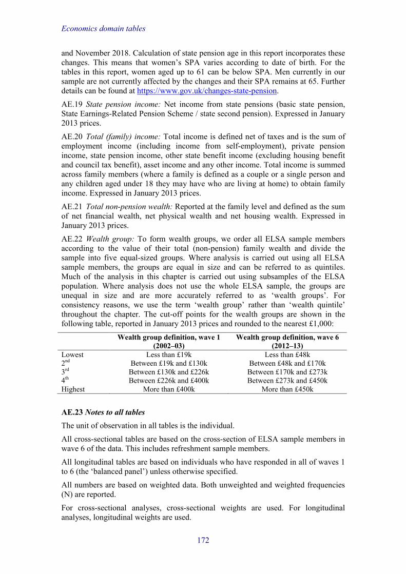
Economics domain tables
and November 2018. Calculation of state pension age in this report incorporates these changes. This means that women’s SPA varies according to date of birth. For the tables in this report, women aged up to 61 can be below SPA. Men currently in our sample are not currently affected by the changes and their SPA remains at 65. Further details can be found at https://www.gov.uk/changes-state-pension.
AE.19 State pension income: Net income from state pensions (basic state pension, State Earnings-Related Pension Scheme / state second pension). Expressed in January 2013 prices.
AE.20 Total (family) income: Total income is defined net of taxes and is the sum of employment income (including income from self-employment), private pension income, state pension income, other state benefit income (excluding housing benefit and council tax benefit), asset income and any other income. Total income is summed across family members (where a family is defined as a couple or a single person and any children aged under 18 they may have who are living at home) to obtain family income. Expressed in January 2013 prices.
AE.21 Total non-pension wealth: Reported at the family level and defined as the sum of net financial wealth, net physical wealth and net housing wealth. Expressed in January 2013 prices.
AE.22 Wealth group: To form wealth groups, we order all ELSA sample members according to the value of their total (non-pension) family wealth and divide the sample into five equal-sized groups. Where analysis is carried out using all ELSA sample members, the groups are equal in size and can be referred to as quintiles. Much of the analysis in this chapter is carried out using subsamples of the ELSA population. Where analysis does not use the whole ELSA sample, the groups are unequal in size and are more accurately referred to as ‘wealth groups’. For consistency reasons, we use the term ‘wealth group’ rather than ‘wealth quintile’ throughout the chapter. The cut-off points for the wealth groups are shown in the following table, reported in January 2013 prices and rounded to the nearest £1,000: Wealth group definition, wave 1
(2002–03) Wealth group definition, wave 6
(2012–13) Lowest Less than £19k Less than £48k 2nd Between £19k and £130k Between £48k and £170k 3rd Between £130k and £226k Between £170k and £273k 4th Between £226k and £400k Between £273k and £450k Highest More than £400k More than £450k
AE.23 Notes to all tables The unit of observation in all tables is the individual.
All cross-sectional tables are based on the cross-section of ELSA sample members in wave 6 of the data. This includes refreshment sample members.
All longitudinal tables are based on individuals who have responded in all of waves 1 to 6 (the ‘balanced panel’) unless otherwise specified.
All numbers are based on weighted data. Both unweighted and weighted frequencies (N) are reported.
For cross-sectional analyses, cross-sectional weights are used. For longitudinal analyses, longitudinal weights are used.
172

Economics domain tables
Values are converted to January 2013 prices using the retail price index (RPI).
The fieldwork dates are shown in the following table:
The fieldwork timetable is as follows: Fieldwork dates (inclusive) Wave 1 March 2002 – March 2003 Wave 2 June 2004 – June 2005 Wave 3 May 2006 – August 2007 Wave 4 June 2008 – July 2009 Wave 5 July 2010 – June 2011 Wave 6 May 2012 – May 2013
173

Economics domain tables
Table E1a. Mean unequivalised net weekly family income (£), by age and family type: wave 6 Employ-
ment income
Self-emp.
income
Private pension income
State pension income
State benefit income
Asset income
Other income
Total income
Wted N
Unwted N
Single men 102.56 27.19 79.06 74.36 36.55 39.90 0.17 359.79 1,015 959 50–54 236.73 57.61 40.75 0.00 50.21 72.09 0.00 457.39 180 63 55–59 224.53 45.36 40.02 0.00 49.99 21.73 0.74 382.37 201 162 60–64 90.82 33.11 73.32 3.97 48.79 104.16 0.00 354.16 125 128 65–69 19.97 14.10 94.33 130.75 21.79 19.06 0.00 300.01 136 160 70–74 8.78 17.48 113.62 145.91 25.56 23.38 0.00 334.74 112 134 75–79 3.63 0.00 118.74 159.77 12.97 14.86 0.10 310.08 92 126 80+ 4.67 0.38 114.06 155.41 28.84 20.97 0.11 324.44 169 186 Single women 58.33 7.41 53.04 101.70 39.04 16.15 2.27 277.94 1,751 1,959 50–54 169.61 13.01 3.22 0.00 66.38 8.86 5.51 266.59 227 102 55–59 201.44 28.58 24.20 0.00 54.72 13.20 7.17 329.31 219 212 60–64 63.14 13.30 59.98 129.58 32.94 28.32 1.84 329.10 196 263 65–69 27.72 1.85 78.25 128.96 27.27 22.04 0.85 286.93 189 265 70–74 5.00 2.94 76.97 141.00 21.66 21.70 0.61 269.87 192 266 75–79 4.14 0.43 68.89 143.81 23.40 16.97 0.77 258.41 225 340 80+ 0.05 0.27 59.68 136.89 40.32 11.29 0.67 249.15 503 511 Couples 252.49 57.05 141.30 122.08 26.41 72.54 1.04 672.91 6,127 6,002 50–54 570.98 91.97 40.41 3.85 31.13 47.90 0.23 786.48 1,142 449 55–59 427.87 94.07 81.98 12.55 31.97 51.90 0.97 701.31 1,148 1,010 60–64 258.80 71.21 181.35 122.49 27.11 110.90 2.00 773.85 1,164 1,293 65–69 75.05 34.94 204.93 206.88 18.54 106.27 0.58 647.20 1,024 1,254 70–74 26.87 17.81 197.10 226.95 19.43 84.76 0.91 573.84 696 860 75–79 11.96 8.34 188.70 232.60 22.41 37.68 2.38 504.07 508 684 80+ 2.68 2.83 160.57 221.43 31.73 31.78 0.49 451.51 446 452 All family types 197.15 43.86 116.82 112.63 30.06 57.71 1.18 559.41 8,893 8,920 50–54 473.30 76.41 35.01 2.84 38.52 45.00 0.98 672.06 1,549 614 55–59 370.12 78.66 68.52 9.18 37.47 42.62 1.81 608.37 1,568 1,384 60–64 218.82 60.35 156.23 113.47 29.70 99.42 1.81 679.80 1,485 1,684 65–69 62.88 28.21 176.07 188.31 20.09 85.70 0.56 561.82 1,348 1,679 70–74 20.65 14.92 164.72 201.40 20.55 65.80 0.75 488.79 999 1,260 75–79 8.90 5.25 148.22 200.27 21.63 29.49 1.69 415.44 825 1,150 80+ 1.79 1.31 108.14 173.41 35.16 20.92 0.51 341.24 1,118 1,149
Note: All values are expressed in January 2013 prices. For variable definitions, see AE.1, AE.6, AE.9, AE.14, AE.15, AE.16, AE.17, AE.19, AE.20 and AE.23.
For related text, see E.5–E.8.
174

Economics domain tables
Table E1b. Mean equivalised net weekly family income (£), by age and sex: wave 6 Employ-
ment income
Self-emp.
income
Private pension income
State pension income
State benefit income
Asset income
Other income
Total income
Wted N
Unwted N
Men 155.22 35.98 88.57 76.18 20.63 45.43 0.63 422.63 4,215 3,980 50–54 337.96 61.26 22.26 0.40 21.81 40.32 0.15 484.15 780 271 55–59 284.22 59.29 43.36 4.89 24.08 31.52 0.76 448.11 767 630 60–64 175.64 46.24 107.31 43.96 25.34 65.38 0.89 464.76 724 739 65–69 49.35 23.10 131.67 136.91 14.81 68.73 0.32 424.89 654 781 70–74 17.71 15.52 130.38 148.82 16.37 53.57 0.35 382.72 473 579 75–79 8.82 5.02 126.92 156.33 13.95 23.39 2.10 336.51 376 507 80+ 3.41 1.30 112.27 150.80 23.77 21.37 0.30 313.21 441 473 Women 113.85 23.55 79.49 92.04 24.46 35.96 1.11 370.45 4,678 4,940 50–54 280.41 36.19 24.99 3.36 29.38 23.00 1.33 398.65 769 343 55–59 232.68 48.15 51.88 7.29 31.87 25.15 2.02 399.04 801 754 60–64 125.74 36.80 108.81 116.88 18.81 74.95 1.65 483.63 761 945 65–69 38.53 15.59 116.54 134.60 15.66 49.37 0.50 370.79 694 898 70–74 11.45 6.53 108.72 148.63 15.74 39.44 0.71 331.21 526 681 75–79 4.45 2.26 94.79 149.26 19.55 20.18 0.45 290.93 449 643 80+ 0.15 0.69 70.20 139.49 35.54 13.66 0.54 260.28 677 676 All 133.46 29.44 83.79 84.52 22.65 40.45 0.88 395.19 8,893 8,920 50–54 309.40 48.81 23.62 1.87 25.56 31.72 0.73 441.72 1,549 614 55–59 257.89 53.59 47.71 6.12 28.06 28.27 1.40 423.04 1,568 1,384 60–64 150.06 41.40 108.08 81.34 21.99 70.28 1.28 474.43 1,485 1,684 65–69 43.78 19.24 123.89 135.72 15.25 58.77 0.41 397.05 1,348 1,679 70–74 14.41 10.79 118.97 148.72 16.03 46.13 0.54 355.59 999 1,260 75–79 6.44 3.51 109.44 152.48 17.00 21.64 1.20 311.71 825 1,150 80+ 1.44 0.93 86.79 143.95 30.90 16.70 0.45 281.15 1,118 1,149
Note: All values are expressed in January 2013 prices. For variable definitions, see AE.1, AE.6, AE.7, AE.9, AE.14, AE.15, AE.16, AE.17, AE.19, AE.20 and
AE.23. For related text, see E.5–E.8.
175

Economics domain tables
Table E2a. Distribution of total net weekly unequivalised family income (£), by age and family type: wave 6
Mean 10th percentile
25th percentile
Median 75th percentile
90th percentile
Wted N
Unwted N
Single men 359.79 104.28 174.31 270.22 437.28 640.17 1,015 959 50–54 457.39 70.75 179.86 368.24 552.26 751.53 180 63 55–59 382.37 62.59 106.32 278.07 490.98 789.35 201 162 60–64 354.16 92.93 126.60 210.34 370.54 542.34 125 128 65–69 300.01 145.48 186.78 255.89 386.83 539.62 136 160 70–74 334.74 153.35 198.78 255.98 380.00 569.61 112 134 75–79 310.08 159.73 184.65 251.02 344.40 558.96 92 126 80+ 324.44 151.88 205.76 285.37 383.76 526.51 169 186 Single women 277.94 116.32 157.40 228.65 329.82 469.77 1,751 1,959 50–54 266.59 70.35 116.32 244.24 372.36 531.06 227 102 55–59 329.31 81.19 148.63 235.89 413.60 594.98 219 212 60–64 329.10 120.47 154.70 221.23 338.71 488.76 196 263 65–69 286.93 141.91 169.23 236.50 343.51 494.19 189 265 70–74 269.87 139.24 171.09 228.14 327.69 431.58 192 266 75–79 258.41 136.56 167.74 226.21 306.85 417.30 225 340 80+ 249.15 127.82 154.35 219.74 300.69 394.69 503 511 Couples 672.91 264.56 369.44 531.35 771.29 1091.11 6,127 6,002 50–54 786.48 315.69 467.31 652.14 918.30 1286.75 1,142 449 55–59 701.31 242.26 408.67 603.55 860.12 1188.06 1,148 1,010 60–64 773.85 265.12 394.06 560.45 800.69 1172.39 1,164 1,293 65–69 647.20 280.29 365.29 500.58 713.48 987.58 1,024 1,254 70–74 573.84 269.49 341.60 451.91 640.78 908.64 696 860 75–79 504.07 247.72 326.39 432.34 579.03 799.03 508 684 80+ 451.51 244.71 305.57 404.92 529.31 721.54 446 452 All family types 559.41 162.56 269.25 432.95 665.76 969.21 8,893 8,920 50–54 672.06 165.97 336.45 559.60 813.41 1186.73 1,549 614 55–59 608.37 142.01 287.69 503.70 774.34 1114.16 1,568 1,384 60–64 679.80 170.81 303.67 487.41 734.11 1076.68 1,485 1,684 65–69 561.82 202.81 296.88 429.11 641.75 923.02 1,348 1,679 70–74 488.79 187.95 269.49 386.42 565.53 814.75 999 1,260 75–79 415.44 171.99 239.54 342.27 501.37 729.14 825 1,150 80+ 341.24 145.29 201.49 293.49 424.19 593.93 1,118 1,149
Note: All values are expressed in January 2013 prices. For variable definitions, see AE.9, AE.20 and AE.23. For related text, see E.9.
176

Economics domain tables
Table E2b. Distribution of total net weekly equivalised family income (£), by age and sex: wave 6 Mean 10th
percentile 25th
percentile Median 75th
percentile 90th
percentile Wted
N Unwted
N Men 422.63 156.92 226.83 331.04 488.52 703.69 4,215 3,980 50–54 484.15 162.67 269.64 378.49 547.58 785.03 780 271 55–59 448.11 102.04 239.62 380.25 551.02 793.58 767 630 60–64 464.76 139.57 228.56 343.13 509.11 723.93 724 739 65–69 424.89 176.37 235.74 329.26 459.94 644.14 654 781 70–74 382.72 170.92 226.66 296.90 427.19 609.12 473 579 75–79 336.51 163.58 206.97 278.81 381.46 552.66 376 507 80+ 313.21 157.08 203.75 276.88 376.02 506.82 441 473 Women 370.45 140.26 197.94 292.01 431.86 625.82 4,678 4,940 50–54 398.65 95.31 206.40 341.59 522.17 741.88 769 343 55–59 399.04 102.04 200.15 333.72 500.36 677.91 801 754 60–64 483.63 151.09 220.67 334.79 493.77 760.53 761 945 65–69 370.79 157.67 212.45 291.25 419.40 615.35 694 898 70–74 331.21 150.78 202.02 267.78 389.29 530.43 526 681 75–79 290.93 144.43 183.25 251.30 337.28 487.32 449 643 80+ 260.28 133.74 164.90 236.43 312.87 416.91 677 676 All 395.19 144.97 209.95 308.47 460.38 658.27 8,893 8,920 50–54 441.72 126.28 227.55 370.36 534.44 781.23 1,549 614 55–59 423.04 102.04 213.64 363.74 527.30 765.58 1,568 1,384 60–64 474.43 143.34 222.40 338.96 497.91 735.75 1,485 1,684 65–69 397.05 163.95 222.94 307.47 443.23 629.17 1,348 1,679 70–74 355.59 161.18 210.38 282.93 407.56 569.61 999 1,260 75–79 311.71 153.53 197.22 262.66 364.30 511.69 825 1,150 80+ 281.15 141.25 177.32 252.15 336.48 451.72 1,118 1,149
Note: All values are expressed in January 2013 prices. For variable definitions, see AE.7, AE.9, AE.20 and AE.23. For related text, see E.9.
177

Economics domain tables
Table E3. Mean and median wealth, by age and family type: wave 6 Net financial
wealth Net physical
wealth Net primary
housing wealth Net total (non-
pension) wealth Wted
N Unwted
N £’000 £’000 £’000 £’000 mean median mean median mean median mean median Single men 42.6 8.1 43.9 0.0 113.5 80.1 200.0 109.4 1,015 959 50–54 24.9 0.1 51.8 0.0 98.6 38.2 175.3 45.3 180 63 55–59 41.4 4.0 89.2 0.0 90.3 44.6 220.8 61.7 201 162 60–64 32.0 6.0 38.8 0.0 98.8 65.1 169.6 79.6 125 128 65–69 45.0 18.6 15.6 0.0 115.1 80.1 175.7 125.8 136 160 70–74 63.4 15.9 13.6 0.0 138.7 130.7 215.6 159.7 112 134 75–79 42.6 9.6 59.5 0.0 134.8 99.1 236.9 130.3 92 126 80+ 55.1 13.5 19.9 0.0 138.5 123.8 213.5 154.2 169 186 Single women 31.1 5.9 17.4 0.0 131.3 104.0 179.8 125.6 1,751 1,959 50–54 14.6 0.0 37.4 0.0 103.7 34.7 155.7 48.8 227 102 55–59 17.3 1.0 11.2 0.0 116.6 100.6 145.1 105.0 219 212 60–64 48.3 5.0 32.6 0.0 129.1 99.1 210.0 125.0 196 263 65–69 47.5 9.5 19.7 0.0 151.3 139.5 218.5 162.5 189 265 70–74 43.0 10.7 12.6 0.0 154.1 138.6 209.7 158.0 192 266 75–79 30.4 9.8 10.1 0.0 145.0 125.6 185.5 149.2 225 340 80+ 27.4 7.9 9.3 0.0 128.8 90.6 165.5 124.8 503 511 Couples 100.2 28.6 77.0 0.0 233.6 192.3 410.9 258.5 6,127 6,002 50–54 69.6 12.8 111.0 0.0 212.0 163.8 392.6 203.6 1,142 449 55–59 81.0 21.8 84.2 0.0 221.6 178.4 386.8 247.1 1,148 1,010 60–64 115.2 40.3 92.4 0.0 244.4 201.0 452.0 292.5 1,164 1,293 65–69 144.0 46.2 70.1 0.0 255.4 199.3 469.5 296.1 1,024 1,254 70–74 111.5 34.4 59.8 0.0 243.5 198.2 414.8 259.8 696 860 75–79 91.9 33.7 36.3 0.0 232.7 198.2 360.9 251.7 508 684 80+ 80.5 25.5 20.4 0.0 227.3 193.2 328.3 234.2 446 452 All 80.0 19.5 61.5 0.0 199.8 165.9 341.3 211.7 8,893 8,920 50–54 56.3 6.3 93.3 0.0 183.0 131.8 332.6 174.4 1,549 614 55–59 67.0 14.8 74.6 0.0 190.0 154.0 331.7 201.2 1,568 1,384 60–64 99.4 30.0 80.0 0.0 217.0 180.9 396.3 253.9 1,485 1,684 65–69 120.5 34.7 57.6 0.0 226.7 183.3 404.8 254.1 1,348 1,679 70–74 93.0 25.0 45.6 0.0 214.6 178.4 353.2 221.4 999 1,260 75–79 69.6 20.1 31.8 0.0 197.9 171.1 299.2 208.1 825 1,150 80+ 52.8 13.8 15.3 0.0 169.6 148.6 237.7 175.9 1,118 1,149
Note: All values are expressed in January 2013 prices. For variable definitions, see AE.9, AE.11, AE.12, AE.13, AE.21 and AE.23. For related text, see E.11.
178

Economics domain tables
Table E4. Distribution of total net non-pension wealth, by age and family type: wave 6 Mean 10th
percentile 25th
percentile Median 75th
percentile 90th
percentile Wted
N Unwted
N £'000 £'000 £'000 £'000 £'000 £'000 Single men 200.0 0.0 2.3 109.4 257.0 444.9 1,015 959 50–54 175.3 –6.9 0.0 45.3 247.3 439.4 180 63 55–59 220.8 –0.3 0.2 61.7 223.3 485.5 201 162 60–64 169.6 –0.3 0.3 79.6 238.3 440.7 125 128 65–69 175.7 0.0 3.5 125.8 271.5 444.9 136 160 70–74 215.6 0.2 7.5 159.7 301.4 439.1 112 134 75–79 236.9 0.2 5.3 130.3 253.3 514.5 92 126 80+ 213.5 3.5 28.7 154.2 297.8 448.2 169 186 Single women 179.8 0.0 4.0 125.6 241.1 402.6 1,751 1,959 50–54 155.7 –1.5 0.0 48.8 173.2 372.4 227 102 55–59 145.1 –0.3 0.4 105.0 200.7 322.9 219 212 60–64 210.0 –0.4 1.3 125.0 257.6 468.7 196 263 65–69 218.5 0.1 14.9 162.5 284.4 484.0 189 265 70–74 209.7 0.1 30.3 158.0 264.6 427.1 192 266 75–79 185.5 0.3 7.0 149.2 255.1 408.3 225 340 80+ 165.5 1.0 7.9 124.8 224.7 388.9 503 511 Couples 410.9 23.2 142.2 258.5 451.3 794.1 6,127 6,002 50–54 392.6 1.2 103.5 203.6 417.2 727.2 1,142 449 55–59 386.8 14.7 115.9 247.1 429.2 774.7 1,148 1,010 60–64 452.0 40.6 162.7 292.5 500.8 840.4 1,164 1,293 65–69 469.5 69.8 167.8 296.1 494.7 840.8 1,024 1,254 70–74 414.8 37.6 164.4 259.8 461.8 827.7 696 860 75–79 360.9 29.7 158.5 251.7 422.1 759.9 508 684 80+ 328.3 74.1 150.6 234.2 398.6 614.2 446 452 All 341.3 0.8 92.0 211.7 387.6 681.5 8,893 8,920 50–54 332.6 –0.2 47.4 174.4 362.3 644.0 1,549 614 55–59 331.7 0.1 72.5 201.2 383.1 624.2 1,568 1,384 60–64 396.3 2.0 119.9 253.9 450.9 786.3 1,485 1,684 65–69 404.8 5.0 139.5 254.1 445.9 775.3 1,348 1,679 70–74 353.2 4.0 133.3 221.4 398.3 718.2 999 1,260 75–79 299.2 2.0 101.7 208.1 349.5 653.9 825 1,150 80+ 237.7 3.5 47.6 175.9 307.6 510.3 1,118 1,149
Note: All values are expressed in January 2013 prices. For variable definitions, see AE.9, AE.21 and AE.23. For related text, see E.11.
179

Economics domain tables
Table E5a. Private pension membership, by age and sex (workers and non-workers under state pension age (SPA)): wave 6
Member of a private pension scheme
Contributing to a private
pension scheme
Receiving income from a
private pension scheme
Retained rights in a private
pension scheme
Wted N
Unwted N
Men (50–SPA) 79% 43% 29% 30% 2,333 1,675 50–54 73% 53% 8% 32% 810 279 55–59 79% 47% 24% 34% 785 643 60–SPA 85% 28% 57% 23% 738 753 Women (50–SPA) 64% 41% 15% 24% 1,824 1,374 50–54 60% 45% 7% 23% 796 356 55–59 68% 41% 17% 27% 825 779 60–SPA 63% 25% 37% 16% 204 239 All under SPA 72% 42% 23% 27% 4,157 3,049 50–54 67% 49% 7% 27% 1,606 635 55–59 73% 44% 21% 30% 1,610 1,422 60–SPA 80% 27% 53% 22% 942 992
Note: The middle three columns of the table do not sum to the first column of numbers (or to 100%) because individuals can have multiple pension schemes at different stages of contributing,
receiving income and retaining rights. SPA for women varies according to date of birth (see AE.18). For variable definitions, see AE.18 and AE.23. For related text, see E.12.
Table E5b. Private pension membership, by age and sex (workers under state pension age (SPA)): wave 6
Member of a private pension scheme
Contributing to a private
pension scheme
Receiving income from a
private pension scheme
Retained rights in a private
pension scheme
Wted N
Unwted N
Men (50–SPA) 82% 56% 21% 33% 1,709 1,146 50–54 78% 60% 7% 33% 693 238 55–59 83% 60% 19% 35% 588 474 60–SPA 86% 44% 47% 30% 428 434 Women (50–SPA) 74% 55% 11% 27% 1,311 954 50–54 72% 57% 6% 27% 615 282 55–59 76% 56% 14% 28% 579 535 60–SPA 69% 41% 31% 19% 117 137 All under SPA 78% 56% 17% 30% 3,020 2,100 50–54 75% 58% 7% 30% 1,308 520 55–59 79% 58% 16% 32% 1,167 1,009 60–SPA 83% 44% 43% 28% 545 571
Note: The middle three columns of the table do not sum to the first column of numbers (or to 100%) because individuals can have multiple pension schemes at different stages of contributing,
receiving income and retaining rights. SPA for women varies according to date of birth (see AE.18). For variable definitions, see AE.18 and AE.23. For related text, see E.12.
180

Economics domain tables
Table E6. Mean equivalised weekly household spending (£), by age and family type: wave 6 Food
inside the
home
Food outside
the home
Clothing and
footwear
Domestic fuel
Leisure Transfers outside
the home
Wted N
Unwted N
Single men 47.56 8.49 10.77 17.99 11.83 15.22 925 873 50–54 45.31 10.66 14.92 17.86 18.79 8.89 171 60 55–59 50.45 10.95 16.41 17.80 18.61 13.94 190 154 60–64 42.88 7.49 6.24 15.53 9.21 8.32 118 121 65–69 45.55 7.16 10.36 16.83 10.21 36.67 122 145 70–74 50.33 6.15 10.38 19.05 7.53 10.09 105 126 75–79 51.13 7.96 6.24 20.60 5.95 6.65 83 116 80+ 47.92 6.53 5.02 19.17 4.23 21.01 136 151 Single women 46.82 5.46 11.41 19.38 7.25 32.41 1,585 1,782 50–54 43.42 6.90 13.89 16.74 9.58 10.08 219 98 55–59 47.41 5.42 14.04 18.92 9.22 19.59 215 207 60–64 46.63 5.95 12.59 20.89 11.10 32.65 181 244 65–69 49.48 6.46 14.79 21.00 9.70 38.34 179 250 70–74 46.13 5.95 10.56 20.06 7.47 58.82 181 251 75–79 47.09 5.16 10.84 20.46 5.32 82.28 208 315 80+ 47.42 3.97 7.32 18.82 3.03 11.04 403 417 Couples 53.28 9.36 13.58 17.45 11.08 20.67 5,966 5,819 50–54 49.95 9.20 15.74 16.43 11.01 14.80 1,127 443 55–59 52.42 10.25 15.08 17.10 13.17 19.19 1,138 1,003 60–64 55.84 11.22 14.97 18.31 13.02 21.07 1,124 1,250 65–69 54.99 9.70 14.71 18.19 12.29 24.49 1,005 1,226 70–74 55.63 8.50 11.28 17.75 8.97 18.94 677 835 75–79 51.57 6.83 8.27 16.69 7.85 18.14 480 644 80+ 51.78 5.79 7.01 17.42 4.51 35.98 416 418 All family types 51.45 8.53 12.87 17.87 10.44 22.27 8,476 8,474 50–54 48.49 9.03 15.38 16.64 11.68 13.45 1,516 601 55–59 51.48 9.66 15.10 17.44 13.29 18.60 1,542 1,364 60–64 53.59 10.24 13.94 18.40 12.46 21.49 1,423 1,615 65–69 53.36 9.02 14.32 18.45 11.74 27.52 1,306 1,621 70–74 53.26 7.77 11.05 18.33 8.53 25.49 963 1,212 75–79 50.31 6.50 8.74 18.13 6.96 34.19 770 1,075 80+ 49.39 5.13 6.86 18.26 3.85 23.32 955 986
Note: All values are expressed in January 2013 prices. For variable definitions, see AE.7, AE.9 and AE.23. For related text, see E.13.
181

Economics domain tables
Table E7. Mean self-reported chances (%) of having insufficient resources to meet needs at some point in the future, by age, sex and income group: wave 6
Total equivalised income group Wted N
Unwted N All Lowest 2nd 3rd 4th Highest
Single men 36.0 46.7 36.0 30.1 28.4 31.2 962 908 50–54 48.1 59.0 51.3 56.6 29.0 46.5 176 61 55–59 42.9 51.9 37.8 31.0 46.3 29.6 194 155 60–64 40.5 44.7 51.5 34.4 27.0 31.5 119 123 65–69 29.0 39.7 33.9 17.7 19.1 22.2 126 151 70–74 32.2 38.8 33.5 30.2 29.0 25.4 110 132 75–79 26.8 32.5 31.9 17.2 22.6 23.0 85 118 80+ 23.9 37.4 27.5 21.0 17.1 12.4 153 168 Single women 37.1 41.9 36.3 34.8 30.0 33.2 1,637 1,847 50–54 56.6 61.8 58.2 46.6 52.0 53.1 217 98 55–59 48.7 54.0 56.0 48.7 40.8 32.4 213 205 60–64 42.9 49.3 38.9 43.3 33.4 37.1 191 257 65–69 41.1 44.0 45.6 36.7 38.1 28.9 181 257 70–74 35.7 40.2 35.8 33.4 31.5 29.6 187 260 75–79 29.7 37.8 25.7 29.3 19.7 22.7 213 325 80+ 21.9 23.7 23.7 23.2 9.1 17.1 434 445 Partnered men 31.5 38.5 34.3 33.0 31.2 25.3 2,980 2,816 50–54 39.0 48.3 50.9 45.3 39.2 28.7 559 194 55–59 35.1 47.7 29.7 41.1 35.0 28.6 520 429 60–64 28.1 37.7 32.0 27.8 27.8 22.1 572 583 65–69 30.4 39.9 36.6 31.9 27.2 24.1 488 587 70–74 27.9 26.3 32.6 27.2 27.3 23.6 336 413 75–79 28.2 35.5 31.6 29.1 21.7 21.3 261 350 80+ 25.6 27.5 28.6 22.4 31.1 12.6 245 260 Partnered women 34.9 39.3 39.9 35.7 32.4 30.0 2,757 2,809 50–54 37.7 43.8 50.5 40.7 31.4 33.2 517 231 55–59 37.6 42.5 43.6 41.5 34.2 33.0 551 514 60–64 35.2 40.8 41.3 35.8 34.6 30.0 540 651 65–69 34.8 40.5 42.6 34.0 30.8 26.4 482 605 70–74 33.0 42.0 35.5 37.3 26.4 22.5 314 391 75–79 30.2 31.9 33.7 26.5 33.9 23.5 207 280 80+ 24.3 21.9 25.3 22.9 33.8 7.5 146 137
For variable definitions, see AE.7, AE.8, AE.9, AE.10 and AE.23. For related text, see E.14.
182

Economics domain tables
Table E8. Labour market participation, by age, sex and wealth group (individuals aged under 75 only): wave 6
% working part-time
% working full-time
% working full- or part-time
% working full- or part-time by wealth group Lowest 2nd 3rd 4th Highest Men (50–74) 11.7 42.0 53.7 38.8 61.1 59.2 54.0 55.5 50–54 8.0 76.3 84.3 66.9 85.2 [100.0] 87.8 [90.5] 55–59 11.0 62.0 73.0 40.7 85.1 84.2 80.3 79.8 60–64 16.2 40.2 56.5 34.9 64.1 67.7 57.5 55.8 65–69 14.8 10.5 25.3 11.6 26.7 30.3 25.6 29.1 70–74 7.5 2.5 10.1 9.3 5.7 7.2 11.6 15.7 Women (50–74) 25.3 18.5 43.7 31.9 52.3 41.2 45.4 47.0 50–54 35.8 40.1 76.0 43.2 87.2 84.0 96.0 85.9 55–59 37.0 32.2 69.2 51.1 77.1 70.9 76.4 70.4 60–64 27.1 9.9 36.9 25.6 37.7 39.4 34.4 44.3 65–69 13.4 2.3 15.7 9.2 21.3 16.5 9.8 20.5 70–74 5.7 0.6 6.3 4.0 3.4 5.4 8.0 10.3 All (50–74) 18.7 29.9 48.6 35.2 56.4 49.8 49.7 51.2 50–54 21.9 58.2 80.1 54.4 86.1 91.9 91.7 88.1 55–59 24.5 46.6 71.1 45.9 80.5 77.7 78.2 75.2 60–64 21.8 24.6 46.4 30.0 49.9 53.8 45.8 49.8 65–69 14.1 6.2 20.3 10.4 23.9 22.3 17.8 24.7 70–74 6.6 1.5 8.1 6.4 4.4 6.2 9.8 12.9
For variable definitions, see AE.22 and AE.23. For related text, see E.15.
Table E8N. Sample sizes for Table E8 Sample sizes
by age and sex Sample sizes by age, sex and wealth group
Wted
N Unwted
N Weighted N Unweighted N
Lowest 2nd 3rd 4th Highest Lowest 2nd 3rd 4th Highest Men (50–74) 3,286 2,910 632 629 617 689 718 458 513 564 664 711 50–54 746 260 180 188 104 141 134 60 66 36 53 45 55–59 730 597 163 140 148 131 149 118 109 116 118 136 60–64 698 713 114 112 139 160 173 103 111 140 169 190 65–69 642 765 102 110 113 157 160 101 129 135 196 204 70–74 470 575 73 80 112 102 102 76 98 137 128 136 Women (50–74) 3,491 3,572 677 712 670 692 740 583 704 713 756 816 50–54 745 334 203 170 108 125 139 85 83 51 55 60 55–59 786 739 163 189 141 150 142 140 169 124 157 149 60–64 743 923 127 131 134 163 187 141 164 173 210 235 65–69 692 896 99 120 155 154 164 118 154 195 202 227 70–74 525 680 85 102 132 99 107 99 134 170 132 145 All (50–74) 6,777 6,482 1,310 1,341 1,287 1,382 1,458 1,041 1,217 1,277 1,420 1,527 50–54 1,491 594 383 358 212 266 273 145 149 87 108 105 55–59 1,516 1,336 327 329 289 281 291 258 278 240 275 285 60–64 1,441 1,636 241 243 273 323 361 244 275 313 379 425 65–69 1,334 1,661 201 229 269 311 324 219 283 330 398 431 70–74 995 1,255 158 182 244 201 209 175 232 307 260 281
183

Economics domain tables
Table E9. Mean self-reported chances (%) of working at future target ages, by age, sex and wealth: wave 6
Target age
Wealth group All Lowest 2nd 3rd 4th Highest Men (50–64) 50–54 60 65.5 64.3 70.0 [73.3] 59.3 [61.1] 55–59 60 67.4 51.3 77.8 71.4 73.0 66.0 60–64 65 34.2 25.8 35.9 35.7 36.2 35.6 Women (50–59) 50–54 55 73.2 52.0 81.1 81.0 77.4 84.2 55–59 60 55.4 44.8 64.5 54.2 58.4 53.6
For variable definitions, see AE.8, AE.22 and AE23. For related text, see E.16.
Table E9N. Sample sizes for Table E9 Sample sizes
by age and sex Sample sizes by age, sex and wealth group
Wted
N Unwted
N Weighted N Unweighted N
Lowest 2nd 3rd 4th Highest Lowest 2nd 3rd 4th Highest Men (50–64) 50–54 738 258 170 188 102 145 134 58 66 35 54 45 55–59 720 590 156 137 150 128 149 114 106 119 115 136 60–64 696 711 111 113 138 161 174 100 112 139 170 190 Women (50–59) 50–54 743 333 200 171 109 125 138 84 83 52 55 59 55–59 774 730 159 183 139 151 141 135 167 122 158 148
184

Economics domain tables
Table E10. Whether health limits kind or amount of work, by age, sex and wealth: wave 6 Age, sex and wealth group
No limiting
health problem
Has limiting
health problem
Has limiting health problem and ... Wted Unwted Not
working Working but
health problem doesn’t limit
current job
Working and health problem
does limit current job
N N
Men 50–54 82% 18% 12% 3% 3% 755 262 Lowest 69% 31% 28% 0% 3% 180 60 2nd 79% 21% 11% 5% 5% 193 67 3rd [93%] [7%] [0%] [2%] [5%] 104 36 4th 90% 10% 6% 3% 0% 145 54 Highest [89%] [11%] [5%] [4%] [2%] 134 45
Men 55–59 78% 22% 15% 4% 3% 730 597 Lowest 50% 50% 48% 2% 1% 162 117 2nd 79% 21% 11% 6% 4% 140 109 3rd 86% 14% 4% 5% 5% 150 119 4th 88% 12% 5% 4% 2% 128 115 Highest 92% 8% 2% 3% 2% 150 137
Men 60–64 75% 25% 18% 3% 4% 700 715 Lowest 46% 54% 49% 2% 2% 114 102 2nd 71% 29% 18% 7% 4% 113 112 3rd 72% 28% 16% 6% 6% 140 141 4th 83% 17% 9% 2% 6% 161 170 Highest 93% 7% 6% 0% 2% 173 190
All men 50–64 79% 21% 15% 3% 3% 2,185 1,574 Lowest 56% 44% 40% 1% 2% 456 279 2nd 77% 23% 13% 6% 4% 445 288 3rd 83% 17% 7% 5% 5% 394 296 4th 87% 13% 7% 3% 3% 433 339 Highest 91% 9% 4% 2% 2% 456 372 Women 50–54 80% 20% 12% 4% 3% 750 336 Lowest 64% 36% 34% 0% 2% 206 86 2nd 82% 18% 8% 6% 4% 171 83 3rd 80% 20% 5% 9% 5% 107 51 4th 88% 12% 3% 4% 5% 127 56 Highest 95% 5% 0% 3% 1% 139 60
Women 55–59 77% 23% 16% 3% 4% 772 732 Lowest 56% 44% 36% 2% 5% 159 136 2nd 77% 23% 14% 5% 4% 180 167 3rd 80% 20% 16% 2% 2% 140 123 4th 87% 13% 7% 3% 3% 151 158 Highest 87% 13% 7% 2% 3% 141 148
All women 50–59 79% 21% 14% 3% 4% 1,522 1,068 Lowest 61% 39% 35% 1% 3% 366 222 2nd 79% 21% 11% 6% 4% 351 250 3rd 80% 20% 11% 5% 3% 247 174 4th 88% 12% 5% 3% 4% 278 214 Highest 91% 9% 4% 3% 2% 280 208
For variable definitions, see AE.22 and AE.23. For related text, see E.17 and E.18.
185

Economics domain tables
Table E11. Mean self-reported chances (%) of health limiting ability to work at age 65 (workers aged under 65 only), by age, sex and wealth group: wave 6
Wealth group All Lowest 2nd 3rd 4th Highest Men (50–64) 34.2 39.9 39.1 34.9 32.0 27.2 50–54 38.6 [43.9] 43.2 [38.6] [33.8] [32.7] 55–59 36.0 [38.3] 43.2 36.2 33.9 29.2 60–64 25.1 [30.4] 23.2 29.3 27.5 17.9 Women (50–64) 36.1 42.4 39.3 37.4 33.4 29.8 50–54 38.6 [45.1] 42.8 [37.4] 33.2 34.6 55–59 39.2 45.9 40.2 42.4 37.8 31.2 60–64 25.2 [27.3] 26.3 28.5 25.0 21.5
For variable definitions, see AE.8, AE.22 and AE.23. For related text, see E.19.
Table E11N. Sample sizes for Table E11 Sample sizes
by age and sex Sample sizes by age, sex and wealth group
Wted
N Unwted
N Weighted N Unweighted N
Lowest 2nd 3rd 4th Highest Lowest 2nd 3rd 4th Highest Men (50–64) 1,545 1,042 218 344 322 327 336 119 213 224 235 251 50–54 622 217 115 157 102 128 121 39 55 35 48 40 55–59 527 422 65 115 125 105 118 45 87 93 92 105 60–64 396 403 38 72 95 94 97 35 71 96 95 106 Women (50–64) 1,387 1,102 203 346 247 291 301 144 267 196 244 251 50–54 569 261 90 151 92 118 118 40 74 44 51 52 55–59 540 499 79 146 99 116 100 67 130 84 119 99 60–64 279 342 34 49 55 58 83 37 63 68 74 100
186

Economics domain tables
Table EL1a. Mean equivalised weekly family TOTAL income (£), by baseline (wave 1) age and family type
Age and family type in 2002–03
Wave 1 Wave 2 Wave 3 Wave 4 Wave 5 Wave 6 Wted N
Unwted N
Single men 326.06 328.14 331.26 313.64 295.35 298.27 379 365 50–54 363.09 341.83 348.99 321.09 287.84 263.73 77 65 55–59 328.64 336.74 306.33 312.56 270.09 284.71 90 89 60–64 290.52 322.27 380.77 307.54 294.48 327.74 66 61 65–69 302.57 322.64 314.82 309.82 301.80 297.74 57 58 70–74 [326.80] [309.92] [301.41] [298.07] [290.76] [295.17] 43 45 75–79 - - - - - - 27 27 80+ - - - - - - 19 20 Single women 269.06 278.14 257.53 273.24 263.62 274.27 853 916 50–54 311.45 313.04 314.95 339.91 311.00 391.49 125 135 55–59 298.25 292.85 286.81 310.95 283.72 281.79 108 140 60–64 277.51 282.95 267.28 271.31 251.92 259.25 116 138 65–69 280.41 272.66 266.11 258.69 264.06 259.59 145 182 70–74 253.92 311.59 228.14 264.55 262.90 252.70 134 147 75–79 236.58 228.24 219.83 239.73 224.78 230.43 118 95 80+ 220.21 238.72 218.87 227.63 245.22 243.97 107 79 Partnered men 426.70 410.64 398.51 389.27 377.00 392.39 1,717 1,672 50–54 476.82 481.87 469.48 467.49 422.15 482.00 455 392 55–59 484.53 451.06 421.56 405.20 409.94 409.02 397 420 60–64 441.01 422.97 407.62 377.31 370.65 373.39 294 290 65–69 373.78 330.42 333.93 334.76 314.70 340.44 261 273 70–74 315.78 316.71 324.10 315.13 339.48 305.91 178 183 75–79 307.14 302.62 296.74 304.08 305.22 302.23 105 92 80+ - - - - - - 27 22 Partnered women 411.47 398.88 374.57 368.83 352.68 378.85 1,672 1,674 50–54 500.68 477.54 443.13 437.21 415.39 517.74 454 423 55–59 414.34 428.92 407.56 401.32 373.76 361.83 403 444 60–64 414.47 404.37 366.37 358.25 333.51 339.14 303 314 65–69 358.04 317.17 314.98 305.62 298.64 315.42 243 261 70–74 302.42 292.83 288.99 286.50 295.55 272.26 167 149 75–79 302.52 295.32 257.54 263.42 273.87 289.66 85 69 80+ - - - - - - 18 14
Note: All values are expressed in January 2013 prices. For variable definitions, see AE.3, AE.7, AE.9, AE.20 and AE.23. For related text, see E.21.
187

Economics domain tables
Table EL1b. Mean equivalised weekly family EARNINGS (£), by baseline (wave 1) age and family type
Age and family type in 2002–03
Wave 1 Wave 2 Wave 3 Wave 4 Wave 5 Wave 6 Wted N
Unwted N
Single men 137.75 117.87 107.35 78.26 53.30 37.31 379 365 50–54 289.97 259.94 258.05 197.00 141.68 114.91 77 65 55–59 196.81 188.20 167.30 138.58 84.63 33.79 90 89 60–64 110.06 89.16 63.54 12.23 16.14 21.44 66 61 65–69 32.75 20.50 18.06 12.70 4.05 6.74 57 58 70–74 [64.48] [11.65] [10.13] [14.70] [10.31] [10.25] 43 45 75–79 - - - - - - 27 27 80+ - - - - - - 19 20 Single women 60.16 54.29 49.88 44.08 27.48 18.31 853 916 50–54 205.12 211.03 217.25 205.72 138.08 91.65 125 135 55–59 145.11 109.17 105.88 64.99 43.38 25.45 108 140 60–64 51.63 50.19 21.57 31.79 10.26 7.88 116 138 65–69 14.76 13.40 6.81 5.40 2.42 4.62 145 182 70–74 10.73 4.09 2.72 0.81 1.09 0.06 134 147 75–79 3.50 3.13 3.21 2.07 0.17 0.00 118 95 80+ –0.52 –2.05 0.00 0.00 0.00 0.00 107 79 Partnered men 245.24 201.22 180.38 142.56 111.64 83.13 1,717 1,672 50–54 414.11 392.55 366.10 328.90 261.97 216.81 455 392 55–59 338.30 280.89 252.57 177.77 143.30 78.45 397 420 60–64 247.80 135.59 101.10 51.41 37.52 29.09 294 290 65–69 72.97 40.52 32.41 29.17 13.60 11.79 261 273 70–74 24.01 18.25 13.87 7.44 2.68 2.41 178 183 75–79 19.73 10.63 21.48 4.91 6.73 9.00 105 92 80+ - - - - - - 27 22 Partnered women 215.61 177.40 147.48 114.68 81.06 62.73 1,672 1,674 50–54 405.46 359.15 325.40 270.57 204.50 166.75 454 423 55–59 280.29 241.86 194.36 130.34 84.04 56.56 403 444 60–64 148.29 99.64 54.59 45.17 23.40 16.03 303 314 65–69 63.69 24.03 17.33 12.43 7.85 6.89 243 261 70–74 13.05 6.39 7.52 1.31 2.21 1.78 167 149 75–79 7.66 0.63 0.23 0.30 0.00 0.49 85 69 80+ - - - - - - 18 14
Note: All values are expressed in January 2013 prices. For variable definitions, see AE.3, AE.4, AE.6, AE.7, AE.9, AE.16 and AE.23. For related text, see E.21.
188

Economics domain tables
Table EL1c. Mean equivalised weekly family PRIVATE PENSION income (£), by baseline (wave 1) age and family type
Age and family type in 2002–03
Wave 1 Wave 2 Wave 3 Wave 4 Wave 5 Wave 6 Wted N
Unwted N
Single men 74.26 88.34 89.59 94.13 93.55 94.35 379 365 50–54 29.87 38.83 41.86 62.96 67.88 82.88 77 65 55–59 47.48 75.66 61.37 73.92 72.19 78.64 90 89 60–64 84.72 90.72 120.00 105.02 100.03 106.37 66 61 65–69 94.71 123.83 113.15 117.80 112.79 116.29 57 58 70–74 [102.09] [101.90] [101.96] [97.32] [97.39] [84.09] 43 45 75–79 - - - - - - 27 27 80+ - - - - - - 19 20 Single women 54.87 69.49 43.95 55.89 64.69 59.95 853 916 50–54 12.11 18.30 15.15 33.87 47.50 47.45 125 135 55–59 47.37 60.21 42.64 70.33 73.29 74.77 108 140 60–64 62.98 67.71 67.09 62.42 64.09 69.99 116 138 65–69 87.81 83.81 60.37 70.02 77.88 72.19 145 182 70–74 64.30 133.40 41.84 63.30 75.75 61.35 134 147 75–79 57.94 64.06 40.98 53.45 59.01 55.67 118 95 80+ 44.05 46.50 37.79 34.93 51.38 35.08 107 79 Partnered men 77.17 93.14 95.87 111.55 121.78 127.63 1,717 1,672 50–54 24.92 43.26 50.87 75.33 94.20 120.87 455 392 55–59 57.50 80.42 89.08 115.20 129.56 137.90 397 420 60–64 103.84 148.09 136.29 144.75 150.93 144.43 294 290 65–69 128.08 119.36 125.29 128.68 120.22 128.08 261 273 70–74 110.95 110.35 110.64 110.31 135.56 105.91 178 183 75–79 114.76 105.70 98.81 115.13 107.25 107.93 105 92 80+ - - - - - - 27 22 Partnered women 79.81 96.54 94.26 104.68 114.19 116.06 1,672 1,674 50–54 32.52 53.79 65.81 84.95 108.60 123.25 454 423 55–59 66.31 85.73 90.51 109.79 124.49 122.87 403 444 60–64 112.74 150.27 131.24 132.66 128.95 125.82 303 314 65–69 125.77 118.65 110.45 117.27 114.56 114.30 243 261 70–74 99.80 96.25 91.54 87.83 88.18 77.97 167 149 75–79 105.28 124.16 90.63 91.27 98.45 104.33 85 69 80+ - - - - - - 18 14
Note: All values are expressed in January 2013 prices. For variable definitions, see AE.3, AE.7, AE.9, AE.15 and AE.23. For related text, see E.21.
189

Economics domain tables
Table EL1d. Mean equivalised weekly family STATE PENSION AND BENEFIT income (£), by baseline (wave 1) age and family type
Age and family type in 2002–03
Wave 1 Wave 2 Wave 3 Wave 4 Wave 5 Wave 6 Wted N
Unwted N
Single men 79.99 91.64 101.90 107.83 127.43 143.85 379 365 50–54 28.53 31.87 34.98 39.94 58.53 52.73 77 65 55–59 44.50 47.17 44.40 64.67 99.74 142.94 90 89 60–64 59.44 102.32 141.77 147.73 154.67 171.16 66 61 65–69 140.30 143.24 163.82 153.73 164.88 162.41 57 58 70–74 [134.67] [148.84] [153.12] [153.76] [154.08] [176.23] 43 45 75–79 - - - - - - 27 27 80+ - - - - - - 19 20 Single women 120.59 132.53 134.80 147.15 154.07 175.98 853 916 50–54 52.92 52.07 49.37 64.60 92.59 215.01 125 135 55–59 68.81 97.88 115.60 142.66 151.01 155.61 108 140 60–64 142.40 145.77 148.26 150.58 156.89 157.60 116 138 65–69 149.85 153.95 160.51 151.16 160.24 164.26 145 182 70–74 141.89 162.65 162.31 180.01 175.29 180.30 134 147 75–79 133.78 141.14 141.19 163.58 157.90 166.88 118 95 80+ 147.90 169.53 162.17 179.87 185.80 191.92 107 79 Partnered men 68.87 78.77 85.19 97.14 114.95 146.86 1,717 1,672 50–54 15.64 18.12 18.60 24.93 38.88 96.05 455 392 55–59 44.55 41.74 46.13 68.73 107.25 154.16 397 420 60–64 48.98 93.95 125.75 141.72 147.54 163.83 294 290 65–69 136.56 144.52 141.60 148.52 161.11 174.25 261 273 70–74 139.40 147.40 150.88 153.47 161.58 175.94 178 183 75–79 139.81 148.94 143.12 155.43 172.65 169.52 105 92 80+ - - - - - - 27 22 Partnered women 78.05 89.87 97.30 110.28 129.52 163.83 1,672 1,674 50–54 36.39 27.46 25.21 43.42 78.51 163.53 454 423 55–59 36.19 68.24 85.03 111.35 130.48 149.27 403 444 60–64 100.41 121.18 134.57 142.27 149.16 167.76 303 314 65–69 127.73 140.41 143.33 142.65 155.16 172.99 243 261 70–74 137.03 147.27 151.35 158.56 165.56 174.62 167 149 75–79 147.33 143.31 150.27 152.74 163.67 172.26 85 69 80+ - - - - - - 18 14
Note: All values are expressed in January 2013 prices. For variable definitions, see AE.3, AE.7, AE.9, AE.17, AE.19 and AE.23. For related text, see E.21.
190

Economics domain tables
Table EL1e. Mean equivalised weekly family ASSET AND OTHER income (£), by baseline (wave 1) age and family type
Age and family type in 2002–03
Wave 1 Wave 2 Wave 3 Wave 4 Wave 5 Wave 6 Wted N
Unwted N
Single men 34.06 30.29 31.93 33.42 21.08 22.77 379 365 50–54 14.72 11.20 14.10 21.19 19.74 13.21 77 65 55–59 39.85 25.70 29.91 35.39 13.54 29.34 90 89 60–64 36.30 40.08 55.47 42.57 23.64 28.77 66 61 65–69 34.82 35.08 19.79 25.59 20.08 12.30 57 58 70–74 [25.57] [47.54] [36.20] [32.28] [28.99] [24.60] 43 45 75–79 - - - - - - 27 27 80+ - - - - - - 19 20 Single women 33.43 21.78 28.86 26.26 17.39 20.03 853 916 50–54 41.30 31.64 33.18 35.71 32.83 37.38 125 135 55–59 36.95 25.59 22.69 32.97 16.04 25.95 108 140 60–64 20.50 19.27 30.36 27.60 20.67 23.78 116 138 65–69 27.99 21.43 38.39 32.11 23.51 18.51 145 182 70–74 37.00 11.45 21.28 20.43 10.77 10.98 134 147 75–79 41.37 19.91 34.46 20.62 7.70 7.87 118 95 80+ 28.79 24.74 18.91 12.84 8.04 16.97 107 79 Partnered men 35.42 37.28 37.31 37.61 28.82 35.31 1,717 1,672 50–54 22.16 28.04 34.22 37.38 26.81 48.89 455 392 55–59 44.19 47.34 33.08 42.62 30.32 38.50 397 420 60–64 40.39 44.79 44.48 39.43 34.52 36.05 294 290 65–69 36.17 26.02 34.63 28.52 19.73 26.32 261 273 70–74 41.42 40.62 48.86 43.87 39.66 21.65 178 183 75–79 32.84 37.35 33.33 28.61 18.59 15.77 105 92 80+ - - - - - - 27 22 Partnered women 38.00 35.00 36.49 38.89 28.80 37.21 1,672 1,674 50–54 26.31 37.32 27.03 37.81 25.19 67.32 454 423 55–59 31.55 33.09 38.85 49.04 35.02 32.90 403 444 60–64 53.03 32.95 45.97 38.15 32.00 29.53 303 314 65–69 40.84 33.99 43.88 33.27 21.06 21.25 243 261 70–74 52.54 42.93 38.58 38.80 39.59 17.88 167 149 75–79 42.23 27.23 16.41 19.10 11.75 12.58 85 69 80+ - - - - - - 18 14
Note: All values are expressed in January 2013 prices. For variable definitions, see AE.1, AE.3, AE.7, AE.9, AE.14 and AE.23. For related text, see E.21.
191

Economics domain tables
Table EL2a. Mean equivalised weekly family TOTAL income (£), by baseline (wave 1) age and education
Age in 2002–03 and education
Wave 1 Wave 2 Wave 3 Wave 4 Wave 5 Wave 6 Wted N
Unwted N
Aged 50–54 464.11 453.76 434.42 432.07 399.10 474.18 1,093 1,002 Low education 396.27 364.89 364.32 347.39 325.06 435.38 448 369 Medium education 440.84 458.96 424.85 440.98 397.68 424.02 425 400 High education 647.57 627.51 598.31 590.24 552.45 652.72 220 233 Aged 55–59 422.60 415.02 391.35 385.86 369.92 366.09 985 1,080 Low education 337.74 327.89 322.01 315.36 294.76 294.83 475 465 Medium education 457.49 430.86 411.51 404.33 408.72 394.29 377 442 High education 627.29 681.30 581.66 590.13 530.22 541.65 133 173 Aged 60–64 394.19 385.33 369.41 348.70 332.15 339.47 774 799 Low education 317.36 288.62 294.62 278.24 270.17 276.39 414 386 Medium education 417.53 423.50 399.31 377.07 364.13 374.94 240 267 High education 612.00 640.08 570.96 538.66 480.35 486.61 120 146 Aged 65–69 345.51 313.67 313.08 307.48 296.21 313.03 691 760 Low education 293.80 273.47 271.16 264.08 253.59 269.12 389 395 Medium education 389.68 346.58 332.77 337.56 326.06 327.30 229 268 High education 481.53 424.51 472.53 445.45 429.12 500.57 73 97 Aged 70–74 297.62 308.96 287.19 292.42 303.03 281.56 514 517 Low education 248.67 293.72 256.47 263.31 288.23 261.87 318 293 Medium education 330.39 300.01 303.76 301.64 292.18 291.05 157 174 High education 568.83 473.84 477.63 495.87 468.91 405.75 38 50 Aged 75+ 275.11 269.58 257.37 266.03 274.18 272.99 497 410 Low education 232.07 225.07 215.73 230.90 241.70 243.63 287 216 Medium education 319.11 316.96 302.32 299.08 305.39 304.28 180 160 High education [424.38] [408.21] [384.58] [402.50] [398.82] [368.68] 30 34
Note: All values are expressed in January 2013 prices. For variable definitions, see AE.3, AE.5, AE.7, AE.9, AE.20 and AE.23. For related text, see E.22.
192

Economics domain tables
Table EL2b. Mean equivalised weekly family EARNINGS (£), by baseline (wave 1) age and education
Age in 2002–03 and education
Wave 1 Wave 2 Wave 3 Wave 4 Wave 5 Wave 6 Wted N
Unwted N
Aged 50–54 382.25 351.79 326.43 282.51 216.67 176.60 1,093 1,002 Low education 323.42 283.45 278.41 226.73 171.08 129.60 448 369 Medium education 353.02 349.57 317.28 291.19 218.68 171.48 425 400 High education 558.87 496.41 442.23 381.34 306.14 282.96 220 233 Aged 55–59 281.38 238.25 206.04 142.85 103.26 59.66 985 1,080 Low education 225.05 192.58 183.01 122.11 86.53 50.79 475 465 Medium education 292.85 226.67 192.89 135.40 109.40 66.82 377 442 High education 450.51 434.92 326.24 240.18 146.27 71.14 133 173 Aged 60–64 169.03 103.58 68.40 42.93 25.89 20.26 774 799 Low education 151.52 80.78 58.73 33.66 21.60 18.02 414 386 Medium education 143.43 97.57 55.87 38.54 24.73 20.01 240 267 High education 280.26 193.81 127.05 84.37 42.78 28.51 120 146 Aged 65–69 54.87 27.59 21.01 17.18 8.50 8.29 691 760 Low education 51.75 23.52 22.08 16.93 8.05 8.08 389 395 Medium education 65.60 33.25 18.50 16.19 8.06 8.99 229 268 High education 37.87 31.50 23.26 21.67 12.23 7.21 73 97 Aged 70–74 20.71 10.43 8.78 4.44 2.79 2.28 514 517 Low education 17.73 7.36 8.02 3.14 2.68 2.75 318 293 Medium education 19.02 12.40 9.15 6.16 2.16 1.19 157 174 High education 52.32 28.07 13.67 8.15 6.23 2.94 38 50 Aged 75+ 7.76 3.43 5.40 1.80 1.57 2.02 497 410 Low education 6.27 2.19 1.86 1.70 0.62 2.30 287 216 Medium education 8.46 3.96 9.75 0.66 1.58 0.70 180 160 High education [17.84] [12.10] [13.04] [9.57] [10.69] [7.32] 30 34
Note: All values are expressed in January 2013 prices. For variable definitions, see AE.3, AE.4 AE.5, AE.6, AE.7, AE.9, AE.16 and AE.23.
For related text, see E.22.
193

Economics domain tables
Table EL2c. Mean equivalised weekly family PRIVATE PENSION income (£), by baseline (wave 1) age and education
Age in 2002–03 and education
Wave 1 Wave 2 Wave 3 Wave 4 Wave 5 Wave 6 Wted N
Unwted N
Aged 50–54 27.14 44.46 52.37 74.31 93.68 111.86 1,093 1,002 Low education 17.66 31.75 36.32 53.05 66.22 79.86 448 369 Medium education 34.68 52.78 58.71 77.52 91.10 109.03 425 400 High education 31.85 54.31 73.09 112.11 154.51 184.11 220 233 Aged 55–59 59.13 80.26 82.33 105.00 116.77 120.15 985 1,080 Low education 33.45 47.35 45.81 61.35 70.37 73.27 475 465 Medium education 80.25 105.14 106.17 128.40 139.93 140.48 377 442 High education 91.01 126.92 145.26 197.47 217.99 230.64 133 173 Aged 60–64 99.76 132.35 122.86 124.72 125.41 123.11 774 799 Low education 55.02 69.04 74.35 77.17 78.01 71.47 414 386 Medium education 127.48 167.64 146.71 154.08 150.02 146.73 240 267 High education 198.45 278.73 244.74 232.09 238.41 254.40 120 146 Aged 65–69 117.71 112.26 106.01 112.20 108.89 111.94 691 760 Low education 81.58 80.97 73.76 79.84 70.28 79.06 389 395 Medium education 143.05 134.61 123.55 131.52 139.39 131.83 229 268 High education 230.04 208.99 221.28 224.82 218.63 223.65 73 97 Aged 70–74 94.98 112.06 86.76 90.61 102.77 84.49 514 517 Low education 70.88 102.07 65.43 67.38 88.02 62.62 318 293 Medium education 109.69 105.15 92.04 99.50 101.34 95.80 157 174 High education 234.30 224.38 244.83 246.69 230.01 219.27 38 50 Aged 75+ 86.05 89.16 75.57 82.02 87.70 78.74 497 410 Low education 58.89 52.98 48.58 52.98 56.77 53.47 287 216 Medium education 108.72 124.29 99.93 108.05 117.79 102.93 180 160 High education [211.03] [222.26] [186.85] [202.52] [204.10] [177.41] 30 34
Note: All values are expressed in January 2013 prices. For variable definitions see AE.3, AE.5, AE.7, AE.9, AE.15 and AE.23. For related text, see E.22.
194

Economics domain tables
Table EL2d. Mean equivalised weekly family STATE PENSION AND BENEFIT income (£), by baseline (wave 1) age and education
Age in 2002–03 and education
Wave 1 Wave 2 Wave 3 Wave 4 Wave 5 Wave 6 Wted N
Unwted N
Aged 50–54 29.20 26.28 26.04 38.14 62.62 134.03 1,093 1,002 Low education 44.86 36.29 35.18 47.37 74.87 213.74 448 369 Medium education 22.84 23.19 23.83 36.14 60.01 83.98 425 400 High education 9.58 11.66 11.49 22.94 42.71 65.16 220 233 Aged 55–59 43.78 59.08 68.51 93.63 120.80 151.72 985 1,080 Low education 58.50 67.02 74.91 101.91 122.52 153.12 475 465 Medium education 35.06 56.98 69.86 90.64 124.72 151.63 377 442 High education 15.86 36.64 41.89 72.01 103.39 146.97 133 173 Aged 60–64 83.37 112.94 134.06 143.71 150.19 165.09 774 799 Low education 92.72 119.35 139.78 149.12 155.29 170.83 414 386 Medium education 78.31 109.99 135.79 139.80 145.64 160.95 240 267 High education 61.27 96.90 110.68 132.68 141.87 153.55 120 146 Aged 65–69 136.43 144.68 147.98 147.32 157.69 170.53 691 760 Low education 137.16 148.65 151.85 149.38 160.41 166.55 389 395 Medium education 139.67 142.56 145.14 145.81 156.41 161.13 229 268 High education 122.49 130.18 136.43 141.08 147.28 220.82 73 97 Aged 70–74 138.85 151.65 153.84 161.67 165.83 176.61 514 517 Low education 139.44 159.68 161.32 170.38 174.88 184.50 318 293 Medium education 141.33 140.99 144.07 152.41 153.55 168.46 157 174 High education 123.76 128.20 131.34 127.38 141.13 144.65 38 50 Aged 75+ 142.36 147.82 147.07 158.33 170.44 177.23 497 410 Low education 146.21 153.24 151.64 163.83 176.35 179.36 287 216 Medium education 137.90 139.82 139.43 149.47 162.03 176.00 180 160 High education [132.26] [144.35] [149.47] [159.08] [164.28] [164.03] 30 34
Note: All values are expressed in January 2013 prices. For variable definitions, see AE.3, AE.5, AE.7, AE.9, AE.17, AE.19 and AE.23. For related text, see E.22.
195

Economics domain tables
Table EL2e. Mean equivalised weekly family ASSET AND OTHER income (£), by baseline (wave 1) age and education
Age in 2002–03 and education
Wave 1 Wave 2 Wave 3 Wave 4 Wave 5 Wave 6 Wted N
Unwted N
Aged 50–54 25.52 31.38 29.95 36.55 26.63 53.38 1,093 1,002 Low education 10.33 13.39 14.23 19.20 13.56 12.45 448 369 Medium education 30.30 33.41 25.95 36.13 28.55 61.66 425 400 High education 47.26 64.61 70.37 73.40 49.52 122.63 220 233 Aged 55–59 38.31 37.21 34.30 43.74 29.44 34.46 985 1,080 Low education 20.74 20.57 18.93 29.08 15.99 17.65 475 465 Medium education 49.33 42.07 41.69 49.61 34.83 35.21 377 442 High education 69.91 82.82 68.28 80.48 62.57 92.44 133 173 Aged 60–64 42.03 36.17 44.09 37.54 30.63 31.00 774 799 Low education 18.10 19.06 21.76 18.60 15.28 16.07 414 386 Medium education 68.32 48.31 60.94 44.66 43.75 47.24 240 267 High education 72.02 70.64 88.50 89.64 56.96 50.15 120 146 Aged 65–69 36.49 29.06 38.05 30.86 21.12 22.28 691 760 Low education 23.31 20.23 23.48 18.08 14.85 15.43 389 395 Medium education 41.36 36.16 45.53 44.01 22.17 25.35 229 268 High education 91.12 53.83 91.55 57.89 50.98 48.89 73 97 Aged 70–74 43.09 34.81 37.87 35.69 31.63 18.17 514 517 Low education 20.62 24.62 21.70 22.42 22.64 12.00 318 293 Medium education 60.35 41.40 58.51 43.54 35.14 25.60 157 174 High education 158.46 93.18 88.52 113.66 91.53 38.89 38 50 Aged 75+ 38.94 29.17 29.33 23.88 14.47 15.00 497 410 Low education 20.70 16.66 13.66 12.38 7.97 8.49 287 216 Medium education 64.04 48.88 53.20 40.89 23.99 24.65 180 160 High education [63.26] [29.49] [35.22] [31.33] [19.75] [19.91] 30 34
Note: All values are expressed in January 2013 prices. For variable definitions, see AE.1, AE.3, AE.5, AE.7, AE.9, AE.14 and AE.23. For related text, see E.22.
196

Economics domain tables
Table EL3. Interquartile ratio (p75/p25) of total equivalised net family income, by baseline (wave 1) age and family type
Age and family type in 2002–03
Wave 1 Wave 2 Wave 3 Wave 4 Wave 5 Wave 6 Wted N
Unwted N
Single men 2.47 2.39 2.28 2.48 2.06 2.10 379 365 50–54 2.27 3.21 3.28 3.30 3.07 2.63 77 65 55–59 2.68 2.56 2.44 2.85 1.76 1.80 90 89 60–64 2.38 2.22 2.23 2.57 1.90 1.93 66 61 65–69 2.43 1.91 1.69 1.89 1.75 1.78 57 58 70–74 [2.43] [2.28] [2.48] [2.34] [2.10] [1.78] 43 45 75–79 - - - - - - 27 27 80+ - - - - - - 19 20 Single women 2.25 2.10 2.07 2.04 1.92 1.96 853 916 50–54 3.20 2.58 2.47 2.52 2.12 2.03 125 135 55–59 2.64 2.41 2.26 2.26 1.95 2.14 108 140 60–64 2.41 2.19 2.30 2.17 1.92 2.00 116 138 65–69 2.45 2.09 2.12 1.90 1.86 1.85 145 182 70–74 1.96 1.78 1.73 1.87 1.72 1.77 134 147 75–79 1.82 1.76 1.85 1.89 1.74 1.96 118 95 80+ 1.97 1.84 1.99 1.97 2.07 2.10 107 79 Partnered men 2.10 2.05 2.15 2.09 2.02 1.99 1,717 1,672 50–54 1.96 1.98 2.10 1.98 2.32 2.10 455 392 55–59 2.12 2.07 2.14 2.32 2.06 1.96 397 420 60–64 2.04 1.98 2.02 1.90 2.02 1.99 294 290 65–69 1.97 1.81 1.79 1.91 1.85 1.84 261 273 70–74 1.97 1.77 1.95 1.81 1.74 1.63 178 183 75–79 2.03 2.02 2.06 1.84 1.54 1.90 105 92 80+ - - - - - - 27 22 Partnered women 2.07 2.08 2.07 2.09 1.97 1.93 1,672 1,674 50–54 1.97 1.93 1.95 2.23 2.23 2.09 454 423 55–59 2.10 2.16 2.11 2.03 2.06 1.96 403 444 60–64 2.15 2.13 2.11 1.96 1.95 1.98 303 314 65–69 1.84 1.71 1.87 1.88 1.71 1.74 243 261 70–74 1.94 1.74 1.85 1.77 1.90 1.62 167 149 75–79 1.84 1.73 1.97 1.94 1.74 2.01 85 69 80+ - - - - - - 18 14 All family types 2.25 2.13 2.23 2.19 2.06 2.00 4,621 4,627 50–54 2.07 2.03 2.16 2.26 2.32 2.23 1,111 1,015 55–59 2.30 2.23 2.22 2.30 2.10 2.02 998 1,093 60–64 2.21 2.07 2.10 2.04 1.97 1.98 779 803 65–69 2.08 1.82 1.95 1.96 1.78 1.84 706 774 70–74 2.03 1.89 1.92 1.88 1.88 1.71 521 524 75–79 2.01 1.89 1.99 1.91 1.79 2.15 336 283 80+ 2.02 1.88 2.06 2.01 2.29 2.15 171 135
For variable definitions, see AE.3, AE.7, AE.9, AE.20 and AE.23. For related text, see E.23.
197
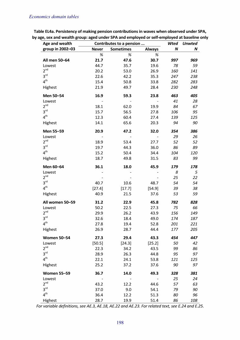
Economics domain tables
Table EL4a. Persistency of making pension contributions in waves when observed under SPA, by age, sex and wealth group: aged under SPA and employed or self-employed at baseline only
Age and wealth group in 2002–03
Contributes to a pension ... Wted N
Unwted N Never Sometimes Always
% % % All men 50–64 21.7 47.6 30.7 997 969 Lowest 44.7 35.7 19.6 78 59 2nd 20.2 53.0 26.9 160 141 3rd 22.6 42.2 35.3 247 238 4th 15.4 50.8 33.8 282 283 Highest 21.9 49.7 28.4 230 248
Men 50–54 16.9 59.3 23.8 463 405 Lowest - - - 41 28 2nd 18.1 62.0 19.9 84 67 3rd 15.7 56.5 27.8 106 95 4th 12.3 60.4 27.4 139 125 Highest 14.1 65.6 20.3 94 90
Men 55–59 20.9 47.2 32.0 354 386 Lowest - - - 29 26 2nd 18.9 53.4 27.7 52 52 3rd 19.7 44.3 36.0 86 89 4th 15.2 50.4 34.4 104 120 Highest 18.7 49.8 31.5 83 99
Men 60–64 36.1 18.0 45.9 179 178 Lowest - - - 8 5 2nd - - - 25 22 3rd 40.7 10.6 48.7 54 54 4th [27.4] [17.7] [54.9] 39 38 Highest 40.9 21.5 37.6 53 59
All women 50–59 31.2 22.9 45.8 782 828 Lowest 50.2 22.5 27.3 75 66 2nd 29.9 26.2 43.9 156 149 3rd 32.6 18.4 49.0 174 187 4th 27.8 19.4 52.8 201 221 Highest 26.9 28.7 44.4 177 205
Women 50–54 27.3 29.4 43.3 454 447 Lowest [50.5] [24.3] [25.2] 50 42 2nd 22.3 34.2 43.5 99 86 3rd 28.9 26.3 44.8 95 97 4th 22.1 24.1 53.8 121 125 Highest 25.2 37.2 37.6 90 97
Women 55–59 36.7 14.0 49.3 328 381 Lowest - - - 25 24 2nd 43.2 12.2 44.6 57 63 3rd 37.0 9.0 54.1 79 90 4th 36.4 12.2 51.3 80 96 Highest 28.7 19.9 51.4 86 108
For variable definitions, see AE.3, AE.18, AE.22 and AE.23. For related text, see E.24 and E.25.
198

Economics domain tables
Table EL4b. Persistency of making pension contributions in waves when observed under SPA, by age, sex and wealth group: employed or self-employed in all waves observed below state
pension age Age and wealth group in 2002–03
Contributes to a pension ... Wted N
Unwted N Never Sometimes Always
% % % All aged 50–64 26.2 23.5 50.2 1,260 1,286 Lowest 40.6 25.1 34.3 104 87 2nd 24.8 27.9 47.3 231 214 3rd 27.9 18.2 54.0 299 303 4th 21.5 21.8 56.7 335 356 Highest 25.9 27.1 46.9 292 326 Men 50–64 21.3 32.8 46.0 624 608 Lowest [35.7] [27.4] [36.9] 42 33 2nd 15.4 43.7 40.9 103 90 3rd 23.8 24.5 51.7 159 152 4th 16.6 33.4 50.1 169 171 Highest 23.8 35.0 41.2 151 162 Women 50–59 31.1 14.5 54.4 636 678 Lowest 43.9 23.6 32.5 63 54 2nd 32.4 15.2 52.4 128 124 3rd 32.6 11.0 56.5 139 151 4th 26.7 9.9 63.5 166 185 Highest 28.2 18.7 53.2 140 164
For variable definitions, see AE.18, AE.22 and AE.23. For related text, see E.26.
199

Economics domain tables
Table EL5. Persistence of self-reported financial difficulties and persistence of managing very well financially, by age and family type
Age and family type in 2002–03
Reports having financial difficulty ... Reports managing very well ... Wted N
Unwted N Never Sometimes Always Always Sometimes Never
% % % % % % Single men 81.8 18.2 0.0 8.1 54.6 37.3 379 365 50–54 75.4 24.6 0.0 3.0 51.1 45.9 77 65 55–59 77.3 22.7 0.0 6.8 53.2 40.0 90 89 60–64 79.2 20.8 0.0 5.7 56.8 37.5 66 61 65–69 82.4 17.6 0.0 13.9 44.0 42.1 57 58 70–74 [96.1] [3.9] [0.0] [14.3] [65.8] [19.9] 43 45 75–79 - - - - - - 27 27 80+ - - - - - - 19 20 Single women 82.6 16.8 0.6 7.3 55.0 37.7 858 920 50–54 61.8 36.6 1.7 4.9 39.5 55.6 127 136 55–59 71.7 26.2 2.2 7.5 51.3 41.1 108 140 60–64 83.0 17.0 0.0 7.6 54.9 37.6 116 138 65–69 82.3 17.3 0.4 11.7 52.5 35.8 147 184 70–74 92.1 7.9 0.0 7.3 55.2 37.5 136 148 75–79 95.3 4.7 0.0 4.3 67.6 28.1 118 95 80+ 92.6 7.4 0.0 6.5 66.4 27.0 107 79 Couples 90.1 9.6 0.3 11.2 58.4 30.4 3,473 3,426 50–54 87.7 11.9 0.4 11.7 55.6 32.7 934 838 55–59 87.4 12.4 0.2 12.4 55.5 32.1 825 892 60–64 92.4 7.5 0.1 13.3 57.5 29.2 608 614 65–69 89.5 10.0 0.5 10.6 58.0 31.5 509 540 70–74 93.8 6.2 0.0 6.2 67.2 26.6 353 340 75–79 98.3 1.7 0.0 9.1 67.3 23.6 197 165 80+ [100.0] [0.0] [0.0] [4.6] [79.2] [16.2] 47 37
Note: The response categories are ‘manage very well’, ‘manage quite well’, ‘get by alright’, ‘don’t manage very well’, ‘have some financial difficulties’ and ‘have severe financial difficulties’. For the
purposes of this table, ‘having financial difficulties’ includes those reporting that they ‘don't manage very well’, ‘have some financial difficulties’ or ‘have severe financial difficulties’. Those ‘managing
very well’ for the purposes of this table include only those reporting in the highest category (manage very well).
For variable definitions, see AE.23. For related text, see E.27 and E.28.
200

Economics domain tables
Table EL6a. Persistence of having too little money to do three or more items of the material deprivation index (waves 2–6), by education and family type: aged 50–SPA
Education and family type in 2002–03
Reports three or more items ... Wted N
Unwted N Never Sometimes Always
% % % Aged 50–SPA 78.6 19.4 2.0 2,485 2,481 Single men 69.1 27.7 3.1 229 211 Low education 67.9 29.4 2.7 136 115 Medium education 72.4 22.8 4.8 56 57 High education [68.7] [29.1] [2.2] 37 39 Single women 50.9 38.8 10.3 229 269 Low education 44.5 48.2 7.2 107 112 Medium education 53.0 30.4 16.6 95 118 High education [69.4] [30.6] [0.0] 26 39 Partnered men 84.4 14.8 0.8 1,149 1,110 Low education 79.5 19.5 1.0 501 433 Medium education 86.0 12.8 1.1 400 403 High education 91.5 8.5 0.0 249 274 Partnered women 80.7 18.2 1.2 878 891 Low education 76.8 21.1 2.1 388 357 Medium education 81.5 17.9 0.6 369 390 High education 90.4 9.6 0.0 121 144
Note: See paragraph E.29 for the definition and description of the items on the deprivation index. For variable definitions, see AE.5 and AE.23. For related text, see E.29–E.31.
201

Economics domain tables
Table EL6b. Persistence of having too little money to do three or more items of the material deprivation index (waves 2–6), by education and family type: aged SPA–74
Education and family type in 2002–03
Reports three or more items ... Wted N
Unwted N Never Sometimes Always
% % % Aged SPA–74 78.0 20.7 1.3 1,643 1,747 Single men 78.4 21.6 0.0 97 101 Low education 73.1 26.9 0.0 72 71 Medium education - - - 21 23 High education - - - 5 7 Single women 68.5 28.8 2.7 394 466 Low education 61.9 34.1 3.9 227 247 Medium education 74.5 24.3 1.2 133 167 High education 88.4 11.6 0.0 35 52 Partnered men 80.1 19.2 0.7 438 455 Low education 76.6 23.4 0.0 247 233 Medium education 83.2 15.4 1.5 139 158 High education 88.2 10.2 1.6 53 64 Partnered women 81.9 17.0 1.1 713 725 Low education 80.2 18.8 1.0 392 362 Medium education 81.8 16.6 1.6 243 265 High education 90.8 9.2 0.0 78 98
Note: See paragraph E.29 for the definition and description of the items on the deprivation index. For variable definitions, see AE.5 and AE.23. For related text, see E.29–E.31.
202

Economics domain tables
Table EL6c. Persistence of having too little money to do three or more items of the material deprivation index (waves 2–6), by education and family type: aged 75+
Education and family type in 2002–03
Reports three or more items ... Wted N
Unwted N Never Sometimes Always
% % % Aged 75+ 87.3 12.3 0.3 501 412 Single men [91.1] [8.9] [0.0] 45 46 Low education - - - 25 23 Medium education - - - 15 16 High education - - - 5 7 Single women 86.2 13.8 0.0 216 167 Low education 85.1 14.9 0.0 134 95 Medium education 92.4 7.6 0.0 71 61 High education - - - 10 11 Partnered men 85.4 13.3 1.3 135 116 Low education 79.1 18.7 2.2 77 59 Medium education [95.6] [4.4] [0.0] 47 45 High education - - - 11 12 Partnered women 90.4 9.6 0.0 104 83 Low education [95.1] [4.9] [0.0] 54 41 Medium education [84.2] [15.8] [0.0] 47 38 High education - - - 4 4
Note: See paragraph E.29 for the definition and description of the items on the deprivation index. For variable definitions, see AE.5 and AE.23. For related text, see E.29–E.31.
203

Economics domain tables
Table EL7a. Percentage of men employed or self-employed at baseline (wave 1) and, of those, percentage still in employment or self-employment at waves 2–6, by wealth group and age
Wealth group and age in 2002–03
Whole sample: Of those employed or self-employed at baseline, % still in employment or self-employment at ...
Wted N
Unwted N % in empl. or self-
empl. in 2002–03 Wave 1 Wave 2 Wave 3 Wave 4 Wave 5 Wave 6 All men 50–74 57.0 100 82.5 74.4 65.6 53.8 41.3 1,093 1,067 Lowest 35.3 100 82.9 71.5 69.7 54.2 37.2 90 68 2nd 52.3 100 86.0 76.8 70.9 59.2 48.3 170 151 3rd 64.5 100 79.6 72.8 63.7 50.6 36.5 270 261 4th 65.7 100 82.2 77.0 63.7 54.6 42.1 303 305 Highest 56.7 100 83.3 72.5 64.9 52.4 42.4 260 282 Men 50–54 87.0 100 92.9 88.6 85.4 75.1 61.6 463 405 Lowest 62.8 - - - - - - 41 28 2nd 83.4 100 96.1 92.4 87.8 76.7 64.7 84 67 3rd 95.8 100 91.4 92.1 87.2 71.7 59.9 106 95 4th 94.0 100 92.7 89.3 83.9 80.7 65.8 139 125 Highest 86.3 100 93.8 87.1 86.6 69.7 57.2 94 90 Men 55–59 72.8 100 84.0 78.7 66.9 51.4 33.6 354 386 Lowest 40.4 - - - - - - 29 26 2nd 68.6 100 86.5 76.2 67.9 59.2 43.0 52 52 3rd 80.0 100 86.9 78.7 69.5 52.4 27.0 86 89 4th 91.8 100 75.1 77.7 61.4 42.5 31.1 104 120 Highest 70.7 100 90.4 81.7 69.0 58.5 44.3 83 99 Men 60–64 49.7 100 67.9 46.3 30.7 21.5 17.2 179 178 Lowest 18.9 - - - - - - 8 5 2nd 49.5 - - - - - - 25 22 3rd 63.5 100 59.4 44.2 26.4 21.7 14.6 54 54 4th 52.4 [100] [75.5] [46.4] [18.6] [12.8] [3.8] 39 38 Highest 48.9 100 67.2 44.8 38.5 28.1 24.4 53 59 Men 65–74 17.8 100 53.3 42.3 30.4 19.9 17.0 96 98 Lowest 16.0 - - - - - - 12 9 2nd 9.9 - - - - - - 10 10 3rd 20.1 - - - - - - 23 23 4th 16.6 - - - - - - 21 22 Highest 24.3 [100] [59.0] [50.0] [32.3] [23.8] [22.3] 30 34
For variable definitions, see AE.3, AE.22 and AE.23. For related text, see E.32.
204

Economics domain tables
Table EL7b. Percentage of women employed or self-employed at baseline (wave 1) and, of those, percentage still in employment or self-employment at waves 2–6, by wealth group and age
Wealth group and age in 2002–03
Whole sample: Of those employed or self-employed at baseline, % still in employment or self-employment at ...
Wted N
Unwted N % in empl. or self-
empl in 2002–03 Wave 1 Wave 2 Wave 3 Wave 4 Wave 5 Wave 6 All women 50–74 44.7 100 81.2 70.1 55.3 42.2 31.0 982 1,055 Lowest 26.5 100 83.6 75.1 55.9 45.9 35.6 90 81 2nd 46.1 100 83.1 73.4 58.1 44.6 28.8 191 188 3rd 48.4 100 78.6 66.2 53.8 40.1 33.9 221 241 4th 50.6 100 82.7 72.0 58.0 44.8 30.2 247 273 Highest 46.8 100 79.7 67.2 51.1 38.2 29.3 234 272 Women 50–54 78.5 100 93.0 87.2 75.0 57.4 44.2 454 447 Lowest 51.5 [100] [92.7] [93.2] [73.3] [59.6] [40.7] 50 42 2nd 85.5 100 94.5 90.6 74.7 56.5 43.0 99 86 3rd 87.9 100 91.4 80.2 74.1 54.5 47.4 95 97 4th 85.1 100 93.4 88.4 77.7 61.0 44.7 121 125 Highest 77.1 100 92.4 86.0 73.7 55.6 43.3 90 97 Women 55–59 64.1 100 77.7 62.9 43.1 32.4 21.5 328 381 Lowest 38.9 - - - - - - 25 24 2nd 66.0 100 81.1 63.5 52.1 37.6 14.0 57 63 3rd 70.6 100 73.0 61.9 40.8 29.8 23.8 79 90 4th 68.2 100 77.3 61.1 40.5 31.1 18.6 80 96 Highest 65.9 100 81.8 64.9 42.4 31.0 21.8 86 108 Women 60–64 31.2 100 61.9 45.4 31.1 25.9 18.3 130 147 Lowest 13.4 - - - - - - 7 7 2nd 30.0 - - - - - - 24 25 3rd 32.7 [100] [52.6] [42.0] [32.4] [26.1] [17.9] 32 36 4th 38.2 [100] [73.5] [52.0] [42.7] [29.1] [18.0] 31 35 Highest 33.3 [100] [67.8] [47.1] [33.9] [31.1] [26.5] 38 44 Women 65–74 10.1 100 57.4 38.5 28.7 19.7 14.2 70 80 Lowest 6.6 - - - - - - 8 8 2nd 8.9 - - - - - - 12 14 3rd 10.8 - - - - - - 15 18 4th 10.1 - - - - - - 15 17 Highest 14.1 - - - - - - 20 23
For variable definitions, see AE.3, AE.22 and AE.23. For related text, see E.32.
205

Economics domain tables
Table EL8. Percentage not employed or self-employed at baseline (wave 1) and, of those, percentage in employment or self-employment at waves 2–6, by age and sex
Age in 2002–03 and sex
Whole sample: Of those not employed or self-employed at baseline, % in employment or self-employment at …
Wted N
Unwted N % not in empl. or
self-empl. in 2002–03 Wave 1 Wave 2 Wave 3 Wave 4 Wave 5 Wave 6 Men 50–74 43.0 0 4.6 4.8 3.1 2.4 1.3 826 809 50–54 13.0 0 6.2 16.0 10.6 10.3 4.8 69 52 55–59 27.2 0 9.8 10.3 6.6 4.6 1.8 133 123 60–64 50.3 0 5.8 3.8 2.4 2.2 2.0 181 173 65–74 82.2 0 2.3 1.8 1.3 0.7 0.3 443 461 Women 50–74 55.3 0 2.9 2.9 2.8 1.5 0.9 1,214 1,278 50–54 21.5 0 11.1 12.2 11.5 7.1 4.4 125 111 55–59 35.9 0 5.7 6.6 5.7 3.4 1.2 183 203 60–64 68.8 0 2.5 1.7 2.3 0.6 0.7 288 305 65–74 89.9 0 0.6 0.6 0.5 0.2 0.2 618 659
For variable definitions, see AE.3 and AE.23. For related text, see E.33.
206

Economics domain tables
Table EL9a. Persistency of health problem limiting ability to work in waves 1–6, by wealth group and age: men aged under 75 at baseline only
Wealth group and age in 2002–03
Health limits ability to work ... Wted N
Unwted N Never Sometimes
(transitory) Sometimes
(onset) Always
% % % % All men 50–74 64.2 25.5 9.0 1.4 1,914 1,872 Lowest 42.5 41.9 13.3 2.3 255 186 2nd 54.4 30.9 11.0 3.7 322 290 3rd 60.0 28.1 10.3 1.6 418 403 4th 73.3 18.4 8.2 0.2 461 475 Highest 77.8 17.2 4.6 0.4 459 518 Men 50–54 75.2 16.0 7.7 1.1 532 456 Lowest [47.9] [35.6] [14.4] [2.1] 65 42 2nd 67.6 21.3 7.3 3.7 100 77 3rd 73.2 15.8 11.0 0.0 111 99 4th 85.6 8.3 6.1 0.0 148 133 Highest 86.2 10.1 2.8 0.9 109 105 Men 55–59 64.0 26.5 8.1 1.3 487 509 Lowest 43.2 42.1 11.6 3.2 73 56 2nd 48.4 39.2 11.2 1.2 75 74 3rd 66.2 24.7 6.7 2.4 107 108 4th 68.5 21.9 9.0 0.7 113 130 Highest 80.7 14.9 4.5 0.0 118 141 Men 60–64 61.9 25.8 10.9 1.3 358 349 Lowest [33.4] [38.9] [25.4] [2.3] 42 31 2nd [58.8] [17.9] [18.5] [4.8] 48 44 3rd 53.8 34.2 11.3 0.7 85 79 4th 67.4 24.0 8.6 0.0 75 74 Highest 76.9 19.2 3.3 0.6 108 121 Men 65–74 54.9 33.7 9.7 1.8 538 558 Lowest 42.4 48.7 7.5 1.4 76 57 2nd 43.4 40.7 10.8 5.1 99 95 3rd 45.8 38.9 12.3 3.0 114 117 4th 66.5 23.8 9.7 0.0 125 138 Highest 68.4 24.0 7.6 0.0 124 151
For variable definitions, see AE.3, AE.22 and AE.23. For related text, see E.34 and E.35.
207

Economics domain tables
Table EL9b. Persistency of health problem limiting ability to work in Waves 1–6, by wealth group and age: women aged under 75 at baseline only
Wealth group and age in 2002–03
Health limits ability to work ... Wted N
Unwted N Never Sometimes
(transitory) Sometimes
(onset) Always
% % % % All women 50–74 62.5 27.6 8.7 1.2 2,195 2,332 Lowest 41.2 43.6 12.1 3.1 338 298 2nd 59.2 30.8 9.3 0.7 414 420 3rd 65.0 24.5 9.1 1.4 456 491 4th 69.5 23.1 6.7 0.7 487 539 Highest 70.7 21.2 7.5 0.5 500 584 Women 50–54 72.3 20.5 6.5 0.7 579 558 Lowest 46.6 40.2 11.6 1.6 97 79 2nd 71.7 20.5 7.0 0.9 116 101 3rd 78.8 17.5 2.4 1.4 108 110 4th 81.5 15.0 3.4 0.0 142 145 Highest 76.8 13.8 9.5 0.0 117 123 Women 55–59 66.0 26.6 6.8 0.7 511 584 Lowest 46.8 43.1 7.9 2.2 64 62 2nd 63.1 30.3 6.6 0.0 86 96 3rd 70.4 20.9 8.1 0.6 112 123 4th 67.1 25.6 6.7 0.6 118 138 Highest 72.5 21.7 5.2 0.6 131 165 Women 60–64 62.6 28.1 8.0 1.3 417 451 Lowest [37.1] [46.0] [12.7] [4.2] 49 44 2nd 59.8 31.5 8.8 0.0 78 82 3rd 62.9 25.0 11.2 0.9 96 102 4th 68.5 25.5 3.9 2.1 80 89 Highest 71.3 22.4 5.6 0.7 113 134 Women 65–74 51.7 34.0 12.4 1.8 688 739 Lowest 35.8 45.5 14.5 4.2 128 113 2nd 45.6 39.7 13.3 1.4 135 141 3rd 51.5 32.5 13.6 2.4 139 156 4th 60.2 27.6 11.5 0.7 147 167 Highest 63.6 26.1 9.6 0.7 139 162
For variable definitions, see AE.3, AE.22 and AE.23. For related text, see E.34 and E.35.
208

S. Social domain tables Katey Matthews University of Manchester James Nazroo University of Manchester
Introduction S.1 This chapter presents selected data tables from the Social domain of the English Longitudinal Study of Ageing. The tables are split into two sections:
• Cross-sectional tables (Tables S1–S14) involve classification by sex and age (divided into five-year categories) and classification by sex and wealth group. Tables S1–S14 contain data for all core members at wave 6 (2012–13), including people from the original ELSA cohort in 2002–03 and the refreshment sample members added to ELSA in 2006–07 (wave 3), 2008–09 (wave 4) and 2012–13 (wave 6). These cross-sectional tables show a representative sample of people aged 50 and over in 2012–13.
• Longitudinal tables (Tables SL1–SL7) include a balanced ELSA sample who participated in all of waves 1 to 6. Again, classifications by sex and age and by sex and wealth group are presented. The longitudinal tables show the change over time in a representative sample of people aged 50 and over in 2002–03. For example, Table SL4a shows the percentage of people using public transport in wave 1 and the percentage still using public transport in every wave up to and including wave 6 (2012–13). Differences across the waves can be interpreted as a consequence of a combination of ageing and period effects.
S.2 The unit of observation in all tables is the individual. The data are weighted using either a cross-sectional (main questionnaire or self-completion questionnaire) or longitudinal weight as appropriate. The variables included in each table have been selected to provide a broad picture of the data available from the Social domain of ELSA. A glossary of the measures is provided in the annex to this chapter.
Cross-sectional tables Socio-demographic S.3 Table S1a shows the percentage of men and women by marital status and age in 2012–13. The majority of men and women are reportedly married or have remarried. The percentage of women who reported being married or remarried declines with age from 62% in those aged 50–54 to 26% in those aged 80 and above. The percentage of men and women reporting as widowed rises considerably with age, particularly for women. Almost two-thirds of women aged 80 and above are widowed (63%) compared with almost a third of men aged 80 and above (32%). There is a decline in the percentage of men who remained single as they aged, with 2% of men aged 80 or above reporting being single. This is compared with a U-shaped relationship with age for women. The decline with age in the percentage who reported being divorced or separated is similar for men and women.

Social domain tables
S.4 Table S1b shows the percentage of men and women by marital status and wealth in 2012–13. The percentage of men and women married or remarried in the three highest wealth groups is as much as double that of the lowest wealth group. Men and women in the lowest wealth group are much more likely to be single, divorced or separated, or widowed than those in higher wealth groups. This is partially explained by the family-level wealth measure used in the analysis (see Table E3 in Economics domain tables, Chapter E).
S.5 Table S2a shows the percentage of men and women by ethnicity and age in 2012–13. Across each age group, the vast majority of men (94%) and women (95%) identify as white. However, the percentage of white respondents increases with age for men and women. Table S2b shows the percentage of men and women by ethnicity and wealth group in 2012–13. Of those men and women who self-identified as non-white, a slightly higher proportion were in the lowest wealth group than in the highest wealth group.
Internet and recreation S.6 Table S3a shows the percentage of men and women by usage of the internet and age in 2012–13. Nearly three-quarters of men (74%) and over six in ten of women (64%) report that they use the internet. However, usage of the internet declines with age, particularly for women. Among those aged 80 and above, 15% of the women report using the internet compared with 36% of the men.
S.7 Table S3b shows the percentage of men and women by usage of the internet and wealth in 2012–13. There is a strong wealth gradient in internet usage among men and women. Just over half of men in the lowest wealth group report using the internet (52%), compared with almost nine-tenths of those in the highest wealth group (89%). These figures are 44% and 83%, respectively, for women.
S.8 Table S4a shows the mean weekly hours of TV watched, by sex and age in 2012–13. On average, men view 15 hours of TV per week and women view 16 hours. The number of hours of TV viewed per week is similar across age groups for men and women. Table S4b shows the mean weekly hours of TV watched by sex and wealth. It suggests that men and women in higher wealth groups watch less TV, on average, than those in lower wealth groups.
S.9 Table S5a shows the percentage of men and women who have taken a holiday, in the UK or abroad, in the last year by age in 2012–13. Around three-quarters of men and women aged between 50 and 74 have taken a holiday in the last year. The percentage is lower for men and women from age 75 onwards, and by age 80 less than half of men and women (47% and 43%, respectively) have taken a holiday in the last year.
S.10 Table S5b shows the percentage of men and women who have taken a holiday, in the UK or abroad, in the last year by wealth in 2012–13. The proportion of men and women in the highest wealth group taking a holiday is about double that for those in the lowest wealth group. Nonetheless, almost half of men and women in the lowest wealth group reported having been on holiday in the last year.
Transport and services S.11 Table S6a shows the percentage of men and women by the frequency of public transport use and age in 2012–13. Women report using public transport more often than men, but this difference is marginal. The frequency of public transport usage
210

Social domain tables
tends to increase for older individuals up to the age of 80. Public transport usage declines rapidly for men and women over the age of 80, with almost half of men and women never using public transport by age 80.
S.12 Table S6b shows the percentage of men and women by the frequency of public transport use and wealth in 2012–13. Men and women in lower wealth groups are more likely to report using public transport regularly (i.e. at least once a week) than those in higher wealth groups, but those in lower wealth groups are also more likely to report never using public transport than those in higher wealth groups.
S.13 Table S7a shows the percentage of men and women who have access to a car or van when needed, by age in 2012–13. Of those who do, the table shows the percentage who drive this vehicle themselves; and of those who do not, the table shows the percentage who drove a vehicle in the past. The percentage of those reporting access to a car or van remains reasonably stable across age groups, but those aged 75 and over see a sharp decline in access. Just over half of women aged 80 and over (52%) have access to a vehicle when needed, compared with three-quarters of men (76%). The majority of men of all ages drive this vehicle themselves, but among women the percentage driving themselves declines with age at a greater rate. Over four-fifths of men aged 80 and over (83%) drive their own vehicle, compared with less than half of women aged 80 and over (47%). The percentage of non-drivers in 2012–13 who drove in the past increases with age at a greater rate for men than for women. Over four-fifths of non-driving men aged 80 and over (83%) drove in the past, compared with less than two-fifths of women aged 80 and over (39%).
S.14 Table S7b shows the percentage of men and women who have access to a car or van when needed, by wealth in 2012–13. Of those who do, the table shows the percentage who drive this vehicle themselves; of those who do not, the table shows the percentage who drove a vehicle in the past. Almost all men and women in the highest wealth quintile have access to a vehicle when needed, compared with just over three-fifths of men (63%) and just over half of women (57%) in the lowest wealth group. There is a 10 percentage point reduction in the proportion of men driving vehicles themselves in the lowest wealth group compared with the highest, but among women this difference is over 40 percentage points. Among non-drivers, rates of having driven in the past are higher among higher wealth groups.
S.15 Table S8a shows the percentages of men and women who find it difficult to get to a bank, post office, corner shop, supermarket, shopping centre, GP, chiropodist, dentist, optician and hospital, by age in 2012–13. Hospitals and shopping centres are the places that both men and women find it most difficult to get to. Older individuals, particularly women, find it more difficult to get to places than younger individuals. Over a third of women and around a quarter of men aged 80 and over find it difficult to get to a hospital (35% and 24%, respectively) or a shopping centre (36% and 25%, respectively).
S.16 Table S8b shows the percentages of men and women who find it difficult to get to a bank, post office, corner shop, supermarket, shopping centre, GP, chiropodist, dentist, optician and hospital, by wealth in 2012–13. Men and women in lower wealth groups find it more difficult to get to these places than those in higher wealth groups. Around a fifth of men and a quarter of women in the lowest wealth group find it difficult to get to a hospital (23% and 25%, respectively) or a shopping centre (21% and 25%, respectively), while less than a tenth of those in the highest wealth group
211

Social domain tables
have difficulty in getting to a hospital (9% of both men and women) or a shopping centre (7% of both men and women).
Providing social support S.17 Table S9a shows the percentage of men and women by frequency of voluntary work and age in 2012–13. The prevalence of frequent voluntary work (i.e. twice a month or more) among men and women is greater as they age up to 75. Around a fifth of men and a quarter of women aged 70–74 (19% and 25%, respectively) do voluntary work at least twice a month. In later age, the prevalence of volunteering declines for men and women, particularly in those aged 80 and over.
S.18 Table S9b shows the percentage of men and women by the frequency of voluntary work and wealth in 2012–13. Men and women in higher wealth groups are more likely to volunteer and volunteer more often than those in lower wealth groups. At least two-fifths of men and women in the highest wealth group (41% for both men and women) did some voluntary work in the last year compared with one-in-seven of those in the lowest wealth group.
S.19 Table S10a shows the percentage of men and women who cared for someone in the last month by age in 2012–13. The prevalence of caring for someone in the last month is 8% among men and 16% among women. The percentage of men who cared for someone in the last month is fairly stable across age groups. However, the percentage of women who cared for someone declines considerably with age, from 22% for those aged 60–64 to 4% for those aged 80 and over.
S.20 Table S10b shows the percentage of men and women who cared for someone in the last month by wealth in 2012–13. The percentage who cared for someone in the last month is similar across wealth groups for men but increases with wealth group for women.
Receipt of social support S.21 Table S11a shows the percentage of men and women with an ADL or IADL difficulty (see AS.9 for details of definitions) who receive help (including from their partner or other people in the household) by age in 2012–13. Almost a third of men (33%) and over two-fifths of women (42%) with a difficulty receive help. The proportion increases with age in men and women. More than half of men aged 80 and over (55%) and over two-thirds of women aged 80 and over (71%) with a difficulty receive help.
S.22 Table S11b shows the percentage of men and women with an ADL or IADL difficulty who receive help (including from their partner or other people in the household) by wealth in 2012–13. The proportion of men and women with a difficulty receiving help is lower for those in higher wealth groups. Over a quarter of men and women in the highest wealth group (27% and 30%, respectively) with a difficulty receive help, compared with over two-fifths of men (45%) and over half of women (57%) in the lowest wealth group.
S.23 Table S12a shows the mean number of close relationships with children, family and friends for men and women by age in 2012–13. On average, men and women have seven or eight close relationships. This varies marginally by age.
S.24 Table S12b shows the mean number of close relationships with children, family and friends for men and women by wealth in 2012–13. On average, men and
212

Social domain tables
women in the higher wealth groups have marginally more closer contacts than those in the lower wealth groups.
Perceived social status S.25 Table S13a shows the percentage of men and women by self-perceived social status and age in 2012–13. More than three-quarters of men and women perceive their social position to be on the third, fourth or fifth rung of a five-point social ladder, where the fifth rung is the best-off and the first rung is the worst-off. Around two-fifths of men aged 50–74 rank their social position as being in the highest two rungs of society (best-off and fourth rungs), but this drops to around a third thereafter. Over a third of women aged 60–64 rank their social position as being in the highest two rungs of society; this percentage then decreases with age.
S.26 Table S13b shows the percentage of men and women by self-perceived social status and wealth in 2012–13. Men and women in the lower wealth groups are more likely to rank their status lower on the social ladder than those in the higher wealth groups.
Expectation of life expectancy S.27 Table S14a shows the mean self-perceived chance of living to 85 for men and women aged below 70 by age in 2012–13. Women are more optimistic about their chances of living to 85 than men. The average man believes that there is a 48% chance he will live to 85, compared with the average woman believing she has a 53% chance of doing so. The percentage of women who expect to live to age 85 increases steadily with age. For men, the percentage increases from age 55 onwards, after an initial drop of 4 percentage points between the ages of 50–54 and 55–59.
S.28 Table S14b shows the mean self-perceived chance of living to 85 for men and women aged below 70 by wealth in 2012–13. Men and women in the highest wealth group are, on average, 10 percentage points more likely to expect to live to 85 than those in the lowest wealth group. Nonetheless, women in the lowest wealth group, on average, believe they have a 47% chance of living to 85 and men in the lowest wealth group, on average, believe they have a 42% chance of living to 85.
Longitudinal tables Marital status S.29 Table SL1a shows the percentage of men and women married or remarried at baseline (wave 1) and the percentage still married across each wave, by age. The majority of married men and women in 2002–03 remained in a marriage by 2012–13. However, this varies by age, particularly for women. For example, less than half (46%) of married women aged 75 and over at baseline were still married by wave 6. Over two-thirds (70%) of men aged 75 and over were still married by wave 6. Almost all no-longer married men and women became widowed in a later wave of ELSA rather than separated or divorced.
S.30 Table SL1b shows the percentage of men and women married or remarried at baseline (wave 1) and the percentage still married across each wave, by wealth. Men and women married in 2002–03 in the lowest wealth group are less likely to remain in a marriage by 2012–13 than those in higher wealth groups.
213

Social domain tables
Internet S.31 Table SL2a shows the percentage of men and women using the internet at baseline (wave 1) and the percentage still using it in subsequent waves, by age. The majority of men and women using the internet in 2002–03 continued to use the internet by 2012–13.
S.32 Table SL2b shows the percentage of men and women using the internet at baseline (wave 1) and the percentage still using it in subsequent waves, by wealth. Men and women in the highest wealth group are much more likely to continue using the internet across each wave of ELSA than those in the lowest wealth group. This is most apparent for women in the lowest wealth group, of whom around a third (30%) who reported using the internet at baseline in 2002–03 stated they did not use it by wave 6 (2012–13).
S.33 Table SL2c shows the percentage of men and women not using the internet at baseline and, of those, the percentage using it in subsequent waves, by age. Around two-thirds of men and women aged 50–54 (67% and 63%, respectively) and over half of men and women aged 55–59 (52% and 54%, respectively) who were not using the internet in 2002–03 stated that they were using it by 2012–13. The proportion of men and women starting to use the internet is lower for each older age group, and women aged 65 and over are considerably less likely to start using the internet than men of the same age.
S.34 Table SL2d shows the percentage of men and women not using the internet at baseline and, of those, the percentage using it in subsequent waves, by wealth. Men and women in the highest wealth group are consistently at least twice as likely to start using the internet as those in the lowest wealth group. Furthermore, half of men (50%) in the highest wealth group not using the internet in 2002–03 did start using it by wave 4 (2008–09). Among women in the highest wealth group not using the internet at baseline, more than half (54%) had started to use it by 2012–13.
Holidays S.35 Table SL3a shows the percentage of men and women having been on holiday in the last year at baseline (wave 1) and the percentage still having been on holiday in the last year in subsequent waves, by age. In each wave up to and including wave 6, at least four-fifths of men and women having been on holiday at baseline (2002–03) had also been on holiday in the last year (83% of men and 80% of women had been on holiday in 2012–13). The proportion of men and women continuing to go on holiday in subsequent waves is lower for older individuals. Only slightly over half of men aged 75 and over (55%) and slightly less than half of women aged 75 and over (49%) reported having been on holiday at wave 6 (2012–13), after reporting that they had been on holiday in 2002–03.
S.36 Table SL3b shows the percentage of men and women having been on holiday in the last year at baseline (wave 1) and the percentage still having been on holiday in the last year in subsequent waves, by wealth. Men and women in the lowest wealth group are more likely to report not going on holiday in subsequent waves. By 2012–13, around two-fifths of women (44%) and more than a third of men (38%) in the lowest wealth group reported not going on holiday in the last year, having reported that they did at baseline. This compares with just over a tenth of those in the highest wealth group.
214

Social domain tables
Transport S.37 Table SL4a shows the percentage of men and women who used public transport at baseline (wave 1) and the percentage still using public transport in subsequent waves, by age. The majority of men and women still used public transport in 2012–13 having already been using public transport in 2002–03. The proportion is lower for those aged 75 and over for men and women, of whom only around half still used public transport in 2012–13 (50% and 52%, respectively). The proportion still using public transport increased after wave 3 (2006–07). This coincides with the introduction of free off-peak bus travel for over-60s in April 2008. The increase was greatest for men aged 55–64 and women aged 55–59.
S.38 Table SL4b shows the percentage of men and women who used public transport at baseline (wave 1) and the percentage still using public transport in subsequent waves, by wealth. The majority of men and women in each wealth group still used public transport in subsequent waves of ELSA.
S.39 Table SL4c shows the percentage of men and women who did not use public transport at baseline (wave 1) and, of those, the percentage using public transport in subsequent waves, by age. Men aged 55–69 and women aged 50–69 in 2002–03 are more likely to start using public transport than those in other age groups. The proportion of men and women in all age groups starting to use public transport increased after wave 3 (2006–07). This coincides with the introduction of free off-peak bus travel for over-60s in April 2008.
S.40 Table SL4d shows the percentage of men and women who did not use public transport at baseline (wave 1) and, of those, the percentage using public transport in subsequent waves, by wealth. Men and women in the lowest wealth group are less likely to start using public transport than those in higher wealth groups. Over two-fifths of men and women (both 43%) in the highest wealth group not using public transport in 2002–03 started using public transport by 2012–13.
S.41 Table SL5a shows the percentage of men and women with access to a car or van when needed at baseline (wave 1) and, of those, the percentage with a car or van when needed in subsequent waves, by age. For men only, those at older ages (70 and above) see a decline in car access over time. For women, this decline appears to happen among younger cohorts (from age 60 onwards), and the decline is more rapid. By 2012–13, only just over half of women (55%) aged 75 and over who had access to a car at baseline still had access to a car when needed. This compares with 71% of men in the same age group.
S.42 Table SL5b shows the percentage of men and women with access to a car or van when needed at baseline (wave 1) and, of those, the percentage with a car or van when needed in subsequent waves, by age. There is a general decline in car access over time across all wealth groups, but the decline is greater in the lower wealth quintiles and again occurs more rapidly among women. By 2012–13, 89% of men in the lowest wealth group who had access to a car at baseline still had access when needed, compared with 66% of women in that wealth group.
Volunteering S.43 Table SL6a shows the percentage of men and women volunteering at baseline (wave 1) and the percentage still volunteering in subsequent waves, by age. Men and women aged 50–59 are less likely to continue volunteering than those aged 60–64.
215

Social domain tables
Over four-fifths of men aged 75 and over (81%) and three-quarters of women aged 75 and over (75%) who volunteered in 2002–03 did not volunteer by 2012–13.
S.44 Table SL6b shows the percentage of men and women volunteering at baseline (wave 1) and the percentage still volunteering in subsequent waves, by wealth. Men and women in the higher wealth groups are more likely to continue volunteering across each wave of ELSA. A quarter of men in the lowest wealth group (25%) still volunteered by 2012–13, compared with almost two-thirds of those in the highest wealth group (61%).
S.45 Table SL6c shows the percentage of men and women not volunteering at baseline (wave 1) and, of those, the percentage volunteering in subsequent waves, by age. The vast majority of men and women not volunteering in 2002–03 did not start volunteering by 2012–13. Men and women aged under 70 are more likely to have started volunteering than those aged 70 and above.
S.46 Table SL6d shows the percentage of men and women not volunteering at baseline (wave 1) and, of those, the percentage volunteering in subsequent waves, by wealth. Men and women in the highest wealth group are more likely to have started volunteering than those in lower wealth groups. About a quarter of men (26%) and almost a fifth of women (19%) in the highest wealth group not volunteering in 2002–03 had started to volunteer by 2012–13.
Caring S.47 Table SL7a shows the percentage of men and women who did not care for someone in the last month at baseline (wave 1) and, of those, the percentage caring for someone in the last month in subsequent waves, by age. The vast majority of men and women in each age group did not start caring for someone by 2012–13. However, men aged 60–64 and women aged under 65 are more likely to have started caring for someone than those at other ages.
S.48 Table SL7b shows the percentage of men and women who did not care for someone in the last month at baseline (wave 1) and, of those, the percentage caring for someone in the last month in subsequent waves, by wealth. The vast majority of men and women did not start caring for someone by 2012–13. However, women in the lowest wealth group are less likely to have started caring for someone than those in higher wealth groups, particularly those in the two highest wealth groups.
216
Social domain tables
Annex AS. Definitions AS.1 Age is defined as age at last birthday.
AS.2 Baseline is defined as wave 1 of ELSA. Fieldwork for wave 1 was conducted in 2002 and 2003. Subsequent waves have been conducted every two years, with the most recent (wave 6) conducted in 2012 and 2013.
AS.3 Caring is defined as whether a respondent cared for someone in the last month.
AS.4 Close relationships are defined as the number of close relationships a respondent has with their children, family and friends.
AS.5 Ethnicity is measured by a dichotomous categorisation of white and non-white. The ELSA sample is known not to be representative of the ethnic minority population aged 50 and over in England.
AS.6 Holidays taken in the last year are measured by whether a respondent has taken a holiday, in the UK or abroad, in the last 12 months.
AS.7 Internet usage is defined by whether a respondent uses the internet and/or email. Those classed as not using the internet report using it less than once every three months or never. AS.8 Marital status is defined as per a respondent’s legal status.
AS.9 Mobility assistance is defined as whether a respondent with an ADL or IADL difficulty receives assistance with these activities, including from a partner or other people in the household. Activities of daily living (ADLs) include dressing, getting around inside the home, bathing or showering, eating, getting in or out of bed and using the toilet. Instrumental activities of daily living (IADLs) include preparing a hot meal, shopping, making telephone calls, taking medication, doing household chores and managing personal finances.
AS.10 Private transport usage is measured by whether a respondent has access to a car or van when needed.
AS.11 Public transport usage is measured by frequency categories: every day or nearly every day; two or three times a week; once a week; two or three times a month; once a month or less; and never. At waves 1–2, the following usage categories were used: a lot; quite often; sometimes; rarely; and never.
AS.12 Self-perceived chance of living to 85 is measured by the mean of respondents’ assessments of the probability (0 to 100) of them living to 85 for those aged 69 and below.
AS.13 Self-perceived social status is measured by respondents indicating on the rung of a ladder where they stand in society based on money, education and employment.
AS.14 Service access is measured by whether a respondent finds it ‘quite’ or ‘very’ difficult to get to or is ‘unable to go to’ a range of places using their usual form of transport.
AS.15 Tenure is defined as accommodation type with the following categories: own outright; own with mortgage or shared ownership; private renting or rent free; and social renting from local authority or housing association.
217

Social domain tables
AS.16 TV viewing is defined as the mean number of hours of television watched during an ordinary week.
AS.17 Volunteering is defined by frequency of any voluntary work carried out: twice a month or more; about once a month; every few months; about once or twice a year; less than once a year; and never.
AS.18 Wealth is defined as non-pension wealth minus any debt. Net non-pension wealth is measured at the family level and includes financial wealth from savings and investments minus debts, physical wealth (wealth held in second homes, farm or business property, other business wealth, other land and other assets such as jewellery or works of art or antiques) minus debts, and housing wealth minus mortgages.
AS.19 Wealth groups are formed by ordering all ELSA sample members according to the value of their total (non-pension) family wealth and dividing the sample into five equal-sized groups. The cut-off points for the wealth groups are shown in the following table, reported in January 2013 prices and rounded to the nearest £1,000: Wealth group definition, wave 1
(2002–03) Wealth group definition, wave 6
(2012–13) Lowest Less than £19k Less than £48k 2nd Between £19k and £130k Between £48k and £170k 3rd Between £130k and £226k Between £170k and £273k 4th Between £226k and £400k Between £273k and £450k Highest More than £400k More than £450k
AS.20 Notes to all tables The unit of observation in all tables is the individual.
All cross-sectional tables are based on the cross-section of ELSA sample members in wave 6 of data. This includes refreshment sample members.
All longitudinal tables are based on individuals who have responded in all of waves 1 to 6 (the ‘balanced panel’) unless otherwise specified.
All numbers are based on weighted data. Unweighted frequencies (N) are reported.
For cross-sectional analyses, cross-sectional weights are used. For longitudinal analyses, longitudinal weights are used.
The fieldwork dates are shown in the following table: Fieldwork dates (inclusive) Wave 1 March 2002 – March 2003 Wave 2 June 2004 – June 2005 Wave 3 May 2006 – August 2007 Wave 4 June 2008 – July 2009 Wave 5 July 2010 – June 2011 Wave 6 May 2012 – May 2013
218

Social domain tables
Table S1a. Marital status (%), by age and sex: wave 6 Age in 2012–13 50–54 55–59 60–64 65–69 70–74 75–79 80+ All Men Single 14.7 14.4 7.3 6.7 6.7 4.5 1.8 9.0 Married or civil partner 59.1 56.0 66.7 65.4 62.3 63.6 55.2 61.2 Remarried 10.9 11.7 11.8 12.1 13.6 11.9 7.5 11.4 Divorced or separated 14.4 16.5 12.2 11.5 7.7 7.4 3.4 11.5 Widowed 0.9 1.4 2.0 4.2 9.6 12.7 32.0 6.9 Women Single 11.2 7.3 5.0 2.5 3.0 3.6 5.7 5.8 Married or civil partner 49.1 53.9 59.2 59.1 53.2 45.3 23.5 49.5 Remarried 13.1 13.4 12.2 11.7 8.3 4.2 2.6 9.9 Divorced or separated 22.4 21.5 16.1 13.4 12.6 9.6 4.9 15.1 Widowed 4.3 3.9 7.3 13.2 22.8 37.3 63.2 19.6 N (unweighted) Men 279 644 755 801 586 516 474 4,055 Women 356 782 970 920 687 646 679 5,040
For variable definitions, see AS.1, AS.8 and AS.20. For related text, see S.3.
Table S1b. Marital status (%), by wealth group and sex: wave 6 Wealth group in 2012–13 Lowest 2nd 3rd 4th Highest All Men Single 20.2 8.1 6.7 5.0 6.5 9.1 Married or civil partner 30.9 58.3 66.7 71.6 75.2 61.2 Remarried 11.9 12.8 12.1 10.3 9.6 11.3 Divorced or separated 26.8 11.7 8.1 7.5 4.4 11.4 Widowed 10.2 9.2 6.3 5.7 4.4 7.0 Women Single 10.6 6.5 4.3 3.7 3.6 5.8 Married or civil partner 23.3 40.9 52.4 64.6 69.4 49.4 Remarried 8.1 11.9 11.2 9.3 9.2 9.9 Divorced or separated 29.1 17.7 11.2 7.7 7.5 14.9 Widowed 29.0 22.8 21.0 14.7 10.3 19.9 N (unweighted) Men 612 715 827 892 933 3,979 Women 908 991 1043 1001 996 4,939
For variable definitions, see AS.8, AS.18, AS.19 and AS.20. For related text, see S.4.
219

Social domain tables
Table S2a. Ethnicity (%), by age and sex: wave 6 Age in 2012–13 50–54 55–59 60–64 65–69 70–74 75–79 80+ All Men White 89.5 91.5 95.5 96.7 97.3 95.0 96.8 94.1 Non-white 10.5 8.5 4.5 3.3 2.7 5.0 3.2 5.9 Women White 89.7 91.1 95.8 97.6 96.8 97.8 98.1 94.8 Non-white 10.3 8.9 4.2 2.4 3.2 2.2 1.9 5.2 N (unweighted) Men 278 644 755 802 586 516 474 4,055 Women 355 782 970 921 687 646 679 5,040
For variable definitions, see AS.1, AS.5 and AS.20. For related text, see S.5.
Table S2b. Ethnicity (%), by wealth group and sex: wave 6 Wealth group in 2012–13 Lowest 2nd 3rd 4th Highest All Men White 93.9 90.8 95.7 93.8 96.2 94.1 Non-white 6.1 9.2 4.3 6.2 3.8 5.9 Women White 91.6 94.1 96.8 95.0 96.8 94.8 Non-white 8.4 5.9 3.2 5.0 3.2 5.2 N (unweighted) Men 612 714 828 892 933 3,979 Women 909 991 1,043 1,000 996 4,939
For variable definitions, see AS.5, AS.18, AS.19 and AS.20. For related text, see S.5.
220

Social domain tables
Table S3a. Use internet and/or email (%), by age and sex: wave 6 Age in 2012–13 50–54 55–59 60–64 65–69 70–74 75–79 80+ All Men 91.7 87.6 83.5 74.4 58.5 47.0 36.0 73.7 Women 85.6 85.1 77.3 67.9 53.4 35.3 15.3 63.8 N (unweighted) Men 220 522 667 714 522 443 362 3,450 Women 280 689 869 842 618 559 471 4,328
For variable definitions, see AS.1, AS.7 and AS.20. For related text, see S.6.
Table S3b. Use internet and/or email (%), by wealth group and sex: wave 6
Wealth group in 2012–13 Lowest 2nd 3rd 4th Highest All Men 51.6 68.7 71.2 82.2 89.1 73.4 Women 43.6 57.8 59.0 74.6 83.2 63.2 N (unweighted) Men 611 715 828 892 933 3,979 Women 909 989 1,042 1,001 996 4,937
For variable definitions, see AS.7, AS.18, AS.19 and AS.20. For related text, see S.7.
Table S4a. Mean total hours of TV watched per week, by age and sex: wave 6 Age in 2012–13 50–54 55–59 60–64 65–69 70–74 75–79 80+ All Men 13.2 14.7 14.8 15.1 15.5 17.0 15.4 14.9 Women 15.1 14.8 16.1 16.0 16.0 17.4 16.6 15.9 N (unweighted) Men 219 520 664 710 520 451 364 3,448 Women 279 685 870 848 625 571 491 4,369
For variable definitions, see AS.1, AS.16 and AS.20. For related text, see S.8.
Table S4b. Mean total hours of TV watched per week, by wealth group and sex: wave 6 Wealth group in 2012–13 Lowest 2nd 3rd 4th Highest All Men 19.9 16.5 14.8 13.5 10.8 14.9 Women 20.0 17.9 16.0 13.6 11.6 15.9 N (unweighted) Men 450 592 722 793 830 3,387 Women 720 844 916 903 899 4,282
For variable definitions, see AS.16, AS.18, AS.19 and AS.20. For related text, see S.8.
221

Social domain tables
Table S5a. Taken holiday (in UK or abroad) in the last 12 months (%), by age and sex: wave 6 Age in 2012–13 50–54 55–59 60–64 65–69 70–74 75–79 80+ All Men 73.7 73.6 77.1 75.6 73.3 67.0 46.8 71.2 Women 73.7 74.7 77.3 79.1 71.0 63.3 43.1 69.7 N (unweighted) Men 221 524 667 715 526 453 370 3,476 Women 282 692 877 852 638 574 498 4,413
For variable definitions, see AS.1, AS.6 and AS.20. For related text, see S.9.
Table S5b. Taken holiday (in UK or abroad) in the last 12 months (%), by wealth group and sex: wave 6
Wealth group in 2012–13 Lowest 2nd 3rd 4th Highest All Men 44.0 64.1 74.3 78.6 90.0 71.3 Women 43.9 65.6 73.6 80.8 86.5 69.6 N (unweighted) Men 456 592 730 804 833 3,415 Women 734 857 926 904 904 4,325
For variable definitions, see AS.6, AS.18, AS.19 and AS.20. For related text, see S.10.
222

Social domain tables
Table S6a. Use of public transport (%), by age and sex: wave 6 Age in 2012–13 50–54 55–59 60–64 65–69 70–74 75–79 80+ All Men Every day or nearly every day 11.4 9.3 6.1 6.6 9.4 6.1 4.8 8.0 Two or three times a week 5.9 6.5 7.3 12.9 14.9 16.1 14.1 10.1 Once a week 5.6 4.2 7.2 6.4 6.5 7.9 6.8 6.2 Two or three times a month 8.1 9.8 11.9 12.7 10.9 9.2 7.3 10.1 Once a month or less 34.3 31.4 33.3 32.4 29.9 29.0 20.6 31.0 Never 34.7 38.8 34.2 29.0 28.5 31.7 46.5 34.7 Women Every day or nearly every day 11.4 11.9 7.2 9.1 7.0 8.4 9.6 9.4 Two or three times a week 6.5 7.7 14.0 16.7 20.2 18.0 14.1 13.2 Once a week 5.0 5.0 9.0 10.6 11.1 11.6 7.2 8.1 Two or three times a month 9.5 8.7 12.9 12.7 10.0 9.8 5.0 9.8 Once a month or less 36.1 35.3 32.6 28.7 24.9 22.0 17.1 29.0 Never 31.4 31.4 24.2 22.2 26.8 30.2 47.0 30.5 N (unweighted) Men 278 644 755 802 586 516 474 4,055 Women 356 781 969 920 687 646 679 5,038
For variable definitions, see AS.1, AS.11 and AS.20. For related text, see S.11.
Table S6b. Use of public transport (%), by wealth group and sex: wave 6 Wealth group in 2012–13 Lowest 2nd 3rd 4th Highest All Men Every day or nearly every day 13.0 7.5 5.5 8.4 6.6 8.1 Two or three times a week 16.0 10.3 9.3 7.8 8.3 10.2 Once a week 6.5 6.4 6.0 6.2 5.9 6.2 Two or three times a month 8.4 9.2 8.6 11.3 11.5 9.9 Once a month or less 18.4 24.0 31.5 35.1 42.7 30.7 Never 37.6 42.6 39.1 31.2 25.0 34.8 Women Every day or nearly every day 14.3 10.0 9.4 7.0 5.8 9.4 Two or three times a week 15.7 16.8 12.2 11.9 8.8 13.2 Once a week 10.1 6.8 9.0 7.4 7.6 8.2 Two or three times a month 6.9 8.6 9.1 13.4 11.4 9.8 Once a month or less 17.4 25.6 28.0 32.9 41.9 28.8 Never 35.6 32.2 32.2 27.3 24.5 30.6 N (unweighted) Men 611 715 828 892 933 3,979 Women 909 989 1,042 1,001 996 4,937
For variable definitions, see AS.11, AS.18, AS.19 and AS.20. For related text, see S.12.
223

Social domain tables
Table S7a. Use of private transport (%), by age and sex: wave 6 Age in 2012–13 50–54 55–59 60–64 65–69 70–74 75–79 80+ All Men Has use of car or van when needed 88.2 90.8 92.8 92.1 89.9 86.4 75.5 88.8 Of whom:
Drives a car or van themselves
97.0
95.7
97.2
96.2
94.5
92.3
82.9
94.3 Drove in the past (if no longer drives) [35.0] 50.0 58.9 48.2 52.4 62.4 83.1 60.7 Women Has use of car or van when needed 86.2 89.3 89.7 89.8 84.6 73.8 52.0 81.6 Of whom:
Drives a car or van themselves
85.4
82.4
80.8
79.4
72.3
66.5
46.9
75.5 Drove in the past (if no longer drives) 27.2 23.9 26.9 27.2 33.5 30.7 39.0 31.3 N (unweighted) Men Has use of car or van when needed 279 644 755 802 586 516 474 4,056 Drives a car or van themselves 237 553 678 711 509 426 339 3,453 Drove in the past (if no longer drives) 40 82 73 83 82 101 160 621 Women Has use of car or van when needed 356 782 970 920 687 646 679 5,040 Drives a car or van themselves 302 682 843 810 567 465 324 3,993 Drove in the past (if no longer drives) 132 283 333 344 345 423 640 2,500
For variable definitions, see AS.1, AS.10 and AS.20. For related text, see S.13.
Table S7b. Use of private transport (%), by wealth group and sex: wave 6 Wealth group in 2012–13 Lowest 2nd 3rd 4th Highest All Men Has use of car or van when needed 62.9 85.6 92.3 96.3 97.1 88.6 Of whom: Drives a car or van themselves 87.1 92.1 95.6 94.6 97.1 94.2 Drove in the past (if no longer drives) 54.2 56.7 64.9 73.3 [79.2] 60.6 Women Has use of car or van when needed 56.7 75.2 84.7 91.9 96.3 81.4 Of whom: Drives a car or van themselves 49.5 66.6 73.6 82.3 90.8 75.3 Drove in the past (if no longer drives) 19.6 29.9 34.3 49.0 54.1 31.3 N (unweighted) Men Has use of car or van when needed 612 715 828 892 933 3,980 Drives a car or van themselves 364 580 730 830 877 3,381 Drove in the past (if no longer drives) 262 141 94 75 48 620 Women Has use of car or van when needed 909 990 1,043 1,001 996 4,939 Drives a car or van themselves 495 724 861 891 931 3,902 Drove in the past (if no longer drives) 633 478 382 239 122 1,854
For variable definitions, see AS.10, AS.18, AS.19 and AS.20. For related text, see S.14.
224

Social domain tables
Table S8a. Finds it difficult to get to services (%), by age and sex: wave 6 Age in 2012–13 50–54 55–59 60–64 65–69 70–74 75–79 80+ All Men Bank or cash point 4.2 4.5 3.1 2.9 3.9 5.2 18.4 5.4 Post office 5.0 4.7 3.8 3.1 4.1 5.8 17.8 5.7 Corner shop 3.2 4.4 4.4 4.1 7.3 8.3 18.4 6.1 Supermarket 4.2 5.4 4.6 2.8 4.2 4.9 18.6 5.8 Shopping centre 8.1 10.5 7.2 7.6 8.5 9.6 25.2 10.1 GP 3.9 6.1 3.6 3.8 3.4 6.7 18.3 5.8 Chiropodist 8.8 9.2 5.8 7.6 5.9 9.8 21.2 9.1 Dentist 5.9 9.2 5.2 6.5 5.3 7.8 20.0 8.0 Optician 6.5 7.4 4.3 5.1 3.9 6.8 19.6 7.2 Hospital 12.5 13.6 9.5 12.9 12.2 14.7 24.2 13.6 Women Bank or cash point 4.5 5.9 3.6 4.2 6.9 10.9 29.5 8.8 Post office 4.7 6.4 4.7 3.8 7.7 10.7 29.3 9.2 Corner shop 4.6 6.1 4.1 4.6 6.7 12.4 30.3 8.8 Supermarket 7.3 6.5 6.1 4.6 8.9 12.4 27.7 9.9 Shopping centre 10.4 10.6 9.2 8.1 13.1 17.5 35.5 14.1 GP 4.4 5.2 4.1 5.2 7.2 10.3 25.9 8.4 Chiropodist 3.5 7.0 6.2 4.9 7.9 12.7 23.2 8.7 Dentist 5.7 7.3 6.5 4.8 9.1 11.2 25.4 9.4 Optician 4.1 4.6 5.8 4.5 8.0 11.2 27.8 8.8 Hospital 10.7 12.8 12.7 11.4 17.3 22.5 35.1 16.6 N (unweighted) Men Bank or cash point 221 523 669 712 525 446 361 3,457 Post office 221 521 663 712 524 445 361 3,447 Corner shop 220 522 655 696 506 428 342 3,369 Supermarket 219 523 668 712 524 446 358 3,450 Shopping centre 221 522 662 706 511 432 340 3,394 GP 220 523 664 714 524 446 362 3,453 Chiropodist 204 478 606 623 433 366 296 3,006 Dentist 219 522 663 702 497 426 342 3,371 Optician 219 517 657 705 510 444 360 3,412 Hospital 221 523 665 710 520 448 360 3,447 Women Bank or cash point 281 688 868 850 623 556 471 4,337 Post office 277 687 875 842 626 554 474 4,335 Corner shop 276 679 843 816 584 526 414 4,138 Supermarket 276 686 875 846 629 560 456 4,328 Shopping centre 277 681 865 833 611 536 439 4,242 GP 278 688 875 847 629 563 475 4,355 Chiropodist 246 614 751 730 502 444 382 3,669 Dentist 280 680 866 826 606 534 442 4,234 Optician 276 679 866 836 616 556 460 4,289 Hospital 281 686 876 844 626 561 474 4,348
For variable definitions, see AS.1, AS.14 and AS.20. For related text, see S.15.
225

Social domain tables
Table S8b. Finds it difficult to get to services (%), by wealth group and sex: wave 6 Wealth group in 2012–13 Lowest 2nd 3rd 4th Highest All Men Bank or cash point 11.5 5.1 3.8 3.9 3.3 5.2 Post office 12.7 4.9 4.3 4.8 3.5 5.9 Corner shop 12.6 5.2 4.9 5.5 3.9 6.2 Supermarket 15.9 5.8 3.3 3.3 2.8 5.9 Shopping centre 20.9 9.2 7.9 8.0 6.7 10.2 GP 13.6 5.0 4.4 3.9 3.1 5.7 Chiropodist 16.4 10.4 8.5 6.6 5.2 9.0 Dentist 14.5 7.4 6.5 8.0 3.8 7.8 Optician 15.6 5.6 5.4 6.4 4.2 7.2 Hospital 22.5 12.4 11.8 13.2 9.2 13.5 Women Bank or cash point 17.1 10.5 8.3 4.8 3.3 8.9 Post office 16.8 10.6 8.8 5.7 3.5 9.2 Corner shop 15.8 9.2 9.5 5.3 4.4 9.0 Supermarket 19.5 11.1 10.9 4.8 2.6 9.9 Shopping centre 24.8 14.6 16.0 7.9 7.0 14.1 GP 15.1 9.9 9.1 4.3 3.0 8.4 Chiropodist 16.4 9.3 9.0 5.9 2.7 8.7 Dentist 16.8 11.1 9.3 6.1 3.6 9.4 Optician 15.6 10.1 9.4 4.8 3.7 8.7 Hospital 24.9 18.5 18.0 12.6 9.2 16.7 N (unweighted) Men Bank or cash point 453 583 730 800 830 3,396 Post office 447 583 726 797 833 3,386 Corner shop 435 575 701 778 820 3,309 Supermarket 448 584 727 798 832 3,389 Shopping centre 442 575 709 784 823 3,333 GP 449 586 727 797 833 3,392 Chiropodist 378 496 625 713 741 2,953 Dentist 429 562 704 787 829 3,311 Optician 436 574 720 792 830 3,352 Hospital 449 585 726 795 831 3,386 Women Bank or cash point 706 836 914 897 896 4,249 Post office 709 829 910 899 902 4,249 Corner shop 672 797 872 849 862 4,052 Supermarket 708 833 911 898 899 4,249 Shopping centre 682 805 895 888 888 4,158 GP 708 840 920 899 900 4,267 Chiropodist 564 713 759 787 773 3,596 Dentist 658 810 896 888 896 4,148 Optician 683 825 908 892 897 4,205 Hospital 706 834 921 900 901 4,262
For variable definitions, see AS.14, AS.18, AS.19 and AS.20. For related text, see S.16.
226

Social domain tables
Table S9a. Voluntary work frequency (%), by age and sex: wave 6 Age in 2012–13 50–54 55–59 60–64 65–69 70–74 75–79 80+ All Men Twice a month or more 16.7 14.5 17.6 22.6 19.1 15.4 10.2 16.9 About once a month 4.3 4.1 2.7 3.9 4.1 5.5 2.2 3.8 Every few months 2.9 2.1 3.2 2.4 2.4 3.3 1.7 2.6 About once or twice a year 6.9 3.3 2.8 2.4 2.8 1.6 1.5 3.4 Less than once a year 4.1 2.7 1.8 1.7 1.1 1.1 1.0 2.2 Never 65.1 73.2 71.9 67.0 70.4 73.1 83.4 71.2 Women Twice a month or more 12.3 14.3 20.7 22.9 25.1 17.5 10.3 17.3 About once a month 2.6 4.6 3.5 3.7 5.2 4.3 1.9 3.6 Every few months 1.5 3.6 3.5 2.0 2.9 1.4 0.8 2.3 About once or twice a year 3.5 3.6 1.6 2.3 1.2 2.7 0.6 2.3 Less than once a year 3.0 2.6 2.3 1.0 0.6 0.2 1.0 1.7 Never 77.2 71.3 68.5 68.1 65.1 73.8 85.4 72.8 N (unweighted) Men 270 611 732 767 563 494 441 3,878 Women 350 763 940 904 673 631 631 4,892
For variable definitions, see AS.1, AS.17 and AS.20. For related text, see S.17.
Table S9b. Voluntary work frequency (%), by wealth group and sex: wave 6 Wealth group in 2012–13 Lowest 2nd 3rd 4th Highest All Men Twice a month or more 7.4 10.8 15.2 22.7 24.9 16.6 About once a month 2.7 2.8 3.2 3.4 6.4 3.8 Every few months 1.6 1.9 3.0 2.2 4.1 2.6 About once or twice a year 2.4 2.4 2.8 3.8 5.2 3.4 Less than once a year 1.7 1.8 1.9 3.1 2.3 2.2 Never 84.2 80.2 73.9 64.8 57.2 71.5 Women Twice a month or more 11.8 10.9 15.4 21.7 27.7 17.3 About once a month 1.6 3.2 3.5 5.0 5.1 3.6 Every few months 0.9 1.6 2.0 3.1 4.4 2.4 About once or twice a year 0.9 2.2 2.1 3.1 3.5 2.3 Less than once a year 0.7 1.3 1.5 1.7 3.4 1.7 Never 84.0 80.8 75.6 65.3 55.9 72.7 N (unweighted) Men 579 675 792 860 900 3,806 Women 878 959 1,015 972 967 4,791
For variable definitions, see AS.17, AS.18, AS.19 and AS.20. For related text, see S.18.
227

Social domain tables
Table S10a. Cared for someone in the last month (%), by age and sex: wave 6 Age in 2012–13 50–54 55–59 60–64 65–69 70–74 75–79 80+ All Men 6.7 9.3 9.5 8.8 9.6 9.5 5.7 8.4 Women 18.8 19.5 21.8 17.8 13.0 11.1 3.5 15.7 N (unweighted) Men 279 644 755 802 586 516 474 4,056 Women 356 782 969 920 687 646 679 5,039
For variable definitions, see AS.1, AS.3 and AS.20. For related text, see S.19.
Table S10b. Cared for someone in the last month (%), by wealth group and sex: wave 6 Wealth group in 2012–13 Lowest 2nd 3rd 4th Highest All Men 8.0 9.4 10.3 7.8 7.2 8.5 Women 13.8 14.2 14.8 17.9 17.3 15.5 N (unweighted) Men 612 715 828 892 933 3,980 Women 909 990 1,043 1,000 996 4,938
For variable definitions, see AS.3, AS.18, AS.19 and AS.20. For related text, see S.20.
Table S11a. Receives help with mobility (%), by age and sex: wave 6 Age in 2012–13 50–54 55–59 60–64 65–69 70–74 75–79 80+ All Men 22.2 23.9 27.7 27.2 32.4 35.8 55.1 32.8 Women 28.8 32.9 31.2 34.0 37.2 46.0 71.0 42.3 N (unweighted) Men 75 238 266 380 316 315 355 1,945 Women 147 385 511 556 456 496 599 3,150
For variable definitions, see AS.1, AS.9 and AS.20. For related text, see S.21.
Table S11b. Receives help with mobility (%), by wealth group and sex: wave 6 Wealth group in 2012–13 Lowest 2nd 3rd 4th Highest All Men 44.7 32.1 32.2 22.6 26.6 32.9 Women 56.6 46.7 38.4 31.1 29.7 42.5 N (unweighted) Men 412 394 413 382 313 1,914 Women 715 671 671 559 489 3,105
For variable definitions, see AS.9, AS.18, AS.19 and AS.20. For related text, see S.22.
228

Social domain tables
Table S12a. Mean number of close relationships with children, family and friends, by age and sex: wave 6
Age in 2012–13 50–54 55–59 60–64 65–69 70–74 75–79 80+ All Men 6.68 6.85 6.53 6.92 7.05 7.57 6.88 6.86 Women 7.76 7.01 7.52 7.58 8.36 7.65 7.02 7.51 N (unweighted) Men 220 515 660 703 514 444 361 3,417 Women 276 686 872 842 622 568 479 4,345
For variable definitions, see AS.1, AS.4 and AS.20. For related text, see S.23.
Table S12b. Mean number of close relationships with children, family and friends, by wealth group and sex: wave 6
Wealth group in 2012–13 Lowest 2nd 3rd 4th Highest All Men 6.58 6.69 7.03 7.08 6.97 6.89 Women 7.25 6.97 7.61 7.89 7.99 7.53 N (unweighted) Men 437 578 721 793 826 3,355 Women 707 834 917 899 901 4,258
For variable definitions, see AS.4, AS.18, AS.19 and AS.20. For related text, see S.24.
Table S13a. Self-perceived social standing in society (%), by age and sex: wave 6 Age in 2012–13 50–54 55–59 60–64 65–69 70–74 75–79 80+ All Men Worst-off 6.0 8.4 3.7 4.6 3.1 2.5 3.7 5.0 2nd 19.2 16.1 18.6 16.4 19.5 20.1 19.1 18.2 3rd 35.4 30.1 35.4 38.2 37.3 45.2 42.9 36.7 4th 33.4 41.4 36.9 34.8 33.7 29.3 30.3 35.1 Best-off 6.0 4.0 5.4 6.0 6.4 2.9 4.0 5.1 Women Worst-off 5.7 5.1 3.4 2.5 3.9 2.2 5.4 4.1 2nd 16.9 19.9 18.3 19.3 17.0 19.0 18.1 18.4 3rd 42.7 43.4 41.2 46.1 49.2 51.5 49.8 45.6 4th 29.4 28.1 32.4 28.4 26.7 25.1 23.1 28.0 Best-off 5.3 3.5 4.7 3.7 3.2 2.2 3.6 3.9 N (unweighted) Men 207 499 650 694 495 431 341 3,317 Women 259 652 847 822 597 538 446 4,161
For variable definitions, see AS.1, AS.13 and AS.20. For related text, see S.25.
229

Social domain tables
Table S13b. Self-perceived social standing in society (%), by wealth group and sex: wave 6 Wealth group in 2012–13 Lowest 2nd 3rd 4th Highest All Men Worst-off 17.2 5.9 2.3 1.1 0.1 4.8 2nd 33.7 26.3 19.4 11.8 4.4 18.4 3rd 31.4 42.2 43.6 40.3 25.8 36.7 4th 16.8 23.9 32.5 43.2 55.2 35.2 Best-off 1.0 1.8 2.3 3.6 14.5 4.8 Women Worst-off 11.3 5.7 2.4 1.1 0.3 4.2 2nd 34.1 21.9 18.4 12.1 4.5 18.3 3rd 42.5 53.5 52.6 47.4 31.6 45.7 4th 10.0 16.9 24.6 35.4 54.2 27.9 Best -off 2.0 2.1 2.0 4.0 9.3 3.8 N (unweighted) Men 427 564 694 772 801 3,258 Women 672 794 878 862 871 4,077
For variable definitions, see AS.13, AS.18, AS.19 and AS.20. For related text, see S.26.
Table S14a. Mean self-perceived chance (%) of living to 85, by age and sex: wave 6 Age in 2012–13 50–54 55–59 60–64 65–69 All Men 51.0 46.5 46.6 48.7 48.2 Women 51.9 52.4 52.9 53.3 52.6 N (unweighted) Men 257 587 706 744 2,294 Women 338 735 910 856 2,839
For variable definitions, see AS.1, AS.12 and AS.20. For related text, see S.27.
Table S14b. Mean self-perceived chance (%) of living to 85, by wealth group and sex: wave 6 Wealth group in 2012–13 Lowest 2nd 3rd 4th Highest All Men 42.2 46.9 50.1 49.1 52.4 48.3 Women 47.0 50.9 53.7 53.6 57.2 52.6 N (unweighted) Men 341 393 413 524 571 2,242 Women 438 546 509 614 646 2,753
Note: Only includes people aged 69 and below. For variable definitions, see AS.12, AS.18, AS.19 and AS.20. For related text, see S.28.
230

Social domain tables
Table SL1a. Percentage married or remarried at baseline (wave 1) and, of those, percentage still married at waves 2–6, by age and sex
Age in 2002–03
% married in 2002–03
Of those married or remarried at baseline, % still married at …
Unweighted N
Wave 1 Wave 2 Wave 3 Wave 4 Wave 5 Wave 6 Men 79.3 100 97.3 96.0 95.1 93.3 91.3 1,640 50–54 78.8 100 98.1 97.7 97.2 97.2 97.0 368 55–59 77.4 100 98.2 96.8 97.1 94.2 93.4 401 60–64 81.4 100 97.3 96.3 95.3 94.6 92.9 294 65–69 81.3 100 96.9 95.8 93.5 93.1 92.7 272 70–74 81.3 100 97.8 95.6 94.5 89.0 85.2 187 75+ 75.4 100 92.8 89.1 86.1 81.8 70.3 118 Women 64.3 100 95.1 92.4 88.7 85.1 82.4 1,655 50–54 74.1 100 96.8 96.1 95.9 94.1 91.8 410 55–59 75.5 100 97.0 95.5 93.3 91.3 88.3 439 60–64 70.6 100 97.0 94.0 89.3 86.7 85.3 307 65–69 61.0 100 93.3 90.8 87.5 82.8 79.6 258 70–74 56.2 100 91.9 82.8 77.6 70.5 66.1 155 75+ 32.5 100 85.0 80.4 61.1 50.0 45.8 86
For variable definitions, see AS.1, AS.2, AS.8 and AS.20. For related text, see S.29.
Table SL1b. Percentage married or remarried at baseline (wave 1) and, of those, percentage still married at waves 2–6, by wealth group and sex
Wealth group in 2002–03
% married in 2002–03
Of those married or remarried at baseline, % still married at …
Unweighted N
Wave 1 Wave 2 Wave 3 Wave 4 Wave 5 Wave 6 Men 79.2 100 97.4 96.0 95.0 93.1 91.3 1,629 Lowest 56.4 100 92.5 89.9 87.4 83.6 81.1 112 2nd 76.1 100 96.8 95.8 95.1 94.0 90.1 249 3rd 79.2 100 98.3 96.9 96.3 95.5 93.7 334 4th 85.4 100 98.4 97.0 96.1 94.0 92.4 439 Highest 88.1 100 98.0 96.6 95.5 93.2 92.6 495 Women 64.3 100 95.1 92.4 88.7 85.0 82.4 1,635 Lowest 35.1 100 90.3 85.1 79.2 73.4 70.1 122 2nd 59.9 100 91.9 88.2 83.8 79.8 79.1 273 3rd 65.8 100 95.4 92.2 87.9 85.0 82.4 337 4th 74.9 100 96.5 94.3 91.3 88.3 85.3 414 Highest 79.6 100 97.5 96.4 93.7 89.4 86.2 489
For variable definitions, see AS.2, AS.8, AS.18, AS.19 and AS.20. For related text, see S.30.
231

Social domain tables
Table SL2a. Percentage using internet and/or email at baseline (wave 1) and, of those, percentage still using internet and/or email at waves 2–6, by age and sex
Age in 2002–03
% using internet
and/or email in 2002–03
Of those using internet and/or email at baseline, % still using internet and/or email at …
Unweighted N
Wave 1 Wave 2 Wave 3 Wave 4 Wave 5 Wave 6
Men 46.3 100 92.4 93.0 91.9 91.8 94.9 687 50–54 64.4 100 97.1 97.9 95.4 96.2 99.2 223 55–59 52.3 100 91.8 92.4 91.3 91.8 94.8 196 60–64 39.4 100 92.2 91.3 93.3 92.3 96.1 114 65–69 34.0 100 89.0 89.0 90.4 87.5 89.0 89 70–74 27.7 [100] [83.3] [88.9] [83.3] [86.5] [86.1] 43 75+ 24.7 - - - - - - 22 Women 33.7 100 85.9 85.6 85.2 86.8 89.3 647 50–54 52.3 100 92.6 92.1 90.7 91.6 94.4 224 55–59 42.4 100 89.3 89.9 90.5 89.9 94.7 206 60–64 30.8 100 81.8 80.7 84.1 86.4 88.0 106 65–69 23.2 100 74.2 77.4 79.0 80.6 82.3 79 70–74 10.6 - - - - - - 18 75+ 9.9 - - - - - - 14
For variable definitions, see AS.1, AS.2, AS.7 and AS.20. For related text, see S.31.
Table SL2b. Percentage using internet and/or email at baseline (wave 1) and, of those, percentage still using internet and/or email at waves 2–6, by wealth group and sex
Wealth group in 2002–03
% using internet
and/or email in 2002–03
Of those using internet and/or email at baseline, % still using internet and/or email at …
Unweighted N
Wave 1 Wave 2 Wave 3 Wave 4 Wave 5 Wave 6
Men 45.8 100 92.0 92.9 91.8 91.5 94.7 684 Lowest 24.7 [100] [76.3] [89.2] [75.7] [81.1] [78.9] 31 2nd 32.9 100 85.7 85.7 84.4 84.4 90.9 76 3rd 39.9 100 91.6 92.4 90.8 89.9 94.1 121 4th 49.0 100 92.4 92.4 91.8 90.6 94.2 184 Highest 64.5 100 96.6 96.6 97.4 97.0 99.1 272 Women 33.5 100 85.7 85.6 85.0 87.2 89.7 641 Lowest 15.7 [100] [62.2] [64.9] [62.2] [64.9] [70.3] 36 2nd 23.7 100 78.1 81.1 76.7 77.0 80.8 79 3rd 27.6 100 87.9 82.7 80.8 85.9 84.8 113 4th 40.8 100 89.4 86.8 90.1 90.1 94.0 171 Highest 49.9 100 89.1 91.5 90.5 93.6 95.5 242
For variable definitions, see AS.2, AS.7, AS.18, AS.19 and AS.20. For related text, see S.32.
232

Social domain tables
Table SL2c. Percentage not using internet and/or email at baseline (wave 1) and, of those, percentage using internet and/or email at waves 2–6, by age and sex
Age in 2002–03
% not using internet
and/or email in 2002–03
Of those not using internet and/or email at baseline, % using internet and/or email at …
Unweighted N
Wave 1 Wave 2 Wave 3 Wave 4 Wave 5 Wave 6
Men 53.7 0 19.9 24.6 32.0 38.6 46.9 719 50–54 35.6 0 29.5 37.9 52.3 58.3 66.7 102 55–59 47.7 0 20.5 23.7 32.7 41.0 51.9 155 60–64 60.6 0 19.4 30.0 34.8 38.8 53.0 150 65–69 66.0 0 18.3 19.0 26.8 33.1 39.0 150 70–74 72.3 0 12.8 14.9 23.2 29.5 29.8 103 75+ 75.3 0 13.8 12.5 6.3 17.2 21.9 59 Women 66.3 0 14.2 19.8 25.0 30.9 39.6 1,148 50–54 47.7 0 23.5 35.2 48.5 53.6 62.8 183 55–59 57.6 0 17.9 25.0 29.3 39.5 53.9 246 60–64 69.2 0 13.6 19.2 26.3 36.0 46.5 213 65–69 76.8 0 10.2 14.4 17.0 22.9 28.8 237 70–74 89.4 0 11.8 14.5 14.4 16.4 19.1 157 75+ 90.1 0 4.4 4.4 5.9 4.4 11.0 112
For variable definitions, see AS.1, AS.2, AS.7 and AS.20. For related text, see S.33.
Table SL2d. Percentage not using internet and/or email at baseline (wave 1) and, of those, percentage using internet and/or email at waves 2–6, by wealth group and sex
Wealth group in 2002–03
% not using internet
and/or email in 2002–03
Of those not using internet and/or email at baseline, % using internet and/or email at …
Unweighted N
Wave 1 Wave 2 Wave 3 Wave 4 Wave 5 Wave 6
Men 54.2 0 19.6 24.5 31.8 38.2 46.5 716 Lowest 75.3 0 12.4 15.9 15.0 19.5 23.0 84 2nd 67.1 0 12.1 20.4 22.3 28.7 37.6 142 3rd 60.1 0 16.9 25.1 30.9 36.3 41.3 174 4th 51.0 0 25.3 23.6 38.8 44.4 57.3 175 Highest 35.5 0 31.0 37.2 49.6 60.5 70.3 141 Women 66.5 0 13.9 19.5 24.6 30.4 39.1 1,135 Lowest 84.3 0 6.5 11.6 16.1 19.2 24.7 173 2nd 76.3 0 8.8 15.5 20.6 26.9 34.0 235 3rd 72.4 0 11.9 18.0 22.7 27.3 36.5 270 4th 59.2 0 20.5 24.7 28.9 37.4 47.2 235 Highest 50.1 0 22.3 28.4 35.6 42.1 53.5 222
For variable definitions, see AS.2, AS.7, AS.18, AS.19 and AS.20. For related text, see S.34.
233

Social domain tables
Table SL3a. Percentage been on holiday in the last year at baseline (wave 1) and, of those, percentage still been on holiday in the last year at waves 2–6, by age and sex
Age in 2002–03
% been on holiday in 2002–03
Of those been on holiday in the last year at baseline, % still been on holiday in the last year at …
Unweighted N
Wave 1 Wave 2 Wave 3 Wave 4 Wave 5 Wave 6 Men 81.9 100 91.7 90.8 86.9 83.4 82.6 1,187 50–54 84.1 100 94.9 93.9 92.3 92.0 91.0 279 55–59 82.4 100 91.4 92.5 87.3 83.9 86.6 296 60–64 80.8 100 91.2 90.7 87.4 84.3 86.1 221 65–69 81.7 100 90.7 87.4 83.6 84.2 80.3 201 70–74 81.2 100 91.0 91.0 81.1 73.0 64.0 124 75+ 75.5 100 84.5 80.3 77.5 56.3 54.9 66 Women 81.2 100 91.8 89.0 85.0 83.0 80.1 1,513 50–54 85.5 100 93.3 91.9 90.8 88.6 87.5 354 55–59 80.5 100 94.4 91.3 90.1 88.2 88.8 376 60–64 87.5 100 91.2 90.7 86.9 86.5 84.6 293 65–69 80.7 100 89.6 85.1 86.0 81.5 77.0 260 70–74 74.9 100 92.6 92.0 80.3 72.1 62.0 142 75+ 67.5 100 83.5 72.2 50.5 57.4 48.6 88
For variable definitions, see AS.1, AS.2, AS.6 and AS.20. For related text, see S.35.
Table SL3b. Percentage been on holiday in the last year at baseline (wave 1) and, of those, percentage still been on holiday in the last year at waves 2–6, by wealth group and sex
Wealth group in 2002–03
% been on holiday in 2002–03
Of those been on holiday in the last year at baseline, % still been on holiday in the last year at …
Unweighted N
Wave 1 Wave 2 Wave 3 Wave 4 Wave 5 Wave 6 Men 81.9 100 91.7 90.8 86.8 83.4 82.6 1,183 Lowest 57.2 100 81.6 75.0 60.9 60.2 62.1 69 2nd 73.4 100 88.5 86.8 82.8 77.0 76.4 161 3rd 83.0 100 92.0 91.2 88.0 84.3 80.7 252 4th 85.5 100 93.7 93.0 90.7 86.3 85.3 310 Highest 93.2 100 93.9 94.8 91.0 89.2 89.8 391 Women 81.1 100 91.8 88.9 85.2 83.1 79.9 1,498 Lowest 58.6 100 79.7 72.7 55.2 63.6 55.9 132 2nd 78.2 100 92.1 83.9 82.6 78.0 74.0 254 3rd 83.2 100 91.9 88.3 86.4 82.4 79.5 333 4th 87.1 100 94.1 94.1 92.6 88.0 87.3 359 Highest 89.7 100 94.2 94.5 91.2 90.7 87.4 420
For variable definitions, see AS.2, AS.6, AS.18, AS.19 and AS.20. For related text, see S.36.
234

Social domain tables
Table SL4a. Percentage using public transport at baseline (wave 1) and, of those, percentage still using public transport at waves 2–6, by age and sex
Age in 2002–03
% using public
transport in 2002–03
Of those using public transport at baseline, % still using public transport at …
Unweighted N
Wave 1 Wave 2 Wave 3 Wave 4 Wave 5 Wave 6
Men 69.0 100 84.5 74.4 78.9 79.7 77.8 1,429 50–54 69.3 100 84.2 68.7 71.5 76.2 78.7 329 55–59 66.9 100 82.7 73.2 83.3 80.9 83.1 349 60–64 65.6 100 85.2 73.7 82.7 86.0 84.7 234 65–69 73.3 100 90.1 80.2 82.8 85.3 78.4 238 70–74 71.2 100 85.4 83.5 80.3 77.2 75.8 163 75+ 70.0 100 77.0 73.0 73.8 67.5 50.0 116 Women 80.4 100 89.1 80.0 81.7 81.2 77.2 2,119 50–54 81.4 100 86.0 75.4 79.0 84.2 83.7 464 55–59 78.2 100 86.7 78.9 84.7 85.2 82.8 473 60–64 82.1 100 94.5 83.5 87.2 85.8 86.4 374 65–69 81.2 100 90.5 82.2 83.5 81.6 76.2 360 70–74 83.7 100 89.5 84.1 86.0 80.5 69.3 255 75+ 76.0 100 89.8 78.7 67.6 62.7 51.6 193
For variable definitions, see AS.1, AS.2, AS.11 and AS.20. For related text, see S.37.
Table SL4b. Percentage using public transport at baseline (wave 1) and, of those, percentage still using public transport at waves 2–6, by wealth group and sex
Wealth group in 2002–03
% using public
transport in 2002–03
Of those using public transport at baseline, % still using public transport at …
Unweighted N
Wave 1 Wave 2 Wave 3 Wave 4 Wave 5 Wave 6
Men 68.9 100 84.4 74.3 78.8 79.5 77.9 1,419 Lowest 67.0 100 85.6 77.5 79.1 80.1 75.8 133 2nd 63.6 100 85.5 73.9 76.5 73.9 72.2 213 3rd 65.2 100 80.9 71.1 79.5 77.7 77.7 276 4th 69.5 100 83.4 71.7 74.9 79.2 78.3 359 Highest 76.6 100 86.7 77.5 83.3 84.1 82.0 438 Women 80.3 100 89.3 79.9 81.8 81.2 77.1 2,094 Lowest 77.0 100 93.4 86.1 84.9 79.2 70.4 281 2nd 83.5 100 89.2 81.8 81.8 83.3 78.6 405 3rd 81.8 100 86.7 76.1 79.2 78.2 76.6 447 4th 76.9 100 88.5 80.2 82.7 83.7 79.0 444 Highest 82.1 100 89.6 77.0 81.2 81.4 79.5 517
For variable definitions, see AS.2, AS.11, AS.18, AS.19 and AS.20. For related text, see S.38.
235
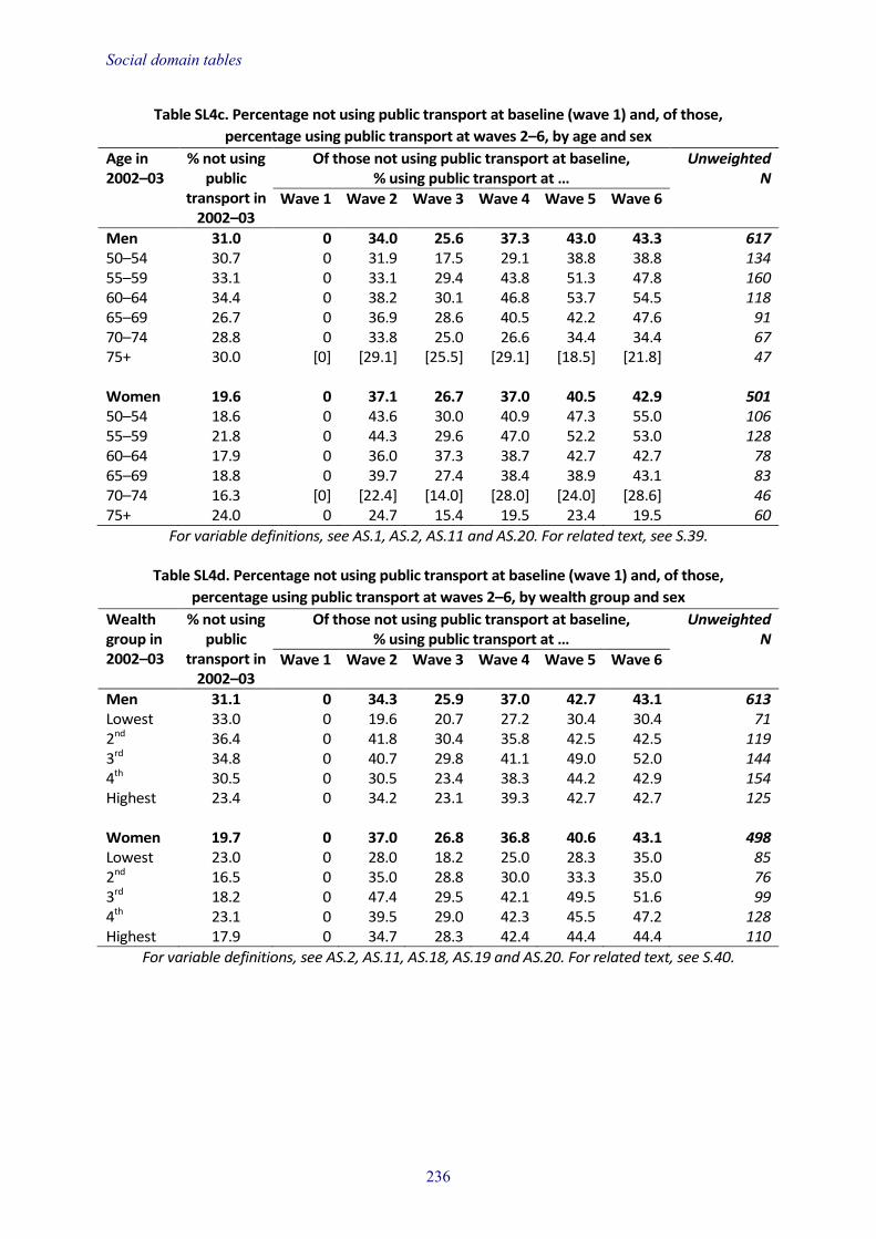
Social domain tables
Table SL4c. Percentage not using public transport at baseline (wave 1) and, of those, percentage using public transport at waves 2–6, by age and sex
Age in 2002–03
% not using public
transport in 2002–03
Of those not using public transport at baseline, % using public transport at …
Unweighted N
Wave 1 Wave 2 Wave 3 Wave 4 Wave 5 Wave 6
Men 31.0 0 34.0 25.6 37.3 43.0 43.3 617 50–54 30.7 0 31.9 17.5 29.1 38.8 38.8 134 55–59 33.1 0 33.1 29.4 43.8 51.3 47.8 160 60–64 34.4 0 38.2 30.1 46.8 53.7 54.5 118 65–69 26.7 0 36.9 28.6 40.5 42.2 47.6 91 70–74 28.8 0 33.8 25.0 26.6 34.4 34.4 67 75+ 30.0 [0] [29.1] [25.5] [29.1] [18.5] [21.8] 47 Women 19.6 0 37.1 26.7 37.0 40.5 42.9 501 50–54 18.6 0 43.6 30.0 40.9 47.3 55.0 106 55–59 21.8 0 44.3 29.6 47.0 52.2 53.0 128 60–64 17.9 0 36.0 37.3 38.7 42.7 42.7 78 65–69 18.8 0 39.7 27.4 38.4 38.9 43.1 83 70–74 16.3 [0] [22.4] [14.0] [28.0] [24.0] [28.6] 46 75+ 24.0 0 24.7 15.4 19.5 23.4 19.5 60
For variable definitions, see AS.1, AS.2, AS.11 and AS.20. For related text, see S.39.
Table SL4d. Percentage not using public transport at baseline (wave 1) and, of those, percentage using public transport at waves 2–6, by wealth group and sex
Wealth group in 2002–03
% not using public
transport in 2002–03
Of those not using public transport at baseline, % using public transport at …
Unweighted N
Wave 1 Wave 2 Wave 3 Wave 4 Wave 5 Wave 6
Men 31.1 0 34.3 25.9 37.0 42.7 43.1 613 Lowest 33.0 0 19.6 20.7 27.2 30.4 30.4 71 2nd 36.4 0 41.8 30.4 35.8 42.5 42.5 119 3rd 34.8 0 40.7 29.8 41.1 49.0 52.0 144 4th 30.5 0 30.5 23.4 38.3 44.2 42.9 154 Highest 23.4 0 34.2 23.1 39.3 42.7 42.7 125 Women 19.7 0 37.0 26.8 36.8 40.6 43.1 498 Lowest 23.0 0 28.0 18.2 25.0 28.3 35.0 85 2nd 16.5 0 35.0 28.8 30.0 33.3 35.0 76 3rd 18.2 0 47.4 29.5 42.1 49.5 51.6 99 4th 23.1 0 39.5 29.0 42.3 45.5 47.2 128 Highest 17.9 0 34.7 28.3 42.4 44.4 44.4 110
For variable definitions, see AS.2, AS.11, AS.18, AS.19 and AS.20. For related text, see S.40.
236

Social domain tables
Table SL5a. Percentage with access to a car or van at baseline (wave 1) and, of those, percentage still with access to a car or van at waves 2–6, by age and sex
Age in 2002–03
% with access to a car or van in 2002–03
Of those with access to a car or van at baseline, % still with access to a car or van at …
Unweighted N
Wave 1 Wave 2 Wave 3 Wave 4 Wave 5 Wave 6
Men 90.8 100 97.1 96.9 96.7 94.7 93.8 1,898 50–54 94.8 100 97.5 97.9 97.9 96.9 97.1 446 55–59 90.7 100 97.9 97.0 97.7 96.4 97.7 474 60–64 91.7 100 97.3 99.1 98.5 96.7 95.2 329 65–69 87.9 100 97.8 96.0 96.8 94.6 96.0 299 70–74 97.8 100 93.3 94.3 93.8 90.3 88.7 209 75+ 85.0 100 96.1 93.5 89.6 83.7 71.4 141 Women 83.8 100 92.5 90.3 90.1 89.1 86.3 2,145 50–54 88.3 100 96.2 95.6 96.4 96.7 96.4 511 55–59 90.7 100 94.8 94.4 93.9 93.1 94.1 548 60–64 90.0 100 91.0 91.0 89.9 88.9 88.1 410 65–69 86.1 100 93.1 89.5 91.6 88.3 85.0 285 70–74 73.5 100 88.9 84.0 84.4 81.3 73.3 228 75+ 63.4 100 83.3 74.5 69.1 70.1 55.4 163
For variable definitions, see AS.1, AS.2, AS.10 and AS.20. For related text, see S.41.
Table SL5b. Percentage with access to a car or van at baseline (wave 1) and, of those, percentage still with access to a car or van at waves 2–6, by wealth group and sex
Wealth group in 2002–03
% with access to a car or van
in 2002–03
Of those with access to a car or van at baseline, % still with access to a car or van at …
Unweighted N
Wave 1 Wave 2 Wave 3 Wave 4 Wave 5 Wave 6
Men 90.7 100 97.1 96.8 96.6 94.7 93.8 1,884 Lowest 66.5 100 91.9 89.7 90.3 88.6 88.6 143 2nd 84.3 100 93.2 94.2 93.9 89.1 88.1 284 3rd 94.7 100 98.1 97.3 96.8 94.4 94.4 401 4th 97.8 100 99.2 98.6 98.6 97.6 96.6 502 Highest 98.0 100 98.8 99.0 98.4 97.8 96.1 554 Women 83.7 100 92.6 90.4 90.1 89.0 86.1 2,219 Lowest 60.6 100 77.1 69.8 72.1 67.9 66.4 229 2nd 77.0 100 87.4 85.3 86.9 84.2 79.1 374 3rd 88.3 100 95.2 92.0 91.3 90.0 86.3 483 4th 92.3 100 96.3 97.0 94.1 94.7 91.9 533 Highest 95.1 100 98.1 96.6 96.4 96.6 95.4 600
For variable definitions, see AS.2, AS.10, AS.18, AS.19 and AS.20. For related text, see S.42.
237

Social domain tables
Table SL6a. Percentage volunteering at baseline (wave 1) and, of those, percentage still volunteering at waves 2–6, by age and sex
Age in 2002–03
% volunteering in 2002–03
Of those volunteering at baseline, % still volunteering at …
Unweighted N
Wave 1 Wave 2 Wave 3 Wave 4 Wave 5 Wave 6 Men 28.5 100 67.9 66.2 62.3 60.1 54.9 609 50–54 30.3 100 62.3 60.6 61.3 61.9 58.5 147 55–59 22.0 100 62.1 68.9 65.0 66.0 58.3 118 60–64 27.8 100 77.6 68.7 70.4 71.4 69.7 104 65–69 26.0 100 75.3 75.3 70.4 65.4 64.6 95 70–74 35.2 100 67.6 68.0 53.3 46.7 42.7 86 75+ 38.6 100 67.2 57.8 48.4 37.5 19.0 59 Women 30.6 100 71.2 67.7 66.1 62.4 56.0 846 50–54 27.7 100 71.3 64.4 69.4 67.5 63.1 163 55–59 27.1 100 66.7 64.5 66.0 65.2 58.5 169 60–64 37.5 100 72.4 73.1 74.2 72.3 69.2 180 65–69 34.0 100 75.4 73.1 66.9 60.0 55.4 162 70–74 29.3 100 78.2 68.2 61.4 54.5 48.3 93 75+ 29.7 100 62.9 61.1 49.4 43.3 24.7 79
For variable definitions, see AS.1, AS.2, AS.17 and AS.20. For related text, see S.43.
Table SL6b. Percentage volunteering at baseline (wave 1) and, of those, percentage still volunteering at waves 2–6, by wealth group and sex
Wealth group in 2002–03
% volunteering in 2002–03
Of those volunteering at baseline, % still volunteering at …
Unweighted N
Wave 1 Wave 2 Wave 3 Wave 4 Wave 5 Wave 6 Men 28.5 100 67.8 66.5 62.7 60.1 54.7 604 Lowest 18.4 [100] [60.4] [56.3] [40.8] [37.5] [25.0] 34 2nd 19.1 100 58.0 60.9 59.4 55.1 52.2 68 3rd 22.9 100 66.7 56.3 57.3 51.0 47.9 100 4th 32.9 100 68.1 69.3 66.3 64.4 61.3 170 Highest 41.2 100 73.4 73.5 69.0 68.0 60.5 232 Women 30.6 100 71.0 67.7 66.1 62.4 56.0 837 Lowest 14.8 100 66.1 61.3 50.8 53.2 43.5 60 2nd 23.2 100 61.8 57.3 56.4 49.1 51.8 115 3rd 29.9 100 65.4 61.7 57.8 55.2 49.0 169 4th 33.5 100 73.1 70.7 70.3 67.2 58.0 191 Highest 47.3 100 78.0 75.3 76.1 71.4 63.5 302
For variable definitions, see AS.2, AS.17, AS.18, AS.19 and AS.20. For related text, see S.44.
238

Social domain tables
Table SL6c. Percentage not volunteering at baseline (wave 1) and, of those, percentage volunteering at waves 2–6, by age and sex
Age in 2002–03
% not volunteering in 2002–03
Of those not volunteering at baseline, % volunteering at …
Unweighted N
Wave 1 Wave 2 Wave 3 Wave 4 Wave 5 Wave 6 Men 71.5 0 12.3 13.5 14.6 15.6 15.5 1,382 50–54 69.7 0 10.9 11.7 15.8 15.2 15.2 306 55–59 78.0 0 13.7 17.2 16.7 21.0 21.3 378 60–64 72.2 0 12.9 15.7 16.5 18.0 18.4 242 65–69 74.0 0 15.3 14.4 16.2 16.5 14.8 229 70–74 64.8 0 8.7 6.5 4.3 5.1 5.8 136 75+ 61.4 0 8.8 7.8 8.8 3.9 2.9 91 Women 69.4 0 11.2 13.5 13.6 14.5 13.8 1,719 50–54 72.3 0 9.8 16.1 15.6 17.0 16.1 395 55–59 72.9 0 12.4 13.9 16.5 17.6 19.9 426 60–64 62.5 0 12.4 16.3 17.8 20.5 16.7 265 65–69 66.0 0 12.7 14.3 12.7 15.9 13.5 274 70–74 70.7 0 9.9 7.1 9.9 7.1 5.7 201 75+ 70.3 0 10.0 10.0 4.3 2.8 2.8 158
For variable definitions, see AS.1, AS.2, AS.17 and AS.20. For related text, see S.45.
Table SL6d. Percentage not volunteering at baseline (wave 1) and, of those, percentage volunteering at waves 2–6, by wealth group and sex
Wealth group in 2002–03
% not volunteering in 2002–03
Of those not volunteering at baseline, % volunteering at …
Unweighted N
Wave 1
Wave 2
Wave 3
Wave 4
Wave 5
Wave 6
Men 71.5 0 12.2 13.5 14.6 15.6 15.4 1,373 Lowest 81.6 0 9.9 8.5 9.4 8.9 5.6 158 2nd 80.9 0 7.9 9.6 11.3 11.6 9.6 258 3rd 77.1 0 12.1 12.7 12.3 12.3 14.5 309 4th 67.1 0 13.9 15.4 17.2 18.4 18.7 333 Highest 58.8 0 16.4 19.9 21.7 25.2 25.5 315 Women 69.4 0 11.1 13.4 13.5 14.6 13.6 1,700 Lowest 85.2 0 5.9 7.3 7.8 9.5 5.9 296 2nd 76.8 0 7.1 11.8 14.6 13.5 13.7 356 3rd 70.1 0 12.6 15.0 12.8 15.0 13.6 367 4th 66.5 0 15.0 16.4 15.3 14.7 17.0 369 Highest 52.7 0 16.2 17.6 17.6 21.5 18.7 312
For variable definitions, see AS.2, AS.17, AS.18, AS.19 and AS.20. For related text, see S.46.
239

Social domain tables
Table SL7a. Percentage not caring for someone at baseline (wave 1) and, of those, percentage caring for someone at waves 2–6, by age and sex
Age in 2002–03
% not caring in 2002–03
Of those not caring for someone at baseline, % caring for someone at …
Unweighted N
Wave 1 Wave 2 Wave 3 Wave 4 Wave 5 Wave 6 Men 92.1 0 9.3 9.4 8.7 10.9 8.6 1,893 50–54 92.1 0 10.2 9.4 9.6 11.4 10.0 427 55–59 90.7 0 8.1 9.7 6.5 9.6 7.0 466 60–64 94.0 0 11.3 7.3 11.3 16.0 12.5 332 65–69 91.9 0 10.2 10.2 8.2 10.2 7.8 307 70–74 91.9 0 10.2 9.8 7.3 8.3 5.4 211 75+ 92.9 0 3.6 11.2 9.5 6.5 5.9 150 Women 87.3 0 15.7 13.0 12.2 12.3 11.8 2,314 50–54 86.2 0 20.1 18.9 19.3 18.7 20.7 500 55–59 82.9 0 20.6 15.9 16.1 18.2 15.9 506 60–64 87.5 0 15.9 13.5 11.6 10.5 11.1 400 65–69 87.0 0 14.7 12.6 10.3 8.8 7.6 394 70–74 94.2 0 12.4 6.2 6.2 6.9 4.2 283 75+ 90.1 0 5.0 4.7 2.7 3.7 3.4 231
For variable definitions, see AS.1, AS.2, AS.3 and AS.20. For related text, see S.47.
Table SL7b. Percentage not caring for someone at baseline (wave 1) and, of those, percentage caring for someone at waves 2–6, by wealth group and sex
Wealth group in 2002–03
% not caring in 2002–03
Of those not caring for someone at baseline, % caring for someone at …
Unweighted N
Wave 1 Wave 2 Wave 3 Wave 4 Wave 5 Wave 6 Men 92.0 0 9.4 9.4 8.8 11.0 8.6 1,879 Lowest 91.5 0 7.0 6.6 7.8 9.7 7.8 188 2nd 92.0 0 10.2 10.8 7.0 10.2 8.2 307 3rd 91.6 0 5.4 7.9 10.6 12.4 10.1 388 4th 93.1 0 12.4 10.9 9.0 10.9 8.2 480 Highest 91.7 0 10.6 9.5 8.9 11.0 8.4 516 Women 87.5 0 15.7 13.0 12.1 12.3 11.9 2,294 Lowest 86.8 0 11.8 8.9 7.9 6.0 7.1 322 2nd 86.1 0 15.0 12.9 10.1 10.8 12.0 423 3rd 88.0 0 15.5 15.1 15.1 14.4 11.2 483 4th 86.6 0 17.4 13.9 14.8 17.4 14.4 503 Highest 89.5 0 17.9 13.3 11.9 11.7 13.7 563
For variable definitions, see AS.2, AS.3, AS.18, AS.19 and AS.20. For related text, see S.48.
240

H. Health domain tables Aparna Shankar University College London Cesar de Oliveira University College London
Introduction H.1 This chapter presents results for the Health domain of the latest wave of the English Longitudinal Study of Ageing. The tables cover self-reported health, diagnosed chronic health conditions, walking speed, limitations with activities of daily living and instrumental activities of daily living, cognitive function, health behaviours and quality of life. As this wave also included a nurse visit, we include tables on anthropometric measures, physical function tests and biomarkers. In addition to cross-sectional tables relating to core sample members at this wave, we also have longitudinal tables showing changes in these variables over time for core sample members who have been in the study since wave 1. Annex AH provides information on the measures used for each table. Details regarding the samples for these tables are as follows:
• Health status cross-sectional tables (H1 to H9): These results are for core sample members at wave 6 and include refreshment samples from waves 3, 4 and the current wave (6). The analyses are weighted using cross-sectional weights, which adjust for non-response. Results are shown by age category (five-year age bands) and sex or by wealth group and sex.
• Health status longitudinal tables (HL1 to HL11): These results are for the balanced panel of participants who were present at every wave from wave 1 to wave 6, and are weighted using longitudinal weights. As above, results are presented by age category (five-year age bands using age at wave 1) and sex or by wealth group (at wave 1) and sex.
• Nurse visit cross-sectional tables (N1 to N11): These results include core sample members from the main interview who then consented to the nurse visit. Results are shown by age category and sex or by wealth group and sex. Anthropometric and physical functioning measures are weighted by nurse visit weights, while blood sampling results are weighted by blood sampling weights.
• Nurse visit longitudinal tables (NL1 to NL17): These results include those participants who provided data at all three nurse visits (waves 2, 4 and 6). Again the results are presented by age category (five-year age bands using age at wave 2) and sex or by wealth group (at wave 2) and sex. These results are unweighted.
Health status cross-sectional tables General health H.2 Table H1a shows self-rated health by age category and sex. In general, poor self-rated health increases with age. Patterns of reporting are similar for men and women, and just over a quarter of participants reported fair or poor self-rated health.

Health domain tables
H.3 Table H1b shows self-rated health by wealth group and sex. A clear wealth gradient is seen such that excellent self-rated health increases and poor self-rated health decreases with greater wealth.
H.4 Table H2a shows the percentage of individuals who report having a limiting long-standing illness by age category and sex. In general, limiting long-standing illness is more commonly reported by women. For both men and women, the proportion of individuals who report having a limiting long-standing illness increases with age.
H.5 Table H2b shows the percentage of individuals who report having a limiting long-standing illness by wealth group and sex. While over half of men and women in the poorest group report having a limiting long-standing illness, under a fifth of men and just over a quarter of women in the wealthiest group report having a limiting long-standing illness.
Diagnosed health conditions H.6 Table H3a shows the prevalence of six diagnosed health conditions (CHD, diabetes, cancer, respiratory disease, arthritis and depression) by age category and sex. For most health conditions, prevalence increases with age, but depression shows the opposite trend. While CHD and diabetes are more prevalent among men, cancer, arthritis and depression are more prevalent among women.
H.7 Table H3b shows the prevalence of the above diagnosed health conditions by wealth group and sex. The prevalence of these chronic conditions is generally higher among the lower wealth groups, with a clear gradient apparent for most conditions. Cancer is, however, an exception, with prevalence being higher among wealthier participants, particularly in women.
Disability H.8 Table H4a shows mean walking speed (m/s) by age category and sex. Walking speed declines rapidly with age and men have higher walking speeds at every age than women.
H.9 Table H4b shows mean walking speed by wealth group and sex. For men and women, mean walking speeds increase with wealth.
H.10 Table H5a shows the percentage of participants reporting limitations with one or more activities of daily living (ADLs) and with one or more instrumental activities of daily living (IADLs) by age category and sex. Within each age category, a higher proportion of women have difficulties with ADLs and IADLs. The prevalence of difficulties with ADLs and IADLs increases with age.
H.11 Table H5b shows the percentage of participants reporting difficulties with ADLs and IADLs by wealth group and sex. A wealth gradient is apparent, with the prevalence of limitations decreasing with increasing wealth. While a greater proportion of women report disabilities, the sex difference is most marked when considering IADLs.
Cognitive function H.12 Table H6a shows scores on the recall tests and the fluid intelligence test by age category and sex. Overall, both men and women show a decrease in cognitive function with age. Among men, scores on both measures are stable between the ages
242

Health domain tables
of 50 and 64 and thereafter start to decline. Among women, scores remain relatively stable till the age of 70 and then decline. While recall scores are higher among women, scores on fluid intelligence are higher for men.
H.13 Table H6b shows scores on cognitive function tests by wealth group and sex. Scores on both tests show increases with wealth, such that recall was about 25% higher in the wealthiest group than in the poorest group and scores on the fluid intelligence score were nearly 5% higher.
Health behaviours H.14 Table H7a shows the percentage of participants who smoke currently, drink daily, report low physical activity and consume fewer than five portions of fruit and vegetables daily. The proportion of smokers decreases with age, while the prevalence of inactivity increases. Daily drinking is most common among those aged 65–69. Low fruit and vegetable consumption generally decreases with age for men but patterns are less clear for women. When compared with men, daily drinking and low fruit and vegetable consumption are less common among women but physical inactivity is more common.
H.15 Table H7b shows the percentage of participants reporting the above health risk behaviours by wealth group and sex. Smoking, inactivity and low fruit and vegetable consumption decrease with increasing wealth, while daily drinking shows the opposite pattern.
Quality of life and depressive symptoms H.16 Table H8a shows the mean scores on the CASP quality of life measure by age category and sex. For men, quality of life shows small increases up to age 69, following which there are decreases. Patterns are less clear for women. There are no appreciable gender differences in quality of life.
H.17 Table H8b shows the mean scores on the CASP measure by wealth group and sex. Quality of life is higher among wealthier participants.
H.18 Table H9a shows mean scores on the Center for Epidemiologic Studies depression (CESD) scale and the proportion of individuals classified as depressed when using this scale, by age category and sex. Mean scores do not show a clear pattern of change with age. The percentage of individuals classified as depressed decreases till age 75 for women, following which there is an increase. Mean scores and proportion depressed are higher among women.
H.19 Table H9b shows mean scores on the CESD scale and the proportion of individuals classified as depressed when using this scale, by wealth group and sex. Around 30% of participants in the lowest wealth group are classified as depressed, compared with 8.9% of women and 4.3% of men in the wealthiest group. This social gradient is also apparent in the mean scores.
243

Health domain tables
Health status longitudinal tables General health H.20 Table HL1a shows the percentage of participants reporting fair or poor self-rated health from waves 1 to 6 by age category in wave 1 and sex.1 For each baseline age category, there is an increase across waves in the proportion of participants reporting fair or poor self-rated health. This increase is most marked in the older age groups.
H.21 Table HL1b shows the percentage of participants reporting fair or poor self-rated health from waves 1 to 6 by wealth group in wave 1 and sex.2 All groups show increases across waves in the proportion of participants reporting poor or fair self-rated health, though the increase is greatest among the poorest groups. At wave 6, the proportion of participants in the wealthiest group who report fair or poor health is smaller than the proportion of participants in the poorest group who report fair or poor health at baseline.
Diagnosed health conditions H.22 Tables HL2a, HL3a and HL4a show the prevalence of CHD, diabetes and depression from waves 1 to 6 by age category at wave 1 and sex. For all conditions, there is an increase in prevalence at each wave. It must be noted that the tables report the percentage of participants who ever report a condition (see AH.19) and in such a case the increase in every successive wave is to be expected. In the case of CHD and diabetes, increases are generally greater in older groups, while increases are greater among younger age groups for depression.
H.23 Tables HL2b, HL3b and HL4b show the prevalence of CHD, diabetes and depression from waves 1 to 6 by wealth group at wave 1 and sex. For each wealth group, there are increases in prevalence over time and these are most marked in the poorer groups. This indicates that socio-economic inequalities in diagnosed conditions have increased over the decade.
Disability H.24 Table HL5a shows the mean walking speed by baseline age category and sex. For all age groups, walking speed decreased with time, and decline was greatest for the older groups. Overall, walking speeds are lower for women than for men.
H.25 Table HL5b shows the mean walking speed by baseline wealth group and sex. There are decreases in walking speeds for all wealth groups, though poorer groups start with lower walking speeds and decrease faster. Indeed, the wave 6 mean walking speed for the wealthiest group is greater than the mean wave 1 walking speed for the poorest group.
H.26 Table HL6a shows the percentage of participants reporting difficulties with one or more ADLs by age category and sex. All groups show an increase in difficulties with ADLs from waves 1 to 6.
1 Wave 3 is excluded because it used a different question. 2 See footnote 1.
244

Health domain tables
H.27 Table HL6b shows the percentage of participants reporting difficulties with one or more ADLs by wealth group and sex. In each group, the proportion of individuals experiencing difficulties with ADLs increases in each successive wave. Wealthier participants consistently have less difficulty with ADLs than poorer participants.
Cognitive function H.28 Table HL7a shows the mean recall scores for participants by baseline age category and sex. Memory performance remains stable or even improves over waves in people aged up to 65. In older age groups, however, there is a sustained decrease in recall over time.
H.29 Table HL7b shows the mean recall scores by wealth group and sex. The poorest groups show decreases in recall over time. However, recall scores remain stable for the wealthiest groups.
Health behaviours H.30 Table HL8a shows the prevalence of cigarette smoking by baseline age category and sex from waves 1 to 6. In general, the prevalence of smoking decreases over time. Prevalence remains stable among men aged 80+, while from wave 2 onwards no women aged 80+ smoked. Behaviour among men aged 60–64 shows less of a pattern and is possibly indicative of difficulties in quitting for this group.
H.31 Table HL8b shows the prevalence of smoking by baseline wealth group and sex. Each wealth group shows decreases in smoking prevalence over time.
H.32 Table HL9a shows the prevalence of sedentary behaviour or low physical activity by baseline age category and sex. For men and women, prevalence of low levels of activity increases with time. The declines in activity levels are relatively small among the younger groups but more marked for older age groups.
H.33 Table HL9b shows the prevalence of sedentary behaviour or low physical activity by baseline wealth group and sex. Poorer groups are less active at baseline. All groups show a decline in activity levels over time and the rate of decline appears similar across wealth groups.
Quality of life and depressive symptoms H.34 Table HL10a shows the mean quality of life score by baseline age category and sex. All age groups show decreases in quality of life over time. However, the decreases are fairly small among younger groups. Participants aged 65 and over show sharper declines in quality of life over the six waves.
H.35 Table HL10b shows the mean quality of life score by baseline wealth group and sex. All groups show similar declines in quality of life over time.
H.36 Table HL11a shows mean scores on the CESD scale by baseline age category and sex. There is no clear pattern of change in mean scores across time.
H.37 Table HL11b shows mean scores on the CESD scale by baseline wealth category and sex. At every wave, mean scores decrease with increasing wealth but there is no discernible pattern to changes over time within each wealth group.
245

Health domain tables
Nurse visit cross-sectional tables Anthropometry H.38 Tables N1a and N1b show the mean body mass index and BMI categories by sex and age category at wave 6. The overall mean BMI in 2012–13 is similar for men (28.3 kg/m2) and women (28.5 kg/m2). Among men, mean BMI starts decreasing after the 65–69 age group, from 28.5 kg/m2 to 27.4 kg/m2 for those aged 80 years or over. In women, mean BMI also decreases after 65–69 years, from 28.7 kg/m2 to 27.3 kg/m2 for those aged 80 or over. Less than 1% of men and slightly over 1% of women are underweight. Just under a third of women and just over a fifth of men have BMI in the desirable category. A greater proportion of men (46.6%) than of women (34.5%) are overweight, and this applies to all age groups, but a greater proportion of women (34.6%) than of men (30.2%) are obese. The very oldest groups are the least likely to be obese.
H.39 Tables N1c and N1d show mean BMI and BMI categories by wealth group and sex. Mean BMI and the prevalence of obesity decrease with increasing wealth.
H.40 Table N2a shows mean waist circumference the prevalence of raised waist circumference by age category and sex. The mean waist circumference is 101.9 cm in men and 92.1 cm in women. Raised waist circumference is defined as 102 cm or greater in men and 88 cm or greater in women. Overall, 46.3% of men have raised waist circumference compared with 58.2% of women.
H.41 Table N2b shows mean waist circumference and the prevalence of raised waist circumference by wealth group and sex. In 2012–13, the prevalence of raised waist circumference falls with increasing wealth. The proportion of male participants with raised waist circumference rises from 41.7% for the wealthiest participants to 52.1% for the poorest. In women, this proportion rises from 45.9% for the wealthiest participants to 67.6% for the poorest.
Blood pressure H.42 Table N3a shows mean systolic (SBP) and mean diastolic (DBP) blood pressure by age category and sex. SBP and DBP are higher among men than women. Among men, SBP increases until age 79 and then there is a small decrease, while there appears to be a steady increase in SBP with age among women. Among both men and women, increased age is associated with decreases in DBP.
H.43 Table N3b shows mean SBP and DBP by wealth category and sex. Mean levels of SBP and DBP do not show a clear pattern of association with wealth.
Lipid profile H.44 Table N4a shows mean levels of total cholesterol, high-density lipoprotein (HDL) cholesterol, low-density lipoprotein (LDL) cholesterol and triglycerides by age category and sex. For each of these, the proportion of individuals reporting ‘at-risk’ values is also reported. At every age, men have lower levels of total cholesterol than women, and these levels decrease with age for men. Among women, there is a small decrease in the mean cholesterol levels with age. Overall, 58.8% of men and 75.6% of women have high total cholesterol levels (at least 5.0 mmol/l). The gender difference in raised total cholesterol is more pronounced in the older groups because the percentage with higher cholesterol declines sharply with age for men but more
246

Health domain tables
gradually for women. Mean HDL cholesterol is higher for women than for men in every age category. Overall, mean HDL levels do not vary appreciably with age in either sex. ‘High-risk’ levels of HDL (less than 1.0 mmol/l for men and less than 1.2 mmol/l for women) are present in 7.7% of men and 6.6% of women and no consistent pattern of difference with age is seen in either sex.
The mean LDL cholesterol levels are slightly lower in men (3.26 mmol/l) than in women (3.48 mmol/l). In men, LDL concentrations decrease with age, while there is little pattern with age for women. In total, 60.8% of men and 68.2% of women have elevated levels of LDL cholesterol (at least 3.0 mmol/l). The prevalence of high LDL levels in men decreases with age, e.g. 73% of men aged 50–54 years compared with 50% of men aged 75–79 years. In women, the prevalence of high LDL also decreases with age. Mean triglycerides concentrations are 1.20 mmol/l in women and 1.34 mmol/l in men. In men, there is a decrease in mean levels by age. Elevated levels of triglycerides (at least 1.7 mmol/l) are present in 32.3% of men and 21.5% of women. The prevalence of high levels of triglyceride decreases with greater age in men, while a small increase with age is seen among women till the age of 70–74, followed by a decrease. Note that values for LDL and triglycerides are available only for participants who provided fasting blood samples (see AH.7).
H.45 Table N4b shows the lipid profile by wealth group and sex. Mean levels of total cholesterol and LDL cholesterol show a marked socio-economic gradient that is the reverse of what might be expected. Increasing wealth is associated with higher rather than lower levels of both total cholesterol and LDL cholesterol. However, fewer participants who are in the highest wealth group have levels of ‘good’ cholesterol (HDL) that would indicate increased risk. Similarly, levels of triglycerides decrease with increasing wealth.
Inflammatory markers H.46 Table N5a shows mean concentration levels of inflammatory markers fibrinogen and C-reactive protein (CRP) concentrations by age category for men and women. The mean levels of fibrinogen and CRP increase with age in both men and women.
H.47 Table N5b shows mean levels of fibrinogen and CRP by wealth group and sex. With increasing wealth, both fibrinogen and CRP levels decrease.
Glycated haemoglobin H.48 Table N6a shows the mean glycated haemoglobin (HbA1c) levels by age and sex. There is a small increase with age in both sexes. The mean rises from 5.62% in the youngest men to 6.07% in the oldest men, and from 5.83% to 6.03% in the same age groups for women.
H.49 Table N6b shows levels of glycated haemoglobin by wealth category and sex. Glycated haemoglobin is inversely related to wealth such that wealthier participants have lower levels of HbA1c.
Haemoglobin H.50 Table N7a shows mean haemoglobin levels and the percentage of individuals who are classified as anaemic by age category and sex. Mean levels of haemoglobin are higher in men than in women. For both sexes, there is a decrease in levels with age. Overall, 11.2% of men and 14.7% of women have low haemoglobin (anaemia).
247

Health domain tables
In both men and women, there is a clear upward shift in the prevalence of anaemia at the oldest age groups. In men, the prevalence of anaemia increases from 5% in the youngest age group to 38% in the oldest age group, with substantial differences between those aged 75 years and over and younger men. Women show a similar pattern.
H.51 Table N7b shows mean levels of haemoglobin and the percentage of participants with anaemia in wave 6 by wealth group and sex. While mean haemoglobin levels do not differ appreciably by wealth group, the prevalence of anaemia is lower among participants in the highest wealth group.
Lung function H.52 Table N8a shows mean forced expiratory volume (FEV1), forced vital capacity (FVC) and peak expiratory flow rate (PEF) by age and sex-specific height group. These measures are all greater in men than in women and greater in taller people of either sex. Within each gender-specific height band, FEV1, FVC and PEF decrease with advancing age.
H.53 Table N8b shows FEV1, FVC and PEF by wealth group and sex-specific height group. For each of the measurements, a similar pattern is observed. Generally, as wealth increases, so does the lung function measure.
Insulin-like growth factor 1 (IGF-1) H.54 Table N9a shows the mean levels of IGF-1 by age category and sex. Overall, mean levels decrease with age. The prevalence of those in the lowest quintile of levels of IGF-1 increases considerably with age in both men (from just 11.6% for the 50–54 age group to 47.8% at 80 years and older) and women (from 15.3% for the 50–54 age group to 38.1% at 80 years and older).
H.55 Table N9b shows mean levels of IGF-1 by wealth group and sex. A socio-economic gradient is evident, such that there are increases in mean levels and decreases in the proportion in the lowest quintile with increased wealth.
Vitamin D H.56 Vitamin D was measured for the first time in wave 6 of ELSA (Table N10a). Overall, the mean levels of vitamin D are similar for both men and women. There also does not appear to be a consistent pattern of change with age.
H.57 Table N10b shows mean levels of vitamin D by wealth group and sex. A socio-economic gradient is observed, with levels increasing with increased wealth.
Grip strength H.58 Table N11a shows mean grip strength by age category and sex. A marked gender difference in grip strength is seen, with men having much higher mean grip strength at every age. For both sexes, there is a decrease in grip strength with increasing age.
H.59 Table N11b shows mean grip strength by wealth group and sex. Wealthier participants have higher mean grip strength.
248

Health domain tables
Nurse visit longitudinal tables Anthropometry H.60 Tables NL1a and NL2a show mean levels of BMI and waist circumference for participants who provided data in the three nurse visits (2004–05, 2008–09 and 2012–13) by age category at wave 2 (2004–05) and sex. Increases are seen in both mean BMI and mean waist circumference from wave 2 to wave 4 but not from wave 4 to wave 6. These increases from wave 2 to wave 4 are apparent for men and women in all age groups.
H.61 Tables NL1b and NL2b show mean BMI and waist circumference at waves 2, 4 and 6 by wealth group at wave 2 and sex. All wealth groups show an increase in BMI and waist circumference over time.
Note that values presented here may differ from those show in Chapter 4, ‘Trends in obesity among older people in England’ as the analyses presented in the chapter use imputed data for BMI and waist circumference (see Section 4.2.5).
Blood pressure H.62 Tables NL3a and NL4a show mean levels of SBP and DBP at waves 2, 4 and 6 by sex and wave 2 age category. Over time, all age groups show a decrease in their mean diastolic blood pressure and this trend is evident for both men and women. For women aged between 52 and 64, there is an increase in systolic blood pressure over time, while older groups show a decrease in SBP over time. Change patterns for SBP are less clear among men.
H.63 Tables NL3b and NL4b show mean levels of SBP and DBP by sex and wave 2 wealth category. All wealth groups show decreases in blood pressure over time, except women in the highest wealth group, who show a decrease in DBP only.
Lipid profile H.64 Tables NL5a, NL6a, NL7a and NL8a show mean lipid levels by age category and sex. Total cholesterol, LDL cholesterol and triglycerides decrease from wave 2 to wave 6 in both men and women, while HDL cholesterol increases.
H.65 Tables NL5b, NL6b, NL7b and NL8b show mean cholesterol levels by sex and wave 2 wealth group. All wealth groups show decreases over time in total cholesterol, LDL cholesterol and triglycerides, with decreases being more marked among lower wealth groups. HDL cholesterol increases over time in all groups.
Inflammatory markers H.66 Tables NL9a and NL10a show levels of C-reactive protein (CRP) and fibrinogen by sex and wave 2 age category. For most age groups, CRP levels increase between waves 2 and 4 and then decrease. However, men aged 70–79 and women aged 65–74 at wave 2 show sustained decreases in CRP levels. In contrast, fibrinogen levels show a pattern of increase between waves 2 and 4 followed by a decrease for all age groups.
H.67 Tables NL9b and NL10b show levels of inflammatory markers by sex and wave 2 wealth category. Among men, the poorer groups show a sustained decrease in CRP levels over time, while the three wealthiest groups show an increase between waves 2 and 4 followed by a decrease. The pattern is less clear for women. For all
249

Health domain tables
wealth groups, levels of fibrinogen show a pattern of increase between waves 2 and 4 followed by a decrease.
Glycated haemoglobin H.68 Table NL11a shows glycated haemoglobin levels over time by sex and wave 2 age category. Mean levels of glycated haemoglobin increase from wave 2 to wave 6 in all age categories for both men and women.
H.69 Table NL11b shows glycated haemoglobin levels over time by sex and wave 2 wealth category. All wealth groups show an increase in mean glycated haemoglobin levels over time.
Haemoglobin H.70 Table NL12a shows mean haemoglobin levels over time by sex and wave 2 age category. All age groups show a sustained decrease in haemoglobin levels over time.
H.71 Table NL12b shows mean haemoglobin levels over time by sex and wave 2 wealth category. All wealth groups show a decrease in haemoglobin levels over time.
Lung function H.72 Tables NL13a, NL14a and NL15a show lung function measures by sex-specific height group and wave 2 age category. Mean forced vital capacity (FVC), forced expiratory volume (FEV1) and peak expiratory flow rate (PEF) decrease between waves 2 and 6. These tests also show that they are all greater in men than in women and greater in taller people of either sex. Within each gender-specific height band, FVC, FEV1 and PEF decrease with advancing age.
H.73 Tables NL13b, NL14b and NL15b show FVC, FEV1and PEF by sex-specific height group and wealth group. For each measure, participants in the highest wealth group have higher values at wave 6 than participants from the lowest wealth group have at wave 2.
Insulin-like growth factor 1 (IGF-1) H.74 Table NL16a shows IGF-1 levels in wave 4 and wave 6. Mean levels of IGF-1 generally increase for women and decrease for men between the waves.
H.75 Table NL16b shows IGF-1 levels in waves 4 and 6 by wealth group and sex. For men, most wealth groups show an increase in IGF-1 levels over time, while the opposite trend is seen for women.
Grip strength H.76 Table NL17a shows mean grip strength from waves 2 to 6 by sex and wave 2 age category. All age groups show a decline in grip strength over time, with older groups (particularly among men) showing a slightly faster decline.
H.77 Table NL17b shows mean grip strength from waves 2 to 6 by sex and wave 2 wealth group. A similar decline in grip strength is shown by all wealth groups across the three waves.
250

Health domain tables
Annex AH. Definitions AH.1 Activities of daily living (ADLs) and instrumental activities of daily living (IADLs): Respondents were asked if they had any difficulty with any of the following because of a mental, physical, emotional or memory problem: dressing, including putting on shoes and socks; walking across a room; bathing or showering; eating, such as cutting up food; getting into or out of bed; using the toilet, including getting up or down; using a map to figure out how to get around in a strange place; shopping for groceries; making telephone calls; taking medication; doing work around the house or garden; or managing money, such as paying bills and keeping track of expenses. Participants were asked not to consider any condition that would last less than 3 months. The first six items relate to ADLs while the remaining items relate to IADLs. Based on responses to these items, separate variables indicating whether the participant had difficulties with one or more ADLs/IADLs were computed.
AH.2 Age: Defined as age at last birthday. For all results presented here, age was categorised into five-year age bands ranging from 50–54 to 80+.
AH.3 Alcohol consumption: Daily drinking was defined as drinking on 3 days a week or more. AH.4 Balanced panel: This is the sample used in the longitudinal tables (HL1 to HL11) and includes core sample participants from wave 1 who provided data on the relevant measure at all follow-up waves. For the nurse data longitudinal tables (NL1 to NL17), this refers to the sample who provided nurse data at each of the three nurse visits.
AH.5 Baseline: This refers to the wave of data that is the starting point for characteristics in longitudinal analysis. For results here, this is either wave 1 (longitudinal tables) or wave 2 (nurse visit longitudinal tables).
AH.6 Blood pressure: The systolic arterial pressure is defined as the peak pressure in the arteries, which occurs near the beginning of the cardiac cycle. The diastolic arterial pressure is the lowest pressure at the resting phase of the cardiac cycle. Systolic (SBP) and diastolic (DBP) blood pressure were measured using a standardised method. In adults, hypertension is defined as having SBP of at least 140 mmHg or having DBP of at least 90 mmHg or being on medication to control hypertension. All respondents were eligible for the blood pressure module, except those who were pregnant. Three readings were collected at one-minute intervals (systolic, diastolic and pulse rate) using the Omron HEM-907 equipment. It was ensured that the room temperature was between 15°C and 25°C. The respondent was asked not to eat, smoke, drink alcohol or take vigorous exercise in the 30 minutes preceding the blood pressure measurement as blood pressure can be raised immediately after any of these activities.
AH.7 Blood sample: Blood samples were taken from willing ELSA core members, except those who had a clotting or bleeding disorders (e.g. haemophilia and low platelets), had ever had a fit, were not willing to give their consent in writing, or were currently on anticoagulant drugs (e.g. warfarin therapy). Fasting blood samples were taken whenever possible. Respondents over 80 years, those known to be diabetic and on treatment, those with a clotting or bleeding disorder or on anti-coagulant drugs (e.g. warfarin), those who had ever had fits, those who seemed frail, or respondents whose health was a cause for concern for the nurse were not asked to fast. Subjects
251

Health domain tables
were considered to have fasted if they had not had food or drink except water for a minimum of 5 hours prior to the blood test.
The amount of blood taken from each participant in order to analyse each biomarker is presented below:
• 1 citrate blue tube (1.8ml) – fibrinogen; • 1 plain red tube (6ml) – total and HDL cholesterol, triglycerides, C-reactive protein
(CRP), insulin-like growth factor 1 (IGF-1); • 1 fluoride grey tube (2ml) – fasting glucose (values not reported here); • 1 EDTA light purple tube (2ml) – haemoglobin and glycated haemoglobin; • 2 EDTA dark purple tubes (4ml) – genetics. All the blood samples were analysed at the Royal Victoria Infirmary laboratory in Newcastle.
AH.8 Body mass index (BMI): This is a widely-accepted measure of weight for height and is defined as weight in kilograms divided by the square of the height in metres (kg/m2). BMI was calculated for all those respondents for whom both a valid height and weight measurement were recorded. BMI scores were categorised as follows:
• underweight group (<18.5 kg/m2); • normal (≥18.5 and <25 kg/m2); • overweight (≥25 and <30 kg/m2); • obese (≥ 30 kg/ m2). AH.9 Centre for Epidemiologic Studies depression (CESD) scale: This scale is a brief measure of depressive symptoms. Participants are asked whether they had experienced any of the eight symptoms in the past 4 weeks. The total score ranges from 0 to 8. A cut-off of 4 or more points is used to classify individuals as being depressed.
AH.10 Cholesterol: Cholesterol is a type of fat present in the blood and is related to diet. Too much total cholesterol in the blood increases the risk of heart disease. High-density lipoprotein (HDL) cholesterol is ‘good’ cholesterol, which is protective for heart disease. Low-density lipoprotein (LDL) cholesterol is ‘bad’ cholesterol and a risk factor for cardiovascular disease. Triglycerides, in combination with total and HDL cholesterol, provide a lipid profile, which can give information on the risk of cardiovascular disease. Measures of LDL and triglycerides were only taken for participants who were asked to fast.
AH.11 C-reactive protein (CRP): The level of this protein in the blood gives information on inflammatory activity in the body and is also associated with risk of heart disease.
AH.12 Depression: See Centre for Epidemiologic Studies depression (CESD) scale (AH.9).
AH.13 Fibrinogen: This is a protein necessary for blood clotting. High levels are also associated with a higher risk of heart disease.
AH.14 Fluid intelligence: This refers to a general ability to solve problems. This was measured for the first time in this wave of ELSA (wave 6) using a number series task which relies on the participant being able to reason with concepts that are based on mathematical relationships. The tasks were adaptive, and progressively increased or
252

Health domain tables
decreased in difficulty based on performance. The final score takes into consideration the difficulty level of the questions and the number of correct responses. Higher scores are indicative of greater levels of fluid intelligence.
AH.15 Fruit and vegetable consumption: Participants were asked about their fruit and vegetable consumption and, based on this, the total number of portions of fruit and vegetable consumed was computed. This was then dichotomised to indicate whether participants ate fewer than five portions a day or at least five portions a day.
AH.16 Glycated haemoglobin (HbA1c): This indicates the presence or risk of type 2 diabetes, which is associated with an increased risk of heart disease.
AH.17 Grip strength: The grip strength test is a measure of upper body strength. The test was given to all respondents who were willing to take it, with no upper or lower age limits. Participants were, however, excluded if they had swelling or inflammation, severe pain or a recent injury, or if they had had surgery to the hand in the preceding six months. If there was a problem with only one hand, measurements were taken using the other hand. After adjusting the gripometer (grip gauge) to suit the respondent’s hand and positioning the respondent correctly, the respondent was asked to squeeze the gripometer as hard as they could for a couple of seconds. Three values were recorded for each hand, starting with the non-dominant hand and alternating between hands. Any measurements carried out incorrectly were not included. The gripometer used was the ‘Smedley’s for Hand’ Dynamo Meter, with a scale ranging from 0 to 100 kg. The average of three measurements (in kilograms) is reported here.
AH.18 Haemoglobin: This is a measure of iron levels in the body and is related to diet and other factors. Anaemia is defined as having a haemoglobin level below 13 g/dl for men and below 12 g/dl for women.
AH.19 Health conditions: Based on participants’ reports of doctor-diagnosed health conditions, variables were derived indicating whether participants had ever been diagnosed with each of the health conditions.
AH.20 Height: Height was measured using a portable stadiometer with a sliding headplate, a base plate and three connecting rods marked with a metric scale. Respondents were asked to remove their shoes. One measurement was taken with the respondent stretching to the maximum height and with the head in the Frankfort plane.3 The reading was recorded to the nearest millimetre.
AH.21 Insulin-like growth factor 1 (IGF-1): This is a hormone that helps control reactions to stress and regulate various body processes including digestion, the immune system, mood and energy usage.
AH.22 Limiting long-standing illness: Respondents were asked whether they suffered from a long-standing illness and whether this condition limited their activities in any way. Responses to both items were combined to create a variable indicating whether a participant suffered from a limiting long-standing illness or not.
AH.23 Lipid profile: See Cholesterol (AH.10).
AH.24 Lung function measures: These tests are commonly used in clinical practice to assess impairment due to chronic lung disease and asthma. Lung function is poorer
3 The Frankfort plane is an imaginary line passing through the external ear canal and across the top of the lower bone of the eye socket, immediately under the eye. This line must be parallel with the floor. This gives the maximum vertical distance from the floor to the highest point of the skull.
253

Health domain tables
among older adults and among smokers. For these tests, respondents were excluded if they had had abdominal or chest surgery in the preceding 3 weeks, had been admitted to hospital with a heart complaint in the preceding 6 weeks, had had eye surgery in the preceding 4 weeks, had a tracheotomy, or were pregnant. Further, the tests were not done if the ambient temperature was less than 15°C or more than 35°C, as this affects the accuracy of the readings. The measures of lung function obtained at the nurse visit were:
• forced expiratory volume (FEV1): the volume in litres expelled in the first second of a forced expiration, starting from a maximum inspiration;
• forced vital capacity (FVC): the full volume in litres expelled following a maximum inspiration;
• peak expiratory flow rate (PEF): the fastest rate of exhalation (in litres per minute) recorded during the measurement.
The protocol requires three measurements and the highest satisfactory score is taken as the valid one. High values indicate better lung function. The equipment used in waves 2 and 4 consisted of a spirometer (Vitalograph Micro), disposable cardboard mouthpieces and a 1 litre calibration syringe. For wave 6, the NDD Easy On-PC spirometer was introduced.
AH.25 Nurse visit: All core members were eligible for a nurse visit in person (i.e. not by proxy) either in a private household or in an institution. A nurse visit was provided to only those partners who explicitly requested a nurse visit. The CAPI (computer-assisted personal interview) program was used. After the main interview, the interviewer made an appointment for the nurse to visit the respondent or set up contact between nurse and respondent. The nurse visit consisted of a series of measurements that were only obtained if the appropriate consents were obtained and the respondent was able to respond affirmatively to relevant safety questions. The nurse visit included several standard measures including anthropometric measures, blood pressure, blood sample and lung function.
AH.26 Physical activity: Participants were asked how often they participated in mild, moderate or vigorous physical activity. Based on their responses, they were classified as being sedentary or reporting low physical activity (versus moderate or vigorous physical activity).
AH.27 Quality of life: This was measured using the CASP questionnaire, which assesses four dimensions of quality of life particularly relevant to older adults (Control, Autonomy, Self-realisation and Pleasure).
AH.28 Recall: This is a score computed on the basis of the cognitive function tests. Participants were presented with a list of 10 common words. After this, participants were asked to recall as many words as they could (immediate recall). They were also asked to recall these words after an interval during which they carried out other tasks (delayed recall). The sum of words correctly recalled during the immediate and delayed recall tasks is the recall score.
AH.29 Self-rated health: Participants were asked whether they would rate their health as excellent, very good, good, fair or poor. Wave 3 used a different question and hence is not included in the longitudinal tables for self-rated health.
AH.30 Smoking status: This related to current smoking status.
254

Health domain tables
AH.31 Vitamin D: This is a vitamin that helps regulate calcium and phosphorus levels in the body. Vitamin D is primarily produced in the skin through exposure to sunlight but is also present in some foods, such as eggs, dairy products and fish. In winter, especially in countries with limited sunlight, vitamin D production is reduced and hence supplementation may be necessary. This is particularly true of older adults or those who may be restricted to their homes.
AH.32 Waist circumference: The waist was defined as the midpoint between the lower rib and the upper margin of the iliac crest. Waist circumference was measured using a tape with an insertion buckle at one end. The measurement was taken twice, using the same tape, and was recorded to the nearest even millimetre (mm). Those whose waist circumference measurements differed by more than 3 cm had a third measurement taken. The mean of the two valid measurements (the two out of the three measurements that were closest to each other, if there were three measurements) were used in the analysis. Waist circumference was categorised into three main groups using sex-specific cut-offs:
• low risk (<94 cm for men and <80 cm for women); • medium risk (≥ 94 cm and <102 cm for men; ≥ 80 cm and <88 cm for women); • high risk (≥ 102 cm for men and ≥ 88 cm for women). Waist circumference may be a better measure than BMI (see AH.8) for identifying those at risk because of their body shape. Fat distribution differs considerably between younger and older people and abdominal fat tends to increase with age. Therefore waist circumference can be considered an appropriate indicator of body fatness and central fat distribution among the elderly.
AH.33 Walking speed: This was computed based on the timed walk test. Participants aged 60 years and over were asked to walk a distance of 8 feet (2.44 metres) twice and timed. The mean of the two speeds is reported here, measured in metres per second (m/s).
AH.34 Wealth group: To form wealth groups, we order all ELSA sample members according to the value of their total (non-pension) family wealth – which includes financial wealth from savings and investments minus debts, physical wealth (wealth held in second homes, farm or business property, other business wealth, other land and other assets such as jewellery or works of art or antiques) minus debts, and housing wealth minus mortgages – and divide the sample into five equal-sized groups. Where analysis is carried out using all ELSA sample members, the groups are equal in size and can be referred to as quintiles. Much of the analysis in this chapter is carried out using subsamples of the ELSA population. Where analysis does not use the whole ELSA sample, the groups are unequal in size and are more accurately referred to as ‘wealth groups’. For consistency reasons, we use the term ‘wealth group’ rather than ‘wealth quintile’ throughout the chapter. The cut-off points for the wealth groups are shown in the following table, reported in January 2013 prices and rounded to the nearest £1,000: Wealth group definition, wave 1
(2002–03) Wealth group definition, wave 6
(2012–13) Lowest Less than £19k Less than £48k 2nd Between £19k and £130k Between £48k and £170k 3rd Between £130k and £226k Between £170k and £273k 4th Between £226k and £400k Between £273k and £450k Highest More than £400k More than £450k
255

Health domain tables
AH.35 Weight: Weight was measured using a portable electronic scale. Respondents were asked to remove their shoes and any bulky clothing. A single measurement was recorded to the nearest 0.1 kg. Respondents who weighed more than 130 kg were asked for their estimated weights because the scales are inaccurate above this level. These estimated weights were included in the analysis.
AH.36 Notes to all tables The unit of observation in all tables is the individual.
The health status cross-sectional tables (H1 to H9) are based on participants who were present at wave 6 of ELSA including refreshment sample members, while the nurse visit cross-sectional tables (N1 to N11) are based on those from the above sample who agreed to the nurse visit.
Health status longitudinal tables (HL1 to HL11) are based on participants who were present at each wave of ELSA from wave 1 to wave 6, while the nurse visit longitudinal tables (NL1 to NL17) are based on participants who were present at the nurse visit at waves 2, 4 and 6.
All results, with the exception of the nurse visit longitudinal tables (NL1 to NL17), are based on weighted data. Only unweighted frequencies (N) for each group are presented.
The fieldwork timetable is as follows: Fieldwork dates (inclusive) Wave 1 March 2002 – March 2003 Wave 2 June 2004 – June 2005 Wave 3 May 2006 – August 2007 Wave 4 June 2008 – July 2009 Wave 5 July 2010 – June 2011 Wave 6 May 2012 – May 2013
256

Health domain tables
257
Table H1a. Self-rated health (%), by age and sex: wave 6
Age in 2012–13
50–54 55–59 60–64 65–69 70–74 75–79 80+ All
Men Excellent 19.2 17.8 14.4 8.3 8.3 6.9 5.9 12.8 Very good 32.2 28.1 32.5 30.7 25.2 26.2 19.3 28.7 Good 31.6 28.6 29.5 33.8 32.8 31.1 32.3 31.2 Fair 10.6 16.7 16.2 18.2 23.3 23.7 30.8 18.4 Poor 6.4 8.8 7.5 9.0 10.4 12.1 11.7 8.9 Women Excellent 21.9 15.3 15.2 11.7 10.0 5.5 3.3 12.7 Very good 30.0 30.1 31.9 29.8 27.3 22.8 21.5 28.2 Good 31.3 30.1 30.9 30.3 34.0 36.2 31.8 31.7 Fair 10.3 16.2 16.4 20.6 19.8 26.0 29.6 19.0 Poor 6.5 8.3 5.7 7.6 8.8 9.6 13.8 8.4 Unweighted N Men 270 612 732 766 563 494 440 3,877 Women 350 763 939 904 673 631 642 4,902
For variable definitions, see AH.2, AH.29 and AH.36. For related text, see H.2.
Table H1b. Self-rated health (%), by wealth and sex: wave 6
Wealth group in 2012–13
Lowest 2nd 3rd 4th Highest
Men Excellent 6.5 7.9 12.0 17.1 19.7 Very good 17.6 23.6 29.4 31.9 38.3 Good 24.9 36.6 32.9 32.6 28.9 Fair 28.4 22.4 19.3 12.8 11.1 Poor 22.7 9.7 6.4 5.5 2.0 Women Excellent 4.8 7.0 14.0 17.4 20.3 Very good 20.1 25.4 27.2 32.0 36.5 Good 28.9 34.8 32.4 32.4 30.7 Fair 26.8 23.9 19.4 14.8 10.2 Poor 19.4 9.0 7.1 3.3 2.2 Unweighted N Men 578 675 792 859 899 Women 878 959 1015 972 967
For variable definitions, see AH.29, AH.34 and AH.36. For related text, see H.3.

Health domain tables
258
Table H2a. Limiting long-standing illness (%), by age and sex: wave 6
Age in 2012–13
50–54 55–59 60–64 65–69 70–74 75–79 80+ All
Men 19.6 26.9 29.0 34.1 40.0 42.0 51.5 32.3 Women 26.5 29.6 31.5 33.8 39.7 45.6 58.5 36.8 Unweighted N Men 279 645 755 804 586 517 486 4,072 Women 356 782 969 919 688 653 725 5,092
For variable definitions, see AH.2, AH.22 and AH.36. For related text, see H.4.
Table H2b. Limiting long-standing illness (%), by wealth and sex: wave 6
Wealth group in 2012–13
Lowest 2nd 3rd 4th Highest
Men 52.9 35.2 32.0 25.5 19.7 Women 54.5 40.8 34.8 26.6 26.0 Unweighted N Men 611 715 828 892 933 Women 909 989 1,042 1,000 996
For variable definitions, see AH.22, AH.34 and AH.36. For related text, see H.5.

Health domain tables
259
Table H3a. Diagnosed health conditions (%), by age and sex: wave 6
Age in 2012–13
50–54 55–59 60–64 65–69 70–74 75–79 80+ All
Men CHD 2.2 8.2 11.9 18.1 24.3 25.9 38.5 15.7 Diabetes 4.0 10.8 13.3 15.1 18.9 19.3 16.3 12.8 Cancer 3.1 4.3 4.9 10.2 12.8 18.3 18.4 8.7 Respiratory illness 10.2 13.6 13.6 20.6 21.8 21.4 17.5 16.1 Arthritis 10.1 23.3 29.9 37.2 42.5 45.2 49.9 30.9 Depression 9.1 10.1 12.7 10.2 8.8 5.8 3.6 9.2 Women CHD 1.3 3.4 5.8 9.1 13.7 21.1 29.6 10.8 Diabetes 6.8 8.2 7.9 12.0 11.9 14.7 17.7 10.9 Cancer 5.0 9.4 9.3 13.2 14.3 13.4 14.7 10.9 Respiratory illness 10.7 18.5 19.9 21.4 23.7 24.3 21.6 19.4 Arthritis 19.7 34.4 44.5 53.7 54.5 61.7 67.2 45.9 Depression 10.7 15.6 15.4 16.4 12.5 7.6 5.7 12.4 Unweighted N Men CHD 279 645 755 803 586 517 487 4,072 Diabetes 279 645 755 802 586 517 487 4,071 Cancer 279 645 754 804 586 516 487 4,071 Respiratory illness 279 645 754 804 586 516 487 4,071 Arthritis 279 645 754 804 586 516 487 4,071 Depression 279 645 755 804 586 517 487 4,073 Women CHD 356 782 969 921 688 653 722 5,091 Diabetes 356 782 969 921 688 653 722 5,091 Cancer 356 782 969 920 688 653 725 5,093 Respiratory illness 356 782 969 920 688 653 725 5,093 Arthritis 356 782 969 920 688 653 725 5,093 Depression 356 782 970 922 688 653 725 5,096
For variable definitions, see AH.2, AH.19 and AH.36. For related text, see H.6.

Health domain tables
260
Table H3b. Diagnosed health conditions (%), by wealth and sex: wave 6
Wealth group in 2012–13
Lowest 2nd 3rd 4th Highest
Men CHD 22.5 14.8 18.6 13.4 10.5 Diabetes 17.4 12.8 13.9 10.7 10.5 Cancer 8.5 9.1 8.4 9.1 9.1 Respiratory illness 20.5 19.1 14.2 15.3 12.4 Arthritis 37.8 33.4 32.3 29.8 23.8 Depression 15.9 8.8 7.4 8.3 6.7 Women CHD 17.7 12.6 11.8 7.9 3.8 Diabetes 17.9 11.7 11.2 9.1 4.0 Cancer 9.7 9.9 11.3 11.7 13.0 Respiratory illness 28.1 19.8 18.9 16.3 13.4 Arthritis 58.4 46.8 48.5 39.4 37.3 Depression 16.1 15.6 10.4 10.1 9.3 Unweighted N Men CHD 612 715 828 891 933 Diabetes 612 715 828 891 933 Cancer 612 715 828 891 932 Respiratory illness 612 715 828 891 932 Arthritis 612 715 828 891 932 Depression 612 715 828 892 933 Women CHD 909 989 1,043 1,000 996 Diabetes 909 989 1,043 1,000 996 Cancer 909 989 1,043 1,001 995 Respiratory illness 909 989 1,043 1,001 995 Arthritis 909 989 1,043 1,001 995 Depression 909 991 1,043 1,001 996
For variable definitions, see AH.19, AH.34 and AH.36. For related text, see H.7.
Table H4a. Mean walking speed (m/s), by age and sex: wave 6
Age in 2012–13
50–54 55–59 60–64 65–69 70–74 75–79 80+ All
Men - - 1.01 0.97 0.92 0.83 0.71 0.92 Women - - 0.96 0.92 0.85 0.78 0.61 0.85 Unweighted N Men - - 679 717 508 444 360 2,708 Women - - 880 832 613 545 471 3,341
For variable definitions, see AH.2, AH.33 and AH.36. For related text, see H.8.

Health domain tables
261
Table H4b. Mean walking speed (m/s), by wealth and sex: wave 6
Wealth group in 2012–13
Lowest 2nd 3rd 4th Highest
Men 0.76 0.84 0.89 0.96 1.04 Women 0.68 0.79 0.83 0.90 0.98 Unweighted N Men 326 436 583 647 671 Women 511 601 767 700 710
For variable definitions, see AH.33, AH.34 and AH.36. For related text, see H.9.
Table H5a. Difficulties with one or more ADLs and IADLs (%), by age and sex: wave 6
Age in 2012–13
50–54 55–59 60–64 65–69 70–74 75–79 80+ All
Men ADLs 9.8 11.0 13.3 15.2 19.0 22.7 33.6 16.0 IADLs 8.0 11.5 11.8 13.9 19.5 23.2 36.3 15.7 Women ADLs 10.3 14.9 13.3 17.3 20.0 26.9 39.1 19.4 IADLs 12.8 16.7 16.0 19.2 21.5 27.4 52.8 23.0 Unweighted N Men 279 645 755 804 586 517 487 4,073 Women 356 782 969 922 688 653 723 5,093
For variable definitions, see AH.1, AH.2 and AH.36. For related text, see H.10.
Table H5b. Difficulties with one or more ADLs and IADLs (%), by wealth and sex: wave 6
Wealth group in 2012–13
Lowest 2nd 3rd 4th Highest
Men ADLs 28.8 19.3 15.8 10.2 8.5 IADLs 31.3 18.4 14.9 10.4 6.1 Women ADLs 32.9 22.8 18.7 13.2 8.6 IADLs 38.6 27.5 20.6 15.3 12.0 Unweighted N Men 612 715 828 892 933 Women 909 990 1,042 1,000 996
For variable definitions, see AH.1, AH.34 and AH.36. For related text, see H.11.

Health domain tables
262
Table H6a. Mean cognitive function scores, by age and sex: wave 6
Age in 2012–13
50–54 55–59 60–64 65–69 70–74 75–79 80+ All
Men Recall 11.3 11.3 11.4 10.5 9.5 8.5 7.3 10.3 Fluid intelligence 543.0 541.8 542.8 539.4 533.3 530.3 519.7 537.9 Women Recall 11.9 12.2 12.1 11.5 10.1 9.4 7.1 10.8 Fluid intelligence 535.3 534.5 534.9 531.3 524.1 521.8 511.8 529.2 Unweighted N Men Recall 270 609 732 767 563 491 440 3,872 Fluid intelligence 263 596 718 750 534 467 389 3,717 Women Recall 350 763 941 904 673 631 639 4,901 Fluid intelligence 339 746 917 877 634 590 519 4,622
For variable definitions, see AH.2, AH.14, AH.28 and AH.36. For related text, see H.12.
Table H6b. Mean cognitive function scores, by wealth and sex: wave 6
Wealth group in 2012–13
Lowest 2nd 3rd 4th Highest
Men Recall 9.2 9.9 10.1 10.8 11.4 Fluid intelligence 524.4 532.3 535.9 542.9 549.5 Women Recall 9.3 10.7 10.5 11.6 12.1 Fluid intelligence 516.2 526.6 528.5 535.6 539.4 Unweighted N Men Recall 577 674 792 857 898 Fluid intelligence 521 640 768 833 882 Women Recall 878 961 1,015 971 966 Fluid intelligence 789 902 964 932 938
For variable definitions, see AH.14, AH.28, AH.34 and AH.36. For related text, see H.13.

Health domain tables
263
Table H7a. Health behaviours (%), by age and sex: wave 6
Age in 2012–13
50–54 55–59 60–64 65–69 70–74 75–79 80+ All
Men Current smokers 21.5 19.0 15.1 12.9 11.1 8.7 3.2 14.4 Physically inactive 16.5 22.9 22.6 27.7 31.2 33.0 55.3 27.5 Daily alcohol 39.9 40.6 44.7 46.4 45.0 41.1 30.9 41.7 Fewer than 5
portions of fruit and vegetables
62.1 50.4 48.6 43.7 46.4 40.7 50.4 49.9
Women Current smokers 19.6 18.5 16.6 11.6 10.4 8.9 6.3 13.8 Physically inactive 25.0 29.9 29.1 30.3 37.2 48.7 71.3 37.5 Daily alcohol 25.8 28.7 27.0 29.7 26.5 19.3 19.5 25.7 Fewer than 5
portions of fruit and vegetables
38.3 41.0 39.5 35.5 36.5 36.7 49.2 39.7
Unweighted N Men Current smokers 279 645 754 804 586 517 487 4,072 Physically inactive 279 645 755 804 586 517 487 4,073 Daily alcohol 219 525 666 703 519 443 353 3,428 Fewer than 5
portions of fruit and vegetables
218 523 665 702 519 437 352 3,416
Women Current smokers 356 782 970 921 688 653 725 5,095 Physically inactive 356 781 969 921 687 653 725 5,092 Daily alcohol 281 687 870 845 622 562 485 4,352 Fewer than 5
portions of fruit and vegetables
279 684 867 839 618 564 484 4,335
For variable definitions, see AH.2, AH.3, AH.15, AH.26, AH.30 and AH.36. For related text, see H.14.

Health domain tables
264
Table H7b. Health behaviours (%), by wealth and sex: wave 6
Wealth group in 2012–13
Lowest 2nd 3rd 4th Highest
Men Current smokers 33.8 18.3 8.7 8.4 5.0 Physically inactive 44.0 33.7 27.3 19.3 16.5 Daily alcohol 26.5 34.8 38.9 45.9 57.4 Fewer than 5
portions of fruit and vegetables
59.5 54.6 47.0 47.7 42.8
Women Current smokers 26.6 16.3 10.5 6.8 6.4 Physically inactive 56.7 44.1 38.2 26.7 19.7 Daily alcohol 11.7 18.3 22.1 33.0 44.5 Fewer than 5
portions of fruit and vegetables
51.4 44.9 40.2 33.3 28.0
Unweighted N Men Current smokers 612 715 827 892 933 Physically inactive 612 715 828 892 933 Daily alcohol 454 582 717 791 820 Fewer than 5
portions of fruit and vegetables
449 582 715 788 819
Women Current smokers 909 990 1,043 1,001 996 Physically inactive 908 989 1,043 1,001 995 Daily alcohol 712 835 915 902 899 Fewer than 5
portions of fruit and vegetables
705 832 915 901 895
For variable definitions, see AH.3, AH.15, AH.26, AH.30, AH.34 and AH.36. For related text, see H.15.
Table H8a. Mean score on quality of life measure, by age and sex: wave 6
Age in 2012–13
50–54 55–59 60–64 65–69 70–74 75–79 80+ All
Men 39.4 40.4 41.1 41.4 40.4 39.5 37.6 40.1 Women 40.4 39.8 42.1 41.7 40.8 39.3 36.7 40.3 Unweighted N Men 210 504 645 692 496 416 325 3,288 Women 260 658 838 801 569 504 390 4,020
For variable definitions, see AH.2, AH.27 and AH.36. For related text, see H.16.

Health domain tables
265
Table H8b. Mean score on quality of life measure, by wealth and sex: wave 6
Wealth group in 2012–13
Lowest 2nd 3rd 4th Highest
Men 34.6 38.4 40.2 42.1 43.8 Women 35.9 38.3 40.5 42.2 44.2 Unweighted N Men 418 548 689 766 807 Women 627 757 853 837 860
For variable definitions, see AH.27, AH.34 and AH.36. For related text, see H.17.
Table H9a. Mean scores on Center for Epidemiologic Studies depression scale and depressed
cases, by age and sex: wave 6
Age in 2012–13
50–54 55–59 60–64 65–69 70–74 75–79 80+ All
Men Mean CESD score 1.29 1.41 1.11 0.93 1.10 0.97 1.41 1.19 Score >3 (%) 13.7 17.1 10.1 7.6 10.4 7.8 12.2 11.7 Women Mean CESD score 1.86 1.77 1.37 1.41 1.46 1.68 2.05 1.66 Score >3 (%) 22.8 18.2 14.0 13.6 13.6 18.1 22.1 17.6 Unweighted N Men 266 606 722 759 552 485 435 3,825 Women 347 759 925 898 668 622 623 4,842
For variable definitions, see AH.2, AH.9 and AH.36. For related text, see H.18.
Table H9b. Mean scores on Center for Epidemiologic Studies depression scale and depressed
cases, by wealth and sex: wave 6
Wealth group in 2012–13
Lowest 2nd 3rd 4th Highest
Men Mean CESD score 2.29 1.47 0.93 0.83 0.59 Score >3 (%) 29.1 15.2 7.2 5.4 4.3 Women Mean CESD score 2.49 1.88 1.56 1.24 1.05 Score >3 (%) 30.3 21.5 15.3 10.7 8.9 Unweighted N Men 565 662 787 847 892 Women 864 950 1,006 964 952
For variable definitions, see AH.9, AH.34 and AH.36. For related text, see H.19.

Health domain tables
266
Table HL1a. Fair or poor self-rated health (%), by age and sex: waves 1 to 6
Age in 2002–03
Wave 1 Wave 2 Wave 4 Wave 5 Wave 6 Unweighted N
Men 19.3 21.4 24.6 26.8 31.8 1,992 50–54 15.7 16.1 18.8 18.9 22.2 454 55–59 22.9 24.4 23.0 25.6 29.5 495 60–64 22.1 22.6 26.6 27.1 35.3 347 65–69 22.0 25.6 27.8 32.0 34.6 323 70–74 14.5 18.6 25.6 33.5 37.9 224 75–79 18.0 23.8 36.9 38.8 54.1 110 80+ [7.1] [21.4] [34.9] [31.0] [31.0] 39 Women 21.7 25.5 27.9 29.4 31.8 2,583 50–54 18.6 21.7 21.9 19.2 22.9 561 55–59 21.5 26.4 24.2 25.3 28.5 595 60–64 22.5 23.4 28.4 26.7 28.0 446 65–69 17.2 22.9 26.3 30.4 33.5 439 70–74 31.4 31.7 38.0 45.3 46.8 296 75–79 20.7 31.1 36.8 41.5 36.3 158 80+ 26.9 32.1 38.9 45.0 55.6 88
For variable definitions, see AH.2, AH.29 and AH.36. For related text, see H.20.
Table HL1b. Fair or poor self-rated health (%), by wealth and sex: waves 1 to 6
Wealth group in 2002–03
Wave 1 Wave 2 Wave 4 Wave 5 Wave 6 Unweighted N
Men Lowest 39.7 42.4 44.0 45.3 55.6 191 2nd 27.3 32.0 37.9 41.0 45.4 328 3rd 17.6 16.9 25.7 25.7 34.0 398 4th 15.0 17.2 17.7 21.1 22.4 502 Highest 8.7 10.8 11.0 13.3 17.6 543 Women Lowest 36.4 42.3 47.5 46.6 51.3 359 2nd 30.7 32.1 33.3 37.4 38.7 467 3rd 19.7 25.2 26.9 28.2 31.0 526 4th 14.4 16.9 20.4 20.8 22.8 564 Highest 11.3 15.2 16.1 18.7 20.5 616
For variable definitions, see AH.29, AH.34 and AH.36. For related text, see H.21.

Health domain tables
267
Table HL2a. Diagnosed CHD (%), by age and sex: waves 1 to 6
Age in 2002–03
Wave 1 Wave 2 Wave 3 Wave 4 Wave 5 Wave 6 Unweighted N
Men 11.3 13.4 14.7 15.8 23.0 24.1 2,075 50–54 3.9 5.9 6.6 7.9 12.2 13.2 466 55–59 9.4 11.4 12.2 13.2 19.7 21.0 517 60–64 13.4 14.2 15.8 16.4 23.2 23.8 356 65–69 14.6 16.5 18.1 19.0 28.0 28.3 335 70–74 20.1 22.8 25.9 27.8 38.4 40.6 235 75–79 17.8 21.6 23.1 24.6 37.8 40.0 123 80+ [17.4] [23.9] [26.1] [26.1] [30.4] [30.4] 43 Women 7.2 8.4 9.7 11.2 16.5 17.3 2,684 50–54 1.7 2.4 3.0 3.0 5.7 5.7 573 55–59 3.6 4.9 5.6 6.6 10.0 10.4 605 60–64 6.1 7.5 8.3 10.1 15.1 15.4 457 65–69 9.4 10.5 12.0 13.0 22.7 24.5 452 70–74 12.3 14.3 15.6 19.8 28.6 30.4 308 75–79 14.2 15.2 17.2 20.6 25.9 26.3 176 80+ 21.4 22.2 29.4 31.0 34.9 38.1 113
For variable definitions, see AH.2, AH.19 and AH.36. For related text, see H.22.
Table HL2b. Diagnosed CHD (%), by wealth and sex: waves 1 to 6
Wealth group in 2002–03
Wave 1 Wave 2 Wave 3 Wave 4 Wave 5 Wave 6 Unweighted N
Men Lowest 18.3 21.2 22.9 25.2 34.1 35.6 209 2nd 11.1 13.8 14.8 16.1 27.2 28.6 342 3rd 12.8 16.0 16.7 17.9 25.1 25.8 415 4th 8.5 10.3 11.9 12.7 19.2 20.4 516 Highest 9.4 9.8 11.6 12.2 16.1 16.9 563 Women Lowest 14.4 15.7 18.0 19.6 25.7 26.9 385 2nd 9.5 10.4 11.0 13.0 18.5 19.1 487 3rd 6.1 7.3 9.4 10.4 16.3 16.7 543 4th 3.6 4.9 6.0 7.7 13.8 14.5 585 Highest 3.8 5.3 5.8 6.9 9.8 10.7 631
For variable definitions, see AH.19, AH.34 and AH.36. For related text, see H.23.
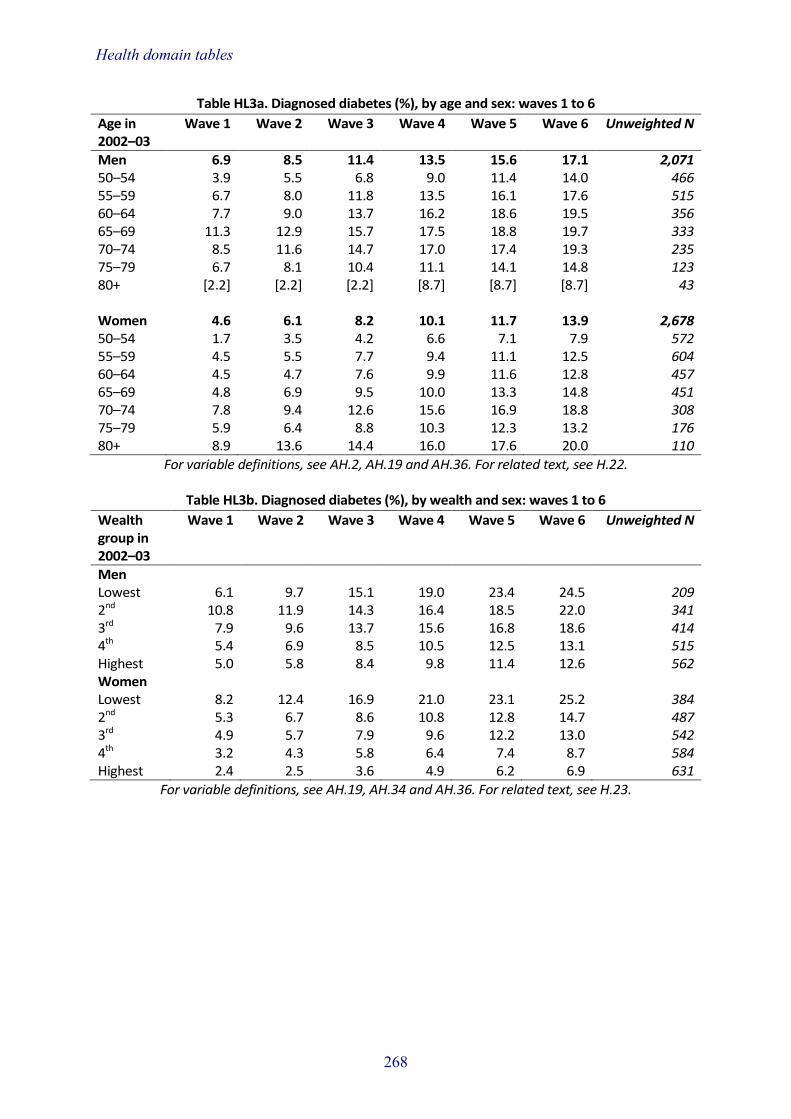
Health domain tables
268
Table HL3a. Diagnosed diabetes (%), by age and sex: waves 1 to 6
Age in 2002–03
Wave 1 Wave 2 Wave 3 Wave 4 Wave 5 Wave 6 Unweighted N
Men 6.9 8.5 11.4 13.5 15.6 17.1 2,071 50–54 3.9 5.5 6.8 9.0 11.4 14.0 466 55–59 6.7 8.0 11.8 13.5 16.1 17.6 515 60–64 7.7 9.0 13.7 16.2 18.6 19.5 356 65–69 11.3 12.9 15.7 17.5 18.8 19.7 333 70–74 8.5 11.6 14.7 17.0 17.4 19.3 235 75–79 6.7 8.1 10.4 11.1 14.1 14.8 123 80+ [2.2] [2.2] [2.2] [8.7] [8.7] [8.7] 43 Women 4.6 6.1 8.2 10.1 11.7 13.9 2,678 50–54 1.7 3.5 4.2 6.6 7.1 7.9 572 55–59 4.5 5.5 7.7 9.4 11.1 12.5 604 60–64 4.5 4.7 7.6 9.9 11.6 12.8 457 65–69 4.8 6.9 9.5 10.0 13.3 14.8 451 70–74 7.8 9.4 12.6 15.6 16.9 18.8 308 75–79 5.9 6.4 8.8 10.3 12.3 13.2 176 80+ 8.9 13.6 14.4 16.0 17.6 20.0 110
For variable definitions, see AH.2, AH.19 and AH.36. For related text, see H.22.
Table HL3b. Diagnosed diabetes (%), by wealth and sex: waves 1 to 6
Wealth group in 2002–03
Wave 1 Wave 2 Wave 3 Wave 4 Wave 5 Wave 6 Unweighted N
Men Lowest 6.1 9.7 15.1 19.0 23.4 24.5 209 2nd 10.8 11.9 14.3 16.4 18.5 22.0 341 3rd 7.9 9.6 13.7 15.6 16.8 18.6 414 4th 5.4 6.9 8.5 10.5 12.5 13.1 515 Highest 5.0 5.8 8.4 9.8 11.4 12.6 562 Women Lowest 8.2 12.4 16.9 21.0 23.1 25.2 384 2nd 5.3 6.7 8.6 10.8 12.8 14.7 487 3rd 4.9 5.7 7.9 9.6 12.2 13.0 542 4th 3.2 4.3 5.8 6.4 7.4 8.7 584 Highest 2.4 2.5 3.6 4.9 6.2 6.9 631
For variable definitions, see AH.19, AH.34 and AH.36. For related text, see H.23.

Health domain tables
269
Table HL4a. Diagnosed depression (%), by age and sex: waves 1 to 6
Age in 2002–03
Wave 1 Wave 2 Wave 3 Wave 4 Wave 5 Wave 6 Unweighted N
Men 4.8 6.2 7.0 7.8 8.5 9.3 2,064 50–54 6.8 7.9 9.0 10.9 12.3 12.5 466 55–59 6.3 9.3 10.2 10.4 11.0 12.0 517 60–64 4.1 5.0 6.3 7.4 8.2 9.6 354 65–69 3.4 4.4 5.0 5.0 5.3 6.9 333 70–74 1.8 1.8 1.8 1.8 2.7 2.7 231 75–79 0.7 3.0 3.7 3.7 3.7 3.7 122 80+ [4.7] [4.7] [4.7] [4.7] [4.7] [4.7] 41 Women 6.9 8.7 10.1 11.3 12.1 12.8 2,659 50–54 9.6 12.2 14.7 16.0 17.7 18.4 570 55–59 10.4 13.3 14.8 16.3 17.2 18.2 601 60–64 6.2 8.1 9.5 10.7 11.4 11.8 454 65–69 3.9 4.1 5.7 7.3 7.5 8.5 445 70–74 3.3 4.3 5.3 6.0 6.6 6.6 302 75–79 3.5 4.0 4.0 4.0 4.5 5.5 173 80+ 4.8 6.4 6.4 6.4 6.4 6.4 114
For variable definitions, see AH.2, AH.19 and AH.36. For related text, see H.22.
Table HL4b. Diagnosed depression (%), by wealth and sex: waves 1 to 6
Wealth group in 2002–03
Wave 1 Wave 2 Wave 3 Wave 4 Wave 5 Wave 6 Unweighted N
Men Lowest 6.1 9.4 11.8 12.6 14.0 15.5 209 2nd 5.9 7.3 8.3 8.9 9.4 10.2 337 3rd 5.1 6.1 7.4 8.6 9.8 10.7 414 4th 4.2 5.6 5.8 6.6 7.4 8.2 513 Highest 3.6 4.0 4.6 4.6 4.8 5.4 561 Women Lowest 8.4 11.7 13.5 15.1 16.5 17.2 376 2nd 6.6 8.4 9.8 11.5 12.7 12.9 482 3rd 7.5 9.5 10.9 11.3 12.3 13.0 538 4th 5.9 6.8 8.3 9.3 10.1 10.6 582 Highest 6.2 7.9 9.3 10.4 10.6 11.5 627
For variable definitions, see AH.19, AH.34 and AH.36. For related text, see H.23.

Health domain tables
270
Table HL5a. Mean walking speed (m/s), by age and sex: waves 1 to 6
Age in 2002–03
Wave 1 Wave 2 Wave 3 Wave 4 Wave 5 Wave 6 Unweighted N
Men 0.97 0.95 0.92 0.90 0.87 0.83 774 60–64 1.03 1.00 0.98 0.98 0.95 0.93 270 65–69 0.99 0.96 0.94 0.91 0.91 0.85 245 70–74 0.91 0.91 0.88 0.83 0.80 0.77 162 75–79 0.89 0.82 0.85 0.75 0.72 0.64 73 80+ - - - - - - 24 Women 0.98 0.89 0.86 0.82 0.80 0.76 984 60–64 1.07 0.96 0.93 0.90 0.91 0.88 347 65–69 1.06 0.93 0.89 0.86 0.83 0.80 319 70–74 0.87 0.84 0.81 0.76 0.73 0.67 195 75–79 0.83 0.77 0.74 0.66 0.65 0.58 89 80+ [0.78] [0.77] [0.71] [0.65] [0.56] [0.53] 34
For variable definitions, see AH.2, AH.33 and AH.36. For related text, see H.24.
Table HL5b. Mean walking speed (m/s), by wealth and sex: waves 1 to 6
Wealth group in 2002–03
Wave 1 Wave 2 Wave 3 Wave 4 Wave 5 Wave 6 Unweighted N
Men Lowest 0.85 0.83 0.76 0.74 0.73 0.70 59 2nd 0.93 0.88 0.86 0.85 0.86 0.77 124 3rd 0.95 0.95 0.90 0.87 0.83 0.80 159 4th 1.00 0.96 0.95 0.91 0.89 0.86 193 Highest 1.04 1.03 1.02 1.00 0.96 0.93 231 Women Lowest 0.78 0.78 0.75 0.70 0.66 0.64 124 2nd 0.87 0.85 0.81 0.75 0.75 0.70 174 3rd 1.07 0.88 0.84 0.81 0.78 0.76 214 4th 1.10 0.93 0.90 0.87 0.85 0.81 221 Highest 1.02 0.98 0.96 0.93 0.91 0.85 244
For variable definitions, see AH.33, AH.34 and AH.36. For related text, see H.25.
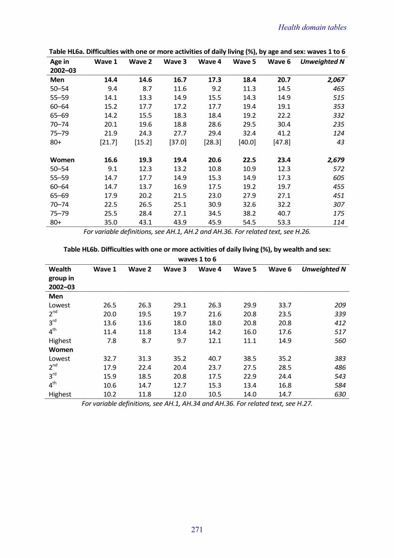
Health domain tables
271
Table HL6a. Difficulties with one or more activities of daily living (%), by age and sex: waves 1 to 6
Age in 2002–03
Wave 1 Wave 2 Wave 3 Wave 4 Wave 5 Wave 6 Unweighted N
Men 14.4 14.6 16.7 17.3 18.4 20.7 2,067 50–54 9.4 8.7 11.6 9.2 11.3 14.5 465 55–59 14.1 13.3 14.9 15.5 14.3 14.9 515 60–64 15.2 17.7 17.2 17.7 19.4 19.1 353 65–69 14.2 15.5 18.3 18.4 19.2 22.2 332 70–74 20.1 19.6 18.8 28.6 29.5 30.4 235 75–79 21.9 24.3 27.7 29.4 32.4 41.2 124 80+ [21.7] [15.2] [37.0] [28.3] [40.0] [47.8] 43 Women 16.6 19.3 19.4 20.6 22.5 23.4 2,679 50–54 9.1 12.3 13.2 10.8 10.9 12.3 572 55–59 14.7 17.7 14.9 15.3 14.9 17.3 605 60–64 14.7 13.7 16.9 17.5 19.2 19.7 455 65–69 17.9 20.2 21.5 23.0 27.9 27.1 451 70–74 22.5 26.5 25.1 30.9 32.6 32.2 307 75–79 25.5 28.4 27.1 34.5 38.2 40.7 175 80+ 35.0 43.1 43.9 45.9 54.5 53.3 114
For variable definitions, see AH.1, AH.2 and AH.36. For related text, see H.26.
Table HL6b. Difficulties with one or more activities of daily living (%), by wealth and sex:
waves 1 to 6
Wealth group in 2002–03
Wave 1 Wave 2 Wave 3 Wave 4 Wave 5 Wave 6 Unweighted N
Men Lowest 26.5 26.3 29.1 26.3 29.9 33.7 209 2nd 20.0 19.5 19.7 21.6 20.8 23.5 339 3rd 13.6 13.6 18.0 18.0 20.8 20.8 412 4th 11.4 11.8 13.4 14.2 16.0 17.6 517 Highest 7.8 8.7 9.7 12.1 11.1 14.9 560 Women Lowest 32.7 31.3 35.2 40.7 38.5 35.2 383 2nd 17.9 22.4 20.4 23.7 27.5 28.5 486 3rd 15.9 18.5 20.8 17.5 22.9 24.4 543 4th 10.6 14.7 12.7 15.3 13.4 16.8 584 Highest 10.2 11.8 12.0 10.5 14.0 14.7 630
For variable definitions, see AH.1, AH.34 and AH.36. For related text, see H.27.

Health domain tables
272
Table HL7a. Mean recall score, by age and sex: waves 1 to 6
Age in 2002–03
Wave 1 Wave 2 Wave 3 Wave 4 Wave 5 Wave 6 Unweighted N
Men 10.2 10.3 10.3 10.1 9.9 9.8 1,954 50–54 11.3 11.5 11.5 11.4 11.4 11.6 442 55–59 10.5 10.8 10.8 10.7 10.5 10.5 486 60–64 10.2 10.4 10.5 10.0 10.1 9.9 340 65–69 9.4 9.5 9.6 9.2 8.9 8.6 318 70–74 9.1 8.9 9.1 8.9 8.6 8.2 220 75–79 8.3 7.9 8.3 7.6 6.9 6.5 110 80+ [8.3] [7.9] [7.6] [6.3] [5.7] [5.3] 38 Women 10.4 10.8 10.8 10.6 10.4 10.2 2,543 50–54 11.5 11.9 11.9 12.2 12.1 12.3 554 55–59 11.1 11.5 11.7 11.6 11.6 11.6 584 60–64 10.7 10.8 10.9 10.8 10.6 10.4 442 65–69 10.1 10.5 10.3 10.0 9.9 9.9 431 70–74 9.2 9.5 9.4 9.0 8.6 8.2 294 75–79 8.7 8.9 8.7 8.1 7.0 6.6 150 80+ 7.6 7.8 8.1 6.9 6.6 5.3 88
For variable definitions, see AH.2, AH.28 and AH.36. For related text, see H.28.
Table HL7b. Mean recall score, by wealth and sex: waves 1 to 6
Wealth group in 2002–03
Wave 1 Wave 2 Wave 3 Wave 4 Wave 5 Wave 6 Unweighted N
Men Lowest 9.4 8.8 8.6 9.0 8.8 8.5 186 2nd 9.5 9.7 9.8 9.2 9.0 8.9 318 3rd 9.9 10.3 10.1 9.8 9.8 9.5 394 4th 10.4 10.6 10.7 10.4 10.4 10.5 491 Highest 10.9 11.1 11.3 11.1 10.7 10.7 537 Women Lowest 8.9 9.4 9.4 8.9 8.7 8.6 350 2nd 10.1 10.4 10.2 9.9 9.7 9.8 460 3rd 10.4 10.9 10.7 10.8 10.5 10.3 515 4th 11.0 11.3 11.4 11.3 11.1 11.1 557 Highest 11.2 11.5 11.7 11.5 11.3 11.2 611
For variable definitions, see AH.28, AH.34 and AH.36. For related text, see H.29.

Health domain tables
273
Table HL8a. Current smokers (%), by age and sex: waves 1 to 6
Age in 2002–03
Wave 1 Wave 2 Wave 3 Wave 4 Wave 5 Wave 6 Unweighted N
Men 13.0 11.2 12.1 10.2 11.0 9.8 1,979 50–54 15.6 14.6 15.0 13.0 13.8 12.2 437 55–59 19.8 14.8 17.0 13.7 14.2 12.2 490 60–64 12.6 10.8 11.7 10.6 12.6 12.3 335 65–69 11.3 10.2 10.2 8.3 9.3 7.6 321 70–74 3.7 4.2 5.1 3.7 4.1 3.2 230 75–79 4.4 4.4 4.4 3.7 3.7 3.7 123 80+ [2.2] [2.2] [2.2] [2.2] [2.2] [2.2] 43 Women 14.0 11.4 12.2 10.5 11.0 9.7 2,578 50–54 20.8 18.6 19.6 17.7 18.4 16.1 547 55–59 15.4 12.1 12.7 10.5 11.3 9.9 567 60–64 14.8 11.0 11.8 10.2 10.5 9.8 435 65–69 10.7 8.9 9.4 7.8 8.9 7.6 442 70–74 12.9 9.9 11.2 9.6 9.6 7.9 302 75–79 5.4 4.5 5.0 3.9 3.9 3.9 173 80+ 1.7 0.0 0.0 0.0 0.0 0.0 112
For variable definitions, see AH.2, AH.30 and AH.36. For related text, see H.30.
Table HL8b. Current smokers (%), by wealth and sex: waves 1 to 6
Wealth group in 2002–03
Wave 1 Wave 2 Wave 3 Wave 4 Wave 5 Wave 6 Unweighted N
Men Lowest 36.1 31.2 33.2 31.3 32.0 26.0 189 2nd 18.3 16.3 17.5 14.6 15.2 14.6 324 3rd 8.8 8.6 9.1 7.6 9.1 6.9 394 4th 7.9 6.3 7.3 5.7 6.3 6.1 504 Highest 6.1 4.7 5.1 3.4 4.0 3.8 538 Women Lowest 25.4 23.5 24.2 21.4 22.8 20.6 362 2nd 19.5 15.6 16.7 16.3 16.5 13.7 463 3rd 9.7 8.4 8.6 7.0 7.4 7.0 518 4th 11.0 8.3 9.3 7.5 7.7 6.8 572 Highest 7.3 4.7 5.5 3.8 4.3 3.4 610
For variable definitions, see AH.30, AH.34 and AH.36. For related text, see H.31.

Health domain tables
274
Table HL9a. Sedentary or low physical activity (%), by age and sex: waves 1 to 6
Age in 2002–03
Wave 1 Wave 2 Wave 3 Wave 4 Wave 5 Wave 6 Unweighted N
Men 24.0 22.9 25.1 26.0 31.1 32.4 2,059 50–54 18.8 17.8 19.0 20.0 22.3 21.9 462 55–59 26.5 24.6 27.9 26.4 29.8 29.2 513 60–64 27.6 22.0 24.0 24.0 25.9 27.3 351 65–69 21.5 23.0 23.0 24.7 35.1 33.5 332 70–74 24.8 26.1 27.5 28.8 37.8 44.6 234 75–79 29.4 30.1 37.5 44.1 50.4 59.6 124 80+ [30.4] [30.4] [43.5] [47.8] [69.6] [80.4] 43 Women 30.7 31.0 33.5 37.7 39.7 43.1 2,667 50–54 24.7 24.9 25.9 28.8 27.7 27.3 570 55–59 28.5 23.0 24.9 25.5 28.8 29.2 601 60–64 27.2 26.4 26.9 30.3 32.1 35.5 453 65–69 27.0 29.7 36.2 40.0 42.3 47.3 449 70–74 39.9 40.3 46.4 53.4 56.3 63.6 308 75–79 37.1 49.5 47.3 61.8 65.9 77.0 176 80+ 60.2 62.2 65.5 72.0 77.3 85.7 110
For variable definitions, see AH.2, AH.26 and AH.36. For related text, see H.32.
Table HL9b. Sedentary or low physical activity (%), by wealth and sex: waves 1 to 6
Wealth group in 2002–03
Wave 1 Wave 2 Wave 3 Wave 4 Wave 5 Wave 6 Unweighted N
Men Lowest 44.7 44.0 47.3 49.1 51.6 49.3 207 2nd 31.7 29.6 33.5 35.2 40.3 43.5 337 3rd 23.6 20.5 24.8 27.1 28.1 32.1 409 4th 17.9 18.3 19.5 19.5 25.6 27.2 517 Highest 14.1 13.1 13.3 12.1 20.6 20.2 559 Women Lowest 47.5 47.2 56.5 61.2 61.1 62.4 377 2nd 37.4 37.9 37.7 43.2 45.1 52.8 483 3rd 32.3 28.7 33.1 35.2 37.6 42.9 542 4th 22.1 25.6 24.9 29.3 29.8 33.1 581 Highest 19.6 20.3 20.9 24.7 28.9 29.9 631
For variable definitions, see AH.26, AH.34 and AH.36. For related text, see H.33.

Health domain tables
275
Table HL10a. Mean score on quality of life measure, by age and sex: waves 1 to 6
Age in 2002–03
Wave 1 Wave 2 Wave 3 Wave 4 Wave 5 Wave 6 Unweighted N
Men 44.1 43.8 42.4 42.0 41.9 41.4 1,209 50–54 43.9 43.4 42.6 42.6 42.7 42.4 297 55–59 43.4 43.6 42.4 42.3 42.5 42.4 321 60–64 44.3 43.5 43.1 42.6 41.5 41.6 228 65–69 44.3 44.6 41.9 41.8 41.0 40.5 196 70–74 45.7 43.9 42.4 40.7 36.9 39.3 115 75–79 [43.2] [43.0] [39.8] [37.8] [33.8] [35.8] 40 80+ - - - - - - 12 Women 44.3 44.2 42.7 42.4 42.2 41.5 1,450 50–54 44.3 44.0 43.1 43.8 43.9 43.4 364 55–59 44.1 44.5 43.1 42.7 42.9 42.4 381 60–64 45.0 44.7 43.2 42.9 42.4 41.9 277 65–69 44.4 44.4 42.1 41.4 40.8 39.8 246 70–74 44.7 44.1 41.8 40.8 40.0 38.4 109 75–79 42.5 41.8 40.5 38.5 38.5 37.7 52 80+ - - - - - - 21
For variable definitions, see AH.2, AH.27 and AH.36. For related text, see H.34.
Table HL10b. Mean score on quality of life measure, by wealth and sex: waves 1 to 6
Wealth group in 2002–03
Wave 1 Wave 2 Wave 3 Wave 4 Wave 5 Wave 6 Unweighted N
Men Lowest 38.8 38.6 37.8 36.8 37.2 36.4 82 2nd 42.2 41.8 40.4 40.7 40.1 39.7 183 3rd 43.6 43.5 41.2 41.1 40.8 40.4 247 4th 45.1 44.7 43.4 43.2 43.2 42.6 315 Highest 46.3 45.9 44.9 44.1 44.2 43.6 370 Women Lowest 39.5 39.5 38.5 37.6 38.4 37.9 160 2nd 42.3 42.7 40.7 41.1 40.6 39.6 220 3rd 44.8 44.3 42.4 42.3 41.8 41.1 294 4th 45.2 44.9 43.5 42.9 43.3 42.4 343 Highest 46.9 46.7 45.3 45.1 44.6 43.8 404
For variable definitions, see AH.27, AH.34 and AH.36. For related text, see H.35.

Health domain tables
276
Table HL11a. Mean scores on the Center for Epidemiologic Studies depression scale,
by age and sex: waves 1 to 6
Age in 2002–03
Wave 1 Wave 2 Wave 3 Wave 4 Wave 5 Wave 6 Unweighted N
Men 1.05 1.13 2.05 0.93 1.16 1.01 1,898 50–54 1.04 1.17 1.01 0.88 0.99 0.95 425 55–59 1.27 1.27 1.09 0.91 0.18 0.91 474 60–64 1.03 0.97 1.02 0.88 1.05 0.93 334 65–69 0.96 1.13 1.14 0.87 1.10 0.92 309 70–74 0.87 0.95 0.91 0.95 1.29 1.13 212 75–79 0.90 1.17 1.03 1.16 1.78 1.68 107 80+ [1.03] [1.31] [1.30] [1.66] [1.69] [1.68] 37 Women 1.64 1.68 1.60 1.52 1.63 1.53 2,428 50–54 1.72 1.70 1.58 1.33 1.51 1.29 532 55–59 1.63 1.57 1.49 1.48 1.46 1.38 565 60–64 1.40 1.53 1.45 1.47 1.51 1.39 428 65–69 1.48 1.55 1.46 1.46 1.55 1.52 410 70–74 1.82 1.76 1.82 1.75 1.98 1.85 280 75–79 1.90 2.20 1.99 1.90 2.40 2.08 136 80+ 1.70 2.03 2.09 1.96 1.63 2.46 77
For variable definitions, see AH.2, AH.9 and AH.36. For related text, see H.36.
Table HL11b. Mean scores on the Center for Epidemiologic Studies depression scale,
by wealth and sex: waves 1 to 6
Wealth group in 2002–03
Wave 1 Wave 2 Wave 3 Wave 4 Wave 5 Wave 6 Unweighted N
Men Lowest 1.92 1.89 1.81 1.62 1.78 1.65 174 2nd 1.22 1.27 1.29 1.10 1.43 1.20 311 3rd 1.11 1.17 1.09 0.97 1.19 1.00 386 4th 0.82 0.96 0.84 0.74 0.94 0.88 476 Highest 0.68 0.81 0.68 0.58 0.82 0.68 523 Women Lowest 2.52 2.27 2.53 2.26 2.41 2.14 331 2nd 1.97 2.00 1.91 1.82 1.78 1.68 435 3rd 1.63 1.77 1.62 1.50 1.71 1.65 494 4th 1.26 1.33 1.16 1.18 1.19 1.23 532 Highest 1.08 1.25 1.04 1.09 1.23 1.14 589
For variable definitions, see AH.9, AH.34 and AH.36. For related text, see H.37.

Health domain tables
277
Table N1a. Mean BMI (kg/m2), by age and sex: wave 6
Age in 2012–13
50–54 55–59 60–64 65–69 70–74 75–79 80+ All
Men 28.3 28.5 28.8 28.5 28.3 27.8 27.4 28.3 Women 28.7 28.8 28.8 28.7 28.5 28.5 27.3 28.5 Unweighted N Men 221 521 650 672 488 422 324 3,298 Women 273 642 826 786 579 530 449 4,085
For variable definitions, see AH.2, AH.8, AH.25 and AH.36. For related text, see H.38.
Table N1b. Body mass index categories (%), by age and sex: wave 6
Age in 2012–13
50–54 55–59 60–64 65–69 70–74 75–79 80+ All
Men Underweight 0.7 1.1 0.3 0.4 0.3 0.3 0.9 0.6 Desirable 26.3 21.3 21.3 19.8 20.9 21.6 27.8 22.6 Overweight 43.3 44.2 44.5 49.2 49.5 53.9 47.5 46.6 Obese 29.6 33.4 33.9 30.7 29.3 24.2 23.7 30.2 Women Underweight 0.3 1.7 1.1 1.2 0.9 2.2 2.1 1.3 Desirable 33.8 30.4 31.1 25.3 26.4 23.1 33.7 29.6 Overweight 30.2 30.8 31.2 39.2 38.8 39.1 36.8 34.5 Obese 35.7 37.1 36.6 34.4 33.9 35.5 27.4 34.6 Unweighted N Men 221 521 650 672 488 422 324 3,298 Women 273 642 826 786 579 530 449 4,085
For variable definitions, see AH.2, AH.8, AH.25 and AH.36. For related text, see H.38.
Table N1c. Mean BMI (kg/m2), by wealth group and sex: wave 6
Wealth group in 2012–13
Lowest 2nd 3rd 4th Highest
Men 28.8 28.6 28.5 28.0 27.9 Women 30.0 29.3 28.8 28.0 26.4 Unweighted N Men 461 560 688 758 775 Women 671 798 850 843 842
For variable definitions, see AH.8, AH.25, AH.34 and AH.36. For related text, see H.39.

Health domain tables
278
Table N1d. Body mass index categories (%), by wealth group and sex: wave 6
Wealth group in 2012–13
Lowest 2nd 3rd 4th Highest
Men Underweight 1.6 0.9 0.3 0.3 0.0 Desirable 23.5 21.9 20.8 22.4 23.9 Overweight 35.9 45.6 47.0 51.5 51.6 Obese 39.0 31.7 31.9 25.8 24.5 Women Underweight 1.3 2.0 0.8 0.7 1.4 Desirable 22.4 24.6 27.2 30.9 43.1 Overweight 29.6 33.2 35.2 38.4 36.8 Obese 46.7 40.2 36.8 30.0 18.7 Unweighted N Men 461 560 688 758 775 Women 671 798 850 843 842
For variable definitions, see AH.8, AH.25, AH.34 and AH.36. For related text, see H.39.
Table N2a. Waist circumference, by age and sex: wave 6
Age in 2012–13
50–54 55–59 60–64 65–69 70–74 75–79 80+ All
Men Mean waist circumference (cm) 100.1 100.9 102.4 109.9 103.3 102.5 102.2 101.9 Raised waist circumference (%) 37.8 42.3 47.3 48.8 54.7 51.6 50.1 46.3 Women Mean waist circumference (cm) 91.0 91.9 92.3 92.9 92.6 92.8 91.6 92.1 Raised waist circumference (%) 52.1 54.9 56.3 63.5 62.0 63.4 59.7 58.2 Unweighted N Men 222 525 654 680 500 440 360 3,381 Women 275 650 830 798 590 542 488 4,173
For variable definitions, see AH.2, AH.25, AH.32 and AH.36. For related text, see H.40.
Table N2b. Waist circumference, by wealth group and sex: wave 6
Wealth group in 2012–13
Lowest 2nd 3rd 4th Highest
Men Mean waist circumference (cm) 103.5 102.4 102.7 100.4 100.6 Raised waist circumference (%) 52.1 47.7 52.1 40.1 41.7 Women Mean waist circumference (cm) 95.9 93.5 92.5 90.5 88.0 Raised waist circumference (%) 67.6 62.2 60.3 55.2 45.9 Unweighted N Men 474 572 707 778 791 Women 705 806 867 856 856
For variable definitions, see AH.25, AH.32, AH.34 and AH.36. For related text, see H.41.

Health domain tables
279
Table N3a. Means of systolic and diastolic blood pressure (mmHg), by age and sex: wave 6
Age in 2012–13
50–54 55–59 60–64 65–69 70–74 75–79 80+ All
Men Systolic BP 129.9 131.5 132.3 134.0 134.6 134.8 133.0 132.5 Diastolic BP 80.0 78.6 76.7 74.7 72.6 70.0 65.7 75.2 Women Systolic BP 122.8 125.8 129.1 132.5 134.5 136.0 136.9 130.4 Diastolic BP 75.6 75.7 74.9 73.9 72.4 70.3 66.1 73.1 Unweighted N Men 212 486 623 653 475 423 353 3,225 Women 249 624 775 758 568 527 468 3,969
For variable definitions, see AH.2, AH.6, AH.25 and AH.36. For related text, see H.42.
Table N3b. Means of systolic and diastolic blood pressure (mmHg), by wealth group and sex:
wave 6
Wealth group in 2012–13
Lowest 2nd 3rd 4th Highest
Men Systolic BP 132.1 133.4 132.7 132.3 132.3 Diastolic BP 74.9 75.6 74.3 75.4 75.5 Women Systolic BP 130.9 130.9 133.1 129.0 128.4 Diastolic BP 72.6 73.0 72.7 73.0 73.8 Unweighted N Men 430 547 682 750 759 Women 655 764 832 824 816
For variable definitions, see AH.6, AH.25, AH.34 and AH.36. For related text, see H.43.

Health domain tables
280
Table N4a. Lipid profile (mmol/l), by age and sex: wave 6
Age in 2012–13
50–54 55–59 60–64 65–69 70–74 75–79 80+ All
Men Mean total cholesterol 5.67 5.56 5.41 5.15 4.94 4.96 4.65 5.28 % ≥5.0 mmol/l chol 71.0 68.9 63.2 54.9 46.4 45.3 40.6 58.8 Mean HDL cholesterol 1.39 1.46 1.47 1.48 1.49 1.47 1.45 1.45 % <1.0 mmol/l HDL 12.1 7.1 6.0 5.5 5.2 8.9 8.3 7.7 Mean LDL cholesterol 3.53 3.48 3.28 3.04 2.89 2.97 - 3.26 % ≥3.0 mmol/l LDL 73.0 70.4 59.9 51.3 47.1 50.0 - 60.8 Meana triglycerides 1.52 1.35 1.38 1.29 1.19 1.21 - 1.34 % ≥1.7 mmol/l trig 42.0 32.2 36.0 28.3 21.4 23.0 - 32.3 Women Mean total cholesterol 5.81 5.96 5.96 5.84 5.74 5.42 5.28 5.75 % ≥5.0 mmol/l chol 79.5 84.5 81.9 78.4 72.0 62.7 60.7 75.6 Mean HDL cholesterol 1.80 1.81 1.78 1.77 1.80 1.77 1.76 1.79 % <1.2 mmol/l HDL 6.8 7.0 5.9 6.1 5.2 7.8 7.8 6.6 Mean LDL cholesterol 3.44 3.59 3.60 3.53 3.44 3.08 - 3.48 % ≥3.0 mmol/l LDL 66.8 75.0 73.0 70.2 63.0 51.8 - 68.2 Meana triglycerides 1.16 1.18 1.22 1.22 1.21 1.19 - 1.20 % ≥1.7 mmol/l trig 21.3 22.4 23.6 20.1 22.6 16.8 - 21.5 Unweighted N Men Total cholesterol 195 428 541 550 363 318 252 2,647 HDL cholesterol 195 427 540 550 363 318 252 2,645 LDL cholesterol 139 292 401 398 271 215 - 1,716 Triglycerides 145 295 407 401 272 216 - 1,736 Women Total cholesterol 227 522 663 648 458 403 315 3,236 HDL cholesterol 226 522 663 648 458 403 315 3,235 LDL cholesterol 165 393 508 504 357 273 - 2,200 Triglycerides 166 395 508 505 357 273 - 2,204
a Geometric means are reported.
Note: Triglycerides and LDL cholesterol measurements were done on those who are eligible to fast
according to the protocol, which excludes those aged 80+. Chol indicates total cholesterol. HDL
indicates HDL cholesterol. LDL indicates LDL cholesterol. Trig indicates triglycerides.
For variable definitions, see AH.2, AH.7, AH.10, AH.23, AH.25 and AH.36. For related text, see H.44.

Health domain tables
281
Table N4b. Lipid profile (mmol/l), by wealth group and sex: wave 6
Wealth group in 2012–13
Lowest 2nd 3rd 4th Highest
Men Mean total cholesterol 5.08 5.27 5.18 5.36 5.43 % ≥5.0 mmol/l chol 48.0 58.5 55.4 63.7 64.2 Mean HDL cholesterol 1.38 1.39 1.44 1.50 1.53 % <1.0 mmol/l HDL 11.5 10.8 7.4 6.3 4.3 Mean LDL cholesterol 3.12 3.31 3.15 3.31 3.35 % ≥3.0 mmol/l LDL 55.5 60.2 54.5 65.6 64.4 Meana triglycerides 1.43 1.43 1.36 1.27 1.27 % ≥1.7 mmol/l trig 42.8 40.4 30.6 25.8 25.8 Women Mean total cholesterol 5.51 5.70 5.68 5.85 6.00 % ≥5.0 mmol/l chol 68.6 74.7 72.9 77.4 84.4 Mean HDL cholesterol 1.66 1.74 1.77 1.84 1.94 % <1.2 mmol/l HDL 12.8 5.9 5.2 5.0 3.7 Mean LDL cholesterol 3.46 3.41 3.43 3.53 3.54 % ≥3.0 mmol/l LDL 70.6 65.4 65.6 69.0 71.0 Meana triglycerides 1.35 1.22 1.21 1.17 1.09 % ≥ 1.7 mmol/l trig 31.7 23.1 21.6 19.6 13.9 Unweighted N Men Total cholesterol 350 443 555 613 637 HDL cholesterol 350 443 553 613 637 LDL cholesterol 192 261 361 418 446 Triglycerides 194 262 372 420 449 Women Total cholesterol 504 627 677 676 683 HDL cholesterol 503 627 677 676 683 LDL cholesterol 275 395 458 485 537 Triglycerides 278 396 458 485 537
a Geometric means are reported.
Note: Triglycerides and LDL cholesterol measurements were done on those who are eligible to fast
according to the protocol. Chol indicates total cholesterol. HDL indicates HDL cholesterol. LDL
indicates LDL cholesterol. Trig indicates triglycerides.
For variable definitions, see AH.7, AH.10, AH.23, AH.25, AH.34 and AH.36. For related text, see H.45.

Health domain tables
282
Table N5a. Fibrinogen (g/l) and C-reactive protein (mg/l) means, by age and sex: wave 6
Age in 2012–13
50–54 55–59 60–64 65–69 70–74 75–79 80+ All
Men Mean fibrinogen 2.74 2.85 2.91 2.97 3.00 3.04 3.04 2.91 Meana C-reactive protein 1.26 1.45 1.57 1.64 1.69 2.04 2.18 1.59 Women Mean fibrinogen 2.85 2.98 2.99 3.04 3.06 3.11 3.11 3.01 Meana C-reactive protein 1.55 1.68 1.70 1.90 1.84 1.97 2.46 1.83 Unweighted N Men Fibrinogen 191 414 533 535 352 309 247 2,581 C-reactive protein 195 427 541 551 363 318 252 2,647 Women Fibrinogen 227 507 658 649 441 393 312 3,187 C-reactive protein 227 522 663 648 458 403 315 3,236
a Geometric means are reported. Participants with levels greater than 10 mg/l were excluded.
For variable definitions, see AH.2, AH.7, AH.11, AH.13, AH.25 and AH.36. For related text, see H.46.
Table N5b. Fibrinogen (g/l) and C-reactive protein (mg/l) means, by wealth group and sex: wave 6
Wealth group in 2012–13
Lowest 2nd 3rd 4th Highest
Men Mean fibrinogen 3.04 2.93 2.94 2.84 2.84 Meana C-reactive protein 2.22 1.67 1.57 1.43 1.35 Women Mean fibrinogen 3.08 3.08 3.04 2.94 2.89 Meana C-reactive protein 2.28 2.13 1.91 1.64 1.31 Unweighted N Men Fibrinogen 342 434 542 592 621 C-reactive protein 351 443 554 613 637 Women Fibrinogen 501 619 664 662 671 C-reactive protein 504 627 677 676 683
a Geometric means are reported. Participants with levels greater than 10 mg/l were excluded.
For variable definitions, see AH.7, AH.11, AH.13, AH.25, AH.34 and AH.36. For related text, see H.47.
Table N6a. Mean glycated haemoglobin (%), by age and sex: wave 6
Age in 2012–13
50–54 55–59 60–64 65–69 70–74 75–79 80+ All
Men 5.62 5.84 5.89 5.99 6.06 6.16 6.07 5.91 Women 5.83 5.93 5.86 5.99 5.98 6.05 6.03 5.94 Unweighted N Men 194 418 540 546 363 316 249 2,626 Women 227 515 646 642 449 399 310 3,188
For variable definitions, see AH.2, AH.7, AH.16, AH.25 and AH.36. For related text, see H.48.

Health domain tables
283
Table N6b. Mean glycated haemoglobin (%), by wealth group and sex: wave 6
Wealth group in 2012–13
Lowest 2nd 3rd 4th Highest
Men 6.02 5.98 5.94 5.85 5.80 Women 6.26 5.92 5.94 5.85 5.77 Unweighted N Men 351 439 553 606 631 Women 499 617 663 661 676
For variable definitions, see AH.7, AH.16, AH.25, AH.34 and AH.36. For related text, see H.49.
Table N7a. Mean haemoglobin and anaemia prevalence, by age and sex: wave 6
Age in 2012–13
50–54 55–59 60–64 65–69 70–74 75–79 80+ All
Men Mean haemoglobin (g/dl) 14.9 14.8 14.6 14.5 14.4 14.0 13.4 14.5 Anaemia prevalence (%) 5.0 2.4 5.6 9.5 13.6 23.8 38.1 11.2 Women Mean haemoglobin (g/dl) 13.2 13.3 13.3 13.2 13.3 12.9 12.4 13.1 Anaemia prevalence (%) 12.4 9.2 8.8 10.1 11.7 21.3 35.2 14.7 Unweighted N Men 195 418 540 547 365 316 248 2,629 Women 227 516 647 642 450 400 309 3,191
For variable definitions, see AH.2, AH.7, AH.18, AH.25 and AH.36. For related text, see H.50.
Table N7b. Mean haemoglobin and anaemia prevalence, by wealth group and sex: wave 6
Wealth group in 2012–13
Lowest 2nd 3rd 4th Highest
Men Mean haemoglobin (g/dl) 14.4 14.4 14.4 14.6 14.6 Anaemia (%) 14.6 15.1 12.8 9.4 6.1 Women Mean haemoglobin (g/dl) 12.9 13.1 13.1 13.1 13.2 Anaemia (%) 22.7 16.3 12.9 12.7 8.8 Unweighted N Men 349 440 553 605 634 Women 500 617 664 662 676
For variable definitions, see AH.7, AH.18, AH.25, AH.34 and AH.36. For related text, see H.51.

Health domain tables
284
Table N8a. Lung function measures: mean values of FEV1, FVC and PEF, by age and sex-specific
height group: wave 6
Age in 2012–13
50–54 55–59 60–64 65–69 70–74 75–79 80+ All
FEV1 (litres) Men<175cm 3.29 3.06 2.89 2.66 2.45 2.23 2.10 2.74 Men≥175cm 3.47 3.54 3.28 3.09 2.76 2.65 2.43 3.25 Women<165cm 2.40 2.24 2.11 1.99 1.80 1.67 1.38 1.98 Women≥165cm 2.78 2.59 2.40 2.26 2.11 1.97 1.79 2.46 FVC (litres) Men<175cm 4.33 4.15 3.94 3.79 3.52 3.23 3.07 3.80 Men≥175cm 4.70 4.76 4.57 4.39 4.07 3.87 3.57 4.50 Women<165cm 3.12 3.00 2.85 2.73 2.50 2.34 1.95 2.69 Women≥165cm 3.66 3.52 3.29 3.07 3.00 2.73 2.40 3.33 PEF Men<175cm 555.2 516.6 490.6 456.6 425.1 395.2 371.9 470.0 (litres/minute) Men≥175cm 558.2 563.2 533.4 502.2 476.2 447.6 [432.9] 528.3 Women<165cm 374.8 367.0 347.8 332.5 301.5 280.0 233.8 325.1 Women≥165cm 418.8 400.0 383.9 362.0 337.8 331.0 - 384.6 Unweighted N Men<175cm 103 233 311 368 283 262 208 1,768 Men≥175cm 105 237 276 241 142 100 46 1,147 Women<165cm 166 412 519 541 404 374 318 2,734 Women≥165cm 86 181 211 144 97 60 20 799
For variable definitions, see AH.2, AH.24, AH.25 and AH.36. For related text, see H.52.
Table N8b. Lung function measures: mean values of FEV1, FVC and PEF, by wealth and sex-specific
height group: wave 6
Wealth group in 2012–13
Lowest 2nd 3rd 4th Highest
FEV1 (litres) Men <175cm 2.56 2.74 2.68 2.75 2.95 Men ≥175cm 3.00 3.11 3.31 3.27 3.36 Women <165cm 1.78 1.93 1.96 2.07 2.14 Women ≥165cm 2.38 2.42 2.41 2.43 2.58 FVC (litres) Men <175cm 3.64 3.79 3.75 3.79 3.99 Men ≥175cm 4.17 4.32 4.55 4.55 4.66 Women <165cm 2.46 2.63 2.65 2.79 2.88 Women ≥165cm 3.23 3.27 3.29 3.32 3.46 PEF Men <175cm 428.5 470.9 461.5 477.5 504.2 (litres/minute) Men ≥175cm 482.1 517.7 539.3 527.6 548.9 Women <165cm 290.8 317.7 321.2 344.0 352.1 Women ≥165cm 378.8 376.7 373.7 381.0 400.5 Unweighted N Men <175cm 266 335 383 391 360 Men ≥175cm 111 155 227 298 336 Women <165cm 447 552 609 559 512 Women ≥165cm 91 126 147 173 241
For variable definitions, see AH.24, AH.25, AH.34 and AH.36. For related text, see H.53.

Health domain tables
285
Table N9a. Mean levels of insulin-like growth factor 1 (nmol/l), by age and sex: wave 6
Age in 2012–13
50–54 55–59 60–64 65–69 70–74 75–79 80+ All
Men Mean IGF-1 19.5 18.4 18.1 17.5 16.8 15.6 14.6 17.6 % in lowest quintile 11.6 13.7 17.3 23.1 24.4 36.8 47.8 22.0 Women Mean IGF-1 16.9 16.7 15.9 15.3 14.6 14.0 13.4 15.5 % in lowest quintile 15.3 15.9 17.0 20.7 26.1 31.3 38.1 22.4 Unweighted N Men 194 427 540 547 364 318 251 2,641 Women 226 522 660 648 458 402 315 3,231
Note: Sex-specific quintiles are used.
For variable definitions, see AH.2, AH.7, AH.21, AH.25 and AH.36. For related text, see H.54.
Table N9b. Mean levels of insulin-like growth factor 1 (nmol/l), by wealth group and sex: wave 6
Wealth group in 2012–13
Lowest 2nd 3rd 4th Highest
Men Mean IGF-1 16.8 17.1 17.4 18.3 18.1 % in lowest quintile 26.8 26.2 22.2 19.6 16.4 Women Mean IGF-1 14.3 15.1 15.4 16.1 16.5 % in lowest quintile 32.1 25.5 21.0 16.6 15.1 Unweighted N Men 349 442 553 613 635 Women 504 626 676 676 680
Note: Sex-specific quintiles are used.
For variable definitions, see AH.7, AH.21, AH.25, AH.34 and AH.36. For related text, see H.55.

Health domain tables
286
Table N10a. Mean levels of vitamin D (nmol/l), by age and sex: wave 6
Age in 2012–13
50–54 55–59 60–64 65–69 70–74 75–79 80+ All
Men 46.6 46.1 46.8 50.8 51.7 49.5 45.7 47.9 Women 46.3 45.8 48.3 50.3 48.8 47.5 42.7 47.0 Unweighted N Men 194 427 539 547 364 318 251 2,640 Women 226 522 659 648 458 402 315 3,230
For variable definitions, see AH.2, AH.7, AH.25, AH.31 and AH.36. For related text, see H.56.
Table N10b. Mean levels of vitamin D (nmol/l), by wealth group and sex: wave 6
Wealth group in 2012–13
Lowest 2nd 3rd 4th Highest
Men 40.6 45.9 49.1 49.7 52.0 Women 39.8 44.3 47.9 49.7 54.3 Unweighted N Men 349 442 553 612 635 Women 503 626 676 676 680
For variable definitions, see AH.7, AH.25, AH.31, AH.34 and AH.36. For related text, see H.57.
Table N11a. Mean grip strength (kilograms), by age and sex: wave 6
Age in 2012–13
50–54 55–59 60–64 65–69 70–74 75–79 80+ All
Men 42 41 40 37 35 31 26 37 Women 25 24 24 22 21 19 15 22 Unweighted N Men 224 526 654 683 498 429 366 3,380 Women 273 643 823 786 581 528 487 4,121
For variable definitions, see AH.2, AH.17, AH.25 and AH.36. For related text, see H.58.
Table N11b. Mean grip strength (kilograms), by wealth group and sex: wave 6
Wealth group in 2012–13
Lowest 2nd 3rd 4th Highest
Men 35 36 37 39 40 Women 19 21 21 23 24 Unweighted N Men 479 571 712 776 784 Women 691 800 856 848 843
For variable definitions, see AH.17, AH.25, AH.34 and AH.36. For related text, see H.59.

Health domain tables
287
Table NL1a. Mean BMI (kg/m2), by age and sex: waves 2, 4 and 6
Age in 2004–05 Wave 2 Wave 4 Wave 6 Unweighted N
Men 27.8 28.1 28.1 1,570 52–54 27.7 28.2 28.3 186 55–59 28.2 28.5 28.7 422 60–64 27.8 28.2 28.3 307 65–69 27.7 27.9 27.7 289 70–74 27.8 28.0 28.1 212 75–79 27.3 27.3 27.0 108 80+ [26.6] [26.9] [26.2] 46 Women 27.9 28.3 28.2 1,995 52–54 27.8 28.6 28.6 207 55–59 28.0 28.5 28.7 547 60–64 28.0 28.3 28.4 411 65–69 27.8 28.2 28.0 364 70–74 28.5 28.6 28.4 259 75–79 27.5 27.7 26.9 141 80+ 26.4 26.1 25.4 66
For variable definitions, see AH.2, AH.8, AH.25 and AH.36. For related text, see H.60.
Table NL1b. Mean BMI (kg/m2), by wealth group and sex: waves 2, 4 and 6
Wealth group in 2004–05
Wave 2 Wave 4 Wave 6 Unweighted N
Men Lowest 28.3 28.5 28.6 164 2nd 28.4 28.8 28.9 248 3rd 28.0 28.2 28.2 331 4th 27.5 27.7 27.8 373 Highest 27.4 27.7 27.7 437 Women Lowest 29.2 29.5 29.2 302 2nd 28.3 28.7 28.6 360 3rd 28.5 28.9 29.0 381 4th 27.6 28.0 27.9 442 Highest 26.5 26.8 26.8 477
For variable definitions, see AH.8, AH.25, AH.34 and AH.36. For related text, see H.61.

Health domain tables
288
Table NL2a. Mean waist circumference (cm), by age and sex: waves 2, 4 and 6
Age in 2004–05 Wave 2 Wave 4 Wave 6 Unweighted N
Men 101.1 102.6 102.2 1,654 52–54 100.0 101.9 101.4 190 55–59 101.6 103.2 103.0 437 60–64 100.3 102.1 102.1 318 65–69 100.9 102.2 101.6 301 70–74 101.9 103.5 103.4 225 75–79 101.9 102.7 101.8 120 80+ 100.7 100.7 99.4 63 Women 90.2 92.3 91.8 2,101 52–54 88.5 91.4 91.1 207 55–59 90.3 92.3 92.2 565 60–64 90.1 92.1 92.1 425 65–69 90.4 92.2 91.6 379 70–74 92.2 94.5 93.3 274 75–79 90.4 92.4 90.6 170 80+ 87.5 88.4 87.0 81
For variable definitions, see AH.2, AH.25, AH.32 and AH.36. For related text, see H.60.
Table NL2b. Mean waist circumference (cm), by wealth group and sex: waves 2, 4 and 6
Wealth group in 2004–05
Wave 2 Wave 4 Wave 6 Unweighted N
Men Lowest 102.5 103.9 104.3 176 2nd 102.9 105.0 104.5 260 3rd 101.5 103.1 102.6 352 4th 100.5 101.8 101.4 398 Highest 99.7 100.9 100.6 447 Women Lowest 94.0 95.7 95.3 331 2nd 90.8 93.1 92.3 383 3rd 91.2 93.4 92.7 401 4th 89.5 91.5 91.0 461 Highest 87.2 89.0 88.9 491
For variable definitions, see AH.25, AH.32, AH.34 and AH.36. For related text, see H.61.

Health domain tables
289
Table NL3a. Mean systolic blood pressure (mmHg), by age and sex: waves 2, 4 and 6
Age in 2004–05 Wave 2 Wave 4 Wave 6 Unweighted N
Men 135.2 134.5 133.8 1,387 52–54 129.8 128.5 130.8 148 55–59 133.3 134.8 132.8 368 60–64 134.5 134.8 136.2 269 65–69 136.9 135.8 134.9 251 70–74 138.2 134.3 133.1 188 75–79 140.7 136.0 136.0 106 80+ 137.7 137.6 129.6 57 Women 132.1 132.4 133.0 1,759 52–54 125.2 125.2 126.4 175 55–59 127.8 129.5 131.9 451 60–64 129.8 131.0 132.9 361 65–69 134.4 133.6 134.0 328 70–74 138.9 136.8 135.0 230 75–79 139.5 137.9 136.2 142 80+ 139.4 143.3 139.2 72
For variable definitions, see AH.2, AH.6, AH.25 and AH.36. For related text, see H.62.
Table NL3b. Mean systolic blood pressure (mmHg), by wealth group and sex: waves 2, 4 and 6
Wealth group in 2004–05
Wave 2 Wave 4 Wave 6 Unweighted N
Men Lowest 138.0 136.3 136.3 127 2nd 136.1 134.8 134.2 212 3rd 134.1 134.2 132.3 296 4th 134.9 134.7 134.1 344 Highest 135.0 133.5 133.0 390 Women Lowest 134.7 134.1 133.4 239 2nd 133.4 133.8 134.5 325 3rd 132.8 134.0 133.3 355 4th 131.4 131.1 132.0 388 Highest 130.0 130.4 132.4 424
For variable definitions, see AH.6, AH.25, AH.34 and AH.36. For related text, see H.63.

Health domain tables
290
Table NL4a. Mean diastolic blood pressure (mmHg), by age and sex: waves 2, 4 and 6
Age in 2004–05 Wave 2 Wave 4 Wave 6 Unweighted N
Men 76.5 74.2 72.3 1,387 52–54 78.2 76.1 76.1 148 55–59 78.5 77.5 75.6 368 60–64 77.4 75.9 74.5 269 65–69 76.4 73.7 71.5 251 70–74 74.1 70.6 67.4 188 75–79 73.8 68.1 66.8 106 80+ 68.3 65.9 61.3 57 Women 75.0 73.4 71.8 1,759 52–54 75.9 74.8 74.4 175 55–59 76.3 75.2 74.9 451 60–64 75.2 73.9 72.9 361 65–69 75.1 73.3 70.7 328 70–74 74.6 72.1 69.0 230 75–79 71.9 68.9 66.3 142 80+ 70.0 68.9 65.4 72
For variable definitions, see AH.2, AH.6, AH.25 and AH.36. For related text, see H.62.
Table NL4b. Mean diastolic blood pressure (mmHg), by wealth group and sex: waves 2, 4 and 6
Wealth group in 2004–05
Wave 2 Wave 4 Wave 6 Unweighted N
Men Lowest 76.7 72.7 71.0 127 2nd 76.8 74.7 72.1 212 3rd 75.3 73.2 71.3 296 4th 76.6 74.7 73.3 344 Highest 77.2 74.7 72.7 390 Women Lowest 74.7 72.4 70.7 239 2nd 75.1 73.2 71.4 325 3rd 75.2 74.1 71.6 355 4th 74.8 73.0 72.1 388 Highest 75.0 73.7 72.7 424
For variable definitions, see AH.6, AH.25, AH.34 and AH.36. For related text, see H.63.

Health domain tables
291
Table NL5a. Mean total cholesterol (mmol/l), by age and sex: waves 2, 4 and 6
Age in 2004–05 Wave 2 Wave 4 Wave 6 Unweighted N
Men 5.70 5.29 5.07 1,011 52–54 5.92 5.50 5.29 130 55–59 5.84 5.50 5.34 286 60–64 5.79 5.33 5.04 208 65–69 5.53 5.08 4.88 174 70–74 5.49 5.16 4.90 111 75–79 5.46 4.91 4.66 71 80+ [5.27] [4.86] [4.37] 31 Women 6.25 5.91 5.75 1,311 52–54 6.15 6.07 6.00 148 55–59 6.24 6.05 5.98 374 60–64 6.30 5.92 5.76 273 65–69 6.24 5.84 5.64 234 70–74 6.25 5.70 5.39 158 75–79 6.29 5.65 5.45 84 80+ [6.21] [5.61] [5.43] 40
For variable definitions, see AH.2, AH.7, AH.10, AH.25 and AH.36. For related text, see H.64.
Table NL5b. Mean total cholesterol (mmol/l), by wealth group and sex: waves 2, 4 and 6
Wealth group in 2004–05
Wave 2 Wave 4 Wave 6 Unweighted N
Men Lowest 5.66 5.03 4.65 111 2nd 5.61 5.19 4.91 143 3rd 5.55 5.17 5.06 212 4th 5.80 5.37 5.23 263 Highest 5.83 5.50 5.18 270 Women Lowest 6.16 5.66 5.39 185 2nd 6.16 5.76 5.69 233 3rd 6.11 5.88 5.69 268 4th 6.37 6.02 5.90 283 Highest 6.37 6.09 5.92 312
For variable definitions, see AH.7, AH.10, AH.25, AH.34 and AH.36. For related text, see H.65.

Health domain tables
292
Table NL6a. Mean HDL cholesterol (mmol/l), by age and sex: waves 2, 4 and 6
Age in 2004–05 Wave 2 Wave 4 Wave 6 Unweighted N
Men 1.40 1.41 1.50 1,010 52–54 1.37 1.39 1.49 130 55–59 1.40 1.43 1.51 285 60–64 1.43 1.44 1.52 208 65–69 1.39 1.41 1.55 174 70–74 1.38 1.41 1.45 111 75–79 1.36 1.34 1.45 71 80+ [1.40] [1.40] [1.38] 31 Women 1.66 1.70 1.80 1,309 52–54 1.70 1.70 1.78 147 55–59 1.66 1.70 1.80 373 60–64 1.65 1.68 1.82 273 65–69 1.65 1.70 1.82 234 70–74 1.65 1.67 1.76 158 75–79 1.70 1.73 1.82 84 80+ [1.66] [1.77] [1.85] 40
For variable definitions, see AH.2, AH.7, AH.10, AH.25 and AH.36. For related text, see H.64.
Table NL6b. Mean HDL cholesterol (mmol/l), by wealth group and sex: waves 2, 4 and 6
Wealth group in 2004–05
Wave 2 Wave 4 Wave 6 Unweighted N
Men Lowest 1.31 1.34 1.38 111 2nd 1.39 1.38 1.48 143 3rd 1.35 1.35 1.46 211 4th 1.41 1.43 1.52 263 Highest 1.46 1.49 1.58 270 Women Lowest 1.56 1.57 1.66 184 2nd 1.63 1.66 1.75 233 3rd 1.63 1.66 1.77 267 4th 1.69 1.72 1.85 283 Highest 1.75 1.81 1.92 312
For variable definitions, see AH.7, AH.10, AH.25, AH.34 and AH.36. For related text, see H.65.

Health domain tables
293
Table NL7a. Meana triglyceride levels (mmol/l), by age and sex: waves 2, 4 and 6
Age in 2004–05 Wave 2 Wave 4 Wave 6 Unweighted N
Men 1.44 1.39 1.21 395 52–54 1.58 1.37 1.31 60 55–59 1.47 1.44 1.26 126 60–64 1.35 1.37 1.14 107 65–69 1.40 1.35 1.14 77 70–74 - - - 25 Women 1.37 1.35 1.22 510 52–54 1.23 1.24 1.18 66 55–59 1.33 1.32 1.23 169 60–64 1.37 1.36 1.22 127 65–69 1.50 1.43 1.25 118 70–74 [1.42] [1.39] [1.15] 30
a Geometric mean reported.
Note: Participants aged 80+ were not asked to fast at any wave. Also, participants aged 75–79 at
wave 2 were aged 80+ at wave 6 and are hence not included in this table.
For variable definitions, see AH.2, AH.7, AH.10, AH.25 and AH.36. For related text, see H.64.
Table NL7b. Meana triglyceride levels (mmol/l), by wealth group and sex: waves 2, 4 and 6
Wealth group in 2004–05
Wave 2 Wave 4 Wave 6 Unweighted N
Men Lowest - - - 29 2nd 1.31 1.26 1.11 56 3rd 1.55 1.44 1.29 82 4th 1.43 1.36 1.21 102 Highest 1.34 1.42 1.17 122 Women Lowest 1.57 1.50 1.36 52 2nd 1.44 1.39 1.26 86 3rd 1.40 1.41 1.27 95 4th 1.36 1.32 1.23 120 Highest 1.26 1.24 1.12 141
a Geometric mean reported.
Note: Participants aged 80+ were not asked to fast at any wave. Also, participants aged 75–79 at
wave 2 were aged 80+ at wave 6 and are hence not included in this table.
For variable definitions, see AH.7, AH.10, AH.25, AH.34 and AH.36. For related text, see H.65.

Health domain tables
294
Table NL8a. Mean LDL cholesterol (mmol/l), by age and sex: waves 2, 4 and 6
Age in 2004–05 Wave 2 Wave 4 Wave 6 Unweighted N
Men 3.62 3.24 3.01 380 52–54 3.71 3.41 3.11 56 55–59 3.62 3.31 3.20 120 60–64 3.66 3.22 2.88 105 65–69 3.43 3.07 2.76 75 70–74 - - - 24 Women 3.94 3.66 3.48 500 52–54 3.79 3.75 3.60 63 55–59 3.88 3.68 3.61 167 60–64 4.05 3.74 3.53 125 65–69 4.04 3.61 3.25 116 70–74 - - - 29
Note: Participants aged 80+ were not asked to fast at any wave. Also, participants aged 75–79 at
wave 2 were aged 80+ at wave 6 and are hence not included in this table.
For variable definitions, see AH.2, AH.7, AH.10, AH.25 and AH.36. For related text, see H.64.
Table NL8b. Mean LDL cholesterol (mmol/l), by wealth group and sex: waves 2, 4 and 6
Wealth group in 2004–05
Wave 2 Wave 4 Wave 6 Unweighted N
Men Lowest - - - 26 2nd 3.64 3.21 3.01 56 3rd 3.51 3.10 2.91 78 4th 3.70 3.31 3.09 99 Highest 3.69 3.37 3.06 117 Women Lowest 3.72 3.39 3.18 50 2nd 4.00 3.55 3.44 86 3rd 3.81 3.75 3.44 91 4th 3.99 3.73 3.56 118 Highest 4.03 3.76 3.54 139
Note: Participants aged 80+ were not asked to fast at any wave. Also, participants aged 75–79 at
wave 2 were aged 80+ at wave 6 and are hence not included in this table.
For variable definitions, see AH.7, AH.10, AH.25, AH.34 and AH.36. For related text, see H.65.

Health domain tables
295
Table NL9a. Meana C-reactive protein (mg/l), by age and sex: waves 2, 4 and 6
Age in 2004–05 Wave 2 Wave 4 Wave 6 Unweighted N
Men 1.41 1.44 1.30 886 52–54 1.16 1.31 1.10 112 55–59 1.32 1.34 1.23 251 60–64 1.26 1.30 1.16 191 65–69 1.53 1.63 1.43 155 70–74 1.85 1.82 1.68 94 75–79 1.78 1.54 1.38 60 80+ - - - 23 Women 1.61 1.63 1.46 1,139 52–54 1.49 1.56 1.34 136 55–59 1.50 1.55 1.40 333 60–64 1.44 1.51 1.35 238 65–69 1.70 1.68 1.41 200 70–74 2.02 1.95 1.75 128 75–79 1.78 1.81 1.68 67 80+ [2.17] [2.01] [2.27] 37
a Geometric mean reported. Values greater than 10 mg/l are excluded.
For variable definitions, see AH.2, AH.7, AH.11, AH.25 and AH.36. For related text, see H.66.
Table NL9b. Meana C-reactive protein (mg/l), by wealth group and sex: waves 2, 4 and 6
Wealth group in 2004–05
Wave 2 Wave 4 Wave 6 Unweighted N
Men Lowest 1.90 1.74 1.48 87 2nd 1.58 1.50 1.42 127 3rd 1.52 1.54 1.41 185 4th 1.37 1.50 1.26 235 Highest 1.16 1.20 1.15 242 Women Lowest 2.14 2.13 1.80 150 2nd 1.77 1.78 1.60 198 3rd 1.77 1.74 1.58 233 4th 1.58 1.71 1.50 253 Highest 1.26 1.24 1.14 281
a Geometric mean reported. Values greater than 10 mg/l are excluded.
For variable definitions, see AH.7, AH.11, AH.25, AH.34 and AH.36. For related text, see H.67.

Health domain tables
296
Table NL10a. Mean fibrinogen levels (g/l), by age and sex: waves 2, 4 and 6
Age in 2004–05 Wave 2 Wave 4 Wave 6 Unweighted N
Men 3.04 3.29 2.93 952 52–54 2.95 3.28 2.85 120 55–59 2.95 3.25 2.93 265 60–64 3.00 3.24 2.87 200 65–69 3.11 3.34 2.96 163 70–74 3.13 3.32 2.93 109 75–79 3.32 3.38 3.08 68 80+ - - - 27 Women 3.20 3.41 3.03 1,250 52–54 3.08 3.31 2.95 140 55–59 3.13 3.38 3.00 364 60–64 3.17 3.37 2.98 260 65–69 3.31 3.45 3.03 221 70–74 3.32 3.46 3.14 147 75–79 3.34 3.60 3.15 80 80+ [3.24] [3.43] [3.25] 38
For variable definitions, see AH.2, AH.7, AH.13, AH.25 and AH.36. For related text, see H.66.
Table NL10b. Mean fibrinogen levels (g/l), by wealth group and sex: waves 2, 4 and 6
Wealth group in 2004–05
Wave 2 Wave 4 Wave 6 Unweighted N
Men Lowest 3.27 3.39 3.00 108 2nd 3.15 3.39 3.03 132 3rd 3.05 3.28 2.93 193 4th 3.01 3.28 2.90 250 Highest 2.92 3.22 2.88 260 Women Lowest 3.29 3.53 3.18 178 2nd 3.28 3.46 3.08 218 3rd 3.25 3.45 3.06 258 4th 3.20 3.39 3.00 270 Highest 3.07 3.30 2.91 299
For variable definitions, see AH.7, AH.13, AH.25, AH.34 and AH.36. For related text, see H.67.

Health domain tables
297
Table NL11a. Mean glycated haemoglobin (%), by age and sex: waves 2, 4 and 6
Age in 2004–05 Wave 2 Wave 4 Wave 6 Unweighted N
Men 5.52 5.86 5.93 988 52–54 5.43 5.74 5.85 130 55–59 5.44 5.78 5.85 278 60–64 5.59 5.90 6.00 204 65–69 5.56 5.91 5.95 173 70–74 5.56 5.91 5.99 104 75–79 5.58 5.97 5.99 68 80+ [5.80] [5.99] [6.08] 31 Women 5.52 5.85 5.92 1,266 52–54 5.34 5.74 5.80 144 55–59 5.50 5.82 5.91 366 60–64 5.54 5.84 5.93 262 65–69 5.52 5.88 5.95 224 70–74 5.62 5.96 6.01 151 75–79 5.58 5.89 5.90 81 80+ [5.64] [5.93] [6.06] 38
For variable definitions, see AH.2, AH.7, AH.16, AH.25 and AH.36. For related text, see H.68.
Table NL11b. Mean glycated haemoglobin (%), by wealth group and sex: waves 2, 4 and 6
Wealth group in 2004–05
Wave 2 Wave 4 Wave 6 Unweighted N
Men Lowest 5.68 6.02 6.15 112 2nd 5.57 6.00 6.13 136 3rd 5.51 5.80 5.88 204 4th 5.49 5.79 5.85 264 Highest 5.49 5.82 5.87 262 Women Lowest 5.63 5.99 6.12 182 2nd 5.57 5.89 6.01 224 3rd 5.56 5.86 5.93 256 4th 5.46 5.80 5.85 274 Highest 5.42 5.77 5.82 301
For variable definitions, see AH.7, AH.16, AH.25, AH.34 and AH.36. For related text, see H.69.

Health domain tables
298
Table NL12a. Mean haemoglobin (g/dl), by age and sex: waves 2, 4 and 6
Age in 2004–05 Wave 2 Wave 4 Wave 6 Unweighted N
Men 15.1 14.8 14.3 983 52–54 15.1 14.8 14.5 130 55–59 15.1 14.9 14.6 276 60–64 15.3 15.0 14.6 205 65–69 15.2 14.8 14.3 171 70–74 15.0 14.6 13.9 105 75–79 14.8 14.4 13.7 67 80+ - - - 29 Women 13.9 13.6 13.1 1,266 52–54 13.9 13.7 13.3 144 55–59 13.8 13.6 13.3 364 60–64 13.9 13.8 13.3 263 65–69 14.1 13.8 13.2 227 70–74 13.9 13.4 12.8 150 75–79 13.9 13.3 12.5 80 80+ [13.5] [12.9] [12.5] 38
For variable definitions, see AH.2, AH.7, AH.18, AH.25 and AH.36. For related text, see H.70.
Table NL12b. Mean haemoglobin (g/dl), by wealth group and sex: waves 2, 4 and 6
Wealth group in 2004–05
Wave 2 Wave 4 Wave 6 Unweighted N
Men Lowest 15.0 14.4 14.0 110 2nd 15.1 14.8 14.2 135 3rd 15.1 14.8 14.4 203 4th 15.1 14.9 14.4 262 Highest 15.1 14.9 14.4 263 Women Lowest 13.9 13.5 12.9 182 2nd 14.0 13.6 13.1 222 3rd 13.9 13.6 13.2 256 4th 13.8 13.6 13.2 274 Highest 13.9 13.8 13.2 302
For variable definitions, see AH.7, AH.18, AH.25, AH.34 and AH.36. For related text, see H.71.

Health domain tables
299
Table NL13a. Mean FVC (litres), by age and sex-specific height group: waves 2, 4 and 6
Age in 2004–05 Wave 2 Wave 4 Wave 6 Unweighted N
Men 4.05 3.91 3.84 1,316
52–54 <175cm 4.22 3.95 4.07 77 ≥175cm 4.92 4.64 4.71 84
55–59 <175cm 3.99 3.94 3.80 187 ≥175cm 4.67 4.52 4.51 175
60–64 <175cm 3.90 3.84 3.67 145 ≥175cm 4.52 4.32 4.32 114
65–69 <175cm 3.61 3.44 3.39 164 ≥175cm 4.19 4.10 4.00 83
70–74 <175cm 3.53 3.37 3.16 107 ≥175cm 3.77 3.73 3.68 61
75–79 <175cm 3.36 3.11 3.11 56 ≥175cm - - - 28
80+ <175cm [3.19] [3.13] [2.77] 31 ≥175cm - - - 4 Women 2.83 2.72 2.64 1,589
52–54 <165cm 3.01 2.97 2.87 111 ≥165cm 3.54 3.43 3.35 55
55–59 <165cm 2.94 2.84 2.78 336 ≥165cm 3.28 3.17 3.17 123
60–64 <165cm 2.82 2.69 2.63 232 ≥165cm 3.15 3.02 2.93 89
65–69 <165cm 2.69 2.51 2.45 227 ≥165cm 2.97 3.05 2.87 59
70–74 <165cm 2.43 2.33 2.22 166 ≥165cm [2.85] [2.85] [2.64] 33
75–79 <165cm 2.24 2.17 2.07 91 ≥165cm - - - 17
80+ <165cm [2.34] [1.95] [1.85] 47 ≥165cm - - - 3
For variable definitions, see AH.2, AH.24, AH.25 and AH.36. For related text, see H.72.

Health domain tables
300
Table NL13b. Mean FVC (litres), by wealth and sex-specific height group: waves 2, 4 and 6
Wealth group in 2004–05
Wave 2 Wave 4 Wave 6 Unweighted N
Men
Lowest <175cm 3.62 3.43 3.37 90 ≥175cm [4.05] [3.67] [3.95] 35
2nd <175cm 3.67 3.58 3.40 135 ≥175cm 4.29 4.13 4.15 66
3rd <175cm 3.77 3.56 3.52 156 ≥175cm 4.43 4.21 4.24 123
4th <175cm 3.82 3.81 3.61 184 ≥175cm 4.51 4.31 4.17 131
Highest <175cm 3.88 3.70 3.63 194 ≥175cm 4.52 4.47 4.43 187
Women
Lowest <165cm 2.48 2.39 2.30 178 ≥165cm [2.84] [2.93] [2.79] 46
2nd <165cm 2.67 2.55 2.43 226 ≥165cm 2.95 2.82 2.79 58
3rd <165cm 2.69 2.55 2.53 236 ≥165cm 3.04 3.03 2.90 77
4th <165cm 2.76 2.68 2.61 263 ≥165cm 3.40 3.19 3.11 92
Highest <165cm 2.92 2.77 2.69 286 ≥165cm 3.30 3.23 3.16 96
For variable definitions, see AH.24, AH.25, AH.34 and AH.36. For related text, see H.73.

Health domain tables
301
Table NL14a. Mean FEV1 (litres), by age and sex-specific height group: waves 2, 4 and 6
Age in 2004–05 Wave 2 Wave 4 Wave 6 Unweighted N
Men 2.96 2.86 2.70 1,316
52–54 <175cm 3.13 2.94 2.97 77 ≥175cm 3.74 3.43 3.38 84
55–59 <175cm 2.95 2.90 2.72 187 ≥175cm 3.44 3.31 3.22 175
60–64 <175cm 2.88 2.81 2.63 145 ≥175cm 3.33 3.10 3.01 114
65–69 <175cm 2.53 2.47 2.31 164 ≥175cm 3.09 3.01 2.73 83
70–74 <175cm 2.40 2.45 2.18 107 ≥175cm 2.80 2.69 2.52 61
75–79 <175cm 2.40 2.26 2.16 56 ≥175cm - - - 28
80+ <175cm [2.38] [2.21] [1.92] 31 ≥175cm - - - 4 Women 2.09 2.00 1.91 1,589
52–54 <165cm 2.34 2.26 2.16 111 ≥165cm 2.65 2.57 2.42 55
55–59 <165cm 2.17 2.09 2.03 336 ≥165cm 2.54 2.39 2.33 123
60–64 <165cm 2.07 1.98 1.90 232 ≥165cm 2.32 2.19 2.08 89
65–69 <165cm 1.94 1.85 1.75 227 ≥165cm 2.24 2.19 2.04 59
70–74 <165cm 1.77 1.68 1.57 166 ≥165cm [1.99] [2.06] [1.91] 33
75–79 <165cm 1.63 1.54 1.45 91 ≥165cm - - - 17
80+ <165cm [1.59] [1.41] [1.30] 47 ≥165cm - - - 3
For variable definitions, see AH.2, AH.24, AH.25 and AH.36. For related text, see H.72.
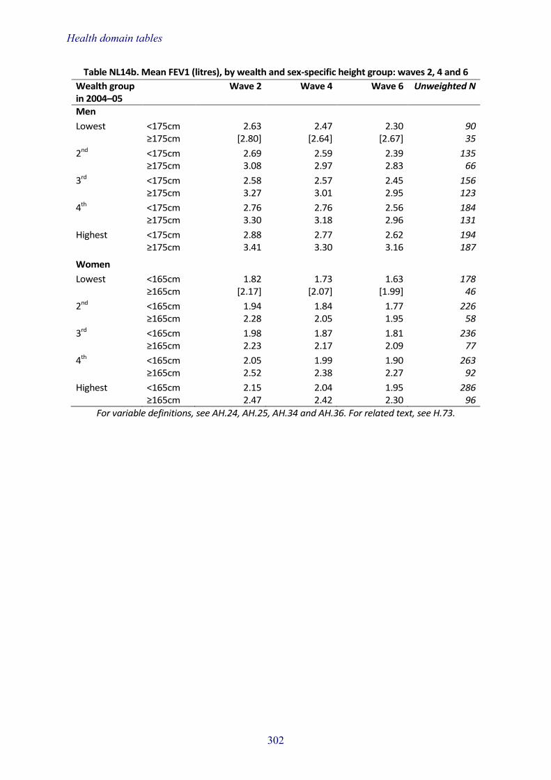
Health domain tables
302
Table NL14b. Mean FEV1 (litres), by wealth and sex-specific height group: waves 2, 4 and 6
Wealth group in 2004–05
Wave 2 Wave 4 Wave 6 Unweighted N
Men
Lowest <175cm 2.63 2.47 2.30 90 ≥175cm [2.80] [2.64] [2.67] 35
2nd <175cm 2.69 2.59 2.39 135 ≥175cm 3.08 2.97 2.83 66
3rd <175cm 2.58 2.57 2.45 156 ≥175cm 3.27 3.01 2.95 123
4th <175cm 2.76 2.76 2.56 184 ≥175cm 3.30 3.18 2.96 131
Highest <175cm 2.88 2.77 2.62 194 ≥175cm 3.41 3.30 3.16 187
Women
Lowest <165cm 1.82 1.73 1.63 178 ≥165cm [2.17] [2.07] [1.99] 46
2nd <165cm 1.94 1.84 1.77 226 ≥165cm 2.28 2.05 1.95 58
3rd <165cm 1.98 1.87 1.81 236 ≥165cm 2.23 2.17 2.09 77
4th <165cm 2.05 1.99 1.90 263 ≥165cm 2.52 2.38 2.27 92
Highest <165cm 2.15 2.04 1.95 286 ≥165cm 2.47 2.42 2.30 96
For variable definitions, see AH.24, AH.25, AH.34 and AH.36. For related text, see H.73.

Health domain tables
303
Table NL15a. Mean PEF rate (litres/minute), by age and sex-specific height group:
waves 2, 4 and 6
Age in 2004–05 Wave 2 Wave 4 Wave 6 Unweighted N
Men 493.7 469.3 463.6 1,316
52–54 <175cm 505.4 482.2 499.1 77 ≥175cm 569.2 567.7 547.8 84
55–59 <175cm 492.8 472.4 469.6 187 ≥175cm 553.7 517.4 522.6 175
60–64 <175cm 475.6 451.9 460.2 145 ≥175cm 545.5 514.3 507.0 114
65–69 <175cm 461.4 434.3 413.6 164 ≥175cm 520.2 506.1 481.7 83
70–74 <175cm 431.8 406.8 392.8 107 ≥175cm 483.3 455.5 450.5 61
75–79 <175cm 388.1 362.3 386.5 56 ≥175cm - - - 28
80+ <175cm [405.7] [384.4] [347.7] 31 ≥175cm - - - 4 Women 323.4 304.3 318.2 1,589
52–54 <165cm 354.1 346.9 357.7 111 ≥165cm 376.1 359.0 379.6 55
55–59 <165cm 343.8 324.3 342.0 336 ≥165cm 380.2 357.5 376.5 123
60–64 <165cm 320.3 304.0 321.0 232 ≥165cm 334.2 323.3 340.2 89
65–69 <165cm 304.8 287.1 293.6 227 ≥165cm 357.5 325.2 336.0 59
70–74 <165cm 282.7 268.7 264.4 166 ≥165cm [295.2] [270.2] [310.0] 33
75–79 <165cm 264.5 232.0 247.0 91 ≥165cm - - - 17
80+ <165cm [237.8] [206.5] [226.8] 47 ≥165cm - - - 3
For variable definitions, see AH.2, AH.24, AH.25 and AH.36. For related text, see H.72.

Health domain tables
304
Table NL15b. Mean PEF rate (litres/minute), by wealth and sex-specific height group:
waves 2, 4 and 6
Wealth group in 2004–05
Wave 2 Wave 4 Wave 6 Unweighted N
Men
Lowest <175cm 420.3 387.5 378.4 90 ≥175cm [475.1] [434.4] [446.4] 35
2nd <175cm 465.9 423.4 429.7 135 ≥175cm 506.9 470.4 472.4 66
3rd <175cm 448.4 430.7 424.6 156 ≥175cm 519.9 483.9 487.2 123
4th <175cm 478.7 466.9 452.3 184 ≥175cm 543.0 517.9 497.0 131
Highest <175cm 484.0 460.7 465.2 194 ≥175cm 555.7 544.3 530.3 187
Women
Lowest <165cm 282.9 266.6 270.6 178 ≥165cm 320.0 307.0 328.6 46
2nd <165cm 307.0 278.4 299.6 226 ≥165cm 335.2 303.0 313.9 58
3rd <165cm 307.6 285.5 305.3 236 ≥165cm 337.2 305.9 342.3 77
4th <165cm 327.8 307.9 316.9 263 ≥165cm 371.5 345.7 374.5 92
Highest <165cm 331.5 324.4 328.6 286 ≥165cm 371.6 365.9 366.3 96
For variable definitions, see AH.24, AH.25, AH.34 and AH.36. For related text, see H.73.

Health domain tables
305
Table NL16a. Mean levels of insulin-like growth factor 1 (nmol/l), by age and sex: waves 4 and 6
Age in 2004–05 Wave 4 Wave 6 Unweighted N
Men 16.5 16.8 1,131 52–54 16.8 18.0 141 55–59 16.9 17.4 326 60–64 17.4 17.3 225 65–69 16.0 16.7 198 70–74 15.7 15.6 129 75–79 15.0 14.5 79 80+ [15.4] [14.1] 33 Women 15.0 14.8 1,474 52–54 16.7 16.5 167 55–59 15.6 15.2 417 60–64 14.9 14.8 305 65–69 14.7 14.6 264 70–74 13.9 14.0 180 75–79 13.4 13.2 93 80+ [13.5] [13.3] 48
Note: IGF-1 was not measured at wave 2.
For variable definitions, see AH.2, AH.7, AH.21, AH.25 and AH.36. For related text, see H.74.
Table NL16b. Mean levels of insulin-like growth factor 1 (nmol/l), by wealth group and sex:
waves 4 and 6
Wealth group in 2004–05
Wave 4 Wave 6 Unweighted N
Men Lowest 15.9 16.2 125 2nd 16.3 16.1 161 3rd 15.8 16.1 238 4th 17.2 17.6 287 Highest 16.8 17.2 306 Women Lowest 13.9 13.8 227 2nd 14.4 14.2 260 3rd 15.4 15.3 291 4th 15.2 15.2 310 Highest 15.8 15.3 356
Note: IGF-1 was not measured at wave 2.
For variable definitions, see AH.7, AH.21, AH.25, AH.34 and AH.36. For related text, see H.75.
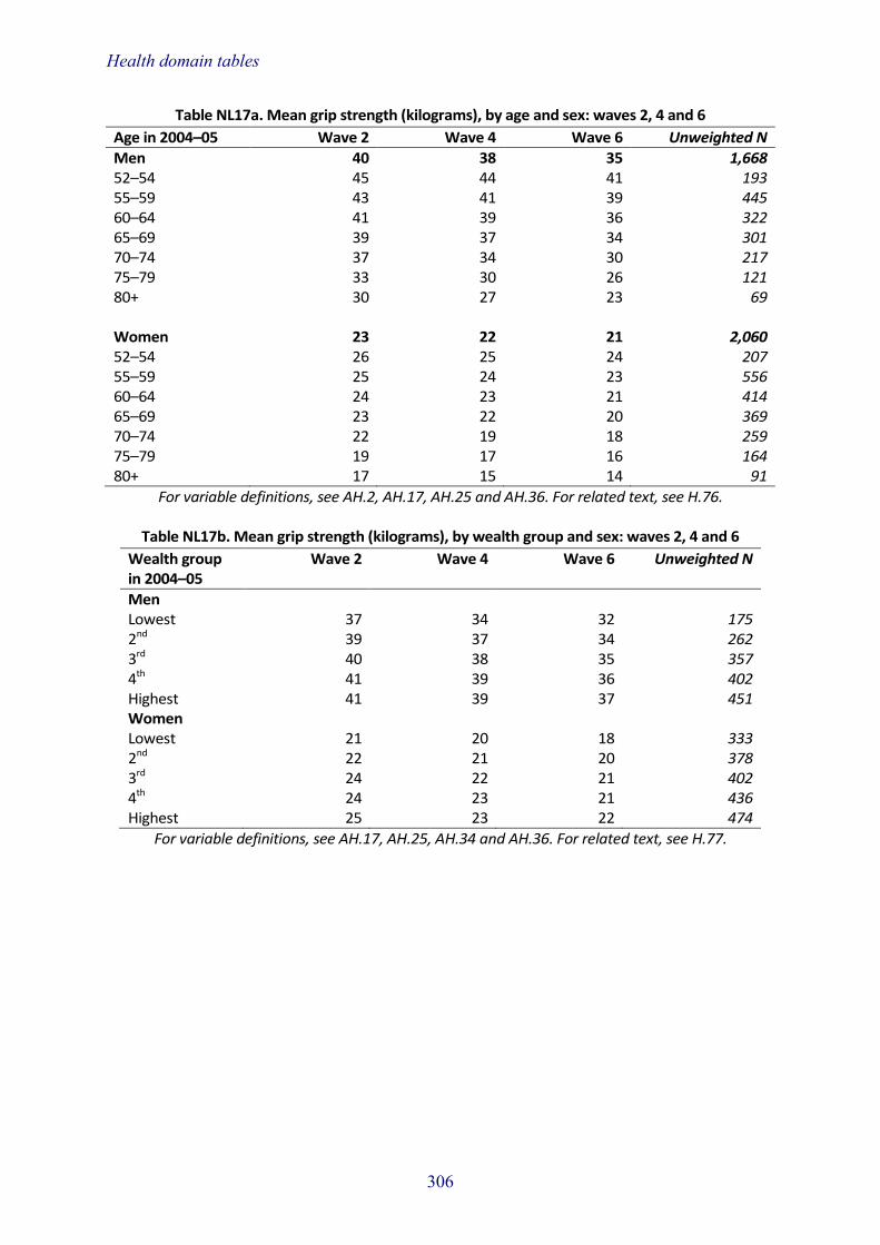
Health domain tables
306
Table NL17a. Mean grip strength (kilograms), by age and sex: waves 2, 4 and 6
Age in 2004–05 Wave 2 Wave 4 Wave 6 Unweighted N
Men 40 38 35 1,668 52–54 45 44 41 193 55–59 43 41 39 445 60–64 41 39 36 322 65–69 39 37 34 301 70–74 37 34 30 217 75–79 33 30 26 121 80+ 30 27 23 69 Women 23 22 21 2,060 52–54 26 25 24 207 55–59 25 24 23 556 60–64 24 23 21 414 65–69 23 22 20 369 70–74 22 19 18 259 75–79 19 17 16 164 80+ 17 15 14 91
For variable definitions, see AH.2, AH.17, AH.25 and AH.36. For related text, see H.76.
Table NL17b. Mean grip strength (kilograms), by wealth group and sex: waves 2, 4 and 6
Wealth group in 2004–05
Wave 2 Wave 4 Wave 6 Unweighted N
Men Lowest 37 34 32 175 2nd 39 37 34 262 3rd 40 38 35 357 4th 41 39 36 402 Highest 41 39 37 451 Women Lowest 21 20 18 333 2nd 22 21 20 378 3rd 24 22 21 402 4th 24 23 21 436 Highest 25 23 22 474
For variable definitions, see AH.17, AH.25, AH.34 and AH.36. For related text, see H.77.

