web guide style types understanding cssbeatty/230/tr_21/css_cheatsheet_long.pdf · 2020. 8. 13. ·...
TRANSCRIPT

Web Guide
What is a rule (style)?A CSS formatting rule (also called a style) consists of two parts—the selector and the declaration.
The selector is a term or name (such as P, H1, a class name, or an id) that identifies the formatted element, and the declaration defines what the style elements are (called the properties of the style like font-size above).
In the example above, H1 (which is an html tag that means “apply a headline size 1 here”) is the selector, and everything that falls between the braces ({}) is the declaration.
H1 { font-size: 12px; font-family: helvetica, arial, sans-serif; font-weight: bold; }
Understanding CSSLet’s say you want to create a headline with certain text formatting. Now, suppose you want to apply those characteristics to many headlines. It would be advantageous to be able to save the formatting and then apply it wherever you want that formatting, wouldn’t it? Well, that’s how a style sheet works. You create formatting once, save it as a style (also called a rule) in a text file called a style sheet, and then you apply it wherever and whenever you want on a web page.
CSS or Cascading Style Sheets are just like the style sheets you may use in a page layout application such as InDesign, QuarkXPress, or even Microsoft Word. Since style sheets are for the web, you get the HTML curve, which adds a little spin on the style sheet of the print world. Style sheets are an amazing tool for controlling your document, keeping file size down (by limiting redundancies), and updating quickly and easily.
Web page with CSS styling Web page without CSS styling
You must understand that style sheets affect much more than just text. Style sheets have many applications from changing the color of text in a paragraph to tracking the position of a layer.
Style TypesThere are three types of styles on the web that each have different purposes:
1. Tags: Change the formatting for predefined HTML tags such as the <p> (paragraph), <h1>–<h6> (headline tags), <a> (anchor tags) and others. The only problem with these is that they change everything within those tags to match the formatting you defined for it. A tag style is just the name of the html tag you are redefining. Example: body
2. Classes: Apply styles to sections of text or other objects, by employing the <span> tag in one instance. A class style name can be almost anything you like, but it’s name needs to start with a period (.) Example: .redtext
3. IDs: IDs are to be used only once on your page and are usually (not always) employed by <div> tags to indicate position and size. An ID style name can be almost anything you like, but it’s name needs to start with a pound sign (#). Example: #header
Tag styles defined in most style sheets to startEveryone creates base styles for the more common formatting on your pages. Common style properties set for these tags:
<body> : background color of page (optional), background image for page (optional), font family, font size, margin=0, padding=0
<p> : font color (optional), line height (optional)
<h1> - <h6> : font size, font family (optional), font color (optional)
a: link : no underline (text-decoration), color
a: visited : no underline (optional), color
a: hover : no underline (optional), color
a: active : no underline (optional), color
There are four “states” to your links (that’s why there are 4 styles):
1. A:link is what your text links look like before users click on them.
2. A:visited is what your links look like after visitors have clicked.
3. A:hover is what the link looks like after a user hovers over the link with the cursor.
4. A:active is the appearance of the last selected link.
arrive smart. leave smarter.™

External LinkingMain.css
The CSS document at left is a separate document from any of your html documents. All that is required to make one is to type the definitions (as you can see one at left), and give the document a name and .css extension. You can then link any of your html docs to the CSS document to pick up the formatting.
You will learn in the next few pages how to link to an external CSS file.
p { color: blue; }
Main Body Text Main Body Text
Main.css
Index.html (Page one)
links.html (Page two)
Link to Main.css
Link to Main.css
At left you see one way to apply styling using a linked style sheet. The page at top is a style sheet file named main.css that contains all the formatting definitions.
1. For instance: p { color: blue } -- this tells the browser that all the paragraphs that use this style sheet should have a color of blue.
2. Since all these documents are sent up to the server, you link from the html pages to the Main.css.
3. The browser sees the link in the head section and follows it to read the definition for the <p> (paragraph) tag in this case whenever it sees the <p> tag in the body!
4. The great thing about creating an external style sheet, is that if you change the definition in Main.css, all the pages that are linked to it are automatically changed also.
Where styles liveIn Dreamweaver there are 3 places that your styles can reside: inline, internal, and external. Below each is defined.
1. Inline styling: Any style information is directly attached to the HTML elements they affect.
• You use the <span> tags to tell the browser that the formatting (indicated by the “style” attribute) needs to span across this text (so between the opening and closing span tags), in this case.
• All inline styles only apply to a single html document and usually only applies to a specified portion of that document.
2. Internal styling: These styles are specific to a single page. For instance, suppose you create some formatting for all your paragraphs (<p> tags found in the html). The formatting definition (the style) can be written in the head section of the html page so that only that page can use the formatting.
• THIS DOCUMENT IS THE ONLY ONE THAT CAN USE THIS STYLE DEFINITION!
• You are telling the browser to make the text red every time it sees a <p> (paragraph).
• Down in the body you can see a <p> tag, so the text “Main body text” will appear red in the browser.
3. External styling: Formatting (CSS styles) are written in a separate text file called a Cascading Style Sheet (.css file). The html pages are linked to the CSS file using the Link tag placed in the head section which directly links to the style sheet. This way you can create the style sheet externally and apply it to as many pages in your web site as you like. See the next page for more information on external linking to styles.
<html> <head> </head>
<body> <p><span style=”color:red”>Main Body text</span></p> </body></html>
<html> <head> <style type=”text/css”> <!-- p {color:red; } --> </style> </head>
<body> <p>Main Body text</p> </body></html>
arrive smart. leave smarter.™

Tables for layoutIn order to create a web page, designers used to rely on tables to control the layout of the page. Tables were like working in Microsoft Excel, or working with tables in a program like InDesign. The table was there to provide a structure with rows, columns, and cells to keep things in place and separate.
Tables are difficult to work with and went the way of the Dodo for layout when more and more browsers began to support divs and CSS for the layout of the page. Tables are still very useful today for holding data like a product table or a calendar, but they are no longer used for the entire layout structure of the page.
Web Safe colorsIn HTML, a web-safe color is one that appears on both Windows and Mac OS systems with an older monitor that can only display 256 colors. There are 216 colors that work on Mac OS and Windows with older monitors. These days, web safe colors are not used nearly as much anymore because newer monitors can support many more colors.
So what does that mean to the average print designer switching to the web? Use whatever colors you want, EXCEPT for spot colors. Also, make sure that you work in RGB colors, since that is what the web also understands. If you run across a color on a web page and you see something like this: #39ae0c, that’s called a hexadecimal color )or hex color for short). That’s how you express a web color in html terms.
#FF0000
R G B
Web Font FamiliesFont families on the web are a bit different than those you can choose for print work. The thing to remember is that the end user that looks at a web page need to have the font you choose installed on their machine.
Why do the font families appear in comma separated order? For example: Verdana, Geneva, sans-serif.
We give browsers options when it comes to picking font families. The first font that appears in the list “Verdana” is tried first. If the person looking at your page don’t have that font, the browser tries to find Geneva, and so on. So the order of the font families is really important. What re some good fonts for the web?
Verdana and Trebuchet are sans-serifs that were designed for the web and have a high x-height for readability.
Understanding divsThe basic building block of the CSS layout is the <div> tag—an HTML tag that in most cases acts as a container for text, images, and other page elements. The following example shows an HTML page that contains five separate div tags for four areas of the page: a wrapper div to contain all of the other divs, a header div tag, a sidebar div tag, a maincontent div tag, and a footer div tag.
1. A <div> by default is as wide as the browser window. It is referred to as a relative width. It’s width is relative to the width of it’s container (the browser window in this case).
2. A <div> by default is as tall as it’s content.
3. Div’s stack on each other like building blocks. They can’t go next to each other unless forced.
div with Header style applied
div with wrapper style applied
div with footer style applied
div with sidebar style applied div with maincontent style applied
The Box ModelFor display purposes, every element in a document is considered to be a rectangular box which has a content area surrounded by padding, border and margins. The illustration below shows these various parts. Margins are always transparent. Borders come in various styles.
Margins, borders and padding are all optional but for purposes of calculating positions and sizes they are given a default width of zero if not specified. Different widths can be set for each individual side (top, right, bottom and left) if desired.
The width of a div (box)=left border+left padding+value typed in width property+right padding+right border
The height of a div (box)=top border+top padding+value typed in height property+bottom padding+bottom border
Content of box is hereMargin
Border
Padding
Content

Working with FloatsIn order to create columns on a web page, most people will “float” divs to put them next to each other. You can float lots of elements like images (<img/>), paragraphs (<p></p>), divs (<div></div>), and lists (<ul></ul>).
You can float elements to the right or the left. Any element that follows the floated element will flow around the floated element on the other side.
For example, if you float an image to the left, any text or other elements following it will flow around it to the right. See the example below. And if you float an image to the right, any text or other elements following it will flow around it to the left. In the case of the images below, floating is sort of like text wrap or runaround in print programs (if you’re familiar with that concept). Floating divs is a simple, but effective way to create columns.
Image placed into some text After float left is applied to the image
A float example
Below is one way to work with two divs to create two columns using a float.
1. Two divs on the page, one on top of the other.
sidebar div
maincontent div
2. Give the top sidebar div a width. The divs stay stacked on each other.
sidebar div
maincontent div
3. Apply a float=left to the sidebar div. This pulls the sidebar div off the page and the maincontent div slides up where the sidebar div was.
maincontent div
4. The sidebar div is put back in place on top of the maincontent div.
maincontent divsidebar div
maincontent divsidebar div
(front view)
(side view)
5. Push the maincontent div from the left using margin. This pushes it to start where the sidebar div ends.
maincontent divsidebar div
What actually happens when you float divs?Here is a rule of thumb for floating divs.
Always float the div closest to the top of the page.
Here’s why: Take a look at the steps on the next page.
1. The div that is floated (the sidebar div) is pulled out of the page leaving a gap where it was (it’s literally pulled out of the stack of divs and floated on top of everything on the page, sort of like the top layer in a Photoshop file). Think of it like a stack of 3 wooden blocks on a table and you were to pull out the middle one.
2. The maincontent div closed the gap left when the sidebar div was pulled out of the page (gravity works in reverse on a web page).
3. The sidebar div was then aligned to the left and is now floating on top of the other divs.
4. The maincontent div is the same width as it was, but it is now underneath the sidebar div. The odd part is that maincontent div text is wrapped around the sidebar by default.
5. The maincontent div is pushed using margin from the left to make it look like two columns next to each other.
arrive smart. leave smarter.™

About the cascade in Cascading Style SheetsThe Cascade in cascading style sheets refers to all of the styles that apply to content such as the paragraph. Take a look at the text below:
<p>The Cascade in <span color=”red”>style sheets</span> refers to all of the styles that apply to content such as the paragraph.</p>
When you apply formatting to text, for instance, some of the formatting cascades to other content. In the text above, there are several styles controlling the formatting:
p { color: black; font-family: verdana; font size: 11px;}.red { color: red; }
All of the text formatting (color, font size, and font family) in the <p> tag (paragraph) is controlled by the p style. A style called “red” is applied to the text “style sheets.” The browser applies the p style first, then the .red style. Whatever formatting is applied last wins but the formatting is cumulative. The text “style sheets” has the follow formatting: color:red, font-family: verdana, and font size: 11px.
Media TypesSome CSS properties are only designed for a certain media. For example the “voice-family” property is designed for aural user agents. Some other properties can be used for different media types. For example, the “font-size” property can be used for both screen and print media, but perhaps with different values.
A document usually needs a larger font-size on a screen than on paper, and sans-serif fonts are easier to read on the screen, while serif fonts are easier to read on paper.
An example of a style sheet using the media type:
<link rel=”stylesheet” media=”print” href=”print.css” type=”text/css”>
Here are the different media types:
* all (default) * aural * braille * embossed * handheld * print * projection * screen * tty * tv
Format PropertiesText Properties
font-style: Italic, normalfont-variant: normal, small-capsfont-weight: bold, normalfont-size: Size of the fontfont-family: Specific font(s) to be used letter-spacing: Space between lettersline-height: Vertical distance between baselinestext-align: Horizontal alignmenttext-decoration: blink, line-through, none, overline, underlinetext-indent: First line indentationtext-transform: capitalize, lowercase, uppercasevertical-align: Vertical alignmentword-spacing: Spacing between words
Lists
list-style-type: Type of bullet or numbering in the list disc; circle; square; decimal; lower-roman; upper-roman; lower-alpha; upper-alpha; none
list-style-position: Position of the bullet or number in a list: inside; outsidelist-style-image: Image to be used as the bullet in a list
Background
background-color: Background colorbackground-image: Background imagebackground-repeat: repeat, no-repeat, repeat-x, repeat-ybackground-attachment: Background image scroll with the element: scroll, fixedbackground-position: (x y), top, center, bottom, left, right
Inline vs. block level elementsThere are two types of elements in HTML: block-level elements and inline-level elements. The two types of elements with examples are below:
• A block-level element will span the full width of the space it’s inside of, and so will start on a new line in the flow of HTML. The flow will continue on a new line after the block-display element. Examples: divs, paragraphs, headlines, horizontal rules, etc.
• Inline-level elements don’t break the flow. They just fit in with the flow ofthe document. Examples: images, links, and text.
arrive smart. leave smarter.™
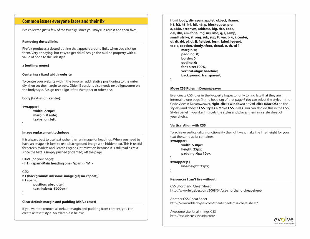
Common issues everyone faces and their fix
I’ve collected just a few of the tweaky issues you may run across and their fixes.
Removing dotted links
Firefox produces a dotted outline that appears around links when you click on them. Very annoying, but easy to get rid of. Assign the outline property with a value of none to the link style.
a {outline: none;}
Centering a fixed width website
To centre your website within the browser, add relative positioning to the outer div, then set the margin to auto. Older IE versions also needs text-align:center on the body style. Assign text-align left to #wrapper or other divs.
body {text-align: center}
#wrapper { width: 770px; margin: 0 auto; text-align: left}
Image replacement technique
It is always best to use text rather than an image for headings. When you need to have an image it is best to use a background image with hidden text. This is useful for screen readers and Search Engine Optimization because it is still read as text since the text is simply pushed (indented) off the page.
HTML (on your page):<h1><span>Main heading one</span></h1>
CSS:h1 {background: url(some-image.gif) no-repeat;}h1 span { position: absolute;{ text-indent: -5000px;{}
Clear default margin and padding (AKA a reset)
If you want to remove all default margin and padding from content, you can create a “reset” style. An example is below:
html, body, div, span, applet, object, iframe,h1, h2, h3, h4, h5, h6, p, blockquote, pre,a, abbr, acronym, address, big, cite, code,del, dfn, em, font, img, ins, kbd, q, s, samp,small, strike, strong, sub, sup, tt, var, b, u, i, center,dl, dt, dd, ol, ul, li, fieldset, form, label, legend,table, caption, tbody, tfoot, thead, tr, th, td { margin: 0; padding: 0; border: 0; outline: 0; font-size: 100%; vertical-align: baseline; background: transparent;}
Move CSS Rules in Dreamweaver
Ever create CSS rules in the Property Inspector only to find late that they are internal to one page (in the head tag of that page)? You can select the styles in the Code view in Dreamweaver, right-click (Windows) or Ctrl-click (Mac OS) on the style(s) and choose CSS Styles > Move CSS Rules. You can also do this in the CSS Styles panel if you like. This cuts the styles and places them in a style sheet of your choice.
Vertical Align with CSS
To achieve vertical-align functionality the right way, make the line-height for your text the same as its container.#wrapper { width: 530px; height: 25px; padding: 0px 10px;}#wrapper p { line-height: 25px;}
Resources I can’t live without!
CSS Shorthand Cheat Sheethttp://www.leigeber.com/2008/04/css-shorthand-cheat-sheet/
Another CSS Cheat Sheethttp://www.addedbytes.com/cheat-sheets/css-cheat-sheet/
Awesome site for all things CSShttp://css-discuss.incutio.com/
arrive smart. leave smarter.™