welcome to the training programme on quality circles 7 qc...
TRANSCRIPT

Business Excellence Divn, TRF Ltd.
Welcome to the Training Programme
on
Quality Circles&
7 QC TOOLS1TRF Limited

Business Excellence Divn, TRF Ltd.
QC - Team
TRF Limited 2
Team size - 3 to 8 – preferebly 6 (including the facilitator)
Composition:Facilitator – 1no. - Can be any person Gradeless / Graded.
He / she can be facilitator of more than one QC.Leader – 1no. – Only Graded employeeHe / she can be a leader of only one QC
Members – Only Graded employeesCan be members of only one QC
The teams have to registered with the Business Excellence Divn. The QC facilitator will assign a serial no. to the Circle.

Business Excellence Divn, TRF Ltd.
QC - Roles
TRF Limited 3
Facilitator –• To help the team with knowledge of job, data
analysis, suggestions on approach to be taken and be the mentor of the team
• To help the team in taking the step-by-step structured approach of QC
• To ensure regular functioning of the team
Leader -• To lead the team in taking up projects• To assign responsibilities to team members • To ensure regular functioning of the team• To ensure timely completion of projects• To prepare the document with the help of members
for project closure

Business Excellence Divn, TRF Ltd.
QC - Functioning
TRF Limited 4
Meeting –• Should meet at least once in a week. Preferably on a
fixed day and time.• Team should maintain a register and record attendence
by having every members signature. It should write briefly the proceedings of the meeting
• Team should keep all its back-up records, sketches, drawings etc with the register

Business Excellence Divn, TRF Ltd.
Project selection
TRF Limited 5
• The team should discuss various problems faced at their place of work, and prepare a list of these problems.
• The problems should relate to the objectives of their department – safety, cost reduction, reducing delays, improving quality, improving the method o working etc
• The team should priortize the problem based on criteria assigned by them. They can adopt the NGT (Nominal Group Technique)

Business Excellence Divn, TRF Ltd.
Project selection – NGT Voting & Ranking
TRF Limited 6
Problem Mr A Mr B Mr C Mr D Total
Problem 1 4 3 3 5 15
Problem 2 1 1 4 2 8
Problem 3 7 5 6 7 25
Problem 4 2 2 1 3 8
Problem 5 5 6 2 1 14
Problem 6 3 4 5 4 16
Problem 7 6 7 7 6 26
Round - 1
Business Excellence Divn, TRF Ltd.TRF Limited 7
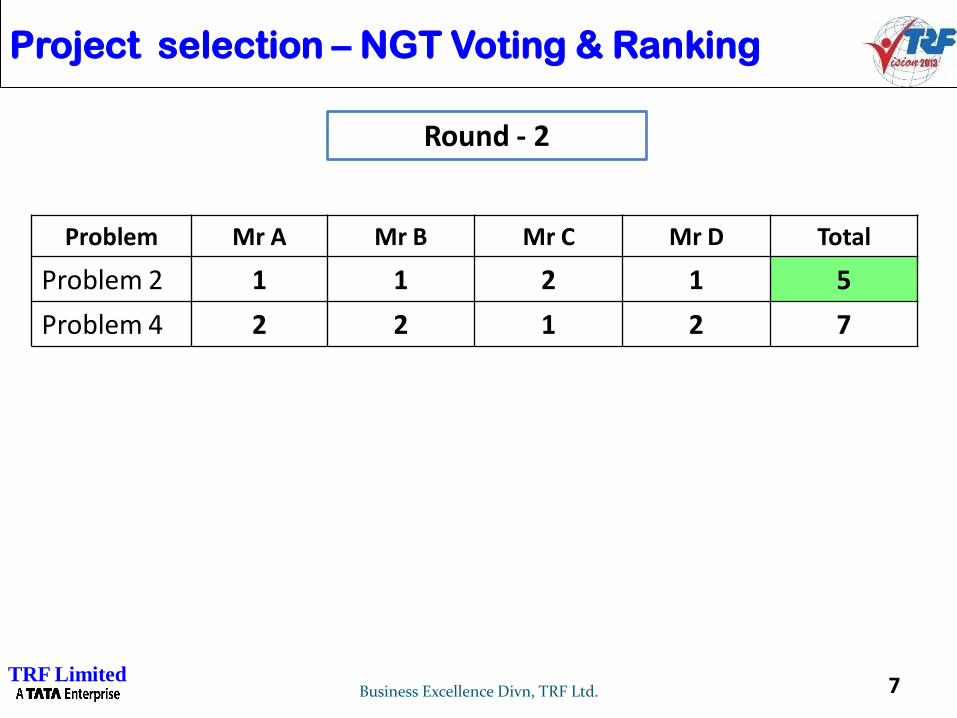
Problem Mr A Mr B Mr C Mr D Total
Problem 2 1 1 2 1 5
Problem 4 2 2 1 2 7
Round - 2
Project selection – NGT Voting & Ranking

SEVEN BASIC QUALITY TOOLS
Cause and Effect Diagram
Check Sheet
Histogram
Pareto Diagram
Stratification
Scatter Diagram
Control Chart8Business Excellence Divn. TRF Ltd.

Analysing a problem when the cause is not obvious
9Business Excellence Divn. TRF Ltd.
Cause & Effect Diagram
Or
Fish Bone Diagram

Cause & Effect Diagram: An Introduction
Invented by Prof. Kaoru Ishikawa in 1943. He first used toexplain at kawasaki Steel Works “How a complex set of factorscould affect the Problem”
Designed for:
Stimulating thinking during a brainstorm of potential causes
Providing a structure to understand the relationships between
many possible causes of a problem
Serving as a visual display of causes that have been studied
• Write only the characteristic and the causal factors which are measurable.
• After completing a cause & effect diagram, it is necessary to grasp the strength of the cause &effect relationship objectively using data
Graphical Technique that can be used in teams to identify and arrange all the possible causes of an event or problem or outcome
Effect: The kid fell…
Cause: Because of the water.
Special notes:
• Make the same number of cause & effect diagram as that of
characteristics.
• Error in weight and length of the same product will have
different cause & effect structures and these should be
analyzed in two separate diagrams
TRF Limited

Uses of The Cause and Effect Diagram
Sorts and segregates the possible causes of a problem
into a logical order
Identifies areas for data gathering activity
Educates participants in problem solving process
Serves as a guide for discussions and serves to keep
meetings on target
Can be developed into a complete project management
tool that displays actions taken and results achieved
11Business Excellence Dept.

Construction of a Cause and Effect Diagram
1. Define the characteristic to improve and control
Should be able to be quantified and measured
Quality characteristics = effect
2. Write the characteristic on the right side of the diagram
3. Draw a broad arrow pointing at the characteristic from the
left side of the diagram
Slow
Check - In
Effect12Business Excellence Dept.

Construction of a Cause and Effect Diagram
4. Define the main factors which influence the characteristic to be improved
Factors = causes
Suggested main causal factors are as shown
5. Draw an arrow from each factor to the main central arrow
Slow
Check - In
Effect
EnvironmentMethodsPeople
Materials Machines
Causes
13Business Excellence Dept.

Construction of a Cause and Effect Diagram
6. Determine the detailed causes for each of the main factors and draw an
arrow to the appropriate branch
On to each of these, write in even more detailed causes and draw
smaller arrows.
5. Continue in this manner to examine and display all potential causes
Slow
Check - In
Effect
EnvironmentMethodsPeople
Materials Machines
Causes
Front Desk Computer
Maintenance
Capability
14Business Excellence Dept.

Causes and Effect Diagram
Environment People Methods
Materials Machines
Slow
check - in
CAUSES EFFECT
Volume
Tempreture
A/C
Co
nte
nt
Ed
uc
ati
on
Training
Ac
cu
rac
y
Adequacy
Co
mp
lete
ne
ss
Consistency
Ve
nd
ors
Front Desk ComputerC
ap
ab
ilit
y Maintenance
Age
Self checks
Pre
cis
ion
15Business Excellence Dept.

Lack of welding methods/knowledge
Supver,thinks
person is
qualified
but not certified
Nobody in office
knows or asks
Always done it
Don’t know
Haven’t doc
No training
Once one
passes
all qualified
OG doesn’t
check
No
t c
ert
ifie
d
No trainers
Traiing
On cust material
Po
or trg
. No set process
Weld symbols
Don’t return cold red
Procedures 77
don’t have right quantity
Keep people busy
Weld Rod
Ta
ke
ou
t o
f h
ea
t
co
ntr
ol
too
ea
rly
Wrong order
quantity
Rush job
Av
ail
ab
ilit
y
Do
n’t
kn
ow
go
od
we
ld r
od
Bad attitude
Do
n’t c
are
No
prid
e
Pe
rso
na
lity
No
rew
ard
&
rec
og
nitio
n
La
ck
of
ex
pe
rien
ce
No
pro
ce
du
re
Hire
ine
xp
erie
nc
ed
pe
op
le
Mis
ca
lc.
Poor Judgement
Build experimental jobs
Lack of training
No
pro
ce
du
re
Ta
ke
too
mu
ch
time
No
foc
us
Some equipment
without gauges
Poor verbal communication
Poorly trained
Not available
Supervison
Do
n;t
se
e w
eld
pro
c
Ch
ec
k l
ist
Mis
sin
g i
nfo
on
we
ld p
roc
Amp
8300,00
P.M
fo
r A
MP
Re
co
nd
itio
n
No date
Av
ail
ab
ilit
y
Think we
save dollars
Dirty material
Ha
nd
lin
g
Ma
ch
ine
s l
ea
k
Old
Poor
maintenance Cra
ne
s l
ea
k
Park
maint.
enance
Ro
ols
le
ak
Don’t care
Not told
Old
Poor
maint-
enancePe
op
le w
alk
on
No
place
forit
Bad Prep
Wro
ng
Be
ve
l Operator
Train on procedure
Shear
Bu
rr
Bad adjustment
Bad blade
Burning Sla
g
Tempreture
Wrong tie
De
cis
ion
to
sto
p o
ve
rrule
d
Push work out
Disagreement on spec.Bad
fillings
Ba
d f
orm
ing
C.S.M
Too loose
Too tight
Doesn’t know
No
tim
ing
s
Siz
e
wro
ng
Wro
ng
le
ng
th c
ut
Not checked
Information wrong
on customer req.
(Cust. order)
Template shrinks
Std. size cone
template
Blueprint
worng
Being
rushed
Not
rained
Different
training
Do
n’t
se
e b
lue
pri
nt
?
PeopleTechniques
Bad
Welds
Vendor
Quality Internal
Supplier
Quality
CAUSE AND EFFECT DIAGRAM
16Business Excellence Dept.

Collecting data in a sytematic way
17Business Excellence Divn. TRF Ltd.
Check Sheet

Check Sheet: Introduction
Based on the purpose, customized check sheets are
designed
What is Check sheet used for?
• Controlling and monitoring the production process
• Analysis of cause and effect properly
• Inspection for non-conformance
• To make data-gathering easy
• To arrange data automatically so that they can be used easily later on
What is it?
• A tool for collecting data in a consistent form.
• Provides an easy, structured way of
recording data as it is collected
• Assures data will be recorded in similar manner
TRF Limited

Check Sheet: An Example
Monitoring Number of defects in a Day Total
Shift A Shift B Shift C
CHATTER //// //// //// //// //// /// //// / 33
SPM ROLL MARKS //// / //// // 12
SPM PINCH MARKS //// //// //// // // 18
SPM SCRATCHES // /// 5
SPM DENTS // //// /// 10
RUBBING MARK - SPM //// 5
BLACK SPOTS NON REMOVABLE
// / 3
Total 38 37 11 86
Number inspected 2037 Percentage defects 4.3%
Product name Lot number Date
Process name
Measuring method
Measuring instrument
Recorded by:
Decide the purpose: In the example check sheet is being used for inspectionDesign the Format: Based on the requirement, the fields are customized
TRF Limited

Analyzing data
20Business Excellence Divn. TRF Ltd.
Histogram, Pareto Diagram, Stratification,
Scatter Diagram

Purpose:
Visual depiction of data, helps to infer about the population at a glance
Histogram: An Introduction
Benefits:
• The shape of the histogram shows process behavior
• The shape and size of the dispersion helps identify otherwise hidden sources of variation
• Presence of multi-modes may give a hint about mixed processes
• Used to determine the capability of a process
• Starting point for the improvement process
• Plots the number of times an event has occurred within a range of value.
• Shows the distribution of occurrence of event
10 11 12 13 14 15 16 17 18 19
0
5
10
Time Estimates (in seconds)
# o
f O
ccu
rren
ces
TRF Limited

Normal distribution Skewed distributionThe ideal case, if a point has a chance to assume any value around a target( in absence of special cause variation ) it will take this shape. Most unlikely to exist in reality.
• May be because the specification limit is in only on one side or process is controlled on one side
• Value lower than a certain value does not occur. Most commonly found
• May be because beyond some point the output is considered as defect.
Skewed distribution, no tail on one side
Histogram: Types & Information Provided
Multiple processes Comb shaped• Existence of more than one process, Can lead to wrong conclusion needs to be stratified
• May be because of a particular tendency in the way data is rounded off.
TRF Limited

Pareto Diagram: An Introduction
What It is?
Developed by Vilfredo Pareto (1897), anItalian economist
He observed that 80 % of Italy’s wealth layin the hands of 20 % of the population
Used for prioritization by 80-20 rule.
Differentiates ‘Vital Few’ from ‘UsefulMany’ (Juran)
Left vertical axis depicts the actualfrequency of items while the right verticalaxis denotes cumulative percentage
Vital few
Useful Many
Benefits:• Useful in establishing priorities
• Comparing Pareto charts of a given situation over time determines whether an implemented solution reduced the relative frequency or cost of that problem or cause
TRF Limited

Comparison of Pareto Diagrams Before and After Improvement
Comparing Pareto Charts
While comparing Pareto Charts, the left vertical axis should have the same scaling
TRF Limited

Scatter Diagram: An Introduction
A graphical representation of relationship between twovariables. It can be between a cause and effect or betweentwo causes. The better the correlation, the tighter thepoints will hug the line
Provides both a visual and statistical means to test the strength of relationship between two variables
When to use scatter diagram:
• Once the causal relationship between the two variables is
established through cause and effect diagrams
Scatter Diagram Consideration:
• Scatter Diagram is used only when both, dependent & independent variables are continuous
• Scatter diagram should be jointly used with correlation coefficient, the value of correlation
coefficient (depicted by r) varies from -1 to +1.
• Correlation implies a linear relationship between two variables. For non-linear relationships r
may not give value close to 1 or – 1 even if the relationship is evident
• Extrapolation of the strength of relationshipbeyond given range of data is risky.
Correlation Coefficientr = 0.702
Characteristic
Ch
ara
cte
rist
ic
• It is desirable to have at least 30 pairs of data
• Decide the horizontal & vertical scales so that the finished
diagram is approximately square
Best Fit Line
TRF Limited

Scatter Diagram: Some Examples
(f) Need Stratification
(a) Strong Positive Correlation
n =50
(d) Negative Correlation
(b) No Correlation (C) Positive Correlation
×××××××××××××××××××××××
××××××××××××××
×××××××
×××
×
×
××××××××××××××××××
×
×××
××××××××××
×× ××××
×××××
××××
×
×××××××
×××
×××××××××
××××
×
×××××
×××××××××
××××× ××
×××××
×
×××× × ××××
××× ××××× ××××
×
× ×××
×××
××××××××××
×××××××
×× ×
×× ××
××××
××××××××××××
×××× ×
×××××××
×
×××××××
× ××
×××
×
×
××
×××××××
×× ×××××× ××
×××
×××××
××
n =50 n =50
n =50n =50n =50 ××××××
××××××××
×××××××××××××××××××××
×××××××
×××
(e) Strong Negative Correlation
Example from “ Statistical Methods for Quality Improvement” by Hitoshi Kume
Look for the outlying points, points far from main group are assumed to be the result of
errors in measurement. It is necessary to exclude such data for correlation.
r ≈ 0.913 r ≈ 0.001 r ≈ 0.725
r ≈ -0.925r ≈ -0.617
TRF Limited

Stratification: An Introduction
When the observed values represent two or more sub-populations according to the conditions which existed atthe time of data collection, such sub populations arecalled strata, and dividing data into strata is calledstratification.
When data from a variety of sources or categories have been lumped together, it becomes impossible to conclude meaning. Stratification is a technique that separates
the data so that patterns can be seen.
Number of rejections stratified basedon Supplier (A&B), Operator (1,2,3,4)
When to use stratification:
• When data comes from several sources or conditions
• When data analysis may require separating different sources or
conditions for detailed study of the problem.
Stratification Consideration:• Examples of different sources that might require data to be stratified:
By time: month, week, day, shift etc. By work force: operator, section etc By Machinery and
Equipment, BY Raw Materials: Supplier, previous process, lot, place of manufacture etc. By
Product: Product category, destination, special order etc., ByMeasurement / Inspection.
• Always consider before collecting the data whether stratification might be needed during analysis.
Plan to collect stratification information. After the data is collected it might be too late.
4753
27 24 23 26
0
10
20
30
40
50
60
Sup A Sup B Op 1 Op 2 Op 3 Op 4
No
. of
reje
ctio
ns
TRF Limited

28
Histogram (A+B)
82.0 82.5 83.0 83.5 84.0 84.5 85.0 85.5 86.0 86.5 87.0 87.5 88.0 88.5
Yield
0
2
4
6
8
10
12
14
16
18No
of ob
serva
tions
Two vessels, A and BHistogram (B)
82.5 83.0 83.5 84.0 84.5 85.0 85.5 86.0 86.5 87.0 87.5 88.0 88.5
Yield
0
2
4
6
8
10
12
14
No
of
ob
serv
ati
on
s
Histogram (A)
82.0 82.5 83.0 83.5 84.0 84.5 85.0 85.5 86.0 86.5 87.0
Yield
0
2
4
6
8
10
12
14
16
18
No of observations
Average 86.03
Stdev 1.036
Max 87.9
Min 83
Average 84.07
Stdev 0.805
Max 86.3
Min 82.7
A BNow it is telling a different story.
Vessel A and vessel B are behaving differently, therefore to be dealt with differently.
After Stratification :
Stratification: An Example
No. of data points = 100
Mean =85.05
Stdev = 1.35
Max : 87.9
Min : 82.7
Combined data from a chemical reaction process in two vessels, A and B
TRF Limited

Understanding the current problem.
Monitoring Improvements
29Business Excellence Divn. TRF Ltd.
Graphs, Run Charts, Control Charts

RUN CHARTM
easu
rem
ent
Time
Average
30Business Excellence Dept.

RUN CHART BENEFITS
Simplest display of trends over time
Data plotted in time order
An aid to understanding basic characteristics of a process
31Business Excellence Dept.

Run Chart ExampleCustomer Inquiries
109876543210
1 2 3 4 5 6 7 8 9 10 11 12 13 14 15 16 17 18 19 20 21 22 23 24 25
Nu
mb
er o
f In
qu
irie
s
Week
32Business Excellence Dept.

Measu
rem
en
t
Control Chart
Time
Upper Control Limit
Lower Control Limit
Average
33Business Excellence Dept.

CONTROL CHART BENEFITS
Displays the expected range of variation in a stableprocess
Display relative stability of a process
Assists in process analysis. Can indicate whensomething out-of-the-ordinary happens
Assesses effects of process control and processimprovement
34Business Excellence Dept.
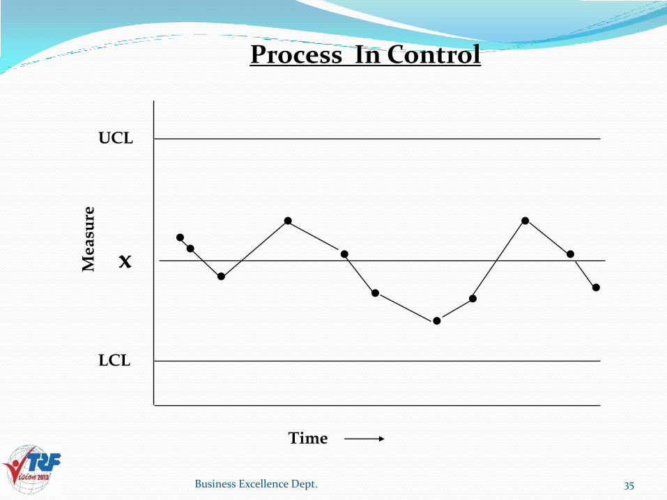
Me
asu
re
Process In Control
UCL
x
LCL
Time
35Business Excellence Dept.
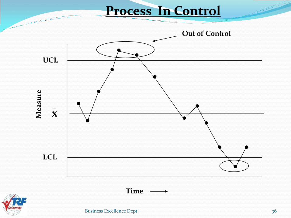
Me
asu
re
Process In Control
UCL
x
LCL
Time
Out of Control
36Business Excellence Dept.

Interpreting Control Charts
Chart
ProcessIn
Control
ProcessOut of
Control
Run
Chart points donot form a parti-cular pattern andlie within theupper and lowerchart limits
Chart points form a particular pattern OR oneor more pointslie beyond theuppor or lowerchart limits
Chart points areon one side of thecenter line. The number of pointsin a run is calledthe “length of therun”
UCL 10
x 19
lcl 30
UCL 10
x 19
lcl 30
UCL 10
x 19
lcl 30
UCL 10
x 19
lcl 30
UCL 10
x 19
lcl 30
UCL 10
x 19
lcl 30
The process is stable, notchanging. Doesn’t necesarily mean to leavethe process alone. Maybe opportunities to improvethe process and enjoy substantial benefits
Alerts us that the processis changing. Doesn’t mean you need to take a corrective action. May berelate to a change you havemade. Be sureto identifythe reason\(s) before takingany constructive actions(w)
Suggest the process hasundergone a permanentchange (positive ornegative) and is nowbecoming stable. Often requires tha t you recompute the controllines for future interpre-tation efforts.
Description Example # 1 Example # 2 Interpretation
37Business Excellence Dept.

Interpreting Control Charts
Chart
Trend
Cycle
Hugging
A continued riseor fall in a seriesof points (7 ormore consecutivepoints direction)
Chart ponts showthe same patternchanges (e.g.riseor fall) over equalperiods of time
Chart points areclose to the centerline or to a control limit line(2 out of 3, 3 out of4, or 4 out of 10.)
UCL 10
x 19
lcl 30
UCL 10
x 19
lcl 30
UCL 10
x 19
lcl 30
UCL 10
x 19
lcl 30
UCL 10
x 19
lcl 30
CL 10
x 19
lcl 30
Description Example # 1 Example # 2 Interpretation
12
34
5 6 7
1/2
1/2
12
3
4
56
1/2
1/2
Often seen after some changehas been made. Helps tellyou if the change(s) had apositive or negative effect.may also be part of a learning curve associatedwith some form of training
often relates to factors thatinfluence the process in apredictable manner. Factorsoccur over a set time periodand a positive/negative effectHelps determine future workload and staffing levels
Suggests a different type ofdata has been mixed into thesub-group being sampled.Often need to change thesub-group, reassemble thedata, redraw the controlchart
38Business Excellence Dept.

Thank you!
TRF Limited