wet paint
DESCRIPTION
Ink Associates MagazineTRANSCRIPT
Issue #01 Brought to you by Ink Associa
tes
Pic
k M
e u
p!
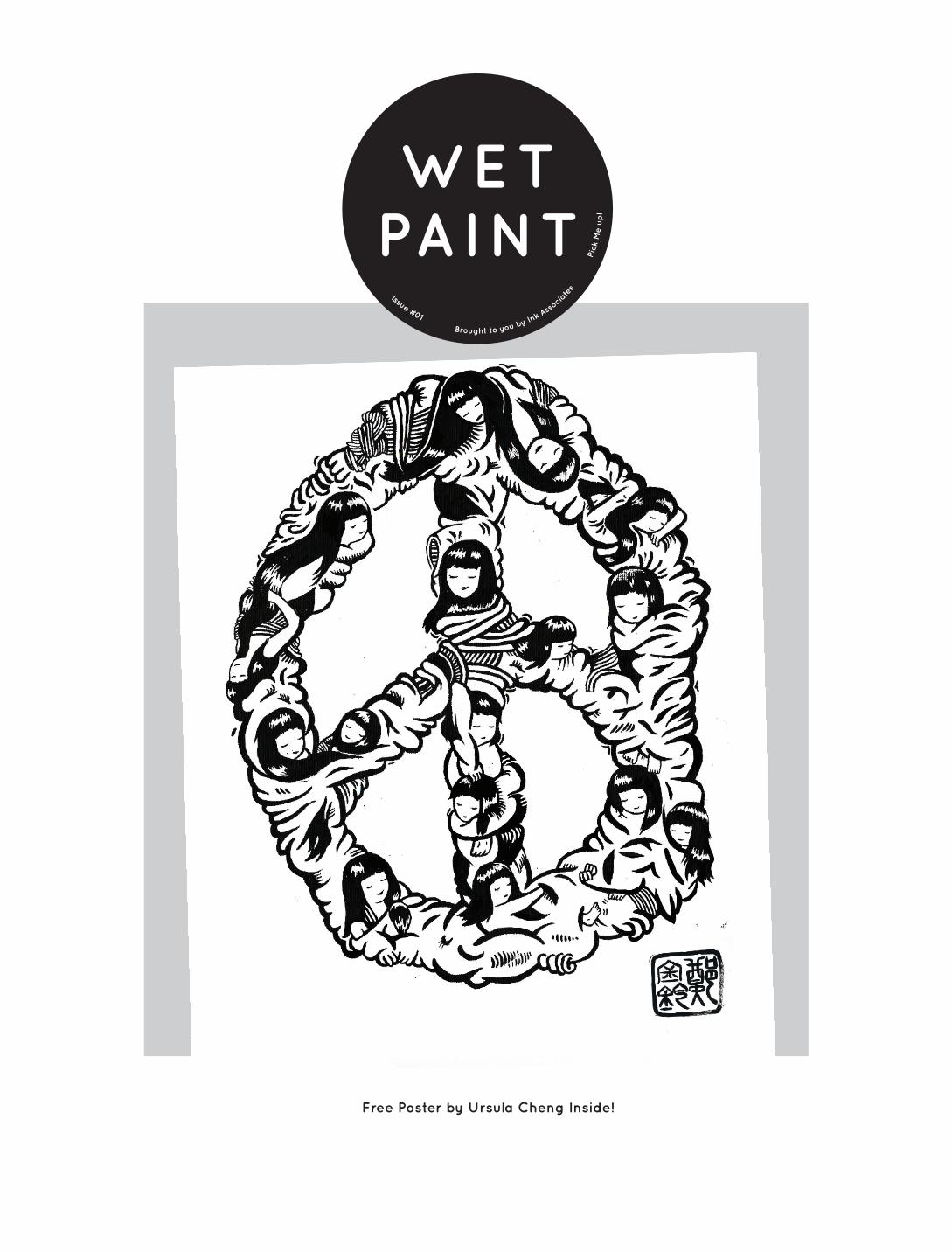
WET PAINT
Free Poster by Ursula Cheng Inside!
2 3
Wet Paint / Issue #01 Wet Paint / Issue #01
CONTENTS
Re-wind In 2007 Luke, Chaz, and 2 of the Simons wrote a recipe, bought the ingredients, and put it on to cook. Over time they added to the pan and the pot grew. It was full of beans and nutty as a fruitcake, but the flavour seemed to work. The boys really knew their onions and when they started to bring home the bacon, the dish souped up and began to bear fruit. More chefs were needed and each one brought their own spice to the mix. Amy brought sugar, Alex brought a new and more exotic variety of nuts, Phil brought coffee. The pot started to gain heat, and in 2010, with bigger fish to fry, they had to transfer to a bigger, shinier pot. The new pot really cooked up a storm. The boys bought in flavours from Spain, France, Mauritius, Canada, New Zealand and South Africa and began to distribute their recipe to every continent across the globe. Except the Antarctic, because the penguins sadly couldn’t stomach it. Fast...Foreword Today there are 27 chefs, two Kitchens and a much more refined recipe. We think it is time that we finally start to show the ingredients of the recipe to the big wide world and the tools that make it. So here it is, this is the first edition. This is us. We are a design, architecture and project management agency. This magazine, gives a behind the scenes look into who we are, what we we’ve been up to and what stirs us.The home and playground for many of us is London. It inspires our creativity, our ambition and our sense of fun. Since our clients and associates come from such a global spectrum and often come as visitors to our beloved capital, we felt it necessary to share all our favourite places to eat and to drink. We have also looked at the latest architectural de-velopments in London and their impact on the skyline. The colossal towers of glass that are being erected are impressive, but are they casting shadows over the historical archi-tecture that makes London so unique? There is an architectural nuance to all the work we do at Ink Associates, but many of us originally come from furniture and industrial design backgrounds; we are therefore surrounded by friends and associates who are creators and makers of a range of new and exciting things. We have cherry picked some of the best and given you a sneak peak into what they are up to. We are always inspired by those around us and the wide range of environments we find ourselves in, we have tried to capture something of that in Wet Paint. So please discover it all for yourself. We have had loads of fun designing, editing and putting this together, we hope you enjoy reading it.
This book is intended for internal use only. The copywriter for any externally sourced images remains with their respective owners. Submissions are welcome please get in touch at
Design: Ink
INTRODUCTION
3 / INTRODUCTION
4 - 11 / THE INK STUDIO
12 -13 / “THERE’S NO I IN TEAM”
14- 17 / LONDON: FOOD & DRINK
17 - 18 / LONDON: SKYLINE
20 -23 / FRIEND’S OF INK: URSULA CHENG
24 - 25 / FRIEND’S OF INK: TURNER & HARPER
26 - 27 / ON THE WEB
28 - 29 / 3D PRINTING
30 - 35 / RECENT WORK
36 - 39 / THE VENICE BIENNIAL
40 - 41 / WHAT’S INSPIRING US?
4 5
Wet Paint / Issue #01 Wet Paint / Issue #01
Luke Nuria
TommyLuigi
Ryan
Liam Steve
Jamina Richard Tim Simon . W
Amy Simon Lee
Karen
Tiffany
LuzGemma Hayden
Sylwia
Shameel
Alex
Charles SimonPhil
Ed
Aly
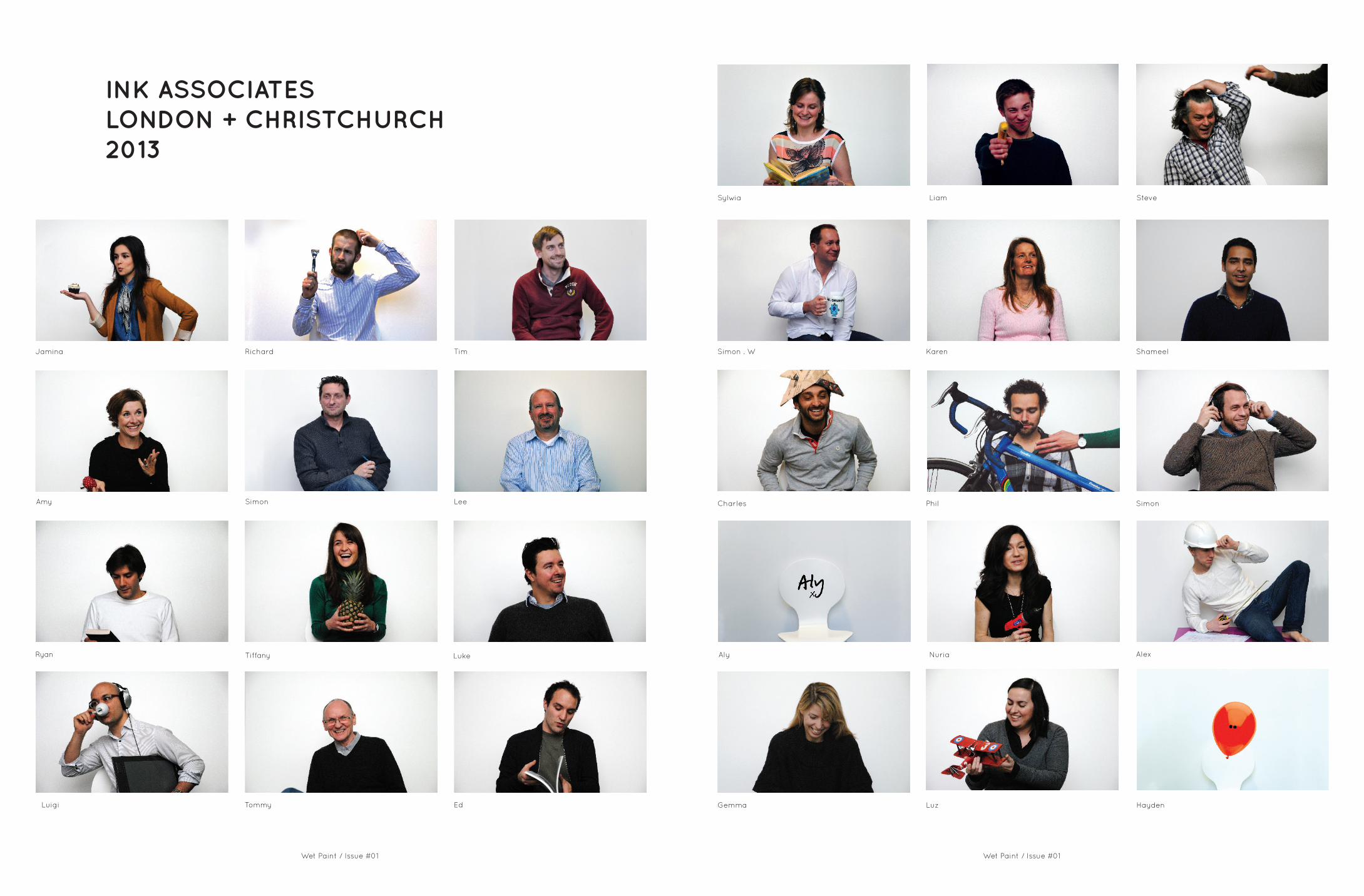
INK ASSOCIATESLONDON + CHRISTCHURCH2013

6 7
Wet Paint / Issue #01 Wet Paint / Issue #01
INK OUTPUTLONDON + CHRISTCHURCH
CREATIVE TEAM
Ink Creative is driven by a desire and curiosity to deliver innovative and imaginative solutions. Our creative centre of excellence is made up of a mix of multi-disciplinary specialists including interior, graphic and furniture designers, supported by animation and visualisation professionals. The cross-disciplinary approach offers a platform to delivery unique and exciting design for projects of drastically different scales from shopping centres to store windows, from brand pop-up and exhibition opportunities.
Ed / Branding & Graphic Design-Jamina / Interiors-Tiff / Interiors-Ryan / Interiors-Luigi / Visualisation-Phil / Furniture & Interiors
TECHNICAL DESIGN
Working closely with concept designers, clients & project managers our team of retail focused architects, technologists and materials experts apply construction industry leading skills to the design challenges. Our mission is to enable the creative ‘vision’ to be delivered on a practical, technical & statutorily compliant level. Whilst at the core our team provides technically led, drawing support we also provide expertise in materials, construction techniques, design for roll-out, value engineering, installation processes & systems, health and safety, the disability discrimination act and building regulations; this expertise is applied consistently locally, regionally & globally.
Alex / Architectural Technologist-Hayden / Architectural Technologist-Liam / Architectural Technologist-Sham / Architectural Technologist-Tim / Architectural Technologist-Luz / Architect
PROJECT MANAGERS
Ink Management provides the necessary level of control required to successfully deliver projects on behalf of our clients; locally, regionally and globally. On all projects we establish clear & unambiguous communication routes, we determine from the outset the client objectives and then seek to manage and balance the three drivers; cost, quality & time. Within this context our professional team provides the following services; Lead Consultant, Project Manager, Cost Control, Programme Management, Contract Administration, Construction Management & ‘ Design & Build’ solutions.
Nuria / Architect & PM-Simon / Architect & PM-Steve / Interiors & PM-Tom / PM & Contracts Management-Richard / QS & PM-Lee / PM & Contracts Management-Gemma / Interiors & PM & FFE-Karen / QS & PM
STRATEGY
We provide knowledge and experience based strategic support to our retail clients. Our focus is on the design & execution of the built environment, however our work includes the strategic application of systems and processes that address business functions in addition to the physical environments. We provide strategic insight to a number of our global brands, the service is always bespoke and centres upon listening and understanding our clients’ challenges, needs & ambition.
Simon W / Architect-Simon WB / Architect-Luke / Furniture & Interiors-Charles / Industrial Design
X14 BICYCLE WHEELS, X 1 GYMNAST, X1 ITALIAN, X2 SPANIARDS, 1/2 A CANADIAN, X1 SOUTH AFRICAN, X2 KIWI’S, X1 IRON MAN, X3 TRIATHLETES, X1 SWIMMERS, X1 RED AEROPLANE, X16750 CUPS OF TEA (YEARLY)

8
Wet Paint / Issue #01 Wet Paint / Issue #01
92012Print Design
Event Design
Exhibition Design
Windows & VM
POSWebsite Design
PR Material
Retail Windows Strategy
Phil, Jamina, Luz, Stracey
Gc Boutique 2.0 Animated ShowreelStill / 01;23;35
Contruction Projects
Gc Boutique 2.0 Animated Show-reelStill / 01;43;19
Gc Boutique 2.0 Animated Show-reelStill / 00;38;07
Brand Marketing Tools
Retail Guidelines

10 11
Wet Paint / Issue #01 Wet Paint / Issue #01
AFRICA: EGYPT / MOROCCO / TUNISIAASIA: BAHRAIN / INDIA / ISRAEL / OMAN / QATAR /SAUDI ARABIA / SINGAPORE / HONG KONG / CHINA / VIETNAM
/ UNITED ARAB EMIRATES / RUSSIA / TAIWAN / THAILAND / JAPAN / KAZAKHSTAN / SOUTH KOREA / KUWAIT / NORTH AMERICA: CANADA / UNITED STATES / SOUTH AMERICA: ARGENTINA / BRAZIL / COLOMBIA / CHILE /
MEXICO / EUROPE: BELGIUM / DENMARK / BULGARIA / NORWAY / CROATIA / NETHERLANDS / LATVIA / LEBANON
/ LITHUANIA / SPAIN / SWEDEN / GIBRALTAR / MALTA / ESTONIA / FINLAND / FRANCE / IRELAND / GREAT BRITAIN
We are proud of the diverse range of countries we work with, so here we’ve decided to list a few of them.

12 13
Wet Paint / Issue #01 Wet Paint / Issue #01
It was in the eternally mild and infrequently pleasant month of May that the directors of Ink decided to treat us, the oil in their engine of progress, to a country retreat.
There was some speculation as to which country we might retreat to. Eventually to rapturous joy and adulation, it was announced it would be Basingstoke, England. Unfortunately this fell through so we settled for Dunstan Hall, a stately Manor with Hotel, Spa, Outdoor and Golf facilities just outside of Norwich. Waiting for us there would be a veritable pantone swatch book of activities cultural and otherwise to challenge, question inspire and perplex our busy architectural minds.
Here was the chance to afford some much needed rest and recreation, although in practice this would prove to be more of the recreation and less of the rest. It would however be a very welcome occasion to get together away from the hurly burly of Chancel Street, and London. All we had to do was to get there.
From the Londoner’s perspective train stations are a way of life. Unfortunately for some, train stations are not always the place of stationary trains: they do have a habit of leaving every now and again. Eventually however we did rally together and got our collective show on the road. In fairness it can be a testimony to the spirit of the occasion that no one teased the latecomers, nor chastised them with hand signals towards watches or made bad jokes about alarm clocks.
We arrived at the venue, where we were greeted by the crisp smell of the cooling spring air and the notionally upper class crunch of gravel underfoot. With rooms apportioned and luggage stowed we transitioned smoothly to the Withdrawing Room for some light refreshments. Outside was pleasant but not warm, inside was warm and quite pleasant; all at the bay window were washed with the splendour/diffuse glow of midday English sun. It was here that one could truly appreciate a climate for ale drinking.
Some were very appreciative indeed, others drank wine.
Following on in our appreciative spirit, it was time for a spot of golf. Far from the misguided and false acronym “Gentlemen Only Ladies Forbidden” there was not a gentleman in sight as Ink’s own answer to Gok’s Fashion Disasters laid siege to the Tee Stand. There were more swingers than a nineties house party, it seemed that for many however the Tees were already in the bowl. Someone quipped “the older you get the better you were” at the appreciative after match function, sadly however that name has been lost to the sands of time.
Meanwhile in a calmer part of the retreat, others opted for a Spa treatment. Thankfully this did not consist of being shouted at in a hot tub or beaten with a piece of rigging from a boat. Instead those others were treated to the well trained masseuses, podiatrists and other bodily healers; happy endings all round.
Next up on the itinerary was the Dinner. The principle meal of the day, it was truly a Festive occasion. Complete with Christmas-type elastic necessity for trousers and bad jokes a plenty, this was the time for much more appreciation.
With festivities well under way the entertainment was not over yet. In fact dinner was merely the prelude to a Pub quiz, of sorts. Here we would pit our passing wits against a piece of paper armed only with a pen. The task; to challenge our ability to think laterally around curious questions, designed by men who wear short shorts and pull up socks and collect stamps and model trains. There was no prejudice, we were only judged after the results were confirmed and in the spirit of equal opportunity losers were announced first and winners last.
Come morning and it was on to the days’ activities. This was an inventive yet light hearted series outdoor
“THERE’S NO I IN TEAM”(SIMON STRACEY REPORTS)
pursuits rooted in the depths of English history and tradition: Falconry, Clay Pigeon Shooting, Archery and Herding. It is fair to say that some of us drew parallels to our present day occupations, some of us were more mediaeval than contemporary in our skill level but all left the events with smiles on our chilly faces.
Another night passed of cheery appreciation and then with a good night sleep and breakfast behind us we rose to attention for the mind blowing climax to the trip: the Chariot Races. Adding fuel to the competitive fire was the experience of designing and building our own chariots. The range of designs and executions were as varied as they were amateur while as entertaining as they were fraught; chariots were surely the winners on the day.
So with the furnace of team spirit well stoked, we could reflect back on our appreciation, the appreciation and the growing awareness of each of own individual strengths and quirks and think it was time to leave. It can be said that with the way well paved all in attendance look forward to the next Retreat.
Simon Stracey

Wet Paint / Issue #01 Wet Paint / Issue #01
2. Hakkasan17 Bruton Street London, Greater London W1J 6QB(Jamina)
8. Tayyabs, Whitechapel83-89 Fieldgate Street, London E1 1JU(Sham)
1. Caytre301 Old Street London EC1V 9LA(Jamina)
Dehesa, Soho (TL)Oxo Tower Wharf, Barge House St, South Bank, London SE1 9PH
10. Maize Grill10-13 Grosvenor Square, Mayfair, London W1K 6JP(Ed)
9. Ed’s Diner12 Moor Street Old Compton Street, Soho, W1D 5NG(Gemma)
3. Belgo Covent Garden 50 Earlham Street, London WC2H 9LJ(Alex)
7. Franco Manca144 Chiswick High Road, London W4 1PU(Luigi)
4. Oxo Brasserie, Southwark (Charles)
Patio5 Goldhawk Road, London W12 8QQ(Tiff)
6. Goodman, canary wharf (Luigi)
F O1.
3
4
7
8.
9.
10.6
4O D
Wet Paint / Issue #01 Wet Paint / Issue #01
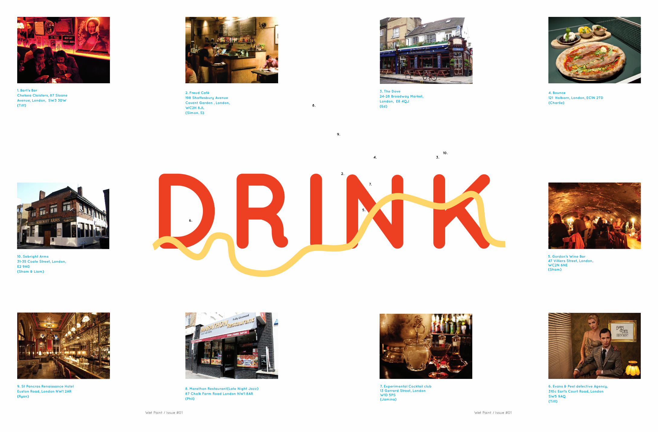
Dehesa, Soho (TL)Oxo Tower Wharf, Barge House St, South Bank, London SE1 9PH
2. Freud Café198 Shaftesbury AvenueCovent Garden , London,WC2H 8JL(Simon. S)
1. Bart’s BarChelsea Cloisters, 87 Sloane Avenue, London, SW3 3DW(Tiff)
10. Sebright Arms 31-35 Coate Street, London, E2 9AG(Sham & Liam)
9. St Pancras Renaissance HotelEuston Road, London NW1 2AR(Ryan)
8. Marathon Restaurant(Late Night Jazz)87 Chalk Farm Road London NW1 8AR(Phil)
5. Gordon’s Wine Bar47 Villiers Street, London, WC2N 6NE(Sham)
7. Experimental Cocktail club 13 Gerrard Street, London W1D 5PS(Jamina)
4. Bounce121 Holborn, London, EC1N 2TD(Charlie)
6. Evans & Peel detective Agency, 310c Earl’s Court Road, London SW5 9AQ(Tiff)
3. The Dove24-28 Broadway Market, London, E8 4QJ(Ed)
1.
2.
8.
9.
6.
3.4.10.
5.
7.
DRINK

18 19
Wet Paint / Issue #01 Wet Paint / Issue #01
‘Cornish Pasty’* (It’s Nasty)
Steve: London should have its own modern skyline set away from the architecture of yesteryear, generating growth with buildings which don’t follow the tall glass rectangle rule book and express something more specific to the country their built in. That might not be so shite.
Liam: I couldn’t agree more! In a perfect world we would…spend our money on beautiful structures rather than ‘skyline screwers’. Although I am fond of some modern day high rise buildings many of them are designed with minimal thought to bespoke concept.
Luigi: I don’t like it (well yes apart from the London eye!). Few weeks ago I was at the Maritime Museum and I saw an old drawing of London around 1600-1700 and the tallest buildings were Saint Paul and all the pinnacles of various monuments and the Thames bigger. I liked it so much. I don’t know, it may be a sign of the time but, to me, too much speculation is going on around the work of architects, especially the “signature” ones.
Steve: “some of the above might be wrong”
•Cockney Rhyming Slang
‘Robin Hood’* (It’s Good)
Ryan: About the Shard, the idea of a vertical 24hr town that rises above one of London’s most historic stations is a bold idea that shows we are still able to adapt to new ways of thinking. Love it.
Gemma: The London skyline has needed an injection of creativity, even controversy for a long time, there should be more…if the alternative is a decade long soap opera like battersea park then bring on Mrs Shard and the whole Shard family
Tommy: the city needs the likes of the Shard and the recently approved Scalpel in Lime Street to keep London at the forefront of design and to keep the money flowing into the economy by encouraging foreign companies to set up in London, now don’t get me started on the 3rd runway at Heathrow or the Boris airport in the Thames Estuary
Jamina: I have never come across a city that has such a juxtaposition of architecture. You can turn around the corner and the buildings can start from Victorian and suddenly turn into Modernist apartment blocks. Many people feel London has a chaotic skyline but I feel it makes London unique.
Sham: I totally disagree, I think the London skyline is getting better and better. I still haven’t seen the Walkie Talkie building though, (I really hope it isn’t really shit)
Tiff: The London Skyline is in a constant state of flux. I think we have been caught at a time where the current ‘flux’ is not in its most flattering state. It will change and evolve and I hope in future we will see a skyline that is wholly unique and one that illustrates architects can dream beyond glass rectangles
“There is no nice way of putting this, but the skyline of London is being screwed,” says
Guardian architecture critic Rowan Moore, on the Shard and the Walky Talky building.
Do you agree?
SKYLINELONDON
20 21
Wet Paint / Issue #01 Wet Paint / Issue #01
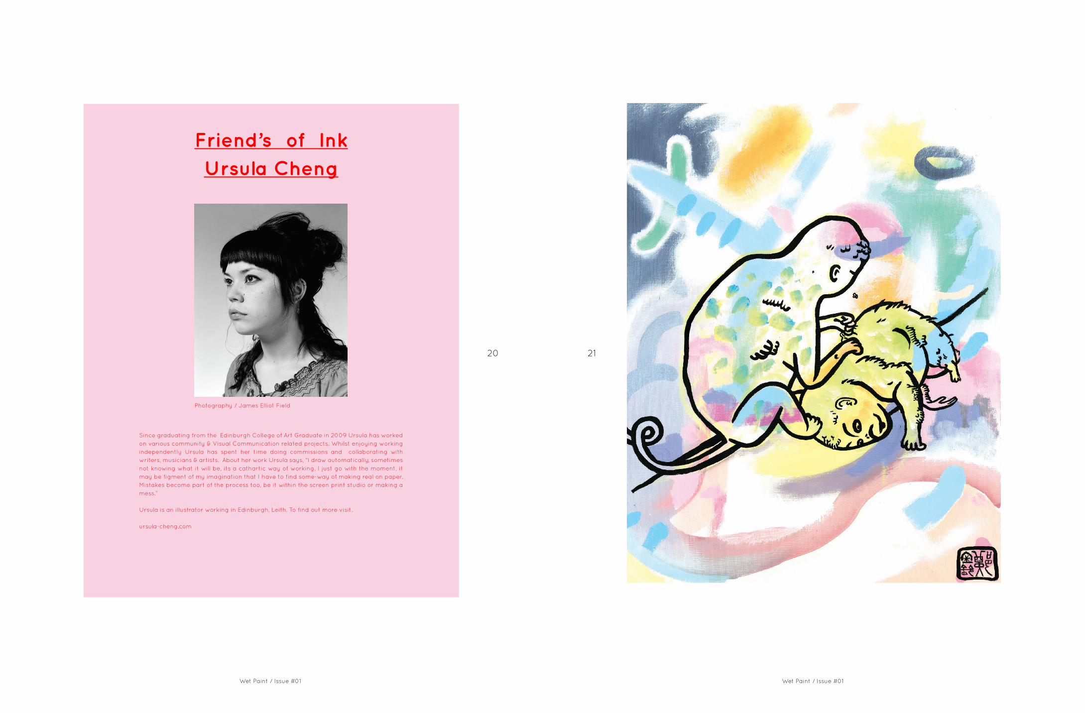
Friend’s of Ink
Ursula Cheng
Since graduating from the Edinburgh College of Art Graduate in 2009 Ursula has worked on various community & Visual Communication related projects. Whilst enjoying working independently Ursula has spent her time doing commissions and collaborating with writers, musicians & artists. About her work Ursula says, “I draw automatically, sometimes not knowing what it will be, its a cathartic way of working. I just go with the moment, it may be figment of my imagination that I have to find some-way of making real on paper. Mistakes become part of the process too, be it within the screen print studio or making a mess.”
Ursula is an illustrator working in Edinburgh, Leith. To find out more visit.
ursula-cheng.com
Photography / James Elliot Field

“DO NOT ASK WHAT TOMORROW BRINGS
‘Th
e E
nd
’ By U
rsula
Ch
en
g

24 25
Wet Paint / Issue #01 Wet Paint / Issue #01
Vitreous Enamel Basin
A household basin with tall sides that lend themselves carrying water without spillage. The kink in the side serves to make holding a full, heavy vessel more comfortable; while the unique properties of enamel result in a very hard wearing finish which is inert to chemicals. The heavy gauge steel is cold formed in a spinning process which hardens the material, resulting in a strong durable product that will serve many years of use.
Materials : Steel, Vitreous Enamel.Capable of holding {13 pints / 6.2 litres}
Visit: cargocollective.com/turnerandharper
Turner and Harper is a British brand devoted to creating quality hand crafted products for the home. They create products which nod to tradition, balancing timeless aesthetics with considered material choices. At the core they are fascinated with translating the small details that fill our daily lives into products which quietly communicate their quality, function and place.
Friend’s Of InkTurner & Harper
Broom
A soft hog bristle broom suited for use on tiled and wooden floors. The wood is selected, machined and finished by hand, giving a unique character to each piece. Supplied with a hook to aid storage and prolong the life of the bristle. Bespoke stainless steel bolts fix the handle to the brush head, employing skills usually reserved for restoration of vintage motorcycles.
Materials : Black walnut, Pure Hog Bristle, Powder Coated Steel, Bespoke Stainless Steel Fixings.
Also available in oak.
Brush
Completely hand made, finished with a hard wearing stain proof oil. Bristled with soft hog hair that will collect fine dust with ease. The bristle can also be washed to restore it as use takes its toll.
Materials : Black Walnut, Pure Hog Bristle, Laser Etching.
Small Brush
A hard wearing stiff bristled brush, suited to brushing clothes or as a nail brush. Hand machined and finished with two coats of waterproof oil; the unique quality of each piece is accentuated by the differing grain in the carefully selected wood.
Materials : Oak, Black Walnut, Pure Hog Bristle.
Stainless Steel Dustpan
Hand formed stainless steel dustpan with a tactile rubber handle to grip the brush. The metal is shaped with a hyde mallet, and the steel is then blasted with a mixture of fine glass and water to unify the surface finish. Carefully assembled and finished with a laser etched brand marking on the underside.
Materials : Stainless Steel, PVC Rubber, Laser Etching.

26 27
Wet Paint / Issue #01 Wet Paint / Issue #01
Fig. 1 Client Portal
Our New SiteDid you know Ink have a new Graphic Design team? Check out our new site
we designed it ourselves...
www.inkassociates.co.uk
Fig. 2 Website
The site also features our client portal. Which will help you to successfully
manage your current and past project data. The system is globally accessible, intuitive and simple to manage. We e
are seeing first hand how this platform is supporting clients efficiently Please get in touch if you would like to find out
more.

28
Wet Paint / Issue #01 Wet Paint / Issue #01
29
Frame
Frame is an editorial manual on window displays. The booklet deals with the what makes window displays successful and how to manage them across the board. It showcases some of our favourites in the industry. Please get in touch if you would like a copy.
30 31
Wet Paint / Issue #01 Wet Paint / Issue #01
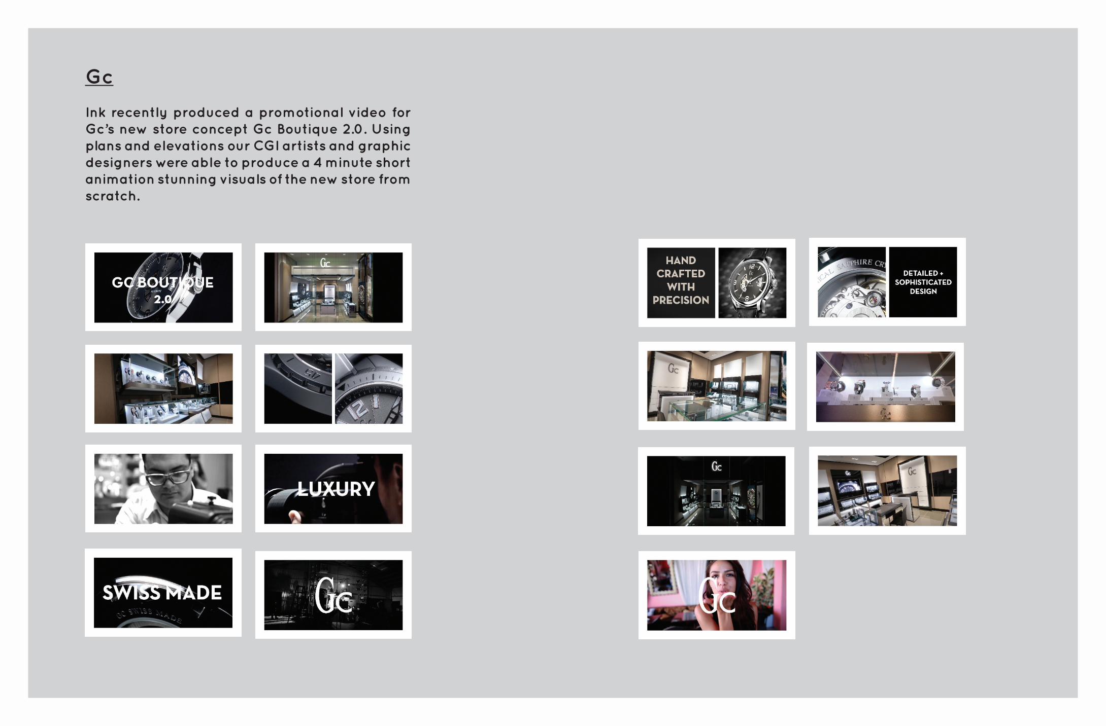
Gc
Ink recently produced a promotional video for Gc’s new store concept Gc Boutique 2.0. Using plans and elevations our CGI artists and graphic designers were able to produce a 4 minute short animation stunning visuals of the new store from scratch.
32 33
Wet Paint / Issue #01 Wet Paint / Issue #01
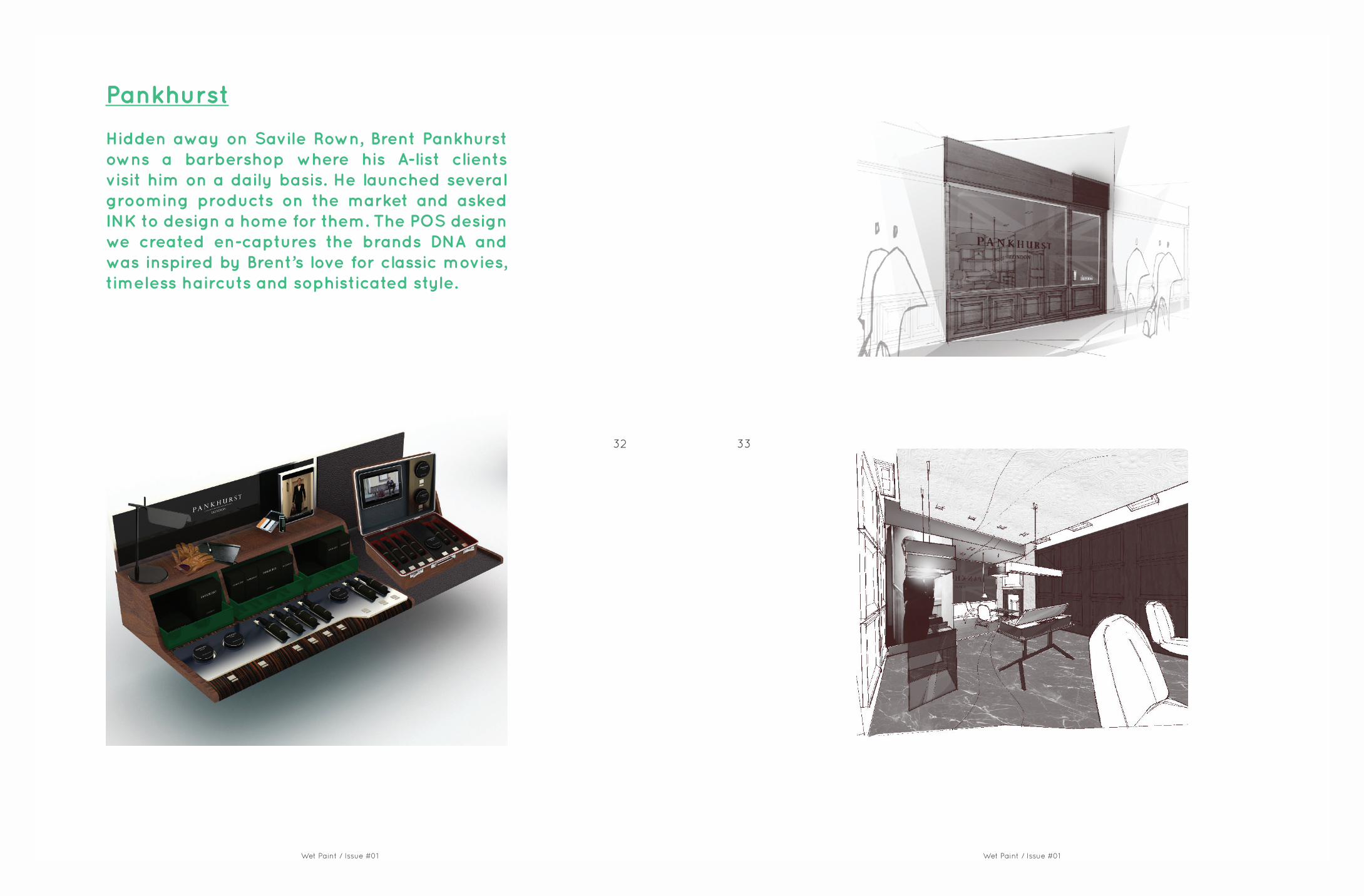
Pankhurst
Hidden away on Savile Rown, Brent Pankhurst owns a barbershop where his A-list clients visit him on a daily basis. He launched several grooming products on the market and asked INK to design a home for them. The POS design we created en-captures the brands DNA and was inspired by Brent’s love for classic movies, timeless haircuts and sophisticated style.
34 35
Wet Paint / Issue #01 Wet Paint / Issue #01
Luz first visited the Biennial in 2000, while doing her Erasmus year in Italy, since then she has only missed one in 2008. Luz tells us more about her last visit.
The Venice Architectural Biennial takes place on even years in two different venues in the city of Venice: The Giardini, where the national pavilions are (each country that owns a pavilion curates their own exhibition, free topic choice) and the Arsenale, where the main exhibition takes place, curated by and international recognized architectural figure (in 2012 was David Chipperfield, in 2014 will be Rem Koolhaas).
The most interesting piece of exhibition of 2012 to me was the Russian pavilion, which told the story of Skolkovo, one of the 60 secret towns that existed in the USSR during the cold war, were the scientific experiments took place, that now has become a technological hub, were the most important architectural offices are working at the moment (OMA, Kazuyo Sejima, Chipperfield, etc.). The story of the new city of Skolkovo was told through technology: when entering the pavilion you had to pick up a tablet, and walk around the rooms scanning the walls, made of QR codes that unveiled the architectural projects currently in progress there. The catalogue of the exhibition was a QR code in a badge. Simply fantastic!
RUSSIAN PAVILION AT THE VENICE ARCHITECTURE BIENNIAL 2012
SPYI

36 37
Wet Paint / Issue #01 Wet Paint / Issue #01
RUSSIAN PAVILION AT THE VENICE ARCHITECTURE BIENNIAL 2012
THE CITY OF CULTURE EISENMAN ARCHITECTS
Luz takes a trip around The City of Culture of Galicia (Cidade da Cultura de Galicia) a new design that is destined to become the cultural hub of the whole Galician region.
It´s situated right outside the city of Santiago de Compostela (North West of Spain). Peter Eisenman was commissioned with the project after winning an international competition of first class architectural offices such as OMA, MVRDV, Steven Holl or Jean Nouvel.
The entire complex was supposed to be finished after 10 years, in 2012, but works are still in progress (and will be for a while). The concept design of the City of Culture was inspired by the old city of Santiago and the five pilgrim routes that from the medieval era lead to the city, to the cathedral. The design superposes a Cartesian grid onto the existing, organic, medieval grid and then warps or deforms these with a topological grid that projects upward in a new vibrant geometry. Due to this high complexity the full project was developed using 3D software and a number of timber models.Site visits can be organized.
QR codes that unveiled the architectural projects currently in progress in the area.

38 39
Wet Paint / Issue #01Wet Paint / Issue #01
THINGS
THAT
INSPIRE
US

London
10 Chancel Street, London, SE1 0UX. +44 (0) 20 7021 0561
Christchurch
Tolsey Studio, 46 High St, Christchurch, Dorset, BH23 1BN. +44 (0) 1202 496 222
[email protected] www.inkassociates.co.uk