what are web standards?
TRANSCRIPT
<<ISBN -Title - Chapter Title>> Last Edited By Swanilda GermanLast Saved on September 12, 2011
The new CSS starter pages in Dreamweaver CS3 are there to help designers rapidly build pages that conform to web standards. They can also help users who are new to CSS create layouts that avoid the common problems in CSS layout techniques. Still, the work will go more smoothly for those who understand the underpinnings of the starter pages. The finished results will be more predictable for those who understand the essential CSS concepts upon which they are based. To that end, in this chapter, we will reconstruct an equal height, two-column layout with header and footer that is similar to the CSS Starter page with the same layout. In the process, we will introduce the basic concepts of CSS that will be common to all of the CSS Starter Pages. By the end of this chapter, you will be able to look at the code of any of these pages and understand most of what you see.
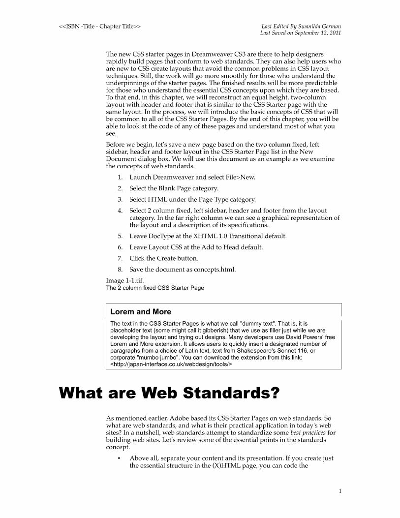
Before we begin, let's save a new page based on the two column fixed, left sidebar, header and footer layout in the CSS Starter Page list in the New Document dialog box. We will use this document as an example as we examine the concepts of web standards.
1. Launch Dreamweaver and select File>New.
2. Select the Blank Page category.
3. Select HTML under the Page Type category.
4. Select 2 column fixed, left sidebar, header and footer from the layout category. In the far right column we can see a graphical representation of the layout and a description of its specifications.
5. Leave DocType at the XHTML 1.0 Transitional default.
6. Leave Layout CSS at the Add to Head default.
7. Click the Create button.
8. Save the document as concepts.html.
Image 1-1.tif.The 2 column fixed CSS Starter Page
Lorem and More
The text in the CSS Starter Pages is what we call "dummy text". That is, it is placeholder text (some might call it gibberish) that we use as filler just while we are developing the layout and trying out designs. Many developers use David Powers' free Lorem and More extension. It allows users to quickly insert a designated number of paragraphs from a choice of Latin text, text from Shakespeare's Sonnet 116, or corporate "mumbo jumbo". You can download the extension from this link: <http://japan-interface.co.uk/webdesign/tools/>
What are Web Standards?As mentioned earlier, Adobe based its CSS Starter Pages on web standards. So what are web standards, and what is their practical application in today's web sites? In a nutshell, web standards attempt to standardize some best practices for building web sites. Let's review some of the essential points in the standards concept.
• Above all, separate your content and its presentation. If you create just the essential structure in the (X)HTML page, you can code the
1

<<ISBN -Title - Chapter Title>> Last Edited By Swanilda GermanLast Saved on September 12, 2011
information once, and output to many different devices. The days of only surfing the web from a desktop computer are a thing of the past. PDAs, cell phones, and assistive technology are just some of the other ways that people access the Internet.
• Use Cascading Style Sheets to design the pages. Remember those wretched days of using browsing sniffing JavaScript to determine which browser and platform someone was using? Remember those print-friendly versions of pages we hoped to find so that the printer didn't cut off the right edge of a page? How about those text-only versions so we could minimally satisfy accessibility requirements? When you use Cascading Style Sheets to design your pages, these resource consuming, economy-draining activities are a thing of the past. A simple text document, with a few well-crafted rules, gives the (X)HTML document its design.
• Design for universal accessibility. Not everyone can access, or see, the page exactly the same way. What we want to accomplish is to give everyone the same content in a reasonably acceptable presentational style without crashing the system. Fully compliant browsers will render the pages one way, buggy browsers such as Internet Explorer will need adjustments to render correctly, assistive technology will enjoy inclusion, and older browsers will still present the essential content but with fewer presentational enhancements.
The Content/Design Equation
Now let's look at the two halves of the content/presentation equation. First we will look at the (X)HTML/content half, and then we will look at the CSS/presentation half.
The (X)HTML DocumentThe (X)HTML document should include the page content, marked up in semantic elements. For example, the top-level title of the page should be tagged with a top-level heading, the h1. In the past, some designers would merely apply formats such as weight, size, and color to title text rather than use the h1 element that describes its meaning. When our content has semantic meaning, it can communicate better, especially with screen readers and search engines!
Now let's turn to some (X)HTML document essentials: the doctype, character encoding, document flow, and inline versus block elements.
The DocTypeThe word "standards" in the term "web standards" suggests a more codified approach to the business of building web pages as opposed to that of the somewhat Wild West nature of what has gone before. Indeed, there is even an "announcement", that is a DocType, at the beginning of each web standards compliant document that pronounces it as such. There are a number of different DocTypes, each with its own set of rules for the standards with which it aspires to comply.
Dreamweaver uses the XHTML 1.0 Transitional doctype as its default. Unless the site has more specific requirements, this is a good DocType to use because of its
2

<<ISBN -Title - Chapter Title>> Last Edited By Swanilda GermanLast Saved on September 12, 2011
backward compatibility with older web pages and its forward compatibility with the future of the web. In other words, it straddles the transition period in which the web finds itself as web standards continue to take a stronger hold. XHTML 1.0 Transitional allows deprecated elements, which are mostly presentational elements and attributes such as font, align, and bgcolor. XHTML 1.0 Strict or HTML 4.01 Strict do not. Take a moment to look at the various DocTypes that are listed in the drop down menu of the New Document dialog box.
1. Return to concepts.html, the CSS Starter page we just saved.
2. Click the Code View button at the top of the Document Window.
3. Look for the following code at the top of the page:
<!DOCTYPE html PUBLIC "-//W3C//DTD XHTML 1.0 Transitional//EN" "http://www.w3.org/TR/xhtml1/DTD/xhtml1-transitional.dtd">
<html xmlns="http://www.w3.org/1999/xhtml">
What this code is telling us is that the page uses XHTML 1.0 Transitional and will be compared against its rules as provided in the URI that follows. If you were to validate, that is check that the page is free from errors, at the World Wide Web (W3C) consortium validator, the W3C would use that particular DocType as the basis of its tests.
So what happens if there is no doctype or there is an incomplete or incorrect DocType? Pages will render in quirks mode instead of standards mode. They will render according to the methods of older browsers. Our carefully constructed CSS might not display as we expect.
Doctype and Rendering Mode
To learn more about doctypes and the various rendering modes, read Rendering Mode and Doctype Switching < http://www.communitymx.com/content/article.cfm?cid=85fee> by Holly Bergevin of Community MX. The article includes a list of DocTypes, as well as a list of resource links for learning everything you ever wanted—or didn't want—to know about doctypes.
Character Encoding
Go back to the two-column starter page and look at the code beneath the DocType. The code should look like the following:
<meta http-equiv="Content-Type" content="text/html; charset=UTF-8" />
Here we will find the character encoding for the page, which is the system whereby each character we type is turned into computer bits. Until fairly recently, developers used character sets that expressed a limited number of languages, such as charset=ISO-8859-1 for Western European languages. When the developer wanted to add a special character, such as a copyright symbol or an accent mark, she used a character entity. An example of this would be the character entity á that we use to represent the French accent acute.
More and more developers are using a universal character encoding called Unicode. In essence, Unicode allows you to use characters from almost any writing system in the world. The Dreamweaver default for both CSS and XHTML documents is a variety of Unicode called UTF-8, which has backwards compatibility with ASCII. Because of the increasing internationalization of the web, as well as the ability of browsers to support Unicode, UTF-8 is a solid choice for character encoding.
3

<<ISBN -Title - Chapter Title>> Last Edited By Swanilda GermanLast Saved on September 12, 2011
The Natural Flow of the Document
Another important concept to understand is the natural flow of the document. To understand natural flow, we will create a new page based on a liquid starter page and open it in a browser.
1. Back in Dreamweaver, select File>New.
2. Select the Blank Page category.
3. Select HTML under the Page Type category.
4. Select 1 column liquid, centered from the layout category.
5. Leave DocType at the XHTML 1.0 Transitional default.
6. Leave Layout CSS at the Add to Head default.
7. Click the Create button.
8. Save the document as flow.html.
Change the size of the browser window several times, and notice how the text re-flows to wrap within the dimensions of the window. This is the default behavior of (X)HTML documents. In the absence of any positioning techniques, page elements will flow one after the other in the order that they appear in the source code of the document.
Inline Versus Block Elements
As we mentioned in the previous section, when you place text, images and other content on an (X)HTML page, each element flows one after the other in the natural order in which you insert it. There is another variable within the flow that will affect how elements behave, and that is their status as a block or inline element.
The essence of block elements is that they are as wide as their container and they stack vertically on top of each other. In other words, block elements do not sit next to each other. Look, for example, at the h1 text Main Content at the top of the flow.html document. It occupies its own block of space. The next element, the dummy text that sits in a paragraph, flows underneath it.
Inline elements, on the other hand, stack horizontally. Starting at the left, text characters, links, and images (all examples of inline elements) flow one after the other until all available horizontal space runs out. The next inline element then moves down to start a new line, just like the wrapping effect in your word processor. The browser calculates how many elements are going to fit on a line and then makes an invisible box that will be tall enough for the highest elements in the line.
Image: 1-2.tif Inline and block elements within the natural flow of the document
Building with DIVs
Before we move on to the presentation half of the separation equation, let's look at an html element with which you may not be familiar. That is the DIV, a generic empty box that lets you divide a page into discrete areas. Some of the most common ways developers divide pages is as header, sidebar, content, and footer sections. They add a DIV and then give it a descriptive name such as "header" or "footer". Look again at any of the starter pages and see if you can locate this code:
<div id="mainContent"> or <div id="header">
The DIV gives us yet another element that we can use to style unique areas of the
4

<<ISBN -Title - Chapter Title>> Last Edited By Swanilda GermanLast Saved on September 12, 2011
page. It has an intrinsic behavior, however, that confuses new CSS coders: the div, natively a block element, ends when the content within it stops flowing vertically. We can see the effect by returning to the concepts.html document that we created earlier. Look at the light gray background color on the sidebar1 div. See how its outlines end when the content within end. Dreamweaver's outlining visuals makes the end of the div very clear.
Image 1-3.tif A div ends when the content within it ends
This behavior does present challenges when we try to extend background color on a column so that it goes to the bottom of the layout. We will explore faux column technique, a common method to give the illusion of two equal height columns, in later chapters of this book.
The CSS DocumentNow that we have a better grasp of the content/markup half of the separation equation, we'll turn to the presentation/CSS half. As we already mentioned, the (X)HTML page is not pure content but has semantic markup (such as the h1 of our earlier example) that describes the content's meaning. This markup provides the "hooks" for using CSS (Cascading Style Sheets) to design the content.
CSS SyntaxStyle sheets are made up of CSS rules that contribute to the design of elements. Each CSS rule is made up of a selector and a declaration block. The declaration block, in turn, is made up of one or more declarations, each of which is a property that we give a value. Let’s break this down by referring to the image below:
Image 1-4.tif. The anatomy of CSS syntax
The h1 tag is the selector or the tag that we want to design. Next comes the declaration block, which is the series of property and value pairs such as color:gray; and font-weight: bold;. As you can see in the example above, the declaration block begins and ends with a curly bracket. Each individual property and value pair within is a declaration. For the first declaration, color is the property and gray is the value. Each declaration ends with a semi-colon. Dreamweaver writes this code for you when you use the CSS Styles panel, but it is always a good idea to understand the code in case you need to troubleshoot or modify it by hand.
CSS Selector TypesThe Dreamweaver CSS New Rule dialog box gives you three CSS selector options—Tag, Class and Advanced.
Tag Selectors
The most basic is a selector that redefines the look of a specific tag. Again, returning to the h1 example, if you want the color of your h1 text to be grey instead of black, you could write a rule for the h1 tag. Keep in mind that redefining a tag is a global operation that affects every tag of the same type on
5

<<ISBN -Title - Chapter Title>> Last Edited By Swanilda GermanLast Saved on September 12, 2011
the page. As you can see in the image below, once you select the radio button for Tag, a Tag dropdown menu appears that lists all HTML tags in alphabetical order.
Image 1-5.tif The Tag Selector and its drop down menu
Class Selectors
The next kind of selector is called the class. The class applies to anything on the page that includes its attribute in the (X)HTML code. Classes are used on an as-needed basis and are not applied automatically. For example, you might add a class to a paragraph element:
<p class="warning">
In the style sheet, the class might include these properties and values:
.warning {
font-weight: bold;color: #FF0000; }
Image 1-6.tif The Class Selector
As we can see, class names begin with a period and then use a descriptive name that we will recognize later. We can use a class as many times as we like within a page to give elements a consistent design. For instance, we might want all of the important text within a paragraph to have the same visual properties and thus define a class called ‘.warning to define their appearance.
The CSS Starter Pages use the class in yet another way. We will discuss that when get to the descendant selector.
Advanced SelectorsThe last radio button is next to the selector type called Advanced. We will use this option most often for IDs, pseudo selectors and descendent selectors, specific parts of a page that are identified by a name we give them, or a kind of tag inside a named area of a page. Let’s look at what those terms mean.
Identifiers
IDs (or identifiers) are often used to identify a specific area of the page, such as the mainContent div from our earlier example: <div id="mainContent">
In the CSS, you might create a rule that sets the content div 225 pixels from the left side of the page.#mainContent {
margin-left: 225px; }
Note that in the style sheet ID names begin with a hash (#). Each ID name must be unique, and unlike classes can only be used one time on the page.
Image 1-7.tif The Advanced ID
Margin Trouble
The W3C states that margins and padding values are written in this specific order: top, right, bottom and left. Many designers remember the order with this acronym: TRBL for trouble, which we will surely be in if we get the order wrong.
6

<<ISBN -Title - Chapter Title>> Last Edited By Swanilda GermanLast Saved on September 12, 2011
Pseudo Selectors:
The next Advanced option is the pseudo selector. The most common examples of pseudo selectors are the a:link, a:visited, a:hover and a:active link styles that we see listed in the drop down menu next to the Advanced selector option. These represent various link states: a:link is the initial state of the link; a:visited is the state of the link after the user has already visited it; a:hover is the interactive state of the link when the visitor passes the mouse over it; and a:active is the state of the link when the user presses the mouse down on the link but has not released it. There is also the a:focus state that behaves much like the a:hover state, but is for those who are using a keyboard rather than a mouse to navigate through links.
We can use CSS to style these link states to clarify their differences visually. There is a specific order in which they must go into the style sheet:
• a:link
• a:visited
• (when included) a:focus
• a:hover
• a:active
Image 1-8.tif The Pseudo selector drop down menu
Descendent Selectors:
Finally, the other Advanced selector we will use frequently in upcoming exercises is the descendent selector.
Earlier we mentioned that redefining the look of a specific tag is a global operation. If the h1 is set to gray, every h1 on the page will be grey. Sometimes we will need to create different looks for the same tag in different areas of the page. For example, we may want h1 to be red in the sidebar column, but green in the main content column. If we set the ID of the mainContent div to #mainContent and the ID of the left column to #sidebar1, we can set individual looks for the H1 tag by writing the style in context. #mainContent h1 will target the H1 tag only when it is in the content area of the page. #sidebar1 h1 will target the H1 tag only when it is in the sidebar area of the page. (Note the use of a space between the ID and the element name.)
Image 1-9.tif The descendant selector targets elements within a specific context
As mentioned earlier, the CSS Starter Pages use descendent selectors in conjunction with a class. There are many varieties of starter pages, and we may want to use more than one within a site. For example, we might want to use both a two column and three column layout, depending on the content in the page. In order to differentiate between the #mainContent div in the two column page versus the #mainContent div in the three column page, the starter pages have a class on the body.
In the code below, you can see the class attribute that the starter pages add to the body of first the two-column page and then the three-column page.
<body class="twoColFixLtHdr">
<body class="thrColFixHdr">
7

<<ISBN -Title - Chapter Title>> Last Edited By Swanilda GermanLast Saved on September 12, 2011
The code below shows how we add a class "prefix" to the #mainContent for each layout.
.twoColFixLtHdr #mainContent
.thrColFixLtHdr #mainContent
Now each rule that has a class prefix maintains unique styles within one style sheet.
Other Selector Types
There are other advanced selectors such as the adjacent sibling and the child selector, but browser support is not yet consistent. You can read more about selector types at the W3C: http://www.w3.org/TR/REC-CSS2/selector.html
Now that you understand basic CSS syntax and selector types, it is time to look at the kinds of style sheets in which we might write them.
Kinds of Style SheetsIn the CSS Starter Pages we've created so far, we can see examples of the embedded style sheet – that is, the CSS rules are written within a style element into the head of an individual document. If we look at the flow.html or concepts.html document in Code view, we can see how this works. There are other ways to code styles, however, and it is necessary to understand their place in the hierarchy of the cascade so that we can ensure that our rules render in the order that we expect.
The CascadeStyle sheets operate in a hierarchy in which certain kinds take precedence over others. In the absence of any other style sheet, there is the browser style sheet. If a user created a user style sheet and set it as the default in her browser preferences, any included styles would take precedence over equivalent browser styles. Finally, if we create author style sheets for our pages, these will have the final authority over the design of the page.
The Browser Style Sheet
We need to be aware that before we create even one CSS rule for our pages that the browser applies a default style sheet. Formats such as the large size on level one headings, the big gaps between paragraphs, the indents on lists, and other basic style information are what give the page some minimal design.
Though the different browsers use similar values in their default style sheets, they are, unfortunately, not exactly the same. This means that you don't have a level playing field as you start to create your own custom rules. Many web developers start out their style sheets by "zeroing out" margins, padding, and borders on many of the (X)HTML elements to get rid of the default browser values. With everything set back to "0", they can then go on to set their own values with the expectation that the effect will now be the same in each browser.
The User Style Sheet
The next kind of style sheet in the hierarchy might come from a user, perhaps a
8
<<ISBN -Title - Chapter Title>> Last Edited By Swanilda GermanLast Saved on September 12, 2011
disabled user, who adds a style sheet that overrides some of the browser styles. This style sheet may designate a larger font size, for example, to make it easier for a person with low vision to more easily read the text. Browsers such as Internet Explorer allow users to set a custom user style sheet in the browser preferences.
The Author Style Sheet
At last, top dog in the hierarchy is the style sheet created by us, the authors. There is a sub hierarchy to author generated styles that includes external, embedded and inline styles. The closer to the element we get, the more precedence a style takes. Inline styles take precedence over embedded style sheets, and embedded style sheets take precedence over external style sheets.
External
External style sheets are exactly what their name implies: they are separate, or external, documents that include all of our CSS rules. The file name ends with the .css extension, and a link to this external CSS document goes in the head of the (X)HTML document. If we were to create a starter page and select the Create New File option in the drop down menu next to Layout CSS, you would see code like that listed below in the head of the (X)HTML page:
<link href="twoColFixLtHdr.css" rel="stylesheet" type="text/css" />
Importing Style Sheets
Some designers import rather than link style sheets. This is another way to reference the style sheet in the head. One of the advantages of importing is that older browsers do not understand it and will ignore the style sheets. This is often preferable to the whacky way they might otherwise render the styles. Instead, they will get a plain, but readable page.
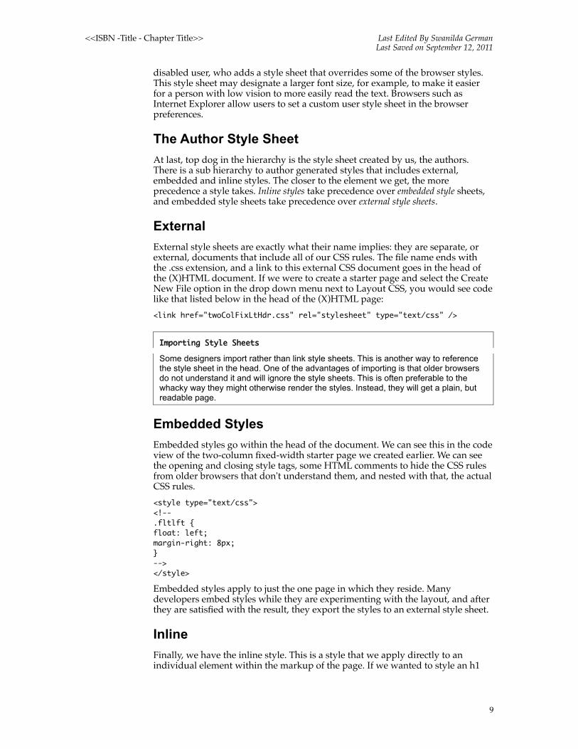
Embedded Styles
Embedded styles go within the head of the document. We can see this in the code view of the two-column fixed-width starter page we created earlier. We can see the opening and closing style tags, some HTML comments to hide the CSS rules from older browsers that don't understand them, and nested with that, the actual CSS rules.
<style type="text/css"> <!--.fltlft { float: left;margin-right: 8px;}--> </style>
Embedded styles apply to just the one page in which they reside. Many developers embed styles while they are experimenting with the layout, and after they are satisfied with the result, they export the styles to an external style sheet.
Inline
Finally, we have the inline style. This is a style that we apply directly to an individual element within the markup of the page. If we wanted to style an h1
9

<<ISBN -Title - Chapter Title>> Last Edited By Swanilda GermanLast Saved on September 12, 2011
element, for example, we would add the style attribute along with the appropriate values
<h1 style="font-size: 160%; color: red">Inline Style</h1>
Conflict ResolutionWhen there is only one rule for a given element, such as the h1 in our earlier example, we will feel confident about which rule the browser will apply. But what if there are conflicting rules for the same element? What if we have two h1 rules, for example, in one style sheet? This is still pretty easy: whichever h1 styles come last in the style sheet win out.
But what if those two h1 rules exist in different style sheets? In that case the browser follows the hierarchy of the kinds of style sheets. Author style sheets take precedence over user style sheets, and user style sheets take precedence over the default browser style sheet.
If the two h1 rules are in different author style sheets, there is a set order of importance there as well. Embedded styles take precedence over external styles, and inline styles take precedence over embedded styles. The inline style is closest the element, and therefore wins out.
Browser
User
Author
• External
• Embedded
• Inline
So we see that in situations where rules have the same degree of importance, the rule that comes last in the most authoritative style sheet has the final say. And so we resolve the issues of order and origin.
But rules can also have greater weight, regardless of where they appear in the order or origin. There can be a p rule within the same #mainContent, for example, that is part of a class, and another that is part of the id. Let's consider these two rules:#mainContent p.warning p
The #mainContent p states that the text will be blue, and the .warning p states that the text will be red. Which one would rule? How would their weight be calculated? The W3C considered this scenario, too, and came up with a conflict resolution technique called specificity.
We calculate specificity by counting the number of ids, classes, and element names in each selector. The digital scheme displays as three hyphenated numbers such as 1-1-0, where 1 is the number of Ids, the next 1 is the number of classes, and the zero stands for the number of elements, also known as tags.
So in our example paragraphs, the #mainContent p would rule; the paragraph text would stay blue, even if we applied a class of warning to one of the paragraphs within it. We would have to apply both the ID and the class to the paragraph to make it more specific, such as in the code below:#mainContent p.warning
10

<<ISBN -Title - Chapter Title>> Last Edited By Swanilda GermanLast Saved on September 12, 2011
Inheritance, Cascade, and Specificity
Zoe Gillenwater of Community MX wrote an article that goes into detail on the subjects of inheritance, cascade, and specificity. You can find it at http://www.communitymx.com/abstract.cfm?cid=2795D. The article includes a complete listing of the properties that elements inherit, and those they do not.
Inheritance
CSS uses terms that probably remind you of the study of genealogy. One of these is inheritance, the process by which the value of a CSS property on one element passes down to a child element.
A general rule of thumb is that child elements inherit text-related properties but not box-related properties. This brings us to the all-important concept of the box model.
The Box ModelThe box model is an essential CSS concept to digest before we create our first layouts. Recall the discussion about inline and block elements. Each block element generates a box—invisible by default—that can be given borders, margins for space between it and other boxes, and padding within to push the content away from the edges of the box. These can be applied as one global value all around the box or as individual values for each side. Inside the padding is the actual content area where we place our page elements.
If the box has no assigned width or height, it is considered fluid or liquid. In other words, it fills the container surrounding it (such as the browser window). It also automatically expands vertically to enclose whatever content is within it.
It is when we assign a width or height that a difference between some versions of Internet Explorer and other browsers can occur. Internet Explorer 5 and 5.5, as well as Internet Explorer 6 when there is no DocType or an incorrect DocType on the page, interpret the box model differently than standards-compliant browsers such as Firefox, Netscape and Safari. Standards-based browsers (that is, those that closely follow the guidelines of the W3C) add padding and border measurements to the dimensions we allocate for our content element. Internet Explorer, in the circumstances stated above, subtracts those measurements. Margins do not have an effect on the calculations—they are always an additional value.
For example, if we set the width of a box to 200 pixels and then add 20 pixels of padding and 2 pixel borders to each side, a standards-compliant browser will read the total as 244 pixels. Some versions of Internet Explorer, however, will interpret the total as 156 pixels because they subtract the padding and borders from the box width.
Image 1-10.tifStandards compliant browsers: 200 + 20 + 20 + 2 + 2 = 244pxSome versions of IE Win: 200 – 20 – 20 – 2 – 2 = 156px
Note: The box model problem also applies to heights. Because the box by default expands vertically as long as there is additional content, this does not usually create problems like those that occur with explicit widths.
11

<<ISBN -Title - Chapter Title>> Last Edited By Swanilda GermanLast Saved on September 12, 2011
The Box Model Problem
John Gallant and Holly Bergevin of Community MX wrote an in depth article about the box model and its problems and solutions. You can read the article at http://www.communitymx.com/abstract.cfm?cid=E0989953B6F20B41.
If we have layouts that need to be pixel-precise, we might run into unexpected results. We would need to have some way to set the width of the box to 156 pixels for older browsers without affecting the correct value of 244 that we set for standards compliant browsers. This brings us to the dread topic of using remedial methods to circumvent the problems of browser anomalies.
Browser AnomaliesIt is probably clear by now that Internet Explorer poses more CSS challenges than standards-compliant browsers such as Safari, Firefox, Netscape and Opera. One such problem that we have already identified is the box model. Let's take a look at how Adobe corrects the problem in the two-column CSS Starter Page.
Internet Explorer Conditional Comments
Because Internet Explorer has so many unique ways of dealing with CSS, it is fortunate that there is a built in way to deal with it. Microsoft engineers created something called the Conditional Comment. It allows us to set up conditions under which we can feed unique rules to targeted Internet Explorer versions. For example, say we need to feed a unique box value to Internet Explorer 5; IE 5, therefore, is the condition.
What follows is the basic syntax for Conditional Comments that we add to the head of the document. First we set up the conditional statement that sniffs out a targeted version of Internet Explorer. Then we code a certain set of styles (in many cases, a style that will correct the box model so that an area has the same width as in other browsers).
You can target all versions of IE, or just specific versions such as 5, 5.5, 6 or 7. Finally, you can set up a range of versions by using expressions such as ‘gte’ (greater or equal to).
The following Conditional Comment selects all versions of Internet Explorer:<!--[if IE]><style type="text/css"> Special Internet Explorer instructions go here.</style><![endif]-->
The following Conditional Comment targets a specific version of Internet Explorer:
<!--[if IE 6]>
Let's open the concepts.html document in Code view. We are going to look at the box model fix for the sidebar1 div. In the style sheet, we can see that the width of the div is 200 pixels. The left padding is 20 pixels, and the right padding is 10 pixels. In standards compliant browsers, the total will automatically add up to 230 pixels. Internet Explorer 5 will subtract the padding, however, and compute the final width as 170 pixels. We need to create a conditional comment that feeds Internet Explorer 5 a value of 230 so that when it subtracts the 30 pixels of padding, the content width will still add up to 200 pixels.
12

<<ISBN -Title - Chapter Title>> Last Edited By Swanilda GermanLast Saved on September 12, 2011
See if you can locate the following code:<!--[if IE 5]><style type="text/css"> /* place css box model fixes for IE 5* in this conditional comment */.twoColFixLtHdr #sidebar1 { width: 230px; }</style><![endif]-->
The hasLayout "Property"
A large number of bugs occur because of Explorer’s mysterious property called ‘hasLayout’. Of course, no such property exists as part of the CSS specifications, and no other browser uses it.
So what is it? It is hard to define but, in general, we can think of haslayout as a way in which Internet Explorer creates boundaries between, and relationships among, all page box areas. Haslayout is not really a tangible property so much as an effect on surrounding objects and a way of calculating dimensions that economizes browser resources. Some elements, such as the body, have hasLayout set to ‘true’ by default. Some properties trigger hasLayout when we use them in style sheets. Height, width and float directions all add hasLayout. Sometimes we want to trigger haslayout deliberately to fix an Internet Explorer bug.
Internet Explorer and hasLayout
If you want to read a comprehensive reference on haslayout, you can find the definitive guide at www.satzansatz.de/cssd/onhavinglayout.html
Open concepts.html again and locate the following code:<!--[if IE]><style type="text/css"> /* place css fixes for all versions of IE in this conditional comment */.twoColFixLtHdr #sidebar1 { padding-top: 30px; }.twoColFixLtHdr #mainContent { zoom: 1; }/* the above proprietary zoom property gives IE the hasLayout it needs to avoid several bugs */</style><![endif]-->
All we're doing in the #mainContent rule is adding styles to trigger hasLayout in Internet Explorer so that it draws the relationships among the DIVs more accurately. We are using the proprietary IE zoom property, a property that triggers hasLayout and (for mysterious reasons) then fixes the bug in the layout.
Positioning TechniquesThere is one more topic to cover before we begin rebuilding the two-column starter page, and that is CSS positioning. Positioning properties allow us to manipulate the natural flow of the document and arrange boxes on the page into a pleasing and user-friendly design.
The different positioning types (static, absolute, relative and fixed), as well as the use of floats for positioning, cover most layout situations. After we explore how each positioning type works, we will do some exercises to put some of them into action.
13
<<ISBN -Title - Chapter Title>> Last Edited By Swanilda GermanLast Saved on September 12, 2011
Static Positioning
You can assign a position of static to an element in your document. Static positioning is the page default; the elements flow one after the other, filling the browser window with block and inline elements. Though it is the default, explicitly setting it can be useful when we need to reset elements that have another kind of positioning applied to them. For example, printers can have trouble with pages that have any kind of positioning; only one page may emerge from the printer or elements may be cut off. We can create a print style sheet that resets positioned elements to static so that they print properly.
Absolute Positioning
We can use absolute positioning to place objects on the page at precise X- and Y-coordinates. These values will derive their starting point from the absolutely positioned element's parent container. We can set values for top, right, bottom, and left, but we wouldn't use both right and left, or both top and bottom, because these coordinates would fight each other.
Remember that HTML provides a natural flow that conforms to the browser window or viewport. Designers often place objects at the top left of the page and continue to flow them in a natural order. Because absolutely positioned elements are no longer in that natural flow on the page, other layout objects will not ‘see’ them and take their position into account. This can result in content on the page overlapping unless the use of absolutely positioned elements is carefully planned. You will see this in action in the exercises that follow.
Relative Positioning
When you use relative positioning, you are still keeping objects in the flow of the document. However, although relative positioning is similar to static positioning or the default behavior of the page, it allows you to give elements offset values for the top, right, bottom or left coordinates relative to the parent container. For example, if the body of the page is the parent container for a relatively positioned area, then the offset is relative to the page margins.
For example, say we have a content div that we give a position of relative. We can then offset the div 50 pixels from the top and 50 pixels from the left. If the body of the page is the container of the content div, the offset occurs in relation to the margins of the page and a 50-pixel gap appears at the top and left.
Fixed Positioning
Like absolute positioning, elements that are given fixed positioning are set at a specific place on the page. However, the position is always set in relation to the browser window. When the visitor scrolls the page, the fixed content remains in the exact location on the page. For example, you might have a navigation area at the right of the page. Even when you scroll to read more content, the navigation area remains in the same place. Unfortunately, the only version of Internet Explorer that supports fixed position is the latest, Internet Explorer 7. Advanced CSS designers use scripts to force earlier versions of Internet Explorer to simulate the effect of fixed position.
Manipulating the Natural FlowIn this exercise, we are going to change the natural behavior of an image so that
14

<<ISBN -Title - Chapter Title>> Last Edited By Swanilda GermanLast Saved on September 12, 2011
text wraps around it.
Exercise One: Floating Images
1. Open starter.html. This page has text very much like that used in the CSS Starter pages.
2. Place the cursor in front of the first paragraph of dummy text, which begins with "Lorem Ipsum". We are going to add a "dummy" or placeholder image to the page.
3. From the Insert menu, select Image Objects>Image Placeholder.
4. Fill out the dialog box with the following values:
• Name: Placeholder
• Width and Height: 200
• Color: #CCCCCC
• Alt text: Placeholder
Image 1-11.tif The Placeholder Image dialog box
5. The placeholder image will appear at the baseline of the first line of text. By default, images are inline elements.
6. Click the plus button at the bottom of the CSS Styles panel to bring up the New CSS Rule dialog box.
7. Select the Class radio button next to the Selector Type.
8. In the Name field, type .fltlft (don't forget the period at the beginning).
9. For Define in, select the radio button for "This document only".
Image 1-12.tif Rule definition for the left floating image class
Many designers develop their pages by first embedding the styles in the head of the document, and then later, after the layout is complete, export the styles to an external style sheet. This is the default method in the Layout CSS drop down menu for the CSS Starter Pages.
10. When the CSS Rule definition for .fltlft dialog box appears, select the Box category.
11. Select left from the Float dropdown menu.
12. Deselect the Same for all checkbox under Margin.
13. Type 8 in the field next to Right.
14. Leave the unit of measurement at pixels.
15. Image 1-13.tif Float properties
16. Click OK.
17. Click the image on the page to select it.
18. Select the .fltlft class from the Class dropdown menu in the Properties inspector.
Image 1-14.tiff After applying the fltlft class to the image, the text wraps around it
The text now wraps around the image. However, the next heading and its paragraphs wrap around the image as well. Sometimes this effect is what we're after, but other times we want to make the next heading and its text appear below the image. This is a job for the CSS clear property.
15

<<ISBN -Title - Chapter Title>> Last Edited By Swanilda GermanLast Saved on September 12, 2011
Exercise Two: Applying a Clearing Element
1. Select the h2 text "H2 level heading".
2. Click the Split button in the document toolbar to enter into a split screen with code and design views.
3. You'll see that the h2 text is also selected in code view.
4. Deselect the h2 and click your cursor right above it.
5. Type a br element to create a line break and give it a class of clearfloat. Since we are using the XHTML Transitional 1.0 Doctype, it is important to add the space and forward slash before closing the element.
6. <br class="clearfloat" />
Image 1-15.tif Adding a class to the br element
The break will provide a "hook" to add some properties via CSS that will clear the float while making sure it doesn't add any dimension to the page. Remember that browsers add their own default styles to many elements, and thus add space that we may not want. In this case, the break is only there for the purpose of stopping the float effect so that the text starting with the h2 doesn't wrap around it. There are various ways and other elements we could have used to clear the image, but this way is stable across browsers and gives us a reusable widget that we can later apply to a floated column. This method does add markup to the page for the express purpose of designing the page, but we do not yet live in a perfect web standards world.
7. Click the plus button to create a new rule called clearfloat.
8. When the New CSS Rule dialog box appears, select the Class radio button next to the Selector Type.
9. In the Name field, type .clearfloat (don't forget the starting period!)
10. For the Define in option, select the radio button next to "This document only".
11. When the CSS Rule definition for .clearfloat dialog box appears, select the Type category.
12. Next to Size type 1 and leave pixels as the default.
13. Next to Line height, type 0.
14. Now select the Box category.
15. Next to Height, type 0.
16. Next to Clear, select both in the dropdown menu.
17. Under Margin type 0.
Image 1-16.tif Removing sources of dimension that the browser style sheet might add
By making sure that the browser doesn't add any height, margin space, or line-height, and by setting the size of fonts to only 1 pixel—giving it that tiny size to prevent the br from collapsing all together—we ensure that the break element does the job of clearing the float without distorting the design with any unexpected dimension. By using both instead of left, the same class can be used for right or left floated images or columns.
18. Click OK. The h2 text and its paragraphs should now appear beneath the image.
Image 1-17.tif The result of applying the clearing element
16

<<ISBN -Title - Chapter Title>> Last Edited By Swanilda GermanLast Saved on September 12, 2011
Exercise 3: Inserting a Div Tag
Continue using the page from the previous exercise, or use create_div.html from the Chapter 1 files. In this exercise, we will divide the page into different sections such as header, footer, and sidebar The DIV element will be the building block to which we will give these descriptive names that have semantic meaning.
1. Select the h1 text "Header". Click the h1 tag in the Tag Selector at the bottom of the Document Window to make sure that Dreamweaver includes both the opening and closing tags for the text.
Image 1-18.tif Using the Tag Selector to select the complete h1 element
2. Return to Design view and from the Insert toolbar, with the Common category selected, click the Insert Div Tag button.
Image 1-19.tif Clicking the Insert Div Tag icon
3. The Insert Div Tag dialog box appears. For Insert, leave the menu at "Wrap around selection". You want the opening Div tag to go before your selection, and the closing Div tag to go at the end of your selection so that it encloses all the text within.
4. Leave the Class field empty, and in the ID field type "header".
Image 1-20.tif Filling out the Insert Div Tag dialog box
5. Click OK.
Dreamweaver adds a dashed line around the area that now falls within the div or division of the page. The line is just a visual effect to help you see where each div on the page lies. You will not see this line in your browser. (Note: If you do not see the dashed line, you may have turned off the CSS Layout Outlines under the Eye icon in the Document toolbar.)
6. Select all the text from the "Main Content" h1 title to the closing p tag of the paragraph after the h2 level heading. Dreamweaver will exclude the opening and/or closing tags of your selection, so it is a good idea to click the Split or Code view button and make sure the opening h1 and closing p are also selected.
Image 1-21.tif Ensuring that Dreamweaver includes opening and closing tags
7. Return to Design view and from the Insert toolbar, with the Common category selected, click the Insert Div Tag button.
8. The Insert Div Tag dialog box appears. For Insert, leave the menu at "Wrap around selection".
9. Again, in the ID field type "mainContent".
10. Click OK.
11. Now select the "Sidebar1 Content" heading and its paragraph. Again, use code view to make sure that the opening of the first h1 and the closing of the paragraph are included in the selection.
12. Return to Design View and then click the Insert Div Tag button on the Insert toolbar.
13. Type the name "sidebar1" the ID field and click OK.
14. Finally, put your cursor within the text that reads "Footer".
15. Select the <p> tag that appears in the Tag Selector at the bottom of the document window.
16. Click the Insert Div Tag button on the Insert toolbar.
17
<<ISBN -Title - Chapter Title>> Last Edited By Swanilda GermanLast Saved on September 12, 2011
17. Name the ID "footer" and click OK.
Your finished page will have four sections, each with dashed lines around them to provide a visual representation of where each div begins and ends.
Image 1-22.tif The page divided into divs
Exercise Four: Columns with Absolute Positioning
Now that you have the page divided into sections, you can manipulate these by using different kinds of positioning techniques. Make sure your CSS Styles panel is open. If you do not see it on screen, go to Window > CSS Styles.
1. Use the completed file from the div exercise in the first part of this series, or open absolute.html from the download folder for this tutorial.
2. Click the new rule icon at the bottom of the panel. The New CSS Rule dialog box will appear.
3. Select the radio button for Advanced (IDs, pseudo-class selectors). You will be making an ID style based on the name you gave the sidebar1 div of the page.
4. In the field next to Selector, type #sidebar1. ID names always begin with the number sign, and must be unique on the page.
5. For Define in:, select the radio button for "This document only".
Image 1-23.tif The #sidebar1 rule
6. Click OK and the CSS Rule definition for #sidebar1 dialog box will open.
7. Select the Background category.
8. Next to the Background color field, type #ebebeb.
9. Select the Positioning category.
10. Choose absolute from the Type menu.
11. Type the value 200 in the field next to the Width menu, and choose pixels (the default) as the unit of measurement.
12. Under Placement type the value 80 next to the Top field.
13. Choose pixels (the default) for the unit of measurement.
14. Type the value 10 next to the Left field and again make sure pixels is the default unit of measurement. The values for top and left are in relationship to the body, which is the parent container of the sidebar1 div.
Image 1-24.tif Absolute Position values for the sidebar1 div
15. Click OK.
You will probably be surprised at the result that appears in Design View in the Dreamweaver document window. The content area now covers the sidebar1 div. An absolutely positioned div is taken out of the natural flow of the document. The other content no longer "sees" it. You will fix this in the next part of the exercise.
Image 1-25.tif The sidebar1 div is taken out of the document flow
16. Click the New CSS rule button, just like you did in step 1.
17. When the New CSS Rule dialog box opens, fill it out the same way you did for the sidebar1 div, but this time type the name #mainContent in the
18

<<ISBN -Title - Chapter Title>> Last Edited By Swanilda GermanLast Saved on September 12, 2011
Advanced field. (Again, note that the ID begins with the number sign and must have a unique name.)
18. Click OK and the CSS Rule definition for #mainContent dialog box will open.
19. Select the Box category on the left.
20. Under Margin, deselect the Same for all checkbox so that it is empty. We want to apply a unique margin to the Left field.
21. Type 225 for the value, and make sure pixels, the default unit of measurement, is selected.
22. Click OK.
The result should look much better to you. We carved out a 225 pixel margin for the sidebar area to slip into.
Image 1-26.tif Carving a left margin for the mainContent div
This is a pretty good method for creating the look of side-by-side columns. There is, however, one potential problem. As long as the content column is longer than the navigation column, the footer will appear below both columns and all will be well. If the navigation column is longer - as it might be if some sidebar text were added underneath the links - then the footer will overlap the sidebar1 div. Just as the content div did not see the absolutely positioned sidebar1 div, so will the footer div be unaware of its existence too.
The second method for creating side-by-side columns gives you the flexibility of either column being longest.
Exercise Five: Floating Columns
The page should still be open from the last exercise. If it is not, open it now. You can also use float.html from the Chapter 1 files.
1. Select the #sidebar1 rule in the CSS Styles panel. (You may need to click the arrow next to the style element to expand the list of rules.)
2. Click the trashcan to remove it.
Image 1-27.tif Selecting the sidebar1 rule and clicking the trashcan to delete it
1. Select and delete the #mainContent rule as well. Your page will revert to non-positioned divs.
2. Put your cursor anywhere within the sidebar1 div.
3. Click <div#sidebar1> in the Tag Selector at the bottom of the document window to make sure the entire div is selected.
4. From the Edit menu, choose Cut, or press Control X (Mac: Command X) on your keyboard.
5. Put your cursor anywhere in the mainContent div.
6. Click <div#mainContent > in the Tag Selector at the bottom of the document window to make sure the entire div is selected.
7. Press the left arrow key on your keyboard to place your cursor in front of the content div.
8. From the Edit menu, choose Paste or press Control V (Command V) on your keyboard. Now your sidebar1 div will be in front of the mainContent div.
Image 1-28.tif Moving the sidebar1 div before the mainContent div
19

<<ISBN -Title - Chapter Title>> Last Edited By Swanilda GermanLast Saved on September 12, 2011
When you want to float a div, you must place it in the source code before the div with which you wish to align it.
9. Now create a new Advanced rule for #sidebar1 div.
10. Select the Background category, and next to the Background color field type #ebebeb.
11. Select the Box category.
12. In the width field type 200 and leave the default unit of measurement at pixels. (Floats should have an explicit width.)
13. Next to Float, click on the drop down menu and select Left.
14. Click OK.
Image 1-29.tif Adding the float property to the sidebar1 div
Now the sidebar1 div is floated to the left of the content div. However, you'll notice that once the sidebar1 div reaches its end, the mainContent div wraps around it. The default behavior for floats is that the elements that follow wrap around them. The content div sees and makes space for the sidebar1 div, but there is not really a true two-column look. You can fix this by again carving out a left margin space on the content div.
Image 1-30.tif The float wrapping effect on columns
15. Create a #mainContent rule like you did in exercise one.
16. Select the Box category on the left.
17. Deselect same for all under Margin.
18. Enter a value of 225 pixels next to the Left field.
The look of two columns is now back.
You will remember that you achieved the same results by using absolute positioning in the previous exercise. By using a float instead, however, you can allow either column to be longest without overlapping the footer div. In the next exercise you will put that into action.
Exercise Six: Clearing a Floated Column
The file from the previous exercise should still be open.
1. Copy the first paragraph or two in the content div by choosing Edit > Copy or by pressing Control+C on your keyboard.
2. Put your cursor after paragraph in the sidebar1 div.
3. Press the Return key.
4. Paste the paragraph you just copied by choosing Edit > Paste or by pressing Control V on your keyboard.
Image 1-31.tif The footer creeps up to wrap around sidebar1 div
Hmm. The extra text in the left column is still breaking through the footer div, though not through the footer text. Think back to the image floating exercise. The image was taller than the paragraphs next to it, and the h2 crept up to wrap around the image. Objects wrap around floats unless they are cleared. And that is exactly the property we need to apply to solve this problem.
5. Put your cursor anywhere in the mainContent div.
6. Select <div#mainContent > in the Tag Selector at the bottom of the
20

<<ISBN -Title - Chapter Title>> Last Edited By Swanilda GermanLast Saved on September 12, 2011
document window. This will select the entire content area.
7. Press your right arrow key once.
8. Click the Split button in the Document toolbar so that you see both code and design view.
9. In Code view, type the following after the closing div for the content region, but before the opening div for the footer:
</div><br class="clearfloat" /><div id="footer"> <p>Footer</p></div>
You already created the clearfloat class in the image floating exercise, so as soon as you return to Design view, the effect should be immediately apparent. The footer clears the sidebar1 column!
Before you continue to the next exercise, delete the extra text that you pasted in the sidebar1 column.
Exercise Seven: Centering a Layout
1. Click anywhere in the page and then click the <body> in the Tag Selector at the bottom of the Document window. This will select everything on the page.
2. Click the Insert Div Tag icon in the Common category of the Insert toolbar.
3. When the Insert Div Tag dialog box displays, type "container" in the ID field and click OK.
4. Click the plus button at the bottom of the CSS Styles panel.
5. Select the third radio button for Advanced ID.
6. Name the Selector #container.
7. Define in: This document only.
8. When the CSS Rule definition for #container dialog box displays, select the Background category.
9. For the Background color, select white.
10. Select the Box category.
11. In the Width field, type 780 and leave the unit of measurement at the default. This width allows users with a screen resolution of 800 by 600 to view the page without encountering horizontal scrollbars. Using 20px less than a full 800px width allows for the room taken up by the "browser chrome".
12. Deselect Same for all under Margin.
13. Select auto from the dropdown menus next to Right and Left.
Image 1-32.tif Setting auto margins on the container to center it
In a perfect world, that would be it. The layout would center by using the auto value for the right and left margins.
Indeed, if you look in most modern browsers, this will work as advertised:
If you were to look at the page in Internet Explorer 4, 5, or 5.5 (and 6 in Quirks
21
<<ISBN -Title - Chapter Title>> Last Edited By Swanilda GermanLast Saved on September 12, 2011
mode, that is without a correct doctype), you would see a very different result. In fact, these browsers ignore the auto margins. You'll have to use a little wizardry if you plan to support these browsers.
Fortunately (we guess), these browsers get something else wrong: they center block elements as well as inline elements when you use text-align: center; Therefore, if we add this to the body of the page, these browsers will center everything on the page.
14. Create a new rule for the body.
15. Select the Background category and type #666666 in the Background color field.
16. Select the Block category.
17. From the Text align dropdown menu, select center.
18. Click OK.
Image 1-33.tif Setting text align to center on the body
Of course, now everything is centered, including all of the text. Not exactly what we had in mind. We'll need to reopen the container rule to reset the text back to left align. The container will stay centered via the body rule and all the divs nested in the container will align left via the rule for the container.
19. Double-click to reopen the #container rule
20. Select the Block category.
21. From the Text align dropdown menu, select left.
22. Click OK.Image 1-34.tif The final result
We now have a basic reconstruction of a CSS Starter page. To complete the layout, all we would need to do is add the missing text formatting, margins, and padding that are in the two-column starter page.
One last note: when we examine the margin values applied to many of the type selectors such as p and h1, we'll see that the top and bottom values have been "zeroed out". We establish the breathing room around the elements with padding instead. The reason we do this is that top and bottom margins for such elements often do not stay contained inside their parent div. Instead, they spill outside it! This happens because of the rules of margin collapsing. For example, if we have two paragraphs stacked one after the other, we wouldn't want the 10 pixels of margin space on the bottom and the ten pixels of space on the top of the second paragraph to morph into 20 pixels. The W3C provides for this contingency by collapsing the 20 pixels into one ten pixel value. This collapsing effect influences how margins interact within divs. (Of course, the effect doesn't occur in Internet Explorer!) In addition to removing margins, adding even one pixel of padding or a border at the top and/or bottom fixes the problem, too.
The Escaping Margin Effect
To read more about the escaping margin effect that comes as a result of margin collapsing, read The Practice of CSS Column Design: Boxes in Columns by John Gallant and Holly Bergevin at http://www.communitymx.com/abstract.cfm?cid=CB7B3
We now have an understanding of the CSS Starter Pages in general, as well as a specific one that represents a common web layout: two-column, fixed-width with header and footer. With this knowledge of essential CSS concepts behind us, we are ready to delve into more complex methods for using the CSS Starter Pages.
22