what happens after the call to action?
TRANSCRIPT

What happens afterthe call to action?The ultimate goal of every website is that users will
complete your call to action. Whether that objective
is to place an order, complete a contact form, sign a
petition or subscribe to a newsletter, we obsess
about how to encourage users to take that step. But
what happens then?
The most popular post I ever wrote was on calls to action
(http://boagworld.com/design/10-techniques-for-an-
effective-call-to-action/) . It consistently out performs anything
else I have written despite being over 3 years old.
This is not surprising really, calls to action are the heart of our
website. We all know how important they are and we will do
anything to make them as effective as possible.
The problem is that as we encourage users to take action, we
often forget to consider what happens next.
Let’s begin by looking at reassuring the user.
Reassure your users
Have you ever been on a site where you placed an order or
submitted a form and were left wondering if it went through
successfully? Too many websites fail to reassure users that the
process has been completed.

Make sure your site confirms in no uncertain terms that
whatever the user was trying to do has been done. It may
seem obvious and you may think you have done it, but I
encourage you to test the experience with a real user and
make sure they agree.
Panic make it
abundantly clear that
the user has
successfully
completed their call
to action for
downloading
Transmit
(http://panic.com/transmit/)
.
Be careful HOW you confirm completion of the process.
Sending an email is not enough. Users are not currently
looking at their email and so will still be left wondering if they
are done. Also email can get lost in spam filters.
Even confirmation on the site itself needs to be done with care,
especially if the call to action is completed without page
refresh. Users can easily miss a notification saying there action
has been completed if they are looking at the button they have
just clicked. Always include notifications in the same place the
user was last interacting.
As well as confirming when something has been completed
successfully you also need to consider what will happen if
something goes wrong.
Handling errors
A major reason for users failing to complete a call to action is
that they encounter an error. Whether that error is of their own
making or a bug in the site, it still amounts to a wasted
opportunity.
You will want to compensate for common errors. For example
if your call to action requires a user to complete their
postcode, don’t make them format it in a specific way. Do the
formatting at the backend. This will significantly reduce the
number of people experiencing problems.
Where errors cannot be prevented, make recovery as easy as
possible. When filling in a form make sure data is not lost when
an error occurs. Users are unlikely to persevere if they have to
enter the entire form from scratch.
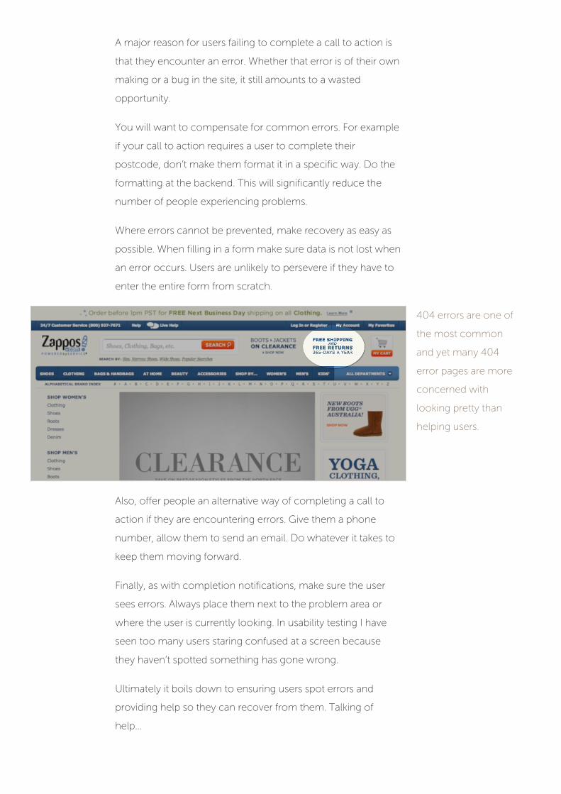
404 errors are one of
the most common
and yet many 404
error pages are more
concerned with
looking pretty than
helping users.
Also, offer people an alternative way of completing a call to
action if they are encountering errors. Give them a phone
number, allow them to send an email. Do whatever it takes to
keep them moving forward.
Finally, as with completion notifications, make sure the user
sees errors. Always place them next to the problem area or
where the user is currently looking. In usability testing I have
seen too many users staring confused at a screen because
they haven’t spotted something has gone wrong.
Ultimately it boils down to ensuring users spot errors and
providing help so they can recover from them. Talking of
help…

Accessing help
Whether the user has successfully completed a call to action
or not, it is important that they can get help afterwards.
Too many sites do their best to make it hard for users to
contact them, offering nothing more than FAQs. Others limit
communication to email. Unfortunately users are impatient
and often unwilling to wait for replies.
When we built the
Wiltshire Farm Foods
website we were very
aware the elderly
audience may have
questions and want to
speak to a real person.
Offering a telephone number or live chat system goes a long
way to reassuring users about their decision to complete a call
to action. The last thing you want is for them to regret their
choice.
Avoiding buyer’s remorse
Have you ever bought something and then regretted it
afterwards? Did you have a feeling that you made the wrong
decision?
This is referred to as buyer’s remorse. It can occur whenever
you make a decision that cannot easily be undone. You start
second guessing the decision and feeling a sense of anxiety.

This sense of buyers remorse can apply to a range of calls to
action, from purchases to handing over personal details for a
newsletter subscription.
Small things can trigger this feeling and makes it more likely
users will cancel their order and undo the decision they
originally made.
Its important that you put a lot of consideration into how you
will reassure the user. This maybe emphasising the benefits the
user will receive from completing the call to action or offering
a small thank you gift.
The trick is to exceed the users expectations rather than merely
meeting them.
Going above and beyond
Ultimately the best way to follow through on your calls to
action, is to exceed expectations and offer exceptional service.
That is what companies like Zappos (http://www.zappos.com/)
do so well. With their 365 day free return policy, they go above
and beyond the industry norm.
There are so many opportunities to go beyond expectations.
Some ideas could include:
Offering a customer support line that picks up straight
away rather than leaving you on hold.
Having 24/7 live chat support.
Paying for postage on returns.
Giving subscribers to your newsletter exclusive content
or gifts.
Personally thanking people when they recommend you
on social networks and rewarding them.

Even when you make mistakes, there are opportunities to
exceed expectations. Take for example Jawbone. When they
first released their Jawbone UP (https://jawbone.com/up) it
had a serious fault that caused problems for a huge number of
users.
When Jawbone had
problems with their
UP product, they far
exceeded their users
expectations with an
impressive return
policy.
Not only did Jawbone offer a full refund they also provided
unlimited replacements if your Jawbone broke. All with no
requirement to return it or even prove the device was broken.
Unfortunately few companies endeavour to exceed user
expectations. In fact many fail to even meet them.
Avoid unwelcome surprises
All too often completing a call to action leads to unexpected
consequences. One user signs up for a newsletter expecting
an email once a week and find themselves spammed daily.
Another decides to buy a product only to be stung with a
delivery charge they hadn’t expected. The sad truth is that
many websites hide surprises in the metaphorical small print.

ASOS do a great job
at clearly explaining
the cost of delivery
before the user goes
to make a purchase.
You will quickly lose any goodwill that lead users to complete
a call to action if you aren’t entirely transparent up front. This is
particularly important with delivery.
Delivering
If your call to action involves delivering a product of some kind
(whether physical or electronic), it is important to handle that
delivery process with care.
First, bear in mind my previous comments about unwelcome
surprises. So if you have to charge delivery for your item, make
sure you are very clear about that upfront. Don’t wait until the
user has filled in all their details before dropping that
bombshell on them. Yes, they are probably less likely to drop
out once they have bothered to enter their details, however
you will royally piss them off in the process.
Second, think about timescales. When a user completes a call
to action they not only want to know what happens next, they
also want to know when it is going to happen.
For example, if a user completes a contact form they want to
know how quickly somebody will be back to them. If they have
purchased a physical product, they want to know when it will
be delivered.

If you open a support
ticket with Basecamp
it clearly indicates
how quickly you can
expect a reply.
Its even important to be clear about delivery with electronic
goods. Will the product be delivered instantly or will they need
to wait for it to be manually approved?
If items are not delivered to the users expectations then you
lose their goodwill. You will need that goodwill if you wish
them to complete future calls to action.
Secondary calls to action
Website owners rarely consider what users should do once
they complete the primary call to action. The presumption is
that the ‘transaction’ is done and so the user is left to their own
devices.
For example, on an ecommerce site the order confirmation
page often contains nothing more than a ‘continue shopping’
link. Why do I need a link for this? Why would I want to
continue shopping when I have just finished? Surely there is a
better secondary call to action to put in here?

If a user has just
bought a laptop from
you, now is a good
time to ask them to
follow you on Twitter.
Instead of leaving users hanging at the end of the process,
direct them towards a new call to action. For example, if they
have just signed up to a newsletter suggest they might want to
consider following you on Twitter. If they have just placed an
order suggest they signup for the newsletter to get exclusive
discounts.
There is always something else users could be doing. You just
need to ask. But, what happens if the user doesn’t complete
the primary call to action properly.
Recovering from false starts
Recently my son decided he wanted to give some of his
birthday money to charity. Together we used my iPad to
donate to Charity Water (http://www.charitywater.org/) .
Unfortunately we could not donate on their website via an iOS
device, so decided to do it later.
The next day I received an email from them thanking me for
my attempt to donate and encouraging me to complete the
process. They had collected my email address, recognised that
I hadn’t followed through on their call to action and
intervened.

Charity Water follows
up via email if you fail
to complete their
donation process.
This is a great example of encouraging users to complete a call
to action they started, but didn’t finish.
The lesson here is to get people’s contact information early.
This would enable you to follow up on a range of calls to
action from abandoned shopping baskets to incomplete
contact forms.
However, even if the user has given you no information you
can still help them recover from false starts. If they are in the
middle of a call to action process, remember their information
if they drop out. That way if they return later to finish their
purchase or contact us form, they don’t have to start from
scratch.
Conclusion
The message here is a simple one; don’t see a call to action as
the end. It is only the beginning of your relationship with users.
When a user completes a call to action they are trusting you.
They trust you with their time, money or personal details. Don’t
let them down and give them a great user experience at every
step.