when red is not red: understanding the importance of color
TRANSCRIPT
Quality control of the colors
A great printer isn’t going to perform at its best if the people running the machines aren’t trained to
verify the consistency and make the necessary adjustments. Every individual printer in our retail stores
and closed-door production facilities print a set of color bars daily. It must measure within the
tolerances of strict industry standards every time. All our printers make this check. This QC process
is part of our proprietary workflow software.
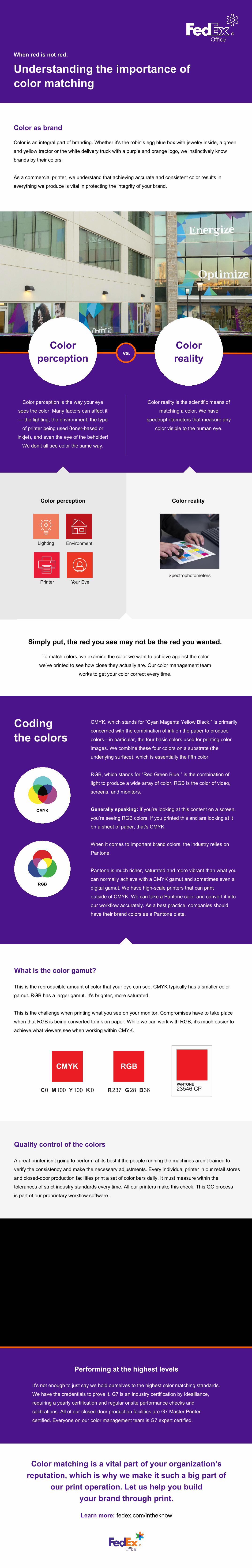
SpectrophotometersPrinter Your Eye
Color perception is the way your eye
sees the color. Many factors can affect it
— the lighting, the environment, the type
of printer being used (toner-based or
inkjet), and even the eye of the beholder!
We don’t all see color the same way.
Color reality is the scientific means of
matching a color. We have
spectrophotometers that measure any
color visible to the human eye.
Understanding the importance of color matching
Color as brand
Color is an integral part of branding. Whether it’s the robin’s egg blue box with jewelry inside, a green
and yellow tractor or the white delivery truck with a purple and orange logo, we instinctively know
brands by their colors.
As a commercial printer, we understand that achieving accurate and consistent color results in
everything we produce is vital in protecting the integrity of your brand.
When red is not red:
Simply put, the red you see may not be the red you wanted.
Color perception Color reality
To match colors, we examine the color we want to achieve against the color
we’ve printed to see how close they actually are. Our color management team
works to get your color correct every time.
What is the color gamut?
This is the reproducible amount of color that your eye can see. CMYK typically has a smaller color
gamut. RGB has a larger gamut. It’s brighter, more saturated.
This is the challenge when printing what you see on your monitor. Compromises have to take place
when that RGB is being converted to ink on paper. While we can work with RGB, it’s much easier to
achieve what viewers see when working within CMYK.
Lighting Environment
CMYK
CMYK, which stands for “Cyan Magenta Yellow Black,” is primarily
concerned with the combination of ink on the paper to produce
colors—in particular, the four basic colors used for printing color
images. We combine these four colors on a substrate (the
underlying surface), which is essentially the fifth color.
RGB, which stands for “Red Green Blue,” is the combination of
light to produce a wide array of color. RGB is the color of video,
screens, and monitors.
Generally speaking: If you’re looking at this content on a screen,
you’re seeing RGB colors. If you printed this and are looking at it
on a sheet of paper, that’s CMYK.
When it comes to important brand colors, the industry relies on
Pantone.
Pantone is much richer, saturated and more vibrant than what you
can normally achieve with a CMYK gamut and sometimes even a
digital gamut. We have high-scale printers that can print
outside of CMYK. We can take a Pantone color and convert it into
our workflow accurately. As a best practice, companies should
have their brand colors as a Pantone plate.
Codingthe colors
Performing at the highest levels
It’s not enough to just say we hold ourselves to the highest color matching standards.
We have the credentials to prove it. G7 is an industry certification by Idealliance,
requiring a yearly certification and regular onsite performance checks and
calibrations. All of our closed-door production facilities are G7 Master Printer
certified. Everyone on our color management team is G7 expert certified.
CMYK
C0 M100 Y100 K 0
RGB
R237 G28 B36 23546 CPPANTONE
Color matching is a vital part of your organization’s reputation, which is why we make it such a big part of
our print operation. Let us help you buildyour brand through print.
Learn more: fedex.com/intheknow
vs.Color
perceptionColorreality
RGB