www smashing magazine com
TRANSCRIPT

8/8/2019 Www Smashing Magazine Com
http://slidepdf.com/reader/full/www-smashing-magazine-com 1/13
By Vitaly Friedman January 31st, 2008 Design 284 Comments Publ ishing Policy
10 Principles Of Effective Web
Design
Advertisement
Usability and the utility, not the visual design, dete rmine the s uccess or failure of a
we b-site. Since the visitor of the page is the only person w ho clicks the mouse and
therefore decides everything, user-centric design has become a standard approach
for succes sful and profit-oriented web des ign. After al l, if users can’ t use a fea ture, it
might as well not exist.
We aren’t going to discuss the implementation details (e.g. where the search box
should be placed) as it has already been done in a number of articles; instead we
focus on the main principles, heuristics and approaches for effective web design
— approaches which, used properly, can lead to more sophisticated design decisions
and s implify the proces s of perceiving prese nted information.
Please notice that
you might be interes ted in the usability-related a rticles abo ut 10 Usability
Nightmares and 30 Usability Issues we’ve published before,
we ’ll cover more principles of effective design in o ur following pos ts. Therefore
you might wa nt to subscribe to our RSS-feed.
This article has been translated to Hebrew.
[By the way, did you know w e have a free Email Newsletter? Subscribe now a nd get
fresh short tips and tricks in your inbox!]
Principles Of Effective Web Design
In order to use the principles properly we first need to understand how users
interact with web-sites, how they think and what are the basic patterns of users’
behavior.
How do users think?
Basically, users’ habits on the Web a ren’t that different from customers’ habits in a
store. Visitors glance at e ach new page , scan some of the text, and click on the first
link that catches their interest or vague ly resembles the thing they’re looking for. In
fact, there are large parts of the page they don’t even look at.
Smashing Network
Advertisement
Useful Adobe Photoshop Techniques , Tutorials and Tools
smashingmagazine.com
Blockquote Bulge
css-tricks.com
Free 960.GS CSS Photography Template and Tutorial
designshack.co.uk
Quitting Your Job to Become a Freelancer
freelancefolder.com
Beyond Visible: 100 Years Of Infrared Photographs
noupe.com
50 Awesome Speed Paintings for Your Inspiration
onextrapixel.com
Magazine RSS Feed
206,572 readers
Follow us on Twitter
257,315 followers
Advertise with us!
MailC himp E-Ma il Ma rk eting PSD to HTML Service s
PS D to HTML C reate fre e stunning flash we bsites!
FlippingBook Photographer A new service f rom Adobe.
News le tter Design & Cod ing Online Projec t Management
White-Label SEO Services Premium Blog Themes
Smashing Magazine Smashing Network
Network Jobs
HomeShop
GraphicsWallpapers, Icons
InspirationPhotos, Showcases
CodingCSS, JS, WordPress
DesignPSD, Fonts, Freebies
Email Newsletter
Search
Go!
converted by Web2PDFConvert.com
8/8/2019 Www Smashing Magazine Com
http://slidepdf.com/reader/full/www-smashing-magazine-com 2/13
Most users s earch for something interesting (or useful) and clickable; as so on as
some promising candidates a re found, users click. If the new page does n’t meet
users’ expe ctations, the Back button is clicked and the s earch process is continued.
Users appreciate quality and credibility. If a page provides use rs with high-
quality content, they are willing to compromise the conte nt with
advertisements and the design of the site. This is the reason why not-that-
we ll-designe d we b-sites with high-quality content ga in a lot of traffic over
years. Content is more important than the de sign which suppo rts it.
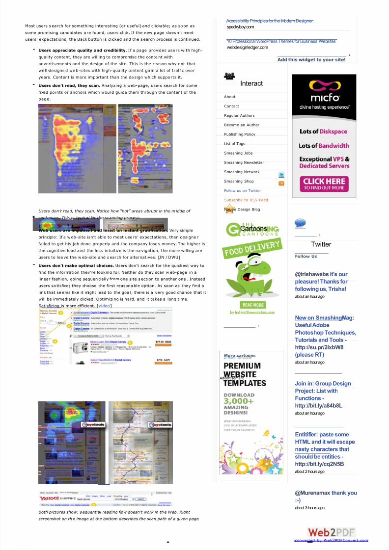
Users don’t read, they scan. Analyzing a web-page, users search for some
fixed po ints or anchors which wou ld guide them through the content of the
page.
Users don’t read, they scan. Notice how “hot” areas abrupt in the m iddle of
sentences. This is typical for the scanning process.
Web users are impatient and insist on instant gratification. Very simple
principle: If a web-site isn’t able to meet use rs’ expectations, then designe r
failed to get his job done properly and the company lose s money. The higher is
the cognitive load and the less intuitive is the na vigation, the more willing are
users to lea ve the w eb-site and s earch for alternatives. [JN / DWU]
Users don’t make optimal choices. Users don’t search for the quickest way to
find the information they’re looking for. Neither do they scan w eb-page in a
linear fashion, going sequen tially from one site s ection to another one . Instead
users sa tisfice; they choose the first reasonable option. As soon as they find a
link that se ems like it might lead to the goa l, there is a very good chance that it
will be immediately clicked. Optimizing is hard, and it takes a long time.
Satisficing is more efficient. [video]
Both pictures show: s equential reading flow doesn’t work in the Web. Right
screenshot on the image at the bottom describes the scan path of a given page.
Add this widget to your site!
Interact
About
Contact
Regular Authors
Become an Author
Publishing Policy
List of Tags
Smashing Jobs
Smashing Newsletter
Smashing Network
Smashing Shop
Follow us on Twitter
Subscribe to RSS-Feed
Noupe Design Blog
Cartoons
More cartoons
Advertisement
Advertisement
Follow Us
@trishawebs it's our
pleasure! Thanks for
following us, Trisha!about an hour ago
New on SmashingMag:
Useful Adobe
Photoshop Techniques,
Tutorials and Tools -
http://su.pr/2lxbW8
(please RT)
about an hour ago
Join in: Group DesignProject: List with
Functions -
http://bit.ly/a84b8L
about an hour ago
Entitifier: paste some
HTML and it will escape
nasty characters that
should be entities -
http://bit.ly/cq2N5B
about 2 hours ago
@Murenamax thank you
:-)
about 3 hours ago
Accessibility Principles for the Modern Designer
speckyboy.com
10 Professional WordPress Themes for Business Websites
webdesignledger.com
converted by Web2PDFConvert.com

8/8/2019 Www Smashing Magazine Com
http://slidepdf.com/reader/full/www-smashing-magazine-com 3/13
Users follow their intuition. In most cases users muddle through instead of
reading the information a d esigne r has provided . According to Steve Krug, the
basic reaso n for that is that users don’t care. “If we find something that wo rks,
we stick to it. It doesn’t matter to us if we understand how things w ork, as
long as w e can use them. If your audience is going to act like you’re designing
billboard, then design g reat billboards.”
Users want to have control. Users want to be able to control their browser
and rely on the consistent data presentation throughout the site. E.g. they
don’t want new windows po pping up unexpectedly and they want to be able
to get ba ck with a “Back”-button to the s ite they’ve been be fore: therefore it’s
a good practice to never open links in new browser windows .
1. Don’t make users think
According to Krug’s first law of usability, the we b-page should be obvious and self-
explanatory . When you’re creating a site, your job is to get rid of the question marks
— the decisions use rs need to make consciously, considering pros, cons and
alternatives.
If the navigation and site architecture aren’t intuitive, the number of que stion marks
grows a nd makes it harder for users to comprehend how the system works and how
to get from point A to point B. A clear structure, moderate visual clues and ea sily
recognizable links can help us ers to find their path to their aim.
Let’s take a look at an example. Beyondis.co.uk claims to be “beyond channels,
beyond products, beyond distribution”. What does it mean? Since use rs tend to
explore web-sites according to the “F”-pattern, these three statements would be the
first elements users will see on the page once it is loaded.
Although the des ign itself is simple and intuitive, to understand wh at the pa ge is
about the us er need s to sea rch for the answ er. This is what an unnecessary question
mark is. It’s designer’s tas k to make sure that the numbe r of question marks is close
to 0. The visual explana tion is placed on the right hand s ide. Just exchanging both
blocks would increase usability.
ExpressionEngine uses the very same structure like Beyondis, but avoids
unnecess ary question marks. Furthermore, the slogan b ecomes functional as users
are provided with options to try the service and download the free version.
By reducing cognitive load you make it easier for visitors to grasp the idea be hind the
system. Once you’ve achieved this, you can communicate why the system is useful
and how users can be nefit from it. Peo ple won’t use your we b site if they can’t find
their way around it.
2. Don’t squander users’ patience
Popular 2010
Web Design Trends 2010
100 iPhone Wallpapers
100 Wordpress Themes 2010
100 Wordpress Themes 2009
45 Useful Checklists
30 Free High-Quality Fonts
More Free High-Quality Fonts
Printable PDF Templates
iPhone App Design
Facebook Fan Page Design
Beauty-Retouching Tutorials
Vintage & Re tro Tutorials
Photoshop Time-Savers
Bizarre a nd Funny Websites
Useful Usab ility Findings
Business Card Design
Color Theory For Designers
Photoshop Actions
Photoshop Custom Shapes
Photoshop Text Effects
Photoshop Tutorials: Best of
Glossaries For Web Designers
Free UI and Wireframing Kits
Desktop Wallpapers I
Desktop Wallpapers II
Dual-Screen Wallpapers
Navigation Design Trends
Powerful Time-Savers
Wordpress Themes for 2009
Illustrator Tutorials
Free Icon Sets I
Free Icon Sets II
Free Icon Sets III
E-Mail Newsletter Design
Free Design Templates
53 CSS Techniques
50 jQuery Techniques
50 CSS Techniques
Graffiti Artworks I
Graffiti Artworks II
Photography: Black & White
Photography Techniques
Fantastic HDR Photos
Stunning Pictures and Photos
Transparent Screen Photos
What are your most
useful and valuable
sites with strong focus
on usability and user
experience? #smux
about 3 hours ago
UX Myths: debunking
user experience
misconceptions -http://uxmyths.com
about 3 hours ago
Are CSS Frameworks
Evil? -
http://bit.ly/bOWN2x-
Well, are they? #smcss
about 3 hours ago
@iA nice one, Oliver,
Writers looks great!
Maybe you would like to
give away a couple of
licenses to our Twitter
followers / Facebook
fans?
about 4 hours ago
@droudable das macht
eigentlich nichts ;-)
Danke für Deine
Retweets, Jürgen!
about 4 hours ago
converted by Web2PDFConvert.com

8/8/2019 Www Smashing Magazine Com
http://slidepdf.com/reader/full/www-smashing-magazine-com 4/13
In every project whe n you are going to offer your visitors some service or tool, try to
keep your us er requirements minimal. The less action is required from users to test a
service, the more likely a ran dom visitor is to a ctually try it out. First-time visitors are
willing to play with the service, not filling long w eb forms for an account they might
never use in the future. Let use rs explore the site a nd discover your services w ithout
forcing them into sharing private data . It’s not reaso nable to force use rs to enter an
email address to test the feature.
As Ryan Singer — the d eveloper of the 37Signals te am — states, users would
probably be eager to provide an email address if they were asked for it after they’d
seen the feature w ork, so they had some idea of w hat they were going to get in
return.
Stikkit is a pe rfect example for a user-friendly service which requires a lmost nothing
from the visitor which is unobtrusive and comforting. And that’s w hat you w ant your
users to feel on your web site.
Apparently, Mite requires more. However the reg istration can be done in less than 30
seconds — as the form has horizontal orientation, the user doesn’t even need to
scroll the page.
Ideally remove all barriers, don’t require subscriptions or registrations first. A user
registration alone is enough of an impediment to user navigation to cut down on
incoming traffic.
3. Manage to focus users’ attentionAs web-sites provide both static and dynamic content, some aspects of the user
interface attract attention more than others d o. Obviously, images a re more eye-
catching than the text — just as the se ntences marked a s bold are more a ttractive
than plain text.
converted by Web2PDFConvert.com

8/8/2019 Www Smashing Magazine Com
http://slidepdf.com/reader/full/www-smashing-magazine-com 5/13
The human eye is a highly non-linear de vice, and w eb-users can instantly recognize
edges, patterns and motions. This is why video-base d advertisements a re extremely
annoying and distracting, but from the marketing perspective they perfectly do the
job of capturing users’ atte ntion.
Humanized.com perfectly uses the principle of focus. The only element w hich is
directly visible to the users is the word “free” which works attractive and appealing,
but still calm and purely informative. Subtle hints provide users w ith enough
information of how to find more abo ut the “free” product.
Focusing users’ attention to specific areas of the site with a moderate use of visual
elements can he lp your visitors to ge t from point A to point B without thinking of how
it actually is suppose d to be d one. The less que stion marks visitors have, the better
sense of orientation they have and the more trust they can develop towards the
company the site represents. In other words: the less thinking needs to happen
behind the s cenes, the be tter is the user expe rience which is the aim of usability in
the first place.
4. Strive for feature exposure
Modern web designs are usually criticized due to their approach of guiding users with
visually appealing 1-2-3-done-steps, large b uttons w ith visual effects etc. But from
the des ign perspe ctive these elements actually aren’t a bad thing. On the contrary,
such guidelines are extremely effective as they lead the visitors through the site
content in a very simple and us er-friendly way.
Dibusoft.com combines visual appea l with clear site structure. The site has 9 main
navigation options which are visible at the first glance. The choice of colors might be
too light, though.
Letting the user see clearly what functions are available is a funda mental principle
of successful user interface de sign. It doesn’t really matter how this is achieved.
Wha t matters is that the content is well-understo od and visitors feel comfortable
with the way they interact with the system.
5. Make use of effective writing
As the We b is different from print, it’s necessa ry to adjust the w riting style to us ers’
preferences and browsing habits. Promotional writing won’t be read. Long text blocks
converted by Web2PDFConvert.com
8/8/2019 Www Smashing Magazine Com
http://slidepdf.com/reader/full/www-smashing-magazine-com 6/13
without images and keywords marked in bold or italics will be skipped. Exaggerated
language w ill be ignored.
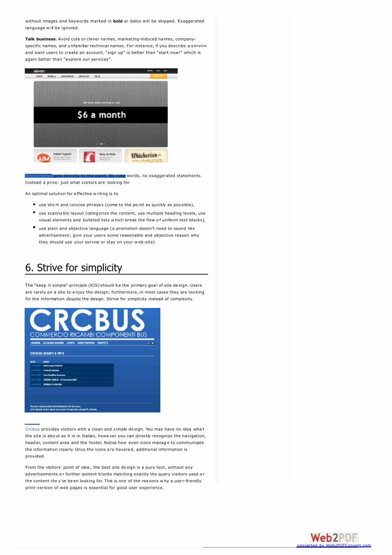
Talk business. Avoid cute or clever na mes, marketing-induced names, company-
specific names, and u nfamiliar technical names. For instance, if you describe a s ervice
and want users to create an account, “sign up” is better than “start now!” which is
again better than “explore our services”.
Eleven2.com gets directly to the point. No cute words, no exaggerated statements.
Instead a price: just what visitors are looking for.
An optimal solution for e ffective w riting is to
use sho rt and concise phrase s (come to the po int as quickly as pos sible),
use scanna ble layout (categorize the content, use multiple heading levels, use
visual elements and bulleted lists which break the flow o f uniform text blocks),
use plain and objective language (a promotion doesn’t need to sound like
advertisement; give your users some reasonable and objective reason why
they should use your service or stay on your w eb-site)
6. Strive for simplicity
The “keep it simple”-principle (KIS) should b e the primary goa l of site de sign. Users
are rarely on a site to e njoy the design; furthermore, in most cases they are loo king
for the information despite the design. Strive for simplicity instead of complexity.
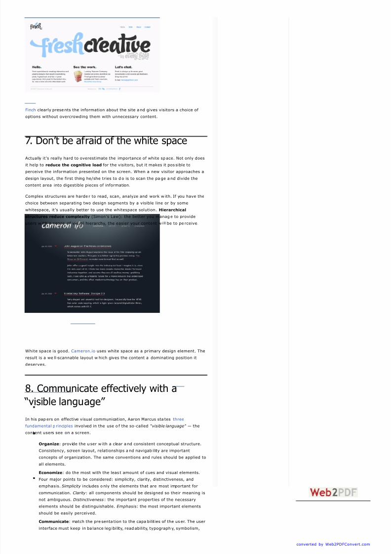
Crcbus provides visitors with a clean and s imple de sign. You may have no idea wha t
the site is abo ut as it is in Italian, howe ver you can directly recognize the navigation,
header, content area and the footer. Notice how even icons manag e to communicate
the information clearly. Once the icons a re hovere d, additional information is
provided.
From the visitors’ point of view , the best site de sign is a pure text, without any
advertisements o r further content b locks matching exactly the query visitors used o r
the content the y’ve be en looking for. This is one of the rea sons w hy a use r-friendly
print-version of web pages is essential for good user experience.
converted by Web2PDFConvert.com
8/8/2019 Www Smashing Magazine Com
http://slidepdf.com/reader/full/www-smashing-magazine-com 7/13
Finch clearly prese nts the information about the site a nd gives visitors a choice of
options without overcrowding them with unnecessary content.
7. Don’t be afraid of the white space
Actually it’s really hard to overestimate the importance of white sp ace. Not only does
it help to reduce the cognitive load for the visitors, but it makes it pos sible to
perceive the information presented on the screen. When a new visitor approaches a
design layout, the first thing he/she tries to d o is to scan the pa ge and divide the
content area into digestible pieces of information.
Complex structures are harde r to read, scan, analyze and work w ith. If you have the
choice between separating two design segments by a visible line or by some
whitespace, it’s usually better to use the whitespace solution. Hierarchical
structures reduce complexity (Simon’s Law): the better you manage to provide
users w ith a sense of visual hierarchy, the easier your content w ill be to pe rceive.
White space is good. Cameron.io uses white space as a primary design element. The
result is a we ll-scannable layout w hich gives the content a dominating position it
deserves.
8. Communicate effectively with a “visible language”
In his pap ers on effective visual communication, Aaron Marcus sta tes three
fundamental p rinciples involved in the use o f the so-called “visible language” — the
content users see on a screen.
Organize: provide the u ser w ith a clear a nd consistent conceptual structure.
Consistency, screen layout, relationships and navigab ility are important
concepts of organization. The same conventions and rules should be applied to
all elements.
Economize: do the most with the leas t amount of cues and visual elements.
Four major points to be considered: simplicity, clarity, distinctiveness, and
emphasis. Simplicity includes o nly the elements that are most important for
communication. Clarity : all components should be designed so their meaning is
not ambiguous. Distinctiveness: the important properties of the necessary
elements should be distinguishable. Emphasis: the most important elements
should be easily perceived.
Communicate: match the pre senta tion to the capa bilities of the us er. The user
interface must keep in ba lance leg ibility, readability, typograph y, symbolism,
converted by Web2PDFConvert.com

8/8/2019 Www Smashing Magazine Com
http://slidepdf.com/reader/full/www-smashing-magazine-com 8/13
multiple views , and color or texture in order to communicate successfully. Use
max. 3 typefaces in a maximum of 3 point sizes — a maximum of 18 wo rds or
50-80 characters per line of text.
9. Conventions are our friends
Conventional design of site elements doesn’t result in a boring web site. In fact,
conventions are very useful as the y reduce the learning curve, the need to figure
out how things wo rk. For instance, it wo uld be a us ability nightmare if all we b-sites
had d ifferent visual pres entation o f RSS-feed s. That’s not that different from our
regular life w here we tend to get used to basic principles of how w e organize data
(folders) or do shopp ing (placement of products).
With conventions you can g ain users’ confidence, trust, reliability and prove your
credibility. Follow users’ expectations — understand what they’re expecting from a
site navigation, text structure, search placement etc. (see Nielsen’s Usability Alertbox
for more information)
BabelFish in use: Amazon.com in Rus sian.
A typical example from usability sessions is to trans late the pa ge in Japane se
(assuming your web users don’t know Japanese, e.g. with Babelfish) and provide
your usability teste rs with a tas k to find something in the page of different language .
If conventions are we ll-applied, users w ill be ab le to achieve a not-too-specific
objective, even if they can’t understand a word o f it.
Steve Krug suggests that it’s better to innovate only when you know you reallyhave a better idea, but take advantages of conventions when you don’t.
10. Test early, test often
This so-called TETO-principle should be applied to e very web d esign project as
usability tests often provide crucial insights into significant problems and issue s
related to a given layout.
Test not too late, not too little and n ot for the wrong re asons . In the latter case it’s
necessary to understand that most design decisions are local; that means that you
can’t universally answer whether some layout is better than the other one as you
need to ana lyze it from a very spe cific point of view (considering requirements,
stakeholders, budget etc.).
Some important p oints to keep in mind:
according to Steve Krug, testing one user is 100% better than testing none
and testing one user early in the project is better than testing 50 near the
end. Accoring to Boehm’s first law , errors are most frequent during
requirements and design activities and are the more expensive the later they
are removed.
testing is an iterative process. That means tha t you design so mething, test it,
fix it and then tes t it again. There might be problems w hich haven’t been found
during the first round as users w ere practically blocked by other problems.
usability tests always produce useful results. Either you’ll be pointed to the
problems you have or you’ll be pointed to the absence of major design flaws
which is in both case s a us eful insight for your project.
according to Weinberg’s law, a developer is unsuited to test his or her code .
This holds for designers as well. After you’ve worked on a site for few weeks,
you can’t observe it from a fresh pe rspective anymore. You know how it is built
and therefore you know exactly how it works — you have the w isdom
independent testers and visitors of your site wouldn’t have.
converted by Web2PDFConvert.com

8/8/2019 Www Smashing Magazine Com
http://slidepdf.com/reader/full/www-smashing-magazine-com 9/13
Homepage Twitter Page
Bookmark Vote up Retweet Share
Bottom line: if you want a great s ite, you’ve go t to test.
References
Designing Effective Us er Interfaces by Suzanne Martin
Summary on Web Design
UID presentation (Flash)
Resea rch-Based Web Design & Us ability Guidelines
“The psychology of computer programming” by Gerald Weinberg
“Designing Web Usability” by Jakob Nielsen [JN / DWU]
“Prioritizing Web U sability” by Jakob Nielsen
“Don’t Make Me Think” by Steve Krug
“Usability for the We b: Designing Web Sites tha t Work” by Tom Brinck, Darren
Gergle, Scott Wood
A Summary of Principles for User-Interface Design
Like 129 people like this.
Vitaly FriedmanVitaly Friedman, editor-in-chief of Smashing Magazine, an
online magazine dedicated to designers and developers.
26
Tags: development, guidelines, interfaces, usability, webdesign
Advertising
251
Reply
Cezar March 3rd, 2010 5:12 am
GOLD!!!!!!!!! Awesome! Thank you!
252
Reply
Louise Bayne March 3rd, 2010 10:31 am
I love your web site
253
Reply
denzil March 4th, 2010 2:39 pm
good post serves as a good guide for website development
254
Reply
usabiliadades March 7th, 2010 6:49 am
Hmmm… In the point (2)…..the action button is to far from the last input
of the form. Maybe it was good practice, position the primary actionbutton below the checkbox….just an opinion based on the heat map
experience.
284 Comments
converted by Web2PDFConvert.com

8/8/2019 Www Smashing Magazine Com
http://slidepdf.com/reader/full/www-smashing-magazine-com 10/13
255
Reply
jhen March 8th, 2010 8:52 pm
ITS OK
256
Reply
Amy paul March 9th, 2010 7:51 am
I just was on the site for 10 Principles Of Effective Design at
http://www.smashingmagazine.com/2008/01/31/10-principles-of-effective-
web-design/ and loved this site so much that I wanted to get a screen
shot of one of the points talked about for my college class in Web
Design I at the University of Phoenix if that is alright? My reason was notfor a comment but to say is a wonderfully easy site but how do I take a
screen shot using a Mac Desktop Computer I am not used to using this
new computer and would really love some help I see the ” fn” button but
do not see a “prt Sc” to do this does Does anyone know how to do this?
I am lost here.
Thanks,
Amy P Omaha NE College Student in IT ,,,
257
Reply
Sean March 15th, 2010 9:20 am
Very helpful info and right on. Thank for the examples!!!
258
Reply
Benjamin Heng March 19th, 2010 4:34 am
Simply amazing
259
Reply
stewart March 30th, 2010 10:18 pm
thanks for your tips, they really helped me, keep it real.
260
Reply
KristinJune 5th, 2010 11:38 am
Great article! Very informative! However, there are a lot of grammatical
errors. It’s a virtual epidemic throughout so many design articles. I
realize many designers may not speak English as a first language, but if
we’re going to discuss usability in the first place, let’s discuss having a
copywriter or editor on hand before we publish written content that may
be hard to read.
261
Reply
RD SHARIF June 19th, 2010 10:27 pm
cheers mate,
great tips and very useful. cheers
262
Reply
mujib June 22nd, 2010 1:33 am
i like cheese…
263
Reply
John Paul Carlo Uy-Calumpong June 27th, 2010 6:53 pm
Rating: 11 of 10. :-bd
264
Reply
yehey June 27th, 2010 6:55 pm
yoro kalbo
265bianca panhatten June 27th, 2010 6:57 pm
i agree with john
converted by Web2PDFConvert.com

8/8/2019 Www Smashing Magazine Com
http://slidepdf.com/reader/full/www-smashing-magazine-com 11/13
Reply
266
Reply
Zaoldyeck June 27th, 2010 6:59 pm
FRD <3
267
Reply
Yoro June 27th, 2010 7:02 pm
Yoro kalbo
268
Reply
urmom June 27th, 2010 7:02 pm
ur mom is afraid of white space
269
Reply
Derek Ramsey June 27th, 2010 7:03 pm
Im bald
270
Reply
j3j3m0n June 28th, 2010 4:46 am
0i,aYuzZz n@maN p0whzZz……
271
Reply
jem garcia June 28th, 2010 7:41 pm
chess i like
272
Reply
Mark June 28th, 2010 7:51 pm
I rock :)
273
Reply
urmom June 29th, 2010 11:33 pm
ur mom needs testing
274
Reply
mark aldaba June 30th, 2010 6:57 pm
mahal ko si tantan
275Reply
BLaCK EyEd PiSS July 1st, 2010 3:55 am
imma bee bee bee imma imma bee
276
Reply
Guru Tuginmypudha July 1st, 2010 3:59 am
G.U.R.U.
277
Reply
Marc July 11th, 2010 5:31 am
Great article. Very help ful tips guys! Keep the good job!
Web Design
278Lina Grebenyuk July 29th, 2010 10:25 am
Thank you! Very useful!
converted by Web2PDFConvert.com

8/8/2019 Www Smashing Magazine Com
http://slidepdf.com/reader/full/www-smashing-magazine-com 12/13
« Older Comments« Older Comments
Name * Email *
Leave a Comment
Make sure you enter the * required information where indicated. Please also rate the article
as it will help us decide future content and posts. Comments are moderated – and
rel="nofollow" is in use. Please no l ink dropping, no keywords or domains as names; do not
spam, and do not advertise!
Message*
Reply
279
Reply
Gunther August 6th, 2010 10:40 pm
Useless, dated information.
I work at a design company that handles many famous firms and clients.
You are way off. Your advise looks like Web design 101, year 1995. Get
a refresher course. I cant believe how little about web design many of
your visitors know.
Guys, this doesn’t work with the big firms. Nor even with the tiny firms.
280
Reply
donna September 1st, 2010 9:59 pm
major major
281
Reply
JOHN PAULO September 8th, 2010 10:49 pm
THANKS FOR THE NOTES!!!!!
282
Reply
MARK ALEJANDRO S. METIN September 8th, 2010 10:51 pm
HEY…….
WEW…..
WEAK SI PAULO.,……..
283
Reply
Martin Immafake September 21st, 2010 11:58 am
W0ah!
11 2
converted by Web2PDFConvert.com

8/8/2019 Www Smashing Magazine Com
http://slidepdf.com/reader/full/www-smashing-magazine-com 13/13
Categories
Graphics, Inspiration
Coding, Design
Photoshop, Wordpress
Tutorials, Wallpapers
Icons, CSS
Information
About Us
Regular authors
Become an Author
Publishing Policy
Advertise with us
Content
Smashing Shop
Smashing Book
Smashing Network
Mobile Version
Smashing E-Mail Newslette r
Smashing Job Board
Smashing Banners and Icons
Connect
Follow us on Twitter
Join us on Facebook
RSS Feed - Magazine
RSS Feed - Network
Contact us
Smashing Media GmbH. Created by Sven Lennartz & Vitaly Friedman | Back to top Design by Function, Team23 GbR