wynne kristin magppt
TRANSCRIPT
Kristin WynneFASHION: VOGUE
The genre that caught my eye was fashion because that’s what im basing my magazine on so it caught my attention the most.
Vogue caught my eye the most because al l of there magazines include a a lot of white space which I fi nd appealing.
Vogue magazine had the best photography. There models were dressed very artistical ly and posed very uniquely. There photography imposes wealth.
The magazine cover with the best design was Glamor magazine. The masthead and the cover l ine colors matched the colors of what the model was wearing.
Seventeen had the best articles that grabbed my attention the most because their cover l ines included brightly used colors and bolded words that drew me in.
The magazine that had the best table of contents was Style magazine. They had every article section organized with a number next to the article tit le matching a photo that was included in the article as well .
The magazine with the best articles was vogue. It included everything that I would want to talk about in my magazine such as what dresses to wear during the spring and makeup tips.
NEWSSTAND VISIT
I had learned from my newsstand visit that the fashion genre was what I definitely wanted to do for my magazine. What caught my attention the most was the photos and the way fashion magazines were designed especially Vogue. I liked how most of the masthead reflected what the colors of the cover lines would be.
After looking at the table of contents the design I like the most was simple and aligned. I enjoyed how the numbers included a sample text about the article.
REFLECTION
INSPIRATIONAL MAGAZINE
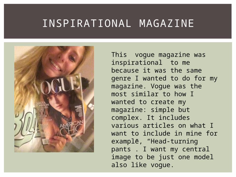
This vogue magazine was inspirational to me because it was the same genre I wanted to do for my magazine. Vogue was the most similar to how I wanted to create my magazine: simple but complex. It includes various articles on what I want to include in mine for example, “Head-turning pants”. I want my central image to be just one model also like vogue.
This magazine is about the high end fashion brands including prints of there latest fashion outfi ts. They also include tips for the hottest styles during the spring, summer, winter, etc. Also they provide an article about whoevers on there central image which can draw a readers attention if they find that celebrity appealing. They also provide real world news articles.
The target audience for this magazine involves successful middle aged women.
They have articles on: real world news situations makeup looks the celebrity in the central image
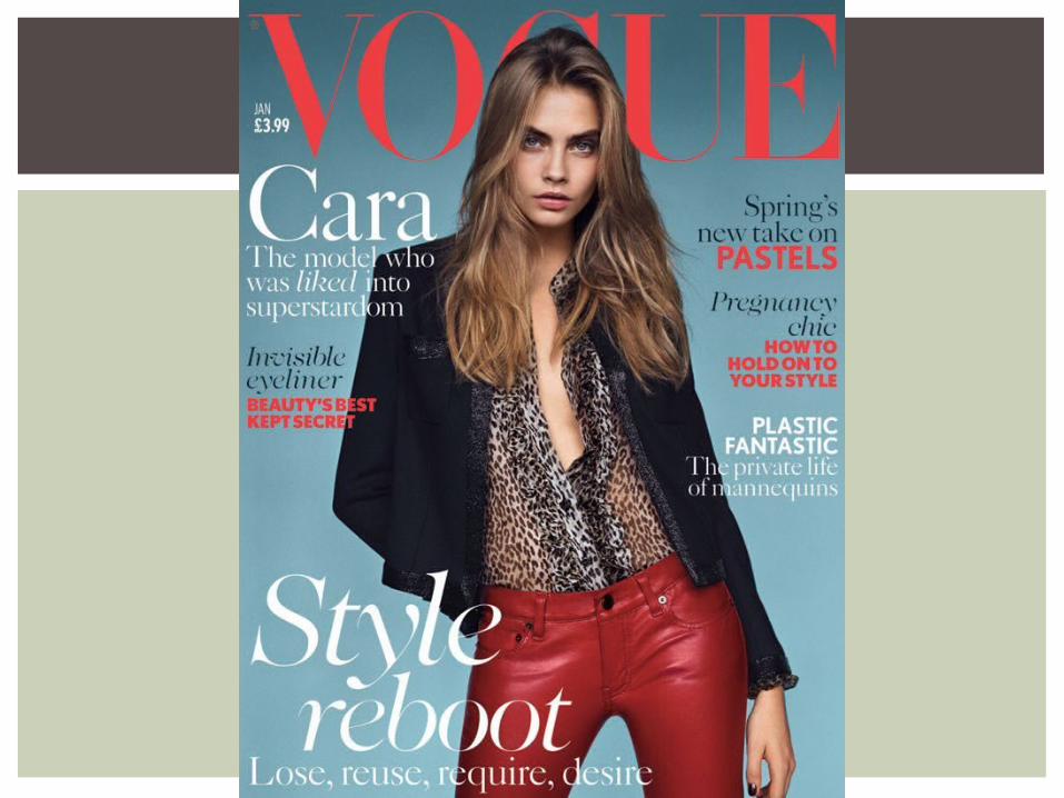
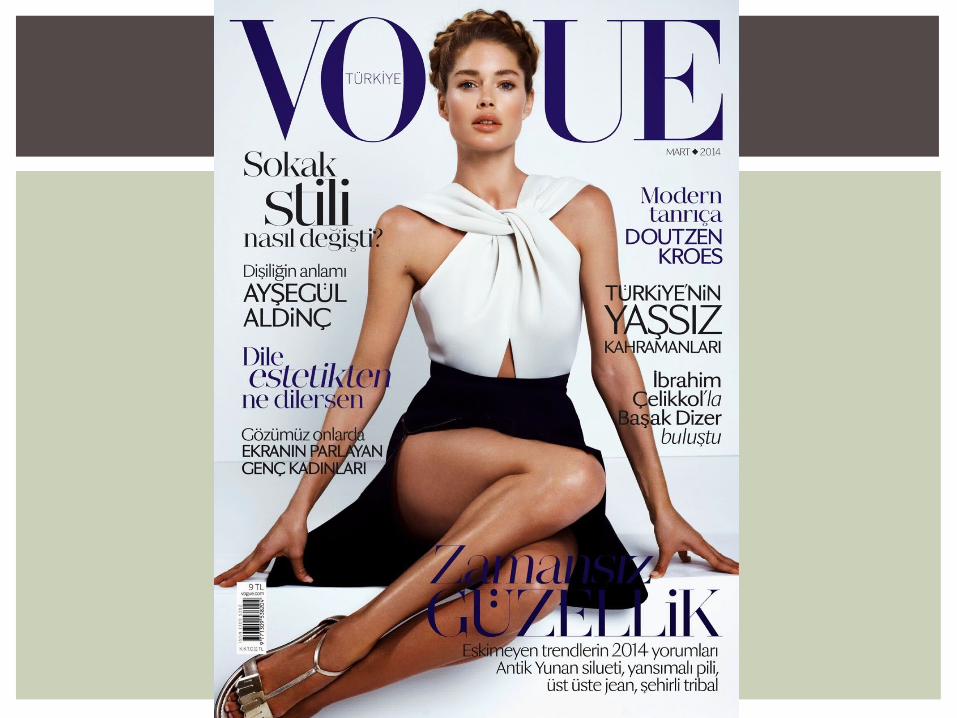
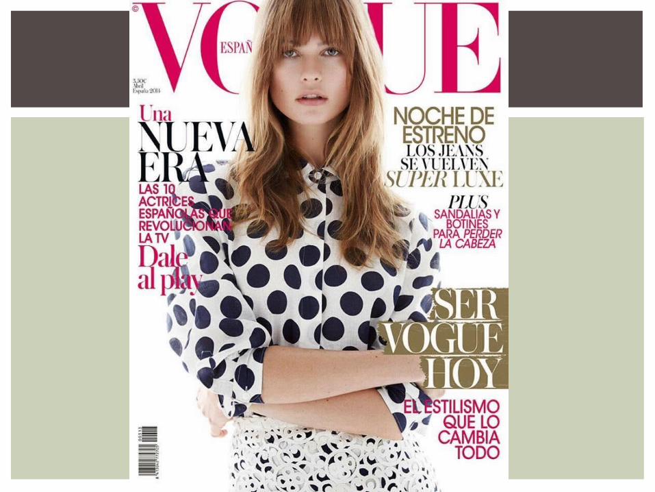
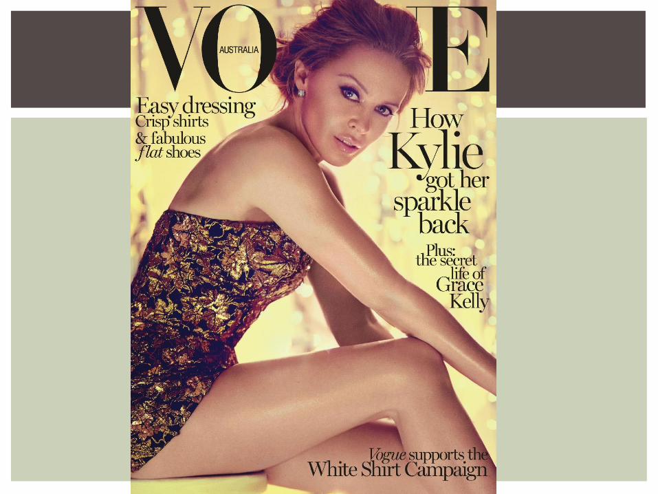
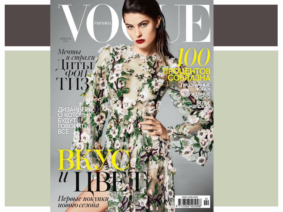
ABOUT VOGUE
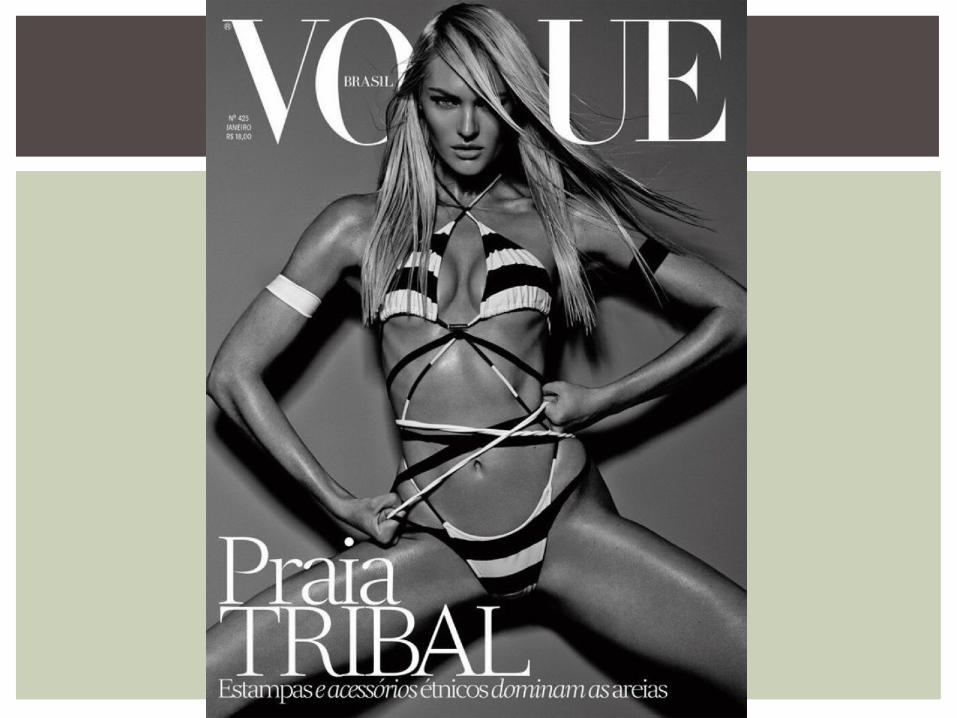
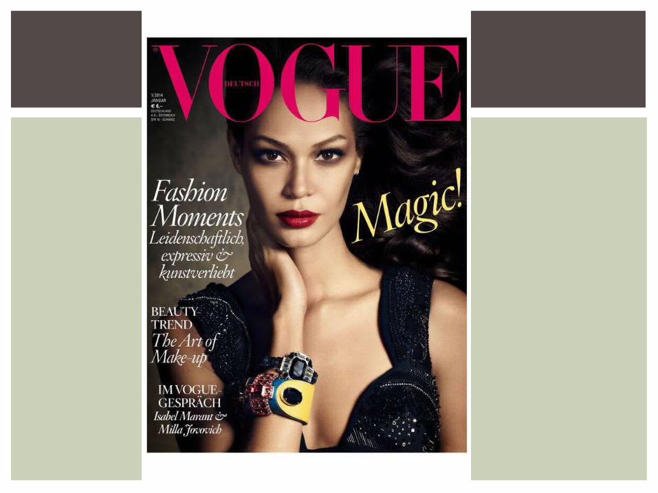
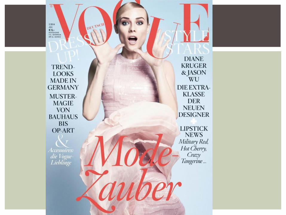
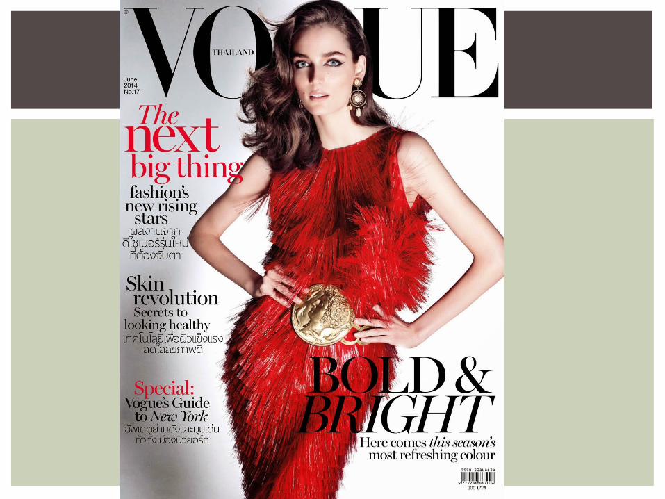
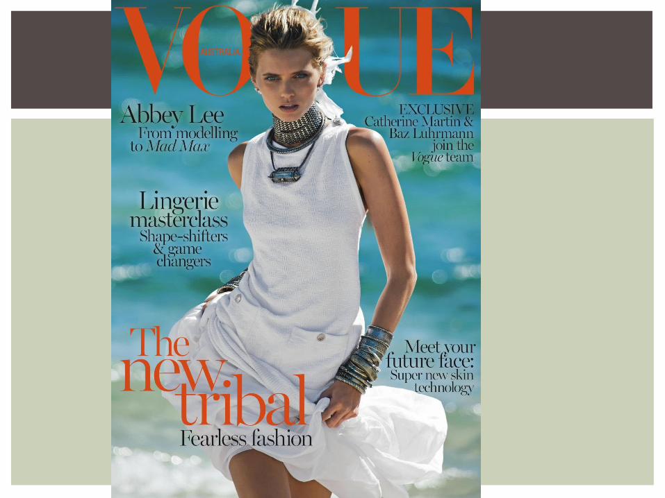
The central image on vogue magazines usually consist of one model or famous actor/singer who are depicted close up or in action shots.
Most of the photos seem to be taken in a studio due to the background being one color but every now an then you'll see one magazine shot outside somewhere like a beach, pool or field.
Common elements of vogue is typically where the models are standing. They are always almost placed in the middle covering the “G” in Vogue. Sometimes the “Vogue” will be placed over the central image. The masthead isn't the same colors, it depends on what the color the model is wearing or what color the cover lines are. Sometimes Vogue magazines include no cover lines or maybe only one.
VOGUE
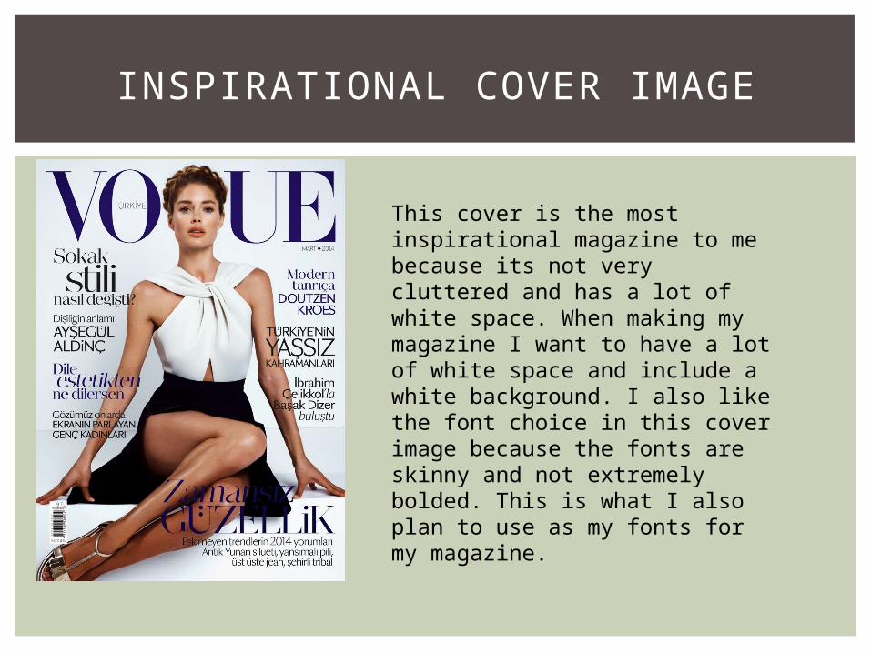
INSPIRATIONAL COVER IMAGE
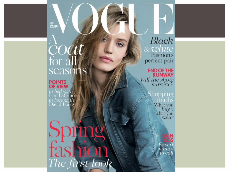
This cover is the most inspirational magazine to me because its not very cluttered and has a lot of white space. When making my magazine I want to have a lot of white space and include a white background. I also like the font choice in this cover image because the fonts are skinny and not extremely bolded. This is what I also plan to use as my fonts for my magazine.
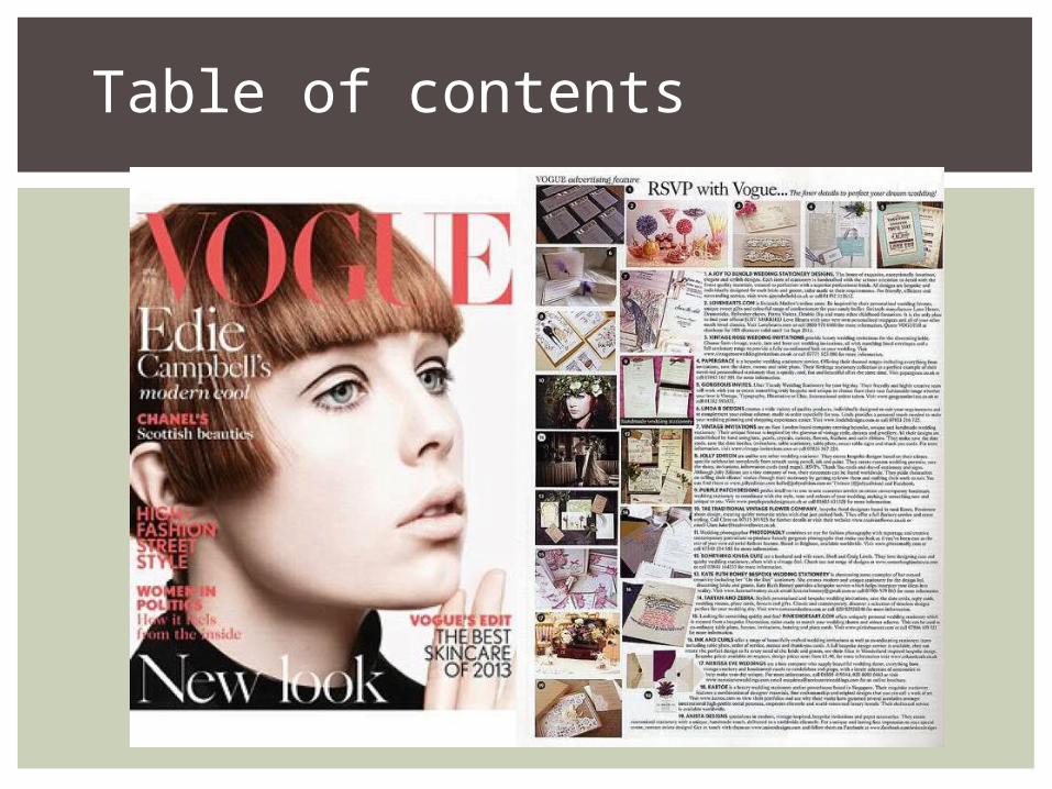
Table of contents
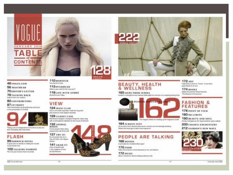
What's common between the table of contents in vogue is that they mostly all have a white background. The white background is filled with article cover lines that are always numbered and can have a picture matching the number.
WHAT'S IN COMMON?
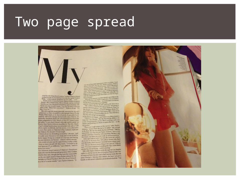
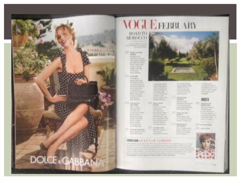
Two page spread
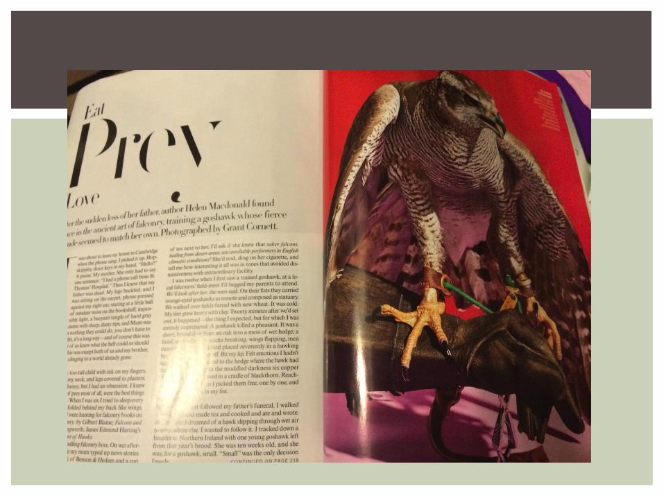
The articles from vogue have in common the enlarged word before starting the sentence. The huge word either starts the sentence or is the beginning title/intro to the article.
The covers of that issue are mostly the same formal vogue look with lots of columns, very elegant.
They both have a photo on the right dealing with what that articles about.
WHAT'S IN COMMON?