© 2012 zewen liang - ideals
TRANSCRIPT

© 2012 Zewen Liang

MOTION-BASED INTERACTION IN PRODUCT DESIGN
BY
ZEWEN LIANG
THESIS
Submitted in partial fulfillment of the requirements for the degree of Master of Fine Arts in Art and Design
with a concentration in Industrial Design in the Graduate College of the
University of Illinois at Urbana-Champaign, 2012
Urbana, Illinois
Advisers:
Associate Professor Kevin Reeder, Chair Professor David Weightman Professor William Bullock

ii
ABSTRACT
Design of the interaction between a user and a product has never been as significant as it
is now in the history of design. By better understanding motion-based interaction,
products can be improved and the user interaction experience improved for the user.
Motion-based interaction is a frequently overlooked when designing products that require
a high degree of physical and mental interaction. There are currently no effective
guidelines or methods regarding motion-based design. This area was explored as the
basis of my graduate thesis in fulfillment of requirement for the Master of Fine Arts in
industrial design. I hope that the results of my work that reviews existing literature and
makes a case for better understanding and utilizing motion-based design and articulates a
methodology for applying motion-based design thinking to improve product design and
enhance the user experience will be of use to industrial designers and others seeking new
inspiration for improving product user satisfaction. In the last section, I rendered theory
to practice by illustrating how this new motion-based methodology can be applied to the
redesign of a vending machine. In summary, I feel the objective of this thesis has been
met, namely to develop an understanding of motion-based interaction in product design,
both in terms of a methodology and though illustrating how it can be utilized in a design
project. I hope this encourages thinking about new opportunities to enhance user
experience.

iii
TABLE OF CONTENTS
CHAPTER 1: INTRODUCTION .......................................................................................1
CHAPTER 2: BACKGROUND .........................................................................................3
CHAPTER 3: FRAMEWORK..........................................................................................13
CHAPTER 4: METHODOLOGY IN DESIGNING MOTION INTERACTION............17
CHAPTER 5: THE VENDING MACHINE DESIGN PROJECT……............................35
CHAPTER 6: CONCLUSION..........................................................................................55
REFERENCES..................................................................................................................56

1
CHAPTER 1: INTRODUCTION
It is often the case in the design process that the consideration of user movements in
interacting with products is frequently overlooked as way to better understand the user
experience and inspire improved product design. Even the smallest difference in
interactive movements can send completely different messages to the user. One example
can be found in the hospitality industry. When you are having dinner in a French fine
dining restaurant, the waiter has a pleasurable etiquette by serving you with food on a big
plate and by approaching the diner slowly and elegantly. Comparably, when you are
driving through a drive-through at McDonalds, the carhop normally brings you a sack of
food through a window quickly and directly. The feelings and messages the customers’
get from these two situations is entirely different, and this difference comes from the
meaning of the gestural movements. Similarly, can a dynamic product that uses motion to
convey different meanings to the user and create and enhanced user experience? If so,
how can we design such a movement? Rather than looking at success of a product design
as just being financially successful or functionally useful, a design could be evaluated by
virtue of its movement interaction, how the user perceives it and the interaction it elicits.
Figure 1. French fine dinning & McDonalds drive thru.
2
To my knowledge there do not currently exist guidelines or methods to help designers to
design the intended movement-interaction. For traditional design elements like color and
form, there are plenty of guidelines. This lack of knowledge in this area motivated my
research involving exploration of movement-based design in the product design.
Industrial designers should be conscious about the experiences products generate while
users interact with them. Motion, as an unexplored but crucial element in modern
interactive products and can be a significant part in understanding and improving such
user-product experiences.

3
CHAPTER 2: BACKGROUND
2.1 Product Personalities and Ambient Intelligent Technology
“Personality” can be described as the characteristics of a person. Some people are
adventurous while some are reliable; some are picky while others are impartial. But how
about a product? Can a product design have a personality? One answer comes from the
brand identity field. Marketing experts explain that a corporation should have a
distinguishable identity so that people can perceive and identify with the brand easily.
This should be consistent over time and corporations spend huge sums creating a
consistent brand image for the company and its products. Perception of a product’s brand
image or personality maintained over time is a key to the successful business strategy of
many corporations. By investigating the meaning of personality in greater detail reveals
five contributing factors are: habits, appearance, behavior, temperament, and emotion
(see Figure 2). Behavior” is one of the more important factors that help determine a
product’s personality. Products that move can also be said to have their own personality.
It is not rare to see such products in our lives and they are called ambient intelligent
products.

4
Figure 2. Human personality compared with product personality.
When we go to public restrooms we find the faucet senses or “feel” our presence and the
proximity of our hands by automatically turning the water on as we approach. The
supermarket doors that automatically open for us give us the impression that it is
intelligent or smart. . When we answer the iPhone and place it against our ear the screen
automatically locks so that we don’t press a key accidentally. A more sophisticated
example cited in research by Philip Ross (Ross, 2008) is a highly interactive reading
lamp that was designed and built to respond according to your personality, i.e., behavior.
The lamp encourages you to interact with it. As indicated in Figure 3, the ideal lamp
seemed to sense what the user needed. Although this is a test prototype and is not yet in
production, it illustrates what the near future may hold in intelligent product design. As
computational power becoming stronger, cheaper and smaller electronic components
such as sensors, actuators, memory, wireless transmitters and receivers, batteries will

5
increasingly be embedded in the everyday products. These intelligent products and
systems are increasingly becoming a part of products in our daily lives.
Figure 3. Scenes from the experiment show how the dancer-lamp “invites” the user to
interact with it, thus encouraging unique and different user interaction behavior.
(http://www.ijdesign.org/ojs/index.php/IJDesign/article/view/765/297)
As shown in Figure 4, the paradigm for ambient intelligent products and systems builds
on five features (Aarts, 2001): (1) Embedded: devices are networked and integrated into
the environment; (2) Context-aware: devices are able to recognize people and their
situational context; (3) Personalized: devices have the possibilities to be tailored to
personal needs; (4) Adaptive: devices are able to adapt their behavior in reaction to
changes in a person’s behavior over time; (5) Anticipatory: devices have the ability to
anticipate a person’s wishes (Aarts & Marzano, 2003, p. 14). Ambient intelligent
products and systems offer new and exciting challenges for the designers today.
Designers must be aware of wide range of new knowledge in human sciences, movement
sciences, socio-cultural awareness, technology sciences ranging from electronics,
informatics, material sciences in a experimental context. Designers will integrate
knowledge from all these disciplines in creating new interactive intelligent products.

6
Figure 4. Paradigm for ambient intelligent products and systems.
2.2 Movement in Interaction Design
Realization of this new area of design opportunity raises an important question: can a
motion, which contains a gesture, represent a certain meaning, or can a product modify
user behavior through motion design? Movement in interaction can create a profound
experience for users and possibly onlookers as well. However, users and even designers
often overlook this aspect. In order to better understand the context in movement
interaction, a quick foam-board mockup was created to demonstrate how complex a
movement could be, as can be seen in Figure 5. When opening this folded paper mockup,
a set of three paper pieces were intended to fan out, instead of merely folding-up. This
could be applied to the design of a portable dressing case if the moving functions were
integrated properly.

7
Figure 5. Foam-board mockup was made to demonstrate movement.
In our daily life, we have a lot of products that contain movement. And product behavior
will be enriched with physical movement. One case I found was an electronic dictionary
shown in Figure 6. The series of images show how this gadget unfolds: after pressing the
button in the front, the gadget began to open slowly with its stand flipping over to the
back and its keyboard stretching against the desktop. The “magic” was that the gadget
transformed from a flat piece to a fully open state by itself. The pace of the movement is
even, which could not be illustrated in the figure. But this subtle change of the form
provides an instant gratification to user. Thus, “it is worthwhile to explore adding
behavioral expression to the existing movement possibilities” (Kyffin, 2002).
Figure 6. A gadget that performed a certain movements.

8
Another case is the CD player. After observing several kinds of CD players, I found most
of them were accepting and ejecting the disc with a loading tray, which was an
astonishing and uninspired way. As can be seen in Figure 7, a CD player called Bang &
Olufsen BeoCenter provides an example of how the “ejecting disc gesture” can be
changed to a more sophisticated one by using multiple gesture-like movements. The
result is a more sophisticated and pleasurable experience than the operation of a more
obvious and cruder mechanism used on other devices.
Figure 7. A CD player that presented a CD gracefully.
As I found more examples of such products our daily life, I became convinced that
movement of a form, if designed correctly, could communicate a more inspired and
interesting meaning than just the aesthetics of the form. I concluded that the quality of
movement could be designed. For the aesthetic considerations, a design should not only
describe the elegant form of a product, but should also take movement of the
correspondingly elegant form into account. In terms of aesthetics, designer Raymond
Loewy explained it succinctly saying, "Ugliness does not sell"(Hopson, 2010).
Accordingly, aesthetics in design doesn’t solely mean form, but can also be a factor to

9
evaluate the movement of the form. “The animation of products is at least as important an
aesthetic factor as form, color, or material. A product's styling and appearance might
speak one language, while its movement and kinetic character speak another language
entirely”(Hopson, 2010).
2.3 Research at Nokia Design Center – Understanding the Semantics of Human Gesture
When interacting with a product, the movement in this context could be either an input or
an output. For example, interacting with a mobile phone requires a person to press a
small space. Performing such a gesture is the movement input. An example of output
could be a mobile phone that vibrates when a message arrives. I was involved in a project
called “understanding the semantics of human gesture” last year at Nokia Research
Center in Beijing, China. This experience proved to be a valuable learning experience in
preparation for my thesis. The image in Figure 8 shows a workshop led by me to collect
ideas of everyday gestures for a gesture library. The aim of the project was to generate
new ideas for future phone interaction design. The goal was to discover intuitive ways to
interact with mobile phones rather than just pressing buttons. The workshop outcomes
were based on an understanding of human gesture movement.

10
Figure 8. Workshop to collect ideas of everyday gesture.
In our daily life, we constantly use gestures every day. We brush our teeth every
morning, drive to work and say “hello” to our colleagues. We may sneeze when we smell
flowers in the office and we wave to say goodbye. If you want to, you can just spend time
on observing what people do everywhere, every moment. These gestures are very
interesting, and people might not know they are making them. I started to look into what
gestures are interesting and intuitive.. What gestures could be applied to our interaction
with a mobile phone? For instance, steering when driving a car turns the car left or right.
This insight could be suited to the interaction of a phone application. In reality, this idea
already exists in some racing game applications on tablets. Another example, flipping to
turn pages in a book is a gesture that indicates “previous/next”. This gesture might be

11
applied in the phone interaction if the physical form is desirable as well. More examples
are shown in Figure 9, such as wiping windows, blowing candles, holding hands,
squeezing pimples, knocking the door, tapping buttons, etc. In this case, certain meanings
were associated with human gesture as metaphors.
Figure 9. Some examples of daily gestures associated with meanings.
The most challenging part was not about finding the real-life gestures that associate with
meaningful metaphors, but the usability of the gesture application. For example, if you
define a gesture to delete emails (see the left one in Figure 10), you might accidently
delete emails (see the right one in Figure 10) since the gesture is used routinely in daily
life. Considering the gesture usability criteria, both quantitative and qualitative criteria
were determined. The quantitative criteria are: (1) the gesture must reliably activate the

12
desired function; (2) performing the gesture must not activate other functions; (3) the
functionality associated with a gesture must not be activated by a user’s everyday
movements. The qualitative criteria are: (1) the gesture should be easy to remember; (2)
the gesture should be easy to perform; (3) the gesture should be socially acceptable. The
final design result of this project successfully demonstrated the overlap between
movements that are natural and intuitive for humans with certain desirable functions.
Figure 10. Inappropriate application of human gestures.
In a conclusion, the previous progress at Nokia has set a foundation of understanding the
profound semantics of daily gestures. Associating a specific meaning with a selected
gesture is a crucial part in developing the design process for motion interaction, which
will be elaborated in Chapter 4.

13
CHAPTER 3: FRAMEWORK
3.1 Laban Movement Analysis
Before designers can design a movement for a product, it is important to understand the
movements performed by human beings. Choreography (see Figure 11), for example, is
singularly devoted to animating dancers' bodies in new and interesting ways to
communicate ideas (Hopson, 2011). To better support the education of choreography,
Laban Movement Analysis (Zhao, 2006) is a theory developed to describe the movement.
“Laban Movement Analysis has four basic components: Effort, Body, Space and Shape.
The movement component Effort describes what the dynamic quality of the movement is,
how the energy is used”. There are mainly two advantages of LMA. First, under the help
of LMA, the dancing movement could be documented in words, which is a more
effective way than drawing images of human body or record of the dancing. This
encourages the development of choreography. Second, there are several parameters in the
framework of LMA, which help to articulate the difference between teachers and students
in the choreography education process.
Figure 11. Movement in ballet.
14
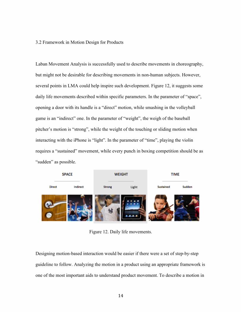
3.2 Framework in Motion Design for Products
Laban Movement Analysis is successfully used to describe movements in choreography,
but might not be desirable for describing movements in non-human subjects. However,
several points in LMA could help inspire such development. Figure 12, it suggests some
daily life movements described within specific parameters. In the parameter of “space”,
opening a door with its handle is a “direct” motion, while smashing in the volleyball
game is an “indirect” one. In the parameter of “weight”, the weigh of the baseball
pitcher’s motion is “strong”, while the weight of the touching or sliding motion when
interacting with the iPhone is “light”. In the parameter of “time”, playing the violin
requires a “sustained” movement, while every punch in boxing competition should be as
“sudden” as possible.
Figure 12. Daily life movements.
Designing motion-based interaction would be easier if there were a set of step-by-step
guideline to follow. Analyzing the motion in a product using an appropriate framework is
one of the most important aids to understand product movement. To describe a motion in
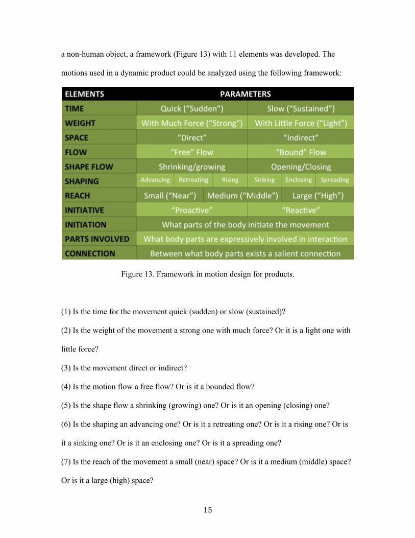
15
a non-human object, a framework (Figure 13) with 11 elements was developed. The
motions used in a dynamic product could be analyzed using the following framework:
Figure 13. Framework in motion design for products.
(1) Is the time for the movement quick (sudden) or slow (sustained)?
(2) Is the weight of the movement a strong one with much force? Or it is a light one with
little force?
(3) Is the movement direct or indirect?
(4) Is the motion flow a free flow? Or is it a bounded flow?
(5) Is the shape flow a shrinking (growing) one? Or is it an opening (closing) one?
(6) Is the shaping an advancing one? Or is it a retreating one? Or is it a rising one? Or is
it a sinking one? Or is it an enclosing one? Or is it a spreading one?
(7) Is the reach of the movement a small (near) space? Or is it a medium (middle) space?
Or is it a large (high) space?

16
(8) Is the initiative of the movement proactive? Or is it reactive?
(9) What part of the body initiates the movement?
(10) What body parts are expressively involved in interaction?
(11) What salient connections exist between parts of the body?

17
CHAPTER 4: METHODOLOGY IN DESIGNING MOTION INTERACTION
In this chapter, a seven-step methodology is described that was developed for use in
designing motion interaction for a product. Since designing for movement is a relatively
new area, a formal methodology is lacking. Some industrial designers might deal with
motion design issue the when doing a typical industrial design project even though they
might not realize it. In this case, the motion design likely does not receive the attention it
deserves from designers, and designers might ignore this promising aspect altogether and
miss the opportunity to generate a better user experience. In this thesis, a methodology
was distilled, based on the experience gained by doing several motion-based interaction
experimental projects. As shown in Figure 14, it illustrates the seven-step methodology
for designing motion interaction that is discussed in this chapter.
Figure 14. Seven-step methodology for designing motion interaction in a product.
18
4.1 Analogy from Daily Scenarios
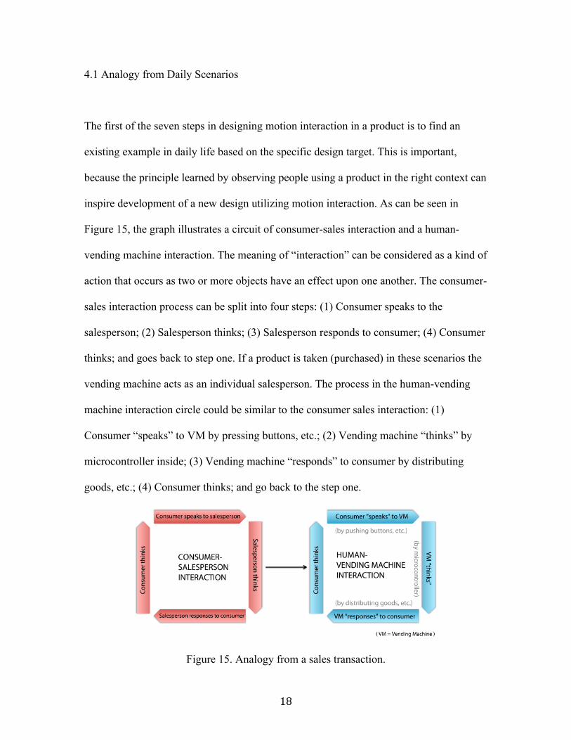
The first of the seven steps in designing motion interaction in a product is to find an
existing example in daily life based on the specific design target. This is important,
because the principle learned by observing people using a product in the right context can
inspire development of a new design utilizing motion interaction. As can be seen in
Figure 15, the graph illustrates a circuit of consumer-sales interaction and a human-
vending machine interaction. The meaning of “interaction” can be considered as a kind of
action that occurs as two or more objects have an effect upon one another. The consumer-
sales interaction process can be split into four steps: (1) Consumer speaks to the
salesperson; (2) Salesperson thinks; (3) Salesperson responds to consumer; (4) Consumer
thinks; and goes back to step one. If a product is taken (purchased) in these scenarios the
vending machine acts as an individual salesperson. The process in the human-vending
machine interaction circle could be similar to the consumer sales interaction: (1)
Consumer “speaks” to VM by pressing buttons, etc.; (2) Vending machine “thinks” by
microcontroller inside; (3) Vending machine “responds” to consumer by distributing
goods, etc.; (4) Consumer thinks; and go back to the step one.
Figure 15. Analogy from a sales transaction.

19
The steps in Figure 15 graph above should be performed by directly observing these sales
transactions in person. This is of help in understanding human personality. I also
performed an experiment (Figure 16), with the purpose to try to have “sympathy” for the
vending machine. I was wearing a large box made of foam board, and was distributing a
Coca-Cola soft drink to passengers on the street. The purpose was to get inspiration from
seeing how people react to a vending “machine” experience. This was helpful to some
extent in terms of inspiration. For example, during this process, I learned that consumers
might be more excited and engaged if the vending “machine” could react proactively
rather than reactively.
Figure 16. Acting as a vending machine.

20
4.2 Defining a Vocabulary for Motion
Determining a vocabulary describing motion design can be a bridge between the real-life
scenario and the abstract objective of the design. During the interaction between the
salesperson and the customer, many gestures and words were used. I reviewed these
conversations and selected verbs that described the conversations. These words were
randomly grouped on the upper part of Figure 17. These verbs were selected because they
helped to evoke a feeling of politeness that could help improve the design of vending
machines, making them more hospitable to use. After the observation in a store, I realized
that some verbs used by the salesperson would be valuable in determining the goals for
new vending machine design. Some of these words are highlighted in Figure 17. They
are: nod, invite, greet, serve, bow, etc. Thus, the vending machine’s motion is intended to
communicate gestural movement that communicates bowing, agreeable nodding, etc.

21
Figure 17. Determine the vocabulary.

22
4.3 Applying Movement Framework
After selecting and defining verbs and other words describing the interaction between
salespeople and customers, it was then time for the third step: to match the defined
vocabulary to the specific movement elements by applying the movement framework
developed in Chapter 3. In this step, I wanted to understand the perception people get
from the existing ways food is delivered, and to better understand these delivery gestures
by analyzing them. Figure 18 presents twenty-one food delivery gestures I found in daily
life, such as picking a tomato and holding a plate. Some gestures are similar, while some
of could be easily distinguished from the other because of their specific hidden meanings.
A gesture of handing a pair a scissors with its sharp end facing the recipient is a good
example. This gesture is considered to be a considerable one, given that the host turns the
more dangerous one to themselves. Another example is the gesture of holding a cup of
tea. In some cultures like in China, it is considered polite and respectful to pass
something to others with two hands rather than one hand. But how do people learn such
cultural norms? Is there a clue or some unseen mechanics behind this?

23
Figure 18. Collection of food delivery gestures.
In order to find how people interpret different food delivery gestures, participants were
asked to express their preferences about what they thought of the several gestures I
collected. Participants expressed their feelings of how each gesture made them feels
including their positive impressions and the connotative values conveyed by each
presented gesture. After sorting and arranging the results, the food delivery gestures were
finally classified into four values as Figure 19 indicates: friendly/respectful, stylish,
surprising, and efficient.
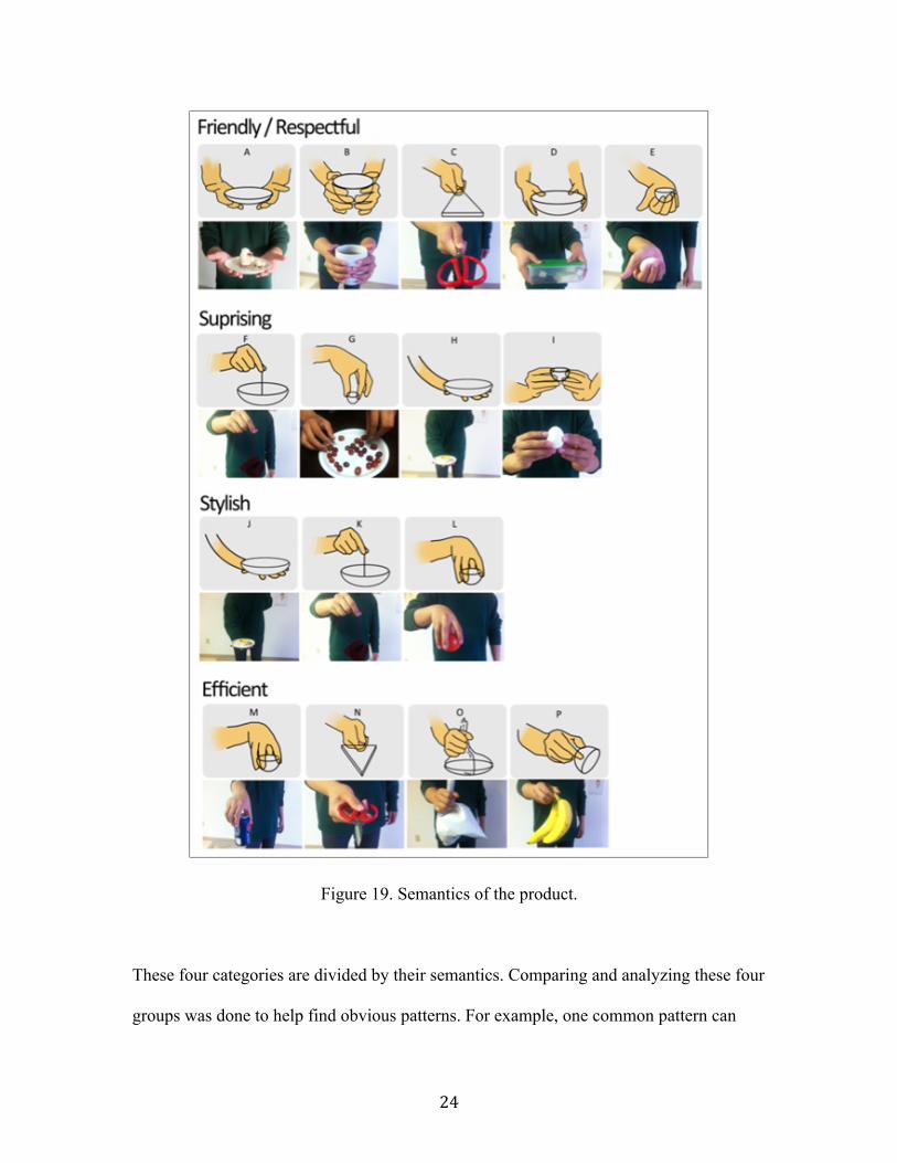
24
Figure 19. Semantics of the product.
These four categories are divided by their semantics. Comparing and analyzing these four
groups was done to help find obvious patterns. For example, one common pattern can

25
found in the respectful gesture group was using two hands. In other words, most of the
friendly/respectful gestures are performed using two hands. Finally there were five
patterns influencing the semantics of food delivery gestures. They are:
Figure 20. One hand or two hands of the product.
Factor 1: Two or one hand gesture (Figure 20);
Factor 2: Size of the surface of contact with the goods;
Factor 3: Direction of movement;
Factor 4: Position of the point of contact on the goods (Figure 21);

26
Factor 5: Speed of movement;
Factor 6: Complexity of the gesture (Figure 22)
Figure 21. Contact of the product
Figure 22. Complexity of the gesture.
These six factors were determined by using the motion framework mentioned in Chapter
3. How can these factors be verified? One effective way is to find two completely

27
different gestures and analyze them according to these factors. The examples mentioned
in Chapter 1 are helpful to analyze. In Figure 23, the “drive-thru food delivery gesture”
and the “fine restaurant food delivery gesture” are compared to each other under these six
or more factors (“+” and “-” represented how friendly the gesture was):
Figure 23. Analyzing two gestures.
“Respect” gesture (the fine restaurant one):
+ Time: Sustained/Slow
+ Weight: Light
+ Direction: up
- Hands: One hand
+ Size of the contact surface: large
+ Position of the contact point: bottom
+ Space: Direct
+ Initiative: Proactive

28
“Efficient” gesture (the drive-thru one):
- Time: Sudden/Quick
- Weight: Strong
- Direction: Down
- Hands: One hand
- Size of the contact surface: Medium
- Position of the contact point: Top
+ Space: Direct
+ Initiative: Proactive
4.4 Sketching Kinetic Motions
Since the topic in this thesis is not about the traditional industrial design model - static
objects, a traditional technique like sketching or building static models is not the most
optimal for exploring dynamic movement. The best way to do this is to make dynamic
animation models. One convenient method is to make a foam board model. The
advantage of a foam-board model is that the material is easy to obtain and fabricate by
hand with only basic tool. Foam-board is a stable construction material in comparison to
paper card stock. Other materials to use are tape, hot glue, and balsa wood. Some modern
fast-fabrication technics like laser cutting or 3d printing could also be used if needed.
The first kinetic sculpture was a box constructed from plywood and acrylic, and
nicknamed “Curiosity Shutter”. The purpose of this model was to elicit a sense of

29
curiosity for the passerby. The whole process was recorded in video. Snapshots from the
video are shown in Figure 24. As shown the model has a hole in the top a little bit larger
than can of coke so that it can be pushed through. Inside the box, there is a mechanism
called “mechanical iris” consisting of five piece-shutters similar to a camera shutter. The
shutter formed a dynamic door that can be closed or opened with the help of a rotatable
wheel. This experiment worked as follows: when people were in a close proximity to the
box, the can was pushed out of the hole in the box; as people approached closer to the
box and were curious about possibly getting a free coke, the can would shrink back inside
the box out of sight. . This kinetic experiment was trying to explore the subtle movement
that defined “curiosity” and “playful”.
Figure 24. Screenshots from the video "Curiosity Shutter".

30
The second kinetic sculpture model was made using foam, foam board, and fishing line.
As indicated in Figure 25, a series of screenshots depict the dynamic way this model
presented a product. It was supposed to explore the element of surprise. With the help of
fishing line that linked the folded foam board, the box opened like a blooming flower.
This is an example of “movement design learning” by observing a daily movement
interaction scenario: proposing marriage by opening a red box with a ring (surprise)
inside. This is an exciting moment in life and this motion design was trying to mimic this
same semantic sense of surprise.
Figure 25. Screenshots from the video "Surprise Gift".
4.5 Programming the behavior
Kinetic sketching is a quick way to explore a number of movement interaction scenarios
quickly. These kinetic models are simply constructed and operated by hand. After making
different kinds of kinetic sketches to explore a several ideas, those deemed more
interesting and sophisticated are selected for further refinement. This step is to build a
more extensive kinetic model designed mechanically and programmed to move

31
automatically without manual help. One of most frequent programming methods used is
to use Arduino (Figure 26). Arduino is an open-source electronics prototyping platform
based on flexible, easy-to-use hardware and software. It is intended for artists, designers,
hobbyists, and anyone interested in creating interactive objects or environments.
Figure 26. Arduino Uno.
Input and output sensors are critical circuit components. Introducing more and more
sensors into the environment will result in loads of data (Overbeeke, 2007). When such
data is fed into a computer, servomotor actuators can be controlled.
An experiment pictured in Figure 27 was performed to test the basic function in Arduino.
A model was made of Arduino board, breadboard, servomotor, distance sensor, a box
with a cover, and some wires. The small plywood box was called “I am a candy box”,
and was able to open or close its cover by sensing the distance of a persons hand in
proximity to the box. . When the candy box was approached, it would automatically open
so that users could retrieve a piece of candy. The cover automatically closed after the

32
candy was retrieved. This was an interesting experiment, and the code for this behavior
was developed as follows:
Figure 27. Programming the "I'm a vending machine" box.
#include <Servo.h>
Servo brianServo1;
Servo brianServo2;

33
int servoPin1 = 9;
int servoPin2 = 10;
int distPin = 0;
void setup()
{
brianServo1.attach(servoPin1);
brianServo2.attach(servoPin2);
}
void loop()
{
int dist = analogRead(distPin);
int pos1 = map(dist, 0, 1023, 0, 180);
int pos2 = map(dist, 0, 1023, 0, 90);
brianServo1.write(pos1);
brianServo2.write(pos2);
}

34
4.6 Designing Integrity and Evaluation
After the final concept is determined, the model should be built in CAD software and a
physical working model fabricated. Questionnaires can be used to assess how use of the
working prototype made the participants feel. This information can provide valuable
feedback for making future improvements.

35
CHAPTER 5: THE VENDING MACHINE DESIGN PROJECT
5.1 Design Background
Japan has one of the world's highest vending machine densities with one vending
machine per an estimated 23 people (according to the Japan Vending Machine
Manufacturers Association). Machines can be found in all cities, towns and even in the
countryside. Almost none of them are vandalized because of the low rates of crime. As
can be seen in Figure 28, other than the most common beverage and snack vending
machine, there are a variety of vending machines for dispensing: newspapers, workbook,
electronic products, photo portraits booth, beef stew or soup, eggs, live lobsters, French
fries, sneakers, tower optical binoculars, Smart Cars, and even gold. Regarding location,
these vending machines are in the public spaces where everyone can approach. They are
also located in specific areas like hotels, shopping malls, entertainment parks
(Disneyland), etc.
Figure 28. Varieties of vending machines.

36
Vending machines are useful and convenient when stores are closed and we need
something immediately. It is so ubiquitous that we have high expectations of them. As
vending machines are designed for people, and people are “invited” to use them because
there design and contents. It is the responsibility of the designer to propose intuitive and
context adapted products for people. As shown in Figure 29, there is a mood-board
designed to communicate the content and the theme emotionally, by picking up materials
and environment pictures for inspiration. The theme is “taming technology”, with five
keys consistently running through the design process: humanized, intelligent, responsive,
dynamic, interactive.
Figure 29. Mood-board to communicate the theme “taming technology”.

37
5.2 The Design Problem
There’s a certain little-kid joy in feeding money into the little slot and watching the
mechanism working through glass and finally presenting a product to you in some way.
Interacting with a vending machine could be fun (Riechers, 2010). But from a different
perspective, being seen as cold and unfriendly, vending machines do not always create a
positive experience for users. It only provides the basic function of “food delivery” and is
adequate only when no other options are available. When the interaction between the
customer and the vending machine is ignored the vending experience will be poor.
In order to look for opportunities to improve the vending machine experience, the project
began with by observing people interacting with a variety of vending machines, from
ATMs to snack machines. As indicated from Figure 30, we can see an interaction map
with the all seven processes linking together. They are:
Figure 30. Process in interacting with a vending machine.

38
Process 1+2: Comparing the merchandise prices, and finding the favorite product;
Process 3: Pressing buttons with information where the product locates;
Process 4: Inserting cash/ swiping credit card;
(Process 4a: If it is a credit card, it needs to go back to the process 3 area and enter the
passcode again;)
Process 5: Seeking necessary instruction on screen;
Process 6: Collecting changes from the tray;
Process 7: Bending down; Opening the door to pick the final product.
This procedure might not accurately reflect all types of vending machines in use. But it
does represent the most common one currently used in the US. After observing this
process performed by different users, a report with a detailed analysis of the heuristic
evaluation process was written to evaluate the usability of the vending machine. Heuristic
evaluation is a discount usability inspection method for computer software that helps to
identify usability problems in the user interface design. After looking at some principles
of it, I found it was also applicable for the physical interface of vending machine if
adopted correctly. The evaluation itself was performed using the heuristic evaluation
usability method, according to Nielsen’s ten usability heuristics (Nielsen, 2010). These
ten guidelines are: (1) Visibility of system status; (2) Match between system and the real
world; (3) User control and freedom; (4) Consistency and standards; (5) Error prevention;
(6) Error prevention; (7) Recognition rather than recall; (8) Recognition rather than
recall; (9) Help users recognize, diagnose, and recover from errors; (10) Help and

39
documentation. The heuristic evaluation result was finally analyzed and concluded in the
following six segments:
(1) Aesthetic experience for the emotional need (from “sight” perspective)
Most vending machines in use today in the US look the same or similar: the face of the
machine is typically very “cold” with rigid looking right angle corners, and are also
heavy. Though one reason for the dull design of vending machines appears to be to
achieve better security, innovative softer and more expressive forms are not utilized.
Vending machines could be designed to fit a different market. For example, a vending
machine that distributes cosmetics could consider the features more appropriate for the
female market, and a baroque style might be popular among the target groups if
necessary. As indicated from Figure 31, the snack vending machine is so big and tall that
it may make some people feel small and intimidated. Using different form could generate
different emotional bonds to users.
Figure 31. Aesthetic experience for the emotional need (from “sight” perspective).

40
(2) Aesthetic experience for the emotional need (from “hearing” perspective)
Hearing is one of the five senses of human beings, and is an important “emotional need”
to consider for users. A delightful sound could generate a more pleasant experience while
a less pleasing sound would not be as effective. As shown in Figure 32, a typical snack
vending machine might push forward a selected product from a certain height from the
floor, and let it fall all the way down to the bottom of the machine with a rude sound -
“bang”. This flow of impolite gesture from the machine will result in an ungraceful
sound, which will create a less pleasurable experience than quieter options of food
presentation and delivery. From the “hearing” perspective, we must be familiar with this
experience: cashiers or shop assistant will say “thank you” after the process, which will
make customers feel good. But we can never get the same experience from an inanimate
vending machine. Another similar example from daily life is the ATM that “throws”
money to you all the time.
Figure 32. Aesthetic experience for emotional need (from “hearing” perspective).

41
(3) Aesthetic experience for emotional need (from “human factor” perspective)
As shown in Figure 33, we can see that after the vending machine drops the product from
the top shelf all the way down to the very bottom of the machine to deliver the food;
sometimes we have to crouch to get the product. It is not elegant to do so, especially for
women who wear skirts. What’s more, it is not a barrier-free design in some situations.
Seniors with arthritis or those with impaired mobility will find it hard to crouch, and
people who are on wheelchairs will also find its hard to approach the door by hand,
which is located in the bottom of the machine.
Figure 33. Aesthetic experience for the emotional need (from “human factor”
perspective).
(4) Visibility of system status
Existing vending machines are not very transparent with respect to providing information
about the product. The products are kept inside the machine and users get only very

42
basic information by looking through the glass wall and trying to read labels. More
information would be important to a certain users such calories and ingredients (see
Figure 34). Users do not have a chance to return a product they do not want as they can
do in a store, which will inevitably cause some inconvenience. Moreover, users might
form an emotional bond when touching the product and turning it around to see all the
details. Keeping product details from the customer can adversely affect the purchasing
process.
Figure 34. Visibility of system status.
(5) Consistency and standards
Although vending machines in the US tend to look the same overall, interfaces tend to
vary. Figure 35, shows a typical interface of the paying system: a component of card
sliding, and an information screen. However, if users switch to another machine, the
interface and the process can change, which will generate a slightly new learning
experience each time. The user should not have to remember information from one part

43
of the dialogue to another according the principle of heuristics. The system provided
should cater to both inexperienced and experience users.
Figure 35. Consistency and standards.
(6) Efficiency of use and minimalist design
From Figure 30 we know that the interaction with the machine was spread out over a
large area as illustrated in Figure 36, and some process are redundant and inefficient.
Shifting from here and there in order to make a purchase can be irritating and taxing to
the senses and ones patience. Minimizing the user’s cognitive load by making actions
intuitive and easy to accomplish is important. Another issue is the minimalism of the
design. Color can be a great way to help highlight important areas of the screen and show
different product selection options. There is a problem, however, when color is used as
the only mechanism for illustrating differences with the vending machine interface. It is
obvious in Figure 36 that every extra unit of information in a dialogue competes with the
relevant units of information and diminishes their relative visibility and importance.

44
Figure 36. Efficiency of use and minimalist design.
5.3 Design Outcomes
To better understand the factors in food delivery gesture from a holistic perspective, a full
map of an info-graphic of gesture analysis was created to illustrate the four different
dimensions involved (Figure 37). These four dimensions are:
(1) Semantics of the gesture: friendly/respectful, surprising, stylish, and efficient
(Represented as four full color circles in the center);
(2) Two or one hand gestures (Represented as purple or green tags on the hands’ circles);
(3) Position of the point of contact on the goods: top, right/left, and bottom (Represented
as two bars on two sides of the graph);
(4) Complexity of the gesture: from simple to complicated (Represented as a Z-shape
dashed with arrows from top to bottom).

45
Figure 37. Info graphics of the gesture analysis.
When designing the vending machine in terms of its form, several considerations were
taken into account: how many types of products the vending machine is distributing; how
to design the structure of the vending machine so that it could be easily refilled with
products when they are all sold out; how to design a more user-friendly interface to

46
provide clear information, etc. And the conceptual drawings were provided in Figure 38
during this ideation process.
Figure 38. Some conceptual drawings during the process.
Figure 39 is one of the design outcomes – the vending machine with hospitality, which
explain how the vending machine’s manner is determined. All the hospitality manners
were supposed to be reflected on the motion design within the vending machine. The
procedure of the motion flow could be mainly included in three steps as follows:

47
Figure 39. Design Explanation.
(1) Waiting and soliciting.
When passengers are walking by, the vending machine keeps standing there but with a
rotatable “eye” looking at you as you move. There’s a glass cover to protect the product
inside the machine. Through the glass, the selling product is placed on a rotatable base.
With the distant sensor installed in the front of the machine, the product is able to mirror
passerby’s movement, acting like the product is interested in you or waving hands to you.
In this situation, some passengers might stop by and see what’s happening, which will
also increase the chance of a sale. This movement is similar to the real salesman’s who
wants to promote their product by catching a customer’ eyes.

48
(2) Opening and inviting:
There’s a big screen of the top of the machine. The screen is designed to sit with a 20-
degree angle towards the users, which provides a more ergonomic operating
environment. Also, the product is designed to be visible from the top surface of the
machine so that users can review the product from all 360-degrees. All the buying
interactions will be visible. Users can review the product or detailed information of the
product itself. Figure 40 illustrates the main page of the interface with necessary buying
functions. After customers decide how many products they want, they may also need to
finish the transaction with credit card information by using the same interface. Then the
machine will open the front cover very slowly, acting like it is “inviting” a honorable
guest to select the product.
Figure 40. Interface on the screen.

49
(3) Bowing and serving:
This motion design is inspired by the Japanese culture. The code of etiquette in Japan is
strict and the core of it is respecting others. Hosts in japan are usually bowing drastically
to a guest to show their respect. Analogously, the hinge for the front cover of the new
design is designed to rotate 135 degrees in order to show the full respect to customers.
The lid opening process is a crucial part of the movement design. The lid will finally stop
with the inside surface horizontal, as if it is serving you.
The product distributed from the machine could range from cans of cock to expensive
watches. But the crucial value for the design should be hospitality: adding value to the
product through a series of sophisticated movements performed by the vending machine.
To deliver a feeling of “exclusiveness” of the product to customers, the number of
products in the vending machine is only one. Several machines could be grouped in the
same area or next to each other (e.g. three of them) to sell different choices of products.
5.4 Design Evaluation
After designing several movement concepts for the inside of a vending machine, it is
crucial to evaluate how movements work and whether the hits the target need. One
assessment method is to refer to the motion framework developed in Chapter 3and to see
how it fits according to each paradigm. From the “applying movement framework”
section in Chapter 4, we know that a respect gesture in serving food has these features: it
is a sustained or slow gesture; the weight of gesture is light; the direction is often from

50
bottom to the top; the size of the contact of the surface is large; the position of the contact
point is usually in the bottom; the space is indirect to the users; the initiative is proactive.
Comparably, regarding the motion of vending machine, it has the following features
(Figure 41):
Figure 41. Evaluation according to the framework.
(1) Time: Sustained/Slow;
(2) Weight: Light;
(3) Direction: up;
(4) Hands: Two hand;
(5) Size of the contact surface: large;
(6) Position of the contact point: bottom;
(7) Space: Direct;

51
(8) Initiative: Proactive/Reactive.
As the result provided above, it is obvious that features of the motion design in the
vending machine concept are similar to the features of a respect gesture in serving food in
in a fine restaurant. Consequently, the motion design concept suited for vending is
theoretically a hospitality gesture.
5.5 Design Implementation
In order to test how people respond to the movements, a full-size prototype was
fabricated and placed in a real-life context. Since this thesis was produced on a limited
graduate student budget, it was not possible to fabricate a working prototype for some
functional parts. However, a digital animation was made and shown at the end of year
Master of Fine Arts exhibition. This is a dynamic format that sufficiently communicates
the idea. As shown in Figure 42, the basic structure for the machine and the location for
computational components are illustrated in this image, including two servomotors, a
breadboard, an Arduino board, and three distance sensors.

52
Figure 42. Structure and computational components in the machine.
5.6. Discussion - The Cultural Context of Gestures
Since the research observations and designs were taken place in the US, the motion of the
vending machine was appropriate for the US cultural context. However, designing a

53
vending machine with its motions suited to every culture is complex, due to cultural
norms that could be completely different in different countries. For instance, nearly
everyone all over the globe knows that flashing the middle finger is meant as a huge
insult to the recipient. However, many common hand gestures, which are perfectly
innocent in the US are in fact quiet dangerous in other parts of the world (Savino, 2012).
The illustration in Figure 43 is raised as an example. In the US, many people use this sign
to call someone "come here". In Philippines, however, performing a gesture by curling
your pointer finger forward and motioning repeatedly does not mean telling someone to
"come here". Instead, it is considered to be a gesture befitting only usage on a dog, and is
punishable with jail time if used on a person.
Figure 43. “Come here” gesture in the US means different in Philippines.
There are a lot of examples regarding to different meanings in different body gestures.
This thesis will not spread out this aspect because the gesture research in culture would

54
be another topic to begin with. But I hope this thesis can start the process of considering
designing product interaction gestures in different cultural contexts. Given its importance,
designers should be aware of the cultural norms when designing the intended movements.

55
CHAPTER 6: CONCLUSION
Rather than providing a single design, the aim of this thesis is to illuminate a seldom-
discussed realm in the design field, opening up new possibilities for product design.
Industrial designers should not only design forms, but also the kinetic movement of the
form in space, aiming to generate pleasurable experience for users. This thesis, has
proposed a new perspective for designing products – designing the motion. The thesis
provides a framework about how movements could be analyzed and described. A
methodology of seven procedures is also proposed, giving a guide in designing kinetic
movement. By adopting the framework and methodology developed, a design project –
vending machine with a hospitable interaction was carried out, to demonstrate the use and
value of the framework. Considering interactive movements in product designs can
deliver a more satisfying and meaningful experience for users.

56
REFERENCES
rduino - HomePage . (n.d.). Arduino - HomePage . Retrieved July 11, 2012, from
http://www.arduino.cc
Denning, P. J. (2002). The Invisible future: the seamless integration of technology into
everyday life. New York: McGraw-Hill.
Ross, P. (2008). Ethics and aesthetics in intelligent product and system design.
Eindhoven: Technische Universiteit Eindhoven.
Guenand, A., Ampilhac, F., & Uehara, M. (2006). Designing benevolence: a study on a
food vending machine taking into account cultural preferences in movements
semantics in Japan and France. Design and semantics of form and movement,
DeSForM 2006, 22.
Kinetic Design and the Animation of Products, by Ben Hopson - Core77. (n.d.). Core77 /
Industrial Design Magazine + Resource / Home. Retrieved July 11, 2012, from
http://www.core77.com/blog/featured_items/kinetic_design_and_the_animation_
of_products_by_ben_hopson_12642.asp
Laban Movement Analysis - Wikipedia, the free encyclopedia. (n.d.). Wikipedia, the free
encyclopedia. Retrieved July 11, 2012, from
http://en.wikipedia.org/wiki/Laban_Movement_Analysis
Nielsen, J. (n.d.). 10 Heuristics for User Interface Design. useit.com: Jakob Nielsen on
Usability and Web Design. Retrieved March 8, 2012, from
http://www.useit.com/papers/heuristic/heuristic_list.html
Overbeeke, K. (2007). the aesthetics of the impossible. Designing Quality in Interaction,

57
ISBN: 978-90-386-1158-7. Retrieved October 26, 2007, from
http://dqi.id.tue.nl/docs/Overbeeke2007.pdf
Rockwell, S. (n.d.). International Design Criminal. Purdue University e-Plus. Retrieved
February 19, 2012, from docs.lib.purdue.edu/dissertations/AAI1479808/
Ross, P., & Wensveen, S. (n.d.). Designing Behavior in Interaction: Using Aesthetic
Experience as a Mechanism for Design. International Journal of Design.
Retrieved October 18, 2011, from
www.ijdesign.org/ojs/index.php/IJDesign/article/view/765/297
Zhao, L. (2001). Synthesis and acquisition of Laban movement: analysis qualitative
parameters for communicative gestures. Philadelphia: University of
Pennsylvania.
Zoontjens, R. (2009). Human Values in Lighting Interaction. Designing Quality in
Interaction, 978-90, 3.
Lindsey, S. (n.d.). Hand Jive [infographic]. Daily Infographic | A New Infographic Every
Day | Data Visualization, Information Design and Infographics. Retrieved June
14, 2012, from http://dailyinfographic.com/hand-jive-infographic