– strategies for effective navigation design & prototype phases
TRANSCRIPT

– Strategies for Effective Navigation
Design & Prototype Phases
Navigation
• Effective web navigation is perhaps the most important aspect of ensuring a Web site's usability.
Understanding a site's mission and audience • Before designing navigation, you
must a firm understanding of the organization and its goals and objectives.
Defining a site's content• Be careful to limit the site’s
content - think carefully about the purpose of the content.
• Each piece of content should in some way support the site's mission and/or user's goals.
80/20 rule of Web functionality • Concentrate on satisfying or meeting 80% of
user needs. • Meet requirements that some (20% or less)
users are interested in, only if it doesn't decrease the usability for the majority of users.
• Try to avoid adding functionality or content because "you can" or "it might be cool" or "some people might like it."
Content labeling • Informative labeling is important to a
navigational scheme. • Major content sections and subsections
should be given descriptive and intuitive titles.
• These titles will be used as labels for the various elements of the navigation.

Paper prototyping • Paper prototyping is an excellent method for
gaining valuable user and client feedback early in the design process.
• It also allows you to save a lot of time, money, frustration, and redesign later in the development process.
• The goal is to receive a maximum amount of feedback for a minimum amount of effort.
Benefits of Paper Prototyping• Paper prototyping is also a valuable tool to
help ensure that the design team and client/project sponsor are on the same page.
• Seeing a tangible, albeit rough, design may help the client to recognize additional content they desire for the site.
• It may also help them to identify content or features that are displayed in a way that differs from what they had envisioned.
Global Navigation
• A web site's overall navigational scheme may be broken down into a series of complimentary navigational pieces.
• These pieces are the global, local (sub), supplemental, and contextual navigation.
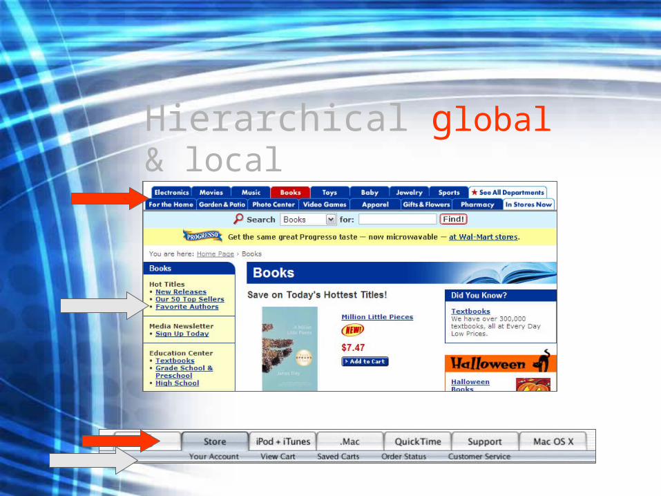
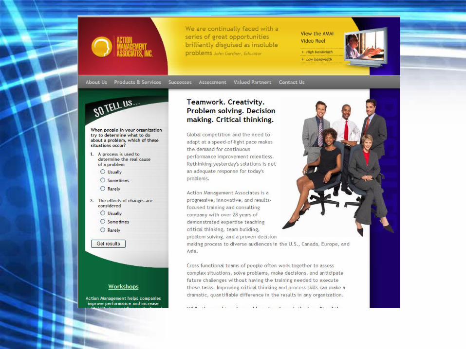
Hierarchical global& local
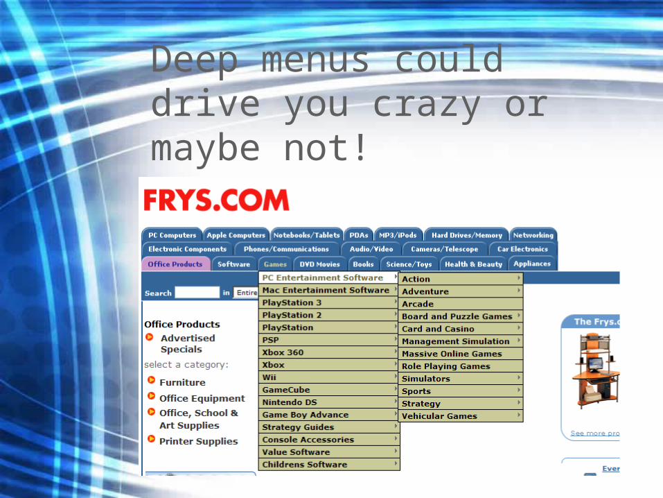
Deep menus could drive you crazy or maybe not!
Navigation styles
• The navigation should be flexible enough to accommodate additional links
• For this using drop-down menus or section home pages might be helpful.
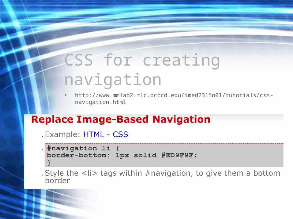
CSS for creating navigation• http://www.mmlab2.rlc.dcccd.edu/imed2315n01/tutorials/css-navigation.html
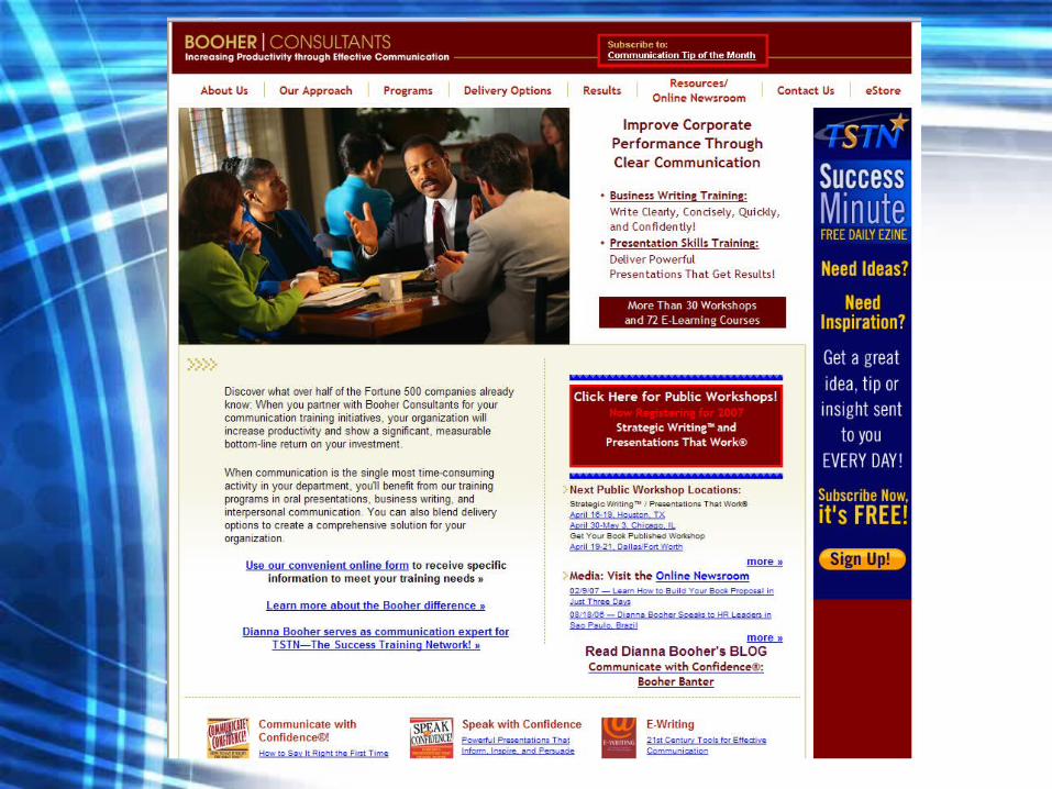
The New York Times• The New York Times
(http://www.nytimes.com/ chooses to display their global navigation at the top and as a left hand menu
• This particular site displays both global and sub navigation in the left hand navigational menu.
• Keeping all of the navigational elements in one general location provides consistency for the user.
Contextual Navigation
• When describing parks in the Dallas area, you may allow users to navigate to the Texas Department of Natural Resources -- this would be considered part of the contextual navigation system.
Supplemental Navigation • Supplemental systems include
things such as sitemaps and site indexes.
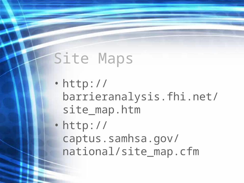
Site Maps
• http://barrieranalysis.fhi.net/site_map.htm
• http://captus.samhsa.gov/national/site_map.cfm
Search Engines
• Most are aware of the huge impact of search engines!
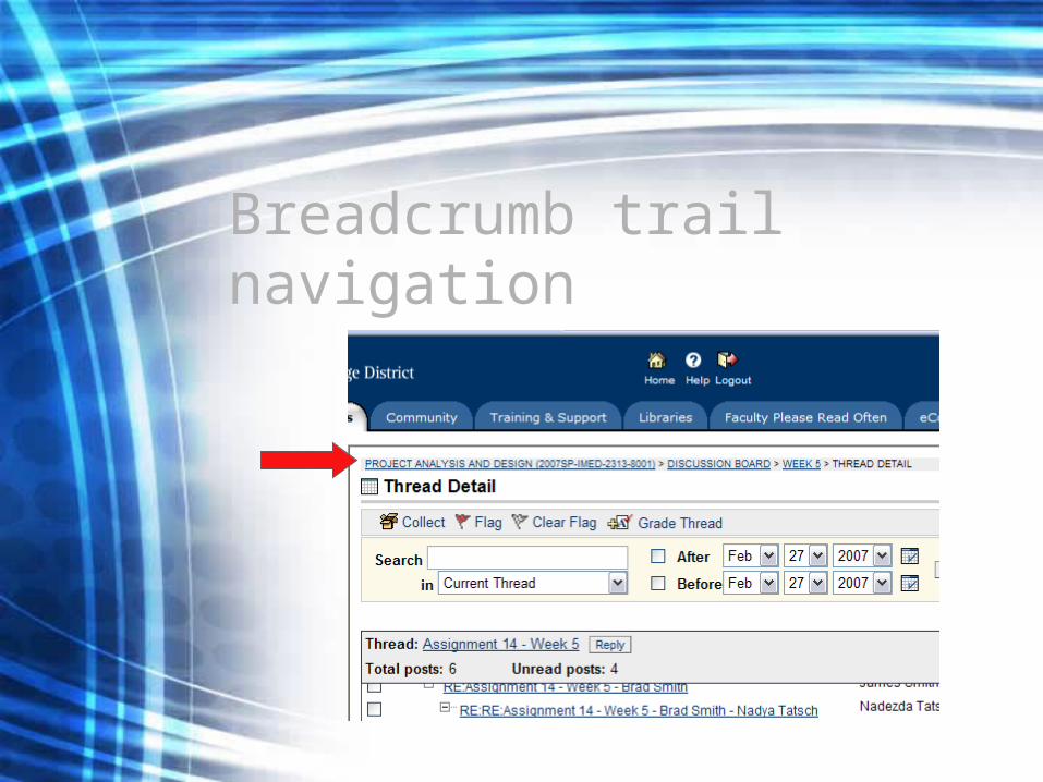
Breadcrumb trail navigation
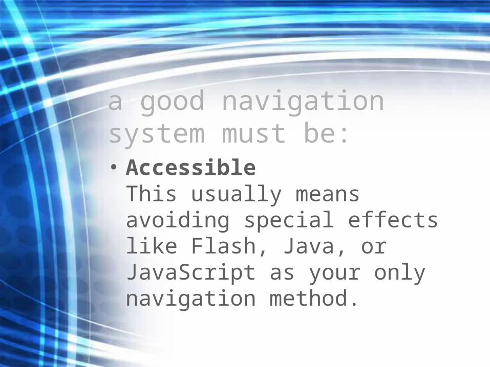
a good navigation system must be: • Accessible
This usually means avoiding special effects like Flash, Java, or JavaScript as your only navigation method.
a good navigation system must be: • Consistent - Your navigation
should appear on every page - not identical navigation, the basic structure should be the same throughout the site, with changes used only to indicate location within the hierarchy.
a good navigation system must be: • Clear - Links should be clearly and easily
identifiable as links (this is also known as visual separation).
• You can highlight the current page link (saying, in effect, "You are here")
• or provide a brief chain of links at the top of the page (e.g., "Home / Company / Employee Profiles")
Therefore, effective navigation systems should:
• Tell users where they are – Users must know where they are so they have a reference point for adjoining areas or states
• Tell users where they can go – Users cannot go somewhere if they do not know how to get there
• Tell users where they have been – Users do not navigate in one direction; they often backtrack
Scalability & Maintenance
• In many cases sites have a tendency to outgrow their navigation, necessitating that additional content sections and links be added.
In Conclusion
• Remember, don’t reinvent the wheel – use navigation structures that have worked for others.
• And don’t disable the back button!
Credits
• Interesting Article on Navigating Large Websites
• Another Excellent Article
• 80-20 Rule