1 information design scott matthews courses: 12-706 / 19-702
Post on 21-Dec-2015
213 views
TRANSCRIPT

1
Information Design
Scott MatthewsCourses: 12-706 / 19-702

12-706 and 73-359 2
Admin Issues
Group HW 1 Due TodayI forgot to attach 1 reading (handout)

12-706 and 73-359 3
Information DesignWhat is it? Idea of carefully linking what data you
have with what you want to say“God” of the field: Edward Tufte (.com)
Substance of lecture - Text from his books The eye can recognize 150 Mbits of informationPerhaps most important: don’t just blindly use
built-in graph/graphic tools when you have a significant point to make a.k.a. Excel and Powerpoint are not friends! They create simplistic graphs that dumb us down Your graphics say a lot about your perceived command

12-706 and 73-359 4
Meta questions
What question are you trying to answer? OR what statement are you trying to make?
What is the right medium for doing so?What visual components are needed to
convey your point as clearly as possible?

12-706 and 73-359 5Source: Frees and Miller, “Designing Effective Graphs”, 1997.
Note the “click on Excel graph button” step is noticeably absent

12-706 and 73-359 6
Strive for “Graphical Excellence”
"consists of complex ideas communicated with clarity, precision, and efficiency
is that which gives to the viewer the greatest number of ideas in the shortest time with the least “ink” in the smallest space
is nearly always multivariate “requires telling the truth about the data.”Aim for “minimalist approach”

12-706 and 73-359 7
Graphics/Viz should: "show the data induce viewer to think about the substance rather than
about methodology, graphic design, the technology, etc. avoid distorting what the data have to say make large data sets coherent encourage the eye to compare different pieces of data serve a reasonably clear purpose: description, exploration,
tabulation, or decoration be closely integrated with the statistical and verbal
descriptions of a data set."

12-706 and 73-359 8
Content Focus
“Above all else show the data." The focus should be on the content of the data,
not the visualization technique. This leads to design transparency.
The success of a visualization is based on deep knowledge and care about the substance, and the quality, relevance and integrity of the content
Assume that the viewer is just as smart as you and cares just as much
Never ‘dumb-down’ a visualization.

12-706 and 73-359 9
Integrity - Misleading visualizations are common
To help limit unintentional visualization lies: “Representation of numbers, as physically measured on the
surface of the graphic, should be directly proportional to the numerical quantities represented
Clear, detailed, and thorough labeling should be used to defeat graphical distortion and ambiguity
Write out explanations of the data on the graphic itself. Label important events in the data if needed
Show data variation, not design variation The number of information-carrying (variable) dimensions
depicted should not exceed the number of dimensions in the data
Graphics must not quote data out of context

12-706 and 73-359 10
“Lie Factor”
Lie-factor = size-of-effect-shown-in-visualization / size-of-effect-in-data
12-706 and 73-359 11
Design Guidelines
Visualizations "are paragraphs about data and should be treated as such." Words, pictures, and numbers are all part of the information to be visualized, not separate entities "have a properly chosen format and design use words, numbers, and drawing together reflect balance, proportion, sense of relevant scale often have a narrative quality, a story to tell about data avoid content-free decoration, including “chartjunk”
(miscellaneous graphics that have nothing to do with the data)

12-706 and 73-359 12
Summary
You should look at and understand the data first, THEN plan out what you want your visual to “say”
And THEN choose how to make the visual Choose: table or graph?
Fight the urge to have Excel graph it for you to identify important trends / points

12-706 and 73-359 13
Graphs
Best when message is in “shape” of data - e.g., increasing trend, pattern, outliers
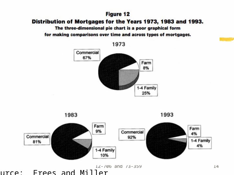
Every element you show should be the result of choices you make: e.g., axes, labels, units (and digits), titles, colors, shading. 3-D graphs rarely useful Avoid pie charts (we don’t “get” angles well) Fight the defaults - e.g., grey backgrounds!
If you will paste into a report, do not put a title on the chart (put the title in the report)
Given all this, why do people use Excel?
12-706 and 73-359 14
Source: Frees and Miller
12-706 and 73-359 15
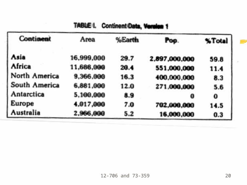
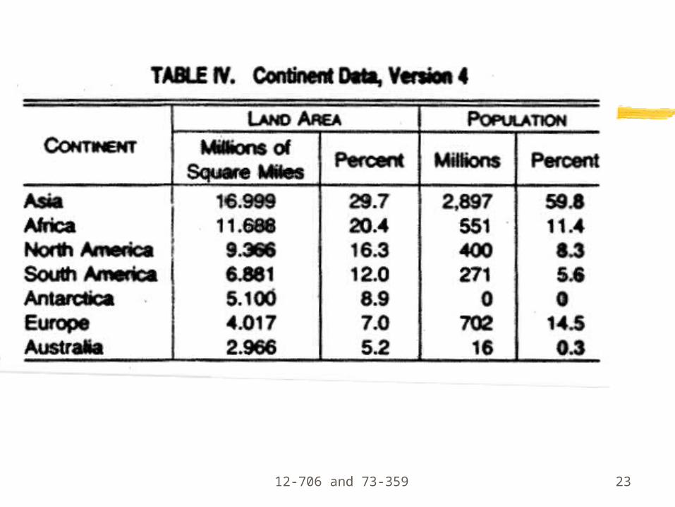
Tables
Nicely formatted table usually beats graphBest for:
looking up and/or comparing individual values Showing precise values (e.g., digits)
Format them so that you are drawn to themSelect digits (units) carefullyTry to sort via a numeric columnAdd bars to separate items if needed

12-706 and 73-359 16Source: Frees and Miller

12-706 and 73-359 17
Examples, and what’s wrong?
Think of Tufte’s “rules” above. Specify.
Hint: think about “message to convey” and how.
12-706 and 73-359 18
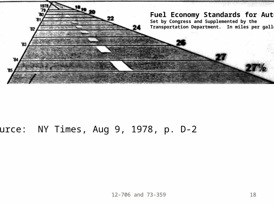
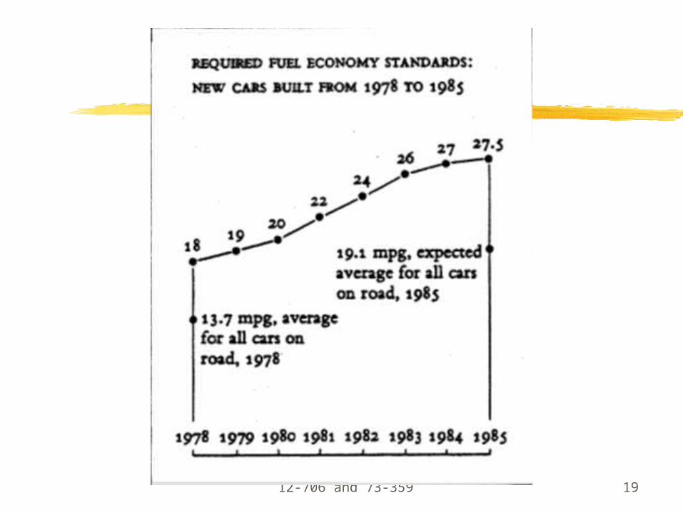
Source: NY Times, Aug 9, 1978, p. D-2
Fuel Economy Standards for AutosSet by Congress and Supplemented by theTransportation Department. In miles per gallon.
12-706 and 73-359 19
12-706 and 73-359 20

12-706 and 73-359 21

12-706 and 73-359 22
12-706 and 73-359 23

12-706 and 73-359 24

12-706 and 73-359 25
What’s wrong?
What could we do better?

12-706 and 73-359 26
Sorted by 5-yrFormatted nicer (big small)
Source:http://edwardtufte.com

12-706 and 73-359 27
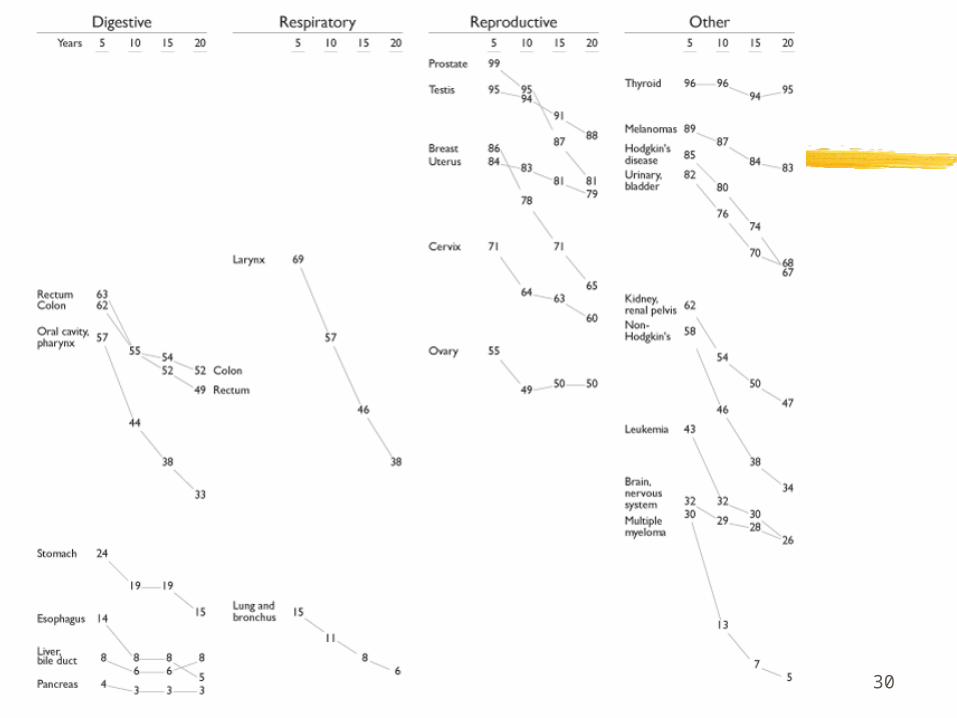
Consistent scale in this caseCauses lots of crossover and Clutter.

12-706 and 73-359 28

12-706 and 73-359 29
Labels on both sides!
12-706 and 73-359 30

12-706 and 73-359 31
How far we’ve come!

12-706 and 73-359 32
Sources
E. Tufte, “The Visual Design of Quantitative Information”, Graphics Press, 2001.
Stephen Few, various, www.perceptualedge.com