5 r tutorial data visualization
TRANSCRIPT

R ProgrammingSakthi Dasan Sekar
http://shakthydoss.com 1
Data visualization
R Graphics
R has quite powerful packages for data visualization.
R graphics can be viewed on screen and saved in various format like pdf, png, jpg, wmf,ps and etc.
R packages provide full control to customize the graphic needs.
http://shakthydoss.com 2

Data visualization
Simple bar chart
A bar graph are plotted either horizontal or vertical bars to show comparisons among categorical data.
Bars represent lengths or frequency or proportion in the categorical data.
barplot(x)
http://shakthydoss.com 3

Data visualization
Simple bar chart
counts <- table(mtcars$gear)
barplot(counts)
#horizontal bar chart
barplot(counts, horiz=TRUE)
http://shakthydoss.com 4

Data visualization
Simple bar chart
Adding title, legend and color.
counts <- table(mtcars$gear)barplot(counts,
main="Simple Bar Plot",xlab="Improvement",ylab="Frequency",legend=rownames(counts),col=c("red", "yellow", "green")
)
http://shakthydoss.com 5

Data visualization
Stacked bar plot
# Stacked Bar Plot with Colors and Legend
counts <- table(mtcars$vs, mtcars$gear)
barplot(counts,
main="Car Distribution by Gears and VS",
xlab="Number of Gears",
col=c("grey","cornflowerblue"),
legend = rownames(counts))
http://shakthydoss.com 6

Data visualization
Grouped Bar Plot
# Grouped Bar Plot
counts <- table(mtcars$vs, mtcars$gear)
barplot(counts,
main="Car Distribution by Gears and VS",
xlab="Number of Gears",
col=c("grey","cornflowerblue"),
legend = rownames(counts), beside=TRUE)
http://shakthydoss.com 7

Data visualization
Simple Pie Chart
slices <- c(10, 12,4, 16, 8)
lbls <- c("US", "UK", "Australia", "Germany", "France")
pie( slices, labels = lbls, main="Simple Pie Chart")
http://shakthydoss.com 8

Data visualization
Simple Pie Chart
slices <- c(10, 12,4, 16, 8)
pct <- round(slices/sum(slices)*100)
lbls <- paste(c("US", "UK", "Australia",
"Germany", "France"), " ", pct, "%", sep="")
pie(slices, labels=lbls2,
col=rainbow(5),main="Pie Chart with Percentages")
http://shakthydoss.com 9
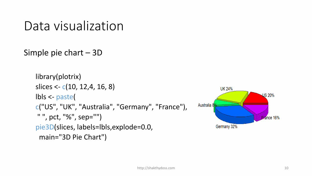
Data visualization
Simple pie chart – 3D
library(plotrix)
slices <- c(10, 12,4, 16, 8)
lbls <- paste(
c("US", "UK", "Australia", "Germany", "France"),
" ", pct, "%", sep="")
pie3D(slices, labels=lbls,explode=0.0,
main="3D Pie Chart")
http://shakthydoss.com 10

Data visualization
Histograms
Histograms display the distribution of a continuous variable.
It by dividing up the range of scores into bins on the x-axis and displaying the frequency of scores in each bin on the y-axis.
You can create histograms with the function
hist(x)
http://shakthydoss.com 11

Data visualization
Histograms
mtcars$mpg #miles per gallon data
hist(mtcars$mpg)
# Colored Histogram with Different Number of Bins
hist(mtcars$mpg, breaks=8, col="lightgreen")
http://shakthydoss.com 12

Data visualization
Kernal density ploy
Histograms may not be the efficient way to view distribution always.
Kernal density plots are usually a much more effective way to view the distribution of a variable.
plot(density(x))
http://shakthydoss.com 13
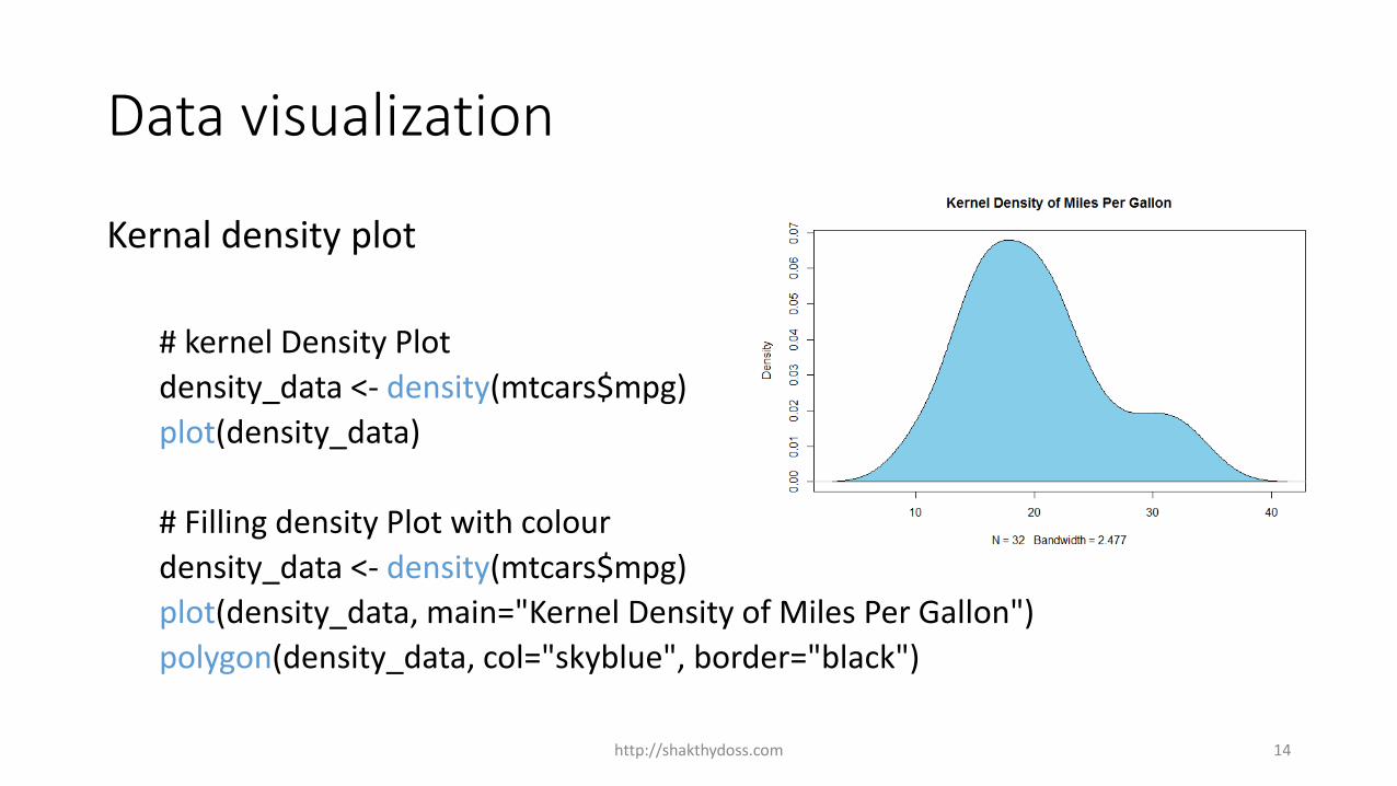
Data visualization
Kernal density plot
# kernel Density Plot
density_data <- density(mtcars$mpg)
plot(density_data)
# Filling density Plot with colour
density_data <- density(mtcars$mpg)
plot(density_data, main="Kernel Density of Miles Per Gallon")
polygon(density_data, col="skyblue", border="black")
http://shakthydoss.com 14

Data visualization
Line Chart
The line chart is represented by a series of data points connected with a straight line. Line charts are most often used to visualize data that changes over time.
lines(x, y,type=)
http://shakthydoss.com 15

Data visualization
Line Chart
weight <- c(2.5, 2.8, 3.2, 4.8, 5.1,
5.9, 6.8, 7.1, 7.8,8.1)
months <- c(0,1,2,3,4,5,6,7,8,9)
plot(months,
weight, type = "b",
main="Baby weight chart")
http://shakthydoss.com 16

Data visualization
Box plot
The box plot (a.k.a. whisker diagram) is another standardized way of displaying the distribution of data based on the five number summary: minimum, first quartile, median, third quartile, and maximum.
http://shakthydoss.com 17

Data visualization
Box Plot
vec <- c(3, 2, 5, 6, 4, 8, 1, 2, 3, 2, 4)summary(vec)boxplot(vec, varwidth = TRUE)
#varwidth=TRUE to make box plot proportionate to width
http://shakthydoss.com 18

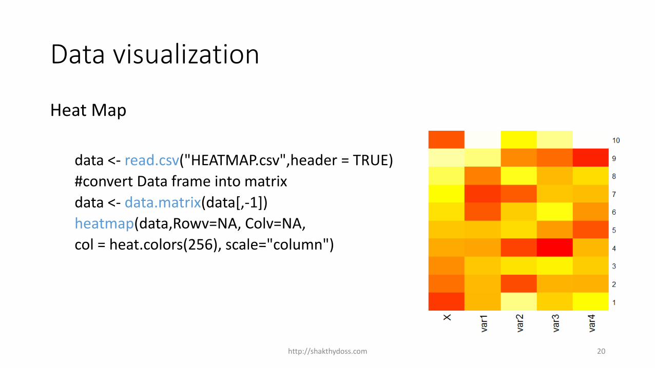
Data visualization
Heat Map
A heat map is a two-dimensional representation of data in which values are represented by colors. A simple heat map provides an immediate visual summary of information. More elaborate heat maps allow the viewer to understand complex data sets.
http://shakthydoss.com 19
Data visualization
Heat Map
data <- read.csv("HEATMAP.csv",header = TRUE)
#convert Data frame into matrix
data <- data.matrix(data[,-1])
heatmap(data,Rowv=NA, Colv=NA,
col = heat.colors(256), scale="column")
http://shakthydoss.com 20

Data visualization
Word cloud
A word cloud (a.ka tag cloud) can be an handy tool when you need to highlight the most commonly cited words in a text using a quick visualization.
R packages : wordcloud
http://shakthydoss.com 21

Data visualization
Word cloud
install.packages("wordcloud")
library("wordcloud")
data <- read.csv("TEXT.csv",header = TRUE)
head(data)
wordcloud(words = data$word,
freq = data$freq, min.freq = 2,
max.words=100, random.order=FALSE)
http://shakthydoss.com 22

Data visualization
Graphic outputs can be redirected to files.
pdf("filename.pdf") #PDF file
win.metafile("filename.wmf") #Windows metafile
png("filename.png") #PBG file
jpeg("filename.jpg") #JPEG file
bmp("filename.bmp") #BMP file
postscript("filename.ps") #PostScript file
http://shakthydoss.com 23

Data visualization
Graphic outputs can be redirected to files.
Example
jpeg("myplot.jpg")
counts <- table(mtcars$gear)
barplot(counts)
dev.off()
http://shakthydoss.com 24

Data visualization
Graphic outputs can be redirected to files.
Function dev.off( ) should be used to return the control back to terminal.
Another way saving graphics to file.dev.copy(jpeg, filename="myplot.jpg");counts <- table(mtcars$gear)barplot(counts)dev.off()
http://shakthydoss.com 25

Data visualization
Export graphs in RStudio
In Graphic panel of RStuido
Step1 : Select Plots tab Click Explore menu
and chose Save as Image.
Step 2: Save image window will open.
Step3 : Select image format and the
directory to save the file.
Step4 : Click save.
http://shakthydoss.com 26
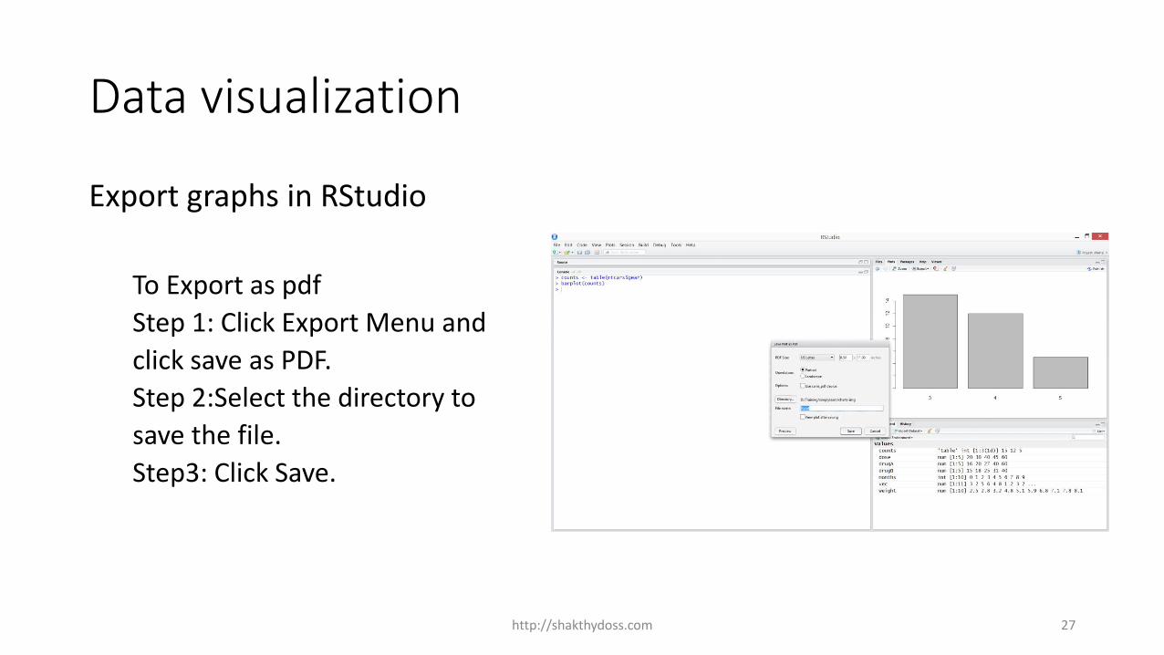
Data visualization
Export graphs in RStudio
To Export as pdf
Step 1: Click Export Menu and
click save as PDF.
Step 2:Select the directory to
save the file.
Step3: Click Save.
http://shakthydoss.com 27

Data visualization
Knowledge Check
http://shakthydoss.com 28

Data visualization
____________ represent lengths or frequency or proportion in the categorical data.
A. Line charts B. Bot plot C. Bar charts D. Kernal Density plot
Answer C
http://shakthydoss.com 29

Data visualization
___________ displays the distribution of data based on the five number summary: minimum, first quartile, median, third quartile, and maximum.
A. Line charts B. Bot plot C. Bar charts D. Kernal Density plot
Answer B
http://shakthydoss.com 30

Data visualization
Histograms display the distribution of a continuous variable.
A. TRUE
B. FALSE
Answer A
http://shakthydoss.com 31

Data visualization
Graphic outputs can be redirected to file using _____________ function.
A. save("filename.png")
B. write.table("filename.png")
C. write.file("filename.png")
D. png("filename.png")
Answer D
http://shakthydoss.com 32

Data visualization
___________ visualization can be used highlight the most commonly cited words in a text.
A. Word Stemmer B. Word cloud C. Histograms D. Line chats
Answer B
http://shakthydoss.com 33