a guide for a selection of spss functions · 3 how to enter data into spss data editor: general...
TRANSCRIPT

A Guide for
a Selection of SPSS
Functions IBM SPSS Statistics 19
Compiled by Beth Gaedy, Math Specialist, Viterbo University - 2012
Using documents prepared by Drs. Sheldon Lee, Marcus Saegrove, Jennifer Sadowski and Michael Alfieri

2
TABLE OF CONTENTS
How to enter data into SPSS data editor: General instructions .................................................................................................................. 3
How to create figures in SPSS: General instructions ................................................................................................................................. 4
Creating Bar Graphs .................................................................................................................................................................................. 5
Creating Pie Charts .................................................................................................................................................................................... 7
Creating Histograms .................................................................................................................................................................................. 7
Computing the Mean, Median, and Standard Deviation .......................................................................................................................... 10
Creating Box Plots ................................................................................................................................................................................... 11
To make a Normal Quantile Plot ......................................................................................................................................................... 11
Make a Scatter Plot .................................................................................................................................................................................. 12
“Standard” Pearson correlation a.k.a Pearson product-moment correlation: ........................................................................................... 12
Linear Regression .................................................................................................................................................................................... 12
Find the regression equation ................................................................................................................................................................ 13
Make a Scatter Plot with regression line in SPSS .................................................................................................................................... 13
Residual Plot in SPSS .............................................................................................................................................................................. 13
Spearman rank-order correlation ............................................................................................................................................................. 14
Logistic regression ................................................................................................................................................................................... 14
Paired T-test ............................................................................................................................................................................................. 15
Independent T-test ................................................................................................................................................................................... 15
Mann Whitney U a.k.a Wilcoxon-Mann-Whitney ................................................................................................................................... 16
ANOVA / General Linear Model ............................................................................................................................................................ 16
Post-Hoc tests – ANOVA .................................................................................................................................................................... 17
Kruskal-Wallis test .................................................................................................................................................................................. 17
Chi-square test of association (Contingency Tables) ............................................................................................................................... 18
Goodness of Fit Test ................................................................................................................................................................................ 18

3
How to enter data into SPSS data editor: General instructions
The Data Editor provides two views of your data:
Data View. This view displays the actual data values or defined value labels (resembles an excel spreadsheet)
Variable View. This view displays variable definition information, including defined variable and value labels, data type (for example, string, date, or numeric), measurement level (nominal, ordinal, or scale), and user-defined missing values.

4
In both views, you can add, change, and delete information that is contained in the data file. You can switch between them at the tabs located at the bottom left hand of the page.
Variable View contains descriptions of the attributes of each variable in the data file. In Variable View: rows are variables and columns are variable attributes. Type in the name of your variable (no spaces), choose the type of data (by clicking the grey box in the cell), a label for your variable (spaces are allowed – this will be the label that shows up on figures/graphs). If desired, in the “values” box code for your values by clicking on the grey box in the cell, and then coding “0=male, 1=female”. When you then return to data view, your codes will translate to your values (do this under “view” and “values labels”).
Once your variables are set up in variable view, return to “data view” and enter your data. Remember to save both your data file and your data output separately (they are different file types).
How to create figures in SPSS: General instructions
General instructions: To create a graph/figure on SPSS, go to “Graphs”, then “Legacy Dialogs” and choose the appropriate option. Typical options are: “Bar” and “Scatter/dot”. There are many options for graphs and/or details (e.g., error bars, best fit lines, etc) – consult the “Help” function on SPSS for additional detailed instructions.

5
Creating Bar Graphs For categorical data, we may use bar graphs or pie charts to visualize the data. In the data below, the three
columns are the favorite colors, favorite football teams, and pulse rates for students in a class. These are
categorical data, so we may use a bar graph or pie chart to display the data.
To make a bar graph in SPSS, go to
Graphs Legacy Dialogs Bar. Note
that the Simple bar graph is the default.
Click “Define.”
Choose either “simple” or “clustered” (“Clustered” is for grouping data – for example, by weeks).
Drag one of the categorical variables
(such as Favorite Color) onto the
Category Axis. Click “OK” to finish.
Notice: You can add additional
“Titles” and change what the “Bars
Represent.”

6
This is the resulting graph, which can be cut and pasted
into other documents.
Also from the “Bars Represent” area:
- Choose your variable of interest and click “other statistic” from the “Bars Represent” area. The mean is automatically chosen (displayed on y- axis). Include the variable of interest for your x- axis and include it in the “category” box.

7
Creating Pie Charts Graphs Legacy Dialogs Pie and click on
Define. Drag a categorical variable into the
“Define Slices by” box. (NOTE: Here the
results will be shown as a % rather than an N
value.)
Creating Histograms For one set of data:
METHOD #1 (the simple way)
Graphs Legacy Dialogs Histogram

8
From the column listings, drag the appropriate variable to “Variable.”
METHOD #2 (more editing options)
Graphs Chart Builder

9
This shot shows that a simple histogram was chosen, and the data for “Volume Diet Cola” was placed into the x-axis. The “Element Properties” window automatically appears.
TO SET CUSTOM VALUES FOR ANCHORS AND BINS:
In the “Set Parameters” tab of the “Element Properties” window, you can use the “Custom value for anchor" option to determine the starting endpoint for the bins. To change the bin width, find "Bin Sizes", select Custom, click on “Interval Width”, and enter the desired bin width into the box
10
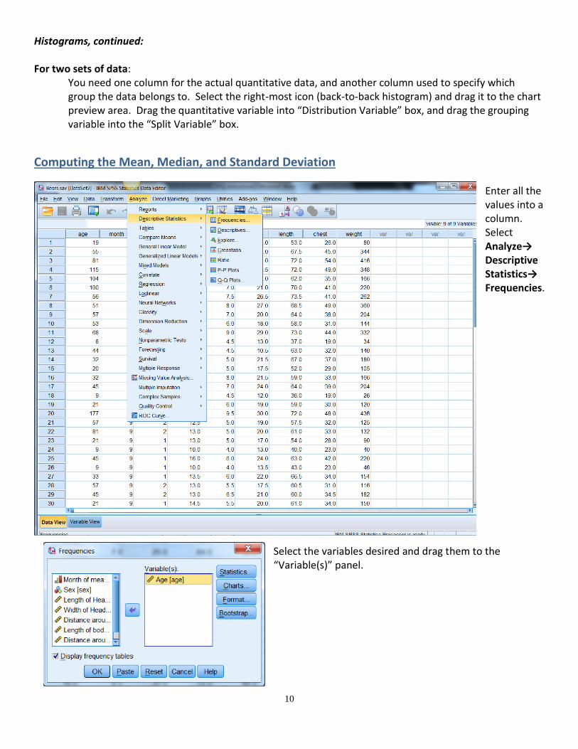
Histograms, continued:
For two sets of data: You need one column for the actual quantitative data, and another column used to specify which group the data belongs to. Select the right-most icon (back-to-back histogram) and drag it to the chart preview area. Drag the quantitative variable into “Distribution Variable” box, and drag the grouping variable into the “Split Variable” box.
Computing the Mean, Median, and Standard Deviation Enter all the values into a column. Select Analyze→ Descriptive Statistics→ Frequencies.
Select the variables desired and drag them to the “Variable(s)” panel.

11
Click the Statistics tab and choose what you want to calculate. (If you want to add Percentile(s), type in the value and click “Add”.) Click “continue” to return to the Frequencies window, and click OK to compute. Here is the
output:
Creating Box Plots
There are several ways to make box plots in SPSS, some of which are described below.
Single box plot Graphs Chart Builder, select Boxplot from the Gallery, drag the rightmost icon into the chart preview area. Drag the corresponding variable into the x-axis, then click OK to finish.
Side-by-side box plots, data in separate columns Analyze Descriptive Statistics Explore, drag all variables to plot into the “Dependent List”. Click “Plots”. Under Boxplots, select “Dependents together”. You also have the option to plot stem-and-leaf plots and histograms.
Side-by-side box plots, data in a single column with another column that is the grouping variable. Graphs Chart Builder, select Boxplot from the Gallery, drag the leftmost icon into the chart preview area. Drag the variable onto the y-axis, and the grouping variable onto the x-axis.
To make a Normal Quantile Plot
Analyze → Descriptive Statistics → Explore
Drag the appropriate column or columns into "Dependent List"
Click "Plots"
Check "Normality Plot with tests"
Optional: check “Histogram” to plot a histogram. Under boxplots, select “Factor levels together” to
make a boxplot for each variable, or select “Dependents together” to make side-by-side boxplots.
Click "Continue"
Click "OK"
Look for the Normal Q-Q Plots in the Output window (You may ignore the Detrended Normal Q-Q
plots)
Statistics
Age
N Valid 54
Missing 0
Mean 43.52
Median 34.00
Std. Deviation 33.721
Percentiles 25 17.00
35 21.00
50 34.00
75 58.00

12
Make a Scatter Plot
Graphs → LegacyDialogs → Scatter/Dot
Select “Simple Scatter”, click “Define” Drag the appropriate columns to the X-axis and Y-axis.
“Standard” Pearson correlation a.k.a Pearson product-moment correlation: Tests whether there is an association between two variables
Data (for both variables) are continuous, parametric Example: “There is a significant association between plant height and plant root length (Pearson correlation: r=0.75, n = 20, p=0.02)”
Pearson correlation How to enter data:
Input data into columns
add appropriate labels
Pearson correlation - How to run test:
Analyze
Correlate
Bivariate…
move variables into variables box
check “Pearson” and “Two-tailed”
Ok
Linear Regression Determines relationship between two variables and implies that a prediction of one value is being
attempted from another (i.e., cause and effect). Data are Continuous
NOTE: x = ‘cause’, ‘predictor’, or ‘independent’ variable that is set or chosen by the experimenter y = ‘effect’, ‘dependent’ which is never set by the experimenter
Example: “The uptake of drug X is significantly affected by pH level: uptake increases at higher pH levels (linear regression: p<0.001)”
Linear Regression How to enter data: Input data into two columns label columns appropriately Linear Regression How to run test:
Analyze
Regression
Linear…
move the “effect” variable into the dependent box
move the “cause” variable into the independent box
Ok

13
Find the regression equation
(continued from steps above)
Optional: Click “Save”. To save the predicted values, check “Unstandardized” under “predicted
Values”. To save the residuals, check “Unstandardized” under “Residuals”.
Click OK
The bottom table in the Output window contains the coefficients.
In this case, the regression equation is
If the value is sufficiently close to 1, you may use the regression equation to do predictions. For example, for somebody who has had 6.5 beers, the approximated blood alcohol level would be
Make a Scatter Plot with regression line in SPSS
Graphs → LegacyDialogs → Scatter/Dot
Select “Simple Scatter”, click “Define”
Drag the appropriate columns to the X-axis and Y-axis and click “OK”
In the Output window, double-click on the scatterplot.
Select Elements→Fit Line at Total.
Set the “Fit Method” to Linear
The “best-fit” line is drawn, and the value is shown to the right of the plot. To convert from the value to the value, you take the positive or negative square root, depending on whether or not the correlation is positive or negative.
Residual Plot in SPSS
Analyze → Regression → Linear
Enter dependent variable (y column) and independent variable (x column) appropriately
Click “Save”. To save the residuals, check “Unstandardized” under “Residuals”.
Click OK, a new column is displayed (probably called RES_1)
Make a regular scatterplot putting the independent variable on the x-axis and the residual on the y-
axis.

14
Spearman rank-order correlation Tests whether there is an association between two variables
Data are discrete, non-parametric
Example: “There is not a significant association between male and female body size in pairs of penguins (Spearman correlation: rs=0.771, n=20, p=0.072)”
NOTE Spearman rank-order is the non-parametric equivalent of the Pearson correlation (pg 83) Spearman rank-order correlation How to enter data:
Enter all data into two columns
o Enter category labels
o Enter value labels
Spearman rank-order correlation How to enter data:
Select “Analyze”
“correlate” then Bivariate…”
Highlight both variables and move them into “Variables” box
Make sure that “Spearman” is selected, and that the “test of Significance” is “Two-tailed”
Click “OK”
Logistic regression Regression, as above, implies cause and effect when ‘y’, ‘dependent variable’ (“effect”) is classified into groups NOTE: Dependent (effect, y, never set by experimenter): only classified into groups
Independent (cause, x, is set or chosen by experimenter): can be continuous OR can be in groups Example: “Shade level has a significant effect on the presence of the plant virus (logistic regression: p=0.006)”
Logistic regression How to enter data:
2 columns 1st has treatment as yes or no (0 or 1) 2nd has category groupings (1-?)
Logistic regression How to run test:
Analyze
Regression
Binary Logistic
move 'effect' variable to "Dependent" box
Place 'cause' variable in "Covariates" box
"OK"

15
Tests of Differences (for each know when to use, what type of data, how to write results):
Paired T-test Data are continuous, paired, in 2 groups, parametric
Example: “Plants in treatment A were significantly taller ( = 5.6 cm) after 7 days than plants in treatment B ( = 4.5 cm) (t-test: p= value of p, Figure 1).”
Paired T-test How to enter data:
Arrange data in 2 columns
Columns labeled as “before” and “after”
Should be one individual per row
Paired T-test How to run test:
Analyze
Compare means
Paired samples
t-test
choose variables
click ok
Independent T-test Data are continuous, unpaired, in 2 groups, parametric
Example: “Plants in treatment A were significantly taller ( = 5.6 cm) after 7 days than plants in treatment B ( = 4.5 cm) (t-test: p= value of p, Figure 1).”
Independent T-test How to enter data : ·1st column put in all data ·2nd column assign category to each data
Go to Variable View- under "Values" put in code 1 or 2
Independent T-test How to run test :
Analyze
Compare Means
Independent Samples T Test
Place independent variable in appropriate box
Grouping variable in other , press "define groups," put in 1 and 2
"Continue"
"OK" Read line with "Equal variances assumed" line for appropriate p-value

16
Mann Whitney U a.k.a Wilcoxon-Mann-Whitney Data are discrete, unpaired, in 2 groups, non-parametric
Example: “There were significantly more plants in treatment A than in treatment B (Mann-Whitney U test: p= 0.025)”
NOTE Mann-Whitney U is the non-parametric equivalent to the independent samples t-test Mann Whitney U How to enter data:
Enter collected data into a column
Enter categories (as numbers) in next column
o Go to variable view and enter in corresponding information, including the ‘values’ column as
what which # represents in the data view.
Mann Whitney U How to run test:
Select “Analyze”
“Nonparametric Tests”
“2-Independent Samples” (by default, the Mann-U should be selected)
Enter dependent variable in the “Test Variable List”
Enter independent variable in the “Grouping Variable”
“Define Groups” (define them as 1 and 2)
Click “OK” to run
ANOVA / General Linear Model Data are continuous, unpaired, in 2 groups or more, parametric
Example: “There is a significant difference in grain size among the three cultivars (ANOVA: F=11.879, df=2, p=0.001)
ANOVA How to enter data: All the data are entered into one column with a second column for the labeling of the groups. ANOVA How to run test:
Analyze menu
choose Compare Means
One-way ANOVA.
the data (numerical) variable goes into the Dependent box
the grouping variable goes into the Factor box
. By clicking on the Options menu you can request a means plot, some descriptive statistics of the data, and a test for Homogeneity of variance. Click continue, then OK.
GLM How to enter data:
Create columns [categorical/variable]
enter data into appropriate columns
label variables within columns if necessary

17
GLM How to run test:
Analyze
General Linear Model
Univariate… move dependent variable into appropriate box move fixed factor into the appropriate box
Ok
ANOVA / General Linear Model
Post-Hoc tests – ANOVA Data are continuous, unpaired, in more than 2 groups, parametric
Example: “There is a significant difference in grain size among the three cultivars (ANOVA: F=11.879, df=2, p=0.001). Premier is significantly smaller than super or dupa and there is no difference between super and dupa (least significant difference (LSD) post-hoc test, table 1).
ANOVA How to enter data:
See directions for ANOVA
ANOVA How to run test:
Run as ANOVA
While selecting variables, click post hoc button
Select LSD, SNK
Click ok in display box
Click ok
GLM How to enter data in SPSS: similar to ANOVA GLM How to run test in SPSS: similar to ANOVA
Kruskal-Wallis test Data are discrete, unpaired, in more than 2 groups, non-parametric
Example: “There is a significant difference in grain size of the three cultivars (Kruskal Wallis: p=0.013).
NOTE Kruskal-Wallis is the non-parametric equivalent to the one-way ANOVA NOTE If Kruskal-Wallis results state a significant difference, then pairwise Mann-Whitney U tests can be run. Kruskal-Wallis How to enter data:
Use independent t-test to enter data but this time have a 3rd group instead of just 2
Kruskal-Wallis How to run test:
Analyze
Non-parametric Tests
K Independent Samples
make sure "Kruskal-Wallis test is selected (default)

18
Place data into the "test variable list"
Grouping variable in other , press "define groups"
put in min. and max (ex: if there are 3 groups, min=1 and max=3)
"Continue"
"OK"
Chi-square test of association (Contingency Tables) Tests whether there is an association between two variables
Data are categorical, non-parametric Example: “There was a significant association between stream velocity category and stream bed category (Chi-square test: X2 = 11.036, d.f. = 3, p=0.012)”
Chi-square test of association How to enter data: Create 3 columns in the worksheet: “frequency”, “row”, and “column”. The “frequency” column contains the data, and the “row” and “column” columns identify the location of the data in the matrix.
Chi-square test of association How to run test:
Data menu
Choose Weight Cases
Click “frequency” into frequency variable box. Click OK.
Analyze menu
choose Descriptive Statistics
select Crosstabs
Enter “row” into row and “column” into column.
Click Statistics
select Chi-square
Continue.
click Cells
in the options box select both Observed and Expected in the Counts area.
click Continue
OK in the Crosstabs box.
Click Display clustered bar charts to produce a visual summary of the frequencies in each of the categories.
Goodness of Fit Test
Enter categories (by number) in one column, and frequency in adjacent column.
DataWeight Cases; click “Weight Cases by” and insert frequency column in “Frequency Variable:
AnalyzeNonparametric TestsLegacy DialogChi Square Test
Click category column into “Test Variable List”
Click appropriate case in “Expected Values”; add proportions in “Values” (if appropriate)
Click OK
Chi-Square value, d.f. and P-value appear in output.