a multidisciplinary approach toward improving … 9-4 sollohub.pdfmultidisciplinary approach toward...
TRANSCRIPT

Multidisciplinary Approach Toward Improving Bus Schedule Readability
61
A Multidisciplinary Approach Toward Improving Bus Schedule
ReadabilityDarius Sollohub, New Jersey Institute of Technology
Anand Tharanathan, Texas Tech University
Abstract
Printed schedules are critical to mass transit mobility, perhaps no more so than to bus transit users who often embark from locations where information is not pro-vided. For economic reasons, they also rely heavily on transit. Schedules are their lifeline. After becoming concerned with the readability of its bus schedules, New Jersey Transit (NJT) enlisted an interdisciplinary research and design team from the New Jersey Institute of Technology (NJIT) to analyze, redesign, and test the agency’s bus timetables over an 18-month period beginning in 2003. The process included precedent research, community outreach, graphic design, laboratory testing, and survey methods. It began with a literature survey and review of timetables produced by other agencies. Two focus groups were convened to incorporate user viewpoints. Based on these methods and acknowledging the institutional and production con-straints of the agency, two prototype timetables were designed for one of the agency’s most complex bus routes. The prototypes and the current schedule for the route were time-tested in a laboratory with 30 participants. A survey was given to the same participants. The analysis of the experimental data was partially inconclusive due to high error rates for all schedules tested. However, in the survey, a majority of partici-pants showed preference for aspects developed in the prototypes, offering the agency important production recommendations regarding font sizes, text orientation and graphic display methods, as well as institutional directives regarding data transfer,

Journal of Public Transportation, Vol. 9, No. 4, 2006
62
maps, zone designations, passenger information, and telephone contacts. This article recounts this process and offers to the larger transit community the conclusions of this interdisciplinary approach, not combined in this manner before, to make bus transit more attractive and efficient.
IntroductionInformation is a critical component of mass transit mobility. Knowing where to take transit and when to board are important preconditions for use. In an age when information is increasingly provided digitally through the Internet, printed schedules remain important. Printed schedules are especially important to bus users, who are frequently of a lower income bracket with limited access to digital information and who often embark from locations where schedules are not pro-vided. This article describes a research project entitled “Improving Public Transit Schedules—Timetables People Can Actually Read” that analyzed these conditions and developed prototypical solutions between January 2003 and July 2004. The participants, who worked as a team in this undertaking, were the project cli-ent, New Jersey Transit (NJT); the project sponsor, the New Jersey Department of Transportation (NJDOT); and the research provider, the New Jersey Institute of Technology (NJIT). At NJIT, the project was undertaken in an interdisciplin-ary manner employing faculty, researchers, and students from the disciplines of transportation planning, design, and human factors. The tasks of the project were fourfold:
1. To understand how schedules evolved, what standards had been developed, and what research had been undertaken to study them.
2. To analyze schedules currently being used and compare them to those of other agencies, in the process, reaching out to the community to do so.
3. To develop prototypes that sought to overcome the deficiencies identi-fied.
4. Test and survey participants on how they used both the prototypes and the originals, side by side, in a controlled environment.
The resulting recommendations, both immediate and long term, are specific to the client’s needs while at the same time relevant to a larger audience regarding this largely unexamined yet critical component of mobility.

Multidisciplinary Approach Toward Improving Bus Schedule Readability
63
NJT’s Bus SchedulesNJT is one of the few transit agencies that mass-produces hardcopy schedules for all its 231 bus routes. NJT estimates that it produces 20 to 25 million schedules per year, making it one of the largest schedule producers in the North America. Printed schedules complement automated and operator-assisted telephone ser-vice and a website that includes a trip planner. Currently, the agency receives 4.7 million calls per year and 71.7 million page views on its website.1 The overall layout and design of NJT bus schedules has evolved over the years, but follows basic stan-dards and guidelines developed in 1972. The current schedule layout and infor-mation contained therein represent the accumulation of years of responses to staff recommendations, legal and liability issues, and policy/procedural changes. Schedules are constantly evolving; they are changed and reissued four times per year to accommodate schedule adjustments and other modifications. Physically, the timetables are 21 to 24 inches long, but can be as long as 36 inches. They fold down to a 3 x 8½-inch packet and are distributed on buses and at stations and various other locations. Each schedule is available in pdf format on the agency’s website.
The agency’s bus schedules (see Figure 1 as a typical example) feature timetables, a map, and text notes. Each timetable consists of selected bus stop locations, or “time-point locations,” which are printed in white text on a black background. Bus arrival/departure times or “time points” are listed below the time-point locations. In general, weekday, Saturday, and Sunday timetables for a specific direction are displayed on one side of the timetable. All bus schedules are printed in black ink on standard white paper. The map is not to scale and includes the names of selected streets and towns served. The map also indicates connecting bus routes and pas-senger rail lines. Other information, including notices, phone numbers, and fare information, is included as blocks of text.
The orientation of text blocks varies on each side of a typical schedule, with some blocks of text perpendicular to others. The cover, which includes the route num-ber and the communities served, is in a box with a “portrait” orientation when folded, but, when unfolded, its long axis is perpendicular to the length of the sheet. The timetables appear in one long column parallel to the sheet’s long axis, with time-point locations enclosed in text boxes at the top. To read the locations, one must rotate the schedule 90 degrees and then rotate back to read the correspond-ing time points. Morning trips begin at the top and proceed down chronologically. One reads the times for each trip horizontally from left to right.

Journal of Public Transportation, Vol. 9, No. 4, 2006
64

Multidisciplinary Approach Toward Improving Bus Schedule Readability
65
Figure 1. (Left) Front side of current 62 schedule and detail of timetable. Note the different orientation for time points and time-point locations.
(Above) Enlarged detail at actual size.

Journal of Public Transportation, Vol. 9, No. 4, 2006
66
PrecedentsLiterature SurveyThe project began with a literature survey that provided a point of reference for reviewing NJT’s current schedules and a scholarly foundation for prototype design. Topics reviewed in the literature included those regarding information display, display design, cognitive behavior, and understanding and interpreting informa-tion in printed displays. Essential findings of the survey are summarized below.
At a fundamental level, reading and deciphering bus schedules consists of a highly complex set of tasks involving many phases of human information processing. The human information processing model described by Wickens and Hollands (2000) requires many different mental processes essential to using schedules. These include short-term sensory storage for the initial search task of scanning the time-table. The accuracy and speed of recognition is greatest if the displayed stimuli are presented in a physical format that is maximally compatible with the visual repre-sentation of the unit in memory. Decision making is essential for determining the bus stop from the schedule. The user should be able to read schedules rapidly and accurately, with critical information recognized automatically to make quick and accurate decisions. Working memory describes the memorization of bus routes, time, and stops that are critical to effectively reading a schedule. Goettl, Kramer, and Wickens (1986) have found that the efficiency of a process increases when items of information are in close proximity. How many units in memory have to be held simultaneously, how many decisions have to be made, and what needs to be memorized to use a schedule, are important design benchmarks.
Typography is a critical component of schedule design. The Transit Cooperative Research Program (1999) generally recommends 10-point font size as a minimum and the avoidance of very narrow stroke widths in transit schedules. According to Wickens et al. (2004), contrast should be maximized by printing black letters on white background and the choice of fonts influence how fast users comprehend information. Roman fonts are recognized standards, according to McCormick and Sanders (1993). Phillips (1979) recommends that, in certain contexts, lowercase should be avoided. Nimmo-Smith and Wilkins (1987) have found that clarity and readability are improved by reducing the typical spacing between the letters and increasing the spacing between the lines. McCormick and Sanders (1993) have found that increasing the size of the initial letter of a word increases legibility sig-nificantly. Fisher and Tan (1989) specifically studied the highlighting of text and

Multidisciplinary Approach Toward Improving Bus Schedule Readability
67
affirm its efficiency, but suggest caution as excessive use impedes the ability to find a target.
As schedules are typically made up of tables, lists, maps, symbols, and other items, the overall style that balances the document equally critical to effectiveness. Tufte (2001) shows many examples that maintain an optimum blend of graphic elegance, text representation, and information display, while Tullis (1983) cites the four important characteristics of display formats as overall density, local density, grouping, and layout complexity.
Other research focuses on specific features found in schedules. Fox and Wright (1972) show that tables should be short and simple to use with the least complica-tions. They also find that columns should be grouped into blocks of approximately five items (Fox and Wright 1970). Tinker (1960) has found that times scanned vertically are better comprehended than those scanned horizontally. Tinker (1954) has also shown that economy of space too often overrides readability fac-tors. Schneiderman (1998) suggests that proper alignment of the information and text boxes improves the overall visual quality. Sparrow (1989) finds that informa-tion should be consistent; if represented in a different manner its meaning can change.
Bartram, Crawshaw, and Sprent (1980) studied the two primary timetable styles: one that represents the route vertically known as the standard format, the other that represents it horizontally known as the reflected format. The reflected format has been shown to be more effective; it is easier to scan and routes are represented in an orientation that corresponds to the horizontal progression from left to right, a powerful western stereotype of motion direction. They also show that the 12-hour system is more efficient than the 24-four hour system. In a later study (1983), they find that the need to rotate information undermines effectiveness and sug-gest that the location and time should be on the same axis.
The Transit Cooperative Research Program (1999) suggests that, wherever pos-sible, route maps should accompany timetables and that these should be identical to those used at bus stops and signboards. All information aids should try to spa-tially orient the passenger by providing points of interest and legends in the maps. Further, the study suggests that timetables should read left to right and either a line or a space break should be given after every three to five rows to enhance read-ability of the tables. Whenever extensive variations occur in a route, separate route maps and separate timetables should be generated. Swanston and Walley (1984)

Journal of Public Transportation, Vol. 9, No. 4, 2006
68
indicate that a clear distinction of different zones of a route increases timetable legibility.
Comparison to Schedules of Other AgenciesBased on recommendations of NJT and consultation with American Public Transportation Association (APTA) staff, schedules were procured from several large transit providers. Also procured were schedules that had won APTA design awards in the prior three years. This survey, albeit unsystematic, yielded several commonalities (see Table 1). Most schedules follow a landscape format. In doing so, most indicate their time points as diagonal text. Most schedules provide some distinction between morning and afternoon/evening, a distinction that provides an additional layer of reference in reading long columns of text.
Table 1. Survey of Other Transit Agencies Regarding Features Proposed
Community OutreachFocus GroupsThe study team solicited user input through two focus groups: one consisted exclusively of NJT employees who regularly use buses, the second of nonemploy-ees whose bus transit use varied from regular to infrequent. Each group consisted of six people. Two existing NJT schedules were selected for discussion. The first was a single schedule for five routes—the 144, 145, 148, and 164—that primarily serve

Multidisciplinary Approach Toward Improving Bus Schedule Readability
69
office workers commuting to Manhattan. The second—for route 62—was a more complex urban route used by a diverse group of riders. The same meeting format was used for both groups with NJT staff serving as facilitators, while research team members observed. The nonemployee participants were culled from a large data-base of customers that NJT maintains and were compensated for their time, as per agency standards. Meeting discussions covered several topics and issues relevant to schedule usability, format, and content. Some of the most significant outcomes of these discussions are presented below.
1. Most participants felt that current maps provide an adequate level of detail and information and should not be revised. Some indicated that established landmarks, such as churches and schools, should be indicated on the map but others expressed concern about placing too much detail on the maps. The seemingly random orientation of the north arrow was a concern for some members of the research team. However, none of the focus group members indicated this as a problem.
2. More explicit display of the customer service telephone numbers was widely recommended. Several participants in the nonemployee focus group indi-cated that making this prominent was their paramount concern.
3. Opinions were somewhat mixed over displaying weekday and weekend/holi-day schedules on separate sides. Presently, bus schedules display weekday and weekend/holiday schedules to a particular direction on one side. So, for example, on the route 62 schedule “To Newark” timetables for both weekday and weekend/holiday appear on one side of the schedule. The research team hypothesized that having all the weekday timetables on one side and weekend/holiday timetables on the other would favor infrequent users who needed to plan on the same day. This measure would considerably reduce the need to flip the schedule when planning a round trip and would be consistent with the findings of Goettl, Kramer, and Wickens (1986) and Bartram, Crawshaw, and Sprent (1983).
4. Both groups agreed that using a numerical code to mark the time-point location on the map was useful. This was a feature unique to the route 62 schedule. The feature was being tested by NJT independent of the study.
Selected transit schedules obtained from other transit agencies were also pre-sented to each of the focus group participants. Each participant was asked to respond to specific characteristics of these schedules. Preferences are summarized as follows:

Journal of Public Transportation, Vol. 9, No. 4, 2006
70
1. Provide shading on alternate columns. Many transit schedules employ shading of alternating columns, assisting readers in identifying time points with time-point locations.
2. Decrease the number of rows in one table by distinguishing between morn-ing and afternoon/evening periods. This feature, as employed by other agen-cies, was generally preferable to NJT’s current layout of one long table.
DesignPrototype Design and DevelopmentOnce the research team reviewed the related literature, analyzed NJT’s and other agency’s schedules, and received input from the focus groups, the design of pro-totypes began. Given the complexity of the 62 schedule (see Figure 1), the team selected it as a suitable challenge for prototype design and testing. NJIT also met on several occasions with NJT’s graphics and printing staff to discuss production operations and identify potential barriers and impacts associated with recom-mended layout changes. To fairly evaluate any modifications, care was taken to eliminate any indicators that might identify the prototypes to test participants. All schedules tested were created using NJT’s in-house graphics software and printing facilities on exactly the same paper. One prototype was designed giving primary importance to the direction of travel, following the same organizational logic of the existing schedule but with significant graphic modifications. This was named the “Directional Prototype” schedule (see Figure 2). The other prototype was designed by giving primary importance to the day of the week, and was named “Weekday/Weekend Prototype” schedule (see Figure 3). Other than this organiza-tional difference, both prototypes shared the following features.
OrientationPrototypes were designed so that all information was organized in a landscape format and time points were displayed at 30 degrees to the horizontal so that they would be read on a slant, thus eliminating the need to rotate schedules consistent with Bartram, Crawshaw, and Sprent (1983) (see Figure 2).
Proximity and Morning–Afternoon/Evening DistinctionThe overall landscape orientation required that otherwise long columns be divided into two separate columns. The logical break point was whether trips began in the

Multidisciplinary Approach Toward Improving Bus Schedule Readability
71
morning or afternoon/evening. This was consistent with Sparrow (1989) and Tufte (2001). This organization style was consistent with schedules of other agencies and supported in focus groups (see Figure 4).
Zebra Pattern (Shading Alternate Columns) In the prototypes, alternate columns were shaded in a “zebra pattern.” This pat-tern was introduced to avoid skipping between columns when a user reads down a column following Smith (1979) who found that proper highlighting attracts users’ attention, thus providing a reference line that helps them read the schedule easily. This feature was also supported in focus groups (see Figure 2).
Maps The maps were not changed, retaining the numeric code currently being tested. However, a new key describing map features and symbols was developed for the prototypes (see Figure 3).
ZonesIn the NJT system, zones are used to calculate the trip fare. Bold lines that define the zones in the tables were included in the prototypes and were keyed to zone boundaries indicated on maps. This responds to Swanston and Walley’s (1984) recommendations that suggest users translate information faster when separa-tions between zones are shown clearly (see Figure 2).
Font SizeNJT schedules typically use font sizes below the 10-point minimum recommended by the Transit Cooperative Research Program (1999). Font sizes on the 62 schedule were at 5.5 point. Because of the finite area of the schedules, it was decided that font sizes would not be enlarged for the prototypes.
Testing and SurveyTime- and Error-Based Laboratory ExperimentParticipants. Thirty subjects from the larger university community participated in the laboratory experiment. Participants were asked to respond to questions that allowed researchers to group them for a finer grain of analysis. Ages ranged between 17 and 65. Participants included high school (relatives of university-affiliated individuals) and college students, professors, maintenance personnel, and office staff. They were grouped according to educational level as “up to high school,” “college,” and “advanced degree.” Seventeen of the 30 participants spoke

Journal of Public Transportation, Vol. 9, No. 4, 2006
72

Multidisciplinary Approach Toward Improving Bus Schedule Readability
73
Figure 2. (Left) Front side of directional 62 prototype and detail of timeta-ble. New features include slanted time points, white on black for headings,
zebra patterns, and zone distinctions.
(Above) Enlarged detail at actual size.

Journal of Public Transportation, Vol. 9, No. 4, 2006
74

Multidisciplinary Approach Toward Improving Bus Schedule Readability
75
Figure 3. (Left) Reverse side of weekday/weekend 62 prototype showing detail of heading. Note the use of black on white as a visual cue
compared to Figure 2.
(Above) Enlarged detail not actual size.

Journal of Public Transportation, Vol. 9, No. 4, 2006
76

Multidisciplinary Approach Toward Improving Bus Schedule Readability
77
Figure 4. Changes to morning–afternoon/evening distinction showing timetables reorganized in landscape format. Morning and afternoon/
evening distinction in modification.

Journal of Public Transportation, Vol. 9, No. 4, 2006
78
English as their second language. Apart from educational level, no specific ques-tions regarding literacy were asked. Familiarity and usage of the agency’s bus schedules separated participants into four groups: “none,” “rarely” (less than twice in the last six months), “frequently” (twice a month), and “very frequently” (twice a week).
Method. Researchers designed a time and error test with three phases for every participant. Each phase was designed to test a specific type of schedule. Partici-pants were asked to answer 11 questions in each phase in the least possible time. The first question in each phase was a warm-up question and was not counted in the analysis. The remaining 10 questions in each phase were designed to test features that may affect reading and interpretation of the schedule. Prior to each phase, participants were given five minutes to familiarize themselves with a given schedule. Even though the questions in the three phases were similar with respect to the design feature they tested, the destinations, departure locations, and times differed. Researchers recorded the accuracy and time each participant took to answer a question on a specific schedule. A camcorder recorded the entire experiment with all devices placed out of the participants’ field of view so as not to distract. To minimize the potential for answer translation errors, staff asked par-ticipants to verbally indicate their answer so that the experimenter could manu-ally record the response and response time. Features tested for efficiency were the zebra pattern, the morning–afternoon/evening distinction, maps, and zones. Other information that had been graphically reorganized was also tested.
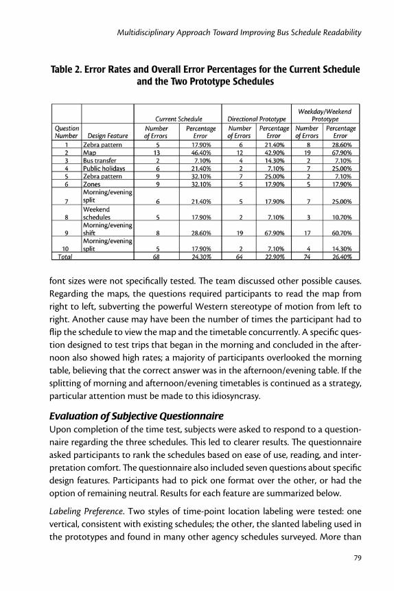
Statistical results of the time tests were largely inconclusive because of overall high error rates (see Table 2) and the relatively small sample size. Statistical power for the study would have been higher with a higher sample size. The only question that showed statistical significance2 was that dealing with different zone repre-sentations, which indicated that different zones were effectively recognized in the prototypes but not in the existing schedule ( F[2,46] = 11.28, p<0.01). In looking at the error rates among different participants, those with an educational level “up to high school” had the highest error rate, committing almost twice as many errors as those made by participants with advanced degrees. This suggests a minimum cognitive capability, which could be marked as the baseline for proficiently reading bus schedules.
Generally, the overall poor performance in using the schedules at all education levels and ages clouded an empirical assessment of the modifications. The research team attributed this to the use of a smaller-than-recommended font, although
Multidisciplinary Approach Toward Improving Bus Schedule Readability
79
font sizes were not specifically tested. The team discussed other possible causes. Regarding the maps, the questions required participants to read the map from right to left, subverting the powerful Western stereotype of motion from left to right. Another cause may have been the number of times the participant had to flip the schedule to view the map and the timetable concurrently. A specific ques-tion designed to test trips that began in the morning and concluded in the after-noon also showed high rates; a majority of participants overlooked the morning table, believing that the correct answer was in the afternoon/evening table. If the splitting of morning and afternoon/evening timetables is continued as a strategy, particular attention must be made to this idiosyncrasy.
Evaluation of Subjective QuestionnaireUpon completion of the time test, subjects were asked to respond to a question-naire regarding the three schedules. This led to clearer results. The questionnaire asked participants to rank the schedules based on ease of use, reading, and inter-pretation comfort. The questionnaire also included seven questions about specific design features. Participants had to pick one format over the other, or had the option of remaining neutral. Results for each feature are summarized below.
Labeling Preference. Two styles of time-point location labeling were tested: one vertical, consistent with existing schedules; the other, the slanted labeling used in the prototypes and found in many other agency schedules surveyed. More than
Table 2. Error Rates and Overall Error Percentages for the Current Schedule and the Two Prototype Schedules

Journal of Public Transportation, Vol. 9, No. 4, 2006
80
50 percent of the participants preferred slanted labeling and 2 of 30 participants were neutral. Only 10 of the 30 voted for the vertical format.
Zebra Pattern. More than 50 percent of the participants voted for the zebra pat-tern and stated that the alternate shading of columns made the bus schedules more readable. Only 3 of 30 subjects voted against the zebra pattern and 6 of the 30 remained neutral.
Zone Representation. Participants voted unanimously for the zone to be repre-sented at the bottom of every table.
Heading Representation. In the prototypes, the headings were represented differ-ently with respect to black on white or visa versa. In the current schedules, the headings are set in black on white backgrounds. In the prototypes (see Figures 2 and 3), the schedule heading on one side of the schedule used white fonts on black background while reversing it on the other. This was expected to catch the attention of the participants and help them in distinguishing between the two sides when using the timetable. The response to this modification was unfavor-able, although there were many abstentions. Only 6 out of 30 subjects voted for the different representation, while 11 of the 30 voted for the black font on white background. Fourteen participants chose to be neutral regarding this issue.
Table Layout. Regarding the morning and afternoon/evening reorganization, more than 50 percent of the participants voted for the single table, without breakup. Twelve out of 30 participants voted for the breakup of tables into morning and afternoon/evening and 2 remained neutral (see Figure 4).
Other Information Representation. The prototypes introduced the pictorial rep-resentation for information regarding handicap facilities that is expressed in text on the current schedules. More than 50 percent of the participants preferred the pictorial format of representation. Six out of 30 were neutral and 6 preferred the text format.
Direction versus Day of Travel. More than 50 percent of the participants chose the “directional prototype” over the “weekday/weekend prototype.” None of the 30 subjects chose to be neutral. Only 9 of the 30 chose the weekday/weekend mode of representation (see Figures 2 and 3).
Ranking Data Analysis: Chi-Square TestsParticipants were asked to rank the existing schedule and the two prototypes with rank 1 indicating most preferred and rank 3 the least. A chi-square test conducted

Multidisciplinary Approach Toward Improving Bus Schedule Readability
81
on the ranking data revealed that between the two prototypes, the “directional schedule” was preferred, ranked more frequently as rank 1 and 2 as compared to rank 3 (Chi square value was17.80 > 9.49, the value for a 95 percent confidence interval and four degrees of freedom [also see Table 3]). The results show that sub-jects ranked the current schedule more frequently as rank 3 as compared to rank 2 or rank 1. Furthermore, the statistical analysis also showed that the ranking of the weekday/weekend schedule was evenly poised across the three ranks, showing no statistical significance. The results have been tabulated in Table 3.
Table 3. Chi-Square Test for the Ranking of the Three Schedules
Expected value for each cell = (Sum of row X Sum of columns)/Grand total =
(30 x 30) / 90 = 10
ChiSq = 2.500 + 0.900 + 6.400
+ 2.500 + 0.400 + 4.900
+ 0.000 + 0.100 + 0.100 = 17.800
Degrees of freedom = 4
17.80 > 9.49; for 95% confidence Interval, Degrees of Freedom = 4
The following conclusions can be drawn from the questionnaire responses:
• The straight, long table was the only feature favored from the current schedule.
• All 30 participants preferred the zone representation incorporated in the prototypes.
• The majority of participants preferred the zebra pattern. Most also favored the slanted labeling and the pictorial format of representing other informa-tion in the schedules.
• The “directional prototype” schedule was preferred over the “weekday/weekend prototype” by a majority of the participants.

Journal of Public Transportation, Vol. 9, No. 4, 2006
82
RecommendationsBased on the entire process, including the review of relevant literature, input from NJT staff, focus group feedback, and the results of the performance test and ques-tionnaire, the following recommendations were made to the agency:
• Font size should be increased. The high overall error rates are most attribut-able to participants’ difficulty in reading text that is almost half the minimum size recommended in generally recognized standards.
• The “directional prototype” schedule was preferred by participants by a more than two-to-one margin. It is also the organizational style currently in use. It should not be changed, despite evidence to the contrary found in the literature search, at least without considerable further study.
• Eliminate information not directly related to the service NJT provides. Much of the “other” information on NJT bus schedules has reportedly been added in response to customer feedback as well as concerns raised from NJT legal and administrative staff. Some of this information needs to remain, regard-less of relevance to the user, but efforts to streamline, consolidate or reduce it, should be made.
• Morning and afternoon/evening time points should be retained in a single timetable although consideration should be given to distinguishing the periods using other display methods. Again, this contradicts findings of the literature search as well as the focus groups, but without further study, it should not be employed at this time.
• Adjacent columns should be distinguished from each other through the use of shading. Caution should be used when adopting this feature, however, as other schedules already use shading to denote peak hours or special excep-tions.
• Time-point locations should be slanted so as to not require rotation. A wide margin of participants preferred this feature, which is also used by many other agencies.
• Time-point locations should be coded to locations on the map as it already is on the 62 schedule.
• Adopt the zone representation format used in the prototypes. This was a feature that showed conclusive statistical significance and a unanimous vote in the questionnaires.

Multidisciplinary Approach Toward Improving Bus Schedule Readability
83
In discussing these changes with NJT staff, it is clear that implementation would likely impact production operations and require additional resources. While the recommendations listed above will probably improve the readability of NJT’s bus schedules in the short term, the momentum created can be continued by focusing on issues that the study identified. Some of these are institutional concerns that transcend those of production, while others are opportunities for further research in this area. The following were recommended to NJT for further action:
• Develop and test additional prototype schedules using the methods estab-lished in this study. The lessons learned in this research provide a significant basis for developing new schedules. Conduct the same time-and-error based experiment with a larger group and expand the content of the study. Specifically, test the effectiveness of different font sizes, as this is probably the most critical attribute of readability. Additionally, different font styles should also be tested. New designs should focus on eliminating extrane-ous information and making the information more user-friendly. Different types of bus routes, serving a variety of demographic groups, should also be examined.
• Initiate a separate study that specifically probes literacy and schedule read-ability. This would be specifically geared toward bus transit users, many of whom are financially and/or educationally disadvantaged or use English as a second language.
• Initiate broad-based institutional discussions with staff to identify informa-tion to eliminate, thereby increasing space to allow for larger fonts. This could take the form of internal focus groups.
• Streamline routes so as to reduce complexity, perhaps based on a maximum number of time points allowable on a schedule.
• Develop a “one-call” system and eliminate the extensive list of phone num-bers on current schedules.
• Investigate other scheduling software that could help facilitate new and improved concepts for schedule presentation. Current software used by NJT since 1989 has considerable limitations. Software that could facilitate changes more easily and cost-effectively should be explored.

Journal of Public Transportation, Vol. 9, No. 4, 2006
84
ConclusionsWhile this article underscores the essential role information plays in mass transit mobility, it stresses the critical importance of the means by which that informa-tion is conveyed. The attributes of those means—clarity, legibility, and readabil-ity—must not be taken for granted. This article offers clear directives regarding certain organizational styles and specific features; it also identifies specific areas for further research. While these results are specific to one of the most complicated schedules of a large agency and its methods respected that agency’s production and institutional conventions, these results can nonetheless speak to the broader transit community. The interdisciplinary approach described here, coordinat-ing community outreach, graphic design and time-based laboratory testing, not combined in this manner before, has proven valuable to NJT and offers a protocol that can be applied elsewhere. The continued pursuit of an effective way to assess and improve existing bus schedule layouts can lead to making bus transit more attractive and efficient.
Acknowledgments
This article reports the research conducted as part of FHWA-NJ-2003-028, “Improving Public Transit Schedules—Timetables People Can Actually Read”. Research for this grant was undertaken in an interdisciplinary capacity that included three co-principal investigators at NJIT: George Fallat P.E., transportation engineer; Darius Sollohub, AIA, architect and graphic designer; and Dr. One-Jang Jeng, human-factors research scientist. They were assisted by graduate researchers Sahanah Rao, Savitha Rajah, Anand Tharanathan, and Nelisa Mejia. The New Jersey Department of Transportation sponsored the project, with Edward Kondrath as project manager. The New Jersey Transit Corporation was the beneficiary of the research, for which Jerome Lutin led the project team that included Janice Pepper, David Volk, Allison Demyanovich, Janet Clark, Robert Lilley, and Helen Hind. Lou Sanders of the American Public Transportation Association provided guidance to the effort.
Endnotes1 These figures are for rail and bus queries combined. The only breakdown available
from NJT is that 65 percent of operator-assisted calls are from bus patrons.

Multidisciplinary Approach Toward Improving Bus Schedule Readability
85
2 An analysis of variance (ANOVA) was conducted to analyze the data. Statistical significance was concluded only if p < 0.05.
References
Bartram, D., M. Crawshaw, and N. Sprent. 1980. Intelligibility of timetables. Human Factors in Transportation Research 1: 319–327.
Bartram, D., M. Crawshaw, and N. Sprent. 1983. Structuring Timetable Informa-tion. Ergonomics 26 505–516.
Fisher, D., and K. Tan. 1989. Visual displays: The highlighting paradox. Human Fac-tors 31: 17–30.
Fox, K., and P. Wright. 1972. Explicit and implicit tabulation formats. Ergonomics 15: 175–188.
Fox, K., and P. Wright. 1970. Presenting information in tables. Applied Ergonomics 1: 234–242.
Goettl, B. P., A. F. Kramer, and C. D. Wickens. 1986. Display format and percep-tion of numeric data. Proceedings of the Human Factors Society—30th Annual Meeting, Human Factors Society, pp. 450–454.
McCormick, E. J., and M. S. Sanders. 1993. Human factors in engineering and design. New York: McGraw Hill.
Transit Cooperative Research Program. 1999. Passenger information services: A guidebook for transit systems—TCRP Report 45. Washington, DC: National Academy Press.
Nimmo-Smith, M., and A. Wilkins. 1987. The clarity and comfort of printed text. Ergonomics 30: 1705–1720.
Phillips, R. 1979. Why is lower case better? Applied Ergonomics10: 211–214.
Schneiderman, B. 1998. Designing the user interface, strategies for effective human-computer interaction. Boston, MA: Addison-Wesley.
Smith, S. L. 1979. Letter size and legibility. Human Factors 21: 661-670.
Sparrow, J. 1989. Graphical displays in information systems: Some data properties influencing the effectiveness of alternative forms. Behaviour and Information Technology 8: 43–56.

Journal of Public Transportation, Vol. 9, No. 4, 2006
86
Swanston, M. T., and C. E. Walley. 1984. Factors affecting the speed of acquisition of tabulated information from visual display. Ergonomics 27: 321–330.
Tinker, M. A. 1960. Legibility of mathematical tables. Journal of Applied Psychology 44: 83–87.
Tinker, M. A. 1954. Readability of mathematical tables. Journal of Applied Psychol-ogy 38: 436–442.
Tufte, E. 2001. The visual display of quantitative design. Cheshire, CT: Graphic Press.
Tullis, S. 1983. The formatting of alphanumeric: A review and analysis. Human Factors 25: 657–682.
Wickens, C. D, and J. D. Hollands. 2000. Engineering psychology and human perfor-mance. NJ: Prentice Hall.
Wickens, C. D., J. D. Lee, Y. Liu, and S.E.G. Becker. 2004. Introduction to human fac-tors engineering. NJ: Prentice Hall.
About the Authors
Darius Sollohub ([email protected]) is an associate professor and co-director of infrastructure planning at the New Jersey School of Architecture at NJIT, where he teaches architecture and infrastructure planning courses and studios, and coor-dinates community outreach. His research interests are in the areas of planning pedagogy, graphic design, infrastructure history, urban design, smart growth, and sustainable development.
Anand Tharanathan ([email protected]) is a Ph.D. (experimental psychology) student in the Department of Psychology and a research assistant at the Visual Performance Laboratory at Texas Tech University. In 2004, he received his masters in industrial engineering from New Jersey Institute of Technology, Newark, New Jersey.