analysis, presentation, interpretation of data. - process of breaking up the whole study into...
TRANSCRIPT
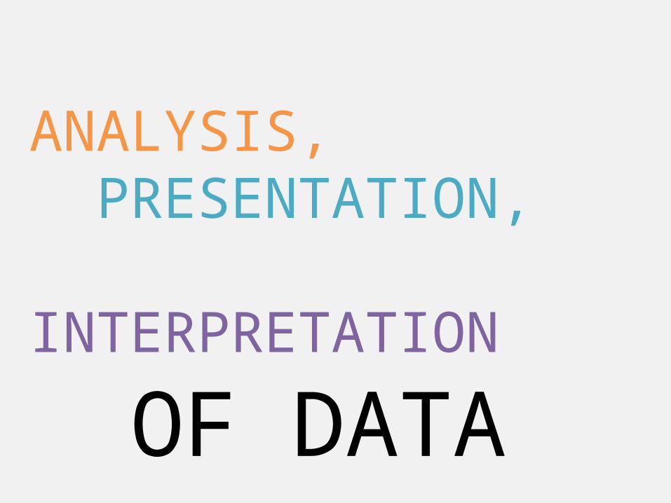
ANALYSIS,PRESENTATION,
INTERPRETATION
OF DATA
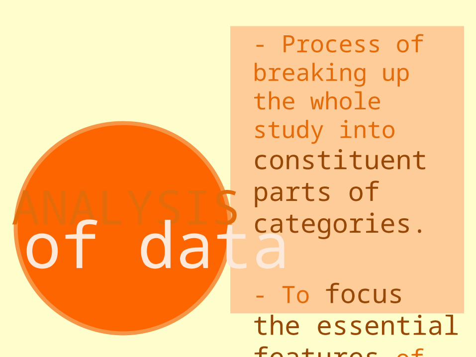
- Process of breaking up the whole study into constituent parts of categories.
- To focus the essential features of the study
ANALYSISof data
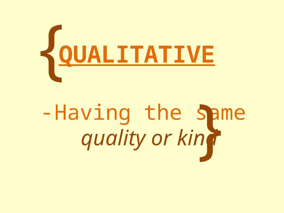
-Having the same quality or kind
{ }
QUALITATIVE

{ }
QUANTITATIVE
-Grouped according to their quantity
-example: grouped into ages of 10-14, 15-19, etc.
{ }
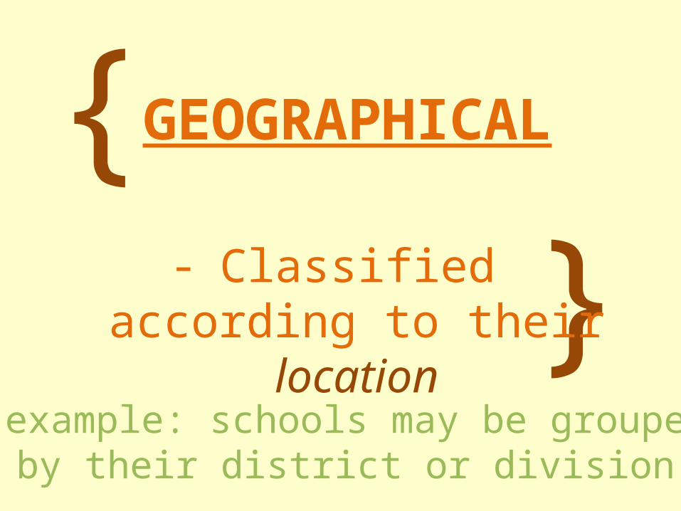
GEOGRAPHICAL
-Classified according to their location
-example: schools may be groupedby their district or division
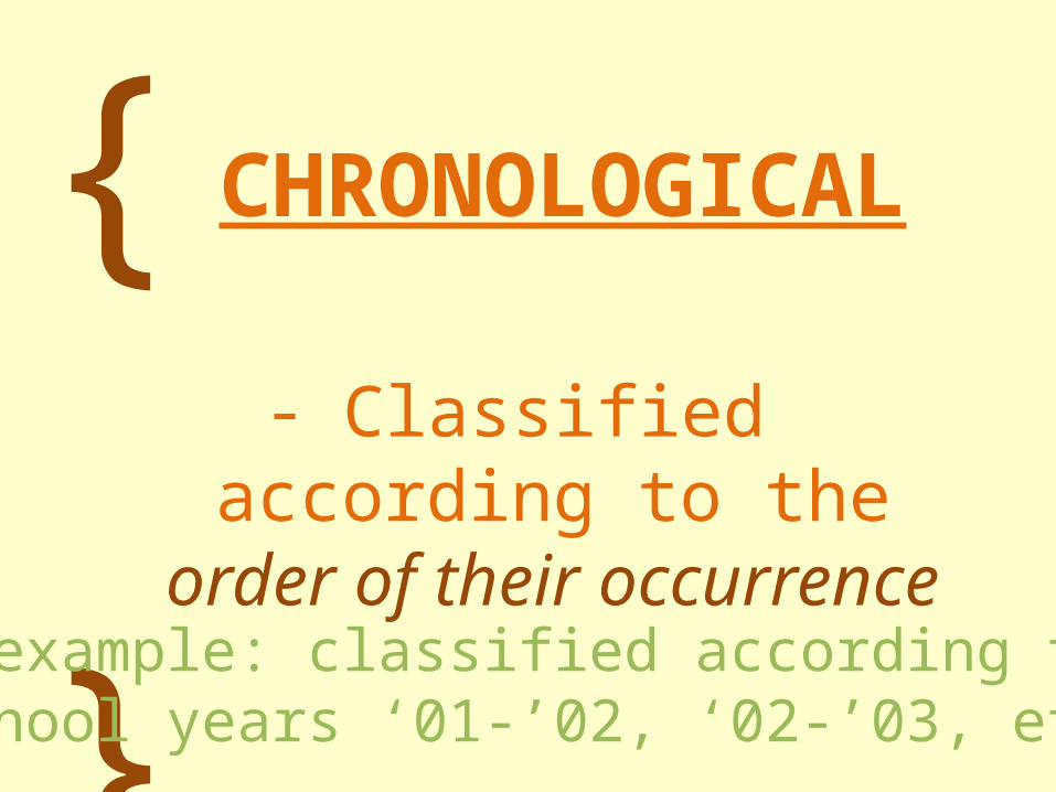
{ }
CHRONOLOGICAL
- Classified according to the order of their occurrence
-example: classified according toschool years ‘01-’02, ‘02-’03, etc.
{ }
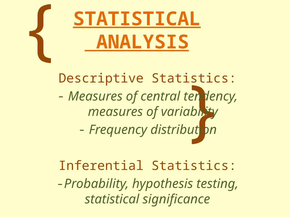
STATISTICAL ANALYSIS
Descriptive Statistics:- Measures of central tendency, measures
of variability- Frequency distribution
Inferential Statistics:-Probability, hypothesis testing, statistical
significance
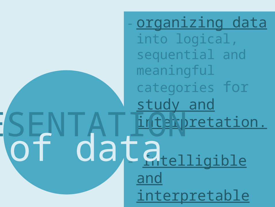
- organizing data into logical, sequential and meaningful categories for study and interpretation.
- Intelligible and interpretable
PRESENTATIONof data

TEXTUALTABULARGRAPHI
CAL
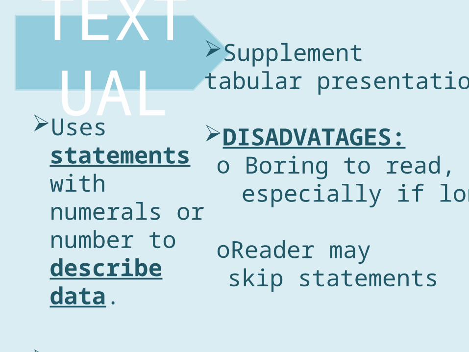
Uses statements with numerals or number to describe data.
Focus to important data
TEXTUAL
Supplement tabular presentation
DISADVATAGES:o Boring to read,
especially if long
oReader may skip statements
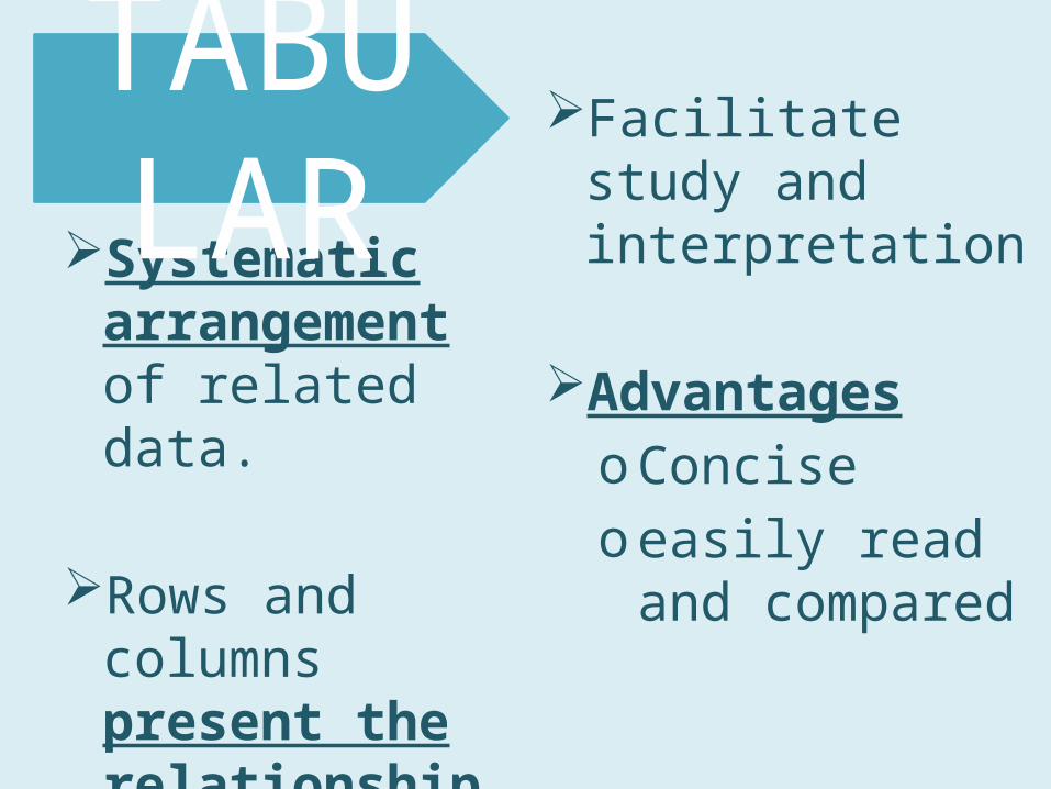
Systematic arrangement of related data.
Rows and columns present the relationship of numerical facts
TABULAR
Facilitate study and interpretation
AdvantagesoConciseo easily read and
compared
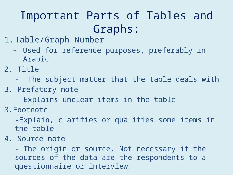
Important Parts of Tables and Graphs:1. Table/Graph Number
- Used for reference purposes, preferably in Arabic2. Title
- The subject matter that the table deals with3. Prefatory note
- Explains unclear items in the table3.Footnote
-Explain, clarifies or qualifies some items in the table4. Source note
- The origin or source. Not necessary if the sources of the data are the respondents to a questionnaire or interview.

A chart representing the quantitative changes of a variable. May be in comparison with other variables
Most attractive and appealing way to present data
GRAPHICAL
May be in pictorial or diagrammatic form.
Advantages:o Attracts more
attention, less likely to be overlooked
o Comprehensive view of quantitative data
o Grasp essential facts quickly.
Disadvantages:o Not as accurate as
tableso Require more skill
and time
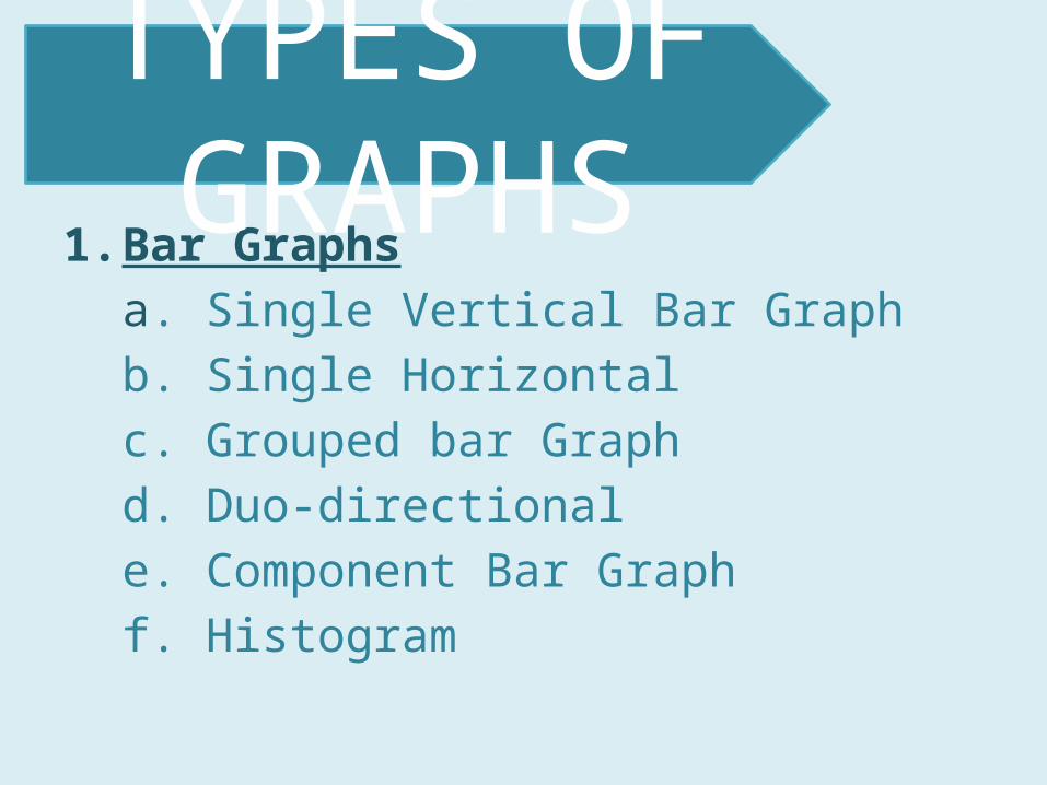
1. Bar Graphsa. Single Vertical Bar Graphb. Single Horizontal c. Grouped bar Graphd. Duo-directionale. Component Bar Graphf. Histogram
TYPES OF GRAPHS
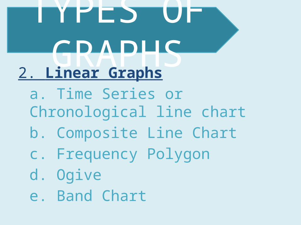
2. Linear Graphsa. Time Series or Chronological line chartb. Composite Line Chartc. Frequency Polygond. Ogivee. Band Chart
TYPES OF GRAPHS
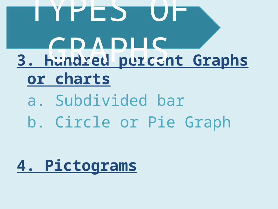
3. Hundred percent Graphs or chartsa. Subdivided barb. Circle or Pie Graph
4. Pictograms
TYPES OF GRAPHS
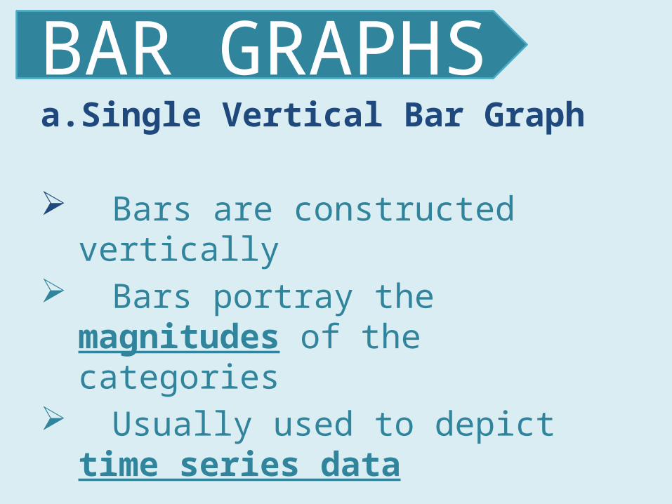
a. Single Vertical Bar Graph
Bars are constructed vertically Bars portray the magnitudes of the
categories Usually used to depict time series
data
BAR GRAPHS

a. Single Vertical Bar Graph
BAR GRAPHS
1985-1986
1986-1987
1987-1988
1988-1989
0
100
200
300
400
500
600
700
No. of students
No. of students
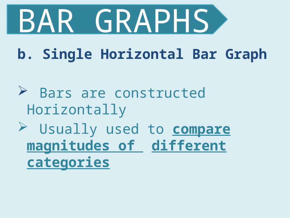
b. Single Horizontal Bar Graph
Bars are constructed Horizontally
Usually used to compare magnitudes of different categories
BAR GRAPHS
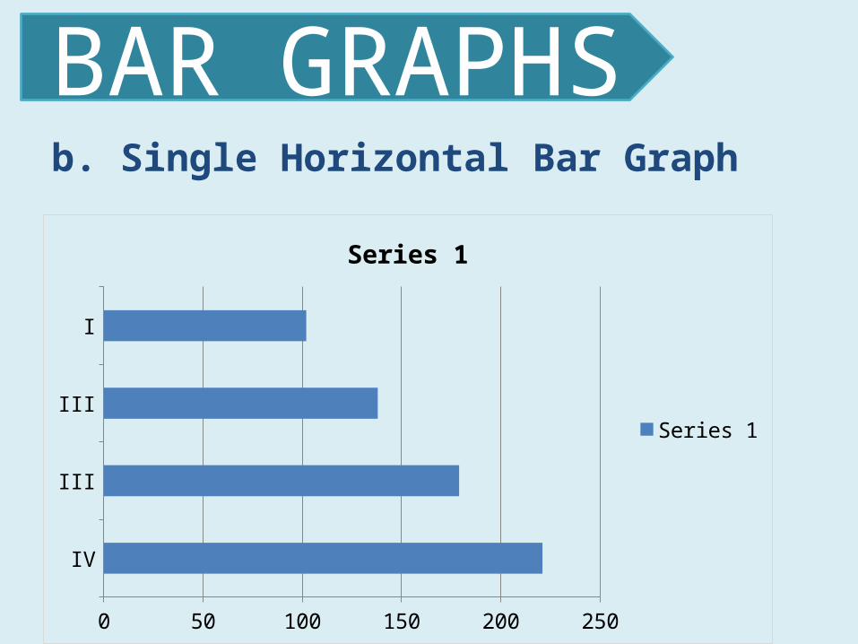
b. Single Horizontal Bar Graph
BAR GRAPHS
IV
III
III
I
0 50 100 150 200 250
Series 1
Series 1

c. Grouped Bar Graph Used to compare two or more
categories of a variable during a specific period of time
Subgroups of the categories have common attributes
BAR GRAPHS
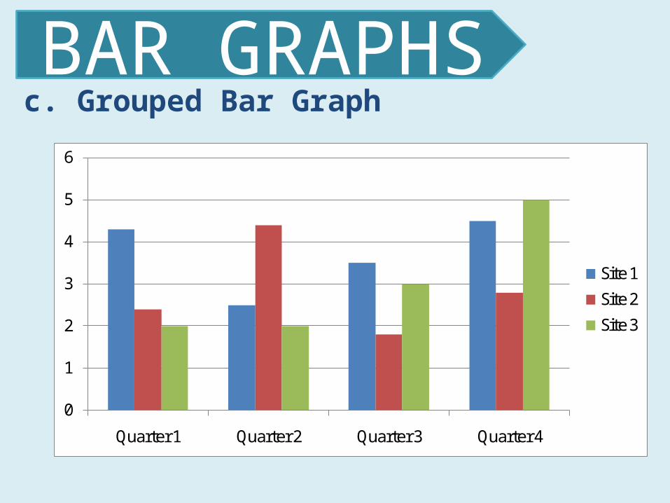
c. Grouped Bar Graph
BAR GRAPHS
0
1
2
3
4
5
6
Quarter 1 Quarter 2 Quarter 3 Quarter 4
Site 1
Site 2
Site 3

d. Bilateral Bar Graph
Present data in forms of assets, profits and positive numbers, liabilities,
losses and negative numbers
Presence of positive and negative values
BAR GRAPHS
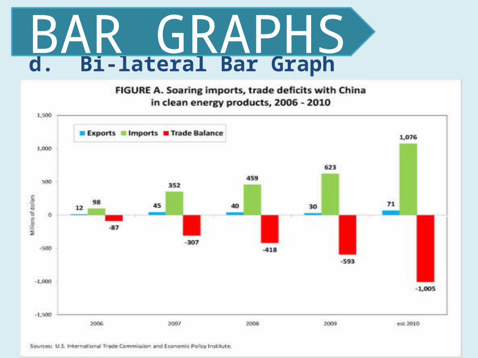
d. Bi-lateral Bar Graph
BAR GRAPHS
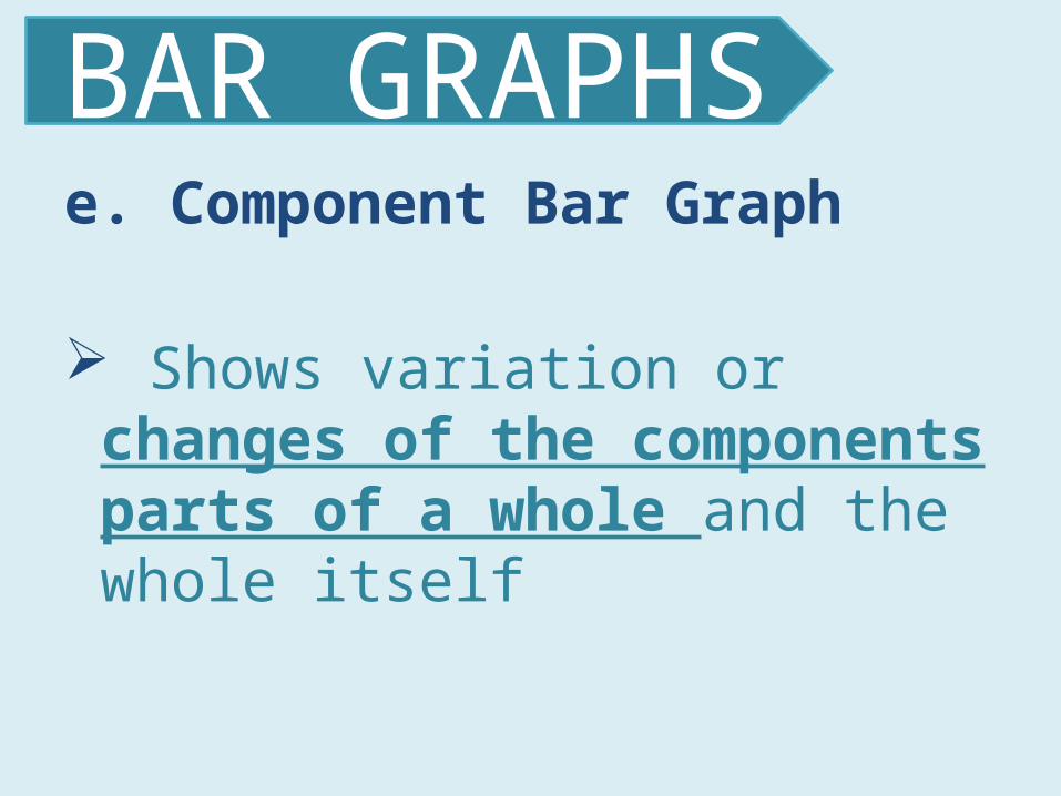
e. Component Bar Graph
Shows variation or changes of the components parts of a whole and the whole itself
BAR GRAPHS
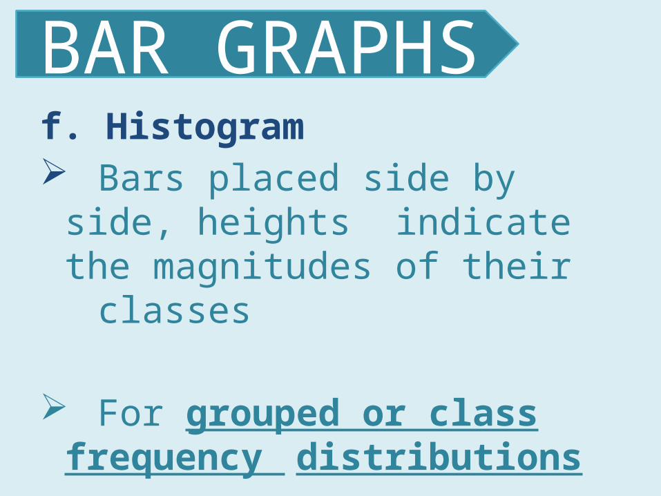
f. Histogram Bars placed side by side, heights
indicate the magnitudes of their classes
For grouped or class frequency distributions
BAR GRAPHS
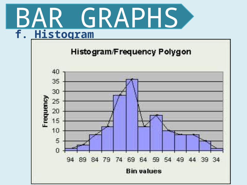
f. Histogram
BAR GRAPHS

A. Time series linear chart
Depict variations of a variable over a period of time
LINE GRAPHS

B. Time series composite charts
comparisons made between or among two or more categories
LINE GRAPHS
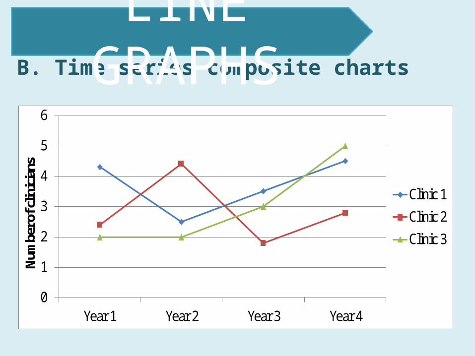
B. Time series composite charts
LINE GRAPHS
0
1
2
3
4
5
6
Year 1 Year 2 Year 3 Year 4
Num
ber o
f clin
ician
s
Clinic 1
Clinic 2
Clinic 3
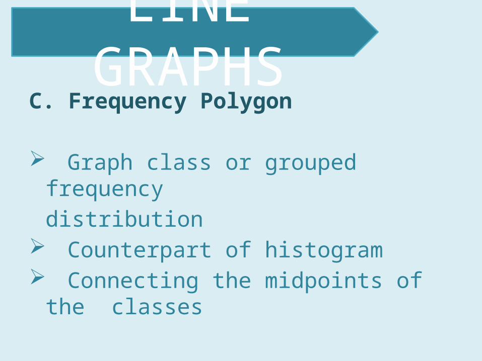
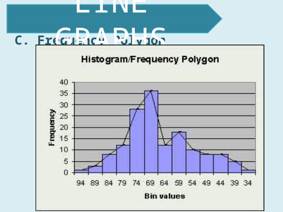
C. Frequency Polygon
Graph class or grouped frequency distribution
Counterpart of histogram Connecting the midpoints of the
classes
LINE GRAPHS
C. Frequency Polygon
LINE GRAPHS
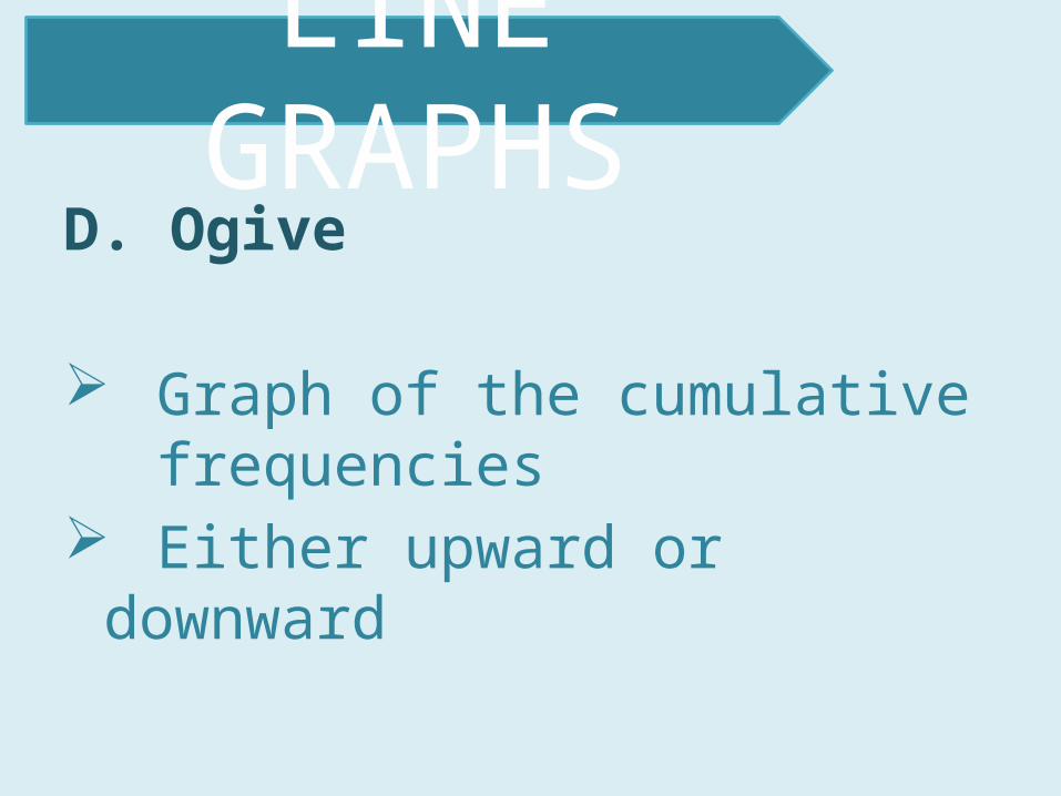
D. Ogive
Graph of the cumulative frequencies
Either upward or downward
LINE GRAPHS

D. Ogive
LINE GRAPHS

E. Band Chart
Proportional variations of the component parts of a whole over a period of time
LINE GRAPHS

a. 100% bar graph or rectangular chart
Division of a 100% graph where the parts are divided per segment
Largest segment at the bottom
ONE HUNDRED PER CENT GRAPHS
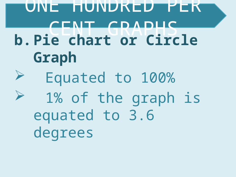
b. Pie chart or Circle Graph Equated to 100% 1% of the graph is equated
to 3.6 degrees
ONE HUNDRED PER CENT GRAPHS

b. Pie chart or Circle Graph
ONE HUNDRED PER CENT GRAPHS
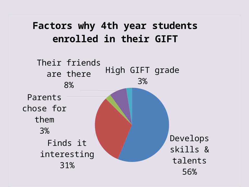
Develops skills & talents56%Finds it interesting
31%
Parents chose for them3%
Their friends are there8%
High GIFT grade3%
Factors why 4th year students enrolled in their GIFT

Portray data by means of pictures or symbols.
Vivid comparison of magnitude
PICTOGRAMS

PICTOGRAMS
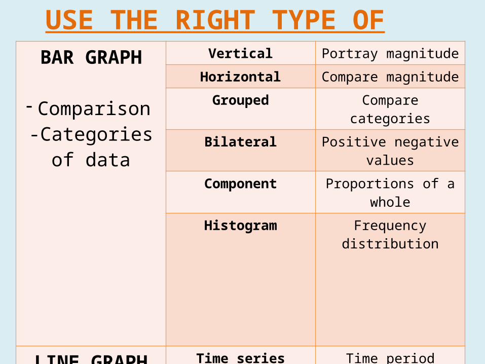
USE THE RIGHT TYPE OF GRAPHIC!!BAR GRAPH
- Comparison-Categories of
data
Vertical Portray magnitudeHorizontal Compare magnitudeGrouped Compare categoriesBilateral Positive negative values
Component Proportions of a wholeHistogram Frequency distribution
LINE GRAPH
- Display trends over time
Time series Time periodComposite line Different categories
Frequency polygon Frequency distributionOgive Cumulative frequency
Band Chart Components of a whole
100% GRAPHS- Show percentages
and proportion
Rectangular bar graph Proportions of a 100%
Pie Graph Proportion of a 100%
PICTOGRAMS Pictorial display of data
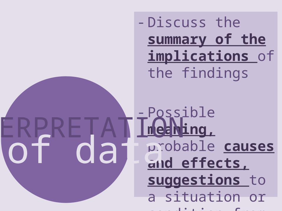
- Discuss the summary of the implications of the findings
- Possible meaning, probable causes and effects, suggestions to a situation or condition from the findings.
INTERPRETATIONof data
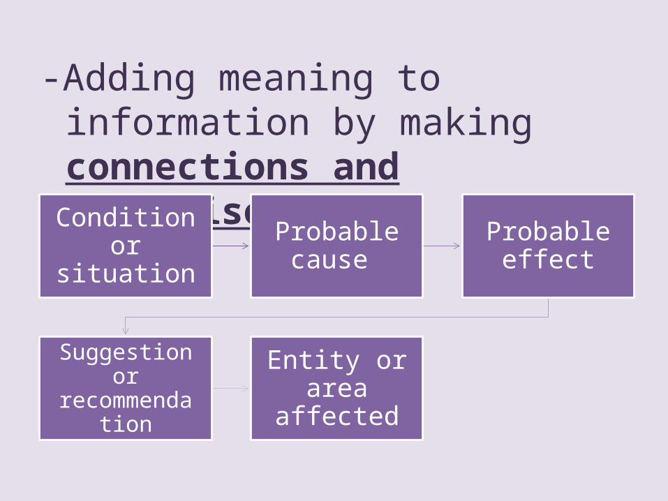
-Adding meaning to information by making connections and comparisons
Condition or situation
Probable cause
Probable effect
Suggestion or recommendatio
n
Entity or area affected
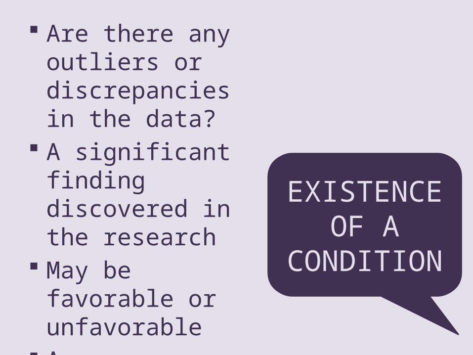
Are there any outliers or discrepancies in the data?
A significant finding discovered in the research
May be favorable or unfavorable
A generalization formed from the findings
EXISTENCE OF A CONDITION
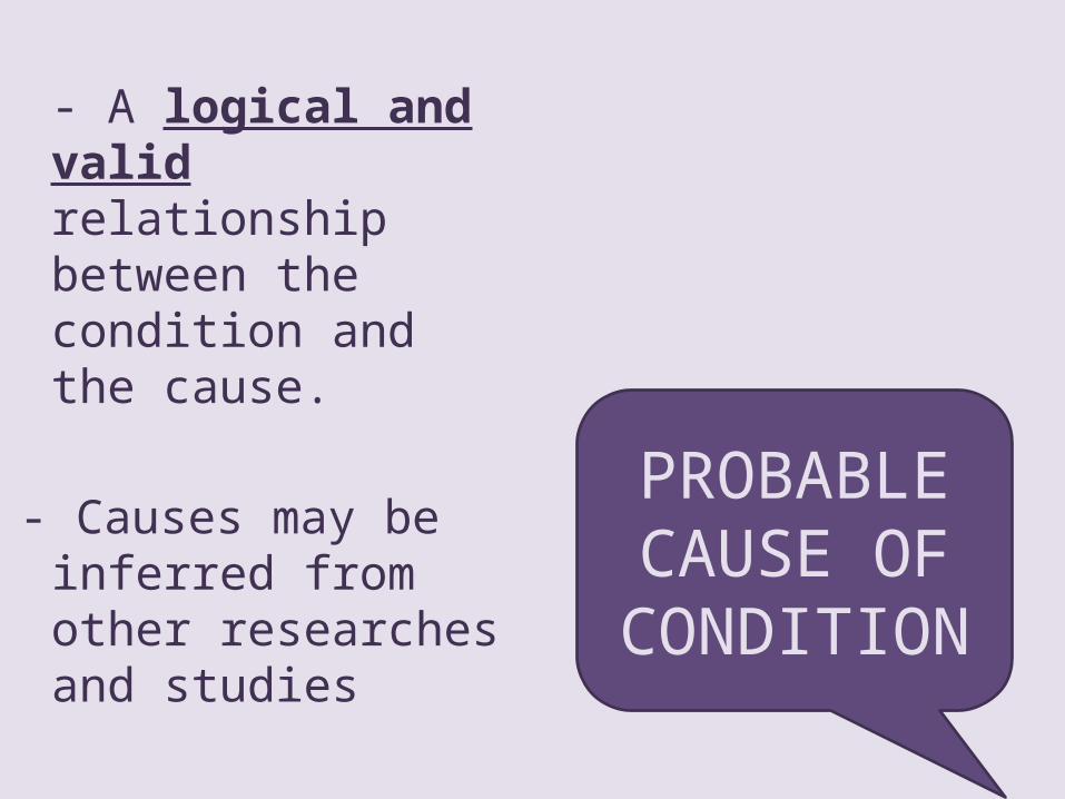
- A logical and valid relationship between the condition and the cause.
- Causes may be inferred from other researches and studies
PROBABLE CAUSE OF
CONDITION
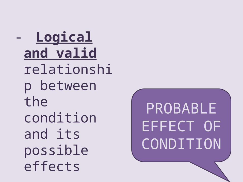
- Logical and valid relationship between the condition and its possible effects
- May be good or bad
PROBABLE EFFECT OF
CONDITION

• Possible solutions to remedy the unsatisfactory condition.
• Suggest to continue practice and to strengthen it.
SUGGESTION OR RECOMMENDATION
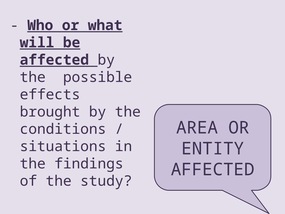
- Who or what will be affected by the possible effects brought by the conditions / situations in the findings of the study?
AREA OR ENTITY
AFFECTED
Develops skills & talents
56%
Finds it interest-
ing31%
Parents chose for them
3%
Their friends are there
8%
High GIFT grade3%
Factors why 4th year students enrolled in their GIFT

1. CONDITION- 56% of the sample select their GIFT class to develop their talents and skill
2. CAUSES-The students were given enough orientation about the program- Students intend to develop their skills
3. EFFECTS- By the end of the program, the students would have enhanced their skills
4. SUGGESTION- Continue the implementation of the program
5. AFFECTED-SPCP students who are enrolled in GIFT
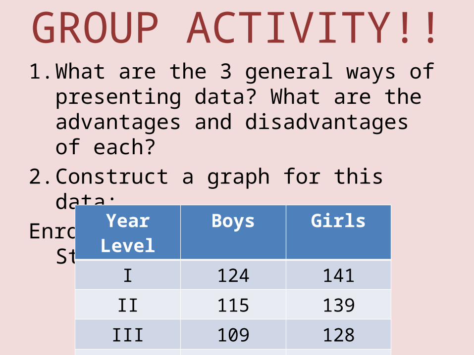
GROUP ACTIVITY!!1. What are the 3 general ways of presenting
data? What are the advantages and disadvantages of each?
2. Construct a graph for this data:Enrolment of High School Student, 1990-1991
Year Level Boys GirlsI 124 141II 115 139III 109 128IV 98 115
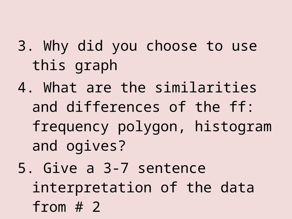
3. Why did you choose to use this graph
4. What are the similarities and differences of the ff: frequency polygon, histogram and ogives?
5. Give a 3-7 sentence interpretation of the data from # 2