analyzing survey data using pivot table - fao.org · ssa data management, analysis & report...
TRANSCRIPT
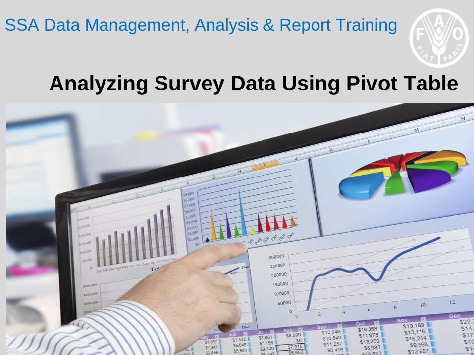
SSA Data Management, Analysis & Report Training
Analyzing Survey Data Using Pivot Table
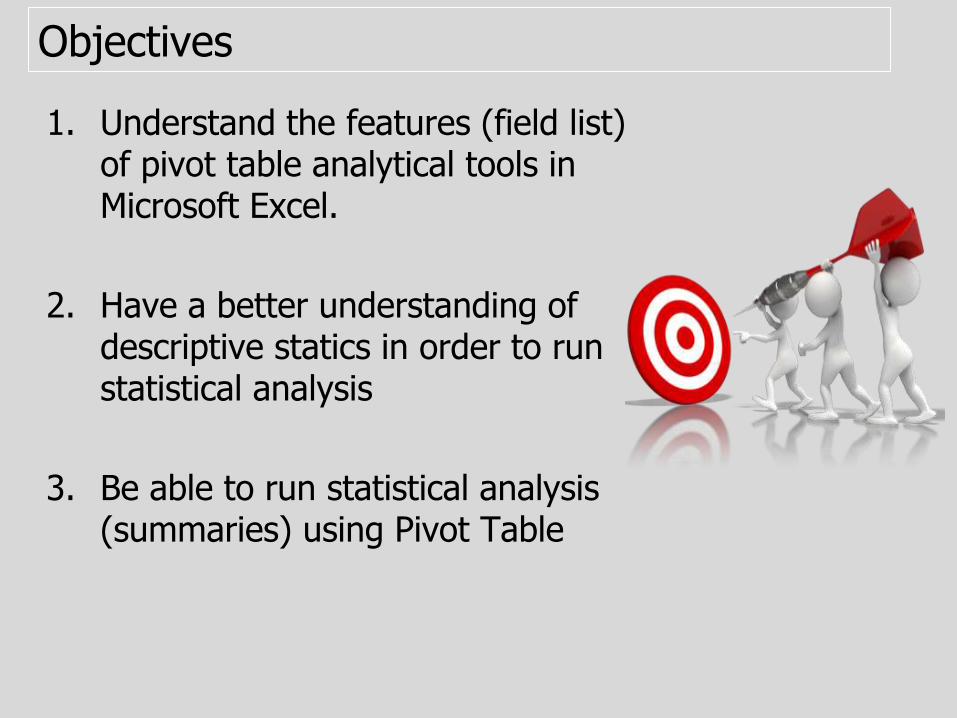
Objectives
1. Understand the features (field list) of pivot table analytical tools in Microsoft Excel.
2. Have a better understanding of descriptive statics in order to run statistical analysis
3. Be able to run statistical analysis (summaries) using Pivot Table

Introduction
• Before running any analysis on the data, it is necessary to be clear about the type of information and analysis required for reporting.
• Note: There is a wide range of information in the data but not all may be needed or reported against.
• The PivotTable feature is a user-friendly and easy-to-use tool, which is relevant for the kinds of analysis required in a SSA.
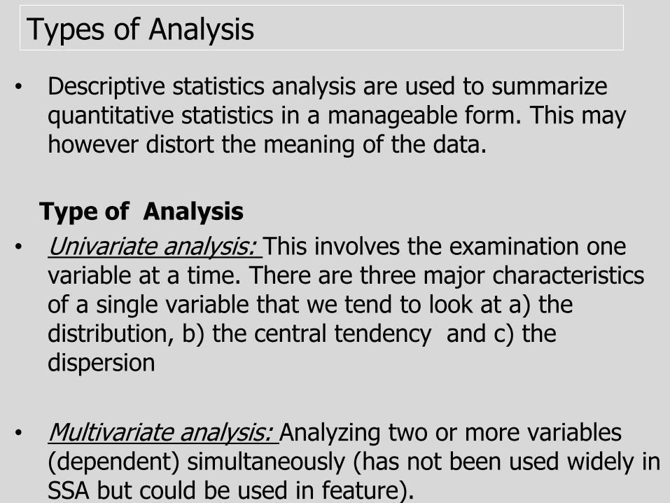
Types of Analysis
• Descriptive statistics analysis are used to summarize quantitative statistics in a manageable form. This may however distort the meaning of the data.
Type of Analysis
• Univariate analysis: This involves the examination one variable at a time. There are three major characteristics of a single variable that we tend to look at a) the distribution, b) the central tendency and c) the dispersion
• Multivariate analysis: Analyzing two or more variables (dependent) simultaneously (has not been used widely in SSA but could be used in feature).
Type of Analysis
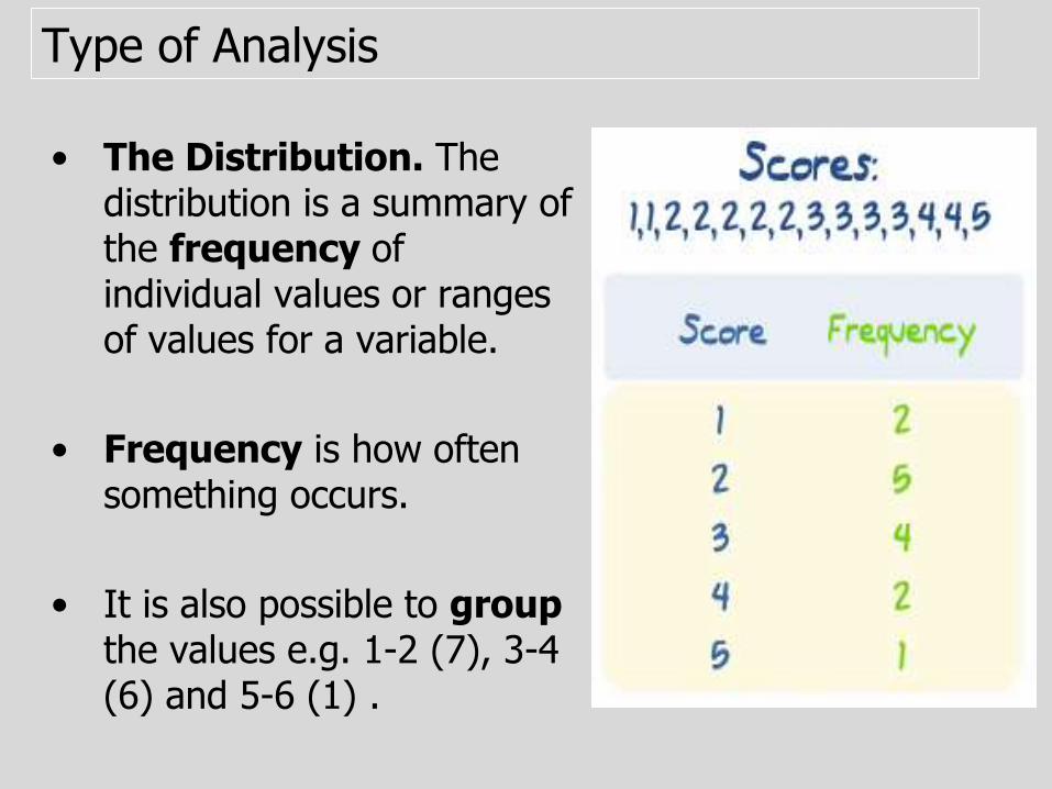
• The Distribution. The distribution is a summary of the frequency of individual values or ranges of values for a variable.
• Frequency is how often something occurs.
• It is also possible to groupthe values e.g. 1-2 (7), 3-4 (6) and 5-6 (1) .
Type of Analysis
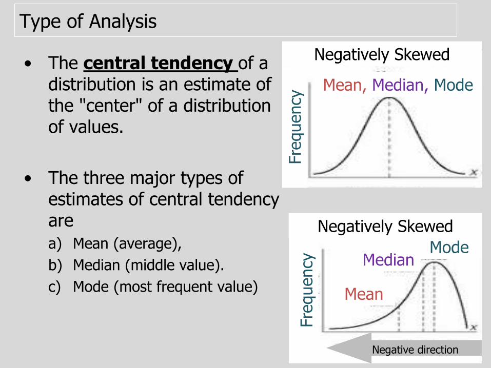
• The central tendency of a distribution is an estimate of the "center" of a distribution of values.
• The three major types of estimates of central tendency are
a) Mean (average),
b) Median (middle value).
c) Mode (most frequent value)
Negatively Skewed
Mean, Median, Mode
Fre
quency
Negatively Skewed
Mean
MedianMode
Fre
quency
Negative direction

Type of Analysis
• Dispersion: The spread of the values around the central tendency. Two common measures of dispersion
a) The range is simply the highest value minus the lowest value.
Note: An outlier can greatly exaggerate the range.
b) The Standard Deviation (SD): how much the members of a group differ from the average value for the
group. It is a more accurate and detailed estimate of dispersion.
Mean=100 (same)
Num
ber
of
anim
als
Types of Questions and Analysis
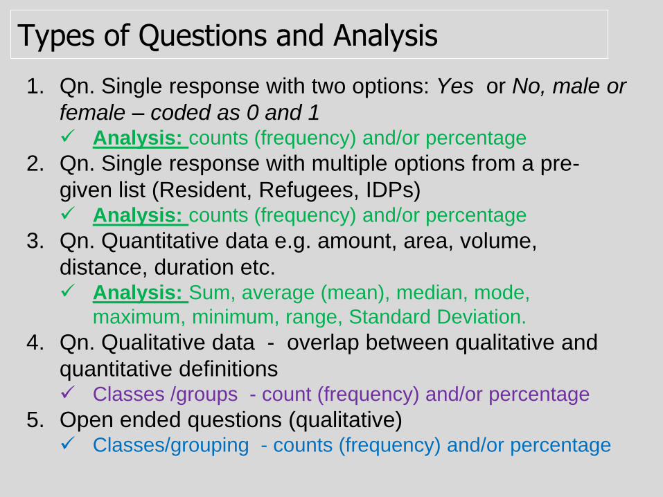
1. Qn. Single response with two options: Yes or No, male or
female – coded as 0 and 1 Analysis: counts (frequency) and/or percentage
2. Qn. Single response with multiple options from a pre-
given list (Resident, Refugees, IDPs) Analysis: counts (frequency) and/or percentage
3. Qn. Quantitative data e.g. amount, area, volume,
distance, duration etc. Analysis: Sum, average (mean), median, mode,
maximum, minimum, range, Standard Deviation.
4. Qn. Qualitative data - overlap between qualitative and
quantitative definitions Classes /groups - count (frequency) and/or percentage
5. Open ended questions (qualitative) Classes/grouping - counts (frequency) and/or percentage
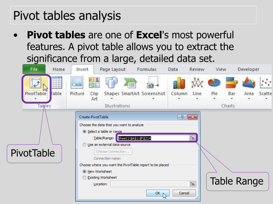
Pivot tables analysis
• Pivot tables are one of Excel's most powerful features. A pivot table allows you to extract the significance from a large, detailed data set.
PivotTable
Table Range

Generating Pivot Table
1. HIGHLIGHT THE VARIABLE(S) you would want to analyze including differentiating (independent) variables such as location, agro-ecologies, gender (sex) residential status – and ensure that all the households interviewed are included.
1. Go to INSERT and click on PIVOT TABLE. Create pivot table box will pop up.
2. From the create pivot table pop up box, SELECT NEW WORSKSHEET, and click OK. A new work sheet will be created with a PIVOT FIELD LIST on the right. Here you will see all the variables you have selected
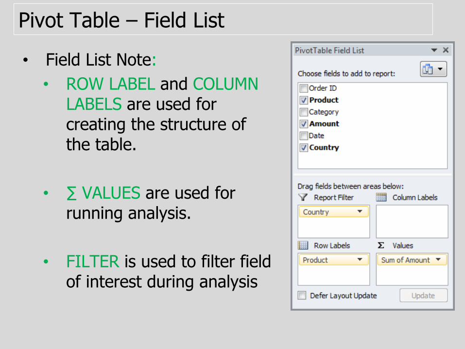
Pivot Table – Field List
• Field List Note:
• ROW LABEL and COLUMN LABELS are used for creating the structure of the table.
• ∑ VALUES are used for running analysis.
• FILTER is used to filter field of interest during analysis
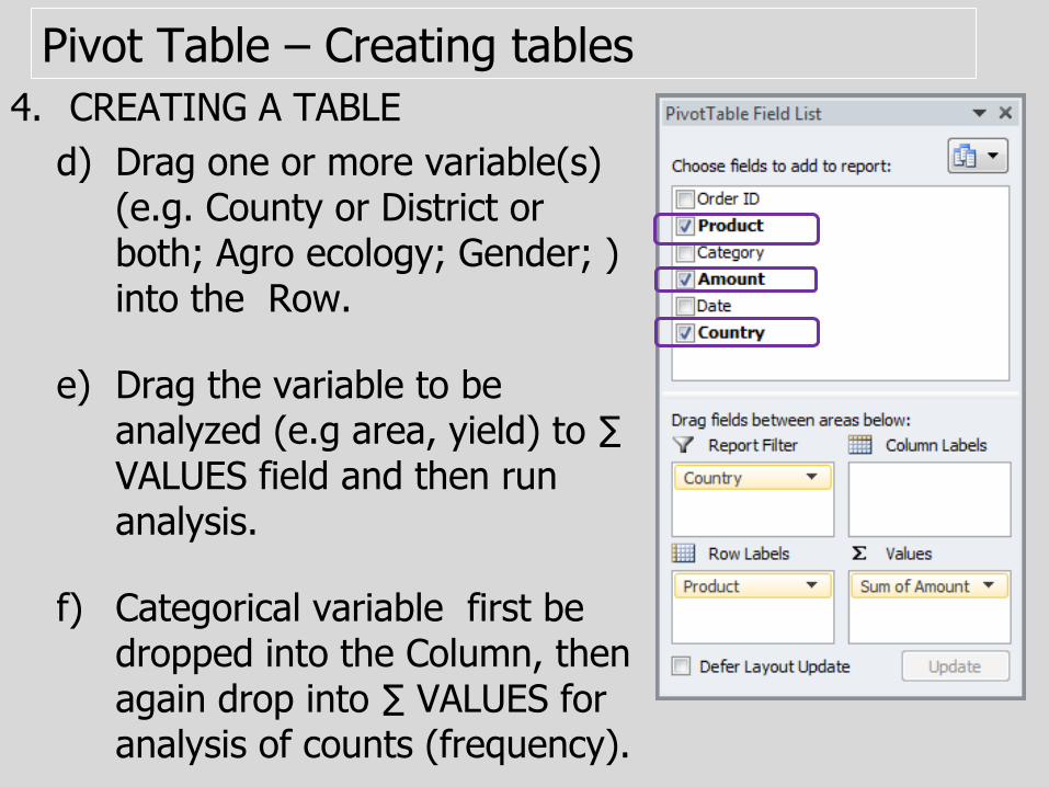
Pivot Table – Creating tables
4. CREATING A TABLE
d) Drag one or more variable(s) (e.g. County or District or both; Agro ecology; Gender; ) into the Row.
e) Drag the variable to be analyzed (e.g area, yield) to ∑ VALUES field and then run analysis.
f) Categorical variable first be dropped into the Column, then again drop into ∑ VALUES for analysis of counts (frequency).

Pivot Table – Statistical calculations
5. RUNING ANALYSIS (Statistics):
a) Click on the VARIABLE NAME in the ∑ VALUES field, then Click VALUE FIELD SETTING.
b) Analytical box with a range of functions (Sum, Counts, Average, Max, ……) will appear.
c) CHOSE the types of calculation you would want to do e.g.. Count and Click Ok.
calculation
Pivot Table – Statistical calculations
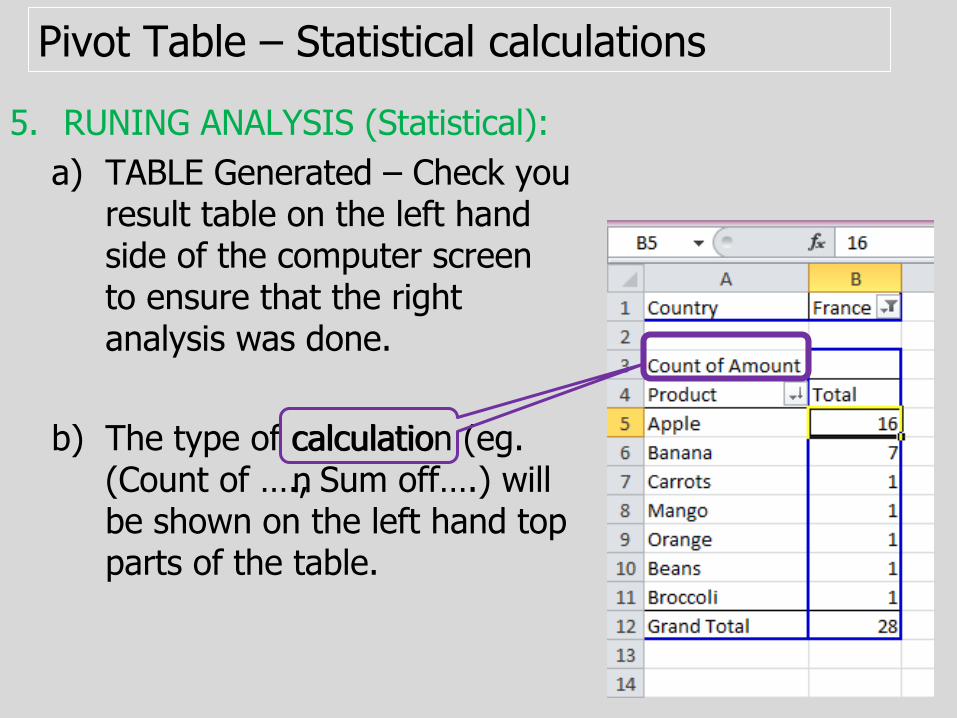
5. RUNING ANALYSIS (Statistical):
a) TABLE Generated – Check you result table on the left hand side of the computer screen to ensure that the right analysis was done.
b) The type of calculation (eg. (Count of …., Sum off….) will be shown on the left hand top parts of the table.
calculation
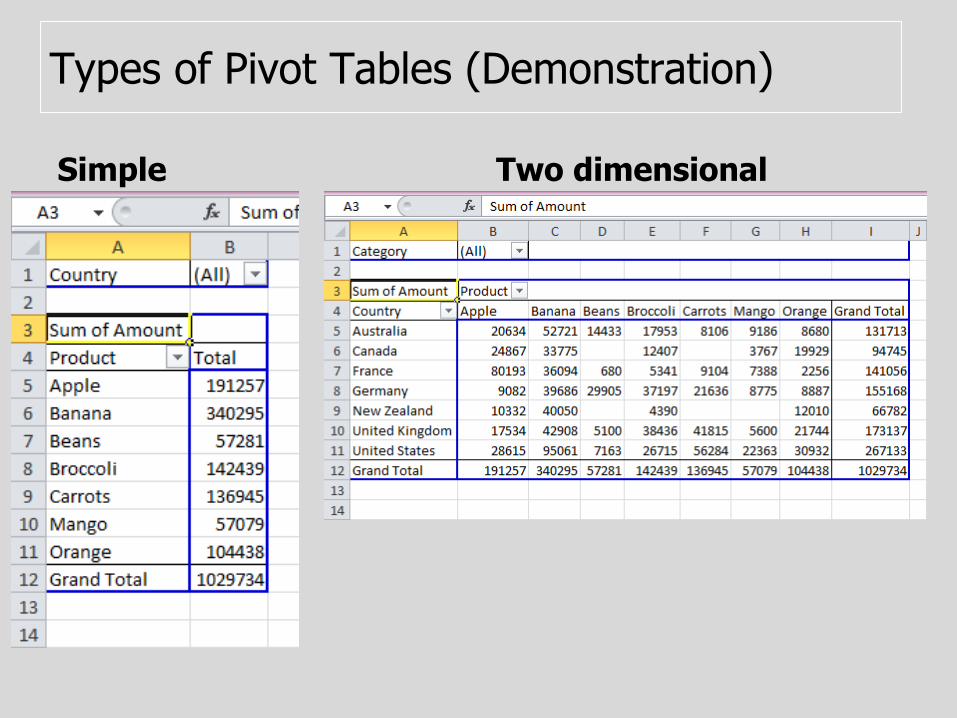
Types of Pivot Tables (Demonstration)
Simple Two dimensional
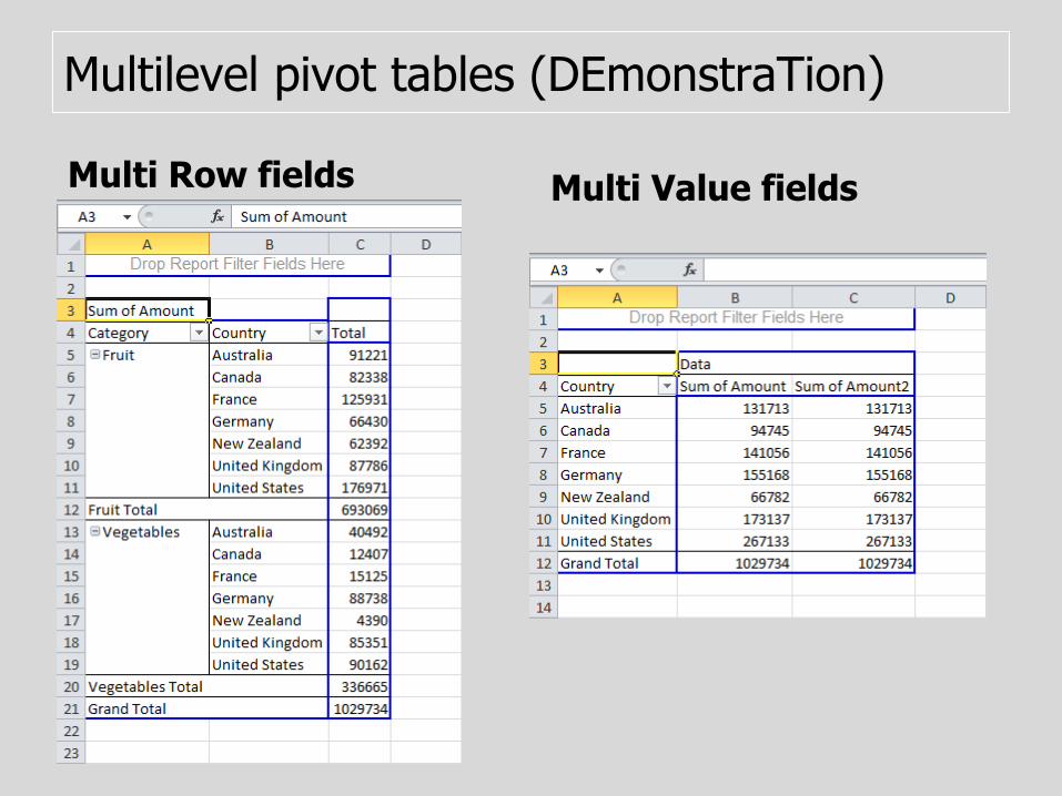
Multilevel pivot tables (DEmonstraTion)
Multi Row fields Multi Value fields
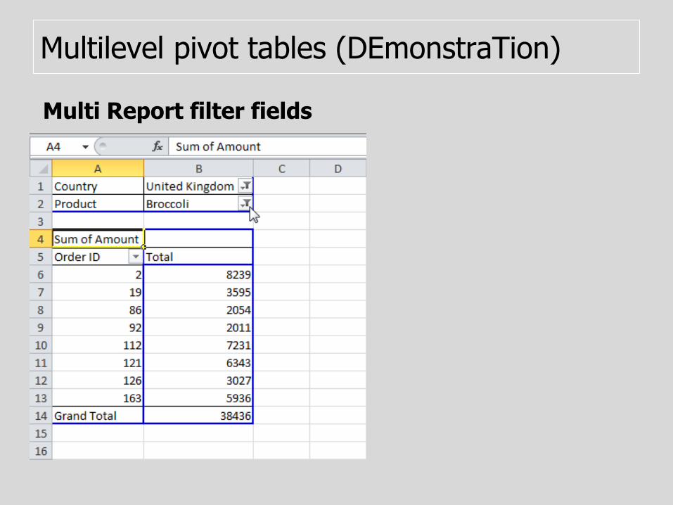
Multilevel pivot tables (DEmonstraTion)
Multi Report filter fields
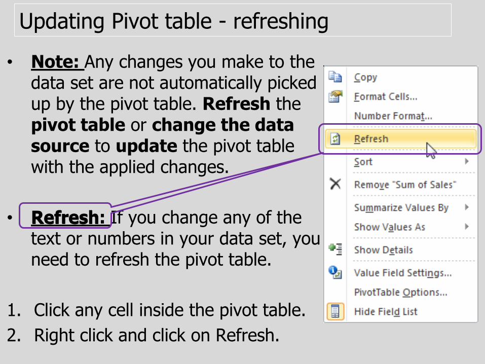
Updating Pivot table - refreshing
• Note: Any changes you make to the data set are not automatically picked up by the pivot table. Refresh the pivot table or change the data source to update the pivot table with the applied changes.
• Refresh: If you change any of the text or numbers in your data set, you need to refresh the pivot table.
1. Click any cell inside the pivot table.
2. Right click and click on Refresh.
Refresh

Updating PT– Changing data source
• Change Data Source: If you change the size of your data set by adding or deleting rows/columns, you need to update the source data for the pivot table.
1. Click any cell inside the pivot table.
2. The PivotTable Tools contextual tab activates. On the Options tab, click Change Data Source.
Change Data Source
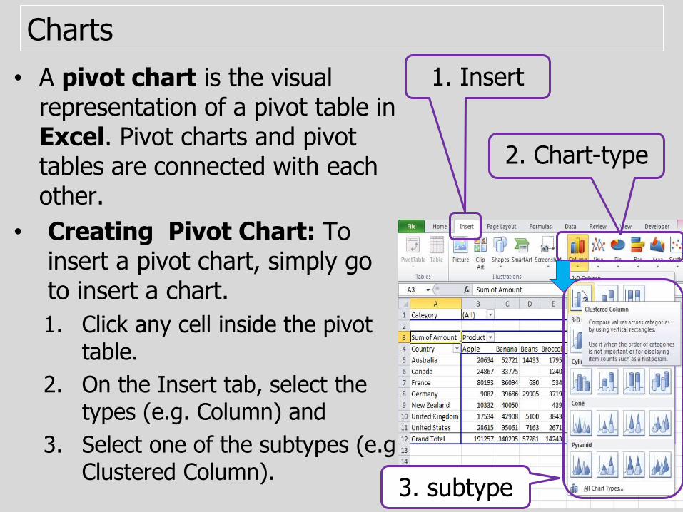
Charts
• A pivot chart is the visual representation of a pivot table in Excel. Pivot charts and pivot tables are connected with each other.
• Creating Pivot Chart: To insert a pivot chart, simply go to insert a chart.
1. Click any cell inside the pivot table.
2. On the Insert tab, select the types (e.g. Column) and
3. Select one of the subtypes (e.gClustered Column).
1. Insert
2. Chart-type
3. subtype
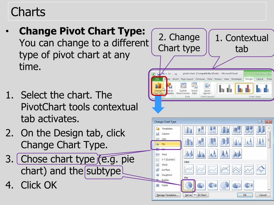
• Change Pivot Chart Type: You can change to a different type of pivot chart at any time.
1. Select the chart. The PivotChart tools contextual tab activates.
2. On the Design tab, click Change Chart Type.
3. Chose chart type (e.g. pie chart) and the subtype
4. Click OK
1. Contextual tab
2. Change Chart type
Charts
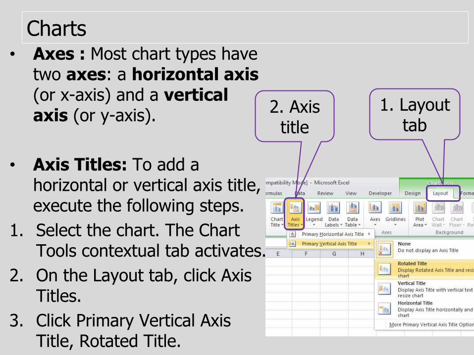
• Axes : Most chart types have two axes: a horizontal axis(or x-axis) and a vertical axis (or y-axis).
• Axis Titles: To add a horizontal or vertical axis title, execute the following steps.
1. Select the chart. The Chart Tools contextual tab activates.
2. On the Layout tab, click Axis Titles.
3. Click Primary Vertical Axis Title, Rotated Title.
1. Layout tab
2. Axis title
Charts

Standard Deviation (σ or Std. Dev.)
• Standard Deviation (σ or Std. Dev.) – Is a quantity expressing by how much the members of a group differ from the average value for the group.
• A low standard deviation indicates that the data points tend to be very close to the mean,
• Whereas high standard deviation indicates that the data are spread out over a large range of values.
Two data sets with the same mean (average) but different Std. Dev.

Standard Deviation (σ or Std. Dev.)
• There are two types of standard deviation: population standard deviation and sample standard deviation.
• Sample standard deviation is used when we want to make inference about the population from the sample.
• If a value from the sample falls outside of the sample standard deviation we can say with a high level of confidence that the value is significantly different from the average of the population.
• Standard deviation is a powerful analysis that helps us in deciding if differences in certaing catergory are representative of differences within the overall population from which the sample is drawn.
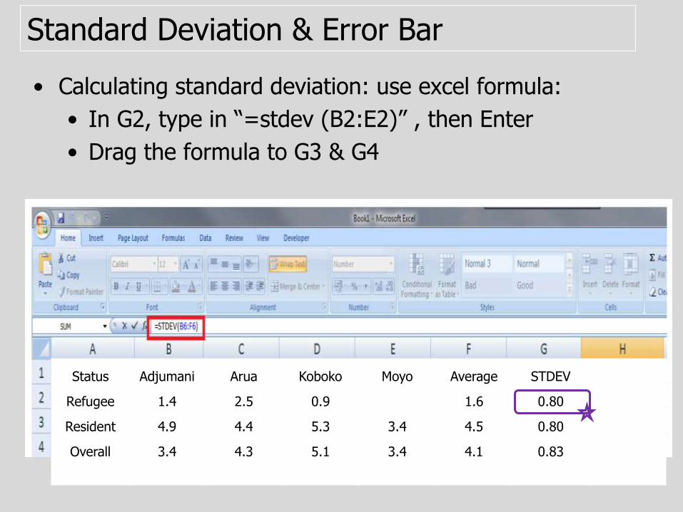
Standard Deviation & Error Bar
• Calculating standard deviation: use excel formula:
• In G2, type in “=stdev (B2:E2)” , then Enter
• Drag the formula to G3 & G4
Status Adjumani Arua Koboko Moyo Average STDEV
Refugee 1.4 2.5 0.9 1.6 0.80
Resident 4.9 4.4 5.3 3.4 4.5 0.80
Overall 3.4 4.3 5.1 3.4 4.1 0.83

Standard Deviation & Error Bar
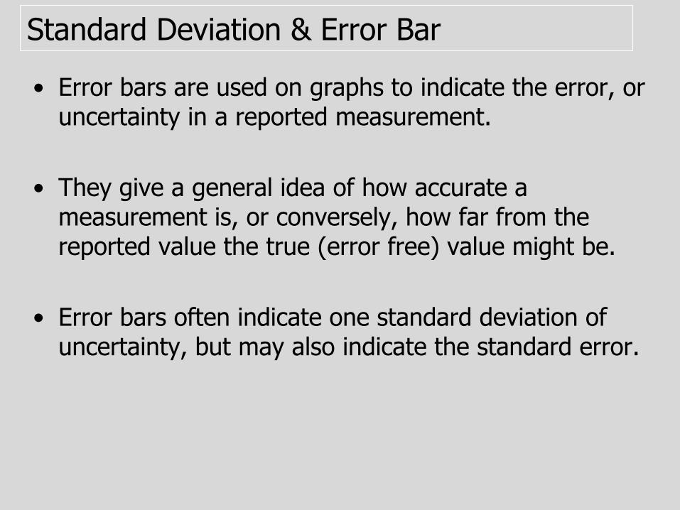
• Error bars are used on graphs to indicate the error, or uncertainty in a reported measurement.
• They give a general idea of how accurate a measurement is, or conversely, how far from the reported value the true (error free) value might be.
• Error bars often indicate one standard deviation of uncertainty, but may also indicate the standard error.
Standard Deviation & Error Bar
• Error bars are used on graphs to indicate the error, or uncertainty in a reported measurement.
• They give a general idea of how accurate a measurement is, or conversely, how far from the reported value the true (error free) value might be.
• Error bars often indicate one standard deviation of uncertainty, but may also indicate the standard error.
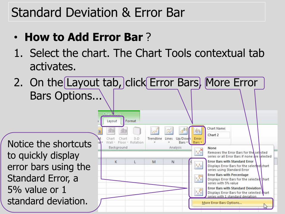
Standard Deviation & Error Bar
• How to Add Error Bar?
1. Select the chart. The Chart Tools contextual tab activates.
2. On the Layout tab, click Error Bars, More Error Bars Options...
Notice the shortcuts to quickly display error bars using the Standard Error, a 5% value or 1 standard deviation.
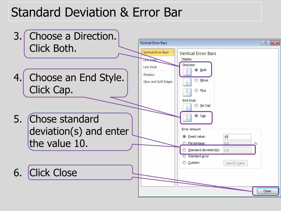
Standard Deviation & Error Bar
3. Choose a Direction. Click Both.
4. Choose an End Style. Click Cap.
5. Chose standard deviation(s) and enter the value 10.
6. Click Close
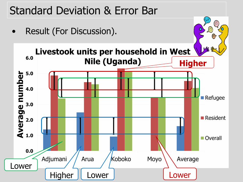
Standard Deviation & Error Bar
• Result (For Discussion).
0.0
1.0
2.0
3.0
4.0
5.0
6.0
Adjumani Arua Koboko Moyo Average
Ave
rag
e n
um
be
r
Livestook units per household in West Nile (Uganda)
Refugee
Resident
Overall
Higher
Higher LowerLower
Lower
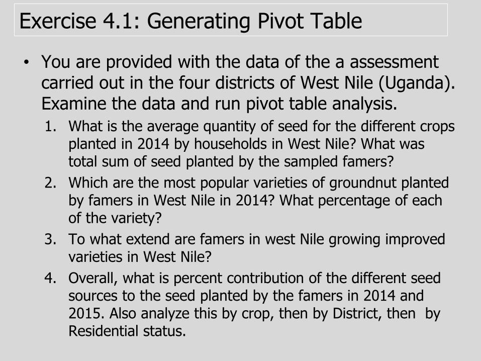
Exercise 4.1: Generating Pivot Table
• You are provided with the data of the a assessment carried out in the four districts of West Nile (Uganda). Examine the data and run pivot table analysis.
1. What is the average quantity of seed for the different crops planted in 2014 by households in West Nile? What was total sum of seed planted by the sampled famers?
2. Which are the most popular varieties of groundnut planted by famers in West Nile in 2014? What percentage of each of the variety?
3. To what extend are famers in west Nile growing improved varieties in West Nile?
4. Overall, what is percent contribution of the different seed sources to the seed planted by the famers in 2014 and 2015. Also analyze this by crop, then by District, then by Residential status.
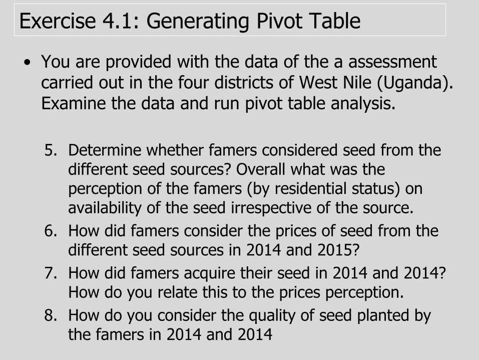
Exercise 4.1: Generating Pivot Table
• You are provided with the data of the a assessment carried out in the four districts of West Nile (Uganda). Examine the data and run pivot table analysis.
5. Determine whether famers considered seed from the different seed sources? Overall what was the perception of the famers (by residential status) on availability of the seed irrespective of the source.
6. How did famers consider the prices of seed from the different seed sources in 2014 and 2015?
7. How did famers acquire their seed in 2014 and 2014? How do you relate this to the prices perception.
8. How do you consider the quality of seed planted by the famers in 2014 and 2014
Exercise 4.2: Charts and Error Bars
Using the pivot tables generated in 4.1
1. Generate a bar chart for average quantity of seed for the different crops planted in 2014?
2. Draw a pie chart for groundnut varieties planted by famers in West Nile in 2014? Include both the frequency and percent figures in your chart.
3. Draw the bar graph for the five major crops showing the extent to which improved and local varieties are being cultivated?
Seed sources/channels
4. Other tables, chose the most appropriate chart type to present you seed source analyses data.
Seed availability
5. Using the most appropriate chart type, present the perception of the famers (by residential status) on availability of the seed, irrespective of the source?
Seed access
7. Using the most appropriate chart type, present how famers acquired their seed in 2014 and 2014?