ancillary product textual analysis digipak 1
TRANSCRIPT

Textual Analysis: Digipak
Morgan Redman

Digipak
Digipak

Digipak

Digipak

Digipak

Colour Scheme• Blue, black, white, sepia, red.• Blue to connote sorrow and sadness, themes of songs in
the compilation such as “Heaven Knows I’m Miserable Now”.
• Black and white to imply the darker themes of society and belief systems.
• Sepia to convey the nostalgia of youth.• Red and pink colourisation to imply danger, romanticism
and being free.
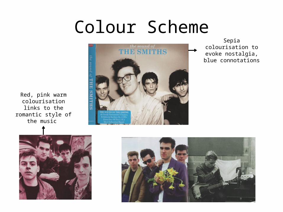
Colour SchemeSepia
colourisation to evoke nostalgia, blue connotations
Red, pink warm colourisation links to the
romantic style of the music

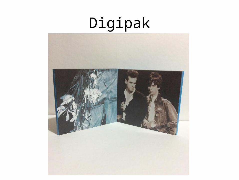
Layout• Non-standard capitalisation, rule of thirds composition,
large format images, diptych CD case inside, plastic inside casing, repeated cover image on booklet.
• The band name is placed in a significant position over the album title due to font size and the capitalisation of “THE SMITHS”.
• Large images take precedence in the booklet as there are too many song lyrics for a small leaflet with 45 songs.
• Dual CD is good for this number of songs but for a single only one would be needed and thus the layout is less significant.
• Repeated use of cover image on leaflet for impact.

Layout
Diptych disc layout with continuous
background to link the layout together seamlessly
Rule of Thirds• Band name and compilation title in the centre third of
the rule of thirds compositional grid. • Band name in top central third due to the layout of the
photograph as the cover image but also as the centre is the main focus of the eye of the receiver.
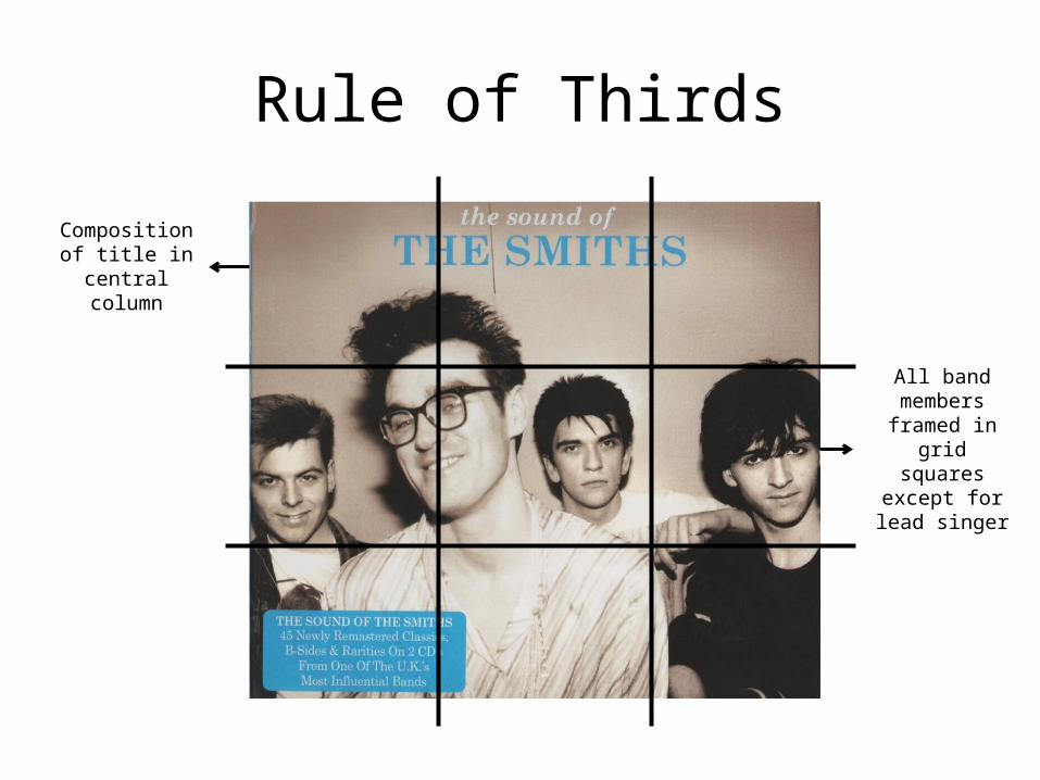
Rule of Thirds
All band members framed in
grid squares
except for lead singer
Composition of title in
central column
Image, Text and Font• Various images: black and white, sepia, colour, blue
hue, red colourisation etc.• Adobe style typography in varied font colour: non
capitalised in white and capitalised in blue. • The colours evoke sorrow, nostalgia and romanticism to
match ideas and themes of the lyrics of the songs in the compilation.
• The typeface and font colours link to the romantic style of the lyrics.

Image, Text and Font
Colourisation of fonts to
match the rest of cover art
Design Construction• Complicated diptych dual two disc CD layout with
singular pocket.• Back 1• Front 1• Secondary fold out back 1• Secondary fold out front 2• Disc compartment 1• Disc compartment 2• Singular pocket

Design Construction
Application to Individual Project
The ideas that can be taken from this for the individual project include:• Post-production colourisation editing• Various fonts throughout• Print on booklet matching the cover• No logo used• Unorthodox genre conventions with no lyrics in the
booklet