ancillary products evaluation
DESCRIPTION
Billboard, Music Magazine Poster, Digipack evaluation by Nicole.TRANSCRIPT

By Nicole.C

First Draft - Final Design For our billboard we were inspired by artists - Lana Del Rey and Adele who favour a black and white style for their marketing/promotion products. As we wanted to have a similar style and colour scheme that was conventional of the singer-songwriter genre we chose to keep the black and white theme throughout our ancillary text and have blue as the contrasting colour. For the first draft we chose this black and white image of our artist facing the camera but slightly hidden by her coat to obscure her features and create curiosity surrounding the artist. Furthermore, we chose this field area as her surroundings as it creates a sense of isolation and confinement as if she is alone with her thoughts and emotions. In addition to this as a group we decided on the typography and continued with this style with all our ancillary text. For the first draft we also chose to include reviews as well as the release date and outlets which are a familiar feature on billboards. Our final draft is polished to a high standard due to the better quality image and professional layout, with of the addition of the ep cover and logos of the music outlets and her social media sights. We changed the billboard image but still slightly hid our artist to create mystery surrounding her character.

Final Design Inspired by singer-songwriter Adele’s 21 Album music poster we decided to continue with the black and white theme. The image we chose is of a photo booth photograph of our main protagonist (artist) and her chosen love interest, this represents a happier time in their life which is contrasted with the torn image that symbolises heart. By using this image we are implying that the music is emotive and derived from personal experiences, this gives the audience a sense of Melina’s type of music and what to expect from the ep. For the music magazine poster we also chose to add a review above the ep cover which shows what people thought of her music, this could ultimately influence others to buy the ep. Here the typography and colour scheme remained the same. If we were to create this poster again I would suggest outlining the ep cover so it could stand out amongst its dark surroundings.

By Nicole.C

Front Cover The front cover for ‘This Is Home’ was inspired by Heartwood Forest which was one of our filming locations. The dense woodlands created a secluded atmosphere and captured the vibe of our music video. The black and white image was chosen to reflect finding someone special in a time of despair (shown via the sunlight peering through the trees) , the reality of drifting apart in a relationship (depicted by the surrounding darkness) and going forth onto better things (represented by the white emblem which is based on a train line map and symbolises embarking on a new journey in life). We decided that this image was ambiguous and open to interpretation from listeners and therefore would attract more people who may be drawn to the artwork in a shop, thus increasing awareness of our artist and her music. For the typography we chose to keep the same design across all of our ancillary products as a cohesive design feature. Overall I am very pleased with the front cover as it is a unique design which was loved by the artist .
Inside Centre – CD Disk Tray The inside centre of our 6 panel digipack is home to the CD disk tray. Here I wanted to continue with the theme of nature. I decided to crop and edit one of our primary images on Photoshop for the background, and chose to adjust the colour (– hue/saturation/brightness) to keep within the colour scheme. As blue is the dominant colour within the digipack, I used this colour as a base and then introduced hints of greens and greys. I liked the way this change of colour emphasised the natural form of the grass and is simple yet an interesting pattern. Moreover, the CD disk took many attempts as I wasn’t very familiar with Photoshop and therefore decided to watch some tutorials on how to create certain effects. For the main circle I created a purple gradient which transitioned onto a purple/grey colour and was outlined with a slight shadow to create a 3-dimensional appearance. I then created two other circles to form the inner parts of traditional CD disk (used to remove the CD from the tray). This worked well with the overall layout of the digipak, however if I was to create this again I would slightly brighten the CD colour for it to appear more vibrant.

Inside Left The image chosen for the inside left panel is of a torn photo booth photograph of the main protagonist (our artist) and her love interest placed on some grass. It was selected as it was the same image Melina tore in the music video for ‘Ready For This’ and was shown as a close-up blown by the wind. This instantly creates a connection between the music video, magazine poster and the digipak. I edited the original image on Pixlr and tried out various effects and colours before we came to the decision of using this as the final image. The colouring of the image follows on from the CD disk background but is much more vibrant due the hint of purple. Overall this image works well alongside the other panels as it keeps within the theme of nature and the colour scheme. This could be even better if we experimented more with other designs or chose a different image (– maybe a close up of the torn photo) to have greater image diversity amongst all our media products.
Extra Panel The extra panel is situated on the right of the back cover. We assigned this space for the publishing information i.e. Publishing/Record Company recognition, LC code and copyright notice. This information is greatly important as it is a legal requirement within the music industry. The typography (and colour) used matches the rest of the ancillary text as this was one design feature we wished to keep consistent. I added the ‘Parlophone’ logo and LC code as ‘Parlophone’ originally developed a reputation in the 1920s as a leading jazz label and is now seen as a leading label with various singer-songwriters from different genres and therefore would be perfect for our artist. In terms of the photograph we chose to flip the image as a reference to the parts of our music video which are re-winded (representing the past), whilst the burnt cigarette symbolises the breakdown of the protagonists relationship. As we wanted to keep the colour of this image simple we placed a light filter on top to provide it with a vintage feel.

Back Cover The back cover of the digipack contains the most information about the EP i.e. copyright notes, song list, barcode, QD barcode and digipak spine. The image of the train platform relates to the white emblem on the front cover which is based on a train line map and symbolises embarking on a new journey in life. In keeping with the blue colour scheme I edited the image on Pixlr and added an effect at the left side as a pop of colour. As for the text, the style and colour remained the same. Melina’s name is placed in the centre with the song list underneath as this is the most important information which sticks-out to music buyers. Underneath this is the copy write list which includes the songs and music rights which are needed for legal reasons. Alongside this I placed the barcode and QD code which allows companies to track the product and can also be used as a way for buyers to access extra content online about the artist. Overall this worked really well with the whole theme of the digibak and the meaning behind the song.
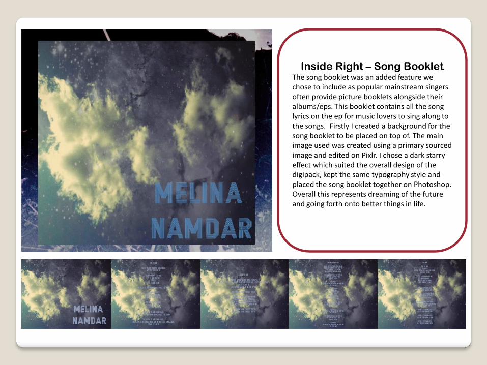
Inside Right – Song Booklet The song booklet was an added feature we chose to include as popular mainstream singers often provide picture booklets alongside their albums/eps. This booklet contains all the song lyrics on the ep for music lovers to sing along to the songs. Firstly I created a background for the song booklet to be placed on top of. The main image used was created using a primary sourced image and edited on Pixlr. I chose a dark starry effect which suited the overall design of the digipack, kept the same typography style and placed the song booklet together on Photoshop. Overall this represents dreaming of the future and going forth onto better things in life.
