archphoto.2.0
DESCRIPTION
architecture magazineTRANSCRIPT

1
archphoto 2.0 01radical city

2 3
archphoto 2.0
plug_in
laboratorio di architettura e arti multimediali
Via Roma 25/22 16012 Busalla (Ge)
[email protected] / www.plugin-lab.it
© 2011 plug_in, Busalla (Ge)
tutti i diritti riservati / All rights reserved
Sales and distributions:
www.plugin-lab.it
Follow us:
www.archphoto.it
http://twitter.com/plugin_lab
Editor:
Emanuele Piccardo
Editorial staff:
Brunetto De Batté
Alessandro Lanzetta
Luigi Manzione
Luca Mori
Giovanna Santinolli
Contributors:
Massimo Ilardi
Elisa Poli
Antonio Tursi
Giovanni Bartolozzi
Hal Foster
Amit Wolf
Caroline Maniaque
Brunetto De Batté
Bruno Orlandoni
Sponsored by:
Fondazione Ordine Architetti Torino
Ordine degli Architetti PPC di Genova
Ordine degli Architetti PPC di La Spezia
Thanks to:
Camec, La Spezia
Carboneri Library Faculty of Architecture
of Genova
Art Direction & Graphic:
Daniele De Batté / Davide Sossi
Artiva Design - www.artiva.it
Translations:
Antonella Bergamin
Print:
Litoprint
Via Geirato, 112 - 16138 Genova
01
Archphoto 2.0
Radical City
Number 01
2011
radical city
The city is where Italian radical architecture represented and experimented its theories. Having
developed a first survey entitled “Dopo la rivoluzione. Azioni e protagonisti dell’architettura
radicale italiana” [“After the revolution. Actions and protagonists of Italian radical architecture”]
where I let those protagonists take the stand, for this new issue of archphoto2.0 I decided to
approach the issue of the radical city. Or the place the radicals chose for their theoretical and
practical experimentations. This change of point of view provides a new reading of radical
architecture as it embraces the entire movement and avoids an excessive focus on individual
fragments, which I think would diminish the radicals’ theoretical power.
The goal is writing a new, as never written before, page of architectural history by using the ‘60s
political and cultural context as a departure point. The student protests for a better education
in universities, sit-ins, strikes, the revolutionary wave from Berkeley, the People Park, the birth
of pop art in England, the crisis of architecture after the end of the modern movement, the
destructuring of language, the disciplinary cross-over of art, architecture, music, and theatre
contributed to the cultural background that generated the radical adventure. An adventure that
took shape between Florence, Turin and Milan and created connections with other movements
of the new architectural avant-garde in Austria (Pichler, Haus Rucker, Coop Himmelblau,
Hollein) and the UK (Archigram, Cedric Price).
Florence was one of movement’s main hubs as the city of the two Leonardos – Ricci and
Savioli who, along with Eco and Konig, promoted the development of radical theories. In Turin a
key role was played by Pietro Derossi with his Arte Povera connections, while the Milan scene
was dominated by Ugo La Pietra, Sandro Mendini, Ettore Sottsass and Fernanda Pivano.
While the early projects remained theoretical proposals, some, including Archizoom,
Superstudio, Strum, established an ambiguous relationship with design that, in time, became
more and more important after the international exhibition “Italy: the new domestic landscape”
curated by Ambasz at the MoMa in 1972; the only exception was Zziggurat, the last radical
group. Others like UFO, Gianni Pettena, Ugo La Pietra and 9999 chose the “piazza” (public
space) for their theoretical/practical experimentation as the adequate venue for installations and
performances that used the same language as that of artists. But the “piazza” was even more
the place for a direct connection with the students and their protests against the academy and
the ruling system – that influenced the development of UFO, the group led by Lapo Binazzi
who, between inflatable objects and performances, admirably interpreted the relationship
between semiology and architecture. Public space became the venue for an exchange between
artists and radicals – for example with Campo Urbano (curated by Luciano Caramel in Como
in 1969), the meeting place of La Pietra, Pettena+Chiari and Paolini; or with the dialogue
between Robert Smithson and Gianni Pettena. There is, however, one place in particular
that an architect in the ‘60s saw as uniquely capable of expressing the concept of modernity:
the disco club. Every radical architect designed one. In Florence, Superstudio designed
Mach2, while 9999 created and managed Space Electronic, the most famous club, where the
group organized concerts by emerging British bands, happenings and experimental theatre
performances. UFO’s Bamba Issa disco club in Forte dei Marmi and the Sherwood restaurant
in Florence, La Pietra’s Altre Cose boutique with its Bang Bang disco club in Milan. The Piper
disco club designed and managed by Pietro Derossi in Turin became an Arte Povera meeting
place. This new scene so keen on entertainment was promoted by Leonardo Savioli who,
inspired by his assistants such as Adolfo Natalini, proposed the disco club as a design type in
his furniture and interior design course at the School of Architecture in Florence; of course, the
designers of the Piper in Rome had also been his students. Another important aspect of this
age was the flourishing of independent publications: from Archigram’s fanzines to La Pietra’s In
and In più, up to 9999’s furry catalogue for an event at Space Electronic with Superstudio. The
new wave of experimentation was championed by magazines such as AD and Casabella with
Sandro Mendini emerging with his revolutionary approach to cover design and focus on images
as crucial expressive devices.
Inspired by the historical avant-gardes – dada, futurism and expressionism, radical architecture
played a crucial role in architecture history seldom if ever mentioned in official histories of
architecture and today represents a treasure still be to be unveiled and researched. This issue
of archphoto2.0 tries to rewrite history by providing a new point of view as the possible source
of new achievable utopias.
Emanuele Piccardo

4 5
2009 — Map, Dopo la rivoluzione. Azioni e protagonisti dell’architettura radicale italiana 1963-73, plug_in

6 7
The italianpolitical contextMassimo Ilardi
It was an overwhelming social and anthropological transformation that swept through Italian
society between the ‘50s and ‘60s when the robust growth of its industrial system completely
changed the country’s ‘face and soul’. The radical passage from mainly rural to mainly
industrial country, with the establishment of large urban and industrial agglomerations and the
massive south-north migrations, erased ancient habits and customs, changed cultures and
mindsets, imposed new patterns and aggregations and, all while producing a myriad social and
geographical disparities, brought an unprecedented integration for the lower and rural classes
into the country’s social body, an integration that came at the very high but necessary cost of
losing the essential features of their historical identity.
The core of such transformations was precisely the top tier of industrial capitalism, or the
engineering factory that became an unavoidable reference for any analysis of the transformation
itself. That core, however, was also inhabited by the extraordinary working class struggles that
began at FIAT in 1962, went on through all the ‘60s and culminated in the hot autumn of 1969
that put an end to the old political and social order. Those struggles were led by a new figure,
the unqualified and unskilled “mass worker”, whose emergence drastically reduced the political
importance and sheer number of skilled workers. The ethics and hierarchy of work was attacked
and demystified within the factory: the workers demanded the same wage rises for everyone,
just one class for everybody and the same treatment as office workers. The workers’ identity
was measured by how they behaved in their struggle and not by their skills or roles within the
production cycle. Soon the heated conflicts in the working world overflowed into other fields of
society and led the entire country to experience this second industrial revolution, finally finding
a connection with a student movement that started to function as a sounding-board for those
struggles. The factory was thus the engine of this transformation process – it broke the inertia of
a backward production system that still reproduced production and consumption patterns similar
to those of pre-capitalist structures.
Faced with the social revolution started by the working class and a dynamic and aggressive
capitalism, some sectors of the labour movement tried to renew their theoretical tools in order
to be prepared to respond to this phase and translate it into political-institutional action. This
resulted in the rediscovery of Marxist theory then promoted by some magazines (Quaderni
rossi and Classe operaia) that criticized the political and ideological experience of the
organized labour movement in order to recover the true essence of Marxism “by stripping it
of the mystification that a purely philosophical use had laid upon it so that it can return to be a
theoretical tool for action.” (A. Asor Rosa). The argument was that “as capitalist development
advances, and thus penetrates and expands the production of relative surplus value, the
production-distribution-exchange-consumption circle necessarily comes to an end, and the
relationship between capitalist production and bourgeois society, between factory and society,
between society and State becomes more and more organic.” As a consequence, “capitalist
development tends to subordinate any political relation to the social relation, any social relation
to the production relation, any production relation to the factory relation”. That means that the
only unsolvable contradiction of capitalism itself, “is the working class within the capital: or, in
other words, it becomes so once it organizes itself as a revolutionary class.” The organizational
consolidation of the working class is thus essential because “the chain will not break where
capitalism is weaker, but where the working class is stronger.” (M. Tronti).
But the argument that saw the working class, at its most developed, as a subject that could
achieve that historical and political breakthrough called revolution failed to materialize. The
fact that the workers’ struggles were the source of capitalistic development did not mean those
same struggles could start a revolutionary process. Or that the workers might actually become
the State or a party. They became neither. The imposition of an agenda, the strategic use of
the workers’ fight indeed ran counter to what the working class “truly was”. The “rugged pagan
race” failed to grow out of the wage claim phase not because it lacked the strength to do so
but because its true enemy was work, not the capital, or, rather, the capital as work. During
those years, its very political exit from the capital, its transformation from work force to working
class, took place entirely within the factory precisely because its subjectivity expressed itself in
the intensity of fight forms (passivity, absenteeism, in-factory marches) that resulted from the
production relationship, from the assembly line itself. The factory and only the factory was its
fighting ground, the working class “shaping” of political organization. Unsurprisingly, the revolt
in Piazza Statuto remained an exceptional event that proved the rule. The ‘refuse to work’ and
‘wage as an independent variable’, or the practices of its independence from the capital, were
therefore acted out on the factory’s ground and measured by the material results they achieved
(more wage and less work).
From factories to society: during the ‘70s the shots would not be called by the working class.
Other social players, equally rugged and pagan, would emerge in the metropolis and they
had nothing to do with the factory or had work as their main focus. For this reason 1977 does
not close the season of movements – it inaugurates the age of metropolitan consumption-
centered revolts. But consumption does not mean, again, that those players could be boxed
into purely economical cages. There is very much to be said about the hostile and unsolved
relation between market and consumption, the conflicts it unleashes, the crisis it produces in the
system’s rules and order.
BerkeleyandPeople’s Park
The park was created during the radical political activism of the late 1960s
The Free Speech Movement was a student protest which took place during the 1964–1965 academic year on the campus of the University of California, Berkeley

8 9
Between criticism and poetics A conversation with Alessandro MendiniElisa Poli & Emanuele Piccardo
E. Piccardo — In the mid-50s Yona Friedman and Constant began to present their projects
– along with the crisis of architectural education, this defines the substrate that gave rise to the
new architectural avant-garde that Celant christened “radical architecture”…
M
I came to radical architecture from other places; I was interested in the work of Friedman, Clau-
de Parent or Constant, but I came from expressionism. When I was at the university I studied
Rudolf Steiner, Erich Mendelsohn and Gaudì, or the spiritualist world. My presence in the radi-
cal architecture movement was always marked by a romantic utopia that was unlike the radi-
cals’ typical attitude. When I got to Casabella, I worked closely with graphic designer AG Fron-
zoni, an extraordinary man: a pure socialist-communist, incorruptible, a great moralist. He de-
manded that I use A. Mendini as my signature rather than Sandro Mendini. Nobody knew his
full name was Angelo Fronzoni – he was simply AG Fronzoni. During that period I was also
interested in programmed art (Paolo Scheggi, Boriani, Gianni Colombo), and it was then that I
got in touch with Germano Celant. When I became editor in chief, I connected with scenes I had
ignored until then: the Florentine designers, the Graz group, the Viennese Pichler, Max Peintner
and Hollein, Yugoslavia, Pettena; a different world that led me to conceive the magazine’s
graphic design as an organic and expressive feature. I personally worked on Casabella’s
graphic design by creating the covers – what my magazines have always had in common is the
major role of their covers’ concept and communication potential – and created specific objects
called “objects for spiritual use”. A heavy suitcase called “Last trip suitcase”, a chair made of dirt,
a performance with a burning chair, a hammer-and-four nails kit called “Do it yourself”. It was in
this context that I met Sottsass and the Florentine designers. At that time they were the Beatles
of design and I think they were doing something like Yellow Submarine.
E.Poli — What was the role of your Casabella in the international propagation of the radical
movement and in its theoretical definition? And how did the transition from this “utopia” to the
concreteness of Modo magazine come about?
M
When I met the radicals, they were only known in the university circles of Florence and Milan.
They were commissioned a research by Montefibre, then we met in Rimini for some small mee-
tings and then we participated as a group to Emilio Ambasz’s exhibition in 1972. It was at the
MoMA that I bought the gorilla postcard and created the cover with the “radical design” title.
They were the young friends gravitating around Sottsass and Nanda Pivano. Those people I
hung out with soon became contributors to the magazine that in turn became an organ of the
radical movement. It was in this context that “Global Tools” was founded (with a notary act in
Florence). Just as quickly the members began to fight and the group fell apart which led to a
sort of official dissolution of “radical design”. In a lecture in Bologna I declared that “radical archi-
tecture was dead” but I was not the only one to say that … My tenure at Casabella – at the
same time when Alchimia was being formed – ended with a sort of treason by those who nego-
tiated with Electa; and Casabella went to Maldonado. Then I felt I had to create another magazi-
ne and so I enlisted a group of businessmen led by Giulio Castelli and with his son Valerio, who
was the art director, we founded Modo. Having always made magazines that had an ideological
premise, I was able to discriminate: rather than counting people in, I could count them out.
Modo was a “Global Tools” magazine as it dealt with crafts – the architect, the graphic designer
or the photographer were just like the baker or the hairdresser. All these crafts were uniformed
by a graphic design that made the monthly magazine look like a weekly magazine. In that case
too there was a sequence of covers, the one by Madelon Vriesendorp with the sleeping
skyscrapers, Peintner, Coop Himmelblau, Missing Link, Peter Cook. It was a time of trips, espe-
cially to London where I hung out with Cedrice Price, Banham, the Archigrams, Pentagram...
E. Piccardo — Your words bring to mind Derossi’s photo-novels with Strum for the MoMA’s
exhibition. What was the role of graphic design vis-à-vis the content?
E. Poli — Also given the fact that photo-novels would be back in Domus with Pierre Restany...
M
I have always been interested in how architecture is represented. When I asked fashion photo-
graphers to photograph architecture in slightly dynamic sequences, such things were unheard
of photography was still and covers were academic in a certain sense. Now the subject is featu-
red on the cover and must be nice-looking, wear fashion clothes … all this puts the subject’s
visibility rather than the work on the front line. When the quality of work is missing and only the
subject emerges, that is bad journalism or bad architecture and design criticism.
E. Poli — Is this the reason why during your latest year-stint at Domus, in 2010, you used
drawings of faces as a reminder of your earlier work through a replacement of photography?
M
In my first Domus tenure, the photographs, then by Occhiomagico and processed with transpa-
rent aniline colours by Emilie van Hees, a Dutch graphic designer, were also kind of reinterpre-
ted. In my recent Domus, I wanted to bring faces back on the cover in a slightly clarified, maca-
bre way; these are sketches with a personal interpretation by Lorenzo Mattotti. Also, the archi-
tects I put on covers thirty years ago – who now are archistars – were not famous then, they
were beginners … In my recent Domus, instead, I looked for slightly more marginal people to
avoid a Pritzker Prize gallery of faces and I thought I wanted two Italians: Riccardo Dalisi and
Maurizio Cattelan.
E. Piccardo — For me your choosing Dalisi was a way of giving a final assessment of radical
architecture, a way of underlining Dalisi’s brilliance in the social and ethical dimension of de-
sign...
M
Dalisi is a major influence, always the contrarian, close to Poverism. He mentions the “tin plate
compasses” I had written about in Modo but with other intentions. It is sort of anti-Pritzker Prize
to put Dalisi on the cover and then Cattelan, an artist I have always liked and who is clearly very
important. The other people I put on the covers were chosen for different reasons and, apart
from Nouvel and Cook, are less well known.
E.Piccardo — Cook certainly represents the other side of the shield from Dalisi. You just men-
tioned the London scene and your hanging out with Price, Banham, and others who inspired
and somehow established the breeding ground for radical theories...
When Emanuele Piccardo asked me to conduct a joint interview with Alessandro Mendini, I immediately thought we would be taking a chance. For one of us Mendini is an active and irreplaceable witness to the reconstruction of the complex and up-and-down trajectory of Florentine radical groups, for the other he is the creator of an editorial venture that, although still unexplored, has been crucial to the production of the cultural processes that define our current way of perceiving architecture. For E.P. (Emanuele Piccardo) Mendini’s voice completes an already defined frame, established over years of painstaking and enthusiastic researches when, in the early ‘70s, the Radicals saw the magazine Casabella as a place where they could carry out their fundamental and utopian projects. For E.P.
(Elisa Poli) Mendini may contribute to substantiate a scenario, the simplified strategy to finally arrange the dispersed pieces of a mosaic where Casabella, in its early ‘70s version, was the first act of a convoluted and far from linear plot that would eventually, to put it simply, find its development in the pages of Modo, Domus, and later Domus once again. This interview – to the extent that interviewing someone means obtaining information that can substantiate an already formed thesis – would have been impossible without Mendini on the other side of the table. With his impeccable clarity and willingness, for an entire afternoon he expertly explained how a good story is built and how improvisation only succeeds when one really knows its techniques well enough. A trip, as Mendini himself called it, between criticism and poetics.
M
Yes, that is true, but in my case Italian radical architecture also came from Expressionism, as
well as from Michelucci, Leonardo Savioli, Leonardo Ricci. Without these three, there would be
not even one Florentine. Remo Buti’s educational role should not be forgotten either. I have
brought him to light again in the design exhibition at the Triennale, where I included two of his
disco clubs models. He was the source for Giovannoni, Venturini, the bolidists as well as for the
approach of Branzi, Morozzi, Deganello. Deganello acquired a very political stance, actually the
Archizoom members are all quite different, and then there is the connection with Rogers. A very
important influence for me, with him I prepared my dissertation about the Goetheanum publi-
shed by Bruno Zevi.
E. Poli — But you were not part of Rogers’ Casabella...
M
No, and even when I came to the new Casabella there was a conflict. When a crisis hits a ma-
gazine, some deep trauma always erupts – Rogers was fired by the publisher. Casabella was
owned by the same publisher who had Domus, at a certain point it was sold and the new owner
changed director. I had some subliminal issues with Rogers just like I would when Sottsass
founded Memphis and I remained with Alchimia…
E. Poli — In its very first issues, your Casabella was full of text, very intellectual; later with the
radicals the text-image ratio changed. Is it true that, with your tenure, the publisher had to deal
with a magazine that, once an organ of the respectable Milanese middle-class, became a
counter culture mouthpiece?
M
When I made the transition from chief editor to director of Casabella, the magazine was actually
owned by the printer, a kind guy who was totally unaware of the processes connected with the
contents, so I had quite a free hand before the agreement with Electa was made. During my
tenure we were in Segrate at the printing office that owned Casabella. It was in front of that
office that I put fire to the burning chairs for one of the covers.
E. Piccardo — Recently AD’s Robin Middleton attacked Beatriz Colomina for including Casabel-
la in the counter culture magazines in her Clip Stamp Fold. I believe that, during your tenure,
Casabella was really perceived as a counter culture magazine…
M
It certainly was. However, as much as an Italian magazine, directed by me, might be considered
radical, one should not forget that I come from the middle-class just like the magazine, as its
history clearly shows. It would be just like saying “we are at Alessi, let’s make some objects that
look nothing like Alessi”. You can make all the anti-design you want but then that gets proces-
sed by a comprehensive corporate image that considers that product as a part of that corpora-
tion; the same applies to Casabella. It still has that DNA and I am glad I did not upturn its funda-
mental attitude.
E. Poli — That DNA was what made Casabella and Domus so successful. Casabella’s image
was hugely influential particularly for the generation that now is called to reinterpret its contents.
We might say it was a sort of battering ram that drove a certain kind of thought through and
made it more powerful.
M
If that is what happened I am glad. My attitude as a “temperamental theorist” makes me write in
a critical-poetic way: rather than making an orthodox criticism I must resort to images and choo-
sing such images is very important for me just like the way they are juxtaposed as it does not
result from a logical principle but tends to create short circuits – a paradox of juxtaposition.
Sometimes I may find some interesting images and I commission a piece starting from them as
they are the source of my interest. The magazine’s table of contents should be composed like a
piece of music just like I have always thought that directing a magazine is little bit like conduc-
ting an orchestra – the freer is an orchestra musician, the better the general performance. Cer-
tainly dirigism is not a guarantee of good results.
E. Poli — It is just what you wrote in your first Domus editorial after Ponti’s death: “The tragic
event of Ponti’s death closes for Domus the age of charismatic protection and opens an age of
new and more direct responsibilities”. What is the inspiration of your editorial project?
M
Considering the objects I design as project and the magazine I create as a narration of myself
and one of many narrations by others: this is the inspiration I still find compelling. I am not capa-
ble of telling the project’s objectivity apart from the subjectivity of my life experience and for this
reason I probably cannot teach and I don’t like it when people call me master. I have a basic
uncertainty and I cannot express things in their objectivity. For example in my recent Domus I
have written these reports I have called my “diary”: I give my reading of either successful or
unsuccessful things. Even my objects include the nice one, the unpleasant one, the bullshit one
that unfortunately ended up on a yacht in Montecarlo. My objects, big or small, are a system of
characters that play with me and the people who use them and work to create them. In my
recent Domus I have expressed some personal memories that are objective enough to be
transmitted to others.
E. Piccardo — You have always used maps as a device for synthesis and even in your recent
Domus experience…
M
In the context of this humanistic and perhaps even romantic inclination, I am a methodical wor-
ker and I need to confront the data of an issue. Whatever the project, I need to lay it out in
words – that create both the antecedent and a thesis to be demonstrated – otherwise I cannot
find my way out so the word systems give me a frame of reference. Even young Seymour goes
in the same direction with his Amateur maps, but his maps are hard to read while mine are in a
child’s handwriting (he laughs)
E. Poli — Unlike the so-called authors’ magazines, Modo embraced different milieus such as
that of manufacturers that currently are key to understand design — see Fabbrica Italia. What
was the inspiration – or, to go back to what you just said, the ideology that guided you when you
created Modo?
M
Manufacturers are the other half of design. Then, with Modo magazine, I had a dozen bosses/
manufacturers, so I tried to establish a close, almost psychoanalytical connection with them. I
spoke to those manufacturers by appealing to their ideals, qualities and defects. I have practi-
ced as a designer through criticism and I successfully interacted with them as though they were
not clients. One should not forget, as Enzo Mari says, that institutionally a designer and his
client should be enemies. Some of them became my friends but basically our goals were diffe-
rent (unless the goal is not money).
E. Poli — Let’s close the circle: which magazines did you look up to then?
M
There were many… one was Projecte, based in Warwaw, the Californian Wet, AD, some small
brochures, alfabeta, re nudo, Architectural Record, Japan Architect. The magazines produced
by big publishers, instead, can only be generalist as they have a generic public and must ad-
dress a generic range of issues and readership. With Domus, Ponti’s skill was interweaving
various art disciplines in order to obtain an organic lowest common denominator – I hope I at
least achieved the same result.

10 11
At school with the two Leonardos
Giovanni Bartolozzi
McLuhanspa ————— ce
Antonio Tursi
2011 marks the centenary of the birth of media theoretician Marshall Herbert McLuhan
(Edmonton, 21 July 1911). Being hardly ascribable to any established discipline, as well as an
ironic agent provocateur who used fragmented and sometimes obscures formulas, the study
of McLuhan has often turned out to be pure and simple incomprehension. That is particularly
true in Italy, where for example the translation of the title of one of his main works already
reveals our culture’s inability to confront the Canadian scholar’s deepest and most productive
heritage. Gli strumenti del comunicare [or The tools of communication, Italian translation of
Understanding Media: the Extensions of Man] neutralizes an approach that was actually based
on the very denial of the media’s instrumental interpretation. For McLuhan, the media are
not mere tools of communication but complex and articulated environments of services and
disservices, life environments that surround us daily. Such view of the media as environments
already demands that architecture and urban planning take the responsibility of organizing our
daily life through the media. Today, with at least thirty per cent of any building’s construction
cost taken up by its energy and communication networks, such responsibility is unavoidably
clear. Designing and building without using the media or taking in due account their role as our
life environments has become impossible.
Therefore, McLuhan should be a constant reference for architects. Besides such fundamental
indication related to the role of the media, there two other, equally valid, specific indications that
are key to address today’s design problems.
First of all, McLuhan’s analysis of the concept of space. In describing the development of
civilizations by analyzing an often undetected factor such as the media, McLuhan thoroughly
examines the different views and perceptions of space emerging within a history revolving
around two major breakthroughs and consequently made of three major ages. The first
breakthrough is represented by the invention of alphabet writing separating the ages of oral
and written communication that, started with the Greek alphabet, reached its full achievement
with type print, giving place to what McLuhan defined as the “Gutenberg galaxy”. The second
breakthrough was due to electricity that in turn marked the configuration of a new age. For
McLuhan, these two media breakthroughs are connected to particular ways of perceiving
space, which means that alphabet writing and type print induced a way of perceiving space
altogether different from the perception of space induced by electricity. Even more precisely,
the different media influence, or enhance, different sensorial conditions that lead to different
ways of considering space. On this point McLuhan proceeds with the utmost clarity: on one
side, he underlines the unbalanced balance founded on the prevailing sense of sight and on
this basis characterizes space as visual and time as linear; on the other side, he finds a balance
among the senses (in his view natural, in our opinion dominated by touch-hearing) and on
this basis characterizes space as acoustic and time as simultaneous. “Visual space, created
by intensifying and separating that sense [eyesight] from the interplay with the others, is an
infinite container, linear and continuous, homogeneous and uniform. Acoustic space is always
penetrated by tactility and the other senses; it is spherical, discontinuous, non-homogeneous,
resonant, and dynamic” (M. McLuhan, E. McLuhan, Laws of Media, Toronto UP, Toronto 1988,
p. 63). The first space is the space of Euclid and perspective on which, particularly after its
mathematization during the Renaissance, the entire modern design practice is based. Acoustic
space, instead, is made of the interactions between its elements and is therefore tensional and
in constant flux. It requires a liquid, adaptable and appropriable design.
Secondly, the concept, now a mere slogan, of global village. In order to understand what
McLuhan means with this syntagma, it is necessary to consider the ecological view he applies
to the world in the age of the electrical media. Seen from the satellites, the planet Earth is
recognizable as a whole, a spaceship travelling across the immensity of the universe. We can
no longer consider ourselves as mere passengers of such spaceship and should rather take full
responsibility as crew members. Such ecological view underlies the definition of global village.
The expansion of a tribal form of living to the global dimension is made possible by the electrical
technologies, or rather by the tactical and acoustical space they generate. Such space is made
of interaction and contacts occurring in intervals and boundaries. “We all know that a frontier,
or a boundary, corresponds to the space between two worlds, and creates a sort of two-fold
network, or parallelism, that evokes a sense of multitude or universality. When two cultures, two
events, two ideas, are placed side by side, there is an interaction, a magical change. The more
different the interfaces, the greater the tension of interchange” (M. McLuhan, B.R. Powers, The
Global Village, Oxford UP, New York 1989, p. 22). The concept of boundary is what structures,
in that it divides and puts together again, the global village, the village and the globe. “The
boundary is an arena of spiralling repetition and reply, both of input and feedback, interlace and
interface, in the area of an imploded circle of rebirth and metamorphosis.” (ivi, p. 209). One may
well say that action occurs on such abrasive surface, that the boundary is provided with the
power to “update” existing social structures.
Every day we see the global village increasingly replace the modern metropolis. We see tribal
processes emerging, new boundaries established even within the metropolis. In fact, while
space tends to open up, enabling the aggregation of new global environments, at the same
time it also tends to close, to become fenced and segmented. Gated communities and slums
become mutually impervious with the boundary between them becoming not a place for contact
and interaction but merely for (actual or potential) violence that must be watched and defended.
As McLuhan warned, and feared, the global village threatens to become a permanent
battlefield, a ground for clashes rather than exchanges. On this architects, and even more
urban planners, are called to act so that the new spaces now emerging in front of us acquire
porous borders enabling the multiplication of differences and avoid becoming resistant to the
penetration of any heterogeneous element.
Brotherly friends, deeply different but complementary, Leonardo Ricci and Leonardo Savioli,
along with master Michelucci, represented the highest and most poetic peak of Italian
architecture in Florence in terms of their contribution to art, design and university education.
Although it is always difficult to establish the paternity of a current of thought, there is no
doubt these two masters played a decisive role with their impulse for renewal and focus on
education in the scene of the Florentine school during the turbulent years of student protest.
Let’s see what their main reasons were. First of all it should be noted that they were men
of extraordinary human value, professors with a true vocation, transgressive artists, tireless
scholars who believed in the complementarity of the arts and the contamination of different
thoughts, all elements that nourished and inspired their educational activity. In almost forty
years of university activity, they forged many generations of architects by teaching several
courses, from Life Drawing to Industrial Design, Interior Design, Visual Design, Elements of
Architectural Composition and Urban Planning. Their former students enthusiastically recall the
original Visual Design course taught by Leo Ricci with its program of tutorials that led students
to master the sign up to three-dimension drawing. Drawings, collages, physical models,
moulds, wire and spatial structures were the result of works that could not be more different
from the Life Drawing classes taught by other professors and that, for the first time, showed
how to represent a thought, an idea by transcribing it in the language of signs. “Representing
foot-prints”, “reproducing rhythm”, “shapes and counter-shapes”, “drawing an expanding
shape” were just some of the tutorials of that course. They crucially contributed to the students’
learning process, as Ricci, through his analysis and correction of tutorials’ results, stimulated
the construction of a grammar of form, in other words retraced the basis of individual languages
and clarified how the sign was directly connected to philosophical meditation and thought. The
same can be said about the Interior Design and Furniture Design courses taught by Leonardo
Savioli in 1966-67 and summarised in the influential book “Ipotesi di spazio”. They opened
the incandescent season of the Florence school of architecture that resulted in an altogether
original take, without ever losing touch with the human dimension, on the researches then
developed by schools of architecture across the world. Architectures that looked like complex
spatial devices and for the first time carried the design of giant, exasperated, de-contextualized
super-objects along with plastic and symbolic elements that legitimized an inclusive approach
to design but always in the context of the formal, plastic and material balance that was typical
of Savioli’s lesson. Ricci’s and Savioli’s courses should thus be credited with giving the first
impulse to the stimulating and aggressive renewal of education at the Florence School of
Architecture. What was their actual influence on the scene of radical architecture and how did
they – unwittingly – prepare its development? With their lessons, prior to the protest years, Ricci
and Savioli inoculated architecture with the vehemence of visual art that later germinated, for
some kind of natural principle, in the connection with pop art. They legitimized such connection,
gave theoretical validation to the opening to art languages that immediately thereafter led to the
heated debate on linguistics. It was Ricci who invited Umberto Eco to give his first semiotics
lectures at his course. Those very lectures were the basis for Eco’s book “The Open Work”.
Initially published as lecture notes to Ricci’s course, the book immediately became a crucial text
in the semiotics debate which, right there in Florence, had one of its main proponents in G. K.
Koenig. Ricci’s and Savioli’s alignment with the students and some goals of the reform, first and
foremost collective exams that for the first time recognized the possibility and potential of group
design and actually enabled the establishment of student groups, was crucial. It was a new
work method that Ricci and Savioli supported as they saw in school an occasion for collective
creation – that inspired the birth of the groups we now know as radicals characterized by their
common student origin. As the minutes of assembly and faculty board meetings clearly show,
Leo Ricci had a decisive role during the student protest. In order to placate the Florentine riot,
with its famous eight-five days occupation of the school of architecture during Giuseppe Gori’s
tenure as president, Ricci, along with the young Umberto Eco, brought to the general assembly
the so-called Ricci-Eco Motion, an important document approved by the Faculty Board in March
1968, a few weeks after the occupation’s end. The motion recognized the students’ requests
and the importance of the general assembly as a place for exchange and communication
between professors and students. First and foremost, for the first time the university was
considered an “open place”. Of the noisy radicals, way too proud of their past, Remo Buti
remains the quietest and truest of the two Florentine Leonardos’ students. “A sneering scourger
of excess”, as Branzi has defined him, Buti took the best from his two masters: Savioli’s atonal
rigour and Ricci’s plastic vehemence, creating an altogether original and individual mix that, with
his work and stimulating educational activity, has kept high, almost until our days, the banner of
these two unusual men’s spirit and lesson.
————
In an unpublished letter to Remo Buti, Savioli writes: «I always ask whether one has seen
“anything beautiful”, for example a painting or a building; but only because the fragment of
existential meaning in someone else’s experience enhances my own existence; it multiplies
my potential for living; […] Then I am glad to spend time with people like you as I can find such
“existence” along with the manifest ability to convey it».
_______
Ricci and Savioli remain the brotherly friends who prepared the ground for the many seasons of
rebirth that have exploded and will explode again in Florence.

13
11 — Alison and Peter Smithson, “Thoughts in Progress,” Architectural Design (April 1957), 113.
12 — Banham, “A Clip-On Architecture,” Design Quarterly, no. 63 (1963), 30. John McHale, a fellow IG member, was an important advocate of Archigram as well.
13 — Banham in Peter Cook, ed., Archigram (London: Studio Vista, 1972), 5. Like Tom Wolfe, his enemy-twin in gonzo journalism, Banham developed a prose that is also a key Pop form, for it mimics linguistically the consumerist landscape of image-overload and commodity-glut; it, too, is plug-in and clip-on in character. Some artists like Richard Hamilton also developed this mimetic patois, as have some architects like Rem Koolhaas (in texts like “Junkspace”).
14 — Banham, “A Clip-On Architecture,” 30.
walks.”12 Influenced by Buckminster Fuller, its projects might appear functionalist—the Plug-in
City (1964) proposed an immense framework in which parts might be changed according to
need or desire—but, finally, with its “rounded corners, hip, gay, synthetic colours [and] pop-
culture props,” Archigram was “in the image business,” and its schemes answered to fantasy
above all.13 Like the Fun Palace (1961-67) conceived by Cedric Price for the Theatre Workshop
of Joan Littlewood, Plug-in City offered “an image-starved world a new vision of the city of the
future, a city of components…plugged into networks and grids.”14 Yet, unlike the Price project,
almost all Archigram schemes were unrealizable—luckily so, perhaps, for these robotic mega-
structures sometimes look like inhuman systems run amok. For Banham it was imperative that
Pop design not only express contemporary technologies but also elaborate them into new
modes of existence. Here lies the great difference between Banham and the Venturis.15 Again,
Banham sought to update the Expressionist imperative of modern form-making vis-à-vis a
Futurist commitment to modern technology, while the Venturis shunned both expressive and
technophilic tendencies; in fact they opposed any prolongation of the modern movement along
these lines. For Banham contemporary architecture was not modern enough, while for the
Venturis it had become disconnected from both society and history precisely through its
commitment to a modernity that was abstract and amnesiac in nature. According to the
Venturis, modern design lacked “inclusion and allusion”--inclusion of popular taste and allusion
to architectural tradition--a failure that stemmed above all from its rejection of ornamental
“symbolism” in favor of formal “expressionism”.16 To right this wrong, they argued, the modern
paradigm of “the duck,” in which the form expresses the building almost sculpturally, must cede
to the postmodern model of “the decorated shed,” a building with “a rhetorical front and
conventional behind,” where “space and structure are directly at the service of program, and
ornament is applied independently of them”.17 “The duck is the special building that is a symbol,”
the Venturis wrote in a famous definition; “the decorated shed is the conventional shelter that
applies symbols.”18 To be sure, the Venturis also endorsed Pop imageability: “We came to the
automobile-oriented commercial architecture of urban sprawl as our source for a civic and
residential architecture of meaning, viable now, as the turn-of-the-century industrial vocabulary
was viable for a Modern architecture of space and industrial technology 40 years ago.”19 Yet in
doing so they accepted--not only as a given but as a desideratum--the identification of “the
civic” with “the commercial,” and thus they took the strip and the suburb, however “ugly and
ordinary,” not only as normative but as exemplary. “Architecture in this landscape becomes
symbol in space rather than form in space,” the Venturis declared. “The big sign and the little
building is the rule of Route 66.”20 Given this rule, Learning from Las Vegas could then conflate
corporate trademarks with public symbols: “The familiar Shell and Gulf signs stand out like
friendly beacons in a foreign land.”21 It could also conclude that only a scenographic architecture
(i.e., one that foregrounds a façade of signs) might “make connections among many elements,
far apart and seen fast.”22 In this way the Venturis translated important insights into this “new
spatial order” into bald affirmations of “the brutal auto landscape of great distances and high
speeds.”23 This move naturalized a landscape that was anything but natural; more, it
instrumentalized a sensorium of distraction, as they urged architects to design for “a captive,
somewhat fearful, but partly inattentive audience, whose vision is filtered and directed
forward.”24 As one result, the old Miesian motto of modernist elegance in architecture--“less is
more”—became a new mandate of postmodern overload in design--“less is a bore.”25 In the call
for architecture to “enhance what is there,” the Venturis cited Pop art as a key inspiration, in
particular the photo-books of Ed Ruscha such as Every Building on the Sunset Strip (1966).26
Yet this is a partial understanding of Pop, one cleansed of its dark side, such as the culture of
death in consumerist America exposed by Warhol in his 1963 silkscreens of car wrecks and
botulism victims. Even Ruscha hardly endorsed the new autoscape: his photo-books
underscore its null aspect, without human presence (let alone social interaction), or document
its space as so much gridded real estate, or both.27 A more salient guide to Learning from Las
Vegas was the developer Morris Lapidus, whom the Venturis quote as follows: “People are
looking for illusions…Where do they find this world of the illusions?…Do they study it in school?
Do they go to museums? Do they travel to Europe? Only one place--the movies. They go to the
movies. The hell with everything else.”28 However ambivalently, Pop art worked to explore this
new regime of social inscription, this new symbolic order of surface and screen. The
postmodernism prepared by the Venturis was placed largely in its service—in effect, to update
its built environment. One might find a moment of democracy in this commercialism, or even a
moment of critique in this cynicism, but it is likely to be a projection. By this point, then, the Pop
rejection of elitism became a postmodern manipulation of populism. While many Pop artists
practiced an “ironism of affirmation”—an attitude, inspired by Marcel Duchamp, that Richard
Hamilton once defined as a “peculiar mixture of reverence and cynicism”--most postmodern
architects practiced an affirmation of irony: as the Venturis put it, “Irony may be the tool with
which to confront and combine divergent values in architecture for a pluralist society.”29 In
principle this strategy sounds fitting; in practice, however, the “double-functioning” of
postmodern design--“allusion” to architectural tradition for the initiated, “inclusion” of commercial
iconography for everyone else—served as a double-coding of cultural cues that reaffirmed
class lines even as it seemed to cross them. This deceptive populism only became dominant in
political culture a decade later under Ronald Reagan, as did the neoconservative equation of
political freedom and free markets also anticipated in Learning from Las Vegas. In this way the
recouping of Pop as the postmodern did constitute an avant-garde, but it was an avant-garde of
most use to the Right. With commercial images thus cycled back to the built environment from
which they arose, Pop became tautological in the postmodern: rather than a challenge to official
culture, it was that culture, or at least its setting (as the corporate skylines of countless cities still
attest).
Yet this narrative is too neat, and its conclusion too final. There were alternative elaborations of
Pop design, such as the visionary proposals of the Florentine collective Superstudio (1966-78),
the antic happenings of the San Francisco-Houston group Ant Farm (1968-78), and other
schemes by related groups in France and elsewhere. Both Superstudio (Adolfo Natalini and
Cristiano Toraldo di Francia) and Ant Farm (Chip Lord, Doug Michels, Hudson Marquez, and
Curtis Schreier) were inspired by the technological dimension of Pop design, as manifest in the
geodesic domes of Fuller and the inflatable forms of Archigram. Yet, changed by the political
15 — At least in part this difference stems from their formations. Venturi was trained in the Beaux Arts tradition at Princeton in the late 1940s, and spent an influential year at the American Academy in Rome, while Scott Brown, though schooled at the Architectural Association in London in the early 1950s, departed early on for the United States, where she eventually partnered with Venturi. Banham came to the States, too, in 1976, but his Pop concerns were always inflected in other ways, as a comparison of Learning from Las Vegas and his Los Angeles: The Architecture of Four Ecologies (New York: Harper & Row, 1971) reveals.
16 — Learning from Las Vegas, 101.
17 — Ibid., 87.
18 — Ibid.
19 — Ibid., 90.
20 — Ibid., 13.
21 — Ibid., 52. One might argue that this conflation of corporate trademark and public sign was another lesson of Pop art, yet it was rarely affirmed there: for example, the “Monuments” of Claes Oldenburg—his giant baseball bats, Mickey Mouses, hamburgers, and the like—do not champion this substitution so much as they underscore its inadequacy.
22 — Ibid., 9.
23 — Ibid., 75.
24 — Ibid., 74. This is actually a quotation from Donald Appleyard, Kevin Lynch, and John R. Myer, The View from the Road (Cambridge, MA: MIT Press, 1964), 5.
25 — Venturi et al., Learning from Las Vegas, 139. Despite their critique of modern masters, the Venturis drww their strategy from Le Corbusier. In Vers une architecture (1923) Corb juxtaposed classical structures and industrial commodities, such as the Parthenon and a Delage sports car, in order to argue for the classical monumentality of Machine Age object-types. The Venturis adjusted these ideological analogies to a commercial idiom: “Las Vegas is to the Strip what Rome is to the Piazza”; billboards punctuate Las Vegas as triumphal arches punctuated ancient Rome; signs mark the Strip as towers mark San Gimignano; and so on (Ibid., 18, 106, 107, 117). If Corb moved to classicize the machine (and vice versa) in the First Machine Age, the Venturis moved to classicize the commodity-image (and vice versa) in the First Pop Age. Sometimes the association between Las Vegas and Rome became an equation: the Strip is our version of the Piazza, and so the “agoraphobic” autoscape must be accepted (more on which below).
26 — Their studio visited Ruscha at the time, but in the end the Venturis might share less with Ruscha on Los Angeles than with Tom Wolfe on Las Vegas, especially his version of Pop language (see note 11) as practiced, for example, in his “Las Vegas (What?) Las Vegas (Can’t hear you! Too noisy) Las Vegas!!!I” in The Kandy-Kolored Tangerine-Flake Streamlined Baby (New York: Farrar, Straus & Giroux, 1965). Previously Venturi made the connection to Pop in “A Justification for a Pop Architecture” in Arts and Architecture 82 (April 1965), as did Scott Brown in “Learning from Pop” in Casabella 359-360 (December 1971). Aron Vinegar touches on this topic in I Am A Monument: On “Learning from Las Vegas” (Cambridge, MA: MIT Press, 2008).27 — On both Warhol and Ruscha, see (among many other texts) chapters 3 and 5 of Painting and Subjectivity in the First Pop Age..
28 — Venturi et al., Learning from Las Vegas, 80. The Venturi take is only slightly different: “Americans feel uncomfortable sitting in a square…they should be working at the office or home with the family looking at television” (Complexity and Contradiction in Architecture, 131).
29 — Richard Hamilton, Collected Words: 1953-1982 (London and New York: Thames and Hudson, 1983), 233, 78; Venturi et al., Learning from Las Vegas, 161.
ImageBuilding
1 — Of course, architecture as sign or advertising precedes World War II, as in the Reklame Architektur of the 1920s. For a helpful account see Janet Ward, Weimar Surfaces: Urvan Visual Culture in 1920s Germany (Berkeley: University of California Press, 2001).
2 — On Pop vis-à-vis this changed semblance, see my The First Pop Age: Painting and Subjectivity in the Art of Hamilton, Lichtenstein, Warhol, Richter and Ruscha (Princeton: Princeton University Press, 2011).
3 — See Reyner Banham, Theory and Design in the First Machine Age (London: Architectural Press, 1960).
4 — See Robert Venturi, Denise Scott Brown, and Steven Izenour, Learning from Las Vegas (Cambridge, MA: MIT Press, 1972). The book began as a studio conducted in fall 1968 at Yale and Las Vegas; its historical argument was prepared by Venturi in his Complexity and Contradiction in Architecture (New York: The Museum of Modern Art, 1966). For a recent review of the postmodern debate, see Reinhold Martin, Utopia’s Ghost: Architecture and Postmodernism, Again (Minneapolis: University of Minnesota, 2010).
5 — Alison and Peter Smithson, “But Today We Collect Ads,” Ark, no. 18 (November 1956), 50. This paragraph and the next are adapted from chapter 1 of The First Pop Age, where more on the Independent Group and “This is Tomorrow” can be found.
6 — Ibid.
7 — Banham, Theory and Design, 11.
8 — Banham, “Vehicles of Desire,” Art, no. 1 (1 September 1955), 3.
9 — As the Smithsons suggested, this move was in keeping with a shift in influence away from the architect as a consultant in industrial production to the ad-man as an instigator of consumerist desire. “The foundation stone of the previous intellectual structure of Design Theory has crumbled,” Banham
10 — Banham in 1960 cited in Whiteley, 163. wrote in 1961; “there is no longer universal acceptance of Architecture as the universal analogy of design.” (“Design by Choice,” The Architectural Review 130 [July 1961], 44). On this point see Nigel Whiteley, Reyner Banham: Historian of the Immediate Future (Cambridge, MA: MIT Press, 2002).
We associate Pop with music, fashion, art, and many other things, but not architecture, and yet
Pop was bound up with architectural debates from first to last. The very idea of Pop—that is,
of a direct engagement with mass culture as it was transformed by consumer capitalism after
World War II--was first floated in the early 1950s by the Independent Group (IG) in London,
a motley collection of young artists and art critics such as Richard Hamilton and Lawrence
Alloway, who were guided by young architects and architectural historians such as Alison
and Peter Smithson and Reyner Banham. Elaborated by American artists a decade later,
the Pop idea was again brought into architectural discussion, especially by Robert Venturi
and Denise Scott Brown, where it came to serve as a discursive support for the postmodern
design of the Venturis, Michael Graves, Charles Moore, Robert Stern, and others in the 1980s,
all of whom featured images that were somehow commercial or historical in origin or both.
More generally, the primary precondition of Pop was a gradual reconfiguration of cultural
space, demanded by consumer capitalism, in which structure, surface, and symbol were
combined in new ways.1 That mixed space is still with us, and so a Pop dimension persists
in contemporary architecture, too. In the early 1950s Britain remained in a state of economic
austerity that made the consumerist world appear seductive to emergent Pop artists there,
while a decade later this landscape was already second nature for American artists. Common
to both groups, however, was the sense that consumerism had changed not only the look of
things but the nature of appearance as such, and all Pop art found its principal subject here--in
the heightened visuality of a display world, in the charged iconicity of personalities and products
(of people as products and vice versa).2 The consumerist superficiality of signs and seriality
of objects affected architecture and urbanism as well as painting and sculpture. Accordingly,
in Theory and Design in the First Machine Age (1960) Banham imagined a Pop architecture
as a radical updating of modern design under the changed conditions of a “Second Machine
Age” in which “imageability” became the primary criterion.3 Twelve years later, in Learning
from Las Vegas (1972), Venturi and Scott Brown advocated a Pop architecture that would
return this imageability to the built environment from which it arose. However, for the Venturis
this imageability was more commercial than technological, and it was advanced not to update
modern design but to displace it; it was here, then, that Pop began to be refashioned in terms
of the postmodern.4 In some ways the first age of Pop can be framed by these two moments-
-between the retooling of modern architecture urged by Banham on the one hand and the
founding of postmodern architecture prepared by the Venturis on the other—but, again, it has
an afterlife that extends to the present. It is this story I sketch here.
————
In November 1956, just a few months after the fabled “This is Tomorrow” exhibition in London
first brought the Pop idea to public attention, Alison and Peter Smithson published a short essay
that included this little prose-poem: “[Walter] Gropius wrote a book on grain silos, Le Corbusier
one on aeroplanes, and Charlotte Perriand brought a new object to the office every morning;
but today we collect ads.”5 Modern designers like Gropius, Corb, and Perriand were hardly
naïve about mass media; the point here is polemical, not historical: they, the old protagonists of
modern design, were cued by functional things, while we, the new celebrants of Pop culture,
look to “the throw-away object and the pop-package” for inspiration. This was done partly in
delight, and partly in desperation: “Today we are being edged out of our traditional role [as
form-givers] by the new phenomenon of the popular arts—advertising,” the Smithsons
continued. “We must somehow get the measure of this intervention if we are to match its
powerful and exciting impulses with our own.”6This anxious thrill drove the entire IG, and
architectural minds led the way. “We have already entered the Second Machine Age,” Banham
wrote four years later in Theory and Design, “and can look back on the First as a period of the
past.”7 In this landmark study, conceived as a dissertation in the heyday of the IG, he, too,
insisted on a historical distance from modern masters (including architectural historians like
Nikolaus Pevsner, his advisor at the Courtauld Institute, and Sigfried Giedion, author of the
classic account of modern archiecture, Space, Time, and Architecture [1941]). Banham
challenged the functionalist and/or rationalist assumptions of these figures--that form must
follow function and/or technique--and recovered other imperatives neglected by them. In doing
so he advocated a Futurist imaging of technology in Expressionist terms—that is, in forms that
were often sculptural and sometimes gestural--as the prime motive of advanced design not only
in the First Machine Age but in the Second Machine (or First Pop) Age as well. Far from
academic, his revision of architectural priorities also reclaimed an “aesthetic of expendability,”
first proposed in Futurism, for this Pop Age, where “standards hitched to permanency” were no
longer so relevant.8 More than any other figure, Banham moved design discourse away from a
modernist syntax of abstract forms toward a Pop idiom of mediated images.9 If architecture was
adequately to express this world--where the dreams of the austere 1950s were about to
become the products of the consumerist 1960s--it had to “match the design of expendabilia in
functional and aesthetic performance”: it had to go Pop.10 What did this mean in practice?
Initially Banham supported the Brutalist architecture represented by the Smithsons and James
Stirling, who pushed given materials and exposed structures to a “bloody-minded” extreme.
“Brutalism tries to face up to a mass production society,” the Smithsons wrote in 1957, “and
drag a rough poetry out of the confused and powerful forces which are at work.”11 This
insistence on the “as found” sounds Pop, to be sure, but the “poetry” of Brutalism was too
“rough” for it to serve for long as the signal style of the sleek Pop Age, and in fact the most Pop
project by the Smithsons, the House of the Future (1955-56), is also the most alien to their work
as a whole. Commissioned by The Daily Mail to suggest the suburban habitat to come, this
model house was replete with gadgets devised by sponsors (e.g., a shower-blowdryer-
sunlamp), but its curvy plasticity was inspired by the sci-fi movie imagery of the time as much as
any imperative to translate new technologies into architectural form. As the Swinging Sixties
unfolded in London, Banham looked to the young architects of Archigram--Warren Chalk, Peter
Cook, Dennis Crompton, David Greene, Ron Herron, and Michael Webb—to carry forward the
Pop project of imageability and expendability. According to Banham, Archigram (1961-76) took
“the capsule, the rocket, the bathyscope, the Zipark [and] the handy-pak” as its models, and
celebrated technology as a “visually wild rich mess of piping and wiring and struts and cat-
Hal Foster

14 15
30 — Kenneth Frampton, Modern Architecture: A Critical History (London and New York: Thames and Hudson, 1980), 281. This dystopian shadow is also present, for instance, in the New Babylon project (1958-62) of the Situationist Constant Nieuwenhuys, who reimagines select cities in Europe as liberated spaces for play--yet such is the ambiguity of his diagrams that these spaces can sometimes be read as constrictive enclosures.
31 — Rem Koolhaas, Delirious New York (New York: Oxford University Press, 1978), 46 and passim. This phrase can also be reversed: the Fantasy of the Technological.
32 — Koolhaas has defined his Office for Metropolitan Architecture (OMA) in Dalíesque terms as a “machine to fabricate fantasy,” but some of the OMA “fantasies” have come true at a Corbusierian scale (Rem Koolhaas and Bruce Mau, S, M, L, XL [New York: Monacelli Press, 1995], 644). Koolhaas also has a Corbusieran knack for catchy concepts (possessed by Banham and the Venturis, too), which, in good Pop fashion, he has presented as if copyrighted. In a sense the Corb-Dalí combination is not as singular as it might seem: a Constructivist-Surrealist dialectic was at the heart of the historical avant-garde, and its (impossible) resolution was a partial project of several neo-avant-gardes—from the Imaginist Bauhaus and the Situationists, through Archigram and Price, to Koolhaas and OMA.
33 — Koolhaas, Delirious New York, 203.
34 — Rem Koolhaas and OMA, Content (Cologne: Taschen, 2003), 489.
35 — Ibid.
36 — Just to be clear: the critique here is not that Gehry violates the (semi-)mythical principle of structural transparency, but that this disconnection often produces null spaces that deaden the architecture and disorient its subjects.
37 — Already in his 1989 project for the Sea Terminal in Zeebrugge Koolhaas posed this effect as an architectural question/ambition: “How to inject a new sign into the landscape that—through scale and atmosphere alone—renders any object both arbitrary and inevitable?” (S, M, L, XL, 582). I return to the transformation of image into “atmosphere” in chapter 7.
38 — Michael Hays writes of this phenomenon: “It is as if the surface of the modern envelope [his example is the Seagram Building of Mies], which already traced the forces of reification and commodification in its very abstraction, has been further neutralized, reappropriated, and then attenuated and animated at a higher level…This new surface [his example is the Seattle library by Koolhaas] is not made up of semiotic material appropriated from popular culture (as with Venturi and Scott Brown) but, nevertheless, is often modulated through procedures that trace certain external programmatic, sociological, or technological facts (what designers refer to as ‘datascapes’).” See Hays, “The Envelope as Mediator,” in Bernard Tschumi and Irene Chang, eds., The State of Architecture at the Beginning of the 21st Century (New York: Monacelli Press, 2003), 66-67.
events associated with 1968, they also wanted to turn this aspect of Pop against its consumerist
dimension. By this point, then, the two sides of Pop, Banhamite and Venturian, were developed
enough to be played against each other. In 1968 Fuller proposed a massive dome for midtown
Manhattan, a utopian project that also suggested a dystopian foreboding of cataclysmic
pollution, even of nuclear holocaust, to come. Again, this dystopian shadow is sometimes
sensed in the sci-fi imagery of Archigram, with its “Armageddon overtones of survival
technology.”30 Superstudio took this utopian-dystopian slippage to the limit: its “Continuous
Monument” project (1969), an example of visionary architecture as Conceptual art, imagined
the capitalist city swept clean of commodities and reconciled with nature—but at the cost of a
ubiquitous grid that, however beautiful in its purity, is monstrous in its totality. Also inspired by
Fuller and Archigram, the Ant Farmers were Merry Pranksters by comparison, pledged as they
were to Bay Area counter-culture rather than to tabula-rasa transformation. Yet their
performances and videos, which somehow combine anti-consumerist impulses with spectacular
effects, also pushed Pop design back toward art. This is most evident in two famous pieces--
Cadillac Ranch (1974), where Ant Farm partially buried ten old Cadillacs, nose down in a row
like upside-down rockets, on a farm near Armarillo, Texas, and Media Burn (1975), where, in a
perverse replay of the JFK assassination, they drove a customized Cadillac at full speed
through a pyramid of televisions set ablaze at the Cow Palace in San Francisco. Today both
works read in part as parodies of the teachings of Learning from Las Vegas. Pop design after
the classic moment of Pop was not confined to visionary concepts and sensational happenings-
-that is, to paper architecture and art events. In fact its emblematic instance might be the
familiar Centre Pompidou (1972-77), designed by Richard Rogers and Renzo Piano, which is at
once technological (or Banhamite) and popular (or Venturian) in effect. These two main strands
of Pop design have persisted in other ways as well. Indeed, they can be detected, albeit
transformed, in two of the greatest stars in the architectural firmament of the last thirty years:
Rem Koolhaas and Frank Gehry. Koolhaas could not help but be influenced by Archigram,
trained as he was at the Architectural Association in London at a time, the late 1960s, when
Chalk, Crompton, and Herron all taught there. Certainly his first book, Delirious New York
(1978), a “retrospective manifesto” for the urban density of Manhattan that was also a riposte to
the celebration of suburban signage-sprawl in Learning from Las Vegas, advanced such
Archigram themes as “the Technology of the Fantastic.”31Yet Koolhaas played down this
connection and, in a strategic swerve around Archigram, cited modernist precedents instead,
Le Corbusier and Salvador Dalí above all. Critical of both figures, he nonetheless combined
these opposites—Corb the Purist form-giver (and manifesto-maker), Dalí the Surrealist desire-
purveyor (and media-celebrity)--in a lively compound that triggered his own success, first as a
writer and then as a designer.32 Yet the Pop imaging of new technology à la Archigram, cut with
a Brutalist attention to rough materials and exposed structures, still guided Koolhaas. Koolhaas
borrowed from Dalí his “paranoid-critical method,” a Pop strategy avant la lettre which
“promises that, though conceptual recycling, the worn, consumed contents of the world can be
recharged or enriched like uranium.”33 In a way that echoes both Banham and the Venturis,
Koolhaas turned this device of a “systematic overestimation of what exists” into his own way of
working: his office has often produced its designs through an exacerbation of one architectural
element or type, and does so to this day. For example, in the public library in Seattle (1999-
2004) and the CCTV (Central China Television) complex in Beijing (2004-08), Koolhaas
retooled the old skyscraper, the hero-type of Delirious New York. In Seattle the glass-and-steel
grid of the Miesian tower is sliced into five large levels (four above grade), stepped into
cantilevered overhangs, and faceted like a prism at its corners; as it follows these twists and
turns, the light-blue metal grid is transformed into different diagonals and diamonds. The result
is a powerful image, second only to the Space Needle (1962) as Pop emblem of the city, that is
not a fixed image at all, for it changes at every angle and from every point of view. The image is
also not arbitrary: the building uses its site, an uneven slope in downtown Seattle, to ground its
forms, which renders them less sculptural and less subjective than they might otherwise appear.
More importantly, the profile is motivated by the program, especially in the penultimate level that
contains a great spiral of ramped bookshelves. The Cubistic skin as a whole wraps the different
functions of the building, which serves as its own diagrammatic representation. The idea of
building as Pop sign is problematic, yet at least in Seattle the sign is placed in the service of a
civic institution. The CCTV in Beijing is a different matter. It, too, transforms the Miesian tower
into a “bent skyscraper,” here an immense faceted arch, and it, too, is motivated by the
program, which combines “the entire process of TV-making”—administration and offices, news
and broadcasting, program production and services—into one structure of “interconnected
activities.”34 Moreover, like the Seattle diamond, the CCTV arch is both a technological
innovation and an “instant icon,” and in this respect it is also connected to Pop, at once
Banhamite and Venturian in its lineage.35Yet, unlike the Seattle library, this building-sign is
overwhelming in its sense of scale and underwhelming in its sense of site, and one can hardly
see it as civic (if anything, it reads as a triumphal arch dedicated to the state). Like Koolhaas,
Gehry has steered mostly clear of architectural labels. Influenced by the Austrian emigré
Richard Neutra (who was long active in Los Angeles), he first turned a modernist idiom into an
L.A. vernacular, mostly in domestic architecture, through an innovative use of cheap materials
associated with commercial building (e.g., exposed plywood, corrugated metal siding, chain-link
fencing, and asphalt), as in his own celebrated home in Santa Monica (1977-78/91-92).
However, this gritty style was soon succeeded by an imagistic one, as in his Chiat Day Building
in Venice (1985-91), where, in collaboration with Claes Oldenburg and Coosje van Bruggen,
Gehry designed giant binoculars for the entrance of this advertising agency. At stake in this
stylistic shift is the difference between an inventive use of common materials, as in his house,
and a manipulative use of mass signs, as in the Chiat Day Building—or indeed the Aerospace
Hall (1982-84), also in L.A., where a fighter jet is attached to the façade. The first path can bring
elite design back in touch with everyday culture, and renew an architectural form with a social
spirit; the second tends to ingratiate architecture to a public projected as a mass consumer. For
the most part Gehry followed the second path into stardom in the 1990s, and the present status
of the celebrity designer, the architect as Pop figure, is in no small measure a by-product of his
fame. Along the way Gehry seemed to transcend the Venturian opposition of modern structure
and postmodern ornament, formal duck and decorated shed, architecture as monument and
39 — A further twist on Pop architecture has become apparent. If in the 1960s there was talk of “meta-forms”, and in the 1970s of “mega-structures,” today one might speak of “hyper-buildings”. Ironically, such architecture has returned the engineer, that old hero of modern architecture, to the fore. One such figure is the Sri Lankan engineer, Cecil Balmond, without whom some hyper-buildings could not have been conceived, let alone executed (he has collaborated with Koolhaas since 1985, and with other celebrated designers more recently). Another is Santiago Calatrava, the Spanish artist-designer also in great demand for his emblematic structures, and we will meet others in subsequent chapters. Such engineering-as-architecture might signal a return to tectonics, but, if so, tectonics are here transformed into Pop image-making as well. Consider the transit hub designed by Calatrava at the World Trade Center site in lower Manhattan: he intends its roof of ribbed arcs to evoke the wings of a released dove no less. If Daniel Libeskind proposed a design for “Ground Zero” that would have turned a site of personal trauma into a field of national triumphalism, Calatrava proposes a post-9/11 Prometheanism in which humanist spirit and imperial technology are also difficult to distinguish—and this phenomenon is hardly confined to Manhattan. In such (post-9/11) instances advanced engineering is placed in the service not only of corporate logo-making but also of mass moral-uplift, and it will likely serve in this way wherever the next mega-spectacle (e.g., the 2012 Olympics in London) lands.
architecture as sign, but in fact he collapsed the two categories. This occurred first, almost
programmatically, in his huge Fish Sculpture at the Olympic Village in Barcelona in 1992, a
trellis hung over arched ribs that is equal parts duck and shed, both all structure and all surface,
with no functional interior. The Fish also marked his initial use of CATIA or “computer-aided
three-dimensional interactive application.” Because CATIA permits the modeling of
nonrepetitive surfaces and supports, of different exterior panels and interior armatures, it
allowed Gehry to privilege shape and skin, the overall configuration, above all else: hence the
non-Euclidean curves, swirls, and blobs that became his signature gestures in the 1990s, most
famously in the Guggenheim Bilbao (1991-97), and perhaps most egregiously in the
Experience Music Project (1995-2000) in Seattle, whose six blobs clad in different metals have
little apparent relation to the many interior display-stations dedicated to popular music. In Bilbao
Gehry moved to make the Guggenheim legible through an allusion to a splintered ship; in
Seattle he compensated with an allusion to a smashed guitar (a broken fret lies over two of the
blobs). Yet neither image works even as a Pop version of sited connection (Bilbao as an old
port, Seattle as the home of Jimi Hendrix and Grunge music), for one cannot read them at
ground level. In fact one can see them in this way only in media reproduction, which is a
primary site of such architecture in any case. On the one hand, then, Gehry buildings remain
modern ducks inasmuch as they privilege formal expression above all; on the other hand, they
also remain decorated sheds inasmuch as they often break down into fronts and backs, with
interiors disconnected from exteriors in a way that sometimes results in dead spaces and cul-
de-sacs in-between (this is especially true of his Walt Disney Concert Hall in L.A. (1987-2003).36
But the chief effect of this combination of duck and shed is the promotion of the quasi-abstract
building as Pop sign or media logo. And on this score Gehry is hardly alone: there is a whole
flock of “decorated ducks” that combine the willful monumentality of modern architecture with
the faux-populist iconicity of postmodern design. In some cases the duck has become the
decoration; that is, the form of the building serves as the sign, and sometimes at a scale that
dominates the setting, as the Guggenheim Bilbao dominates its surroundings. In other cases
the decorated shed has become the duck; that is, the surface of the building is elaborated, with
the aid of high-tech materials manipulated by digital means, into idiosyncratic shapes and
mediated envelopes. The first tendency exceeds the ambition of the Venturis, who wanted only
to reconcile architecture to its given context via signs, not to have it become a sign that
overwhelms its context (the latter is also a “Bilbao-Effect”, one not often acknowledged).37 The
second tendency exceeds the ambition of Banham, who wanted only to relate architecture to
contemporary technology and media, not to have it become a “mediated envelope” or
“datascape” subsidiary to them.38Today decorated ducks come in a wide variety of plumage, yet
even as the stylistic appearance is varied, the logic of effect is often much the same. And,
despite the attacks of September 2001 and the crash of September 2008, it remains a winning
formula for museums and companies, cities and states, indeed for any corporate entity that
desires to be perceived, through an instant icon, as a global player.39 For them and perforce for
us it is still—it is ever more--a Pop world.
1962 — Giuseppe Chiari, Spartito, Cozzani Collection, Camec, La Spezia
Hal Foster,The Art-Architecture Complex, Verso books 2011

16 17
Theory
1962-1971 — Bernd & Hilla Becher, Cozzani Collection, Camec, La Spezia

18 19
Superstudio 1969 — Monumento Continuo, storyboard for a film, 1971 Casabella n° 358 pages.19/22 — Superstudio — Piero Frassinelli, Alessandro Magris, Roberto Magris, Adolfo Natalini, Alessandro Poli, Cristiano Toraldo di Francia

20 21
Archizoom
1970 — No Stop City, archivio C.S.A.C., Parma. — Archizoom — Andrea Branzi, Gilberto Corretti, Paolo Deganello, Massimo Morozzi, Lucia Morozzi, Dario Bartolini

22 23
Gruppo Strum
1972 — Mediatory City, Picture Story. — Gruppo Strum — Pietro Derossi, Giorgio Ceretti, Carlo Gianmarco, Riccardo Rosso, Maurizio Vogliazzo

24 25
Zziggurat
1969 — Linear City - Urban Corridor, Areal view, Santa Croce, Axonometric view. — Zziggurat — Alberto Breschi, Roberto Pecchioli, Giuliano Fiorenzoli

26 27
Field of action /The piazza
1971 — 9999, Salvation of Venice Competition1968 — Urboeffimero n.2 — UFO Carlo Bachi, Lapo Binazzi, Patrizia Cammeo, Riccardo Foresi, Titti Maschietto

28 29
Superurbeffimero n. 7:
Umberto Eco’s Semiologia and the Architectural Rituals of the U.F.O.
Amit Wolf
On 24 June 1968, the city of San Giovanni Valdarno opened its sixth edition of “Premio di Pittura
Masaccio” with a performance by eight students from the Faculty of Architecture at the
University of Florence, which were grouped under the English acronym U.F.O.1 Titled
Superurbeffimero n. 7, it was in fact the last of the Urboeffemeri, a series of happenings
performed regularly in Florence since February. The date of the opening was to fatedly coincide
with the religious procession for the city’s Patron, and the happening, which was promoted by
the group as “sociourban architectural ritual”, escalated into a public riot and later an inquiry by
the magistratura on suspicions of blasphemy.2 From the few sources available, the performance
began with U.F.O.’s provocation to occupy City-Hall’s tower, its roof, and other strategic points
off the main square.3 “From his pied-à-tour the great alchemist organizes the virgins pied-à-toit
and the technicians at the pied-à-terre.” The great alchemist, the virgins, and technicians
continued to perform complicated maneuvers on the theme of Valdarnese free-range chicken
(pollo ruspante alla valdarnese, a local dish), which saw the deployment of “prefabricated
elements for a new Tuscan architecture,” or else live poultry, large papier-mâché roosters, and
half-chicken in tinfoil, as well as the group’s notorious “unidentified objects”—long clear
polyethylene tubes which were carried off by the furious Valdarnesi.4 The overlooked progenitor
of this neglected work and its contemporaries, emerging in the Florentine architectural milieu
between 1966 and 1969, was Umberto Eco, whose linking then of visual design to semiotic
principles brought a new vigor and depth to the emergent ideas of Superarchitecture.5 Indeed, of
all the architects and writers associated with that decade or more of radical experimentation,
Eco’s contribution appears particularly decisive. While Ettore Sottsass did develop much of the
design, production, and marketing strategies that came to characterize Superarchitecture, and
while Alessandro Mendini’s Casabella did set up the conditions necessary for the diffusion of the
movement’s imagery, it was Eco who first joined architecture to a structuralist position derived
from Barthes; and it was Eco who therefore first exploded the Modernist understanding of
function, drawing on Barthes’ social reading of “usage” and “code” to fuel Florentine anti-design
agitators; and it was Eco who first introduced architecture to the idea of “a chromatic continuum”
of visual codes and who persuaded succeeding generations of architects—from fellow faculty
Leonardo Ricci, to Superstudio, Archizoom, and U.F.O.— to navigate and spatially program that
continuum. The field studied by Eco during his tenure in Florence was not architecture but
semiology, founded in Italy and expanded for the benefit of other semiologists. This research,
which was gathered first as a two hundred page course reader Appunti per una semiologia delle
comunicazioni visive (1967) and later republished as part A, B, and C of La Struttura assente
(1968), closed a set of cultural studies on mass media and communication that included Opera
aperta (1962) and Apocalittici e integrati (1964).6 Appunti was Eco’s first attempt at
systematizing his theory on cultural processes and at the application of linguistic theories on
mass produced visual objects, while insisting, like Walter Benjamin before him, on the
predominance of architecture for such a theory. Eco’s translocation from the culturally and
intellectually vibrant metropolis of Milan to the parochial setting of Florence in 1966 was itself
congruent with that development. Two years before, Roland Barthes published his influential
“Éléments de sémiologie”, in Communication, a text, which as Eco observed, was to mark all of
the Italian thinker’s subsequent work.7 Barthes premise in Sémiologie was that “semiology must
first of all...try itself out…[i.e.] its knowledge must be applied forthwith...to non-linguistic objects”.8
Indeed, this appeal for an applicative rather than a purely linguistic study of semantic systems
was particularly aligned to Eco’s ambitions in fields like television and architecture at the time.9
The underlying conditions for the application of Semiology on architecture, however, were never
verified at the Politecnico of Milan, Eco’s home department between 1964 and ‘65. The
1— U.F.O was founded in 1967 by Lapo Binazzi, Riccardo Foresi, Titti Maschietto, Carlo Bachi and Patrizia Cammeo.
2 — See U.F.O., “Effimero urbanistico scala 1/1,” Marcatré 37-40 (1968): 198. 3 — See U.F.O., “Urboeffimeri avvenenti scala 1/1,” Marcatré 41-42 (1968): 76-82; Trini, Tommaso. “Masaccio a U.F.O.,” Domus 466 (1968): 55-56; and the recent conversation with Lapo Binazi in Piccardo, Emanuele, Dopo la rivoluzione. Azioni e protagonisti dell’architettura radicale italiana 1963-73, DVD (Busalla: plug_in, 2010).
4 — U.F.O., “Urboeffimeri...” 76.
5 — The terms “superarchitettura” or “superarchitecture” has variously been used by scholars to refer to a wide range of experimentation that took place across Italy between 1963 and 1973. It has been revitalized by critic Sylvia Lavin to denote the generation of architects Germano Celant (and later, P. Navone, B. Orlandoni, F. Raggi, G. Pettena, among others) grouped under the rubric ‘architettura radicale’.
6 — Umberto Eco, Appunti per una semiologia delle comunicazioni visive (Milano: Bompiani, 1967). The book was published in a limited edition and sold at reduced cost
prevailing theoretical mindset at the Politecnico was tied to that of the phenomenologist Enzo
Paci, thus hindering a genuine semiologic debate. Florence was significantly more favorable to
Eco’s semiologic ambitions: the conception and early elaboration of semiology came early to the
Florentine department, chiefly through the work of art critic Gillo Dorfles, who was appointed as
professor of Decorazione in 1959—a position which Eco later inherited. The Florentine debate
around language and architecture remained fundamentally unchanged since Dorfles first
introduces this theme to the faculty. The department came at the debate from two angles. The
first involved Dorfles’ semantic and psychological assumptions, which were relying in large part
on the aesthetics of American critic Susanne Langer. “In my opinion—he argued—thinking of
architecture semantically means to consider the singular architectural forms as the primary
elements of a coherent discourse”.10 The second angle had to do with the reduction of Dorfles’
thought to a simpler theory of stimulus and response, in order to accommodate the diverse
needs of the Florentine professors. On his part, Dorfles’ dismissed this approach as “mere
behaviorism”, and insisted that it had little to do with linguistic theories and everything to do wit
do with previous “conceptualization of that sign”: the tried conventions of function and type (the
convention house/habitation or school/learning, for example).11 Surprisingly, despite obvious
affinities between the two philosophers, Eco did not choose Dorfles’ view in this divergence but
systemized both the latter’s view and that of fellow faculty within one coherent framework. In
Appunti, this mediation is achieved with the support of Barthes’ “staggered system,” the
organizing conceit of signification as described in “Éléments de sémiologie” .The relevant
passage appears at the start of section C: The semiologic perspective that we have accepted,
however (with its distinction between signifiers and signifieds, the former can be observed and
described a priori, at least in principle, of the meanings we assign to them, while the latter vary
according to the codes we apply in their interpretation) allows us to interpret architectural signs
and to describe and catalog their meaning. Interpreted using certain codes, such signs denote
precise functions; but they might be “filled” with succeeding signifieds, as will be seen, not only
by way of denotation but by way of connotation as well, on the basis of other interpretative
codes.12 For Eco the simple rapport architecture recognizes between architectural sign, function,
and type no longer contradicts the complex signification processes semiology was interested in,
because such a rapport represents only the very basic and conventional structure of denoted
meaning. Eco argues—after Barthes— that once this first structure is put in place, i.e. once
function is established as a “norm” or a convention of “usage”, it “might be ‘filled’ with succeeding
[connoted] signifieds”. Eco’s response, while not an architectural theory per se, is surely a
philosopher’s response: an apt mediation between both parts of the Florentine debate. Yet for all
its bravura, this response provides a partial and not wholly satisfactory estimate of the place of
Eco, his semiologic approach to architecture, and its application in the department. These can
be grasped, however, in the context of Superarchitecture and, in particular, the early work of the
U.F.O. group. The U.F.O. included Lapo Cammeo, Riccardo Foresi, Sandro Gioli, and Titti
Maschietto, all students of Eco from 1966, as well as Lapo Binazzi, Patrizia Cammeo, who
succeeded Paolo Fabbri as Eco’s course assistant in 1968. It formed at the end of 1967, but it
only became active during the students’ occupation of the Florentine Faculty of Architecture at
palazzo S. Clement a year later. The relationship between Eco and the group is immediately
apparent in the wall-newspaper that was created by the U.F.O. on that occasion. In fact, a close
examination of the capitalized segments of this wall-manifesto reveals many of the key terms
Eco introduces in his course reader, in particular with regards to “the Ionic” and its primacy in
relation to other visual codes. The distinct aspects of Eco’s thought on “the Iconic” are little
known and may be briefly clarified here. In Appunti per una semiologia Eco explodes the classic
definition of iconic sign, according to which iconic signs possess certain properties of the objects
they denote. I will not reiterate the way this is done, nor will I repeat the resulting multipart
definition of “the Iconic” that follows. I would like, however, to underline Eco’s main conclusion,
which is the following: visual signs Eco opines, are essentially “weak” because they exist in an
“iconic continuum”, in which their “pertinent” or familiar aspects are constantly unsettled and
varied according to different aesthetic conventions. An iconic code made out of such ‘unsettled’
domain, he concludes, contains “a welter of idiolects”. The semiologicly conscious architect is, in
fact, “a technician of the idiolect, [..one with a singular] autonomy with respect to the system of
existing norms, an autonomy unavailable to any speaker, but the poet”.13 In considering this
premise, it is not surprising that U.F.O.’s subsequent work continued to elude clear architectural
meaning, opting instead for increasingly more independent code sources and private and poetic
idiolects. What distinguishes U.F.O. with respect to similar links Eco enjoined within the
Florentine department (figures such as Leonardo Ricci, and by extensions experimental groups
such as Archizoom and Superstudio) is this uncompromising affinity with Eco’s theoretical
position. In fact, the Urboeffimeri and later work, such as the group’s competition proposal for
the University of Florence (1971), or Giro d’Italia ( 1972), and its installations for Eurodomus 4
(1972) were all to employ varied theoretical impulses (respectively, semiologia, prossemica, and
cinesica) that were introduced to the group by Eco during or immediately after his Florentine
tenure. The results were architectural objects that, while surprisingly communicative, actively
eluded clear architectural function and meaning, oftentimes verging on the cryptic and the
incomprehensible. Going back to U.F.O.’s wall-newspaper, while it clearly echoes the strategies
of the historical avant-gardes, the aim is markedly semiologic. By using a simple arrangement of
type-glyphs, line continuity, leading and tracking U.F.O. illustrates the main points of Eco’s
research. The printed word itself is manipulated accordingly: the compound MA NOI
PERDONIAMO ANCHE I FRATELLI CHE HANNO SBAGLIATO designs two parallel strokes
that divide the manifesto from left to right. In fusing distinct linguistic units, or morphemes, into a
single expression, U.F.O. bends the structure of a simple and familiar code (the conventional
religious slogan BUT WE FORGIVE ALSO THE BROTHERS THAT MADE MISTAKES) to the
complexity of the iconic, affording it with something like “a chromatic continuum”.14 A similar
“Iconic” approach informs U.F.O.’s event architectures. Urboeffimero n. 1 begins with a simple,
abstract form—a 20 inch in diameter round profile tube of white Polyethylene, 30 feet long. The
tube is deflated at 1:30pm, “ora italiana del lunch,” and inflated from 4pm to 7pm, “ora italiana
del dinner”, for the second and third act, where it is introduced, still half rigid, to the student body
adjoined in the 2nd floor auditorium. Here, it is made to interrupt and explode the collective
meeting of the Student Movement. It is subsequently carried out by the assembly, from the north
opening down to the park below and into the city. At this point, as the U.F.O. note, the iconic
tube already carries (and effectively replaces) the Student Movement’s slogan, attached to its
head during its flight through the center of Florence (piazza S. Marco, down via Cavour, then
piazza del Duomo, and from there to Strozzi-Tornabuoni, Florence shopping area, and then the
department of the Law): “POWER to the STUDENTS”. The abstract profiles of Urboeffimero n.
1 were reused in Urboeffimero n. 4 to 6 to produce recognizable, figurative icons. Thus N. 4
sees the generic tube elongated to 100 feet and its diameter reduced to 3 inches to resemble
Buitoni Spaghetti Noodles. These are supplemented by giant papier-mâché lips and fork. N. 5 is
a 6 feet in diameter inflated cylinder-shaped rocket, while n. 6 is modeled after the insignia of
Esse Lunga as the letter S, which is then transformed on site into a dollar sign. Particularly
significant here are U.F.O.’s extended use of open-ended counter information slogans.15 In both
n. 5 and n. 6, fly paper and plastic paint are directly applied to the polyurethane tubes,
transcribing coded slogans that blend messages and rhetorical techniques from the mass
media, ads, and a particularly idiosyncratic idiolect which references Eco himself. In
Urboeffimero n. 5, for example, the slogan “Colgate con Vietcong”, brings together the
conventional language of American anti-war movements, which were largely emulated by the
Student Movement, and that of advertising, as do “Che” and “giocagiocimìn”, while the idiolect
“W il magozurlìnpiao”, references “Mago Zurlì” Eco’s professed alter ego, a character he created
for RAI in 1957.The most ambitious of U.F.O.’s performances is Superurbeffimero n. 7. It was
put on for the VI Premio Masaccio in June 1968, following a prewritten script, contrary to the
group’s usual loosely programmed acts.16 Singular episodes of public outrage began even
before with response to Gianni Pettena’s treatment for the facade of Palazzo d’Arnolfo, where
Premio Masaccio’s wining works were to be exhibited. Pettena installed his design a few days
prior to U.F.O.’s performance, transforming the building’s portico and loggia that run along the
front and rear of the building, visible from every angle of the Piazza as well as from the highway,
using a simple pattern of oblique silver strips. As observed by Tommaso Trini, the result was
striking: an intelligent and ironic reversal of local conventions with which “the old palace-
Renaissance monument became a compact sign, the architectural volume reduced to the
flatness of the façade, [and] the container of the exhibition and its function became, in fact,
themselves the object of visual experience”.17 A similar linguistic approach is experimented in
Superurbeffimero. Here, Pettena’s visual reduction of the urban space is achieved by way of
existing architectural icons: the fourteenth century Palazzo d’Arnolfo, the great traversal Piazza
Cavour, the statue of Garbaldi, and the Marzocco. And yet U.F.O. move even further , forcing
on the public a different set of iconic codes and urging it to reinterpret and decode their city’s
monuments through its active reuse. The links between the palpably “weak” set of codes offered
in Superurbeffimero N. 7 to the system theorized by Eco are striking, as is the appearance of
explicit semiologic devices like “secret weapon connotation”. and, therefore, connotative
impulses such as pollo ruspante alla Valdarnese (poultry in any form and shape, “caramelized”
on site according to local conventions); the popular narratives of James Bond;18 the more
scandalous intrigues of the Kennedys; as well as the advertisement banners for Pastucol, the
company that provided U.F.O. with its polyethylene. During the event, these banners were
skillfully transformed into a wearable garment system that distinguished between the
“technicians”, “virgins,” and “the alchemist” from the crowd in a ceremony that included a
mockup review from special fashion correspondent “Rolando Barthes”. Taken as a whole and
compared with similar experiments in the U.S. and Europe, the Urboeffemeri are striking; rather
than a new architecture parlant, such as the one proposed by the Venturis, U.F.O. affords
architecture with mobile and soft objects that are open to multiple and distinct readings, yet
almost never to their basic architectural sense. Similarly, while clearly related to Austrian
Actionism and the inflatable “action” pieces of Hans Hollein and Walter Pichler (respectively
Mobile Office, 1966; and Groser Raum, 1966, and Intensive-Box, 1967) U.F.O.’s inflatables are
never reducible to the realm of the habitable (and the architectural convention house/habitation)
as pursued by the Viennese. Considered against these examples, the fatal addition of religious
iconology by the Catholic procession that traversed the last of the Urbeffimeri and the ensuing
babble of religious, commercial, and popular icons that resulted in the public riots at Valdarno
that night, and which lasted for a week, seem less idiosyncratic. Rather, such outrageous events
reveal U.F.O. as particularly determined to thoroughly test out Eco’s notion of “the Iconic” in all
its implications. Only reread against such radical intentions can Eco’s work be seen to regain its
original appeal for the Florentine house of talent, whose conscious use of Eco’s theory was
nearly as fierce as its passion for its open-ended effects.
for the benefit of the Florentine students. The last section of the text was reproduced in “Proposte per una semiologia dell’architettura,” Marcatré, 34-36 (1967): 56-76. 7 — See Roland Barthes, “Éléments de sémiologie,” Communication 4, (1964); reprinted in English as Elements of Semiology (London: Cape, 1967).
8 — Eco’s adherence to that formulation and subsequent use of analytic concepts from linguistics for interpreting non linguistic systems would result in the following anomaly: Eco’s linguistic analysis of architecture excludes a priori the notion that architecture is a language.
9 — Eco makes this point particularly clear in his 1984 introduction to La Struttura Assente: “Mi pare giusto ricordare qui ciò che quel breve testo [...] ha costituito per tutti noi [...]: un impulso di lavorare su sistemi di segni e sui sistemi di comunicazione [...]. Senza l’appello di Barthes molte cose non sarebbero successe.” Umberto Eco, La Struttura Assente (Milano: T. Bompiani, 1989) ii.
10 — Gillo Dorfles, Simbolo, Communicazione, Consumo (Torino: G. Einaudi, 1967) 183.
11 — Dorfles 193.
12 — Eco, La Struttura 195.
13 — Eco, La Struttura 123-24.
14 — Eco, La Struttura 123. A list of iconic codes appear in “Effimero urbanistico scala 1/1” alternately in the bottom right and in the middle left section. The code POLICE/OF/CODES/MULTIPLICITY/OF/INTERRAPPORT/HIGH/ENTROPY/OF/INFORMA TION/ATROPHY/OF/ OBJECT/HYPERTROPHY/OF/IMMAGE describes a hierarchy of signification, moving from the simple codes (used by police) to more complex codes such as those offered by the media (informazione) to visual objects and images. Similarly, the coded list PHILOLOGY/REREADING/BREAK/IN/UNDER/FROM/OPERATION/AND/OR/PRODUCTION/OPERATION/METHOD/WORK/PRODUCTION/ELABORATION/SEMIOLOGY lists different decoding techniques used by the social sciences, from the most basic (philology and close reading) to Barthes operative metalanguage, to Eco’s formulation on artistic form and production, finally to semiology.
15 — For Eco’s thought on counterinformation in relation to U.F.O. see U. Eco, “Il medium è il messagio,” Marcatré, 41-42 (1968): 36-39; and “Controinformazione e informazione alternative,” Contemporanea (Roma: Centro Di, 1973)
510-511.
16 — Although, the script for Superurboffimero n.7 was written, in effect, only an hour before the show, apparently in order to preserve previous performances’ casual and unstructured effect. See Piccardo, Dopo la rivoluzione...17 — Trini 56. Pettena’s installations of consumable, architecturally fragile semantic-cardboard structures offered another branch of experiments in visual communication. The most significant of these works was produced soon after the Superurbeffimero in December 1968 in Palermo as part of a mass protest that saw cardboard six foot letters, spelling the messege “Grazia e Giustizia,” carried across the city and lunched into the sea. On Pettana’s work see Gianni Pettena, L’An Architetto (Rimini: Guaraldi Editore, 1972); and the Gianni Pettena, Gianni Pettena (Orléans: HYX, 2002).
18 — In fact, the name Superurboffimero n.7 references Eco’s thought on what he described then as “avatars of the masses,” superman…narrated in terms of spy thriller—James Bond.” This literary research on popular genres was developed simultaneously to Eco’s work in Florence in journal articles. It is gathered in Umberto Eco, Il Superuomo Di Massa : Studi Sul Romanzo Popolare (Roma: Cooperativa scrittori, 1976).

30 31
GianniPettena
Carabinieri
Palazzo Comunale, Novara.
Grazia & Giustizia.
6th Festival of Avant-Garde Music, Palermo.
Milite Ignoto
Palazzo dei Diamanti, Ferrara.
1968
Verso il Centro
Campo Urbano
1972
1969
UgoLa Pietra
1968
1968
Il Commutatore1970
Duomo square, Milan
Campo Urbano, Como, photo by Ugo Mulas
Suburb, Milan

32 33
9999
1968 — Performance on Ponte Vecchio, Florence — 9999 — Giorgio Birelli, Carlo Caldini,Fabrizio Fiumi, Paolo Galli

34 35
A conversation inSalt Lake City
RSWe could start out with the idea that I had at the beginning of the lecture (University of Utah,
Jan. 24, 1972) about recycling quarries, disused mining areas and that sort of things in terms of
art. Working in industrial areas that are no longer used - disused areas. That’s the thing that l’m
interested in. Sonsbeek in Holland indicated a direction away from the centralized museum into
something more social, and less esthetic. I would say mainly in Europe one would have to work
in a quarry or in a mining area, because everything is so cultivated in terms of the Church or
aristocracy. The rest is all middle-class versions of that kind of cultivation.
GPI kind of agree about that, thinking about the distinction you made between here and Europe.
That’s essential. Here, let’s say you’ve got a lot of land and there they don’t That’s the
difference. I also agree on your choice of sites. I think I understand why you prefer dismissed
areas rather than untouched areas. But the fact is that for me those areas are still too natural.
That is to say that, for me, natural, dismissed or untouched areas are really the same thing.
All of them are natural and not exactly the place for a work of mine. I have no right to touch a
natural area and an old disused mine it’s a place that nature recycled according to its standards,
thus subtracting it to me.
RS
I think you have to find a site that is free of scenic meaning. Scenery has too many built-in
meanings that relate to stagey isolated views. I prefer views that are expansive, that include
everything. . .
GPI’m thinking that perhaps you are able to do something in a town in Europe while you are not
able to do something in a town here.
RSWell, I can’t really work in towns. I have to work in the outskirts or in the fringe areas, in the
backwaters. The real estate too, in the towns, too, is too expensive. So that it’s a practical,
actually, to go out to wasteland areas whether they’re natural or manmade and reconvert
those into situations. The Salt Lake piece is right near a disused oil drilling operation and the
whole northern part of the lake is completely useless. I’m interested in bringing a landscape with
low profile up, rather than bringing one with high profile down. The macro aggression that goes
into certain _______earthworks_______ doesn’t interest me.
GPThere’s no need to choose, then, a nice landscape.
RSBeauty spots, they call them. Nature with class.
GPThat’s exactly what some groups of architects are doing. They are doing photo-montage (not
real) proposals on conceptual architecture and they have often to choose very beautiful or
very famous landscapes, postcards landscapes, in a way which will support their idea. The
fundamental position of putting a light under a painting to light it.
RSOr put a balloon tent structure on a landscape that’s already cultivated. I think that should be
avoided. l’m not interested in that kind of thing. . World’s Fair kind of architecture. It suggest the
future that will never come. . .I’m more interested right now in things that are sort of sprawling
and imbedded in the landscape rather than putting an object on the landscape.
GPl’m not avoiding anything which is in the landscape, but in an urban landscape. Because for me
it’s the only place, as you were saying about Sonsbeek, where you can make something more
social and less esthetic.
RSWell, New York itself is natural like the Grand Canyon. We have to develop a different sense of
nature; we have to develop a dialectic of nature that includes man. . .
_______
A kind of << virgin >>, beauty was established in the early days of this country and most people
who don’t look too hard tend to see the world through postcards and calendars so that affects
their idea of what they think nature should be rather than what it is.
GPI remember once I was with a German friend of mine and we were looking at a beautiful
landscape near the University. There was a helicopter in the sky, far and still like a black point
but one could notice it. My friend asked what it was and I answered him that it was
a printing mistake. . .
RSI like landscapes that suggest prehistory. As an artist it is sort of interesting to take on the
persona of a geologic agent where man actually becomes part of that process rather than
overcoming it. . .
rather than overcoming the natural processes of challenging the situation.
You just go along with it, and there can be a kind of building that takes place this way. . I did an
article once, on Passaic, New Jersey, a kind of rotting industrial town where they were building
a highway along the river. It was somewhat devastated. In a way, this article that I wrote on
Passaic could be conceived of as a kind of appendix to William Carlos William’s poem
<< Patterson >> . It comes out of that kind of New Jersey ambiance where everything is
chewed up. New Jersey like a kind of destroyed California, a derelict California.
Robert Smithson &Gianni Pettena
GP
Another work I did was exactly in a place where they were building a highway. You know,
sometimes for me it is difficult to make that kind of observations because you really have to find
a place that doesn’t work any more like a town but still has to look like a town. Or you can use
the town while it is still working but then there are always many difficulties. You really can’t . . .
RS
You really can’t There’s a word called entropy. These are kind of like entropic situations that
hold themselves together. It’s like the Spiral Jetty is physical enough to be able to withstand
all these climate changes, yet it’s intimately involved with those climate changes and natural
disturbances. That’s why l’m not really interested in conceptual art because that seems to
avoid physical mass. You’re left mainly with an idea. Somehow to have something physical
that generates ideas is more interesting to me than just an idea that might generate something
physical.
GP
I think the main tension of something so called conceptual can be really a kind of old way to
think about physicality.
RS
It’s very idealistic. It’s basically a kind of reductionism, A lot of it verges on a cultism and
pseudoconscience and that sort of thing. Conceptual art is a kind of reduced object down to a
notion of ideas that leads to idealism. An idealism is a kind of spiritualism and that never seems
to work out.
GP
I wouldn’t be so drastic. I’m only thinking that what has been said and done speaking about
language, was very important and has been useful to several people. I think that only after what
Art & Language etc, asserted, one can go back to a certain physicality after learning the lesson.
There’s no longer need of being afraid to do something physical but what you do must show
that you learnt that lesson. That physicality doesn’t bother you because you control it and it is
simply a physical support to the concepts you communicate.
RS
It’s interesting too, in looking at the slides of ruins there’s always a sense of highly developed
structures in the process of disintegration, You could go and look for the great temple and it’s in
ruins, but you rarely go looking for the factory or highway that’s in ruins. Lévi Strauss suggested
that they change the word anthropology to entropology, meaning highly developed structures
in a state of disintegration. I think that’s part of the attraction of people going to visit obsolete
civilizations. They get a gratification from the collapse of these things. The same experience
can be felt in suburban architecture, in what they call the <<slurbs>>.
GP
I feel the same way about suburban architecture and this is generally the area where I like to
work.
RS
It could apply to anything actually. There Is no taste differential actually.
GP
Once, in Italy, some people (artists) were invited to do something as an intervention on a
town. We had all the town. We could work in every part of the town, but strangely enough
everybody chose the main square.
RS
They all run towards the center because that’s the more secure place.
GP
Every town, downtown, has nice, clean rich bui;dings which are an expression of power and
make you feel secure. But in the meantime you have to remember that this is generally a
visualization of power. And the suburbs are exactly the contrary. At that time. in 1969, I got
mad thinking about this kind of choice that everyone was making. Choosing the space of power
only because it was nice and clean. In this way, all the town was seen and interpreted even
if correctly and honestly only through the main square, which was used like a simple gallery
space..
RS
You put a clothesline into the square?
GP
I put some clotheslines into the square to rebuild a deemphatization.
RSSo that’s sort of like bringing the fringes into the main square.
GPThis was very intentional.
RSThe clotheslines are an interesting thing to bring into the main plaza.
GPYes, I did It this way intentionally to correct this kind of emphatization. I think this was me only
chance anyone ever had to put a clothesline in a main square. And looking at the catatogue
of this show, I would say it really worked out. In fact every work or intervention has these
clotheslines In the background.
RSThe notions of centrality give people a security and certainty because it’s also a place
where most people gather. But they tend to forget the fringes. I have a dialectic between the
center and the outer circumferences. You realty can’t get rid of this notion of centrality nor can
you get rid of the fringes and they both sort of feed on each other. It’s kind of Interesting to bring
the fringes into the centrality and the centrality out to the fringes. I developed that somewhat
with the non-sites where I would go out to a fringe area and send back the raw material to New
York City, which is a kind of center. . . a big sprawling nightmare center, but it’s still there. Then
that goes into the gallerv and the non-site functions as a map that tells you where the fringes
are. it’s rare trat anybody will visit these fringes, but it’s interesting to know about them.
GP You always show the places from which you are coming, if you are sincere.
25 01 1972Domus n. 516

36 37
Field of action /InflatableCity
1968 — UFO, Urboeffimero n. 6, inflatable in Florence
1968 — Haus Rucker-Co, Yellow Heart, Wien 1966 — Walter Pichler,Grosser Raum, Domus n°457/December 1967

38 39
1967 — Jean Paul Jungmann,Jean Aubert and Antoine Stinco, Inflatable structure 1974 — Hans Walter Muller, Cine-Signal, Paris

40 41
In search of the ephemeralCaroline Maniaque
Weight as opposed to weightlessness
Why did engineers embark upon the inflatables, this new form of architecture?1 What exactly
attracted them to it? German engineer Jorg Schlaich identified the ecological, sociological
and cultural implications that surround the development of lightweight struc tures. Ecologically
speaking, he observed that “lightweight structures are economical in terms of resources.
They seek to exploit to the full the inher ent resistance of the raw materials they use, thus
avoiding any waste of precious resources. As a gen eral rule, lightweight constructions can
be taken down and their components recycled”2. He also emphasised his own preference for
all that is light, soft, and subtle as opposed to heavy. Weight as opposed to weightlessness.
Lightness, mobility, transportability. The notion of weight is not just material: it is a quest
for lightness as opposed to traditional weight. The disappearance of matter and structure
appears as an alternative that will lead to greater fluidity in space and soci ety. This was a
theme that was uppermost in Buckminster Fuller’s mind when he asked his famous question,
“Madam, do you know how much your house weighs?”, expressing an underlying suspicion
of the monumental. The unshakeable foundations of traditional constructions are seen as the
symbol of conservative values (such as an attachment to land), as opposed to nomadism, a
sign of freedom and the ability to move to new pastures. This suspi cion is implicitly shared by
thousands of Americans who have already shaken off the dead weight of architecture (a house
and its foundations) to live in mobile homes. Society, lifestyle, family structures, all is mobility.
The next step was to imagine a domestic environment with a mechanical core that blows hot
air into an inflatable membrane envelope. Reyner Banham described this “ideal” in his article
“A House is not a Home”, published in “Art in America” in 1965 with illustrations by François
Dallegret: “Warm and dry in the Lebensraum of your lo-metre wide hemi sphere, you have a
front row seat from which to watch the wind blowing down the trees, snow whirling through the
clearing, the forest fire getting closer to the hill and Lady Chatterley running through the rain to
meet her gamekeeper.” The indi vidual is closer to Nature in his or her inflatable bub ble (and
far from the tower blocks that filled the columns of European architectural reviews). Cut off
from the world in one’s monad. One expected to return to lost integrity and unity (the matrix)
to rediscover fundamental needs and once again live according to the “laws of Nature”. The
theme of the disappearance of matter (to escape the language of static architecture) comes to a
climax. Lightness and nudity prevail. Reyner Banham, trusting in modern life, is depicted naked
in his bubble, freed from the weight of tradition just as pop culture meant it to be. Illusion and
fantasy?
In search of the ephemeral
Inflatable bubbles resolve this quest for lightness. Mobility, transportability, temporariness,
obsoles cence, flexibility, transparency, transformation: words that describe the very opposite
of fossilised neo-academicism. Artists in all domains were seduced by the playful elasticity
of inflatables. Let us begin with furniture: the Aérolande group’s Tore PVC armchair in 1967,
furniture by Quasar Khanh and Bernard Quentin, and Gernot Nalbach’s pneumatic armchair,
also in 1967. Artists too explored the qualities of inflatable envelopes by introducing them into
their perfor mances: Austrian group Haus-Rücker & Co. presented Balloon for Two in Vienna
in 1967. Coop Himmelblau imagined colossal beach balls with which to play in Restless Ball,
presented in Zurich in 1971, and Giant Soccer, presented in Vienna. The public played an
active role in this new space-time concept which reinvented their relationship with the body.
Let us not forget Graham Stevens’ Atmosfields, in which he walked on water, like Christ, inside
a long transparent cylinder. For him too inflatables and body are interconnected: “Air is in our
bodies, our body live in air and the planet earth we live on is housed in air. Air is the physical
connection, between us and our environment, transmitting our sense experience of light,
heat, sound, taste, smell and pressure. But its very transparency prevents us from observing
its continuous transformations Atmosfields and pneumatic environments aim to reveal the
aesthetic of air, both in the natural states which make up the atmosphere and by using thin
membrane to manifest their motions and forces, in order to extend and change our direct
experiences of air and our relation to our atmospheric environment”.3 All these experiences
sought to modify perception by liberat ing the body from orthogonal geometric space.
In reaction to “bunker” aesthetics, architects too were seduced by bubbles. In the middle of the
countryside, Hans Hollein sits cross-legged on the grass under a transparent cylindrical capsule
that shelters him from wind and rain. Here in his “mobile office”, concentrated on the writing pad
balanced on his knee, he is far from a city seen as the root of all evil. Spheres and capsules,
metaphors for the cosmos, invade the architectural scene in its most utopian manifestation4.
Archigram’s projects in the nineteen sixties are brimming with yellow, red and green inflatable
domes. Non-foundations, the absence of structure, nomadism.... “Architecture shouldn’t be
permanent”, or in the simplified formula later coined by Peter Cook, “Architecture shouldn’t
be.” Is this the inevitable conclusion to which the inflatable leads? In France, three architecture
students - Jean Aubert, Jean-Paul Jungmann and Antoine Stinco, all pupils of David Georges
Emmerich - created the Aérolande group. In May 1967 for the Paris Biennial they presented
a project entitled Habiter Pneumatique - Economique/Mobile, featuring five illustrations:
pneumatic structures, pneumatic house and pneumatic seats and lighting.
The last illustra tion addressed the issue of transport and mobility with a house in a trunk
and furniture in a suitcase. In this imaginary, all-inflatable world, there is clearly no place for
foundations or the perennial. In 1967, at the Ecole des Beaux-Arts, they presented their joint
degree project entitled Architectures pneumatiques. Each of the three architects contributed
an idea. Jean Aubert drew a travelling podium with a five thousand person capacity. Jean-
Paul Jungmann cre ated the Dyodon, an experimental pneumatic habi tat, and Antoine Stinco
presented an itinerant exhibition hall displaying objects from daily life5. The three colleagues
took their investigations a stage further by organising Structures gonflables, an exhibition at
the City of Paris Museum of Modern Art in March 1968. This proved to be the ideal venue.
The exhibition attracted extensive media coverage precisely because it was held in a modern
art museum rather than a more technical setting such as a science or technology museum.
Industrial culture met museum, an incongruity that added zest to the event. Aubert, Jungmann
and Stinco presented a variety of inflatable objects supplied by manu facturers, industrialists
and artists: land, sea, air and space buggies, furniture, toys, beach accessories, artworks and
advertising gimmicks. Their work was accompanied by a theoretical paper published in Utopie
as well as in the columns of L’Architecture d’aujourd’hui in September 19686.. The mass market
appeal of the industrial object rubbed shoulders with academic culture. Inflatable structures
were a sign of the times, although Aérolande’s projects failed to attract the same criti cal
attention as work by Archigram.
Economise natural resources and control the climate
Other voices were also to be heard: the voice of utopia as expressed by engineers such as
Buckminster Fuller and Frei Otto, for whom the emancipation of Man must go hand in hand
with the economical use of Nature’s resources. This meant sparing natural resources, to
produce energy, refusing to clutter up land with permanent constructions and cities and instead
developing mobile, lightweight structures that would blend into the landscape. It meant adapting
a number of human settlements and decongesting or abolishing towns and cities, no longer
by seeking to alter the nature of the land or control hostile climates but by developing suitable
protective environments that could then be used to occupy the north and south poles, the
sea or even outer space. Fuller’s “prefabricated clouds” would carry humanity into space in
spheres that were lighter than air. The myth of the frontier and the conquest of new territories
to be discovered and developed took on an interplanetary meaning. The first space flights
and the 1969 moon-landing sud denly made this imaginary world seem very real. Architectural
circles of the Sixties and Seventies were struck by Fuller’s 1960 photomontage, show ing a
three-kilometre wide dome covering fifty blocks in Manhattan and offering shelter against the
elements and pollution. The image was pub lished in France by L’Architecture d’aujourd’hui in
a special issue entitled “Architectures fantastiques” in June 1962. Their very lightness meant
that the inflatable or geodesic structures developed by Fuller on the prin ciple of tensegrity
could span huge distances. Vast membrane envelopes would house protected envi ronments
with artificial climates, capable of wel coming human communities in places and conditions
that would otherwise be inhospitable to Man. It was in this light that Frei Otto completed his
1971 project for a city in the Arctic whose 45,000 inhabitants would be protected from the
hostile cli mate by an immense spherical membrane. Similar projects continue today as part of
programmes financed, among others in the United States, by the NASA.
And yet one question will not go away: who is inside the transparent dome and who is outside?
Who is in control and who is controlled? To regulate the climate and eliminate the unex pected,
both the architect and the engineer wish to control environments, noise, heat and pollution. This
utopian desire to master the environments in which we live is not new. Reyner Banham first
explored the issue in his 1969 work, The Architecture of the Well-Tempered Environment. The
development of new materials such as fabrics and plastics, and of new structural possibilities
such as air-supported structures opened the door to remarkable achieve ments. And yet is life
worth living without wind, rain and snow? Is not the desire to eliminate the unpre dictable an
unbearable utopia?
The DIY inflatable
In the nineteen sixties the radomes (inflatable struc tures erected to protect surveillance
antennae) were turned against the very authorities that had put them there by an American
counter-culture protesting against the Vietnam war and vilifying America the-great and
imperialism. Alternative lifestyle groups in California set up inflatable domes to house
large-scale gatherings of environmental activists. Supple membranes offered a light-hearted
and ephemeral alternative to architectural academicism, more willingly represented by
solid structures. They also corresponded to the “anti-city stance”. Backed by messages of
environmentalism, friendly technologies and new ways of living, this spatial habitat responded
to a philosophy of obso lescence and fragility. It also aimed to raise envi ronmental awareness
among the public, linked to the growing realisation that planet Earth did not offer unlimited
resources, and that these natural resources must be protected. However, such action in
favour of the environment was undermined by the energy consumption of this technology.
Similarly, the lightweight composite materials used by these structures and the synthetic resin
glue needed to assemble them score poorly in terms of recycling and reuse.7 Since 1968, the
American group Ant Farm played an active role in the criticism of the architectural object by
opposing the ephemeral to the permanent. For Chip Lord, Doug Michels and Curtis Schreier,
in addition to the high-tech aura that surrounded it, the inflatable reflected a certain notion
of nomadism and liberty so dear to American counter-culture. The symbolic reaction to the
brutal monuments held up as examples in schools of architecture, inflatable structures can
be transported and installed wherever shelter is needed. Ant Farm created several temporary
inflatable structures. One was erected for Stewart Brand who wanted to prove that his Whole
Earth Catalogue could be published far from the city (once again the anti-city stance). A
second housed the free concert given by the Rolling Stones in Altamont. A third hosted the
1970 Environment Conference organised by Sim Van der Ryn in Freestone, a meeting which
brought together advocates of American counter-culture. In 1970 Ant Farm published two
thousand copies of its lnflatocookbook. Sold by mail-order for $3 each, these plastic-wrapped
“recipe cards” explained how to erect a DIY inflatable structure. Having installed structures
such as Dreamcloud, Flagbag and The World’s Largest Snake, Ant Farm went on to share
technical know-how and useful addresses. Technology is no longer the exclusive playground
of a few specialists: anyone can join in. Each recipe card featured explanatory diagrams and
hand-written instructions. Erecting an inflatable structure is child’s play, as suggested by the
Inflatocookbook’s round handwriting and comic-strips8. Model-building is a favourite American
pastime. DIY is indeed one of the cornerstones of the “American way of life”, a sort of tribute
to the nation’s founding fathers, the 17th century settlers who built their homes with their bare
hands. Buckminster Fuller made his contri bution to the do-it-yourself craze by proposing, in
1943 in Life magazine, a DIY Dymaxion globe kit, complete with instructions on how to put it
up. Anyone can take part in the adventure. Constructive knowledge is no longer the preserve
of an elite. DIY enthusiasts offset the power of government and multinationals with the power
of individuals who were taking responsibility for their education, who were conscious of their
existence and that of others, and who were willing to share their knowledge. Such educational
democracy was also a sign of the times. Engineers developed lightweight technology to cover
super-stadiums, in particular in the United States, so that sporting events could take place
whatever the weather. TV viewers could rest assured: the match would be televised and the
financial benefits of these broadcasts would balance the huge cost of covering these vast
stadiums. There is a price to pay for technological progress. Light doesn’t always mean cheap.
Ironically, the architectural utopias of the early Sixties (living under a dome, DIY constructions, a
rejection of permanent architecture) have given way to institution alised, monumentalised events
held inside these heavily anchored sports facilities whose coverings are paid for by the colossal
income generated by television broadcasts. However, in the 1990s enthusiasm for inflatable
structures began to wane (before its resurgence today in 2011), even as a means of covering
stadi ums. Inadequate safety, repetition of forms and their image as something temporary led
to a drop in demand (except in Japan where their popularity is as strong as ever). Forty years
ago many were seduced by the innovative nature of this new architecture but failed to realise
the obligatorily “active” rela tionship between them and their construction, the time and effort
it would require. “I couldn’t live anywhere else than in an inflatable, freed from the material
constraints of walls,” declares Hans-Walter Müller. “It demands a different outlook on life. The
occupant of an inflatable structure is like a sailor out at sea, constantly attentive to his ship, alert
and ready to intervene at any moment. It requires the same attention one would give to a liv ing
companion and yet is resistant and even forgiv ing. An oversight, snow, wind or an accidental
gash can bring it down but in no time at all it is repaired, newly inflated and newly present”9.
Appreciating the fragility of these structures and their material demands a different vision of life
and of the individual’s place in the world. Is not this alternative vision of the monumental, the
perennial and duration a part of Oriental philosophy? We are currently witnessing a revival of
the inflatable medium through the theme of skin as something that covers and protects. This is
one of the major inspira tions behind the research and experimentation that underpins numerous
contemporary architectural projects.
1 — This article is the second part of a text published under the title “En quête de légèreté/in search of lightness”, in Marie-Eve Mestre (ed.), Air Air Celebrating Inflatables, Monaco, 2000.
2 — Jorg Schlaich, «Structures légères» in Antoine Picon (ed.), L’art de l’ingénieur, Paris, Centre Georges Pompidou/Le Moniteur, p. 477.
3 — Graham Stevens, “Pneumatics and Atmospheres”, Architecture Design, March 1972, p. 166.
4 — Cf. Gunther Feuerstein, Visionary Architecture in Austria in the Sixties and Seventies, bm :wvk, 1996. See also David Crowley, “Looking Down on Spaceship Earth: Cold War Landscapes” and Jana Scholze, “Architecture or Revolution- Vienna’s1968”, in David Crowley and Jane Pavitt (eds.), Cold War Modern Design 1945-1970, London V&A Publishing, 2008, pp.248-267 and pp. 242-247.
5 — See Marc Dessauce (ed.), The Inflatable Moment: Pneumatics and Protest in ‘68, New York, Princeton Architectural Press, 1998.
6 — Groupe Utopie, « L’architecture comme problème théorique », in L’architecture d’aujourd’hui, n°139, September 1968.
7 — Cf. Adriaan Beukers and Ed van Hinte, Lightness. The Inevitable Renaissance of Minimum Energy Structures, Rotterdam, 010 Publishers, 1998.
8 — Caroline Maniaque, “Searching for energy”, in Constance Lewallen and Steve Seid (eds.), Ant Farm 1968-1978, University of California Press, 2004, pp. 14-21; Caroline Maniaque, “Building the ephemeral: Two or three things about Ant Farm”, in Ant Farm, Frac Centre/Editions HYX, 2007, pp. 32-43.
9 — Hans-Walter Müller in a letter to Caroline Maniaque, December 2000.
Aview attached document

42 43
Disco
(1969 built)-1971 — 9999 — Space Electronic, S-Space Festival n.1, Florence
Zziggurat — piper1969 — UFO — Bambaissa,Forte dei Marmi 1969 — Ugo La Pietra — BangBang + Altrecose, Milan — photo by U. Mulas
1966 — Pietro Derossi, Piper, Turin 1967 — Superstudio — Mach 2, Florence

44 45
From Drop City to the anti-city experiments
The idea of the radical city has had different iterations, from macro structures to land
appropriation to savage territory. Such attitude of “living anywhere” between nomadic life and
various dérives reveals the sense of a wave that began to rise in the ‘60s. Its first signs can
actually be detected at the beginning of that decade in the Situationists’ dérives, in Constant
with New Babylon and in other manifestos such as Schulze-Fielitz’s spatial city, in Fuller’s world
map and Yona Friedman’s ten principles of space town planning.
The first manifesto-example emerged clearly in the experience of Drop City1, founded in
1965 by four students from the University of Kansas and the University of Colorado – Gene
Bernofsky (Curly), Jo Ann Bernofsky (Jo), Richard Kallweit (Lardo)and Clark Richert (Clard)
– who bought a 7-acre (28.000 m2) tract of land at about four miles (6 km) north of Trinidad,
thus inaugurating the most sensational work of Drop Art (a “collage of dropping” that had its
inspiration in A. Kaprow, J. Cage and M. Cunningham, R. Rauschenberg, B. Fuller …) .
Inspired by the architectural ideas of Buckminster Fuller and Steve Baer this community was
built in sheet from scrap metal and organized into zonohedra forming a housing complex
of eight geodesic domes – it was the ultimate place, and as such it won the Dymaxion
Buckminster Fuller award in 1967. Soon enough the community became famous and grew
in size and promising to remain “forever free and open to all people”, it attracted hundreds
of hippies. Towards the end of 1968, some of the community’s original residents moved to
Boulder, Colorado, to start a cooperative, “Criss-Cross “, the purpose of which, like Drop City’s,
was to function synergetically between peers in order to promote an experimental artistic
innovation.
In 1970, many intentional communities were established in South and North Colorado, and New
Mexico , some inspired by Drop City (see Libre, north of Gardner, Colorado). Another important
experiment was the Dome Village2. The domes designed by architect Craig Chamberlain (a
student of Fuller) were an innovative solution to homelessness. Made of 21 polyester fiberglass
panels, they were easy to repair and conceived to maintain an even temperature.
The village was organized with 20 domes (20 feet in diameter and 12 feet tall) , 8 for community
use (kitchen, community room, office, bathrooms, laundry) and the remaining ones for
residential (individual or family) use. In that period, Fuller3 and all his students were a major
influence in the US. Unsurprisingly, an endless variety and iterations of Domes were developed,
designs and architectures collected in two influential “handbooks”: Dome 2 4 and Shelter5.
Recently, Anna Rita Emili’s reconsideration of Fuller’s universe as seen by the new avant-
gardes6, and Emanuele Piccardo’s work on “Soleritown”7, provide important insights to these
experiences.
As a reformed urban planner, Paolo Soleri saw Arizona as a ground for experimentation with
the construction of Cosanti and Arcosanti, still very active and attractive for the new generations
who are keen on experimenting alternative housing solutions.
During the same period, in Italy, following the precursory experiments of the little known
Goodmans (Paul & Percival)8, Carlo Doglio’s “changeable districts”9 an interesting hypothesis of
flexible urban aggregation along with Giovanni Francia’s “solar city” 10, one of the world’s main
pioneers of solar energy in the twentieth century, whose experience grew in parallel with those
of Arca and the Todds’ bio-dwellings in the US11.
This “utopian” spirit rediscovers of the community dimension (small is beautiful)12 as a possibly
way of making the “hic et nunc” (here and now) utopia possible.
The development of centres of excellence (the real utopian workshops of TWIN OAKS &
Acorn and the Skinner-inspired Los Horcones, along with Findhorn), still active today, were
supplemented by similar experiments. The Communities Directory site13 provides an overview
of the huge network of New Age, Hippie, Yippie and other philosophies of alternative life that
have increasingly contributed to the idea of an anti-city.
Other issues have come to the fore, from “the city boundary” to “social ecology”14 along with
other strong developments in radical thought as observable in Latouche’s and Gilles’ discourse
on de-growth.
Thus the radical city takes shape between utopia and community or between dystopias and
dérives, the main themes of the exhibition “Immagine per la città” curated by Gianfranco
Bruno and Franco Sborgi in Genoa in 1972 (when radical architecture was still in full bloom);
an important phenomenology of the evolution of urban image/imagination from modern to
contemporary times. It was the first time that phenomenon was analyzed particularly in terms of
its radical evolution.
“Spatial city”, “Instant city”, “Plug in city”, “Mobile city” are extreme instances in which the urban
image is projected at its most functionalized by the technological logos and as totally deprived
of formal identity and semantic value.
However, when technology becomes the universal form of material production, and thus
defines an entire culture, it becomes a historical totality, a city, a world where different
theoretical scenarios converge, from dystopias (such as Superstudio’s and Archizoom’s) to
Ant Farm’s extreme experiments (Media Var, Freedom Land and Dolon EMB) to the Florentine
group UFO’s para-military explorations.
Even Orlandoni, in his book “Dalla città al cucchiaio”15, offers an analytic view of the changing
strategies of investigation beyond the design discipline.
The 1960s and 1970s express stark contradictions and tensions, the advent of the new
reproposes the Utopia and/or Revolution issue (in a meeting at the University of Turin held in
April 1969 and recorded in Marcatrè 50/55) .
The radical impulse finds two different outlets with the “community or urban guerrilla” in the city
and the “community or eco-village” in rural areas.
What remains of those years is the continuing intention to live the contemporary condition and
the constant pursuit of a boundary to be defined for the city or of new alternative and different
ways of life.
1 — M.Matthews , DROPPERS_America’s First Hippie Commune, Drop City, University of Oklahoma press Norman 2010.
2 — http://utopiaecomunita.blogspot.com/
3 — R.B. Fuller, EDUCATION AUTOMATION, Lerici editore, Rome 1968.
4 — AA.VV., DOMEBOOK 2, Shelter pubblication,S. Barbara 1971.
5 — AA.VV., SHELTER, Shelter pubblication,S. Barbara 1973.
6 — A.R. Emili, R.B.FULLER e le neoavanguardie, ed.Kappa, Rome 2003.
7 — E. Piccardo e F. Romano, SOLERITOWN, ed. plug_in, Brusalla 2007.
8 — P.e P. Goodman, COMMUNITAS, ed. il Mulino, Bologna 1970.
9 — C. Doglio, “COMPRENSORI MUTEVOLI E NUOVA FORMA URBANA”,in Volontà n. 5, sett. Ott. 1970, pp.327/336
10 — N.J. e J. Todd, PROGETTARE SECONDO NATURA, ed. eléuthera, Milan 1997.
11 — http://movimentieavanguardie.blogspot.com/
12 — E.S.Schumacher, IL PICCOLO E’ BELLO, ed. Moizzi, Milan 1977
13 — http://directory.ic.org/
14 — M.Bookchin, “I LIMITI DELLA CITTA’”, ed Feltrinelli, Milano 1975. M.Bookchin, “L’ECOLOGIA DELLA LIBERTA’”, ed. eléuthera, Milano 1988. M.Bookchin, “PER UNA SOCIETA’ ECOLOGICA”, ed. eléuthera, Milan 1989.
15 — B. Orlandoni e G.Vallino, DAL LA CITTA’ AL CUCCHIAIO_saggi sulle avanguardie nell’architettura e nel design, ed. studio forma, Turin 1977.
Brunetto De Batté
1965 — Drop City, Tridad, Colorado, photo by Gene Bernofsky
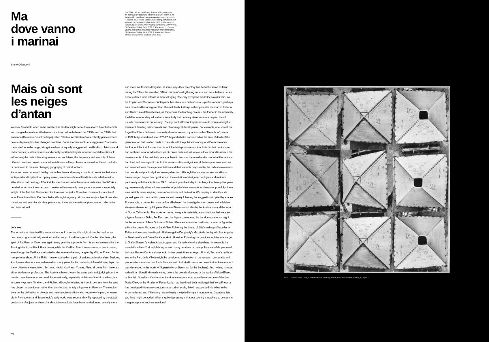
46 47
Ma dove vannoi marinai
We look forward to when some architecture student might set out to research how that remote
and marginal episode of Western architectural culture between the 1960s and the 1970s that
someone (Germano Celant perhaps) called “Radical Architecture” was critically perceived and
how such perception has changed over time. Some moments of true, exaggerated “damnatio
memoriae” would emerge, alongside others of equally exaggerated beatification; oblivions and
rediscoveries, sudden passions and equally sudden betrayals, abandons and deceptions. It
will certainly be quite interesting to measure, each time, the frequency and intensity of these
different reactions based on market variations – in the professional as well as the art market –
or compared to the ever changing geography of critical factions.
As far as I am concerned, I will go no further than addressing a couple of questions that, more
whispered and implied than openly asked, seem to surface at fixed intervals: what remains,
after almost half century, of Radical Architecture and what became of radical architects? As a
detailed report is not in order, such queries will necessarily have generic answers, especially
in light of the fact that Radical Architecture was not just a Florentine movement – in spite of
what Florentines think. Far from that – although irregularly, almost randomly subject to sudden
mutations and even karstic disappearances, it was an international phenomenon: alternative
and international.
————
Let’s see.
The Americans dissolved like snow in the sun. In a sense, this might almost be read as an
outcome programmatically inscribed in their very cultural background. On the other hand, the
spirit of Ant Farm or Onyx rises again every year like a phoenix from its ashes in events like the
Burning Man in the Black Rock desert, while the Cadillac Ranch seems more or less to resist,
even though the Cadillacs are buried under an overwhelming tangle of graffiti, as Franco Fonta-
na’s pictures show. All the British have embarked on a path of serious professionalism. Besides,
Archigram’s diaspora was redeemed for many years by the continuing influential role played by
the Architectural Association. Tschumi, Hadid, Koolhaas, Coates, Alsop all come from there, as
either students or professors. The Austrians have chosen the same path and, judging from the
results, have been most successful internationally, especially Hollein and the Himmelblau, but
in some ways also Abraham, and Pichler, although the latter, as it could be seen from the start,
has chosen to practice art rather than architecture. In Italy things went differently. The medita-
tions on the civilization of objects and merchandise and its – also negative – impact, for exam-
ple in Archizoom’s and Superstudio’s early work, were soon and swiftly replaced by the actual
production of objects and merchandise. Many radicals have become designers, actually more
and more like fashion-designers. In some ways their trajectory has been the same as Milan
during the ‘80s – the so-called “Milano da bere” – all glittering surface and no substance, when
even surfaces were often less than satisfying. The only exception would the Natalini who, like
his English and Viennese counterparts, has stuck to a path of serious professionalism, perhaps
on a more traditional register than Himmelblau but always with impeccable standards. Pettena
and Binazzi are different cases, as they chose the teaching career – the former in the university,
the latter in secondary education – an activity that certainly deserves more respect than it
usually commands in our country. Clearly, such different trajectories would require a lengthier
treatment detailing their contexts and chronological development. For example, one should not
forget that Ettore Sottsass’ most radical works are – in my opinion – his “Metaphors”, started
in 1972 but pursued well into 1976-77, beyond what is considered as the time of death of the
phenomenon that is often made to coincide with the publication of my and Paola Navone’s
book about Radical Architecture. In fact, the Metaphors were not included in that book as we
had not been introduced to them yet. It comes quite natural to take a look around to retrace the
developments of the last thirty years, at least in terms of the reverberations of what the radicals
had tried and envisaged to do. In this sense such investigation is all but easy as so numerous
and nuanced were the experimentations and their variants proposed by the radical movements
that one should practically look in every direction. Although the socio-economic conditions
have changed beyond recognition, and the evolution of design technologies and methods,
particularly with the adoption of CAD, makes it possible today to do things that twenty-five years
ago were merely either – it was a matter of point of view – wonderful dreams or pure folly, there
are certainly many inspiring cases of continuity and derivation. We may try to identify such
genealogies with no scientific pretence and merely following the suggestions implied by shapes.
For example, a connection may be found between the investigations on pneus and inflatable
elements developed by Utopie or Graham Stevens – but also by the Austrians – and the work
of Nox or Xefirotarch. The works on reuse, low-grade materials, accumulations that were such
a typical feature – Dalisi, Ant Farm and the hippie communes, the London squatters – might
be the ancestors of Arne Quinze or Richard Greaves’ anarchitectural huts, or even of figurative
artists like Jason Rhoades or Sarah Sze. Following the thread of Site’s makeup of façades or
Pettena’s ice or mud coatings in Utah we get to Dougherty’s Max Azria boutique in Los Angeles
or Dan Havel’s and Dean Ruck’s works in Houston. Following unconscious architecture we get
to Olafur Eliasson’s Icelandic landscapes, and his radical works elsewhere, for example the
waterfalls in New York which bring to mind many iterations of metropolitan waterfalls proposed
by Haus Rucker-Co. At a closer look, further possibilities emerge. All in all, Tschumi’s red hou-
ses in the Parc de la Villette might be considered a derivation of the research on seriality and
progressive mutations that Paola Navone and I included in our book on radical architecture as it
was developed in the works of Superstudio or Eisenman (or the Bechers). And nothing is more
radical than Libeskind’s early works, before the Jewish Museum; or the works of Isidro Blasco
or Dionisio Gonzàles. On the other hand, one wonders what would have become of Gordon
Matta Clark, or the Miralles of Paseo Icaria, had they lived. Let’s not forget that Yona Friedman
has developed his macro-structures at an urban scale, Soleri has pursued his follies in the
Arizona desert, and Oldenburg has endlessly multiplied his giant monuments. Countless lists
and links might be added. What is quite depressing is that our country is nowhere to be seen in
the geography of such connections1.
Bruno Orlandoni
1 — While I will not provide any detailed bibliographies on the individual professionals, often less than well-known to the Italian public, useful and pleasant overviews might be found in R. Klanten e L. Feireiss, Space Craft. Fleeting architecture and hideouts, Die Gestalten Verlag, Berlin 2007. R. Klanten and L. Feireiss, Space Craft II. More fleeting architecture and hideouts, Die Gestalten Verlag, Berlin 2009. R. Klanten and L. Feireiss, Beyond Architecture. Imaginative buildings and fictional cities, Die Gestalten Verlag, Berlin 2009. J. Krauel, Architettura effimera innovazione e creatività, Links 2010.
1973 — Gordon Matta-Clark, A W-Hole House: Roof Top Atrium, Cozzani Collection, Camec, La Spezia
Mais où sont les neiges d’antan

ISBN 978-88-95459-08-0 10 EUR _ 14 USD _ 9 GBP _ 1150 JPY www.archphoto.it
03
04_05
06
07
08_09
10
11
12_15
16_17
18_19
20_21
22_23
24_25
26_27
28_29
30
31
32_33
34_35
36_39
40_41
42_43
44_45
46
archphoto 2.0 - 02 - Radical City
Radical map
The italian political context
Berkeley and People’s Park
A conversation with Alessandro Mendini
McLuhan’s space
At school with the two Leonardos
Image building
Theory
Superstudio
Archizoom
Gruppo Strum
Zziggurat
Field of action / The piazza
Superurbeffimero n.7
Gianni Pettena
Ugo La Pietra
9999
A conversation in Salt Lake City
Field of action / Inflatable City
In search of the ephemeral
Disco
From Drop City to the anti-city experiments
Ma dove vanno i marinai
Emanuele Piccardo
Massimo Ilardi
Elisa Poli & Emanuele Piccardo
Antonio Tursi
Giovanni Bartolozzi
Hal Foster
Amit Wolf
Robert Smithson & Gianni Pettena
Caroline Maniaque
Brunetto De Batté
Bruno Orlandoni
Massimo Ilardi
Urban sociologist Professor at the School of
Architecture at Ascoli Piceno.
Elisa Poli
Architecture historian and critic.
She is a PhD in Architecture History.
6 8 10
Giovanni Bartolozzi
Architect, co-founder of Fabbricanove.
He is a Phd in Urban and Architectural
Design at the Florence University.
Caroline Maniaque
Professor at Ecole nationale supérieure
d’architecture Paris-Malaquais
Brunetto De Batté
Architect, Professor at the
Genova University
Bruno Orlandoni
Architect and Architecture historian.
He is co-author (with Paola Navone) of
“Architettura Radicale”, Casabella, 1974
11
40_41 44_45 46
Antonio Tursi
Senior Fellow at the MCLuhan Program and
a PhD in Theory of communication at the
Macerata University.
Hal Foster
Art historian and critic is Townsend Martin
Professor of Art and Archaeology at
Princeton University
12_15Amit Wolf
Critic and architect, teaching Contemporary
Architecture Theory and History at SCI Arc,
Los Angeles.
28_29