artist representation 1
TRANSCRIPT

TASK 5Representation of Artists
Shot type
Mise en scene
Language
Colours
Font

The artists are represented as quite aggressive, dangerous and intimidating. They represent this through the use of image, font, language, mise-en-scene and colours.
The way they’re represented as aggressive and intimidating through the image is the shot type they use, so they use a high angle which makes them look more intimidating because you can see every member of the band, and so you can see the expression of each one. Also it makes them appear more violent and aggressive because you can also see their clothing, which consists mainly of black clothing which makes them look dark, aggressive and mysterious. Also they used a long shot, so you can see all of them, except for the two in the back, whose legs are being covered by the lead singer. You can also see that the lead singer has a twisted aggressive smile, which again makes him look aggressive and dangerous, and the rest of the band have blank expressions or look angry, which helps them to look dangerous and come across as violent.
They used costumes which consist mainly of black, they also used leather jackets and a vest, which makes them look quite dangerous and intimidating, because motorcyclists wear leather jackets and they’re thought of as quite rebellious and dangerous, and so this is how the band would appear, and with the lead singer, he’s seen in a vest top, which shows off his arm tattoos, which again makes him look very aggressive and dangerous because tattoos are seen as quite aggressive and rebellious. The lead singer is also wearing a pair of leather gloves, which again makes him look aggressive and quite dangerous, and he’s also wearing a pair of blacked out glasses, making it unable to see is eyes, and so he comes across as quite mysterious and dangerous. They also use props like chains, and in the background, the first person on the left is holding what looks like a plank of wood, which again makes them look dangerous because they look like they’re prepared to hit you, and again on the right hand side, the first person is holding what looks like a metal pipe, which again if he hit you with it could cause serious injury, so again he looks dangerous and aggressive, and then the chain that the lead singer is holding looks dangerous too because he could strangle you with it or chain you up with it, which is quite intimidating and scary.
The way they’re represented as aggressive through the use of language is because above the cover story it says “Sex, drugs, violence” which represents them as aggressive and rebels because drugs as we know are illegal, and so they’re in a way promoting drugs because it’s like they’re saying if you listen to this band, you will be associated with drugs. This also helps represent them as aggressive because it actually says violence, which makes them seem aggressive because the cover story is the name of the band, and so it’s written things around the band name which are associated with the band, so again if you listen to this band you will be associated with violence. Underneath the cover story is also says “The world’s most dangerous band” which is obviously going to associate them with aggression and danger because it says that they’re dangerous, so you’re going to associate them with danger, and when someone is dangerous, they are normally either violent or aggressive, so that helps represent them as aggressive.
The way they’re represented as aggressive and dangerous through the use of colours is because they used colours like black, dingy yellows and reds, they also use white but that’s used because it contrasts well against the black. Black is used mainly on the masthead and with the colour clothing they’re wearing. This helps represent them as aggressive because black is used to represent danger and darkness, and so they’d be seen as dangerous and quite dark and violent. The dingy yellow is quite unsettling and uncomfortable to look at, so they’d be seen as quite unsettling and quite scary and uncomfortable. Finally, the red helps them to look aggressive because red represents anger and can also be represented as blood and danger, so this helps them to look aggressive too.Teenagers and young adults (16-25) are quite specific about the colours and kind of clothing they wear. They’re quite stubborn when it comes to changing this, and so are stereotyped as quite stubborn and moody, and also this is more common in females than males, although it does still take place in males.
The way the font style helps represent them as dangerous and aggressive is the way they use sans serif throughout the whole page. This makes it look more masculine whereas serif is more feminine, and men tend to be stereotyped as more aggressive and dangerous than women, so this helps to make them look dangerous and more like they could be more aggressive than what women could be.
The social groups who like this genre can be seen also as aggressive and dangerous, because of the way the artist is seen. The main social groups who enjoy this genre and the artist, are normally teenagers and young adults. They’re also normally more male, but can also be female, and their ethnic group is normally whites, mainly because a lot of bands and artists are white as well.

The main artist for this contents page is represented as quite mysterious and looks quite evil. They represent this through image, colours, font and mise-en-scene
The way they represent the artist as quite mysterious and evil is through the image. They use a mid-shot as the shot type, which allows us to see his emotion and expression, in this case quite an evil and devious smile, but isn’t too close that it becomes uncomfortable and unsettling, although it is quite unsettling because of the expression he has. It also allows us to see a bit of what he’s wearing, in this case, he’s wearing all black. This also helps him to look more mysterious because all you can see is the top half of what he’s wearing, and it’s all black, and black is quite a mysterious and dangerous colour, so that helps him to look more mysterious and quite evil. He’s also using his body language to come across as quite mysterious as well, because he’s pulling his glasses down, but not far enough down to reveal his eyes, just enough for us to be able to see the top half of his eyes. This makes him look more mysterious because we can’t see his eyes completely and so we can’t see his true identity, which makes him quite mysterious and like he doesn’t want to be noticed or seen.
The way they represent the artist as quite mysterious and evil is also through the colours. They use mainly black in the image of the artist, and they also place dingy yellow writing across the rest of the page.The black helps represent the artist as quit e mysterious because again black is quite a mysterious and dangerous colour, so this helps him to look mysterious and unsettling. It also helps him to look evil too because we associate black and dark colours with evil, like Darth Vader, he’s always seen in a dark costume, and we know that he’s evil, so this helps represent him as evil.The dingy yellow also helps with making the artist look unsettling and evil because yellow is already an unsettling colour and most people don’t like looking at if for long periods of time, and it helps to make him look evil as well because when something is evil we’re quite on edge and unsettled already, so this just adds to the unsettlement.
The way the font helps represent the artist as mysterious and evil is because of the way the font of the words “Contents” and “Kerrang! This week” is all distorted and it looks like broken glass or rotting wood. This helps him look quite mysterious and evil because he can be seen as the villain, so he can be seen as the one who has broken the glass or in quite an unsettling area where the wood is rotting. The fact that it’s all surrounding him just helps him to look very evil and mysterious. The other font is sans serif which is masculine, and so fits in with the artist.
The way mise-en-scene helps the artists appear as mysterious and evil is because of the kind of clothes he’s wearing. So the first thing you see is a pair of glasses and a leather glove. These both work well together to help him seem mysterious because he’s hiding his identity, so this makes him seem mysterious because he doesn’t want people to recognise him or see who he is.He is also wearing a leather jacket and his iconic hat. The leather jacket helps him look quite mysterious and dangerous because leather jackets can also represent bikers, and bikers can be dangerous and rebellious, so this can also make him seem dangerous and rebellious. Finally his iconic hat doesn’t make him seem all that mysterious because we know that Slash is always wearing his hat, and so we can identify him from this.
The social groups who like this genre and artist can also be seen as quite unsettling and mysterious because of the way the artist is represented. If they like this artist and genre they will be associated with them and stereotyped like them. Again they’re normally teenagers or young adults, mainly male but can be female too, and the ethnic groups are mainly white because of the bands and artists’ ethnic groups.
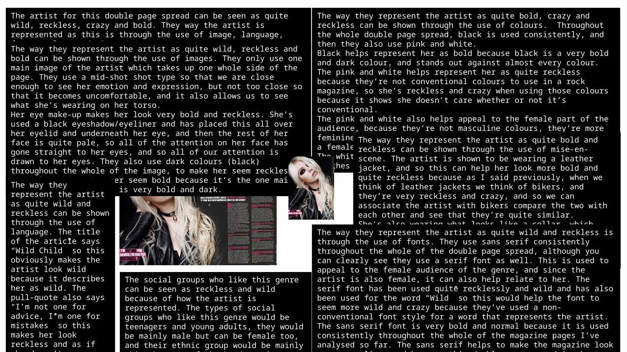
The artist for this double page spread can be seen as quite wild, reckless, crazy and bold. They way the artist is represented as this is through the use of image, language, fonts, colour and mise-en-scene.
The way they represent the artist as quite wild, reckless and bold can be shown through the use of images. They only use one main image of the artist which takes up one whole side of the page. They use a mid-shot shot type so that we are close enough to see her emotion and expression, but not too close so that it becomes uncomfortable, and it also allows us to see what she’s wearing on her torso.Her eye make-up makes her look very bold and reckless. She’s used a black eyeshadow/eyeliner and has placed this all over her eyelid and underneath her eye, and then the rest of her face is quite pale, so all of the attention on her face has gone straight to her eyes, and so all of our attention is drawn to her eyes. They also use dark colours (black) throughout the whole of the image, to make her seem reckless and bold. This makes her seem bold because it’s the one main colour used, and black is very bold and dark.
The way they represent the artist as quite bold, crazy and reckless can be shown through the use of colours. Throughout the whole double page spread, black is used consistently, and then they also use pink and white. Black helps represent her as bold because black is a very bold and dark colour, and stands out against almost every colour.The pink and white helps represent her as quite reckless because they’re not conventional colours to use in a rock magazine, so she’s reckless and crazy when using those colours because it shows she doesn’t care whether or not it’s conventional. The pink and white also helps appeal to the female part of the audience, because they’re not masculine colours, they’re more feminine, and it also helps relate to the artist because she’s a female and so they’re basing the colours around the artist.The white is used to contrast well against the black of her clothes and the background.
The way they represent the artist as quite bold and reckless can be shown through the use of mise-en-scene. The artist is shown to be wearing a leather jacket, and so this can help her look more bold and quite reckless because as I said previously, when we think of leather jackets we think of bikers, and they’re very reckless and crazy, and so we can associate the artist with bikers compare the two with each other and see that they’re quite similar.She’s also wearing what looks like a collar, which again helps her look bold and reckless because people don’t normally wear collars, so she stands out against the crowd and it makes her look like she doesn’t care what people think of her.
The way they represent the artist as quite wild and reckless is through the use of fonts. They use sans serif consistently throughout the whole of the double page spread, although you can clearly see they use a serif font as well. This is used to appeal to the female audience of the genre, and since the artist is also female, it can also help relate to her. The serif font has been used quite recklessly and wild and has also been used for the word “Wild” so this would help the font to seem more wild and crazy because they’ve used a non-conventional font style for a word that represents the artist.The sans serif font is very bold and normal because it is used consistently throughout the whole of the magazine pages I’ve analysed so far. The sans serif helps to make the magazine look more masculine, and because this double page spread is about a female artist and uses quite feminine colours and font styles, the sans serif just helps to bring it back to the male appeal and make it look more masculine again.
The way they represent the artist as quite wild and reckless can be shown through the use of language. The title of the article says “Wild Child” so this obviously makes the artist look wild because it describes her as wild. The pull-quote also says “I’m not one for advice, I’m one for mistakes” so this makes her look reckless and as if she doesn’t care, because if she did she’d listen to advice, but she doesn’t so she makes more mistakes and takes chances.
The social groups who like this genre can be seen as reckless and wild because of how the artist is represented. The types of social groups who like this genre would be teenagers and young adults, they would be mainly male but can be female too, and their ethnic group would be mainly white because of the bands/artists ethnic group.