audience response power point
TRANSCRIPT

How does the house style make you feel ?(Comment on colour, images, layout)
•It goes with the genre of music •It makes me feel scared but that’s good•Looks very dark, lets me know what type of genre the magazine is about well•It fits with the genre of the music
Which sell lines appeal to you most ?•The ones with the red outline box•The bottom left with images•The bottom left
Would they encourage you to buy this magazine?•If I liked this genre of music•Not really, maybe if I enjoyed this music•The bottom ones
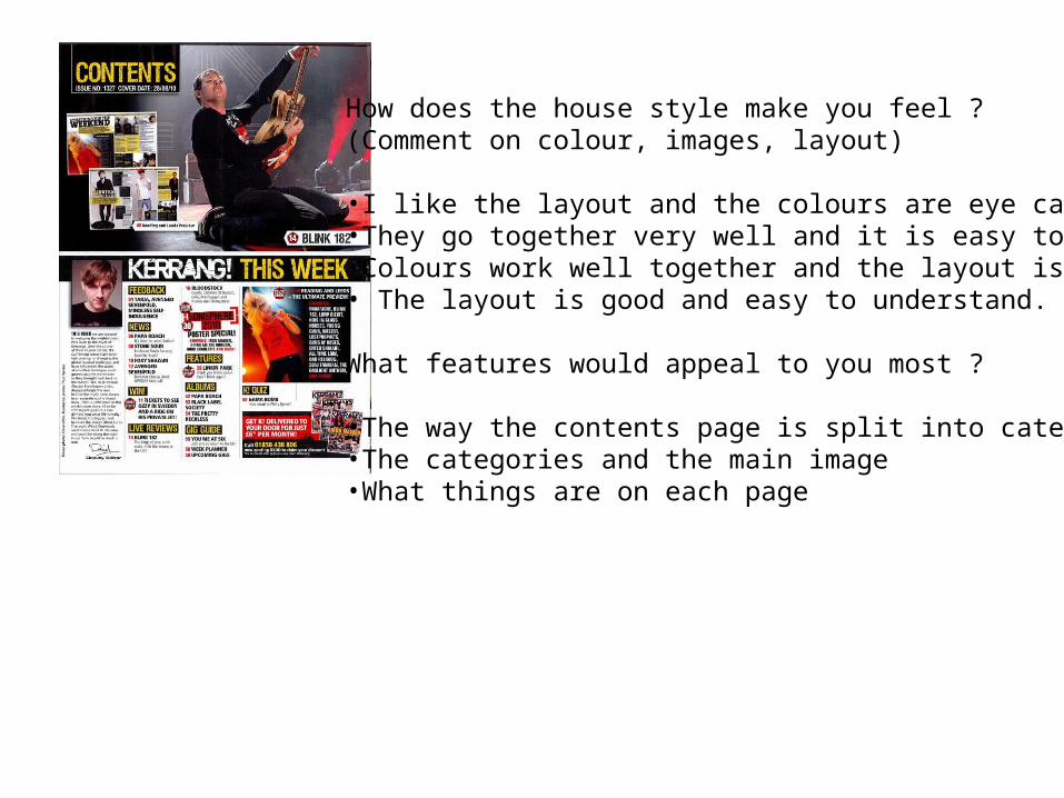
How does the house style make you feel ?(Comment on colour, images, layout)
•I like the layout and the colours are eye catching•They go together very well and it is easy to understand•Colours work well together and the layout is simple• The layout is good and easy to understand.
What features would appeal to you most ?
•The way the contents page is split into categories•The categories and the main image•What things are on each page

How does the house style make you feel ?Comment on colour, images, layout?•I like it because the title stands out and caught my attention•The colours are very good and it seems really enjoyable•Looks quite boring with all the grey •The title stands out but the questions and answers don’t
What would attract you to reading This article and why ?
•The colour scheme and the main image•Yes because it looks really professional. The only thing I don’t like is the white dots around the page•No it looks too boring, the colour scheme the main image and the bold text at the top