basic elements of visual expression scratchboard...1º- a4 worksheet 2º- pencil and eraser 3- wax...
TRANSCRIPT

Composición VIII, Kandinsky, 1923 Source: www.ibiblio.org
As well as written comunication, visual comunication has an alphabet. It consists on several basicsigns that can work as images on their own or can be combined to form a more complex image.
Many times Kandinsky used music as an inspiration for his artworks and, so many of thetitles are related to music. He used basic geometric elements such as the line, that couldbe either an expressive or compositive element. The lines he used could be straight orcurved, arcs, converging, parallel and sometimes in contrast with geometric lines theycould even be organic or irregular.The dot could take place in many appearances such as small figures, big circles or evensquares or little geometric shapes. And the plane was usually depicted as a big geometriccolored shape, sometimes filled up with colors and some other with more lines and dotsthat created a natural or artificial texture. Planes, lines and dots many times helped theartist to achieve a tri-dimensional sense with some sort of depth impression.
LIGHT & COLORIN TEXTURE
RUBBING
SCRATCHBOARD
BASIC ELEMENTS OF VISUAL EXPRESSION
ARTIFICIAL TACTILE
VISUAL
DOT LINE
TEXTUREPLANE(Spot or Shape)
Small marks Geometric figures
SquaresCircles
COMPOSITIVEELEMENT
THREE-DIMENSIONALSENSE
NATURAL
COMPOSITIVEELEMENT
EXPRESSIVEELEMENT
StraightCurved
ArcsGeometricOrganic
or
Dependingon the origin
Dependingon the structure
or
Kandinsky's artworks are the first onesin Art History considered entirelyabstract. Kandinsky was influenced bynew artistic movements that startedtaking a different depiction path thanreality or realism.
He thought that art and its images mustbe related to the soul and can go fartherthan reality. In order to achive thatthought he wrote books describing thefeelings and ideas that colours, andvisual elements express.
BASIC ELEMENTS OF IMAGE:GENERAL SCHEME AND KANDINSKY INTRODUCTION
Page:1 of6

Niharu Matsunaga: Ten-TenSource: http://miharumatsunaga.com/ten-ten/
DIFFERENT QUALITIES OF DOTS
In Geometry a dot would be a small circle or also apoint. A point can be determined by two crossing linesor an intersection between a line and a plane. Actuallythe geometric point doesn't have any features, anydimmensions. In Geometry points are just points givenby coordinates, they don't have color, shapes ordimensions.
Images on the right are paintings by the abstract Americanpainter Ross Bleckner. He uses the dot in many appearancesand features to make his abstract depictions.
Source: http://www.rbleckner.com/paintings.html
Miguel Endara's thin blackmarker's dotsSource: http://miguelendara.com/art/hero/
Damien Hirst, Spot painting versionBy Henry HargreavesSource:http://www.highsnobiety.com/
Chuck Close:Robert Rauschenberg, 1997.Source: http://www.flickr.com/photos/rocor/8332183896/
Gala contemplating themediterranian sea. Dali.Source: http://www.virtualdali.com/
Roman Mosaic:Villa tejada lou, PalenciaSource: wikipedia
THE DOTS
However in visual comunication such as art or graphic design the dot is the smallestvisual element that can have different features such as color, size, intensity ortexture.It can have or not an outline or and it can be focussed or diffused. It usuallylooks like a small circle, but can vary and adopt multiple appearances. For examplein digital images it is a square called pixel. It can be grouped to form structures ordepictions with volume, texture, chiaroscuro, etc.. By varying its characteristics itcan change the expressiveness of an image. Depending on the location of the dotin the plane, different sensations can be created.
Page:2 of6
Check out Obliterationroom Art instalationby Yayoi Kusama byclicking on the link orscanning the QR code.
Straight lines in all directions. 1996Sol Lewitt.Source:http://www.barbarakrakowgallery.com/contentmgr/showdetails.php/id/7646
Mona Lisa. Thomas PavitteDot to Dot drawingsSource: http://thomasmakesstuff.com/
#6 (after untitled 1975) Jasper JohnsSource:http://www.artslant.com/ny/events/show/46953-jasper-johns-prints-1960-2007
Wall drawings at MASS MoCA. Sol LewittSource: http://www.portlandart.net/archives/2009/03/the_black_squar_1.html
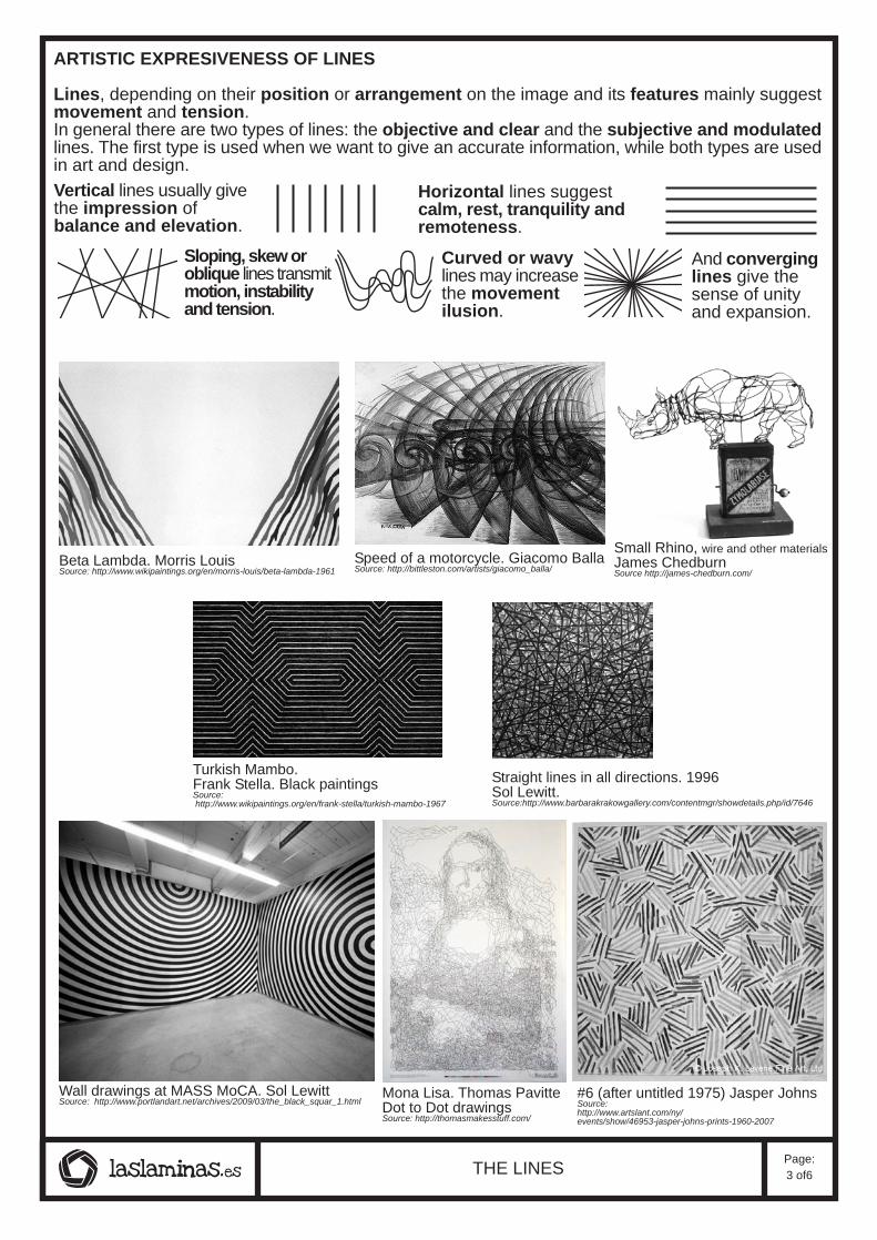
ARTISTIC EXPRESIVENESS OF LINES
Lines, depending on their position or arrangement on the image and its features mainly suggestmovement and tension.In general there are two types of lines: the objective and clear and the subjective and modulatedlines. The first type is used when we want to give an accurate information, while both types are usedin art and design.
Speed of a motorcycle. Giacomo BallaSource: http://bittleston.com/artists/giacomo_balla/
Beta Lambda. Morris LouisSource: http://www.wikipaintings.org/en/morris-louis/beta-lambda-1961
Turkish Mambo.Frank Stella. Black paintingsSource: http://www.wikipaintings.org/en/frank-stella/turkish-mambo-1967
Vertical lines usually givethe impression ofbalance and elevation.
Horizontal lines suggestcalm, rest, tranquility andremoteness.
Sloping, skew oroblique lines transmitmotion, instabilityand tension.
And converginglines give thesense of unityand expansion.
Curved or wavylines may increasethe movementilusion.
Small Rhino, wire and other materialsJames ChedburnSource http://james-chedburn.com/
THE LINESPage:3 of6

The plane and Matisse
The word plane is more a geometric word that stands for a flat surface. When we talk about theplane in art and visual language in general we refer to shapes or brush strokes that define theelements of the depictions.
ACTIVITY__Read the text. Below you can see three Matisse artworks with some plane atributions or features.Find the intruder, a feature that doesn't correspond, and scratch it.
The plane has been used in painting giving different atributions or features, from geometricto natural and organic. Henry Matisse was a fauvist and post impresionist artist who usedthe plane using different techniques such as collage or painting. Fauvist comes from "fauve",which means in French "beast", and that adjective is referred to the bright and agressive useof color these painters did.One of the main uses of the plane with color is to give volume and depth to the elements orthe artwork, in most of those cases the plane can be observed as brush strokes. That can alsobe achieved by changing the size of the planes, also by playing with their colors; warm andlight colors seem to be closer while cold and dark colors appear to be further. Contrasting colorswork to obtain this goal. Shading, as well as overlapping shapes or planes can help to givedepiction, depth and volume .
changing sizebrush strokesoverlappinggeometric
organicbrush strokesOverlappingCollage
GeometricCollageColor contrastorganic
Matisse Portrait with pipe. Adre DerainSource: http://www.tate.org.uk/art/artworks/derain-henri-matisse-t00165
Snail MatisseSource: http://www.tate.org.uk/art/artworks/matisse-the-snail-t00540
Blue nude. MatisseSource: http://www.henri-matisse.net/cutouts/m.html
Emilio Pettoruti
Emilio Pettoruti was an Argentinian Painter. He caused a scandal in anexhibition in Buenos Aires in 1924 due to his modern style. He was influencedby some avant gardes and his main style was cubist even though he didn'tthink himself as a cubist.The head of cubists was Picasso and there are also some well known cubistpainters such as Georges Braque or Juan Gris, so it's good to hear of anothercubist painter different other than these.Cubist painting main feature is the use of geometric planes, brush strokesor shapes showing a polygonal appearance to compose figurative but quiteabstracted paintings.
Paisaje. Emilio PettorutiSource:
http://www.artnet.com/artwork/426214496/425669004/emilio-pettoruti-paisaje.html
THE PLANE, SHAPE OR BRUSH STROKE Page:4 of6
Textures are present in daily life. Art and image uses them constantly in painting and sculpture, but otherdisciplines like architecture, industrial and textile design or even for food texture is one of the main features.
Textures are the surfaces qualities, apart from color, that can be perceived with the sense of visionor touch.
In first term a texture can be visual or graphic if they are only a flat image. Then they can only be perceivedby the sense of vision, or tactile if they have a relief or real volume.
All textures are visual but only some of them are actually tactile so can be perceived with the sense of touch.Textures can be geometric if they show straight orthographic and ordely arranged lines and dots, and onthe other hand they can be organic if they show an irregular and random arrangement of their elements.Depending on their origin they can be natural if they come from nature or artificial if they have been createdby humans. Some natural textures look like geometric, like a pine apple skin or some artificial textures appearto be natural, for instance in fursnishing sometimes wood looking surfaces are created to appear to sightnatural.
Here you have some adjectives related to textures: cold, warm, hot, freezing, soft, smooth, rough, dry, wet,regular, flat.
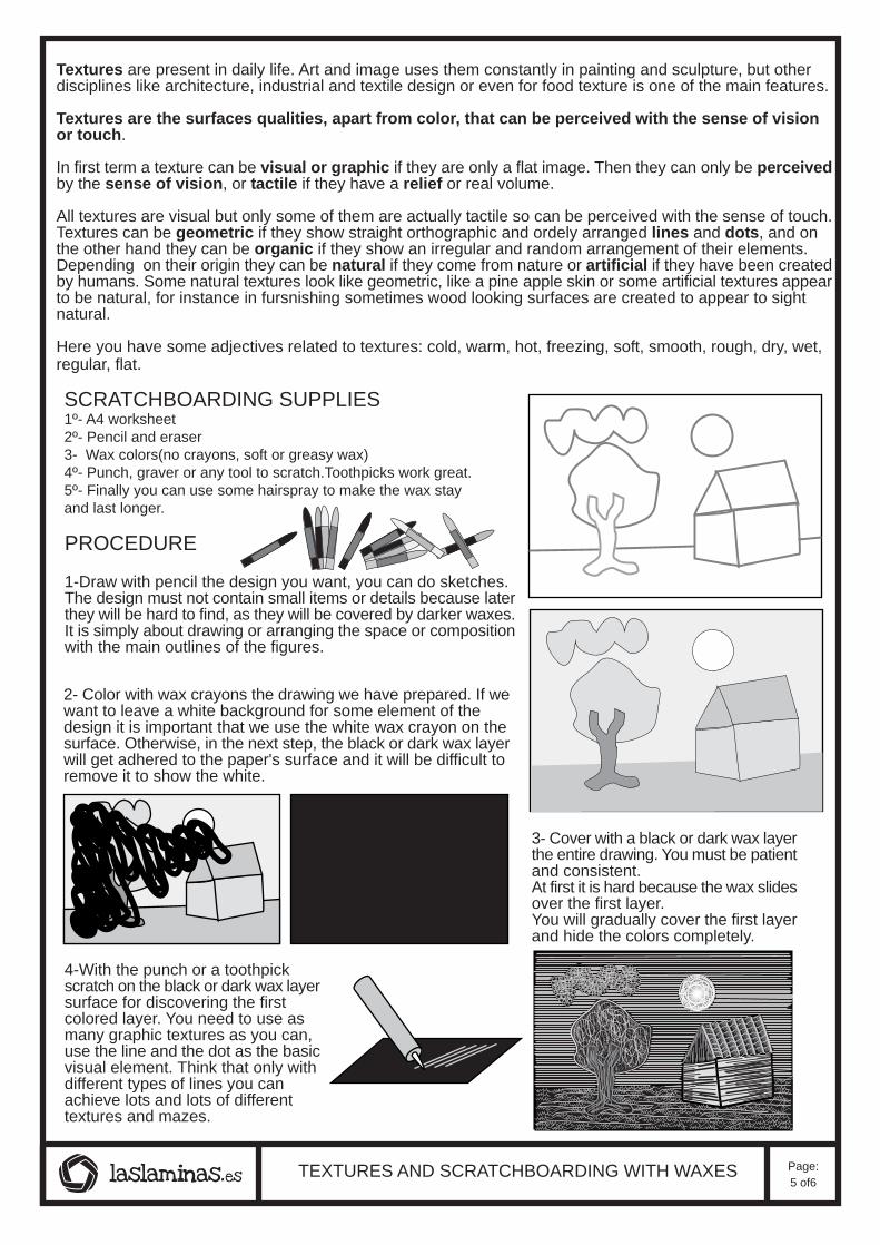
SCRATCHBOARDING SUPPLIES1º- A4 worksheet2º- Pencil and eraser3- Wax colors(no crayons, soft or greasy wax)4º- Punch, graver or any tool to scratch.Toothpicks work great.5º- Finally you can use some hairspray to make the wax stayand last longer.
PROCEDURE
1-Draw with pencil the design you want, you can do sketches.The design must not contain small items or details because laterthey will be hard to find, as they will be covered by darker waxes.It is simply about drawing or arranging the space or compositionwith the main outlines of the figures.
4-With the punch or a toothpickscratch on the black or dark wax layersurface for discovering the firstcolored layer. You need to use asmany graphic textures as you can,use the line and the dot as the basicvisual element. Think that only withdifferent types of lines you canachieve lots and lots of differenttextures and mazes.
2- Color with wax crayons the drawing we have prepared. If wewant to leave a white background for some element of thedesign it is important that we use the white wax crayon on thesurface. Otherwise, in the next step, the black or dark wax layerwill get adhered to the paper's surface and it will be difficult toremove it to show the white.
TEXTURES AND SCRATCHBOARDING WITH WAXES
3- Cover with a black or dark wax layerthe entire drawing. You must be patientand consistent.At first it is hard because the wax slidesover the first layer.You will gradually cover the first layerand hide the colors completely.
Page:5 of6

THE DOTDot: It is the smallest visual element, the dot is a visual element and can have different characteristics ascolor, size, intensity or texture.Dot appearances: The dot is usually a small circle, but it can vary in size and shape depending on the toolwith which it is produced or the visual medium in which it appears, for example in digital images it is a square(pixel).The Dot Expressiveness: The dot can be grouped to form structures with volume, texture, chiaroscuro, etc..By varying its characteristics of shape, size and color it can change the expressiveness of an image.The dot in the composition: Depending on the situation of the dot in the plane, different sensations canbe created.
THE LINELine: It is defined as a moving point. As well as the dot, the line may contain very different features, especially:thickness, color and intensity.Expressiveness of the line: Depending on its tracing, path and other features the line can transmit differentsensations. When the thickness and intensity of the line is controlled depending on the different sensationsthat can produce is called "sensitive line".Uniform and objective line:It is a type of line that seeks to give clear and sharp information, without doubts,questions or interpretations.Modulated and subjective line: It's another name for the sensitive line. Combining different thicknesses,colors and intensities, you can get a multitude of expressive intentions.The line and composition: The lines, depending on their position on the image and its features can suggestdifferent sensations.Vertical lines: They suggest balance and elevation in compositions.Horizontal lines: They suggest calm, rest, tranquility and remoteness in compositions.Skew lines: They suggest motion, instability, unsteadyness and tension in compositions.Curved lines: They also suggest movement in compositions.Lines converging on one point: They give the sense of unity and expansion.
THE PLANEThe plane: Visually defined by its shape, size, color and texture. When we talk about the visual plane werefer to the spots with different shades, shapes or textures in the images. The plane can be described ordefined by contrasts, outlines, different colors or textures.Three-dimensional sense of the plane: Being a two-dimensional element, the plane may suggest certainvisual sensations as a resulting three-dimensional sensation, an approach, distance or volume.Size contrasts: Increasing or decreasing the plane in size produces a sense of depth in depictions.Tone or value contrasts: Warm colors are perceived as closer while cold ones can be seen as distant.Indoors clear planes are enhanced, while outdoors dark planes atract more attention.Texture contrasts: Smooth and homogeneous textures express a sense of remoteness, while rough andirregular textures express a feeling of closeness.Overlapping: When a shape obviously overlaps with another it seems to be ahead of the other that is leftbehind , covering it partially, then creating the sense of depth.Shading: The shading of shapes in drawings or artworks helps them to be perceived with certain volumes.The plane in the composition: Depending on the disposition of the spots or brush strokes, the images canachieve different visual effects similar to those that the lines getThe plane in space: Sculpture, architecture or engineering are disciplines that use the plane constantly.Curved planes suggest the organic and natural while orthographic planes express order and sense of balance.
TEXTURETexture: Visual and tactile quality of the objects' surface. Generally surfaces have color and texture qualitieswhich do not hold a relationship with each other. In art, texture provides expressive qualities while in architecture,engineering or in the textile disciplines, textures provide another kind of qualities to materials.Tactile texture: It is the one which can be perceived through the sense of touch and sight.Visual or graphic texture: Texture that can only be perceived through the sense of sight. Visual texturesare usually similar to tactile textures.These can be obtained through various techniques such as scratching,rubbing, stenciling or stamping.Hatching: Shading an area or shape with closely drawn parallel lines. When there are two or more sets ofparallel lines in different directions it is called Cross hatching.Stippling:Mark a surface, shape or area with numerous small dotsArtificial textures: Those textures created by humans. They can be usually defined by the material thatcomposes the surface shown.Natural textures: Those belonging to or appearing like textures of nature. Some artificial textures are similarto natural textures and some natural textures may look more geometric and artificial but they are actuallynatural.Color and light in texture: The color or color combination can have a decisive influence on the perceptionof textures. Side lighting enhances any texture or relief, as well as frontal lighting softens and makes moreunnoticeable both the texture and the relief.
BASIC ELEMENTS OF VISUAL LANGUAGE VOCABULARY Page:6 of6