before and after photoshop contents page
TRANSCRIPT

Before and After Photoshop
Screenshot evidenceContents Page

• I began with a transparent A4 page on Photoshop CS3. I then added a white background, and then I added a grey colour overlay.

• I added a grey lighter grey background on a new layer so the Q (for Quaint) and the contents masthead would stand out more.

• I then added a new layer and put multi coloured dots which I lowered the opacity of to 40% and put a glow around them. I then added a ‘Featuring…’ subtitle and my first band picture of Kasabian.

• I then added text over the top of the Kasabian gig picture saying ‘Kasabian in concert, photos, reviews and interviews’ and the page number it could be found on. I then also added my second gig picture of The Maccabees.

• I again added text over the top of my Maccabees gig picture of their name and the page number they can be found on. Then I added a third picture of Bastille.

• Again I added Bastille’s name to their picture and a page number. I then added a forth picture of Florence and The Machine in concert and the Ricoh Arena.

• I added text of Florences’s name and band over the top of her picture and a page number. I then added the fifth picture of John Newman at V festival 2013 that I took also.

• Again I added John Newman text over his picture and a page number. I then added the 6th and final picture of Two Door Cinema Club.

• I similarly added Two Door Cinema Club’s name and the page number on which they can be found. In the third screenshot I began a different section of my contents page, adding a pink glow for my subscription box.

• I added a white circle/stamp with a black rim, then I added a grey background for the subscribe title. The word subscribe has been edited using a drop and inner shadow effect.
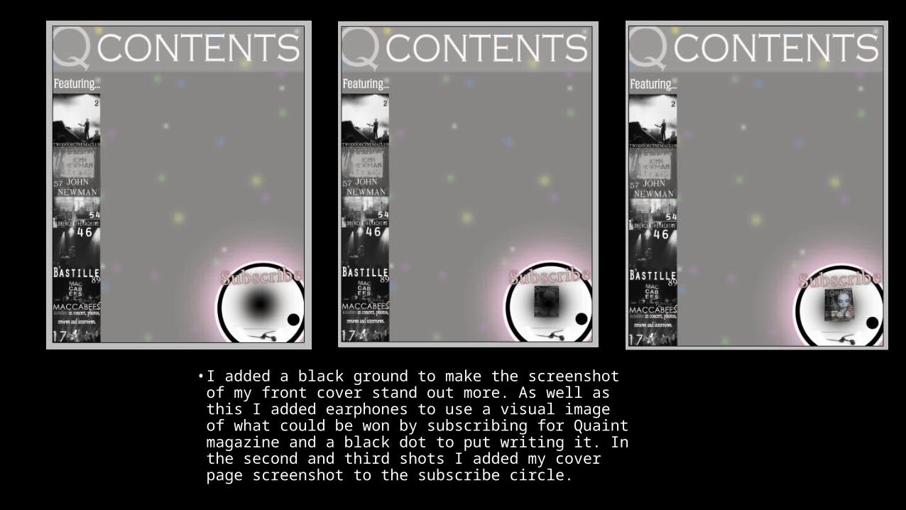
• I added a black ground to make the screenshot of my front cover stand out more. As well as this I added earphones to use a visual image of what could be won by subscribing for Quaint magazine and a black dot to put writing it. In the second and third shots I added my cover page screenshot to the subscribe circle.

• I then added writing to the little black circle saying; ‘Turn to page 117 for more information’ and text under the cover page screenshot, where it says ‘Subscribe to Q and get free Jays earphones’. In the final screenshot I added black rectangular shape to use as a background, which I faded the opacity of slightly so I could add similar colour text and it still stand out effectively.
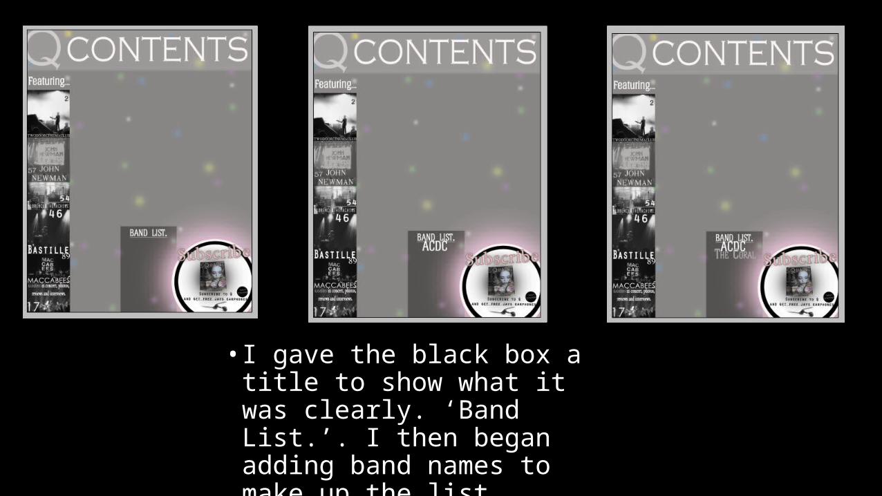
• I gave the black box a title to show what it was clearly. ‘Band List.’. I then began adding band names to make up the list.

• I continued adding more band names to make up the list, such as; ACDC, The Coral, Nirvana and The Smiths.

• I continued adding more band names. These were made up if; Swim Deep, Peace and The Twang.

• I added my final band name to the band list box; ‘The Drums’ and then left of it I added a blue faded out (Lowered opacity) glow to be the background for my BRITS 2015 logo. The third screenshot shows the construction of the logo.

• The construction of the BRITS 2015 logo is still ongoing. With different lines beings added and freely transformed to face the correct way/be on the right angle.
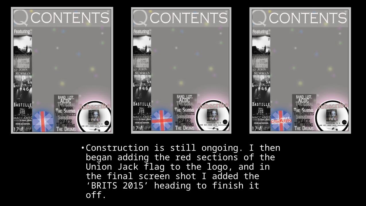
• Construction is still ongoing. I then began adding the red sections of the Union Jack flag to the logo, and in the final screen shot I added the ‘BRITS 2015’ heading to finish it off.
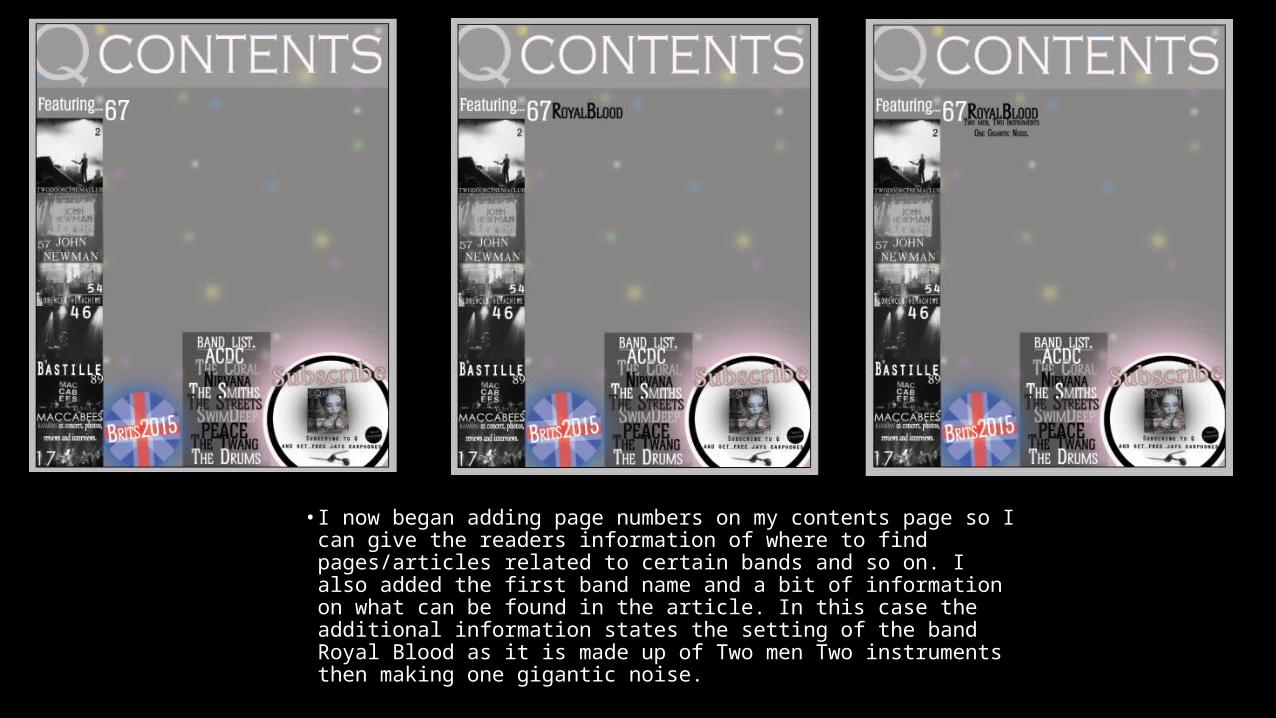
• I now began adding page numbers on my contents page so I can give the readers information of where to find pages/articles related to certain bands and so on. I also added the first band name and a bit of information on what can be found in the article. In this case the additional information states the setting of the band Royal Blood as it is made up of Two men Two instruments then making one gigantic noise.
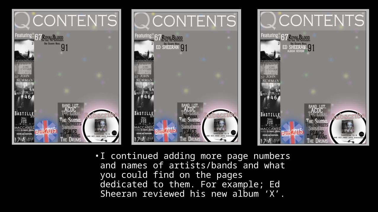
• I continued adding more page numbers and names of artists/bands and what you could find on the pages dedicated to them. For example; Ed Sheeran reviewed his new album ‘X’.

• I continued adding more page numbers and names of artists/bands and what you could find on the pages dedicated to them. For example; Sam Smith about his participation in MTV’s Music Video Awards. When constructing the MTV logo I used separate layers for the ‘M’ and the ‘TV’s’.

• I continued adding more page numbers and names of artists/bands and what you could find on the pages dedicated to them. For example; The Charlatans.

• I continued adding more page numbers and names of artists/bands and what you could find on the pages dedicated to them. For example; Elbow.
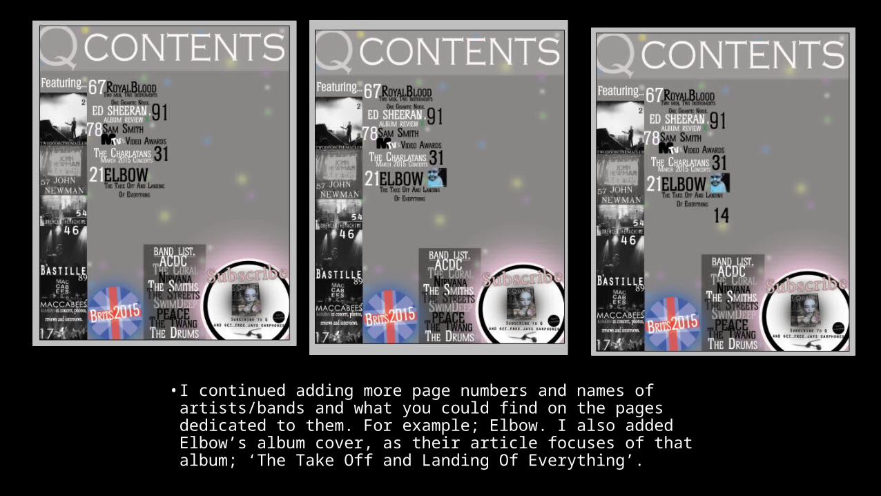
• I continued adding more page numbers and names of artists/bands and what you could find on the pages dedicated to them. For example; Elbow. I also added Elbow’s album cover, as their article focuses of that album; ‘The Take Off and Landing Of Everything’.

• I continued adding more page numbers and names of artists/bands and what you could find on the pages dedicated to them. For example; Paolo Nutini and his favourite album track (‘Iron Sky’)
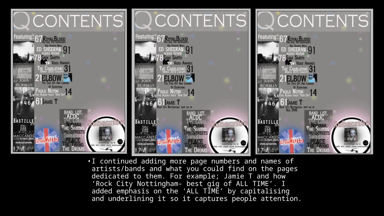
• I continued adding more page numbers and names of artists/bands and what you could find on the pages dedicated to them. For example; Jamie T and how ‘Rock City Nottingham- best gig of ALL TIME’. I added emphasis on the ‘ALL TIME’ by capitalising and underlining it so it captures people attention.
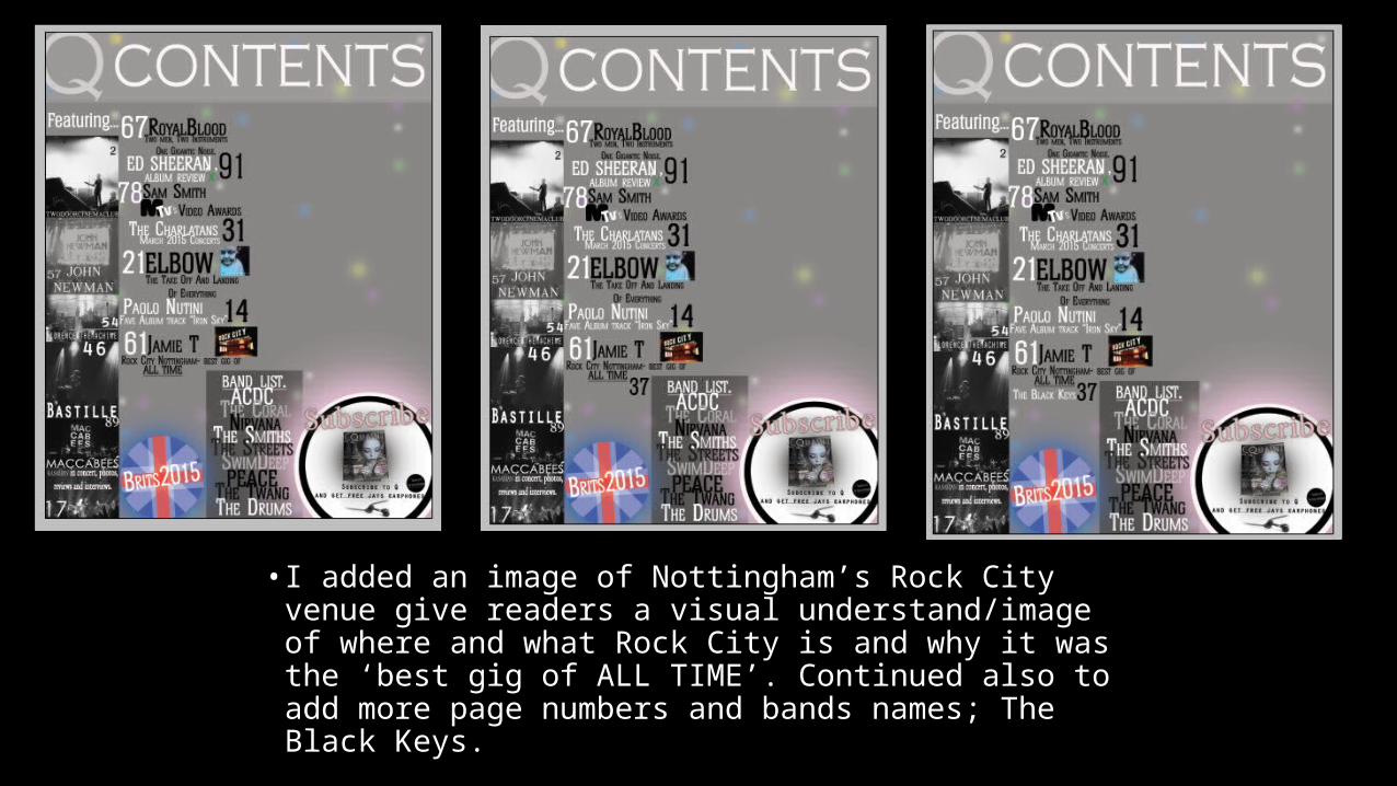
• I added an image of Nottingham’s Rock City venue give readers a visual understand/image of where and what Rock City is and why it was the ‘best gig of ALL TIME’. Continued also to add more page numbers and bands names; The Black Keys.

• I continued adding more page numbers and names of artists/bands and what you could find on the pages dedicated to them. For example; The Enemy, on page 70.

• I continued adding more page numbers and names of artists/bands and what you could find on the pages dedicated to them. For example; How Coventry will always be home for The Enemy boys. I also added a ‘Editors Nome’ heading and a black glow so the white text will stand out more over the top of it.

• I added the editors note which was all about Rosie McCarthy. The main focus of Quaint’s 23rd issue and main cover feature and how she is 21 and absolutely fabulous and has already collaborated with Lana Del Rey and Florence and the machine.
• I also put ‘Mollie x’ to sign off the editors note to make it seem more personal to the readers (directly addressed to them). This makes them wish to continue reading the issue then.

• Next, I added Rosie McCarthy’s name to show that see was still the main focus of Quaint’s magazine 23rd issue regardless of the other bands and artists mentioned. I then added a polaroid template which in the third screenshot I covered over with a picture I took of Rosie (my model).

• I then added the same polaroid but smaller to the right hand side of the main polaroid. I again replaced the template image with a picture of my model, Rosie McCarthy.
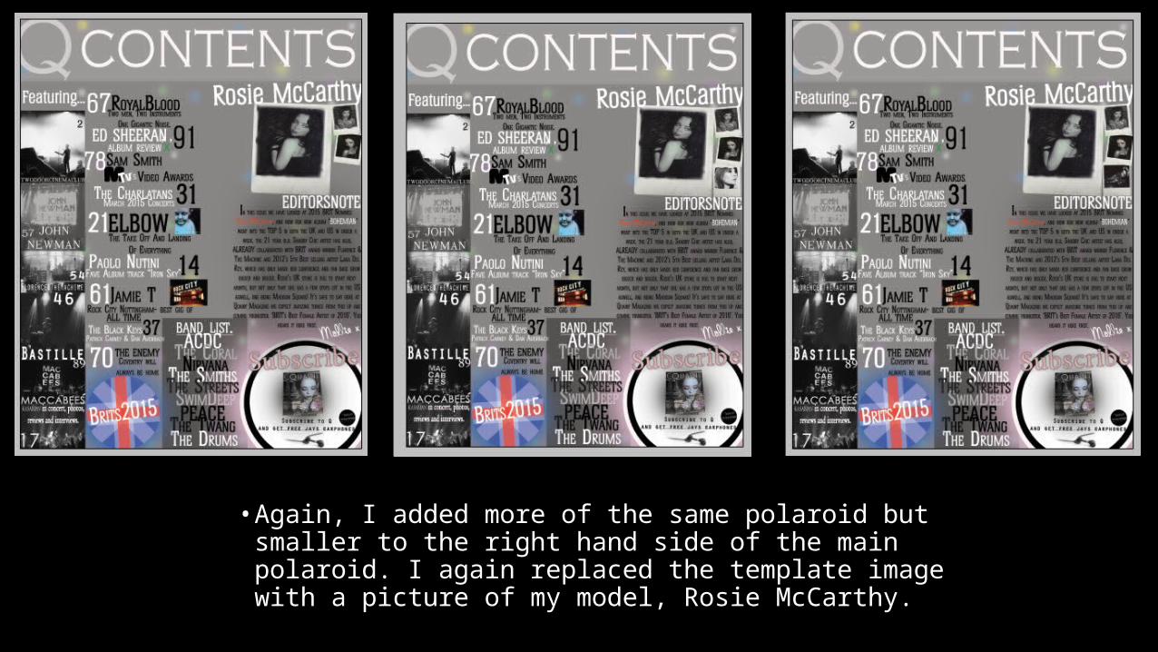
• Again, I added more of the same polaroid but smaller to the right hand side of the main polaroid. I again replaced the template image with a picture of my model, Rosie McCarthy.
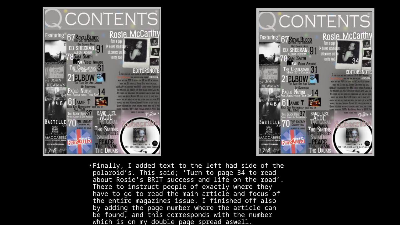
• Finally, I added text to the left had side of the polaroid’s. This said; ‘Turn to page 34 to read about Rosie’s BRIT success and life on the road’. There to instruct people of exactly where they have to go to read the main article and focus of the entire magazines issue. I finished off also by adding the page number where the article can be found, and this corresponds with the number which is on my double page spread aswell.