bootstrap components
TRANSCRIPT

Bootstrap Components The widgets that bring your site to life
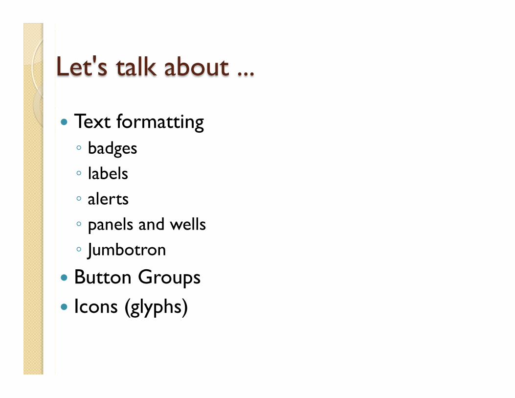
Let's talk about ...
� Text formatting ◦ badges ◦ labels ◦ alerts ◦ panels and wells ◦ Jumbotron
� Button Groups � Icons (glyphs)

TEXT COMPONENTS

Bootstrap is great about making text look good.
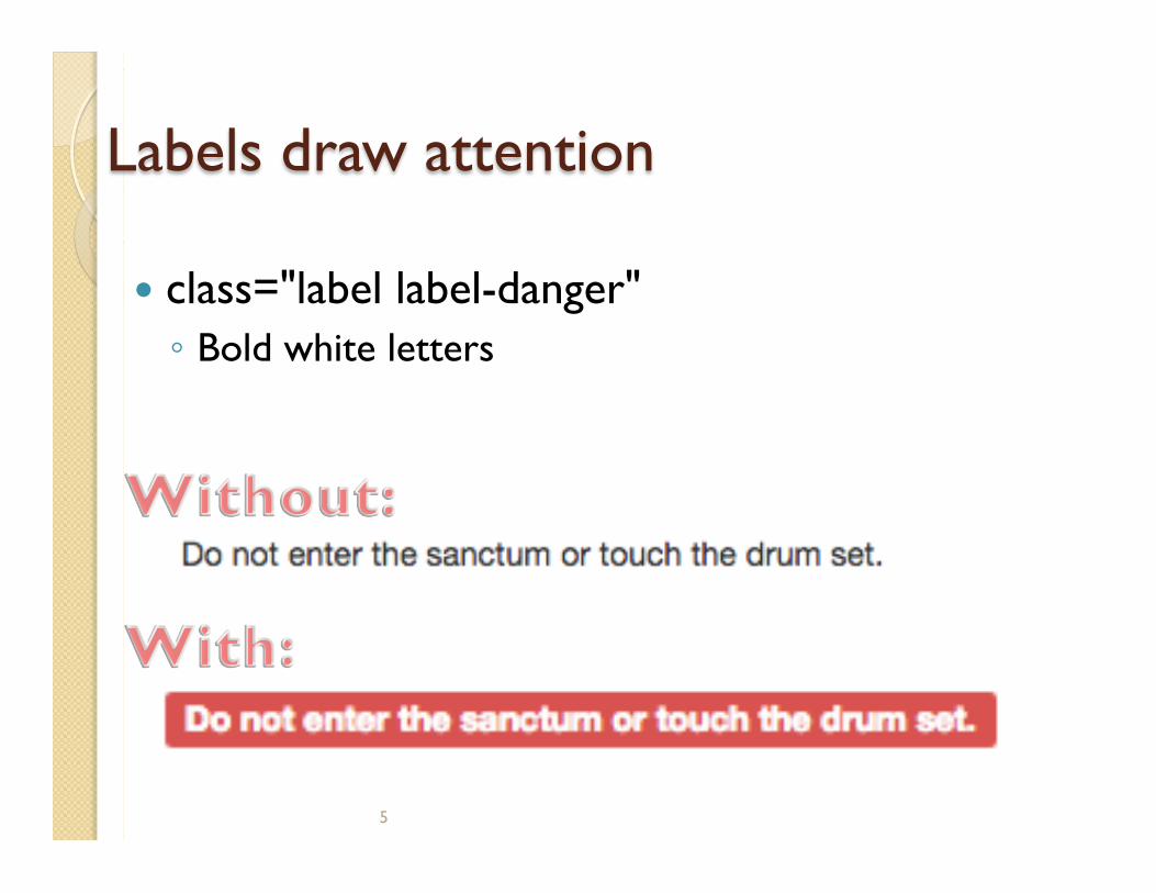
Labels draw attention
� class="label label-danger" ◦ Bold white letters
5

Alerts - When there are many words
� class="alert alert-danger" ◦ Not a pop-up box ◦ Dark words on light background in a rounded-
cornered box
6

Badges share info at a glance
<button class="btn btn-primary">
Emails <span class="badge">4</span>
</button>
� Rounded cornered colored background ◦ Like the unread messages notice on an email icon
in iOS
7

Panels offset text from normal text � Can have optional panel-header and panel-footer. <div class="panel panel-success"> <div class="panel-heading"> <h3 class="panel-title">Helpful hints</h3> </div> <div class="panel-body"> Studies have shown that having bunk beds clears up floor space for so many activities. </div></div>

Wells make text look inset
� Creates rounded corners and a lightly colored background
<div class="well">
Listen, I know that we started out as foe. But after that courageous act that you ... bridge of Hemdale.
</div>

A jumbotron is a message that can't be missed.
<hgroup class="jumbotron">
<h1>KVWN Channel 4</h1>
<h2>The Voice of San Diego</h2>
</hgroup>

BUTTON GROUPS

Groups of buttons look really nice
<div class="btn-group"> <button class="btn">Job Offers</button> <button class="btn">Emails</button> <button class="btn">Videos</button> ... </div>

ICONS (GLYPHS)

What are glyphs? � From Mirian Webster's Dictionary: � glyph (\ˈglif\): a symbol (as a curved arrow on a
road sign) that conveys information nonverbally. � Font-based glyphs replaced image-based icons
as of Bootstrap 3.0. � They do the same thing but are more efficient.

Including glyphs on a page is super-easy
� Put them in an empty <span> (or similar)
<span class="glyphicon glyphicon-briefcase"></span>
<span class="glyphicon glyphicon-envelope"></span>
<span class="glyphicon glyphicon-film"></span>

tl;dr Bootstrap allows you to easily create
components like: � Jumbotron � Wells � Alerts � Badges � Labels � Button groups � Icons (glyphs)

Further Study
� HTML playground for Bootstrap testing ◦ http://bootply.com