brand guide - the aluminum association card ... how to use the brand guide ... aluminum is an...
TRANSCRIPT
Brand GuideVERSION 1.0 2017

Contents at a glanceIntroductionUsing Brand Guidelines ..............................
A Note on Branding ....................................
LogoColor Version ...............................................
Special Cases Only .......................................
Logo UsageClear Space ..................................................
Minimum Size .............................................
Common Mistakes ....................................
Appropriate Applications ..........................
Color PalettePrimary Colors ............................................
Secondary Colors .......................................
Using Colors ...............................................
TypographyBrand Typeface ............................................
Headlines .....................................................
Establishing Hierarchy .................................
ImageryPhotography .................................................
Iconography & Infographics .........................
Brand IdentityDocument Headers ......................................
Business Card ...............................................
Email Signature ............................................
3
4
5
6
7
8
9
10
11
12
13
14
15
16
17
18
19
20
21

3The Aluminum Association | Brand Standards
Introduction Using Brand Guidelines
How to Use the Brand GuideThis brand guide was created to assist the Aluminum Association employees, freelancers and vendors in applying our brand assets.
To maintain the integrity and continuity of the Aluminum Association brand, we’ve established some basic visual standards to which our communications should strive to adhere.
And the key to successfully implementing these standards? Consistency. The guidelines contained here are based on best practices in the industry, and consistently employing them presents a unified and professional image of the Aluminum Association in the marketplace.
Questions not covered in this guide should be directed to the Public Affairs department.
4The Aluminum Association | Brand Standards
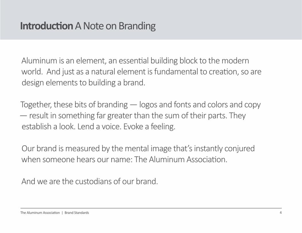
Introduction A Note on Branding
Aluminum is an element, an essential building block to the modern world. And just as a natural element is fundamental to creation, so are design elements to building a brand. Together, these bits of branding — logos and fonts and colors and copy — result in something far greater than the sum of their parts. They establish a look. Lend a voice. Evoke a feeling.
Our brand is measured by the mental image that’s instantly conjured when someone hears our name: The Aluminum Association.
And we are the custodians of our brand.

5The Aluminum Association | Brand Standards
Logo Color Version
Aluminum Association GreenOur logo is Aluminum Association Green. Every effort should be made to ensure the logo is presented in color.
Our logo features two distinct parts: The logotype, and the logomark.
The Aluminum Association name, or logotype, is stacked on three lines, right-aligned. Further to the right, the logomark, an encircled “a” letterform is the punctuating mark.
Neither the logotype or the logomark may be used independently of the other, the logo must remain intact. An exception to this rule is for sizes smaller than an inch, or on a case-by-case basis as approved by Public Affairs. See page 8 for more details.
LOGOTYPE LOGOMARK
6The Aluminum Association | Brand Standards
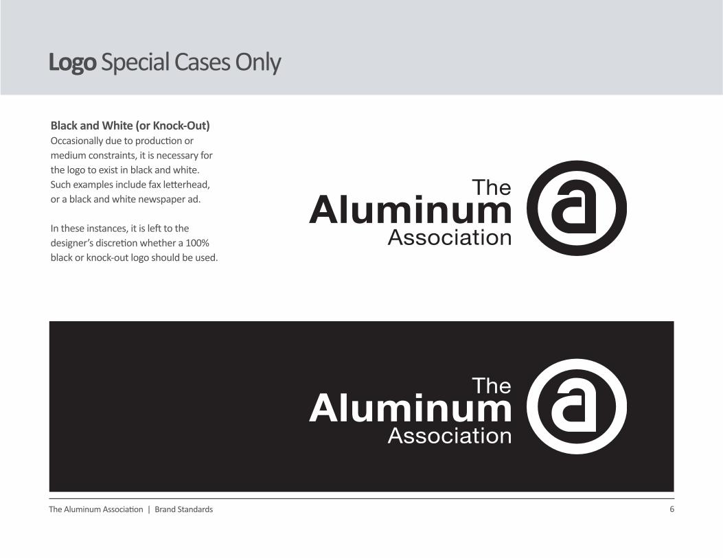
Logo Special Cases Only
Black and White (or Knock-Out)Occasionally due to production or medium constraints, it is necessary for the logo to exist in black and white. Such examples include fax letterhead, or a black and white newspaper ad.
In these instances, it is left to the designer’s discretion whether a 100% black or knock-out logo should be used.

7
Logo Usage Clear Space
Clear Space, or Safety ZoneIt’s important to preserve the empty space immediately surrounding our logo. This means that the logo shouldn’t be crowded by nearby text or design elements.
The clear space, or safety zone around the logo is relative to the size of the logo. It scales up and down with the size of the letter “m” in the word Aluminum.
That means other elements on a page must be at least an “m” distance away from the logo at all times.
The Aluminum Association | Brand Standards

Minimum Size of LogoThe Aluminum Association logo can be reproduced in a range of sizes, however, at very small sizes, we risk compromising the legibility of the words.
Therefore, the recommended minimum size for displaying the logo on a printed page is 1.25 inches across.
For on-screen, the minimum width translates to approximately 140 pixels.
On rare occasions, it may be permitted to use the “a” seal independently of the logotype. Example applications might include a lapel pin, social media icon, or artwork element.
8
Logo Usage Minimum Size
The Aluminum Association | Brand Standards
1.25 INCHES, IN PRINT STAND-ALONE SEALFOR SPECIAL USES ONLY
140 PIXELS, ONLINE@72 DPI
ROUGHLY THE WIDTH OF TWO DIMES PLACEDSIDE-BY-SIDE
SUCH AS A LAPEL PIN, SOCIAL ICON OR AN ARTWORK ELEMENT
FITS SNUGLY INSIDE A STANDARD 160x600 px WEB BANNER

9
Welcome to
1
4
7
Logo Usage Common Mistakes
Common Logo MistakesHere’s how to avoid making a logo mistake:
(1) Don’t scale logo disproportionately.
(2) Don’t use the logo on a conflicting color. The background color should not hinder the logo’s legibility. Overall, it should be light enough or dark enough to sustain legibility of all 3 words.
(3) Don’t place logo on a busy image backdrop.
(4) Don’t change colors in the logo file.
(5) Don’t use individual logo elements.
(6) Don’t infringe on the clear space.
(7) Don’t add a drop shadow or other filter.
(8) Don’t use a low resolution logo. A vector, or .EPS logo is preferred for high-res printing purposes.
(9) Don’t use the black and white logo when you have the opportunity to use color.
2
5
8
3
9
6
The Aluminum Association | Brand Standards

10
Logo Usage Appropriate Applications
Using the Logo AppropriatelyHere are some successful applications of the logo:
(1) Use the green logo whenever possible.Our signature green logo is the very essence of our brand. It pops nicely on a white background, offering a noticeable green accent amidst a patchwork of silvery shades.
(2) Use the black/white logo only when the medium dictates it. This photo is being used in a black and white newspaper ad, so the black logo is an appropriate choice.
(3) Be conscious of the background. This photo is contains colors and textures that may interfere with the legibility of the logo if it were placed directly over the image. A white bar with curved corners provides a clean space and visually anchors the logo in the lower left corner.
(4) Special cases only. The mark may be used independently in appropriate and approved instances only.
The Aluminum Association | Brand Standards
1
3
2
4

11
Color Palette Primary
The Primary Color PaletteA simple way to maintain brand integrity is to build communications materials within a single color palette. This way, no matter where and when a piece is created, it will always feel in-brand.
The Aluminum Association palette is comprised of primary and secondary colors. At the heart of the primary palette is Aluminum Association green.
Green is our distinguishing feature. It is an essential part of our identity. It is closely associated with sustainability and this helps to position aluminum as the sustainable metal of choice.
Aluminum Association Green
Aluminum Association Grey
DARK GREYLIGHT GREY
PANTONE: 375CMYK: 51 / 0 / 100 / 0RGB: 138/198/64HEX: 8AC640
CMYK: 14/9/8/0RGB: 215/220/224HEX: D7DCE0
CMYK: 70/63/62/57RGB: 52/53/53HEX: 343535
PANTONE: 430CMYK: 51 / 38 / 33 / 2RGB: 133/142/151HEX: 858E92
The Aluminum Association | Brand Standards

12
Color Palette Secondary
The Secondary Color PaletteThese five hues are the recommended secondary, or supplemental colors. They complement the primary palette, and round out the full Aluminum Association color palette.
MEDIUM GREYDARK BLUE
CMYK: 74 / 44 / 19 / 1RGB: 76 / 126 / 166HTML: 4C7EA6
CMYK: 65 / 51 / 47 / 18RGB: 94 / 103 / 108HTML: 5E676C
The Aluminum Association | Brand Standards
LIGHT BLUE MEDIUM BLUE
CMYK: 27/2/0/0RGB: 179/222/246HEX: B3DEF6
CMYK: 51/25/5/0RGB: 126/166/206HEX: 7EA6CE
SUNNY YELLOW
CMYK: 11 / 32 / 94 / 0RGB: 227 / 173 / 50HTML: E3AD32

13
Color Palette Using Colors
How to Use Our ColorsAs previously mentioned, our primary color is green. It is our distinguishing feature. It is an essential part of our identity.
However, the green shouldn’t be overused. It’s not intended to be the dominant, over-arching color page-after-page. Our palette’s array of greys and blues should be the staple, utilizing the green as a distinguishing accent.
This cooler color ratio, dominated by blues and greys, offers the light and airy feel that best represents our brand temperature. Together, the blues, greys and green are a light palette that portrays the perfect blend of sustainability and modernization.
The Aluminum Association | Brand Standards
14
Typography Brand Typeface
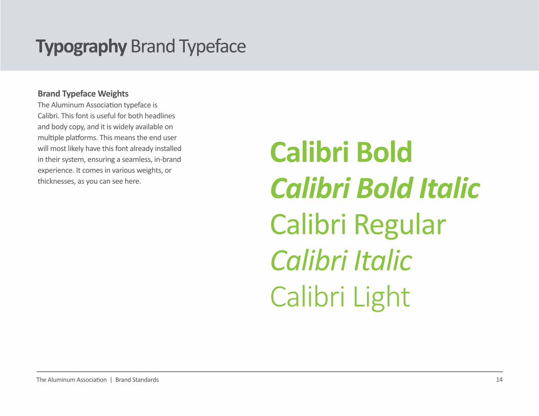
Brand Typeface WeightsThe Aluminum Association typeface is Calibri. This font is useful for both headlines and body copy, and it is widely available on multiple platforms. This means the end user will most likely have this font already installed in their system, ensuring a seamless, in-brand experience. It comes in various weights, or thicknesses, as you can see here.
The Aluminum Association | Brand Standards
Calibri BoldCalibri Bold ItalicCalibri RegularCalibri ItalicCalibri Light
15
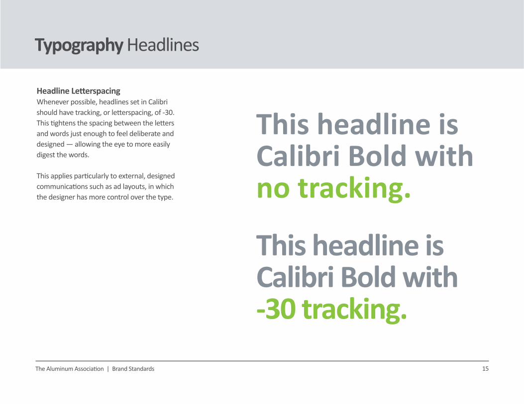
Typography Headlines
The Aluminum Association | Brand Standards
This headline isCalibri Bold with -30 tracking.
This headline isCalibri Bold withno tracking.
Headline LetterspacingWhenever possible, headlines set in Calibri should have tracking, or letterspacing, of -30. This tightens the spacing between the letters and words just enough to feel deliberate and designed — allowing the eye to more easily digest the words.
This applies particularly to external, designed communications such as ad layouts, in which the designer has more control over the type.

16
Typography Establishing Hierarchy
Using Type Hierarchy in LayoutBrand communications should aspire to a clean and thoughtful typographical style. Layouts should have a type hierarchy in place to guide the viewer’s eye through the content and call attention to pertinent details and action items.
For legibility, body copy should always be, at a minimum, 10 points in size with 13 point leading, or line-spacing.
Body copy is set in Calibri Regular, at a minimum of 10 pt. with 13 pt. leading, or the space between lines. Consider using a grey instead of black, for ease of reading. Body copy is set in Calibri Regular, at a minimum of 10 pt. with 13 pt. leading, or the space between lines. Consider using a grey instead of black, for ease of reading. Body copy is set in Calibri Regular, at a minimum of 10 pt. with 13 pt. leading, or the space between lines. Consider using a grey instead of black, for ease of reading.
An optional subhead or pull quote might be set in Calibri Light 20 pt.
The Aluminum Association | Brand Standards
This headline is Calibri Bold 48 pt.
Call to action

17
Imagery Photography
The Aluminum Association | Brand Standards
Using PhotographyOverall, the photography should look like our color palette. Light, airy, and driven by silvery blues and greys. Subject matter ranges widely, but in general should feel future-facing, modern and fresh. All photos should be properly licensed/purchased or attributed if necessary.
(1) Abstract can be beautiful. Consider an image that showcases the art of aluminum, even if it borders on the abstract. Patterns can provide an artful backdrop.
(2) Keep color temperatures cool. Even when depicting a full-color subject like a car driving down a sun-lit road, consider shots with a cooler, blue-silvery cast to them.
(3) Keep it clean. Industry images, such as this factory environment, should appear pristine and with appropriate safety measures in place.
(4) Unique perspectives welcome. Consider selecting and/or cropping an image to achieve a fresh perspective or interesting angle.
3
1 2
4

18
Imagery Iconography & Infographics
The Aluminum Association | Brand Standards
Using Icons & InfographicsHere are some examples of on-brand icons and infographics.
(1) Icons should be minimalist, using a simple, representative symbol to convey meaning. Keep the illustrative style and level of detail consistent across all icons. Consider using the brand green, as icons are often used as small accents on the page.
(2) Technical illustrations offer more detail. When subject matter can’t be easily distilled to an icon, a more detailed technical illustration may be in order. It’s best to keep these to a single color, like the drawings one might see in an instruction manual.
(3) If full color is used in illustration, ensure the palette reflects our brand colors. Illustrative style should feel modern and clean, and NOT like cartoons or clip art.
(4) Infographics should be rooted in brand colors. The brand green should be used as a positive accent, for instance, to call attention to reduced carbon emissions in a bar chart.
1
3
2
4
60% lesscarbonemissions

19
Brand Identity Document Headers
The Aluminum Association | Brand Standards
Memos, Agendas and MoreAlways use the official Aluminum Association 8.5x11 page templates when creating documents such as memos, agendas, minutes, and press releases. These templates feature unique configurations of the building block title treatment in their headers.

20
Brand Identity Business Card
The Aluminum Association | Brand Standards
Business CardAlways use the official Aluminum Association design template when creating business cards. This format features curved corners and two-sided printing.

21
Brand Identity Email Signature
The Aluminum Association | Brand Standards
Branded Email SignatureAlways use the official branded signature on all outgoing Aluminum Association emails. See the example for proper formatting.