brand guidelines - agcas
TRANSCRIPT

BRAND GUIDELINESAUGUST 2017

2AGCAS brand guidelines August 2017
3 Introduction to AGCAS
5 Logo requirements
9 Colour specifications
12 Photographic style
14 Fonts
19 Document design and styling
20 Document page elements
21 Tone of voice
25 A-Z style guide
Guidelinecontents

3AGCAS brand guidelines August 2017
Introduction to AGCAS
Our mission and vision
Mission
AGCAS is the expert membership organisation for higher education student career development and graduate employment professionals. Through our members, we support the best possible career outcomes from higher education for individuals, institutions, society and the economy.
Vision
Through the reach and expertise of our members, AGCAS is to be recognised as the expert organisation for policy consultations and opinion on higher education student career development and graduate employment.
About AGCAS
We are enabled by five strategic pillars. These core strategic areas are underpinned by AGCAS’s financial sustainability, robust financial stewardship, the Board which represents the membership and provides strategic direction, and well-motivated competent staff.

4AGCAS brand guidelines August 2017
Five strategic pillars
Quality
The Quality agenda represents one of the core areas in AGCAS’s strategic plan as it underpins our drive to ensure careers advice and guidance is fully valued in today’s complex and ever-changing landscape of employability in the higher education sector. It is this agenda that ensures that AGCAS is, and continues to be, the recognised body for professional careers practitioners in higher education.
Learning
AGCAS members can access a broad spectrum of professional development opportunities tailored to the modern-day higher education careers professional. Our members receive access to world-class training opportunities delivered through short courses and conferences, and through residential courses for the AGCAS qualifications accredited by the University of Warwick. Our Learning programme aspires to meet the needs of all higher education careers and employability professionals by ensuring that the design, format and delivery of Learning is open, supportive and accessible to all members.
Community
AGCAS members are the heart of the organisation and form a collective Community sharing a sense of common purpose. It is this Community which ensures that all AGCAS members feel that their profession, devolved nation, region and mission group is represented. Members are represented by task groups, mission groups and location-based Communities resulting in a matrix of member engagement and activity. Members also receive access to AGCAS email discussion lists, which provide instant virtual access to nearly 3,000 like-minded higher education careers and employability professionals.
Advocacy
As thought leaders and the voice for higher education careers and employability professionals we are helping to inform debate and provide answers by tapping into the expertise of our members. By bringing our knowledge, resources and expertise to bear on public and private policy development we can help ensure that any change is positive.
Research and Knowledge
Our Research and Knowledge agenda supports the development of expertise in student career development and graduate employment. Through a range of individual, regional and national research projects, AGCAS is able to develop unique insights into student engagement with careers and employability support and better understand graduate employer behaviours and preferences. We also produce a portfolio of publications that support our members and enhance their expertise in areas of graduate employment and opportunities.
Introduction to AGCAS
5AGCAS brand guidelines August 2017
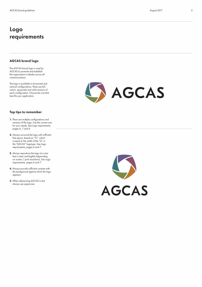
AGCAS brand logo
The AGCAS brand logo is used by AGCAS to promote and establish the organisation’s identity across all communications.
The logo is available in horizontal and vertical configurations. There are full-colour, grayscale and solid versions of each configuration. Choose the one that best fits your application.
Top tips to remember
1. There are multiple configurations and versions of the logo. Use the correct one for your needs. See Logo requirements, pages 6, 7 and 8.
2. Always surround the logo with sufficient free space, based on “G”, which is equal to the width of the “G” in the “AGCAS” logotype. See Logo requirements, pages 6 and 7.
3. Always reproduce the logo at a size that is clear and legible (depending on screen / print resolution). See Logo requirements, pages 6 and 7.
4. Always provide sufficient contrast with the background against which the logo appears.
5. When referencing AGCAS in text always use uppercase.
Logo requirements

6AGCAS brand guidelines August 2017
AGCAS brand logo
The horizontal logo will be appropriate for most digital and print applications.
To ensure the best legibility of the AGCAS logo follow the minimum size and free space specifications indicated below. (Size may depend on screen and print resolution.)
Minimum size and free space
Logo requirements
Horizontal logo with and without full name

7AGCAS brand guidelines August 2017
AGCAS brand logo
The vertical logo will be appropriate where there is insufficient room to use the horizontal logo.
To ensure the best legibility of the AGCAS logo follow the minimum size and free space specifications indicated below. (Size may depend on screen and print resolution.)
Logo requirements
Minimum size and free space
Vertical logo with and without full name

8AGCAS brand guidelines August 2017
Positive and reverse logo usage
When using positive logo versions you are able to use either the full colour or black versions.
For reverse logo applications on black you may use the logo in either full colour or white. For design or documentation referring directly to a specific strategic pillar there will be a dominant colour used. In this case white out should be used.
The colour rules indicated above are applicable for all horizontal and vertical configurations.
Logo requirements
Reverse logo usage
Positive logo usage

9AGCAS brand guidelines August 2017
Primary brand colours
The AGCAS brand logo’s five distinct colours have been developed to serve as a foundation for brand recognition.
To ensure the consistency of AGCAS’s visual identity, specifications for each colour are provided for both print and digital use. Pantone colours and CMYK values are provided for colour printing applications.
Colourspecifications
Primary colour values
Research and Knowledge
Advocacy
Quality
Community
Learning
10AGCAS brand guidelines August 2017
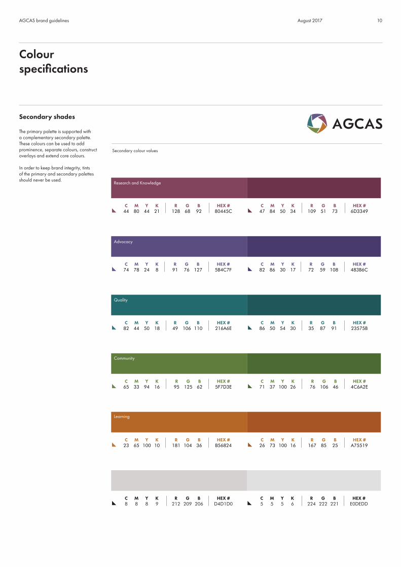
Secondary shades
The primary palette is supported with a complementary secondary palette. These colours can be used to add prominence, separate colours, construct overlays and extend core colours.
In order to keep brand integrity, tints of the primary and secondary palettes should never be used.
Colourspecifications
Secondary colour values
Research and Knowledge
Advocacy
Quality
Community
Learning
11AGCAS brand guidelines August 2017
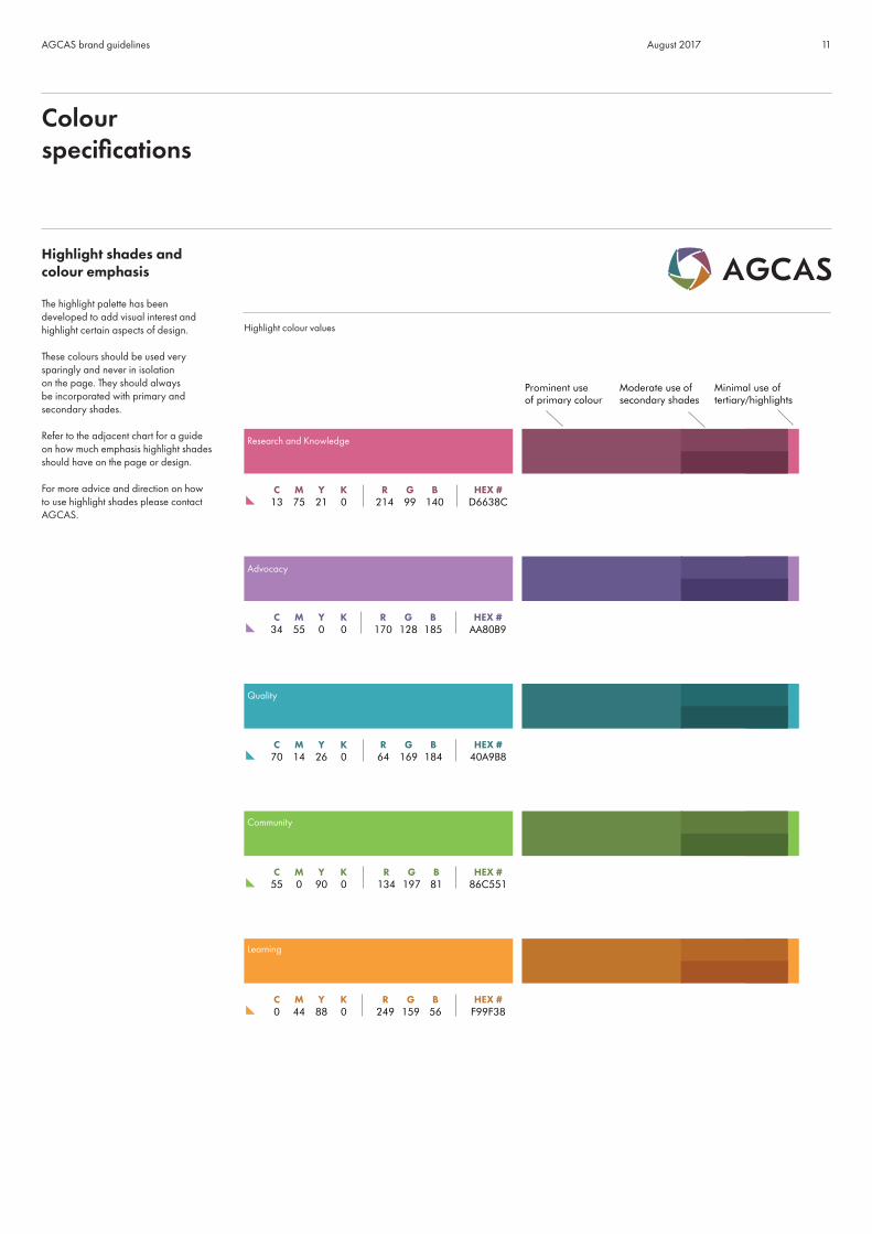
Highlight shades and colour emphasis
The highlight palette has been developed to add visual interest and highlight certain aspects of design.
These colours should be used very sparingly and never in isolation on the page. They should always be incorporated with primary and secondary shades.
Refer to the adjacent chart for a guide on how much emphasis highlight shades should have on the page or design.
For more advice and direction on how to use highlight shades please contact AGCAS.
Colourspecifications
Highlight colour values
Research and Knowledge
Advocacy
Quality
Community
Learning
12AGCAS brand guidelines August 2017
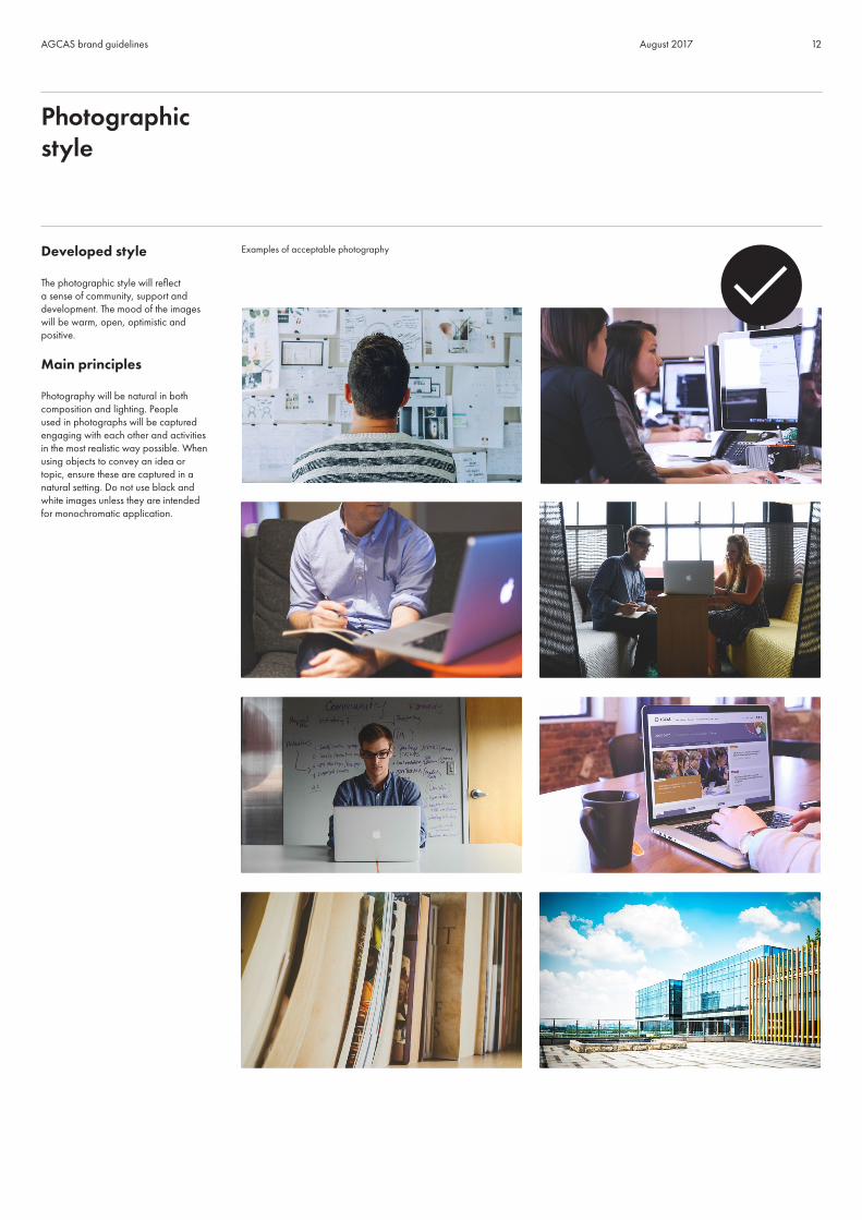
Developed style
The photographic style will reflect a sense of community, support and development. The mood of the images will be warm, open, optimistic and positive.
Main principles
Photography will be natural in both composition and lighting. People used in photographs will be captured engaging with each other and activities in the most realistic way possible. When using objects to convey an idea or topic, ensure these are captured in a natural setting. Do not use black and white images unless they are intended for monochromatic application.
Photographicstyle
Examples of acceptable photography
Primary

13AGCAS brand guidelines August 2017
What to avoid
To provide authenticity and naturalness, it is important to avoid clichéd poses, effects or environments. Typical mistakes in image selection are choosing photos where people are obviously staged in a studio.
Do not use stock illustrations or 3D images to convey meaning.
Do not use montages made up of smaller images; stick to full frame shots for impact.
Photographicstyle
Examples of what not to use
Primary

14AGCAS brand guidelines August 2017
AGCAS default font
Typography helps to centre AGCAS’s brand identity and should be used to help ensure that all visual communications are consistent.
AGCAS employs one overarching typeface called Futura PT for all web and print-related materials.
Futura PT is a uniform type system, consisting of seven weights with corresponding obliques. All these fonts are coordinated in letterforms, metrics and weights to work better together.
Fonts
Futura PT
Futura PT font weights
ABCDEFGHIJKLMNOPQRSTUVWXYZ1234567890abcdefghijklmnopqrstuvwxyzffifl!#%&/?@[\]{|}
Futura PT lightFutura PT light italicFutura PT bookFutura PT book italicFutura PT mediumFutura PT medium italicFutura PT demiFutura PT demi italicFutura PT heavyFutura PT heavy italicFutura PT boldFutura PT bold italicFutura PT extra boldFutura PT extra bold italic

15AGCAS brand guidelines August 2017
AGCAS default font styling
This will help users and contributors to create content for documents using the default Futura PT Family.
Fonts
Header style 1 – 36pt Futura PT medium, capitalised. Colour may be used relating to the appropriate strategic pillar. For cover and title pages.
HEADER STYLE 1HEADER STYLE 1Header style 2 – 18pt Futura PT demi, sentence case. For section titles.
Header style 2
Header style 3 – 16pt Futura PT medium, sentence case. For subsection titles.
Header style 3
Header style 4 – 12pt Futura PT demi, sentence case. Colour may be used relating to the appropriate strategic pillar. For subsection titles.
Header style 4Header style 4
Body copy 1 – 11pt Futura PT regular, 15pt leading. For basic A4 document content.
Lorem ipsum dolor sit amet, consectetur adipiscing elit. Integer nec iaculis felis. Curabitur ac luctus justo, id blandit neque. Suspendisse nec tortor ornare, condimentum dui quis, suscipit est. Vestibulum ante ipsum primis in faucibus orci luctus et ultrices posuere cubilia.
Vestibulum non ipsum eget enim ullamcorper auctor vitae ac lacus. Nunc at massa ultrices, lobortis elit vel, elementum arcu. Nulla facilisi. Donec vehicula ipsum a enim molestie eleifend. Aliquam at blandit justo, nec consequat sapien.
Body copy 2 – minimum 7.5pt Futura PT regular, 11pt leading. Body copy below 11pt can be used for A5 and smaller-sized flyers, leaflets, etc. When using smaller font sizes, be aware that copy should never be set below 7.5pt and should never exceed 75 characters per line.
Lorem ipsum dolor sit amet, consectetur adipiscing elit. Integer nec iaculis felis. Curabitur ac luctus justo, id blandit neque. Suspendisse nec tortor ornare, condimentum dui quis, suscipit est. Vestibulum ante ipsum primis in faucibus orci luctus et ultrices posuere cubilia.
Vestibulum non ipsum eget enim ullamcorper auctor vitae ac lacus. Nunc at massa ultrices, lobortis elit vel, elementum arcu. Nulla facilisi. Donec vehicula ipsum a enim molestie eleifend. Aliquam at blandit justo, nec consequat sapien.

16AGCAS brand guidelines August 2017
AGCAS default font styling
This will help users and contributors to create content for documents using the default Futura PT Family.
Fonts
Quote – 11pt Futura PT book oblique, 15pt leading, 1.5 line spacing, 5mm left indent. Colour may be used relating to the appropriate strategic pillar. For quotation style.
“Lorem ipsum dolor sit amet, consectetur adipiscing elit. Integer nec iaculis felis. Curabitur ac luctus justo, id blandit neque.”
“Lorem ipsum dolor sit amet, consectetur adipiscing elit. Integer nec iaculis felis. Curabitur ac luctus justo, id blandit neque.”
Display Fonts – Futura PT Family, capitalised and/or sentence case. Colour may be used relating to the appropriate strategic pillar. These heavier weight fonts may be used for designs where larger font sizes are used to give a distinctive personality to printed or displayed layouts. These types of application may be used on posters, flyers, exhibition stands/panels and certain reports. Please get advice from AGCAS before using any of these.
DISPLAY STYLE 1DISPLAY STYLE 1Futura PT bold / upper case
Display style 1Display style 1Futura PT bold / sentence case
DISPLAY STYLE 1DISPLAY STYLE 1Futura PT extra bold / upper case
17AGCAS brand guidelines August 2017
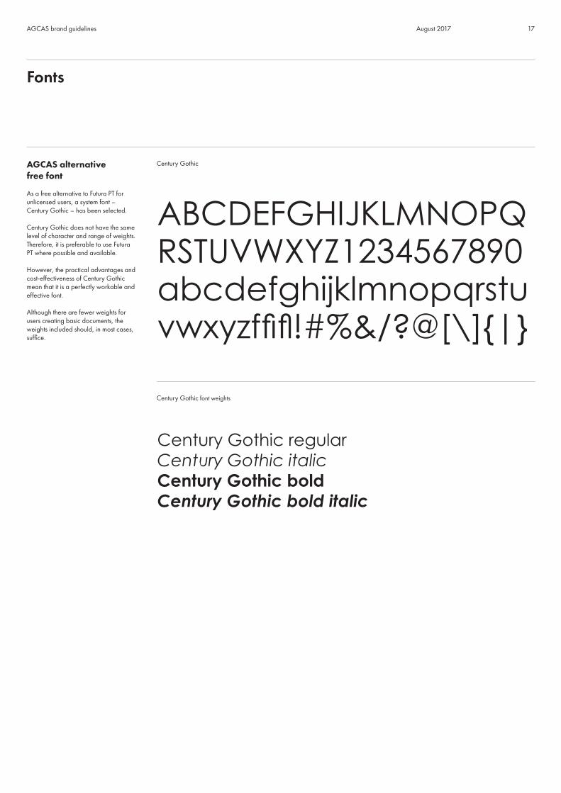
AGCAS alternative free font
As a free alternative to Futura PT for unlicensed users, a system font – Century Gothic – has been selected.
Century Gothic does not have the same level of character and range of weights. Therefore, it is preferable to use Futura PT where possible and available.
However, the practical advantages and cost-effectiveness of Century Gothic mean that it is a perfectly workable and effective font.
Although there are fewer weights for users creating basic documents, the weights included should, in most cases, suffice.
Fonts
Century Gothic
Century Gothic font weights
ABCDEFGHIJKLMNOPQ RSTUVWXYZ1234567890abcdefghijklmnopqrstuvwxyzffifl!#%&/?@[\]{|}
Century Gothic regularCentury Gothic italicCentury Gothic boldCentury Gothic bold italic

18AGCAS brand guidelines August 2017
AGCAS alternative free font styling
This will help users and contributors to create content for basic A4 format documents using the Century Gothic system font.
Fonts
Header style 1 – 36pt Century Gothic bold, capitalised. Colour may be used relating to the appropriate strategic pillar. For cover and title pages.
HEADER STYLE 1HEADER STYLE 1Header style 2 – 18pt Century Gothic bold. For section titles.
Header style 2
Header style 3 – 16pt Century Gothic bold. For subsection titles.
Header style 3
Header style 4 – 12pt Century Gothic bold. Colour may be used relating to strategic pillars. For subsection titles
Header style 4Header style 4
Body copy – 10pt Century Gothic regular, 15pt leading. For basic document content.
Lorem ipsum dolor sit amet, consectetur adipiscing elit. Integer nec iaculis felis. Curabitur ac luctus justo, id blandit neque. Suspendisse nec tortor ornare, condimentum dui quis, suscipit est.
Vestibulum non ipsum eget enim ullamcorper auctor vitae ac lacus. Nunc at massa ultrices, lobortis elit vel, elementum arcu. Nulla facilisi. Donec vehicula ipsum a enim molestie eleifend.
Quote – 10pt Century Gothic italic, 15pt leading, 5mm left indent. Colour may be used relating to the appropriate strategic pillar. For quotation style.
“Lorem ipsum dolor sit amet, consectetur adipiscing elit. Integer nec iaculis felis. Curabitur ac luctus justo, id blandit neque. Suspendisse nec.”
“Lorem ipsum dolor sit amet, consectetur adipiscing elit. Integer nec iaculis felis. Curabitur ac luctus justo, id blandit neque. Suspendisse nec.”

19AGCAS brand guidelines August 2017
AGCAS developed style
To help unify the brand style across multiple publications and channels, templates and graphic elements have been designed using the brand logo’s negative space.
These graphics will be used for document covers and can be used as an option for document section dividers. In addition, the devices have been created in a landscape format to be used in a similar manner for PowerPoint presentations.
Different colours are available, relating to the five strategic pillars and should be used accordingly to relate to the section, document or publications topic.
Due to the shape of the graphic frames, careful image selection and cropping is needed if you plan to incorporate photography. One of the more simple graphic covers may be used as an alternative to the photo frame. Please contact AGCAS for advice.
Document design and styling
Examples of AGCAS document templates
20AGCAS brand guidelines August 2017
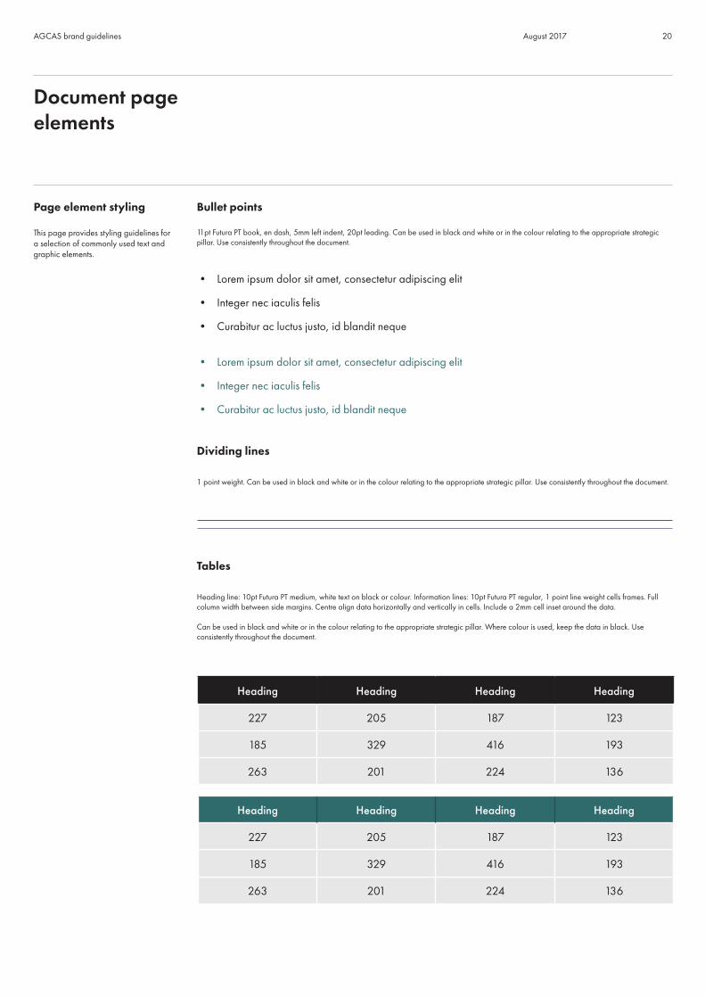
Page element styling
This page provides styling guidelines for a selection of commonly used text and graphic elements.
Document pageelements
Bullet points
11pt Futura PT book, en dash, 5mm left indent, 20pt leading. Can be used in black and white or in the colour relating to the appropriate strategic pillar. Use consistently throughout the document.
• Lorem ipsum dolor sit amet, consectetur adipiscing elit
• Integer nec iaculis felis
• Curabitur ac luctus justo, id blandit neque
• Lorem ipsum dolor sit amet, consectetur adipiscing elit
• Integer nec iaculis felis
• Curabitur ac luctus justo, id blandit neque
Dividing lines
1 point weight. Can be used in black and white or in the colour relating to the appropriate strategic pillar. Use consistently throughout the document.
Tables
Heading line: 10pt Futura PT medium, white text on black or colour. Information lines: 10pt Futura PT regular, 1 point line weight cells frames. Full column width between side margins. Centre align data horizontally and vertically in cells. Include a 2mm cell inset around the data.
Can be used in black and white or in the colour relating to the appropriate strategic pillar. Where colour is used, keep the data in black. Use consistently throughout the document.
Heading Heading Heading Heading
227 205 187 123
185 329 416 193
263 201 224 136
Heading Heading Heading Heading
227 205 187 123
185 329 416 193
263 201 224 136

21AGCAS brand guidelines August 2017
AGCAS’s vision is to be recognised as the expert organisation for policy consultations and opinion on higher education (HE) student career development and graduate employment. To fulfil this, AGCAS needs to be the voice of graduate careers and the go-to organisation for industry professionalism, not just because of our extensive expertise, but due to our approachable and future-focused nature.
The language used throughout AGCAS communications should be clear, concise and quickly understood by busy policymakers and stakeholders. Content should be accurate, impartial and credible and reflect our diversity, modernity and dynamism.
Although we work with people all around the world, we adopt British English spellings. However, take care not to slip into colloquial language that will undermine our mission to be easily understood.
We need to ensure all content truly benefits and serves our members and equips them with engaging and reliable information so they can provide the best service for HE undergraduates and graduates. This will help us to both retain our members and to become the trusted organisation for all careers and employability professionals working with students and graduates.
AGCAS should always be presented in a modern, dynamic and clear way that focuses on professionalism and does not stray into
informal territory.
AGCAS’s voice
AGCAS’s voice should be authentic and consistent. We wish to be perceived as inclusive, innovative, authoritative and knowledgeable. This personality should underpin all of our communications.
Inclusive
We want our members to feel comfortable and to enjoy their membership. Inclusion of all members is essential to us and we pride ourselves on our diverse knowledge and structure. This is why we keep all information and content clear, so that we can be easily understood by our wide and diverse audience.
We are committed to working together with our members for the benefit of students, graduates and the wider HE society and we will always go the extra mile to help our members. We are the trusted authority for industry professionals to look to when they need help and support.
However, we are aware that members’ time is precious. Our members need information given to them in a simple, clear manner, which is why our goal is always to be concise.
Innovative
We operate within an ever-evolving sphere of information and understand that our success depends on keeping the content of our website and marketing materials fresh and relevant.
Always looking to improve, we listen to our members and assess how we can act upon this intelligence and grow as an organisation.
Tone of voice

22AGCAS brand guidelines August 2017
Authoritative
The AGCAS team is comprised of professionals who share a wealth of knowledge about policy consultations, HE student career development and graduate employment.
We always work hard to maintain best practice. Our access to members, who have years of sector expertise, makes us one of the most reliable sources for industry knowledge. Our inclusive nature, together with our knowledge of current affairs and insight into future developments, mean that we can communicate with confidence.
As the authority on industry news and developments, we are impartial and professional in all the advice and information we provide. This means we can always help our members, no matter what their issue may be.
Knowledgeable
Our extensive knowledge of the industry means that we can be trusted to provide reliable sector intelligence. Dedicated to providing detailed information, our expertise should always be apparent throughout all of our branding and content. It is of paramount importance that AGCAS comes across as informed.
As industry leaders, our knowledge of our subject, coupled with our ability to adapt to future trends, makes us hugely influential in the student and graduate careers sector.
AGCAS’s tone
To ensure consistency across all our communication channels, we need to adhere to AGCAS’s tone of voice. However, this tone should shift slightly depending on the context, audience and channel/medium used.
Audience
Our intended audience will be the primary driver behind our tone, whether we are targeting members or external stakeholders, for example:
• partners
• government bodies
• employers
• universities
• general public
External-facing communications
Our tone is formal so we use the third person when introducing external-facing communications that will be viewed by a wider audience, including partners, stakeholders and the general public, e.g.:
• AGCAS is the professional body for careers and employability professionals working with higher education students and graduates.
Tone of voice

23AGCAS brand guidelines August 2017
• AGCAS is a professional membership organisation that relies on a combination of volunteers and paid employees to operate on a daily basis.
• AGCAS is a vibrant professional body brought together by a whole host of individuals and groups.
You may then switch to the first person to deliver your communication in more detail, e.g.:
• AGCAS is the expert membership organisation for higher education student career development and graduate employment professionals. Through our members we support the best possible career outcomes from higher education for individuals, institutions, society and the economy.
Avoid jumping from tense to tense. For example, if you begin a paragraph in the third person and then swap to the first person, make sure you continue in the first person to the end of the paragraph.
Member communications
We want to engage with our members and to be inclusive, so we use the first person when producing communications aimed primarily at them. These types of communications will also include member-related calls for action and news items, e.g.:
• We would like to invite members to apply for the following task group vacancies.
• Following our call for volunteers, a number of members have been appointed to the new AGCAS committees and working parties.
• Our members are the heart of the organisation and form a collective community of professionals sharing a sense of common purpose.
Context and message
What is the purpose of the communication? Are you looking to inform, educate, influence or encourage action? The purpose of your message, as well as the audience you are addressing, will influence your tone and whether you use the first or third person writing style.
In cases where you are delivering the same message to difference audiences, you may need to adjust the content and tone of the communication. For example, if you are writing to influence a university policymaker, you can include less contextual information than if you are writing to influence an employer, who may not have an understanding of HE.
Calls to action should resonate on a personal level and so should be written in the first person, e.g.:
• Become a Member
• Join a Committee
Channel
The channels you use to communicate with will also influence the tone and content of your message, as well as your use of the first or third person. Regular channels of AGCAS communication include the website, emails, LinkedIn, ARENA and direct mail.
When using social media, for example Twitter or writing a blog, the tone should be slightly more informal. Use the first person regardless of the audience.
Whichever channel you use, bear in mind that AGCAS is approachable and inclusive, but always authoritative and professional.
Tone of voice

24AGCAS brand guidelines August 2017
AbbreviationsThere are several kinds of abbreviations: acronyms, contractions, initialisms and shortenings. See below for more information on how to use them in your writing.
e.g. and i.e.
Use full stops for e.g. and i.e.
e.g. – used to introduce examples.
i.e. – (that is to say) used to add explanatory information or to state something in different words. Not to be used to introduce examples.
Don’t include a comma after e.g. or i.e.
Try not to use e.g. or i.e. too often, especially in the middle of a sentence. Think about amending the sentence or using ‘for example’ or ‘such as’.
etc
Try not to use ‘etc’ and find an alternative if possible, like ‘such as’ or ‘including’.
Acronyms
Acronyms, such as AGCAS, are words formed from the initial letters of other words and pronounced as they are spelled, not as separate letters (Oxford Living Dictionary).
Write out acronyms in full the first time they are used (but not in a headline) followed by the acronym in brackets. Then use the acronym every other time:
The United Nations Educational, Scientific and Cultural Organization (UNESCO) has launched a series of new graduate programmes. Further details are available from the UNESCO website.
Contractions (See ‘Apostrophes’)
Initialisms
Initialisms are abbreviations which consist of the initial (i.e. first) letters of words and which are pronounced as separate letters when they are spoken (Oxford Living Dictionary).
There’s no need to spell out obvious/well-known initialisms, e.g. the BBC, DVD, MBA, MP, RSS, UK and USA.
Plural initialisms end with a lowercase ‘s’ and no apostrophe, e.g. FAQs and HNDs.
A-Z document style guide

25AGCAS brand guidelines August 2017
HE and FE
Use higher education with the abbreviation after it the first time it is used, but then use the abbreviation HE only afterwards. Use the same style for further education (FE). For example:
New entrants to higher education (HE) come from a range of socio-economic backgrounds. Their routes into HE are diverse.
The use of abbreviations (without the name written out in full) is acceptable on social media.
AccentsGive non-English words their proper accents unless they are well-known anglicised words such as ‘cafe’ or ‘regime.’
American v British English Always use British English spellings. For example:
• ‘behaviour’ rather than ‘behavior’
• ‘centre’ rather than ‘center’
• ‘counsellor’ rather than ‘counselor’
• ‘dialogue’ rather than ‘dialog’
• ‘driving licence’ rather than ‘driving license’
• ‘enrol’ rather than ‘enroll’
• ‘judgement’ rather than ‘judgment’
• ‘skilful’ rather than ‘skillful’
Always use –ise, for example ‘organisation’ and not ‘organization’, and ‘specialise’ not ‘specialize’ (unless it is part of an organisation’s name).
Ampersands (&)Don’t use ampersands, except in organisation names when the organisation does, e.g. Marks & Spencer, B&Q.
A-Z document style guide

26AGCAS brand guidelines August 2017
ApostrophesWhen using apostrophes to indicate possession, place the apostrophe after the person or thing that is the owner. For example:
• ‘The careers adviser’s day was fully booked with appointments.’ (one career adviser)
• ‘The careers advisers’ day was fully booked with appointments.’ (more than one careers adviser)
• ‘The student’s work was excellent.’ (one student)
• ‘The students’ work was excellent.’ (more than one student)
Also:
• AGCAS’s work covers several main themes.
And:
• three years’ experience
• one day’s work
• 30 days’ holiday.
The possessive ‘its’ never has an apostrophe. It is a possessive like ‘his’, ‘hers’ ‘yours’, ‘ours’.
Don’t use apostrophes when referring to decades. It should be 1990s and not 1990’s or ‘90s.
Apostrophes can also be used to indicate omission or contraction. For example:
• don’t
• didn’t
• let’s
• there’s (there is or there has) is singular, so never follow it with a plural (e.g. There’s lots of master’s courses to choose from) as this is incorrect.
• it’s (it is or it has)
• you’ll, he’ll, she’ll.
BoldAvoid the unnecessary use of bold in sentences, particularly in the middle of a sentence when it can look as if you’re shouting at people. It can distract readers if used randomly and makes the page look untidy.
Bold can be used to highlight an important date or deadline (see ‘Dates’ for information on how to write out dates).
Bullet points (see p.20) and Lists (pp.31-32)
A-Z document style guide
27AGCAS brand guidelines August 2017
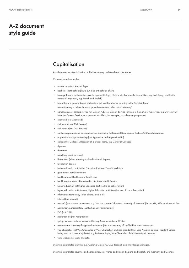
Capitalisation Avoid unnecessary capitalisation as this looks messy and can distract the reader.
Commonly used examples:
• annual report not Annual Report
• bachelor (not Bachelor) but a BA, BSc or Bachelor of Arts
• biology, history, mathematics, psychology not Biology, History, etc (but specific course titles, e.g. BA History, and for the names of languages, e.g. French and English)
• board (as in a general board of directors) but use Board when referring to the AGCAS Board
university entry – delete the extra space between the bullet point ‘university’
• careers adviser, careers service not Careers Adviser, Careers Service (unless it is the name of the service, e.g. University of Leicester Careers Service, or a person’s job title in, for example, a conference programme)
• chartered (not Chartered)
• civil servant (not Civil Servant)
• civil service (not Civil Service)
• continuing professional development not Continuing Professional Development (but use CPD as abbreviation)
• apprentice and apprenticeship (not Apprentice and Apprenticeship)
• college (not College, unless part of a proper name, e.g. Cornwall College)
• diploma
• doctorate
• email (not Email or E-mail)
• first or third (when referring to classification of degree)
• foundation degree
• further education not Further Education (but use FE as abbreviation)
• government not Government
• healthcare not Healthcare or health care
• health service (often abbreviated to NHS) not Health Service
• higher education not Higher Education (but use HE as abbreviation)
• higher education institution not Higher Education Institution (but use HEI as abbreviation)
• information technology (often abbreviated to IT)
• internet (not Internet)
• master’s (not Masters or masters), e.g. ‘she has a master’s from the University of Leicester’ (but an MA, MSc or Master of Arts)
• parliament, parliamentary (not Parliament, Parliamentary)
• PhD (not PHD)
• postgraduate (not Postgraduate)
• spring, summer, autumn, winter not Spring, Summer, Autumn, Winter
• university not University for general references (but use University of Sheffield for direct references)
• vice chancellor (not Vice Chancellor or Vice-Chancellor) and vice president (not Vice President or Vice-President) unless being used as a person’s job title, e.g. Professor Boyle, Vice Chancellor of the University of Leicester
• web; website not Web; Website.
Use initial capitals for job titles, e.g. ‘Gemma Green, AGCAS Research and Knowledge Manager’.
Use initial capitals for countries and nationalities, e.g. France and French, England and English, and Germany and German.
A-Z document style guide

28AGCAS brand guidelines August 2017
Use initial capitals for the names of events and conferences, e.g. Employer Engagement Conference and AGCAS Research Conference.
Check the spellings of companies, universities and organisations, as well as people’s names, and make sure capitals are used correctly.
Colons and semicolonsUse a colon (Oxford Living Dictionary):
• between two main clauses in cases where the second clause explains or follows from the first
• to introduce a list (see ‘Lists’ for more information)
• before a quotation (see p.16 for more information on how to lay out quotes).
Use a semicolon (Oxford Living Dictionary):
• to mark a break that is stronger than a comma but not as final as a full stop
• as a stronger division in a sentence that already contains commas.
CommasTry not to overuse commas but make sure they are included where needed to make the sense clear and grammatically correct. Don’t use commas before the final item in a list unless it requires one for the sentence to make sense.
‘Students can benefit from undertaking internships, work shadowing, voluntary work and work placements.’
NOT
‘Students can benefit from undertaking internships, work shadowing, voluntary work, and work placements.’
However, do use a comma before the final ‘and’ here to make the meaning clear:
‘Senior editors may be involved in developing an editorial strategy, commissioning work, writing and typesetting material, and printing.’
Currencies (see also ‘Numbers’)
Use lower case for currency names, e.g. euro, dollar, pound, sterling. ‘It only costs a few pounds.’
Use symbol when using figures. ‘It only costs £5.’ ‘The course costs €150.’
Millions: Use m for sums of money, units and in headlines, e.g. ‘£5m spent on new careers service.’
A-Z document style guide

29AGCAS brand guidelines August 2017
DashesUse dashes sparingly to avoid the page looking messy. You can use a pair of dashes as an alternative to commas or brackets for parenthesis (if you want to draw the attention to something unusual).Dashes should be en dashes – rather than em dashes — or hyphens -.Relevant work placements – as well as voluntary work and part-time work – can increase your chances of getting a job.
Dates• Use the format 19 May 2008
• Don’t add ‘the’ before or ‘th’ after the numeral
• Write out the year in full
• Refer to decades in the format 1990s (not 1990’s or ‘90s)
• Use an unspaced en dash to show time span (e.g. 2008–9)
Degree classifications - see ‘Numbers’
Diversity• Write in a gender neutral way and avoid using ‘he’ or ‘she’ (unless writing about a specific person, e.g. John is a great careers
adviser. He is very committed). Try to think of an alternative, such as ‘them’ or ‘they’, or talk directly to the reader using ‘you’.
• Avoid using gender specific terms (so ‘chairperson’ rather than ‘chairman’, for example).
• Use BME when referring to black and minority ethnic groups in general writing. (However, when undertaking research, ethnic groups may be split into a wider range of groups in order to collect and analyse specific data.)
• Use positive language about disability and avoid outdated terms.
• Use the term ‘gay’ as an adjective, not as a noun (so a gay man, gay people, gay men and lesbians).
• Use the term ‘trans people’ or ‘trans person’ when referring to transgender (transgender is a person who transitions to live in the gender role of their choice but has not undergone, and generally does not intend to undergo, gender reassignment surgery).
Email communicationMake sure all email communication is written in a professional manner. This includes emails to members as well as external communications with other bodies, stakeholders and the public. See pp.21-23 for information on the correct tone of voice to adopt.
A-Z document style guide

30AGCAS brand guidelines August 2017
EmojisNever use emojis in your writing as it looks unprofessional. This includes use in any external communication, such as email and social media.
Exclamation marksAvoid using exclamations unless absolutely necessary. The overuse of the exclamation mark is unprofessional and is distracting to the reader.Exclamations are typically used in informal writing to end sentences that express:
• an exclamation
• direct speech that represents something shouted or spoken very loudly
• something that amuses the writer (OED).
Font For details on fonts, see pp.14-18.
HeadingsFor details on header styles, see p.15 and 18.
HyphensAvoid unnecessary hyphenation, e.g.:
• full time and part time (but full-time work and part-time work)
• cooperate (not co-operate)
• coordinate (not co-ordinate)
• email (not e-mail but do write e-newsletter and e-marketing)
• extracurricular (not extra-curricular)
• government approved not government-approved (but government-approved apprenticeship)
• multidiscipline, multimillion, multinational (not multi-discipline, multi-million, multi-national)*
• online (not on-line)
• postgraduate (not post-graduate)
• subheading and subsection (not sub-heading sand sub-section)
A-Z document style guide

31AGCAS brand guidelines August 2017
• up to date (but use up-to-date when used as an adjective, e.g. ‘up-to-date resources’)
• upskill (not up-skill)
• worldwide (not world-wide).
*When deciding whether a word beginning with multi needs a hyphen, check the dictionary. If it’s not there, use your own judgement to decide whether adding a hyphen makes it clearer.
But use the hyphen for:
• A-levels
• face-to-face
• follow-up
• in-depth (when used as an adjective)
• medium-sized
• nine-to-five job (when used as an adjective)
• not-for-profit organisation (when used as an adjective)
• scale-up
• self-employment and self-employed
• three-year course
• twenty-odd careers advisers (not twenty odd careers advisers)
• two-day event
• under-represented
• well-being.
ItalicsItalics can be used to emphasise particular words or statements but must be used sparingly to avoid messy pages. Quotes are to be italicised.
The following should also be in italics:• titles of books, journals and reports • titles of TV programmes, films, etc• newspaper and magazine titles (make sure you only italicise the ‘The’ if it is part of the title)• foreign phrases that haven’t yet been naturalised.
For styling see p.16 and 18.
Job titles (see ‘Capitalisation’)
A-Z document style guide
32AGCAS brand guidelines August 2017
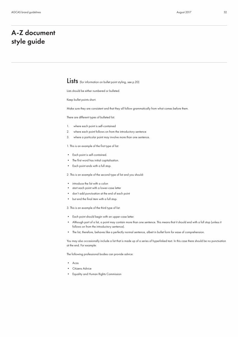
Lists (for information on bullet point styling, see p.20)
Lists should be either numbered or bulleted.
Keep bullet points short.
Make sure they are consistent and that they all follow grammatically from what comes before them. There are different types of bulleted list:
1. where each point is self-contained
2. where each point follows on from the introductory sentence
3. where a particular point may involve more than one sentence.
1. This is an example of the first type of list:
• Each point is self-contained.
• The first word has initial capitalisation.
• Each point ends with a full stop.
2. This is an example of the second type of list and you should:
• introduce the list with a colon• start each point with a lower-case letter
• don’t add punctuation at the end of each point
• but end the final item with a full stop.
3. This is an example of the third type of list:
• Each point should begin with an upper-case letter.
• Although part of a list, a point may contain more than one sentence. This means that it should end with a full stop (unless it follows on from the introductory sentence).
• The list, therefore, behaves like a perfectly normal sentence, albeit in bullet form for ease of comprehension.
You may also occasionally include a list that is made up of a series of hyperlinked text. In this case there should be no punctuation at the end. For example:
The following professional bodies can provide advice:
• Acas
• Citizens Advice
• Equality and Human Rights Commission
A-Z document style guide

33AGCAS brand guidelines August 2017
NamesMake sure names are spelt correctly and check if you’re unsure.
Don’t use Mr, Mrs or Ms in acknowledgements and in promotional material (e.g. conference brochures) but do include Dr or Professor.
Contractions such as Dr don’t need a full stop after them.
Numbers (see also ‘Dates’ and ‘Currencies’)
• Write numbers up to ten in full, numbers over ten in figures: ‘ten’ and ‘11’
• Try to avoid starting sentences with figures. If, however, a sentence does have to start with a number, always use words (even for numbers over ten), e.g. ‘Forty per cent of careers advisers...’
• Millions: Use m for sums of money, units and in headlines, e.g. ‘£10m spent on new careers library’, but use million for people, e.g. ‘one million heads of service’, ‘23 million careers information specialists’
• If there are two numbers in a range and one is over ten, use numerals, e.g. ‘between 4 and 13 AGCAS training courses ...’ or ‘4 to 13 AGCAS training courses’
• Use commas in numbers over 1,000, e.g. 17,500
• Write percentages in numerals followed by %, e.g. 50%
• If you do have to write out % in words (for example, if starting a sentence with a percentage), use per cent rather than percent
• For degree classifications use first, 2:1, 2:2 and third
• For salaries use £17,000 (not 17K)
• Do not hyphenate telephone numbers: use 0161 123 4567, 020 7533 5043 and +886 2 2192 7000 (international)
• If comparing statistics, use like for like (‘two thirds of students said....whereas a fifth said...’ and not ‘two thirds of students said...whereas 1 in 20 said...’)
Quotes For details on how to style quotes, see p.16 and 18
RegionsRefer to regions as follows (as this matches how they are referred to in the ‘Communities’ section of the website):
• North East England
• North West England
• West Midlands
• East Midlands.
A-Z document style guide

34AGCAS brand guidelines August 2017
Social mediaWhen referring to social media and professional networks, use the correct spellings, e.g.:
• Skype
• YouTube.
Spellings of commonly used words• AGCAS’s (not AGCAS’) when using the possessive (see ‘Apostrophes’)
• careers advisers (not careers advisors)
• dos and don’ts (not do’s and donts)
• email (not e-mail)
• entrepreneur and entrepreneurship
• healthcare (not health care)
• jobseeker (not job seeker)
• licence (when used as a noun) and license (when used as a verb).
• workplace (not work place)
• postgraduate (not post graduate or post-graduate)
• practise when used as a verb and practice when used as a noun*
• program (computer)
• programme (planned series of events, workshops, etc)
• teamwork (not team work)
• Wi-Fi
*Example
‘Give an example of best practice.’ (noun)‘They practised hard to win the award.’ (verb)
Times• Use the 24-hour clock with a colon between the hour and the minutes, e.g. 13:40.
• When writing a time span, use an en dash without spaces in between the times, e.g. 14:00–16:00.
A-Z document style guide

35AGCAS brand guidelines August 2017
University and company namesMake sure the name is correct and use the format that the universities/companies use themselves. This is important as it is a branding issue and something that university and company marketing departments take very seriously.
When writing the name of a university, check whether the ‘the’ should be ‘The’. If in doubt, go to a university’s website to find out how it refers to itself or speak to their marketing department.
Web and email addressesWhen including web and email addresses in text, for example on websites or in online articles, use the following guidance.
Web addresses
• Always embed web links within the text rather than typing out the URL (unless in a printed document).
• Click on the link to make sure it works and goes to the intended web page.
• Don’t include the slash at the end.
• If a link comes at the end of a sentence, you can use a full stop.
• If typing out a URL for a printed publication, leave out the http:// and start with www. (if it’s used – see, for example, targetjobs.co.uk).
Email addresses
• Always embed email addresses within the text, rather than typing out the email address (unless in a printed document).
• Click on the email link to make sure it works.
• If a link comes at the end of a sentence, you can use a full stop.
A-Z document style guide