brand toolkit - august 1
TRANSCRIPT

AIESEC Brand Toolkit [August 2004]
AIESEC Brand Toolkit

AIESEC Brand Toolkit [August 2004] Table of Contents
1.0 Why Branding?
2.0 AIESEC Brand Promise
3.0 Positioning
4.0 Visual Guidelines
5.0 Creation Guide
6.0 Templates
7.0 Global Brandsite
Table of Contents

AIESEC Brand Toolkit [August 2004] 1.0 Why Branding?
1.1 What is a Brand?
1.2 Why does AIESEC have a Branding Initiative?
Why Branding?
AIESEC Brand Toolkit [August 2004] 1.0 Why Branding?
1.1 What is a Brand?
A brand is more than just a logo, a slogan, or a colour scheme; it is the image and reputation that we want others to associate with our organization.
But, a brand is also more than just the image that we want others to have of us; it is also a description of the organization that we want to be.
Finally, a brand is a choice. It is choosing how we want others to view us. It is choosing to support the public and our stakeholders in forming that image. It is choosing to live up to the brand we have created for ourselves.
1.2 Why does AIESEC have a Branding Initiative?
We are firstly looking to have a clearer brand that will not only describe AIESEC accurately, but will help to bring out the most unique and powerful elements of our organization. This will help us to attract more stakeholders and the right type of stakeholders.
A clearer brand will also help to set the right expectations with our stakeholders. Given the nature and activities of AIESEC, it is important that the members and organizations from different parts of the world have a shared understanding of our mission, values, and role. This depends greatly on having a common understanding of our brand.
We also want to have a more consistent brand. The more consistently we portray AIESEC, the more awareness and credibility we will generate with the public and our stakeholders. We have a huge opportunity to increase our consistency.
We also think it is the right time for a branding initiative. With the introduction of the new AIESEC experience, we have a more powerful understanding of how AIESEC can fulfil its role and mission. A branding initiative can both support and leverage the implementation.
While we do not have ambitions of being widely known like Coke or Nike, we can still increase the public awareness of AIESEC, especially in key areas like university campuses. With some effort and systems, we can begin to increase our recognition. But, this starts with having a clear and consistent brand.
Why Branding?
AIESEC Brand Toolkit [August 2004] 2.0 AIESEC Brand Promise
2.1 What is the Brand Promise?
2.2 AIESEC Uniqueness
2.3 Activating Leadership
2.4 Global
2.5 Connecting
2.6 Youth Driven
2.7 Excellence
2.8 Enjoying
2.9 Diversity
AIESEC Brand Promise

AIESEC Brand Toolkit [August 2004] 2.0 AIESEC Brand Promise
2.1 What is the Brand Promise?
The Brand Promise is a set of elements that we want our stakeholders to associate with AIESEC - it is in effect our promise to them.
It is intended to be aspirational - meaning our organization will need to evolve its messages and strategies over time to deliver on it.
The Brand Promise was developed in a workshop at IC 2003 based on analysis of over 1000 stakeholder surveys and with advisory support from UBS and Prophet.
Essence is a simple and single thought that captures the core of the brand. It is not a slogan.
Primary elements are the base for brand-building programs and should remain consistent over time and across products and markets.
Secondary elements enrich the brand and give it completeness. Their importance can be “turned up” or “turned down” depending on the stakeholder and the local reality.
AIESEC Brand Promise

AIESEC Brand Toolkit [August 2004] 2.0 AIESEC Brand Promise
2.2 What makes AIESEC unique?
One important and fascinating question to the branding process is what makes AIESEC unique. The truth is there is no other organization like AIESEC. But, what makes us unique is not a simple, one-line answer, rather a combination of factors.
The following points together represent what makes AIESEC unique, based on a review of our competitive environment available for download on the brandsite. These points have been incorporated into the development and interpretation of the Brand Promise.
AIESEC Uniqueness Level of ambition - we want to produce people who will be proactive and positive forces in society (versus just impacting individuals) Develop and Discover - we both develop young people and help them explore/discover the direction and ambition of their future Global Reach - the incredible presence on over 800 universities in 89 countries and territories International Experience - the constant and numerous opportunities to interact and experience an international environment Access - we provide organizations with various points to interact and source the talent within our organization High-Potential People - we are attracting and retaining high-potential people Fun part - it is fun and enjoyable to be a part of AIESEC By Youth For Youth - it is a feat in itself and draws a clearer contribution to society

AIESEC Brand Toolkit [August 2004] 2.0 AIESEC Brand Promise
2.3 Activating Leadership
AIESEC is about developing people and the reason we develop people is so they can have a positive impact on their environments. It is important to keep this link between what and why.
We also want to communicate the important role the individual plays in the experience - the self-driven element. We do this through the concept of AIESEC as a platform of opportunities from which individuals can drive their own experience.
But, developing people is not what makes AIESEC unique. The powerful feature of AIESEC is personal discovery - we engage young people right when they are thinking most about what to do with their lives and we offer them the incredible opportunity to explore themselves and the role they want to play in the world.
Activating Leadership AIESEC is the platform - the individuals drive their own experience We help individuals to both develop and discover their potential Our ambition is to develop people that will have a positive impact on society
AIESEC Brand Toolkit [August 2004] 2.0 AIESEC Brand Promise
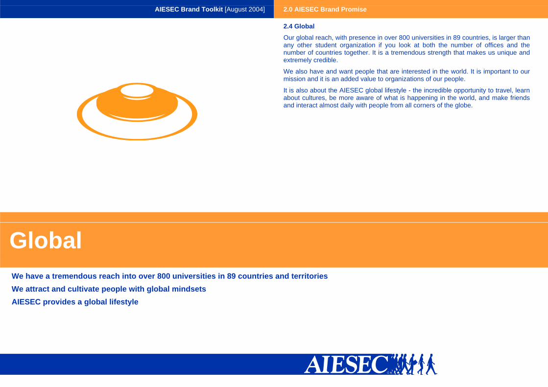
2.4 Global
Our global reach, with presence in over 800 universities in 89 countries, is larger than any other student organization if you look at both the number of offices and the number of countries together. It is a tremendous strength that makes us unique and extremely credible.
We also have and want people that are interested in the world. It is important to our mission and it is an added value to organizations of our people.
It is also about the AIESEC global lifestyle - the incredible opportunity to travel, learn about cultures, be more aware of what is happening in the world, and make friends and interact almost daily with people from all corners of the globe.
Global We have a tremendous reach into over 800 universities in 89 countries and territories We attract and cultivate people with global mindsets AIESEC provides a global lifestyle

AIESEC Brand Toolkit [August 2004] 2.0 AIESEC Brand Promise
2.5 Connecting
A great strength of AIESEC is that it brings together young people and organizations in a number of different ways and on a large scale - through running exchange, AIESEC.net, conferences, and more. We should highlight this strength.
We also know that our members join AIESEC to make friends, meet people with similar interests, and to get professional contacts. We help people to connect on many levels - not just friends, and not just pure networking.
We also recognize that one of key reasons organizations partner with us is that we connect them to young people - in particular the talent and diversity of membership, but also to our energy and perspectives.
Connecting AIESEC connects young people to each other and organization on a social, interest, and professional level AIESEC connects organization to young people - their talent and diversity

AIESEC Brand Toolkit [August 2004] 2.0 AIESEC Brand Promise
2.6 Youth Driven
We knew it was important for us to communicate that we are an organization of young people but we wanted to clarify what exactly it was about being young that was important.
We firstly think that the way young people do things, especially AIESEC people, is important. We think young people do things with passion, energy, and commitment. This is why we say youth-driven and not just youth.
We also think youth are important because they represent the future - so investing in AIESEC means investing in a better future. We want this link between our nature and mission to come through.
Finally, we also wanted to get away from the student organization image - as it is often has negative connotations in people’s minds and also that AIESEC is much more than your typical student organization.
Youth Driven The way we as young people do things - with passion, energy, and commitment Youth represents the future - which further communicates our contribution to society We are more than your typical student organization

AIESEC Brand Toolkit [August 2004] 2.0 AIESEC Brand Promise
2.7 Excellence
We recognized that our organizational stakeholders value a quality service and quality people. The concept of excellence addresses this need - that we always strive to do the best we can in all we do and we have high quality people in our organization.
We also want to be a leading organization - one that can attract and retain high-potential young people and one with whom our members and our partners are proud to be associated.
Excellence Our attitude - that we strive for excellence in all we do, including our service Our people - that we have excellent people Our organization - that we are a leading and respected organization

AIESEC Brand Toolkit [August 2004] 2.0 AIESEC Brand Promise
2.8 Enjoying
AIESEC has an emotional and spirited side to it - some combination of passion and fun. We think this emotion and spirit within our culture is one of our strengths and that we should communicate it.
We felt enjoying was a better concept that passion or fun - in particular because it is a concept that we can relate to all stakeholders. We know our members enjoy being part of AIESEC but we also think that enjoying is something we can credibly offer to our partner organizations - that they will enjoy being involved with AIESEC.
Enjoying The fun and spirited side of AIESEC That this fun and spirited side is one of the reasons our close partner organizations and our members are involved with AIESEC

AIESEC Brand Toolkit [August 2004] 2.0 AIESEC Brand Promise
2.9 Diversity
AIESEC always had a strong connection to cultural understanding. The concept of diversity builds on this tradition and extends it to make it more practical and relevant in the external environment.
The concept of diversity is a little broader than cultural understanding. Where cultural understanding is about knowing and appreciating another cultures, diversity is about respecting and being able to work with people who are different - including cultures, attitudes, and ideas.
The concept of diversity is important to organizations right now - both in terms of attracting a diverse group of people and having people who know how to work effectively in diverse environments. AIESEC is perfectly suited to provide both.
Diversity Broader concept - includes not only cultures but also perspectives and people We make the most of diversity - celebrating it, embracing it, creating synergy This is an externally relevant concept we can offer to organizations Diversity of perspectives - we do not represent one point of view

AIESEC Brand Toolkit [August 2004] 3.0 Positioning
3.1 Global Descriptor
3.2 “It’s up to you!”
3.3 “It’s up to you!” Examples
3.4 What is AIESEC
Positioning

AIESEC Brand Toolkit [August 2004] 3.0 Positioning
3.1 Global Descriptor
The global descriptor is a one-line description of AIESEC. It directly addresses the essence and primary elements of our Brand Promise.
Taken together with “It’s up to you!”, it makes a complete and logical thought - that AIESEC is an international platform of opportunities and it is up to you to make the most of them.
The use of descriptor under the logo is optional. However, the global descriptor should be the only descriptor used under the logo.
In paragraph text and spoken communication, we use the full sentence “AIESEC is the international platform for young people to discover and develop their potential to have a positive impact on society.”
The international platform for young people to discover and develop their potential
Platform represents the different opportunities that AIESEC offers. It brings out the full AIESEC experience and sets the stage for self-driven learning and connecting.
Young people most accurately (if not precisely) the composition of AIESEC being both university students and recent graduates.
This is a distinguishing feature of AIESEC - that we not only develop young people, but help them to discover themselves and what they want to do with their lives.
International reinforces our global aspect but highlights better the nature (vs. reach) of our platform and the experiences we offer.

AIESEC Brand Toolkit [August 2004] 3.0 Positioning
3.2 “It’s up to you!”
“It’s up to you!” is a concept to communicate the essence of AIESEC. The value of “It’s up to you!” is that it is both simple and versatile.
It hits directly on our essence and can be leveraged with different stakeholders and different elements of the brand promise. This versatility allows for customization to different situations and different markets.
“It’s up to you!” Essence - it is a simple and powerful way to communicate Activating Leadership. Our understanding of Activating Leadership is that we provide the platform and individuals drive their learning. This highlights the active role of the individual and reminds them of the choice they have in reaching their potential, associating AIESEC with that choice. ”It’s up to you!” Questions - the supporting questions present two options - one is okay, other is better – and then “It’s up to you!” underneath. Together with “It’s up to you!”, these questions provide a framework:
• to grab attention
• to present different opportunities of AIESEC
• to highlight different elements of brand promise Global Descriptor - together with the global descriptor it makes a complete and logical thought. AIESEC is an international platform of opportunities and it is up to you to make the most of them. Versatility - through the “It’s up to you!” questions, we are able to highlight different elements of our brand promise and different opportunities/benefits available to our stakeholders. This allows MCs and LCs to craft campaigns to address the needs in their market and the current state of their brand.

AIESEC Brand Toolkit [August 2004] 3.0 Positioning
Students Organisations Alumni
3.3 “It’s up to you!” Examples
The following are a few examples of “It’s up to you!” and supporting questions. For support on writing your own “It’s up to you!” questions, refer to 5.0 Creation Guide. For more examples, please refer to the Global Brandsite.
It’s up to you! Examples

AIESEC Brand Toolkit [August 2004] 3.0 Positioning
3.4 What is AIESEC
The answer to the question “What is AIESEC” should have a similar feel across different stakeholders and situations. However, the context of the situation will ultimately determine the emphasis and detail.
The shortest response is that AIESEC is the international platform for young people to discover and develop their potential to have a positive impact in society. This should be the first sentence in paragraph text and spoken communication.
After this sentence, it is important to reinforce the full range of opportunities in the platform, the different elements of the brand promise, and the result of having gone through the AIESEC experience.
It is also important to use accurate numbers in all communications.
On the brandsite, we have different examples of how to describe AIESEC in varying lengths and according to stakeholder. Here you can also get accurate numbers.
What is AIESEC? First sentence - AIESEC is the international platform for young people to discover and develop their potential to have a positive impact in society Reinforce brand promise, full range of platform, and end result of AIESEC experience Use accurante numbers

AIESEC Brand Toolkit [August 2004] 4.0 Visual Guidelines
4.1 Logo
4.2 Colour
4.3 Typography
4.4 “It’s up to you!”
Visual Guidelines

AIESEC Brand Toolkit [August 2004] 4.1 Logo
4.1.1 Logo Overview
Introduced in 1991, the AIESEC logo remains a relevant and important component of the AIESEC brand identity.
The designs show young people, gaining definition as individuals as they emerge from the blue mass. This represents young people, forming themselves as individuals, heading toward their future, and choosing their own path.
In short, it represents how AIESEC enables young people to discover and develop their potential and head towards their future with a clearer and stronger vision for themselves.
The logo should not be modified in anyway and should always be used according to the guidelines in this section.
Young people shown through carrying of book Walking forward represents walking towards the future Increasing definition represents forming/developing as individuals Emerging from the blue mass represents building your own path or moving towards your personal vision

AIESEC Brand Toolkit [August 2004] 4.1 Logo
4.1.2 Colour Specifications
The logo is the most powerful visual element within our brand and we should always treat it with respect. It should only be used with approved colours.
The examples here illustrate the correct use of the logo in positive and reverse formats. Any other combinations or changes to the typeface should not be used.
Permitted Colour Combinations Blue Logo on White Background Black Logo on White Background Blue Logo on AIESEC Orange Background White Logo on AIESEC Blue Background

AIESEC Brand Toolkit [August 2004] 4.1 Logo
4.1.3 Clear Space
To protect the strength and integrity of the logo, a clear space, free of competing visual elements, should be maintained. This includes additions of country/LC names, changing background colours, or adding a shadow. The only exception is with the global descriptor.
In the example below, the unit of measurement for clear space equals the height of the people. The clear space on the right side is 1 unit. The clear space on the left, bottom, and top is 0.5 units.
Clear Space 1 unit = height of people 1 unit isolation on the right 0.5 units isolation on bottom, top, and left Only exception is when using global descriptor
AIESEC Brand Toolkit [August 2004] 4.1 Logo
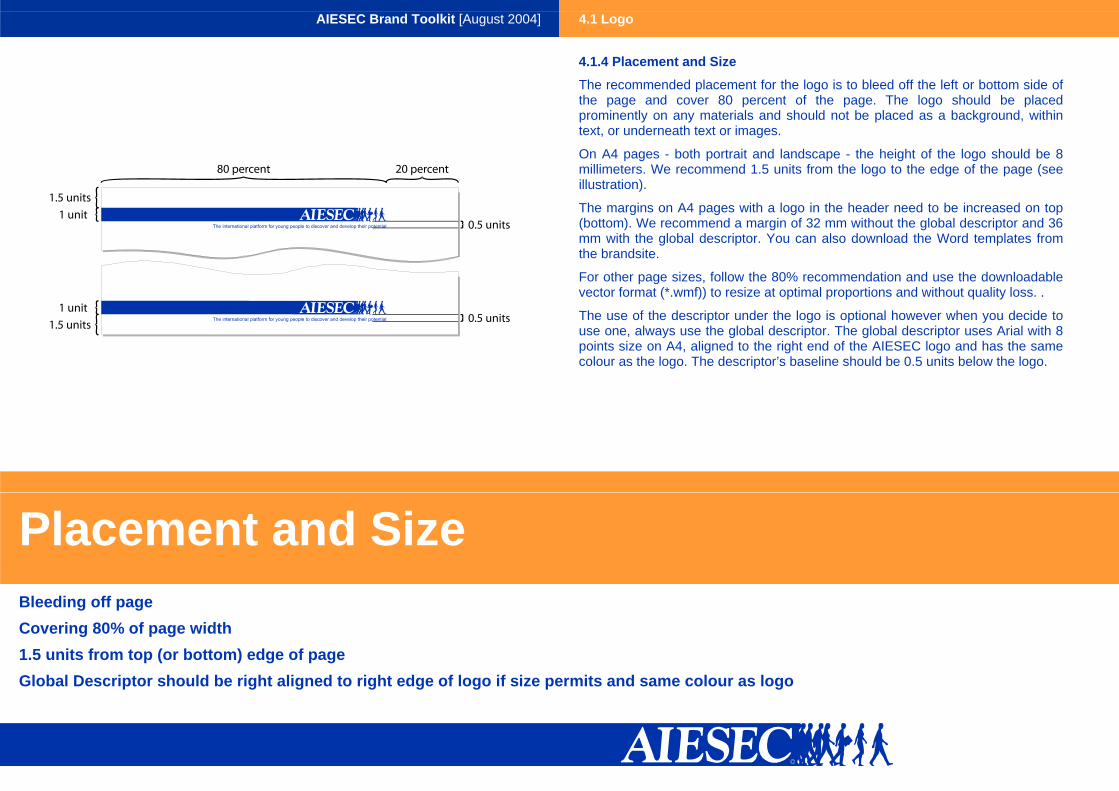
4.1.4 Placement and Size
The recommended placement for the logo is to bleed off the left or bottom side of the page and cover 80 percent of the page. The logo should be placed prominently on any materials and should not be placed as a background, within text, or underneath text or images.
On A4 pages - both portrait and landscape - the height of the logo should be 8 millimeters. We recommend 1.5 units from the logo to the edge of the page (see illustration).
The margins on A4 pages with a logo in the header need to be increased on top (bottom). We recommend a margin of 32 mm without the global descriptor and 36 mm with the global descriptor. You can also download the Word templates from the brandsite.
For other page sizes, follow the 80% recommendation and use the downloadable vector format (*.wmf)) to resize at optimal proportions and without quality loss. .
The use of the descriptor under the logo is optional however when you decide to use one, always use the global descriptor. The global descriptor uses Arial with 8 points size on A4, aligned to the right end of the AIESEC logo and has the same colour as the logo. The descriptor’s baseline should be 0.5 units below the logo.
Placement and Size Bleeding off page Covering 80% of page width 1.5 units from top (or bottom) edge of page Global Descriptor should be right aligned to right edge of logo if size permits and same colour as logo

AIESEC Brand Toolkit [August 2004] 4.2 Colour
Blue Orange
PMS 286C PMS 1235C
CMYK
C 100M 76 Y 0 K 18
RGB
R 0 G 51 B 153
#003399
CMYK
C 0 M 40 Y 90 K 0
RGB
R 255 G 153 B 51
#FF9933
Print - Use PMS or CMYK
Screen - Use RGB Web - Use HEX code
4.2.1 Primary Colours
Colour is a vital element of our brand and consistent use of colour will greatly increase recognition and credibility.
AIESEC Orange and AIESEC Blue supplement each other well and give AIESEC a young and vibrant feel. Primary colours should be displayed prominently on all colour-marketing materials.
You will notice, the colours specified with the Pantone code (PMS) the CMYK, RGB and the HEX values will look slightly different when viewed on screen. For printed materials, you should use the PMS code or the CMYK values. For screen, use the RGB codes. For the web to make sure the colour appears correctly, use the websafe HEX code.
Colour

AIESEC Brand Toolkit [August 2004] 4.2 Colour
Alumni Organisations Students
PMS 484C PMS 313C PMS 382C
CMYK
C 0 M 100 Y 100 K 30
RGB
R 151 G 0 B 10
#97000A
CMYK
C 100 M 0 Y 5 K 10
RGB
R 0 G 152 B 208
#0098D0
CMYK
C 40 M 0 Y 100K 0
RGB
R 182 G 200 B 39
#B6C827
50%
CMYK
C 0 M 50 Y 50 K 15
RGB
R 203 G 128 B 133
#CB8085
CMYK
C 50 M 0 Y 2,5 K 5
RGB
R 128 G 204 B 232
#80CCE8
CMYK
C 20 M 0 Y 50 K 0
RGB
R 219 G 228 B 147
#DBE493
20%
CMYK
C 0 M 20 Y 20 K 6
RGB
R 235 G 205 B 207
#EBCDCF
CMYK
C 20 M 0 Y 1 K 2
RGB
R 205 G 235 B 246
#CDEBF6
CMYK
C 8 M 0 Y 20 K 0
RGB
R 241 G 244 B 213
#F1F4D5
15%
CMYK
C 0 M 15 Y 15 K 4,5
RGB
R 240 G 218 B 219
#F0DADB
CMYK
C 15 M 0 Y 0 K 1,5
RGB
R 218 G 240 B 248
#DAF0F8
CMYK
C 6 M 0 Y 15 K 0
RGB
R 244 G 247 B 224
#F4F7E0
4.2.2 Stakeholder Highlights
Stakeholder highlights provide additional feel and consistency to materials developed for particular stakeholders - alumni, student, or organizations.
Stakeholder highlights should be the first colour after the primary colours used in stakeholder specific materials. If there is no need for a third colour, it is okay not to use a stakeholder highlight.
Colour

AIESEC Brand Toolkit [August 2004] 4.2 Colour
Blue Orange
PMS 286C PMS 1235C
50%
CMYK
C 15 M 11,4Y 0 K 2,5
RGB
R 134 G 138 B 186
#868ABA
CMYK
C 0 M 20 Y 45 K 0
RGB
R 239 G 209 B 150
#EFD196
20%
CMYK
C 20 M 15,2Y 0 K 3,6
RGB
R 205 G 207 B 228
#CDCFE4
CMYK
C 0 M 8 Y 18 K 0
RGB
R 249 G 238 B 215
#F9EED7
15%
CMYK
C 15 M 11,4Y 0 K 2,7
RGB
R 218 G 219 B 235
#DADBEB
CMYK
C 0 M 6 Y 13,5 K 0
RGB
R 250 G 242 B 225
#FAF2E1
4.2.3 General Highlights
General highlights are transparent versions (50%, 20%, 15%) of our primary colours and offer additional versatility to our palette while still maintaining a consistent look and feel.
General highlights should be used as the first colour after the primary colour in non-stakeholder specific materials.
For stakeholder specific materials, accents can be used after the stakeholder highlight and/or in small portions to add additional colour.
Colour

AIESEC Brand Toolkit [August 2004] 4.3 Typography
4.3.1 Overview
Typography is an important element of our brand. By controlling the type styles we use, we can strengthen the visual recognition of our brand.
The recommended typeface is Arial. Arial is Sans Serif typeface that is clear, highly legible, and available on all computers. The professional print version of Arial is Helvetica. Use it for print and general materials. Titles and subtitles can use Arial Black or Arial bold. Use the Arial italic and Arial bold only for highlightning plaintext. Do not use underlined text. Optimally plaintext should have 8.5 pnt.
For web-based applications, use Arial in graphics and use Verdana for all HTML text. Verdana is font designed specifically for on-screen reading such as web.
Typography

AIESEC Brand Toolkit [August 2004] 4.4 “It’s up to you!”
4.4.1 Overview
The design of „It’s up to you!” icon is an important component of the new AIESEC brand identity. The design includes exact wording, typography, shape and the colours.
The exact wording is „It’s up to you!”. If you create your own materials or use it in paragraph text, do not change any letter to capitals. Also, avoid using more exclamation marks and short versions such as „It’s up 2 U”.
On the icon, the text should remain in english and the font, italicized style, or spacing should not be changed. In paragraph text, it should remain in english unless the translated versions keeps is meaning and sharpness.
We recommend the icon to be placed on the bottom and half embedded in the AIESEC orange, separated with an AIESEC blue horizontal line of the same width as the oval shape outline.
On portrait layout posters and ads, it should appear more prominently so the whole graphic should take 60 percent of the page width. On other portrait layout materials, like newsletters, brochures, letterheads and pamphlets the whole graphic should only take 30 percent of the page width. Also, make sure nothing interfers with the graphic.
We recommend to have a free space equal to the height of the text above and under the graphic free.
“It’s up to you!”

AIESEC Brand Toolkit [August 2004] 5.0 Creation Guide
5.1 Creating Sets of Questions for “It’s up to you!”
5.2 Creating and Using Images
5.3 Creating Materials with Templates
Creation Guide

AIESEC Brand Toolkit [August 2004] 5.0 Creation Guide
5.1 Creating “It’s up to you!” Question Sets
“It’s up to you!” question sets enable us to customize our message for different stakeholders and situations. They also enable us to highlight different opportunities in AIESEC and different elements of our brand promise.
MCs and LCs can create their own “It’s up to you!” question sets to create a customized campaign for their market. The question sets should respect the following guidelines:
• Choice - showing two questions to imply a choice.
• First Okay, Then Better - the first question represents an okay situation and second question something better. The reverse (Better then Okay) should be avoided.
• Reasonable gap - the difference between the okay situation and better situation should be reasonable. Question sets that show large gaps (really bad to good or okay to unbelievable) should be avoided.
• Purpose - the question sets should have a clear purpose. A clear purpose is to highlight a brand promise element or a specific benefit/opportunity within AIESEC.
• Connection - the two questions should ideally have a common word or theme to connect them together.
“It’s up to you!” Question Sets
AIESEC Brand Toolkit [August 2004] 5.0 Creation Guide
5.2 Creating and Using Images
Images can increase the visual appeal and professionalism of our marketing materials. Images can also reinforce different elements of our brand promise.
The following are considerations for use and creation of images:
• Diverse groups of young people in different situations showing confidence or fun
• Question Set Space - images to be used as backdrop to “It’s up to you!” questions should have a clear open space on which to put the question
In order to get an appropriate quality in print you will need the images to have big enough resolution. The optimal resolution is 300dpi. This means that in case of A4 posters you will need an image of about 2400*2400 pixels. You can always enlarge smaller pictures, but keep in mind, that this comes with major quality loss and less professional look.
Once you have the image of right size, you should open the image in a graphics software. Follow these instructions to get the blue tint of your image.
• select the background areas of the image and fill it with white colour (don’t select the whole background at the same time, but you enlarge parts of the image and fill them one-by-one, this way you will be able to select the edges more precisely)
• colourize the image by first changing the mode to greyscale and than making it a "duotone" of the AIESEC blue and white
• before giving the picture the layered effect, optimize the brightness and contrast
• use the Photoshop filter called Cutout (Filter > Artistic)
There is no general rule for setting the brightness, contrast and exact settings of the cutout filter, in the end it’s up to your sense of taste how you choose the values for these.
Creating and Using Images

AIESEC Brand Toolkit [August 2004] 5.0 Creation Guide
5.3 Creating Materials with Templates
The templates you can download from the Global Brandsite are mostly in eps format. Eps stands for encapsulated postscript. It is a widely spread format, which is not bound to any specific software, so you can import it anywhere: vector graphics (such as Adobe Illustrator, CorelDRAW or Macromedia Freehand) and bitmap graphics softwares (such as Adobe Photoshop or Macromedia Fireworks).
You might want to use your materials for print and for screen. Either way we recommend using vector graphics software, which will have highest quality in print, and still - most of the times - generate smaller file sizes. Most vector graphics softwares support the publishing to pdf format. This is a widely spread format for distributing materials on the internet and also suitable for professional printing. If your software does not support the conversion into pdf by default, you can get a virtual pdf printer installed, which will create a pdf file from any document.
You will notice that the templates only include information about the graphic elements, but do not have any text boxes specified. With the examples given, you can get the idea of how the text should be aligned, but in the end it is up to you, how you arrange the text and images of your content. But, consider the following.
• A file with the template will include suggested font sizes.
• If you want to highlight plain text, use Arial italic and Arial bold, not underline.
Some templates we have made available in cdr (CorelDRAW) format where in addition to the graphic elements the exact alignment, fonts, colours and sizes of all text is specified in the document.
In case of letterheads besides the full header design with colours, we designed and created a word template, which you should use for A4 materials printed on your local monochrome printer.
Creating Materials with Templates
AIESEC Brand Toolkit [August 2004] 6.0 Templates
6.1 Poster
6.2 Leaflet
6.3 Ad
6.4 Pamphlet
6.5 Brochure
6.6 Powerpoint
6.7 Newsletter
6.8 Case Study
6.9 Letterhead
6.10 Business Card
Templates

AIESEC Brand Toolkit [August 2004] 6.0 Templates
6.1 Poster
The poster’s primary use is within the university environment to attract attention to attend an AIESEC information session. As the target audience is just passing by, it is designed to catch attention and not communicate a lot of information about AIESEC.
The poster has four different versions:
• Text Version with sponsors
• Text Version without sponsors
• Image with sponsors
• Image without sponsors
The following are recommendations for poster use:
• Pick either text or image version for each campaign (don’t mix)
• Pick between 3-7 question sets per campaign
• If using image version, use different images for each question set and place question set within a white space versus over image
• Professional printing with stickers or felt-tip markers to write information on the information session
Poster
AIESEC Brand Toolkit [August 2004] 6.0 Templates
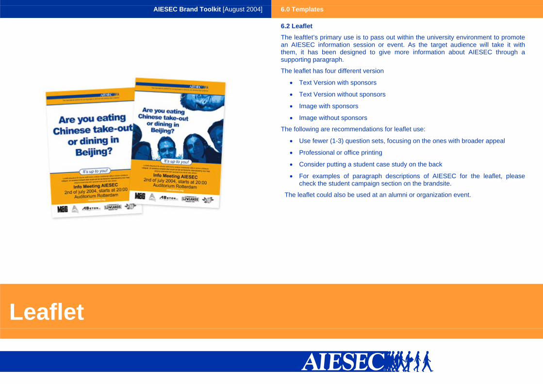
6.2 Leaflet
The leaftlet’s primary use is to pass out within the university environment to promote an AIESEC information session or event. As the target audience will take it with them, it has been designed to give more information about AIESEC through a supporting paragraph.
The leaflet has four different version
• Text Version with sponsors
• Text Version without sponsors
• Image with sponsors
• Image without sponsors
The following are recommendations for leaflet use:
• Use fewer (1-3) question sets, focusing on the ones with broader appeal
• Professional or office printing
• Consider putting a student case study on the back
• For examples of paragraph descriptions of AIESEC for the leaflet, please check the student campaign section on the brandsite.
The leaflet could also be used at an alumni or organization event.
Leaflet

AIESEC Brand Toolkit [August 2004] 6.0 Templates
6.3 Advertisement
The advertisement is intended to promote AIESEC within publications and is customizable to different stakeholders. As the target audience is reading the publication, it has been designed to both catch their attention and to communicate a longer description of AIESEC.
The advertistement has four different version
• Text Version with sponsors
• Text Version without sponsors
• Image with sponsors
• Image without sponsors
The following are recommendations for advertisement use:
• Within the same publication, pick either text or image version (do not mix) and change question sets for new issues.
• If using image version, use different images for each question set and place question set within a white space versus over image
• For examples of longer descriptions of AIESEC, please check the campaign section of the specific stakeholder on the brandsite.
Advertisement

AIESEC Brand Toolkit [August 2004] 6.0 Pamphlet
6.4 Pamphlet
The pamphlet is a tri-fold, double-sided material to provide a complete but concise summary of AIESEC to different stakeholders. It is usually given to individuals that have already shown at least some level of interest in AIESEC - so as a takeway from an information session, sales call, or a trip to AIESEC office.
The pamphlet has three different versions - student, organization, and alumni - each using a different highlight colour. It can be printed professionally or from the office.
The use of an “It’s up to you!” question on the title page is suggested but optional.
For examples of content, please refer to the campaign section of the specific stakeholder on the brandsite.
Pamphlet

AIESEC Brand Toolkit [August 2004] 6.0 Brochure
6.5 Brochure
The brochure is several double-fold sheets and provides the most complete description of AIESEC and its opportunities. It is usually given in important situations and should only be printed professionally.
The brochure has three different versions - student, organization, and alumni - each with a different highlight colour.
Brochure

AIESEC Brand Toolkit [August 2004] 6.0 Templates
6.6 Powerpoint
The powerpoint template is intended for use in powerpoint presentations with externals.
The powerpoint template has three different versions - student, organization and alumni - each with a different highlight colour.
The co-branding of potential partners or events is suggested to happen through the addition of the logo on the title page and through the addition of text, such as “Partnership Proposal AIESEC - Company X” n the lower left band of orange.
Powerpoint

AIESEC Brand Toolkit [August 2004] 6.0 Templates
6.7 Newsletter
The newsletter is to provide updates and news about AIESEC to different stakeholders, particularly alumni or organizational partners.
The newsletter can be printed from office or simply sent as a file (preferably a pdf) to the intended stakeholders.
The newsletter template has three different versions - student, organization and alumni - each with a different highlight colour.
Newsletter

AIESEC Brand Toolkit [August 2004] 6.0 Templates
6.8 Case Study
The case study shows an example of how a particular stakeholder - a student, an organization, or alumni - has taken advantage of the different opportunities that AIESEC has to offer.
The case study template has three different versions - student, organization and alumni - each with a different highlight colour. The addition of an image has been built into the case study.
The case study can be printed professional or in the office.
By removing the case study icon, the template can be used as a product sheet.
For examples of content, please refer to campaign section of the specific stakeholder on the brandsite.
Case Study

AIESEC Brand Toolkit [August 2004] 6.0 Templates
6.9 Letterhead
The AIESEC letterhead is for word documents to be e-mailed or printed for external use. The AIESEC letterhead comes in three different versions:
• Official Letterhead - to be printed professionally and used for important situations
• Word Template - to be used for regular documents, good for both internal and external materials
Letterhead

AIESEC Brand Toolkit [August 2004] 6.0 Templates
6.10 Business Card
The AIESEC business card comes in two different versions - one with picture and one without, depending on preference. The number and exact content of the lines is customizable.
Business Card
AIESEC Brand Toolkit [August 2004] 7.0 Global Brandsite
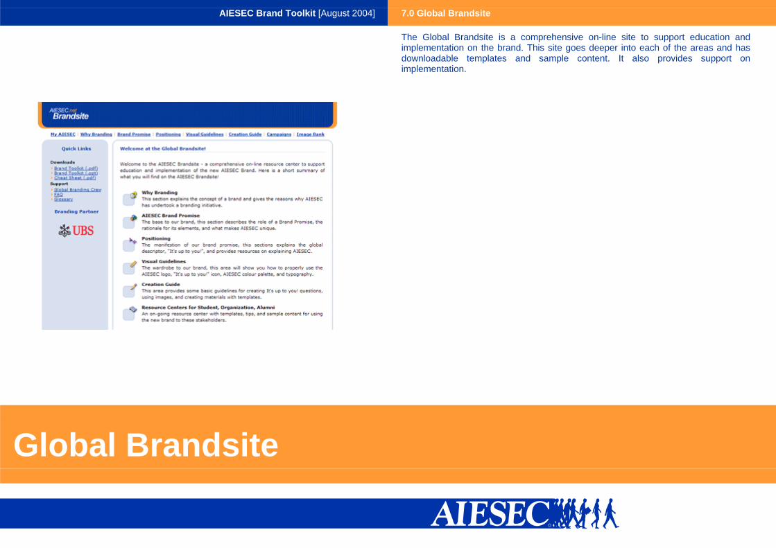
The Global Brandsite is a comprehensive on-line site to support education and implementation on the brand. This site goes deeper into each of the areas and has downloadable templates and sample content. It also provides support on implementation.
Global Brandsite