cchhhaaapppttteeerrr 3 33 -...
TRANSCRIPT
CCCHHHAAAPPPTTTEEERRR 333
Bar Charts
Purpose: In my opinion, the bar chart is probably the #1 most useful of all the charts.
This chapter demonstrates how to create several different types of bar charts, and control
their appearance and layout.
Horizontal Bar Chart
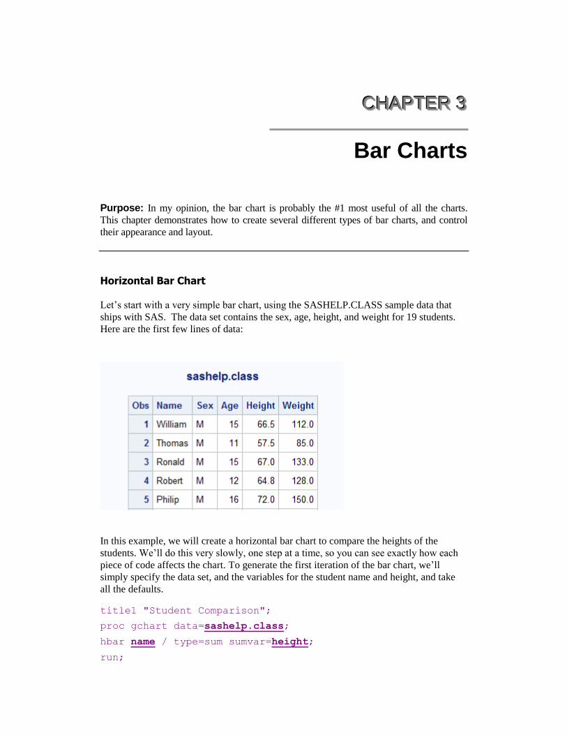
Let‟s start with a very simple bar chart, using the SASHELP.CLASS sample data that
ships with SAS. The data set contains the sex, age, height, and weight for 19 students.
Here are the first few lines of data:
In this example, we will create a horizontal bar chart to compare the heights of the
students. We‟ll do this very slowly, one step at a time, so you can see exactly how each
piece of code affects the chart. To generate the first iteration of the bar chart, we‟ll
simply specify the data set, and the variables for the student name and height, and take
all the defaults. title1 "Student Comparison";
proc gchart data=sashelp.class;
hbar name / type=sum sumvar=height;
run;

SAS/GRAPH: The Basics
The code produces the following bar chart, which is acceptable but not great. As in all
good bar charts, the axis for the length of the bars (the response axis) starts at zero, so
that the lengths of the bars (representing the heights of the students) are all proportional.
By examining the chart, you can see that the students are all in the same range of heights
(roughly 50 to 75 inches), but it is difficult to quickly determine which students are the
tallest and shortest.
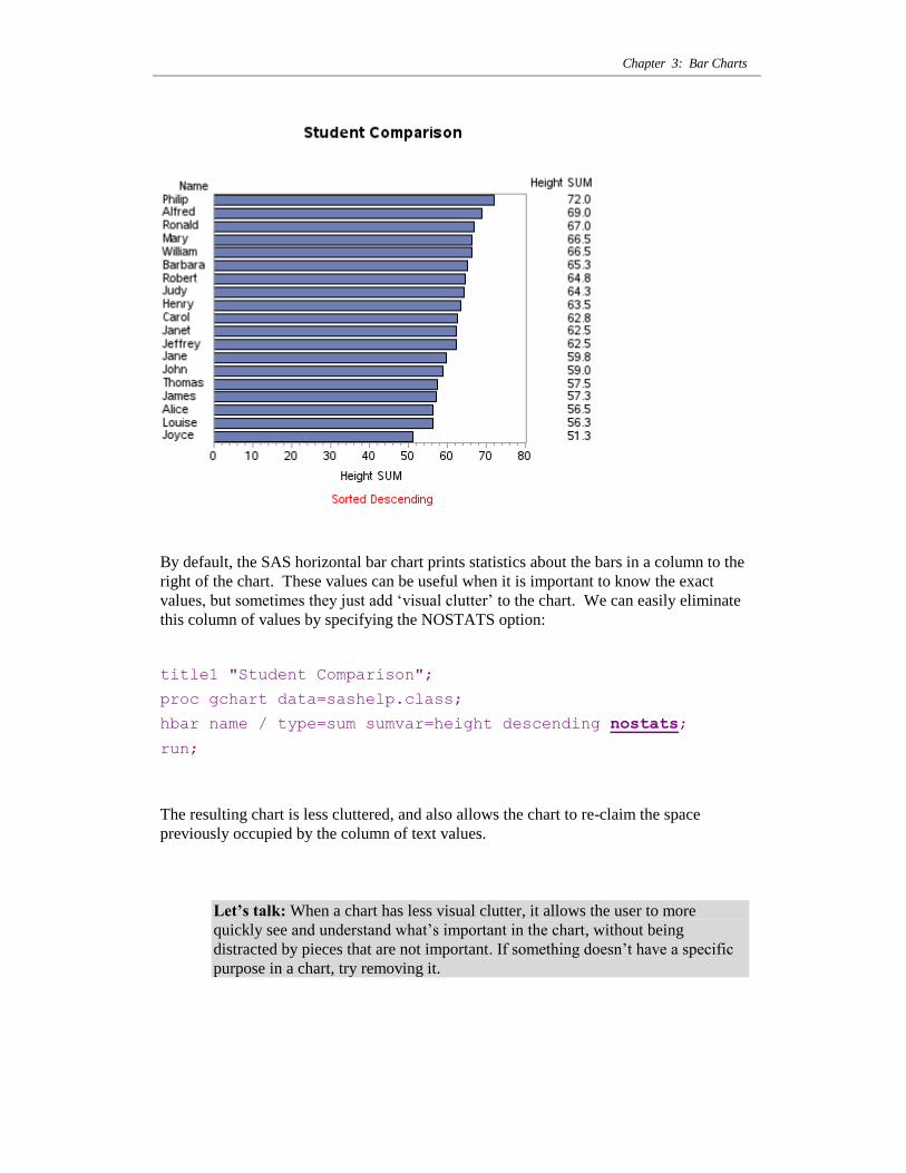
By default, the bars are sorted alphabetically (in this case, by the student name), but we
can add the DESCENDING option to sort the bars by length. This makes it much easier
to quickly identify which students are the tallest and shortest. By sorting the bars, we can
also get a better feel for the distribution of the student heights.
title1 "Student Comparison";
proc gchart data=sashelp.class;
hbar name / type=sum sumvar=height descending;
run;
We can easily determine the tallest (Philip) and shortest (Joyce) students in the resulting
chart. And you can also see that the distribution from tallest to shortest is fairly even (no
big groups of „tall students‟ and „short students‟).
Chapter 3: Bar Charts
By default, the SAS horizontal bar chart prints statistics about the bars in a column to the
right of the chart. These values can be useful when it is important to know the exact
values, but sometimes they just add „visual clutter‟ to the chart. We can easily eliminate
this column of values by specifying the NOSTATS option:
title1 "Student Comparison";
proc gchart data=sashelp.class;
hbar name / type=sum sumvar=height descending nostats;
run;
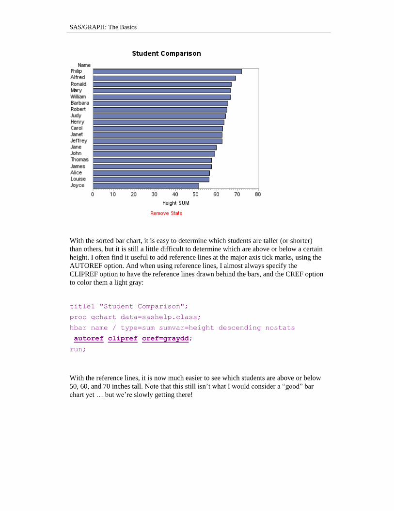
The resulting chart is less cluttered, and also allows the chart to re-claim the space
previously occupied by the column of text values.
Let’s talk: When a chart has less visual clutter, it allows the user to more
quickly see and understand what‟s important in the chart, without being
distracted by pieces that are not important. If something doesn‟t have a specific
purpose in a chart, try removing it.
SAS/GRAPH: The Basics
With the sorted bar chart, it is easy to determine which students are taller (or shorter)
than others, but it is still a little difficult to determine which are above or below a certain
height. I often find it useful to add reference lines at the major axis tick marks, using the
AUTOREF option. And when using reference lines, I almost always specify the
CLIPREF option to have the reference lines drawn behind the bars, and the CREF option
to color them a light gray:
title1 "Student Comparison";
proc gchart data=sashelp.class;
hbar name / type=sum sumvar=height descending nostats
autoref clipref cref=graydd;
run;
With the reference lines, it is now much easier to see which students are above or below
50, 60, and 70 inches tall. Note that this still isn‟t what I would consider a “good” bar
chart yet … but we‟re slowly getting there!
Chapter 3: Bar Charts
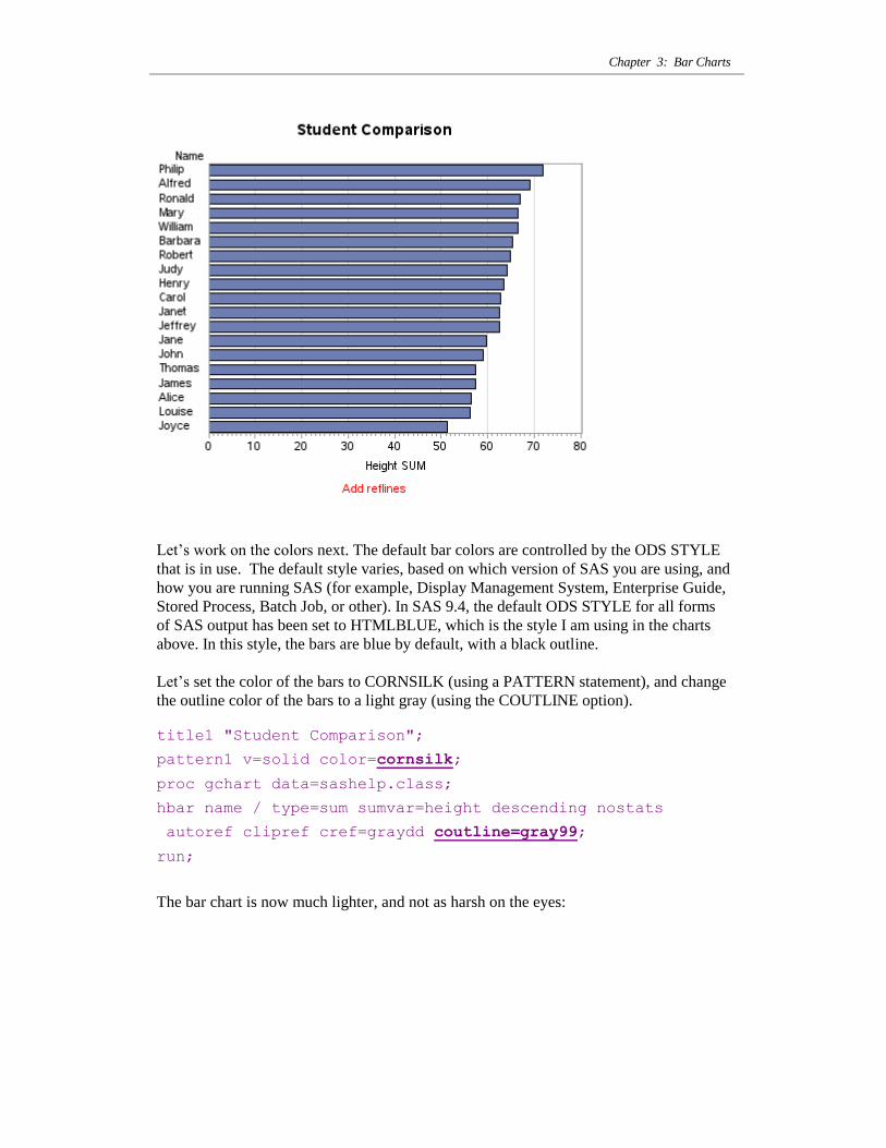
Let‟s work on the colors next. The default bar colors are controlled by the ODS STYLE
that is in use. The default style varies, based on which version of SAS you are using, and
how you are running SAS (for example, Display Management System, Enterprise Guide,
Stored Process, Batch Job, or other). In SAS 9.4, the default ODS STYLE for all forms
of SAS output has been set to HTMLBLUE, which is the style I am using in the charts
above. In this style, the bars are blue by default, with a black outline.
Let‟s set the color of the bars to CORNSILK (using a PATTERN statement), and change
the outline color of the bars to a light gray (using the COUTLINE option).
title1 "Student Comparison";
pattern1 v=solid color=cornsilk;
proc gchart data=sashelp.class;
hbar name / type=sum sumvar=height descending nostats
autoref clipref cref=graydd coutline=gray99;
run;
The bar chart is now much lighter, and not as harsh on the eyes:
SAS/GRAPH: The Basics
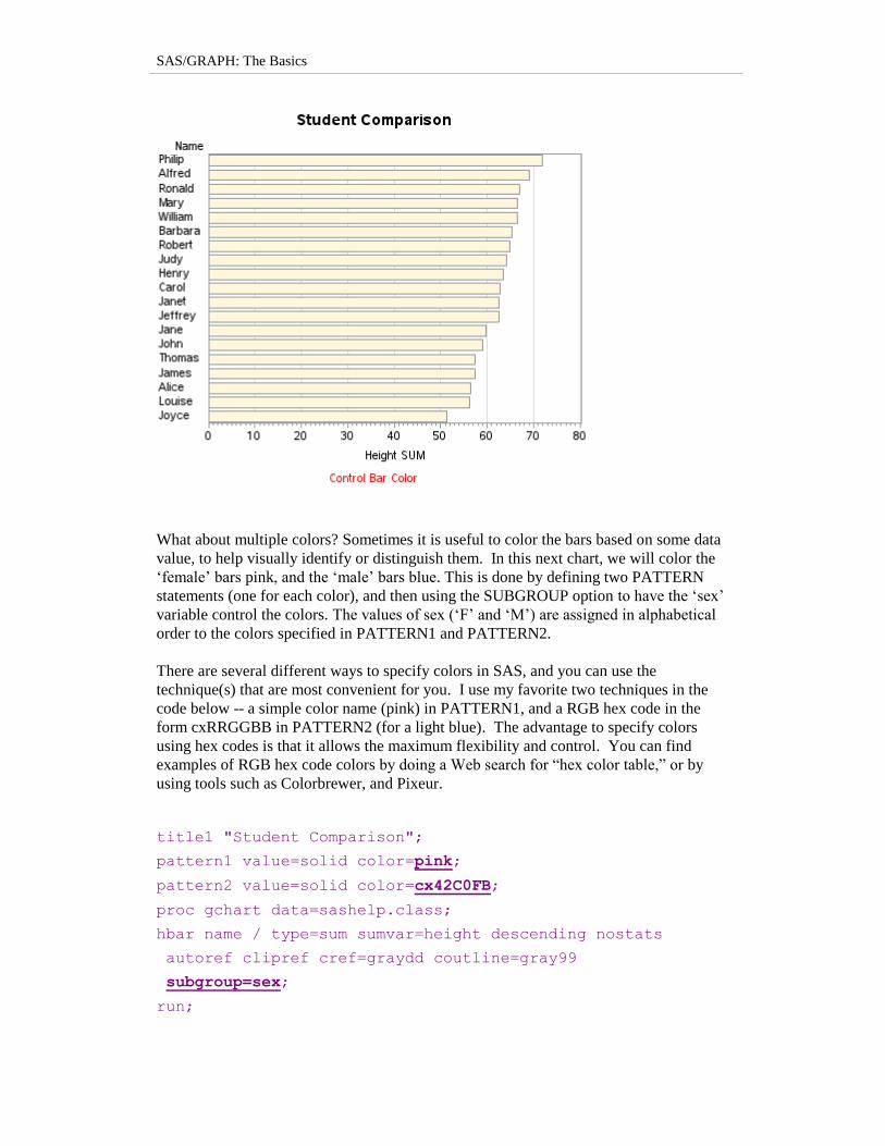
What about multiple colors? Sometimes it is useful to color the bars based on some data
value, to help visually identify or distinguish them. In this next chart, we will color the
„female‟ bars pink, and the „male‟ bars blue. This is done by defining two PATTERN
statements (one for each color), and then using the SUBGROUP option to have the „sex‟
variable control the colors. The values of sex („F‟ and „M‟) are assigned in alphabetical
order to the colors specified in PATTERN1 and PATTERN2.
There are several different ways to specify colors in SAS, and you can use the
technique(s) that are most convenient for you. I use my favorite two techniques in the
code below -- a simple color name (pink) in PATTERN1, and a RGB hex code in the
form cxRRGGBB in PATTERN2 (for a light blue). The advantage to specify colors
using hex codes is that it allows the maximum flexibility and control. You can find
examples of RGB hex code colors by doing a Web search for “hex color table,” or by
using tools such as Colorbrewer, and Pixeur.
title1 "Student Comparison";
pattern1 value=solid color=pink;
pattern2 value=solid color=cx42C0FB;
proc gchart data=sashelp.class;
hbar name / type=sum sumvar=height descending nostats
autoref clipref cref=graydd coutline=gray99
subgroup=sex;
run;
Chapter 3: Bar Charts
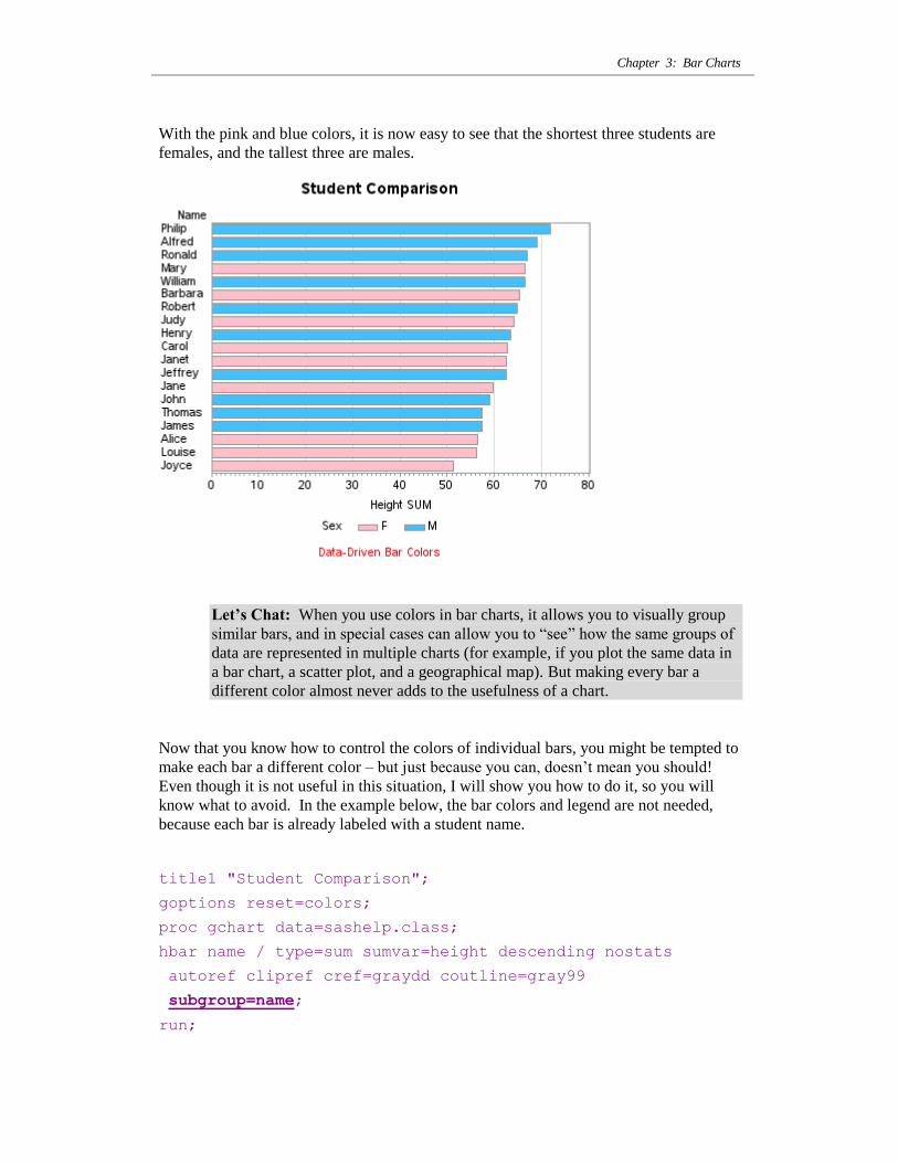
With the pink and blue colors, it is now easy to see that the shortest three students are
females, and the tallest three are males.
Let’s Chat: When you use colors in bar charts, it allows you to visually group
similar bars, and in special cases can allow you to “see” how the same groups of
data are represented in multiple charts (for example, if you plot the same data in
a bar chart, a scatter plot, and a geographical map). But making every bar a
different color almost never adds to the usefulness of a chart.
Now that you know how to control the colors of individual bars, you might be tempted to
make each bar a different color – but just because you can, doesn‟t mean you should!
Even though it is not useful in this situation, I will show you how to do it, so you will
know what to avoid. In the example below, the bar colors and legend are not needed,
because each bar is already labeled with a student name.
title1 "Student Comparison";
goptions reset=colors;
proc gchart data=sashelp.class;
hbar name / type=sum sumvar=height descending nostats
autoref clipref cref=graydd coutline=gray99
subgroup=name;
run;
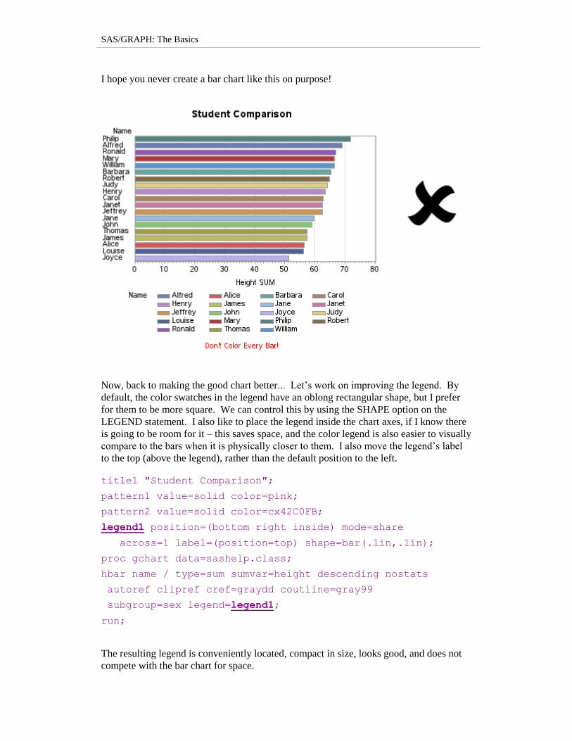
SAS/GRAPH: The Basics
I hope you never create a bar chart like this on purpose!
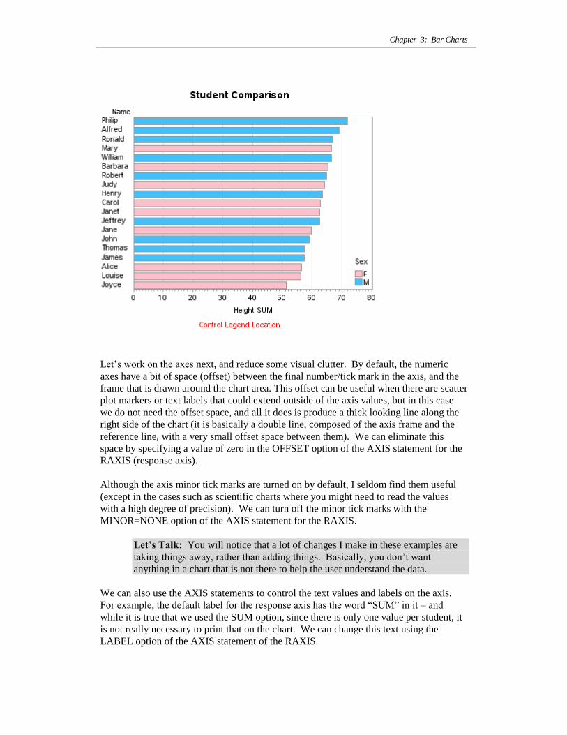
Now, back to making the good chart better... Let‟s work on improving the legend. By
default, the color swatches in the legend have an oblong rectangular shape, but I prefer
for them to be more square. We can control this by using the SHAPE option on the
LEGEND statement. I also like to place the legend inside the chart axes, if I know there
is going to be room for it – this saves space, and the color legend is also easier to visually
compare to the bars when it is physically closer to them. I also move the legend‟s label
to the top (above the legend), rather than the default position to the left.
title1 "Student Comparison";
pattern1 value=solid color=pink;
pattern2 value=solid color=cx42C0FB;
legend1 position=(bottom right inside) mode=share
across=1 label=(position=top) shape=bar(.1in,.1in);
proc gchart data=sashelp.class;
hbar name / type=sum sumvar=height descending nostats
autoref clipref cref=graydd coutline=gray99
subgroup=sex legend=legend1;
run;
The resulting legend is conveniently located, compact in size, looks good, and does not
compete with the bar chart for space.
Chapter 3: Bar Charts
Let‟s work on the axes next, and reduce some visual clutter. By default, the numeric
axes have a bit of space (offset) between the final number/tick mark in the axis, and the
frame that is drawn around the chart area. This offset can be useful when there are scatter
plot markers or text labels that could extend outside of the axis values, but in this case
we do not need the offset space, and all it does is produce a thick looking line along the
right side of the chart (it is basically a double line, composed of the axis frame and the
reference line, with a very small offset space between them). We can eliminate this
space by specifying a value of zero in the OFFSET option of the AXIS statement for the
RAXIS (response axis).
Although the axis minor tick marks are turned on by default, I seldom find them useful
(except in the cases such as scientific charts where you might need to read the values
with a high degree of precision). We can turn off the minor tick marks with the
MINOR=NONE option of the AXIS statement for the RAXIS.
Let’s Talk: You will notice that a lot of changes I make in these examples are
taking things away, rather than adding things. Basically, you don‟t want
anything in a chart that is not there to help the user understand the data.
We can also use the AXIS statements to control the text values and labels on the axis.
For example, the default label for the response axis has the word “SUM” in it – and
while it is true that we used the SUM option, since there is only one value per student, it
is not really necessary to print that on the chart. We can change this text using the
LABEL option of the AXIS statement of the RAXIS.
SAS/GRAPH: The Basics
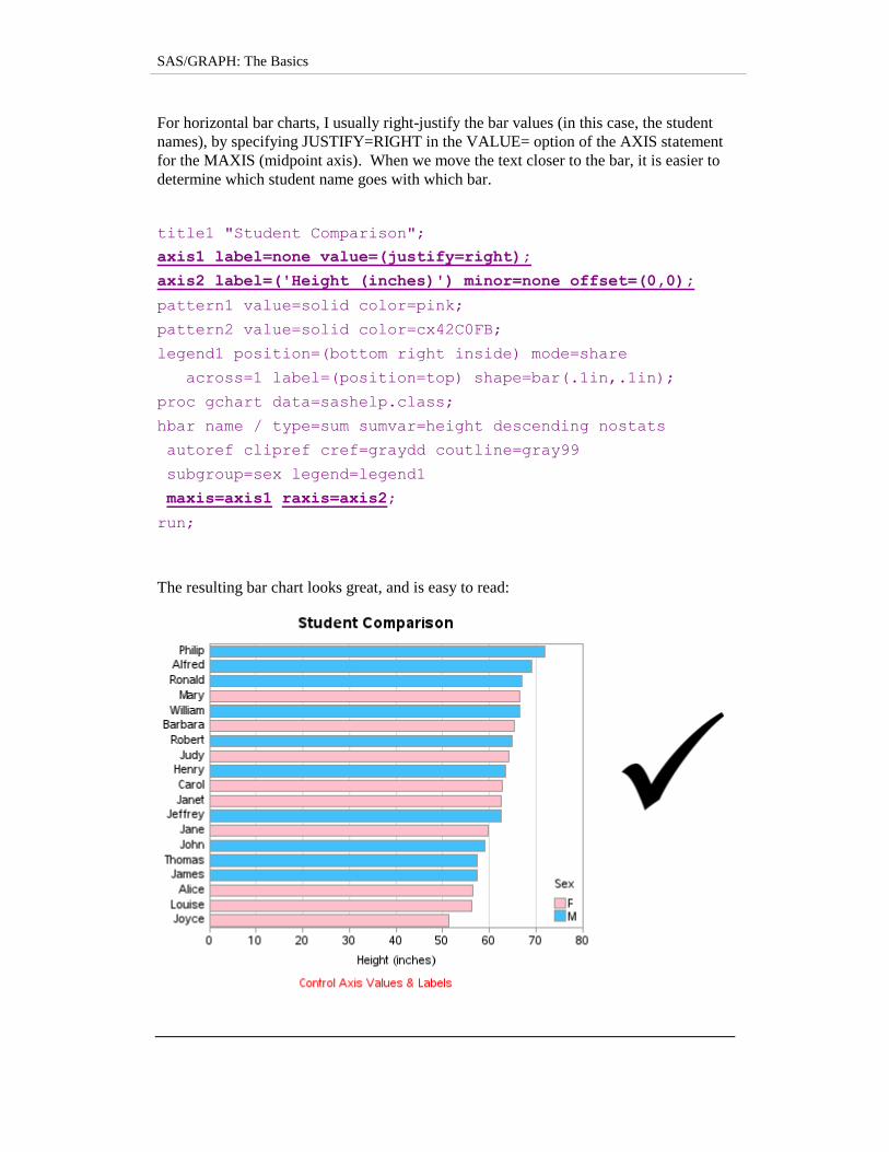
For horizontal bar charts, I usually right-justify the bar values (in this case, the student
names), by specifying JUSTIFY=RIGHT in the VALUE= option of the AXIS statement
for the MAXIS (midpoint axis). When we move the text closer to the bar, it is easier to
determine which student name goes with which bar.
title1 "Student Comparison";
axis1 label=none value=(justify=right);
axis2 label=('Height (inches)') minor=none offset=(0,0);
pattern1 value=solid color=pink;
pattern2 value=solid color=cx42C0FB;
legend1 position=(bottom right inside) mode=share
across=1 label=(position=top) shape=bar(.1in,.1in);
proc gchart data=sashelp.class;
hbar name / type=sum sumvar=height descending nostats
autoref clipref cref=graydd coutline=gray99
subgroup=sex legend=legend1
maxis=axis1 raxis=axis2;
run;
The resulting bar chart looks great, and is easy to read:
Chapter 3: Bar Charts
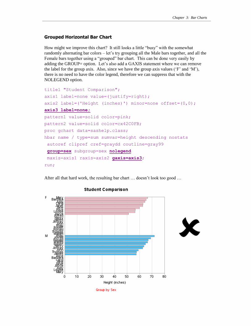
Grouped Horizontal Bar Chart
How might we improve this chart? It still looks a little “busy” with the somewhat
randomly alternating bar colors – let‟s try grouping all the Male bars together, and all the
Female bars together using a “grouped” bar chart. This can be done very easily by
adding the GROUP= option. Let‟s also add a GAXIS statement where we can remove
the label for the group axis. Also, since we have the group axis values („F‟ and „M‟),
there is no need to have the color legend, therefore we can suppress that with the
NOLEGEND option.
title1 "Student Comparison";
axis1 label=none value=(justify=right);
axis2 label=('Height (inches)') minor=none offset=(0,0);
axis3 label=none;
pattern1 value=solid color=pink;
pattern2 value=solid color=cx42C0FB;
proc gchart data=sashelp.class;
hbar name / type=sum sumvar=height descending nostats
autoref clipref cref=graydd coutline=gray99
group=sex subgroup=sex nolegend
maxis=axis1 raxis=axis2 gaxis=axis3;
run;
After all that hard work, the resulting bar chart … doesn‟t look too good …
SAS/GRAPH: The Basics
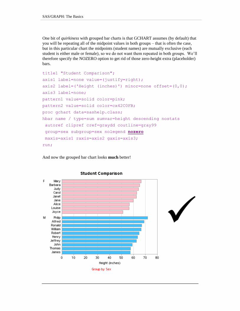
One bit of quirkiness with grouped bar charts is that GCHART assumes (by default) that
you will be repeating all of the midpoint values in both groups – that is often the case,
but in this particular chart the midpoints (student names) are mutually exclusive (each
student is either male or female), so we do not want them repeated in both groups. We‟ll
therefore specify the NOZERO option to get rid of those zero-height extra (placeholder)
bars.
title1 "Student Comparison";
axis1 label=none value=(justify=right);
axis2 label=('Height (inches)') minor=none offset=(0,0);
axis3 label=none;
pattern1 value=solid color=pink;
pattern2 value=solid color=cx42C0FB;
proc gchart data=sashelp.class;
hbar name / type=sum sumvar=height descending nostats
autoref clipref cref=graydd coutline=gray99
group=sex subgroup=sex nolegend nozero
maxis=axis1 raxis=axis2 gaxis=axis3;
run;
And now the grouped bar chart looks much better!
Chapter 3: Bar Charts
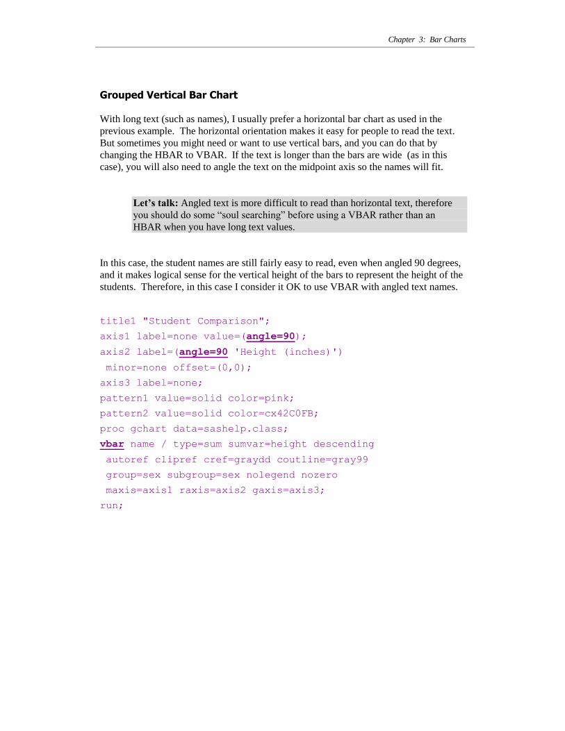
Grouped Vertical Bar Chart
With long text (such as names), I usually prefer a horizontal bar chart as used in the
previous example. The horizontal orientation makes it easy for people to read the text.
But sometimes you might need or want to use vertical bars, and you can do that by
changing the HBAR to VBAR. If the text is longer than the bars are wide (as in this
case), you will also need to angle the text on the midpoint axis so the names will fit.
Let’s talk: Angled text is more difficult to read than horizontal text, therefore
you should do some “soul searching” before using a VBAR rather than an
HBAR when you have long text values.
In this case, the student names are still fairly easy to read, even when angled 90 degrees,
and it makes logical sense for the vertical height of the bars to represent the height of the
students. Therefore, in this case I consider it OK to use VBAR with angled text names.
title1 "Student Comparison";
axis1 label=none value=(angle=90);
axis2 label=(angle=90 'Height (inches)')
minor=none offset=(0,0);
axis3 label=none;
pattern1 value=solid color=pink;
pattern2 value=solid color=cx42C0FB;
proc gchart data=sashelp.class;
vbar name / type=sum sumvar=height descending
autoref clipref cref=graydd coutline=gray99
group=sex subgroup=sex nolegend nozero
maxis=axis1 raxis=axis2 gaxis=axis3;
run;

SAS/GRAPH: The Basics
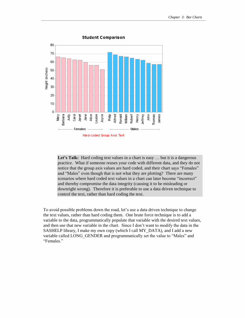
In the vertical orientation, you might notice that the “F” and “M” group axis labels have
lots of extra space, so let‟s go ahead and spell out the entire words “Females” and
“Males”. The quickest and easiest way to do that is to hard code the text values using
the VALUE= option of the group axis (AXIS3).
title1 "Student Comparison";
axis1 label=none value=(angle=90);
axis2 label=(angle=90 'Height (inches)')
minor=none offset=(0,0);
axis3 label=none value=('Females' 'Males');
pattern1 value=solid color=pink;
pattern2 value=solid color=cx42C0FB;
proc gchart data=sashelp.class;
vbar name / type=sum sumvar=height descending
autoref clipref cref=graydd coutline=gray99
group=sex subgroup=sex nolegend nozero
maxis=axis1 raxis=axis2 gaxis=axis3;
run;
Chapter 3: Bar Charts
Let’s Talk: Hard coding text values in a chart is easy … but it is a dangerous
practice. What if someone reuses your code with different data, and they do not
notice that the group axis values are hard coded, and their chart says “Females”
and “Males” even though that is not what they are plotting? There are many
scenarios where hard coded text values in a chart can later become “incorrect”
and thereby compromise the data integrity (causing it to be misleading or
downright wrong). Therefore it is preferable to use a data driven technique to
control the text, rather than hard coding the text.
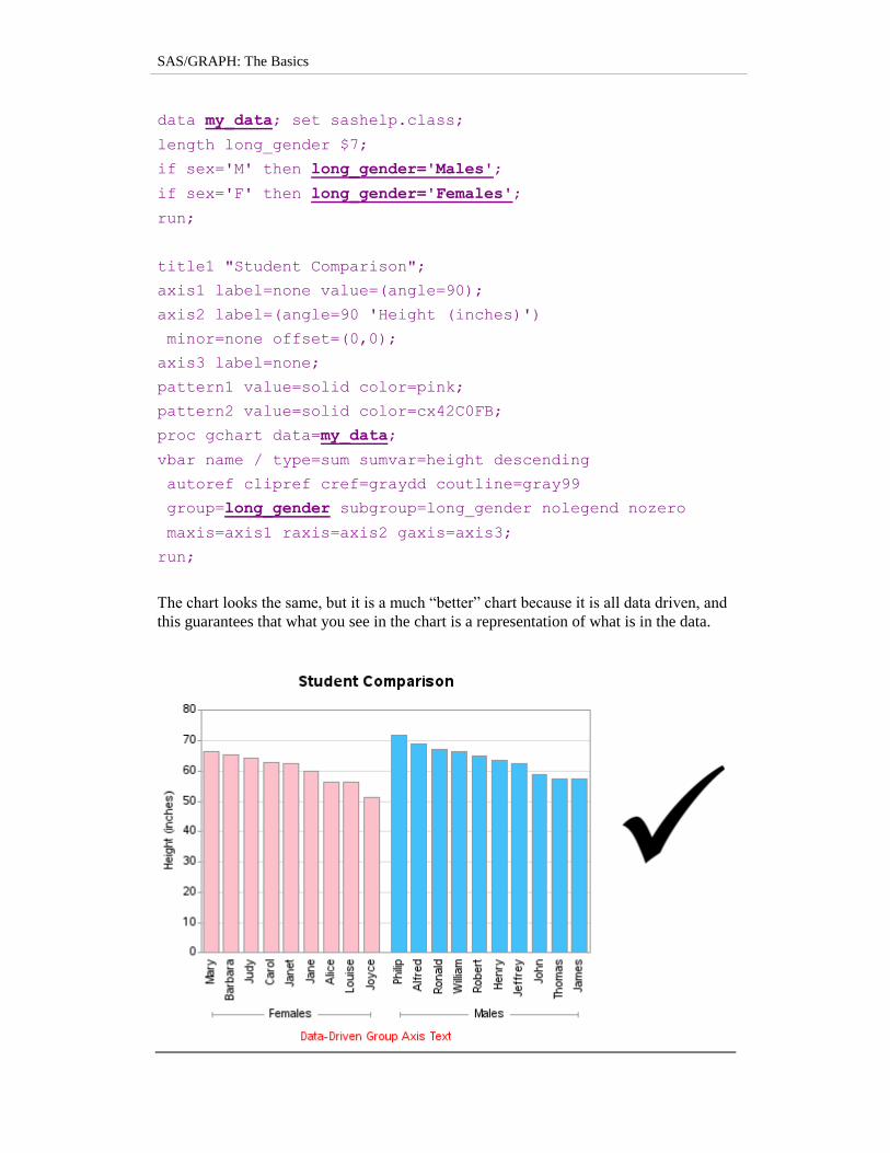
To avoid possible problems down the road, let‟s use a data driven technique to change
the text values, rather than hard coding them. One brute force technique is to add a
variable to the data, programmatically populate that variable with the desired text values,
and then use that new variable in the chart. Since I don‟t want to modify the data in the
SASHELP library, I make my own copy (which I call MY_DATA), and I add a new
variable called LONG_GENDER and programmatically set the value to “Males” and
“Females.”
SAS/GRAPH: The Basics
data my_data; set sashelp.class;
length long_gender $7;
if sex='M' then long_gender='Males';
if sex='F' then long_gender='Females';
run;
title1 "Student Comparison";
axis1 label=none value=(angle=90);
axis2 label=(angle=90 'Height (inches)')
minor=none offset=(0,0);
axis3 label=none;
pattern1 value=solid color=pink;
pattern2 value=solid color=cx42C0FB;
proc gchart data=my_data;
vbar name / type=sum sumvar=height descending
autoref clipref cref=graydd coutline=gray99
group=long_gender subgroup=long_gender nolegend nozero
maxis=axis1 raxis=axis2 gaxis=axis3;
run;
The chart looks the same, but it is a much “better” chart because it is all data driven, and
this guarantees that what you see in the chart is a representation of what is in the data.
Chapter 3: Bar Charts
Bar Chart with Dates
Beginners often have trouble with date values. Date values are stored as integer numbers
in the computer, and then a SAS date format is applied to make the numbers display as
the text strings that we humans recognize as a date. For example, December 1, 2005 is
stored as 16,771 – when you store the number 16,771 in a SAS data set, and apply the
DATE7. format, it displays as “01DEC05.” If you store your date values as strings, then
your axis will sort alphabetically rather than in the correct date order, therefore you
always want to store dates as true (numeric) date values rather than strings.
Let’s Talk: Since a bar chart has evenly-spaced bars, your data should contain
(approximately) evenly-spaced dates. If your data does not contain evenly-
spaced dates, and if it is important to have the date axis show the true
proportional distribution of the data over time, then a bar chart is not a good
choice (a GPLOT needle or line plot would be a better choice in that situation).
In this example, we will use the SASHELP.STOCKS sample data. This data set contains
a monthly snapshot (the first trading day of the month) of the high, low, and closing price
for several stocks from 1986 to 2005. It would be too crowded to try to plot all of this
data in a single bar chart, therefore we will plot a subset (just one year of one stock). We
will subset the data using the following WHERE= option when we specify the data set:
data=sashelp.stocks (where=(year(date)=2005 and stock='Intel')).
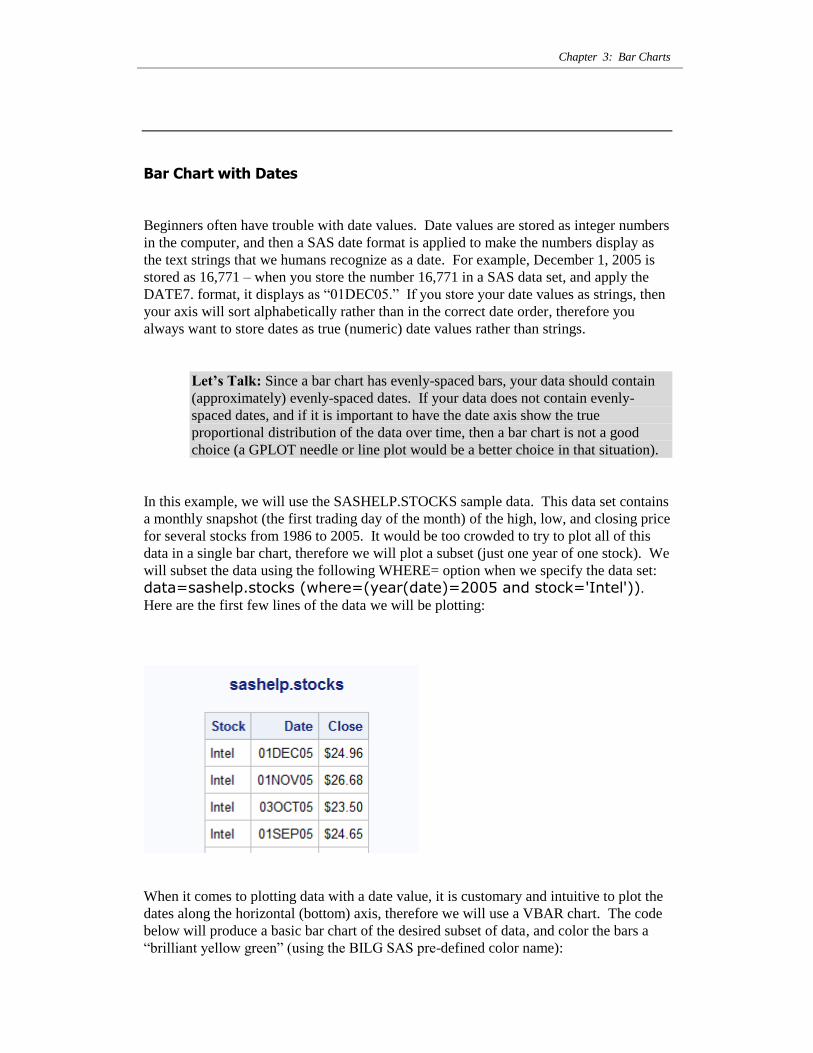
Here are the first few lines of the data we will be plotting:
When it comes to plotting data with a date value, it is customary and intuitive to plot the
dates along the horizontal (bottom) axis, therefore we will use a VBAR chart. The code
below will produce a basic bar chart of the desired subset of data, and color the bars a
“brilliant yellow green” (using the BILG SAS pre-defined color name):
SAS/GRAPH: The Basics
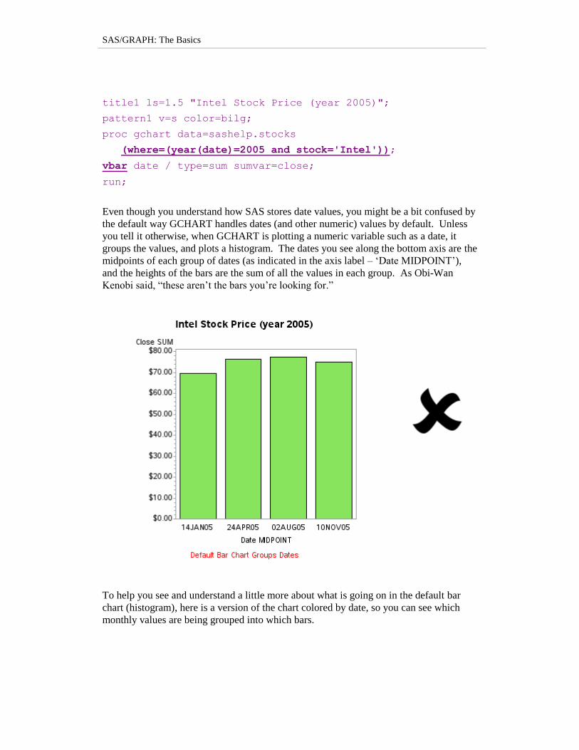
title1 ls=1.5 "Intel Stock Price (year 2005)";
pattern1 v=s color=bilg;
proc gchart data=sashelp.stocks
(where=(year(date)=2005 and stock='Intel'));
vbar date / type=sum sumvar=close;
run;
Even though you understand how SAS stores date values, you might be a bit confused by
the default way GCHART handles dates (and other numeric) values by default. Unless
you tell it otherwise, when GCHART is plotting a numeric variable such as a date, it
groups the values, and plots a histogram. The dates you see along the bottom axis are the
midpoints of each group of dates (as indicated in the axis label – „Date MIDPOINT‟),
and the heights of the bars are the sum of all the values in each group. As Obi-Wan
Kenobi said, “these aren‟t the bars you‟re looking for.”
To help you see and understand a little more about what is going on in the default bar
chart (histogram), here is a version of the chart colored by date, so you can see which
monthly values are being grouped into which bars.
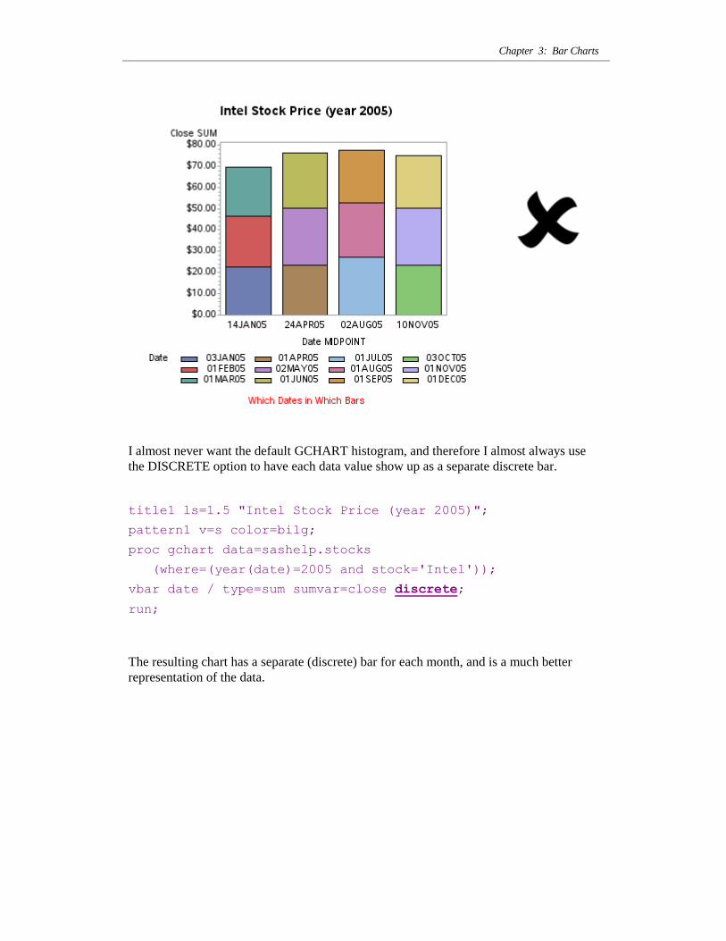
Chapter 3: Bar Charts
I almost never want the default GCHART histogram, and therefore I almost always use
the DISCRETE option to have each data value show up as a separate discrete bar.
title1 ls=1.5 "Intel Stock Price (year 2005)";
pattern1 v=s color=bilg;
proc gchart data=sashelp.stocks
(where=(year(date)=2005 and stock='Intel'));
vbar date / type=sum sumvar=close discrete;
run;
The resulting chart has a separate (discrete) bar for each month, and is a much better
representation of the data.
SAS/GRAPH: The Basics
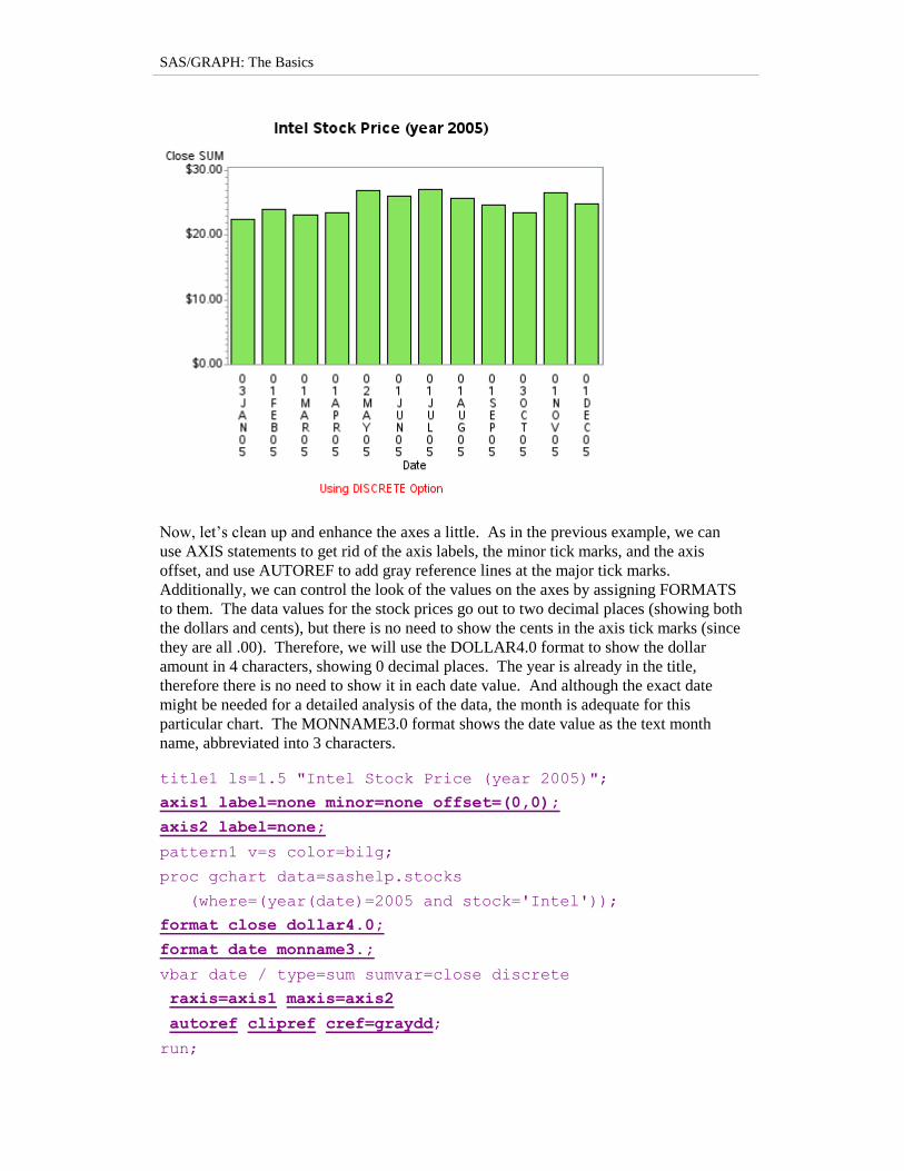
Now, let‟s clean up and enhance the axes a little. As in the previous example, we can
use AXIS statements to get rid of the axis labels, the minor tick marks, and the axis
offset, and use AUTOREF to add gray reference lines at the major tick marks.
Additionally, we can control the look of the values on the axes by assigning FORMATS
to them. The data values for the stock prices go out to two decimal places (showing both
the dollars and cents), but there is no need to show the cents in the axis tick marks (since
they are all .00). Therefore, we will use the DOLLAR4.0 format to show the dollar
amount in 4 characters, showing 0 decimal places. The year is already in the title,
therefore there is no need to show it in each date value. And although the exact date
might be needed for a detailed analysis of the data, the month is adequate for this
particular chart. The MONNAME3.0 format shows the date value as the text month
name, abbreviated into 3 characters.
title1 ls=1.5 "Intel Stock Price (year 2005)";
axis1 label=none minor=none offset=(0,0);
axis2 label=none;
pattern1 v=s color=bilg;
proc gchart data=sashelp.stocks
(where=(year(date)=2005 and stock='Intel'));
format close dollar4.0;
format date monname3.;
vbar date / type=sum sumvar=close discrete
raxis=axis1 maxis=axis2
autoref clipref cref=graydd;
run;
Chapter 3: Bar Charts
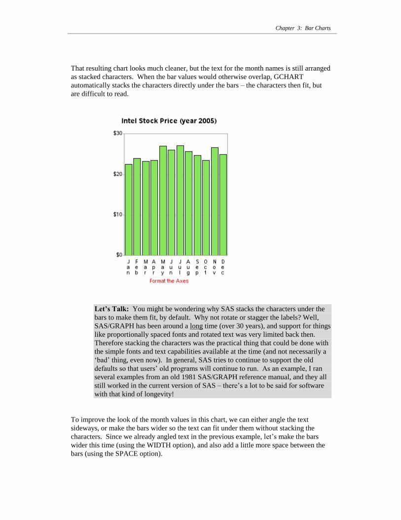
That resulting chart looks much cleaner, but the text for the month names is still arranged
as stacked characters. When the bar values would otherwise overlap, GCHART
automatically stacks the characters directly under the bars – the characters then fit, but
are difficult to read.
Let’s Talk: You might be wondering why SAS stacks the characters under the
bars to make them fit, by default. Why not rotate or stagger the labels? Well,
SAS/GRAPH has been around a long time (over 30 years), and support for things
like proportionally spaced fonts and rotated text was very limited back then.
Therefore stacking the characters was the practical thing that could be done with
the simple fonts and text capabilities available at the time (and not necessarily a
„bad‟ thing, even now). In general, SAS tries to continue to support the old
defaults so that users‟ old programs will continue to run. As an example, I ran
several examples from an old 1981 SAS/GRAPH reference manual, and they all
still worked in the current version of SAS – there‟s a lot to be said for software
with that kind of longevity!
To improve the look of the month values in this chart, we can either angle the text
sideways, or make the bars wider so the text can fit under them without stacking the
characters. Since we already angled text in the previous example, let‟s make the bars
wider this time (using the WIDTH option), and also add a little more space between the
bars (using the SPACE option).
SAS/GRAPH: The Basics
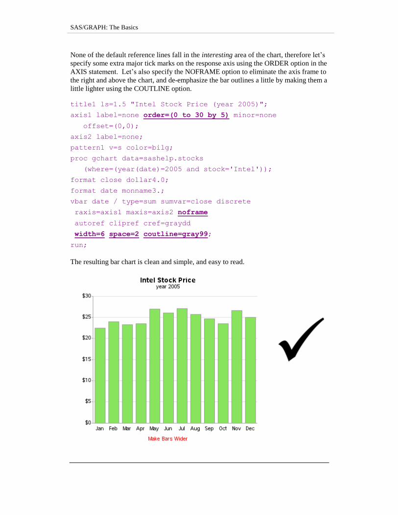
None of the default reference lines fall in the interesting area of the chart, therefore let‟s
specify some extra major tick marks on the response axis using the ORDER option in the
AXIS statement. Let‟s also specify the NOFRAME option to eliminate the axis frame to
the right and above the chart, and de-emphasize the bar outlines a little by making them a
little lighter using the COUTLINE option.
title1 ls=1.5 "Intel Stock Price (year 2005)";
axis1 label=none order=(0 to 30 by 5) minor=none
offset=(0,0);
axis2 label=none;
pattern1 v=s color=bilg;
proc gchart data=sashelp.stocks
(where=(year(date)=2005 and stock='Intel'));
format close dollar4.0;
format date monname3.;
vbar date / type=sum sumvar=close discrete
raxis=axis1 maxis=axis2 noframe
autoref clipref cref=graydd
width=6 space=2 coutline=gray99;
run;
The resulting bar chart is clean and simple, and easy to read.
Chapter 3: Bar Charts
Stacked Bar Chart
There are certain situations where a simple bar chart does not tell the whole story, or can
even be visually misleading. Let‟s explore that with some quarterly sales data. This
time, rather than using sample data from the SASHELP library, we‟ll embed the data in
the SAS code (this is a very useful technique which I encourage you to learn). The code
below creates a data set called MY_DATA, which contains the sales for each quarter in
the years 2010-2013. Note that the 2013 data is “year to date” and the Q4 value is not
available yet.
data my_data;
length Quarter $2;
input Year Quarter Sales;
datalines;
2010 Q1 5.0 2010 Q2 7.3 2010 Q3 6.2 2010 Q4 7.9 2011 Q1 6.5 2011 Q2 8.3 2011 Q3 6.1 2011 Q4 7.8 2012 Q1 7.1 2012 Q2 7.7 2012 Q3 6.3 2012 Q4 8.3 2013 Q1 7.3
2013 Q2 8.8 2013 Q3 10.7 ;
run;
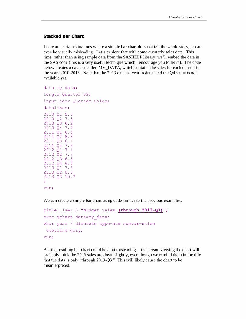
We can create a simple bar chart using code similar to the previous examples.
title1 ls=1.5 "Widget Sales (through 2013-Q3)";
proc gchart data=my_data;
vbar year / discrete type=sum sumvar=sales
coutline=gray;
run;
But the resulting bar chart could be a bit misleading -- the person viewing the chart will
probably think the 2013 sales are down slightly, even though we remind them in the title
that the data is only “through 2013-Q3.” This will likely cause the chart to be
misinterpreted.
SAS/GRAPH: The Basics
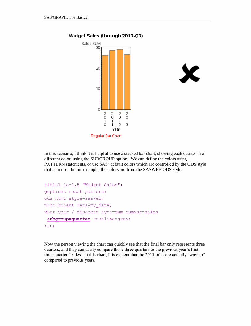
In this scenario, I think it is helpful to use a stacked bar chart, showing each quarter in a
different color, using the SUBGROUP option. We can define the colors using
PATTERN statements, or use SAS‟ default colors which are controlled by the ODS style
that is in use. In this example, the colors are from the SASWEB ODS style.
title1 ls=1.5 "Widget Sales";
goptions reset=pattern;
ods html style=sasweb;
proc gchart data=my_data;
vbar year / discrete type=sum sumvar=sales
subgroup=quarter coutline=gray;
run;
Now the person viewing the chart can quickly see that the final bar only represents three
quarters, and they can easily compare those three quarters to the previous year‟s first
three quarters‟ sales. In this chart, it is evident that the 2013 sales are actually “way up”
compared to previous years.
Chapter 3: Bar Charts
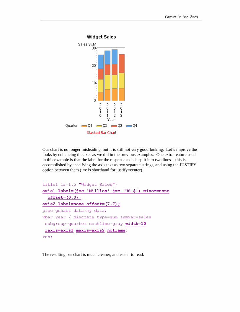
Our chart is no longer misleading, but it is still not very good looking. Let‟s improve the
looks by enhancing the axes as we did in the previous examples. One extra feature used
in this example is that the label for the response axis is split into two lines – this is
accomplished by specifying the axis text as two separate strings, and using the JUSTIFY
option between them (j=c is shorthand for justify=center).
title1 ls=1.5 "Widget Sales";
axis1 label=(j=c 'Million' j=c 'US $') minor=none
offset=(0,0);
axis2 label=none offset=(7,7);
proc gchart data=my_data;
vbar year / discrete type=sum sumvar=sales
subgroup=quarter coutline=gray width=10
raxis=axis1 maxis=axis2 noframe;
run;
The resulting bar chart is much cleaner, and easier to read.
SAS/GRAPH: The Basics
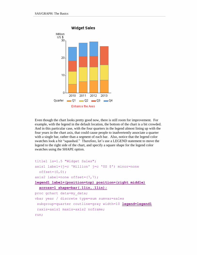
Even though the chart looks pretty good now, there is still room for improvement. For
example, with the legend in the default location, the bottom of the chart is a bit crowded.
And in this particular case, with the four quarters in the legend almost lining up with the
four years in the chart axis, that could cause people to inadvertently associate a quarter
with a single bar, rather than a segment of each bar. Also, notice that the legend color
swatches look a bit “squashed.” Therefore, let‟s use a LEGEND statement to move the
legend to the right side of the chart, and specify a square shape for the legend color
swatches using the SHAPE option.
title1 ls=1.5 "Widget Sales";
axis1 label=(j=c 'Million' j=c 'US $') minor=none
offset=(0,0);
axis2 label=none offset=(7,7);
legend1 label=(position=top) position=(right middle)
across=1 shape=bar(.11in,.11in);
proc gchart data=my_data;
vbar year / discrete type=sum sumvar=sales
subgroup=quarter coutline=gray width=10 legend=legend1
raxis=axis1 maxis=axis2 noframe;
run;
Chapter 3: Bar Charts
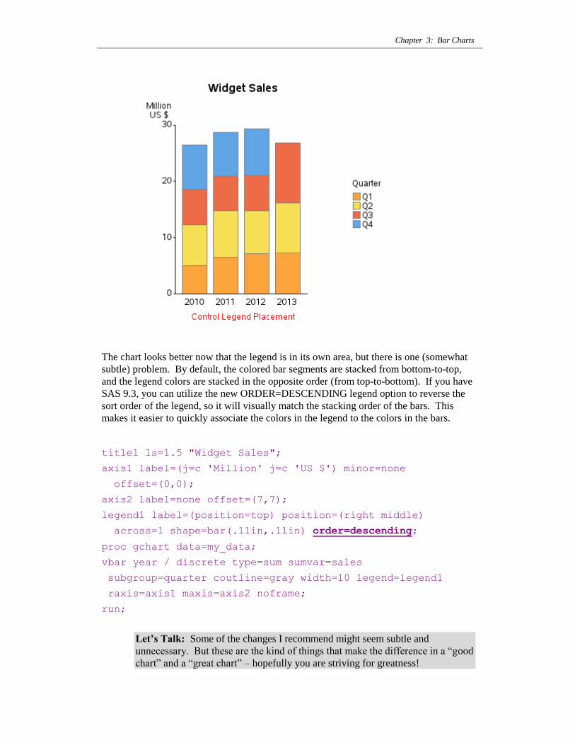
The chart looks better now that the legend is in its own area, but there is one (somewhat
subtle) problem. By default, the colored bar segments are stacked from bottom-to-top,
and the legend colors are stacked in the opposite order (from top-to-bottom). If you have
SAS 9.3, you can utilize the new ORDER=DESCENDING legend option to reverse the
sort order of the legend, so it will visually match the stacking order of the bars. This
makes it easier to quickly associate the colors in the legend to the colors in the bars.
title1 ls=1.5 "Widget Sales";
axis1 label=(j=c 'Million' j=c 'US $') minor=none
offset=(0,0);
axis2 label=none offset=(7,7);
legend1 label=(position=top) position=(right middle)
across=1 shape=bar(.11in,.11in) order=descending;
proc gchart data=my_data;
vbar year / discrete type=sum sumvar=sales
subgroup=quarter coutline=gray width=10 legend=legend1
raxis=axis1 maxis=axis2 noframe;
run;
Let’s Talk: Some of the changes I recommend might seem subtle and
unnecessary. But these are the kind of things that make the difference in a “good
chart” and a “great chart” – hopefully you are striving for greatness!
SAS/GRAPH: The Basics
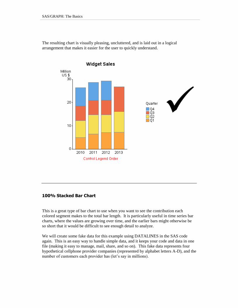
The resulting chart is visually pleasing, uncluttered, and is laid out in a logical
arrangement that makes it easier for the user to quickly understand.
100% Stacked Bar Chart
This is a great type of bar chart to use when you want to see the contribution each
colored segment makes to the total bar length. It is particularly useful in time series bar
charts, where the values are growing over time, and the earlier bars might otherwise be
so short that it would be difficult to see enough detail to analyze.
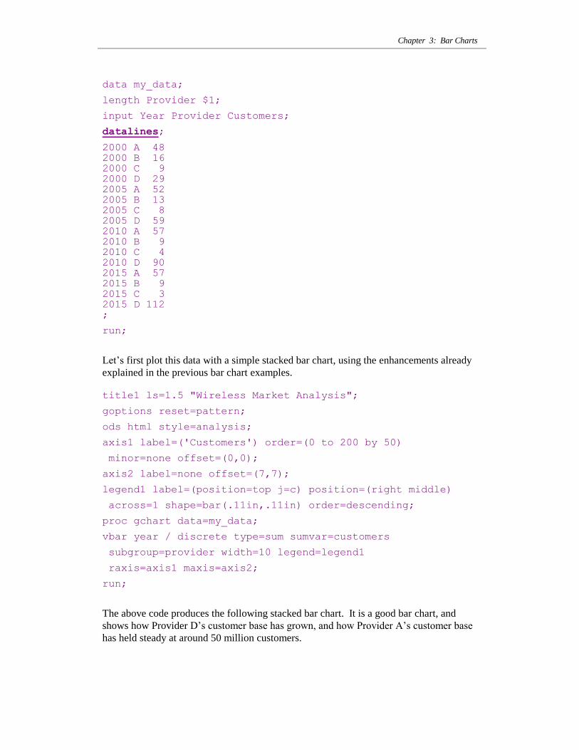
We will create some fake data for this example using DATALINES in the SAS code
again. This is an easy way to handle simple data, and it keeps your code and data in one
file (making it easy to manage, mail, share, and so on). This fake data represents four
hypothetical cellphone provider companies (represented by alphabet letters A-D), and the
number of customers each provider has (let‟s say in millions).
Chapter 3: Bar Charts
data my_data;
length Provider $1;
input Year Provider Customers;
datalines;
2000 A 48 2000 B 16 2000 C 9 2000 D 29 2005 A 52 2005 B 13 2005 C 8 2005 D 59 2010 A 57
2010 B 9 2010 C 4 2010 D 90 2015 A 57 2015 B 9 2015 C 3 2015 D 112 ;
run;
Let‟s first plot this data with a simple stacked bar chart, using the enhancements already
explained in the previous bar chart examples.
title1 ls=1.5 "Wireless Market Analysis";
goptions reset=pattern;
ods html style=analysis;
axis1 label=('Customers') order=(0 to 200 by 50)
minor=none offset=(0,0);
axis2 label=none offset=(7,7);
legend1 label=(position=top j=c) position=(right middle)
across=1 shape=bar(.11in,.11in) order=descending;
proc gchart data=my_data;
vbar year / discrete type=sum sumvar=customers
subgroup=provider width=10 legend=legend1
raxis=axis1 maxis=axis2;
run;
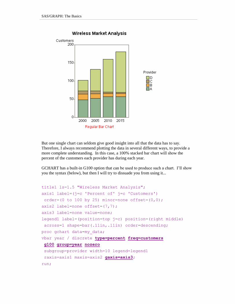
The above code produces the following stacked bar chart. It is a good bar chart, and
shows how Provider D‟s customer base has grown, and how Provider A‟s customer base
has held steady at around 50 million customers.
SAS/GRAPH: The Basics
But one single chart can seldom give good insight into all that the data has to say.
Therefore, I always recommend plotting the data in several different ways, to provide a
more complete understanding. In this case, a 100% stacked bar chart will show the
percent of the customers each provider has during each year.
GCHART has a built-in G100 option that can be used to produce such a chart. I‟ll show
you the syntax (below), but then I will try to dissuade you from using it...
title1 ls=1.5 "Wireless Market Analysis";
axis1 label=(j=c 'Percent of' j=c 'Customers')
order=(0 to 100 by 25) minor=none offset=(0,0);
axis2 label=none offset=(7,7);
axis3 label=none value=none;
legend1 label=(position=top j=c) position=(right middle)
across=1 shape=bar(.11in,.11in) order=descending;
proc gchart data=my_data;
vbar year / discrete type=percent freq=customers
g100 group=year nozero
subgroup=provider width=10 legend=legend1
raxis=axis1 maxis=axis2 gaxis=axis3;
run;

Chapter 3: Bar Charts
Notice that the syntax is a bit obscure and indirect. You have to use the GROUP option
to use G100, although you are not really creating what looks like a grouped bar chart
(and you must also specify a GAXIS to suppress the group axis labels and values). You
must use the FREQ option (which is not the most mnemonic option name in this case) to
identify a weight variable that the percents are to be based on. And then you must also
throw in the NOZERO option to get rid of all the zero-height bars that would otherwise
show up in all the zero height bars within the fake groups. It‟s not a bad chart, but the
options used to create it are just not intuitive in my opinion. (Did I mention that I will
soon be showing you a different way of producing this same chart?!?)
It‟s difficult to figure out the G100 syntax the first time you use it, but once you have a
working example it‟s not too bad. So, why do I still recommend you not use it? And
how do I recommend you create 100% stacked bar charts other than using G100? I
recommend pre-summarizing the data yourself, and then using a simple stacked
GCHART. One advantage is that you know exactly how the values are calculated.
Another advantage is that once you have the calculated values in your data set, you can
also include these values in tables and custom charttips (html hover text).
Let’s Talk: In general, I‟m a big fan of pre-calculating your statistics, rather than
letting gchart calculate them for you (… if you haven‟t already guessed that!)
There are several ways to pre-calculate such statistics in SAS, but I like doing it one step
at a time using PROC SQL and a data step. First, use sql to calculate the total number of
customers each year.
SAS/GRAPH: The Basics
proc sql;
create table my_data as
select *, sum(customers) as total_customers
from my_data
group by year;
quit; run;
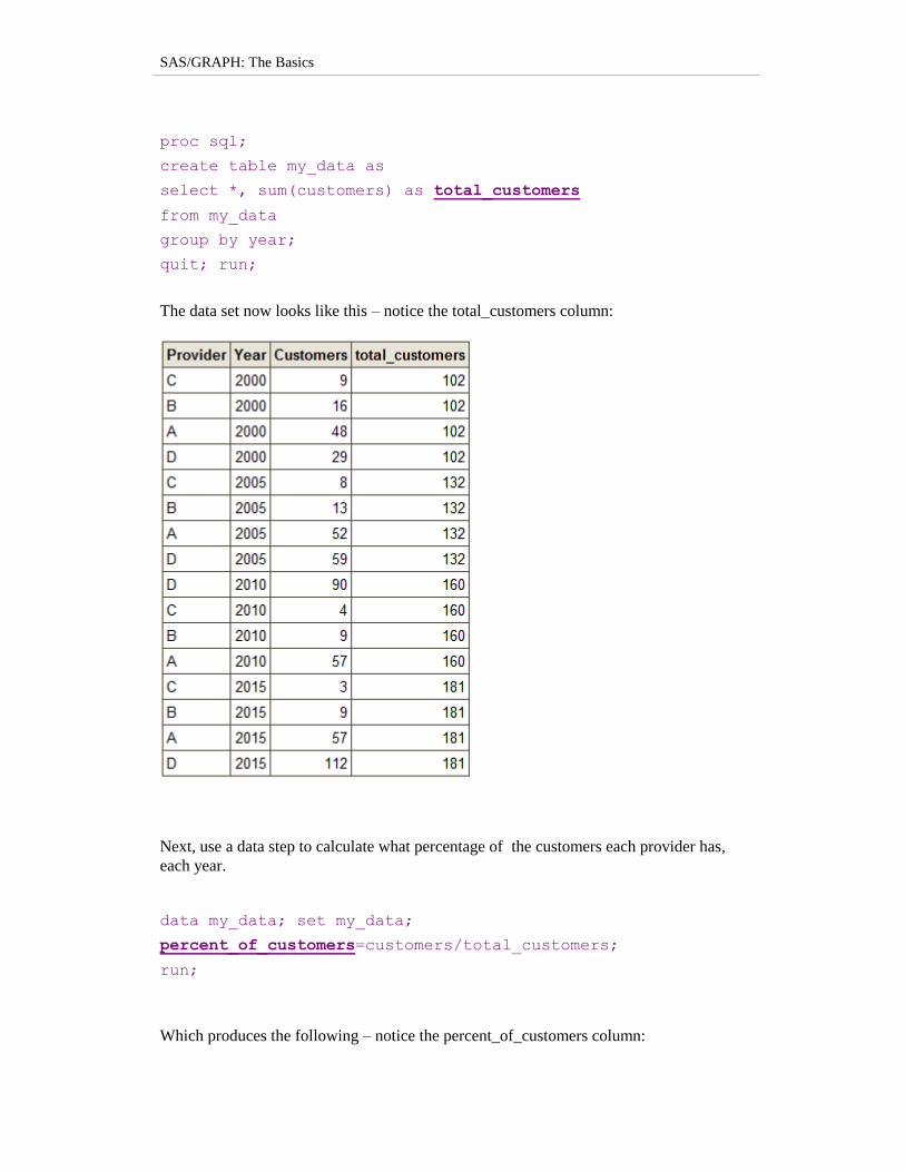
The data set now looks like this – notice the total_customers column:
Next, use a data step to calculate what percentage of the customers each provider has,
each year.
data my_data; set my_data;
percent_of_customers=customers/total_customers;
run;
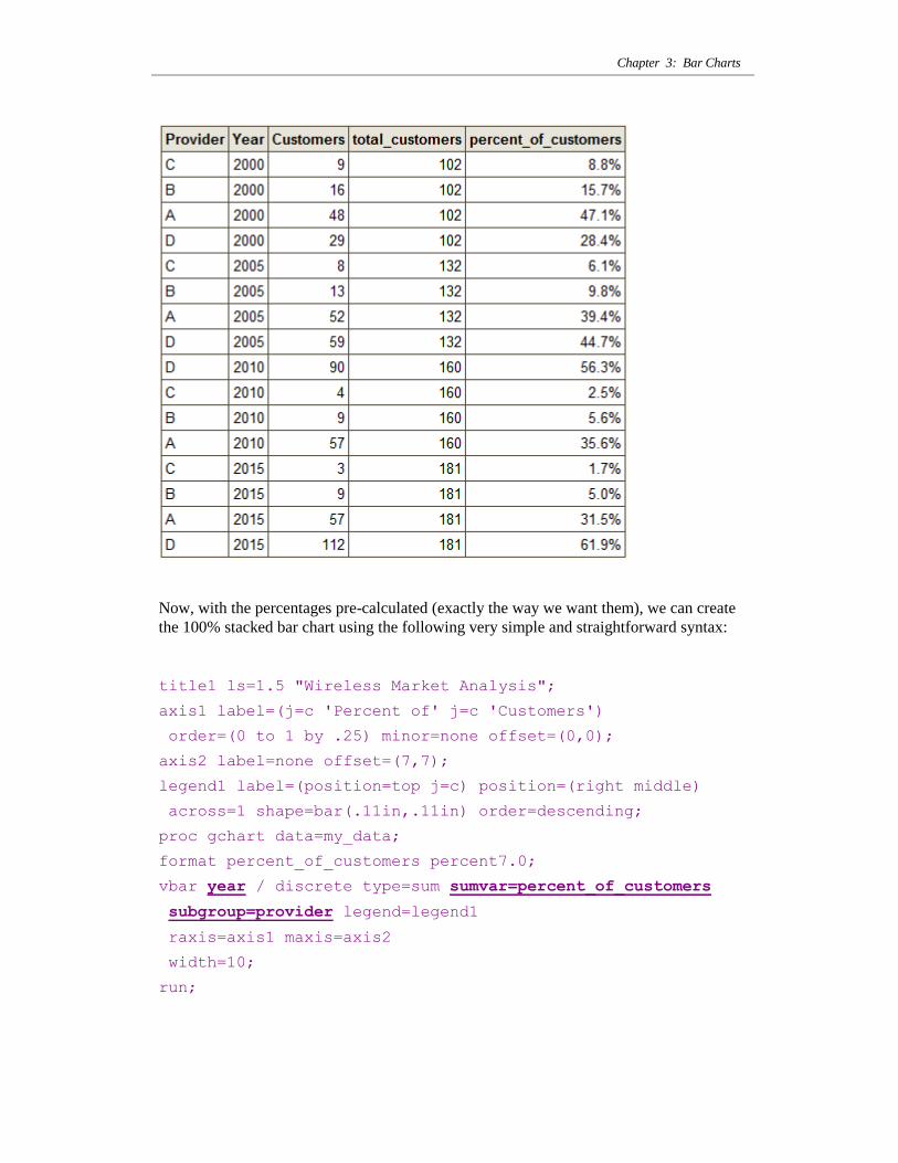
Which produces the following – notice the percent_of_customers column:
Chapter 3: Bar Charts
Now, with the percentages pre-calculated (exactly the way we want them), we can create
the 100% stacked bar chart using the following very simple and straightforward syntax:
title1 ls=1.5 "Wireless Market Analysis";
axis1 label=(j=c 'Percent of' j=c 'Customers')
order=(0 to 1 by .25) minor=none offset=(0,0);
axis2 label=none offset=(7,7);
legend1 label=(position=top j=c) position=(right middle)
across=1 shape=bar(.11in,.11in) order=descending;
proc gchart data=my_data;
format percent_of_customers percent7.0;
vbar year / discrete type=sum sumvar=percent_of_customers
subgroup=provider legend=legend1
raxis=axis1 maxis=axis2
width=10;
run;

SAS/GRAPH: The Basics
The above chart is still a little busy, so let‟s add a few finishing touches. I like to set the
spacing between the bars in this sort of chart to zero (SPACE=0), which joins all the bars
into a continuous area, and produces the visual effect similar to a stacked area-under-the-
curve chart. And with the bars being a continuous area, you no longer need the axis
frame (and can use the NOFRAME option to turn it off).
title1 ls=1.5 "Wireless Market Analysis";
axis1 label=(j=c 'Percent of' j=c 'Customers')
order=(0 to 1 by .25) minor=none offset=(0,0);
axis2 label=none offset=(7,7);
legend1 label=(position=top j=c) position=(right middle)
across=1 shape=bar(.11in,.11in) order=descending;
proc gchart data=my_data;
format percent_of_customers percent7.0;
vbar year / discrete type=sum sumvar=percent_of_customers
subgroup=provider legend=legend1
raxis=axis1 maxis=axis2
width=15 space=0 noframe;
run;
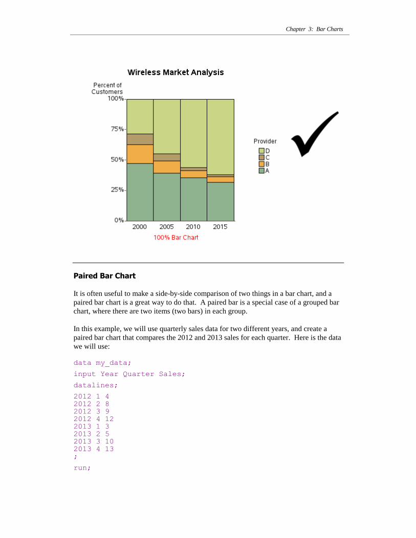
The finished chart is uncluttered, and shows the trends in the data well. Notice that
whereas the original chart showed Provider A as holding steady with their number of
customers, this chart dramatically shows how their % market share is declining. This just
goes to show that it‟s always good to plot your data in several different ways, to get the
whole story.
Chapter 3: Bar Charts
Paired Bar Chart
It is often useful to make a side-by-side comparison of two things in a bar chart, and a
paired bar chart is a great way to do that. A paired bar is a special case of a grouped bar
chart, where there are two items (two bars) in each group.
In this example, we will use quarterly sales data for two different years, and create a
paired bar chart that compares the 2012 and 2013 sales for each quarter. Here is the data
we will use:
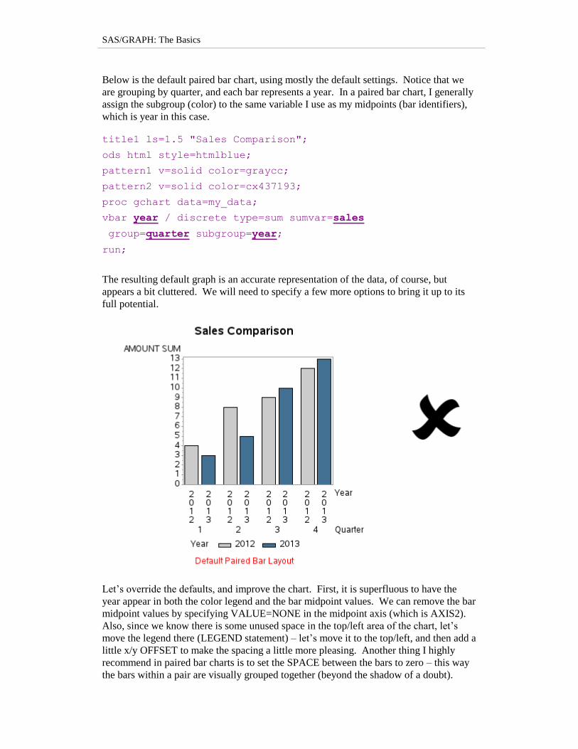
data my_data;
input Year Quarter Sales;
datalines;
2012 1 4 2012 2 8
2012 3 9 2012 4 12 2013 1 3 2013 2 5 2013 3 10 2013 4 13 ;
run;
SAS/GRAPH: The Basics
Below is the default paired bar chart, using mostly the default settings. Notice that we
are grouping by quarter, and each bar represents a year. In a paired bar chart, I generally
assign the subgroup (color) to the same variable I use as my midpoints (bar identifiers),
which is year in this case.
title1 ls=1.5 "Sales Comparison";
ods html style=htmlblue;
pattern1 v=solid color=graycc;
pattern2 v=solid color=cx437193;
proc gchart data=my_data;
vbar year / discrete type=sum sumvar=sales
group=quarter subgroup=year;
run;
The resulting default graph is an accurate representation of the data, of course, but
appears a bit cluttered. We will need to specify a few more options to bring it up to its
full potential.
Let‟s override the defaults, and improve the chart. First, it is superfluous to have the
year appear in both the color legend and the bar midpoint values. We can remove the bar
midpoint values by specifying VALUE=NONE in the midpoint axis (which is AXIS2).
Also, since we know there is some unused space in the top/left area of the chart, let‟s
move the legend there (LEGEND statement) – let‟s move it to the top/left, and then add a
little x/y OFFSET to make the spacing a little more pleasing. Another thing I highly
recommend in paired bar charts is to set the SPACE between the bars to zero – this way
the bars within a pair are visually grouped together (beyond the shadow of a doubt).

Chapter 3: Bar Charts
Control the axes and reference lines, as we‟ve done in previous examples.
title1 ls=1.5 "Sales Comparison";
pattern1 v=solid color=graycc;
pattern2 v=solid color=cx437193;
axis1 label=none order=(0 to 15 by 3) minor=none
offset=(0,0);
axis2 label=none value=none;
axis3 label=('Quarter') offset=(2,2);
legend1 label=none position=(top left inside) across=2
shape=bar(.12in,.12in) offset=(2,-4);
proc gchart data=my_data;
vbar year / discrete type=sum sumvar=sales
group=quarter subgroup=year
raxis=axis1 maxis=axis2 gaxis=axis3
width=9 space=0 gspace=4 coutline=white
autoref clipref cref=graydd
legend=legend1;
run;
With those few changes, the resulting bar chart looks so much better.
SAS/GRAPH: The Basics
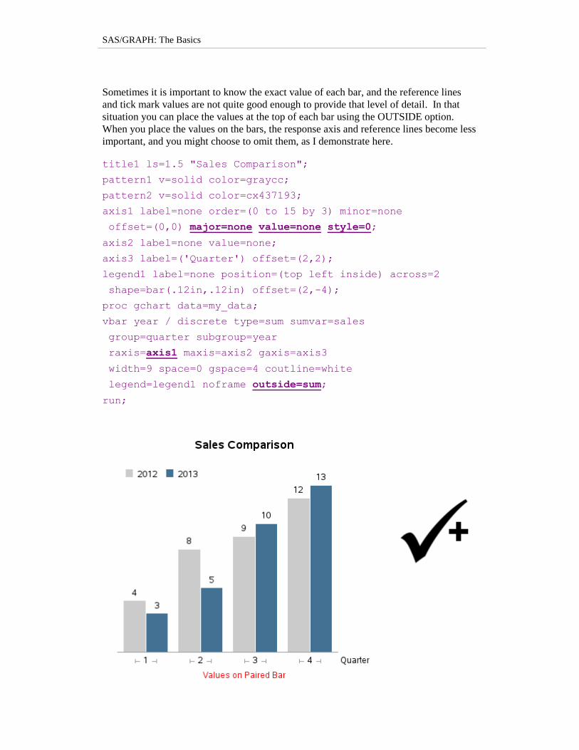
Sometimes it is important to know the exact value of each bar, and the reference lines
and tick mark values are not quite good enough to provide that level of detail. In that
situation you can place the values at the top of each bar using the OUTSIDE option.
When you place the values on the bars, the response axis and reference lines become less
important, and you might choose to omit them, as I demonstrate here.
title1 ls=1.5 "Sales Comparison";
pattern1 v=solid color=graycc;
pattern2 v=solid color=cx437193;
axis1 label=none order=(0 to 15 by 3) minor=none
offset=(0,0) major=none value=none style=0;
axis2 label=none value=none;
axis3 label=('Quarter') offset=(2,2);
legend1 label=none position=(top left inside) across=2
shape=bar(.12in,.12in) offset=(2,-4);
proc gchart data=my_data;
vbar year / discrete type=sum sumvar=sales
group=quarter subgroup=year
raxis=axis1 maxis=axis2 gaxis=axis3
width=9 space=0 gspace=4 coutline=white
legend=legend1 noframe outside=sum;
run;
Chapter 3: Bar Charts
Let’s Talk: The OUTSIDE option is very easy and convenient to use, but
sometimes GCHART will tell you that the values are too wide to fit. In that
case, you can try making the bars wider, but at some point you will probably
need to change your strategy and start using ANNOTATE to create your own
custom labels on the bars. Annotate will always let you add the text, whether
GCHART thinks you have enough room or not. You can also easily control the
size, color, font and format of the text, as well as rotate it, with annotate.
Bar-Line Chart
Sometimes you need to show two different things on a bar chart that cannot be plotted to
the same scale, and therefore cannot be plotted as a grouped (or paired) bar chart. In
such a case, you might consider plotting the data in 2 separate charts, or using a bar-line
chart.
For example, the data below contains ice cream sales and average temperature for each
month.
data my_data;
input Month Temperature Sales;
datalines;
1 40.5 1348 2 42.2 1305 3 49.2 1441 4 59.5 2195 5 67.4 2681 6 74.4 4003 7 77.5 8351 8 76.5 9228 9 70.6 6311 10 60.2 2284 11 50.0 1739 12 41.2 1832 ;
run;
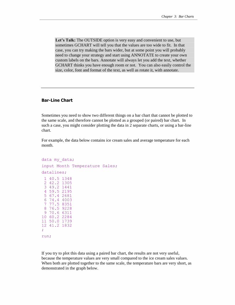
If you try to plot this data using a paired bar chart, the results are not very useful,
because the temperature values are very small compared to the ice cream sales values.
When both are plotted together to the same scale, the temperature bars are very short, as
demonstrated in the graph below.
SAS/GRAPH: The Basics
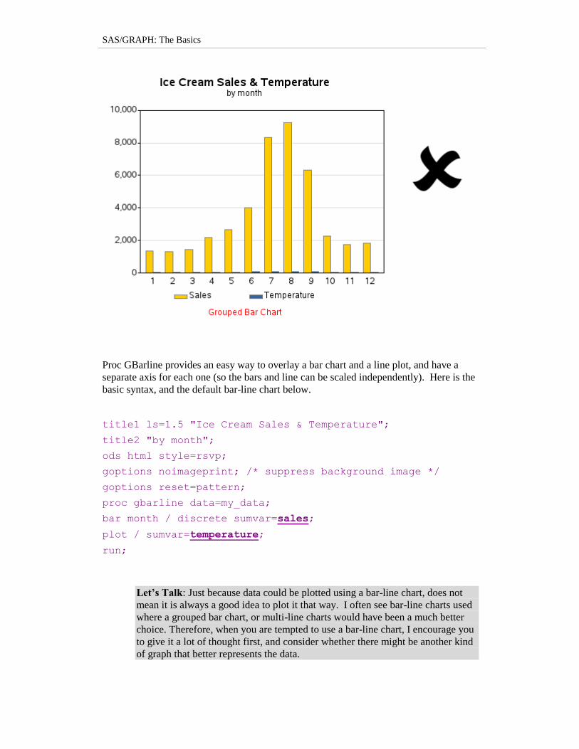
Proc GBarline provides an easy way to overlay a bar chart and a line plot, and have a
separate axis for each one (so the bars and line can be scaled independently). Here is the
basic syntax, and the default bar-line chart below.
title1 ls=1.5 "Ice Cream Sales & Temperature";
title2 "by month";
ods html style=rsvp;
goptions noimageprint; /* suppress background image */
goptions reset=pattern;
proc gbarline data=my_data;
bar month / discrete sumvar=sales;
plot / sumvar=temperature;
run;
Let’s Talk: Just because data could be plotted using a bar-line chart, does not
mean it is always a good idea to plot it that way. I often see bar-line charts used
where a grouped bar chart, or multi-line charts would have been a much better
choice. Therefore, when you are tempted to use a bar-line chart, I encourage you
to give it a lot of thought first, and consider whether there might be another kind
of graph that better represents the data.
Chapter 3: Bar Charts
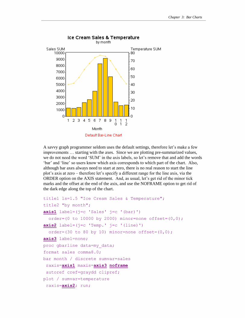
A savvy graph programmer seldom uses the default settings, therefore let‟s make a few
improvements … starting with the axes. Since we are plotting pre-summarized values,
we do not need the word „SUM‟ in the axis labels, so let‟s remove that and add the words
„bar‟ and „line‟ so users know which axis corresponds to which part of the chart. Also,
although bar axes always need to start at zero, there is no real reason to start the line
plot‟s axis at zero – therefore let‟s specify a different range for the line axis, via the
ORDER option on the AXIS statement. And, as usual, let‟s get rid of the minor tick
marks and the offset at the end of the axis, and use the NOFRAME option to get rid of
the dark edge along the top of the chart.
title1 ls=1.5 "Ice Cream Sales & Temperature";
title2 "by month";
axis1 label=(j=c 'Sales' j=c '(bar)')
order=(0 to 10000 by 2000) minor=none offset=(0,0);
axis2 label=(j=c 'Temp.' j=c '(line)')
order=(30 to 80 by 10) minor=none offset=(0,0);
axis3 label=none;
proc gbarline data=my_data;
format sales comma8.0;
bar month / discrete sumvar=sales
raxis=axis1 maxis=axis3 noframe
autoref cref=graydd clipref;
plot / sumvar=temperature
raxis=axis2; run;
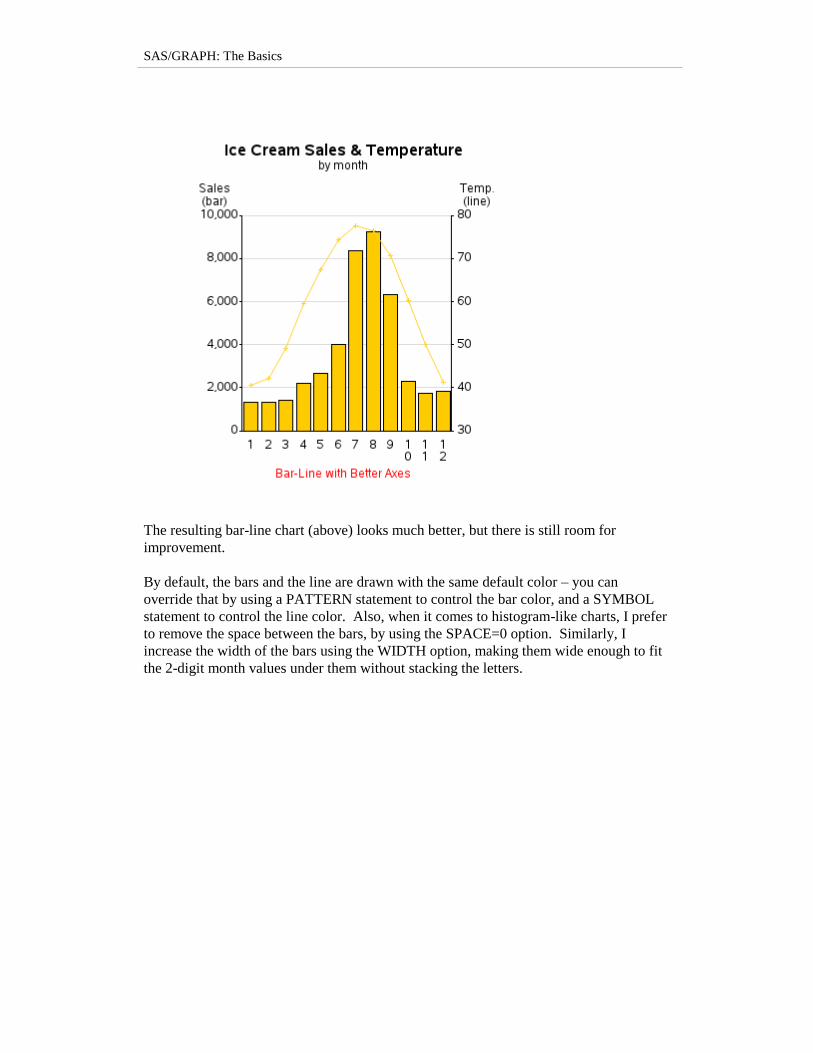
SAS/GRAPH: The Basics
The resulting bar-line chart (above) looks much better, but there is still room for
improvement.
By default, the bars and the line are drawn with the same default color – you can
override that by using a PATTERN statement to control the bar color, and a SYMBOL
statement to control the line color. Also, when it comes to histogram-like charts, I prefer
to remove the space between the bars, by using the SPACE=0 option. Similarly, I
increase the width of the bars using the WIDTH option, making them wide enough to fit
the 2-digit month values under them without stacking the letters.
Chapter 3: Bar Charts
title1 ls=1.5 "Ice Cream Sales & Temperature";
title2 "by month";
axis1 label=(j=c 'Sales' j=c '(bar)')
order=(0 to 10000 by 2000) minor=none offset=(0,0);
axis2 label=(j=c 'Temp.' j=c '(line)')
order=(30 to 80 by 10) minor=none offset=(0,0);
axis3 label=none;
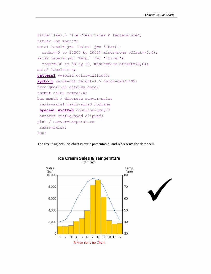
pattern1 v=solid color=cxffcc00;
symbol1 value=dot height=1.5 color=cx336699;
proc gbarline data=my_data;
format sales comma8.0;
bar month / discrete sumvar=sales
raxis=axis1 maxis=axis3 noframe
space=0 width=6 coutline=gray77
autoref cref=graydd clipref;
plot / sumvar=temperature
raxis=axis2;
run;
The resulting bar-line chart is quite presentable, and represents the data well.
SAS/GRAPH: The Basics
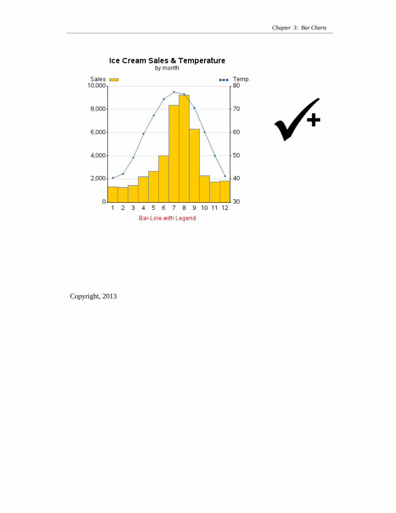
Here is an idea for one other possible enhancement. Let‟s assume that people who like
graphs generally do not like to read text. If you want to relieve the user from having to
read the text in the axis label (as in the graph above) to determine which axis
corresponds to the bars and which corresponds to the line, you can add “graphical
legends” for the axes.
In this variation of the code, I use LEGEND statements to place the legends in the top-
left and top-right of the graph area, and then use an OFFSET value to move them such
that they line up with the axis labels. I suppress the default legend text, and let the axis
labels suffice. The decision whether to use text labels or a graphical legend is a matter
of user-preference, but it is good to know how to use both techniques.
title1 ls=1.5 "Ice Cream Sales & Temperature";
title2 "by month";
axis1 label=('Sales')
order=(0 to 10000 by 2000) minor=none offset=(0,0);
axis2 label=('Temp.')
order=(30 to 80 by 10) minor=none offset=(0,0);
axis3 label=none;
pattern1 v=solid color=cxffcc00;
symbol1 value=dot height=1.5 color=cx336699;
legend1 label=none value=none
position=(top left inside) offset=(0,5);
legend2 label=none value=none
position=(top right inside) offset=(0,5);
proc gbarline data=my_data;
format sales comma8.0;
bar month / discrete sumvar=sales
raxis=axis1 maxis=axis3 noframe
space=0 width=6 coutline=gray77
autoref cref=graydd clipref
legend=legend1;
plot / sumvar=temperature
raxis=axis2 legend=legend2;
run;
Chapter 3: Bar Charts
Copyright, 2013