centaur s real-time graphic interface … cd centaur 5.1...introduction to centaur’s real-time...
TRANSCRIPT

CENTAUR’S REAL-TIME GRAPHIC INTERFACE V4.0OPERATOR’S MANUAL


TABLE OF CONTENTS
Installation ................................................................... 6
Introduction to Centaur’s real-Time Graphic Interface ................ 6Computer Requirements .............................................................. 7Operating System Requirements................................................... 7
Installing the Software........................................................... 7
Add-ins................................................................................ 7
Starting the Software............................................................. 8
Getting Started ............................................................. 9
Window Overview................................................................ 10Tree Window............................................................................ 10Event Window .......................................................................... 10Work Window........................................................................... 11Status Bar ............................................................................... 11File Toolbar.............................................................................. 11Align Toolbar............................................................................ 11Font Toolbar ............................................................................ 11Main Toolbar ............................................................................ 11Shape Toolbar.......................................................................... 11Grid ........................................................................................ 11
Project Overview................................................................. 11
Creating a Background......................................................... 12Using the Default Background .................................................... 12Using Microsoft® Paint .............................................................. 12Using a Background from Another Software.................................. 12
Starting a Project ................................................................ 13Using the New Project Wizard..................................................... 13Importing a Background Directly into Centaur’s Graphic Interface ... 13
Inserting and Defining Elements............................................ 13Snap to Grid ............................................................................ 14
Designing the Scene ............................................................ 15Adding a Scene ........................................................................ 15Deleting a Scene ...................................................................... 15
Linking to Devices ............................................................... 15
FRONTVIEW 1

Programming Actions........................................................... 16
Inserting and Defining Elements................................. 17
Creating, Defining and Deleting a Shape ................................ 18Creating Shapes ...................................................................... 18Defining a Shape...................................................................... 18
Deleting a Shape ................................................................ 18
Shape Properties: General Tab.............................................. 18Name ..................................................................................... 18Visible .................................................................................... 18Filled ...................................................................................... 18Line Width............................................................................... 19Default Colour ......................................................................... 19
Shape Properties: Device Tab ............................................... 19
Shape Properties: Actions Tab .............................................. 19
Creating, Defining and Deleting a Text Object ......................... 20Creating Text Objects ............................................................... 20Defining Text Objects ............................................................... 20Deleting a Text Object .............................................................. 20
Text Properties: General Tab ................................................ 20Name ..................................................................................... 20Text ....................................................................................... 20Visible Shape........................................................................... 20
Text Properties: Font Tab..................................................... 21
Text Properties: Device Tab.................................................. 21
Text Properties: Action Tab .................................................. 21
Creating, Defining and Deleting Buttons ................................. 22Bitmap Buttons - ............................................................................ 22Picture Buttons - ............................................................................ 22Event Buttons - .............................................................................. 22
Creating Buttons ...................................................................... 22Defining Buttons ...................................................................... 22Deleting a Button ..................................................................... 22
Bitmap Button Properties: General Tab .................................. 23Name ..................................................................................... 23Text ....................................................................................... 23
2 OPERATOR’S MANUAL

Has Text Check Box .................................................................. 23Text Positioning........................................................................ 23
Event Properties: General Tab............................................... 24Name...................................................................................... 24
Picture Properties: General Tab ............................................. 25Name...................................................................................... 25Visible..................................................................................... 25Path........................................................................................ 25Transparent Colour ................................................................... 25
Bitmap Button Properties: Button Style Tab ............................ 26Button Style............................................................................. 26
Bitmap Button Properties: Font Tab ....................................... 26
Event Properties (Event Buttons Only): Action Tab................... 27Not Linked To A Device.............................................................. 27Device Type ............................................................................. 27Device Name............................................................................ 27Device State ............................................................................ 28Adding an Event Button Action to a Device State........................... 28Editing an Event Button Action ................................................... 29Deleting an Event Button Action ................................................. 29Rearranging Assigned Event Button Actions.................................. 29Event Button Action Programming Example .................................. 30
Creating, Defining and Deleting an Icon Object........................ 31Creating Icon Objects................................................................ 31Defining Icon Objects ................................................................ 31Deleting Icon Objects ................................................................ 31
Icon Properties: General Tab ................................................ 32Name...................................................................................... 32Notes ...................................................................................... 32
Icon Properties: Device Tab .................................................. 32Not Linked To A Device.............................................................. 32Device Type ............................................................................. 32Device Name............................................................................ 32Device State ............................................................................ 32Flash....................................................................................... 32Status Icon .............................................................................. 33
Icon.............................................................................................. 33Transparent Colour ......................................................................... 33
Flash Icon................................................................................ 33Flash Icon...................................................................................... 33
FRONTVIEW 3

Transparent Colour.......................................................................... 34
Icon Properties: Actions Tab ................................................. 34
Common Element Property Tabs ................................. 36
Device Tab......................................................................... 37Not Linked To A Device ............................................................. 37Device Type ............................................................................ 37Device Name ........................................................................... 37Device State............................................................................ 37
Filled ............................................................................................. 37Flash ............................................................................................. 37Colour ........................................................................................... 38Flash Colour ................................................................................... 38Transparent ................................................................................... 38
Actions Tab ........................................................................ 38Mouse Over Object Action ................................................................ 39Mouse Leaves Object Action ............................................................. 39Left Mouse Down Action ................................................................... 39Left Mouse Up Action ....................................................................... 39Left Double Click Action ................................................................... 39
Assigning an Action .................................................................. 39Editing an Action...................................................................... 40Deleting an Action.................................................................... 40Rearranging Assigned Actions .................................................... 40
Font Tab ............................................................................ 41Font Box ................................................................................. 41Font Point Size......................................................................... 41Font Style ............................................................................... 41Font Colour ............................................................................. 41
Using Centaur’s Real-Time Graphic Interface.............. 43
Play Mode .......................................................................... 44Starting Play Mode - ................................................................ 44Full Screen - ........................................................................... 44Stopping Play Mode - ............................................................... 45
Security Options ................................................................. 45Enabling the Security Option...................................................... 45Changing a Security Password ................................................... 45Disabling the Security Option..................................................... 45
4 OPERATOR’S MANUAL

Default Project.................................................................... 45
Defining Events................................................................... 46
Event Window: Actions Tab .................................................. 48
Event Window: Display Tab .................................................. 49
Event Window: Filter Tab ..................................................... 50
Debug Events ..................................................................... 51
Scene Navigation Using The Link Wizard................................. 51
Index.......................................................................... 54
FRONTVIEW 5

CHAPTER 1: INSTALLATION
WHAT’S IN THIS CHAPTER• Installation requirements• How to install the software
Centaur’s real-time graphic interface software enables you to link any device (input, output, relay, etc.) in your system to a graphical representation. The graphics provide a visual tool to monitor and control the activity in your system. This chapter outlines this software’s features and explains how to install the software.
INTRODUCTION TO CENTAUR’S REAL-TIME
6 OPERATOR’S MANUAL

GRAPHIC INTERFACE
Centaur’s real-time graphic interface is included free of charge with the Centaur 4.0 Access Control software. For more information, speak to your local distributor or visit our website at www.CDVAmericas.com.
Computer RequirementsThe Centaur 4.0 Access Control software, along with Centaur’s real-time graphic interface software, is designed to operate with Microsoft Windows® and with IBM® or IBM® compatible computers.
• Pentium 800MHz or higher• Centaur 4.0 Access Control software• 256MB RAM (512 MB recommended)• 300MB free disk space (1GB recommended)• Network Card for connection (as required)• CD-ROM Drive required for installation• Super VGA Monitor
Operating System RequirementsCentaur’s real-time graphic interface software has been tested on the following operating system languages:
• Windows® 98 Second Edition (English and French)• Windows® 2000 Professional Edition (English, French and Spanish)• Windows® 2000 Server Edition (English, French and Dutch)• Windows® XP Pro (English and French)
If the operating system platform or language you are using to run Centaur’s real-time graphic interface is not listed above, please contact CDV Americas for an updated list.
INSTALLING THE SOFTWARE
Centaur’s real-time graphic interface software installs automatically with the Centaur 4.0 Access Control software. For more information on installing the Centaur 4.0 Access Control software, refer to the Centaur 4.0 Installation Manual.
ADD-INS
Upon request, CDV Americas can add other software programs to Centaur’s real-time graphic interface software, such as Microsoft Speech Application Programming Interface Software (SAPI 5.0). On the Options menu, click Addins and then select the desired program. Enabled Add-in programs will appear on the Options menu and may have features or options available to program.
FRONTVIEW 7

STARTING THE SOFTWARE
1. Make sure the Centaur Service Manager and the MSDE or SQL Server are running on the computer where the Centaur software is installed. If they are not, click Start Programs CDV AMERICAS Centaur Centaur Service Manager. The Centaur Service Manager window will appear. Click Start/Continue. When the server is running you can close the Centaur Service Manager window. Please note that the SQL Server will automatically be started when you start the Centaur Service Manager.
2. From the computer where the Centaur software is installed, click Start Programs CDV AMERICAS Centaur Administration Console FrontView. The Welcome to FrontView window will open.
3. Select one of the options and follow the on-screen instructions. For details about each option, see "Getting Started" on page 9.
4. When the Logon window appears, type the appropriate Logon ID and Password. Centaur’s real-time graphic interface uses the same Logon ID and Password that is used for the Centaur 4.0 Access Control software. The default Logon ID and Password is Admin. If you are trying to logon to another workstation on the network, type the computer’s network name in the Computer box. Click OK. For details on creating Logon IDs and Passwords, refer to the Centaur Reference Manual.
5. When the Select Site window appears, select an access control site from the Site box. Click OK.
8 OPERATOR’S MANUAL

CHAPTER 2: GETTING STARTED
WHAT’S IN THIS CHAPTER?• Overview• Displaying toolbars and windows• Building a project• Creating a background• Using Microsoft® Paint• Creating a scene
Centaur’s real-time graphic interface uses events generated in Centaur to help you see changes in the status of the devices in your Centaur Access Control system as they occur. Only Centaur’s real-time graphic interface features are explored in this manual. Details of Centaur’s features can be found in the Centaur Reference Manual. This chapter provides an overview of Centaur’s real-time graphic interface and explains how to create a scene and build a project.
FRONTVIEW 9

WINDOW OVERVIEW
Centaur’s real-time graphic interface window includes several toolbars and windows to help you create your projects. From the View menu on the Menu bar, click the options to show or hide the toolbars or windows.
Figure 2-1: Window overview
Tree WindowThe Tree window displays the current project’s scenes and elements. To modify the scene, right-click the project, scene or element in the Tree window. Click the Explorer tab at the bottom of the window to list all of the project’s scenes and any elements that have been inserted into each scene. Click the Scenes tab at the bottom of the window to display all the scenes in the project. Although the scenes will be shown, inserted elements will not.
Event WindowThe Event window displays the events that occur in Centaur and in Centaur’s real-time graphic interface window. This will enable the user to troubleshoot the Work window, such as to make sure that the object is correctly linked to the desired device.
File toolbar
Treewindow
Workwindow
Align toolbar
Status bar Event window
Shapetoolbar
Gridlines
Font toolbar
Main toolbarMenu bar
10 OPERATOR’S MANUAL

Work WindowThe Work window displays the current project’s floor plans and is where all additions and modifications will be performed. This window is where elements will be placed, defined and possibly linked to devices in the Centaur system. The Work window is also where the floor plan will be viewed when in Play mode.
Status BarThe Status bar displays what is occurring in the Work window or provides a description of the highlighted feature.
File ToolbarThe File toolbar includes shortcuts for New Project, Open, Save, Cut, Copy, Paste and About FrontView.
Align ToolbarThe Align toolbar includes buttons to align elements along their left sides, right sides, tops or bottoms. To display the Align toolbar, click View and then Align Toolbar.
Font ToolbarUse the Font toolbar to select the font, the size and font style (bold, italics and underline) of text displayed in the Work window. Click View and then Font Toolbar to display the toolbar.
Main ToolbarUse the Main toolbar to start or stop Play mode as well as adding elements (shapes, buttons and icon objects) to the Work window. Add new scenes to your project as well by clicking the Scene icon in the Main toolbar. Click View and then Main Toolbar to display the toolbar.
Shape ToolbarUse the Shape toolbar to add shapes (Ex.: squares, circles, etc.) to the Work window. Click View and then Shape Toolbar to display the toolbar.
GridThe Grid provides a visual reference to draw or align objects manually over the background and to define the area available where objects can be placed. Click View and then Grid to display the grid.
PROJECT OVERVIEW
The first step is to determine the backgrounds you will require. A background is the layout of a protected area with the permanent elements drawn out (i.e. walls, machinery, stairways, etc.). Once the background is created, it is imported into Centaur’s real-time graphic interface and used to create a scene. A scene consists of elements representing the devices in the system drawn over the background and
FRONTVIEW 11

interactive elements used to perform actions or to navigate Centaur’s real-time graphic interface. A project can consist of one to several scenes.
Example: Each project can be an access control site and each floor of the site can be a scene.
CREATING A BACKGROUND A background is a diagram of a protected area with the walls, machinery, stairways and other permanent fixtures drawn out. The entire background should fit in the Work window so you can view the entire scene without using the scroll bars.
Using the Default BackgroundCentaur’s real-time graphic interface includes five blank, coloured backgrounds. You can draw the walls and other permanent fixtures on the default backgrounds from the Work window. Refer to "Starting a Project" on page 13.
Using Microsoft® PaintMicrosoft Paint is a graphics editing program included with Microsoft® Windows. It is a simple software useful for creating basic images. Use the tools in the toolbox to draw the layout of the protected area, such as the walls, windows, elevators, etc.
Using a Background from Another SoftwareYou can create backgrounds using the software of your choice:
• Use a drawing program to design a background• Scan pictures or floorplans• Use Print Screen to paste an image into Paint
Whichever method you use, save the file as a bitmap (.bmp) in the same directory as Centaur’s real-time graphic interface in the template folder (ex.: C:\Program Files\CDV AMERICAS\FrontView\Template).
How do I create a background in Paint?1. Click the Windows Start button, point to Programs, point to
Accessories and click Paint.2. Use the tools to draw the layout of the protected area.3. Click File.4. Click Save As and save the file as a bitmap (.bmp) in the same
directory as Centaur’s real-time graphic interface in the template folder (ex.: C:\Program Files\CDV AMERICAS\FrontView\Template).
12 OPERATOR’S MANUAL

STARTING A PROJECT
You begin setting up a project by importing a background or backgrounds into Centaur’s real-time graphic interface.
Using the New Project WizardThe New Project Wizard will guide you step-by-step in the importing of a background into the project.
Importing a Background Directly into Centaur’s Graphic Inter-faceA background can be imported directly into Centaur’s real-time graphic interface window without launching the New Project Wizard.
INSERTING AND DEFINING ELEMENTS
Insert elements using either the Main or Shape toolbars (refer to Figure 2-1 on page 10). Each element has features that determine how the elements appear in the Work window and/or during Play mode (page 43). The design of the elements are set by tabs in the Properties windows of the shapes, text objects, Bitmap Buttons, Event Buttons and Picture Buttons. Right-click the element and click Properties or double-
How do I import a background into Centaur’s real-time graphic interface?1. Open Centaur’s real-time graphic interface (see “Starting the Software”
on page 8). In the Welcome to FrontView window, click Run the New Project Wizard. Click OK.
2. Click Next.3. In the Number of Scenes box, select the number of scenes to be
included in the project. Click Next.4. Select a background in the Select Template box. Click Next.5. Type the project’s name in the Project Name box. A default path where
the project will be saved appears in the Project Directory box. To change the path, click to clear the Use Default Directory check box and enter a new path. Click Next.
6. Click Finish.
How do I import a background into Centaur’s real-time graphic interface??1. Open Centaur’s real-time graphic interface (see “Starting the Software”
on page 8). In the Welcome to FrontView window, click Create an empty project. Click OK.
2. Right-click Project.cml in the Tree window. Click Add Scene.3. In the Name box, label the scene as desired.4. In the Background File box, type the path where the background is
saved or click the [...] button to choose another path.5. Click OK.
FRONTVIEW 13

click the element to open the element’s Properties window. For more information on determining the properties of an element, refer to "Inserting and Defining Elements" on page 17.
Figure 2-2: Overview of the Elements
Snap to GridThis feature forces elements to align automatically to a point on the grid. The element will attach itself to the grid whenever the element is moved. The grid must be enabled in order for this feature to work (refer to "Grid" on page 11 for more information on the Grid feature).
The Grid feature must be enabled in order for the Snap to Grid feature to function.
How do enable the Snap to Grid feature?1. Click Options from the Options menu. The Options window will
appear.2. Click the General tab.3. Select the Snap to Grid check box to enable the feature.4. Click OK.
Picture ButtonEvent Button
Text ObjectBitmap Button
Shapes
Icon Button
14 OPERATOR’S MANUAL

DESIGNING THE SCENE
After you import a background into Centaur’s real-time graphic interface, you set up the elements on the background. The elements are the shapes, text objects and buttons (Bitmap, Event and Picture) placed on the background to represent the objects, devices or to preform actions. For more information on the elements, refer to "Inserting and Defining Elements" on page 17.
Adding a SceneA project can contain more than one scene. Right-click a scene entry in the Tree window (page 10) and click Add Scene or click the Scene icon in the Main toolbar (page 11) to add another scene.
Deleting a SceneRight-click a scene entry in the Tree window (page 10) and click Delete Scene to delete the desired scene.
LINKING TO DEVICES
Some elements can be associated with devices in your Centaur system and programmed to display the state of those devices through their Device tabs in the Properties windows. These elements can change colour, flash, appear or disappear depending on the condition of the associated device. For more information on which elements can be linked to a device refer to "Inserting and Defining Elements" on page 17.
Figure 2-3: Example of an Element displaying a Device’s State
Door 1 is open.
The rectangular shape has turned green because Door 1 in the Centaur system has been opened after an Access Granted.
Partial view of scene’s floor plan in Play mode.
FRONTVIEW 15

Example: A rectangle shape is linked to Door 1 in Centaur and programmed to turn green when the door opens after an “Access Granted” event.
You must be in Play mode to show the states of linked devices as they occur.
For more information on how to link an element to a device, refer to "Inserting and Defining Elements" on page 17.
PROGRAMMING ACTIONS
An action is a user-initiated operation that can program an element to perform certain pre-determined tasks in Centaur’s real-time graphic interface or in the Centaur Access Control system. An action uses the mouse to initiate an operation. For example, double-clicking the left button of the mouse on an element unlocks a locked door in the Centaur system. Elements can be used to navigate between scenes, manipulate other elements, generate a reaction, display the Status window or activate/deactivate a device in Centaur. For more information refer to "Inserting and Defining Elements" on page 17.
How do I link an element to a device?1. Right-click the element and click Properties.2. On the Device tab, deselect the Not linked to a device check box.3. In the Device type box, select the desired type of device.4. In the Device name box, select the specific device from your Centaur
system.5. Select a state in the Device state box.6. Set the colour and other options to determine how the element will react
when the device enters that state.7. Return to Step 5 to select another state and continue until all the states
are set as desired.8. Click OK.
How do I assign an action?1. Right-click the element and click Properties or double-click the
element.2. In the Actions tab, click a mouse operation (e.g.: Mouse Over Object).3. Click the Add button. The Actions Wizard window will appear.4. From the Action Wizard window, select an action from the Action list
and then click Next.5. Select the desired element to be affected by the action from the Object
list and click Next.6. Click Finish.7. To add another action, repeat steps 2 to 6.
16 OPERATOR’S MANUAL
CHAPTER 3: INSERTING AND DEFINING ELEMENTS
WHAT’S IN THIS CHAPTER?• Creating, Defining and Deleting Shapes• Shape Property Tabs• Creating, Defining and Deleting Text Objects• Text Object Property Tabs• Creating, Defining and Deleting Buttons• Button Property Tabs
Each element (such as shapes and text objects) in Centaur’s real-time graphic interface can be configured to perform certain actions and/or be displayed in certain ways. Some elements can also be linked to devices in the Centaur system.
FRONTVIEW 17

CREATING, DEFINING AND DELETING A SHAPE
Creating ShapesShapes are a collection of geometrical objects that can be used to represent devices (doors, relays, inputs, outputs, controllers) or to perform actions. To link the shape to a device, refer to "Linking to Devices" on page 15. To link the shape to an action, refer to "Programming Actions" on page 16.
Defining a ShapeDefine an existing shape by right-clicking the shape and selecting Properties or by double-clicking the shape. The Shape Properties window will appear. Click on a tab and enter the desired data for the shape.
DELETING A SHAPE
Right-click the desired shape and click Delete or select the desired shape and then press the [Delete] key on your computer keyboard.
SHAPE PROPERTIES: GENERAL TAB
NameThe Name text box identifies the shape in the Tree window (see “Tree Window” on page 10). Click in the Name text box and type the name of shape as you want it to appear in the Tree window.
VisibleThe Visible check box determines whether the shape appears in the Work window when Play mode is activated. When the Visible check box is not selected, the shape will remain hidden and can only be made to appear through a user-initiated action (see “Programming Actions” on page 16).
FilledThe Filled check box only affects the appearance of the shape if it is not linked to a device. The colour of a shape not linked to a device is determined by the Default Colour box (see below). When the Filled check box is selected, the programmed colour is applied to the shape’s area during Play mode. When the Filled check box is not selected, the shape remains as an outline.
How do I create a shape?1. Click a shape from the Main or Shapes toolbars.2. Click where you want the shape to appear. 3. Use the sizing handles to adjust the size of the shape.
18 OPERATOR’S MANUAL

Line WidthThe Line Width box determines the thickness of the outline of the shape in the Work window and during Play mode. Click the Line Width box and select a point size.
Default ColourShapes in the Work window and shapes that are not linked to a device while in Play mode remain in the programmed default colour (see “Linking to Devices” on page 15). Click the Default Colour box to select a colour.
Figure 3-1: General Tab in the Shape Properties window
SHAPE PROPERTIES: DEVICE TAB
This tab defines a shape’s link to a device in your Centaur system. For information on programming this tab, refer to "Device Tab" on page 36.
SHAPE PROPERTIES: ACTIONS TAB
This tab programs user-initiated actions using mouse operations. For information on programming this tab, refer to "Actions Tab" on page 37.
FRONTVIEW 19

CREATING, DEFINING AND DELETING A TEXT OBJECT
Creating Text ObjectsText objects are words or phrases placed in the Work window that can be used to represent devices (doors, relays, inputs, outputs, controllers) or to perform actions. To link the text objects to a device, refer to "Linking to Devices" on page 15. To program the text objects to perform an action, refer to "Programming Actions" on page 16.
Defining Text ObjectsDefine an existing text object by right-clicking the text object and selecting Properties or by double-clicking the text object. The Text Properties window will appear. Click on a tab and enter the desired data for the text object.
Deleting a Text ObjectRight-click the desired text object and click Delete or select the desired text object and then press the [Delete] key on your keyboard.
TEXT PROPERTIES: GENERAL TAB
NameThe Name text box identifies the text object in the Tree window (see “Tree Window” on page 10). Click in the Name text box and type the name of text object as you want it to appear in the Tree window.
TextThis text box identifies the text object in the Work window and in Play mode. For example, if “door 1” was entered into the Text text box, it will appear as “door 1” in the Work window and during Play mode.
Visible ShapeThe Visible Shape check box determines whether the text object appears in the Work window when Play mode is activated. When the Visible Shape check box is not selected, the text object will remain hidden and can only be made to appear through a user-initiated action (see “Programming Actions” on page 16).
How do I create a text object?1. Click the Text button from the Main toolbar.2. Click where you want the text object to appear.
20 OPERATOR’S MANUAL

Figure 3-2: General Tab in Text Properties window
TEXT PROPERTIES: FONT TAB
This tab determines the font type, size, style and colour that the text object will be displayed as in the Work window. For information on programming this tab, refer to "Font Tab" on page 40.
TEXT PROPERTIES: DEVICE TAB
This tab defines a text object’s link to a device in your Centaur system. For information on programming this tab, refer to "Device Tab" on page 36.
TEXT PROPERTIES: ACTION TAB
This tab programs user-initiated actions using mouse operations. For information on programming this tab, refer to "Actions Tab" on page 37.
FRONTVIEW 21

CREATING, DEFINING AND DELETING BUTTONS
Buttons are used to perform actions, such as change scenes, open another program or control a device in your Centaur system. Centaur’s real-time graphic interface provides three button types (see Figure 2-2 on page 14):
Bitmap Buttons - A Bitmap Button is a miniature bitmap with text. You can select one of several bitmap images and change the button’s text through its Properties window. To program the Bitmap Button to perform an action, refer to "Programming Actions" on page 16.
Picture Buttons - A Picture Button is any bitmap image (.bmp) that you can import into Centaur’s real-time graphic interface, such as your company logo, pictures or graphics. To program the Picture Button to perform an action, refer to "Programming Actions" on page 16.
Event Buttons - An Event Button is a special button represented by an exclamation point. To program the Event Button to perform an action, refer to "Programming Actions" on page 16.
Creating Buttons
Defining ButtonsDefine an existing button by right-clicking the button and selecting Properties or by double-clicking the button. The relevant Properties window will appear. Click on a tab and enter the desired data for the button.
Deleting a ButtonRight-click the desired button and click Delete or select the desired button and then press the [Delete] key on your computer keyboard.
How do I create a button?1. Click the Bitmap, Picture or Event Button from the Main toolbar.2. Click where you want the button to appear.
22 OPERATOR’S MANUAL

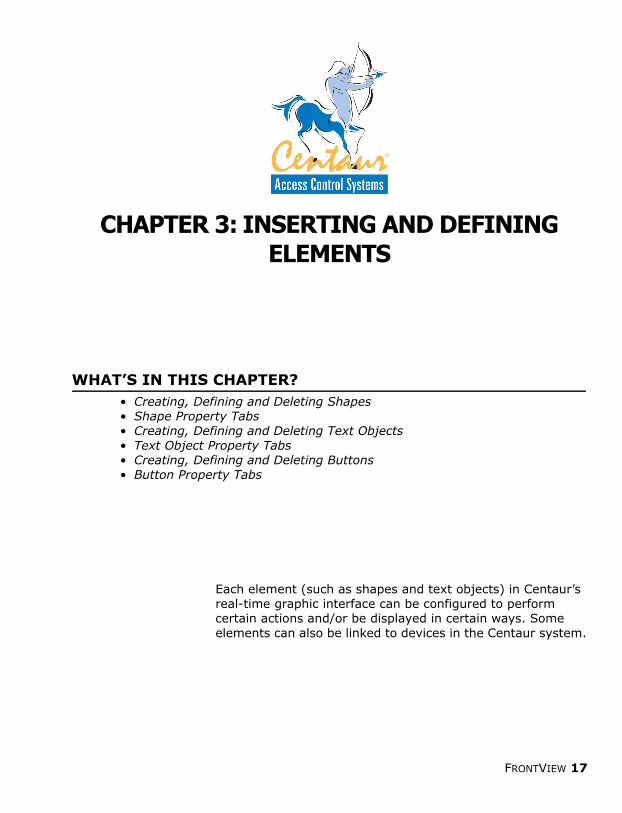
BITMAP BUTTON PROPERTIES: GENERAL TAB
This programming tab applies to Bitmap Buttons only.
NameThe Name text box identifies the Bitmap Button in the Tree window (see “Tree Window” on page 10). Click in the Name text box and type the name of Bitmap Button as you want it to appear in the Tree window.
TextThis text box identifies the Bitmap Button in the Work window and in Play mode. For example, if “door 1” was entered into the Text text box, it will appear as “door 1” in the Work window and during Play mode.
The Has Text check box must be selected if the writing from the Texttext box is to be displayed in the Work window.
Has Text Check BoxThe Has Text check box determines whether the writing in the Text text box (see above) will appear in the Work window and when in Play mode. Select the check box (a check mark will be displayed in the check box) if you wish the text of the Bitmap Button to be displayed.
Text PositioningThe Bitmap Button’s text can be displayed on the right or on the left of the image. To position the text to the left of the image, click Left of image. To position the text to the right of the image, click Right of Image.
The Has Text check box must be selected in order to use the textpositioning option buttons.
FRONTVIEW 23
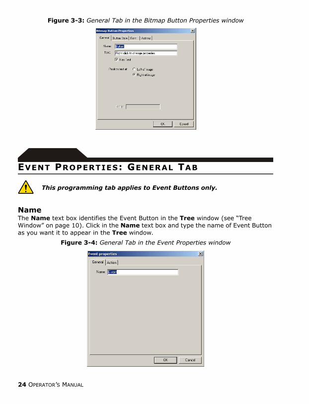
Figure 3-3: General Tab in the Bitmap Button Properties window
EVENT PROPERTIES: GENERAL TAB
This programming tab applies to Event Buttons only.
NameThe Name text box identifies the Event Button in the Tree window (see “Tree Window” on page 10). Click in the Name text box and type the name of Event Button as you want it to appear in the Tree window.
Figure 3-4: General Tab in the Event Properties window
24 OPERATOR’S MANUAL

PICTURE PROPERTIES: GENERAL TAB
This programming tab applies to Picture Buttons only.
NameThe Name text box identifies the Picture Button in the Tree window (see “Tree Window” on page 10). Click in the Name text box and type the name of Picture Button as you want it to appear in the Tree window.
VisibleThe Visible check box determines whether the Picture Button appears in the Work window when Play mode is activated. When the Visible check box is not selected, the Picture Button will remain hidden and can only be made to appear through a user-initiated action (see “Programming Actions” on page 16).
PathType in the path in the Path text box or click the Browse button to find the path of the bitmap image that the Picture Button will display.
Transparent ColourEach bitmap image that is used with a Picture Button has a background colour as seen in Paint or any other graphic software. Click the Transparent Colour box and select the colour that matches the background colour as seen in the graphic software. For images using a white background or found with Centaur’s real-time graphic interface, use the default colour (blue).
Figure 3-5: General Tab in the Picture Button Properties window
FRONTVIEW 25

BITMAP BUTTON PROPERTIES: BUTTON STYLE TAB
This programming tab applies to Bitmap Buttons only.
Button StyleThe Bitmap Button’s image can be one of six images. The image can be of a Controller, a Bulb, a Pale Blue Dot, a Black Oval, a Red Dot or a Black Triangle. Select a button style image from the drop-down list.
Figure 3-6: Bitmap Button Styles
BITMAP BUTTON PROPERTIES: FONT TAB
This programming tab applies to Bitmap Buttons only.
This tab determines the font type, size, style and colour that the Bitmap Button will be displayed as in the Work window. For information on programming this tab, refer to "Font Tab" on page 40.
26 OPERATOR’S MANUAL

BITMAP BUTTON AND PICTURE PROPERTIES: ACTIONS TAB
This programming tab can be found in the Properties window ofBitmap Buttons and Picture Buttons.
This tab programs user-initiated actions using mouse operations. For information on programming this tab, refer to "Actions Tab" on page 37.
EVENT PROPERTIES (EVENT BUTTONS ONLY): ACTION TAB
The Action tab can only be found in the Event Button Propertieswindow.
Unlike the actions of other elements (refer to "Actions Tab" on page 37 for more information), the action of an Event Button is device-initiated instead of user-initiated. An Event Button’s action is determined by the state of a device. Therefore the Event Button must be linked to a device (refer to "Linking to Devices" on page 15 for information on linking to a device).
Not Linked To A DeviceIf the Not linked to a device check box is selected (a checkmark is displayed in the check box), the Event Button is not linked to any devices from your Centaur system. If the Not linked to a device check box is deselected, the Event Button can be linked to a device. For more information on linking to a device, refer to "Linking to Devices" on page 15.
Device TypeIf the Event Button is to be linked to a device, select the type of device (such as doors, relays, etc.) from the Device Type drop-down list that the button is to be linked to (refer to "Not Linked To A Device" on page 36 for more information).
The Not linked to a device check box must be deselected in order toprogram the device type.
Device NameIf an Event Button is to be linked to a device and a device type has been selected (see above), click the Device Name box and select the specific device the button is to be linked to (refer to "Not Linked To A Device" on page 36 for more information).
FRONTVIEW 27

The Not linked to a device check box must be deselected in order toprogram the specific device.
Device StateClick the Device State box to view all the device states (e.g.: Closed and Locked) the Centaur devices can experience. Each state can be assigned an action. Click the Device State box and select a device state to assign an action. Actions can be started in two ways: when a device enters a state and when it leaves a state.
Adding an Event Button Action to a Device State
Any device operation displayed in bold has an action assigned to it. Double-click the bolded mouse operation to view what actions have been assigned to it.
More than one action can be applied to a device state. For example, entering a device state can be programmed to hide an element in the Work window but can also be programmed to lock an unlocked door in the Centaur system.
How do I Add an Event Button Action to a Device State?1. Right-click the Event Button and select Properties or double-click the
desired Event Button.2. Click the Action tab.3. Click the Device State box and select a device state.4. Highlight a device operation (Entering State or Leaving State) and
click the Add button.5. From the Action Wizard window, select an action from the Action list
and then click Next.6. Select the desired element to be affected by the action from the Object
list and click Next.7. Click Finish.8. To add another action, repeat steps 3 to 7.
28 OPERATOR’S MANUAL

Editing an Event Button Action
Deleting an Event Button Action
Rearranging Assigned Event Button ActionsThe order in which actions are displayed under a device operation can be changed.
How do I Edit an Event Button Action?1. Right-click the desired Event Button and select Properties or double-
click the desired Event Button.2. Click the Actions tab.3. Click the Device State box and select a device state.4. Double-click a bolded device operation to display the action(s) assigned
to it.5. Highlight an action and click the Edit button.6. From the Action Wizard window, select an action from the Action list
and then click Next.7. Select the desired element to be affected by the action from the Object
list and click Next.8. Click Finish.9. To edit another action, repeat steps 3 to 8.
How do I Delete an Event Button Action?1. Right-click the desired Event Button and select Properties or double-
click the desired Event Button.2. Click the Actions tab.3. Click the Device State box and select a device state.4. Double-click a bolded device operation to display the action(s) assigned
to it.5. Highlight an action and click the Delete button.6. To delete another action, repeat steps 3 to 5.
How do I Rearrange Assigned Event Button Actions?1. Right-click the Event Button and select Properties or double-click the
desired Event Button.2. Click the Actions tab.3. Click the Device State box and select a device state.4. Double-click a bolded device operation to display the action(s) assigned
to it and highlight the desired action.5. To move the action up in the order click the Move Up button. To move
the action down in the order, click the Move Down button.6. To move another action, repeat steps 3 and 4.
FRONTVIEW 29

Event Button Action Programming ExampleA user wishes to program an Event Button to display the words “Alert - Door 1 Forced” (a text object) whenever door 1 in the Centaur system is forced and once the forced door is restored, for the text object to disappear. The user must perform the following:
1. The user creates an Event Button by clicking the Event Button icon and clicking where in the Work window the button is to be placed.
2. The user then right-clicks the Event Button and clicks Properties. The Event Properties window appears.
3. In the General tab, a name is typed into the Name text box and then the Action tab is clicked.
4. The Event Button must now be linked to door 1 of the Centaur system. The user starts by deselecting the Not linked to a device check box. Then Door is selected from the Device Type box and then door 1 from Device name box.
5. The user starts to assign an action by first selecting Forced from the Device State box.
6. The user then highlights Entering State and clicks the Add button. The Action Wizard window appears. The user selects Show Object from the Action box and clicks Next. The user then selects Alert - Door 1 Forced from the Object box and clicks Next. The user then clicks Finish to exit. The action now appears under Entering State.
7. The user then highlights Leaving State and clicks the Add button. The Action Wizard window appears. The user selects Hide Object from the Action box and clicks Next. The user then selects Alert - Door 1 Forced from the Object box and clicks Next. The user then clicks Finish to exit. The action now appears under Leaving State.
Whenever Centaur’s real-time graphic interface is in Play mode and when door 1 is forced open, the words “Alert - Door 1 Forced” will appear and then disappear when the forced door is closed.
30 OPERATOR’S MANUAL
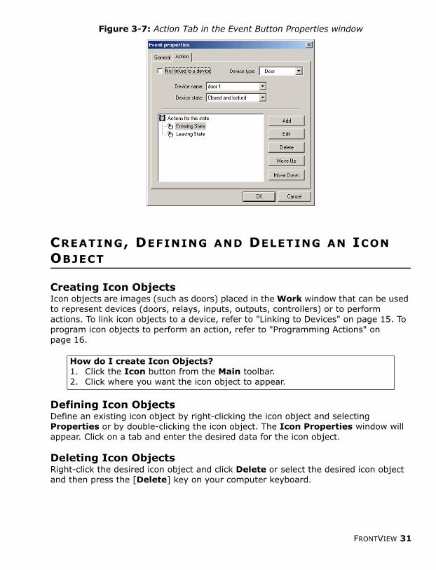
Figure 3-7: Action Tab in the Event Button Properties window
CREATING, DEFINING AND DELETING AN ICON OBJECT
Creating Icon ObjectsIcon objects are images (such as doors) placed in the Work window that can be used to represent devices (doors, relays, inputs, outputs, controllers) or to perform actions. To link icon objects to a device, refer to "Linking to Devices" on page 15. To program icon objects to perform an action, refer to "Programming Actions" on page 16.
Defining Icon ObjectsDefine an existing icon object by right-clicking the icon object and selecting Properties or by double-clicking the icon object. The Icon Properties window will appear. Click on a tab and enter the desired data for the icon object.
Deleting Icon ObjectsRight-click the desired icon object and click Delete or select the desired icon object and then press the [Delete] key on your computer keyboard.
How do I create Icon Objects?1. Click the Icon button from the Main toolbar.2. Click where you want the icon object to appear.
FRONTVIEW 31

ICON PROPERTIES: GENERAL TAB
NameThe Name text box identifies the icon object in the Tree window (see “Tree Window” on page 10). Click in the Name text box and type the name of the icon object as you want it to appear in the Tree window.
NotesUse the Notes text box to enter notes or information concerning the icon object. Click in the Notes text box and type your desired notes or information.
ICON PROPERTIES: DEVICE TAB
The Device tab in an icon object’s Properties window determines whether the icon is linked to devices in your Centaur system and defines how the icon will display the state of the device.
Not Linked To A DeviceThis check box determines whether the icon object is linked to any devices from the Centaur system. Refer to "Not Linked To A Device" on page 36 for more information on this feature.
Device TypeIf the icon is to be linked to a device, this box determines what device the icon is linked to. Refer to "Device Type" on page 36 for more information.
Device NameIf the icon is to be linked to a device and a device type has been selected (see above), this box determines the specific device the icon object is linked to. Refer to "Device Name" on page 36 for more information.
Device StateThis box determines how a device’s state (e.g.: “Door Forced Open”) will be displayed in Centaur’s real-time graphic interface. Refer to "Device State" on page 36 for more information.
FlashSelect the Flash check box and click OK to have the icon object flash when the linked device enters the programmed device state.
32 OPERATOR’S MANUAL

Status IconThis section determines what image will be displayed for each device state. For example, an image of a closed door can be used to display an access door that is closed and locked.
IconSelect what image will be used to represent a device state. Centaur’s real-time graphic interface comes with some default images that can be found within the real-time graphic interface directory or you can use some custom made images. Please note that the image must be a bitmap image (*.bmp). To load the desired image:
Only bitmap images (*.bmp) are accepted by Centaur’s real-time graphic interface.
Transparent ColourEach bitmap image that is used with an icon object has a background colour as seen in Paint or any other graphic software. Click the Transparent Colour box and select the colour that matches the background colour as seen in the graphic software. For images using a white background or found with Centaur’s real-time graphic interface, use the default colour (blue).
Flash IconThis section determines what image will be displayed for each device state when programmed to flash. For example, an image of an open door can be used to flash when a closed door is opened without access being granted.
The Flashing checkbox must be enabled in order to access theFlash Icon section (see “Flash” on page 32).
Flash IconSelect what image will be used to flash when a particular device state occurs. Centaur’s real-time graphic interface comes with some default images that can be found within the graphic interface’s directory or you can use some custom made images. Please note that the image must be a bitmap image (*.bmp). To load the desired image:
How do I load an image to represent a device state?1. Double-click the desired icon object.2. Click the Device tab.3. Select the desired device state from the Device State box.
4. Click the button next to the Icon box, select the desired image and click Open.
5. Repeat steps 3 and 4 to program the image for another device state.
FRONTVIEW 33

Only bitmap images (*.bmp) are accepted by Centaur’s real-time graphic interface.
Transparent ColourEach bitmap image that is used with an icon object has a background colour as seen in Paint or any other graphic software. Click the Transparent Colour box and select the colour that matches the background colour as seen in the graphic software. For images using a white background or found with Centaur’s real-time graphic interface, use the default colour (blue).
Figure 3-8: Device Tab in the Icon Properties window
ICON PROPERTIES: ACTIONS TAB
This tab programs user-initiated actions using mouse operations. For information on programming this tab, refer to "Actions Tab" on page 37.
How do I load an image to represent a device state?1. Double-click the desired icon object.2. Click the Device tab.3. Select the desired device state from the Device State box.4. Select the Flashing check box.
5. Click the button next to the Flash Icon box, select the desired image and click Open.
6. Repeat steps 3 and 4 to program the flashing image for another device state.
34 OPERATOR’S MANUAL

CHAPTER 4: COMMON ELEMENT PROPERTY TABS
WHAT’S IN THIS CHAPTER?• Defining the Device tab• Defining the Actions tab • Defining the Font tab
The Device, Actions and Font tabs are property tabs that are shared by more than one element. The Device tab determines an element’s relationship with a Centaur device. The Actions tab defines user-initiated actions using certain mouse operations. The Font tab defines how the text of some elements will be displayed either in the Work window, in Play mode or in both.
FRONTVIEW 35

DEVICE TAB
The Device tab in an element’s Properties window determines whether the element is linked to devices in your Centaur system and defines how the element will display the state of the device.
Not Linked To A DeviceIf the Not linked to a device check box is selected (a checkmark is displayed in the check box), the element is not linked to any devices from your Centaur system. If the Not linked to a device check box is deselected, the element can be linked to a device. For more information on linking an element shape to a device, refer to "Linking to Devices" on page 15.
Device TypeIf the element is to be linked to a device, click the Device Type box and select the type of device (such as doors, relays, etc.) the element is to be linked to (refer to "Linking to Devices" on page 15 for more information).
The Not linked to a device check box must be deselected in order toprogram the device type.
Device NameIf an element is to be linked to a device and a device type has been selected (see above), click the Device Name box and select the specific device the element is to be linked to (refer to "Linking to Devices" on page 15 for more information).
The Not linked to a device check box must be deselected in order toprogram the device type.
Device StateClick the Device State box to view all the device states (e.g.: “Closed and Locked”) the Centaur devices can experience. Each state has default settings programmed on how the linked element will display the device state. Click the Device State box and select a device state to change the default settings.
Filled Select the Filled check box (a checkmark is displayed in the check box), to have the programmed colour applied to the element when it enters the programmed device state. Deselect the Filled check box to have the element remain as an outline. When finished, click OK.
When the element is linked to a device, the Filled check box (page 18) in the General tab is ignored.
FlashSelect the Flash check box and click OK to have the element flash when the
36 OPERATOR’S MANUAL

linked device enters the programmed device state.
ColourClick the Colour box, select a colour and click OK to define what colour the linked element will be displayed as in Play mode.
Flash ColourThe Flash Colour box determines in what colour the linked element will flash when it enters the programmed device state. Click the Flash Colour box, select a colour and click OK.
The Flash check box must be selected and the Transparent check boxdeselected in order to program the flash colour.
TransparentSelect the Transparent check box and click OK to program the linked element to blink when it enters the programmed device state.
When the Transparent check box is selected, the Flash Colour (see above) is ignored.
Figure 4-1: Device Tab in an Element’s Properties window
ACTIONS TAB
An action is a user-initiated operation that can program an element to perform certain pre-determined tasks in Centaur’s real-time graphic interface or in the Centaur Access Control system. An action uses a mouse to initiate an operation. For example, double-clicking the left button of the mouse on an element unlocks a locked door in the Centaur system. There are five mouse operations to choose from; Mouse
FRONTVIEW 37

Over Object, Mouse Leaves Object, Left Mouse Down, Left Mouse Up and Left Double Click.
Mouse Over Object ActionThis action is initiated when the user places the mouse cursor over the selected element.
Mouse Leaves Object ActionThis action is initiated when the mouse cursor is moved from the selected element.
Left Mouse Down ActionThis action is initiated when the mouse cursor is placed over the selected element, the left mouse button is clicked and held and then the mouse cursor is dragged down and out of the element.
Left Mouse Up ActionThis action is initiated when the mouse cursor is placed over the selected element, the left mouse button is clicked and held and then the mouse cursor is dragged up and out of the element.
Left Double Click ActionThis action is initiated when the selected element is double-clicked using the left mouse button.
Assigning an Action
Any mouse operation displayed in bold has an action assigned to it. Double-click the bolded mouse operation to view what actions have been assigned to it.
More than one action can be applied to a mouse action. For example, a mouse action can be programmed to hide an element in the Work window but can also be programmed to lock an unlocked door in the Centaur system.
How do I Assign an Action to an Element?1. Right-click the desired element and select Properties or double-click
the desired element.2. Click the Actions tab.3. Highlight a mouse operation and click the Add button.4. From the Action Wizard window, select an action from the Action list
and then click Next.5. Select the desired element to be affected by the action from the Object
list and click Next.6. Click Finish.7. To assign another action, repeat steps 3 to 6.
38 OPERATOR’S MANUAL

Editing an Action
Deleting an Action
Rearranging Assigned ActionsThe order in which actions are displayed under a mouse operation can be changed.
How do I Edit an Action?1. Right-click the desired element and select Properties or double-click
the desired element.2. Click the Actions tab.3. Double-click a bolded mouse operation to display the action(s) assigned
to it.4. Highlight an action and click the Edit button.5. From the Action Wizard window, select an action from the Action list
and then click Next.6. Select the desired element to be affected by the action from the Object
list and click Next.7. Click Finish.8. To edit another action, repeat steps 3 to 6.
How do I Delete an Action?1. Right-click the desired element and select Properties or double-click
the desired element.2. Click the Actions tab.3. Double-click a bolded mouse operation to display the action(s) assigned
to it.4. Highlight an action and click the Delete button.5. To delete another action, repeat steps 3 and 4.
How do I Rearrange Assigned Actions?1. Right-click the desired element and select Properties or double-click
the desired element.2. Click the Actions tab.3. Double-click a bolded mouse operation to display the action(s) assigned
to it and highlight the desired action.4. To move the action up in the order click the Move Up button. To move
the action down in the order, click the Move Down button.5. To move another action, repeat steps 3 and 4.
FRONTVIEW 39

Figure 4-2: Actions Tab in an Element’s Properties window
FONT TAB
The options available in the Font tab affect the font type, size, colour and style of the element’s text displayed in the Work window and during Play mode. The font can also be changed by using the options on the Font toolbar (see Figure 2-1 on page 10).
Font BoxThe Font box determines what font type the element’s text will display. Click the Font box, select the desired font and then click OK.
Font Point SizeThe Point Size box determines the size of the element’s text to be displayed. Click the Point Size box, select the desired text point size and then click OK.
Font StyleUse the Bold, Italic and Underlined check boxes to determine the style the element’s text will use. Select the Bold check box to bold text, the Italic check box to italicize text and the Underlined check box to underline text and then click OK.
Font ColourThe Default Colour box determines the colour of the selected element’s text when displayed in the Work window. Click the Default Colour box to select a colour for the text and then click OK.
40 OPERATOR’S MANUAL

Figure 4-3: Font Tab in an Element’s Properties window
How do I change the font of an element?1. Right-click the element in the Work window and click Properties or
double-click the element.2. In the Font tab, change the font as desired: In the Font box, select a
font type. In the Point Size box, select a font size. Under Style, select the Bold, Italic and/or Underlined check boxes to enable the desired style. In the Default Colour box, select the desired colour for the text.
3. Click OK.
FRONTVIEW 41

CHAPTER 5: USING CENTAUR’S REAL-TIME GRAPHIC INTERFACE
WHAT’S IN THIS CHAPTER?• Using Play Mode• Security Options• Default Project• Defining Events• Debug Events• Scene Navigation using the Link Wizard
Once Centaur’s real-time graphic interface has been configured to suit your needs, you can start using the software to graphically help you monitor your Centaur system. Monitoring of the system is done in Play mode, which shows the state of the system in real time. Centaur’s real-time graphic interface also comes with other features designed to help the user monitor the system, such as security options, default project settings, event defining, debug events and easy scene navigation.
42 OPERATOR’S MANUAL

PLAY MODE
After designing and setting up your project’s scene, Centaur’s real-time graphic interface must be placed in Play mode. Play mode graphically displays your Centaur system in real time. Any elements that have been linked to devices will display device states as they happen. Operations that have been programmed to start with certain actions or events will also be displayed in real time.
Starting Play Mode - To start Play mode, click Play from the Control menu or click the Play icon from the Main toolbar.
When in Play mode, no other action can be performed. All icons and functions will be greyed out.
Figure 5-1: Play Mode
Full Screen - Full Screen Mode is used to display as much of the Play mode as possible on the screen. In this mode, Centaur’s real-time graphic interface removes distracting screen elements, such as toolbars and scroll bars and automatically activates Play mode. To display Full Screen mode, click View and click Full Screen or click the Full Screen icon from the Main toolbar.
FRONTVIEW 43

Stopping Play Mode - Click Stop from the Control menu or click the Stop icon from the Main toolbar to stop Play mode.
SECURITY OPTIONS
Centaur’s real-time graphic interface comes with a security option that prevents unauthorized users from accessing the Work window and changing a project’s scene properties. When the security option is enabled, Centaur’s real-time graphic interface will automatically open in Play mode (page 43). When exiting Play mode, Centaur’s real-time graphic interface will ask for a password. If an incorrect password is entered or if an attempt is made to bypass the security feature, access to the Work window will be denied and Centaur’s real-time graphic interface can either close down or return to Play mode.
Enabling the Security Option
Changing a Security Password
Disabling the Security Option
DEFAULT PROJECT
This feature sets Centaur’s real-time graphic interface to automatically open with a default project. The default project can also be configured to automatically open in Play mode. This feature is useful when a workstation uses Centaur’s real-time graphic interface to view one particular project at all times. Since one project is always the
How do I enable the Security Option?1. Click Options from the Options menu. Click the Security tab.2. Click the Use Password checkbox.3. Enter a password into the Password text box and click OK. The
Password Confirmation dialog box will appear.4. Re-enter the same password that you entered in Step 3 and click OK.
How do I change my Security Password?1. Click Options from the Options menu. Click the Security tab.2. Enter a new password into the Password text box and click OK. The
Password Confirmation dialog box will appear.3. Re-enter the same password that you entered in Step 3 and click OK.
How do I disable my Security Password?1. Click Options from the Options menu. Click the Security tab.2. Disable the Use Password checkbox.
44 OPERATOR’S MANUAL

main focus, the operator doesn’t have to manually open the project whenever they log on.
Figure 5-2: Default Project Feature
DEFINING EVENTS
Every event that occurs in the Centaur system can be programmed to perform an action and/or whether they will be displayed in the Event window (page 10). To program an event definition to perform an action, you must first select an event. Once the event has been selected, the Event window will appear. The event definitions can be programmed for any event.
How do I enable Centaur’s Real-Time Graphic Interface Default Project feature?1. Click Options from the Options menu. 2. Click the Default Project tab.3. Select the Startup with default project checkbox.4. Select the Startup in Play Mode check box if you wish this feature to
automatically start the project in Play (page 43) mode.
5. Click the button next to the Project Name list to select the desired project. Click Open.
6. Click OK.
FRONTVIEW 45

Figure 5-3: Selecting and Defining an Event
1.Click Event Definition from the Options menu.
2.Double-click the Centaur entry to display a list of all the events that can occur in the system.
3.Double-click an event or highlight the event and click the Edit button. The Event window will appear.
OR
1.Select Individual Devices from the Settings For: box to have the event affect only the devices selected in the window below.
2.Use the Actions, Display and Filter tabs to define the event.
3.Click OK after programming the tabs.
1.Select All Devices from the Settings For: box to have the event affect all the devices shown in the window below.
2.Use the Actions, Display and Filter tabs to define the event.
3.Click OK after programming the tabs.
46 OPERATOR’S MANUAL

EVENT WINDOW: ACTIONS TAB
This programming tab defines what action(s) will be automatically performed when the event occurs. Actions can be added, edited or deleted from an event.
How do I add an event action?1. Click Event Definition from the Options menu. The Event Definition
window will appear.2. Double-click the Centaur entry displayed in the window. All the events
that can occur in the system will be listed in alphabetical order.3. Double-click the desired event or highlight the event and click the Edit
button. The Event Properties window will appear.4. Click the Actions tab.5. To assign the action to all the devices to be affected by the event, select
All Devices from the Settings for: box. To select what devices are to be affected by the event, select Individual Devices from the Settings for: box and then select the desired devices listed below.
6. Click the Add button. The Action Wizard window will appear.7. From the Action Wizard window, select an action from the Action list
and then click Next.8. Select the desired element to be affected by the action from the Object
list and click Next.9. Click Finish. The action will now appear under the Actions tab.10. To add another action, repeat Steps 6 to 9. When finished, click OK.
How do I edit existing event actions?1. Click Event Definition from the Options menu. The Event Definition
window will appear.2. Double-click the Centaur entry displayed in the window. All the events
that can occur in the system will be listed in aplhabetical order.3. Double-click the desired event or highlight the event and click the Edit
button. The Event Properties window will appear.4. Click the Actions tab.5. To edit an action assigned to all the devices to be affected by the event,
select All Devices from the Settings for: box. To select what devices are to be affected by the event, select Individual Devices from the Settings for: box and then select the desired devices listed below. Select an action assigned to the devices listed under the Actions tab.
6. Click the Edit button. The Action Wizard window will appear.7. From the Action Wizard window, select a new action from the Action
list and then click Next.8. Select the desired element to be affected by the action from the Object
list and click Next.9. Click Finish. The new action will now appear under the Actions tab.10. To edit another action, repeat Steps 6 to 9. When finished, click OK.
FRONTVIEW 47

Figure 5-4: Actions Tab in the Event Properties window
EVENT WINDOW: DISPLAY TAB
This tab defines whether the selected event will be displayed in the Event window (page 10). Enabling this option will display the event in the Event window. By default, this feature is enabled.
How do I delete an event action?1. Click Event Definition from the Options menu. The Event Definition
window will appear.2. Double-click the Centaur entry displayed in the window. All the events
that can occur in the system will be listed in aplhabetical order.3. Double-click the desired event or highlight the event and click the Edit
button. The Event Properties window will appear.4. Click the Actions tab.5. To delete an action assigned to all the devices to be affected by the
event, select All Devices from the Settings for: box. To select what devices are to be affected by the event, select Individual Devices from the Settings for: box and then select the desired devices listed below.
6. Select an action assigned to the devices listed under the Actions tab. Click the Delete button.
7. To delete another action, repeat Steps 5 and 6. When finished, click OK.
How do I display an event in the Event window?1. Click Event Definition from the Options menu. The Event Definition
window will appear.2. Double-click the Centaur entry displayed in the window. All the events
that can occur in the system will be listed in aplhabetical order.3. Double-click the desired event or highlight the event and click the Edit
button. The Event Properties window will appear.4. Click the Display tab.5. Select the Display event in event window check box. Click OK.6. To display another event in the Event window, repeat Steps 3 to 5.
When finished, click OK.
48 OPERATOR’S MANUAL

Figure 5-5: Display Tab in the Event Properties window
EVENT WINDOW: FILTER TAB
Use this tab to define keywords within the selected event. Only events containing the defined keyword will be displayed in the Event window. For example, you can define the “Door Open” event to only display events with the word open in it.
Figure 5-6: Filter Tab in the Event Properties window
How do I set a filter for an event in the Event window?1. Click Event Definition from the Options menu. The Event Definition
window will appear.2. Double-click the Centaur entry displayed in the window. All the events
that can occur in the system will be listed in alphabetical order.3. Double-click the desired event or highlight the event and click the Edit
button. The Event Properties window will appear.4. Click the Filter tab.5. Type in the desired keyword in the text box. Click OK.6. To filter another event in the Event window, repeat Steps 3 to 5. When
finished, click OK.
The Display event in event window check box is enabled by default.
Select the Filter tab to define a keyword for the selected event. Type the desired keyword in the text box.
FRONTVIEW 49

DEBUG EVENTS
This feature is used to validate the programming of a project. Whatever programming was done, such as inserting a button and linking it to an action, will be displayed in the Event window when in Play mode. This is intended for the user to see what was programmed and if the project was programmed properly. Enable this feature by selecting Options from the Options menu and in the General tab of the Options window, selecting the Display debug events check box.
Figure 5-7: General Tab in the Options window
SCENE NAVIGATION USING THE LINK WIZARD
Centaur’s real-time graphic interface comes with a feature that allows the user to add Bitmap Buttons (page 22) to each scene in a project with the sole purpose of helping the user navigate between all the scenes in Play mode. With the help of the Link Wizard, the user can place these buttons wherever they wish within the scene, and while in Play mode, navigate between scenes simply by clicking on these buttons.
With the Debug display option enabled, whenever an event, action or device state change occurs in the system, such as a door opening, anything programmed to react will do so and its programming will be displayed in the Event window.
Partial view of Play Mode
50 OPERATOR’S MANUAL

Figure 5-8: Scene Navigation Bitmap Button Example
How do I add a scene navigating Bitmap Button?1. Click Add Link Wizard from the Object menu. The Link Wizard
window will appear. Click Next.2. Select the button style by clicking the Select the button style: box.3. Select a colour for the text by clicking the Select the text colour: box.4. select the font style that the text will employ by clicking the Select the
text font: box. If you wish the text to be bolded, select the Bold check box.
5. Click Next and then Finish.6. The button will appear in the scene displayed in the Work window. You
can place the button wherever you wish within the scene. You can do the same with the other scenes.
1.Click Add Link Wizard from Object menu.
2.Configure the Bitmap Button.
3.Click Next and then Finish.
Click the Bitmap Button to switch from scene to scene.
The Button Bitmap will appear displayed in the Work window. Place the button wher- ever you wish within the scene.
FRONTVIEW 51

INDEXAAction Programming 16Actions 16
Assigning 39Deleting 40Editing 40Left Double Click 39Left Mouse Down 39Left Mouse Up 39Mouse Leaves Object 39Mouse Over Object 39Rearranging 40
Actions Tab 38Adding a scene 15Adding Event Button Actions to Device States 28Add-ins 7Align Toolbar 11Assigning an Action 39BBackgrounds
Creating 12Default Backgrounds 12From other softwares 12Importing 13Using Microsoft Paint 12
Bitmap Button PropertiesActions Tab 27Font Tab 26General Tab 23
Bitmap Button Properties General TabHas Text 23Name 23Text 23Text Positioning 23
Bitmap Button scene navigation 52Bitmap Button Style 26Bitmap Buttons 22Buttons
Creating 22Defining 22Deleting 22
CChanging the font of an Element 42Changing the Security Password 45Colour 38Common Element Property Tabs 36
52 OPERATOR’S MANUAL

Computer Requirements 7Creating
Buttons 22Icon Objects 31Shapes 18Text Objects 20
Creating a Background 12DDebug Events 51Default Backgrounds 12Default project 45Defining
Buttons 22Icon Objects 31Shapes 18Text Objects 20
Defining Elements 13, 17Defining Events 46Deleting
Buttons 22Icon Objects 31Shapes 18Text Objects 20
Deleting a scene 15Deleting an Action 40Deleting Event Button Actions 29Designing the Scene 15Device Linking 15Device State
Colour 38Filled 37Flash 37Flash Colour 38Transparent 38
Device TabDevice Name 37Device State 37Device Type 37Not Linked to a Device 37
Disabling the Security Options 45EEditing an Action 40Editing Event Button Actions 29Element Font Change 42Element Property Tabs, Common 36Elements, Inserting and Defining 13, 17Enabling the Security Options 45Event Action Buttons
Rearranging 29
Event Button ActionsAdding to a Device State 28Deleting 29Editing 29Programming Example 30
Event Buttons 22Event Properties
Action Tab 27Event Properties Action Tab
Device Name 27Device State 28Device Type 27Not Linked To A Device 27
Event Properties General TabName 24
Event Window 10Actions Tab 48Adding an Event Action 48Deleting Event Actions 49Display Tab 49Displaying Events 49, 50Editing Existing Event Actions 48Filter Tab 50
Events, Defined 46FFile Toolbar 11Filled 37Filter 50Flash 37Flash Colour 38Font Tab
Font Box 41Font Colour 41Font Point Size 41Font Style 41
Full Screen Mode 44GGetting Started 9Grid 11Grid, Snap to 14HHow do I add a scene navigating BitmapButton 52How do I change the font of an element?42IIcon Properties
Actions Tab 34Device Tab 32
FRONTVIEW 53

General Tab 32Icon Properties Device Tab
Device Name 32Device State 32Device Type 32Flash 32Flash Icon 33Not Linked to a Device 32Status Icon 33
Icon Properties General TabName 32Notes 32
Importing Backgrounds 13Inserting Elements 13, 17Installation 6Installing 7Introduction 6LLink Wizard scene navigation 51Linking to Devices 15Logon 8MMicrosoft Paint 12NNew Project Wizard 13OOperating System Requirements 7Overview 10Overview, Project 11PPicture Buttons 22Picture Properties
Actions Tab 27Picture Properties General Tab
Name 25Path 25Transparent Colour 25Visible 25
Play ModeStarting 44Stopping 45
Programming Actions 16Project Overview 11Project Start 13Project Wizard 13Project, default 45RRearranging Assigned Actions 40Rearranging Event Button Actions 29
RequirementsComputer 7Operating System 7
SScene Design 15Scene Navigating Using the Link Wizard51Scene navigating with Bitmap Buttons 52Scene, Adding a 15Scene, Deleting a 15Security Options
Changing the Password 45Disabling 45Enabling 45
Security Passwords 45Shape Properties
Actions Tab 19Device Tab 19General Tab 18
Shape Properties General TabDefault Colour 19Filled 18Line Width 19Name 18Visible 18
ShapesCreating 18Defining 18
Snap to Grid 14Software Installation 7Starting a Project 13Starting the Software 8Status Bar 11TText Object Properties. See Text Proper-tiesText Objects
Creating 20Defining 20Deleting 20
Text PropertiesActions Tab 21Device Tab 21Font Tab 21General Tab 20
Text Properties General TabName 20Text 20Visible Shape 20
54 OPERATOR’S MANUAL

ToolbarsAlign Toolbar 11File Toolbar 11
Transparent 38Tree Window 10UUsing Backgrounds from other softwares12Using the Software 43VVisible 25WWindow
Event Window 10Tree Window 10Work Window 11
Work Window 11
FRONTVIEW 55

©2006 CDV Americas. All rights reserved. Specifications may change without prior notice. One or more of the following US patents may apply: 6215399, 6111256, 5751803, 5721542, 5287111, 5119069, 5077549, 5920259, 5886632. Canadian and international patents may also apply.
Centaur is a trademark or registered trademark of CDV Americas or its affiliates in Canada, the United States and/or other countries. Windows® is a registered trademark of Microsoft Corporation.


CDV Americas1645A Autoroute 440 W.,Laval, Qc., Canada, H7L 3W3
www.cdvamericas.comCENTAUR4_EI09
07/2006
For technical support in Canada or the U.S., call 1-450-682-7945, Monday to Friday from 8:00 a.m. to 8:00 p.m. EST. For technical
support outside Canada and the U.S., call 1-866-610-0102 , Monday to Friday from 8:00 a.m. to 8:00 p.m. EST. Please feel free to visit our
website at www.cdvamericas.com.