classic cartographic techniques in arcmap · web viewclassic_cartography_in_arcmap.docx page 1 of...
TRANSCRIPT

document.docx Page 1 of 21
Classic Cartographic Techniques in ArcMap
Preparing For the Tutorial
1. Open the web browser available on your machine and navigate to the Map Collection website at http://guides.library.yale.edu/gis. Click on the “Yale GIS Workshops” tab look for the Classic Cartographic Techniques in ArcGIS materials. Download the Data file to your C:\Temp\intials folder.Navigate to the C:\Temp folder on your harddrive.
2. Unzip the dataset to your temp folder (You should be able to simply right-click on the file and select Extract Here…). This file contains the datasets we will use for the exercises that follow.
Creating Custom Representations of Topography
Using Symbology to Indicate Topographic Features & Creating a Custom Symbol from a Bitmap Image
In this part of the tutorial, you will use a custom symbol, created from a scanned image, to symbolize topographic features on the map. Here, you will use a point file derived from the GEOnet Names Server. This is the U.S. Board on Geographic Names repository of all foreign placenames. They are downloadable in tabular form and include LAT/LON coordinates for each entity in the database, so that it can be easily
converted into a shapefile using the “Display XY Data” tool and “Data Export.” Here, the file has been subset to only the
features that are classified as mountains, mountain ranges, hills, etc…
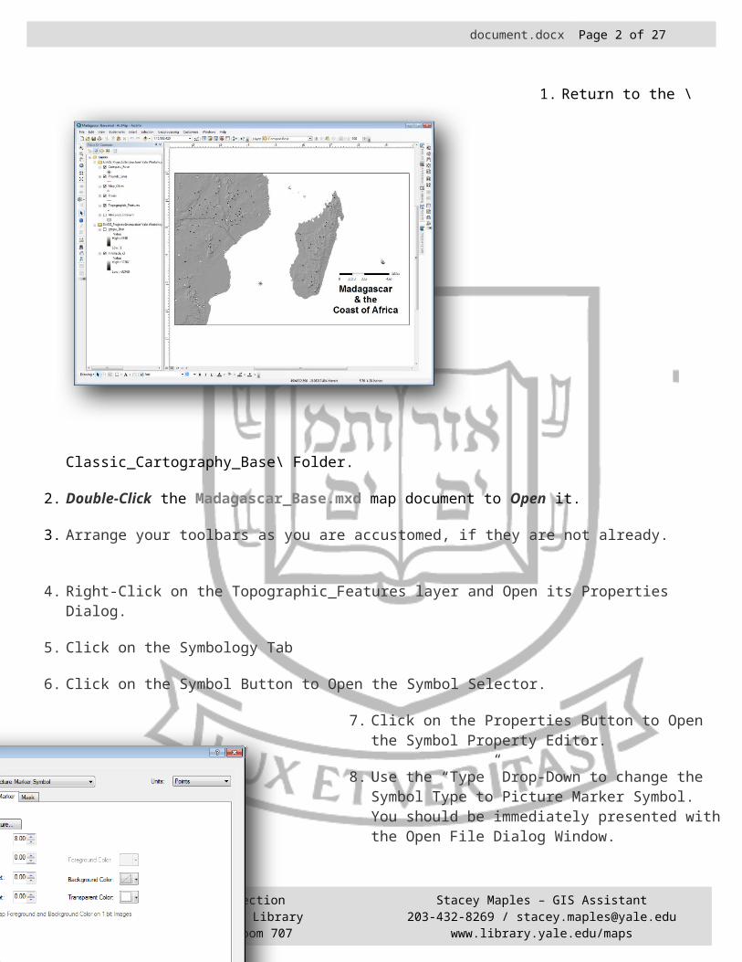
1. Return to the \Classic_Cartography_Base\ Folder.
2. Double-Click the Madagascar_Base.mxd map document to Open it.
3. Arrange your toolbars as you are accustomed, if they are not already.
The Yale Map CollectionAt Sterling Memorial Library130 Wall Street, Room 707
Stacey Maples – GIS Assistant203-432-8269 / [email protected]
www.library.yale.edu/maps
document.docx Page 2 of 21
4. Right-Click on the Topographic_Features layer and Open its Properties Dialog.
5. Click on the Symbology Tab
6. Click on the Symbol Button to Open the Symbol Selector.
7. Click on the Properties Button to Open the Symbol Property Editor.
8. Use the “Type” Drop-Down to change the Symbol Type to Picture Marker Symbol. You should be immediately presented with the Open File Dialog Window.
9. Browse to the \Data\Images\ Folder in the tutorial.
10.Use the “Views” Button at the top right of the Browse Window to change to the “thumbnails” view, so that you can preview the images.
11.Select one of the “Hill” Bitmaps and Click Open.
12.Make sure that the “Transparent Color” is set to WHITE.
13.Click OK to Exit the Symbol Property Editor.
14.When you are back in the Symbol Selector, Click on the Save As… Button.
15.Name the new symbol “My Hill” and the new category “Historic,” then Click OK.
The Symbol you have just created will now be available to you whenever you use ArcMap.
16. Click OK on the Symbol Selector.
17.Click OK on the Properties Dialog Window to Apply the Symbology to the Topographic Features.
The Yale Map CollectionAt Sterling Memorial Library130 Wall Street, Room 707
Stacey Maples – GIS Assistant203-432-8269 / [email protected]
www.library.yale.edu/maps

document.docx Page 3 of 21
18.Save Your Work!
The Yale Map CollectionAt Sterling Memorial Library130 Wall Street, Room 707
Stacey Maples – GIS Assistant203-432-8269 / [email protected]
www.library.yale.edu/maps
Note that in some cases, the symbol overlaps the coastline at the Northern end of Madagascar. You could fix this in several ways, including:
Editing the location of the feature points to move them away from the coast (less desirable).
Creating a new field in the attribute table of the topographic features layer and give the features that are too close to the coast a unique value. Then symbolize the features based upon this categorical field, and using a smaller symbol size for the coastal features (more desirable).

document.docx Page 4 of 21
The Swiss Hillshade Technique
This method of hillshading uses a layering technique to emphasize major elevation features, minimize minor features and smooth irregularities on the slopes in an area of topographic relief. At its simplest, the method requires three layers:
The Input DEM raster – The raw DEM file, which is provided for you as gtopo_2km.
Median Filter Hillshade layer – This layer is used to “smooth” the topography, providing a more generalized impression of the landscape.
Illumination Hillshade layer – This layer provides an emphasis on the higher elevations in the landscape.
Creating the Median Filter Hillshade Layer
1. In the Table of Contents, turn off the visibility of all layers, except for the gtopo_2k and the hillshade_x3 layer.
2. Search on the term ”focal” and open the “Focal Statistic” Tool, from the resulting list.
3. Select the hillshadex3 as the Input Raster.
4. Browse to the \Data\Raster\ Folder and save the Output raster as Focalmd_hill.
5. Set the Neighborhood to Circle, with a radius of 4 Cell Units.
6. Select Median as the Statistic Type.
7. Click OK to Apply the calculation.
The Yale Map CollectionAt Sterling Memorial Library130 Wall Street, Room 707
Stacey Maples – GIS Assistant203-432-8269 / [email protected]
www.library.yale.edu/maps

document.docx Page 5 of 21
Creating the Illumination Hillshade Layer
1. Return to the Search Tab of ArcToolbox and Search on the term “Divide,” and Open the Spatial Analyst “Divide” Tool from the Search results.
2. Select the gtopo_2km layer as the Input Raster.
3. Enter ‘5’ as the “Constant Value 2.”
4. Browse to the \Data\Raster\ Folder and save the Output Raster as Div5_gtopo.
5. Click OK to Apply the calculation.
6. Return to the ArcToolbox and Search on the term “Plus.” Open the Spatial Analyst “Plus” Tool from the search results.
7. Select the Div5_gtopo layer as the Input Raster 1.
8. Select the hillshade_x3 layer as the Input raster 2.
9. Browse to the \Data\Raster\ Folder and Save the Output Raster as Illum_Hill.
10.Click OK to Apply the Calculation.
Putting It All Together
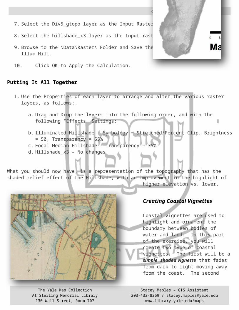
1. Use the Properties of each layer to arrange and alter the various raster layers, as follows:.
a. Drag and Drop the layers into the following order, and with the following “Effects” Settings:
b. Illuminated Hillshade – Symbology = Stretched/Percent Clip, Brightness = 50, Transparency = 55%
c. Focal Median Hillshade – Transparency = 35%d. Hillshade_x3 – No changes
The Yale Map CollectionAt Sterling Memorial Library130 Wall Street, Room 707
Stacey Maples – GIS Assistant203-432-8269 / [email protected]
www.library.yale.edu/maps

document.docx Page 6 of 21
What you should now have, is a representation of the topography that has the shaded relief effect of the Hillshade, with an improvement in the highlight of higher elevation vs. lower.
Creating Coastal Vignettes
Coastal vignettes are used to highlight and ornament the boundary between bodies of water and land. In this part of the exercise, you will create two type of coastal vignettes. The first will be a simple shaded vignette that fades from dark to light moving away from the coast. The second type, the concentric line vignette, is one that more closely resembles the type of coastal, riverine and lacustrine vignettes commonly seen on maps from the 19th and early 20th centuries.
Shaded Coastal Vignettes
This technique is simple to apply to your maps and adds a great deal to the “finished” look of a map that depicts coastal features.
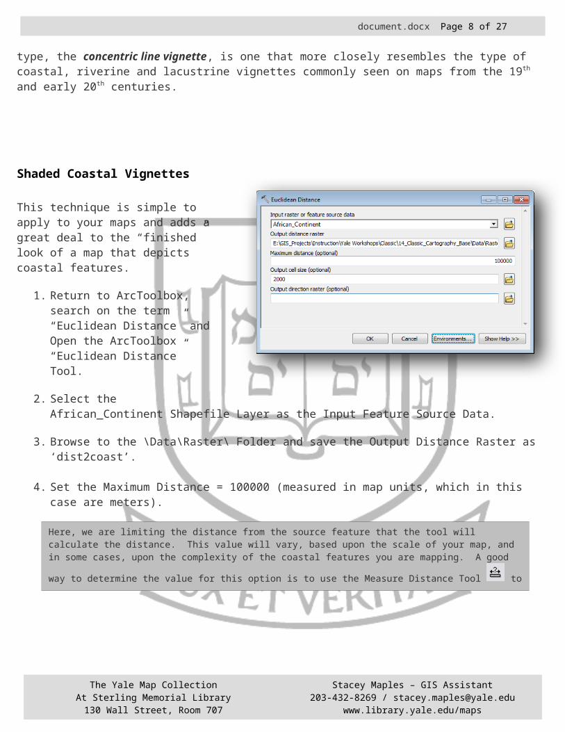
1. Return to ArcToolbox, search on the term “Euclidean Distance” and Open the ArcToolbox “Euclidean Distance” Tool.
2. Select the African_Continent Shapefile Layer as the Input Feature Source Data.
3. Browse to the \Data\Raster\ Folder and save the Output Distance Raster as ‘dist2coast’.
4. Set the Maximum Distance = 100000 (measured in map units, which in this case are meters).
The Yale Map CollectionAt Sterling Memorial Library130 Wall Street, Room 707
Stacey Maples – GIS Assistant203-432-8269 / [email protected]
www.library.yale.edu/maps
document.docx Page 7 of 21
Here, we are limiting the distance from the source feature that the tool will calculate the distance. This value will vary, based upon the scale of your map, and in some cases, upon the complexity of the coastal features you are
mapping. A good way to determine the value for this option is to use the Measure Distance Tool to measure from the coastal feature to the distance from the coast that you want your vignette to end.
5. Set the Output Cell Size to 2000.
Here, again, this value will vary with the scale of your map. In this case, you are using the same cell size as the gtopo_2km layer. In other cases, you may need to experiment with this setting to get the result you want).
6. Click on the “Environments…” Button, at the bottom of the Euclidean Distance Tool Window.
7. Using the Drop-Down to change the Output Extent to Same as Layer gtopo_2km.”
8. Click OK to Apply the new extent.
The default setting here is to use the extent of the input file (African_Continent, in this case) as the Output Extent. Here, that would result in a much larger file (and processing time) than you want, since the African_Continent layer’s extent is much larger than the extent of the map you are creating.
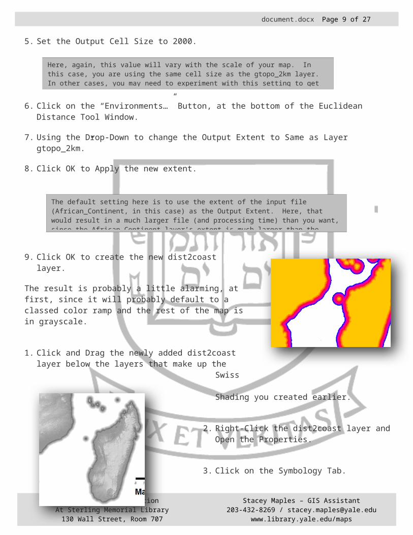
9. Click OK to create the new dist2coast layer.
The result is probably a little alarming, at first, since it will probably default to a classed color ramp and the rest of the map is in grayscale.
1. Click and Drag the newly added dist2coast layer below the layers that make up the Swiss Shading you created earlier.
2. Right-Click the dist2coast layer and Open the Properties.
3. Click on the Symbology Tab.
4. Change the layer’s Symbology to “Stretched.”
The Yale Map CollectionAt Sterling Memorial Library130 Wall Street, Room 707
Stacey Maples – GIS Assistant203-432-8269 / [email protected]
www.library.yale.edu/maps
document.docx Page 8 of 21
5. Make sure the Stretch Type is set to “Standard Deviation” and that n=2.
6. Click OK to apply the change.
7. Adjust the transparency of the dist2coast layer to 35%, using the Effects Toolbar.
The Yale Map CollectionAt Sterling Memorial Library130 Wall Street, Room 707
Stacey Maples – GIS Assistant203-432-8269 / [email protected]
www.library.yale.edu/maps
document.docx Page 9 of 21
Concentric Coastal Vignettes This type of coastal vignette is really an extension of the previous method, in terms of its creation in ArcMap. In classic cartography, these concentric vignette lines appear to fade as they move away from the coastal features. This effect is achieved by increasing the distance between the lines as you move away from the coast, at what usually appears to be an exponential rate.
1. Return to ArcToolbox and Search on the term “Square.”
2. Open the Spatial Analyst “Square Root” Tool.
3. Select the dist2coast layer as the Input Raster.
4. Browse to the \Data\Raster\ Folder and save the Output aster as SqRt_dist.
5. Click OK to Apply the Calculation.
6. Click and Drag the resulting SqRt_dist layer to just above the original dist2coast layer, so that it obscures it, but underlies the Swiss Shading layers.
7. Right-Click on the SqRt_dist layer and Open its Properties.
8. Click on the Symbology Tab.
9. Change the Symbology of the layer to “Classified.”
10.Click on the “Classify…” Button.
11.Change the Classification Method to Defined Interval and make the Interval Size = 15.
12.Click OK.
13.Click Apply to preview the change in the Map Document.
The Yale Map CollectionAt Sterling Memorial Library130 Wall Street, Room 707
Stacey Maples – GIS Assistant203-432-8269 / [email protected]
www.library.yale.edu/maps
document.docx Page 10 of 21
14.Click OK.
15.Return to ArcToolbox and search on the term “contour.”
16.Open the Spatial Analyst “Contour” Tool.
17.Select SqRt_dist as the Input Raster.
18.Browse to the \Data\Raster\ Folder and Save the Output Polyline Features as Cst_Vignet15.
19.Enter 15 (the value from the previous Symbology test) as the Contour Interval.
20.Click OK.
21.Drag the resulting Line Layer between the Swiss Shading Layer and the SqRt_dist layer.
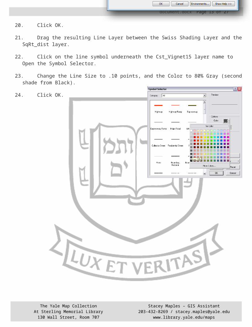
22.Click on the line symbol underneath the Cst_Vignet15 layer name to Open the Symbol Selector.
23.Change the Line Size to .10 points, and the Color to 80% Gray (second shade from Black).
24.Click OK.
The Yale Map CollectionAt Sterling Memorial Library130 Wall Street, Room 707
Stacey Maples – GIS Assistant203-432-8269 / [email protected]
www.library.yale.edu/maps
This is a good way to “eyeball” the value that you will use in the next step of this method. Since, in this case, the class value 15 gave a nice result in the map document window, you will use that value as the contour interval, for the next step. You could, at this point, simply use the results of this change in Symbology as your coastal vignette.

document.docx Page 11 of 21
The Yale Map CollectionAt Sterling Memorial Library130 Wall Street, Room 707
Stacey Maples – GIS Assistant203-432-8269 / [email protected]
www.library.yale.edu/maps
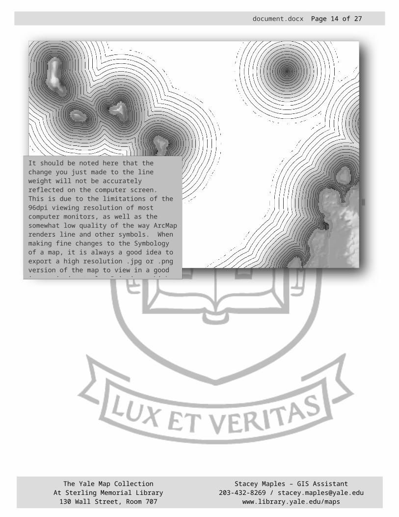
It should be noted here that the change you just made to the line weight will not be accurately reflected on the computer screen. This is due to the limitations of the 96dpi viewing resolution of most computer monitors, as well as the somewhat low quality of the way ArcMap renders line and other symbols. When making fine changes to the Symbology of a map, it is always a good idea to export a high resolution .jpg or .png version of the map to view in a good image viewing tool. Printing a high resolution version is always a good idea, too. The fact that what you see on the screen is not always what you see on the page, or resulting image, is simply one of the frustrations you must learn (through experience) to work around.

document.docx Page 12 of 21
Creating Custom Map Elements
Rhumb Lines and Custom North Arrows
A Rhumb Line is a line of constant bearing. That is, if you follow a compass bearing of East without deviation, you will be following a rhumb line. Rhumb lines are commonly seen on navigation charts (portolan charts), and are devices that
allowed navigators to plot bearing based upon the map rhumbs as a standard. Here, you will create a compass rose, with rhumb lines. Classic maps often had many compass roses, with rhumb lines that intersected.
1.Change to the Data View using the View Toolbar at the
bottom left of the Data Frame.
2. Turn off all but the African_Continent, Compass_Rose and Rhumb_Lines layers (to save having to wait for rendering of the layers you created previously).
3. Right-click on the Rhumb_Lines layer and go to Edit Features>Start Editing.
4. If you are warned about Projections and Coordinate Systems, Click OK.
5. Click Editor>Options and click on the Units Tab to bring it forward.
6. Set the ‘Direction Type’ option to Quadrant Bearing and click OK to apply.
7. Click on the Editor Button, at the far left of the Editor Toolbar and Select “Snapping…”
8. Check the “Compass Rose: Vertex & End” Checkboxes.
9. Check the “Rhumb_Lines: Vertex & End” Checkboxes.
This will cause the ends of the Rhumb lines that you are adding to ‘snap’ to the Compass_Rose point,
The Yale Map CollectionAt Sterling Memorial Library130 Wall Street, Room 707
Stacey Maples – GIS Assistant203-432-8269 / [email protected]
www.library.yale.edu/maps
document.docx Page 13 of 21
and/or the ends of the other rhumb lines, which will function as the apex of the lines of bearing you will add to the layout.
10.Close the Snapping Panel by clicking the X at the upper right corner.
11.Select the Rhumb_Lines template from the Creat Features window.
12. ‘Hover’ over the Compass_Rose point until the Editing Cursor ‘snaps’ to it.
13.Click once to place the beginning vertex of the first Rhumbline.
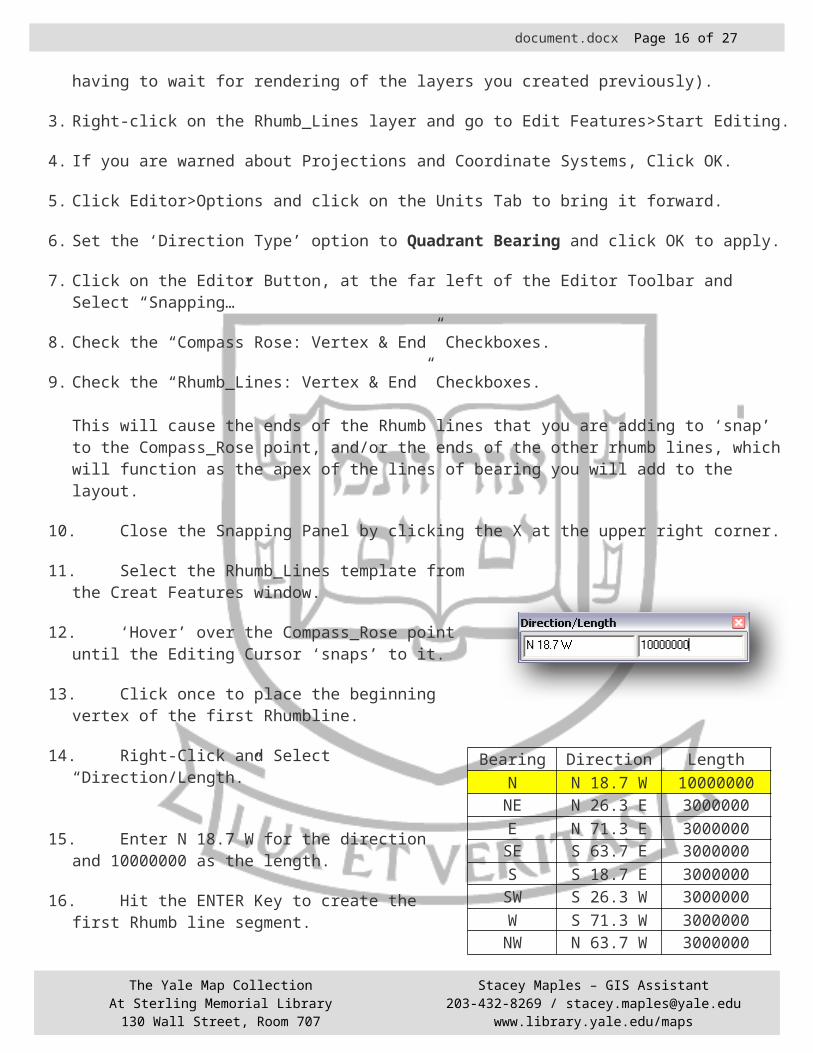
14.Right-Click and Select “Direction/Length.”
15.Enter N 18.7 W for the direction and 10000000 as the length.
16.Hit the ENTER Key to create the first Rhumb line segment.
17.Right-Click and Select “Finish Sketch” (or use the F2 key) to complete the first rhumb line.
18.
18.Add the remaining lines in the same way, but using the Direction/Lengths shown in the table.
19.Once all rhumb lines have been created, click the Editor Button on the Editor Toolbar and select “Save Edits.”
20.Click the Editor Button and select “Stop Editing.”
21.Drag the Rhumb_Line Layer below the Coastal Vignette layer and change it’s symbology to .10
The Yale Map CollectionAt Sterling Memorial Library130 Wall Street, Room 707
Stacey Maples – GIS Assistant203-432-8269 / [email protected]
www.library.yale.edu/maps
Bearing Direction LengthN N 18.7 W 10000000
NE N 26.3 E 3000000E N 71.3 E 3000000
SE S 63.7 E 3000000S S 18.7 E 3000000
SW S 26.3 W 3000000W S 71.3 W 3000000
NW N 63.7 W 3000000
document.docx Page 14 of 21
line weight and 80% grey.
22.Save Your Work!
Placing a Custom North Arrow and Altering its Declination
1. In the Table of Contents, Click on the Symbol under the Compass_Rose Layer name to open the Symbol Selector.
2. Click on the Properties Button.
3. Change the Symbol “Type:” to Picture Marker Symbol, using the drop-down.
4. Browse to the \Data\Images\ Folder and select compass_rose-3.bmp. (You may need to change to Thumbnail view to preview them).
5. Click Open.
6. In the Symbol Property Editor, Change the size of the Compass to 72.
7. Change the Angle to 18.7.
8. Change the X Offset to -2
9. Change the Y Offset to 4.1. (Notice that you are using the offsets to position the center of the compass rose over the crosshairs in the Preview Pane.)
10.Make sure that the Transparent Color is set to White.
11.Click OK.
12. In the Table of Contents, Move the Rhumb_Lines Layer between the Swiss Shading Layers and the Coastal Vignette Layers.
The Yale Map CollectionAt Sterling Memorial Library130 Wall Street, Room 707
Stacey Maples – GIS Assistant203-432-8269 / [email protected]
www.library.yale.edu/maps

New Marker
document.docx Page 15 of 21
Seamonsters, etc…
You can add just about any graphic you would like by using essentially the same technique used above to insert a custom .BMP image into the map. Here, you will add a few sea monsters to your map.
1. Return to the Layout View, if you are not already there.
2. Activate the Draw Toolbar from the View.Toolbars Menu, if it is not already.
3. Use the Graphic Element Drop-down to Select the Insert New Marker Tool.
4. Place the marker in the upper right corner of the map layout.
5. Right-click on the marker and Open its Properties.
6. Click on the Change Symbol Button to Open the Symbol Selector.
7. Click on the Edit Symbol Button.
8. Change the Symbol Type: to “Picture Marker Symbol.”
9. Browse to the \Data\Images\ Folder and Select the sea_monster-2.bmp.
10.Click Open.
11.Change the Size to 72.
12.Make sure the Transparent Color is set to White.
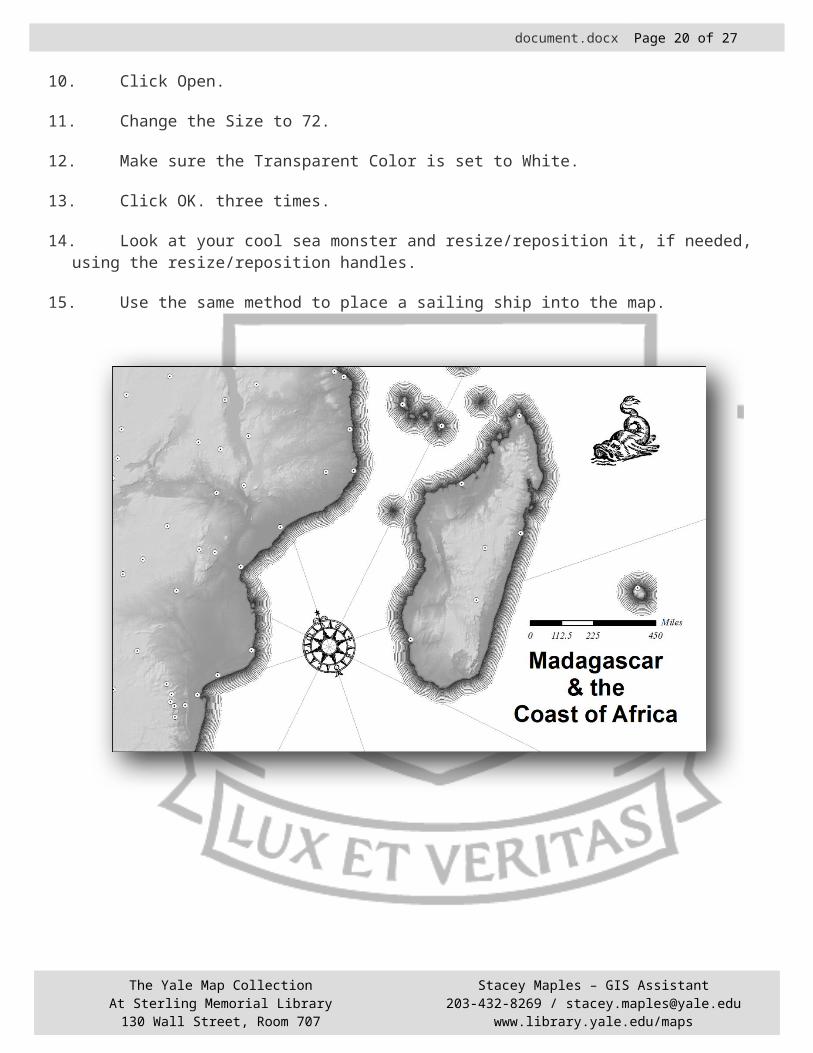
13.Click OK. three times.
14.Look at your cool sea monster and resize/reposition it, if needed, using the resize/reposition handles.
15.Use the same method to place a sailing ship into the map.
The Yale Map CollectionAt Sterling Memorial Library130 Wall Street, Room 707
Stacey Maples – GIS Assistant203-432-8269 / [email protected]
www.library.yale.edu/maps
New Marker
document.docx Page 16 of 21
The Cartouche
Decorative cartouches are ubiquitous in classic cartography. ArcMap provides native capability to place simple cartouches in a map layout, but for something really over-the-top, it is necessary to use methods similar to those used to add the sea
monsters. Here you will add a scanned image (in BMP format) and apply transparency, just as you did in the last section. The difference here is that you want to resize your Title text and Group it with the Cartouche so that the Title Cartouche and Title become a single unit that can be resized and repositioned together.
1. Return to the Layout View, if you are not already there.
2. Activate the Draw Toolbar from the View.Toolbars Menu, if it is not already.
The Yale Map CollectionAt Sterling Memorial Library130 Wall Street, Room 707
Stacey Maples – GIS Assistant203-432-8269 / [email protected]
www.library.yale.edu/maps

document.docx Page 17 of 21
3. Use the Graphic Element Drop-down to Select the Insert New Marker Tool.
4. Place the marker in the lower right corner of the map layout, near the Title Text.
5. Right-click on the marker and Open its Properties.
6. Click on the Change Symbol Button to Open the Symbol Selector.
7. Click on the Properties Button.
8. Change the Symbol Type: to “Picture Marker Symbol.”
9. Browse to the \Data\Images\ Folder and Select the Cartouche_1.bmp image.
10.Click Open.
11.Change the Size to 80.
12.Make sure the Transparent Color is set to Gray.
13.Click OK.
14.Click OK.
15.Click OK.
16.Use the Select Elements Tool to Select the Title Text.
17.Change the Text Size to 12.
18.Alternate between resizing the Cartouche and the Text until you have a good match (the text fits inside the Cartouche).
19.Using the Select Elements Tool and holding down the CTRL-Key, Select both the text and the cartouche.
20.Right Click on the two selected elements and select Group.
21.Resize the Grouped Cartouche element and reposition the scalebar underneath it.
The Yale Map CollectionAt Sterling Memorial Library130 Wall Street, Room 707
Stacey Maples – GIS Assistant203-432-8269 / [email protected]
www.library.yale.edu/maps
document.docx Page 18 of 21
The Measured Frame
Finally, to give the map a final touch, you will add a measured frame, or graticule. These elements are common in all of cartography, from rare portolan charts to the most modern USGS Topographic Maps. More than a simple decorative element, the Measured
Frame provides a means of referencing locations on the map using Cartesian coordinates. Here, you will use the tools built into ArMap to create a Measured Frame, then surround it with a Neatline, to give a finished look.
1. Use the Select Elements Tool to select the Data Frame in Layout View.
2. Right-Click on the Data Frame and Open the Properties.
3. Click on the “Grids” Tab.
4. Click on the “New Grid…” Button to Open the Grids and Graticules Wizard.
5. In the First Window, Check the Graticule Radio Button.
The Yale Map CollectionAt Sterling Memorial Library130 Wall Street, Room 707
Stacey Maples – GIS Assistant203-432-8269 / [email protected]
www.library.yale.edu/maps

document.docx Page 19 of 21
6. Click Next.
7. Under Appearance, Check “Labels Only.”
8. Change the Intervals to 1 Degree.
9. Click Next.
10.Uncheck “Minor Division Ticks” and Click Next.
11.Check the “Place a calibrated border at edge of graticule.”
12.Click Finish.
13.Highlight the new “Graticule” item in the Grids List and Click the Properties Button.
14.Click the Labels Tab and check the “Left” and “Right” Checkboxes Under “Label Orientation: Vertical Labels.”
15.Click OK. twice to Apply the Graticule to the Layout.
16.Make sure the Data Frame is still selected.
17.On the Main Menu, go to Insert>Neatline.
18.Check the “Place around selected element(s)” checkbox.
19.Set the Gap to 10 pts.
20.Click OK.
21.Use the Resize Handles to Resize the Neatline, if necessary.
22.Save Your Work!
The Yale Map CollectionAt Sterling Memorial Library130 Wall Street, Room 707
Stacey Maples – GIS Assistant203-432-8269 / [email protected]
www.library.yale.edu/maps
document.docx Page 20 of 21
Finishing Up
You now have the makings of an interesting map, using some of the cartographic elements found in classic cartography. To finish up, you should experiment with various versions of your map, alternating between the use of the Swiss Shading & Hill Symbols, various combinations of Shaded & Concentric Vignettes and the addition of different graphic elements (sea monsters, ships, etc…). Try using the parchmentgray.bmp file that is in the \Data\Images\ Folder as a Data Frame Background. Enjoy and explore, but most of all, look at maps and think about how you can reproduce effects that you are interested in.
The Yale Map CollectionAt Sterling Memorial Library130 Wall Street, Room 707
Stacey Maples – GIS Assistant203-432-8269 / [email protected]
www.library.yale.edu/maps

document.docx Page 21 of 21
This Swiss Shading Model is derived from the work of David Barnes, Product Specialist at ESRI.
Barnes, D. 2002. Using ArcGIS to Enhance Topographic Presentation, "Cartographic Perspectives" 42: 5-11.
The Yale Map CollectionAt Sterling Memorial Library130 Wall Street, Room 707
Stacey Maples – GIS Assistant203-432-8269 / [email protected]
www.library.yale.edu/maps