color% - the university of texas at dallasmelacy/pages/2d_design/color_designprinciples... ·...
TRANSCRIPT
Color
Design Principles and Problems Paul Zelanski & Mary Pat Fisher Chapter : Color pp. 227-‐250
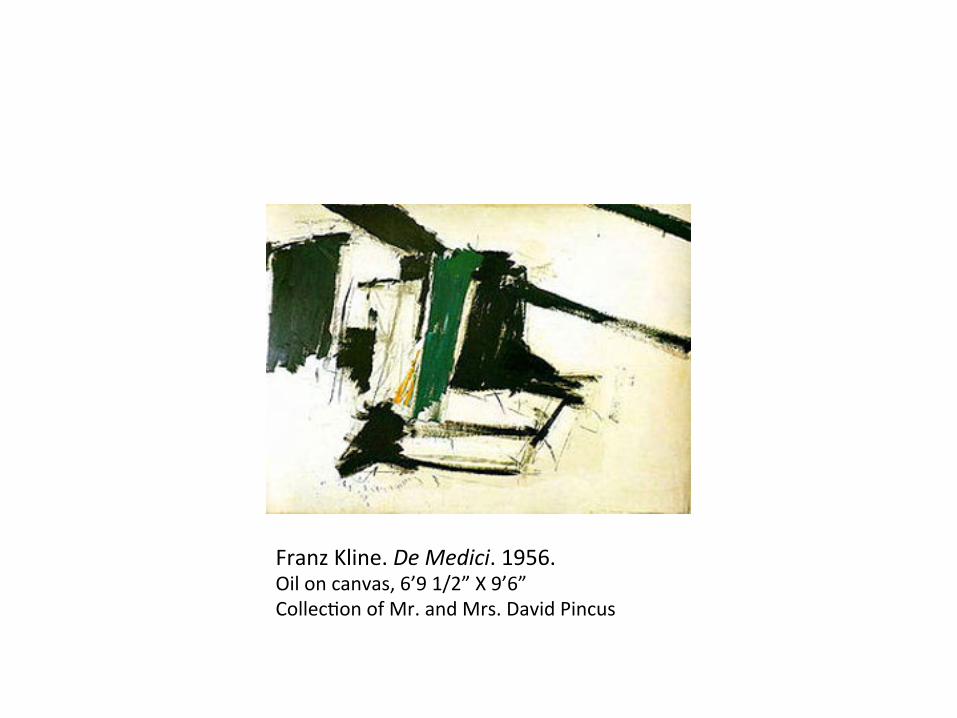
Franz Kline. De Medici. 1956. Oil on canvas, 6’9 1/2” X 9’6” CollecJon of Mr. and Mrs. David Pincus


Franz Kline used colors as a great chef would use herbs.
Color is an extraordinarily rich tool for arJsts. It is also extremely complex. Unlike learning the skillful use of the elements of design explored, just beginning to appreciate what color can do requires comprehensive study.

CharacterisJcs of Color
When a ray of white light from the sun passes through a glass prism or a spray of water its energy is broken or refracted into the rainbow spectrum of colors that humans can see. This visible spectrum of light refracted through a prism ranges from red to violet. The colors which we can disJnguish correspond to different wavelengths, or frequencies, of electromagneJc radiaJon. There are many other wavelengths that we cannot see at all; infrared, ultraviolet, x-‐rays, and radio waves are invisible to us.
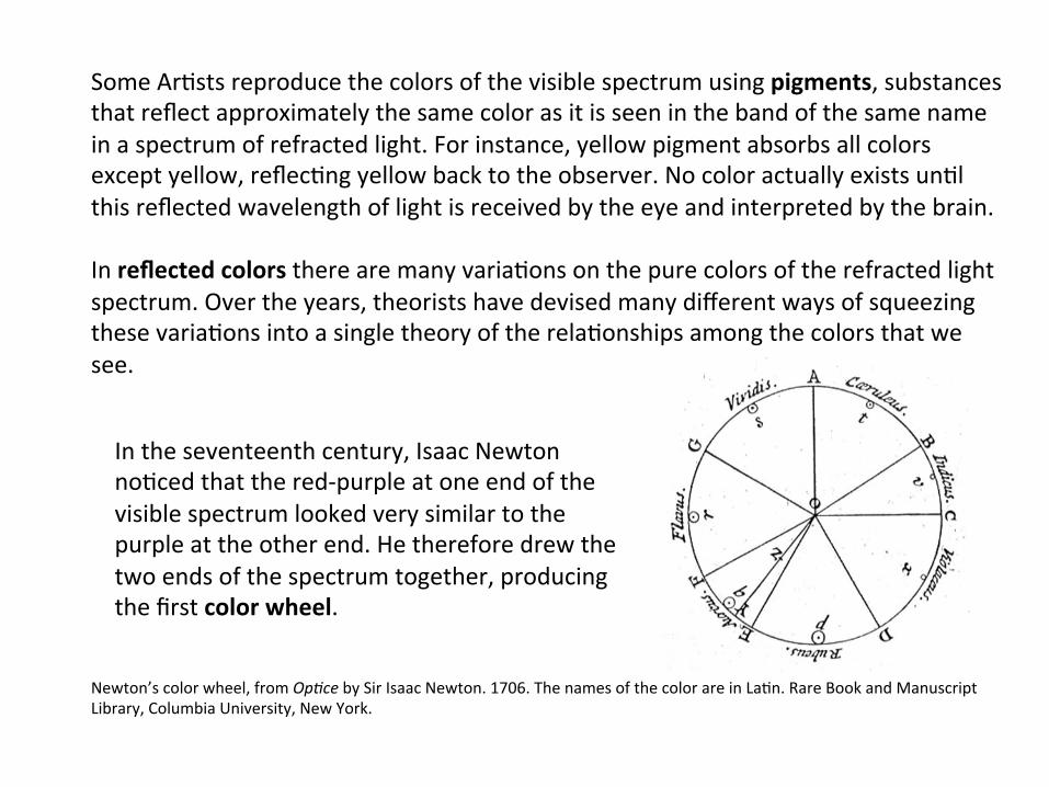
Some ArJsts reproduce the colors of the visible spectrum using pigments, substances that reflect approximately the same color as it is seen in the band of the same name in a spectrum of refracted light. For instance, yellow pigment absorbs all colors except yellow, reflecJng yellow back to the observer. No color actually exists unJl this reflected wavelength of light is received by the eye and interpreted by the brain. In reflected colors there are many variaJons on the pure colors of the refracted light spectrum. Over the years, theorists have devised many different ways of squeezing these variaJons into a single theory of the relaJonships among the colors that we see.
In the seventeenth century, Isaac Newton noJced that the red-‐purple at one end of the visible spectrum looked very similar to the purple at the other end. He therefore drew the two ends of the spectrum together, producing the first color wheel.
Newton’s color wheel, from Op4ce by Sir Isaac Newton. 1706. The names of the color are in LaJn. Rare Book and Manuscript Library, Columbia University, New York.


Pigments for sale at a market stall in Goa, India.

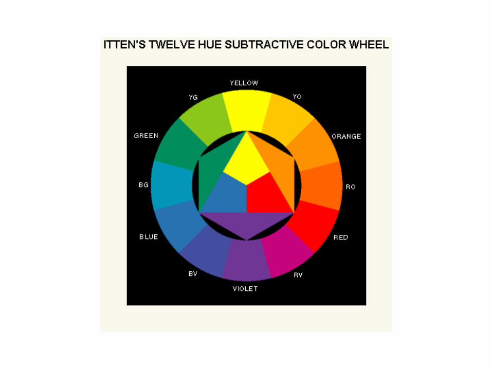
Hue
Color wheels are two-‐dimensional models of color relaJonships that deal only with hues – the names of colors. Hues opposite each other on a color wheel are said to be complementary; hues next to each other are called analogous. If complementary hues are juxtaposed, each appears brighter, if closely analogous hues are juxtaposed, they tend to blend visually, and it may be difficult to see the edge that separates them.

Even in simple color-‐wheel models, controversies have arisen over which few hues are the basic ones from which all other hues can be mixed. There are at least five different possibiliJes that seem to be true, depending on the situaJon. In light mixtures, as in film, photography, computer graphics, and TV, where refracted light operates, all hues can be obtained from combinaJons of the rays that produce red, green, and blue-‐violet.
Refracted light
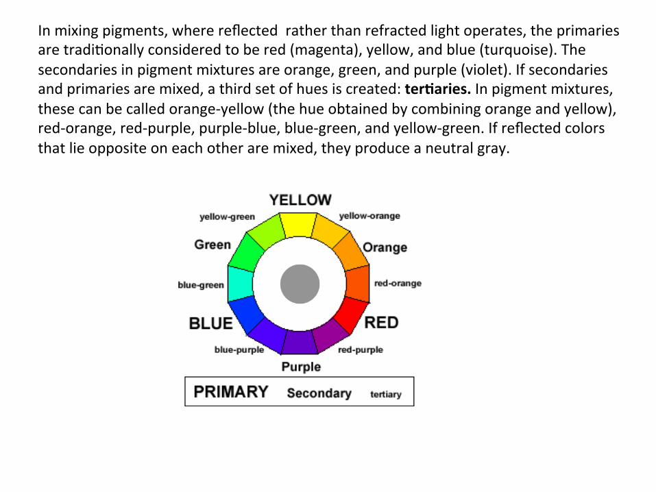
In mixing pigments, where reflected rather than refracted light operates, the primaries are tradiJonally considered to be red (magenta), yellow, and blue (turquoise). The secondaries in pigment mixtures are orange, green, and purple (violet). If secondaries and primaries are mixed, a third set of hues is created: ter:aries. In pigment mixtures, these can be called orange-‐yellow (the hue obtained by combining orange and yellow), red-‐orange, red-‐purple, purple-‐blue, blue-‐green, and yellow-‐green. If reflected colors that lie opposite on each other are mixed, they produce a neutral gray.

Finding that actual pigment mixing based on this tradiJonal pigment wheel did not necessarily produce colors that varied from each other in equal steps, Albert Munsell worked out a third color circle with five “principal” colors that relate to each other and to intermediary mixed colors on a more precise numerical basis. Munsell’s principle colors were red, yellow, green, blue, and purple.

Wilhelm Ostwald worked out sJll another color circle that was based chiefly on how colors are perceived by the eyes and the brain rather than on the light or pigment mixtures in the world that we experience. In Ostwald’s color theory, the primary colors are red, yellow, sea green, and blue – four in all.

Yet another system was devised by Arthur Hoener. It deals with the relaJonships between certain colors and the background against which they are presented. In this system orange, green, and violet can be used as primaries to produce yellow (orange plus green), blue (green plus violet), and red (violet plus orange). If, for instance, you stare at a medium circle for a Jme and then glance immediately at a white area, you will “see: it’s complement red emerging from the white. A lighter green circle will make the background appear greenish; a dark-‐green circle will make the background appear whiter, and the green will look almost black. If two colors are presented in the right amounts against a light-‐colored background, their effects will mingle, producing an overall illusion of a single color that is different from either. Whereas the classic theory of pigment mixtures defined yellow and red as primaries, claiming that they cannot be combining any two colors, Arthur Hoener demonstrated that yellow and red can be mixed using pigments. If you look closely at the “yellow” shape coming down from the upper right of Hoener’s Penuous, you will discover that it actually consists of green and orange circles on a light background. And the “red” shape coming up from the bomom is actually violet and orange circles on a light background. Hoener referred to this opJcal color mingling of color energies as synergisJc color mixing. By transcending the dogmaJc “rules” of color mixing, he greatly expanded our knowledge of how colors work together.

Arthur Hoener. Penuous. 1974, acrylic on masonite, (60 x 60 cm.)


Value
Hues are not the only variaJons we see in colors. Another variaJon is value – their degree of lightness or darkness.

Georgia O’Keeffe. From a Day with Juan, II. 1977. Oil on canvas, 4 x 3’. The Museum of Modern Art, New York.

Georgia O’Keeffe used an extremely limited hue paleme in her 1977 painJng From a Day with Juan, II. The only hues used are blue and gray. Yet by gradually varying their value from very light at the bomom to very dark at the top. O’Keeffe provided a great range of color sensaJons. If you cover the middle of the painJng you will see how different the two extremes are. The top has very strong emoJonal impact, the bomom a very delicate one. The transiJonal area through the middle – especially where the grays are changing – has a mysJcal quality. This is a fantasJc range of sensaJon, yet it is based merely on value changes in two hues.

SaturaJon
The third characterisJc of color that theorists have isolated is satura:on (also know as chroma or intensity). This is a measure of the purity and brightness, or grayness, of a color. Janet Fish’s Cut Peach and Blue Vase uses all the colors of the spectrum at high saturaJon. They appear almost as pure as transparent jewels with light passing through them. In comparison, the color in works by Paul Zelanski and Robert Lazuka are of low saturaJon, dulled as if by thin layers of grayed paint of top of purer hues. In pigments there are two major ways of graying a pure color of maximum saturaJon without changing its value: Mix it with gray of the same value, or mix it with its complementary of the same value (the color that lies opposite it on the color wheel). When mixed, complementaries will neutralize each other unJl – mixed in the right proporJons – they form a gray that resembles neither, represented by the gray in the center of the color wheel. There is another way of changing saturaJon that can be explained only by the color principle that is true in all situaJons: Colors are affected by the colors that around them. In any combinaJon of colors, adjacent colors will affect our visual percepJon of their hue, value, and saturaJon. Even when working with very few hues arJsts can vary their effects by the ways they are combined.

Janet Fish. Cut Peach and Blue Vase. 1993. Oil on canvas, 40x50”. Grace Borgenicht Gallery, N
ew York.

An example of work by Paul John Zelanski


Color Solids
To devise a single system for portraying the relaJonships among colors along the three variables discussed –hue, saturaJon, and value – color theorists have developed a variety of color solids. These models typically show value as measurement up a verJcal pole, from black at the bomom to white at the top. SaturaJon is represented as horizontal measurement away from this verJcal pole, from neutral grays in the center to maximum saturaJon at the outer limit of this line. Varying hues are shown as posiJons on the circumference of the circle, just as they are in two-‐dimensional color wheels.
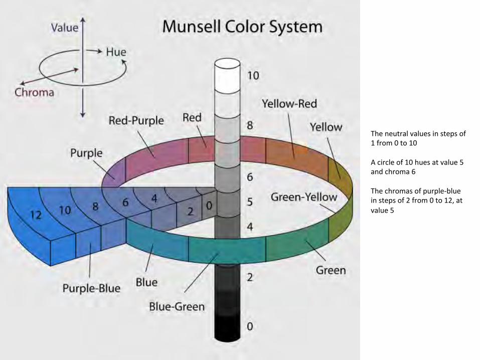
The neutral values in steps of 1 from 0 to 10 A circle of 10 hues at value 5 and chroma 6 The chromas of purple-‐blue in steps of 2 from 0 to 12, at value 5

Phillip Omo Runge’s Farbenkugel (color sphere), 1810, showing the surface of the sphere (top two images), and horizontal and ver4cal cross sec4ons (boMom two images).
Color sphere of Albert Henry Munsell, 1900

Side-‐by-‐side comparison of nine different color solids for the HSL, HSV and RGB color models.
HSL and HSV are two related representaJons of points in an RGB color model that amempt to describe perceptual color relaJonships more accurately than RGB, while remaining computaJonally simple. HSL stands for hue, saturaJon and lightness, while HSV stands for hue, saturaJon and value.

Although this and other color solids are useful means of standardizing color names and of demonstraJng some color relaJonships they should not necessarily be accepted as reality. Color wheels and color solids are a parJal map of how we perceive colors. There is much that we do not yet know. Color theory is in a constant state of change, and different people perceive colors somewhat differently. Rather than being dogmaJc about color theories, it is bemer to explore with an open mind what colors can do.

Computer Color Choices
Color exploraJon in computer graphics offers almost limitless possibiliJes. SophisJcated computer graphics systems make available possible colors from which to choose, far more that the human eye even disJnguish. These are all created from combinaJons of the three primaries – red, green, and blue-‐violet. In Jme, color generated by and mixed on the computer will have a tremendous effect on percepJon and use of color.

Artwork created using both tradiJonal and digital methods during the producJon of the digital ficJon piece The Diary of Anne Sykes Designed, coded and wrimen by Andy Campbell
Dreaming Methods -‐ experimental venture combining ficJonal narraJves with atmospheric mulJmedia designed to be read and experienced on-‐screen. hmp://www.dreamingmethods.com/

Color Prejudices and Color CombinaJons
Prejudices toward a parJcular color theory can prevent you from making your own discoveries. Many of us are vicJms of prejudices for or against parJcular colors and color combinaJons. In everyday speech we use color names in ways that implant or reinforce stereotypical ideas of their fixed emoJonal connotaJons.
Yellow, for instance, is oqen associated with negaJve connotaJons: A “yellowbelly” with a “yellow streak” is a disloyal coward, “yellow journalism” is distorted and sensaJonalist, a dishonorable discharge from the service comes on a “yellow paper.” Red is typically associated with anger, passion, and warmth; blue and green with coolness and calm. Some of these associaJons probably come from typical experiences with our environment. We see fire and angry faces as red and therefore link the color with warmth and passion. We see skies as blue and therefore tend to link blue with the seeming coolness and distant serenity of the sky. But the sky at sunset may be red, an extremely hot object may glow white or blue, and to a person in an ice-‐bound land, red may bring a sense of peace. To limit ourselves to more familiar color associaJons, defining them as universals, is to overlook the exciJng possibiliJes of presenJng blue in a passionate, emoJonal design and red in a serene serng. We can do whatever we like with color, so long as we can make it work.

We may also be unwirng vicJms of prejudices toward certain color combinaJons. Color theorists have long tried to specify rigidly “the” combinaJons that work an how they work. Color combinaJons are said to produce a quiet, ressul effect if they avoid strong contrasts and colors of high intensity. Two schemes thought to create this effect are monochroma4c (using a single hue in a range of values) – and analogous (using three to five hues adjacent to or near each other on the color wheel, such as blue, blue-‐green, and green.)

Pablo Picasso. La Vie. 1903 Oil on canvas 196.5 x 129.2 cm

Fabric squares represent a monochroma4c scheme using a single hue in a range of values

Analogous using three to five hues adjacent to or near each other on the color wheel, such as blue, blue-‐green, and green

Color combinaJons with strong contrasts are thought to produce a bolder, more exciJng effect. These include complementary schemes built on a pair of hues that lie opposite each other on the color wheel, such as the red and green of Toulouse-‐Lautrec’s painJng of a scene from Carlo Pallavicino's VeneJan opera Messalina (1680).
Color CombinaJons

Complementary scheme built on a pair of hues that lie opposite each other on the color wheel
painJng of a scene from the opera "Messalina" at Bordeaux Opera
Henri de Toulouse-‐Lautrec

cover from playbill Dallas Opera 2009/2010 season Otello Margot and Bill Winspear Opera House

Double complementary schemes two adjacent hues plus the complements of each
Split complementary schemes any hue plus the two hues to either side of its complement
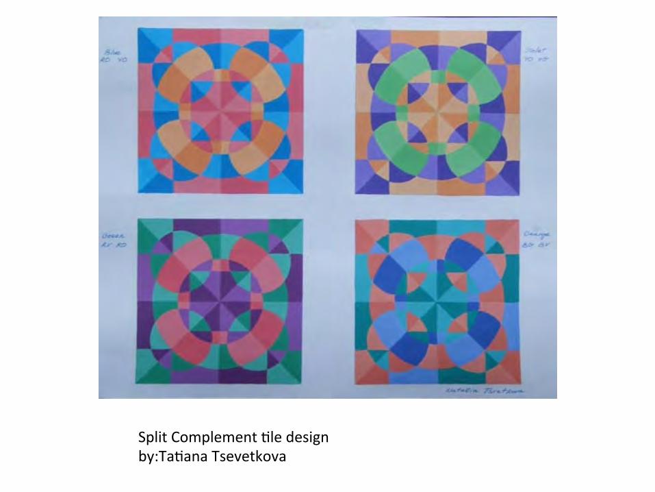
Split Complement Jle design by:TaJana Tsevetkova

Split Complement Jle design By: Ami Inose

Triad schemes combine any three hues that are of equal distance from each other on the color wheel
P.Fix-‐Masseau, Periodical Cover, 1948.

Tetrad schemes combine any four hues of equal distance from each other on the color wheel
“Advancing” and “Receding” Colors
Any color can be brought forward or pushed back in space by the visual clues to spaJal organizaJon given to it.

Richard Lytle’s painJng Early Sound Cantabria overthrows the noJons of advancing and receding colors by making the same colors advance and recede in the same painJng. Where reddish-‐brown areas are shown in the foreground (the bomom of the painJng), associated with large objects, they seem to advance. The large reddish-‐brown area in the lower center of the painJng seems very close to the viewer. But in the next strip to the right, the reddish-‐browns shown in the upper part of the painJng seem to recede as background. Lytle contradicts the advancing-‐and-‐receding rule again and again by conJnually reversing the posiJon of his colors, as though he were shiqing colored films. The painJng holds our amenJon as we try finding logic in the receding and advancing color forms. Lyle has used images that conJnue despite the color changes and has held the whole composiJon together by a chain of dark values.
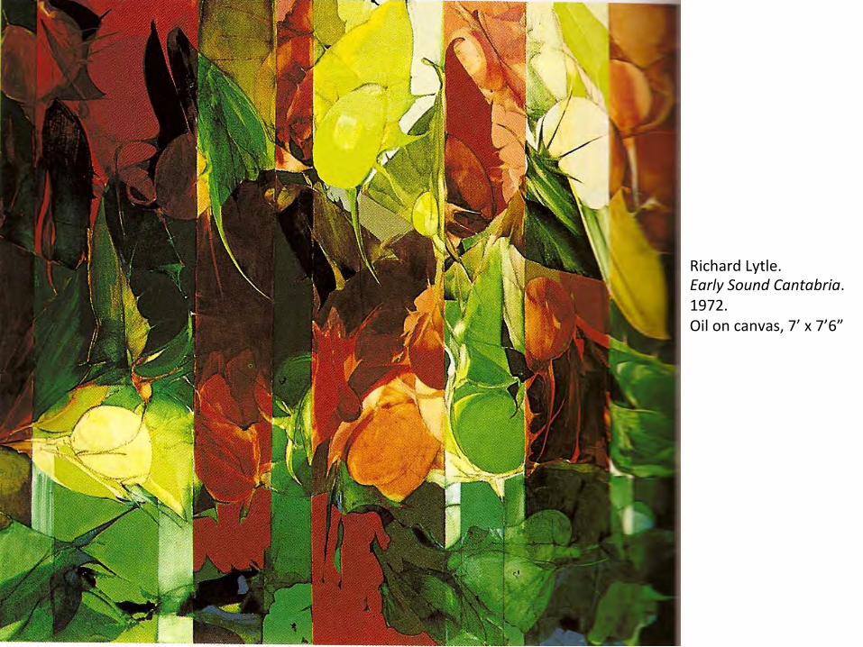
Richard Lytle. Early Sound Cantabria. 1972. Oil on canvas, 7’ x 7’6”

Hues and values themselves may be used as clues to spaJal organizaJon. The greater the contrast in value and/or hue between two areas, the greater the distance between them will appear. If heavy black type is placed on a white groundsheet, the type will seem closer than the groundsheet, coming out toward us rather than occupying the same space as the page. This is because the black contrasts sharply with the white paper. The stronger the contrast between figure and ground, the farther apart they seem to be in space. As they approach each other in value and hue, they seem to exist more and more on the same plane.


Guglielmo Achille Cavellini (1914-‐1990-‐2014) There is no arJst in modern Jmes, perhaps in all of Jme, who tried to insure (some would say purchase) his place in art history with the intensity of the Italian arJst Guglielmo Achille Cavellini. His art of “self-‐historificaJon” was based on the premise that no one knew the arJst bemer than himself (or herself), and that he (or she), rather than criJcs and historians, was bemer able to guide the public towards an appreciaJon of the arJst’s life and work. Through a series of self-‐produced books, performances, fesJvals, portraits, novelty items, and voluminous correspondence, he sought to ingraJate himself with criJcs, curators, and arJsts the world over. In doing so, he laid the foundaJon for the future examinaJon of his art based on a vocabulary of his own devising.

Roy Lichtenstein has used overlapping as a clue to three-‐dimensional relaJonships in his Interior with Mirrored Closet. But the values are so flat and the shapes so simple that there is a fascinaJng interplay of ambiguiJes as to where these highly contrasJng colors lie in space. There is a great deal of spaJal tension between the dark and light diagonal lines.


“SubjecJve” Versus Local Color
Use of local color reports the actual colors of objects, as we would perceive them. A Night in the Bike Store (Red’s Dream) is a tour de force of the ability of computer graphics to create the complexiJes of local color, including highlight and shadow effects.

By contrast, George Segal has used color subjecJvely to create mood and mystery.
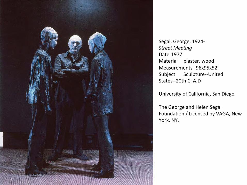
Segal, George, 1924-‐ Street Mee4ng Date 1977 Material plaster, wood Measurements 96x95x52' Subject Sculpture-‐-‐United States-‐-‐20th C. A.D
University of California, San Diego
The George and Helen Segal FoundaJon / Licensed by VAGA, New York, NY.

1905 (165 Kb); Oil and tempera on canvas, 40.5 x 32.5 cm (15 7/8 x 12 7/8 in); Royal Museum of Fine Arts, Copenhagen
MaJsse, Henri Green Stripe (Madame MaJsse)

In this portrait of his wife, MaJsse used solid colors throughout, and depended enJrely upon the intensity of his colors to create depth and shape. Thick black lines and rough brush strokes completed the image. Although it isn’t necessarily a flamering portrait, MaJsse did exactly what he intended to, creaJng a stylisJc and primiJve painJng that deliberately celebrated the use of color.


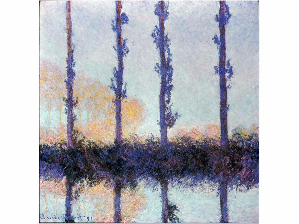
Monet, Claude, 1840-‐1926 Poplars 1891 oil on canvas 81.9x81.6cm Metropolitan Museum of Art (New York, N.Y.) Impressionism Landscape Light -‐-‐France-‐-‐19th C. A.D University of California, San Diego
The label subjecJve color is oqen misapplied to works in which the arJst has observed and reported local colors very carefully. Monet’s Poplars is an example of color use that is oqen mislabeled subjecJve. Monet watched the colors of the same objects change as the light they reflected constantly changed. In Poplars he observes that the trees on the riverbank seen perhaps for a few fleeJng moments during sunrise or sunset on a warm, hazy day actually appear to be blue and red rather than green and brown. A shadow is falling on them, darkening their values, while trees in the background are bathed in golden sunlight. Although these colors do not conform to stereotyped noJons of what colors trees “are,” the colors Monet used are truly local – the colors he saw – under specific, short-‐lived lighJng condiJons.

Simultaneous Contrast
Our percepJon of color is affected by the environment in which we see that hue. Because a color is rarely seen by itself, the surrounding colors will influence and in many cases, alter the color perceived. This visual phenomenon is known as simultaneous contrast and occurs when one color is seen on differing backgrounds. It is commonly associated with complements, but it can also occur in any situaJon when two or more hues are placed next to each other. This is because the appearance of color is relaJve and is always affected by the surrounding hues.

For example, when a hue of yellow is placed next to a neutral gray, the gray will appear to have a cool or violet cast to it. If that same gray is then placed on a violet ground, it will have a warm or yellowish cast to it.
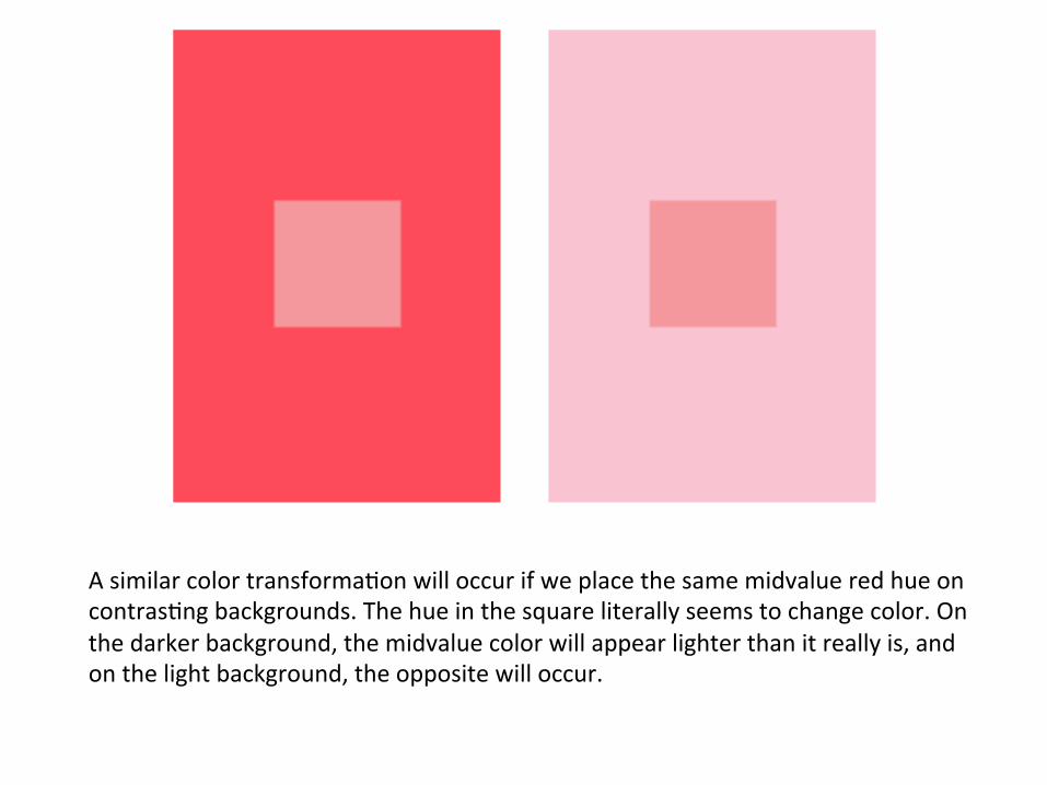
A similar color transformaJon will occur if we place the same midvalue red hue on contrasJng backgrounds. The hue in the square literally seems to change color. On the darker background, the midvalue color will appear lighter than it really is, and on the light background, the opposite will occur.

Simultaneous Contrast
hmp://web.mit.edu/persci/gaz/gaz-‐teaching/flash/contrast-‐movie.swf
hmp://www.worqx.com/color/imen.htm
hmp://library.thinkquest.org/27066/theeye/nlsimcontrast.html
hmp://www.fulltable.com/vts/c/cbk/c/c.htm M.E. Chevreul – simultaneous contrast

OpJcal Color Mixtures
A color interacJon intenJonally used by certain arJsts and designers is opJcal mixing of colors. Nineteenth-‐century French poinJllist painters, such as Monet and Seurat, placed dots of unmixed colors on or near each other. When seen from a distance, the colors tended to blend to create new color sensaJons. Instead of mixing their paints on a paleme, the poinJllists forced viewers to mix them opJcally. When it works, this technique evokes luminous color sensaJons that pulsate with life, for the colors are being conJnually created behind the viewer’s very eyes.


From a great distance – or in a small reproducJon – Chuck Close’s 8 ½ foot high self portrait painJng begins to resemble the local colors of his actual face. But at close range, our eyes cannot mix the dots of juxtaposed colors, so they take on an idenJty of their own. For the arJst to work at this range with colored shapes that have their own idenJty and yet create an overall opJcal effect that can be perceived only at a distance is a striking achievement.

Chuck Close, American, born 1940 Self-‐Portrait 1997 Oil on canvas 8' 6 x 7' (259.1 x 213.4 cm) The Museum of Modern Art Giq of Agnes Gund, Jo Carole and Ronald S. Lauder, Donald L. Bryant, Jr., Leon Black, Michael and Judy Ovitz, Anna Marie and Robert F. Shapiro, Leila and Melville Straus, Doris and Donald Fisher, and purchase

Detail: Chuck Close Self-‐Portrait 1997 Oil on canvas

Another opJcal color mixture extensively explored by the color theorist Josef Albers involves middle mixtures. These are three analogous colors that relate to each other as parents and child: The third contains equal parts of the first two. A middle mixture of the hues blue and green would be blue-‐green. A middle mixture of dark and light values of the same hue would be a medium value. If the middle mixture is presented in the right proporJons between the parents, their colors will seem to interpenetrate it. In Intersec4ng Orange from Josef Alber’s Homage to the Square series, the middle mixture – the orange band – develops a red-‐orange glow near the yellow-‐orange and a yellow-‐orange glow near the red-‐orange, but is actually painted uniformly in a single color. Alber’s explanaJon for the opJcal mixture is that a color seems to subtract its own color from colors placed next to it. Alber’s work clearly demonstrates the only absolute principle of color use: Colors are affected by the colors around them. We never see colors in isolaJon, but rather in juxtaposiJon to other colors with inevitably affect the way we perceive them.


The LaJn Jtle Vir Heroicus Sublimis of this painJng can be translated as "Man, heroic and sublime." It refers to Newman’s essay "The Sublime is Now," in which he asks, "If we are living in a Jme without a legend that can be called sublime, how can we be creaJng sublime art?" His response is embodied in part by this painJng—his largest ever at that Jme. Newman hoped that the viewer would stand close to this expansive work, and he likened the experience to a human encounter: "It's no different, really, from meeJng another person. One has a reacJon to the person physically. Also, there’s a metaphysical thing, and if a meeJng of people is meaningful, it affects both their lives.

Aware of the strong effects that colors have on each other when looked at in juxtaposiJon, Barnem Newman created extraordinary visual sensaJons in his Vir Heroicus Sublimis. As you look at the painJng, many things happen within your visual percepJon, if you give the opJcal sensaJons Jme to develop. The white stripe appears to develop. The white stripe appears to develop a yellow cast because the bluish-‐red surrounding it subtracts blue and red from the white, leaving the only remaining primary: yellow. The other stripes change, too, they interact with the red background. The center of the painJng may appear to be spotlit, reflecJng a lighter value. Aqerimages of the four stripes that Newman painted begin to appear along the painJng, turning it into a dynamic parade of ever-‐changing verJcal stripes of many hard-‐to-‐describe colors. Some of these are strategically placed so that they many even overlap and mingle their color energies. Newman has thus evoked an extraordinary range of color sensaJons with an extremely limited paleme.

Color is so complex and rich in potenJal that the more you experiment with it, the more it will surprise you. The color theories of the past point to only some of the possibiliJes. It is up to you to explore further. The problems that follow merely scratch the surface. They are only appeJzers – hopefully they will whet your taste for a full course on color alone.

source: Design Principles and Problems Paul Zelanski & Mary Pat Fisher Chapter : Color pp. 227-‐250