value - university of texas at dallasmelacy/pages/2d_design/value_art-fundamentals12... · in the...
TRANSCRIPT
Value

art fundamentals: theory and practice 12 edition
OCVIRK, STINSTON,WIGG, BONE, CAYTON p. 150-

INTRODUCTION TO VALUE RELATIONSHIPS
From the rising of the sun to the soft glow of the moon, we see images as light against dark or dark against light. the greater the contrast, the easier the image can be seen – although an extreme contrast of light and dark is not always necessary for an object to be understandable.

Robert Longo
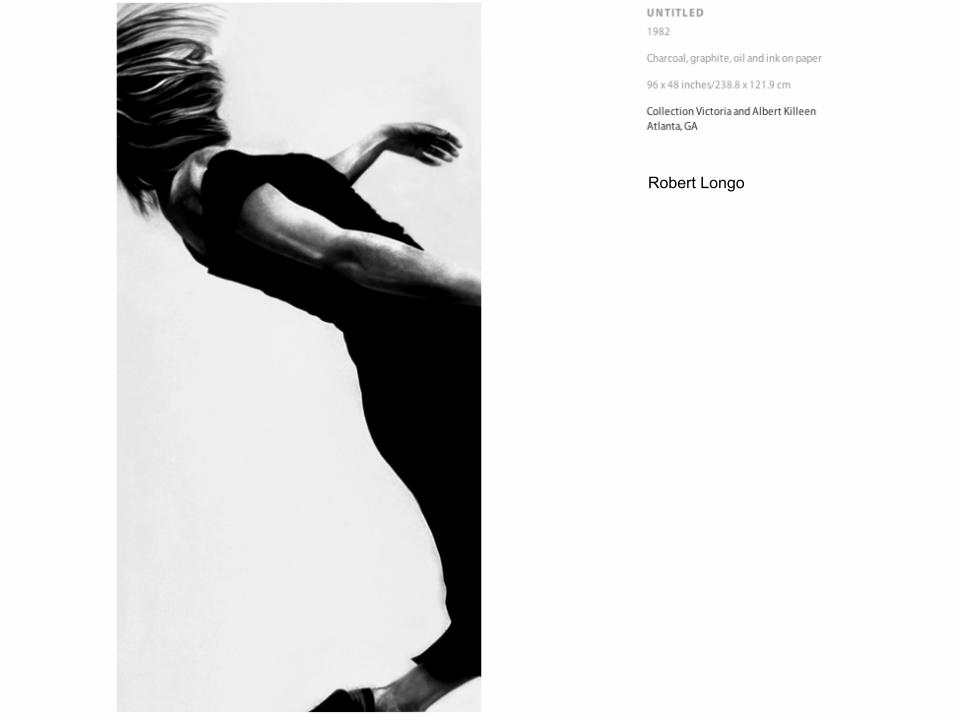
Robert Longo
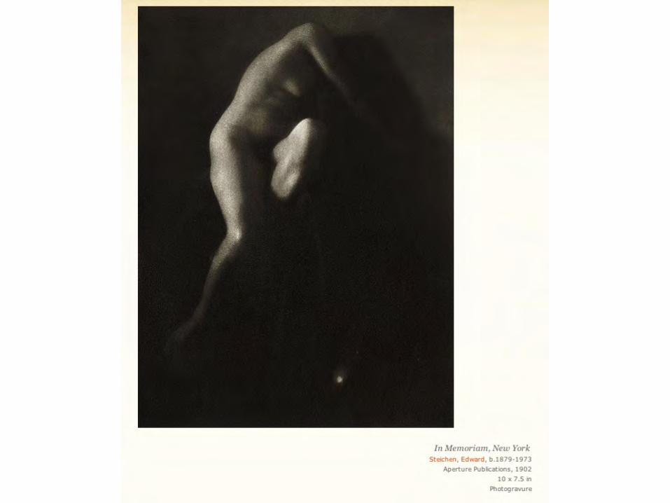

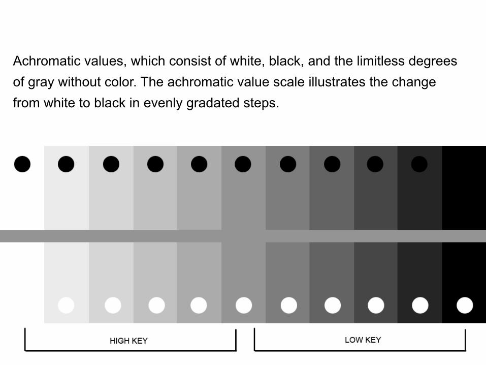
Achromatic values, which consist of white, black, and the limitless degrees of gray without color. The achromatic value scale illustrates the change from white to black in evenly gradated steps.
In the visual arts, an area’s relative lightness or darkness is referred to as its value. Contrasts in value allow us to see lines and shapes, sense depth and dimensionality, and perceive surface textures. Our eyes are also guided through a composition by the patterns of those value contrasts, which encourage us to focus on particular locations in the work. Careful value choices even affect our psychological or emotional reactions. Value has both compositional function and great expressive capability. An understanding of value is fundamental to the study of art because it applies to all the elements.
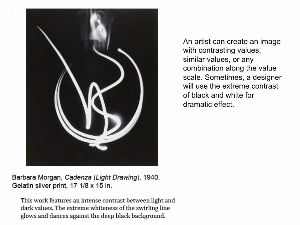
An artist can create an image with contrasting values, similar values, or any combination along the value scale. Sometimes, a designer will use the extreme contrast of black and white for dramatic effect.
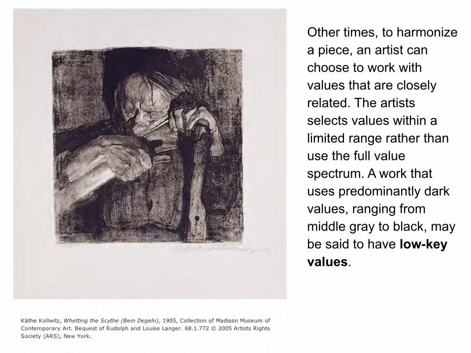
Other times, to harmonize a piece, an artist can choose to work with values that are closely related. The artists selects values within a limited range rather than use the full value spectrum. A work that uses predominantly dark values, ranging from middle gray to black, may be said to have low-key values.

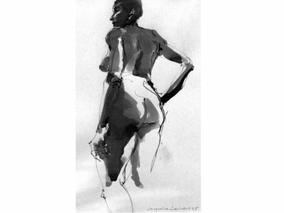
artist: Robert Bauer
When a work contains mostly light values, ranging from white to middle gray, it is said to have high-key values.
With both approaches, a limited amount of the opposite values may be introduced for accents, but those contrasting accents
should not destroy the dominate feeling of lightness or darkness.
The “key” selected can be used to establish a general mood for
the work – a preponderance of dark (low-key) areas creates an atmosphere of gloom, mystery, drama, or menace, whereas a
composition that is basically light (high-key) will produce quite the
opposite effect.

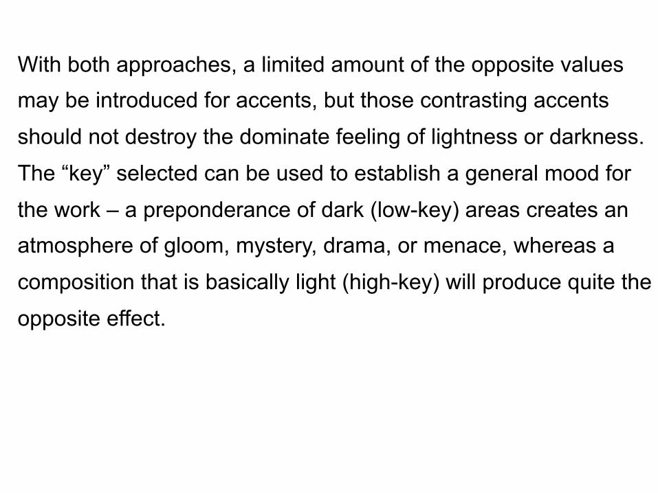
Ellen Soderquist Doppelganger © 1992
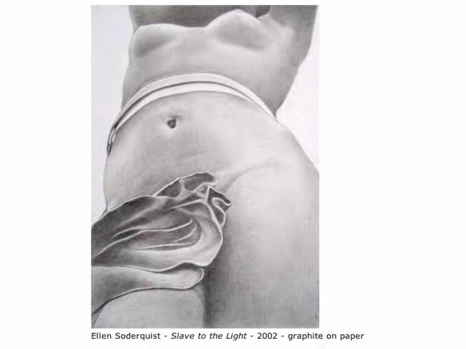
Robert Dale Anderson
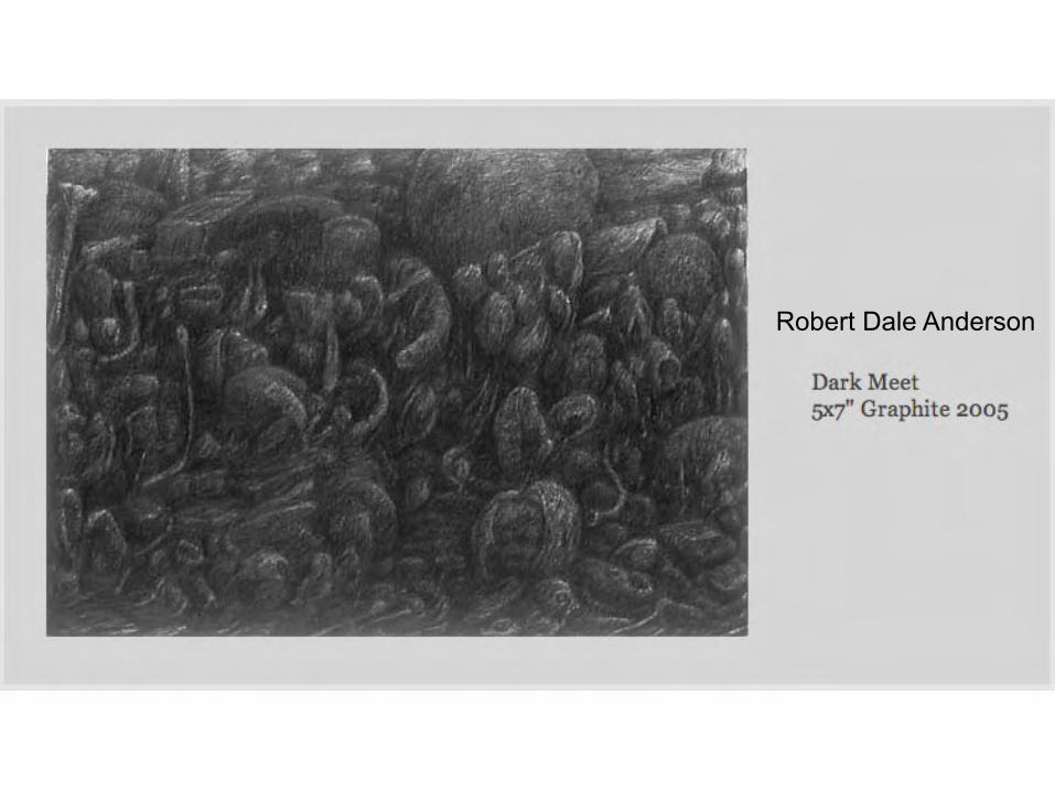
Peter Milton, 1930 - Pl.II-2 from the Portfolio The Jolly Corner - Text by Henry James 1971 Etchings
37.7 x 24.7 cm (image)


Chiaroscuro
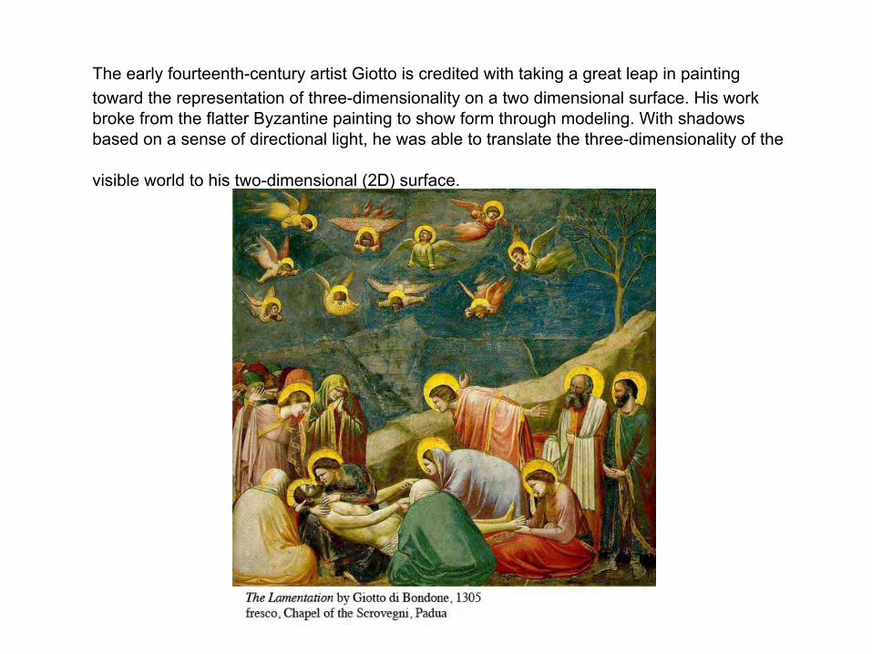
The early fourteenth-century artist Giotto is credited with taking a great leap in painting toward the representation of three-dimensionality on a two dimensional surface. His work broke from the flatter Byzantine painting to show form through modeling. With shadows based on a sense of directional light, he was able to translate the three-dimensionality of the
visible world to his two-dimensional (2D) surface.
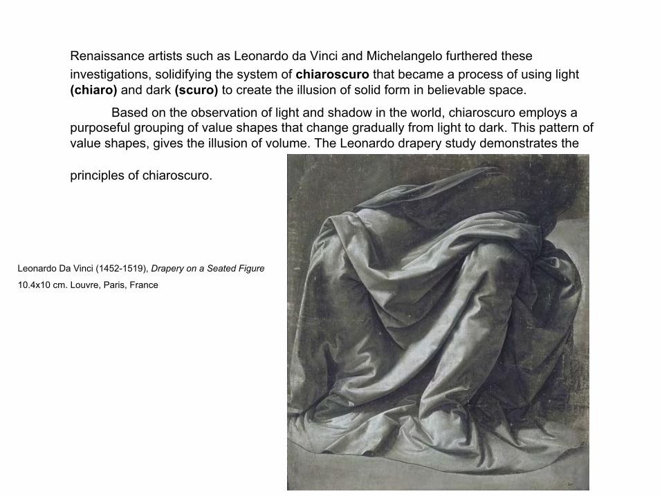
Renaissance artists such as Leonardo da Vinci and Michelangelo furthered these investigations, solidifying the system of chiaroscuro that became a process of using light (chiaro) and dark (scuro) to create the illusion of solid form in believable space.
Based on the observation of light and shadow in the world, chiaroscuro employs a purposeful grouping of value shapes that change gradually from light to dark. This pattern of value shapes, gives the illusion of volume. The Leonardo drapery study demonstrates the
principles of chiaroscuro.
Leonardo Da Vinci (1452-1519), Drapery on a Seated Figure
10.4x10 cm. Louvre, Paris, France
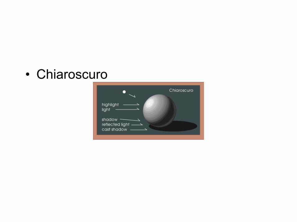
• Chiaroscuro
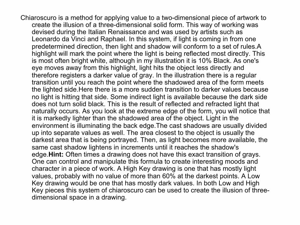
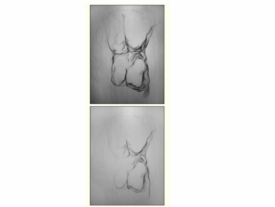
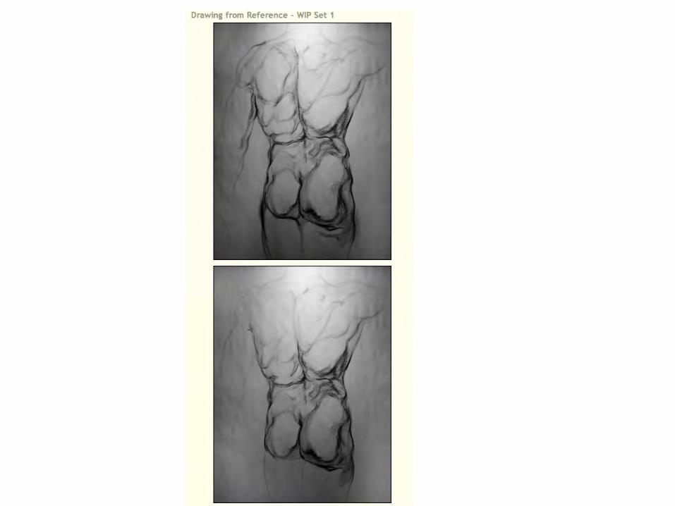
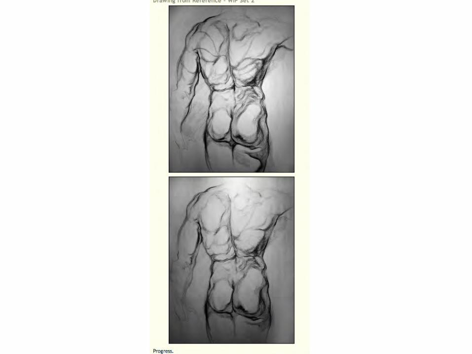
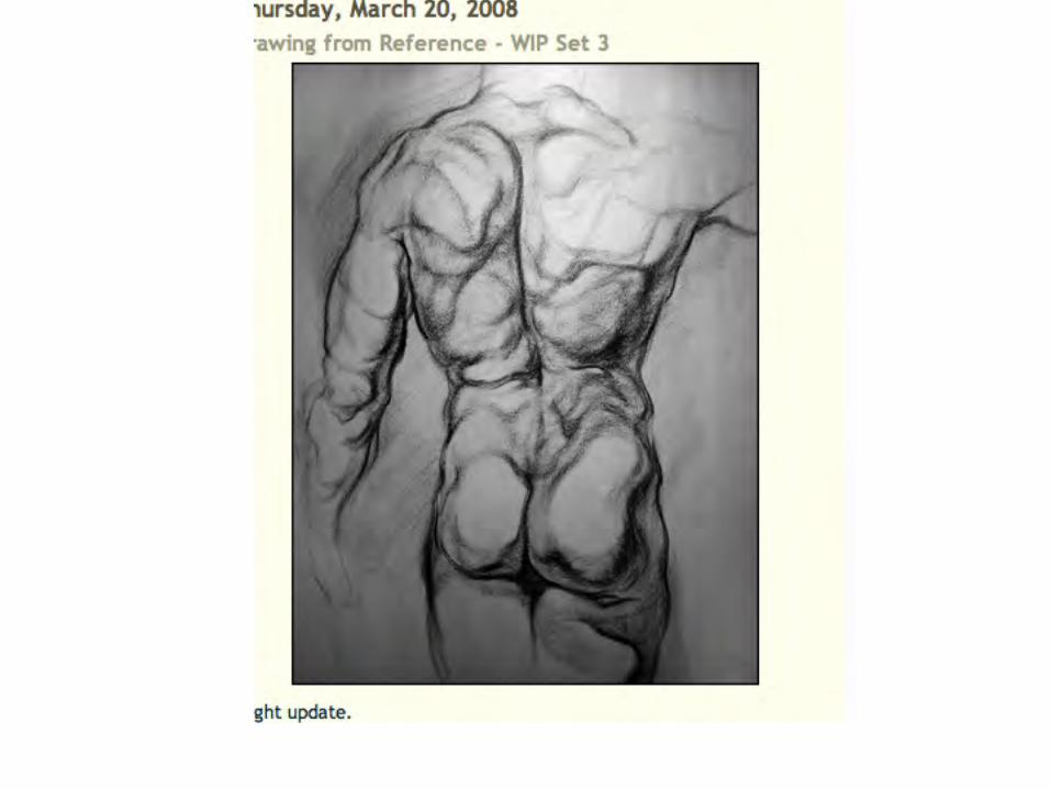
Chiaroscuro is a method for applying value to a two-dimensional piece of artwork to create the illusion of a three-dimensional solid form. This way of working was devised during the Italian Renaissance and was used by artists such as Leonardo da Vinci and Raphael. In this system, if light is coming in from one predetermined direction, then light and shadow will conform to a set of rules.A highlight will mark the point where the light is being reflected most directly. This is most often bright white, although in my illustration it is 10% Black. As one's eye moves away from this highlight, light hits the object less directly and therefore registers a darker value of gray. In the illustration there is a regular transition until you reach the point where the shadowed area of the form meets the lighted side.Here there is a more sudden transition to darker values because no light is hitting that side. Some indirect light is available because the dark side does not turn solid black. This is the result of reflected and refracted light that naturally occurs. As you look at the extreme edge of the form, you will notice that it is markedly lighter than the shadowed area of the object. Light in the environment is illuminating the back edge.The cast shadows are usually divided up into separate values as well. The area closest to the object is usually the darkest area that is being portrayed. Then, as light becomes more available, the same cast shadow lightens in increments until it reaches the shadow's edge.Hint: Often times a drawing does not have this exact transition of grays. One can control and manipulate this formula to create interesting moods and character in a piece of work. A High Key drawing is one that has mostly light values, probably with no value of more than 60% at the darkest points. A Low Key drawing would be one that has mostly dark values. In both Low and High Key pieces this system of chiaroscuro can be used to create the illusion of three-dimensional space in a drawing.

some divisions of light/shadow: Highlight: The point closest to the light source where light is most concentrated. Highlights are
easiest to see on reflective or glossy surfaces. Light: Half of a hemisphere is lit when a light source is present. We see more of the light
side than we do shadow in the illustration at the top right. Shadow: The half hemisphere that is darker (not necessarily dark) which is opposite the lit
hemisphere. Core shadow: This is the center of the darkened area. From our vantage point it is a thin crescent. Reflected light: Use this as often as you can. It can help to define the back edge of an object. It
occurs in a shadowed area and is caused by light being reflected from another area or created by a secondary light source.
Cast shadow: This gives an object a nice sense of space
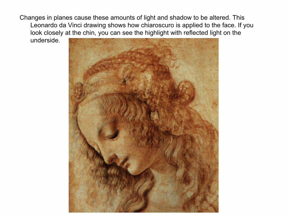
Changes in planes cause these amounts of light and shadow to be altered. This Leonardo da Vinci drawing shows how chiaroscuro is applied to the face. If you look closely at the chin, you can see the highlight with reflected light on the underside.
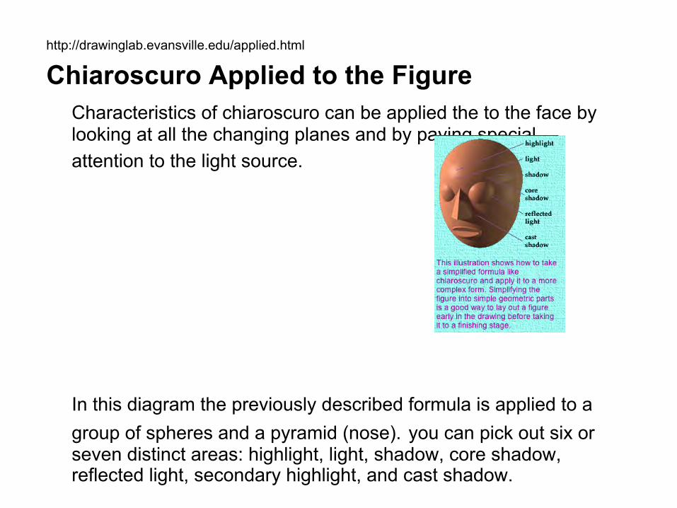
http://drawinglab.evansville.edu/applied.html Chiaroscuro Applied to the Figure
Characteristics of chiaroscuro can be applied the to the face by looking at all the changing planes and by paying special attention to the light source.
In this diagram the previously described formula is applied to a group of spheres and a pyramid (nose). you can pick out six or seven distinct areas: highlight, light, shadow, core shadow, reflected light, secondary highlight, and cast shadow.

Some elements to note: The head is oval in shape so the shading will stretch around the form differently than in a sphere. The eyes are a sphere and will protrude from the face. A common mistake among those first learning to draw the figure is to draw the eyes as flat. The nose has flat planes on each side which change in value (lightness/darkness). The lower lip tends to more often be lit more than the upper lip because light generally comes from above it. The lower lip tends to be shadowed. The nose casts a shadow. That shadow wraps around the planes of the face.The rest of the figure has similar characteristics. The arms, legs and trunk of the body can be thought of as cylindrical forms which have the same distinct areas of light.Changes in planes cause these amounts of light and shadow to be altered.
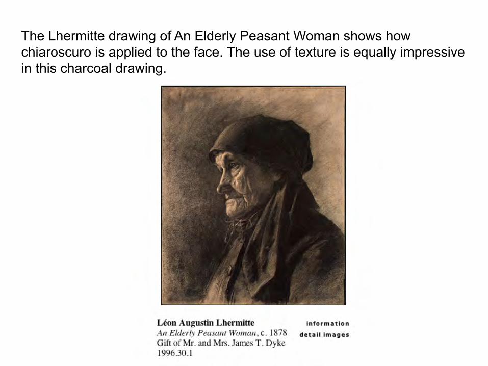
The Lhermitte drawing of An Elderly Peasant Woman shows how chiaroscuro is applied to the face. The use of texture is equally impressive in this charcoal drawing.
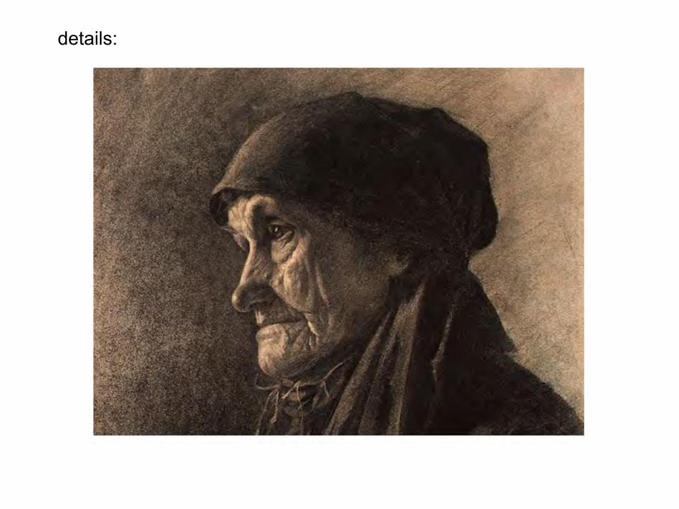
details:

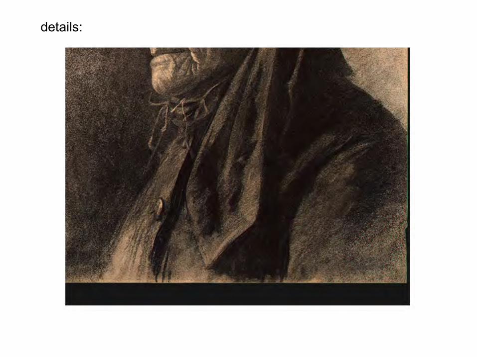
details:
details:
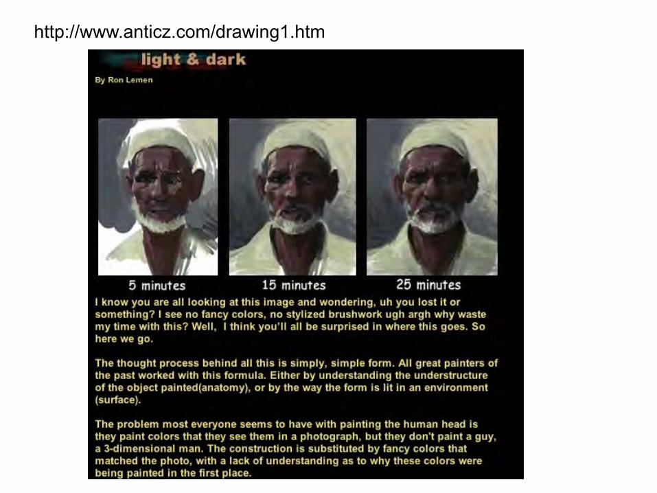
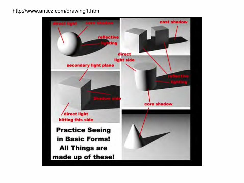
http://www.anticz.com/drawing1.htm
http://www.anticz.com/drawing1.htm

http://www.anticz.com/drawing1.htm

http://www.anticz.com/drawing1.htm