competitor website best practices power point
TRANSCRIPT

PPL EnergyPlus Competitor Website Review
August 21, 2012

Brief Overview
• The review comprised of 39 competitor websites – 12 electric utility companies, 27 competitive
suppliers
• 30 out of the 39 websites contained some sort of residential and business section– 23 out of the 30 had distinct, separate pages for
business and residential customers• Of these 23 websites, 13 of them broke their
business section down even further, into small or large businesses

A majority of the websites have a similar setup where the navigation toolbar (i.e. the section saying “My Account”, “Customer Service”, etc.) is located at or near the top of the page. PECO’s website is an example of this.

Energy Plus is another example of this standard setup, but in a slightly different format.

A few websites did not have that traditional setup with the toolbar on the top. PPL Electric Utilities is one example of this. They have a small toolbar near the top, but they also have a Quick Links tab to activate even more tabs. Along with the Quick Links tab, the residential and commercial/industrial pages are accessed in the middle of the page.

These are the tabs that are accessible after clicking on the Quick Links tab.

Con Edison Solutions has a typical navigation toolbar, but theirs is located in the center of the page. From this toolbar, access to the business (small or large) and residential pages are possible.

HOP Energy doesn’t have any sort of navigation toolbar on the page at all. Instead, at the top of the page, it has a cluster of subsidiary company logos, which are clickable and direct you to that specific company’s page. In the middle right of the page, there is a section to access residential and business pages.

Reliant Energy does not have a toolbar on the top of the page either. The entire homepage is rather small compared to most of the other websites in this review. The entire page can be viewed without scrolling. In the center of the page there is a residential and a business section. The text seems a bit small and hard to read on this website though.

Duquesne Light has the most noticeably different website. It has a very untraditional feel to it and it looks to give the viewer an easier and simpler way to navigate through the page. On the left there are 3 large tabs where you can select residential, business, or “Inside Duquesne Light.” When the viewer scrolls over each tab the picture to the right changes to what the tab is (i.e. above: a picture of a family comes up when you scroll over “For Your Home.”

Another design that became quite common (over half of the websites) was the use of “slide shows” or “banner” items in the websites. These slide shows scroll through a variety of different pictures and texts. Most of the sites automatically scroll through, although a few sites are designed where the viewer needs to manually scroll through them. NextEra Energy’s website is an example of this. The picture on the left shows the first slide and the picture on the right shows the transition to the second slide.

One interesting slideshow to note is one on the Amerigreen Energy website. On the bottom right of the page there is a small section where a box rotates through all of the different clients that Amerigreen serves. The picture on the left shows Pennsy Supply in the box, and the picture right shows Cruisers Yachts. These are just two of the many clients that are shown in this slide show.

One of the main things looked at during this review was the way the residential and commercial pages were presented. The most common way it was presented was by having the pages accessible directly from the homepage. PECO has the page links located under the “My Account” tab, which is accessed by simply scrolling over it. Other sites are even more direct such as Duquesne Light and PPL Electric Utilities shown earlier, which have their own tab on the homepage. Additionally, PECO breaks business down into small and large.
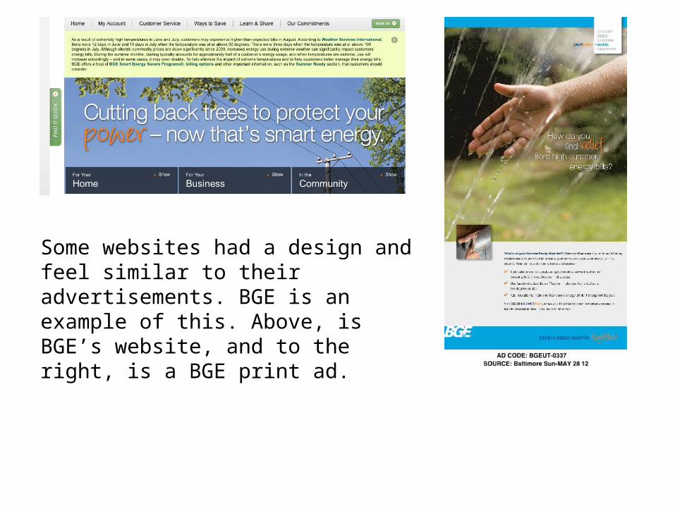
Some websites had a design and feel similar to their advertisements. BGE is an example of this. Above, is BGE’s website, and to the right, is a BGE print ad.

Spark Energy is another example of this similar website and advertisements. The picture on the left shows the website and the picture on the right shows an outdoor ad.

A few websites had unique, interesting features on the homepages. One website was UGI’s. The viewer can drag through a set of large tabs by just dragging the mouse along it. In the example above, there is a before and after picture of the tabs.

On PECO’s website there is a moving feedback tab on the right side of the page. As the viewer scrolls down the page, the tab stays put and is clickable. This can be seen in the picture on the left. The picture on the right shows the short feedback survey that pops up when you click the tab.

PSE&G has interesting animations on their homepage. For example, when scrolling over the “For Your Home” tab, as seen above, a light in the house goes on. If the viewer scrolls over “For Your Business,” the machine parts begin to turn. The same thing happens for the other two tabs as well.

Some of the websites chose to include customer reviews and testimonies directly on the page. Two of companies that used this were Direct Energy (pictured left) and Respond Energy (pictured right).

Gateway Energy’s website included a link to the “Gateway Energy Store” on the homepage. This is one of the only websites that includes a link of this kind.

This is the page that the viewer is directed to upon clicking the link on the homepage. On this site, the viewer can scroll through various products and accessories associated with energy.

The last unique, interesting thing noticed was on Oasis Energy’s homepage. Located in the middle of the page, there is a weather section. Specifically, it shows the current high and low temperature, any precipitation (or lack there of), as well as the time of day for Baltimore, MD and New York, NY.

Additional Notes• All of the First Energy companies (Met-Ed, Penelec,
Jersey Central Power & Light, as well as others not included in the review) have the same exact website setup. They are word-for-word the same, except that the company names change.
• Like the First Energy companies, all of the PHI Companies (Delmarva Power, Pepco, and Atlantic City Electric) have word-for-word, the exact same websites.
• Despite Exelon and Constellation merging, they still have differently setup websites.