componentone toolbar for wpf · part 3: using commands in mvvm ..... 25. 1 componentone toolbar for...
TRANSCRIPT

ComponentOne
Toolbar for WPF

Copyright 1987-2012 GrapeCity, Inc. All rights reserved.
ComponentOne, a division of GrapeCity
201 South Highland Avenue, Third Floor
Pittsburgh, PA 15206 • USA
Internet: [email protected]
Web site: http://www.componentone.com
Sales
E-mail: [email protected]
Telephone: 1.800.858.2739 or 1.412.681.4343 (Pittsburgh, PA USA Office)
Trademarks
The ComponentOne product name is a trademark and ComponentOne is a registered trademark of GrapeCity, Inc. All other trademarks used herein are the properties of their respective owners.
Warranty
ComponentOne warrants that the original CD (or diskettes) are free from defects in material and workmanship, assuming normal use, for a period of 90 days from the date of purchase. If a defect occurs during this time, you may return the defective CD (or disk) to ComponentOne, along with a dated proof of purchase, and ComponentOne will replace it at no charge. After 90 days, you can obtain a replacement for a defective CD (or disk) by sending it and a check for $25 (to cover postage and
handling) to ComponentOne.
Except for the express warranty of the original CD (or disks) set forth here, ComponentOne makes no other warranties, express or implied. Every attempt has been made to ensure that the information contained in this manual is correct as of the time it was
written. We are not responsible for any errors or omissions. ComponentOne’s liability is limited to the amount you paid for the product. ComponentOne is not liable for any special, consequential, or other damages for any reason.
Copying and Distribution
While you are welcome to make backup copies of the software for your own use and protection, you are not permitted to make
copies for the use of anyone else. We put a lot of time and effort into creating this product, and we appreciate your support in seeing that it is used by licensed users only.
This manual was produced using ComponentOne Doc-To-Help™.

iii
Table of Contents
ComponentOne Toolbar for WPF Overview ..................................................................................................1
Help with ComponentOne Studio for WPF .................................................................................................. 1
Key Features ................................................................................................................................................3
Toolbar for WPF Quickstart ..........................................................................................................................3
Step 1 of 3: Adding Toolbar for WPF to your Project ................................................................................... 4
Step 2 of 3: Adding C1ToolbarGroups to C1Toolbar .................................................................................... 4
Step 3 of 3: Adding a C1ToolbarStrip and C1ToolbarToggleButtons to C1ToolbarGroup .......................... 5
XAML Quick Reference ...............................................................................................................................6
EX: Add Items to the C1Toolbar ................................................................................................................... 7
Toolbar Elements .........................................................................................................................................7
Toolbar Group ............................................................................................................................................... 7
Toolbar Button ............................................................................................................................................... 8
Toolbar DropDown ....................................................................................................................................... 9
Toolbar SplitButton ...................................................................................................................................... 10
Toolbar Strip ................................................................................................................................................ 11
Toolbar Tab Item ......................................................................................................................................... 12
Toolbar ToggleButton .................................................................................................................................. 13
Toolbar for WPF Layout and Appearance ................................................................................................... 14
Toolbar Layout ............................................................................................................................................ 15
Button Size and Text Position in C1ToolbarGroup .................................................................................... 15
Toolbar for WPF Appearance Properties .................................................................................................... 16
C1Toolbar Templates ................................................................................................................................... 18
C1Toolbar Styles .......................................................................................................................................... 18
ComponentOne ClearStyle Technology ...................................................................................................... 19
How ClearStyle Works ................................................................................................................... 19
Toolbar ClearStyle Properties......................................................................................................... 19
Toolbar for WPF Samples ........................................................................................................................... 19
Toolbar for WPF Task-Based Help .............................................................................................................. 21

iv
Adding an Image to the Toolbar Button ...................................................................................................... 21
Adding Logic Behind the ToolbarButton Click Event ................................................................................. 21
Commanding Tutorial with C1Toolbar ........................................................................................................ 23
Part 1: Using the Command Library............................................................................................................ 23
Part 2: Creating Custom Commands ........................................................................................................... 24
Part 3: Using Commands in MVVM ........................................................................................................... 25
1
ComponentOne Toolbar for WPF
Overview Create custom toolbars to provide additional navigation in your application with
ComponentOne Toolbar™ for WPF. Toolbar for WPF provides items (such as links,
custom content, and separators) and groups, giving you the flexibility to place almost any control in the toolbar.
For a list of the latest features added to ComponentOne Studio for WPF, visit What's New in Studio for WPF.
Getting
Started
To get started, review the following topics:
- Toolbar for
WPF Quickstart (page 3)
- XAML Quick Reference (page 6)
- Toolbar for WPF Samples (page 19)
Help with ComponentOne Studio for WPF Getting Started
For information on installing ComponentOne Studio for WPF, licensing, technical support, namespaces and
creating a project with the control, please visit Getting Started with Studio for WPF.
What's New
For a list of the latest features added to ComponentOne Studio for WPF, visit What's New in Studio for WPF.


3
Key Features ComponentOne Toolbar for WPF allows you to create customized, rich applications. Make the most of Toolbar
for WPF by taking advantage of the following key features:
Tabs and Groups
Organize related commands together using tabs and groups. For example, group similar toolbar buttons such as those relating to the Font or the Clipboard. You can label each tab and group to best describe the commands within and the actions they perform.
For more information see Toolbar Elements (page 7).
Ribbon-like Features
C1Toolbar has built-in Microsoft Ribbon-like features including collapse, help and dialog launcher buttons.
Lightweight ToolbarStrip
Create a lightweight C1ToolbarStrip that can be used separately, for simple scenarios.
Styled Buttons and Drop-downs
The C1ToolBar control is a container that supports any UIElements. To make toolbar creation easy, Toolbar for WPF includes several types of controls to place inside including buttons, toggle buttons, separators and drop-down controls. Attach event handlers or take advantage of the commanding framework to add behavior to each control.
WPF Command Framework Support
Toolbar supports the WPF command framework. Create single commands each including a title, small and large image source and share them throughout your toolbars.
For more information see Commanding Tutorial with C1Toolbar (page 23).
OverFlow Support
Depending on the available space in the Strip panel, the items will jump between the Strip panel and drop-down Overflow panel. This occurs automatically by default, but can be set to occur never, always, or as needed.
For more information see Toolbar Strip (page 11).
Change the Orientation
Select from horizontal (default) or vertical orientations for your toolbar.
For more information see Toolbar Layout (page 15).
Supports ClearStyle Technology
Toolbar for WPF supports ComponentOne's ClearStyle technology, which allows you to easily change control
colors without having to change control templates. By setting a few color properties, you can quickly style the
C1Toolbar elements. See Toolbar ClearStyle Properties (page 19) for more information on the
ComponentOne ClearStyle technology.
Toolbar for WPF Quickstart The following quick start guide is intended to get you up and running with Toolbar for WPF. In this quick start you'll
start in Visual Studio and create a new project, add Toolbar for WPF to your application, and add C1Toolbar items such

4
as C1ToolbarGroup, C1ToolbarStrip, C1ToolbarButton, and C1ToolbarToggleButton to your C1Toolbar. For more
information see Toolbar Elements (page 7).
Step 1 of 3: Adding Toolbar for WPF to your Project To set up your project and add a C1Toolbar control to your application, complete the following steps
1. Create a new WPF project in Visual Studio.
2. Add a reference to the C1.WPF and the C1.WPF.C1Toolbar assemblies. In the Solution Explorer right-
click on References and select Add Reference. In the Add Reference dialog box select the Browse tab.
Browse for the C1.WPF.C1Toolbar.dll and the C1.WPF and select OK.
3. Define the System and the C1.WPF.C1Toolbar prefixes.
xmlns:System="clr-namespace:System;assembly=mscorlib"
xmlns:c1toolbar="clr-
namespace:C1.WPF.Toolbar;assembly=C1.WPF.Toolbar"
4. Add 2 Rows to the LayoutRoot Grid and set the Height of the first row to ‘Auto’.
<Grid x:Name="LayoutRoot" Background="White">
<Grid.RowDefinitions>
<RowDefinition Height="Auto"/>
<RowDefinition Height="*"/>
</Grid.RowDefinitions>
</Grid>
5. Drop a C1Toolbar onto the page within the first row and Remove the default properties: Height="100" HorizontalAlignment="Left" Margin="174,34,0,0". Your XAML should now look like the following:
<Grid.RowDefinitions>
<RowDefinition Height="Auto"/>
<RowDefinition Height="*"/>
</Grid.RowDefinitions>
<c1:C1Toolbar Grid.Row="1" Name="c1Toolbar1">
</c1:C1Toolbar>
Step 2 of 3: Adding C1ToolbarGroups to C1Toolbar In this step you'll continue in Visual Studio by adding C1ToolbarGroups to your C1Toolbar. You'll then add C1ToolbarButtons to the C1ToolbarGroups.
1. Right-click on the C1Toolbar control and select Properties to open its Properties window. Navigate to the
ToolbarItems property and click on the ellipsis button to open up the Collection Editor: ToolbarItems.
2. Click on the Add button twice to add two C1ToolbarGroups and click OK. Your XAML should now
look like the following:
<c1:C1Toolbar Name="c1Toolbar1">
<c1:C1ToolbarGroup />

5
<c1:C1ToolbarGroup />
</c1:C1Toolbar>
3. In XAML, set the Header property of each C1ToolbarGroup to the following: Clipboard and Font. Your XAML should now look like the following:
<c1:C1Toolbar Grid.Row="1" Name="c1Toolbar1">
<c1:C1ToolbarGroup Header="Clipboard"/>
<c1:C1ToolbarGroup Header="Font"/>
</c1:C1Toolbar>
4. Select the Clipboard C1ToolbarGroup and click on the ellipsis button next to the Items collection editor.
5. From the Select item drop-down, click Add three times to add three C1ToolbarButtons to the collection.
6. Select the first C1ToolbarButton and expand the Other node in its properties window to set the
LabelTitle property to Paste and set the other two to Cut and Copy, repectively.
7. As an optional step you can set the LargeImageSource and/or SmallImageSource properties to resources found within your project or add new images.
8. Click OK to close the Items Collection editor. Your XAML should now look like this:
<c1:C1Toolbar Name="c1Toolbar1">
<c1:C1ToolbarGroup Header="Clipboard">
<c1:C1ToolbarButton LabelTitle="Paste"
LargeImageSource="/ToolbarQuickstart;component/Images/Paste.png" />
<c1:C1ToolbarButton LabelTitle="Cut"
SmallImageSource="/ToolbarQuickstart;component/Images/Cut.png" />
<c1:C1ToolbarButton LabelTitle="Copy"
SmallImageSource="/ToolbarQuickstart;component/Images/Copy.png" />
</c1:C1ToolbarGroup>
<c1:C1ToolbarGroup Header="Font"/>
</c1:C1Toolbar>
Step 3 of 3: Adding a C1ToolbarStrip and C1ToolbarToggleButtons to C1ToolbarGroup In this step you'll continue in Visual Studio by adding a C1ToolbarStrip to your ‘Font’ C1ToolbarGroup and then
you will add C1ToolbarToggleButtons to the C1ToolbarGroup.
1. Select the Font C1ToolbarGroup and and add a C1ToolbarStrip in XAML.
<c1:C1ToolbarGroup Header="Font">
<c1:C1ToolbarStrip />
</c1:C1ToolbarGroup>
The rest of your XAML should appear like the following:
<c1:C1Toolbar Grid.Row="1" Name="c1Toolbar1"
<c1:C1ToolbarGroup Header="Clipboard">

6
<c1:C1ToolbarButton LabelTitle="Paste" />
<c1:C1ToolbarButton LabelTitle="Cut" />
<c1:C1ToolbarButton LabelTitle="Copy" />
</c1:C1ToolbarGroup>
<c1:C1ToolbarGroup Header="Font">
<c1:C1ToolbarStrip />
</c1:C1ToolbarGroup>
</c1:C1Toolbar>
2. Select the C1ToolbarStrip and open its Items collection editor
3. Select the C1ToolbarToggleButton from the Select item dropdown and click Add three three times to
add three C1ToolbarToggleButtons; set each LabelTitle property to: Bold, Italic, and Underline. Click
OK to close the Items collection editor.
<c1:C1ToolbarGroup Header="Font">
<c1:C1ToolbarStrip>
<c1:C1ToolbarToggleButton LabelTitle="Bold" />
<c1:C1ToolbarToggleButton LabelTitle="Italic" />
<c1:C1ToolbarToggleButton LabelTitle="Underline" />
</c1:C1ToolbarStrip>
</c1:C1ToolbarGroup>
Congratulations! You've now completed creating a toolbar UI using Toolbar for WPF.
Further topics:
Adding Logic Behind the ToolbarButton Click Event (page 21) – This topic shows you how to use button click events to add logic behind buttons
Commanding Tutorial with C1Toolbar (page 23) – This tutorial demonstrates how to use C1Toolbar with
commands in a WPF application
Button Size and Text Position in C1ToolbarGroup (page 15) – This topic shows you how to use GroupSizeDefinitions of the C1ToolbarGroup.
Toolbar Tab Item (page 12) – This topic shows you how to add the C1ToolbarTabItem control.
XAML Quick Reference This section provides an example that show how to use the WPF Toolbar control with only XAML code.

7
EX: Add Items to the C1Toolbar The following XAML code shows you how to add a C1ToolbarGroup, C1ToolbarStrip, and C1ToolbarButton to the C1Toolbar control:
<c1:C1Toolbar Name="c1Toolbar1">
<c1:C1ToolbarTabControl>
<c1:C1ToolbarTabItem Header="Home">
<c1:C1ToolbarGroup Header="Clipboard">
<c1:C1ToolbarButton LabelTitle="Paste"
LargeImageSource="/Images/Paste.png" />
<c1:C1ToolbarButton LabelTitle="Cut"
SmallImageSource="/Images/Cut.png" />
<c1:C1ToolbarButton LabelTitle="Copy"
SmallImageSource="/Images/Copy.png" />
</c1:C1ToolbarGroup>
<c1:C1ToolbarGroup Header="Font">
<c1:C1ToolbarStrip>
<c1:C1ToolbarToggleButton LabelTitle="Bold" />
<c1:C1ToolbarToggleButton LabelTitle="Italic" />
<c1:C1ToolbarToggleButton LabelTitle="Underline" />
</c1:C1ToolbarStrip>
</c1:C1ToolbarGroup>
</c1:C1ToolbarTabItem>
</c1:C1ToolbarTabControl>
</c1:C1Toolbar>
The following image shows how the C1Toolbar control will appear after adding the above XAML code:
Toolbar Elements C1Toolbar is a WPF control that is used as a container to hold other controls such as buttons, check buttons, text boxes,
drop-down lists, split-buttons, and separators. C1ToolBar provides seven different objects to support the various types
of controls used in the C1ToolBar: C1ToolbarButton, C1ToolbarDropDown, C1ToolbarGroup, C1ToolbarSplitButton,
C1ToolbarStrip, C1ToolbarTabItem, C1ToolbarToggleButton,
Toolbar Group The C1ToolBarGroup object defines a group of toolbar elements. The C1ToolbarGroup can hold the following toolbar controls: C1ToolbarButton, C1ToolbarToggleButton, C1ToolbarDropDown, and C1ToolbarSplitButton.
When you add toolbar items to the C1ToolbarGroup the child toolbar items appear grouped in a rectangular box like the following:
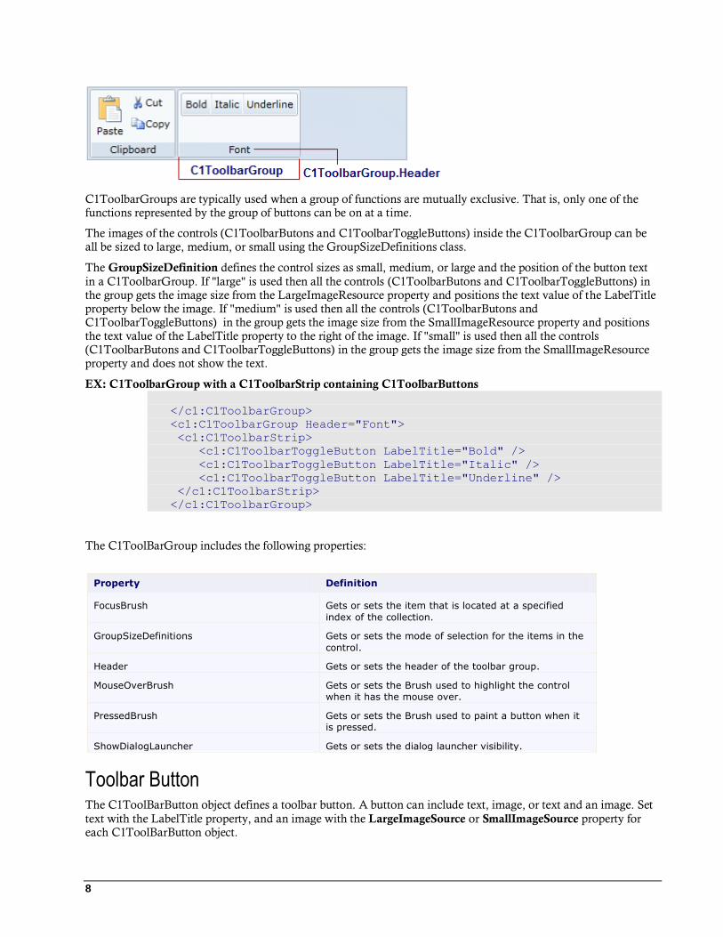
8
C1ToolbarGroups are typically used when a group of functions are mutually exclusive. That is, only one of the functions represented by the group of buttons can be on at a time.
The images of the controls (C1ToolbarButons and C1ToolbarToggleButtons) inside the C1ToolbarGroup can be all be sized to large, medium, or small using the GroupSizeDefinitions class.
The GroupSizeDefinition defines the control sizes as small, medium, or large and the position of the button text
in a C1ToolbarGroup. If "large" is used then all the controls (C1ToolbarButons and C1ToolbarToggleButtons) in the group gets the image size from the LargeImageResource property and positions the text value of the LabelTitle property below the image. If "medium" is used then all the controls (C1ToolbarButons and C1ToolbarToggleButtons) in the group gets the image size from the SmallImageResource property and positions the text value of the LabelTitle property to the right of the image. If "small" is used then all the controls (C1ToolbarButons and C1ToolbarToggleButtons) in the group gets the image size from the SmallImageResource property and does not show the text.
EX: C1ToolbarGroup with a C1ToolbarStrip containing C1ToolbarButtons
</c1:C1ToolbarGroup>
<c1:C1ToolbarGroup Header="Font">
<c1:C1ToolbarStrip>
<c1:C1ToolbarToggleButton LabelTitle="Bold" />
<c1:C1ToolbarToggleButton LabelTitle="Italic" />
<c1:C1ToolbarToggleButton LabelTitle="Underline" />
</c1:C1ToolbarStrip>
</c1:C1ToolbarGroup>
The C1ToolBarGroup includes the following properties:
Property Definition
FocusBrush Gets or sets the item that is located at a specified
index of the collection.
GroupSizeDefinitions Gets or sets the mode of selection for the items in the
control.
Header Gets or sets the header of the toolbar group.
MouseOverBrush Gets or sets the Brush used to highlight the control when it has the mouse over.
PressedBrush Gets or sets the Brush used to paint a button when it is pressed.
ShowDialogLauncher Gets or sets the dialog launcher visibility.
Toolbar Button The C1ToolBarButton object defines a toolbar button. A button can include text, image, or text and an image. Set
text with the LabelTitle property, and an image with the LargeImageSource or SmallImageSource property for each C1ToolBarButton object.

9
The buttons can be added at design time using the C1ToolbarItems collection editor, programmatically using
C1ToolBarItemCollection.Add or C1ToolBarItemCollection.Remove methods from the
C1ToolBarItemCollection collection, or through XAML code..
The C1ToolBarButton includes the following unique properties:
Property Definition
LabelTitle Gets or sets the label title of control.
LargeImageSource Gets or sets the large image source of the control.
MouseOverBrush Gets or sets the Brush used to highlight the control when it has the mouse over
PressedBrush Gets or sets the Brush used to paint a button when it is pressed.
SmallImageSource Gets or sets the large image source of the control.
Toolbar DropDown The C1ToolbarDropDown control represents a drop-down button on the C1ToolbarStrip. When clicking it displays popup panel with Content property or context menu set by Menu property. A drop-down button provides
users with a list of options. When you click on a C1ToolBarDropDown button the Click event always fires and the drop down list appears.
Example 1: Drop-down with popup stack panel with buttons
<c1:C1ToolbarDropDown Padding="2" Header="Color">
<c1:C1ToolbarDropDown.Content>
<StackPanel Margin="2" Orientation="Horizontal">
<Button Margin="2" Content="Red" Foreground="Red" />
<Button Margin="2" Content="Green" Foreground="Green" />
<Button Margin="2" Content="Blue" Foreground="Blue" />
</StackPanel>
</c1:C1ToolbarDropDown.Content>
</c1:C1ToolbarDropDown>
Example 2: Dropdown with popup menu
<c1:C1Toolbar Name="c1Toolbar1" Margin="0,127,0,160">

10
<c1:C1ToolbarDropDown Padding="2" Header="Color">
<c1:C1ToolbarDropDown.ContextMenu>
<ContextMenu>
<MenuItem Foreground="Red" Header="Red" IsCheckable="True" />
<MenuItem Foreground="Green" Header="Green"
IsCheckable="True" />
<MenuItem Foreground="Blue" Header="Blue" IsCheckable="True"
/>
</ContextMenu>
</c1:C1ToolbarDropDown.ContextMenu>
</c1:C1ToolbarDropDown>
</c1:C1Toolbar></c1:C1ToolbarDropDown>
The C1ToolBarDropDown includes the following unique properties:
Property Definition
ContentBackground Gets or sets the content background.
Menu Gets or sets the context menu which is displayed when the control is clicked.
MouseOverBrush Gets or sets the Brush used to highlight the control when it has the mouse over.
PressedBrush Gets or sets the Brush used to paint a button when it is pressed.
Toolbar SplitButton C1ToolbarSplitButton control represents a drop-down split button on the C1ToobarStrip.
It's similar to C1ToolbarDropDown but contains two clickable areas: the button area and the downward-pointing arrow.
When clicking on the rightmost part of the downward-pointing rectangle it displays a popup panel with the
Content property or context menu set by the ContextMenu property. Clicking on the left part of button fires the
Click event as in the standard button. Usually the Click event is used to perform the default or last action while the popup allows to select alternative options.
A solid vertical line dividing the image from the drop down arrow appears when you hover the cursor over the button like in the following image:
EX: Split button with popup menu <c1:C1ToolbarSplitButton Padding="2" Header="Defaut"
Click="SetDefaultStyle">
<c1:C1ToolbarDropDown.Menu>
<c1:C1ContextMenu>
<c1:C1MenuItem Header="Heading 1" FontSize="14" />
<c1:C1MenuItem Header="Heading 2" FontSize="12" />
<c1:C1MenuItem Header="Title" FontWeight="Bold" />
<c1:C1MenuItem Header="Subtitle" FontWeight="SemiBold"

11
FontStyle="Italic" />
<c1:C1MenuItem Header="Quote" FontStyle="Italic" />
</c1:C1ContextMenu>
</c1:C1ToolbarDropDown.Menu>
</c1:C1ToolbarSplitButton>
Toolbar Strip Represents a container for the toolbar controls and other C1 WPF controls. The C1ToolbarStrip is capable of hosting C1ToolbarButton, C1ToolbarToggleButton, C1ToolbarDropDown, C1ToolbarSplitButton, C1Separator, C1ComboBox, and C1TextBox controls.
The C1ToolbarStrip supports overflow depending on the available space in the Strip panel. The items will jump between the Strip panel and drop-down Overflow panel. This occurs automatically by default, but can be set to occur never, always, or as needed
The following imagellustrates the overflow support the C1ToolbarStrip provides:
The C1ToolbarStrip can be added using XAML or programatically.
Ex: Toolbar strip with toggle buttons <c1:C1ToolbarGroup Header="Font">
<c1:C1ToolbarStrip>
<c1:C1ToolbarToggleButton LabelTitle="Bold" />
<c1:C1ToolbarToggleButton LabelTitle="Italic" />
<c1:C1ToolbarToggleButton LabelTitle="Underline" />
</c1:C1ToolbarStrip>
</c1:C1ToolbarGroup>
The C1ToolBarStrip includes the following unique properties:
Property Definition
ButtonBackground Gets or sets the Brush that will be assigned to the
Background of the buttons inside the control.
ButtonForeground Gets or sets the Brush that will be assigned to the
Foreground of the buttons inside the control.
FocusBrush Gets or sets the Brush used to highlight the focused
control.
MouseOverBrush Gets or sets the Brush used to highlight the control
when it has the mouse over.
Orientation Gets or sets the orientation of the toolbar strip.
Overflow Gets or set the value that indicates how to handle the items which do not fit to the available space.
OverflowMenuItems Gets the collection that contains elements of overflow

12
menu.
OverflowPanel Gets or sets the template for overflow panel.
PressedBrush Gets or sets the Brush used to paint a button when it
is pressed.
Toolbar Tab Item The C1ToolbarTablItem represents a tab item on the C1Toolbar. The C1ToolbarTabItems are beneficial to use
when you have substantial amounts of information to display on minimum window space.
The C1ToolbarTabItem divides the controls onto a separate page and shows one tab at a time.
A C1ToolbarTabItem can hold a collection of C1ToolbarGroups which can contain C1ToolbarButtons, C1ToolbarToggleButtons, C1ToolbarDropDowns, and C1ToolbarSplitButtons.
The following image displays two C1ToolbarTabItems:
A C1ToolbarTabItem can be added to C1Toolbar via the ToolbarItems collection editor, through XAML, or
programatically.
To add a C1ToolbarTabItem using the designer, complete the following:
1. Add a C1Toolbar control to your page.
2. Select the C1Toolbar control and click on the ellipsis button next to the ToolbarItems property in the
C1Toolbar properties window.
The ToolbarItems collection editor appears.
3. Select the C1ToolbarTabItem from the select item dropdown list and click Add.
The C1ToolbarTabItem is added to the C1Toolbar control.
4. Set the Header property to Tab 1.
To add a C1ToolbarTabItem using XAML code, add the following:
<c1:C1Toolbar Grid.Row="1" Name="c1Toolbar1">
<c1:C1ToolbarTabItem Header="Tab 1">
<c1:C1ToolbarTabItem.Content>
<c1:C1ToolbarPanel />
</c1:C1ToolbarTabItem.Content>
</c1:C1ToolbarTabItem>
</c1:C1Toolbar>
C1ToolBarGroups can be added to the C1ToolbarTabItem via the Groups collection editor, through XAML, or programatically using the Groups property.

13
To add a C1ToolbarGroup to the C1ToolbarTabItem using the designer, complete the following:
1. Add a C1Toolbar control to your page.
2. Right-click on the C1ToolbarTabItem and select Properties. Click on the ellipsis button next to the
Groups property in the C1ToolbarTabItem properties window.
The Groups collection editor appears.
3. Click Add to add a C1ToolbarGroup to the C1ToolbarTabItem.
The C1ToolbarGroup is added to the C1ToolbarTabItem.
4. Set the Header property to Tab 1.
To add a C1ToolbarGroup to a C1ToolbarTabItem using XAML code, add the following:
<c1:C1Toolbar Grid.Row="1" Name="c1Toolbar1">
<c1:C1ToolbarTabItem Header="Tab 1">
<c1:C1ToolbarTabItem.Content>
<c1:C1ToolbarPanel />
</c1:C1ToolbarTabItem.Content>
<c1:C1ToolbarGroup/>
</c1:C1ToolbarTabItem>
</c1:C1Toolbar>
The C1ToolBarTabItem includes the following unique property:
Property Definition
Groups Gets the collection of toolbar groups.
Toolbar ToggleButton The C1ToolbarToggleButton represents a toggle button on the C1ToolbarToolStrip. It is a stateful button that enables users to toggle between on and off states. When clicking on the toggle button it remains activated, or pressed, until it is clicked again.
Toggle buttons display graphic or text like command buttons, but when it is pressed or activated the state appears in an on state. To indicate an on state you can set a color for the PressedBrush property.
The following image illustrates three C1ToolbarToggleButtons with the Italic toggle button pressed. The second
toggle button, Italic, has the PressedBrush set to Gray.
C1ToolbarToggleButtons can be added to the C1ToolbarStrip via the Items collection editor, programmatically, or through XAML.

14
EX: Three C1TolbarToggleButtons with one of them having an on state <c1:C1Toolbar Grid.Row="1" Name="c1Toolbar1">
<c1:C1ToolbarGroup Header="Clipboard">
<c1:C1ToolbarButton LabelTitle="Paste" />
<c1:C1ToolbarButton LabelTitle="Cut" />
<c1:C1ToolbarButton LabelTitle="Copy" />
</c1:C1ToolbarGroup>
<c1:C1ToolbarGroup Header="Font">
<c1:C1ToolbarStrip>
<c1:C1ToolbarToggleButton LabelTitle="Bold" />
<c1:C1ToolbarToggleButton PressedBrush ="Gray" LabelTitle="Italic"
/>
<c1:C1ToolbarToggleButton LabelTitle="Underline" />
</c1:C1ToolbarStrip>
</c1:C1ToolbarGroup>
</c1:C1Toolbar>
The C1ToolBarToggleButton includes the following properties:
Property Definition
GroupName Gets or sets the name that specifies which C1ToolbarToggleButton controls are mutually
exclusive.
LabelTitle Gets or sets the label title of control.
LargeImageSource Gets or sets the large image source of the control.
MouseOverBrush Gets or sets the Brush used to highlight the control
when it has the mouse over.
PressedBrush Gets or sets the Brush used to paint a button when it
is pressed.
SmallImageSource Gets or sets the small image source of the control.
Toolbar for WPF Layout and
Appearance The following topics detail how to customize the C1Toolbar control's layout and appearance. You can use built-in
layout options to lay your controls out in panels such as Grids or Canvases.
You can customize the appearance of your toolbar items by using the stack panel. Inside the stack panel you can determine the orientation of your toolbar item. Additionally you can add an image and some text. The text’s alignment, font style, and color can be modified.
<c1tb:C1Toolbar>
<c1tb:C1ToolbarGroup Header="Clipboard">
<c1tb:C1ToolbarStrip Padding="0">
<c1tb:C1ToolbarButton Width="60"
HorizontalContentAlignment="Left">
<StackPanel Orientation="Horizontal" >
<Image Grid.Column="1" Source="Resources/cut.png" Margin="7 0
7 0"/>

15
<TextBlock Text="Cut" Foreground= "DarkOrange"
VerticalAlignment="Center" TextAlignment="Center" />
</StackPanel>
</c1tb:C1ToolbarButton>
</c1tb:C1ToolbarStrip>
<c1tb:C1ToolbarStrip Padding="0">
<c1tb:C1ToolbarButton Width="60"
HorizontalContentAlignment="Left" >
<StackPanel Orientation="Horizontal">
<Image Source="Resources/copy.png" Margin="4 0 4 0"/>
<TextBlock Text="Copy" VerticalAlignment="Center"
TextAlignment="Center"/>
</StackPanel>
</c1tb:C1ToolbarButton>
</c1tb:C1ToolbarStrip>
<c1tb:C1ToolbarStrip Padding="0">
<c1tb:C1ToolbarButton Width="60"
HorizontalContentAlignment="Left">
<StackPanel Orientation="Horizontal">
<Image Source="Resources/paste.png" Margin="4 0 4 0"/>
<TextBlock Text="Paste" VerticalAlignment="Center"
TextAlignment="Center"/>
</StackPanel>
</c1tb:C1ToolbarButton>
</c1tb:C1ToolbarStrip>
</c1tb:C1ToolbarGroup>
</c1tb:C1Toolbar>
Toolbar Layout Select from horizontal (default) or vertical orientations for your toolbar when you use the C1ToolbarStrip.
The strip panel in the C1Toolbar control can be rendered horizontally or vertically by setting its Orientation property. The layout for the individual child elements in the C1Toolbar can also be controlled using the
StackPanel.Orientation property.
Button Size and Text Position in C1ToolbarGroup You can define the same size (small, medium, or large) for all C1ToolbarButtons and C1ToolbarToggleButtons in
a C1ToolbarGroup using the GroupSizeDefinition.
The GroupSizeDefinition defines the button sizes as small, medium, or large and the position of the button text in
a C1ToolbarGroup. If "large" is used then all the buttons in the group gets the image size from the LargeImageResource property and positions the text value of the LabelTitle property below the image. If "medium" is used then all buttons in the group gets the image size from the SmallImageResource property and positions the text value of the LabelTitle property to the right of the image. If "small" is used then all the buttons in the group gets the image size from the SmallImageResource property and does not show the text.
The following image displays the buttons as Large with the LargeImageResource property used and the text for
the LabelTitle property shown below the image:

16
The following image displays the buttons as Medium with the SmallImageResource property used and the text for
the LabelTitle property shown to the right of the image:
The following image displays the buttons as Small with the SmallImageResource property used:
Toolbar for WPF Appearance Properties ComponentOne Toolbar for WPF includes several properties that allow you to customize the appearance of the control. You can change the appearance of the text displayed in the control and customize graphic elements of the control. The following topics describe some of these appearance properties.
Text Properties
The following properties let you customize the appearance of text in the C1Toolbar control.
Property Description
FontFamily Gets or sets the font family of the control. This
is a dependency property.
FontSize Gets or sets the font size. This is a dependency property.
FontStretch Gets or sets the degree to which a font is condensed or expanded on the screen. This is
a dependency property.
FontStyle Gets or sets the font style. This is a
dependency property.
FontWeight Gets or sets the weight or thickness of the
specified font. This is a dependency property.

17
Content Positioning Properties
The following properties let you customize the position of header and content area content in the C1Toolbar control.
Property Description
Padding Gets or sets the padding inside a control.
This is a dependency property.
HorizontalAlignment Gets or sets the horizontal alignment characteristics applied to this element when
it is composed within a parent element, such as a panel or items control. This is a
dependency property..
HorizontalContentAlignment Gets or sets the horizontal alignment of the
control's content. This is a dependency property.
VerticalAlignment Gets or sets the vertical alignment characteristics applied to this element when
it is composed within a parent element such as a panel or items control. This is a
dependency property.
VerticalContentAlignment Gets or sets the vertical alignment of the control's content. This is a dependency
property.
Color Properties
The following properties let you customize the colors used in the control itself.
Property Description
Background Gets or sets a brush that describes the
background of a control. This is a dependency
property.
Foreground Gets or sets a brush that describes the
foreground color. This is a dependency
property.
Border Properties
The following properties let you customize the control's border.
Property Description
BorderBrush Gets or sets a brush that describes the border
background of a control. This is a dependency
property.
BorderThickness Gets or sets the border thickness of a control.
This is a dependency property.
Size Properties
The following properties let you customize the size of the C1Toolbar control.

18
Property Description
Height Gets or sets the suggested height of the
element. This is a dependency property.
MaxHeight Gets or sets the maximum height constraint of
the element. This is a dependency property.
MaxWidth Gets or sets the maximum width constraint of
the element. This is a dependency property.
MinHeight Gets or sets the minimum height constraint of
the element. This is a dependency property.
MinWidth Gets or sets the minimum width constraint of
the element. This is a dependency property.
Width Gets or sets the width of the element. This is a
dependency property.
C1Toolbar Templates One of the main advantages to using a Silverlight control is that controls are "lookless" with a fully customizable user interface. Just as you design your own user interface (UI), or look and feel, for Silverlight applications, you
can provide your own UI for data managed by ComponentOne Toolbar for WPF. Extensible Application Markup
Language (XAML; pronounced "Zammel"), an XML-based declarative language, offers a simple approach to designing your UI without having to write code.
Accessing Templates
You can access templates in Microsoft Expression Blend by selecting the C1Toolbar control and, in the menu,
selecting Edit Template. Select Edit a Copy to create an editable copy of the current template or Create Empty, to create a new blank template.
Once you've created a new template, the template will appear in the Objects and Timeline window. Note that you can use the Template property to customize the template.
Note: If you create a new template through the menu, the template will automatically be linked to that template's
property. If you manually create a template in XAML you will have to link the appropriate template property to the template you've created.
Additional Templates
In addition to the default template, the C1Toolbar control includes a few additional templates. These additional templates can also be accessed in Microsoft Expression Blend – in Blend select the C1Toolbar control and, in the
menu, select Edit Additional Templates. Choose a template, and select Create Empty:
C1Toolbar Styles ComponentOne Toolbar for WPF's C1Toolbar control provides several style properties that you can use to change the appearance of the control. Some of the included styles are described in the table below:
Style Description
Style Gets or sets the style used by this element when it is rendered. This is a dependency property.

19
ComponentOne ClearStyle Technology ComponentOne ClearStyle™ technology is a new, quick and easy approach to providing Silverlight and WPF control
styling. ClearStyle allows you to create a custom style for a control without having to deal with the hassle of XAML
templates and style resources.
Currently, to add a theme to all standard Silverlight controls, you must create a style resource template. In Microsoft
Visual Studio this process can be difficult; this is why Microsoft introduced Expression Blend to make the task a bit
easier. Having to jump between two environments can be a bit challenging to developers who are not familiar with Blend or do not have the time to learn it. You could hire a designer, but that can complicate things when your designer and your
developers are sharing XAML files.
That's where ClearStyle comes in. With ClearStyle the styling capabilities are brought to you in Visual Studio in the
most intuitive manner possible. In most situations you just want to make simple styling changes to the controls in your
application so this process should be simple. For example, if you just want to change the row color of your data grid this
should be as simple as setting one property. You shouldn't have to create a full and complicated-looking template just to
simply change a few colors.
How ClearStyle Works
Each key piece of the control's style is surfaced as a simple color property. This leads to a unique set of style properties
for each control. For example, a Gauge has PointerFill and PointerStroke properties, whereas a DataGrid has
SelectedBrush and MouseOverBrush for rows.
Let's say you have a control on your form that does not support ClearStyle. You can take the XAML resource created by
ClearStyle and use it to help mold other controls on your form to match (such as grabbing exact colors). Or let's say
you'd like to override part of a style set with ClearStyle (such as your own custom scrollbar). This is also possible
because ClearStyle can be extended and you can override the style where desired.
ClearStyle is intended to be a solution to quick and easy style modification but you're still free to do it the old fashioned
way with ComponentOne's controls to get the exact style needed. ClearStyle does not interfere with those less common
situations where a full custom design is required.
Toolbar ClearStyle Properties
Toolbar for WPF supports ComponentOne's ClearStyle technology, which allows you to easily change control colors without having to change control templates. By setting a few color properties, you can quickly style the C1Toolbar
elements. The supported properties for C1Toolbar are listed in the following table:
Property Description
Background Gets or sets the background used to fill the C1Toolbar.
MouseOverBrush Gets or sets the brush used to highlight the control when
the mouse is hovering over it.
PressedBrush Gets or sets the System.Windows.Media.Brush used to
highlight the buttons when they are clicked.
FocusBrush Gets or sets the brush of the control when the control is
focused.
Header (C1ToolbarGroup only)
Gets or sets the brush used to paint the header.
Toolbar for WPF Samples Please be advised that this ComponentOne software tool is accompanied by various sample projects and/or demos, which may make use of other ComponentOne development tools included with ComponentOne Studios.

20
Samples can be accessed from the ComponentOne Control Explorer. To view samples, on your desktop, click the
Start button and then click ComponentOne | Studio for WPF | Samples | WPF ControlExplorer.
The following pages within the ControlExplorer detail the C1Toolbar control:
C# Samples
Sample Description
Toolstrip Shows lightweight C1ToolbarStrip control that supports horizontal and vertical orientation and overflow handling.
Toolbar Represents C1Toolbar control that supports grouping, separators and
different button types.
Commands Shows how to use C1Toolbar with command support and various sizes of toolbar buttons.

21
Toolbar for WPF Task-Based Help The task-based help assumes that you are familiar with programming in Visual Studio .NET and know how to use the
C1Toolbar control in general. If you are unfamiliar with the ComponentOne Toolbar for WPF product, please see the
Toolbar for WPF QuickStart (page 3) first.
Each topic in this section provides a solution for specific tasks using the ComponentOne Toolbar for WPF product.
Each task-based help topic also assumes that you have created a new WPF project. For additional information on this
topic, see Creating a .NET Project in Visual Studio or Creating a Microsoft Blend Project.
Adding an Image to the Toolbar Button You can use the LargeImageSource or SmallImageSource properties to add large or small images to your
C1ToolbarButtons.
Using the Designer
5. Right-click the C1ToolbarButton control on your page and select Properties.
6. Locate the LargelImageSource property and click the ellipsis button next to it.
The Choose Image dialog box appears.
7. Click the Add button and select the image you wish to add to it and click OK.
Adding Logic Behind the ToolbarButton Click Event This topic shows how to add logic behind the C1ToolbarButton Click event for C1ToolbarButtons through XAML representation and then adding the code for the method in the Code Editor.
8. Add a C1ToolbarButton to the C1Toolbar element in the XAML editor and set the LabelTitle property to Search.
<c1:C1Toolbar Grid.Row="1" Height="100" Name="c1Toolbar1">
<c1:C1ToolbarButton LabelTitle="Search"
</c1:C1Toolbar>
9. Add an attribute named Click to the C1ToolbarButton element in the XAML editor, and set its value to
New Click. This is the name that you will give the event handler in code. Also give the C1ToolbarButton
element a unique name and set its value to Search.
<c1:C1Toolbar Grid.Row="1" Height="100" Name="c1Toolbar1">
<c1:C1ToolbarButton LabelTitle="Search" Click="New_Click"
Name="Search"/>
</c1:C1Toolbar>
10. Right-click the designer and then click View Code.
11. Add the following event handler to the Window1 class. This code displays a message whenever you click the button.
private void New_Click(object sender, RoutedEventArgs e)
{
MessageBox.Show("Event handler was created by clicking the " + Search);
}

22
Run the application and observe:
The name of the toolbar button appears in the message box:
23
Commanding Tutorial with C1Toolbar ComponentOne Toolbar for WPF supports the command framework. Commands have several purposes in WPF. The
primary purpose is to separate the object that invokes the command from the logic that executes the command.
Commands allow loose coupling between the origin and the handling of an action.
The following tutorial demonstrates how to use C1Toolbar with commands in a WPF application.
Part 1: Using the Command Library WPF provides a library of predefined commands such as the following:
Application Commands (Cut, Copy, and Paste)
Navigation Commands (BrowseBack, BrowseForward)
Media Commands (Play, Stop, Pause)
Editing Commands
Component Commands
Many WPF controls have built-in support for these commands so you can implement them without having to write code.
The following steps show how to implement some common clipboard commands using C1Toolbar.
12. Open or create a new WPF application.
13. Add two RowDefinitions to the default Grid element, giving the first row an automatic height, such as this:
<Grid.RowDefinitions>
<RowDefinition Height="Auto" />
<RowDefinition />
</Grid.RowDefinitions>
14. Add a C1Toolbar to the fill the first row.
15. Paste the following XAML to fill C1Toolbar with some tabs, groups and buttons: <c1:C1Toolbar Name="c1Toolbar1" FocusManager.IsFocusScope="True">
<c1:C1ToolbarTabControl>
<c1:C1ToolbarTabItem Header="Home">
<c1:C1ToolbarGroup Header="Clipboard">
<c1:C1ToolbarButton LabelTitle="Paste"
Command="ApplicationCommands.Paste"
LargeImageSource="/Resources/paste.png" />
<c1:C1ToolbarButton LabelTitle="Cut"
Command="ApplicationCommands.Cut" SmallImageSource="/Resources/cut.png"
/>
<c1:C1ToolbarButton LabelTitle="Copy"
Command="ApplicationCommands.Copy"
SmallImageSource="/Resources/copy.png" />
</c1:C1ToolbarGroup>
</c1:C1ToolbarTabItem>
</c1:C1ToolbarTabControl>
</c1:C1Toolbar>
This markup creates a single tab containing a single group inside C1Toolbar. The Clipboard group
contains three C1ToolbarButtons each assigned a common clipboard command from the WPF

24
application command library. Notice the attached IsFocusScope property is set to True for
C1Toolbar. This enables C1Toolbar to keep track of the focused element within its scope. Small and
large images are also specified for the C1ToolbarButtons, although these are not required.
16. Add a TextBox control below C1Toolbar.
17. Run the application and notice that the common clipboard commands (Paste, Copy and Cut) work in the
TextBox by clicking the C1ToolbarButtons.
Part 2: Creating Custom Commands If the commands in the command library classes do not meet your needs, then you can create your own commands. You create a custom command by implementing the ICommand Interface. WPF provides a specific
implementation named RoutedCommand (and RoutedUICommand), which defines a command routed through the element tree.
The following steps show how to add a custom command to C1Toolbar using a RoutedCommand.
18. Using the same sample from Part 1, open the code-behind file.
19. Define a RoutedCommand named ClearCommand. This command will be used to clear the text from the
TextBox on the page. public static RoutedCommand ClearCommand = new RoutedCommand();
20. Create an event handler which defines the command logic.
// performs logic for ClearCommand
private void ExecutedClearCommand(object sender, ExecutedRoutedEventArgs
e)
{
textBox1.Clear();
}
21. Create another event handler which determines whether or not the command can be executed. When a
command cannot be executed, the Toolbar buttons associated with the command will become grayed out and disabled.
// only returns true if the textbox has text.
private void CanExecuteClearCommand(object sender,
CanExecuteRoutedEventArgs e)
{
if (textBox1.Text.Length > 0)
25
{
e.CanExecute = true;
}
else
{
e.CanExecute = false;
}
}
22. Next, create a CommandBinding which associates the command with the event handlers. When the command is invoked, the element tree will be traversed looking for an object with a CommandBinding. Put this code after the InitializeComponent call for your page:
CommandBinding customCommandBinding = new CommandBinding(ClearCommand,
ExecutedClearCommand, CanExecuteClearCommand);
// attach CommandBinding to root element
this.CommandBindings.Add(customCommandBinding);
23. In your XAML containing C1Toolbar, add a new C1ToolbarButton inside a group named Application.
24. Set the Command property to the static command in the code behind for your page. <c1:C1ToolbarGroup Header="Application">
<c1:C1ToolbarButton LabelTitle="Clear Text" Command="{x:Static
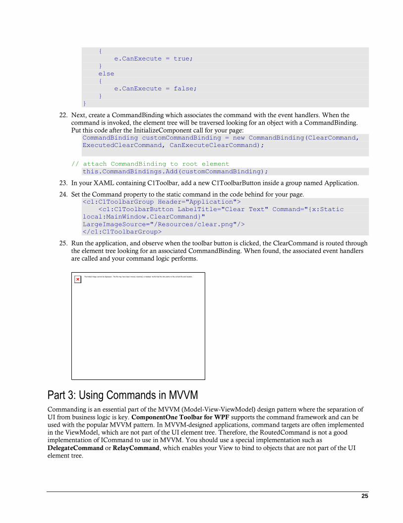
local:MainWindow.ClearCommand}"
LargeImageSource="/Resources/clear.png"/>
</c1:C1ToolbarGroup>
25. Run the application, and observe when the toolbar button is clicked, the ClearCommand is routed through the element tree looking for an associated CommandBinding. When found, the associated event handlers are called and your command logic performs.
Part 3: Using Commands in MVVM Commanding is an essential part of the MVVM (Model-View-ViewModel) design pattern where the separation of
UI from business logic is key. ComponentOne Toolbar for WPF supports the command framework and can be used with the popular MVVM pattern. In MVVM-designed applications, command targets are often implemented in the ViewModel, which are not part of the UI element tree. Therefore, the RoutedCommand is not a good implementation of ICommand to use in MVVM. You should use a special implementation such as
DelegateCommand or RelayCommand, which enables your View to bind to objects that are not part of the UI element tree.

26
The following steps show how to create the same custom command implemented in Part 2 using the RelayCommand
class and C1Toolbar.
26. Create a new class named MainViewModel, which implements the INotifyPropertyChanged interface.
This class will act as the ViewModel for our View containing C1Toolbar. class MainViewModel : System.ComponentModel.INotifyPropertyChanged
{
private string textValue = "";
public string TextValue
{
get
{
return textValue;
}
set
{
textValue = value;
OnPropertyChanged("TextValue");
}
}
private RelayCommand clearCommand;
public ICommand ClearCommand
{
get
{
if (clearCommand == null)
{
clearCommand = new RelayCommand(param => this.Clear(),
param => this.CanClear());
}
return clearCommand;
}
}
private bool CanClear()
{
return textValue.Length > 0;
}
private void Clear()
{
TextValue = "";
}
public event PropertyChangedEventHandler PropertyChanged;
protected void OnPropertyChanged(string propertyName)
{
PropertyChangedEventHandler handler = PropertyChanged;
if (handler != null)
{
handler(this, new PropertyChangedEventArgs(propertyName));
}
}

27
}
This class uses the RelayCommand, which is a lightweight variation of the DelegateCommand. Both
ICommand implementations allow you to delegate commanding logic to methods passed as
parameters with command targets that are not part of the UI element tree. The RelayCommand and
DelegateCommand classes are not part of the WPF framework and can be found online and with
various MVVM toolkits.
27. Add the RelayCommand class to your project.
/// <summary>
/// This class allows delegating the commanding logic to methods
passed as parameters,
/// and enables a View to bind commands to objects that are not part
of the element tree.
/// </summary>
public class RelayCommand : ICommand
{
#region Fields
readonly Action<object> _execute;
readonly Predicate<object> _canExecute;
#endregion // Fields
#region Constructors
public RelayCommand(Action<object> execute)
: this(execute, null)
{
}
public RelayCommand(Action<object> execute, Predicate<object>
canExecute)
{
if (execute == null)
throw new ArgumentNullException("execute");
_execute = execute;
_canExecute = canExecute;
}
#endregion // Constructors
#region ICommand Members
[DebuggerStepThrough]
public bool CanExecute(object parameter)
{
return _canExecute == null ? true : _canExecute(parameter);
}
public event EventHandler CanExecuteChanged
{
add { CommandManager.RequerySuggested += value; }

28
remove { CommandManager.RequerySuggested -= value; }
}
public void Execute(object parameter)
{
_execute(parameter);
}
#endregion // ICommand Members
}
28. To bind to the ViewModel, add the following XAML at the top of your View containing C1Toolbar: <Window.Resources>
<local:MainViewModel x:Key="viewModel" />
</Window.Resources>
<Window.DataContext>
<Binding Source="{StaticResource viewModel}"/>
</Window.DataContext>
This adds your ViewModel as a resource which is then bound to the DataContext of the Window or
UserControl.
29. Then add the following toolbar group to the C1Toolbar you created in Part 1. <c1:C1ToolbarGroup Header="Application">
<c1:C1ToolbarButton LabelTitle="Clear Text" Command="{Binding
ClearCommand}" LargeImageSource="/Resources/delete.png"/>
</c1:C1ToolbarGroup>
This toolbar group contains one C1ToolbarButton with its Command property bound to the
ClearCommand defined in the ViewModel.
30. Since this command should follow MVVM best practices, the TextBox Text property should also be
bound to a value from the ViewModel if we wish to apply business logic to it. Bind the Text property to
the TextValue property which is also defined in the ViewModel. <TextBox Grid.Row="1" Text="{Binding TextValue,
UpdateSourceTrigger=PropertyChanged}" Height="23"
HorizontalAlignment="Left" Margin="12,17,0,0" Name="textBox1"
VerticalAlignment="Top" Width="165" />
By setting the UpdateSourceTrigger to PropertyChanged, the TextValue property on the ViewModel will be updated any time there is a change in Text value, as opposed to only when the TextBox loses focus.
31. Run the application and observe the custom RelayCommand in action.

29
There are many benefits that you get by following the MVVM design pattern due to the loose coupling of UI from business logic.