content authoring for responsive design - madcap...
TRANSCRIPT

PRESENTED BY
Content Authoring for Responsive Design
Mike Hamilton V.P. Product Evangelism at MadCap Software [email protected]
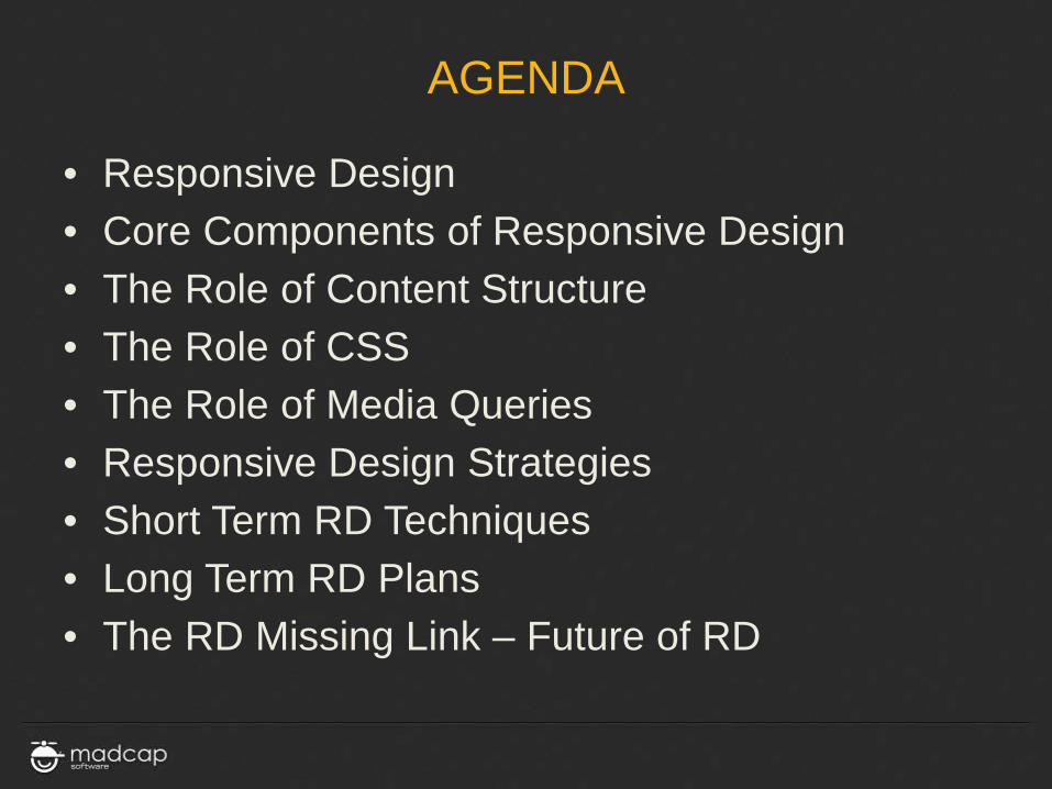
AGENDA
• Responsive Design • Core Components of Responsive Design • The Role of Content Structure • The Role of CSS • The Role of Media Queries • Responsive Design Strategies • Short Term RD Techniques • Long Term RD Plans • The RD Missing Link – Future of RD

WHAT IS RESPONSIVE DESIGN?
WHAT IS RESPONSIVE DESIGN?
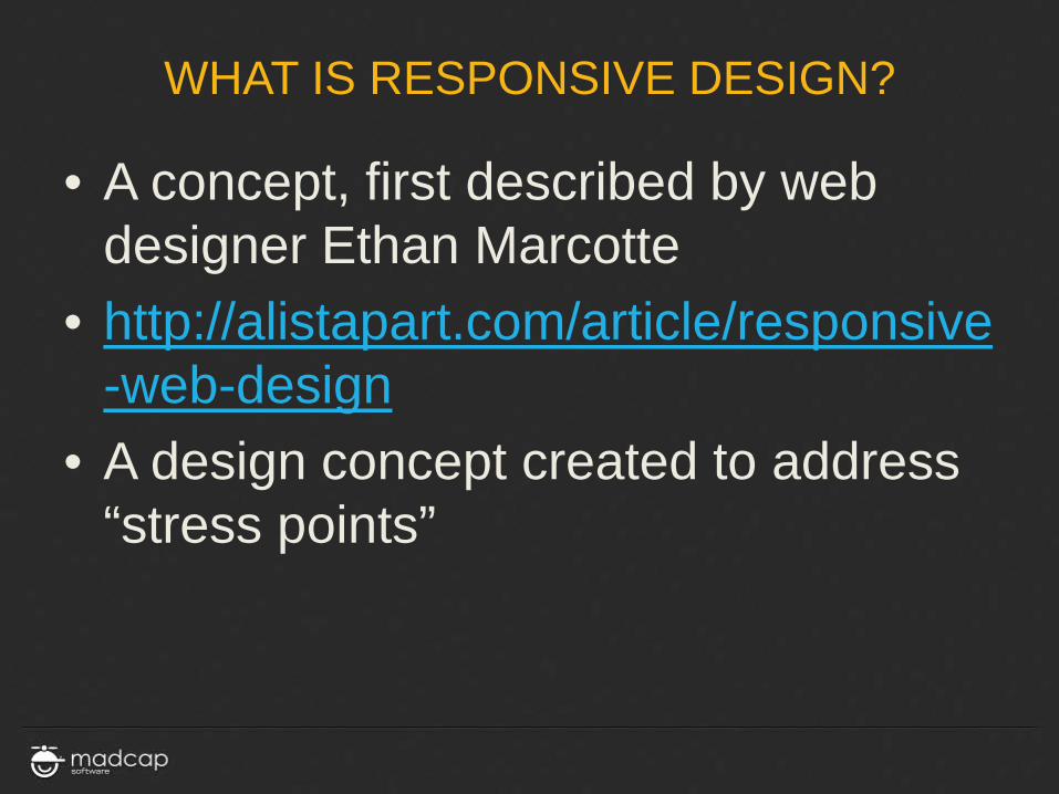
• A concept, first described by web designer Ethan Marcotte
• http://alistapart.com/article/responsive-web-design
• A design concept created to address “stress points”

WHAT IS RESPONSIVE DESIGN?
Responsive Design is NOT: » A smaller version of your page » Removing content to fit » A separate version for each and every
device out there
WHAT IS RESPONSIVE DESIGN?
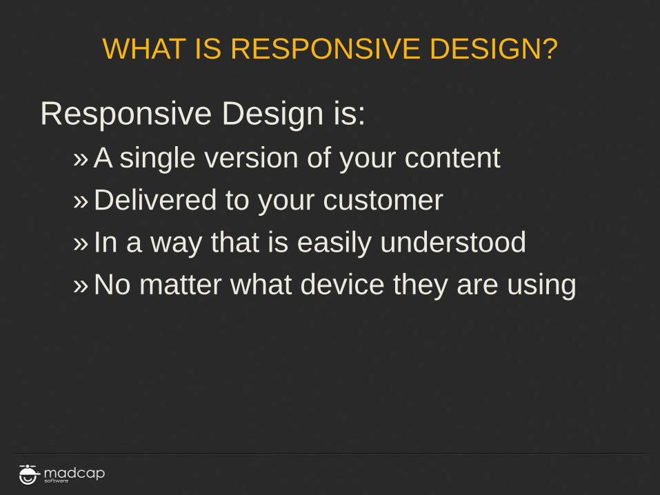
Responsive Design is: » A single version of your content » Delivered to your customer » In a way that is easily understood » No matter what device they are using

RESPONSIVE DESIGN THE EASY WAY
(LET FLARE DO THE HARD WORK)

CORE COMPONENTS OF RESPONSIVE DESIGN
CORE COMPONENTS
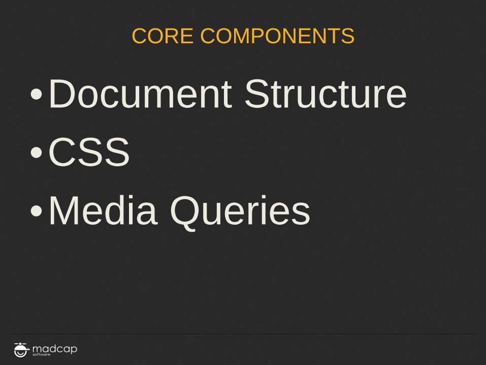
•Document Structure •CSS •Media Queries

DOCUMENT STRUCTURE

DOCUMENT STRUCTURE
• In Responsive Design less is more
• Keep formatting out of the core document
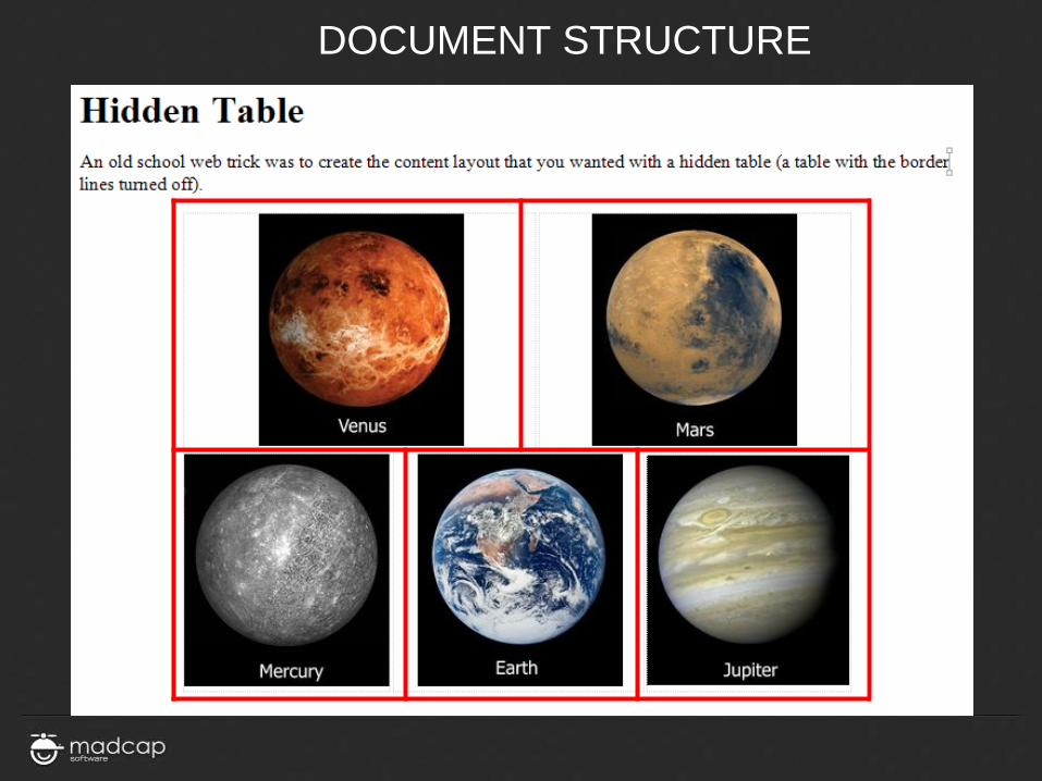
• EXAMPLE: No more hidden tables

DOCUMENT STRUCTURE
DOCUMENT STRUCTURE
DOCUMENT STRUCTURE
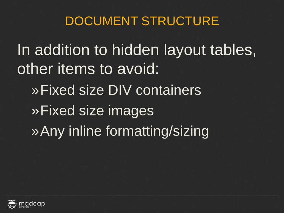
In addition to hidden layout tables, other items to avoid:
»Fixed size DIV containers »Fixed size images »Any inline formatting/sizing

DOCUMENT STRUCTURE
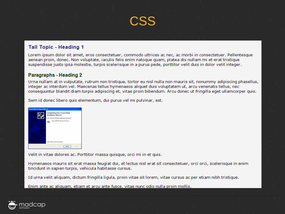
It may feel like going backward, but, the more your pages look like this…

CSS

CSS
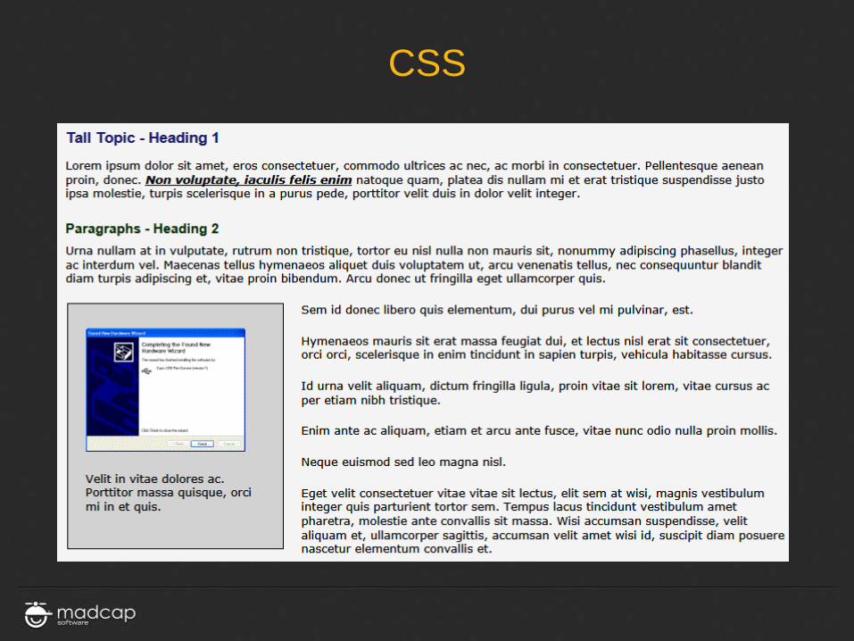
The second leg of the RD stool is Cascading Style Sheets (CSS)
»All look/feel/formatting »Block level (p, H1, H2, etc.) »Character level (span) »Grouping/formatting level

CSS
CSS

CSS
CSS

MEDIA QUERIES

MEDIA QUERIES
The new “Secret Sauce” of Responsive Design
»Part of the CSS3 spec.
»Derived from CSS2 Media Types

MEDIA TYPES @media screen body { color: #000000; font-family: Verdana, Arial, Helvetica, sans-serif; font-size: 0.8em; } @media print body { color: #000000; font-family: “Times New Roman”; font-size: 10pt; }

MEDIA QUERIES
Media Queries provide for:
»Testing the parameters of the viewing device
»Dynamically adjusting the CSS information based on the reported parameters
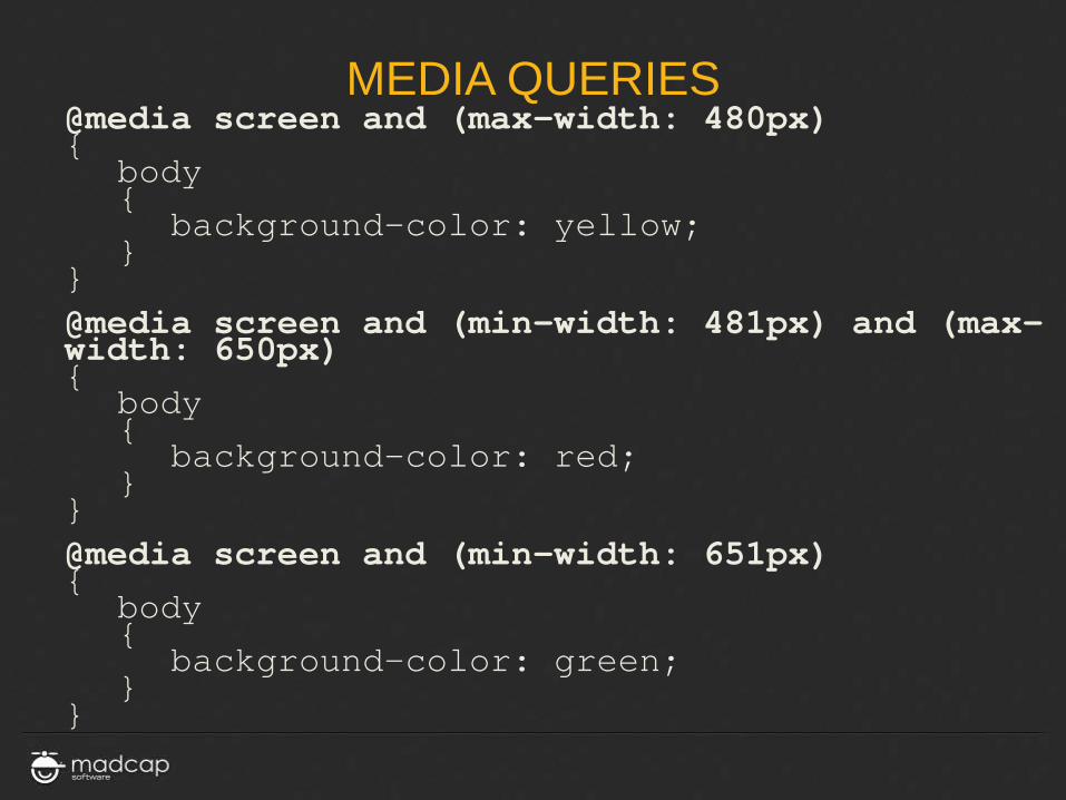
MEDIA QUERIES @media screen and (max-width: 480px) { body { background-color: yellow; } } @media screen and (min-width: 481px) and (max-width: 650px) { body { background-color: red; } } @media screen and (min-width: 651px) { body { background-color: green; } }

MEDIA QUERIES
@media screen and (max-width: 480px) { body { background-color: yellow; } }

MEDIA QUERIES @media screen and (min-width: 481px) and (max-width: 650px) { body { background-color: red; } }

MEDIA QUERIES
@media screen and (min-width: 651px) { body { background-color: green; } }
DEMO
MEDIA QUERIES
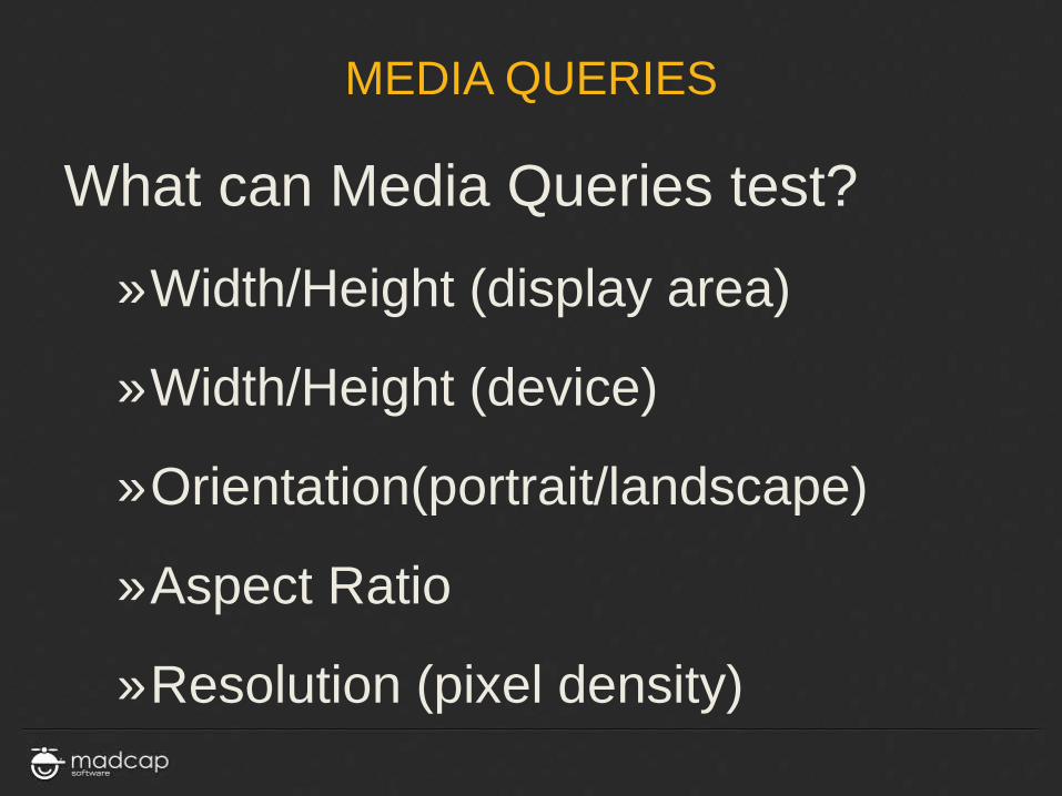
What can Media Queries test?
»Width/Height (display area)
»Width/Height (device)
»Orientation(portrait/landscape)
»Aspect Ratio
»Resolution (pixel density)

RESPONSIVE DESIGN STRATEGIES

STRATEGIES
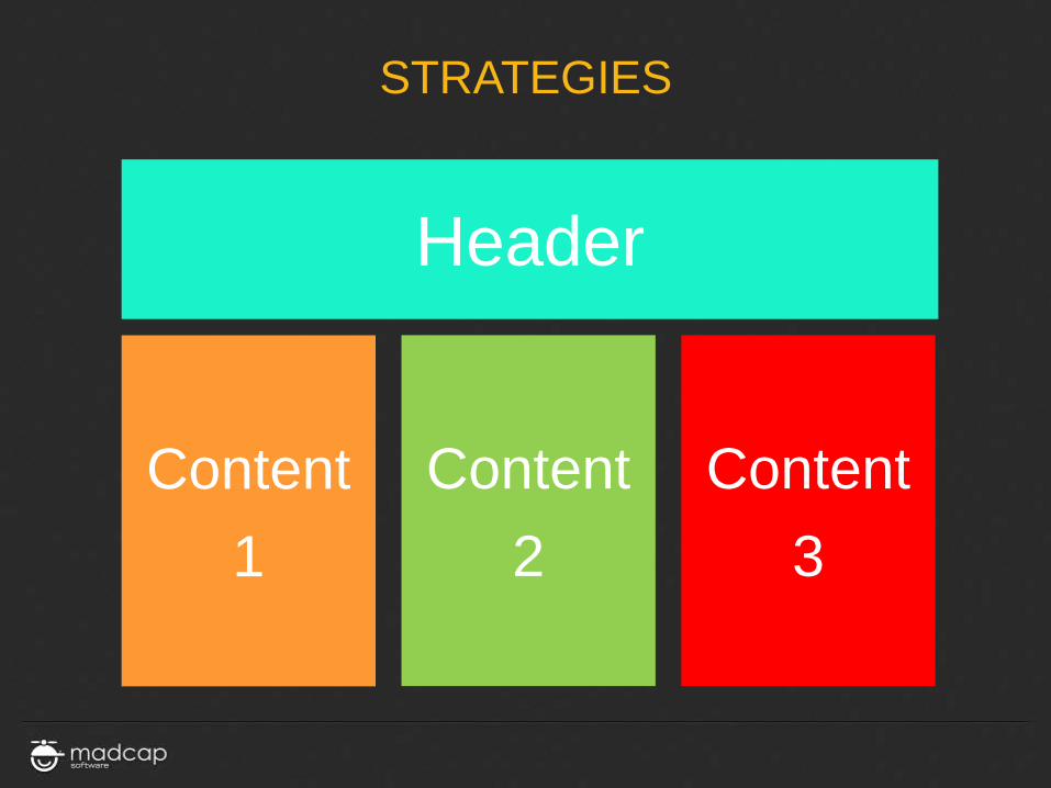
• First, focus on content areas and purposes, rather than specific formatting
• Think of each of these areas as a grid element
STRATEGIES
Header
Content 1
Content 2
Content 3

STRATEGIES
Header
Content 1
Content 2
Content 3

STRATEGIES
Header
Content 1
Content 2
Content 3
STRATEGIES
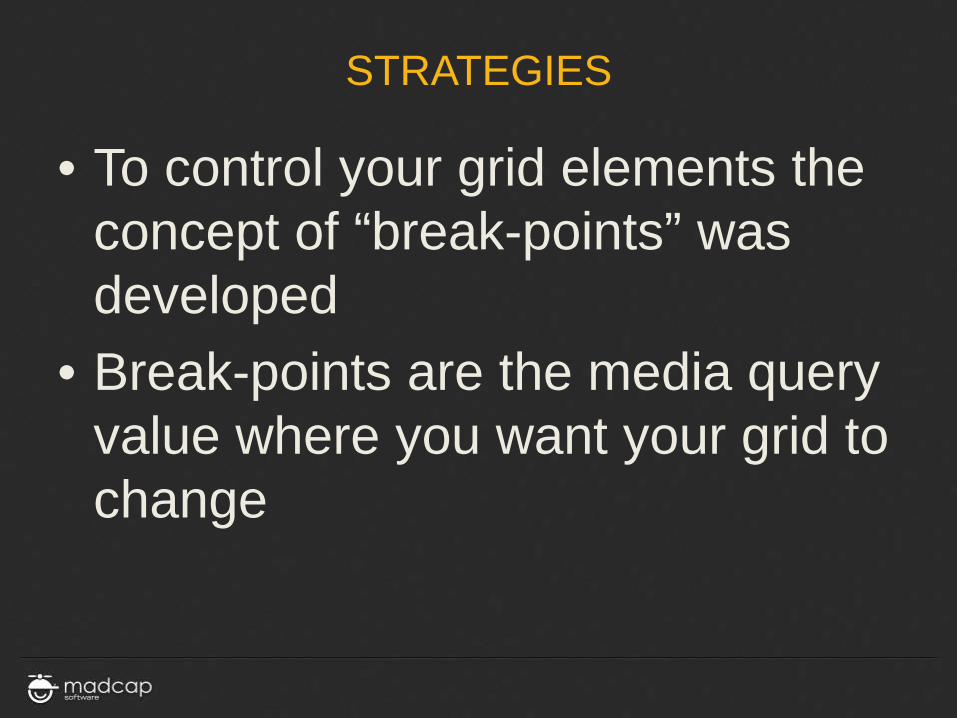
• To control your grid elements the concept of “break-points” was developed
• Break-points are the media query value where you want your grid to change

STRATEGIES
• There are differing break-point strategies
• One school is to create break-points based on the resolution of common devices
…except
COMMON DEVICE RESOLUTIONS
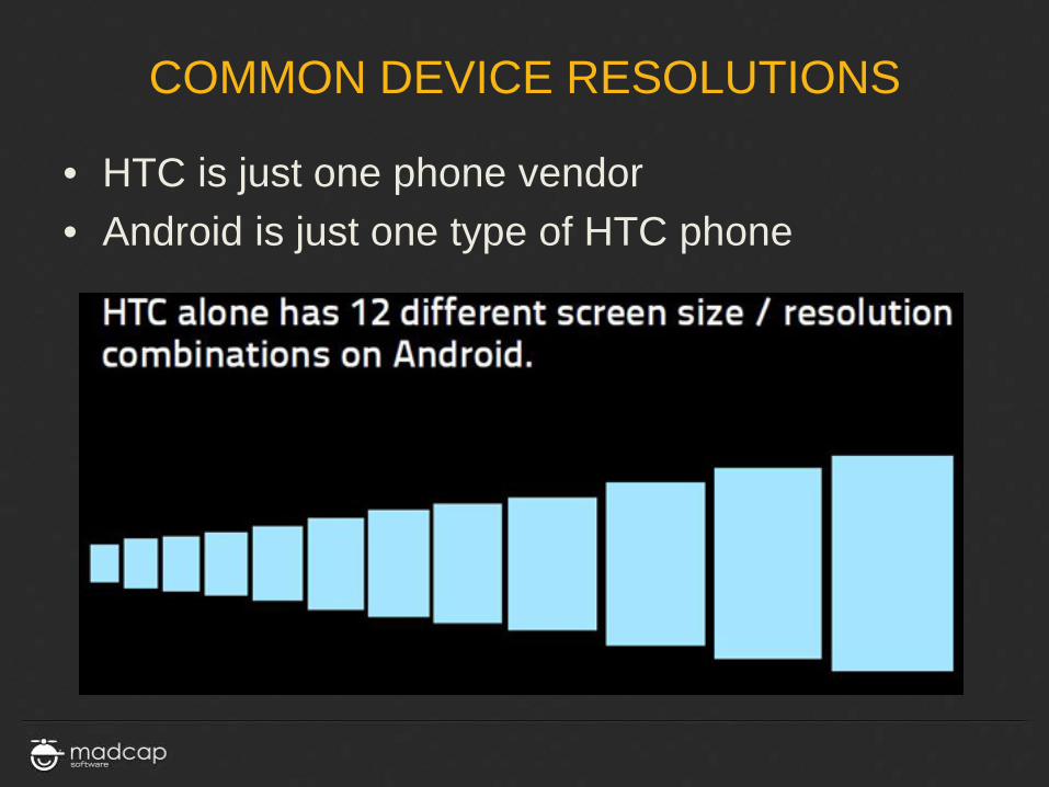
• HTC is just one phone vendor • Android is just one type of HTC phone

COMMON DEVICE RESOLUTIONS

COMMON DEVICE RESOLUTIONS
Resolution / Graphic Array
2880 x 1800
2560 x 1700
2560 x 1600 WQXGA
2560 x 1440 (W)QHD
2048 x 1536 QXGA
1920 x 1280
1920 x 1200 WUXGA
1920 x 1080 FHD
1680 x 1050 WSXGA+
1600 x 1200 UXGA
Resolution / Graphic Array
1600 x 900 HD+
1440 x 900 WXGA+
1366 x 768 WXGA
1280 x 1024 SXGA
1280 x 800 WXGA
1280 x 768 WXGA
1280 x 720 HD / WXGA
1024 x 768 XGA
1024 x 600 WSVGA
Resolution / Graphic Array
400 x 240 WQVGA
320 x 240 QVGA
Resolution / Graphic Array
1136 x 640
960 x 640 DVGA
960 x 540 qHD
854 x 480 FWVGA
800 x 480 WVGA
720 x 720
640 x 480 VGA
640 x 360 nHD
480 x 360
480 x 320 HVGA
DEMO
Over 31 different device
resolutions in use

STRATEGIES
An easier break-point strategy: »Determine the min/max width
values you must support »Resize your browser and watch for
where your content breaks
DEMO

STRATEGIES
• Break the large image into smaller images
• Add CSS class data as necessary <p class="venus"> <img src="../Resources/Images/venus.png“ class="venus" /> </p>
DEMO

STRATEGIES
• Now create the Media Queries
@media screen and (max-width: 450px){
body { background-color: yellow; }
p.mercury { text-align: center; }
p.venus { text-align: center; }
p.earth { text-align: center; }
p.mars { text-align: center; }
p.jupiter { text-align: center; }
}
DEMO

STRATEGIES • Now create the Media Queries
@media screen and (min-width: 451px) and (max-width: 910px)
{
body { background-color: red; }
p.mercury { text-align: center; }
img.mercury { }
img.venus { float: left; }
img.earth { float: right; }
img.mars { float: left; clear: both;}
img.jupiter { float: right; }
} DEMO
STRATEGIES
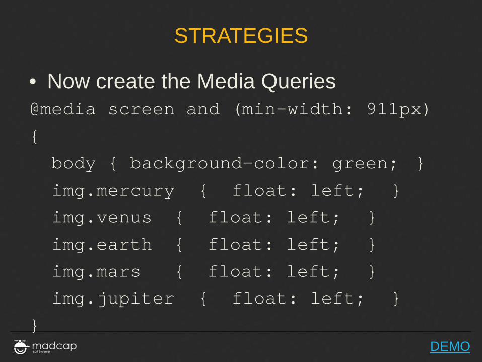
• Now create the Media Queries @media screen and (min-width: 911px)
{
body { background-color: green; }
img.mercury { float: left; }
img.venus { float: left; }
img.earth { float: left; }
img.mars { float: left; }
img.jupiter { float: left; }
} DEMO

SHORT TERM TECHNIQUE WHILE STRIVING FOR RD

SHORT TERM TECHNIQUES
• Brush up on CSS skills
• The DIV element is your friend
• The quickest / dirtiest short term workaround
div.rdoverflow

SHORT TERM TECHNIQUES
Add to your style sheet:
div.rdoverflow
{
overflow: auto;
}

SHORT TERM TECHNIQUES
• Wrap any content that doesn’t fit on a target screen (such as a large table) with:
div.rdoverflow • Scroll bars will be added
automatically when needed
DEMO

LONG TERM RESPONSIVE DESIGN
RECOMMENDATIONS

LONG TERM RECOMMENDATIONS
•Study •Practice
Cascading Style Sheets: Designing for the Web (3rd Edition) (Paperback) by Hakon Wium Lie and Bert Bos ISBN-13: 978-0321193124 CSS: The Definitive Guide, Third Edition by Eric Meyer ISBN-13: 978-0596527334 Responsive Web Design with HTML5 and CSS3 by Ben Frain ISBN-13: 978-9350237885
SUGGESTED READING LIST

SUMMARY
• Responsive Design • Core Components of Responsive Design • The Role of Content Structure • The Role of CSS • The Role of Media Queries • Responsive Design Strategies • Short Term RD Techniques • Long Term RD Plans