contents page analysis
DESCRIPTION
Contents page analysis for bloggerTRANSCRIPT

My College Magazine Design.

Front Cover of the College Magazine
I took this image ofA few friends out sideThe main entrance ofthe college. The camera had to be of a landscape angle. ThisImage Was one of several Images I took but I decided this wasthe better of the Medium close ups.
I didn’t edit the originalimage I cropped it down to size to fit the A4 measurements.
I had no problemwith red eye orthe backgroundimage.

Stage twoI took the ‘Y’ from Dafont.com. I printScreened the image into paint. I then cut out the ‘Y’ from the rest of the web page. I moved the image into Photoshop and used the paint bucket tool to colour the ‘Y’ Yellow which was the theme I wanted for the front cover. I then used the effects tool to make the image stand out from the page.
For the selling line I First of all I made Thetext box and filled it redAgain this was in Keeping with the yellowAnd red theme I wanted.I added the text to theSky line, and added Extra effects to highlight The text and the text box.
I put the text ‘College’ into Dafont.comand printed screen I then cropped the imageIn paint and pasted it into Photoshop. I addedEffects to the text highlighting the word ‘College.’
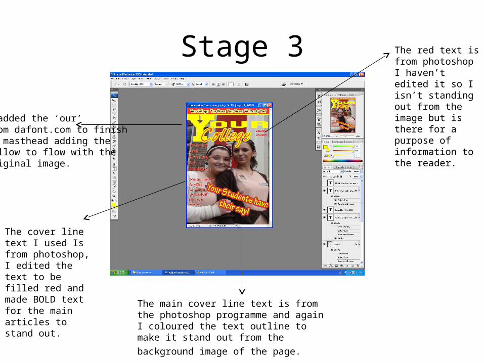
Stage 3
I added the ‘our’from dafont.com to finishmy masthead adding theYellow to flow with the Original image.
The cover line text I used Is from photoshop, I edited the text to be filled red and made BOLD text for the main articles to stand out. The main cover line text is from the
photoshop programme and again I coloured the text outline to make it stand out from the background image of the page.
The red text is from photoshop I haven’t edited it so I isn’t standing out from the image but is there for a purpose of information to the reader.

Final Product

Final Analysis My final product is very similar to my research products I found. I made very little cover lines to
appeal to my target audience but all of which I produce are relevant to students and their interests. The image of the two students are relevant to college life and represent all kinds of students. The main cover line I used is open ended and doesn’t specify what the students have to say. The masthead I designed is very relevant to what the magazine is about and this simple design will appeal to all kinds of students. All of the information Is located on the left third of the magazine, making the magazine look less busy and less distracting which I found was a common theme of the ‘college magazine’.