conventions of street
TRANSCRIPT

No skyline or slogan to keep things minimal.
Bold Masthead in graffiti writing to represent genre of the magazine. White contrasts the black at the top of the image making it very crisp and clear.
Bright red jacket stands out from a distance. Representative of hip hop genre. Eye contact with the audience grabs your attention.
Main artist feature is bold and contrasting on black and white. Easily recognizable as a feature.
Sell lines relevant to genre. Interesting summary of some of the articles inside. Enough to make someone pick it up and read through it.
Footer shows the main areas of the magazine
Barcode tucked away in the corner so it is not distracting for the audience. Clearly displays the price and issue date.
Competition to win tickets to a Hop-Hop/Electronic festival in the summer. Representative of genre and audience.
Main image is bold, takes up a large portion of the screen. Clear and representative of genre
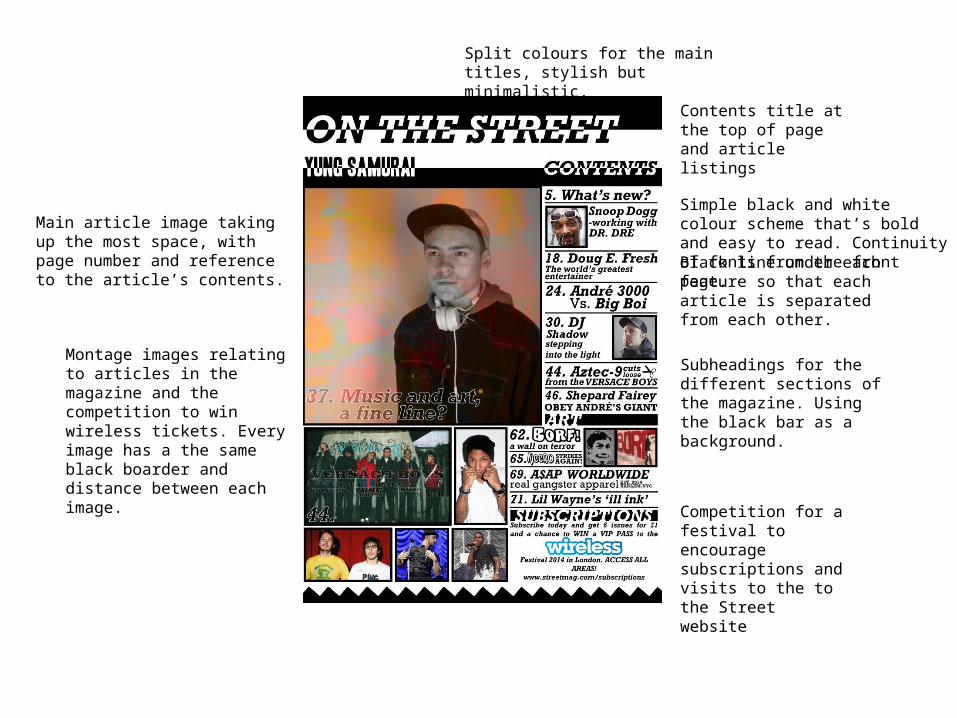
Simple black and white colour scheme that’s bold and easy to read. Continuity of fonts from the front page.
Main article image taking up the most space, with page number and reference to the article’s contents.
Montage images relating to articles in the magazine and the competition to win wireless tickets. Every image has a the same black boarder and distance between each image.
Black line under each feature so that each article is separated from each other.
Split colours for the main titles, stylish but minimalistic.
Contents title at the top of page and article listings
Subheadings for the different sections of the magazine. Using the black bar as a background.
Competition for a festival to encourage subscriptions and visits to the to the Street website
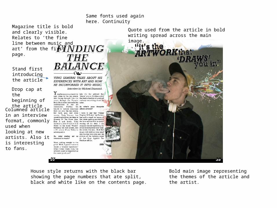
Same fonts used again here. Continuity
Magazine title is bold and clearly visible. Relates to ‘the fine line between music and art’ from the first page.
Stand first introducing the article
Columned article in an interview format, commonly used when looking at new artists. Also it is interesting to fans.
House style returns with the black bar showing the page numbers that ate split, black and white like on the contents page.
Quote used from the article in bold writing spread across the main image.
Drop cap at the beginning of the article
Bold main image representing the themes of the article and the artist.
Summary
• I didn’t really challenge the codes and conventions of magazine production when making my product. But I did try to make my product minimalistic in regards to the layout and use of text. This was done so that the imagery was the main focus of the product and the text involved was straight to the point. I kept my layout and fonts the same, using the same simple black bars for titles. My Main artist was the same throughout and the stories and page number were the same. Overall, I think that all the key conventions are where they need to be for a successful product.