copyright © 2013, 2010 and 2007 pearson education, inc. chapter organizing and summarizing data 2
TRANSCRIPT

Copyright © 2013, 2010 and 2007 Pearson Education, Inc.
Chapter
Organizing and Summarizing Data
2
Copyright © 2013, 2010 and 2007 Pearson Education, Inc.
Section
Organizing Qualitative Data
2.1

Copyright © 2013, 2010 and 2007 Pearson Education, Inc.
Objectives
1. Organize Qualitative Data in Tables
2. Construct Bar Graphs
3. Construct Pie Charts
Copyright © 2013, 2010 and 2007 Pearson Education, Inc.2-4
When data is collected from a survey or designed experiment, they must be organized into a manageable form. Data that is not organized is referred to as raw data.
Ways to Organize Data
• Tables
• Graphs
• Numerical Summaries (Chapter 3)
Copyright © 2013, 2010 and 2007 Pearson Education, Inc.2-5
Objective 1
• Organize Qualitative Data in Tables
Copyright © 2013, 2010 and 2007 Pearson Education, Inc.2-6
A frequency distribution lists each category of data and the number of occurrences for each category of data.
Copyright © 2013, 2010 and 2007 Pearson Education, Inc.2-7
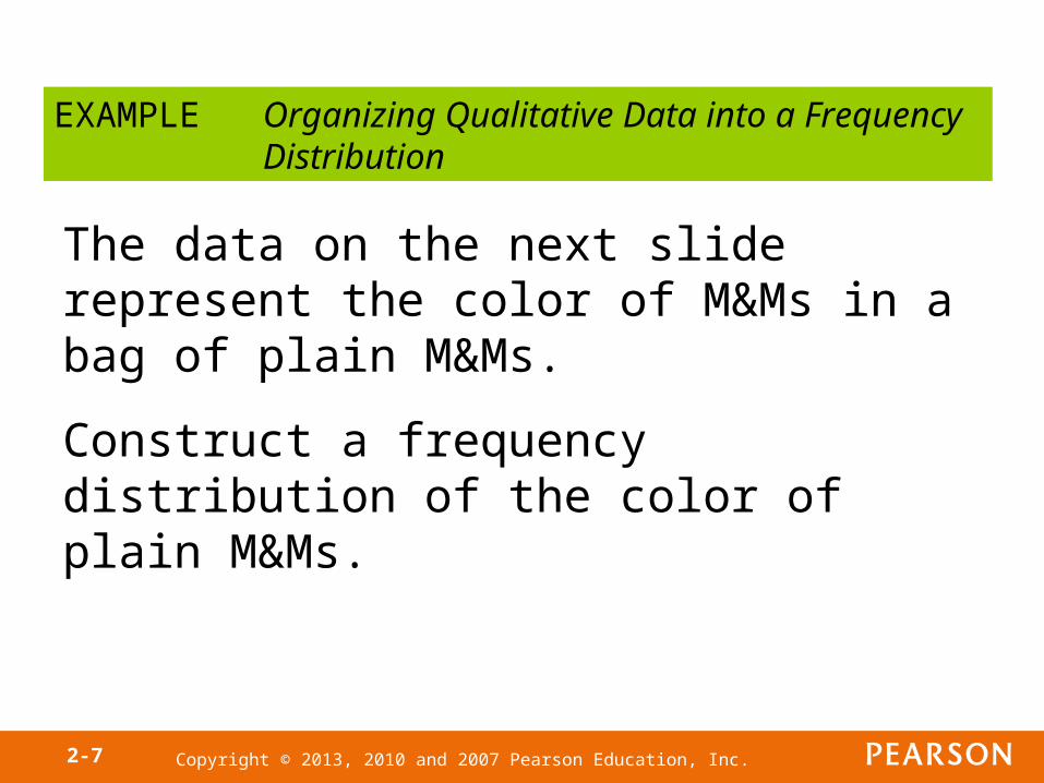
EXAMPLE Organizing Qualitative Data into a Frequency Distribution
The data on the next slide represent the color of M&Ms in a bag of plain M&Ms.
Construct a frequency distribution of the color of plain M&Ms.
Copyright © 2013, 2010 and 2007 Pearson Education, Inc.2-8
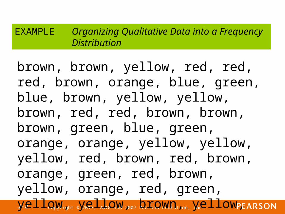
EXAMPLE Organizing Qualitative Data into a Frequency Distribution
brown, brown, yellow, red, red, red, brown, orange, blue, green, blue, brown, yellow, yellow, brown, red, red, brown, brown, brown, green, blue, green, orange, orange, yellow, yellow, yellow, red, brown, red, brown, orange, green, red, brown, yellow, orange, red, green, yellow, yellow, brown, yellow, orange

Copyright © 2013, 2010 and 2007 Pearson Education, Inc.2-9
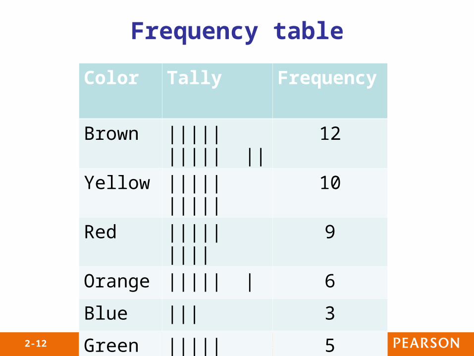
Frequency table
Color Tally Frequency
Brown ||||| ||||| || 12
Yellow ||||| ||||| 10
Red ||||| |||| 9
Orange ||||| | 6
Blue ||| 3
Green ||||| 5
Copyright © 2013, 2010 and 2007 Pearson Education, Inc.2-10
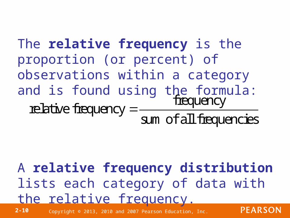
The relative frequency is the proportion (or percent) of observations within a category and is found using the formula:
A relative frequency distribution lists each category of data with the relative frequency.
frequencyrelative frequency
sum of all frequencies

Copyright © 2013, 2010 and 2007 Pearson Education, Inc.2-11
EXAMPLE Organizing Qualitative Data into a Relative Frequency Distribution
Use the frequency distribution obtained in the prior example to construct a relative frequency distribution of the color of plain M&Ms.
Copyright © 2013, 2010 and 2007 Pearson Education, Inc.2-12
Frequency table
Color Tally Frequency
Brown ||||| ||||| || 12
Yellow ||||| ||||| 10
Red ||||| |||| 9
Orange ||||| | 6
Blue ||| 3
Green ||||| 5
Copyright © 2013, 2010 and 2007 Pearson Education, Inc.2-13
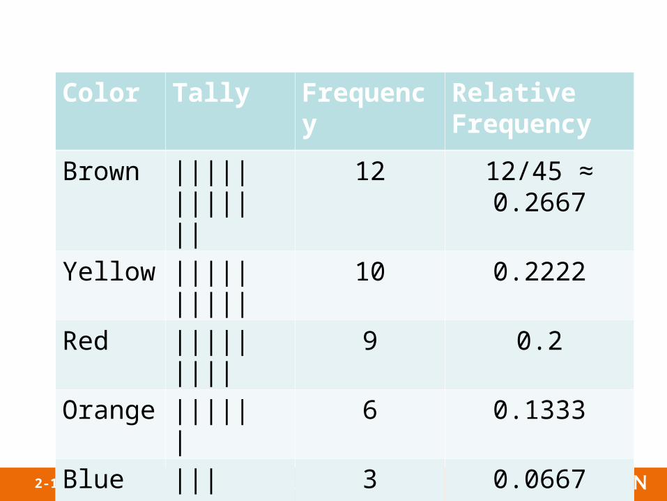
Color Tally Frequency Relative Frequency
Brown ||||| ||||| || 12 12/45 ≈ 0.2667
Yellow ||||| ||||| 10 0.2222
Red ||||| |||| 9 0.2
Orange ||||| | 6 0.1333
Blue ||| 3 0.0667
Green ||||| 5 0.1111
Copyright © 2013, 2010 and 2007 Pearson Education, Inc.2-14
Objective 2
• Construct Bar Graphs
Copyright © 2013, 2010 and 2007 Pearson Education, Inc.2-15
A bar graph is constructed by labeling each category of data on either the horizontal or vertical axis and the frequency or relative frequency of the category on the other axis. Rectangles of equal width are drawn for each category. The height of each rectangle represents the category’s frequency or relative frequency.

Copyright © 2013, 2010 and 2007 Pearson Education, Inc.2-16
Use the M&M data to construct
(a) a frequency bar graph and
(b) a relative frequency bar graph.
EXAMPLE Constructing a Frequency and Relative Frequency Bar Graph

Copyright © 2013, 2010 and 2007 Pearson Education, Inc.2-17
Frequency table
Color Tally Frequency
Brown ||||| ||||| || 12
Yellow ||||| ||||| 10
Red ||||| |||| 9
Orange ||||| | 6
Blue ||| 3
Green ||||| 5

Copyright © 2013, 2010 and 2007 Pearson Education, Inc.2-18

Copyright © 2013, 2010 and 2007 Pearson Education, Inc.2-19
Color Tally Frequency Relative Frequency
Brown ||||| ||||| || 12 12/45 ≈ 0.2667
Yellow ||||| ||||| 10 0.2222
Red ||||| |||| 9 0.2
Orange ||||| | 6 0.1333
Blue ||| 3 0.0667
Green ||||| 5 0.1111

Copyright © 2013, 2010 and 2007 Pearson Education, Inc.2-20
Copyright © 2013, 2010 and 2007 Pearson Education, Inc.2-21
A Pareto chart is a bar graph where the bars are drawn in decreasing order of frequency or relative frequency.
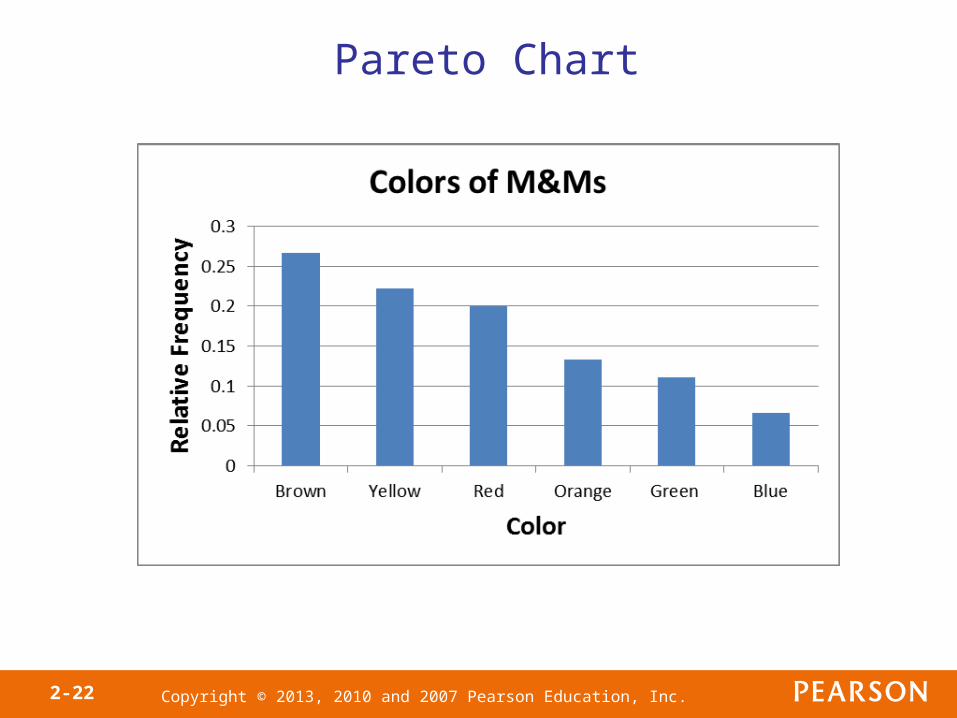
Copyright © 2013, 2010 and 2007 Pearson Education, Inc.2-22
Pareto Chart
Copyright © 2013, 2010 and 2007 Pearson Education, Inc.2-23
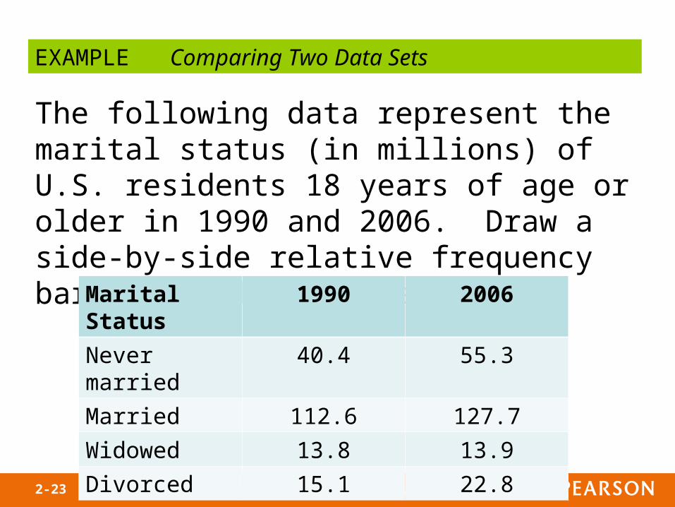
EXAMPLE Comparing Two Data Sets
The following data represent the marital status (in millions) of U.S. residents 18 years of age or older in 1990 and 2006. Draw a side-by-side relative frequency bar graph of the data.
Marital Status 1990 2006
Never married 40.4 55.3
Married 112.6 127.7
Widowed 13.8 13.9
Divorced 15.1 22.8
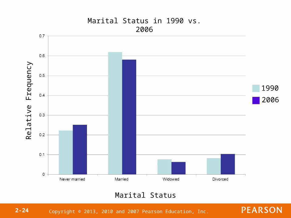
Copyright © 2013, 2010 and 2007 Pearson Education, Inc.2-24
Rel
ativ
e F
requ
ency
Marital Status
Marital Status in 1990 vs. 2006
1990
2006
Copyright © 2013, 2010 and 2007 Pearson Education, Inc.2-25
Objective 3
• Construct Pie Charts
Copyright © 2013, 2010 and 2007 Pearson Education, Inc.2-26
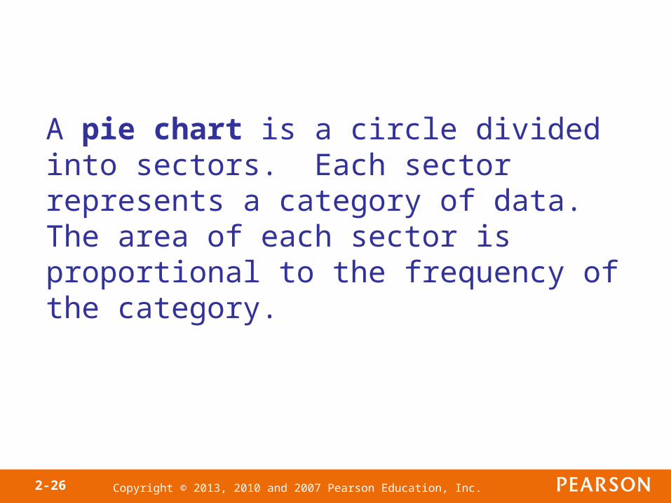
A pie chart is a circle divided into sectors. Each sector represents a category of data. The area of each sector is proportional to the frequency of the category.
Copyright © 2013, 2010 and 2007 Pearson Education, Inc.2-27
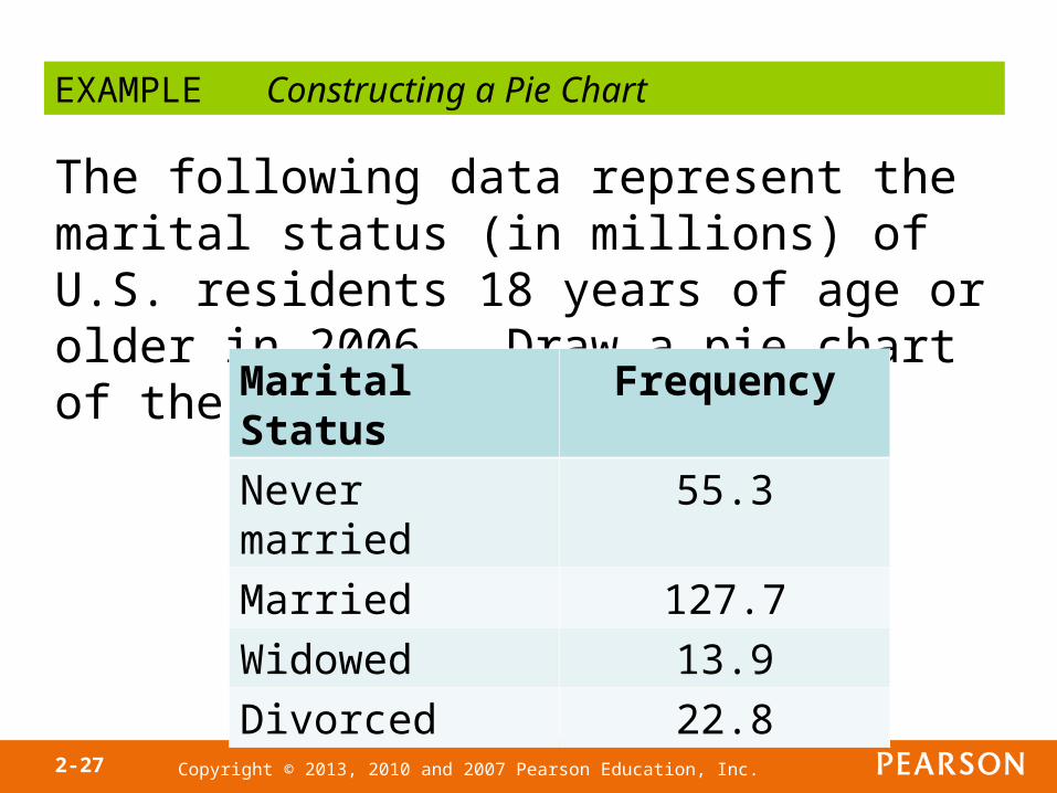
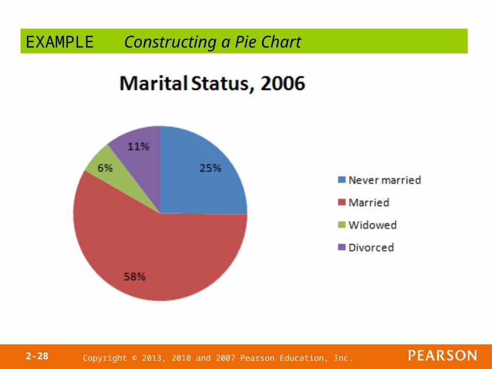
EXAMPLE Constructing a Pie Chart
The following data represent the marital status (in millions) of U.S. residents 18 years of age or older in 2006. Draw a pie chart of the data.
Marital Status Frequency
Never married 55.3
Married 127.7
Widowed 13.9
Divorced 22.8
Copyright © 2013, 2010 and 2007 Pearson Education, Inc.2-28
EXAMPLE Constructing a Pie Chart
Copyright © 2013, 2010 and 2007 Pearson Education, Inc.
Section
Organizing Quantitative Data: The Popular Displays
2.2

Copyright © 2013, 2010 and 2007 Pearson Education, Inc.2-30
Objectives
1. Organize discrete data in tables
2. Construct histograms of discrete data
3. Organize continuous data in tables
4. Construct histograms of continuous data
5. Draw stem-and-leaf plots
6. Draw dot plots
7. Identify the shape of a distribution
Copyright © 2013, 2010 and 2007 Pearson Education, Inc.2-31
The first step in summarizing quantitative data is to determine whether the data are discrete or continuous. If the data are discrete and there are relatively few different values of the variable, the categories of data (classes) will be the observations (as in qualitative data). If the data are discrete, but there are many different values of the variables, or if the data are continuous, the categories of data (the classes) must be created using intervals of numbers.
Copyright © 2013, 2010 and 2007 Pearson Education, Inc.2-32
Objective 1
• Organize Discrete Data in Tables

Copyright © 2013, 2010 and 2007 Pearson Education, Inc.2-33
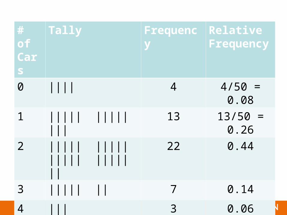
The following data represent the number of available cars in a household based on a random sample of 50 households. Construct a frequency and relative frequency distribution.
EXAMPLE Constructing Frequency and Relative Frequency Distribution from Discrete Data
3 0 1 2 1 1 1 2 0 24 2 2 2 1 2 2 0 2 41 1 3 2 4 1 2 1 2 23 3 2 1 2 2 0 3 2 22 3 2 1 2 2 1 1 3 5Data based on results reported by the United States Bureau of the Census.
Copyright © 2013, 2010 and 2007 Pearson Education, Inc.2-34
# of Cars
Tally Frequency Relative Frequency
0 |||| 4 4/50 = 0.08
1 ||||| ||||| ||| 13 13/50 = 0.26
2 ||||| ||||| ||||| ||||| || 22 0.44
3 ||||| || 7 0.14
4 ||| 3 0.06
5 | 1 0.02
Copyright © 2013, 2010 and 2007 Pearson Education, Inc.2-35
Objective 2
• Construct Histograms of Discrete Data
Copyright © 2013, 2010 and 2007 Pearson Education, Inc.2-36
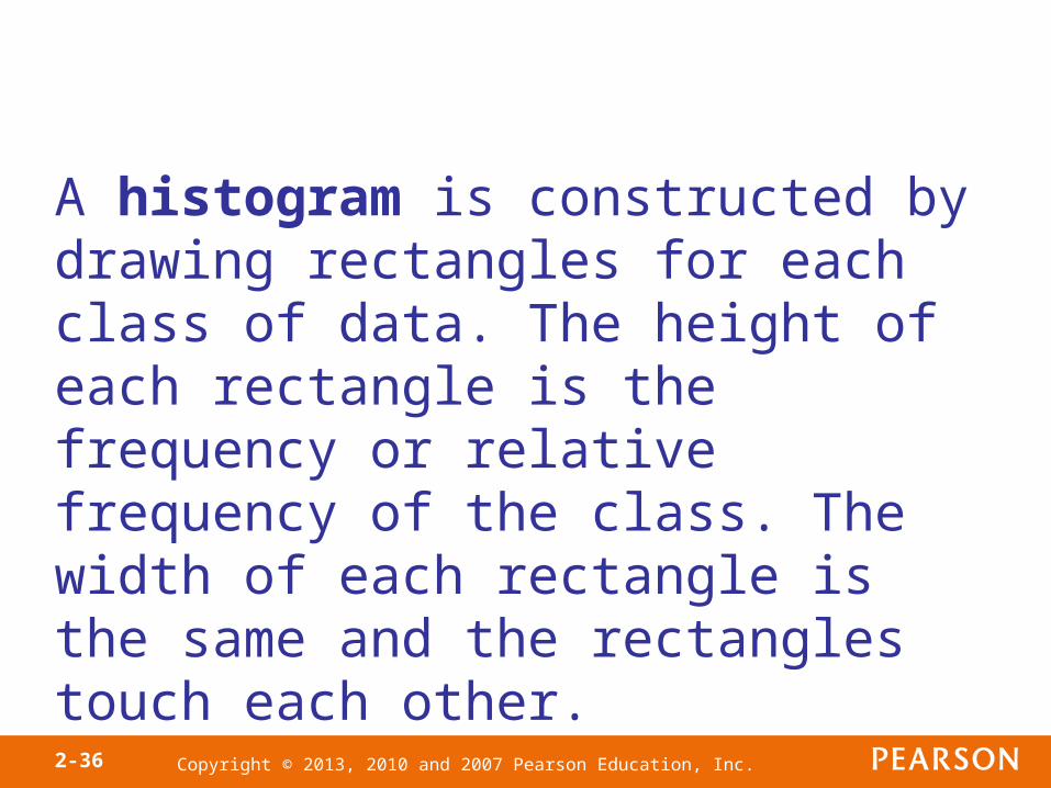
A histogram is constructed by drawing rectangles for each class of data. The height of each rectangle is the frequency or relative frequency of the class. The width of each rectangle is the same and the rectangles touch each other.
Copyright © 2013, 2010 and 2007 Pearson Education, Inc.2-37
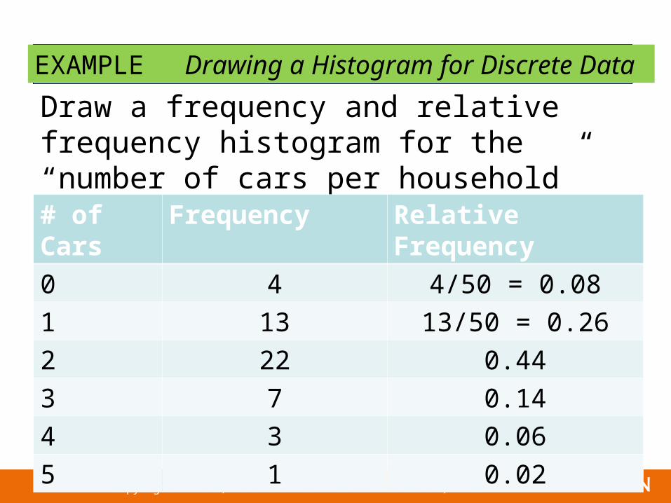
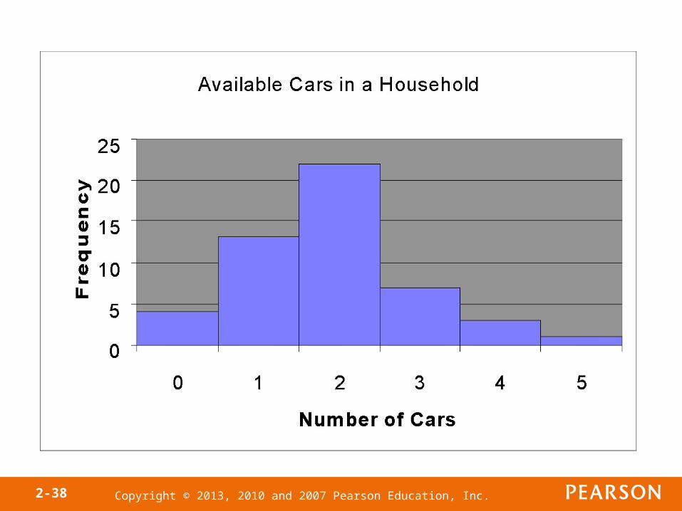
EXAMPLE Drawing a Histogram for Discrete Data
Draw a frequency and relative frequency histogram for the “number of cars per household” data.# of Cars Frequency Relative Frequency
0 4 4/50 = 0.08
1 13 13/50 = 0.26
2 22 0.44
3 7 0.14
4 3 0.06
5 1 0.02
Copyright © 2013, 2010 and 2007 Pearson Education, Inc.2-38

Copyright © 2013, 2010 and 2007 Pearson Education, Inc.2-39
Copyright © 2013, 2010 and 2007 Pearson Education, Inc.2-40
Objective 3
• Organize Continuous Data in Tables

Copyright © 2013, 2010 and 2007 Pearson Education, Inc.2-41
Classes are categories into which data are grouped. When a data set consists of a large number of different discrete data values or when a data set consists of continuous data, we must create classes by using intervals of numbers.
Copyright © 2013, 2010 and 2007 Pearson Education, Inc.2-42
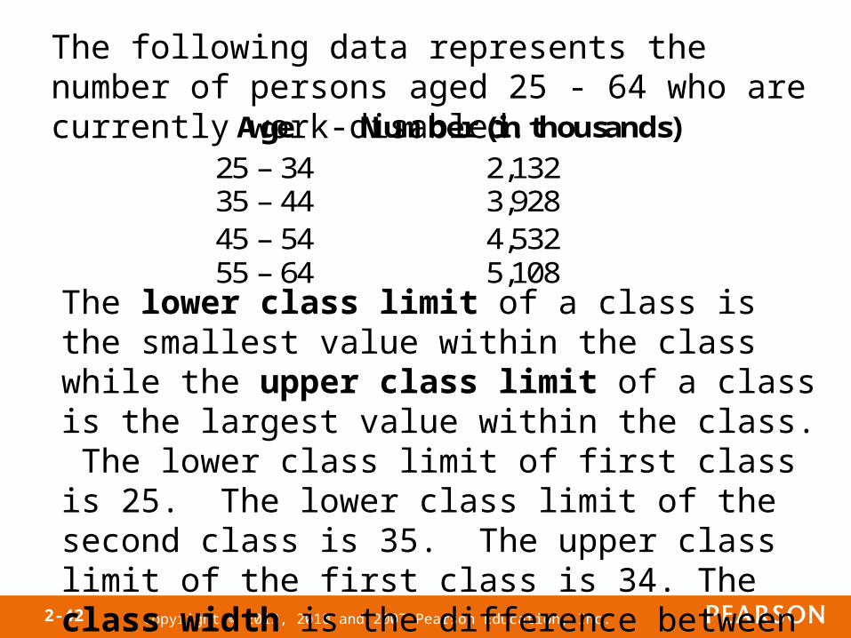
The following data represents the number of persons aged 25 - 64 who are currently work-disabled.
Age Number (in thousands)
25 – 34 2,132 35 – 44 3,928 45 – 54 4,532 55 – 64 5,108
The lower class limit of a class is the smallest value within the class while the upper class limit of a class is the largest value within the class. The lower class limit of first class is 25. The lower class limit of the second class is 35. The upper class limit of the first class is 34. The class width is the difference between consecutive lower class limits. The class width of the data given above is 35 – 25 = 10.
Copyright © 2013, 2010 and 2007 Pearson Education, Inc.2-43
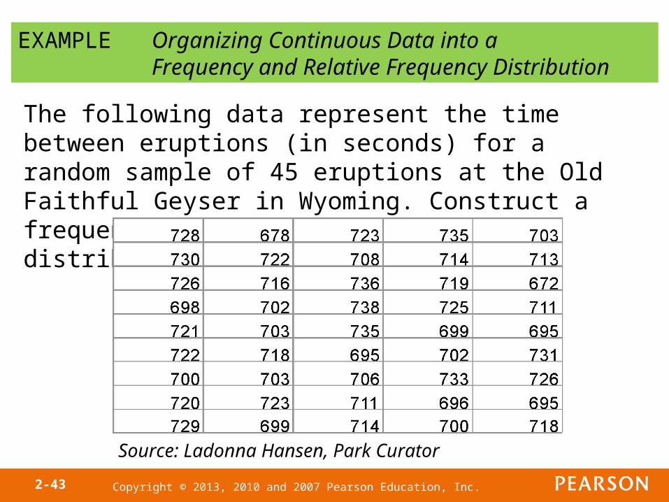
EXAMPLE Organizing Continuous Data into aFrequency and Relative Frequency Distribution
The following data represent the time between eruptions (in seconds) for a random sample of 45 eruptions at the Old Faithful Geyser in Wyoming. Construct a frequency and relative frequency distribution of the data.
Source: Ladonna Hansen, Park Curator
Copyright © 2013, 2010 and 2007 Pearson Education, Inc.2-44
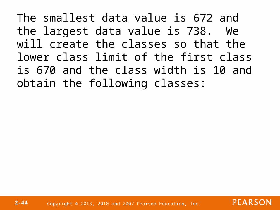
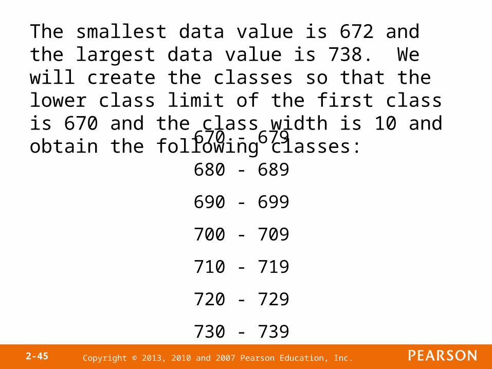
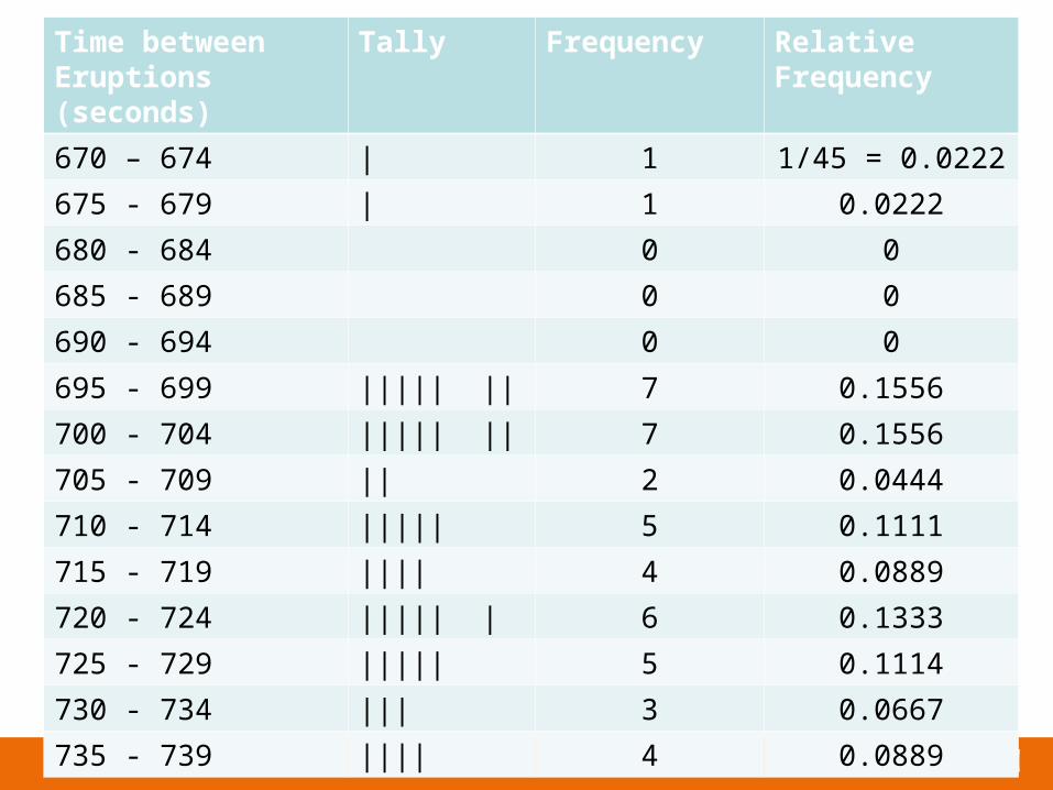
The smallest data value is 672 and the largest data value is 738. We will create the classes so that the lower class limit of the first class is 670 and the class width is 10 and obtain the following classes:
Copyright © 2013, 2010 and 2007 Pearson Education, Inc.2-45
The smallest data value is 672 and the largest data value is 738. We will create the classes so that the lower class limit of the first class is 670 and the class width is 10 and obtain the following classes:
670 - 679
680 - 689
690 - 699
700 - 709
710 - 719
720 - 729
730 - 739

Copyright © 2013, 2010 and 2007 Pearson Education, Inc.2-46
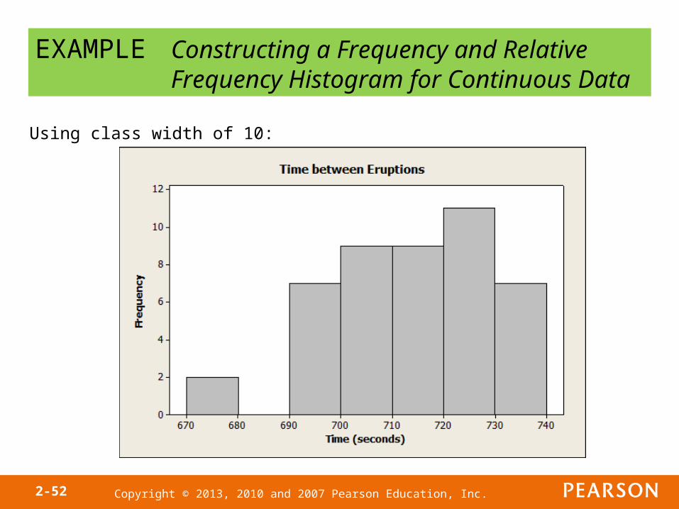
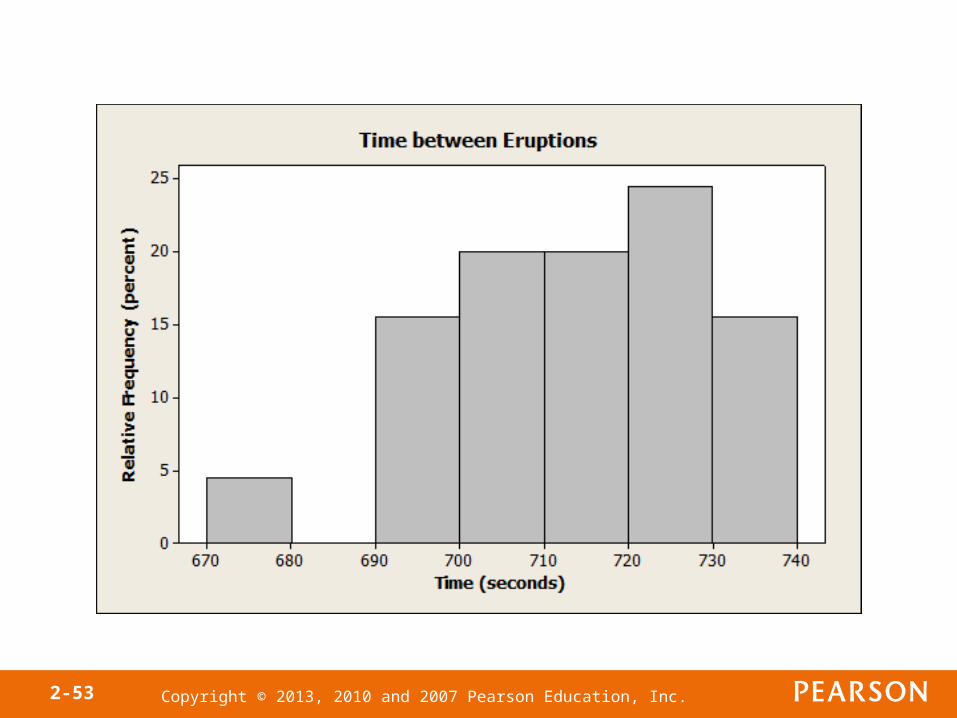
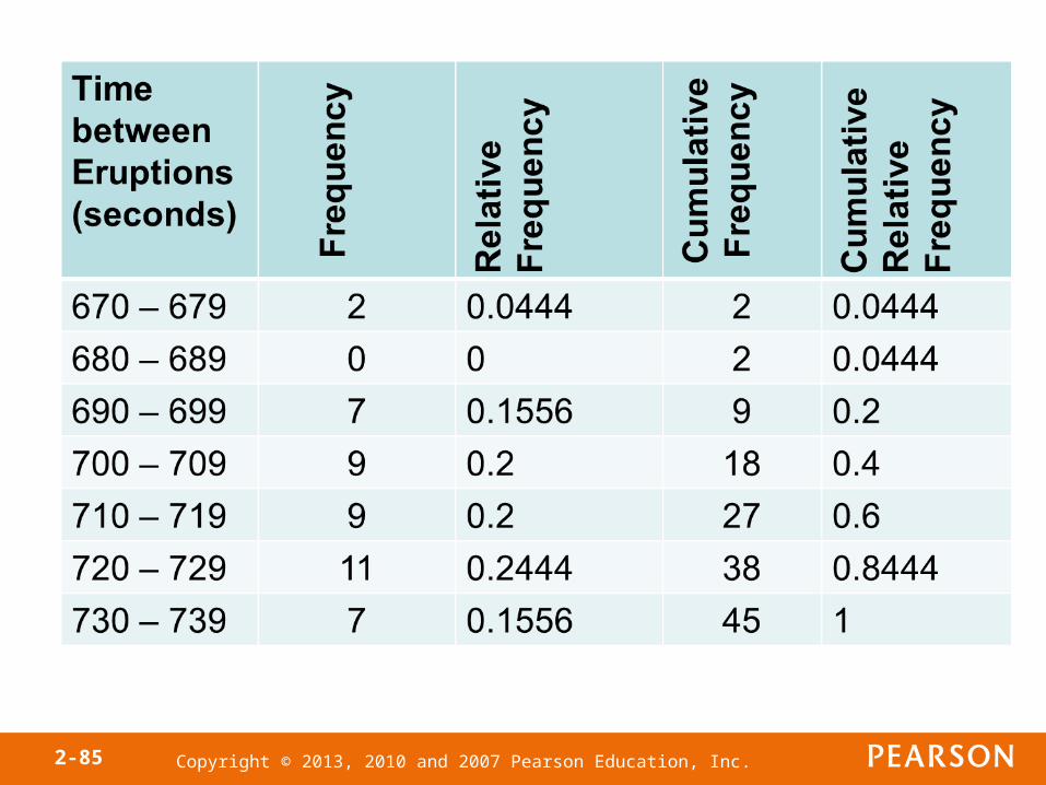
Time between Eruptions (seconds)
Tally Frequency Relative Frequency
670 – 679 || 2 2/45 = 0.044
680 - 689 0 0
690 - 699 ||||| || 7 0.1556
700 - 709 ||||| |||| 9 0.2
710 - 719 ||||| |||| 9 0.2
720 - 729 ||||| ||||| | 11 0.2444
730 - 739 ||||| || 7 0.1556
Copyright © 2013, 2010 and 2007 Pearson Education, Inc.2-47
The choices of the lower class limit of the first class and the class width were rather arbitrary.
There is not one correct frequency distribution for a particular set of data.
However, some frequency distributions can better illustrate patterns within the data than others. So constructing frequency distributions is somewhat of an art form.
Use the distribution that seems to provide the best overall summary of the data.
Copyright © 2013, 2010 and 2007 Pearson Education, Inc.2-48
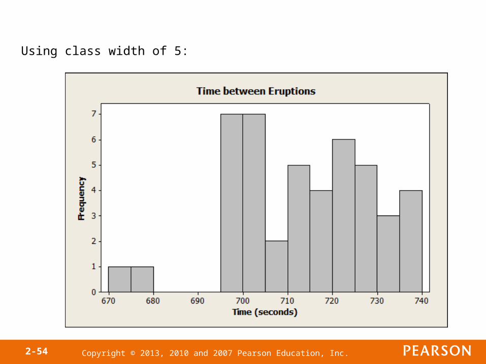
Time between Eruptions (seconds)
Tally Frequency Relative Frequency
670 – 674 | 1 1/45 = 0.0222
675 - 679 | 1 0.0222
680 - 684 0 0
685 - 689 0 0
690 - 694 0 0
695 - 699 ||||| || 7 0.1556
700 - 704 ||||| || 7 0.1556
705 - 709 || 2 0.0444
710 - 714 ||||| 5 0.1111
715 - 719 |||| 4 0.0889
720 - 724 ||||| | 6 0.1333
725 - 729 ||||| 5 0.1114
730 - 734 ||| 3 0.0667
735 - 739 |||| 4 0.0889
Copyright © 2013, 2010 and 2007 Pearson Education, Inc.2-49
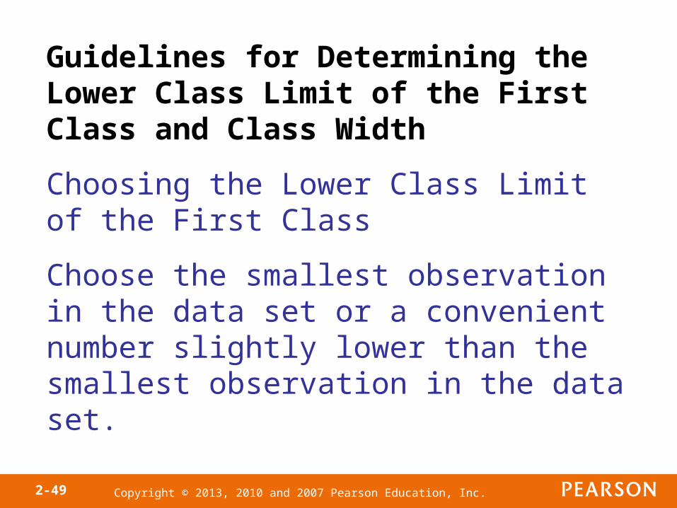
Guidelines for Determining the Lower Class Limit of the First Class and Class Width
Choosing the Lower Class Limit of the First Class
Choose the smallest observation in the data set or a convenient number slightly lower than the smallest observation in the data set.
Copyright © 2013, 2010 and 2007 Pearson Education, Inc.2-50
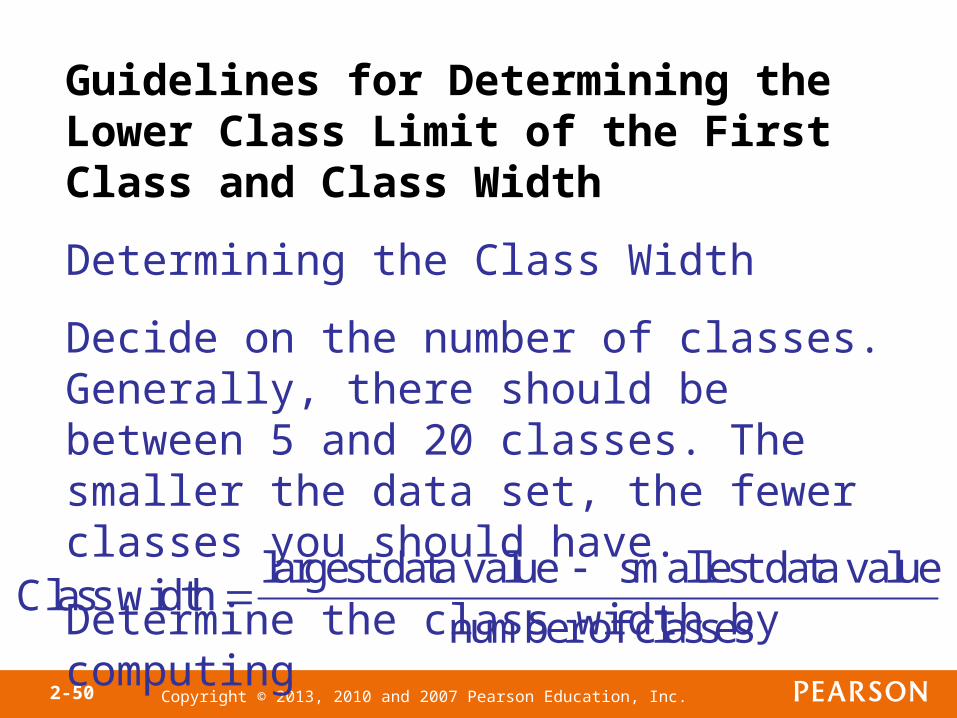
Guidelines for Determining the Lower Class Limit of the First Class and Class Width
Determining the Class Width
Decide on the number of classes. Generally, there should be between 5 and 20 classes. The smaller the data set, the fewer classes you should have.
Determine the class width by computing
Class width largest data value smallest data value
number of classes
Copyright © 2013, 2010 and 2007 Pearson Education, Inc.2-51
Objective 4
• Construct Histograms of Continuous Data
Copyright © 2013, 2010 and 2007 Pearson Education, Inc.2-52
EXAMPLE Constructing a Frequency and Relative Frequency Histogram for Continuous Data
Using class width of 10:
Copyright © 2013, 2010 and 2007 Pearson Education, Inc.2-53
Copyright © 2013, 2010 and 2007 Pearson Education, Inc.2-54
Using class width of 5:
Copyright © 2013, 2010 and 2007 Pearson Education, Inc.2-55
Objective 5
• Draw Stem-and-Leaf Plots
Copyright © 2013, 2010 and 2007 Pearson Education, Inc.2-56
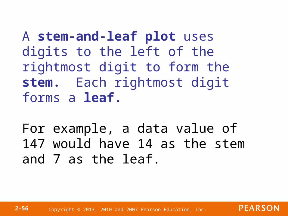
A stem-and-leaf plot uses digits to the left of the rightmost digit to form the stem. Each rightmost digit forms a leaf.
For example, a data value of 147 would have 14 as the stem and 7 as the leaf.
Copyright © 2013, 2010 and 2007 Pearson Education, Inc.2-57
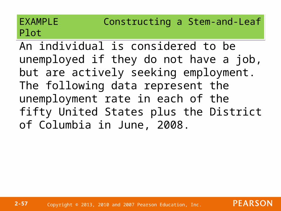
EXAMPLE Constructing a Stem-and-Leaf PlotEXAMPLE Constructing a Stem-and-Leaf Plot
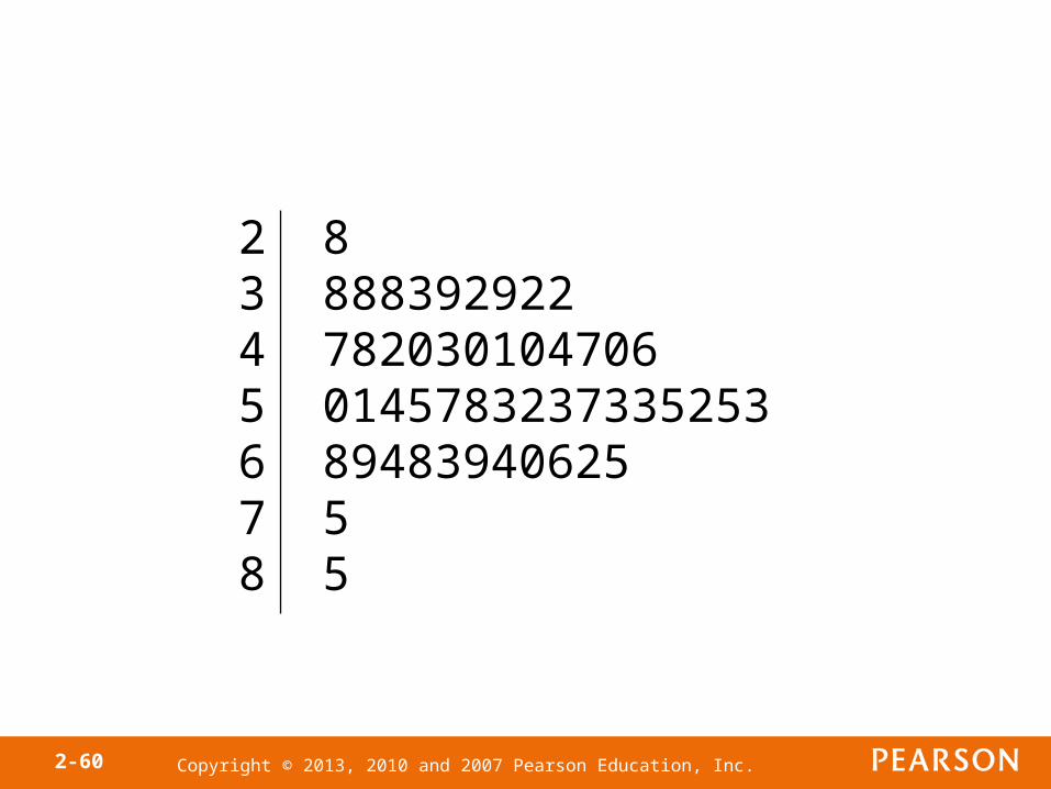
An individual is considered to be unemployed if they do not have a job, but are actively seeking employment. The following data represent the unemployment rate in each of the fifty United States plus the District of Columbia in June, 2008.
Copyright © 2013, 2010 and 2007 Pearson Education, Inc.2-58
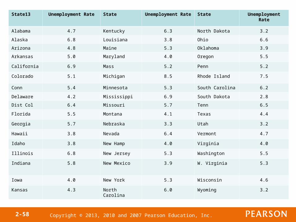
State13 Unemployment Rate State Unemployment Rate State Unemployment Rate
Alabama 4.7 Kentucky 6.3 North Dakota 3.2
Alaska 6.8 Louisiana 3.8 Ohio 6.6
Arizona 4.8 Maine 5.3 Oklahoma 3.9
Arkansas 5.0 Maryland 4.0 Oregon 5.5
California 6.9 Mass 5.2 Penn 5.2
Colorado 5.1 Michigan 8.5 Rhode Island 7.5
Conn 5.4 Minnesota 5.3 South Carolina 6.2
Delaware 4.2 Mississippi 6.9 South Dakota 2.8
Dist Col 6.4 Missouri 5.7 Tenn 6.5
Florida 5.5 Montana 4.1 Texas 4.4
Georgia 5.7 Nebraska 3.3 Utah 3.2
Hawaii 3.8 Nevada 6.4 Vermont 4.7
Idaho 3.8 New Hamp 4.0 Virginia 4.0
Illinois 6.8 New Jersey 5.3 Washington 5.5
Indiana 5.8 New Mexico 3.9 W. Virginia 5.3
Iowa 4.0 New York 5.3 Wisconsin 4.6
Kansas 4.3 North Carolina 6.0 Wyoming 3.2
Copyright © 2013, 2010 and 2007 Pearson Education, Inc.2-59
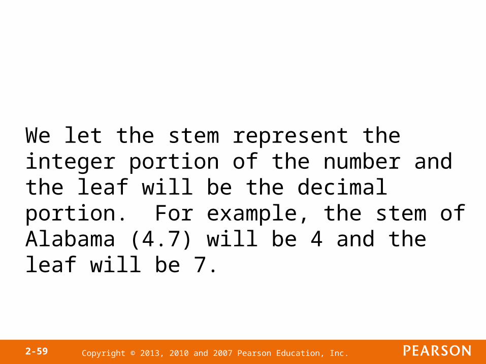
We let the stem represent the integer portion of the number and the leaf will be the decimal portion. For example, the stem of Alabama (4.7) will be 4 and the leaf will be 7.
Copyright © 2013, 2010 and 2007 Pearson Education, Inc.2-60
2 83 8883929224 7820301047065 01457832373352536 894839406257 58 5

Copyright © 2013, 2010 and 2007 Pearson Education, Inc.2-61
2 83 2223888994 0000123467785 01223333345557786 023445688997 58 5

Copyright © 2013, 2010 and 2007 Pearson Education, Inc.2-62
Construction of a Stem-and-leaf Plot
Step 1 The stem of a data value will consist of the digits to the left of the right- most digit. The leaf of a data value will be the rightmost digit.
Step 2 Write the stems in a vertical column in increasing order. Draw a vertical line to the right of the stems.
Step 3 Write each leaf corresponding to the stems to the right of the vertical line.
Step 4 Within each stem, rearrange the leaves in ascending order, title the plot, and include a legend to indicate what the values represent.
Copyright © 2013, 2010 and 2007 Pearson Education, Inc.2-63
When data appear rather bunched, we can use split stems.
The stem-and-leaf plot shown on the next slide reveals the distribution of the data better.
As with the determination of class intervals in the creation of frequency histograms, judgment plays a major role.
There is no such thing as the correct stem-and-leaf plot. However, some plots are better than others.
Copyright © 2013, 2010 and 2007 Pearson Education, Inc.2-64
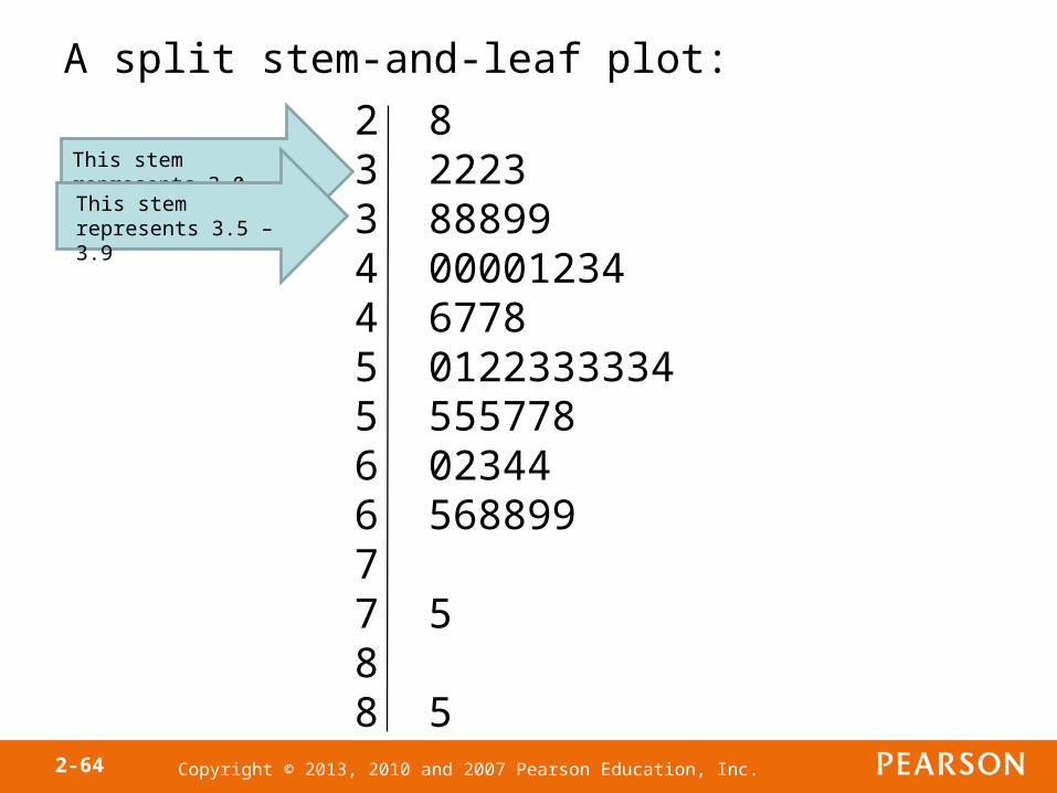
A split stem-and-leaf plot:
2 83 22233 888994 000012344 67785 01223333345 5557786 023446 5688997 7 58 8 5
This stem represents 3.0 – 3.4This stem represents 3.5 – 3.9
Copyright © 2013, 2010 and 2007 Pearson Education, Inc.2-65
Once a frequency distribution or histogram of continuous data is created, the raw data is lost (unless reported with the frequency distribution), however, the raw data can be retrieved from the stem-and-leaf plot.
Advantage of Stem-and-Leaf Diagrams over HistogramsAdvantage of Stem-and-Leaf Diagrams over Histograms

Copyright © 2013, 2010 and 2007 Pearson Education, Inc.2-66
Objective 6
• Draw Dot Plots
Copyright © 2013, 2010 and 2007 Pearson Education, Inc.2-67
A dot plot is drawn by placing each observation horizontally in increasing order and placing a dot above the observation each time it is observed.
Copyright © 2013, 2010 and 2007 Pearson Education, Inc.2-68
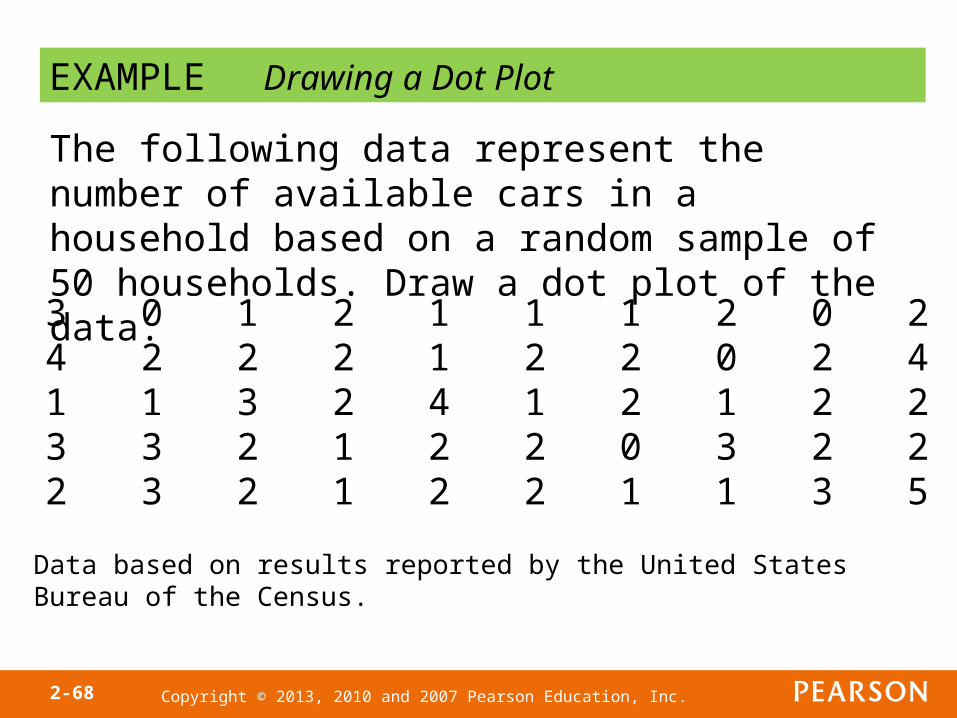
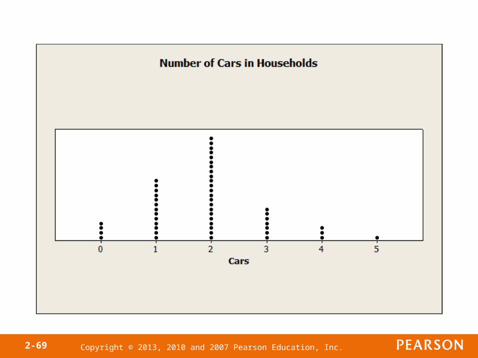
EXAMPLE Drawing a Dot Plot
The following data represent the number of available cars in a household based on a random sample of 50 households. Draw a dot plot of the data.
3 0 1 2 1 1 1 2 0 24 2 2 2 1 2 2 0 2 41 1 3 2 4 1 2 1 2 23 3 2 1 2 2 0 3 2 22 3 2 1 2 2 1 1 3 5
Data based on results reported by the United States Bureau of the Census.
Copyright © 2013, 2010 and 2007 Pearson Education, Inc.2-69

Copyright © 2013, 2010 and 2007 Pearson Education, Inc.2-70
Objective 7
• Identify the Shape of a Distribution
Copyright © 2013, 2010 and 2007 Pearson Education, Inc.2-71
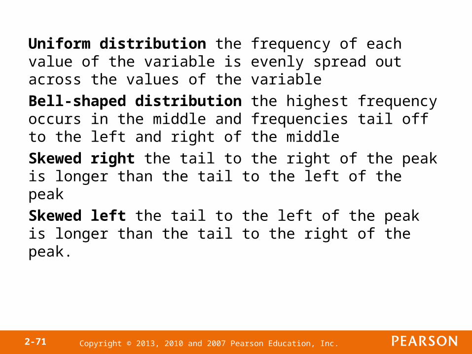
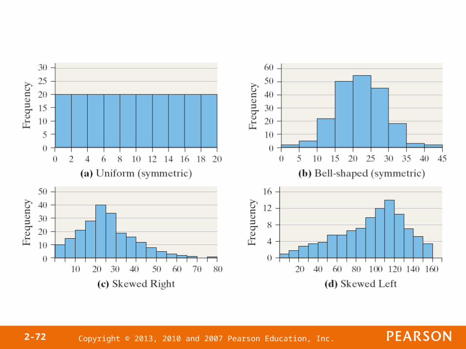
Uniform distribution the frequency of each value of the variable is evenly spread out across the values of the variable
Bell-shaped distribution the highest frequency occurs in the middle and frequencies tail off to the left and right of the middle
Skewed right the tail to the right of the peak is longer than the tail to the left of the peak
Skewed left the tail to the left of the peak is longer than the tail to the right of the peak.
Copyright © 2013, 2010 and 2007 Pearson Education, Inc.2-72
Copyright © 2013, 2010 and 2007 Pearson Education, Inc.2-73
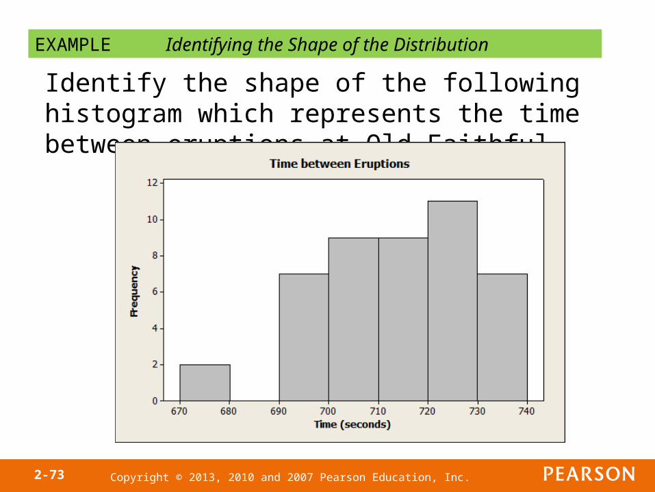
EXAMPLE Identifying the Shape of the Distribution
Identify the shape of the following histogram which represents the time between eruptions at Old Faithful.
Copyright © 2013, 2010 and 2007 Pearson Education, Inc.2-74
Copyright © 2013, 2010 and 2007 Pearson Education, Inc.
Section
Additional Displays of Quantitative Data
2.3

Copyright © 2013, 2010 and 2007 Pearson Education, Inc.2-76
Objectives
1. Construct frequency polygons
2. Create cumulative frequency and relative frequency tables
3. Construct frequency and relative frequency ogives
4. Draw time-series graphs
Copyright © 2013, 2010 and 2007 Pearson Education, Inc.2-77
Objective 1
• Construct Frequency Polygons
Copyright © 2013, 2010 and 2007 Pearson Education, Inc.2-78
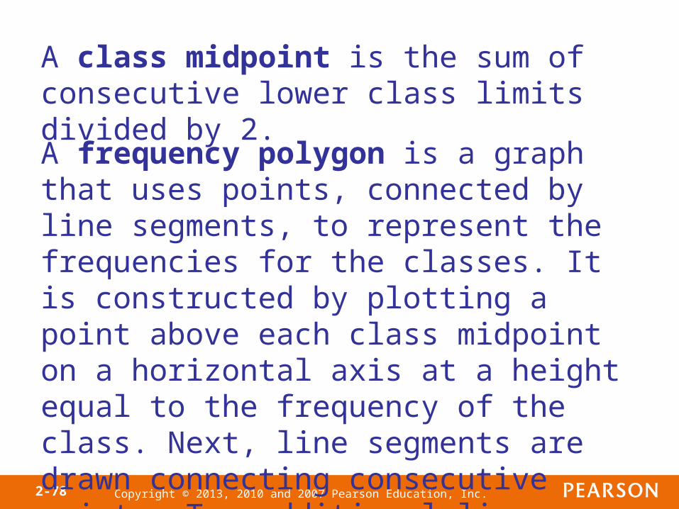
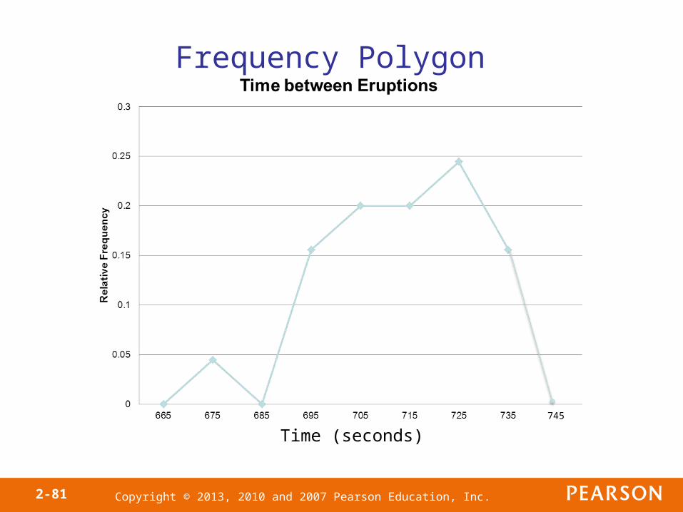
A class midpoint is the sum of consecutive lower class limits divided by 2.
A frequency polygon is a graph that uses points, connected by line segments, to represent the frequencies for the classes. It is constructed by plotting a point above each class midpoint on a horizontal axis at a height equal to the frequency of the class. Next, line segments are drawn connecting consecutive points. Two additional line segments are drawn connecting each end of the graph with the horizontal axis.
Copyright © 2013, 2010 and 2007 Pearson Education, Inc.2-79
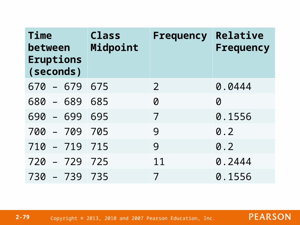
Time between Eruptions (seconds)
Class Midpoint
Frequency Relative Frequency
670 – 679 675 2 0.0444
680 – 689 685 0 0
690 – 699 695 7 0.1556
700 – 709 705 9 0.2
710 – 719 715 9 0.2
720 – 729 725 11 0.2444
730 – 739 735 7 0.1556
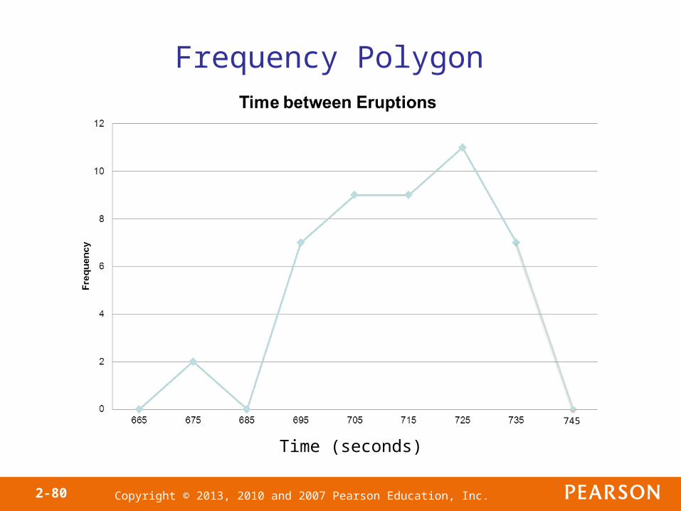
Copyright © 2013, 2010 and 2007 Pearson Education, Inc.2-80
Time (seconds)
Frequency Polygon
745
Copyright © 2013, 2010 and 2007 Pearson Education, Inc.2-81
Time (seconds)
Frequency Polygon
745

Copyright © 2013, 2010 and 2007 Pearson Education, Inc.2-82
Objective 2
• Create Cumulative Frequency and Relative Frequency Tables
Copyright © 2013, 2010 and 2007 Pearson Education, Inc.2-83
A cumulative frequency distribution displays the aggregate frequency of the category. In other words, for discrete data, it displays the total number of observations less than or equal to the category. For continuous data, it displays the total number of observations less than or equal to the upper class limit of a class.
Copyright © 2013, 2010 and 2007 Pearson Education, Inc.2-84
A cumulative relative frequency distribution displays the proportion (or percentage) of observations less than or equal to the category for discrete data and the proportion (or percentage) of observations less than or equal to the upper class limit for continuous data.
Copyright © 2013, 2010 and 2007 Pearson Education, Inc.2-85
Copyright © 2013, 2010 and 2007 Pearson Education, Inc.2-86
Objective 3
• Construct Frequency and Relative Frequency Ogives
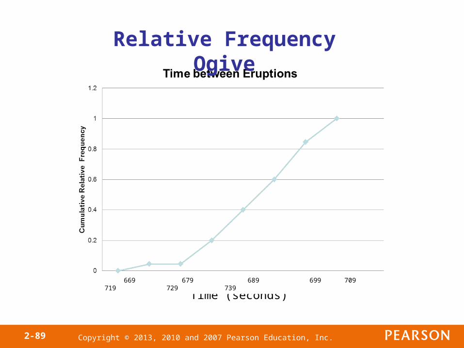
Copyright © 2013, 2010 and 2007 Pearson Education, Inc.2-87
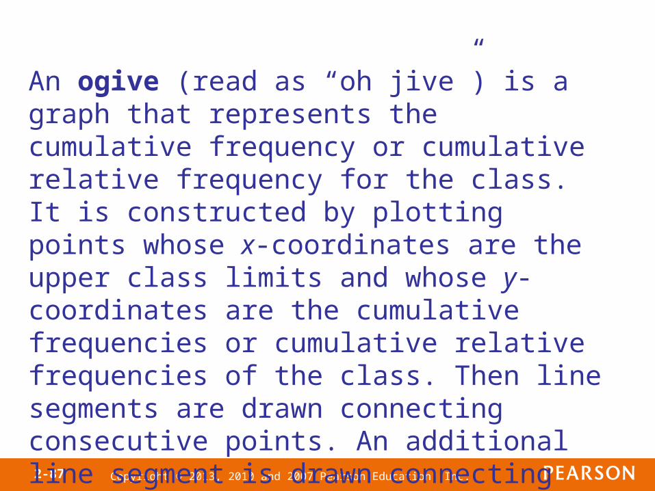
An ogive (read as “oh jive”) is a graph that represents the cumulative frequency or cumulative relative frequency for the class. It is constructed by plotting points whose x-coordinates are the upper class limits and whose y-coordinates are the cumulative frequencies or cumulative relative frequencies of the class. Then line segments are drawn connecting consecutive points. An additional line segment is drawn connecting the first point to the horizontal axis at a location representing the upper limit of the class that would precede the first class (if it existed).
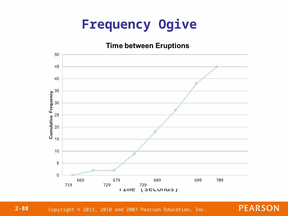
Copyright © 2013, 2010 and 2007 Pearson Education, Inc.2-88
Time (seconds)
Frequency Ogive
669 679 689 699 709 719 729 739
Copyright © 2013, 2010 and 2007 Pearson Education, Inc.2-89
Time (seconds)
Relative Frequency Ogive
669 679 689 699 709 719 729 739

Copyright © 2013, 2010 and 2007 Pearson Education, Inc.2-90
Objective 4
• Draw Time Series Graphs
Copyright © 2013, 2010 and 2007 Pearson Education, Inc.2-91
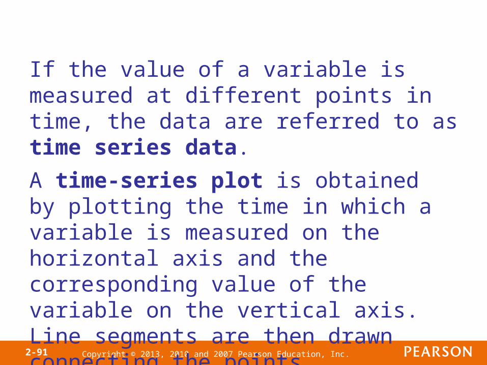
If the value of a variable is measured at different points in time, the data are referred to as time series data.
A time-series plot is obtained by plotting the time in which a variable is measured on the horizontal axis and the corresponding value of the variable on the vertical axis. Line segments are then drawn connecting the points.
Copyright © 2013, 2010 and 2007 Pearson Education, Inc.2-92
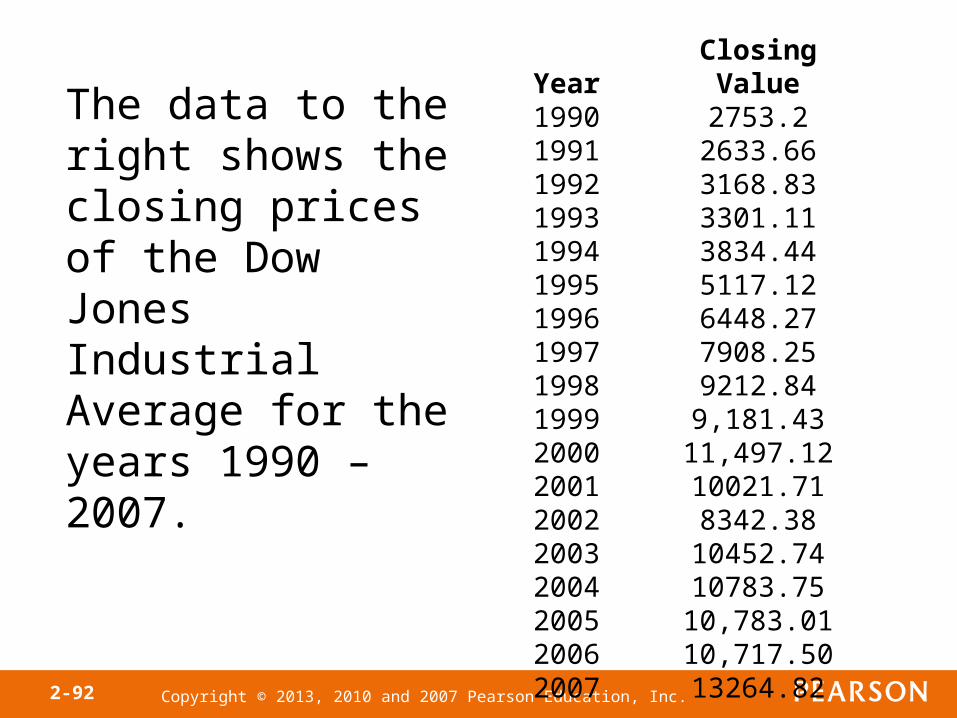
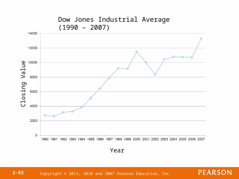
Year Closing Value1990 2753.21991 2633.661992 3168.831993 3301.111994 3834.441995 5117.121996 6448.271997 7908.251998 9212.841999 9,181.432000 11,497.122001 10021.712002 8342.382003 10452.742004 10783.752005 10,783.012006 10,717.502007 13264.82
The data to the right shows the closing prices of the Dow Jones Industrial Average for the years 1990 – 2007.
Copyright © 2013, 2010 and 2007 Pearson Education, Inc.2-93
Year
Clo
sing
Val
ueDow Jones Industrial Average (1990 – 2007)
Copyright © 2013, 2010 and 2007 Pearson Education, Inc.
Section
Graphical Misrepresentations of Data
2.4
Copyright © 2013, 2010 and 2007 Pearson Education, Inc.2-95
Objectives
1. Describe what can make a graph misleading or deceptive
Copyright © 2013, 2010 and 2007 Pearson Education, Inc.2-96
Objective 1
• Describe What Can Make a Graph Misleading or Deceptive
Copyright © 2013, 2010 and 2007 Pearson Education, Inc.2-97
Statistics: The only science that enables different experts using the same figures to draw different conclusions. – Evan Esar
Copyright © 2013, 2010 and 2007 Pearson Education, Inc.2-98
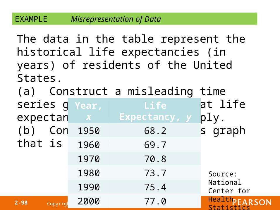
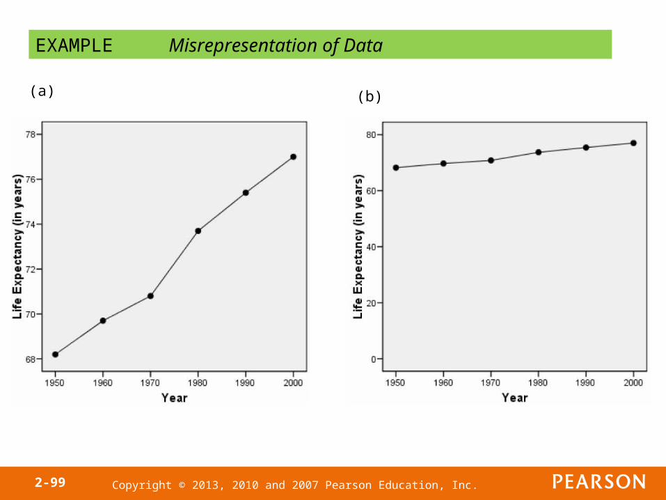
EXAMPLE Misrepresentation of Data
The data in the table represent the historical life expectancies (in years) of residents of the United States. (a) Construct a misleading time series graph that implies that life expectancies have risen sharply.(b) Construct a time series graph that is not misleading.
Year, x Life Expectancy, y
1950 68.2
1960 69.7
1970 70.8
1980 73.7
1990 75.4
2000 77.0
Source: National Center for Health Statistics
Copyright © 2013, 2010 and 2007 Pearson Education, Inc.2-99
EXAMPLE Misrepresentation of Data
(a) (b)
Copyright © 2013, 2010 and 2007 Pearson Education, Inc.2-100
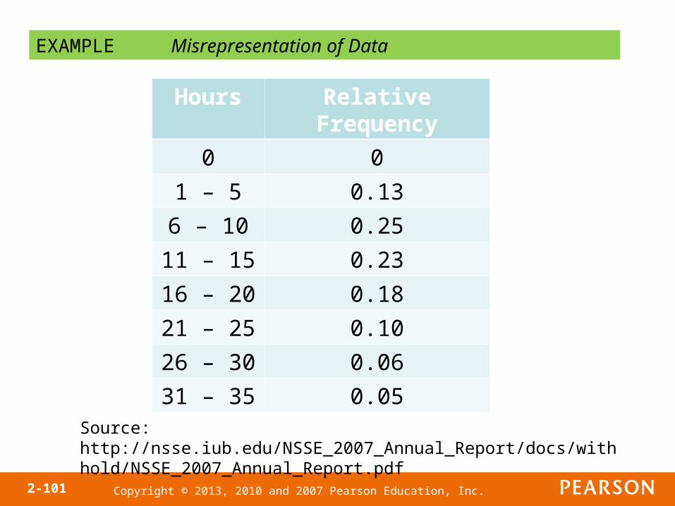
EXAMPLE Misrepresentation of Data
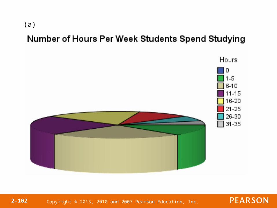
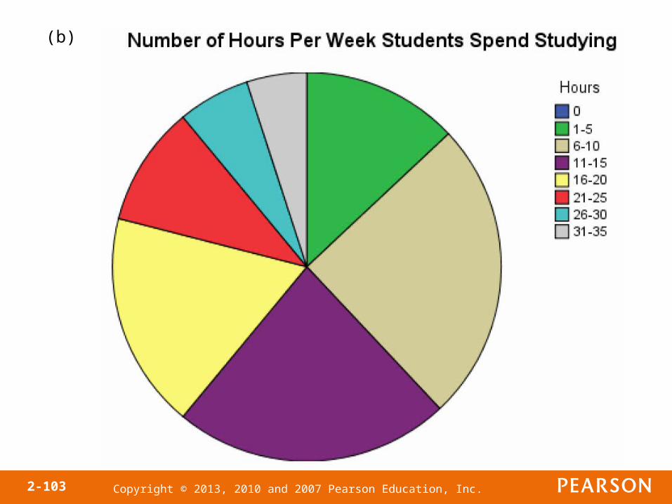
The National Survey of Student Engagement is a survey that (among other things) asked first year students at liberal arts colleges how much time they spend preparing for class each week. The results from the 2007 survey are summarized on the next slide. (a) Construct a pie chart that exaggerates the percentage of students who spend between 6 and 10 hours preparing for class each week.(b) Construct a pie chart that is not misleading.
Copyright © 2013, 2010 and 2007 Pearson Education, Inc.2-101
EXAMPLE Misrepresentation of Data
Hours Relative Frequency
0 0
1 – 5 0.13
6 – 10 0.25
11 – 15 0.23
16 – 20 0.18
21 – 25 0.10
26 – 30 0.06
31 – 35 0.05
Source: http://nsse.iub.edu/NSSE_2007_Annual_Report/docs/withhold/NSSE_2007_Annual_Report.pdf
Copyright © 2013, 2010 and 2007 Pearson Education, Inc.2-102
(a)
Copyright © 2013, 2010 and 2007 Pearson Education, Inc.2-103
(b)

Copyright © 2013, 2010 and 2007 Pearson Education, Inc.2-104
Guidelines for Constructing Good Graphics
• Title and label the graphic axes clearly, providing explanations, if needed. Include units of measurement and a data source when appropriate.
• Avoid distortion. Never lie about the data.• Minimize the amount of white space in the
graph. Use the available space to let the data stand out. If scales are truncated, be sure to clearly indicate this to the reader.
Copyright © 2013, 2010 and 2007 Pearson Education, Inc.2-105
Guidelines for Constructing Good Graphics
• Avoid clutter, such as excessive gridlines and unnecessary backgrounds or pictures. Don’t distract the reader.
• Avoid three dimensions. Three-dimensional charts may look nice, but they distract the reader and often lead to misinterpretation of the graphic.
Copyright © 2013, 2010 and 2007 Pearson Education, Inc.2-106
Guidelines for Constructing Good Graphics
• Do not use more than one design in the same graphic. Sometimes graphs use a different design in one portion of the graph to draw attention to that area. Don’t try to force the reader to any specific part of the graph. Let the data speak for themselves.
• Avoid relative graphs that are devoid of data or scales.