chapter two organizing and summarizing data 2.2 organizing quantitative data i
TRANSCRIPT
Chapter TwoOrganizing and Summarizing
Data
2.2
Organizing Quantitative Data I
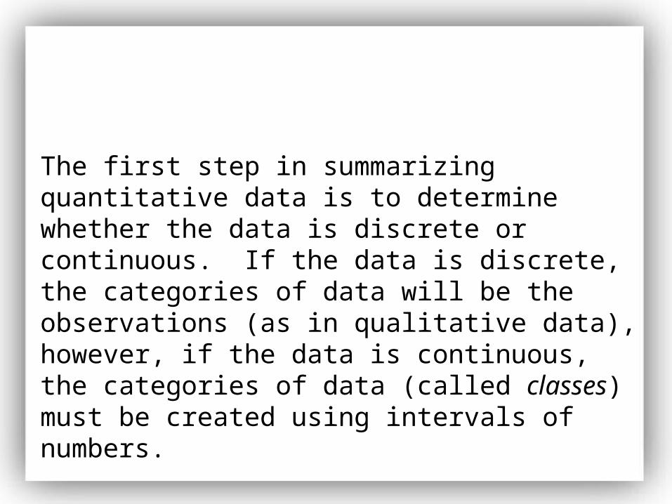
The first step in summarizing quantitative data is to determine whether the data is discrete or continuous. If the data is discrete, the categories of data will be the observations (as in qualitative data), however, if the data is continuous, the categories of data (called classes) must be created using intervals of numbers.
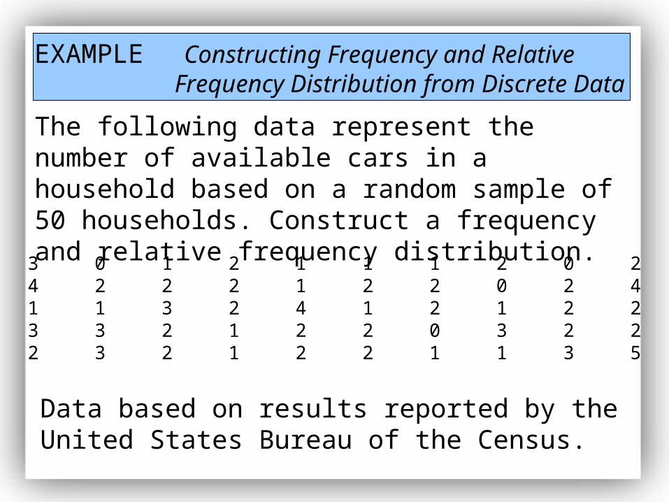
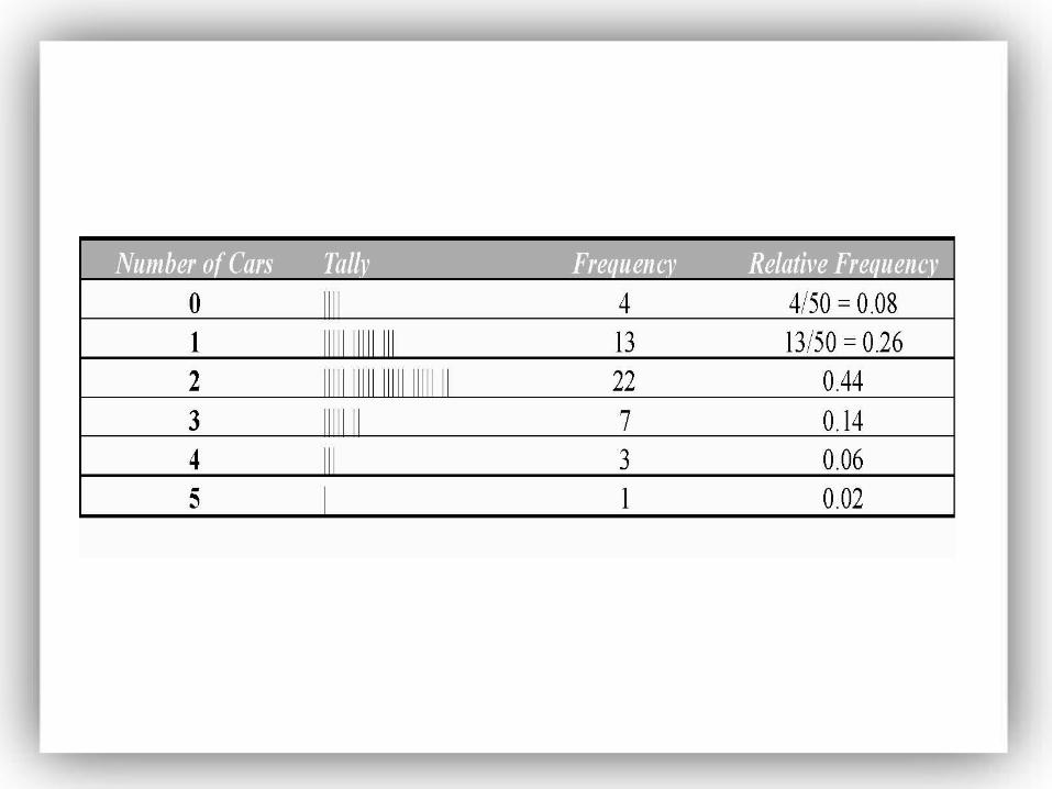
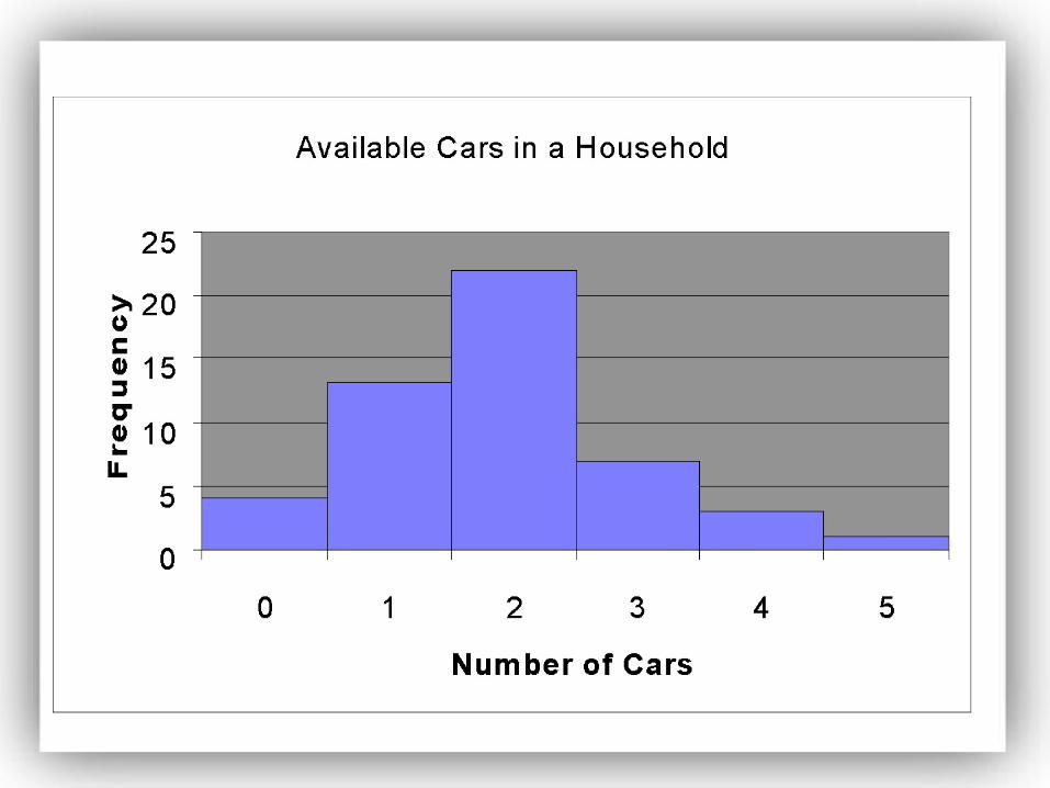
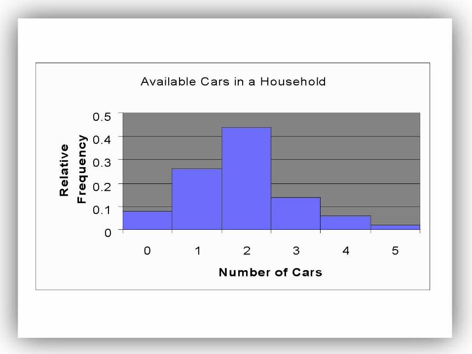
EXAMPLE Constructing Frequency and Relative Frequency Distribution from Discrete Data
The following data represent the number of available cars in a household based on a random sample of 50 households. Construct a frequency and relative frequency distribution.
3 0 1 2 1 1 1 2 0 24 2 2 2 1 2 2 0 2 41 1 3 2 4 1 2 1 2 23 3 2 1 2 2 0 3 2 22 3 2 1 2 2 1 1 3 5
Data based on results reported by the United States Bureau of the Census.
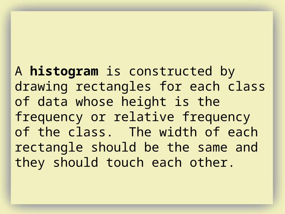
A histogram is constructed by drawing rectangles for each class of data whose height is the frequency or relative frequency of the class. The width of each rectangle should be the same and they should touch each other.
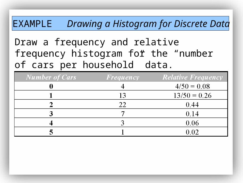
EXAMPLE Drawing a Histogram for Discrete Data
Draw a frequency and relative frequency histogram for the “number of cars per household” data.
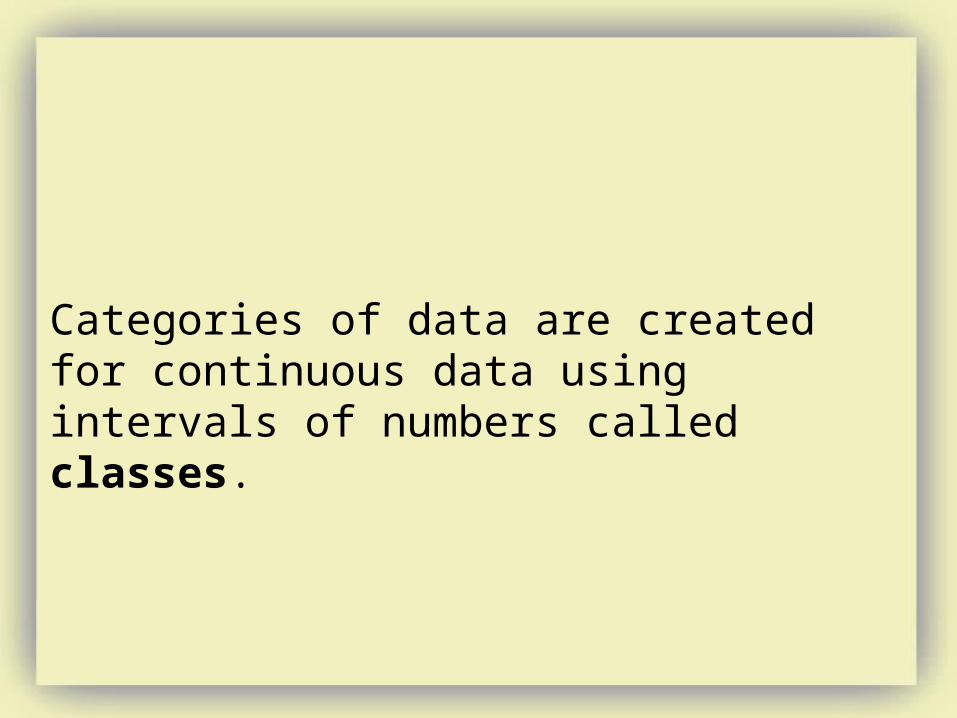
Categories of data are created for continuous data using intervals of numbers called classes.
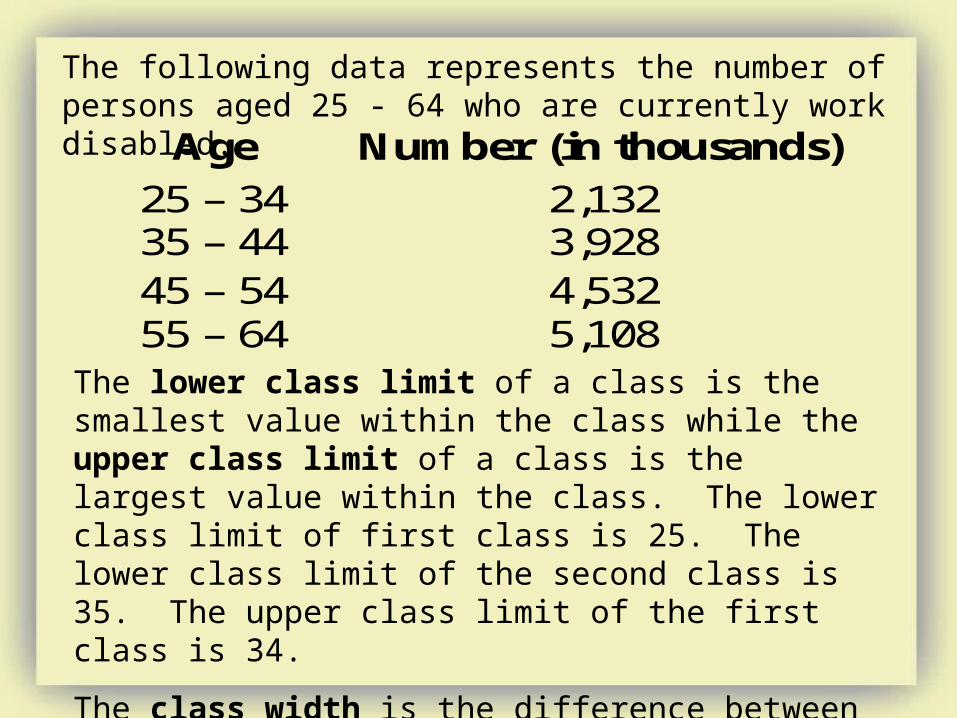
The following data represents the number of persons aged 25 - 64 who are currently work disabled.
Age Number (in thousands)
25 – 34 2,132 35 – 44 3,928 45 – 54 4,532 55 – 64 5,108
The lower class limit of a class is the smallest value within the class while the upper class limit of a class is the largest value within the class. The lower class limit of first class is 25. The lower class limit of the second class is 35. The upper class limit of the first class is 34.
The class width is the difference between consecutive lower class limits. The class width of the data given above is 35 - 25 = 10.
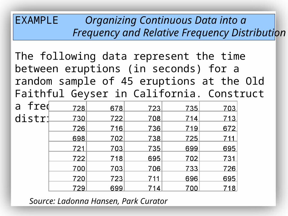
EXAMPLE Organizing Continuous Data into aFrequency and Relative Frequency Distribution
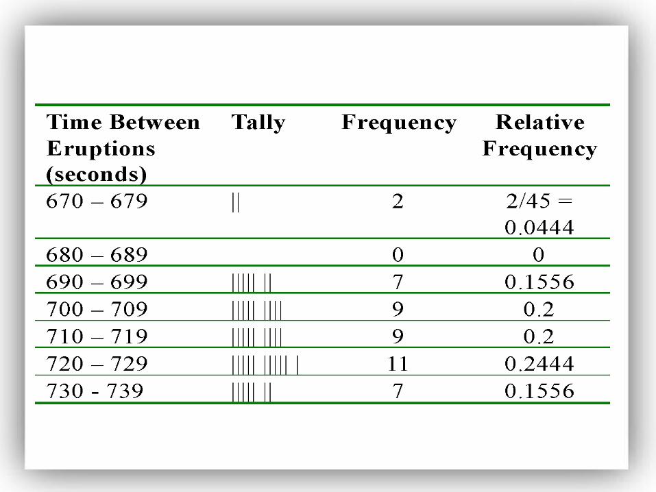
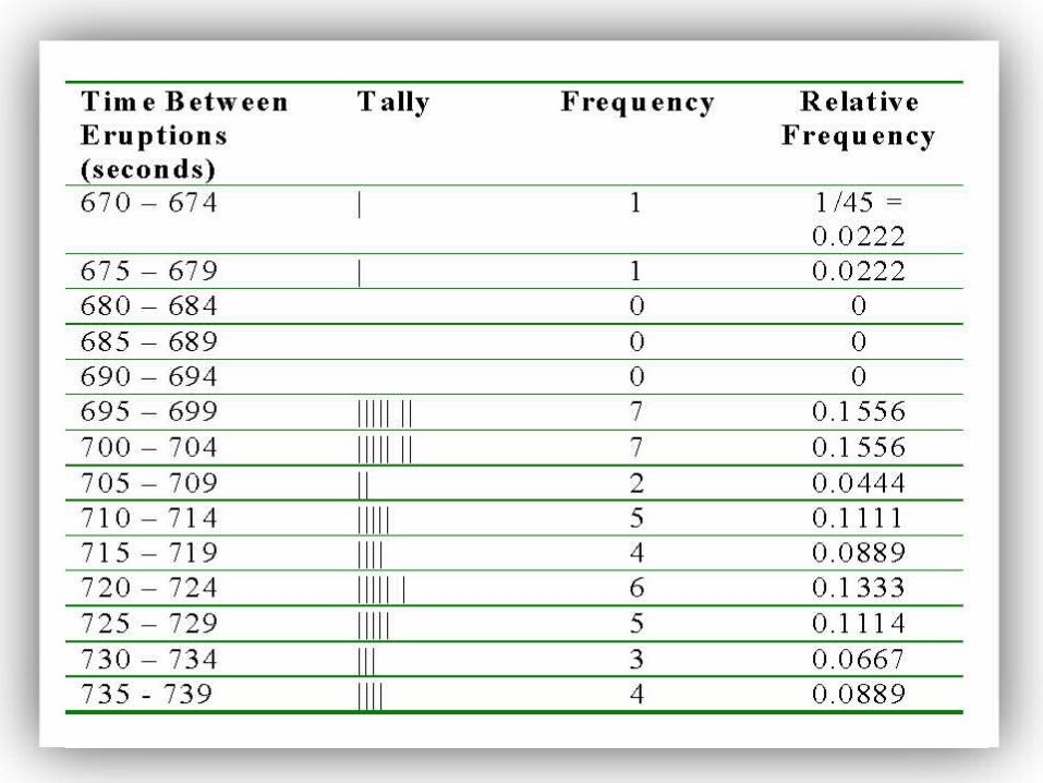
The following data represent the time between eruptions (in seconds) for a random sample of 45 eruptions at the Old Faithful Geyser in California. Construct a frequency and relative frequency distribution of the data.
Source: Ladonna Hansen, Park Curator
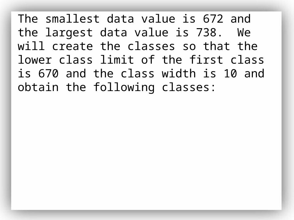
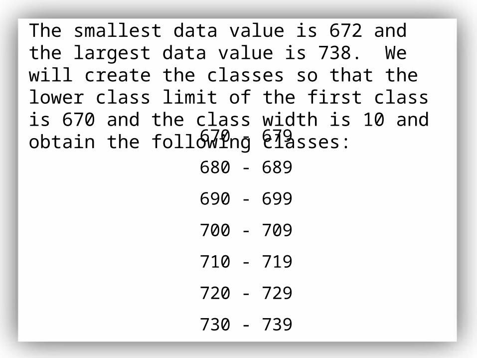
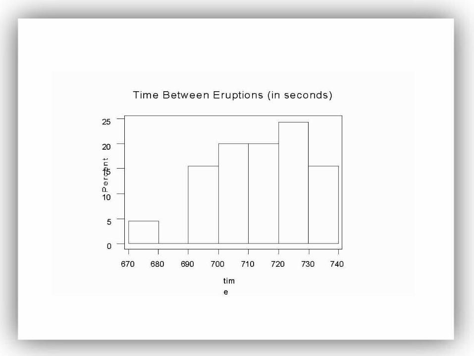
The smallest data value is 672 and the largest data value is 738. We will create the classes so that the lower class limit of the first class is 670 and the class width is 10 and obtain the following classes:
The smallest data value is 672 and the largest data value is 738. We will create the classes so that the lower class limit of the first class is 670 and the class width is 10 and obtain the following classes:
670 - 679
680 - 689
690 - 699
700 - 709
710 - 719
720 - 729
730 - 739
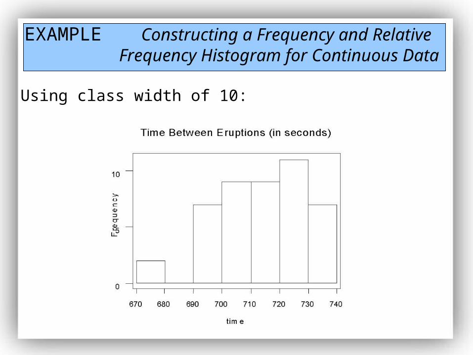
EXAMPLE Constructing a Frequency and Relative Frequency Histogram for Continuous Data
Using class width of 10:
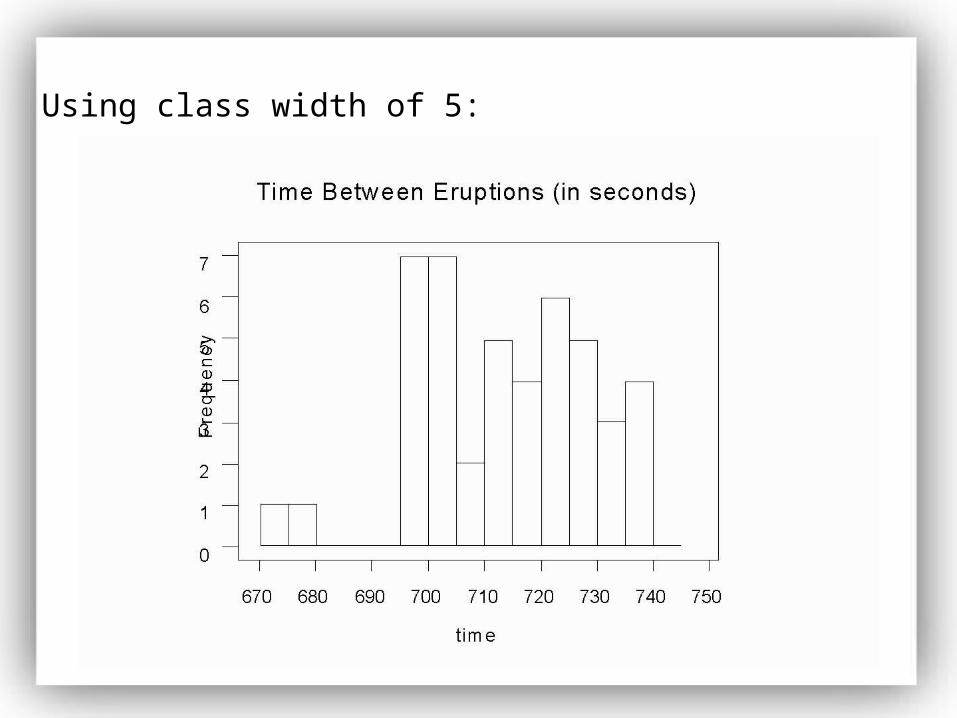
Using class width of 5:
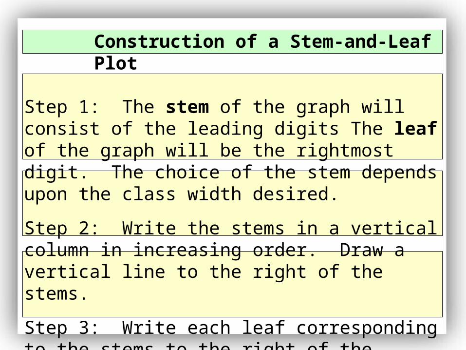
Construction of a Stem-and-Leaf Plot
Step 1: The stem of the graph will consist of the leading digits The leaf of the graph will be the rightmost digit. The choice of the stem depends upon the class width desired.
Step 2: Write the stems in a vertical column in increasing order. Draw a vertical line to the right of the stems.
Step 3: Write each leaf corresponding to the stems to the right of the vertical line. The leafs must be written in ascending order.
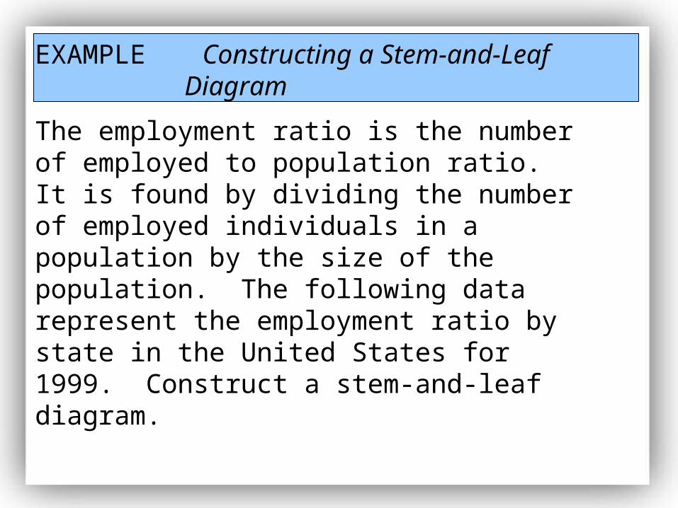
EXAMPLE Constructing a Stem-and-Leaf Diagram
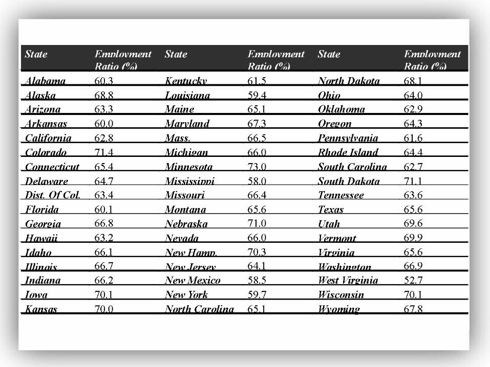
The employment ratio is the number of employed to population ratio. It is found by dividing the number of employed individuals in a population by the size of the population. The following data represent the employment ratio by state in the United States for 1999. Construct a stem-and-leaf diagram.
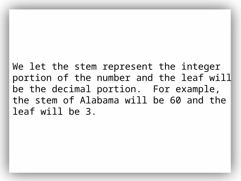
We let the stem represent the integer portion of the number and the leaf will be the decimal portion. For example, the stem of Alabama will be 60 and the leaf will be 3.
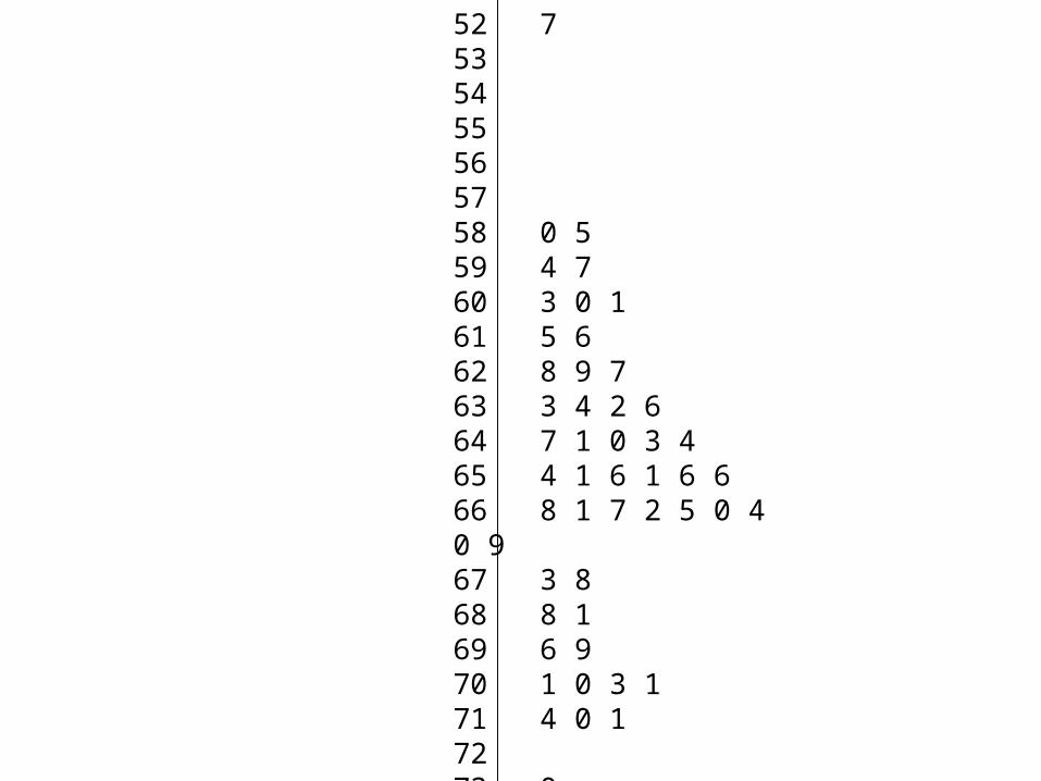
52 753545556 5758 0 559 4 760 3 0 161 5 662 8 9 763 3 4 2 664 7 1 0 3 465 4 1 6 1 6 666 8 1 7 2 5 0 4 0 967 3 868 8 169 6 970 1 0 3 171 4 0 17273 0
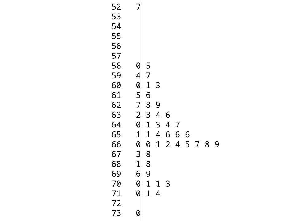
52 753545556 5758 0 559 4 760 0 1 361 5 662 7 8 963 2 3 4 664 0 1 3 4 765 1 1 4 6 6 666 0 0 1 2 4 5 7 8 967 3 868 1 869 6 970 0 1 1 371 0 1 47273 0
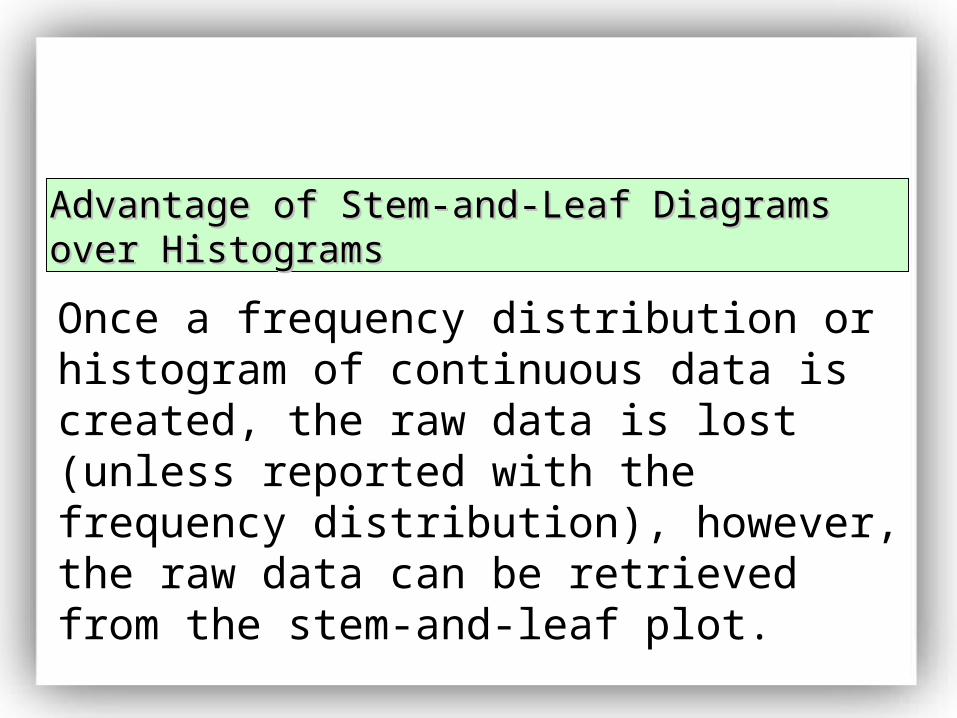
Once a frequency distribution or histogram of continuous data is created, the raw data is lost (unless reported with the frequency distribution), however, the raw data can be retrieved from the stem-and-leaf plot.
Advantage of Stem-and-Leaf Diagrams over Advantage of Stem-and-Leaf Diagrams over HistogramsHistograms
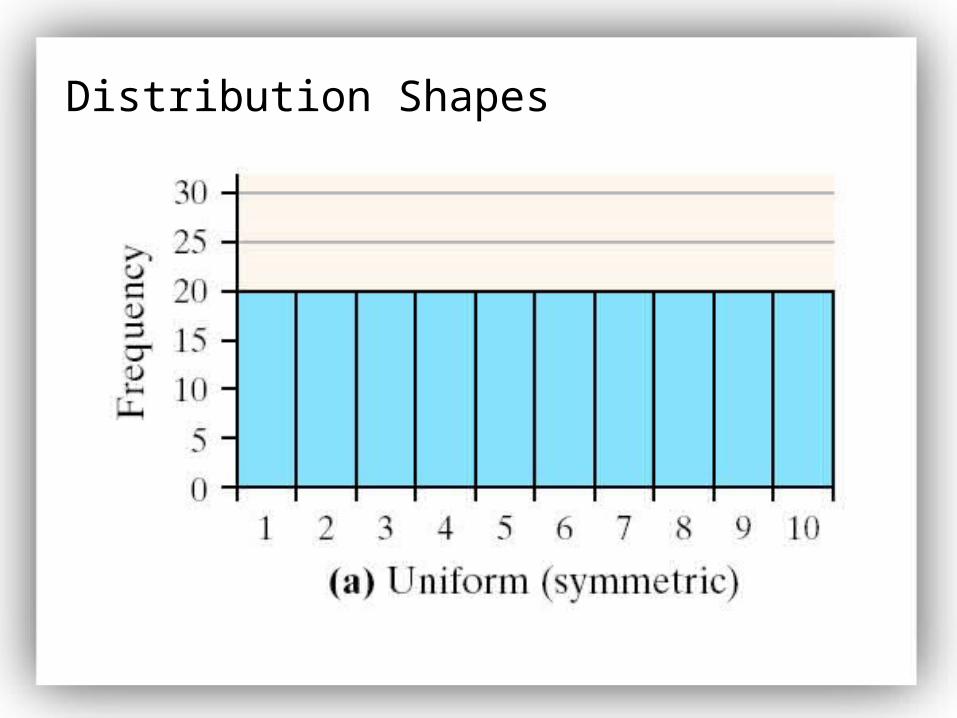
Distribution Shapes
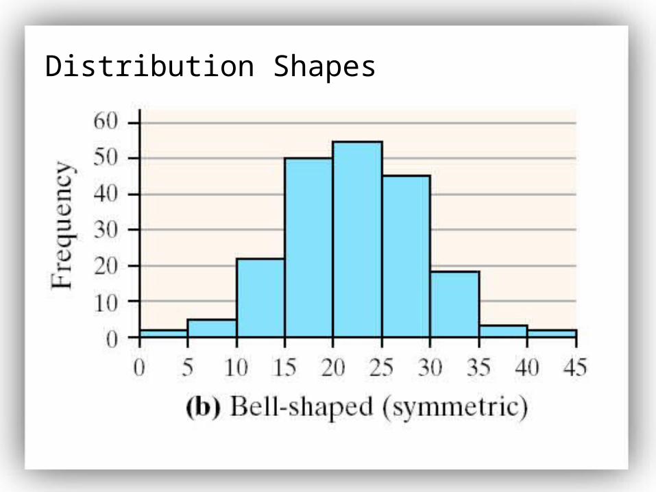
Distribution Shapes
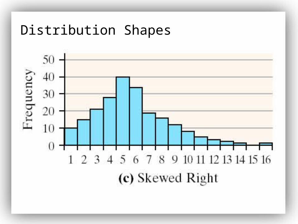
Distribution Shapes
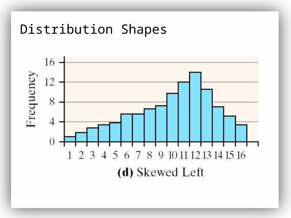
Distribution Shapes
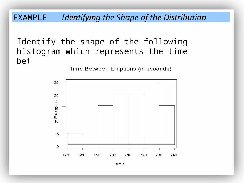
EXAMPLE Identifying the Shape of the Distribution
Identify the shape of the following histogram which represents the time between eruptions at Old Faithful.
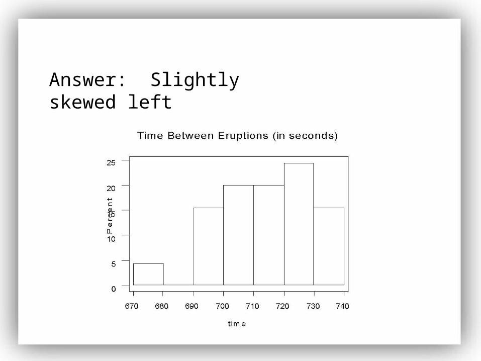
Answer: Slightly skewed left